Liquid Death ads teardown: 7 static templates from a $1.4B brand

Updated April 2026.
A guy spent $1,500 on a fake commercial in 2017 to test whether anyone would buy water in a beer can. Eight years later, Liquid Death pulled $333M in revenue, reached a $1.4B valuation, and ran its second consecutive national Super Bowl spot at $7M+ a pop.
Every teardown of Liquid Death's ads on the internet talks about the same things: Tony Hawk's blood-infused skateboards, the CORPSE PAINT × e.l.f. collab that won a Cannes Lion, the Martha Stewart severed-hand candle. Useful if you're writing a brand-strategy essay. Useless if you're a dropshipper who needs to ship a Meta static next Tuesday.
This post is about the part nobody analyzes: the actual static social ads in Liquid Death's Meta Ad Library. Seven repeating templates. Each does a different job in the funnel. Each one is cloneable for your product. Here are all of them — decomposed, ad by ad.
Template 1 — Premium hero on environmental backdrop
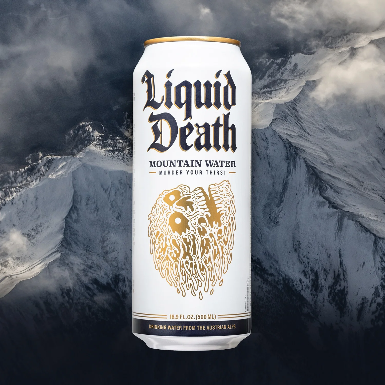
The brand-awareness anchor. One can, dead-center. A photographic mountain plate behind it that signals "premium spring water" without ever saying "premium." The wordmark stacked vertically in gothic blackletter does the work of any "death metal water" copy line — the visual signature that's instantly recognizable at scroll speed.
Function: Cold prospecting. The ad has to survive the worst possible viewer — distracted, in a feed, scrolling fast.
What's load-bearing: A centered can, a wordmark big enough to read on a phone, a high-contrast environmental plate behind it. What's optional: the specific mountain. Liquid Death runs variants with cliffs, oceans, and skull-shaped rock formations. The plate swaps; the structure doesn't.
Cloneable for your product: Pick a plate that signals your category's premium tier without naming it. Mountain = premium water. Ocean horizon = surf brand. Industrial warehouse floor = workwear. The lesson is environmental association, not literal location.
Template 2 — Disarming fear / category defense
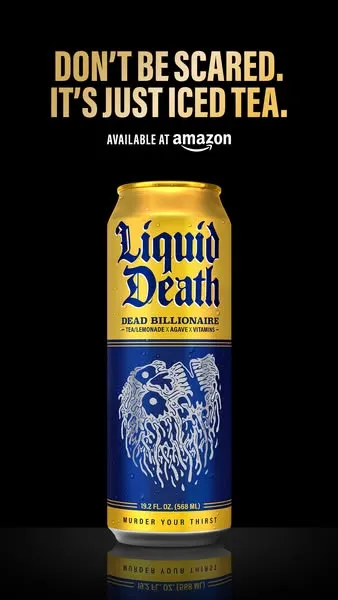
The brand looks like a black-metal album cover and sells iced tea. That's a problem most beverage brands would solve by softening the design. Liquid Death solves it by leaning in — the headline names the reaction the visual creates, then disarms it.
Function: Address skepticism. New buyers see a can that reads as alcohol or energy drink. The headline tells them "It's just iced tea" before they have to look it up.
Context worth knowing: This is the Dead Billionaire SKU — Liquid Death's iced tea-and-lemonade product. It's also a receipt. The product was originally called "Armless Palmer" until Arnold Palmer Enterprises sent a cease-and-desist in November 2023. The brand renamed it within weeks. The disarming headline pattern survived the rebrand.
Cloneable for your product: If your packaging triggers a wrong-category assumption — energy-drink-looking water, candy-looking supplements, alcohol-looking kombucha — name the reaction in the headline. "Don't be scared." "Yes, this is X." "Looks like Y, isn't." It's the cheapest objection-handling you can run, and it works because it's honest.
Template 3 — Surprising product reveal
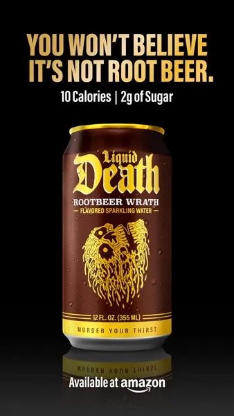
The cultural reference is "I Can't Believe It's Not Butter" — a 1981 margarine slogan that outlived the brand. Liquid Death weaponizes that exact construction to launch Rootbeer Wrath, a flavored sparkling water that tastes like a soda it isn't. The headline carries the whole product positioning: "Tastes like X, but isn't X, and here's why that matters."
Function: New SKU launch. New flavor announcement. Reveal-not-description framing.
What's load-bearing: The "you won't believe…" construction creates instant familiarity. The stat callout (10 Cal | 2g sugar) lands the why-this-matters in three numbers. The brown can color carries the root-beer association without a single drop of root beer in the picture. Visual = flavor identity.
Cloneable for your product: When launching a flavor variant or product extension, lead with the surprise, not the spec. "You won't believe this is decaf." "Tastes like dessert. Acts like a workout shake." The reveal frame outperforms description because it engages the reader in the discovery instead of declaring the answer.
Template 4 — Category positioning for a new line
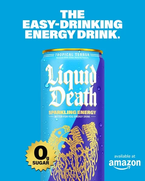
When Liquid Death launched Sparkling Energy in February 2026, they entered a saturated category dominated by Red Bull, Monster, and Celsius. The static ad doesn't try to out-extreme the extremes. The headline claims a niche: "The easy-drinking energy drink." Two adjectives reframe the entire category map.
What's load-bearing: The sky blue full-bleed background — the only ad in the set that breaks the black-on-white rule. Sparkling Energy's can is blue, so the background mirrors the SKU. The "0g SUGAR" starburst lives where competitors put their caffeine claims. Position-by-omission.
Cloneable for your product: If you're entering a saturated category, your headline is one adjective different from the incumbent. The competitor sells "extreme" — you sell "easy-drinking." The competitor sells "fast" — you sell "all-day." The visual rule: only deviate from your brand's default palette when the new SKU's own packaging demands it. Discipline shows up in the consistency of when you allow yourself to break the rules.
Template 5 — Direct comparison with stats
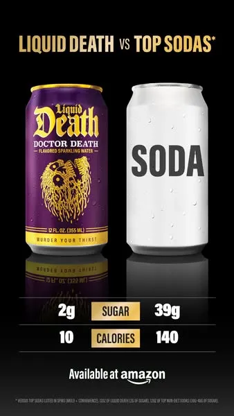
When you have a measurable category advantage, the cleanest ad is the comparison. Liquid Death's Doctor Death sparkling water is positioned against soda — not against another sparkling water. The right side of the ad is a literal generic "SODA" can with no brand markings, no logo, no specifics. That avoids legal exposure and makes the comparison feel categorical, not competitive.
Function: Bottom-funnel decision support. The viewer who's debating "should I switch from soda to this" gets the math in three numbers.
What's load-bearing: The stats are large, tabular, and binary. 2g sugar vs 39g. 10 calories vs 140. No paragraph of explanation. Just numbers and a delta.
Cloneable for your product: Don't name the competitor unless you can defend it legally. Use a generic stand-in ("the leading X," a blurred logo, a generic packshot). Make the stat readable on a phone. Limit to two or three numbers. The reader can do the multiplication themselves — your ad doesn't need to tell them what to think.
Template 6 — Real comment as the headline
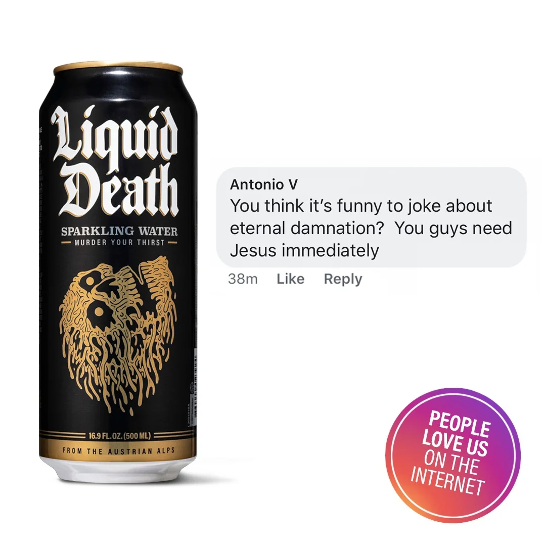
The most-replicated Liquid Death format on social. The structure: can left, screenshotted hostile comment right, "PEOPLE LOVE US ON THE INTERNET" badge bottom-right, flat white background. The comment is real. The badge below it puns directly off the comment — the viewer says "you guys need Jesus," the badge says "people love us." Self-aware bait.
Function: Retargeting and middle-funnel. The viewer has seen the brand once. Now they need to see other people reacting to it. Hostile comments work better than friendly ones because hostility reads as authentic.
What's load-bearing: A real comment, screenshot-style. The brand doesn't write the headline — strangers do, for free. The "PEOPLE LOVE US" badge punctuates the irony.
Cloneable for your product: Pull a real comment from your Facebook page, Instagram replies, or product reviews. Don't fabricate one. The hostile ones convert better than the friendly ones because they're harder to fake. Pin the comment to the right of your product, with a circular social-proof stamp bottom-right. Refresh weekly.
Template 7 — Retail-availability announcement
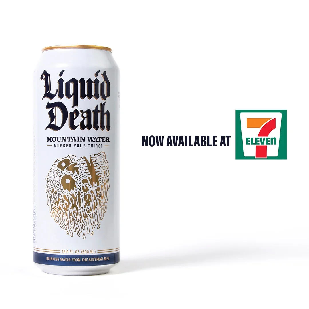
The least visually exciting template. Also the one that runs the longest, because Liquid Death is now in more than 133,000 retail stores and every retail relationship is a fresh creative brief. The structure: can left, retail partner logo right, two lines of news copy. White background. Same wordmark. Same can shot. Different retailer.
Function: Distribution moments. Bottom-funnel. Local-targeting.
What's load-bearing: The retailer logo on the right side of the ad. The news copy ("Now at 7-Eleven") is plain language, not branded language. The point is to be unmistakable, not memorable.
Cloneable for your product: Every retail relationship — Amazon storefront launch, Target rollout, regional grocer pickup, even an exclusive flavor at a single chain — is one of these ads. Each one is a 10-minute Photoshop edit. The same ad can serve the news for years if you keep refreshing the retailer logo and copy line.

Create your own product product ads
Create your adThe visual grammar that runs across all 7
After seven ads, the rules become obvious. Every static ad in Liquid Death's library shares these elements:
- Gothic blackletter wordmark, always centered vertically on the can. Never floating, never scaled differently, never restyled. The wordmark IS the brand asset; the can is its frame.
- Single can, dead-center as the hero. No groups. No lifestyle shots. No people holding it. The product is the protagonist of every ad.
- Bold all-caps headline above the can in tight sans-serif (white on dark backgrounds, gold or dark on light). One line, two lines max. No body copy.
- Background is binary by default — black or white. Black for premium / category-defense / surprise / comparison. White for social proof / retail. Deviate (sky blue for Sparkling Energy) only when the SKU's can color demands it.
- Retail anchor at the bottom or right. "Available at Amazon" appears in 5 of 7 ads. The conversion path is always one tap away.
- Optional stats badge or comparison element. Used in 2 of 7 — when the message is comparative or category-positioning. Always tabular, always tight.
This is one design system, run by hand. One Photoshop file structure. Six can colors (Mountain Water white, Sparkling Water black, Dead Billionaire gold-on-blue, Rootbeer Wrath brown, Doctor Death purple, Sparkling Energy blue). Three background colors. The ads are templates, not creative briefs.
Receipts behind the playbook
Every claim above is sourced inline. The headline numbers:
- Revenue: $45M (2021) → $130M (2022) → $263M (2023) → ~$333M (2024, +27% YoY). Sacra and Bloomberg.
- Valuation: $1.4B as of March 11, 2024, $67M round led by Live Nation, SuRo Capital, and Science Inc.
- Distribution: 133,000+ retail stores. Exclusive water at the Live Nation venue network.
- Social: ~7M TikTok and ~7.2M Instagram followers — most-followed water brand on each, third most-followed beverage globally behind Red Bull and Monster, per MarketingBrew.
- Super Bowl spend: $7M+ for the first national spot, "Safe for Work," Feb 2025. Second consecutive national spot, "Stop Exploding," Feb 2026, launching Sparkling Energy.
- Awards: Bronze Lion at Cannes Lions 2024 for the CORPSE PAINT × e.l.f. collab. AdAge "Best Marketers" 2022 and "Best Product Launches of 2024."
The CEO quotes that explain the model:
"At the end of the day, we're really creating an entertainment company and a water company." — Mike Cessario, CNBC, November 2022
"98% of people actually hate marketing. If you can make people laugh, they will have a deeper connection with your brand, regardless of the functional differences of your liquid." — Mike Cessario, Marketplace, January 2023
And Andy Pearson, VP of Creative, on Liquid Death's in-house Death Machine studio:
The team "functions as both agency and client simultaneously — when we have an idea we just go make it. There's no traditional approval process." — Andy Pearson via The Drum, March 2024
That last quote is the production-cost advantage hiding inside the brand voice. No agency invoice. No client approval cycle. An idea on Tuesday is a shipped ad on Friday — using one of the seven templates above.
What's cloneable vs. what's the moat
Cloneable for your product (today):
- Vertical gothic-blackletter wordmark stacked over the product. License a Blackletter or Old English font; the visual recognition is in the style, not the specific typeface.
- Studio shot of one product, dead-center, on flat black or white. Two photos, one product.
- The seven headline patterns — disarming, surprising, category-positioning, comparison, social-proof, distribution, environmental hero. One headline pattern per ad.
- A fixed visual system: two background colors as default, one retail anchor, one wordmark zone, one optional stat callout. Decide once, ship for years.
- Real hostile comments from your own social channels as the headline of the ad. Free copywriting, sourced from your audience.
- A retail-announcement template ready for every new chain, marketplace, or partnership. Each one is a 10-minute edit.
Not cloneable (the moat):
- Tony Hawk's actual blood infused into a $500 limited-edition skateboard.
- Two consecutive national Super Bowl spots at $7M+ each, plus the production budget on top.
- A Martha Stewart severed-hand candle ($58 limited drop).
- 225,000+ fans who legally "sold their soul" to a loyalty program with notarized digital contracts.
- An in-house creative studio called Death Machine that produces both Super Bowl spots and runs three years of campaigns without an agency invoice.
- Ozzy Osbourne's DNA in 10 limited iced-tea cans, signed, $450 each.
- A Cannes Lion (CORPSE PAINT × e.l.f., 2024).
The lesson: when a $1.4B brand publishes a viral stunt, the stunt is the news. The static templates are the system. Imitate the stunt and you get cosplay; imitate the system and you get a production line that ships ads on Friday. Liquid Death runs both. As a small brand, you can only run one.
This is what AdDogs was built for — the static templates, not the celebrity blood. The layout is the asset.
Pick your template based on what you're shipping
Map your situation to a template:
- Cold prospecting / brand awareness: Template 1 (premium hero on environmental backdrop)
- Your product looks weird and the audience doesn't trust it yet: Template 2 (disarming-fear)
- Launching a new flavor / SKU variant: Template 3 (surprising product reveal)
- Defining a niche in a saturated category: Template 4 (category-positioning)
- You have a measurable advantage over the incumbent: Template 5 (direct comparison with stats)
- Mid-funnel retargeting / building social proof: Template 6 (real comment as headline)
- You just landed retail or a partnership: Template 7 (retail-availability announcement)
Then the production loop:
- Drop your product photo into the template you picked.
- Write one headline that fits the pattern. Don't overwrite — the pattern carries the work.
- Variant test 10–15 versions. Different headlines, different stat callouts, different retail anchors. 1 in 10 ads becomes a winner — that's why you ship volume, not perfection. (The full math is in our ad creative testing guide.)
- Static iterates 8–10× faster than video for the same ad spend. The math is in the static vs. video breakdown.
AdDogs handles the static-only piece — composition, layout, color extraction — in seconds per variation. Pick a Liquid Death reference layout from above. Upload your product photo. The AI rebuilds the composition with your product in the same zones, pulls your brand colors automatically, and exports at 1:1 for feed, 9:16 for stories, 16:9 for placements. Basic covers 3 aspect ratios; Pro and Ultimate unlock all 14.
Liquid Death didn't get to $1.4B by hiring more designers. The team got there by running seven templates harder than anyone else in their category.
Glossier runs the same template discipline with a softer palette. The teardown is here.
FAQ
What is Liquid Death's marketing strategy?
Liquid Death markets canned water through seven repeating static-ad templates plus high-budget viral stunts and Super Bowl spots that buy reach into the templates. Their CEO calls it "an entertainment company and a water company."
Who created Liquid Death?
Mike Cessario, a former creative at VaynerMedia, Crispin Porter+Bogusky, and Humanaut. He trademarked the name in 2017, registered the company in December 2018, and shipped first product in January 2019 from Los Angeles.
What is the controversy with Liquid Death?
The most notable IP dispute was a November 2023 cease-and-desist from Arnold Palmer Enterprises over Liquid Death's "Armless Palmer" iced-tea-and-lemonade product name. Liquid Death rebranded it to "Dead Billionaire" within weeks — and now uses the new name in static ads.
How much do Liquid Death's Super Bowl ads cost?
Their first national Super Bowl spot ("Safe for Work," 2025) was disclosed by CEO Mike Cessario as a $7M+ buy. The second national spot ("Stop Exploding," Super Bowl LX 2026) was reportedly in the same range. Both produced fully in-house by their internal creative studio, Death Machine.
What is Liquid Death's slogan?
"Murder Your Thirst." It appears on every can underneath the gothic blackletter wordmark. The brand also leans on "Death to Plastic" as a secondary anti-bottle environmental tagline.
Who owns Liquid Death?
Founder and CEO Mike Cessario, alongside investors including Live Nation, SuRo Capital, Science Inc., and a long list of celebrity backers — Tony Hawk, Wiz Khalifa, Steve Aoki, Travis Barker, Whitney Cummings, Tom Segura, Josh Brolin, and DeAndre Hopkins. The 2024 round valued the company at $1.4B.
Can a small brand actually copy Liquid Death's style?
Yes — but only the static templates. Cloneable: the seven layouts, the gothic wordmark style, the two-background discipline, real social comments as headlines, retail-announcement creative. Not cloneable: anything requiring Tony Hawk, Ozzy Osbourne, or a $7M Super Bowl buy.


