AdDogs

Beauty Ad Examples From Glossier-Grade Brands

Browse 45+ beauty and cosmetics ad examples sourced from high-performing campaigns. Clone any design, swap in your product, and get a finished ad in seconds.

Updated June 2026

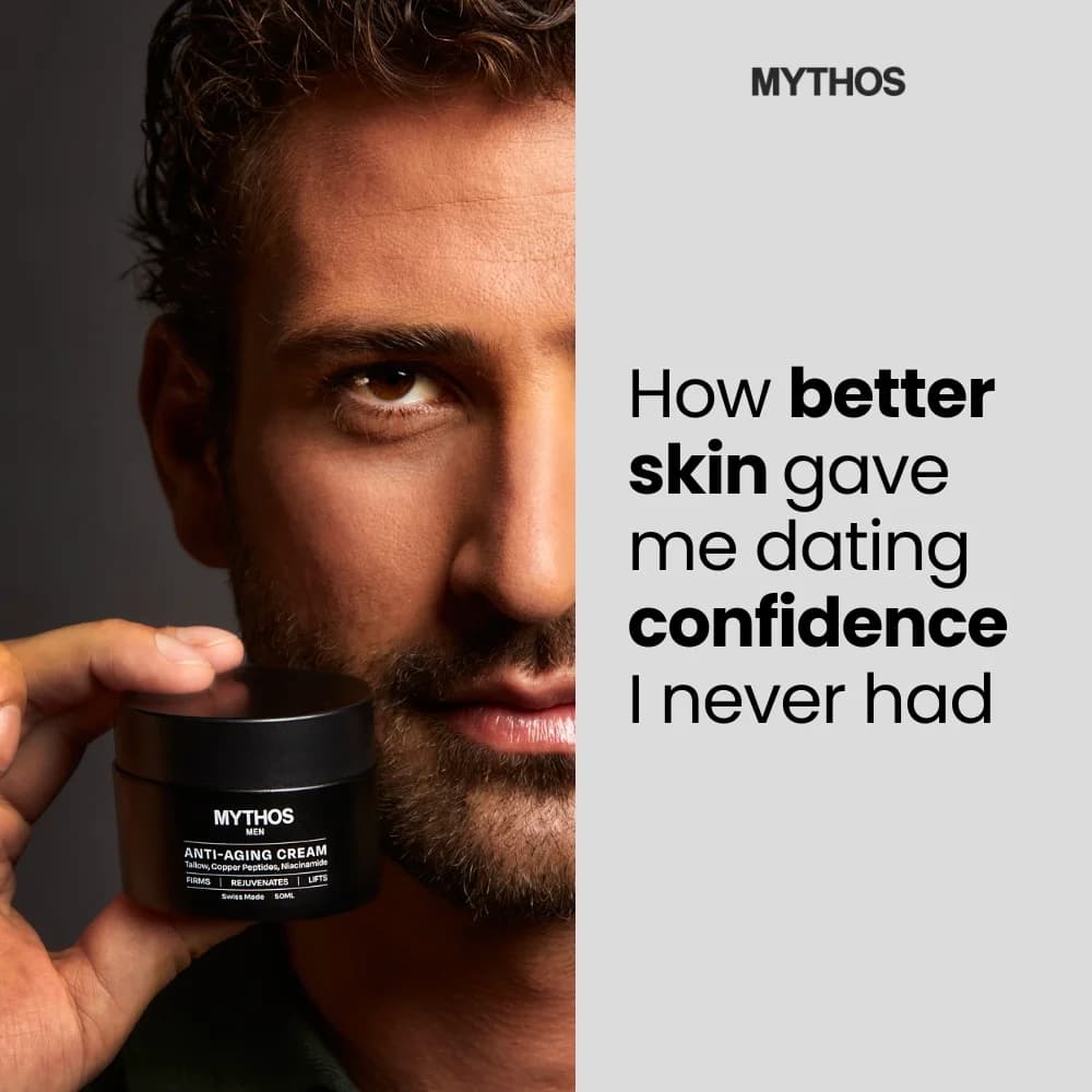
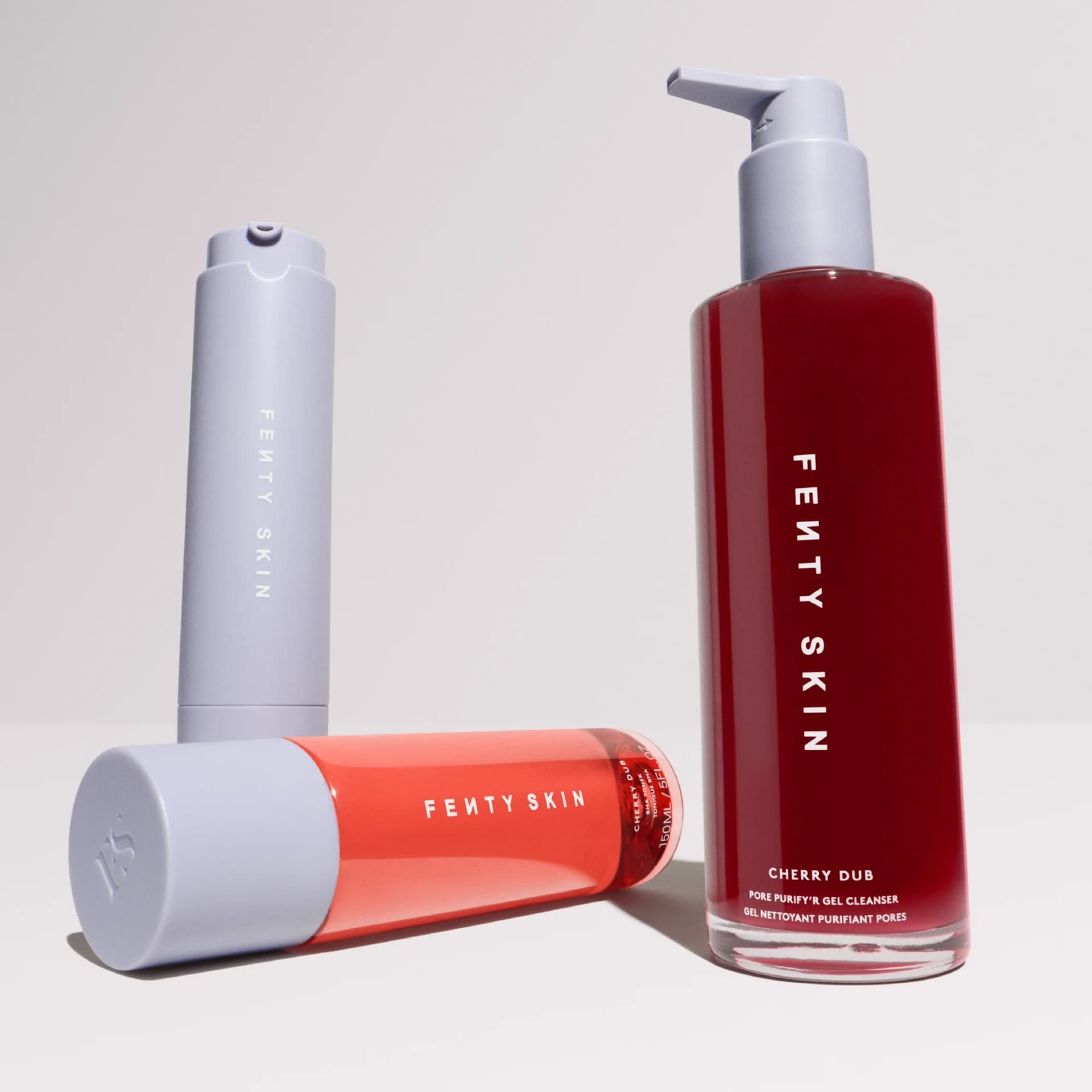
Beauty ads split into two camps. Old-guard Sephora brands run polished studio shots with models in perfect lighting. New-wave DTC brands — Glossier, ILIA, Rare Beauty, Merit — run skin-close-ups with visible freckles, pores, and redness. The second camp has been winning ad dollars for five years running because realism converts.

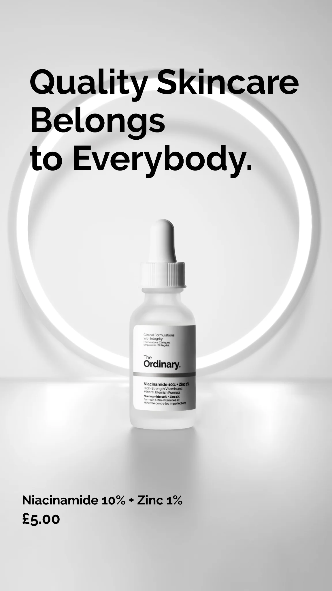
The pattern repeats across the best-performing beauty ads: face-at-40%-of-frame composition, one product doing one thing, a color swatch overlay, and three to five words of copy. Palettes skew personal — dusty pink for millennial, bold coral for Gen-Z, earthy brown for clean-beauty positioning. Instagram and TikTok carry the majority of spend because the aesthetic depends on feed context. Portrait 9:16 and 4:5 dominate, with 1:1 used for grid posts.

Browse beauty ad examples from real campaigns — lip product swatches, mascara close-ups, foundation shade ladders, clean-beauty hero shots. Pick a template, upload your product, and AdDogs applies your palette across three formats.

SACE LADY 8.8 Sale — Product Explosion Collage. Brand: SACE LADY. This ad employs a vibrant, high-energy product explosion layout, strategically designed to capture attention during a major sale event. Multiple SACE LADY cosmetic products are dynamically arranged against a gradient sky background, creating a sense of abundance and excitement. The dominant red and gold color palette, combined with confetti elements, evokes urgency and celebration, aligning perfectly with a "BIG SALE" theme. Text hierarchy is clear: the "8.8 BIG SALE" banner is the primary focal point, followed by the scarcity-driven "First 1000 Buyers Get" offer. This composition is optimized for platforms like Facebook or Instagram, where bold visuals and clear value propositions are crucial for scroll-stopping and driving immediate conversion. The busy, yet organized, arrangement ensures that while many products are shown, the overall message of a massive sale is paramount. The design successfully communicates a festive, unmissable shopping opportunity, leveraging visual cues for immediate impact and driving purchase intent.. Headline: 8.8 BIG SALE. Primary text: First 1000 Buyers Get. Why this ad works: Urgency-driven scarcity offer highlights value — The "First 1000 Buyers Get" headline immediately creates a sense of urgency and exclusivity. This psychological trigger encourages quick action, as potential customers fear missing out on a limited-time, high-value offer. It effectively converts passive browsing into active consideration and purchase intent. Vibrant color palette signals festive sale — The combination of bright reds, golds, and a gradient sky background creates a celebratory and energetic mood. This vibrant palette is highly effective for a "BIG SALE" announcement, drawing the eye and associating the brand with excitement and positive shopping experiences. It cuts through visual clutter on social feeds. Product explosion showcases diverse offerings — By displaying a variety of makeup products in a dynamic, scattered arrangement, the ad effectively communicates the breadth of SACE LADY's range. This "explosion" layout allows potential customers to quickly see multiple items, increasing the likelihood of finding something appealing and encouraging exploration of the full sale.. Specs: Brand: SACE LADY, Industry: Health & Wellness, Platform: Facebook, Format: Static, Audience: Women 25-34Beyond Burger — Nutritional Comparison Layout. Brand: Beyond Burger. This ad employs a clear split-screen comparison layout, directly contrasting Beyond Burger's nutritional profile against traditional beef. The dark green background provides a strong, earthy foundation, while vibrant green highlights key positive stats, leveraging color psychology to emphasize health benefits and naturalness. Compositionally, the side-by-side product images establish the comparison immediately, followed by a vertical hierarchy of data points, each supported by intuitive icons for quick comprehension. Optimized for platforms like Facebook or Instagram, where users can pause to digest detailed information, it aims to educate and persuade through data. The prominent text hierarchy, from bold product names to detailed stats and a conclusive, action-oriented headline, guides the viewer through the compelling evidence, positioning Beyond Burger as the superior, healthier choice. The high text density is justified by the ad's informative, fact-based approach.. Headline: OUR STATS SPEAK FOR THEMSELVES.. Primary text: NO GMOS, NO ADDED HORMONES OR ANTIBIOTICS**. Why this ad works: Direct comparison drives clear persuasion — The side-by-side layout immediately establishes a clear contrast between Beyond Burger and beef. This direct comparison, supported by specific nutritional data, allows consumers to quickly grasp the product's advantages, making a compelling, fact-based case for switching to plant-based options. Color-coded data for quick scan — Using bright green for Beyond Burger's superior stats (0mg Cholesterol, 2g Sat. Fat) against the dark background draws the eye and visually reinforces the positive attributes. This color coding simplifies complex nutritional information, enabling rapid comprehension and highlighting key benefits at a glance. Iconography enhances data readability and recall — The inclusion of simple, universally recognized icons (bicep for protein, heart for cholesterol, droplet for saturated fat) alongside the numerical data significantly improves readability and recall. These visual cues make the health benefits more accessible and impactful, even for a quick glance in a busy feed.. Specs: Brand: Beyond Burger, Industry: Food & Beverage, Platform: Facebook, Format: Static, Audience: GeneralConcealer Applicator — Extreme Macro Shot. This ad employs an extreme macro shot, focusing intensely on a product applicator coated with a pink-hued cosmetic. The vertical composition is optimized for mobile platforms like Instagram Stories or Reels, ensuring maximum screen real estate. The soft, diffused lighting and clean, light background create a minimalist aesthetic, emphasizing the product's texture and implied gentleness. Color psychology leverages the comforting pink for the product and a subtle green for the bottle, suggesting natural or soothing properties. The bold yellow headline, "Dark Circles Need This," immediately addresses a pain point, creating a direct, problem-solution narrative. A small "magic" annotation adds intrigue. This composition effectively stops the scroll by presenting an intriguing, high-detail visual that promises a solution.. Headline: Dark Circles Need This. Primary text: magic. Why this ad works: Macro shot highlights product texture and detail — The extreme close-up magnifies the applicator's unique texture and the product's consistency. This high-fidelity detail creates a sense of premium quality and efficacy, drawing viewers in to examine the "magic" up close. It's highly effective for beauty products where texture and application experience are key selling points. Benefit-driven headline addresses pain point — The direct headline "Dark Circles Need This" immediately connects with a common beauty concern. This problem-solution approach resonates strongly with the target audience, implying the product is an essential remedy. It creates urgency and relevance, prompting viewers to consider the product's potential benefits. Strategic color contrast for visual impact — The soft pink product and subtle green bottle pop against the neutral background. The vibrant yellow text "Dark Circles Need This" provides a strong, eye-catching contrast, ensuring the key message is immediately legible and memorable. This color strategy enhances visibility and scroll-stopping power on busy feeds.. Specs: Industry: Health & Wellness, Platform: Instagram, Format: Static, Audience: Women 25-34Eyeliner Swatches — Arm Testimonial Layout. This ad effectively uses a direct, in-use demonstration to build product credibility and showcase variety. The composition places six distinct eyeliner swatches prominently on a forearm, creating an immediate visual reference for color and texture. The slight diagonal angle adds dynamic interest while maintaining clarity. The neutral gray background ensures the vibrant and dark shades pop, enhancing visual contrast crucial for mobile feeds where ads compete for attention. A testimonial box in the lower left corner strategically reinforces a key product benefit – smudge-proof wear – directly addressing common consumer concerns and building trust. Text hierarchy is clear: color names are legible on each swatch, and the testimonial is presented in a clean, readable font, ensuring easy consumption of information. This layout is optimized for platforms like Instagram, where authentic product demonstrations and social proof drive consideration and trust, making the ad highly persuasive by showing rather than just telling.. Primary text: I wore it for 6 hours and some of that time i was cooking in extreme heat and it did not smudge whatsoever!. Why this ad works: Direct product swatch demonstration — Showing multiple eyeliner shades directly on skin provides immediate visual context. This "try-before-you-buy" effect helps consumers visualize how colors appear, reducing purchase friction. It's more effective than flat product shots, building confidence in color accuracy and texture. Strategic testimonial placement — The testimonial is positioned in the lower-left, a natural resting point for the eye after scanning the product. It directly addresses a common pain point (smudging) with social proof, enhancing credibility. This builds trust and reinforces the product's performance claim effectively. High contrast for color clarity — The neutral gray background provides excellent contrast for all six eyeliner shades, from light "Icing" to dark "Liquorice." This ensures each color's true pigment and finish are accurately represented, which is vital for makeup products where color perception drives purchase decisions.. Specs: Industry: Health & Wellness, Platform: Instagram, Format: Static, Audience: Women 25-34nanit Dad Mode — Lifestyle Product Shot. Brand: nanit. This ad effectively uses a lifestyle overlay to connect with its target audience. The layout strategically places the product (baby monitor app on a phone) alongside a tennis racket, subtly communicating the "Dad Mode: Always On" message—balancing personal interests with parental responsibilities. The muted green background provides a calm, trustworthy foundation, while the bright green toggle switches introduce a playful, interactive element that draws the eye to key features. Text hierarchy is clear: brand, main message, then benefit-driven feature bubbles. This composition is optimized for social feeds like Instagram, where relatable scenarios and clear value propositions resonate. The visual metaphor of "always on" is reinforced by the toggles, making the product's benefits immediately understandable and engaging for busy parents.. Headline: Dad Mode: Always On. Primary text: See baby from anywhere Real-time notifications Parenting confidence. Why this ad works: Relatable lifestyle context for dads — By showing a tennis racket alongside the baby monitor, the ad immediately connects with active fathers who balance hobbies with parenting. This visual storytelling creates an emotional resonance, positioning Nanit as a solution that supports their lifestyle, not just a product, enhancing relatability and appeal. Interactive UI elements highlight features — The use of toggle switches for "See baby from anywhere," "Real-time notifications," and "Parenting confidence" mimics a familiar app interface. This interactive visual cue makes the features feel tangible and user-friendly, encouraging engagement and making the benefits instantly digestible for the viewer. Benefit-driven feature communication — Instead of just listing technical specs, the ad focuses on the *outcomes* for the parent: "Parenting confidence." This approach addresses emotional needs and pain points, making the product's value proposition much stronger and more persuasive than a simple list of functions, driving deeper connection.. Specs: Brand: nanit, Industry: Kids & Family, Platform: Instagram, Format: Static, Audience: Men 25-34Glossier Boy Brow — Before/After Eye Close-up. Brand: Glossier. This ad effectively utilizes a split-screen before/after layout, focusing intensely on the eye and brow area to showcase the transformative power of Glossier's Boy Brow. The composition employs a direct, side-by-side comparison, making the product's impact immediately evident without needing extensive text. Natural skin tones and lighting maintain an authentic, relatable aesthetic, appealing to a demographic valuing subtle enhancement over heavy makeup. The minimal text hierarchy, limited to "before" and "after boy brow" labels, ensures the visual narrative is paramount. This approach is highly optimized for visual-first platforms like Instagram, where quick comprehension and compelling visual evidence drive engagement and consideration. The close-up detail allows viewers to scrutinize the results, building trust and desire for the product's specific benefit.. Why this ad works: Direct Before/After comparison highlights efficacy — The split-screen layout provides an instant, undeniable visual comparison of the brow's appearance. This direct evidence of transformation is highly persuasive, allowing potential customers to immediately grasp the product's benefit. It effectively communicates results without relying on lengthy descriptions, crucial for fast-paced social feeds. Hyper-focused close-up emphasizes product detail — By zooming in on the eye and brow, the ad forces attention onto the specific area where the product works. This detailed view allows viewers to observe the texture, fullness, and definition achieved, making the benefit tangible. It builds confidence in the product's ability to deliver precise, noticeable results. Authentic, natural aesthetic builds relatability — The use of natural lighting and minimal makeup on the model's skin creates an authentic and approachable vibe. This resonates with an audience seeking natural beauty enhancements rather than dramatic transformations. It positions the product as an everyday essential that enhances one's existing features, fostering trust and desire.. Specs: Brand: Glossier, Industry: Health & Wellness, Platform: Instagram, Format: Static, Audience: Women 25-34Tower 28 Mascara — Product Pile Question. Brand: Tower 28. This ad employs a product-as-background layout, featuring a dynamic pile of Tower 28 mascara tubes and boxes. The composition strategically places a direct, pain-point-addressing question, "Eyes too sensitive for mascara?", centrally to immediately hook the target audience. The brand's signature muted pink and vibrant orange colors are prominent, creating a playful yet trustworthy aesthetic. A high-contrast orange CTA button, "Try This One," stands out, guiding user action. Below the CTA, key benefits like "designed for sensitive eyes," "ophthalmologist-tested," and "contact lens safe" are presented in a clear, bullet-like hierarchy, reinforcing product credibility. Optimized for platforms like Instagram, this ad leverages a relatable problem and offers an immediate, visually distinct solution, encouraging engagement and consideration. The text overlay is medium, balancing visual interest with crucial information.. Headline: Eyes too sensitive for mascara?. Primary text: designed for sensitive eyes ophthalmologist-tested contact lens safe. Why this ad works: Direct question hooks target audience — The headline "Eyes too sensitive for mascara?" immediately addresses a common pain point for many beauty consumers. This direct, empathetic approach pre-qualifies the audience, ensuring the ad resonates deeply with those experiencing irritation, significantly boosting relevance and initial engagement. High-contrast CTA drives immediate action — The bright orange "Try This One" button pops against the product background and white text. Its prominent placement and clear directive make it an undeniable focal point, effectively guiding the user towards the next step and improving click-through rates. Benefit-driven bullet points build trust — The concise list of benefits—"designed for sensitive eyes," "ophthalmologist-tested," "contact lens safe"—directly answers the initial question with credible, reassuring information. This rapid delivery of key selling points builds trust and alleviates potential concerns, accelerating consideration.. Specs: Brand: Tower 28, Industry: Health & Wellness, Platform: Instagram, Format: Static, Audience: Women 25-34ILIA Makeup Collection — Minimalist Product Display. Brand: ILIA. This ad effectively uses a minimalist product display against a warm, neutral background to highlight ILIA's clean beauty offerings. The composition strategically places products in a loose cluster, allowing for natural shadows that add depth without clutter. The color palette of muted beiges and creams reinforces the brand's natural and sophisticated aesthetic, appealing to consumers seeking premium, understated cosmetics. Text hierarchy is clear: the prominent "15% off" and "YOUR FIRST ORDER" immediately convey a strong incentive, positioned in the upper left for quick scanning. This layout is optimized for platforms like Instagram, where clean visuals and direct offers perform well, stopping the scroll with its elegant simplicity and clear value proposition. The overall design communicates quality and accessibility, encouraging new customer acquisition through a compelling discount.. Headline: 15% off. Primary text: YOUR FIRST ORDER. Why this ad works: Clear Discount Incentive Drives Action — The prominent "15% off YOUR FIRST ORDER" immediately communicates a strong value proposition. This direct offer targets new customers, effectively reducing friction for trial. The large, clean font ensures readability, making the discount undeniable and driving conversion intent efficiently for first-time buyers. Harmonious Neutral Palette Signals Clean Beauty — The consistent use of warm beige and cream tones for both the background and product packaging creates a cohesive, sophisticated aesthetic. This palette aligns perfectly with the "clean beauty" trend, signaling natural ingredients and a gentle approach, which resonates strongly with the target demographic seeking premium, conscious cosmetics. Strategic Product Grouping Adds Depth and Realism — Products are arranged naturally, not rigidly, allowing for soft, directional shadows that add depth and realism to the composition. This avoids a sterile, flat look, enhancing visual appeal and making the products feel tangible and desirable. It maintains a clean aesthetic while adding visual interest and dimension.. Specs: Brand: ILIA, Industry: Health & Wellness, Platform: Instagram, Format: Static, Audience: Women 25-34Hims Sildenafil — Minimalist Product Spotlight. Brand: hims. This ad employs a minimalist layout to address a common consumer query directly. The central placement of the generic Sildenafil pill, highlighted by a subtle arrow, serves as the visual anchor, immediately connecting the question to the solution. The color palette, a soft blush pink with deep brown text and footer, creates an approachable yet authoritative tone, avoiding the starkness often associated with medical ads. Text hierarchy is clear: a large, engaging question at the top, followed by a concise, informative answer that bold-highlights the key value proposition ("fraction of the price"). This design is optimized for platforms like Facebook or Instagram, where clear, direct messaging and a clean aesthetic can cut through clutter, driving consideration by educating the audience efficiently and dispelling common misconceptions about cost. The composition ensures readability and impact on mobile screens.. Headline: Does cheap Viagra exist?. Primary text: Sildenafil uses the same active ingredient as Viagra, but costs a fraction of the price.. Why this ad works: Direct question immediately engages audience — The headline "Does cheap Viagra exist?" directly addresses a common pain point and curiosity, immediately grabbing the attention of the target demographic. This question-based approach fosters engagement by inviting the viewer to seek the answer within the ad copy, making the information feel relevant and personalized. Clear visual anchor for product explanation — The single, central pill image, accompanied by a simple arrow, provides a clear visual anchor. It demystifies the product, making the generic Sildenafil tangible and approachable. This direct visual representation helps to build trust and clarity around a potentially sensitive topic, reinforcing the ad's informative purpose effectively. Bolded value proposition highlights affordability — By bolding "fraction of the price," the ad strategically emphasizes its core competitive advantage. This visual cue ensures that even a quick scan reveals the primary benefit, addressing cost concerns upfront. This direct communication of value is crucial for conversion-focused campaigns, driving immediate interest and clicks.. Specs: Brand: hims, Industry: Health & Wellness, Platform: Facebook, Format: Static, Audience: Men 35-44Blemish Coverage — Triple Comparison Layout. This ad employs a compelling vertical triptych layout, showcasing a direct "before-during-after" comparison for blemish coverage. The composition strategically zooms in on a common skin concern, using dashed circles to highlight the blemish's progression across three stages: uncovered, foundation-only, and with the hero product, "Blemish Defeat'r," combined with foundation. This clear visual hierarchy immediately communicates the product's superior efficacy. The natural skin tones and realistic lighting enhance authenticity, building trust with the target audience. Minimal, descriptive text at the bottom of each panel reinforces the visual narrative without distracting. Optimized for mobile-first platforms like Instagram, this ad leverages direct problem/solution demonstration to drive consideration, effectively stopping the scroll with its undeniable visual proof. The focus is purely on product performance, not abstract lifestyle.. Primary text: UNCOVERED BLEMISH COVERED WITH FOUNDATION ONLY COVERED WITH BLEMISH DEFEAT'R + FOUNDATION. Why this ad works: Direct visual problem-solution demonstration — The ad masterfully uses a three-panel comparison to visually articulate a common skin concern and its effective solution. By showing "uncovered," "foundation only," and "product + foundation," it directly addresses the viewer's pain point and provides undeniable proof of the product's superior performance. This builds immediate trust and relevance. Three-stage comparison elevates product efficacy — The inclusion of a "foundation only" panel is a brilliant strategic move. It establishes a baseline, demonstrating that typical solutions fall short, thereby amplifying the perceived value and necessity of the featured "Blemish Defeat'r." This technique not only showcases improvement but also positions the product as an essential upgrade for superior results. Authentic skin portrayal builds viewer trust — The ad's commitment to showcasing realistic skin texture and an un-retouched blemish significantly enhances its credibility. In an industry often criticized for unrealistic perfection, this authenticity resonates deeply with consumers seeking genuine results. It fosters trust by presenting a relatable problem and a believable, achievable solution, boosting conversion potential.. Specs: Industry: Health & Wellness, Platform: Instagram, Format: Static, Audience: Women 18-24Fenty Beauty Mascara — Minimalist Product Shot. Brand: Fenty Beauty. This ad employs a minimalist hero shot layout, centering the Fenty Beauty mascara tube and brush against a clean, light grey background. The composition strategically uses negative space to draw immediate attention to the product's sleek design and the texture of the mascara on the brush. The high contrast between the dark product and light background ensures excellent visibility and scroll-stopping power, particularly on visually-driven platforms like Instagram. The subtle purple hue in the "FENTY BEAUTY" text adds a touch of brand personality without distracting from the product. With no additional text, the ad relies solely on strong product aesthetics and brand recognition, making it effective for awareness and reinforcing luxury positioning. The vertical alignment of the product and brush creates a balanced, elegant visual narrative, showcasing both the packaging and the functional aspect of the mascara.. Why this ad works: Minimalist composition highlights product design — The ad uses ample negative space and a clean background to focus entirely on the mascara. This minimalist approach elevates the product, making its unique hexagonal packaging and the brush's texture the undeniable focal points. It communicates luxury and sophistication, appealing to consumers who value sleek design. High contrast ensures immediate visual impact — The stark contrast between the deep black mascara packaging and brush against the light grey background creates a powerful visual pop. This contrast is crucial for cutting through cluttered social feeds, ensuring the product is instantly recognizable and commands attention, driving higher engagement rates on platforms like Instagram. Brand name as sole text drives recognition — By featuring only the "FENTY BEAUTY" logo in a subtle, reflective purple, the ad reinforces brand identity without overwhelming the viewer. This singular focus on the brand name, coupled with the distinctive product design, builds strong brand recall and positions Fenty Beauty as a premium, confident brand that lets its products speak for themselves.. Specs: Brand: Fenty Beauty, Industry: Fashion & Apparel, Platform: Instagram, Format: Static, Audience: Women 25-34SNOW Teeth Whitening Kit — Product Display with Testimonial. Brand: SNOW. This ad employs a product display layout, showcasing the SNOW teeth whitening kit both packaged and unboxed, alongside handwritten social proof. The composition uses a clean, bright background, emphasizing the product's clinical yet accessible nature. The orange sticky notes immediately draw the eye, establishing a clear text hierarchy that prioritizes user results. This informal, authentic presentation of statistics builds trust, making it highly effective for platforms like Instagram where user-generated content or authentic-feeling ads resonate. The blue and white product branding reinforces a clean, professional image, while the unboxed items provide transparency and perceived value. This visual strategy encourages consideration and conversion by clearly demonstrating the kit's contents and highlighting immediate, tangible benefits, optimizing for direct-response campaigns. The overall aesthetic balances clinical efficacy with approachability, appealing to a broad audience seeking cosmetic improvements.. Headline: 97% of users saw whiter teeth.... Primary text: ...after just 1 use. Why this ad works: Authentic handwritten social proof builds trust — The use of orange sticky notes with handwritten statistics creates an immediate sense of authenticity and relatability. This informal presentation bypasses typical ad skepticism, making the impressive "97% saw whiter teeth after just 1 use" feel more credible and trustworthy to the viewer, driving higher engagement. Transparent unboxing display builds perceived value — By showcasing both the packaged product and its contents unboxed, the ad provides transparency and builds consumer trust. This visual demonstration of what's included in the kit helps manage expectations and reduces purchase friction, allowing potential customers to clearly see the value and components they will receive. Clean, clinical aesthetic for health product — The bright white background combined with the product's blue and white branding conveys a clean, professional, and trustworthy image. This minimalist approach is ideal for health and beauty products, signaling efficacy and safety without distraction. It positions SNOW as a premium, reliable solution in the competitive whitening market.. Specs: Brand: SNOW, Industry: Health & Wellness, Platform: Instagram, Format: Static, Audience: Women 25-34Tower 28 Make Waves Mascara — Vibrant Product Pile. Brand: Tower 28. This ad employs a dynamic, immersive product pile layout, showcasing Tower 28's "Make Waves" mascara. The composition utilizes a high-contrast color palette of vibrant orange branding against a soft lilac background and packaging, immediately drawing the viewer's eye. The overlapping, angled arrangement of multiple product units creates a sense of abundance and popularity, subtly leveraging social proof. Natural lighting casts soft shadows, adding depth and authenticity. Optimized for visual-first platforms like Instagram, the ad's playful and energetic vibe resonates with a younger, trend-conscious audience. Minimal text hierarchy ensures the visual appeal of the packaging and product volume remains the primary focus, encouraging scroll-stopping engagement through bold aesthetics rather than explicit claims.. Why this ad works: Product abundance signals popularity — The dense, overlapping arrangement of mascara tubes creates an impression of high demand and desirability. This visual cue subtly communicates that the product is a popular choice, leveraging social proof without explicit testimonials. It encourages viewers to join a trend. High-contrast palette grabs attention — The vibrant orange branding against the soft lilac packaging and background creates a striking visual contrast. This bold color combination is highly effective at cutting through visual clutter on social feeds, immediately drawing the eye and establishing a playful, energetic brand identity. Dynamic angles create visual interest — The scattered, angled placement of the mascara tubes and boxes avoids a static, sterile product shot. This dynamic composition adds energy and a sense of candid authenticity, making the ad feel less staged and more engaging, resonating well with organic social content.. Specs: Brand: Tower 28, Industry: Health & Wellness, Platform: Instagram, Format: Static, Audience: Women 18-24Foundation Shade Range — Product Grid & Lifestyle. This ad effectively combines a product grid with lifestyle imagery to showcase a diverse foundation shade range. The left side features twelve distinct foundation shades in clear jars, each clearly labeled, presented against a clean white background. This systematic display emphasizes the breadth of the offering. On the right, three different models, representing various skin tones, hold a product jar, demonstrating real-world application and inclusivity. The composition strategically uses a clean, bright aesthetic to highlight the product's natural appearance on diverse skin. Optimized for visual platforms like Instagram, it leverages strong visual contrast and relatable models to stop the scroll and build trust, addressing a key pain point for foundation shoppers: finding the right match. The text hierarchy is simple, focusing solely on shade names, making product identification straightforward.. Why this ad works: Diverse Shade Range Visualized Clearly — The ad prominently displays twelve distinct foundation shades, from "Porcelain" to "Espresso," in a clear grid. This comprehensive visual representation directly addresses a major consumer need in foundation shopping, assuring potential customers that their perfect match is likely available within the brand's offerings. Integrated Product and Lifestyle Proof — By combining a detailed product grid with authentic lifestyle shots of models holding the product, the ad builds immediate trust and relatability. This dual approach allows viewers to both see the full range of shades and visualize how the product looks on real skin tones, enhancing consideration. Legible Shade Names for Easy Identification — Each foundation jar is clearly labeled with its shade name in a bold, high-contrast font. This simple yet effective text hierarchy ensures that consumers can easily identify and remember shades, streamlining the selection process and reducing friction for online purchases.. Specs: Industry: Health & Wellness, Platform: Instagram, Format: Mixed, Audience: Women 25-34ILIA Super Serum Skin Tint — Marbled Product Shot. Brand: ILIA. This ad masterfully centers the ILIA Super Serum Skin Tint bottle against a dynamic, marbled backdrop of various foundation shades. This composition technique immediately draws the eye to the product, while simultaneously illustrating its diverse shade range and liquid texture. The earthy, natural color palette of browns, tans, and creams evokes a sense of organic beauty and inclusivity, resonating with a target audience seeking clean, skin-friendly cosmetics. Optimized for visual platforms like Instagram, the ad leverages high aesthetic appeal to stop the scroll. The minimal text hierarchy, confined to the bottle itself, ensures the product's visual impact is paramount, allowing the sophisticated visual design to communicate brand values and product essence effectively. This approach builds brand awareness and consideration through elegant product presentation.. Why this ad works: Dynamic Marbled Background Showcases Range — The swirling, multi-toned background effectively visualizes the product's diverse shade range and liquid serum texture. This artistic representation communicates inclusivity and product versatility without needing explicit text, engaging viewers visually and hinting at a perfect match for various skin tones. Centered Product with Clean Branding — Placing the ILIA bottle centrally ensures it's the undeniable hero. The clean, minimalist branding on the bottle stands out against the rich, fluid background, reinforcing a premium, modern aesthetic. This strong focal point enhances brand recognition and product memorability. Earthy Palette Conveys Natural & Inclusive Appeal — The use of warm browns, tans, and creams creates an inviting, natural aesthetic. This color psychology signals that the product is suitable for a wide array of skin tones and aligns with the "clean beauty" movement, appealing to consumers prioritizing natural ingredients and inclusive representation.. Specs: Brand: ILIA, Industry: Health & Wellness, Platform: Instagram, Format: Static, Audience: Women 25-34Long-Lasting Lipstick — Before/After Split Screen. This ad effectively utilizes a split-screen before/after layout to demonstrate the long-lasting quality of a lipstick. The extreme close-up composition immediately draws attention to the product's performance, highlighting the vibrant initial application versus its impressive retention after a meal. The color palette, featuring a bold red against natural skin tones, emphasizes authenticity and product efficacy. Teal text provides clear, high-contrast labels, guiding the viewer through the comparison without distraction. This visual-first approach is highly optimized for platforms like Instagram, where quick, impactful visuals are crucial for stopping the scroll. The ad focuses purely on product benefit, allowing the visual evidence to build trust and consideration, making it a strong asset for performance marketing campaigns.. Headline: Right after applying. Primary text: Even after a meal. Why this ad works: Direct before/after comparison builds trust — The split-screen format directly contrasts the lipstick's initial application with its appearance post-meal. This immediate visual evidence powerfully communicates the product's long-lasting benefit, eliminating ambiguity and building trust. For beauty products, showing tangible results is far more persuasive than descriptive claims alone, driving higher engagement and consideration among potential customers. Extreme close-up highlights product detail — An extreme close-up on the lips allows viewers to scrutinize the lipstick's texture, pigment, and wear with remarkable detail. This level of magnification builds confidence in the product's quality and performance, as there's no hiding imperfections. It's particularly effective for makeup, where consumers value seeing the true finish and durability. Contrasting text ensures clear communication — The use of a distinct teal color for the overlay text against the warm skin tones and red lipstick creates excellent contrast. This ensures readability and quickly directs the viewer's eye to the key information for each comparison stage. Clear text hierarchy is crucial for rapid comprehension on mobile feeds, enhancing the ad's overall effectiveness.. Specs: Industry: Health & Wellness, Platform: Instagram, Format: Static, Audience: Women 25-34Fenty Beauty Foundation & Stick — Clean Product Shot. Brand: Fenty Beauty. This ad utilizes a minimalist product-on-background layout, strategically placing two Fenty Beauty products against a soft, peachy-orange backdrop. The composition employs a slight diagonal arrangement, creating dynamic visual interest while maintaining balance. Strong, defined shadows add depth and a sense of realism, grounding the products and enhancing their sculptural forms. The monochromatic color scheme, featuring various shades of nude and peach, evokes warmth, natural beauty, and inclusivity, aligning with Fenty's brand identity. Optimized for visual platforms like Instagram, the clean aesthetic and focus on product design are highly scroll-stopping. The absence of overt text hierarchy emphasizes the product's visual appeal, allowing the packaging and color story to communicate premium quality and brand recognition. This approach prioritizes aesthetic impact over direct messaging, fostering brand association and consideration.. Why this ad works: Monochromatic Palette Evokes Natural Beauty — The consistent use of peachy-nude tones across the background and products creates a harmonious, inviting visual. This color psychology subtly communicates natural beauty, warmth, and inclusivity, resonating deeply with Fenty Beauty's diverse target audience and brand values, making the products feel approachable. Strategic Shadows Add Depth and Realism — The sharp, elongated shadows cast by the products introduce significant depth and a three-dimensional quality to the flat image. This technique enhances visual interest, makes the products feel more tangible, and adds a sophisticated, artistic touch, elevating the overall premium perception of the ad. Minimalist Layout Highlights Product Design — By stripping away distractions, the ad's minimalist layout directs undivided attention to the unique shapes and textures of the Fenty Beauty packaging. This clean presentation allows the sophisticated product design to shine, reinforcing brand identity and communicating a sense of modern luxury and quality without needing overt messaging.. Specs: Brand: Fenty Beauty, Industry: Fashion & Apparel, Platform: Instagram, Format: Static, Audience: Women 25-34Sephora Collection — Diverse Product Shelf Display. Brand: Sephora. This ad showcases a diverse range of Sephora Collection products on a clean, minimalist shelf against a light background. The horizontal arrangement of items, from skincare to makeup, creates a visual journey across the brand's extensive offerings. Generous negative space above the products ensures they are the undisputed focal point, preventing visual clutter and allowing each item to be clearly perceived. The bright, neutral color palette of the background allows the individual product packaging, with its varied colors and textures, to pop and convey specific benefits or ingredients. This composition is highly effective for visual-first platforms like Instagram or Pinterest, where a clean aesthetic and clear product presentation drive engagement and scroll-stopping power. The ad relies heavily on visual appeal rather than explicit ad copy, letting the breadth and quality of the collection speak for itself, subtly communicating variety and accessibility.. Why this ad works: Variety on display highlights collection breadth — The diverse product range (skincare, makeup, masks) showcases the extensive Sephora Collection. This communicates value and choice, appealing to a broad audience looking for a one-stop beauty solution. It subtly suggests that Sephora Collection can meet multiple beauty needs effectively. Clean, minimalist background enhances product focus — The stark white shelf and light grey background eliminate distractions, making the colorful product packaging stand out. This clean aesthetic signals quality and sophistication, ensuring the viewer's attention is solely on the items being advertised. It reinforces a premium yet accessible brand image. Horizontal arrangement creates visual flow and abundance — Arranging products in a line across the frame encourages the eye to scan from left to right, absorbing each item. This technique effectively communicates a sense of abundance and a curated selection, inviting exploration of the full range without overwhelming the viewer.. Specs: Brand: Sephora, Industry: Health & Wellness, Platform: Instagram, Format: Static, Audience: Women 25-34Fenty Beauty Soft Matte — Inclusive Shade Grid. Brand: Fenty Beauty. This ad employs a powerful grid layout, showcasing Fenty Beauty's "Soft Matte" foundation in a diverse range of shades. The composition uses repetition and diagonal lines created by the staggered arrangement of tubes, guiding the eye across the extensive color spectrum. The warm, peachy background complements the product tones, creating a cohesive and inviting aesthetic. Strategic use of shadows adds depth and dimension, preventing the repetitive pattern from feeling flat. This visual strategy effectively communicates inclusivity and variety, a core brand message for Fenty. Optimized for platforms like Instagram, the vibrant yet clean presentation stands out in a feed, appealing to a broad audience seeking personalized beauty solutions. The minimal text overlay keeps the focus purely on the product's visual impact and shade diversity.. Why this ad works: Extensive Shade Range Visualized — The ad powerfully communicates Fenty Beauty's commitment to inclusivity by displaying a vast array of foundation shades. This visual representation immediately conveys that there's a match for everyone, resonating deeply with consumers who often struggle to find their perfect shade, building trust and brand loyalty. Repetitive Grid Creates Visual Impact — The staggered grid arrangement of numerous product tubes creates a strong visual rhythm and sense of abundance. This repetition emphasizes the sheer breadth of the "Soft Matte" line, making a memorable statement about the product's availability and variety, which is crucial for a foundation launch. Warm, Cohesive Color Palette — The harmonious blend of the peachy background with the diverse foundation shades creates an inviting and sophisticated aesthetic. This warm color psychology evokes feelings of comfort and natural beauty, enhancing the product's appeal and aligning with a premium yet approachable brand image.. Specs: Brand: Fenty Beauty, Industry: Health & Wellness, Platform: Instagram, Format: Static, Audience: Women 25-34WONDERSKIN Eyeliner — Testimonial Split Screen. Brand: WONDERSKIN. This ad effectively uses a split-screen layout to juxtapose a compelling customer testimonial with a high-quality product-in-use shot. The left side, dominated by clean white space, ensures the text is highly readable, employing a clear hierarchy from the impactful quote to the customer's name and brand affiliation. On the right, a close-up of the model's eye, expertly made up with the eyeliner, provides visual proof of the product's effect. The composition directs the eye from the text's claim to the visual evidence. The overall clean aesthetic, with a neutral color palette, positions the brand as trustworthy and premium, optimized for platforms like Instagram where visual appeal and social proof drive engagement. This design strategy builds credibility by letting a real customer's experience speak directly to potential buyers.. Headline: I wore the eyeliner for 6-8 hours, in the heat, while dancing at a wedding, and it stayed the whole time!. Primary text: I wore the eyeliner for 6-8 hours, in the heat, while dancing at a wedding, and it stayed the whole time!. Why this ad works: Direct testimonial builds immediate trust — The prominent customer quote directly addresses a common pain point for eyeliner users – longevity. By featuring a real person's experience, "Brooke Rose, WONDERSKIN CUSTOMER," the ad leverages social proof, making the claim more believable and relatable than a brand-generated statement. This fosters trust and encourages consideration. Split-screen layout for clear communication — The ad's split-screen design effectively separates the textual proof from the visual demonstration. The left panel's ample negative space ensures the testimonial is the focal point, while the right panel provides a detailed, aspirational view of the product in action. This clear division prevents visual clutter and allows each element to deliver its message powerfully. Visual proof enhances product credibility — The close-up of the model's eye, featuring the eyeliner, serves as compelling visual evidence for the testimonial's claim. The dark, smudgy yet defined eyeliner look directly correlates with the "stayed the whole time" message. This visual reinforcement helps potential customers envision the product's performance and desired outcome on themselves.. Specs: Brand: WONDERSKIN, Industry: Health & Wellness, Platform: Instagram, Format: Static, Audience: Women 25-34Kosas Beauty Collection — Pastel Flat Lay. Brand: Kosas. This ad employs a clean, organized flat lay composition to showcase a collection of Kosas beauty products. The pastel color palette, featuring soft blues, pinks, and greens, creates a cohesive and inviting aesthetic that aligns with modern clean beauty trends. Products are strategically arranged around a central branded pouch, drawing the eye across the various items. This composition is highly optimized for visual platforms like Instagram and Pinterest, where aesthetic appeal drives engagement. The minimal text overlay, limited to product branding, maintains a premium, uncluttered feel. The overall strategy is to convey a sense of curated luxury and natural beauty through harmonious color and thoughtful product presentation, encouraging discovery and brand association among target demographics seeking high-quality, aesthetically pleasing cosmetics.. Why this ad works: Pastel Color Harmony Signals Clean Beauty — The ad's consistent use of soft pastel shades across all products and the pouch creates a strong visual identity. This palette immediately communicates a sense of natural, gentle, and modern clean beauty, appealing to consumers seeking sophisticated yet approachable cosmetic options that align with current aesthetic trends. Curated Collection Enhances Perceived Value — By presenting multiple products as a cohesive set, the ad elevates the perceived value beyond individual items. This 'kit' approach suggests a complete routine or curated experience, making the offering more attractive and encouraging a larger basket size from interested customers looking for a comprehensive solution. Clear Brand Visibility Through Product Placement — The Kosas brand name is prominently displayed on the central pouch and individual products. This consistent branding reinforces recognition and trust, ensuring that even without explicit ad copy, the viewer clearly associates the appealing aesthetic and product range with the Kosas brand, building strong brand recall.. Specs: Brand: Kosas, Industry: Health & Wellness, Platform: Instagram, Format: Static, Audience: Women 25-34Alleyoop Tubing Mascara — Before/After Comparison Grid. Brand: Alleyoop. This ad effectively uses a vertical before/after/after composition to demonstrate product efficacy. The layout strategically guides the eye downwards, showcasing the progressive improvement from "No Mascara" to "One Coat" and "Two Coats." The clean, minimalist background ensures the focus remains entirely on the eye and the mascara's impact. Color psychology is subtle, using green checkmarks for benefits and red crosses for problems, creating clear visual cues for positive and negative attributes. Text hierarchy is well-defined, with a bold headline grabbing attention, followed by clear sub-headers and concise bullet points that explain the visual transformation. This format is highly optimized for platforms like Instagram, where visual storytelling and direct comparison drive engagement and consideration, making the benefits immediately apparent to a scrolling audience.. Headline: MEET THE VIRAL TUBING MASCARA THAT I FEEL NAKED WITHOUT. Why this ad works: Progressive Before/After Visual Storytelling — The vertical stack of three eye images, clearly labeled "No Mascara," "One Coat," and "Two Coats," creates a compelling visual narrative. This progressive reveal effectively demonstrates the mascara's buildable impact, allowing viewers to immediately grasp the product's transformative power and versatility for different looks. Clear Benefit-Driven Bullet Points — Each stage is accompanied by concise bullet points using green checkmarks for benefits and red crosses for issues. This visual shorthand quickly communicates key advantages like "No clumps" and "Dramatic length," addressing common mascara pain points and highlighting the product's solutions in an easily digestible format. Direct, Relatable Headline Engagement — The headline "MEET THE VIRAL TUBING MASCARA THAT I FEEL NAKED WITHOUT" uses strong, relatable language and taps into the "viral" trend. This personal, slightly provocative statement immediately captures attention and creates curiosity, inviting the viewer to discover the product that elicits such a strong, indispensable feeling.. Specs: Brand: Alleyoop, Industry: Health & Wellness, Platform: Instagram, Format: Static, Audience: Women 25-34Glossier Cloud Paint — Split Screen Product & In-Use. Brand: Glossier. This ad leverages a compelling split-screen layout, effectively showcasing both the product's appealing texture and its natural, in-use effect. The left panel features Glossier Cloud Paint, with a generous swatch demonstrating its creamy consistency, while the right panel highlights a model applying the blush, emphasizing a healthy, radiant glow. The warm, peachy color palette, consistent across product and application, evokes a natural, approachable beauty aesthetic. The aspirational headline, "Blush like the sky at sunset," uses evocative language to connect the product to a desirable, effortless look. Optimized for visual-first platforms like Instagram, the composition balances product focus with lifestyle appeal, making it highly engaging. The clear text hierarchy guides the viewer from product name to aspirational benefit, culminating in a prominent call to action.. Headline: Blush like the sky at sunset. Primary text: cloud paint™. Why this ad works: Split-screen layout demonstrates product efficacy — The ad's split-screen design masterfully pairs the product's tactile appeal with its real-world application. This dual focus allows viewers to visualize the creamy texture and then immediately see the natural, flattering result on skin. This technique builds trust and reduces purchase friction by clearly illustrating the product's benefit and ease of use. Evocative headline creates aspirational connection — The headline "Blush like the sky at sunset" is highly poetic and aspirational, moving beyond mere product features. It taps into emotional desires for natural beauty and effortless radiance, aligning with Glossier's brand identity. This language helps the ad resonate deeply with consumers seeking a feeling, not just a cosmetic. Warm, natural palette enhances brand aesthetic — The consistent use of soft, peachy-pink tones across the product, swatch, and model's skin reinforces a natural, healthy glow. This color psychology aligns perfectly with Glossier's minimalist and "no-makeup makeup" philosophy. It communicates approachability and authenticity, attracting an audience that values understated elegance over heavy glam.. Specs: Brand: Glossier, Industry: Health & Wellness, Platform: Instagram, Format: Static, Audience: Women 25-34Tower 28 GoGo Shimmer Stick — In-Use Close-up. Brand: Tower 28. This ad leverages a dynamic close-up composition, placing the Tower 28 GoGo Shimmer Eyeshadow Stick directly in action on a model's eye. The diagonal placement of the product creates a leading line, drawing the viewer's gaze from the brand name down to the product application and the model's shimmering eyelid. The vibrant pastel purple of the stick contrasts beautifully with the warm skin tones and the golden shimmer, creating a youthful and energetic aesthetic. Optimized for vertical platforms like Instagram or TikTok, its bright colors and clear product demonstration are designed to capture attention quickly. Text hierarchy is clean: brand at the top, followed by "NEW!" and the playful product name "GoGo," then the descriptive "SHIMMER EYESHADOW STICK." This clear, concise messaging supports a product launch goal.. Headline: NEW! GoGo. Primary text: SHIMMER EYESHADOW STICK. Why this ad works: Direct in-use product demonstration — Showing the eyeshadow stick actively being applied to the eye immediately demonstrates its purpose and texture. This visual proof is highly effective for beauty products, allowing potential customers to envision the product's effect and ease of use, building trust and desire more effectively than a static product shot. Vibrant color contrast and youthful aesthetic — The striking pastel purple of the eyeshadow stick against the model's warm skin and the golden shimmer creates a playful and modern visual. This color palette appeals strongly to a younger demographic, signaling a fun, approachable, and trendy brand identity that stands out in a crowded beauty feed. Clear and concise product naming — The prominent "NEW! GoGo SHIMMER EYESHADOW STICK" clearly communicates the product's novelty, playful name, and core function. This immediate clarity helps viewers quickly understand what is being advertised, reducing cognitive load and increasing the likelihood of engagement, especially in fast-scrolling environments.. Specs: Brand: Tower 28, Industry: Fashion & Apparel, Platform: Instagram, Format: Static, Audience: Women 18-24ILIA Beauty Blush — Vibrant Product Flat Lay. Brand: ILIA Beauty. This ad masterfully combines a visually appealing product flat lay with a high-impact text overlay to drive engagement and list growth. The composition showcases multiple ILIA Beauty blushes, their warm, earthy packaging tones beautifully contrasting with the vibrant product shades, signaling both natural elegance and playful allure. This rich yet clean backdrop effectively captures attention on a busy feed. The centrally placed, rounded text box serves as an immediate focal point, clearly communicating a high-value giveaway. This layout is optimized for Instagram's visual-first environment, where scroll-stopping aesthetics meet direct, enticing offers. Text hierarchy is expertly managed: "exclusive giveaway" provides context, the bold headline articulates the substantial prize, and smaller text guides the user to the next action, making the value proposition instantly clear and actionable.. Headline: Want a Spot on Our PR List + £1000-Worth of ILIA?. Primary text: exclusive giveaway Join the waitlist for our new launch for a chance to win.*. Why this ad works: Vibrant product colors capture attention — The diverse range of blush shades, from soft nudes to bold reds and fuchsias, creates a dynamic visual tapestry. These vibrant pops of color against the neutral packaging and white background are highly effective at stopping the scroll on visually competitive platforms like Instagram, drawing the eye directly to the product details. Clear, high-value giveaway proposition — The text overlay immediately highlights an "exclusive giveaway" with a significant prize: a PR list spot and £1000-worth of ILIA products. This clear, high-value offer creates strong incentive for engagement, directly addressing the audience's desire for premium beauty products and insider access, driving waitlist sign-ups. Strategic text overlay guides focus — The centrally placed, rounded white text box provides excellent contrast against the product background, ensuring readability. Its position naturally draws the eye, establishing a clear visual hierarchy where the giveaway message is prioritized. This design choice ensures the core value proposition is absorbed quickly, enhancing ad effectiveness.. Specs: Brand: ILIA Beauty, Industry: Health & Wellness, Platform: Instagram, Format: Static, Audience: Women 25-34ILIA Beauty Mascara — Feature Spotlight. Brand: ILIA Beauty. This ad employs a minimalist, clean aesthetic, leveraging a muted, warm beige background to create a sophisticated yet approachable feel. The composition strategically places the mascara wand diagonally, drawing the eye from the top-left text block down to the product held by a hand, and finally to the brand logo at the bottom-left. This diagonal line creates dynamic visual flow. The text hierarchy is clear: an introductory statement, followed by three distinct benefit points, each underlined for emphasis and readability. This layout is highly optimized for vertical platforms like Instagram Stories or Reels, where its clean design and clear value proposition can quickly capture attention. Color psychology uses natural tones to align with the "clean beauty" messaging, enhancing trust and perceived quality. The overall design prioritizes clarity and feature communication over elaborate visuals, making it effective for informing potential customers.. Headline: CULT FAVORITE CLEAN MASCARA— NOW IN BROWN. Primary text: flake-resistant smudge-resistant safe for sensitive eyes. Why this ad works: Clear Feature List Enhances Readability — The ad effectively uses a bulleted list format with horizontal lines to segment key product benefits: flake-resistant, smudge-resistant, and safe for sensitive eyes. This visual separation improves readability and allows consumers to quickly absorb the core value propositions. It's a direct, no-nonsense approach that builds trust and addresses common mascara pain points efficiently. Human Touch Adds Relatability and Authenticity — Including a hand holding the mascara wand introduces a subtle human element, making the product feel tangible and relatable. This personal touch helps potential customers visualize themselves using the product, fostering a sense of authenticity and connection. It subtly reinforces the "clean beauty" ethos by showing a natural interaction with the product. Muted Background Highlights Product and Text — The choice of a soft, neutral beige background minimizes visual distraction, ensuring that the black mascara wand and the dark grey text stand out prominently. This minimalist approach directs the viewer's focus entirely to the product's features and the brand, reinforcing a premium, clean aesthetic without competing for attention. It's highly effective for clear communication.. Specs: Brand: ILIA Beauty, Industry: Health & Wellness, Platform: Instagram, Format: Static, Audience: Women 25-34Versed Skin Tint — Restock Urgency Flat Lay. Brand: Versed. This ad leverages a diagonal composition, placing the Versed Multi-Serum Skin Tint and a makeup brush on a clean, textured background. Natural light and shadows create an authentic, organic aesthetic, appealing to the clean beauty demographic. The dominant text overlay, "THE SKIN TINT THAT SOLD OUT 3X IS BACK," immediately establishes social proof and scarcity, reinforced by the "SELLING FAST" sticker. This strong urgency messaging is central to its effectiveness. Optimized for vertical platforms like Instagram Stories, the layout ensures key information is visible and scroll-stopping. The muted color palette of mint green and skin-tone beige further reinforces the product's natural and gentle attributes. The clear text hierarchy guides the viewer from the compelling headline to the product details, driving immediate consideration and conversion.. Headline: THE SKIN TINT THAT SOLD OUT 3X IS BACK. Primary text: SELLING FAST. Why this ad works: Urgency Messaging Drives Action — The prominent text overlays, 'SOLD OUT 3X IS BACK' and 'SELLING FAST,' strategically create a powerful sense of urgency and scarcity. This leverages consumer psychology, indicating high demand and limited availability. Such messaging effectively compels immediate action, driving quick conversions by instilling a fear of missing out on a popular, sought-after product. Natural Lighting & Aesthetic — The ad's use of natural lighting and a minimalist, textured background cultivates an authentic and trustworthy brand image. This clean aesthetic resonates strongly with the target audience seeking transparent and 'clean' beauty products. It positions the Versed skin tint as a natural, gentle solution, enhancing product appeal without relying on overt glamour. Diagonal Composition for Dynamic Flow — The diagonal arrangement of the product bottle and application brush creates a dynamic and visually engaging composition. This technique guides the viewer's eye smoothly across the ad, preventing visual stagnation. It adds an artistic touch while subtly suggesting product use, making the ad more memorable and effective in capturing attention within a crowded feed.. Specs: Brand: Versed, Industry: Health & Wellness, Platform: Instagram, Format: Static, Audience: Women 25-34AG1 Summer Essentials — Organized Flat Lay. Brand: AG1 by Athletic Greens. This ad utilizes a clean flat lay composition on a natural wood background, showcasing a comprehensive AG1 product kit. The grid-like arrangement of products creates visual order, reinforcing the brand's commitment to foundational nutrition. The dominant AG1 green palette, contrasted with the warm wood, evokes a sense of natural wellness and trustworthiness. Text overlays are strategically placed to highlight a lifestyle theme ("My Summer Essentials") and a strong conversion offer ("Grab your kit for free!"). Optimized for vertical platforms like Instagram, the ad's clear product display and direct call-to-action aim to capture attention and drive new subscriptions, leveraging a sense of aspirational health and convenience. The overall composition is balanced, allowing for easy product identification and message absorption.. Headline: ✨ My Summer Essentials ✨. Why this ad works: Organized Flat Lay Highlights Product Range — The meticulous flat lay arrangement showcases the full AG1 ecosystem, from powder to travel packs and accessories. This visual completeness communicates value and convenience, allowing potential customers to easily grasp the breadth of the offering. It builds trust by transparently displaying what's included. Natural Background Enhances Brand Authenticity — The light wood background provides an organic, authentic feel, aligning with AG1's health and wellness positioning. This natural setting avoids sterile studio shots, making the products feel more approachable and integrated into a healthy lifestyle, resonating with a health-conscious audience. Clear, Action-Oriented Offer Drives Conversion — The prominent "Grab your kit for free!" headline immediately communicates a compelling incentive. This direct, high-value offer, coupled with the clear product display, significantly reduces friction for new subscribers, making the ad highly effective for driving immediate conversions and sign-ups.. Specs: Brand: AG1 by Athletic Greens, Industry: Health & Wellness, Platform: Instagram, Format: Static, Audience: GeneralCocunat Anti-Aging — Before/After Zoom. Brand: Cocunat. This ad effectively leverages a split-screen, before/after composition to visually demonstrate product efficacy. The close-up on the mouth and cheek area, with a magnified inset, creates a compelling visual comparison, directly addressing a common pain point: wrinkles. The natural skin tones and minimal makeup suggest authenticity and achievable results. The text hierarchy places the benefit-driven "WITHOUT SURGERY" prominently, reinforcing the non-invasive solution. Optimized for platforms like Instagram, where visual storytelling and direct problem/solution ads perform well. The clean white background for text ensures readability, while the overall aesthetic is clean and focused on the transformation, driving consideration for anti-aging solutions. The ad's design prioritizes clear visual evidence over abstract promises.. Headline: HOW I WENT FROM THIS TO THIS WITHOUT SURGERY. Why this ad works: Direct Before/After Visual Comparison — The ad immediately showcases a clear visual transformation of wrinkles. This direct comparison is highly effective for skincare, providing tangible proof of results without requiring extensive text, boosting credibility and engagement. It directly answers the 'what will this do for me?' question. "Without Surgery" Value Proposition — The prominent text "WITHOUT SURGERY" addresses a major consumer desire for non-invasive solutions. This headline immediately positions the product as a desirable alternative, attracting users seeking effective anti-aging results without drastic measures or recovery time, enhancing perceived value. Magnified Inset for Detail — The circular inset magnifies the "before" area, drawing attention to the specific problem (wrinkles) and making the "after" improvement in the main image more impactful. This technique enhances visual proof and product credibility by highlighting the precise area of transformation.. Specs: Brand: Cocunat, Industry: Health & Wellness, Platform: Instagram, Format: Static, Audience: Women 35-44Milk Makeup — Vibrant Shelf Display Sale. Brand: Milk Makeup. This ad leverages a dynamic product-on-background layout, mimicking a retail shelf to showcase a wide array of Milk Makeup products. The composition uses a strong vertical orientation, ideal for Instagram Stories or Reels, with bold, high-contrast typography dominating the upper third. The vibrant color palette of the packaging, featuring neon pinks, greens, and blues, creates an energetic and playful mood, appealing to a younger, trend-conscious audience. The text hierarchy is clear: a large, impactful headline immediately grabs attention, followed by a smaller, benefit-driven sub-headline. This design effectively communicates a sale event, using visual abundance and urgency in copy to drive consideration and conversion. The overall aesthetic is clean yet bold, ensuring visibility and engagement within a busy social feed.. Headline: GIFTS THAT GO OFF. Primary text: TOP HITS, HOT DEALS. GRAB 'EM BEFORE THEY FLY OFF SHELVES.. Why this ad works: Bold, high-contrast headline commands attention — The oversized, black sans-serif font against a stark white background creates immediate visual impact. This high contrast ensures the headline "GIFTS THAT GO OFF" is instantly legible and attention-grabbing, cutting through scroll fatigue on platforms like Instagram where users rapidly scan content. It effectively signals a high-energy sale. Vibrant product display creates abundance — Arranging multiple colorful product packages on shelves simulates a well-stocked retail display. This visual abundance communicates a wide selection and value, enticing viewers to explore the "hot deals." The bright, diverse packaging colors contribute to a playful and exciting shopping experience, aligning with the brand's youthful vibe. Urgency-driven secondary text compels action — The sub-headline "TOP HITS, HOT DEALS. GRAB 'EM BEFORE THEY FLY OFF SHELVES." creates a clear sense of urgency and scarcity. This psychological trigger encourages immediate engagement and clicks, leveraging the fear of missing out (FOMO) to accelerate the conversion funnel for time-sensitive offers and promotions.. Specs: Brand: Milk Makeup, Industry: Health & Wellness, Platform: Instagram, Format: Static, Audience: Women 18-24Wildling New Sleep Mask — Split Screen Launch. Brand: Wildling. This ad effectively utilizes a split-screen layout, dedicating the left half to compelling text and the right to a hero shot of the new product. The muted, earthy color palette of beige and soft greens evokes a sense of natural origin and premium quality, aligning with the "neurocosmetic" claim. Compositionally, the large, elegant serif font for "New Sleep Mask" immediately draws the eye, establishing clear text hierarchy. The product, partially framed by a circular cut-out, adds a dynamic, organic feel, hinting at natural ingredients. This design is optimized for platforms like Instagram, where clean aesthetics and a balance of visual appeal and informative text can stop the scroll. The ample white space and sophisticated typography communicate luxury and efficacy without clutter, making it highly effective for a product launch targeting discerning consumers.. Headline: MEET OUR New Sleep Mask. Primary text: We poured years of formulation into this moment – A neurocosmetic night mask that will calm you down and relax wrinkles while you sleep.. Why this ad works: Split Screen Layout for Clear Messaging — The ad strategically divides the canvas, dedicating a significant portion to descriptive text and another to the product. This ensures both the product's identity ("New Sleep Mask") and its unique benefits ("neurocosmetic," "calm down," "relax wrinkles") are clearly communicated without competing for attention, enhancing comprehension. Muted Earth Tones Signal Natural Luxury — The palette of soft beige, light green, and the product's pinkish-beige tube creates a harmonious, organic feel. These colors psychologically convey natural ingredients, gentleness, and premium quality, appealing to consumers seeking sophisticated, wellness-oriented skincare. This avoids harshness, reinforcing the calming product promise. Elegant Typography Elevates Brand Perception — The use of a classic, elegant serif font for "New Sleep Mask" against a clean background immediately communicates sophistication and high quality. This choice, combined with ample negative space, positions the brand as premium and trustworthy, attracting an audience that values refined aesthetics and effective, well-formulated products.. Specs: Brand: Wildling, Industry: Health & Wellness, Platform: Instagram, Format: Static, Audience: Women 25-34Jones Road Hero Kit — Exploded Product Layout. Brand: Jones Road. This ad effectively utilizes an exploded product layout on a stark white background to highlight the components of "The Hero Kit." The central cluster of products, dynamically yet organized, maintains visual interest while clear labels and arrows guide the viewer's eye to each item. The minimalist black and white color scheme, punctuated by the natural tones of the makeup, creates a clean, sophisticated aesthetic, aligning with Jones Road's brand identity. This high-contrast composition is optimized for social feeds like Instagram, ensuring immediate visibility and scroll-stopping power amidst busy content. Text hierarchy is clear: a bold headline announces the launch, followed by a benefit-driven sub-headline, then individual product callouts. This strategic layout emphasizes product clarity, premium positioning, and the value proposition of the kit, making it highly effective for a product launch and driving consideration.. Headline: JUST RELEASED: The Hero Kit. Primary text: 5 award-winning products. Why this ad works: Exploded View for Product Clarity — The ad employs an exploded product layout, separating each item in "The Hero Kit" while keeping them visually connected. This technique allows viewers to clearly identify and understand each of the five award-winning products included, reducing cognitive load and enhancing the perceived value of the bundle. Guided Visual Flow with Labels — Arrows and concise labels point directly to each product, creating an intuitive visual path. This ensures that every component of the kit is noticed and understood, preventing confusion and allowing the audience to quickly grasp the comprehensive nature of the offering without needing additional descriptive text. High-Contrast Minimalist Aesthetic — The stark white background combined with the black product packaging and text creates exceptional contrast. This minimalist approach makes the ad pop in busy social feeds, drawing immediate attention to the products. It also reinforces a clean, modern brand image, appealing to a discerning beauty consumer.. Specs: Brand: Jones Road, Industry: Health & Wellness, Platform: Instagram, Format: Static, Audience: Women 25-34ILIA Beauty — Hands Holding Product Testimonial. Brand: ILIA Beauty. This ad leverages a clean, minimalist composition against a vibrant blue sky, immediately drawing attention to the product and key message. The hands holding the ILIA sticks create an "in-use" feel, suggesting ease and natural integration into daily life. The prominent statistical claim, "91% said it doesn't feel like wearing makeup," acts as the primary headline, establishing strong social proof and addressing a common consumer pain point. The text hierarchy is clear: large percentage, then the benefit, followed by the small print for credibility. The bright, natural lighting and blue backdrop evoke a fresh, outdoor, and healthy aesthetic, aligning with a "clean beauty" brand image. Optimized for vertical platforms like Instagram Stories or Reels, its directness and clear value proposition aim to stop the scroll and build consideration. The low-contrast white text on blue is legible and maintains the clean vibe.. Headline: 91% said it doesn't feel like wearing makeup*. Primary text: *In a clinical study of 53 people.. Why this ad works: Clear, compelling statistical claim — The large "91%" immediately grabs attention, followed by a highly desirable benefit for makeup users. This specific, data-backed claim builds trust and directly addresses a key consumer desire for natural-feeling makeup, making it highly persuasive for consideration-stage audiences. Natural, aspirational product context — Placing the products in hands against a bright blue sky evokes a sense of freedom, natural beauty, and ease of use. This lifestyle imagery suggests the product enhances natural beauty without being heavy or noticeable, aligning with a clean beauty ethos and appealing to those seeking a minimalist routine. Strong visual hierarchy for key message — The large "91%" and accompanying testimonial are the dominant visual elements, ensuring the core value proposition is instantly communicated. The product is secondary but clearly visible, reinforcing the brand and what the claim refers to, creating a cohesive and impactful message.. Specs: Brand: ILIA Beauty, Industry: Health & Wellness, Platform: Instagram, Format: Static, Audience: Women 25-34Jones Road Beauty — Split Screen Product Grid. Brand: Jones Road Beauty. This ad employs a split-screen layout, dedicating the top half to a visually engaging grid of Jones Road Beauty foundation jars in diverse skin tones, and the bottom half to a clear, educational text block. The warm, natural color palette, featuring various skin-tone shades against a soft beige background, subtly communicates inclusivity and a natural aesthetic, aligning with the brand's ethos. The repetitive composition of the jars creates a pattern that is both aesthetically pleasing and highlights the product's range. Optimized for vertical platforms like Instagram Stories, the design ensures readability and impact on mobile. Text hierarchy guides the viewer from the "How To" prompt to the main benefit statement, then to the brand, effectively delivering an educational message. The overall clean and minimalist vibe enhances the premium perception while offering practical advice.. Headline: How To Even Out Skin Tone Without Traditional Foundation. Why this ad works: Diverse shade range showcased visually — The grid of foundation jars immediately communicates a broad spectrum of skin tones. This visual inclusivity resonates deeply with modern consumers, building trust and signaling that the brand caters to a wide audience, which is crucial for beauty brands in today's market. "How To" headline offers value — The "How To Even Out Skin Tone" headline provides immediate value, positioning the ad as a helpful resource rather than just a sales pitch. This approach attracts users seeking solutions, increasing engagement and click-through rates, especially on content-rich platforms like Instagram. Split-screen layout balances product and education — The ad effectively uses a split-screen format, dedicating the top to product visuals and the bottom to educational text. This ensures that both the aesthetic appeal of the product and the problem-solving message are clearly conveyed, catering to different viewer motivations simultaneously.. Specs: Brand: Jones Road Beauty, Industry: Health & Wellness, Platform: Instagram, Format: Static, Audience: Women 25-34Tower 28 Makeup Bag — Hands Holding Product. Brand: Tower 28. This ad employs a vibrant, clean aesthetic, featuring a bright orange mesh makeup bag held by hands against a neutral grey background. The composition uses a subtle diagonal line created by the hands and bag, drawing the eye towards the product and the brand logo on the bag. The high-contrast color palette, particularly the energetic orange, immediately captures attention on busy social feeds like Instagram. Text hierarchy is clear: the prominent "TOWER 28" brand name establishes identity, followed by the "Free Gift With Purchase" headline, and then the specific offer details. This ensures the value proposition is quickly understood. The minimalist background prevents distraction, keeping the focus on the product and the incentive. Optimized for mobile, its vertical orientation and clear visual message make it effective for quick consumption, driving consideration and conversion through a compelling gift-with-purchase offer.. Headline: Free Gift With Purchase. Primary text: Get a TOWER 28 Makeup Bag with your first order over $60. Why this ad works: Vibrant Color Contrast for Scroll-Stopping — The bright orange bag against the muted grey background creates a strong visual pop. This high contrast is crucial for cutting through visual clutter on social media feeds, ensuring the ad captures immediate attention and stops the scroll, which is the first hurdle in ad effectiveness. Clear Value Proposition Hierarchy — The ad effectively uses text hierarchy to communicate its offer. "Free Gift With Purchase" is prominently displayed, immediately followed by the specific details ("Get a TOWER 28 Makeup Bag with your first order over $60"). This direct and clear messaging reduces cognitive load, making the incentive easy to grasp and act upon. Authentic Hand Model Engagement — Featuring hands holding the product adds a human touch and a sense of tangibility. This "in-use" presentation makes the makeup bag feel more real and desirable, subtly implying that the viewer could also be holding this attractive gift, enhancing relatability and perceived value.. Specs: Brand: Tower 28, Industry: Health & Wellness, Platform: Instagram, Format: Static, Audience: Women 25-34L'ange Le Duo — Product Comparison Layout. Brand: L'ange. This ad effectively uses a clean, minimalist layout to compare three variants of the L'ange Le Duo styling tool. The vertical arrangement of the blush-toned products against a stark white background creates strong visual contrast, drawing immediate attention. Compositionally, the ad employs clear lines and text annotations to guide the viewer's eye, facilitating easy comparison of plate sizes and ideal hair lengths. The soft pink color palette evokes a sense of modern femininity and premium quality, aligning with beauty industry aesthetics. Optimized for platforms like Instagram or Pinterest, its high-resolution product focus and informative text hierarchy make it ideal for users seeking detailed product information. The text overlay is medium, providing crucial feature differentiation without overwhelming the clean design. This ad works by simplifying complex product choices into an easily digestible visual format, driving consideration.. Primary text: LE DUO CLASSIC STANDARD 3.5" plates Ideal for shorter hair LE DUO EDGE 4.5" plates Ideal for all hair lengths LE DUO CLASSIC GRANDE 5.3" plates Ideal for longer hair. Why this ad works: Clear product differentiation through comparison — The side-by-side display with explicit annotations for plate sizes and hair suitability makes it incredibly easy for the consumer to understand the differences between the three models. This clarity reduces decision fatigue and helps users self-identify the best product for their needs, streamlining the purchase journey. Minimalist aesthetic enhances product focus — The clean white background and generous negative space ensure the blush-toned products are the undisputed focal point. This minimalist approach prevents visual clutter, allowing the product's design and features to stand out, which is crucial for premium beauty tools in a crowded feed environment. Strategic use of color for brand appeal — The soft pink/blush color of the styling tools is inherently appealing to the target demographic, often associated with beauty, femininity, and modern aesthetics. This color choice subtly communicates the brand's identity and product's premium positioning without explicit branding statements, fostering an emotional connection.. Specs: Brand: L'ange, Industry: Health & Wellness, Platform: Instagram, Format: Static, Audience: Women 25-34IL MAKIAGE Foundation — Ingredient Spotlight Layout. Brand: IL MAKIAGE. This ad effectively uses a clean, minimalist layout to highlight product features. The foundation bottle is angled to create dynamic visual interest, while the left side is dedicated to a clear, hierarchical breakdown of key ingredients and their benefits. The neutral grey background ensures the product and ingredient visuals pop, aligning with a premium, scientific aesthetic. Compositionally, the ad balances product visibility with educational content, optimized for platforms like Instagram where users seek both visual appeal and quick information. The text hierarchy guides the eye from the overarching benefit ("FIND YOUR CUSTOM MATCH") to specific ingredient details, making complex information digestible. This approach positions the product as both effective and sophisticated, appealing to a discerning beauty consumer.. Headline: MAKEUP MEETS SKINCARE FIND YOUR CUSTOM MATCH. Why this ad works: Clear ingredient breakdown with visual cues — Each ingredient (Hyaluronic Acid, Vitamin E, Optically Corrective Powders) is paired with a distinct visual representation and a concise benefit statement. This visual-textual pairing makes complex scientific information easily digestible and memorable, enhancing product credibility and appealing to ingredient-conscious consumers. Strategic product angling and placement — The foundation bottle is angled dynamically on the right, drawing the eye while leaving ample space on the left for the ingredient spotlight. This composition creates a sense of movement and sophistication, preventing the ad from feeling static despite its informational density and maintaining visual interest. Benefit-driven headline for immediate engagement — The headline "FIND YOUR CUSTOM MATCH" immediately addresses a common consumer pain point in foundation selection. It promises a personalized solution, creating relevance and encouraging further engagement with the product's detailed features, thereby driving consideration for the brand's offering.. Specs: Brand: IL MAKIAGE, Industry: Health & Wellness, Platform: Instagram, Format: Static, Audience: Women 25-34Glossier Body Collection — Stacked Product Hero. Brand: Glossier. This ad employs a clean, minimalist layout with a light grey background, allowing the Glossier Body Collection products to stand out. The stacked composition efficiently showcases multiple items, signaling a comprehensive collection while maintaining visual order. Color psychology is key, with Glossier's signature pastel hues (mint, blush, cream) conveying a sense of gentle care and modern luxury. The bright yellow CTA button provides a high-contrast focal point, guiding the user's eye directly to the desired action. Text hierarchy is clear: brand, engaging question, collection details, then CTA. This design is optimized for platforms like Instagram, where a clean aesthetic and clear call to action effectively capture attention and drive consideration, leveraging brand recognition and a distinct visual identity to stop the scroll.. Headline: Are you team zen or team energy?. Primary text: THE FULL BODY COLLECTION IN SANDSTONE + ORANGE BLOSSOM NEROLI. Why this ad works: Engaging Headline Promotes Interaction — The headline "Are you team zen or team energy?" directly addresses the viewer, creating an immediate, personalized connection. This interactive approach encourages mental engagement beyond passive viewing, prompting consideration of the product's potential benefits and aligning with individual preferences, which can increase click-through rates. Signature Pastel Palette Reinforces Brand — Glossier's distinctive use of soft, pastel colors for its product packaging is a powerful brand identifier. This consistent aesthetic communicates a clean, modern, and approachable luxury. It helps the ad instantly register as Glossier, building trust and familiarity while appealing to its target demographic's preference for sophisticated, understated design. Stacked Product Display Showcases Collection — The vertical stacking of various products effectively presents the full "Body by Glossier" collection in a single frame. This composition technique allows viewers to quickly grasp the breadth of the offering without feeling overwhelmed, promoting the idea of a complete body care routine and encouraging exploration of the entire range.. Specs: Brand: Glossier, Industry: Health & Wellness, Platform: Instagram, Format: Static, Audience: Women 25-34ILIA Bronzer & Highlighter — Split Product Focus. Brand: ILIA Beauty. This ad employs a split-screen composition, balancing product visibility with key benefit communication. The soft blue gradient background evokes a natural, airy feel, aligning with the clean beauty brand ethos. The product, partially visible on the right, uses natural light to highlight its texture and packaging. Text hierarchy is clear: product names in an elegant script, followed by concise, bulleted benefits in a clean sans-serif. This layout is optimized for platforms like Instagram, where visual appeal and quick information absorption are crucial. The color palette of muted blues and natural beige/bronze communicates a fresh, healthy aesthetic, appealing to consumers seeking gentle, effective makeup. The diagonal product placement creates dynamic visual interest without distracting from the core message.. Headline: Sunshift Bronzer + Lightshift Highlighter. Primary text: NON-COMEDOGENIC MELTS IN + BLENDS EFFORTLESSLY WEIGHTLESS BOOSTED WITH ANTIOXIDANTS. Why this ad works: Split composition highlights product and benefits — The ad effectively divides the frame, dedicating significant space to both the product and its key features. This ensures viewers immediately grasp what the product is and why it's beneficial, catering to quick scanning habits on social media. It prevents either element from being overlooked. Soft blue gradient evokes natural, fresh feel — The serene blue background creates an immediate association with clear skies and natural beauty, enhancing the product's "Sunshift" and "Lightshift" names. This color psychology positions the makeup as light, refreshing, and suitable for a natural, healthy glow, resonating with clean beauty trends. Clear, concise bullet points for quick absorption — Utilizing checkmarks and short, impactful phrases like "NON-COMEDOGENIC" and "WEIGHTLESS" allows for rapid comprehension of the product's advantages. This efficient communication strategy is vital for engaging mobile users who spend limited time on individual posts, driving consideration effectively.. Specs: Brand: ILIA Beauty, Industry: Health & Wellness, Platform: Instagram, Format: Static, Audience: Women 25-34ILIA Eye Shadow Sticks — Benefit Hero Shot. Brand: ILIA Beauty. This ad employs a clean, minimalist product-on-background layout, focusing on two ILIA Eye Stylus Shadow Sticks. The composition uses a diagonal arrangement, creating dynamic visual interest while maintaining product clarity. The muted, neutral background ensures the vibrant product colors and shimmering textures pop, leveraging color psychology to convey quality and appeal. Text hierarchy is clear: a prominent, benefit-driven headline ("98% SAID IT STAYS PUT AFTER 12 HOURS.") immediately grabs attention, followed by the product type and brand name. This structure guides the viewer from benefit to product to brand, optimized for quick consumption on platforms like Instagram. The ad effectively highlights a key performance feature, building trust and consideration through a clinical claim, making it suitable for audiences seeking reliable, high-performance makeup. The subtle texture of the crumbled product adds an authentic, tactile element.. Headline: 98% SAID IT STAYS PUT AFTER 12 HOURS.*. Primary text: EYE STYLUS SHADOW STICK. Why this ad works: Benefit-driven headline builds trust — The "98% SAID IT STAYS PUT AFTER 12 HOURS" headline immediately addresses a common pain point for eye makeup users. This specific, data-backed claim, even with a small disclaimer, instills confidence and positions the product as high-performing and reliable, driving consideration and perceived value for the target audience. Dynamic diagonal product composition — The two shadow sticks are arranged diagonally, creating a sense of movement and visual depth. This breaks the monotony of a purely horizontal or vertical layout, making the image more engaging and drawing the eye across both products and their textures. This dynamic approach enhances visual appeal and scroll-stopping power. Tactile product detail enhances authenticity — The subtle crumbling of shadow on the purple stick adds a tactile, authentic element. It suggests real product use and texture, making the product feel more tangible and less sterile. This detail can resonate with consumers seeking genuine product experiences, fostering a deeper connection and trust with the brand.. Specs: Brand: ILIA Beauty, Industry: Health & Wellness, Platform: Instagram, Format: Static, Audience: Women 25-34Glossier Lip Glaze — Multi-Swatch Product Showcase. Brand: Glossier. This ad effectively leverages a multi-panel layout to showcase Glossier's new Lip Glaze. The top panel features diverse arm swatches, immediately addressing inclusivity and demonstrating shade range on various skin tones, a key consideration for makeup. The clean white background ensures the product colors pop, while the "New!" sticker and bold "Lip Glaze" headline establish a clear product launch. Text hierarchy is well-defined, guiding the eye from the product name to its benefit and then to the brand and CTA. The macro shot at the bottom adds a tactile, luxurious element, emphasizing texture and finish. Optimized for visual platforms like Instagram, its bright, clean aesthetic and clear product demonstration are designed to stop the scroll and drive consideration. The composition balances aspirational imagery with practical product information.. Headline: Lip Glaze. Primary text: The next-generation lip oil.. Why this ad works: Diverse Swatches Build Inclusivity & Trust — The use of multiple skin tones for swatches immediately communicates inclusivity, a vital aspect for modern beauty brands. This visual demonstration helps potential customers envision how shades will look on their skin, reducing purchase friction and building trust. It's a highly effective way to showcase product versatility. Clear Visual Hierarchy for Product Launch — The "New!" sticker, prominent "Lip Glaze" headline, and descriptive sub-headline "The next-generation lip oil." create a strong visual hierarchy. This ensures the ad's core message—a new product launch with a clear benefit—is immediately understood, guiding the viewer efficiently from announcement to product type. Macro Texture Shot Enhances Desire — The large, detailed image of the lip glaze's texture at the bottom adds a sensory dimension. It highlights the product's glossy, rich quality, appealing to tactile and visual desires. This close-up detail elevates the product's perceived luxury and encourages engagement by showcasing its unique finish.. Specs: Brand: Glossier, Industry: Health & Wellness, Platform: Instagram, Format: Static, Audience: Women 25-34Glossier Lash Slick — Split Screen Product Focus. Brand: Glossier. This ad employs a split-screen layout, effectively showcasing both product application and detailed product features. The top half features a close-up of an eye with mascara being applied, emphasizing the natural, enhanced look. This lifestyle shot immediately conveys the product's benefit. The bottom half transitions to a clean, minimalist display of the mascara wand itself, highlighting its unique brush design, alongside the product name and a benefit-driven tagline. The warm, natural skin tones contrasted with the neutral grey background create an authentic, approachable vibe, aligning with Glossier's brand identity. Text hierarchy is clear: product name, benefit statement, and a prominent CTA. This vertical composition is optimized for mobile platforms like Instagram, ensuring high engagement by delivering both aspirational imagery and crucial product details in a single, scroll-stopping unit. The focus on natural beauty and product efficacy is well-communicated.. Headline: Lash Slick. Primary text: Baby lash extensions with every flick.. Why this ad works: Dynamic Split-Screen Storytelling — The ad effectively uses a split-screen format to tell a concise story. The top half immediately engages viewers with a close-up of mascara application, demonstrating the product in use. This visual proof of concept is then complemented by the bottom half, which highlights the unique brush design and key messaging, creating a comprehensive and persuasive narrative within a single ad unit. Authentic Close-Up Enhances Relatability — The tight crop on the eye and visible skin texture in the top section creates an authentic, relatable feel. This avoids overly retouched perfection, resonating with a target audience seeking natural beauty solutions. By showing the product in a real-world application, it builds trust and allows potential customers to envision the results on themselves more easily. Benefit-Driven Copy Highlights Key Outcome — The primary text, "Baby lash extensions with every flick," is highly effective because it immediately communicates a tangible benefit and desirable outcome. It uses evocative language ("baby lash extensions") to paint a clear picture of the results, making the product's value proposition instantly understandable and appealing to consumers looking for enhanced, yet natural-looking, lashes.. Specs: Brand: Glossier, Industry: Health & Wellness, Platform: Instagram, Format: Static, Audience: Women 25-34DRMTLGY "We're Sorry" — Text-Heavy Product Duo. Brand: DRMTLGY. This ad employs a text-heavy, faux-note layout, framed by a dark background, to convey urgency and a special offer. The "We're sorry" headline immediately grabs attention, leveraging curiosity and a touch of humor. The layout strategically places the compelling narrative and discount details at the top, ensuring key information is seen first. Product imagery is positioned below, providing visual context to the "Makeup Minimalist Duo" mentioned in the copy. The color palette, featuring a dark green border and a light, almost parchment-like main block, evokes a premium yet approachable feel. Text hierarchy is clear, using bolding for emphasis on the discount and product name. This design is optimized for social feeds, where a strong hook and clear value proposition are crucial for stopping the scroll and driving conversion, especially during a sale event. The note-like aesthetic adds a personal, direct-to-consumer touch.. Headline: We're sorry.. Primary text: We accidentally made a duo that makes you look put-together in under a minute. And its 35% Off for our extended Black Friday Sale with code: BLACKFRIDAY30. Our apologies. But get our best-selling Makeup Minimalist Duo before it sells out again.. Why this ad works: Intriguing "We're Sorry" headline hook — The headline immediately creates curiosity and a human connection, making viewers pause and read. This unconventional approach cuts through typical promotional noise, increasing engagement and read-through rates for the subsequent offer details, which is crucial for a text-heavy ad. Clear value proposition and urgency — The ad clearly states a 35% discount and uses "extended Black Friday Sale" and "before it sells out again" to create strong urgency. This combination of significant savings and fear of missing out is highly effective for driving immediate conversion during peak sales periods like Black Friday. Personalized, note-like aesthetic — The main content block resembling a note, complete with taped corners, adds a personal, direct-to-consumer touch. This informal presentation makes the brand feel more relatable and the offer more exclusive, fostering a stronger connection with the audience on social platforms and enhancing trust.. Specs: Brand: DRMTLGY, Industry: Health & Wellness, Platform: Instagram, Format: Static, Audience: Women 25-34ILIA Beauty Mascara — Product & Social Proof. Brand: ILIA Beauty. This ad cleverly combines a product hero shot with social proof to announce a new shade. The top half features a clean, close-up shot of the brown mascara wand, immediately highlighting the "NEW" product. The muted, cool-toned background ensures the rich brown mascara stands out, conveying a clean and sophisticated aesthetic. Below, screenshots of genuine customer requests for brown mascara build immediate validation and excitement, leveraging user-generated content for authenticity. Text hierarchy is clear: the bold headline announces the news, while the comments provide context and demand. Optimized for Instagram, this ad effectively addresses a known customer desire, driving consideration and conversion by showcasing both the product and its highly anticipated nature. The composition balances product focus with compelling social narrative.. Headline: NEW Cult-Favorite Clean Mascara —Now in BROWN. Why this ad works: Leverages user demand for new product — By showcasing actual customer comments explicitly asking for a brown mascara, this ad directly addresses a known market need. This social proof validates the product launch, making potential customers feel heard and increasing their excitement and likelihood to purchase, as it feels like a direct response to their desires. Clear product focus with color highlight — The close-up of the mascara wand prominently displays the new brown shade, making it the undeniable hero of the top half. This visual clarity immediately communicates the product's key feature. The contrast between the rich brown and the muted background ensures the color is accurately and appealingly represented, crucial for a cosmetic launch. Authentic social proof builds immediate trust — Integrating screenshots of real customer comments acts as powerful, authentic social proof. This approach is far more credible than generic testimonials, fostering immediate trust and relatability. It taps into the psychological principle of social validation, signaling that this product is highly desired by others, which encourages new purchases.. Specs: Brand: ILIA Beauty, Industry: Health & Wellness, Platform: Instagram, Format: Static, Audience: Women 25-34Good Molecules Skincare Lineup — Benefit-Focused Display. Brand: Good Molecules. This ad employs a playful, informal flat lay composition, showcasing four Good Molecules skincare products. The layout strategically places each product with a direct, benefit-oriented text overlay ("exfoliates skin," "brightens skin," "preps skin for makeup," "evens out skin tone"). This clear visual hierarchy immediately communicates product function. The vibrant product labels pop against a pastel purple background adorned with various skincare-related stickers, creating an approachable and relatable aesthetic. This informal style is highly optimized for platforms like Instagram or TikTok, where user-generated content and authentic visuals resonate. Color psychology leans into bright, cheerful tones, suggesting efficacy and a positive user experience. The medium text overlay density provides essential information without overwhelming the viewer, guiding them through a potential routine.. Why this ad works: Clear benefit-driven text overlays — Each product is directly associated with its primary benefit via a bold text overlay. This eliminates guesswork and quickly educates the viewer on what each product does, making it easier for them to identify solutions for their specific skin concerns. This direct communication enhances product consideration. Playful, relatable aesthetic engages audience — The use of a pastel background, various skincare stickers, and an informal product arrangement creates a "shelfie" or "flat lay" vibe. This aesthetic feels authentic and less like a traditional advertisement, fostering trust and relatability, particularly with younger, social media-savvy demographics who value genuine content. Routine-building product lineup presentation — Presenting multiple products together, each with a distinct function, subtly encourages the viewer to consider a multi-step skincare routine. This strategy can increase average order value by positioning the products as complementary essentials rather than standalone items, guiding the consumer towards a complete regimen.. Specs: Brand: Good Molecules, Industry: Health & Wellness, Platform: Instagram, Format: Static, Audience: Women 18-24
Why Clone Ads

What Makes Beauty Ads Convert

Show skin, not staged perfection

Visible pores, freckles, and imperfect texture outperform airbrushed studio shots in beauty ads. The best-converting mascara ad isn't a glam shot — it's one eye, slightly smudged, on a real face. Audiences have calibrated against fake, and the ad that looks honest wins the scroll.

Swatches do more work than copy

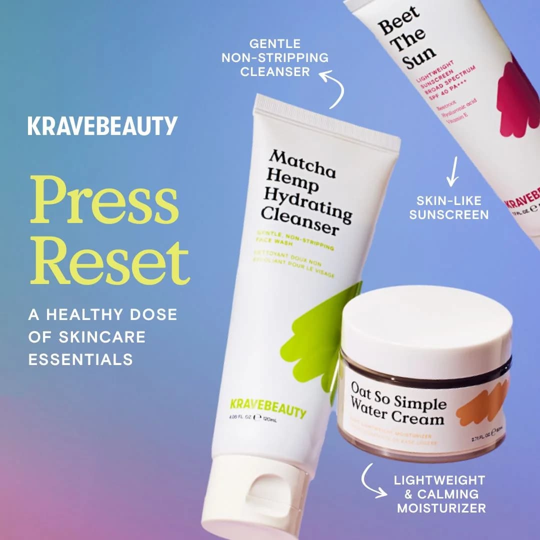
A lipstick shade ladder — five colors side by side — sells the range faster than a paragraph of product copy. If your beauty product comes in variants, the swatch grid is your best ad format. Let the colors sell themselves. Copy becomes the CTA line, nothing more.

Pick one thing to sell per ad

Glossier sells identity. ILIA sells SPF. Rare Beauty sells representation. Every ad should pick one claim and show it. Ads that try to communicate pigment and longevity and ingredients and price end up selling nothing. One ad, one hook.

Questions

Close-up application shots (mascara on lashes, lipstick on lips, foundation on skin) lead CTR benchmarks, followed by swatch ladders and UGC-style selfie ads. Static hero shots on flat backgrounds have faded outside of color cosmetics luxury tiers. Reels with a single uninterrupted application gesture — lip liner, eye liner, mascara pull — consistently outperform multi-cut edits because the gesture itself is the proof.

TikTok first for Gen-Z color cosmetics — Rare Beauty, Tower 28, and Rhode all scaled there before Meta. Instagram Reels second, with static feed as support. Pinterest works for clean-beauty research phase (Ilia, Merit). YouTube pre-roll only becomes efficient once you have a hero product generating 100+ daily orders — until then, the video production cost doesn't pay back.

Lifestyle ads put the product in a scene — a hand applying blush in front of a kitchen window, a lipstick on a vanity with real clutter. Studio ads isolate the product on a set background with controlled lighting. Lifestyle converts harder for millennials and clean-beauty audiences because it reads as aspirational-but-real. Studio still wins on luxury SKUs where craftsmanship needs to be visible.

Run shade-inclusive creative from day one. A foundation ad with only two skin tones in frame underperforms against a swatch ladder covering six. Brands like Fenty, Rare Beauty, and Rose Inc. lead with inclusive framing because it expands the addressable audience and signals brand values. Split-test single-shade hero vs multi-shade ladder on cold audiences — the ladder usually wins on CPA.

Overly airbrushed skin (reads as catalog), too many products in frame (dilutes the hook), fake color swatches that don't match the actual product, and text-heavy benefit lists. Beauty shoppers have calibrated against traditional cosmetics marketing for a decade — anything that feels like a Maybelline TV ad from 2014 gets scrolled past on Reels.

Create Your Own
Beauty Ad

Clone any beauty ad example. Upload your product photo. Seconds later, you have a finished ad ready to launch.

Create your ad
AdDogs ad examples globe