AdDogs

Ad examples from 14,066+ winning campaigns

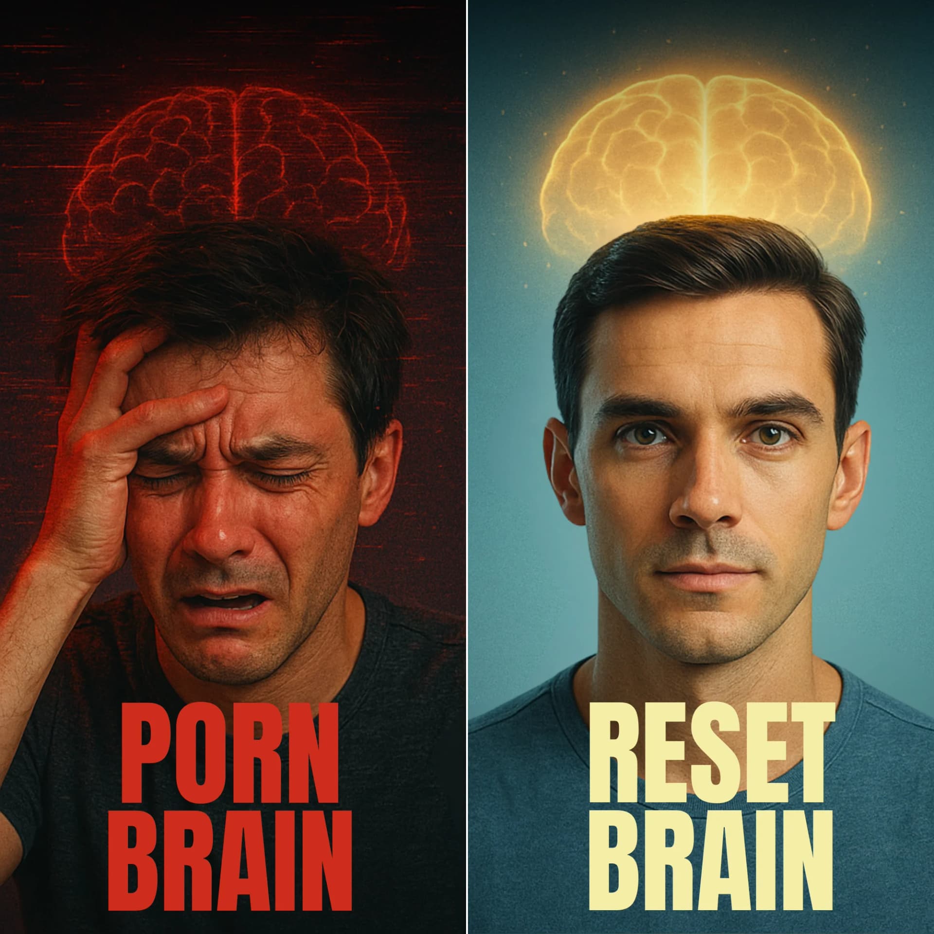
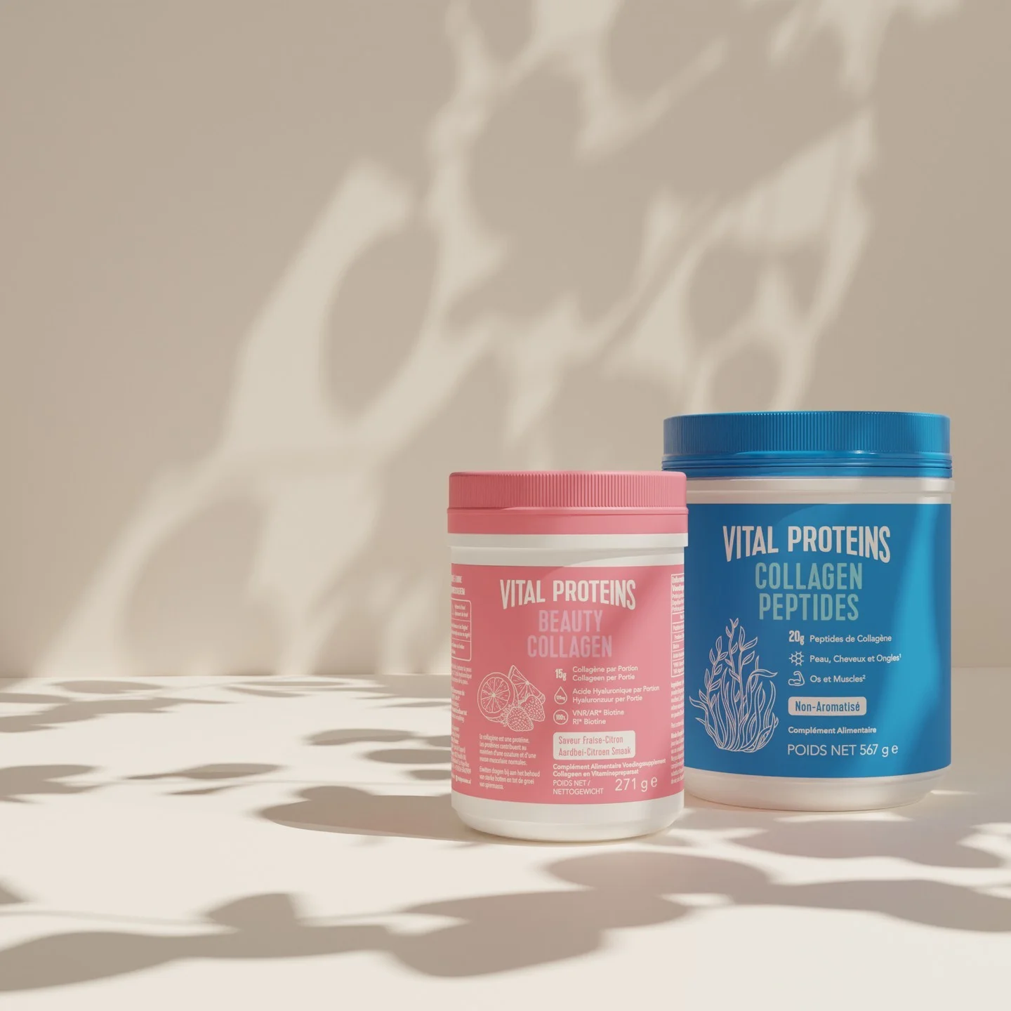
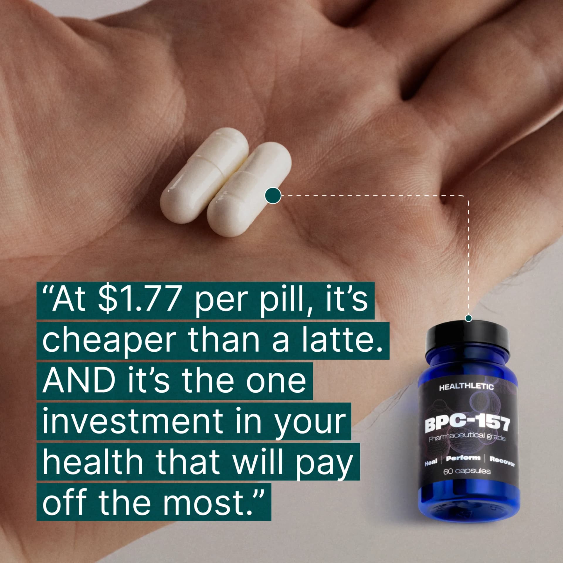
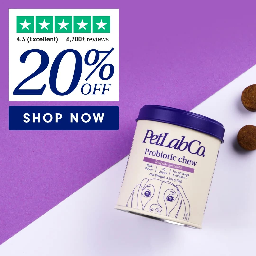
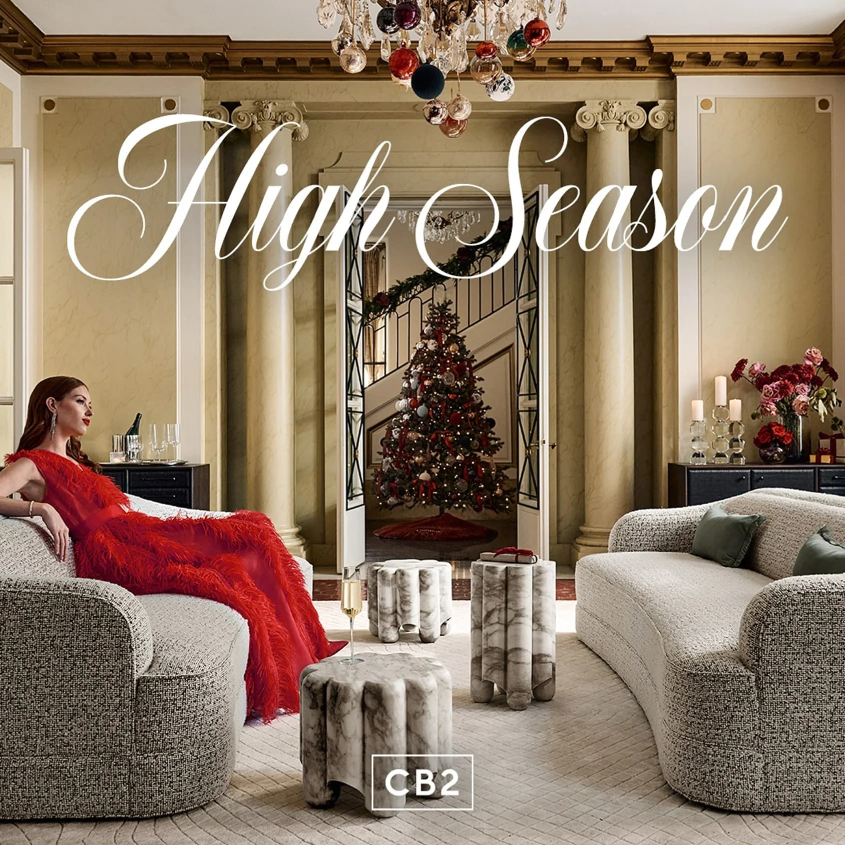
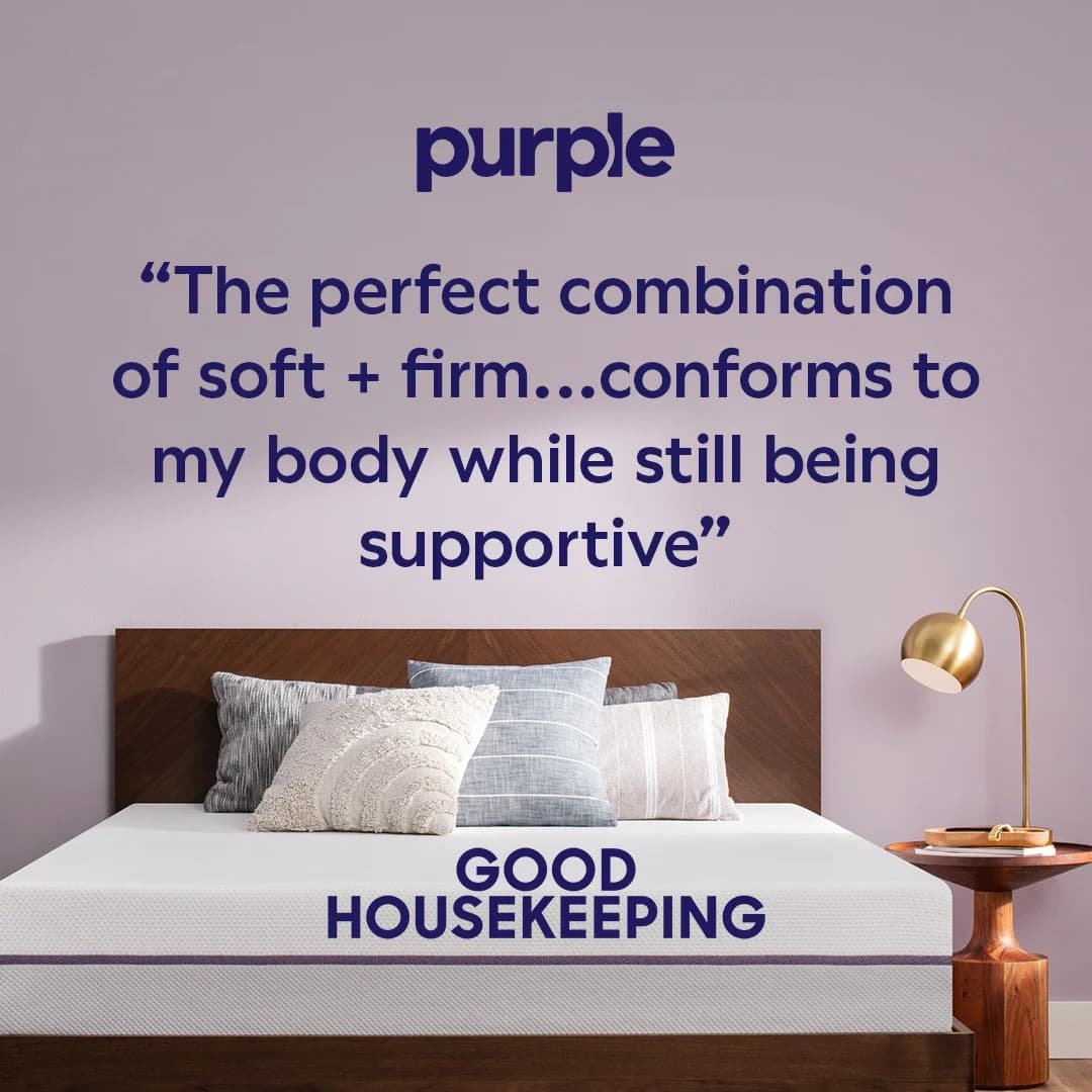
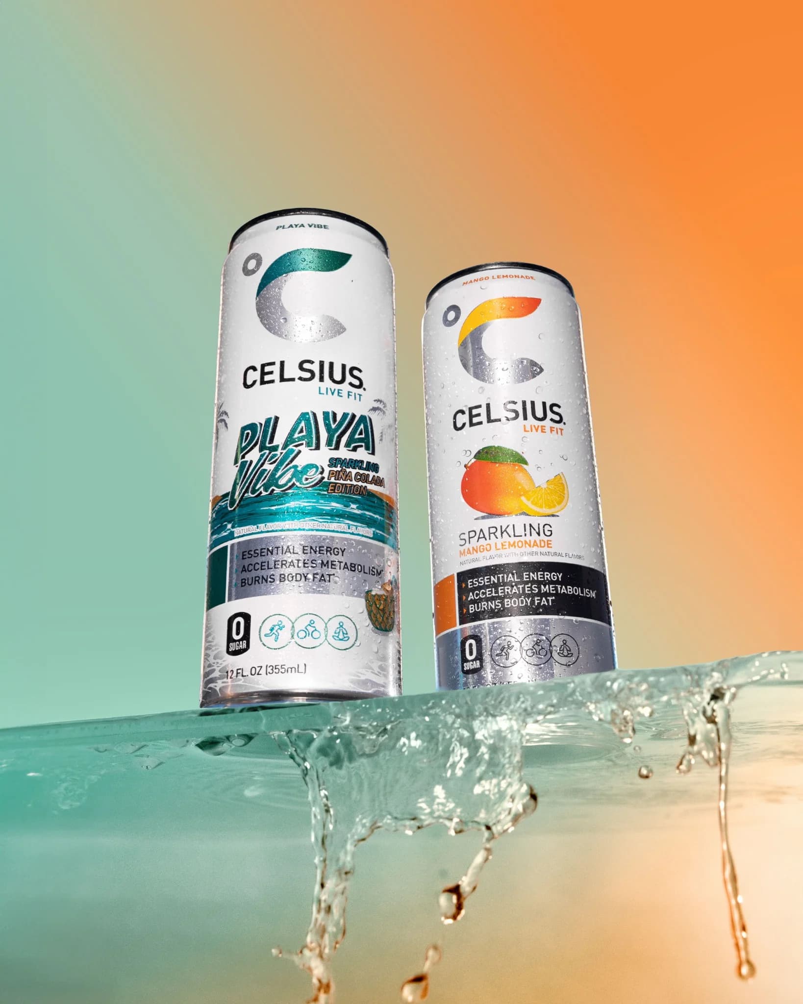
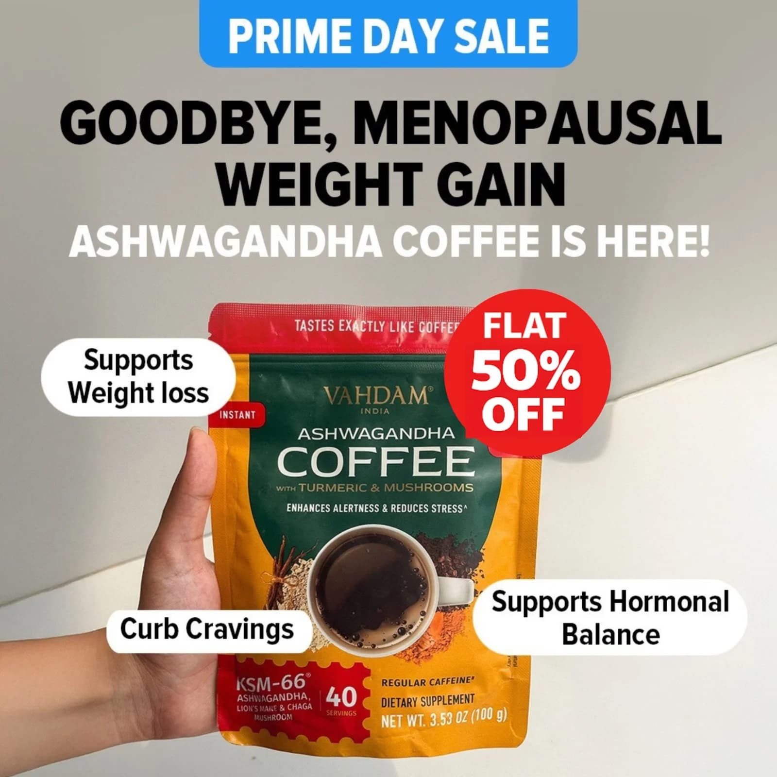
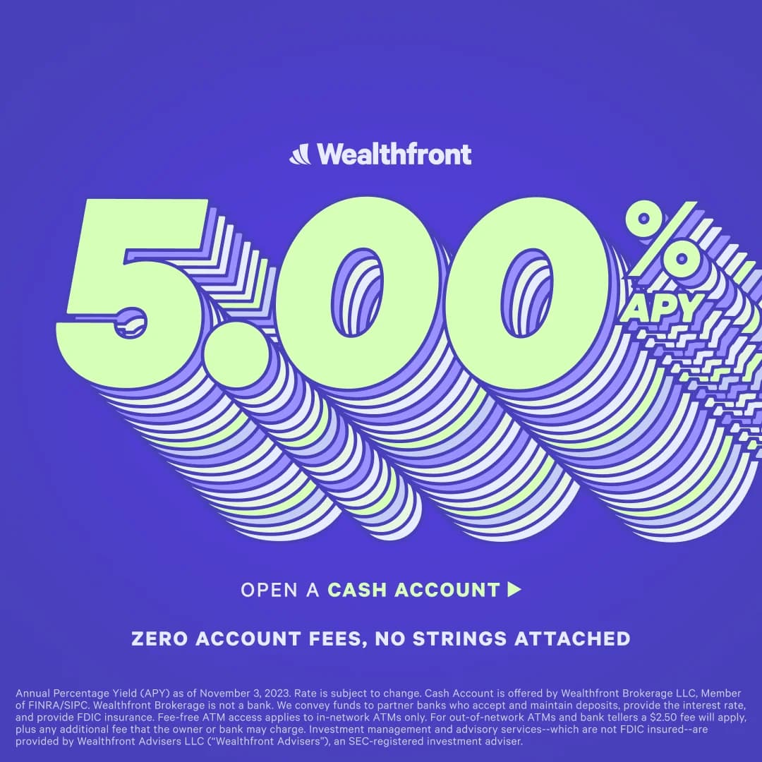
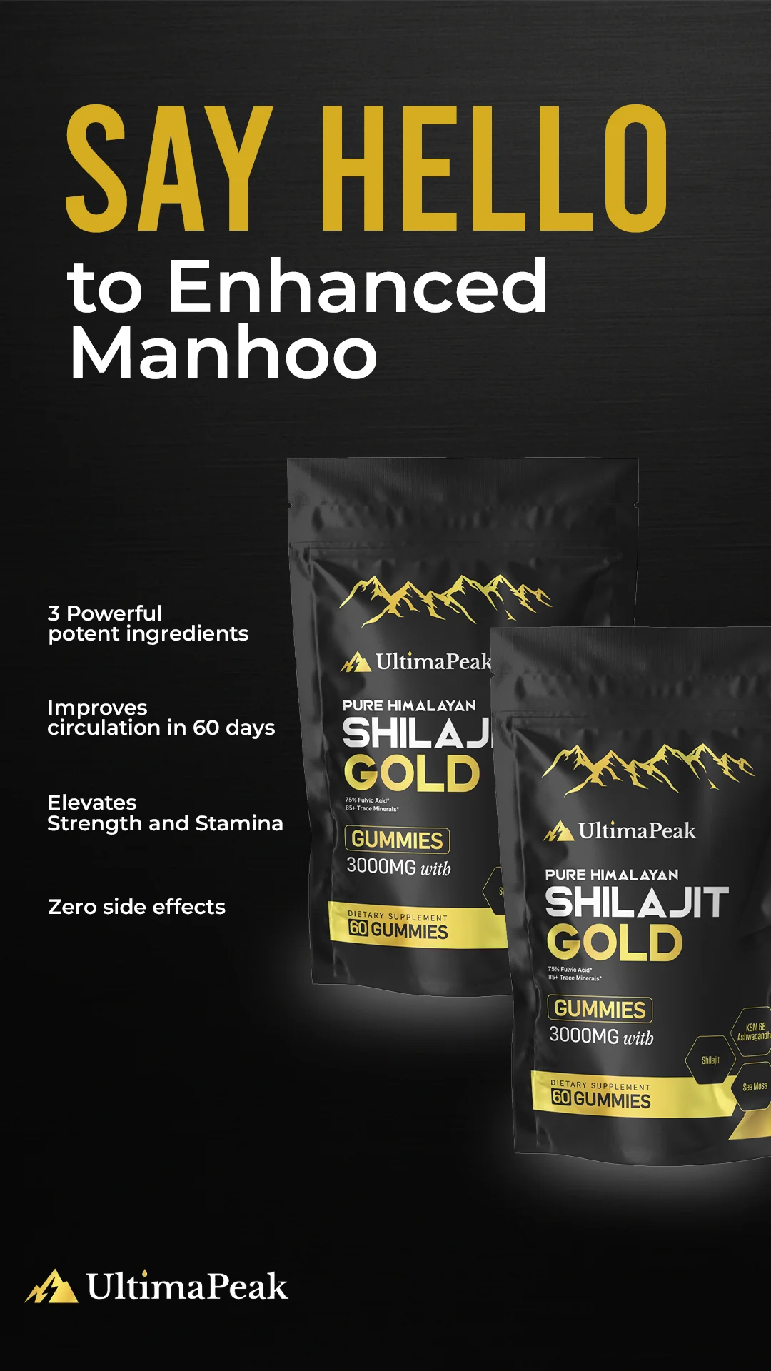
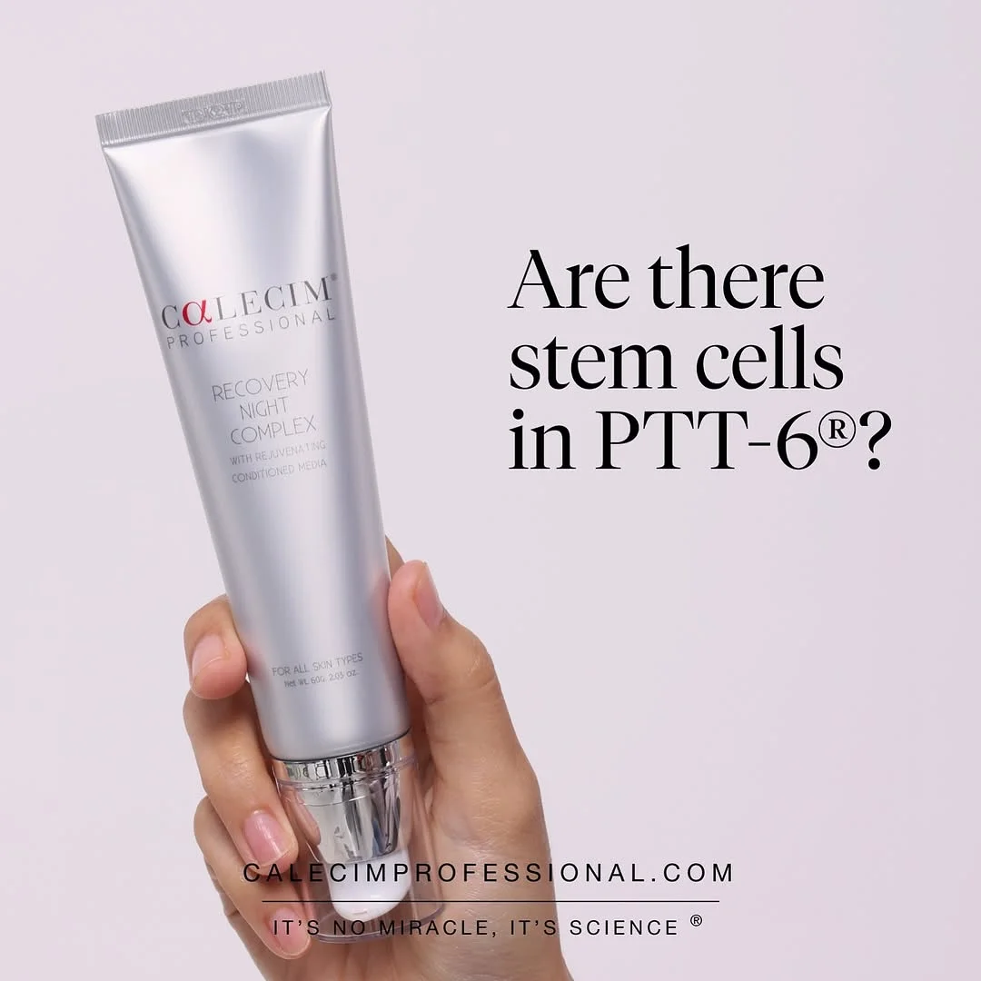
Real ads that ran as paid campaigns on Facebook, Instagram, TikTok, Google, and LinkedIn. Sourced from Meta Ad Library and similar public archives — not stock filler. Browse by industry, by platform, by visual format, or by brand to find what's already working in your category.

Wild Dose — Testimonial Product Stack. Brand: Wild Dose. This ad effectively leverages social proof through a dynamic testimonial layout. The vibrant, clean green background aligns with health and wellness, creating a fresh, approachable feel. Products are arranged in an engaging, slightly off-kilter stack, drawing the eye. Multiple speech bubbles, strategically placed around the products, create a visual narrative of positive customer experiences. The headline uses bold, contrasting text for immediate impact, while the testimonials provide detailed, relatable benefits. Optimized for social feeds like Instagram, its bright colors and clear, concise social proof cut through clutter, encouraging engagement and building trust. The composition balances product visibility with user-generated content, making the ad highly persuasive.. Headline: Regularity that everyone is obsessed with.. Why this ad works: Dynamic product arrangement grabs attention — The slightly tilted and stacked product boxes create visual interest, breaking the monotony of a static hero shot. This dynamic composition makes the ad feel less like a traditional advertisement and more like an organic, shareable post, increasing scroll-stopping power on social feeds. Authentic social proof builds immediate trust — Integrating multiple customer testimonials directly into the ad, complete with names and emojis, provides powerful social proof. This peer endorsement is highly persuasive, addressing potential skepticism and validating the product's efficacy more effectively than brand-generated claims alone. Playful, relatable language resonates with audience — The use of informal language, emojis (like the poop emojis from Evie), and direct quotes makes the testimonials highly relatable and authentic. This lighthearted approach destigmatizes the product's sensitive topic, fostering a connection with the target audience and encouraging engagement.. Specs: Brand: Wild Dose, Industry: Health & Wellness, Platform: Instagram, Format: Static, Audience: Women 25-34
Pure Encapsulations — Hand-Held Product & Benefits. Brand: Pure Encapsulations. This ad employs a split-screen layout, featuring the product held by a hand against a vibrant blue sky on the right, balanced by benefit-driven text on the left. The clear blue background evokes feelings of freshness and clarity, aligning with the product's promise of mental energy. Compositionally, the product is slightly off-center, drawing the eye from the bold headline to the tangible item, then down the bulleted benefits. This visual flow is optimized for platforms like Instagram, where clean aesthetics and quick information absorption are key. The text hierarchy is clear: a large, problem/solution headline, followed by concise, icon-supported benefits, and a necessary disclaimer. This design effectively communicates value and efficacy.. Headline: Goodbye Afternoon Slump. Hello Rapid Mental Energy.. Primary text: Improved working memory within 1 hour Working memory support sustained over 6 hours Contains Cereboost® to support learning and memory Supports cognitive alertness. Why this ad works: Benefit-driven headline hooks attention — This headline immediately resonates with the target audience experiencing energy dips, framing the product as a positive transformation. Using contrasting phrases, it highlights a common problem and offers a clear, desired outcome. This emotional connection drives initial engagement and encourages further reading, making the ad highly effective at capturing interest quickly. Clear visual hierarchy with product focus — By placing the product in a human hand, the ad creates an immediate sense of scale and real-world application, making it tangible and relatable. The bright blue sky ensures the white bottle stands out, while the left-aligned text provides digestible information without cluttering the main visual, optimizing for quick comprehension and guiding the viewer's eye. Iconography enhances benefit comprehension — The use of distinct icons alongside bulleted benefits significantly improves readability and information retention. In a fast-scrolling feed, these visual cues allow users to quickly grasp the core advantages of the product without needing to read every word. This makes the ad highly efficient at communicating complex value propositions in a digestible format.. Specs: Brand: Pure Encapsulations, Industry: Health & Wellness, Platform: Instagram, Format: Static, Audience: Women 25-34
Cadence Recover Sleep — Split Screen Product & Text. Brand: Cadence. This ad employs a clean, split-screen layout, dedicating the left half to persuasive text and the right to a minimalist product shot. The dark, sleek product packaging against a stark white background creates high contrast, ensuring immediate product recognition and a premium feel. Text hierarchy is clear: a compelling headline poses a question, followed by a bolded value proposition and a concise, benefit-driven bulleted list. This structure guides the viewer's eye efficiently. Optimized for mobile platforms like Instagram, the vertical format and ample negative space prevent visual clutter, enhancing readability and focus. The overall design communicates professionalism and efficacy, positioning Cadence as a superior, science-backed alternative to common sleep aids, appealing to a health-conscious audience seeking functional recovery.. Headline: Why I swapped melatonin gummies for Cadence. Primary text: Deep sleep, clean wake, real recovery — not just sedation. Fall asleep faster, wake up clear. Supports real recovery - not sedation. Non-habit forming, safe for nightly use. Built for performance, travel, and training.. Why this ad works: Problem/Solution Framing Drives Engagement — The headline "Why I swapped melatonin gummies for Cadence" immediately addresses a common user pain point and offers a clear solution. This narrative approach invites curiosity and positions Cadence as a superior alternative, directly engaging users who might be dissatisfied with current sleep aids. Benefit-Driven Bullet Points Enhance Clarity — The use of concise, checked bullet points clearly articulates the product's advantages and differentiators. Each point highlights a specific benefit, such as "real recovery - not sedation," making the ad highly scannable and easy for the audience to grasp the key value propositions quickly and effectively. High-Contrast Minimalist Design Builds Trust — The stark white background paired with the dark, sleek product packaging creates a clean, professional aesthetic. This minimalist approach reduces visual clutter, allowing the product and its benefits to stand out. The high contrast and clean lines convey a sense of scientific rigor and trustworthiness, appealing to a discerning audience.. Specs: Brand: Cadence, Industry: Health & Wellness, Platform: Instagram, Format: Static, Audience: Professionals
Storyworth — Testimonial with Product Display. Brand: Storyworth. This ad leverages a powerful testimonial-driven layout, placing a compelling quote as the central visual element. The soft, muted green background and complementary book colors (teal, dark green) evoke a sense of calm, nostalgia, and importance, aligning with the product's legacy-building theme. Compositionally, the large text on the left draws the eye immediately, while the subtly angled product shots on the right provide visual context without overwhelming the message. The circular "Turn Your Memories into a Memoir" element acts as a clear value proposition and soft CTA. This vertical format is optimized for platforms like Instagram Stories or Reels, where full-screen, emotionally resonant content performs well. The text hierarchy prioritizes the emotional hook, followed by brand recognition and a clear benefit statement.. Headline: The idea of leaving a written legacy for my children, grandchildren, and great grandchildren is what inspired me to try Storyworth.. Why this ad works: Emotional Testimonial Dominates Visual Field — The large, heartfelt quote directly addresses the core emotional benefit of Storyworth – creating a legacy. This authentic voice builds immediate trust and relatability, resonating deeply with the target audience's desire to preserve family history. It's a powerful persuasion technique for a product centered on personal stories. Subtle Product Integration Supports Message — The two Storyworth books are angled naturally, appearing as tangible examples of the legacy described in the testimonial. Their presence is supportive rather than intrusive, allowing the emotional message to lead while still clearly showcasing the product's physical output. This balances aspiration with tangibility effectively. Calming Color Palette Reinforces Brand Values — The muted green background paired with the teal and dark green book covers creates a harmonious, sophisticated, and calming aesthetic. This color choice subtly communicates the thoughtful, enduring, and personal nature of the Storyworth service, enhancing its premium feel and aligning with the emotional topic of legacy.. Specs: Brand: Storyworth, Industry: Home & Lifestyle, Platform: Instagram, Format: Static, Audience: Parents
SoundCloud — Bold Feature Spotlight Layout. Brand: SoundCloud. This ad effectively uses a bold, high-contrast design optimized for mobile vertical feeds. The deep blue-purple gradient background creates a vibrant, energetic mood, while white typography and crisp vector graphics ensure maximum readability and visual pop. The layout strategically places the core value proposition ("Upload, get heard, get paid") as the dominant visual element, immediately communicating the ad's purpose. Supporting graphics like the dollar coins and speaker icon reinforce the benefits without clutter. The composition guides the eye from the brand logo, through the headline, to the explanatory text, creating a clear narrative flow. This design is highly effective for platforms like Instagram Stories or TikTok, where quick comprehension and visual impact are crucial for engagement. The text hierarchy is clear, with the main message dominating.. Headline: Upload, get heard, get paid.. Primary text: It's never been easier to get your music out there. Try our new upload experience today.. Why this ad works: Clear Value Proposition as Headline — The headline "Upload, get heard, get paid" is direct and benefit-driven. It immediately communicates the core value to aspiring artists, addressing their primary motivations for using a platform like SoundCloud. This clarity cuts through noise, driving immediate understanding and relevance for the target audience. High-Contrast, Energetic Color Palette — The deep blue-purple gradient paired with stark white text and graphics creates a vibrant, modern aesthetic. This high contrast ensures readability on mobile screens and captures attention in a busy feed. The colors evoke creativity and digital innovation, resonating with the music creation demographic. Illustrative Graphics Reinforce Benefits — The abstract graphics, such as the dollar coins and the speaker icon, visually represent the "get paid" and "get heard" aspects of the headline. These simple, yet effective, visual cues quickly reinforce the ad's message, making it more memorable and engaging than text alone, especially for quick mobile consumption.. Specs: Brand: SoundCloud, Industry: Media & Entertainment, Platform: Instagram, Format: Static, Audience: Professionals
Trinny London Bounce Back — Testimonial & Product Showcase. Brand: Trinny London. This ad leverages a testimonial-driven layout to build trust and highlight product efficacy. A prominent quote from "Woman's Way" anchors the composition, strategically placed against a clean white background. The vibrant coral/pink product packaging of Trinny London's "Bounce Back" moisturizer provides strong visual contrast, ensuring brand recognition and product visibility. Compositionally, product shots are dynamically scattered around the testimonial card, creating an engaging yet organized feel. Key benefits within the testimonial are highlighted in yellow, guiding the viewer's eye to the most impactful claims. This design is optimized for social platforms like Instagram, where authentic social proof and visually appealing product presentation are crucial for stopping the scroll and driving consideration among an older female demographic. The text hierarchy prioritizes the credible source and direct user experience.. Headline: I love it so much. Primary text: Dryness has been one of my biggest bugbears since menopause hit. I decided to try out [Bounce Back] intense peptide moisturiser and OMG, my skin has been transformed. It's reduced fine lines and made my skin plump and firm.". Why this ad works: Authentic Testimonial Builds Trust — The "Woman's Way" endorsement and detailed quote from Andrea Smith provide strong social proof. Highlighting specific benefits like "reduced fine lines" and "plump and firm" directly addresses common skincare concerns, making the ad highly relatable and trustworthy for the target audience, particularly women experiencing menopause-related skin changes. Vibrant Brand Color Commands Attention — The consistent use of Trinny London's distinctive coral/pink on all product packaging creates a strong, memorable brand identity. This bold color pops vibrantly against the clean white background, ensuring the ad is visually arresting and stands out in a crowded social feed, driving immediate brand recognition and recall among potential customers. Strategic Product Placement Reinforces Message — Multiple product angles and formats (tube, refill, jar) are strategically placed around the testimonial card. This not only showcases the full product range but also subtly reinforces the message by visually associating the praised results with the specific "Bounce Back" moisturizer, enhancing product recall and desire through visual reinforcement.. Specs: Brand: Trinny London, Industry: Health & Wellness, Platform: Instagram, Format: Static, Audience: Women 45+
Yubo — Social Gathering Lifestyle Shot. Brand: Yubo. This ad leverages a user-generated content (UGC) aesthetic, capturing a group selfie in a social setting, likely a club or party. The composition is informal and authentic, mirroring typical social media posts, which enhances relatability for its target demographic. The vibrant yellow Yubo logo and bold white text with a black outline create strong contrast against the darker background, ensuring high visibility and readability on platforms like Instagram. The text hierarchy is simple: brand logo at the top, followed by a conversational headline that sparks curiosity and highlights the app's core value proposition – facilitating real-life connections. This approach is optimized for engagement, encouraging viewers to imagine similar social outcomes. The dark, moody lighting with bright highlights adds to the authentic, spontaneous vibe, making the ad feel less like an advertisement and more like a shared moment.. Headline: Who would have thought they'd met on Yubo. Why this ad works: Authentic UGC Aesthetic Builds Trust — The ad's raw, unpolished look, resembling a casual selfie taken by a friend, resonates deeply with Gen Z. This authenticity bypasses traditional ad skepticism, making the message about meeting people on Yubo feel genuine and attainable. It fosters trust and relatability, crucial for social apps. Curiosity-Driven Conversational Headline — Who would have thought they'd met on Yubo is a compelling, narrative-driven question. It immediately piques viewer interest, prompting them to consider the unexpected connections possible through the app. This approach encourages engagement and reinforces Yubo's value proposition without being overtly promotional. High-Contrast Branding and Text — The bright yellow Yubo logo and bold white text with a black outline stand out dramatically against the dark, low-light background. This ensures maximum visibility and readability, even in a busy feed. The vibrant branding reinforces a youthful, energetic vibe, aligning with the app's target audience.. Specs: Brand: Yubo, Industry: Media & Entertainment, Platform: Instagram, Format: Static, Audience: Teens
Portland Pet Food — Cat Food Product Showcase. Brand: Portland Pet Food. This ad effectively uses a split background to segment product variants, with vibrant orange and pink packaging contrasting against a light blue top and yellow bottom. The composition strategically places product pouches above corresponding bowls of food, visually demonstrating the 'in-use' appeal and moisture-rich quality. Arrows guide the eye from pouch to bowl, reinforcing the product's readiness. The headline, "Finally, Fuss-Free Fresh Cat Food!", immediately addresses a pain point for pet owners. Color psychology leverages warm, inviting tones for appetite appeal. Optimized for visual platforms like Instagram, the clear product shots and benefit-driven copy aim to capture attention and drive consideration among pet owners seeking convenient, high-quality options. Text hierarchy is clear, with the main benefit highlighted.. Headline: Finally, Fuss-Free Fresh Cat Food!. Primary text: Shelf-stable, 100% human-grade cat meals. Why this ad works: Clear product visualization, pouch to bowl — The ad clearly showcases both the product packaging and its prepared state in bowls. This 'before-and-after' visual, enhanced by guiding arrows, effectively communicates the product's convenience and appealing texture. It helps potential customers visualize the meal, building trust and appetite appeal, which is crucial for pet food purchases. Vibrant color contrast creates appetite appeal — The use of contrasting, warm colors like the vibrant orange and pink packaging against the yellow bottom background creates strong appetite appeal. These hues are associated with energy and warmth, making the food look fresh and inviting. This color strategy helps the ad stand out in a busy feed and emotionally connects with pet owners. Benefit-driven headline addresses pain points — The headline 'Finally, Fuss-Free Fresh Cat Food!' directly addresses a common pain point for pet owners: the effort involved in providing fresh meals. By promising 'shelf-stable, 100% human-grade' benefits, the ad immediately positions the product as a convenient, high-quality solution, driving initial interest and consideration.. Specs: Brand: Portland Pet Food, Industry: Food & Beverage, Platform: Instagram, Format: Static, Audience: General
Ancient + Brave Marine Collagen — Data-Driven Product Shot. Brand: Ancient + Brave. This ad effectively leverages a minimalist, dark aesthetic to highlight product efficacy. The vertical composition is optimized for mobile-first platforms, drawing the eye down through a clear hierarchy. The headline, "CLINICALLY PROVEN MARINE COLLAGEN," immediately establishes trust, reinforced by three prominent, data-backed benefit statistics. The dark background and gold accents convey a premium, sophisticated vibe, appealing to a discerning audience. Compositionally, the product (scoop and bottle) is central, grounding the scientific claims visually. Text hierarchy is clear: strong claim, then supporting data, then a small disclaimer. This ad works by combining scientific credibility with a luxurious visual presentation, designed to stop the scroll and educate potential customers on key benefits without overwhelming them with text.. Headline: CLINICALLY PROVEN MARINE COLLAGEN. Primary text: 94% SAW AN IMPROVEMENT IN SKIN ELASTICITY 137% INCREASE IN SKIN HYDRATION 100% SAW A REDUCTION IN FINE LINES & WRINKLES. Why this ad works: Clinical data builds immediate trust — The prominent "CLINICALLY PROVEN" headline, followed by specific percentage improvements in skin elasticity, hydration, and wrinkle reduction, provides strong, data-backed claims. This directly addresses potential skepticism, establishing credibility for a health supplement and reassuring the target audience of its efficacy. Vertical composition optimizes for mobile feeds — The tall, narrow layout with key information stacked vertically is perfectly suited for Instagram Stories or Reels. It maximizes screen real estate, ensuring all essential elements—headline, benefits, and product—are visible without requiring additional scrolling, enhancing immediate engagement and message retention on mobile devices. Dark, minimalist aesthetic conveys premium quality — The deep, muted background combined with the metallic gold scoop and amber product bottle creates a sophisticated, luxurious feel. This visual language aligns with a high-end wellness product, effectively attracting consumers who value quality, efficacy, and a refined brand experience in their health and beauty choices.. Specs: Brand: Ancient + Brave, Industry: Health & Wellness, Platform: Instagram, Format: Static, Audience: Women 35-44
Hydrant Electrolytes — Feature Callout Layout. Brand: Hydrant. This ad effectively uses a clean, product-on-background layout to highlight Hydrant's key benefits. The bold blue headline "Train hard. Recover harder." immediately sets a motivational tone, appealing to fitness enthusiasts. The central product shot, a vibrant blue pouch with individual flavor sticks, is surrounded by clear, concise feature callouts using arrows, guiding the viewer's eye to specific product advantages like "Real fruit juice powder" and "Fast acting electrolytes." The off-white background ensures high contrast, making the product and text pop, optimizing for platforms like Instagram and Facebook where visual clarity is paramount. The inclusion of social proof (4.8 stars, 6,390+ reviews) at the bottom builds trust and encourages conversion. Text hierarchy is clear, moving from a strong value proposition to detailed benefits, then social proof.. Headline: Train hard. Recover harder.. Why this ad works: Benefit-driven headline hooks target audience — The headline "Train hard. Recover harder." directly speaks to the core motivation of fitness enthusiasts. This aspirational and action-oriented language creates an immediate connection, positioning Hydrant as an essential part of their recovery regimen, driving higher engagement and relevance for the target demographic. Clear feature callouts enhance product understanding — The use of arrows and distinct text boxes around the central product image effectively breaks down complex information into digestible points. This visual segmentation allows users to quickly grasp key benefits like "Zero Sugar" and "Fast acting electrolytes," reducing cognitive load and improving message retention in a busy feed. Strong social proof builds immediate trust — The prominent display of "(4.8) 6,390+ Reviews" at the bottom provides powerful third-party validation. This level of positive feedback from a large user base significantly reduces perceived risk and increases purchase intent, especially for new customers evaluating a health and wellness product.. Specs: Brand: Hydrant, Industry: Health & Wellness, Platform: Instagram, Format: Static, Audience: Fitness Enthusiasts
Timeleft — Cleveland Relocation Question Ad. Brand: Timeleft. This ad leverages a bold, text-heavy layout to immediately engage a specific audience: recent movers. The central question, "JUST MOVED TO Cleveland?", uses high-contrast black text against a soft pink background, with key words "MOVED" and "Cleveland" highlighted by vibrant pink and red blocks. This color strategy creates visual pop, ensuring the message stands out in a busy feed. The composition is direct and minimalist, focusing solely on the question and brand logo. This approach is highly optimized for platforms like Instagram or Facebook, where quick comprehension and scroll-stopping visuals are crucial. The clear hierarchy guides the eye from the provocative question to the brand identity, effectively qualifying potential users and sparking curiosity about Timeleft's solution for new residents. The playful, slightly askew text blocks add a dynamic, approachable vibe.. Headline: JUST MOVED TO Cleveland ?. Why this ad works: Direct Question Targets Specific Audience — The ad immediately poses a highly relevant question to its target demographic: individuals who have recently relocated. This direct address creates instant relatability and stops the scroll, prompting self-identification and piquing curiosity about what Timeleft offers to address this specific life event. High-Contrast Text Blocks Command Attention — Utilizing vibrant pink and red highlight boxes behind key words like "MOVED" and "Cleveland" against a light background ensures maximum visibility. This technique breaks visual monotony and draws the eye directly to the most critical information, making the ad highly effective at capturing attention in a crowded social feed. Playful, Minimalist Design Enhances Approachability — The simple, bold typography combined with the slightly tilted, colorful text blocks creates a playful and informal aesthetic. This minimalist approach avoids clutter, making the message clear and inviting. It signals that Timeleft is a modern, friendly solution, appealing to a younger, digitally native audience seeking social connections.. Specs: Brand: Timeleft, Industry: Home & Lifestyle, Platform: Instagram, Format: Static, Audience: General
AgeMate Energy Drink — Lifestyle Benefit List. Brand: AgeMate. This ad effectively combines a lifestyle visual with a clear benefit-driven text overlay, optimized for vertical social feeds. The layout strategically places a bold headline at the top, followed by a concise brand introduction, then a bulleted list of four key benefits, each paired with a simple icon. This structure guides the viewer's eye down the ad, quickly communicating the product's value proposition. The vibrant purple drink, held in hand, serves as a strong visual anchor against the blurred, natural outdoor background, suggesting a healthy, active lifestyle. Color psychology leverages the bright yellow headline for attention and the purple drink for uniqueness. The composition emphasizes product integration into daily life, while the text hierarchy ensures scannability. This design is well-suited for platforms like Instagram or TikTok, where quick comprehension and aspirational imagery drive engagement.. Headline: SKIP THE SPIKE. Primary text: Your way to better energy with AgeMate Steady, sustained energy (no crashes) Calmer mind and reduced stress Sharper brain health and clarity Focus and attention that lasts. Why this ad works: Clear benefit list with icons — The ad uses a vertical list format, pairing each key benefit with a distinct icon. This technique allows for rapid information processing, enabling viewers to quickly grasp the product's multi-faceted advantages. In fast-scrolling environments, this visual-text synergy effectively communicates value, addressing various potential customer needs and pain points efficiently. Vibrant product color creates visual anchor — The striking purple color of the AgeMate drink immediately draws the eye, contrasting sharply with the muted, natural background. This vibrant hue acts as a powerful visual anchor, ensuring the product itself is central to the viewer's attention. It also hints at a unique, perhaps exotic, ingredient or experience, sparking curiosity and memorability. Lifestyle background adds aspirational context — The blurred outdoor setting, with a hand holding the drink, grounds the product in a desirable, everyday lifestyle. This subtle backdrop suggests the product seamlessly integrates into a healthy, active routine, rather than being a clinical supplement. It helps potential customers envision themselves enjoying the benefits in a natural, relaxed environment.. Specs: Brand: AgeMate, Industry: Health & Wellness, Platform: Instagram, Format: Static, Audience: Professionals
True Botanicals Face Oil — Testimonial with User. Brand: True Botanicals. This True Botanicals ad leverages an authentic testimonial layout, featuring a smiling woman in a robe, creating a relatable, user-generated content feel. The composition places her face prominently, establishing direct eye contact and trust. A clean, semi-transparent text box overlays the lower portion, presenting a 5-star review and product shot. The warm, natural color palette of skin tones, white robe, and amber oil evokes a sense of purity and efficacy. This design is highly optimized for platforms like Instagram, where genuine social proof and aspirational yet achievable beauty resonate strongly. The text hierarchy guides the eye from the star rating to the personal endorsement, then to the product, effectively building consideration. The overall vibe is clean and trustworthy, aligning with premium skincare branding.. Primary text: "If I could only have one skincare product, this face oil would be it! It's been a game changer for my dry skin." - Jenna. Why this ad works: Authentic smile builds immediate trust — The ad features a genuine smile and direct eye contact from the model, immediately building rapport and trust with the viewer. This personal connection makes the testimonial feel more authentic and believable, significantly increasing the persuasive power of the social proof. It effectively humanizes the brand and product experience. Integrated product shot reinforces testimonial — Integrating the product bottle directly within the testimonial box provides immediate visual context for the glowing review. This clever composition links the positive experience directly to the True Botanicals face oil, reinforcing the product's efficacy and making the claim more tangible and credible for potential customers. UGC-style content enhances relatability — The ad successfully mimics user-generated content (UGC) with its natural lighting, casual setting, and authentic model expression. This approach bypasses traditional ad skepticism, making the message feel more organic and trustworthy, which is crucial for driving engagement and consideration on social media platforms like Instagram.. Specs: Brand: True Botanicals, Industry: Health & Wellness, Platform: Instagram, Format: Static, Audience: Women 25-34
Public Rec Dealmaker Pants — Modern In-Use Shot. Brand: Public Rec. This ad employs a dynamic, close-up, in-use shot, effectively showcasing the fit, texture, and modern details of the "Dealmaker Pants." The vertical composition is perfectly optimized for mobile-first platforms like Instagram Stories or Reels, ensuring maximum screen real estate and scroll-stopping power. A muted, earthy olive-green background provides a sophisticated yet subtle contrast, allowing the charcoal grey pants and distinctive patterned belt to pop without visual distraction. The bold, white text hierarchy, with the product name "The Dealmaker Pants" leading into the impactful headline "Not Your Dad's Dress Pants," immediately communicates a contemporary, comfort-driven value proposition. This strategic messaging, combined with the clean aesthetic and focus on product quality, targets a discerning male audience seeking an upgrade from traditional formal wear, driving both awareness and consideration through aspirational lifestyle imagery.. Headline: Not Your Dad's Dress Pants. Primary text: The Dealmaker Pants. Why this ad works: Bold headline challenges traditional perception — The headline "Not Your Dad's Dress Pants" instantly creates intrigue and positions the product as a modern, comfortable alternative. This direct challenge to an outdated concept resonates with younger audiences seeking innovation in wardrobe staples, driving engagement and brand differentiation. Close-up in-use shot highlights product details — The tight crop on the model wearing the pants effectively showcases the fabric texture, fit, and the unique belt design. This visual emphasis on quality and contemporary styling allows potential customers to visualize themselves in the product, building desire and confidence in the purchase. Muted background enhances product prominence — The subtle olive-green background provides just enough contrast to make the grey pants and patterned belt stand out without competing for attention. This minimalist approach ensures the product remains the undisputed focal point, reinforcing a clean, sophisticated brand image and preventing visual clutter in a busy feed.. Specs: Brand: Public Rec, Industry: Fashion & Apparel, Platform: Instagram, Format: Static, Audience: Men 25-34
Sprints Running Bag — Outdoor Hero Shot. Brand: Sprints. The ad effectively utilizes a centered hero shot of the Sprints running bag against a blurred natural forest background, immediately establishing its intended use case. The dark green and vibrant orange color palette creates a strong contrast, making the product pop while aligning with an adventurous, energetic vibe. Text hierarchy is clear: "NO BOUNCE BAGS FOR RUNNING" directly addresses a key pain point for runners, with "RUNNING" emphasized. This composition is optimized for vertical platforms like Instagram Stories or Reels, where full-screen product visibility and concise messaging are crucial for engagement. The overall design communicates functionality and brand identity, leveraging the outdoor setting to evoke a sense of freedom and performance. The low text overlay ensures the product remains the primary focus, enhancing visual appeal and scroll-stopping power.. Headline: NO BOUNCE BAGS FOR RUNNING. Why this ad works: Problem-solution headline captures runner's pain point — "NO BOUNCE BAGS FOR RUNNING" directly addresses a common frustration for runners. This immediately resonates with the target audience, signaling that the product offers a specific, valuable solution. It creates instant relevance and encourages further engagement by promising a better running experience, making it a strong hook. Vibrant product contrast against natural backdrop — The dark green bag with bright orange accents stands out powerfully against the muted, blurred forest background. This high contrast ensures the product is the undeniable focal point, while the natural setting reinforces its outdoor, active utility. It's visually appealing and contextually relevant, enhancing product visibility. Vertical format optimizes for mobile storytelling — The ad's vertical aspect ratio and central product placement are perfectly suited for mobile-first platforms like Instagram Stories or TikTok. This native format maximizes screen real estate, providing an immersive view of the product and its benefit, leading to higher retention and engagement rates among active users.. Specs: Brand: Sprints, Industry: Sports & Fitness, Platform: Instagram, Format: Static, Audience: Fitness Enthusiasts
Katkin Trial Offer — Benefit-Oriented Product Display. Brand: Katkin. This ad employs a high-contrast, benefit-driven layout on a dark background, immediately grabbing attention. The central product display, featuring both packaged and prepared pet food, grounds the offer in tangible reality. Neon green and vibrant orange brand colors create a bold, energetic vibe, signaling freshness and quality. Text hierarchy is clear: brand, then a strong headline, followed by bulleted value propositions that address common pet owner concerns. This structure guides the eye efficiently, optimizing for quick comprehension on busy social feeds like Facebook. The composition balances product visibility with persuasive copy, ensuring the audience understands what they're getting and why it's valuable, without overwhelming the visual. The overall design is direct and action-oriented.. Headline: WHAT YOU'LL GET IN YOUR KATKIN TRIAL. Primary text: 28 FRESHLY-PREPARED MEALS 100% REAL MEAT + FISH FREE EXTRA-TEMPTING MEAL TOPPER FREE DELIVERY. Why this ad works: High-contrast palette for scroll-stopping visibility — The stark black background combined with vibrant neon green and orange creates exceptional contrast. This color strategy ensures the ad stands out dramatically in a crowded social feed, immediately drawing the eye and preventing passive scrolling. It communicates energy and modernity, aligning with a premium pet food brand. Clear, bulleted value proposition highlights benefits — The ad effectively uses bullet points to list key benefits: "28 FRESHLY-PREPARED MEALS," "100% REAL MEAT + FISH," "FREE EXTRA-TEMPTING MEAL TOPPER," and "FREE DELIVERY." This scannable format allows potential customers to quickly grasp the comprehensive value of the trial, addressing multiple purchase drivers efficiently. Product-in-context visual enhances realism — Showing the food both in its packaging and prepared in a bowl makes the product tangible and appealing. This visual strategy helps potential customers envision the product in use, building trust and demonstrating the quality and freshness of the meals, which is crucial for pet food purchases.. Specs: Brand: Katkin, Industry: Food & Beverage, Platform: Facebook, Format: Static, Audience: General
Loftie Red Light Devices — Bedroom Setup. Brand: Loftie. This ad leverages a bold, monochromatic red palette to immediately capture attention and evoke a sense of warmth and tranquility, crucial for sleep products. The layout strategically places the brand name and benefit-driven headline on the left, aligning with natural reading patterns, while showcasing the products in an in-use bedroom setting on the right. This composition effectively demonstrates the product's function and integration into a nightly routine. The strong color contrast against the white text ensures readability, optimized for scroll-stopping on visual platforms like Instagram. The minimalist approach, with generous negative space, keeps the focus squarely on the core message and the innovative red light technology, positioning Loftie as a modern solution for sleep enhancement.. Headline: Supercharge your sleep with Loftie's red light devices. Why this ad works: Monochromatic Red Palette Creates Strong Mood — The dominant red color saturates the entire frame, instantly grabbing attention. This bold choice not only creates a distinct visual identity for Loftie but also subtly communicates warmth and the specific "red light" technology, making the ad memorable and reinforcing the product's unique selling proposition. In-Situ Placement Demonstrates Product Use — By showing the red light devices on a bedside table, the ad effectively illustrates their intended use and seamless integration into a nighttime routine. This contextual placement helps potential customers visualize the products in their own homes, increasing relatability and perceived value without needing explicit instructions. Benefit-Driven Headline Highlights Core Value — The headline "Supercharge your sleep with Loftie's red light devices" immediately communicates a clear, desirable benefit. This direct approach quickly informs the viewer about the product's purpose and value proposition, appealing to those actively seeking sleep improvement solutions and driving consideration.. Specs: Brand: Loftie, Industry: Health & Wellness, Platform: Instagram, Format: Static, Audience: Women 25-34
ASRV Performance Apparel — Lifestyle & Detail Collage. Brand: ASRV. This ad effectively combines a dynamic lifestyle hero shot with detailed product close-ups, creating a comprehensive visual narrative. The grid layout strategically places the main action shot on the right, drawing the eye, while smaller panels highlight specific garment features and fit. The muted, earthy color palette of grays and whites conveys a sense of rugged performance and premium quality, resonating with serious fitness enthusiasts. A prominent five-star rating and direct testimonial provide strong social proof, building immediate trust. The clear text hierarchy, with the testimonial as the focal point, guides the viewer from visual appeal to persuasive endorsement. Optimized for platforms like Instagram, this ad balances aspirational imagery with tangible product benefits and user validation, encouraging consideration.. Headline: TOP QUALITY FIT AND FUNCTION.. Primary text: Top quality fit and function. ASRV is the best brand out there, period.. Why this ad works: Integrated Lifestyle and Detail Shots — The ad cleverly combines a large, engaging action shot with smaller, focused detail images. This dual approach allows viewers to visualize the apparel in a high-performance context while simultaneously appreciating the specific design and fit. It builds both aspiration and practical understanding, crucial for premium activewear. Prominent Testimonial Builds Trust — Featuring a five-star rating and a direct quote from a satisfied customer, "TOP QUALITY FIT AND FUNCTION," immediately establishes credibility. This social proof is highly persuasive, reducing perceived risk and validating the product's claims. It directly addresses potential customer skepticism, driving consideration for purchase. Muted Palette Signals Serious Performance — The ad's color scheme, dominated by grays, whites, and natural concrete textures, avoids flashy colors often associated with mass-market fitness. This sophisticated, understated palette communicates durability, functionality, and a premium, no-nonsense approach to athletic wear, appealing to a discerning, performance-focused male audience.. Specs: Brand: ASRV, Industry: Sports & Fitness, Platform: Instagram, Format: Carousel/Collage, Audience: Men 25-34
Hydrant Stevia-Free Hydration — Split Offer Layout. Brand: Hydrant. This ad leverages a split-screen layout to present two distinct offers, maximizing value proposition within a single frame. The vibrant blue background with water droplets immediately communicates hydration, while the contrasting lime green "55% OFF" grabs attention, leveraging color psychology for urgency and excitement. Text hierarchy places the main discount prominently at the top, followed by the product benefit, then two clear, distinct calls to action for each offer. This structure guides the eye efficiently. The composition uses a clean, bright aesthetic, optimized for platforms like Facebook or Instagram where clear, benefit-driven visuals perform well. The high text overlay ensures the core message is unmistakable, driving conversion by highlighting both savings and product features. The overall design is direct and action-oriented.. Headline: UP TO 55% OFF. Primary text: STEVIA-FREE HYDRATION. Why this ad works: Bold discount callout grabs immediate attention — The prominent, high-contrast "UP TO 55% OFF" in bright green immediately captures attention, signaling significant value. This bold visual hierarchy prioritizes the discount, a powerful motivator for conversion-focused campaigns. It leverages scarcity and urgency, compelling viewers to engage further with the offer details and explore the product. Clear dual offer presentation caters to preferences — Presenting "Free Mystery Pack" and "Buy 2, Get 2" side-by-side allows consumers to quickly compare and choose the most appealing deal. This dual-offer strategy caters to different purchasing motivations, increasing the ad's overall relevance and potential conversion rate by offering choice within a single, digestible ad unit. Hydration-themed visuals reinforce product benefit — The refreshing blue background adorned with water droplets instantly communicates the product's core benefit: hydration. This visual metaphor creates an immediate connection with the product's purpose, enhancing brand recall and reinforcing the message of "Stevia-Free Hydration" in a visually appealing and contextually relevant manner, building trust.. Specs: Brand: Hydrant, Industry: Health & Wellness, Platform: Instagram, Format: Static, Audience: General
Nutrafol Hair Growth — Product & Testimonial. Brand: Nutrafol. This ad effectively combines social proof with a clear product presentation. The split background, featuring a warm wooden top and a clean white bottom, creates a sophisticated yet approachable aesthetic. Products are centrally placed, flanked by a glass of water and scattered pills, suggesting ease of use. The prominent "Voted #1" headline and US News badge immediately establish credibility, leveraging authority bias. Text hierarchy guides the eye from the bold claim to specific benefits, highlighted by yellow arrows for scannability. Optimized for vertical platforms like Instagram, the composition ensures key information is visible without clutter. The color palette of natural wood, clean white, and product-specific green/blue reinforces a health and wellness vibe, appealing to a broad audience seeking tangible results.. Headline: Voted #1 for hair growth (again).. Primary text: Visibly thicker hair Visibly less shedding Stronger and faster hair growth. Why this ad works: Strong social proof builds immediate trust — The prominent "Voted #1" headline, reinforced by the trusted US News badge, immediately establishes strong credibility. This leverages authority bias, assuring potential customers of the product's efficacy and market leadership. In a crowded health supplement market, third-party validation significantly reduces purchase friction and builds trust, making the ad highly persuasive. Clear product differentiation for targeted needs — Showcasing both "Women" and "Men" versions of Nutrafol side-by-side clearly communicates tailored solutions for different demographics. This direct visual comparison simplifies the decision-making process for the viewer, highlighting inclusivity and specialized care. It addresses specific needs, making the product feel more relevant and effective for a broader audience. Benefit-driven bullet points enhance scannability — The use of clear, concise bullet points like "Visibly thicker hair" directly addresses consumer pain points and desired outcomes. The yellow arrow icons serve as effective visual cues, drawing attention to each benefit and improving scannability. This structure allows for quick comprehension of key advantages, reinforcing the product's value proposition efficiently.. Specs: Brand: Nutrafol, Industry: Health & Wellness, Platform: Instagram, Format: Static, Audience: General
Moom Healthy V — Testimonial Product Shot. Brand: Moom. This ad effectively combines a powerful testimonial with a clean product display, optimized for social feeds. The vertical composition places the brand and a compelling customer quote at the top, immediately addressing a sensitive pain point. Below, the "Healthy V" product box and a single sachet are presented with ample negative space, drawing focus to the solution. The soft pastel color palette of pinks and blues, against a muted cream background, creates an approachable, trustworthy, and premium feel, mitigating the potentially sensitive nature of the product. Green text for the testimonial reinforces a natural, health-focused message. Text hierarchy guides the eye from the impactful testimonial to the product's benefits, ensuring key information is absorbed quickly. This design is highly effective for Instagram or TikTok, where scroll-stopping visuals and relatable content drive engagement and consideration.. Headline: I'm no longer EMBARRASSED about my vaginal health. Primary text: ORGANIC CRANBERRY, PROBIOTIC, D-MANNOSE BLEND URINARY TRACT HEALTH, VAGINAL PH LEVELS, YEAST BALANCE, VAGINAL ODOUR. Why this ad works: Direct Testimonial Addresses Sensitive Pain Point — The bold, direct testimonial "I'm no longer EMBARRASSED about my vaginal health" immediately grabs attention by articulating a common, often unspoken, pain point. This authentic customer voice builds trust and relatability, making the ad highly effective for an audience seeking solutions to intimate health concerns. Soft Pastel Palette Creates Trust and Approachability — The use of gentle pinks, blues, and a cream background softens the potentially sensitive topic of vaginal health. This aesthetic choice avoids clinical harshness, instead conveying a sense of care, naturalness, and premium quality. It helps reduce stigma and makes the product feel more inviting and less intimidating to potential customers. Clear Product Display Highlights Key Benefits — The product box and sachet are prominently displayed, allowing for easy identification. Crucially, the ad clearly lists key benefits like "Urinary Tract Health," "Vaginal PH Levels," and "Yeast Balance." This transparent presentation of ingredients and outcomes builds credibility and helps the audience quickly understand the product's value proposition.. Specs: Brand: Moom, Industry: Health & Wellness, Platform: Instagram, Format: Static, Audience: Women 25-34
PAUME — Mother-Focused Product Assortment. Brand: PAUME. This ad leverages a minimalist flat lay composition against a warm, neutral background, creating a soothing and premium aesthetic. The headline, "The Best Baby Gift is not for Babies," immediately creates intrigue and redefines the target recipient, shifting focus to mothers. Products are artfully scattered, showcasing the range without clutter, reinforcing the brand's clean and sophisticated identity. Color psychology employs earthy tones, evoking natural ingredients and gentle care, appealing to a discerning audience. The text hierarchy is clear: a bold, thought-provoking headline at the top, followed by the product display, and a reinforcing sub-headline at the bottom. This structure guides the eye, making it ideal for platforms like Instagram where visual storytelling and a strong, concise message resonate. The ad effectively positions the brand as a thoughtful solution for new mothers' self-care.. Headline: The Best Baby Gift is not for Babies.. Why this ad works: Intriguing Headline Redefines Gifting Norms — The headline "The Best Baby Gift is not for Babies." immediately captures attention by challenging conventional baby gift ideas. This clever twist creates curiosity and positions the PAUME products as a thoughtful, unique solution for new mothers, tapping into the often-overlooked need for maternal self-care. Warm, Minimalist Aesthetic Signals Premium Care — The ad's muted, earthy color palette and clean product arrangement convey a sense of calm and luxury. This minimalist design avoids visual clutter, allowing the products to shine while reinforcing PAUME's brand identity as sophisticated and natural. It resonates with consumers seeking high-quality, gentle self-care solutions. Strategic Product Assortment for Lifestyle Appeal — By showcasing a variety of products—from hand gels to wipes—the ad illustrates a comprehensive self-care routine for mothers. This assortment suggests a lifestyle rather than just individual items, making the bundle more appealing as a holistic gift. It subtly communicates versatility and utility in daily life.. Specs: Brand: PAUME, Industry: Health & Wellness, Platform: Instagram, Format: Static, Audience: Parents
Beauty Pie — Split Screen Testimonial. Brand: Beauty Pie. This ad employs a vertical split-screen layout, effectively segmenting the frame into a product focus and a lifestyle shot. The top section features the Beauty Pie product alongside a compelling testimonial from "well+good," leveraging social proof. The bottom half showcases a model's eye, creating an immediate, personal connection and illustrating the product's intended effect – looking "more awake." The color palette is dominated by clean white and soft pink, aligning with the brand's aesthetic and conveying a sense of freshness and femininity. Text hierarchy guides the eye from the trusted source to the benefit, then to the call to action, with the brand name anchoring the bottom. This composition is optimized for mobile feeds like Instagram, where vertical formats and relatable imagery drive engagement and consideration.. Headline: well+good. Primary text: A small dab is all you need to instantly look more awake. Why this ad works: Leverages trusted third-party social proof — The prominent inclusion of "well+good" as a source for the testimonial instantly builds credibility and trust. Consumers are more likely to believe a third-party endorsement than direct brand claims, significantly reducing skepticism and increasing the perceived value of the product. This is crucial for driving consideration. Effective split-screen product-lifestyle blend — The vertical split-screen design expertly combines a clear product shot with an aspirational lifestyle image. This allows the viewer to simultaneously understand what the product is and visualize its benefit on a real person, creating a holistic and persuasive narrative that addresses both product features and emotional desires. Direct eye contact creates personal connection — The close-up of the model's eye, with a direct gaze, establishes an immediate and intimate connection with the viewer. This technique makes the ad feel more personal and relatable, fostering a sense of empathy and making the promise of looking "more awake" feel directly applicable to the audience.. Specs: Brand: Beauty Pie, Industry: Health & Wellness, Platform: Instagram, Format: Static, Audience: Women 25-34
Hollow Socks — Rugged Boot In-Use Shot. Brand: Hollow Socks. This ad effectively leverages a rugged, in-use lifestyle shot to connect with its target audience. The composition places the product (boot and sock) centrally, with a hand lacing the boot, implying preparation and action. The natural, earthy color palette of greens, browns, and oranges (lacing) reinforces the outdoor theme and brand authenticity. Text hierarchy is clear: a problem-solution headline ("SWEAT ITCH STINK" crossed out) immediately addresses pain points, followed by social proof ("TRUSTED BY HUNTERS"), and a strong call to action (sale banner). This layout is optimized for platforms like Instagram, where authentic imagery combined with clear value propositions drives engagement. The visual storytelling focuses on comfort and reliability in challenging environments, directly appealing to the practical needs of hunters and outdoor enthusiasts.. Headline: SWEAT ITCH STINK. Primary text: TRUSTED BY HUNTERS. Why this ad works: Problem-solution headline grabs attention — The crossed-out "SWEAT ITCH STINK" immediately highlights common pain points for the target audience. This negative framing creates instant relatability and positions the product as the solution, compelling viewers to learn how these issues are eliminated, driving initial engagement effectively. Authentic lifestyle imagery builds trust — Showing a person actively lacing a boot in a natural, outdoor setting creates an authentic and aspirational feel. This "in-use" context demonstrates the product's intended purpose and ruggedness, resonating deeply with hunters and outdoor enthusiasts and enhancing perceived value. Social proof reinforces product credibility — The "TRUSTED BY HUNTERS" text with five stars acts as powerful social proof. This endorsement from a relevant, discerning community builds immediate credibility and trust, assuring potential customers of the product's quality and performance in real-world, demanding conditions.. Specs: Brand: Hollow Socks, Industry: Sports & Fitness, Platform: Instagram, Format: Static, Audience: Men 25-34
Mott & Bow Jeans — Benefit-Driven Product Shot. Brand: Mott & Bow. This ad employs a split-screen layout, dedicating the top half to bold, benefit-driven text and the bottom to a clean product shot of folded jeans. The dark, minimalist background ensures high contrast, making the white text highly readable and the blue denim pop, optimizing for mobile feed visibility. The text hierarchy is clear: a provocative headline immediately addresses a potential price objection, followed by a bulleted list of unique, relatable benefits. This direct-response approach is well-suited for platforms like Facebook or Instagram, where clear value propositions drive consideration. The composition effectively balances information delivery with product visualization, guiding the viewer from understanding the value proposition to seeing the product itself. The overall design prioritizes clarity and persuasive copywriting over elaborate visuals.. Headline: These jeans AREN'T cheap but.... Primary text: Your pancake butt will be lifted to look just right. Your jewels won't be crushed, they're roomy but elegant. You won't be sweating aggressively cause they are lightweight. Their Dynamic Stretch gives you the comfort you're looking for.. Why this ad works: Bold headline addresses price objection directly — The headline "These jeans AREN'T cheap but..." immediately confronts a common consumer barrier. This transparent, confident approach builds trust and primes the audience to absorb the subsequent value propositions, effectively turning a potential negative into a compelling reason to read further. Relatable, benefit-driven bullet points — The use of specific, slightly humorous language like "pancake butt" and "jewels won't be crushed" creates an immediate, relatable connection with the target audience. Each point highlights a tangible benefit, making the product's value clear and addressing common pain points associated with jeans. High-contrast dark background enhances readability — The deep charcoal background provides excellent contrast for both the white text and the blue denim product. This design choice significantly improves readability on various screen types and lighting conditions, ensuring the key message and product details are easily absorbed, which is crucial for direct-response advertising.. Specs: Brand: Mott & Bow, Industry: Fashion & Apparel, Platform: Facebook, Format: Static, Audience: Men 25-34
Kitsch Rice Water Protein — US vs. THEM Comparison. Brand: Kitsch. This ad effectively uses a split-screen comparison layout to highlight Kitsch's product advantages. The torn paper effect visually separates "Us" (Kitsch) from "Them" (competitor), creating a clear distinction. A warm, inviting peach background for Kitsch contrasts with a lighter, more neutral tone for the competitor, subtly influencing perception. Text hierarchy is strong, with the bold "US VS. THEM" headline immediately grabbing attention. Bullet points clearly articulate benefits and drawbacks, facilitating quick information absorption, ideal for fast-scrolling platforms like Instagram Stories. The composition strategically places product imagery alongside key data points, reinforcing claims visually. This direct comparison strategy is highly effective for driving consideration by addressing common pain points and offering a superior alternative.. Headline: US VS. THEM. Primary text: US: $0.10* a day *with subscription, Increased volume by 20% after 5 washes*, Directly treats hair and scalp, Clinically proven results. THEM: $2.63 a day, Slow results, Oral supplement, Limited effectiveness.. Why this ad works: Direct Comparison Layout Drives Clarity — The "US VS. THEM" split-screen format immediately frames the ad as a direct comparison. This layout is highly effective for consideration-stage audiences, allowing them to quickly grasp the value proposition by contrasting Kitsch's benefits (cost, results) against a generic competitor's drawbacks. It simplifies complex information into an easily digestible visual argument. Clear Value Proposition with Price Anchor — Highlighting "$0.10* a day" for Kitsch versus "$2.63 a day" for the competitor provides an immediate, compelling cost advantage. This price anchoring, combined with specific benefits like "Increased volume by 20% after 5 washes," creates a strong, data-backed argument for Kitsch, appealing to both value and efficacy. Visual Storytelling with Color and Texture — The warm, peachy background on Kitsch's side, combined with the torn paper effect, adds a tactile, approachable feel. This contrasts with the plain, lighter background for the competitor, subtly positioning Kitsch as more inviting and natural. The visual separation reinforces the brand's distinct identity and perceived superiority.. Specs: Brand: Kitsch, Industry: Health & Wellness, Platform: Instagram, Format: Static, Audience: Women 25-34
Henson Shaving — Razor Kit on Rock Display. Brand: Henson Shaving. This ad employs a clean hero shot layout, featuring the Henson Shaving 2-Year Shave Kit prominently. The product box and an aluminum razor with its stand are artfully placed on a rugged rock, creating a compelling contrast between natural texture and sleek, engineered design. The muted beige background and cool grey rock establish a sophisticated, minimalist aesthetic, signaling quality and durability. The headline, "The only gift that pays them back every year," is strategically positioned at the top, immediately grabbing attention with a strong benefit. This composition is highly optimized for platforms like Instagram, where visual clarity and a strong value proposition quickly capture user interest. Text hierarchy guides the eye from the headline to the product details on the box, then to the brand name at the bottom, ensuring key information is absorbed efficiently.. Headline: The only gift that pays them back every year.. Primary text: The razor trusted by people around the world. Includes 2+ years of replacement blades and a razor stand.. Why this ad works: Natural texture contrasts sleek product design — Placing the modern aluminum razor and its minimalist packaging on a raw, textured rock creates a visually striking juxtaposition. This contrast elevates the product, highlighting its precision and durability against a backdrop of natural strength, appealing to consumers who value both form and function in their grooming tools. Benefit-driven headline captures immediate interest — The headline "The only gift that pays them back every year" immediately communicates a long-term value proposition. This framing shifts the focus from a simple product purchase to a smart investment, making it highly appealing for gift-givers seeking meaningful and practical presents, driving higher consideration. Clear product display and strong branding — The ad clearly showcases both the product packaging and the razor itself, allowing viewers to understand exactly what they're getting. The prominent brand name "Henson Shaving" at the bottom reinforces brand identity, building recognition and trust for future purchases within the target audience.. Specs: Brand: Henson Shaving, Industry: Health & Wellness, Platform: Instagram, Format: Static, Audience: Men 25-34
Drowsy Sleep Mask — Split Screen Feature Reveal. Brand: Drowsy Sleep Co.. This ad effectively uses a split-screen layout to showcase both the aspirational lifestyle and a key product innovation. The top frame presents the Drowsy silk sleep mask in use, conveying luxury and comfort through the model's serene pose and the product's rich teal and gold accents. This establishes an emotional connection. The bottom frame then transitions to a functional reveal, highlighting the "built-in eyecups" with a clear visual and explanatory text, addressing a common pain point for sleep mask users. The vibrant teal color, associated with tranquility and sophistication, stands out against the neutral background, optimized for scroll-stopping on platforms like Instagram. Text hierarchy is clear: a collection name, product type, and a prominent "Just dropped" CTA, guiding the viewer from aspiration to action and feature understanding.. Headline: Breakfast at Drowsy. Primary text: Silk sleep mask now with built-in eyecups. Why this ad works: Split-screen balances aspiration and utility — The ad masterfully uses a split-screen to first evoke desire with the mask worn by a serene model, then immediately addresses a functional need by revealing the innovative eyecups. This dual approach captures attention with lifestyle appeal and converts interest by showcasing a unique, practical benefit, appealing to both emotional and rational buying triggers. Vibrant color palette creates strong contrast — The striking teal of the sleep mask, accented with gold, pops against the minimalist grey background and the model's skin tone. This high contrast ensures the product is the undeniable focal point, making the ad highly visible and memorable in a cluttered social feed. The color choice also conveys luxury and tranquility, aligning with the product's purpose. Clear feature highlight drives differentiation — By explicitly showing and labeling the "built-in eyecups" in the bottom frame, the ad immediately communicates a unique selling proposition. This visual explanation, combined with concise text, educates the viewer on a key benefit that differentiates Drowsy from competitors, justifying a premium price point and fostering a sense of innovation and superior comfort.. Specs: Brand: Drowsy Sleep Co., Industry: Health & Wellness, Platform: Instagram, Format: Static, Audience: Women 25-34
Carnivore Snax — Bold Product Feature Callout. Brand: Carnivore Snax. This ad employs a high-contrast, bold layout to immediately communicate its core value proposition. The dark background makes the product packaging and prominent yellow text pop, ensuring scroll-stopping visibility on platforms like Instagram or Facebook. The composition strategically places the large, declarative headline "IT'S JUST MEAT & SALT" on the left, anchoring the ad's primary message. On the right, two product bags spilling their contents are visually linked by red callout arrows highlighting key "NO" benefits (sugar, seasonings, additives). This direct, no-nonsense approach appeals to a health-conscious audience seeking clean ingredients. The text hierarchy is clear: main benefit first, then supporting feature details. The overall design is optimized for quick comprehension and strong brand identity, leveraging a primal aesthetic to reinforce the product's natural origins.. Headline: IT'S JUST MEAT & SALT. Primary text: NO SUGAR NO SEASONINGS NO ADDITIVES. Why this ad works: Bold, high-contrast palette commands attention — The stark black background paired with vibrant yellow text and red accents creates an immediate visual impact. This high contrast ensures the ad stands out in a busy social feed, effectively stopping the scroll. It communicates a strong, no-nonsense brand identity, resonating with an audience seeking directness and clarity in their food choices. Direct, benefit-driven headline anchors message — The prominent headline "IT'S JUST MEAT & SALT" instantly communicates the product's simplicity and clean ingredient profile. This directness appeals powerfully to consumers on carnivore, keto, or clean-eating diets, immediately establishing relevance and trust by highlighting what the product doesn't contain, which is a key selling point for this niche. Feature callouts clarify product purity — The use of red arrows pointing to specific "NO SUGAR," "NO SEASONINGS," and "NO ADDITIVES" callouts effectively highlights the product's purity. These visual cues guide the viewer's eye to key differentiators, reinforcing the main headline's promise and addressing common concerns for the target health-conscious demographic, building confidence in the product's integrity.. Specs: Brand: Carnivore Snax, Industry: Food & Beverage, Platform: Instagram, Format: Static, Audience: Fitness Enthusiasts
Glaize — Time-Saving Manicure Comparison. Brand: Glaize. This ad employs a clear split-screen comparison layout to highlight a significant time-saving benefit. The top section visually represents the problem with a clock and text, while the bottom half presents the solution with manicured hands and contrasting text. The minimalist composition, featuring soft pastel backgrounds (white and peach) and dark green text, creates a clean and approachable aesthetic. This color palette resonates with a premium, self-care audience. The vertical format and clear visual hierarchy make it highly effective for platforms like Instagram Stories or Reels, where quick comprehension is key. By focusing on a relatable pain point—time-consuming nail appointments—the ad effectively positions Glaize as a convenient and efficient alternative, driving consideration through a clear value proposition. The visual metaphor of time is immediately understandable, requiring minimal cognitive load.. Headline: 5 years of 2-hour nail appointments. Primary text: 1 month of 10-minute manicures. Why this ad works: Direct comparison highlights time-saving benefit — The split-screen layout directly contrasts the time spent on traditional manicures versus Glaize. This clear "before and after" of time investment immediately communicates the core value proposition, making the benefit tangible and easy for the audience to grasp, driving strong consideration for the product. Relatable pain point engages target audience — The ad taps into the common frustration of long nail appointments. By quantifying "5 years of 2-hour appointments," it creates an immediate, empathetic connection with the target audience, who likely experience this exact issue. This problem-solution framing effectively primes viewers for the Glaize solution. Clean, soft aesthetic enhances brand appeal — The use of soft white and peach backgrounds, combined with a minimalist clock and manicured hands, creates a clean and inviting visual. This aesthetic aligns well with modern beauty brands, signaling quality and ease. The gentle color palette enhances the perception of a pleasant, stress-free beauty routine.. Specs: Brand: Glaize, Industry: Fashion & Apparel, Platform: Instagram, Format: Static, Audience: Women 25-34
Industry

Browse by Industry

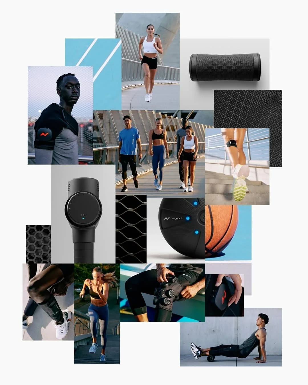
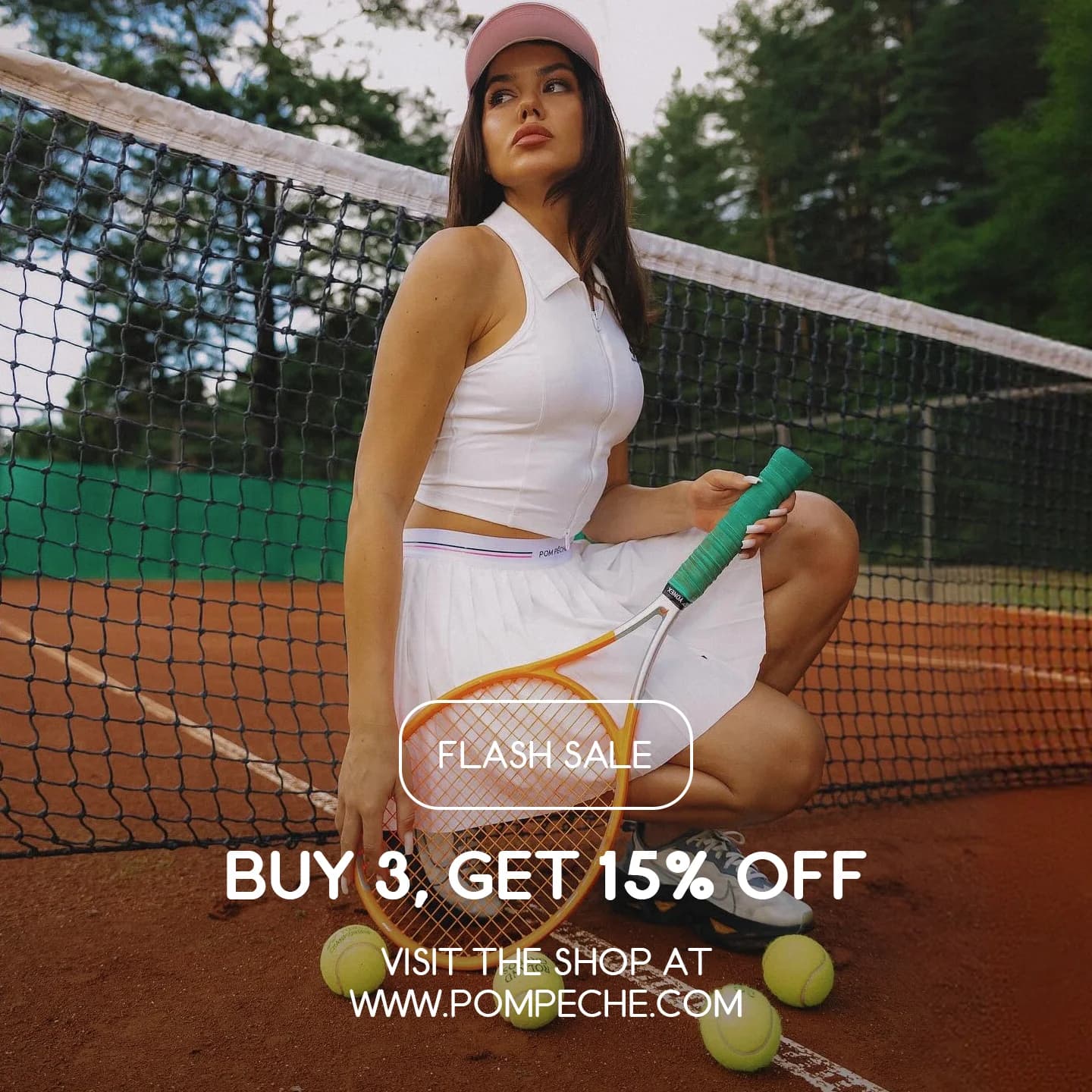
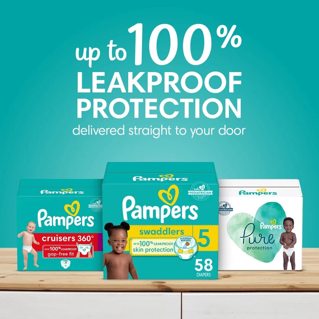
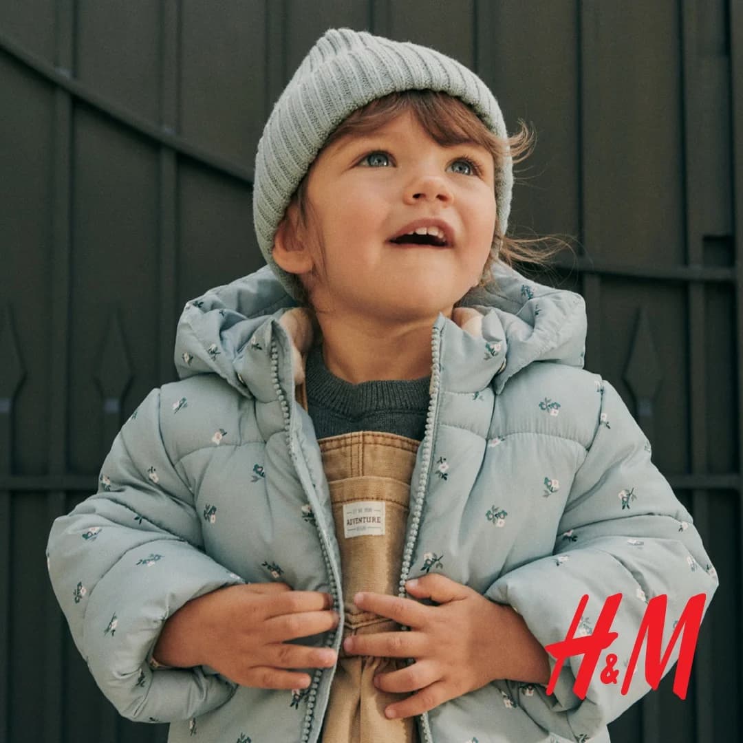
Skincare ads don't convert like SaaS ads. Pet brands can't run fitness layouts. Color palettes, composition rules, trust signals, every industry has visual patterns that work, and patterns that burn ad spend. Browse 14,000+ advertisement examples across 20 industries, filtered by the categories where they won.

Platform

Browse by Platform

Facebook ad examples look nothing like TikTok ad examples. Instagram ads examples need different crops than Google Display. LinkedIn plays by its own rules too. Every platform has its own specs, safe zones, and scroll-stopping patterns. Browse social media ads examples by platform. Clone what fits.
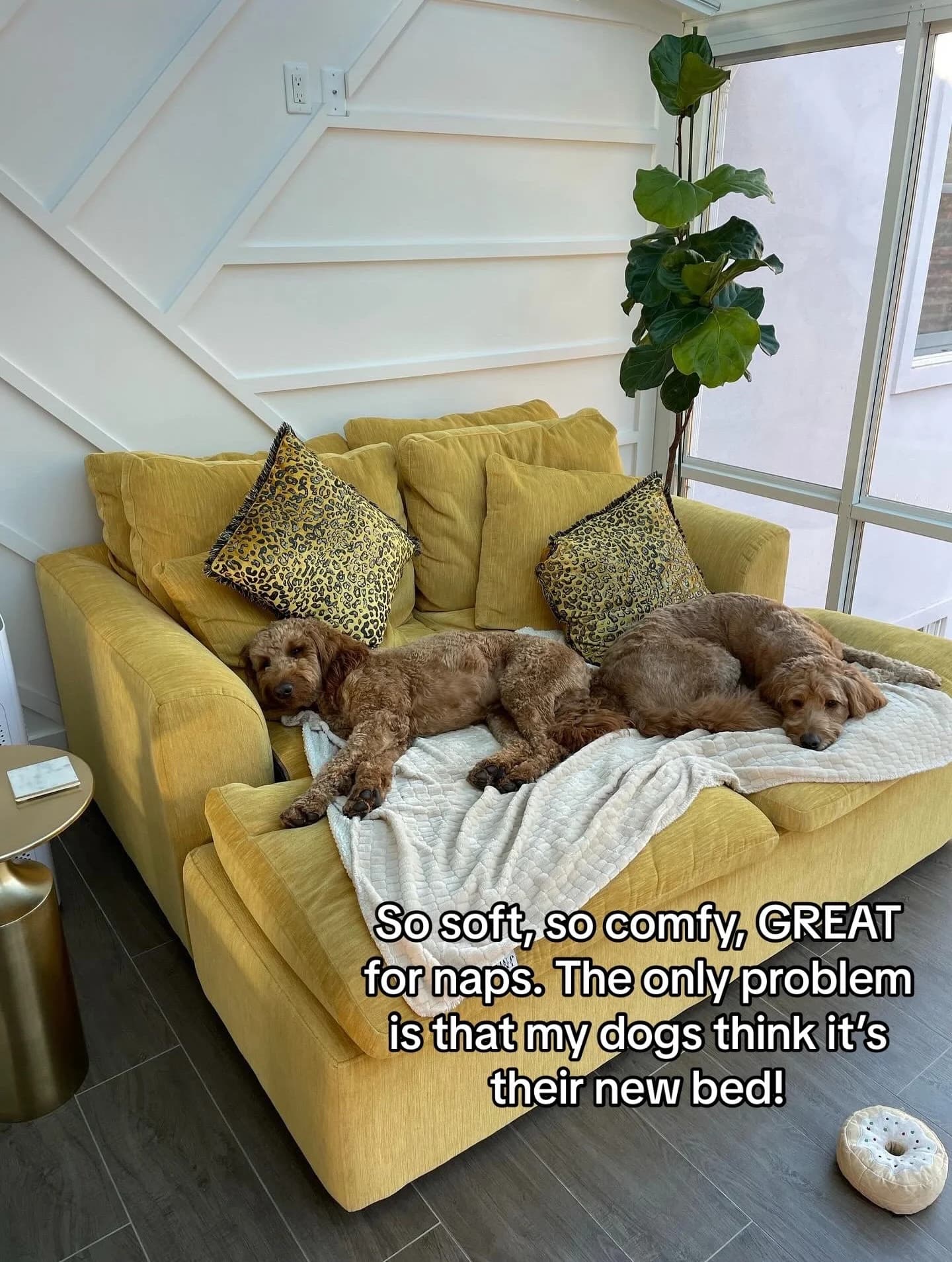
Performance

Best Ads Running Right Now

Any ad that stays in Meta Ad Library for 60+ days is paying for itself — agencies don't keep losing ads live. Every ad below has been running 90 days or longer. These are the ones actually spending money, not the ones that flame out after a week. Refreshed quarterly.

Wild Dose — Testimonial Product Stack. Brand: Wild Dose. This ad effectively leverages social proof through a dynamic testimonial layout. The vibrant, clean green background aligns with health and wellness, creating a fresh, approachable feel. Products are arranged in an engaging, slightly off-kilter stack, drawing the eye. Multiple speech bubbles, strategically placed around the products, create a visual narrative of positive customer experiences. The headline uses bold, contrasting text for immediate impact, while the testimonials provide detailed, relatable benefits. Optimized for social feeds like Instagram, its bright colors and clear, concise social proof cut through clutter, encouraging engagement and building trust. The composition balances product visibility with user-generated content, making the ad highly persuasive.. Headline: Regularity that everyone is obsessed with.. Why this ad works: Dynamic product arrangement grabs attention — The slightly tilted and stacked product boxes create visual interest, breaking the monotony of a static hero shot. This dynamic composition makes the ad feel less like a traditional advertisement and more like an organic, shareable post, increasing scroll-stopping power on social feeds. Authentic social proof builds immediate trust — Integrating multiple customer testimonials directly into the ad, complete with names and emojis, provides powerful social proof. This peer endorsement is highly persuasive, addressing potential skepticism and validating the product's efficacy more effectively than brand-generated claims alone. Playful, relatable language resonates with audience — The use of informal language, emojis (like the poop emojis from Evie), and direct quotes makes the testimonials highly relatable and authentic. This lighthearted approach destigmatizes the product's sensitive topic, fostering a connection with the target audience and encouraging engagement.. Specs: Brand: Wild Dose, Industry: Health & Wellness, Platform: Instagram, Format: Static, Audience: Women 25-34Pure Encapsulations — Hand-Held Product & Benefits. Brand: Pure Encapsulations. This ad employs a split-screen layout, featuring the product held by a hand against a vibrant blue sky on the right, balanced by benefit-driven text on the left. The clear blue background evokes feelings of freshness and clarity, aligning with the product's promise of mental energy. Compositionally, the product is slightly off-center, drawing the eye from the bold headline to the tangible item, then down the bulleted benefits. This visual flow is optimized for platforms like Instagram, where clean aesthetics and quick information absorption are key. The text hierarchy is clear: a large, problem/solution headline, followed by concise, icon-supported benefits, and a necessary disclaimer. This design effectively communicates value and efficacy.. Headline: Goodbye Afternoon Slump. Hello Rapid Mental Energy.. Primary text: Improved working memory within 1 hour Working memory support sustained over 6 hours Contains Cereboost® to support learning and memory Supports cognitive alertness. Why this ad works: Benefit-driven headline hooks attention — This headline immediately resonates with the target audience experiencing energy dips, framing the product as a positive transformation. Using contrasting phrases, it highlights a common problem and offers a clear, desired outcome. This emotional connection drives initial engagement and encourages further reading, making the ad highly effective at capturing interest quickly. Clear visual hierarchy with product focus — By placing the product in a human hand, the ad creates an immediate sense of scale and real-world application, making it tangible and relatable. The bright blue sky ensures the white bottle stands out, while the left-aligned text provides digestible information without cluttering the main visual, optimizing for quick comprehension and guiding the viewer's eye. Iconography enhances benefit comprehension — The use of distinct icons alongside bulleted benefits significantly improves readability and information retention. In a fast-scrolling feed, these visual cues allow users to quickly grasp the core advantages of the product without needing to read every word. This makes the ad highly efficient at communicating complex value propositions in a digestible format.. Specs: Brand: Pure Encapsulations, Industry: Health & Wellness, Platform: Instagram, Format: Static, Audience: Women 25-34Cadence Recover Sleep — Split Screen Product & Text. Brand: Cadence. This ad employs a clean, split-screen layout, dedicating the left half to persuasive text and the right to a minimalist product shot. The dark, sleek product packaging against a stark white background creates high contrast, ensuring immediate product recognition and a premium feel. Text hierarchy is clear: a compelling headline poses a question, followed by a bolded value proposition and a concise, benefit-driven bulleted list. This structure guides the viewer's eye efficiently. Optimized for mobile platforms like Instagram, the vertical format and ample negative space prevent visual clutter, enhancing readability and focus. The overall design communicates professionalism and efficacy, positioning Cadence as a superior, science-backed alternative to common sleep aids, appealing to a health-conscious audience seeking functional recovery.. Headline: Why I swapped melatonin gummies for Cadence. Primary text: Deep sleep, clean wake, real recovery — not just sedation. Fall asleep faster, wake up clear. Supports real recovery - not sedation. Non-habit forming, safe for nightly use. Built for performance, travel, and training.. Why this ad works: Problem/Solution Framing Drives Engagement — The headline "Why I swapped melatonin gummies for Cadence" immediately addresses a common user pain point and offers a clear solution. This narrative approach invites curiosity and positions Cadence as a superior alternative, directly engaging users who might be dissatisfied with current sleep aids. Benefit-Driven Bullet Points Enhance Clarity — The use of concise, checked bullet points clearly articulates the product's advantages and differentiators. Each point highlights a specific benefit, such as "real recovery - not sedation," making the ad highly scannable and easy for the audience to grasp the key value propositions quickly and effectively. High-Contrast Minimalist Design Builds Trust — The stark white background paired with the dark, sleek product packaging creates a clean, professional aesthetic. This minimalist approach reduces visual clutter, allowing the product and its benefits to stand out. The high contrast and clean lines convey a sense of scientific rigor and trustworthiness, appealing to a discerning audience.. Specs: Brand: Cadence, Industry: Health & Wellness, Platform: Instagram, Format: Static, Audience: ProfessionalsStoryworth — Testimonial with Product Display. Brand: Storyworth. This ad leverages a powerful testimonial-driven layout, placing a compelling quote as the central visual element. The soft, muted green background and complementary book colors (teal, dark green) evoke a sense of calm, nostalgia, and importance, aligning with the product's legacy-building theme. Compositionally, the large text on the left draws the eye immediately, while the subtly angled product shots on the right provide visual context without overwhelming the message. The circular "Turn Your Memories into a Memoir" element acts as a clear value proposition and soft CTA. This vertical format is optimized for platforms like Instagram Stories or Reels, where full-screen, emotionally resonant content performs well. The text hierarchy prioritizes the emotional hook, followed by brand recognition and a clear benefit statement.. Headline: The idea of leaving a written legacy for my children, grandchildren, and great grandchildren is what inspired me to try Storyworth.. Why this ad works: Emotional Testimonial Dominates Visual Field — The large, heartfelt quote directly addresses the core emotional benefit of Storyworth – creating a legacy. This authentic voice builds immediate trust and relatability, resonating deeply with the target audience's desire to preserve family history. It's a powerful persuasion technique for a product centered on personal stories. Subtle Product Integration Supports Message — The two Storyworth books are angled naturally, appearing as tangible examples of the legacy described in the testimonial. Their presence is supportive rather than intrusive, allowing the emotional message to lead while still clearly showcasing the product's physical output. This balances aspiration with tangibility effectively. Calming Color Palette Reinforces Brand Values — The muted green background paired with the teal and dark green book covers creates a harmonious, sophisticated, and calming aesthetic. This color choice subtly communicates the thoughtful, enduring, and personal nature of the Storyworth service, enhancing its premium feel and aligning with the emotional topic of legacy.. Specs: Brand: Storyworth, Industry: Home & Lifestyle, Platform: Instagram, Format: Static, Audience: ParentsSoundCloud — Bold Feature Spotlight Layout. Brand: SoundCloud. This ad effectively uses a bold, high-contrast design optimized for mobile vertical feeds. The deep blue-purple gradient background creates a vibrant, energetic mood, while white typography and crisp vector graphics ensure maximum readability and visual pop. The layout strategically places the core value proposition ("Upload, get heard, get paid") as the dominant visual element, immediately communicating the ad's purpose. Supporting graphics like the dollar coins and speaker icon reinforce the benefits without clutter. The composition guides the eye from the brand logo, through the headline, to the explanatory text, creating a clear narrative flow. This design is highly effective for platforms like Instagram Stories or TikTok, where quick comprehension and visual impact are crucial for engagement. The text hierarchy is clear, with the main message dominating.. Headline: Upload, get heard, get paid.. Primary text: It's never been easier to get your music out there. Try our new upload experience today.. Why this ad works: Clear Value Proposition as Headline — The headline "Upload, get heard, get paid" is direct and benefit-driven. It immediately communicates the core value to aspiring artists, addressing their primary motivations for using a platform like SoundCloud. This clarity cuts through noise, driving immediate understanding and relevance for the target audience. High-Contrast, Energetic Color Palette — The deep blue-purple gradient paired with stark white text and graphics creates a vibrant, modern aesthetic. This high contrast ensures readability on mobile screens and captures attention in a busy feed. The colors evoke creativity and digital innovation, resonating with the music creation demographic. Illustrative Graphics Reinforce Benefits — The abstract graphics, such as the dollar coins and the speaker icon, visually represent the "get paid" and "get heard" aspects of the headline. These simple, yet effective, visual cues quickly reinforce the ad's message, making it more memorable and engaging than text alone, especially for quick mobile consumption.. Specs: Brand: SoundCloud, Industry: Media & Entertainment, Platform: Instagram, Format: Static, Audience: ProfessionalsTrinny London Bounce Back — Testimonial & Product Showcase. Brand: Trinny London. This ad leverages a testimonial-driven layout to build trust and highlight product efficacy. A prominent quote from "Woman's Way" anchors the composition, strategically placed against a clean white background. The vibrant coral/pink product packaging of Trinny London's "Bounce Back" moisturizer provides strong visual contrast, ensuring brand recognition and product visibility. Compositionally, product shots are dynamically scattered around the testimonial card, creating an engaging yet organized feel. Key benefits within the testimonial are highlighted in yellow, guiding the viewer's eye to the most impactful claims. This design is optimized for social platforms like Instagram, where authentic social proof and visually appealing product presentation are crucial for stopping the scroll and driving consideration among an older female demographic. The text hierarchy prioritizes the credible source and direct user experience.. Headline: I love it so much. Primary text: Dryness has been one of my biggest bugbears since menopause hit. I decided to try out [Bounce Back] intense peptide moisturiser and OMG, my skin has been transformed. It's reduced fine lines and made my skin plump and firm.". Why this ad works: Authentic Testimonial Builds Trust — The "Woman's Way" endorsement and detailed quote from Andrea Smith provide strong social proof. Highlighting specific benefits like "reduced fine lines" and "plump and firm" directly addresses common skincare concerns, making the ad highly relatable and trustworthy for the target audience, particularly women experiencing menopause-related skin changes. Vibrant Brand Color Commands Attention — The consistent use of Trinny London's distinctive coral/pink on all product packaging creates a strong, memorable brand identity. This bold color pops vibrantly against the clean white background, ensuring the ad is visually arresting and stands out in a crowded social feed, driving immediate brand recognition and recall among potential customers. Strategic Product Placement Reinforces Message — Multiple product angles and formats (tube, refill, jar) are strategically placed around the testimonial card. This not only showcases the full product range but also subtly reinforces the message by visually associating the praised results with the specific "Bounce Back" moisturizer, enhancing product recall and desire through visual reinforcement.. Specs: Brand: Trinny London, Industry: Health & Wellness, Platform: Instagram, Format: Static, Audience: Women 45+Yubo — Social Gathering Lifestyle Shot. Brand: Yubo. This ad leverages a user-generated content (UGC) aesthetic, capturing a group selfie in a social setting, likely a club or party. The composition is informal and authentic, mirroring typical social media posts, which enhances relatability for its target demographic. The vibrant yellow Yubo logo and bold white text with a black outline create strong contrast against the darker background, ensuring high visibility and readability on platforms like Instagram. The text hierarchy is simple: brand logo at the top, followed by a conversational headline that sparks curiosity and highlights the app's core value proposition – facilitating real-life connections. This approach is optimized for engagement, encouraging viewers to imagine similar social outcomes. The dark, moody lighting with bright highlights adds to the authentic, spontaneous vibe, making the ad feel less like an advertisement and more like a shared moment.. Headline: Who would have thought they'd met on Yubo. Why this ad works: Authentic UGC Aesthetic Builds Trust — The ad's raw, unpolished look, resembling a casual selfie taken by a friend, resonates deeply with Gen Z. This authenticity bypasses traditional ad skepticism, making the message about meeting people on Yubo feel genuine and attainable. It fosters trust and relatability, crucial for social apps. Curiosity-Driven Conversational Headline — Who would have thought they'd met on Yubo is a compelling, narrative-driven question. It immediately piques viewer interest, prompting them to consider the unexpected connections possible through the app. This approach encourages engagement and reinforces Yubo's value proposition without being overtly promotional. High-Contrast Branding and Text — The bright yellow Yubo logo and bold white text with a black outline stand out dramatically against the dark, low-light background. This ensures maximum visibility and readability, even in a busy feed. The vibrant branding reinforces a youthful, energetic vibe, aligning with the app's target audience.. Specs: Brand: Yubo, Industry: Media & Entertainment, Platform: Instagram, Format: Static, Audience: TeensPortland Pet Food — Cat Food Product Showcase. Brand: Portland Pet Food. This ad effectively uses a split background to segment product variants, with vibrant orange and pink packaging contrasting against a light blue top and yellow bottom. The composition strategically places product pouches above corresponding bowls of food, visually demonstrating the 'in-use' appeal and moisture-rich quality. Arrows guide the eye from pouch to bowl, reinforcing the product's readiness. The headline, "Finally, Fuss-Free Fresh Cat Food!", immediately addresses a pain point for pet owners. Color psychology leverages warm, inviting tones for appetite appeal. Optimized for visual platforms like Instagram, the clear product shots and benefit-driven copy aim to capture attention and drive consideration among pet owners seeking convenient, high-quality options. Text hierarchy is clear, with the main benefit highlighted.. Headline: Finally, Fuss-Free Fresh Cat Food!. Primary text: Shelf-stable, 100% human-grade cat meals. Why this ad works: Clear product visualization, pouch to bowl — The ad clearly showcases both the product packaging and its prepared state in bowls. This 'before-and-after' visual, enhanced by guiding arrows, effectively communicates the product's convenience and appealing texture. It helps potential customers visualize the meal, building trust and appetite appeal, which is crucial for pet food purchases. Vibrant color contrast creates appetite appeal — The use of contrasting, warm colors like the vibrant orange and pink packaging against the yellow bottom background creates strong appetite appeal. These hues are associated with energy and warmth, making the food look fresh and inviting. This color strategy helps the ad stand out in a busy feed and emotionally connects with pet owners. Benefit-driven headline addresses pain points — The headline 'Finally, Fuss-Free Fresh Cat Food!' directly addresses a common pain point for pet owners: the effort involved in providing fresh meals. By promising 'shelf-stable, 100% human-grade' benefits, the ad immediately positions the product as a convenient, high-quality solution, driving initial interest and consideration.. Specs: Brand: Portland Pet Food, Industry: Food & Beverage, Platform: Instagram, Format: Static, Audience: GeneralAncient + Brave Marine Collagen — Data-Driven Product Shot. Brand: Ancient + Brave. This ad effectively leverages a minimalist, dark aesthetic to highlight product efficacy. The vertical composition is optimized for mobile-first platforms, drawing the eye down through a clear hierarchy. The headline, "CLINICALLY PROVEN MARINE COLLAGEN," immediately establishes trust, reinforced by three prominent, data-backed benefit statistics. The dark background and gold accents convey a premium, sophisticated vibe, appealing to a discerning audience. Compositionally, the product (scoop and bottle) is central, grounding the scientific claims visually. Text hierarchy is clear: strong claim, then supporting data, then a small disclaimer. This ad works by combining scientific credibility with a luxurious visual presentation, designed to stop the scroll and educate potential customers on key benefits without overwhelming them with text.. Headline: CLINICALLY PROVEN MARINE COLLAGEN. Primary text: 94% SAW AN IMPROVEMENT IN SKIN ELASTICITY 137% INCREASE IN SKIN HYDRATION 100% SAW A REDUCTION IN FINE LINES & WRINKLES. Why this ad works: Clinical data builds immediate trust — The prominent "CLINICALLY PROVEN" headline, followed by specific percentage improvements in skin elasticity, hydration, and wrinkle reduction, provides strong, data-backed claims. This directly addresses potential skepticism, establishing credibility for a health supplement and reassuring the target audience of its efficacy. Vertical composition optimizes for mobile feeds — The tall, narrow layout with key information stacked vertically is perfectly suited for Instagram Stories or Reels. It maximizes screen real estate, ensuring all essential elements—headline, benefits, and product—are visible without requiring additional scrolling, enhancing immediate engagement and message retention on mobile devices. Dark, minimalist aesthetic conveys premium quality — The deep, muted background combined with the metallic gold scoop and amber product bottle creates a sophisticated, luxurious feel. This visual language aligns with a high-end wellness product, effectively attracting consumers who value quality, efficacy, and a refined brand experience in their health and beauty choices.. Specs: Brand: Ancient + Brave, Industry: Health & Wellness, Platform: Instagram, Format: Static, Audience: Women 35-44Hydrant Electrolytes — Feature Callout Layout. Brand: Hydrant. This ad effectively uses a clean, product-on-background layout to highlight Hydrant's key benefits. The bold blue headline "Train hard. Recover harder." immediately sets a motivational tone, appealing to fitness enthusiasts. The central product shot, a vibrant blue pouch with individual flavor sticks, is surrounded by clear, concise feature callouts using arrows, guiding the viewer's eye to specific product advantages like "Real fruit juice powder" and "Fast acting electrolytes." The off-white background ensures high contrast, making the product and text pop, optimizing for platforms like Instagram and Facebook where visual clarity is paramount. The inclusion of social proof (4.8 stars, 6,390+ reviews) at the bottom builds trust and encourages conversion. Text hierarchy is clear, moving from a strong value proposition to detailed benefits, then social proof.. Headline: Train hard. Recover harder.. Why this ad works: Benefit-driven headline hooks target audience — The headline "Train hard. Recover harder." directly speaks to the core motivation of fitness enthusiasts. This aspirational and action-oriented language creates an immediate connection, positioning Hydrant as an essential part of their recovery regimen, driving higher engagement and relevance for the target demographic. Clear feature callouts enhance product understanding — The use of arrows and distinct text boxes around the central product image effectively breaks down complex information into digestible points. This visual segmentation allows users to quickly grasp key benefits like "Zero Sugar" and "Fast acting electrolytes," reducing cognitive load and improving message retention in a busy feed. Strong social proof builds immediate trust — The prominent display of "(4.8) 6,390+ Reviews" at the bottom provides powerful third-party validation. This level of positive feedback from a large user base significantly reduces perceived risk and increases purchase intent, especially for new customers evaluating a health and wellness product.. Specs: Brand: Hydrant, Industry: Health & Wellness, Platform: Instagram, Format: Static, Audience: Fitness EnthusiastsTimeleft — Cleveland Relocation Question Ad. Brand: Timeleft. This ad leverages a bold, text-heavy layout to immediately engage a specific audience: recent movers. The central question, "JUST MOVED TO Cleveland?", uses high-contrast black text against a soft pink background, with key words "MOVED" and "Cleveland" highlighted by vibrant pink and red blocks. This color strategy creates visual pop, ensuring the message stands out in a busy feed. The composition is direct and minimalist, focusing solely on the question and brand logo. This approach is highly optimized for platforms like Instagram or Facebook, where quick comprehension and scroll-stopping visuals are crucial. The clear hierarchy guides the eye from the provocative question to the brand identity, effectively qualifying potential users and sparking curiosity about Timeleft's solution for new residents. The playful, slightly askew text blocks add a dynamic, approachable vibe.. Headline: JUST MOVED TO Cleveland ?. Why this ad works: Direct Question Targets Specific Audience — The ad immediately poses a highly relevant question to its target demographic: individuals who have recently relocated. This direct address creates instant relatability and stops the scroll, prompting self-identification and piquing curiosity about what Timeleft offers to address this specific life event. High-Contrast Text Blocks Command Attention — Utilizing vibrant pink and red highlight boxes behind key words like "MOVED" and "Cleveland" against a light background ensures maximum visibility. This technique breaks visual monotony and draws the eye directly to the most critical information, making the ad highly effective at capturing attention in a crowded social feed. Playful, Minimalist Design Enhances Approachability — The simple, bold typography combined with the slightly tilted, colorful text blocks creates a playful and informal aesthetic. This minimalist approach avoids clutter, making the message clear and inviting. It signals that Timeleft is a modern, friendly solution, appealing to a younger, digitally native audience seeking social connections.. Specs: Brand: Timeleft, Industry: Home & Lifestyle, Platform: Instagram, Format: Static, Audience: GeneralAgeMate Energy Drink — Lifestyle Benefit List. Brand: AgeMate. This ad effectively combines a lifestyle visual with a clear benefit-driven text overlay, optimized for vertical social feeds. The layout strategically places a bold headline at the top, followed by a concise brand introduction, then a bulleted list of four key benefits, each paired with a simple icon. This structure guides the viewer's eye down the ad, quickly communicating the product's value proposition. The vibrant purple drink, held in hand, serves as a strong visual anchor against the blurred, natural outdoor background, suggesting a healthy, active lifestyle. Color psychology leverages the bright yellow headline for attention and the purple drink for uniqueness. The composition emphasizes product integration into daily life, while the text hierarchy ensures scannability. This design is well-suited for platforms like Instagram or TikTok, where quick comprehension and aspirational imagery drive engagement.. Headline: SKIP THE SPIKE. Primary text: Your way to better energy with AgeMate Steady, sustained energy (no crashes) Calmer mind and reduced stress Sharper brain health and clarity Focus and attention that lasts. Why this ad works: Clear benefit list with icons — The ad uses a vertical list format, pairing each key benefit with a distinct icon. This technique allows for rapid information processing, enabling viewers to quickly grasp the product's multi-faceted advantages. In fast-scrolling environments, this visual-text synergy effectively communicates value, addressing various potential customer needs and pain points efficiently. Vibrant product color creates visual anchor — The striking purple color of the AgeMate drink immediately draws the eye, contrasting sharply with the muted, natural background. This vibrant hue acts as a powerful visual anchor, ensuring the product itself is central to the viewer's attention. It also hints at a unique, perhaps exotic, ingredient or experience, sparking curiosity and memorability. Lifestyle background adds aspirational context — The blurred outdoor setting, with a hand holding the drink, grounds the product in a desirable, everyday lifestyle. This subtle backdrop suggests the product seamlessly integrates into a healthy, active routine, rather than being a clinical supplement. It helps potential customers envision themselves enjoying the benefits in a natural, relaxed environment.. Specs: Brand: AgeMate, Industry: Health & Wellness, Platform: Instagram, Format: Static, Audience: ProfessionalsTrue Botanicals Face Oil — Testimonial with User. Brand: True Botanicals. This True Botanicals ad leverages an authentic testimonial layout, featuring a smiling woman in a robe, creating a relatable, user-generated content feel. The composition places her face prominently, establishing direct eye contact and trust. A clean, semi-transparent text box overlays the lower portion, presenting a 5-star review and product shot. The warm, natural color palette of skin tones, white robe, and amber oil evokes a sense of purity and efficacy. This design is highly optimized for platforms like Instagram, where genuine social proof and aspirational yet achievable beauty resonate strongly. The text hierarchy guides the eye from the star rating to the personal endorsement, then to the product, effectively building consideration. The overall vibe is clean and trustworthy, aligning with premium skincare branding.. Primary text: "If I could only have one skincare product, this face oil would be it! It's been a game changer for my dry skin." - Jenna. Why this ad works: Authentic smile builds immediate trust — The ad features a genuine smile and direct eye contact from the model, immediately building rapport and trust with the viewer. This personal connection makes the testimonial feel more authentic and believable, significantly increasing the persuasive power of the social proof. It effectively humanizes the brand and product experience. Integrated product shot reinforces testimonial — Integrating the product bottle directly within the testimonial box provides immediate visual context for the glowing review. This clever composition links the positive experience directly to the True Botanicals face oil, reinforcing the product's efficacy and making the claim more tangible and credible for potential customers. UGC-style content enhances relatability — The ad successfully mimics user-generated content (UGC) with its natural lighting, casual setting, and authentic model expression. This approach bypasses traditional ad skepticism, making the message feel more organic and trustworthy, which is crucial for driving engagement and consideration on social media platforms like Instagram.. Specs: Brand: True Botanicals, Industry: Health & Wellness, Platform: Instagram, Format: Static, Audience: Women 25-34Public Rec Dealmaker Pants — Modern In-Use Shot. Brand: Public Rec. This ad employs a dynamic, close-up, in-use shot, effectively showcasing the fit, texture, and modern details of the "Dealmaker Pants." The vertical composition is perfectly optimized for mobile-first platforms like Instagram Stories or Reels, ensuring maximum screen real estate and scroll-stopping power. A muted, earthy olive-green background provides a sophisticated yet subtle contrast, allowing the charcoal grey pants and distinctive patterned belt to pop without visual distraction. The bold, white text hierarchy, with the product name "The Dealmaker Pants" leading into the impactful headline "Not Your Dad's Dress Pants," immediately communicates a contemporary, comfort-driven value proposition. This strategic messaging, combined with the clean aesthetic and focus on product quality, targets a discerning male audience seeking an upgrade from traditional formal wear, driving both awareness and consideration through aspirational lifestyle imagery.. Headline: Not Your Dad's Dress Pants. Primary text: The Dealmaker Pants. Why this ad works: Bold headline challenges traditional perception — The headline "Not Your Dad's Dress Pants" instantly creates intrigue and positions the product as a modern, comfortable alternative. This direct challenge to an outdated concept resonates with younger audiences seeking innovation in wardrobe staples, driving engagement and brand differentiation. Close-up in-use shot highlights product details — The tight crop on the model wearing the pants effectively showcases the fabric texture, fit, and the unique belt design. This visual emphasis on quality and contemporary styling allows potential customers to visualize themselves in the product, building desire and confidence in the purchase. Muted background enhances product prominence — The subtle olive-green background provides just enough contrast to make the grey pants and patterned belt stand out without competing for attention. This minimalist approach ensures the product remains the undisputed focal point, reinforcing a clean, sophisticated brand image and preventing visual clutter in a busy feed.. Specs: Brand: Public Rec, Industry: Fashion & Apparel, Platform: Instagram, Format: Static, Audience: Men 25-34Sprints Running Bag — Outdoor Hero Shot. Brand: Sprints. The ad effectively utilizes a centered hero shot of the Sprints running bag against a blurred natural forest background, immediately establishing its intended use case. The dark green and vibrant orange color palette creates a strong contrast, making the product pop while aligning with an adventurous, energetic vibe. Text hierarchy is clear: "NO BOUNCE BAGS FOR RUNNING" directly addresses a key pain point for runners, with "RUNNING" emphasized. This composition is optimized for vertical platforms like Instagram Stories or Reels, where full-screen product visibility and concise messaging are crucial for engagement. The overall design communicates functionality and brand identity, leveraging the outdoor setting to evoke a sense of freedom and performance. The low text overlay ensures the product remains the primary focus, enhancing visual appeal and scroll-stopping power.. Headline: NO BOUNCE BAGS FOR RUNNING. Why this ad works: Problem-solution headline captures runner's pain point — "NO BOUNCE BAGS FOR RUNNING" directly addresses a common frustration for runners. This immediately resonates with the target audience, signaling that the product offers a specific, valuable solution. It creates instant relevance and encourages further engagement by promising a better running experience, making it a strong hook. Vibrant product contrast against natural backdrop — The dark green bag with bright orange accents stands out powerfully against the muted, blurred forest background. This high contrast ensures the product is the undeniable focal point, while the natural setting reinforces its outdoor, active utility. It's visually appealing and contextually relevant, enhancing product visibility. Vertical format optimizes for mobile storytelling — The ad's vertical aspect ratio and central product placement are perfectly suited for mobile-first platforms like Instagram Stories or TikTok. This native format maximizes screen real estate, providing an immersive view of the product and its benefit, leading to higher retention and engagement rates among active users.. Specs: Brand: Sprints, Industry: Sports & Fitness, Platform: Instagram, Format: Static, Audience: Fitness EnthusiastsKatkin Trial Offer — Benefit-Oriented Product Display. Brand: Katkin. This ad employs a high-contrast, benefit-driven layout on a dark background, immediately grabbing attention. The central product display, featuring both packaged and prepared pet food, grounds the offer in tangible reality. Neon green and vibrant orange brand colors create a bold, energetic vibe, signaling freshness and quality. Text hierarchy is clear: brand, then a strong headline, followed by bulleted value propositions that address common pet owner concerns. This structure guides the eye efficiently, optimizing for quick comprehension on busy social feeds like Facebook. The composition balances product visibility with persuasive copy, ensuring the audience understands what they're getting and why it's valuable, without overwhelming the visual. The overall design is direct and action-oriented.. Headline: WHAT YOU'LL GET IN YOUR KATKIN TRIAL. Primary text: 28 FRESHLY-PREPARED MEALS 100% REAL MEAT + FISH FREE EXTRA-TEMPTING MEAL TOPPER FREE DELIVERY. Why this ad works: High-contrast palette for scroll-stopping visibility — The stark black background combined with vibrant neon green and orange creates exceptional contrast. This color strategy ensures the ad stands out dramatically in a crowded social feed, immediately drawing the eye and preventing passive scrolling. It communicates energy and modernity, aligning with a premium pet food brand. Clear, bulleted value proposition highlights benefits — The ad effectively uses bullet points to list key benefits: "28 FRESHLY-PREPARED MEALS," "100% REAL MEAT + FISH," "FREE EXTRA-TEMPTING MEAL TOPPER," and "FREE DELIVERY." This scannable format allows potential customers to quickly grasp the comprehensive value of the trial, addressing multiple purchase drivers efficiently. Product-in-context visual enhances realism — Showing the food both in its packaging and prepared in a bowl makes the product tangible and appealing. This visual strategy helps potential customers envision the product in use, building trust and demonstrating the quality and freshness of the meals, which is crucial for pet food purchases.. Specs: Brand: Katkin, Industry: Food & Beverage, Platform: Facebook, Format: Static, Audience: GeneralLoftie Red Light Devices — Bedroom Setup. Brand: Loftie. This ad leverages a bold, monochromatic red palette to immediately capture attention and evoke a sense of warmth and tranquility, crucial for sleep products. The layout strategically places the brand name and benefit-driven headline on the left, aligning with natural reading patterns, while showcasing the products in an in-use bedroom setting on the right. This composition effectively demonstrates the product's function and integration into a nightly routine. The strong color contrast against the white text ensures readability, optimized for scroll-stopping on visual platforms like Instagram. The minimalist approach, with generous negative space, keeps the focus squarely on the core message and the innovative red light technology, positioning Loftie as a modern solution for sleep enhancement.. Headline: Supercharge your sleep with Loftie's red light devices. Why this ad works: Monochromatic Red Palette Creates Strong Mood — The dominant red color saturates the entire frame, instantly grabbing attention. This bold choice not only creates a distinct visual identity for Loftie but also subtly communicates warmth and the specific "red light" technology, making the ad memorable and reinforcing the product's unique selling proposition. In-Situ Placement Demonstrates Product Use — By showing the red light devices on a bedside table, the ad effectively illustrates their intended use and seamless integration into a nighttime routine. This contextual placement helps potential customers visualize the products in their own homes, increasing relatability and perceived value without needing explicit instructions. Benefit-Driven Headline Highlights Core Value — The headline "Supercharge your sleep with Loftie's red light devices" immediately communicates a clear, desirable benefit. This direct approach quickly informs the viewer about the product's purpose and value proposition, appealing to those actively seeking sleep improvement solutions and driving consideration.. Specs: Brand: Loftie, Industry: Health & Wellness, Platform: Instagram, Format: Static, Audience: Women 25-34ASRV Performance Apparel — Lifestyle & Detail Collage. Brand: ASRV. This ad effectively combines a dynamic lifestyle hero shot with detailed product close-ups, creating a comprehensive visual narrative. The grid layout strategically places the main action shot on the right, drawing the eye, while smaller panels highlight specific garment features and fit. The muted, earthy color palette of grays and whites conveys a sense of rugged performance and premium quality, resonating with serious fitness enthusiasts. A prominent five-star rating and direct testimonial provide strong social proof, building immediate trust. The clear text hierarchy, with the testimonial as the focal point, guides the viewer from visual appeal to persuasive endorsement. Optimized for platforms like Instagram, this ad balances aspirational imagery with tangible product benefits and user validation, encouraging consideration.. Headline: TOP QUALITY FIT AND FUNCTION.. Primary text: Top quality fit and function. ASRV is the best brand out there, period.. Why this ad works: Integrated Lifestyle and Detail Shots — The ad cleverly combines a large, engaging action shot with smaller, focused detail images. This dual approach allows viewers to visualize the apparel in a high-performance context while simultaneously appreciating the specific design and fit. It builds both aspiration and practical understanding, crucial for premium activewear. Prominent Testimonial Builds Trust — Featuring a five-star rating and a direct quote from a satisfied customer, "TOP QUALITY FIT AND FUNCTION," immediately establishes credibility. This social proof is highly persuasive, reducing perceived risk and validating the product's claims. It directly addresses potential customer skepticism, driving consideration for purchase. Muted Palette Signals Serious Performance — The ad's color scheme, dominated by grays, whites, and natural concrete textures, avoids flashy colors often associated with mass-market fitness. This sophisticated, understated palette communicates durability, functionality, and a premium, no-nonsense approach to athletic wear, appealing to a discerning, performance-focused male audience.. Specs: Brand: ASRV, Industry: Sports & Fitness, Platform: Instagram, Format: Carousel/Collage, Audience: Men 25-34Hydrant Stevia-Free Hydration — Split Offer Layout. Brand: Hydrant. This ad leverages a split-screen layout to present two distinct offers, maximizing value proposition within a single frame. The vibrant blue background with water droplets immediately communicates hydration, while the contrasting lime green "55% OFF" grabs attention, leveraging color psychology for urgency and excitement. Text hierarchy places the main discount prominently at the top, followed by the product benefit, then two clear, distinct calls to action for each offer. This structure guides the eye efficiently. The composition uses a clean, bright aesthetic, optimized for platforms like Facebook or Instagram where clear, benefit-driven visuals perform well. The high text overlay ensures the core message is unmistakable, driving conversion by highlighting both savings and product features. The overall design is direct and action-oriented.. Headline: UP TO 55% OFF. Primary text: STEVIA-FREE HYDRATION. Why this ad works: Bold discount callout grabs immediate attention — The prominent, high-contrast "UP TO 55% OFF" in bright green immediately captures attention, signaling significant value. This bold visual hierarchy prioritizes the discount, a powerful motivator for conversion-focused campaigns. It leverages scarcity and urgency, compelling viewers to engage further with the offer details and explore the product. Clear dual offer presentation caters to preferences — Presenting "Free Mystery Pack" and "Buy 2, Get 2" side-by-side allows consumers to quickly compare and choose the most appealing deal. This dual-offer strategy caters to different purchasing motivations, increasing the ad's overall relevance and potential conversion rate by offering choice within a single, digestible ad unit. Hydration-themed visuals reinforce product benefit — The refreshing blue background adorned with water droplets instantly communicates the product's core benefit: hydration. This visual metaphor creates an immediate connection with the product's purpose, enhancing brand recall and reinforcing the message of "Stevia-Free Hydration" in a visually appealing and contextually relevant manner, building trust.. Specs: Brand: Hydrant, Industry: Health & Wellness, Platform: Instagram, Format: Static, Audience: GeneralNutrafol Hair Growth — Product & Testimonial. Brand: Nutrafol. This ad effectively combines social proof with a clear product presentation. The split background, featuring a warm wooden top and a clean white bottom, creates a sophisticated yet approachable aesthetic. Products are centrally placed, flanked by a glass of water and scattered pills, suggesting ease of use. The prominent "Voted #1" headline and US News badge immediately establish credibility, leveraging authority bias. Text hierarchy guides the eye from the bold claim to specific benefits, highlighted by yellow arrows for scannability. Optimized for vertical platforms like Instagram, the composition ensures key information is visible without clutter. The color palette of natural wood, clean white, and product-specific green/blue reinforces a health and wellness vibe, appealing to a broad audience seeking tangible results.. Headline: Voted #1 for hair growth (again).. Primary text: Visibly thicker hair Visibly less shedding Stronger and faster hair growth. Why this ad works: Strong social proof builds immediate trust — The prominent "Voted #1" headline, reinforced by the trusted US News badge, immediately establishes strong credibility. This leverages authority bias, assuring potential customers of the product's efficacy and market leadership. In a crowded health supplement market, third-party validation significantly reduces purchase friction and builds trust, making the ad highly persuasive. Clear product differentiation for targeted needs — Showcasing both "Women" and "Men" versions of Nutrafol side-by-side clearly communicates tailored solutions for different demographics. This direct visual comparison simplifies the decision-making process for the viewer, highlighting inclusivity and specialized care. It addresses specific needs, making the product feel more relevant and effective for a broader audience. Benefit-driven bullet points enhance scannability — The use of clear, concise bullet points like "Visibly thicker hair" directly addresses consumer pain points and desired outcomes. The yellow arrow icons serve as effective visual cues, drawing attention to each benefit and improving scannability. This structure allows for quick comprehension of key advantages, reinforcing the product's value proposition efficiently.. Specs: Brand: Nutrafol, Industry: Health & Wellness, Platform: Instagram, Format: Static, Audience: GeneralMoom Healthy V — Testimonial Product Shot. Brand: Moom. This ad effectively combines a powerful testimonial with a clean product display, optimized for social feeds. The vertical composition places the brand and a compelling customer quote at the top, immediately addressing a sensitive pain point. Below, the "Healthy V" product box and a single sachet are presented with ample negative space, drawing focus to the solution. The soft pastel color palette of pinks and blues, against a muted cream background, creates an approachable, trustworthy, and premium feel, mitigating the potentially sensitive nature of the product. Green text for the testimonial reinforces a natural, health-focused message. Text hierarchy guides the eye from the impactful testimonial to the product's benefits, ensuring key information is absorbed quickly. This design is highly effective for Instagram or TikTok, where scroll-stopping visuals and relatable content drive engagement and consideration.. Headline: I'm no longer EMBARRASSED about my vaginal health. Primary text: ORGANIC CRANBERRY, PROBIOTIC, D-MANNOSE BLEND URINARY TRACT HEALTH, VAGINAL PH LEVELS, YEAST BALANCE, VAGINAL ODOUR. Why this ad works: Direct Testimonial Addresses Sensitive Pain Point — The bold, direct testimonial "I'm no longer EMBARRASSED about my vaginal health" immediately grabs attention by articulating a common, often unspoken, pain point. This authentic customer voice builds trust and relatability, making the ad highly effective for an audience seeking solutions to intimate health concerns. Soft Pastel Palette Creates Trust and Approachability — The use of gentle pinks, blues, and a cream background softens the potentially sensitive topic of vaginal health. This aesthetic choice avoids clinical harshness, instead conveying a sense of care, naturalness, and premium quality. It helps reduce stigma and makes the product feel more inviting and less intimidating to potential customers. Clear Product Display Highlights Key Benefits — The product box and sachet are prominently displayed, allowing for easy identification. Crucially, the ad clearly lists key benefits like "Urinary Tract Health," "Vaginal PH Levels," and "Yeast Balance." This transparent presentation of ingredients and outcomes builds credibility and helps the audience quickly understand the product's value proposition.. Specs: Brand: Moom, Industry: Health & Wellness, Platform: Instagram, Format: Static, Audience: Women 25-34PAUME — Mother-Focused Product Assortment. Brand: PAUME. This ad leverages a minimalist flat lay composition against a warm, neutral background, creating a soothing and premium aesthetic. The headline, "The Best Baby Gift is not for Babies," immediately creates intrigue and redefines the target recipient, shifting focus to mothers. Products are artfully scattered, showcasing the range without clutter, reinforcing the brand's clean and sophisticated identity. Color psychology employs earthy tones, evoking natural ingredients and gentle care, appealing to a discerning audience. The text hierarchy is clear: a bold, thought-provoking headline at the top, followed by the product display, and a reinforcing sub-headline at the bottom. This structure guides the eye, making it ideal for platforms like Instagram where visual storytelling and a strong, concise message resonate. The ad effectively positions the brand as a thoughtful solution for new mothers' self-care.. Headline: The Best Baby Gift is not for Babies.. Why this ad works: Intriguing Headline Redefines Gifting Norms — The headline "The Best Baby Gift is not for Babies." immediately captures attention by challenging conventional baby gift ideas. This clever twist creates curiosity and positions the PAUME products as a thoughtful, unique solution for new mothers, tapping into the often-overlooked need for maternal self-care. Warm, Minimalist Aesthetic Signals Premium Care — The ad's muted, earthy color palette and clean product arrangement convey a sense of calm and luxury. This minimalist design avoids visual clutter, allowing the products to shine while reinforcing PAUME's brand identity as sophisticated and natural. It resonates with consumers seeking high-quality, gentle self-care solutions. Strategic Product Assortment for Lifestyle Appeal — By showcasing a variety of products—from hand gels to wipes—the ad illustrates a comprehensive self-care routine for mothers. This assortment suggests a lifestyle rather than just individual items, making the bundle more appealing as a holistic gift. It subtly communicates versatility and utility in daily life.. Specs: Brand: PAUME, Industry: Health & Wellness, Platform: Instagram, Format: Static, Audience: ParentsBeauty Pie — Split Screen Testimonial. Brand: Beauty Pie. This ad employs a vertical split-screen layout, effectively segmenting the frame into a product focus and a lifestyle shot. The top section features the Beauty Pie product alongside a compelling testimonial from "well+good," leveraging social proof. The bottom half showcases a model's eye, creating an immediate, personal connection and illustrating the product's intended effect – looking "more awake." The color palette is dominated by clean white and soft pink, aligning with the brand's aesthetic and conveying a sense of freshness and femininity. Text hierarchy guides the eye from the trusted source to the benefit, then to the call to action, with the brand name anchoring the bottom. This composition is optimized for mobile feeds like Instagram, where vertical formats and relatable imagery drive engagement and consideration.. Headline: well+good. Primary text: A small dab is all you need to instantly look more awake. Why this ad works: Leverages trusted third-party social proof — The prominent inclusion of "well+good" as a source for the testimonial instantly builds credibility and trust. Consumers are more likely to believe a third-party endorsement than direct brand claims, significantly reducing skepticism and increasing the perceived value of the product. This is crucial for driving consideration. Effective split-screen product-lifestyle blend — The vertical split-screen design expertly combines a clear product shot with an aspirational lifestyle image. This allows the viewer to simultaneously understand what the product is and visualize its benefit on a real person, creating a holistic and persuasive narrative that addresses both product features and emotional desires. Direct eye contact creates personal connection — The close-up of the model's eye, with a direct gaze, establishes an immediate and intimate connection with the viewer. This technique makes the ad feel more personal and relatable, fostering a sense of empathy and making the promise of looking "more awake" feel directly applicable to the audience.. Specs: Brand: Beauty Pie, Industry: Health & Wellness, Platform: Instagram, Format: Static, Audience: Women 25-34Hollow Socks — Rugged Boot In-Use Shot. Brand: Hollow Socks. This ad effectively leverages a rugged, in-use lifestyle shot to connect with its target audience. The composition places the product (boot and sock) centrally, with a hand lacing the boot, implying preparation and action. The natural, earthy color palette of greens, browns, and oranges (lacing) reinforces the outdoor theme and brand authenticity. Text hierarchy is clear: a problem-solution headline ("SWEAT ITCH STINK" crossed out) immediately addresses pain points, followed by social proof ("TRUSTED BY HUNTERS"), and a strong call to action (sale banner). This layout is optimized for platforms like Instagram, where authentic imagery combined with clear value propositions drives engagement. The visual storytelling focuses on comfort and reliability in challenging environments, directly appealing to the practical needs of hunters and outdoor enthusiasts.. Headline: SWEAT ITCH STINK. Primary text: TRUSTED BY HUNTERS. Why this ad works: Problem-solution headline grabs attention — The crossed-out "SWEAT ITCH STINK" immediately highlights common pain points for the target audience. This negative framing creates instant relatability and positions the product as the solution, compelling viewers to learn how these issues are eliminated, driving initial engagement effectively. Authentic lifestyle imagery builds trust — Showing a person actively lacing a boot in a natural, outdoor setting creates an authentic and aspirational feel. This "in-use" context demonstrates the product's intended purpose and ruggedness, resonating deeply with hunters and outdoor enthusiasts and enhancing perceived value. Social proof reinforces product credibility — The "TRUSTED BY HUNTERS" text with five stars acts as powerful social proof. This endorsement from a relevant, discerning community builds immediate credibility and trust, assuring potential customers of the product's quality and performance in real-world, demanding conditions.. Specs: Brand: Hollow Socks, Industry: Sports & Fitness, Platform: Instagram, Format: Static, Audience: Men 25-34Mott & Bow Jeans — Benefit-Driven Product Shot. Brand: Mott & Bow. This ad employs a split-screen layout, dedicating the top half to bold, benefit-driven text and the bottom to a clean product shot of folded jeans. The dark, minimalist background ensures high contrast, making the white text highly readable and the blue denim pop, optimizing for mobile feed visibility. The text hierarchy is clear: a provocative headline immediately addresses a potential price objection, followed by a bulleted list of unique, relatable benefits. This direct-response approach is well-suited for platforms like Facebook or Instagram, where clear value propositions drive consideration. The composition effectively balances information delivery with product visualization, guiding the viewer from understanding the value proposition to seeing the product itself. The overall design prioritizes clarity and persuasive copywriting over elaborate visuals.. Headline: These jeans AREN'T cheap but.... Primary text: Your pancake butt will be lifted to look just right. Your jewels won't be crushed, they're roomy but elegant. You won't be sweating aggressively cause they are lightweight. Their Dynamic Stretch gives you the comfort you're looking for.. Why this ad works: Bold headline addresses price objection directly — The headline "These jeans AREN'T cheap but..." immediately confronts a common consumer barrier. This transparent, confident approach builds trust and primes the audience to absorb the subsequent value propositions, effectively turning a potential negative into a compelling reason to read further. Relatable, benefit-driven bullet points — The use of specific, slightly humorous language like "pancake butt" and "jewels won't be crushed" creates an immediate, relatable connection with the target audience. Each point highlights a tangible benefit, making the product's value clear and addressing common pain points associated with jeans. High-contrast dark background enhances readability — The deep charcoal background provides excellent contrast for both the white text and the blue denim product. This design choice significantly improves readability on various screen types and lighting conditions, ensuring the key message and product details are easily absorbed, which is crucial for direct-response advertising.. Specs: Brand: Mott & Bow, Industry: Fashion & Apparel, Platform: Facebook, Format: Static, Audience: Men 25-34
How It Works

Start With What's Already Working

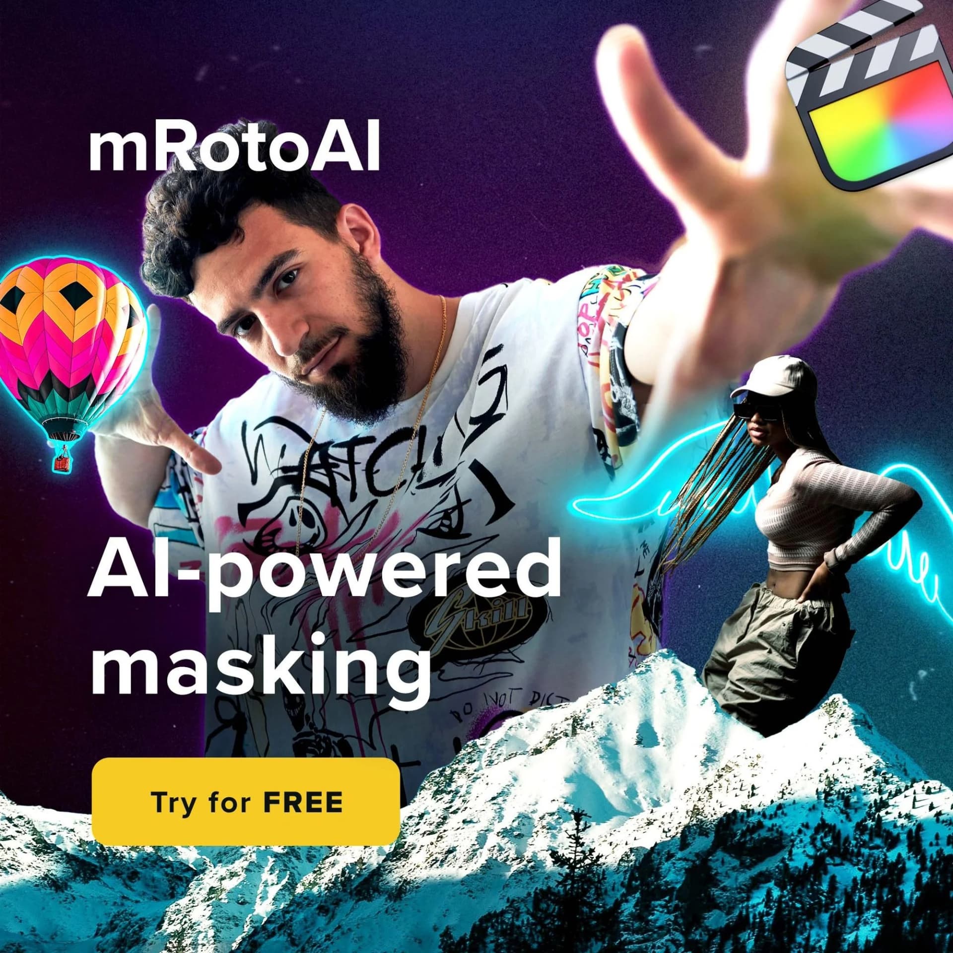
From reference to ready-to-run static ad in seconds

Pick a static ad to clone or upload any reference

Pick a static ad to clone or upload any reference

Found a clean product ad on Instagram that just works? A Facebook image ad with perfect composition? A Pinterest image you loved?

Upload it to AdDogs. Our AI analyzes the layout, typography, and visual hierarchy so you can recreate it with your own product.

Add your product

Upload any product photo. White background, lifestyle shot, or raw smartphone capture — it all works. AdDogs extracts your brand colors, drops your product into the layout, and applies your logo automatically.

Add your product photo
Customize and generate

Customize and generate

Write your ad copy, set your brand guidelines, and pick the right dimensions. Feed Post (1:1), Instagram Story (9:16), Facebook Ad (2:1), or custom. One click to generate.

Generated static ad

Get your static ad

In seconds, receive a clean, professional static ad sized for your platform.

Create your static ad
Why Clone Ads

Designing ads from scratch wastes your ad budget

Proven layouts, not guesswork

Every ad in the library already ran. Already converted. Cloning a winning layout beats staring at a blank Canva canvas for three hours — somebody else already spent the budget testing what works.

You're inheriting someone else's winning bets

Allbirds' pedestal shot didn't come from a moodboard. The composition, the eucalyptus branches, the olive background — all tested before you saw it. Clone the layout and those decisions come with it. Start from blank and you're running every test yourself, on your own dime.

20 variants by lunch, not one concept by Friday

A fresh creative takes a designer 2–5 days to deliver one concept. Cloning ships 20 variants of a proven layout in a morning. Dropshippers testing 10 products a week need 200 ads, not 2. Volume beats one perfect guess.

The ads already running are your research

Gymshark ran hundreds of ad variants to find their winners. So did Glossier. So did Liquid Death. Their live ads in Meta Ad Library are public. Clone the ones still spending money — skip the part where you rediscover what they already proved.

FAQ

Real advertising examples from real campaigns that ran on Facebook, Instagram, TikTok, Google, or display networks. Marketers study winning ad copy examples and layouts that converted in their industry, then replicate what works. Every ad in the library here is a real campaign with a breakdown attached.

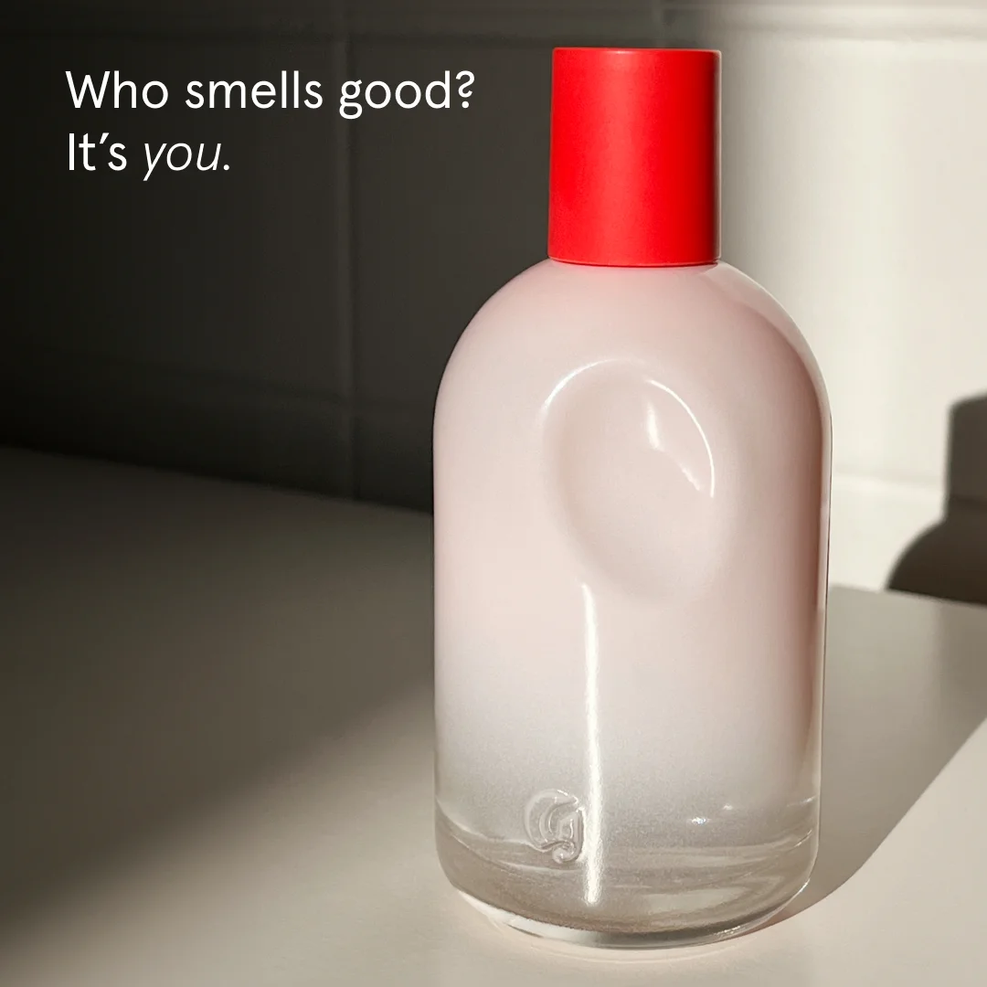
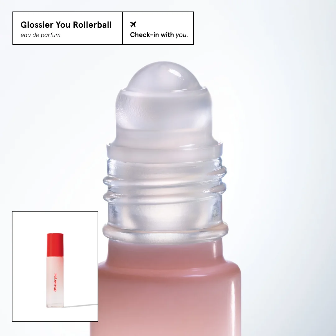
Some of the strongest marketing campaign examples running right now: Allbirds' product-on-pedestal format. Glossier's split-screen product-plus-proof. Liquid Death's dark-canvas identity ads. The Farmer's Dog's kibble-vs-fresh comparison. Ridge Wallet's scarcity hero shots. Huel's benefit split-screens. Each one has a full design breakdown in the library and in our Facebook and Instagram deep-dives.

Three sources. Meta Ad Library shows every active ad with run dates — search by brand. AdDogs has 14,000+ ads sorted by performance signal. TikTok Creative Center covers native platform content. Prioritize ads running 60+ days. Long run-times mean the ad is paying for itself.

Image ads served on Google Display Network, Facebook Audience Network, and programmatic exchanges. Standard IAB sizes: 300×250 (medium rectangle), 728×90 (leaderboard), 320×50 (mobile banner), 160×600 (skyscraper). The best display ads use one bold visual, one benefit line, and a contrasting CTA button. Browse display ad examples in our format library.

Ads that blend into platform organic content. Sponsored feed posts, “recommended for you” modules, promoted search results. They outperform standard display because the reader's ad-detection filter stays down. UGC-style and editorial layouts dominate this format.

Ads for businesses, not consumers. LinkedIn dominates. Lead with a specific outcome ("Cut onboarding time 40%"), show a screenshot or chart, end with a demo CTA. LinkedIn ad examples have the lowest keyword competition in the entire cluster (KD 5).

6–15 seconds. Hook in the first 2 seconds. Demo in the middle. CTA in the last frame. Static still converts better for bottom-of-funnel — $8.91 CPM vs $10.55 for video per industry benchmarks. Start with static. Layer video once static has proven product-market fit. Our static vs video breakdown has the full data.

Yes. Every ad in AdDogs is cloneable. Pick one, upload a product photo, and AdDogs rebuilds the layout with your product and brand colors applied. Choose your dimension per generation — 3 on Free and Basic (square, portrait, landscape), all 14 on Pro and Ultimate. Finished in seconds.

14,000+ across 20 industries, 5 platforms, and 11 formats, covering 40+ brands. Sourced from real campaigns with active Meta Ad Library presence. No stock filler.

Browsing costs nothing. 5 free generations to clone any ad into a branded ad — no credit card. Plans start at $12/mo for 30 ads after that, which works out to $0.40 each.

Foreplay, Meta Ad Library, adsoftheworld, famouscampaigns.com show you the ad. Done. AdDogs shows the ad, breaks down why it works — layout, color psychology, ad copy structure — and lets you clone it with your product. Browse, learn, clone. One place.

Start cloning winning ads

Start Cloning Winning Ads

Create your ad