AdDogs

Testimonial Ad Examples

Browse 45+ testimonial and review ad examples sourced from high-performing campaigns. Clone any design, swap in your product, and get a finished ad in seconds.

Updated May 2026

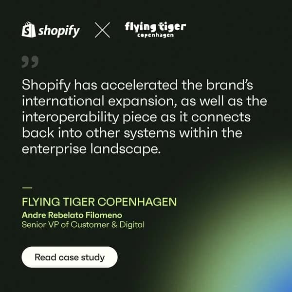
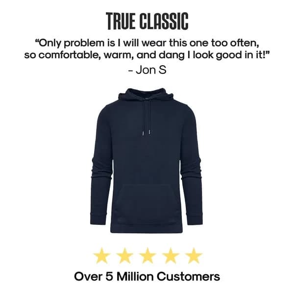
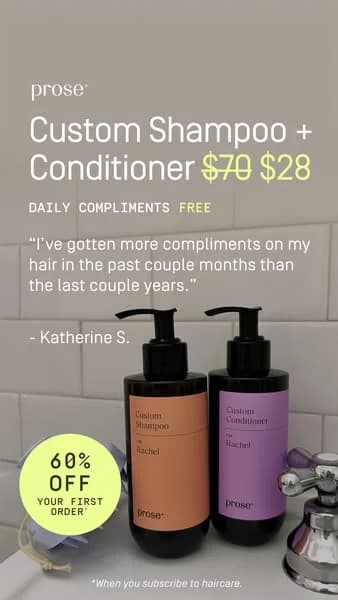
Testimonial ads borrow trust from a real customer instead of asserting it from the brand. A short customer quote sits centered, a five-star graphic anchors the top of the frame, and named attribution — first name, last initial, city or job title — signs the claim. Audiences weight customer voice over brand voice, which is why the format converts where product-only stalls. Five archetypes carry the category: pull-quote on a flat background, customer face plus quote, star-rating callout, video-still with caption, and side-by-side authentic photos with a before-after line. ARMRA, Function Health, Glossier, HubSpot, and Calendly all run variants.

Layout rules are tight. Quote pulled to under 12 words with a specific claim — "my joints stopped clicking," "closed 38% more demos," "skin cleared in three weeks" — beats verbatim paragraphs at thumbnail size. Star graphic in the top third primes the quote as positive before words get parsed. Palettes stay quiet — cream, oat, charcoal, soft sage. Attribution density matters: Sarah M., Austin TX out-converts Sarah. LinkedIn rewards quote-led creative hardest, Meta runs strong at 1:1 and 4:5, TikTok rewards video-still UGC over static pull-quotes.

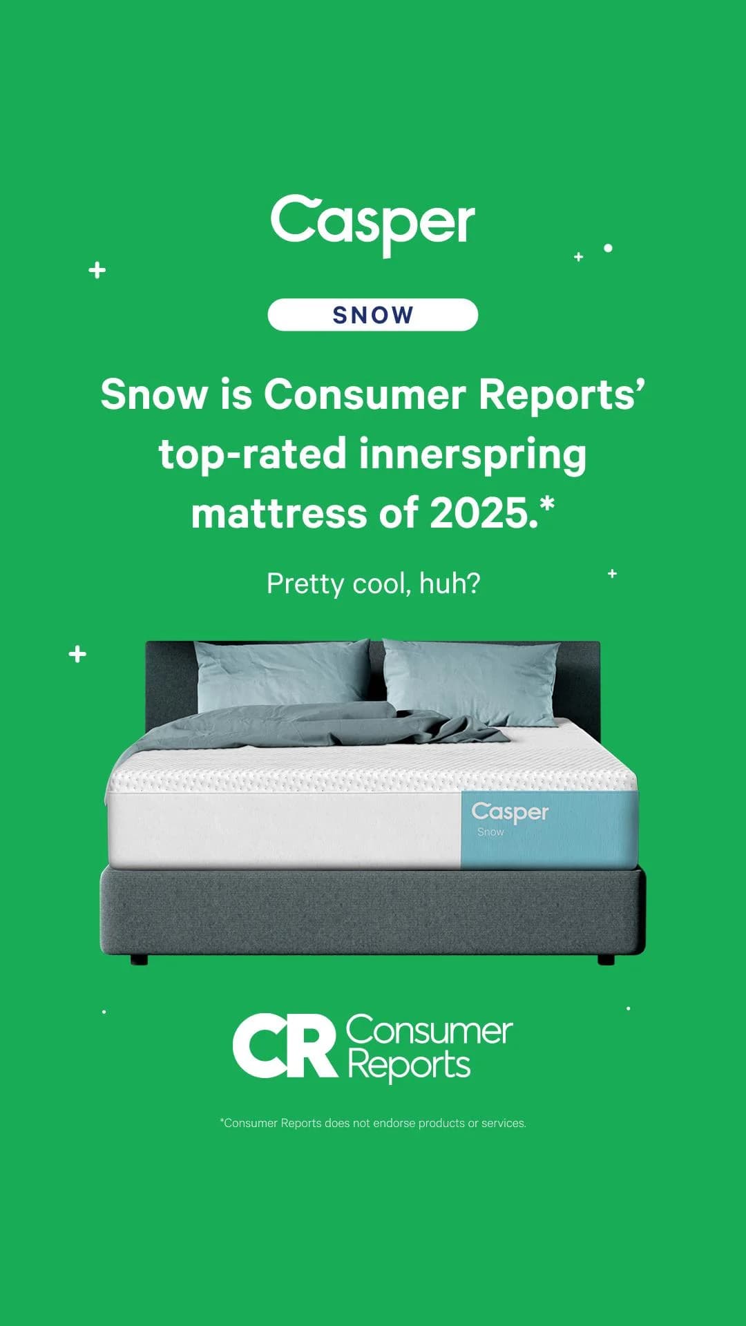
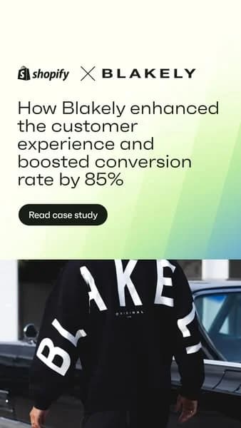
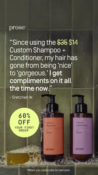
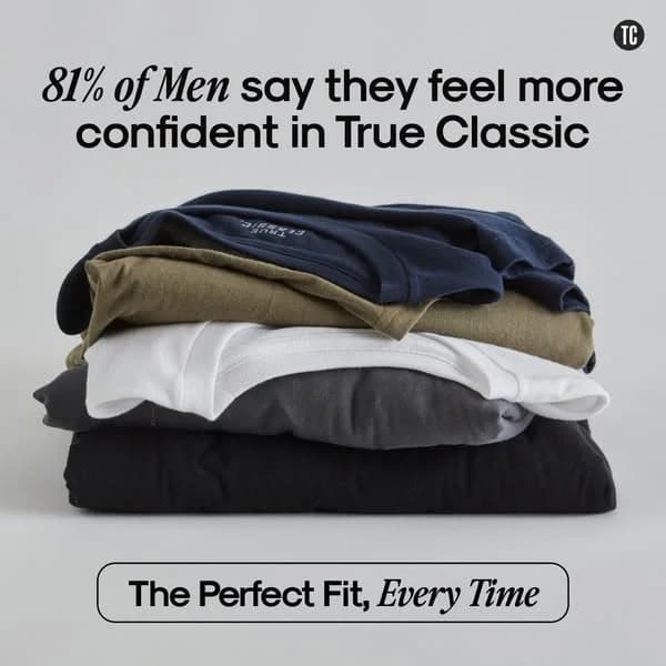
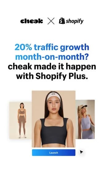
Ad examples below pull testimonial creative from DTC and B2B SaaS — review screenshots, influencer pull-quotes, case-study features. Clone a layout and drop your customer quote in.
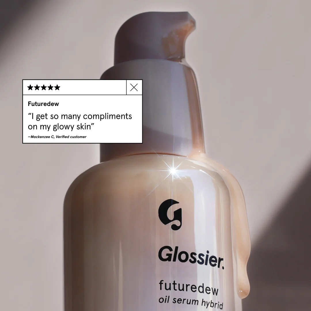
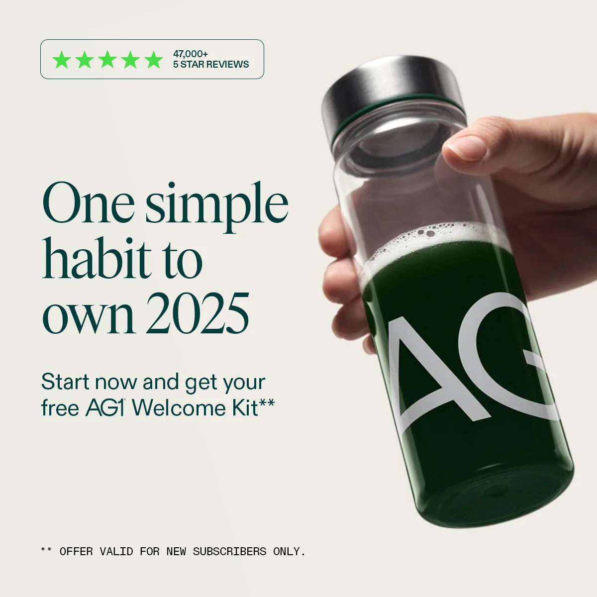
Italic Serene Towels — Lifestyle Testimonial. Brand: Italic. This ad effectively blends lifestyle imagery with social proof to build trust and desire. The composition places the model and product in a natural, serene setting, emphasizing comfort and quality. The warm, earthy tones and soft lighting evoke a sense of calm and luxury, aligning with the "Serene Ultraplush" product name. Text hierarchy is clear: product name, then a prominent 5-star rating, followed by a personal testimonial headline and supporting quote, all anchored by the brand logo. This structure guides the eye from product feature to emotional benefit and social validation. Optimized for platforms like Instagram, where authentic, aspirational content resonates, it leverages a relatable human element to convey product experience rather than just features. The overall design prioritizes emotional connection and perceived quality.. Headline: My Favorite Towels!. Primary text: SERENE ULTRAPLUSH TOWELS "EVERYONE IN MY FAMILY LOVES IT.". Why this ad works: Authentic lifestyle imagery builds emotional connection — The close-up shot of a relaxed woman with closed eyes, gently touching the towel to her face, creates an intimate and sensory experience. This conveys the towel's softness and comfort, allowing the viewer to imagine the feeling, which is more persuasive than just showing the product. Prominent 5-star rating establishes instant trust — Placing a large, clear 5-star rating directly above the testimonial headline immediately signals high quality and customer satisfaction. This visual social proof is a powerful psychological trigger, reducing perceived risk and encouraging consideration for a premium product. Personalized testimonial enhances relatability — The headline "My Favorite Towels!" combined with the quote "EVERYONE IN MY FAMILY LOVES IT." provides a strong, personal endorsement. This makes the ad feel less like a sales pitch and more like a genuine recommendation from a trusted source, resonating deeply with potential buyers.. Specs: Brand: Italic, Industry: Home & Lifestyle, Platform: Instagram, Format: Static, Audience: Women 25-34Purple Mattress — Testimonial Lifestyle Shot. Brand: Purple. This ad effectively uses a split-composition layout, dedicating the top half to a large, impactful testimonial and the bottom half to a clean lifestyle shot of the product. The brand's signature purple color is strategically integrated into the background, text, and mattress detail, reinforcing brand identity. The composition places the mattress centrally, grounding the visual, while the testimonial floats above, drawing immediate attention. This design is optimized for social feeds like Instagram, where strong visual branding and social proof quickly capture attention. The clear text hierarchy, from brand name to quote to attribution, guides the viewer through the message, building trust and consideration without overwhelming the eye. The overall clean aesthetic and relatable bedroom setting enhance approachability.. Headline: The perfect combination of soft + firm...conforms to my body while still being supportive. Primary text: GOOD HOUSEKEEPING. Why this ad works: Credibility through third-party endorsement — The prominent "GOOD HOUSEKEEPING" attribution below the testimonial instantly boosts trust and authority. Leveraging a well-known, respected publication validates the product's quality, making the ad more persuasive to potential buyers who value independent verification. This reduces perceived risk. Relatable and benefit-driven testimonial — The quote "The perfect combination of soft + firm...conforms to my body while still being supportive" speaks directly to common mattress pain points and desired benefits. It uses everyday language, making the experience tangible and relatable, which resonates strongly with consumers seeking comfort and support. Strategic brand color integration — The consistent use of Purple's signature color in the background, text, and a subtle stripe on the mattress creates strong brand recognition. This visual cohesion reinforces brand identity, making the ad instantly identifiable and memorable, even in a crowded social media feed.. Specs: Brand: Purple, Industry: Home & Lifestyle, Platform: Instagram, Format: Static, Audience: GeneralYoga International — Testimonial Grid Layout. Brand: Yoga International. This ad utilizes a testimonial-focused grid layout, strategically placing two positive reviews to build social proof. The soft, watercolor lotus background evokes a sense of calm and healing, aligning with the "Post-Traumatic Growth" theme. Color psychology employs gentle pastels (pinks, greens, blues) to create a soothing, trustworthy atmosphere, contrasting effectively with the crisp white text and review cards for readability. Compositionally, the stacked review cards guide the eye downwards, reinforcing the positive sentiment. Text hierarchy is clear: a prominent headline introduces the course, followed by a sub-headline setting up the testimonials. This design is optimized for platforms like Instagram or Facebook, where user-generated content and social proof are highly effective, encouraging consideration and conversion through authentic endorsements. The overall aesthetic supports a wellness brand, promoting a sense of peace and expertise.. Headline: Yoga for Post-Traumatic Growth. Primary text: Praise for Dr. Arielle Schwartz's New Course. Why this ad works: Stacked testimonials build strong social proof — Two prominent 5-star testimonials are stacked vertically, creating a powerful visual of positive feedback. This repetition reinforces credibility and trust, which is crucial for courses addressing sensitive topics like trauma, significantly boosting consideration for potential enrollees by demonstrating real-world positive impact. Calming watercolor background aligns with topic — The soft, organic watercolor background featuring a lotus flower immediately communicates tranquility and growth. This visual metaphor for healing and renewal resonates deeply with the target audience, setting an empathetic and inviting tone that supports the sensitive nature of "Post-Traumatic Growth" before any text is even read. Clear text hierarchy guides user attention — The large, bold headline "Yoga for Post-Traumatic Growth" immediately grabs attention, followed by a clear sub-headline introducing the testimonials. This ensures the core message and supporting evidence are absorbed efficiently, preventing cognitive overload and directing the viewer's focus effectively towards the social proof.. Specs: Brand: Yoga International, Industry: Health & Wellness, Platform: Instagram, Format: Static, Audience: Women 35-44Healthy Lab Co. PatellaPrime — Testimonial with Product. Brand: Healthy Lab Co. This ad effectively leverages a testimonial-driven layout on a soft pink background to build trust and address a common pain point. The composition strategically places a bold headline and a compelling user review prominently on the left, capturing immediate attention. A bright pink "Buy 1 Get 1 FREE" offer banner creates urgency and highlights value. On the right, a hand holds the product, "Healthy Lab Co PatellaPrime," providing visual proof and grounding the testimonial in a tangible solution. The contrasting dark product against the light background ensures visibility. Text hierarchy prioritizes problem/solution, then social proof, and finally the product, optimized for platforms like Facebook or Instagram where users scroll quickly and respond to direct benefits and social validation. The overall design balances informative text with product visualization, aiming for high engagement and consideration.. Headline: If traditional knee braces have failed you, this is your answer.. Primary text: I have chronic knee pain from old sports injuries that usually keeps me from enjoying activities. After trying countless braces and treatments, I got PatellaPrime two months ago and felt 80% less pain immediately—and now I'm hiking again without any discomfort! My mobility is completely restored. This actually works!. Why this ad works: Strong headline addresses specific pain point — The headline "If traditional knee braces have failed you, this is your answer" directly targets users experiencing chronic knee pain and dissatisfaction with existing solutions. This problem-solution framing immediately resonates, establishing relevance and promising relief, which is crucial for stopping the scroll in a crowded feed. Authentic testimonial builds immediate trust — A detailed, first-person testimonial provides powerful social proof. It outlines chronic pain, failed solutions, and the specific product's efficacy ("80% less pain immediately"). This narrative approach is highly persuasive, converting skepticism into belief by sharing a relatable success story and validating the product's claims. High-contrast product shot provides visual proof — The dark knee brace held by a hand against the light pink background creates excellent visual contrast, making the product stand out. This visual anchor connects the detailed testimonial to a tangible solution, allowing viewers to visualize the product and reinforcing the brand's credibility and the story's authenticity.. Specs: Brand: Healthy Lab Co, Industry: Health & Wellness, Platform: Instagram, Format: Static, Audience: Women 35-44Interrio AI — Before/After Testimonial Split. Brand: Interrio AI. This ad employs a compelling quadrant layout, effectively combining a visual before-and-after transformation with a user testimonial. The dark background for text and the "before" image creates a stark contrast with the bright, modern "after" image, visually reinforcing the product's impact. The text hierarchy guides the viewer through a narrative problem-solution arc, highlighting the brand "Interrio AI" and culminating in a clear "TRY NOW" call to action. This design is optimized for social feeds, where its strong visual contrast and relatable story are designed to capture attention and drive consideration. The color palette leverages dark tones for sophistication and bright tones for aspiration, appealing to homeowners seeking modern renovations.. Primary text: I didn't have money to hire a designer, but I really wanted to update my kitchen. Then I saw an ad for Interrio AI, and to my surprise, in just one minute I got over 10 design options for my own room. I recommend Interrio AI to everyone planning a renovation to save time and money.. Why this ad works: Stark Before/After Visual Proof — The dramatic visual transformation from a dated, dimly lit bathroom to a modern, bright space powerfully illustrates the product's impact. This side-by-side comparison provides immediate, undeniable proof of value, making the abstract concept of "design options" concrete and highly desirable for users considering home improvements. First-Person Testimonial Builds Trust — The ad leverages a compelling first-person narrative, starting with a common pain point ("didn't have money to hire a designer") and presenting Interrio AI as the accessible solution. This relatable storytelling approach fosters immediate connection and trust with potential customers, making the product's benefits feel more authentic and achievable for their own renovation projects. High-Contrast CTA Drives Immediate Action — The "TRY NOW" call-to-action is strategically placed and designed with high contrast against the dark background, making it impossible to miss. The clean white outline further isolates it, creating a powerful visual magnet that directs user attention and encourages immediate engagement. This clear directive is essential for converting interest into clicks and sign-ups.. Specs: Brand: Interrio AI, Industry: Home & Lifestyle, Platform: Instagram, Format: Mixed, Audience: GeneralRise App — Story-Driven Text with Aura Figures. Brand: Rise. This ad employs a text-heavy, narrative-driven layout, balancing a compelling story on the left with ethereal, glowing human figures on the right. The dark background with vibrant blue and pink aura-like visuals creates a mystical yet energetic feel, symbolizing transformation and inner balance. This composition effectively draws the eye from the headline down through the personal testimonial, making it highly engaging for social platforms like Instagram or Facebook where long-form content can capture attention. The clear text hierarchy, starting with a bold problem-solution headline, guides the reader through the journey. Color psychology uses the dark to represent the problem (burnout) and the bright, flowing light to represent the solution (energy from Rise), reinforcing the app's benefit. The blend of personal story and striking visuals optimizes for consideration by building trust and intrigue.. Headline: How the wrong bedtime burns out millennial women. Primary text: It's hard to believe but it's true. I was waking up at 10am but still felt exhausted and out of control all the time. Then my roommate told me about Rise and it changed everything. The app calculated that my ideal wake up time was actually 5:55am, so I had been on the wrong schedule for years. Since I've been using Rise, I'm waking up with tons of energy, my focus is locked in, and I'm finally able to reclaim my day. A 1 min quiz could literally change your life.. Why this ad works: Relatable Problem & Solution Narrative — The ad masterfully crafts a personal story, beginning with a common pain point for millennial women – exhaustion and lack of control. This narrative approach builds immediate empathy and trust, making the solution (the Rise app) feel authentic and highly relevant. It transforms a product pitch into a shared experience. Intriguing Visuals & Symbolic Colors — The glowing, ethereal human figures on a dark, cosmic background are visually captivating. The vibrant blue and pink hues symbolize energy, transformation, and inner balance, directly aligning with the app's promise of improved sleep and vitality. This aesthetic elevates the ad beyond mere information to an aspirational experience. Strong Hook & Low-Barrier Engagement — The headline immediately addresses a specific, relatable issue ("burns out millennial women"), grabbing the target audience's attention. Concluding with "A 1 min quiz could literally change your life" provides a clear, low-commitment next step, encouraging immediate interaction and moving prospects further down the funnel.. Specs: Brand: Rise, Industry: Health & Wellness, Platform: Instagram, Format: Static, Audience: Women 25-34Dog DNA Test — Testimonial Overlay. This ad effectively leverages user-generated content (UGC) with a split-focus composition. The main subject, a dog, occupies the left and center, drawing immediate attention. A clean, card-style overlay in the upper right presents the "Mixed Ancestry" results, providing key product information. A vibrant yellow speech bubble in the lower left houses a personal testimonial, adding authenticity and relatability. The overall color palette is warm and natural, enhancing the organic feel, which is crucial for pet-related products. The text hierarchy guides the eye from the dog to the results, then to the personal reaction, creating a narrative flow. This layout is optimized for social feeds like Instagram, where authentic stories and clear, digestible information perform well, encouraging engagement and consideration.. Headline: I guessed chow-lab-dachshund! Could totally see the weiner dog in the side profile.. Why this ad works: Authentic UGC drives relatability — The ad uses a genuine photo of a dog and a personal quote, mimicking organic social media posts. This approach builds trust and relatability far more effectively than polished studio shots, making the product feel accessible and real to potential customers who are often skeptical of overly curated ads. Clear visual hierarchy for information flow — The composition guides the viewer from the engaging dog image to the concise ancestry results, then to the user's reaction. This natural progression allows for easy absorption of both the product's output and its emotional impact, reducing cognitive load and enhancing message retention for the audience. Vibrant overlay highlights key message — The bright yellow speech bubble with bold black text immediately draws attention to the testimonial. This high-contrast element ensures the user's personal endorsement is not missed, reinforcing the product's value through social proof in a visually appealing and scroll-stopping manner on busy social feeds.. Specs: Industry: Pets & Animals, Platform: Instagram, Format: Static, Audience: GeneralDating App — Social Proof Text & Image. This ad employs a high-contrast, text-heavy layout designed for immediate impact on busy feeds. The central image of a happy, relatable couple is framed by a vibrant teal border, drawing the eye to the aspirational outcome of using the service. Bold, rounded black typography against a stark white background ensures maximum readability and scroll-stopping power. The composition strategically places social proof ("TRUSTED BY 10M+ INTROVERTS") prominently, leveraging a strong psychological trigger. The friendly ghost emoji adds a playful, approachable brand personality, subtly reinforcing the "introvert" theme. This direct, no-frills approach is optimized for platforms like Facebook, where clear value propositions and social proof drive consideration. The layout prioritizes message delivery over intricate design, making it highly effective for direct-response campaigns targeting a specific niche.. Headline: TRUSTED BY. Primary text: 10M+ INTROVERTS FOR DATING. Why this ad works: Strong Social Proof for Niche Audience — The "10M+ INTROVERTS" immediately validates the service for its target demographic. This specific number and audience segment builds immense trust and relevance, making introverted users feel seen and understood. It directly addresses a common pain point for introverts in dating. High Contrast & Bold Typography — The black text on a white background with a thick, rounded font ensures maximum readability and visual punch. This high contrast design cuts through feed clutter, making the core message impossible to miss. It's highly effective for quick consumption on mobile devices. Relatable & Aspirational Visual — The image of a happy, genuine couple provides an aspirational yet achievable outcome. It's not overly glamorous, making it relatable to the target audience. The warm tones in the photo contrast nicely with the stark text, adding emotional appeal to the logical social proof.. Specs: Industry: Software & Tools, Platform: Facebook, Format: Static, Audience: GeneralMÄNNKITCHEN Pepper Cannon — In-Use Testimonial Shot. Brand: MÄNNKITCHEN. This ad effectively leverages a dynamic in-use hero shot to showcase the MÄNNKITCHEN Pepper Cannon. The composition places the product and the action of grinding pepper centrally against a stark black background, creating high contrast that immediately draws the eye. The dark, minimalist aesthetic conveys a sense of premium quality and robust performance. A prominent testimonial from Food Network serves as the primary headline, providing powerful third-party validation and building instant trust. This text is strategically highlighted in blue, ensuring readability and attention. The overall layout is optimized for social feeds like Instagram, where its bold visual and clear value proposition can quickly stop the scroll and drive consideration. The focus is on demonstrating efficacy and authority, rather than just product features.. Headline: Mannkitchen Pepper Cannon is the pepper grinder of all pepper grinders.. Why this ad works: Dynamic action shot highlights product efficacy — The dynamic image of pepper actively grinding and falling immediately demonstrates the product's primary function and power. This visual proof of performance is more compelling than a static product shot, engaging viewers by showing the 'what it does' rather than just 'what it is'. Third-party endorsement builds instant trust — Featuring the 'Food Network' logo prominently next to a strong testimonial from them leverages their established authority and credibility. This acts as powerful social proof, instantly validating the product's quality and performance to a target audience interested in culinary tools. High-contrast dark aesthetic conveys premium quality — The deep black background with the sleek black grinder and subtle lighting creates a sophisticated, high-end visual. This minimalist, bold aesthetic communicates premium quality and durability, appealing to consumers who value robust, well-designed kitchen tools over generic alternatives.. Specs: Brand: MÄNNKITCHEN, Industry: Food & Beverage, Platform: Instagram, Format: Static, Audience: GeneralTopicals Like Butter — Testimonial with Product. Brand: Topicals. This ad leverages a strong user testimonial to build social proof, strategically placing it as the dominant visual element. The layout prioritizes the review text and a bold headline, immediately communicating product benefits through an authentic voice. The product tubes, "Like Butter" and "Topicals," are subtly angled below, grounding the ad in a tangible offering. A creamy product swatch provides a visual cue of texture and efficacy. The clean white background with a muted yellow product color palette creates a fresh, approachable vibe, optimized for platforms like Instagram where user-generated content and authentic reviews resonate. Text hierarchy guides the eye from the benefit-driven headline to the detailed review and then to the product, effectively building trust and interest.. Headline: SO CALMING & HYDRATING!. Primary text: I really like this mask. It has wonderful calming ingredients and truly feels like butter. It is much more lightweight than I expected, but still has massive hydrating power. I even use it as an overnight sleeping mask sometimes and wake up with restored skin every time.. Why this ad works: Authentic Testimonial Builds Instant Trust — The ad prominently features a detailed, positive customer review, complete with a 5-star rating. This social proof is highly effective, as consumers trust peer recommendations more than brand claims. It provides specific use cases and benefits, making the product relatable and desirable to potential buyers. Visual Product Swatch Reinforces Efficacy — The subtle, creamy product swatch in the background visually demonstrates the product's texture and presence. This tactile suggestion enhances the testimonial's claims of "calming" and "hydrating," offering a tangible representation of the product's quality and feel, which is crucial for skincare purchases. Playful Branding Creates Approachable Identity — The "Like Butter" product name and its retro, bubbly font, combined with the brand's overall aesthetic, create a playful and distinctive identity. This approachability helps differentiate the product in a crowded market, attracting a younger, trend-conscious audience looking for effective yet fun skincare solutions.. Specs: Brand: Topicals, Industry: Health & Wellness, Platform: Instagram, Format: Static, Audience: Women 18-24Hair Gain Gummies — Testimonial Product-in-Hand. Brand: Hair Gain. This ad leverages a user-generated content (UGC) aesthetic, featuring a product held in hand with a prominent testimonial overlay. The layout strategically places the social proof at the top, immediately grabbing attention and building trust before the viewer fully processes the product. The soft pink and black packaging, combined with the natural bathroom background, creates an authentic, relatable vibe. Compositionally, the hand holding the product provides scale and a sense of personal interaction. The text hierarchy prioritizes the glowing review, making it the primary message, while product details on the jar are secondary. This approach is highly effective for platforms like Instagram, where authenticity and peer recommendations drive engagement and consideration. The color palette of the product itself is clean and modern, appealing to a health-conscious audience.. Headline: Great results. Primary text: I have always had thin hair but this product is miraculous, my hair has never been thicker. Why this ad works: Authentic Testimonial Builds Immediate Trust — The large, clear testimonial box at the top, complete with a 5-star rating and "Verified" badge, immediately establishes credibility. This social proof is highly effective, as consumers trust peer reviews more than brand claims, significantly increasing consideration for the product. User-Generated Content Aesthetic Enhances Relatability — The product being held in a hand against a natural, slightly blurred bathroom background mimics organic user content. This unpolished, authentic feel resonates strongly on social platforms, making the ad less intrusive and more trustworthy compared to highly stylized studio shots. Product-in-Hand Provides Scale and Context — Showing the product held by a hand offers a clear sense of its size and encourages viewers to imagine themselves using it. This personal interaction makes the product feel tangible and accessible, bridging the gap between digital ad and real-world experience.. Specs: Brand: Hair Gain, Industry: Health & Wellness, Platform: Instagram, Format: Static, Audience: Women 25-34AG1 — Hand-Held Product Lifestyle Shot. Brand: AG1. This ad effectively leverages a clean, minimalist layout to highlight the AG1 product. The composition uses a diagonal line created by the hand holding the bottle, drawing the eye from the top right towards the prominent headline on the left. The muted, earthy color palette of off-white and deep green evokes natural health and trustworthiness, aligning with the wellness product. Text hierarchy is clear: a large, aspirational headline captures attention, followed by a benefit-driven sub-headline and a social proof element (star reviews). Optimized for platforms like Instagram, its uncluttered design and strong visual focus ensure high visibility and readability, cutting through feed noise. The overall strategy combines aspirational messaging with tangible value, encouraging consideration for a new health habit.. Headline: One simple habit to own 2025. Primary text: Start now and get your free AG1 Welcome Kit**. Why this ad works: Diagonal composition guides eye flow — The bottle, held at an angle, creates a strong diagonal line. This dynamic composition naturally guides the viewer's eye from the product towards the headline and offer, ensuring key information is absorbed efficiently. It breaks static monotony and adds visual interest, making the ad more engaging. Aspirational headline with future focus — The headline "One simple habit to own 2025" taps into New Year's resolutions and self-improvement goals. This aspirational messaging creates an emotional connection, positioning the product not just as a supplement, but as a tool for personal achievement and a better future, resonating deeply with users. Social proof builds immediate trust — The prominent "47,000+ 5 STAR REVIEWS" badge at the top left provides instant credibility. This strong social proof mitigates skepticism and builds trust, signaling to potential customers that the product is widely endorsed and effective, which is crucial for health and wellness products.. Specs: Brand: AG1, Industry: Health & Wellness, Platform: Instagram, Format: Static, Audience: Fitness EnthusiastsAnti-Inflammatory Cleanse — Vibrant Grid Layout. Grid-based text blocks are framed by a vibrant, organic pattern, creating distinct zones for information while balancing readability with visual interest. High-contrast black and yellow blocks ensure text legibility, while the psychedelic pink and orange background adds a playful, energetic vibe, contrasting with the serious health topic. The central grid acts as a focal point, segmenting information into digestible chunks: headline, testimonial, description, and CTA. This composition is optimized for platforms like Facebook or Instagram, where a visually distinct, text-rich static image can stand out against endless scrolling. The bold colors and clear text hierarchy are designed for quick comprehension on mobile. A clear headline, supporting details, a compelling testimonial, and a prominent CTA guide the user's eye, with "2 weeks -20 Lbs" acting as a strong, benefit-driven sub-headline to capture immediate attention and convey value.. Headline: Anti-Inflammatory Cleanse. Primary text: 2 weeks -20 Lbs A 21-day inflammation reset designed for women juggling it all: balance, joint pain, and the exhaustion no one talks about. "My mother told me aging was just something you 'push through,' but I knew there had to be a better way. The balance issues, the stiffness—it was wearing me down. Now, I feel stronger, steadier, and back in control." - Sharon. Why this ad works: High-contrast grid for information segmentation — The black and yellow blocks with contrasting text ensure maximum readability for multiple text elements. This allows complex information (headline, testimonial, benefits) to be presented clearly without overwhelming the viewer. The grid makes it easy to scan and digest key points quickly, enhancing user comprehension and engagement in a busy feed environment. Vibrant, unique background pattern grabs attention — The psychedelic pink and orange pattern immediately grabs attention and differentiates the ad from typical health and wellness content. This bold aesthetic creates a memorable visual identity, breaking through the noise of a crowded feed and signaling a fresh, non-traditional approach to wellness, appealing to a specific, adventurous demographic. Benefit-driven headline with clear, tangible results — The headline "Anti-Inflammatory Cleanse" combined with "2 weeks -20 Lbs" provides a strong, tangible promise upfront. This direct approach appeals to users seeking specific outcomes, increasing relevance and driving immediate interest by highlighting a significant, measurable benefit that addresses common pain points directly.. Specs: Industry: Health & Wellness, Platform: Facebook, Format: Static, Audience: Women 35-44Canine Clear MobilityMax — Educational Product Layout. Brand: Canine Clear. This ad employs a hybrid layout, blending educational graphics with product display to inform and persuade. The top half features a clear anatomical diagram alongside bulleted benefits, creating a logical flow for understanding "How MobilityMax Restores Joint Function." The dominant green color palette, associated with health, nature, and trust, reinforces the product's natural and beneficial claims, while white provides a clean, clinical backdrop. Compositionally, the eye moves from the explanatory headline and diagram to the detailed benefits, then down to the product bottles and strong social proof. This structure is optimized for platforms like Facebook or Google where users seek solutions, providing immediate value and credibility. Text hierarchy is clear, with the main headline drawing attention, followed by scannable benefit points and impactful testimonials, ensuring key information is easily digestible for pet owners.. Headline: How MobilityMax Restores Joint Function. Primary text: Replenishes synovial fluid Rebuilds worn cartilage Reduces joint inflammation Vet Recommended 2500+ reviews. Why this ad works: Clear educational headline and benefits — The headline "How MobilityMax Restores Joint Function" immediately sets an educational tone. Paired with clear, concise bullet points, it directly addresses a common pet owner concern. This approach builds trust and positions the product as a credible solution, engaging users actively seeking information. Anatomical diagram simplifies complex benefits — The stylized joint diagram visually explains the product's mechanism of action. This visual aid simplifies complex biological information, making it accessible and understandable for the average pet owner. It enhances comprehension and reinforces the scientific basis of the product's claims, boosting perceived efficacy. Strong social proof builds immediate trust — The "Vet Recommended" badge and "2500+ reviews" with 4.5 stars provide powerful social proof. These elements immediately establish credibility and alleviate skepticism, assuring potential customers of the product's effectiveness and widespread acceptance. This is crucial for high-consideration purchases like pet health supplements.. Specs: Brand: Canine Clear, Industry: Pets & Animals, Platform: Facebook, Format: Static, Audience: GeneralPurple Mattress — Testimonial Lifestyle Shot. Brand: Purple. This Purple ad effectively combines strong social proof with a relatable lifestyle image. The layout places a smiling customer prominently, conveying comfort and satisfaction, while the bold "98%" statistic immediately grabs attention and builds trust. The brand's signature purple color for the text reinforces brand identity, creating a cohesive visual. Compositionally, the text is strategically placed in the upper half, leaving the lower half for the human element, creating a balanced visual hierarchy that guides the eye. The clean, bright aesthetic with white bedding and natural lighting is optimized for platforms like Instagram, where authenticity and aspirational comfort resonate. The clear text hierarchy guides the eye from the brand to the compelling statistic, then to the satisfied customer, making it a strong consideration-stage ad designed to foster consumer confidence and encourage future engagement.. Headline: 98% of Purple customers would shop with us again.. Why this ad works: Quantifiable social proof builds immediate trust — The prominent '98%' statistic acts as powerful social proof, immediately establishing trust and credibility. In a competitive market, this quantifiable endorsement from existing customers significantly reduces perceived risk for potential buyers. It leverages the psychological principle of consensus, making new customers more likely to consider the brand based on widespread satisfaction. Authentic lifestyle imagery creates emotional connection — Featuring an authentic, smiling customer creates an emotional connection and makes the product benefits tangible. This lifestyle imagery allows viewers to envision themselves experiencing similar comfort and happiness. It humanizes the brand beyond just product features, fostering relatability and aspiration, which is crucial for high-consideration purchases like mattresses. Consistent brand color reinforces identity and recall — The consistent use of Purple's distinctive brand color for the text, along with the prominent brand name, ensures strong brand recall. This visual consistency helps viewers quickly identify the ad's source, reinforcing brand recognition and association with positive customer experiences. It's a subtle yet effective way to embed brand identity.. Specs: Brand: Purple, Industry: Home & Lifestyle, Platform: Instagram, Format: Static, Audience: GeneralARMRA Colostrum — Testimonial & Product Focus. Brand: ARMRA. This ad effectively combines a compelling testimonial with a clear product shot and discount offer, creating a strong conversion-focused message. The layout strategically places the emotional, relatable testimonial prominently in the upper left, leveraging the natural F-pattern reading behavior. The close-up of the woman's skin provides a direct visual connection to the testimonial's claims about skin transformation, enhancing authenticity. The product, ARMRA Colostrum, is clearly visible with its key benefits, while the vibrant yellow-green "30% OFF" circle acts as a high-contrast focal point, driving immediate attention to the offer. The overall clean aesthetic, with natural skin tones and white packaging, reinforces a health and wellness vibe, optimized for platforms like Instagram where authentic user-generated content and clear value propositions perform well. Text hierarchy guides the eye from the impactful testimonial to the product details and then to the urgent discount.. Headline: At 55 I found my skin dull and ARMRA has completely transformed my skin and hair!!!. Primary text: —Verified ARMRA customer. Why this ad works: Authentic testimonial drives emotional connection — The direct quote from a "Verified ARMRA customer" immediately builds trust and relatability. Highlighting age ("At 55") and specific benefits ("transformed my skin and hair") addresses common concerns of the target demographic, making the product's promise tangible and aspirational. This personal endorsement is highly persuasive. High-contrast discount circle captures attention — The bright yellow-green circle with "30% OFF" stands out dramatically against the muted background and product packaging. This color choice and prominent placement ensure the offer is unmissable, acting as a powerful call-out for users scrolling quickly. It creates urgency and incentivizes immediate action for conversion. Visual proof reinforces testimonial claims — The close-up of the woman's skin, subtly showing texture and vitality, visually supports the testimonial's claim of "transformed skin." While not a before/after, it provides a realistic, aspirational image of healthy skin, making the product's benefits feel more achievable and credible to the target audience.. Specs: Brand: ARMRA, Industry: Health & Wellness, Platform: Instagram, Format: Static, Audience: Women 45+Miracle Balm — Clean Product Hero Shot. This ad employs a minimalist hero shot layout, centering a vibrant pink balm against a pristine white background. The composition leverages generous negative space, directing the viewer's eye immediately to the product's rich texture and color. The headline, "My most used beauty product from 2023:", acts as a compelling personal testimonial, creating instant intrigue and positioning the product as a trusted favorite. The high-contrast color palette, featuring a bold, warm pink against a clean white, ensures visual pop and highlights the product's tactile qualities. Text hierarchy is simple: an engaging question at the top, followed by the product name "MIRACLE BALM" at the bottom. This design is optimized for platforms like Instagram or Pinterest, where clean aesthetics and strong visual appeal drive engagement. It effectively communicates desirability through simplicity and implied endorsement, encouraging curiosity without overwhelming the viewer.. Headline: My most used beauty product from 2023:. Primary text: MIRACLE BALM. Why this ad works: Testimonial headline creates instant intrigue — The headline "My most used beauty product from 2023:" acts as a personal endorsement, immediately engaging the viewer by implying a trusted recommendation. This builds curiosity and encourages further engagement, leveraging social proof without needing a full review. It positions the product as a proven favorite. High-contrast product highlights texture — The vibrant, textured pink balm against a stark white background creates strong visual contrast. This emphasizes the product's unique texture and rich color, making it visually appealing and tactile. The clean backdrop ensures the product is the undisputed focal point, enhancing its perceived quality and desirability. Minimalist design enhances premium perception — The ad's clean layout with significant negative space and minimal text conveys a sense of sophistication and premium quality. This uncluttered aesthetic allows the product to speak for itself, suggesting confidence in its appeal. It aligns with luxury beauty branding, attracting an audience that values elegance and simplicity.. Specs: Industry: Health & Wellness, Platform: Instagram, Format: Static, Audience: Women 25-34Spacegoods Watermelon Electrolytes — Email Testimonial. Brand: Spacegoods. This ad leverages an authentic email testimonial in dark mode, presenting user-generated content as a powerful social proof. The layout mimics a real inbox, enhancing credibility and trust. The dark background with white text creates high contrast, making the message highly readable and scroll-stopping on social feeds. Compositionally, the focus is entirely on the user's enthusiastic review, detailing a specific use case (festival recovery) and product benefit ("new man"). This direct, unpolished approach bypasses traditional ad skepticism. Text hierarchy naturally follows email structure, with the subject line acting as a hook. Optimized for platforms like Instagram or Facebook, it aims to build consideration by showcasing genuine customer satisfaction.. Headline: Re: Unlock the Full Spectrum of Benefits ✨. Primary text: Yo, Your new watermelon electrolytes are SO good. I was flagging hard at a festival last weekend, I didn't think anything could restore me I was so depleted, space goods electrolytes and 15 minutes later I'm a totally new man, genuinely mind-blowing. If I were you I'd be taking it around UK festivals as a rave pep up, I think you'd do well... it's a proper 'sort your life out'! From: Spacegoods <support@spacegoods.com> Date: Thursday, 15 May 2025 at 10:59 To: Peter B Subject: Unlock the Full Spectrum of Benefits ✨. Why this ad works: Authentic Email Format Builds Trust — The ad presents a raw email screenshot, instantly conveying authenticity and bypassing typical ad skepticism. This user-generated content feels genuine, making the testimonial more believable and relatable to potential customers. It's a powerful form of social proof that resonates deeply with audiences. Specific Use Case & Benefit Resonance — The testimonial details a clear problem ("flagging hard at a festival") and a direct solution ("space goods electrolytes... totally new man"). This specific, relatable scenario helps the target audience visualize the product's efficacy in their own lives, driving stronger consideration and perceived value. Dark Mode Enhances Readability & Scroll-Stop — The dark mode email interface provides high contrast for the white text, making the testimonial easy to read quickly. This aesthetic choice also stands out in a feed often dominated by brighter images, effectively stopping the scroll and drawing attention to the textual content of the ad.. Specs: Brand: Spacegoods, Industry: Health & Wellness, Platform: Instagram, Format: Static, Audience: Men 25-34Cozy Earth — ChatGPT Recommendation UI. Brand: Cozy Earth. This ad leverages a ChatGPT UI screenshot to present a product recommendation, effectively turning an AI's endorsement into a compelling ad. The dark mode interface with white text ensures high contrast and readability, minimizing visual clutter and focusing the user's attention on the content. The composition uses a clear text hierarchy, starting with a user query, followed by the AI's "thought process," and then the detailed, bulleted recommendation for Cozy Earth. This conversational layout mimics organic discovery, making the endorsement feel authentic. Optimized for mobile platforms like Instagram or Facebook, where screenshots of valuable information are often shared, it capitalizes on the authority of AI and expert lists to drive consideration. The lack of traditional ad elements enhances its native feel.. Headline: Luxury & Most Recommended. Primary text: Here are the top-rated bamboo sheet sets on the market right now, based on expert reviews, lab tests, and real-user feedback: Luxury & Most Recommended Cozy Earth Bamboo Sheet Set. Why it's #1: Cozy Earth consistently tops expert lists (Sleep Foundation, People, Sleepopolis, Time Mag) for its ultra-soft feel, coolness, 20" deep pockets, 100-night trial, and 10-year warranty. sleepfoundation.org +15 . Oprah even named it a favorite sleepopolis.com . Material: 100% bamboo viscose, sateen weave, up to 400 thread-count.. Why this ad works: AI endorsement builds instant credibility — Presenting the product as a top recommendation from ChatGPT immediately establishes high credibility. This leverages the perceived objectivity and authority of AI, making the claim feel more trustworthy than a direct brand statement, which is crucial for premium home goods like sheets. Bullet points highlight key benefits clearly — The use of concise bullet points for "Why it's #1" and "Material" makes complex information easily digestible. This format allows users to quickly scan and grasp the core value propositions, such as "ultra-soft feel" and "10-year warranty," enhancing information retention and persuasive power. Oprah mention leverages celebrity authority — Highlighting that "Oprah even named it a favorite" is a powerful celebrity endorsement. Oprah's long-standing influence and reputation for curating quality products, especially in home and lifestyle, significantly boosts brand trust and desirability among a broad, affluent audience.. Specs: Brand: Cozy Earth, Industry: Home & Lifestyle, Platform: Instagram, Format: UI Mockup, Audience: GeneralBearaby Weighted Blanket — Lifestyle Testimonial. Brand: Bearaby. This ad effectively combines a serene lifestyle image with a powerful testimonial to build trust and drive consideration. The layout features a relaxed woman on the left, enveloped in the product, while a prominent text box on the right showcases a glowing customer review. Muted, natural colors like beige, white, and grey evoke comfort and calm, aligning perfectly with the product's benefit of improved sleep. The composition guides the eye from the satisfied customer to her positive experience, reinforced by the large "250,000+ Reviews" social proof. Optimized for platforms like Instagram, this ad leverages visual storytelling and authentic feedback to resonate with an audience seeking wellness solutions, creating a compelling narrative without being overly salesy. The text hierarchy prioritizes the testimonial's headline and body, followed by the impressive review count, ensuring key messages are absorbed.. Headline: Bekämpft Schlaflosigkeit. Primary text: Ich habe mein ganzes Leben lang mit Schlaflosigkeit gekämpft. In den letzten Monaten schlief ich nur 3 bis 4 Stunden pro Nacht. Auf einer Beratungs-Website entdecke ich eine Empfehlung für diese Gewichtsdecke mit sehr guten Bewertungen, also habe ich eine gekauft. Ich nutze sie seit einer Woche und schlafe seitdem jede Nacht solide 7 Stunden. Ich kann dieses Produkt nur empfehlen. -Karin H.. Why this ad works: Relatable Lifestyle Imagery for Connection — The image of a relaxed woman comfortably wrapped in the weighted blanket creates an immediate emotional connection. This aspirational yet achievable scene allows potential customers to visualize themselves experiencing the product's benefits, fostering desire and making the ad highly relatable in a crowded feed. Authentic Testimonial Builds Trust — Featuring a detailed customer testimonial directly addresses a common pain point (insomnia) and provides a tangible solution ("sleeps 7 hours"). This authentic social proof from "Karin H." is far more persuasive than brand claims alone, significantly enhancing credibility and reducing purchase friction for skeptical buyers. Strong Social Proof Reinforces Credibility — The bold "250,000+ Reviews" prominently displayed acts as powerful social proof. This large number instantly communicates widespread satisfaction and product efficacy, reassuring potential customers that many others have found value in the product, thereby validating their consideration and encouraging conversion.. Specs: Brand: Bearaby, Industry: Health & Wellness, Platform: Instagram, Format: Static, Audience: Women 25-34AdCreative.ai — Trustpilot Testimonial Layout. Brand: AdCreative.ai. This ad leverages a clean, high-contrast layout to highlight social proof. The central testimonial, rendered in a bold, dark purple font against a stark white background, immediately draws the eye, establishing a clear visual hierarchy. Trustpilot ratings are strategically placed at the top-right and bottom-left, reinforcing credibility without clutter. The minimalist color palette of white, dark purple, and vibrant green for ratings creates a professional yet trustworthy aesthetic, optimized for platforms like LinkedIn or Instagram where B2B audiences appreciate direct, evidence-based messaging. The composition ensures the brand logo is prominent while the testimonial remains the focal point, effectively communicating value and building consideration. Text density is high but well-organized, making the key message digestible.. Headline: Investing in AdCreative.ai's 50% yearly discount has been our top advertising decision this year.. Why this ad works: Prominent Testimonial Builds Instant Credibility — The large, centered testimonial quote immediately captures attention, serving as powerful social proof. Placing it front and center leverages the psychological principle of authority and social validation, making the ad highly persuasive for potential customers considering a similar investment. This direct quote feels authentic and relatable. Strategic Trustpilot Integration Enhances Trust — Featuring Trustpilot ratings at both the top and bottom of the ad, including the "Verified Company" badge, significantly boosts perceived trustworthiness. This repetition reinforces the positive sentiment and assures viewers of the brand's reliability, crucial for a SaaS product where trust is paramount for conversion. High Contrast Typography Ensures Readability — The use of dark purple text against a clean white background provides excellent contrast, making the testimonial highly readable even on smaller mobile screens. This design choice ensures the core message is effortlessly consumed, preventing scroll-past due to illegibility and maximizing message retention for the target audience.. Specs: Brand: AdCreative.ai, Industry: Software & Tools, Platform: Instagram, Format: Static, Audience: ProfessionalsBevel App — Apple Watch UI Testimonial. Brand: Bevel App. This ad leverages a user-generated content (UGC) aesthetic, featuring a hand wearing an Apple Watch displaying the Bevel app interface. The composition is a close-up, vertical shot, optimized for Instagram Stories or Reels. Multiple text bubbles act as a personal testimonial, guiding the viewer through key app features like stress tracking and sleep recovery scores. The natural lighting and plant background contribute to an organic, authentic vibe. The dark watch face with vibrant data points creates visual contrast, drawing attention to the app's functionality. Text hierarchy is conversational, explaining benefits and personal impact, fostering relatability. This approach builds trust and demonstrates the app's value through a credible, user-centric narrative, effectively engaging a health-conscious audience.. Primary text: Hands down my favorite Apple Watch face (information overload, I know 😊 but I like seeing seeing all my stats at a glance) As someone who's health-conscious, one of my favorite complications these days is the Bevel stress graph It helps me identify stress triggers & visualize the impact that even just 1 minute of breathwork can have on my stress levels 🙏 Also a huge fan of the sleep and recovery scores Bevel gives me every morning It tricks the video game nerd in me into getting better sleep so my health bar is never depleted 💪💯. Why this ad works: Authentic UGC style builds trust — The ad's user-generated content aesthetic, featuring a real hand and natural background, significantly enhances credibility. This organic presentation feels less like an ad and more like a genuine recommendation, fostering trust and relatability with the target audience. It bypasses ad fatigue by appearing as native content. Detailed feature explanation via testimonial — The multiple text bubbles meticulously explain specific app features like the stress graph and sleep scores, detailing their personal benefits. This narrative approach educates the viewer on the app's value proposition in a digestible, engaging way, moving beyond generic claims to concrete use cases. Visual proof of data tracking — The clear display of the Bevel app on the Apple Watch face provides immediate visual evidence of its data tracking capabilities. Seeing the graphs and scores in action reinforces the app's functionality and tangibility, making the benefits described in the text bubbles more believable and impactful for potential users.. Specs: Brand: Bevel App, Industry: Health & Wellness, Platform: Instagram, Format: Static, Audience: Fitness EnthusiastsLemonade Pet — Testimonial Text-Heavy Ad. Brand: Lemonade. This ad effectively uses a text-heavy, testimonial-driven layout to communicate value. The composition strategically places the problem statement at the top, followed by the solution, mimicking natural reading flow. A minimalist color palette of grey text on a light background ensures readability, while the vibrant pink highlights key financial figures, drawing immediate attention to the core benefit. The playful script font for "Lemonade Pet" adds a friendly, approachable brand personality. A simple line-art illustration of a dog in a cone adds an emotional touch without distracting from the data. This design is optimized for platforms like Facebook or Instagram, where clear, concise messaging and relatable scenarios resonate with pet owners, driving consideration by directly addressing a common pain point: high vet bills. The clear hierarchy ensures the message is absorbed quickly.. Headline: Dublin's parents had a $15,259 vet bill for his heart disease complications. Primary text: Lemonade Pet covered $14,143. Why this ad works: Direct Problem-Solution Narrative — The ad immediately presents a significant financial problem faced by pet owners, followed by Lemonade's clear solution. This direct, relatable storytelling taps into a common pain point, making the value proposition instantly understandable and compelling for potential customers. Strategic Use of Highlight Color — The vibrant pink color is used sparingly but effectively to highlight the critical financial figures. This draws the eye directly to the cost of the vet bill and the amount covered, emphasizing the tangible benefit and making the ad's core message impossible to miss. Emotional Connection via Illustration — The simple, line-art illustration of a dog wearing a cone of shame evokes empathy and immediately connects with pet owners. It visually reinforces the "complications" mentioned in the text, adding a relatable, emotional layer to the otherwise data-driven testimonial.. Specs: Brand: Lemonade, Industry: Finance & Insurance, Platform: Facebook, Format: Static, Audience: ParentsJoy Dravecky Layered Necklace — Testimonial Hero Shot. Brand: JOY DRAVECKY. This ad employs a powerful testimonial layout, featuring a close-up of the product (layered gold necklaces) on a model's neckline in the upper half, while the lower half is dedicated to a prominent customer review. This composition effectively merges product visualization with strong social proof. The color palette, featuring gold jewelry against a black top and natural skin tones, conveys elegance and highlights the product's luxury appeal. White text on a dark overlay ensures excellent readability, crucial for the testimonial's impact. Optimized for platforms like Instagram, the vertical format and clear visuals are designed to stop the scroll. The text hierarchy guides the viewer from brand recognition to the compelling social proof, fostering trust and consideration for the product.. Primary text: I have gotten so many compliments on this necklace. Everyone stares at my neckline while I'm talking to them. They look up and say "Wow". That's s gorgeous necklace. Why this ad works: Authentic Testimonial Builds Trust — The direct quote from "Cheryl B." detailing the compliments received on the necklace provides powerful social proof. This authentic voice resonates with potential buyers, validating the product's appeal and quality more effectively than brand-generated claims. It directly addresses a common desire for external validation and compliments, making the product highly desirable. Product-Centric Visual with Lifestyle Context — The close-up shot of the necklaces on a real person's neckline showcases the product beautifully while providing immediate lifestyle context. Viewers can easily visualize themselves wearing the jewelry, enhancing desirability and perceived value. This avoids sterile product shots, making the item feel more attainable and fashionable, which is key for fashion accessories. High-Contrast Text Ensures Readability — The white text of the testimonial and reviewer name is strategically placed over a dark, semi-transparent overlay, ensuring maximum readability against the varied background of the model's top and skin. This crucial contrast is vital for conveying the social proof message quickly and effectively, especially on smaller mobile screens where attention spans are limited.. Specs: Brand: JOY DRAVECKY, Industry: Fashion & Apparel, Platform: Instagram, Format: Static, Audience: Women 25-34Nuve Youthlift — Testimonial & Before/After Layout. Brand: Nuve. This ad effectively combines social proof with visual evidence and product information. The layout strategically places a handwritten testimonial sticky note prominently, immediately drawing the eye with its personal, relatable tone. Below it, the product packaging and jar are clearly displayed, providing brand and ingredient details. Crucially, the before/after image of hands offers compelling visual proof of efficacy, a powerful conversion driver. The muted, clean color palette reinforces a sense of trustworthiness and clinical effectiveness. This composition is optimized for platforms like Facebook or Instagram, where authentic testimonials and tangible results resonate strongly, encouraging consideration and conversion by addressing a common pain point directly. The text hierarchy prioritizes the testimonial, followed by visual proof, then product details.. Primary text: I finally found something that works after trying everything else & my hands don't give away my age anymore. Why this ad works: Authentic handwritten testimonial builds trust — The sticky note with a personal, handwritten message feels genuine and relatable. This informal, user-generated content style bypasses ad skepticism, making the claim more believable and immediately connecting with potential customers who share similar concerns about aging hands. Direct before/after visual proof — The side-by-side comparison of hands clearly demonstrates the product's claimed anti-aging effects. This visual evidence is highly persuasive, quickly communicating the benefit without requiring extensive reading, which is crucial for fast-scrolling social feeds. Clear product display with key benefits — The product packaging and jar are well-lit and readable, highlighting "Youthlift Hand Cream" and key benefits like "+HA Firming Moisturizing Protecting." This ensures viewers understand what product is being offered and its core functionalities after being drawn in by the testimonial and visual proof.. Specs: Brand: Nuve, Industry: Health & Wellness, Platform: Instagram, Format: Static, Audience: Women 35-44Jones Road Fragrance — Minimalist Testimonial Product Shot. Brand: JONES ROAD. This ad employs a minimalist split-screen composition, featuring the Jones Road product prominently on the left against a clean, light grey background. Water droplets on the bottle subtly evoke freshness and hydration, aligning with a "revived" feeling. On the right, a testimonial is presented on textured beige blocks, providing social proof and a personal touch with Bobbi's signature. The text hierarchy prioritizes the testimonial, drawing the eye to the benefit-driven quote, followed by the brand name and a clear "Back In Stock" call to action. This clean aesthetic is highly optimized for platforms like Instagram, where visual clarity and aspirational imagery resonate. The overall design balances product focus with compelling user-generated content, aiming for both awareness and conversion through scarcity.. Headline: I spray on Shower and I feel revived.. Primary text: xx, Bobbi.. Why this ad works: Credible Testimonial with Personal Touch — The testimonial, attributed with a handwritten signature "xx, Bobbi," adds significant authenticity and trust. This personal endorsement from a recognizable figure (likely Bobbi Brown, the founder) is highly persuasive, making the product's benefit feel genuine and relatable to the target audience, enhancing perceived value and effectiveness. Minimalist Aesthetic Highlights Product Purity — The clean white product against a light grey background, accented by water droplets, creates a fresh, pure, and premium impression. This minimalist approach reduces visual clutter, allowing the product's design and the implied sensory experience of "revived" to take center stage, appealing to a sophisticated audience seeking quality. Scarcity and Urgency with "Back In Stock" — The "*Back In Stock*" banner at the bottom effectively creates a sense of urgency and scarcity. This signals high demand and encourages immediate action, leveraging psychological triggers to drive conversions for a product that consumers might have been waiting for, enhancing its perceived desirability and value.. Specs: Brand: JONES ROAD, Industry: Health & Wellness, Platform: Instagram, Format: Static, Audience: Women 25-34Twelve South AirFly — In-Use Testimonial Shot. Brand: twelve south. This ad effectively leverages a user-generated content aesthetic to build trust and demonstrate product utility. The layout places the AirFly device and AirPods case prominently in a hand, connected to an airplane's entertainment system, immediately illustrating the problem (bad airline headphones) and solution. A large, high-contrast testimonial overlay, complete with a 5-star rating, dominates the upper left, acting as the primary headline and social proof. The composition is simple, focusing on the product in its intended environment, which enhances relatability. Color psychology is minimal, relying on the white products against a muted, realistic airplane interior to highlight the tech. Optimized for social feeds like Instagram, its authentic feel and clear value proposition are designed to stop scrolling and drive consideration. The text hierarchy prioritizes the user's positive experience, making the ad feel like a genuine recommendation rather than a hard sell.. Headline: No more awful airline headphones!. Primary text: AirFly paired easily with my AirPods and sound quality was great. Highly recommend!. Why this ad works: Authentic User-Generated Content Feel — The ad mimics a genuine customer photo, showing the product in a real-world, relatable scenario (on an airplane). This authentic, unpolished look builds immediate trust and credibility, making the testimonial feel more believable and impactful than a studio-shot ad. Clear Problem-Solution Demonstration — By showing the AirFly connected to the airline screen alongside AirPods, the ad instantly communicates its purpose. It visually solves a common pain point for travelers – poor airline audio – positioning the product as an essential travel companion without needing extensive explanation. Prominent Social Proof and Endorsement — The large 5-star rating and direct testimonial from a satisfied customer are highly visible. This strong social proof immediately establishes product quality and user satisfaction, significantly reducing perceived risk and encouraging potential customers to consider the AirFly.. Specs: Brand: twelve south, Industry: Home & Lifestyle, Platform: Instagram, Format: Static, Audience: GeneralAWAY Luggage — Testimonial Lifestyle Shot. Brand: AWAY. This ad effectively uses a lifestyle-infused hero shot to promote AWAY luggage. The dark, muted color palette of the navy suitcase against the rich wooden door and textured ground creates a sophisticated, premium aesthetic. The composition places the product centrally, emerging from a doorway, subtly implying departure and adventure. A prominent testimonial from "Gear Patrol" acts as the primary text, leveraging social proof to build trust and desire. The clean, sans-serif typography for the quote contrasts well with the background, ensuring readability. Optimized for platforms like Instagram, this ad blends aspirational imagery with a strong third-party endorsement, appealing to modern travelers seeking quality and style. The layout ensures the product remains the focal point while the quote provides compelling validation.. Headline: “The suitcase of every modern traveler’s dreams.”. Why this ad works: Leverages trusted third-party endorsement — The prominent quote from "Gear Patrol" immediately establishes credibility and social proof. This external validation from a respected source is highly effective in influencing purchase decisions, as consumers trust third-party reviews more than brand claims. It positions the suitcase as a top-tier choice for discerning travelers. Aspirational lifestyle context through subtle action — The image of the suitcase being pulled through a doorway subtly evokes the excitement of travel and departure. This lifestyle context allows potential customers to visualize themselves using the product, connecting it with positive experiences and aspirations rather than just its functional features. It creates an emotional resonance. Minimalist design and dark palette signal luxury — The sleek, unadorned design of the navy suitcase, combined with the dark, rich background tones, communicates a sense of understated luxury and sophistication. This minimalist aesthetic appeals to a demographic that values quality and timeless style over flashy branding, positioning the product as a premium, essential travel item.. Specs: Brand: AWAY, Industry: Fashion & Apparel, Platform: Instagram, Format: Static, Audience: ProfessionalsBiossance Squalane Cream — Doctor Testimonial Layout. Brand: BIOSSANCE. This ad effectively combines expert endorsement with product visualization, leveraging a split-composition layout. The left side features a dermatologist's image and a compelling testimonial, establishing immediate credibility and trust. The right showcases the Biossance Squalane + Omega Repair Cream, emphasizing its texture and premium packaging with dynamic water splashes. The soft, warm neutral background color palette evokes a sense of calm and luxury, aligning with high-end skincare. Text hierarchy places the doctor's quote prominently, followed by product benefits, guiding the viewer's eye. Optimized for platforms like Instagram, its clean aesthetic and clear value proposition are designed to stop the scroll and build consideration, appealing to an audience seeking scientifically-backed beauty solutions. The composition balances information and visual appeal.. Headline: THIS LIPID-RICH CREAM FEELS LIKE THE HUG YOUR SKIN BARRIER DESPERATELY NEEDS.. Primary text: WITH A FULL FORMULATION OF NOURISHING INGREDIENTS, OMEGA REPAIR CREAM RESTORES AND SUPPORTS HYDRATED AND HEALTHY SKIN.. Why this ad works: Expert endorsement builds immediate trust — Featuring a dermatologist's quote and image instantly elevates the product's credibility. This third-party validation bypasses skepticism, assuring potential customers of the cream's efficacy and scientific backing. It directly addresses the need for trustworthy information in the crowded skincare market, driving consideration. Visual texture and hydration cues — The product shot not only displays the cream but also uses water splashes to visually communicate hydration and freshness. The visible creamy texture inside the jar further reinforces the "lipid-rich" description from the testimonial, creating a cohesive sensory experience that enhances product appeal and perceived benefits. Balanced composition for information and product — The ad masterfully divides the frame, dedicating significant space to both the expert testimonial and the product shot. This ensures that viewers receive both the persuasive narrative and a clear visual of what they are buying, preventing either element from being overshadowed. It's effective for educating and engaging.. Specs: Brand: BIOSSANCE, Industry: Health & Wellness, Platform: Instagram, Format: Static, Audience: Women 25-34Carnivore Diet Testimonial — Bold Text Overlay. This ad leverages a bold, text-heavy layout to deliver a powerful testimonial. The primary focus is the large, white serif font quote, strategically placed over a dark, raw bacon background. This composition technique creates high contrast, ensuring readability and immediate impact on platforms like Instagram or Facebook. The background, while potentially polarizing, directly reinforces the "Carnivore Diet" theme, creating strong visual association. Color psychology uses the deep reds and whites to evoke primal, direct messaging. The text hierarchy prioritizes the user's success story, with a smaller attribution and a tiny disclaimer at the bottom. This ad is optimized for scroll-stopping, relying on a direct, results-oriented message to capture attention and drive consideration for the diet.. Headline: AT 54, I DECIDED TO GET BACK IN SHAPE, SO I STARTED THE CARNIVORE DIET. IN THREE MONTHS, I WENT FROM 200 LBS TO 162 LBS.. Why this ad works: Quantifiable testimonial drives immediate credibility — The ad prominently features a specific, measurable weight loss claim ("200 lbs to 162 lbs in three months"). This direct, results-oriented testimonial from a named individual builds trust and provides tangible proof of the diet's effectiveness, making it highly persuasive for potential adopters. Thematic background reinforces diet concept — The raw bacon imagery, though stark, immediately communicates the core principle of the Carnivore Diet. This visual shortcut ensures that the ad's message is understood instantly, appealing directly to those already familiar with or curious about meat-centric eating plans, enhancing relevance and engagement. High contrast ensures maximum readability — The choice of large, white serif text against the dark, textured bacon background creates exceptional contrast. This design decision ensures that the critical testimonial is easily readable even on small mobile screens or in quick glances, preventing the message from being lost in a busy feed environment.. Specs: Industry: Health & Wellness, Platform: Instagram, Format: Static, Audience: Men 45+Oneleaf — Neuroscience Head Profile Layout. Brand: Oneleaf. This ad employs a conceptual layout featuring a stylized human head, emphasizing the brain, to visually represent its neuroscience-based weight loss solution. The vibrant, intricate background, resembling neural pathways and cellular structures, immediately grabs attention, suggesting scientific depth. White text overlays create strong contrast, ensuring readability despite the busy backdrop. Text hierarchy guides the eye from the bold headline to supporting claims and a powerful testimonial, culminating in the brand logo. The composition cleverly uses the head's profile to frame the core message. Optimized for platforms like Instagram, its unique visual style and clear value proposition cut through typical feed clutter, appealing to an audience seeking innovative health solutions. The color palette, while complex, maintains a clean, scientific yet approachable feel.. Headline: Shed pounds easily without exercise. Primary text: Best Neuroscience App of 2025 100% drug free “In four months I reached my ideal weight, going from 182 lbs to 147 lbs” Jessica B. Why this ad works: Conceptual imagery highlights scientific approach — The intricate, abstract illustration of a human head, focusing on the brain, immediately conveys the ad's scientific and neurological approach to weight loss. This unique visual stands out significantly from typical fitness or diet ads, capturing attention through curiosity and implying a sophisticated, non-traditional solution. It effectively positions the brand as innovative and science-backed, appealing to a discerning audience. High-contrast text ensures readability and impact — The bold white text against the dark, complex background ensures maximum readability and visual impact. This high contrast is crucial for mobile viewing, allowing the core message 'Shed pounds easily without exercise' to be instantly digestible. It leverages the visual hierarchy to draw the eye directly to the primary benefit, making the ad highly effective in conveying its value proposition quickly. Specific testimonial builds immediate credibility — Integrating a strong testimonial directly into the ad copy provides immediate social proof and builds credibility. The specific numbers ('182 lbs to 147 lbs') make the claim tangible and relatable, addressing potential skepticism about 'easy' weight loss. This personal success story enhances trust and encourages prospective users to believe in the app's efficacy, driving consideration.. Specs: Brand: Oneleaf, Industry: Health & Wellness, Platform: Instagram, Format: Static, Audience: Women 25-34Baby Food Testimonial — Split Screen Lifestyle. This ad effectively uses a split-screen layout to combine social proof with a lifestyle visual. The left panel, dominated by a warm orange, features a prominent 5-star rating and a detailed testimonial, establishing immediate trust and addressing key parent concerns like organic ingredients and texture variety. The right panel showcases a happy baby actively enjoying the product in a clean, bright setting, providing aspirational context. The vibrant color palette, with natural food illustrations, reinforces a healthy, organic brand image. Compositionally, the baby's direct gaze creates an emotional connection. Text hierarchy is clear, prioritizing the testimonial. Optimized for social platforms like Instagram, this ad leverages authentic user experience to drive consideration and build brand affinity among parents.. Primary text: Perfect for baby-led weaning! We love that they are organic, plant-based, and expose him to so many textures and flavors.. Why this ad works: Split-screen layout balances proof and product — The ad's split-screen design expertly dedicates space to both compelling social proof and a relatable product-in-use visual. The left side delivers a detailed testimonial, while the right shows a happy baby, creating a holistic message that builds trust and demonstrates product appeal simultaneously for parents browsing social feeds. Authentic testimonial builds immediate trust — A detailed 5-star testimonial from "Matthew L." directly addresses key parent concerns like organic, plant-based, and texture exposure. This specific, positive feedback from a named individual feels genuine and significantly lowers perceived risk, making the product more appealing to potential buyers seeking reliable options for their children. Warm, inviting color palette reinforces brand values — The vibrant orange background, complemented by natural food illustrations (mango, carrot, beans), creates a wholesome and trustworthy aesthetic. This color psychology evokes feelings of happiness, health, and natural goodness, aligning perfectly with the organic and plant-based claims in the testimonial and appealing to health-conscious parents.. Specs: Industry: Kids & Family, Platform: Instagram, Format: Static, Audience: ParentsHealthy Berries — Testimonial Overlay. This ad employs a vibrant food hero shot with a prominent text overlay to convey a health and wellness message. The composition features fresh berries and yogurt, creating an immediate sense of natural goodness and appetite appeal. A dark background enhances the visual pop of the colorful fruit, ensuring high contrast for scroll-stopping visibility on platforms like Instagram. Text hierarchy is clear: a large, bold headline grabs attention, followed by a compelling testimonial that provides social proof and addresses a common pain point. The disclaimer is present but unobtrusive. This layout effectively balances aspirational imagery with direct, relatable results, aiming to build consideration by showcasing tangible benefits through a user's experience. The overall design is clean, focusing on the core message and visual freshness.. Headline: EAT LIKE THE APOSTLES. Primary text: “I wanted to get back in shape, so I started the Anti-inflammatory diet. In three months, I went from 180 lbs to 142 lbs.” - Olivia Please consult your physician before starting. Sticking to recommended diet and exercise plans is essential for your fitness journey and can significantly affect outcomes. Most users can expect to lose up to 1-2 pounds per week over 4 weeks. Individual results may vary.. Why this ad works: Vibrant food imagery creates appetite appeal — The close-up of fresh, dew-kissed berries and creamy yogurt immediately evokes health and natural goodness. This vibrant imagery creates strong appetite appeal, visually reinforcing the benefits of a healthy diet. It positions the 'Anti-inflammatory diet' as delicious and attainable, drawing viewers in through sensory engagement before they even read the text. Specific testimonial builds trust and credibility — A powerful testimonial from 'Olivia' provides authentic social proof, detailing a significant weight loss of 38 lbs in three months. This specific, quantifiable result makes the diet feel credible and achievable for potential customers. It directly addresses the audience's desire for tangible outcomes, fostering trust and encouraging consideration for the program. High contrast text ensures readability — The bold white text against the dark background and vibrant fruit ensures excellent readability, even with the busy imagery. This high contrast design is crucial for mobile platforms where quick scanning is common. The clear text hierarchy, from headline to testimonial, guides the viewer's eye efficiently through the ad's core message, preventing visual fatigue.. Specs: Industry: Health & Wellness, Platform: Instagram, Format: Static, Audience: GeneralEyeliner Swatches — Arm Testimonial Layout. This ad effectively uses a direct, in-use demonstration to build product credibility and showcase variety. The composition places six distinct eyeliner swatches prominently on a forearm, creating an immediate visual reference for color and texture. The slight diagonal angle adds dynamic interest while maintaining clarity. The neutral gray background ensures the vibrant and dark shades pop, enhancing visual contrast crucial for mobile feeds where ads compete for attention. A testimonial box in the lower left corner strategically reinforces a key product benefit – smudge-proof wear – directly addressing common consumer concerns and building trust. Text hierarchy is clear: color names are legible on each swatch, and the testimonial is presented in a clean, readable font, ensuring easy consumption of information. This layout is optimized for platforms like Instagram, where authentic product demonstrations and social proof drive consideration and trust, making the ad highly persuasive by showing rather than just telling.. Primary text: I wore it for 6 hours and some of that time i was cooking in extreme heat and it did not smudge whatsoever!. Why this ad works: Direct product swatch demonstration — Showing multiple eyeliner shades directly on skin provides immediate visual context. This "try-before-you-buy" effect helps consumers visualize how colors appear, reducing purchase friction. It's more effective than flat product shots, building confidence in color accuracy and texture. Strategic testimonial placement — The testimonial is positioned in the lower-left, a natural resting point for the eye after scanning the product. It directly addresses a common pain point (smudging) with social proof, enhancing credibility. This builds trust and reinforces the product's performance claim effectively. High contrast for color clarity — The neutral gray background provides excellent contrast for all six eyeliner shades, from light "Icing" to dark "Liquorice." This ensures each color's true pigment and finish are accurately represented, which is vital for makeup products where color perception drives purchase decisions.. Specs: Industry: Health & Wellness, Platform: Instagram, Format: Static, Audience: Women 25-34Yummely Fatty Liver — Testimonial Text & Illustration. Brand: Yummely. This ad employs a text-heavy, testimonial-driven layout designed to resonate with individuals struggling with liver health and diet myths. The composition strategically places a bold, brush-stroke headline at the top, immediately grabbing attention with a strong, benefit-oriented statement. Below, a personal narrative unfolds, building trust and empathy, a classic direct-response technique. The color palette, featuring warm orange, teal, and a soft cream background, evokes a friendly, approachable, and trustworthy vibe, avoiding clinical sterility often associated with health ads. The small, charming illustration of a breakfast plate subtly reinforces the diet theme without distracting from the core message. Text hierarchy is clear, with the headline and key results ("16 pounds") highlighted, guiding the reader through the story to the clear call to action. Optimized for platforms where longer-form copy and personal stories perform well, like Facebook, this ad aims to convert through relatable experience and a low-friction quiz.. Headline: FORGET FATTY LIVER DIET MYTHS. Primary text: My liver health didn't improve with confusing diets. I felt tired, bloated, and stuck with no results. Then a friend told me about Yummely, and honesty? It changed everything. I lost 16 pounds in the first week. No more fatigue or cravings. My liver feels stronger. If you're ready to try something new – take their free 1-minute quiz. Trust me, it's that simple.. Why this ad works: Personal testimonial builds trust and relatability — The ad leverages a first-person narrative to share a relatable struggle and subsequent success with Yummely. This testimonial format is highly effective in direct-response advertising, as it bypasses skepticism by presenting a peer-like endorsement. It fosters an immediate connection, making the solution feel achievable and trustworthy for the target audience seeking real results. Clear problem/solution framing hooks audience — The headline directly addresses a common pain point ("Fatty Liver Diet Myths") and positions the ad as a source of truth and a solution. This immediate problem identification hooks the reader, who likely shares this concern. The subsequent narrative then provides the solution (Yummely) and tangible benefits, creating a compelling journey from pain to relief. Warm, approachable color palette reduces intimidation — The use of a soft cream background, warm orange, and inviting teal for the text creates a friendly and non-intimidating visual experience. Unlike stark, clinical health ads, this palette fosters a sense of comfort and approachability. It subtly communicates that the solution is gentle and easy to integrate, reducing perceived barriers to engagement for a sensitive health topic.. Specs: Brand: Yummely, Industry: Health & Wellness, Platform: Facebook, Format: Static, Audience: Women 35-44Glossier You — In-Use Testimonial Shot. Brand: Glossier. This ad effectively uses an in-use product shot combined with a testimonial overlay to build trust and desire. The composition places the product, Glossier You, centrally in the frame, being sprayed onto an arm, creating an immediate connection to personal use and demonstrating application. Natural lighting and soft, organic shadows contribute to a clean, authentic aesthetic, aligning perfectly with Glossier's minimalist and approachable brand identity. The testimonial pop-up, strategically placed in the lower-left, mimics a native UI element, making it feel organic and trustworthy on a social platform like Instagram. This technique leverages powerful social proof without disrupting the primary visual focus on the product experience. The overall minimalist color palette of warm neutrals, skin tones, and the product's subtle pink hue enhances the premium, yet accessible, feel. Text hierarchy is simple, focusing solely on the impactful review, which is easy to digest quickly. This ad is optimized for vertical viewing, typical of Instagram Stories or Reels, where authenticity and quick information absorption are key.. Why this ad works: Authentic In-Use Shot Builds Relatability — Showing the product being actively used on skin immediately makes it relatable and aspirational. This "show, don't tell" approach demonstrates the product's purpose and texture, allowing the audience to visualize themselves using it. This fosters a stronger emotional connection than a static product shot. Native UI Testimonial Enhances Credibility — The testimonial presented as a clean, minimalist pop-up window feels like a genuine user review or a screenshot from a social platform. This design choice bypasses traditional ad skepticism, making the "Heaven in a bottle" quote feel more authentic and trustworthy, leveraging social proof effectively. Soft Lighting & Shadows Create Organic Vibe — The use of natural, soft lighting and subtle wall shadows adds depth and an organic, unforced aesthetic. This avoids a sterile, overly-produced look, reinforcing Glossier's brand image of effortless beauty. It creates a warm, inviting atmosphere that resonates with a premium, self-care audience.. Specs: Brand: Glossier, Industry: Health & Wellness, Platform: Instagram, Format: Static, Audience: Women 25-34Cortisol Detox Challenge — Testimonial Grid. The ad employs a split-screen layout, contrasting a bold headline with a clean grid of daily meal examples. The top section uses a warm, inviting orange-gold background, drawing immediate attention to the "Cortisol Detox Challenge" headline. Below, a neutral off-white background hosts a compelling testimonial and a visual grid of diverse, healthy meals, reinforcing the program's practical application. This composition effectively balances aspirational messaging with tangible proof points. The color palette, combining energetic orange with calming neutrals, psychologically supports both motivation and trust. Text hierarchy is clear: the challenge name is prominent, followed by a specific target audience and benefit, then a personal testimonial, and finally a strong call to action. Optimized for platforms like Facebook or Instagram, the grid format allows for quick scanning of program content, while the testimonial builds credibility, driving consideration and conversion.. Headline: CORTISOL DETOX CHALLENGE. Primary text: For women with BMI over 30 to burn up to 40 lbs in 30 days. Why this ad works: Specific audience and benefit statement — The sub-headline "For women with BMI over 30 to burn up to 40 lbs in 30 days" immediately qualifies the audience and offers a clear, ambitious benefit. This precision ensures the ad resonates deeply with its target demographic, increasing relevance and click-through rates by directly addressing their specific pain points and goals. Visual proof with daily meal grid — The grid of daily food examples provides tangible proof of the program's structure and variety. This visual representation demystifies the "detox" concept, making it feel achievable and appealing. It addresses potential concerns about restrictive diets, showing diverse, healthy options, which builds trust and encourages participation. Authentic testimonial for social proof — Featuring a short, impactful testimonial from "Olivia" ("My energy and mood feel amazing.") adds crucial social proof. This personal endorsement humanizes the challenge, making the results feel more attainable and credible than mere claims. Testimonials significantly boost conversion rates by alleviating skepticism and building trust.. Specs: Industry: Health & Wellness, Platform: Instagram, Format: Static, Audience: Women 35-44NORTVI. — Modern Lifestyle Product Shot. Brand: NORTVI. This ad effectively leverages a minimalist, architectural backdrop to elevate the NORTVI brand and product. The composition uses leading lines from the staircase to direct the eye towards the model and the suitcase, creating a dynamic yet sophisticated visual flow. The muted, neutral color palette of greys, whites, and earthy tones reinforces a premium, clean aesthetic, appealing to a discerning audience. The large, stark white brand name at the top establishes strong brand recognition, while the "Best Suitcase of the Year VOGUE" endorsement at the bottom provides powerful social proof. This layout is optimized for platforms like Instagram, where high-quality, aspirational imagery and subtle branding resonate, driving both awareness and consideration through implied luxury and third-party validation. The low text overlay keeps the focus on the visual narrative.. Headline: NORTVI.. Why this ad works: Architectural lines guide eye to product — The strong diagonal lines of the staircase and railings naturally lead the viewer's gaze from the top left down to the model and the NORTVI suitcase. This dynamic composition technique ensures the product is the focal point, making the ad visually engaging and directing attention efficiently. VOGUE endorsement builds instant credibility — Featuring "Best Suitcase of the Year VOGUE" prominently at the bottom provides powerful third-party validation. This instantly elevates the brand's status and signals luxury and quality to potential customers, leveraging a highly respected fashion authority to drive trust and desirability. Minimalist aesthetic conveys premium brand identity — The clean, uncluttered background with a neutral color palette of greys and whites, combined with the model's sophisticated attire, creates a minimalist and luxurious vibe. This design choice effectively communicates a premium brand identity, appealing to consumers who value understated elegance and high-quality design.. Specs: Brand: NORTVI, Industry: Fashion & Apparel, Platform: Instagram, Format: Static, Audience: Men 25-34The Purest Co. Sicilian Orange — Before/After Testimonial. Brand: the purest co.. This ad effectively utilizes a split-screen before/after layout, presenting a user's authentic weight loss journey. The warm, inviting orange overlay unifies the two images, subtly reinforcing the "Sicilian Orange" product theme and creating a vibrant, energetic mood. Compositionally, the product bottles are strategically placed in the foreground, anchoring the visual proof and making the solution immediately apparent. The dominant text is a direct, relatable testimonial, positioned to draw the eye after scanning the visual transformation, which significantly boosts credibility. This user-generated content (UGC) approach is highly optimized for social platforms like Instagram or Facebook, where authentic peer reviews and visual evidence drive strong engagement and consideration. The text hierarchy prioritizes the user's voice over overt brand messaging, fostering trust and making the ad feel less like an advertisement and more like a genuine recommendation.. Primary text: I take this 30 mins before eating and it helps me lose kgs faster!. Why this ad works: Authentic User-Generated Content Feel — The ad mimics a personal social media post, featuring a real person's self-taken photos. This authenticity builds immediate trust and relatability with the target audience, making the product's claims feel more credible than polished studio photography. It bypasses ad skepticism. Direct Visual Before/After Proof — The side-by-side comparison clearly illustrates a physical transformation, providing compelling visual evidence of the product's efficacy. This immediate visual impact is highly persuasive, allowing viewers to quickly grasp the potential benefits without needing extensive text. Relatable First-Person Testimonial — The prominent quote, "I take this 30 mins before eating and it helps me lose kgs faster!", is a powerful social proof. It uses simple, direct language from a user, making the product's benefits tangible and believable, directly addressing potential customer pain points.. Specs: Brand: the purest co., Industry: Health & Wellness, Platform: Instagram, Format: Static, Audience: Women 25-34Rocket Money — Authentic Napkin Testimonial. Brand: Rocket Money. This ad leverages an authentic, user-generated content (UGC) aesthetic, presenting a handwritten testimonial on a napkin. The layout strategy immediately signals relatability and trust, bypassing polished corporate imagery. The high-contrast black text on a white, textured napkin background ensures maximum readability and draws the eye directly to the personal narrative. Compositionally, the informal setting with subtle hints of a meal (glass, crumbs) grounds the message in everyday life, making the financial struggle and solution feel tangible. This approach is highly optimized for social platforms like Instagram or TikTok, where raw, unscripted content often outperforms highly produced ads by fostering genuine connection and stopping the scroll. The text hierarchy is simple: the entire message is the focus, delivering a clear problem-solution story directly from a peer.. Primary text: When I was broke a friend told me to get Rocket Money - Saved me hundreds by finding & cancelling unknown subscriptions & got refunds for the lost money. Why this ad works: Authentic handwritten testimonial format — The handwritten message on a napkin creates an immediate sense of authenticity and personal connection. This low-production, user-generated style builds trust more effectively than slick corporate ads, making the testimonial feel genuine and relatable to potential users facing similar financial challenges. Relatable problem-solution narrative — The ad directly addresses a common pain point ("When I was broke") and offers a clear, tangible solution ("Saved me hundreds by finding & cancelling unknown subscriptions"). This narrative structure resonates deeply with audiences, demonstrating immediate value and positioning Rocket Money as a practical, accessible financial helper. High contrast ensures message clarity — The dark, clear handwriting against the bright white, textured napkin background provides excellent visual contrast. This ensures the message is easily readable and stands out in a busy social feed, preventing scroll-past and effectively communicating the core benefit without requiring significant cognitive effort from the viewer.. Specs: Brand: Rocket Money, Industry: Finance & Insurance, Platform: Instagram, Format: Static, Audience: GeneralAncient Diet Program — Testimonial & Food Shot. This ad employs a dark, high-contrast layout to command attention, leveraging a classic black background with stark white typography. The composition strategically places a compelling headline at the top, followed by an evocative sub-headline to build intrigue around "ancient ways of eating." A prominent testimonial provides social proof and a relatable transformation story, enhancing credibility. The visual element, featuring olive oil and rustic cheese/bread, subtly reinforces the Mediterranean diet theme without being overly explicit. Text hierarchy guides the eye from the bold headline to the testimonial, then to key program benefits ("40 days, 12 ingredients, 1 transformation"), creating a clear value proposition. This design is optimized for platforms like Facebook or Instagram, where strong textual hooks and authentic testimonials drive consideration, despite the lack of a direct CTA button. The dark aesthetic conveys seriousness and tradition, aligning with the "ancient" theme.. Headline: EAT LIKE APOSTLES. Primary text: Inspired by ancient ways of eating—and by the strength of those who walked before us. "I wanted to get back in shape, so I started the Mediterranean diet. In three months, I went from 180 lbs to 142 lbs." — Olivia 40 days 12 ingredients 1 transformation. Why this ad works: High-contrast text on dark background — The stark white text against the deep black background creates exceptional readability and visual impact. This contrast ensures the headline and key messages immediately capture attention in a busy feed, preventing passive scrolling and drawing the eye directly to the core proposition, making the ad highly visible and memorable. Relatable testimonial builds trust and aspiration — Featuring a specific, quantifiable testimonial ("I went from 180 lbs to 142 lbs") from "Olivia" provides powerful social proof. This personal success story makes the program feel achievable and trustworthy, significantly increasing consideration by demonstrating real-world results rather than just making abstract claims, fostering aspiration. Benefit-driven summary points for quick understanding — The "40 days, 12 ingredients, 1 transformation" section distills the program's essence into easily digestible, impactful metrics. This concise summary quickly communicates the commitment required and the ultimate reward, appealing to users seeking clear, structured paths to health goals and providing immediate value proposition without extensive reading.. Specs: Industry: Health & Wellness, Platform: Facebook, Format: Static, Audience: GeneralSolar Ground Lights — Authentic Lifestyle Shot. This ad leverages an authentic, selfie-style lifestyle shot to promote solar ground lights. The composition places a smiling, relatable woman front and center, holding two products, immediately establishing a human connection. Lush green foliage in the background reinforces the outdoor, home improvement context. The bright, natural lighting contributes to an organic and inviting vibe, suggesting ease and enjoyment. This approach is highly effective for platforms like Instagram or Facebook, where user-generated content and authentic testimonials resonate strongly. The lack of explicit text places full emphasis on visual storytelling, allowing the viewer to infer benefits like simplicity and practicality through the model's positive interaction with the product. The direct gaze fosters trust, making the product feel approachable and reliable.. Why this ad works: Authentic Relatability Builds Trust — The smiling, natural appearance of the woman holding the product creates an immediate sense of trust and relatability. This human element makes the solar lights feel accessible and trustworthy, especially for home improvement items where practical, real-world use is key. It suggests a positive, effortless user experience. Product Scale and Context Demonstrated — By having the woman hold the two solar lights, the ad effectively communicates their size and how they might be handled or installed. This "in-use" composition provides immediate context, allowing potential customers to visualize the product in their own outdoor spaces more easily than a static product shot. Positive Outdoor Vibe Enhances Appeal — The bright, natural sunlight and lush green background, combined with the model's genuine smile, evoke feelings of warmth, happiness, and ease. This positive association transfers directly to the product, suggesting that these solar lights will contribute to a pleasant, well-lit outdoor environment, enhancing lifestyle appeal.. Specs: Industry: Home & Lifestyle, Platform: Instagram, Format: Static, Audience: Women 45+TILLIV Compak Vacuum Packs — Testimonial & In-Use. Brand: TILLIV. This ad effectively uses a split-screen composition, dedicating the top half to a prominent customer testimonial and the bottom to a product-in-use demonstration. The bright, airy blue sky background for the text section evokes a sense of freedom and travel, while the sandy beach beneath the luggage grounds the product in a relatable vacation context. The composition strategically places the hand interacting with the vacuum pack, clearly illustrating its functionality without needing explicit instructions. Text hierarchy is clear: brand, product name with social proof (stars), and then the detailed, authentic testimonial. This design is optimized for platforms like Instagram, where visual storytelling combined with social proof drives consideration by showing both utility and user satisfaction. The clean aesthetic and clear demonstration make it highly shareable and understandable at a glance.. Headline: Compak Vacuum Packs ★★★★★. Primary text: I love these travel bags. I used a medium and a small bag for everything, still room for shoes and other things. — Elke R.. Why this ad works: Prominent Testimonial Builds Instant Trust — Placing a five-star testimonial as the ad's headline immediately establishes social proof and credibility. This leverages user-generated content to overcome skepticism, making the product's benefits feel authentic and relatable. Viewers are more likely to trust peer reviews than brand claims, driving higher engagement and consideration. In-Use Visual Demonstrates Product Value — The bottom half visually demonstrates the vacuum pack being placed into a suitcase, clearly showing its purpose and ease of use. This "show, don't tell" approach helps potential customers visualize how the product solves a common travel problem (lack of space), making its value proposition instantly clear and compelling. Relatable Travel Setting Enhances Aspiration — The combination of a clear blue sky and sandy beach background anchors the product in an aspirational travel context. This evokes positive emotions associated with vacations and adventure, subtly linking the product to enjoyable experiences. It positions the vacuum packs not just as a utility, but as an enabler of better travel.. Specs: Brand: TILLIV, Industry: Home & Lifestyle, Platform: Instagram, Format: Static, Audience: GeneralTILLIV Travel Compression Bags — Testimonial Split Screen. Brand: TILLIV. This ad employs a split-screen layout, dedicating the upper half to a prominent testimonial and the lower half to a product-in-use demonstration. The serene blue sky and sandy beach background evoke aspirational travel, aligning the product with desired vacation experiences. Color psychology leverages light blues and whites for a clean, organized feel, reinforcing the product's promise of effortless packing. Compositionally, the large, centered testimonial immediately builds social proof, while the hand interacting with the compression bags provides a clear visual of utility and ease. This design is optimized for visual platforms like Instagram, where authentic testimonials and clear product benefits drive engagement. Text hierarchy prioritizes the brand, then the testimonial, making the user's positive experience the ad's core message, effectively converting trust into consideration.. Headline: Solo Explorer. Primary text: Love this product! Made my traveling experience super easy and I was able to pack more of the clothes I wanted on vacation.. Why this ad works: Testimonial-First Social Proof — The large, centrally placed testimonial from "Delanna R." immediately establishes credibility and trust. This direct endorsement from a user addresses potential skepticism and highlights a relatable pain point (packing woes), making the product's solution highly appealing to prospective travelers. Clear Product Utility Demonstration — The lower half of the ad visually showcases the compression bags inside a suitcase, with a hand demonstrating interaction. This "show, don't just tell" approach makes the product's benefit — efficient packing and space-saving — immediately tangible and understandable, reducing cognitive load for the viewer. Aspirational Travel Context — The background, transitioning from a clear blue sky to a sandy beach, creates an aspirational setting. This visual cue connects the practical benefit of the product (easy packing) directly to the desired outcome (a relaxed, enjoyable vacation), enhancing emotional resonance and perceived value beyond mere functionality.. Specs: Brand: TILLIV, Industry: Home & Lifestyle, Platform: Instagram, Format: Static, Audience: GeneralLiquidix Hydration — Influencer In-Use Lifestyle. Brand: Liquidix. This ad leverages an influencer-style, in-use layout, positioning Liquidix as an essential part of an active lifestyle. The vertical composition, typical for Instagram Stories or Reels, places the user centrally, engaging with the product. Color psychology is subtle, with the product's vibrant packaging providing pops of color against the neutral background of the poolside setting. The composition guides the eye from the influencer's face, down to the product being mixed, and then to the additional product sachets, creating a natural visual flow. Text hierarchy is informal, mimicking organic social content, with a top-level endorsement and a personal testimonial. This approach is optimized for platform authenticity, blending seamlessly with user-generated content to build trust and consideration rather than direct conversion. The ad effectively demonstrates product utility in a relatable context.. Headline: @kuldeep_18 has his hydration game on point. Primary text: My recovery essential through a long season @liquidix.in. Why this ad works: Influencer endorsement builds immediate trust — Featuring a recognizable individual like @kuldeep_18 (implied influencer) immediately lends credibility to the product. Viewers are more likely to trust recommendations from perceived peers or respected figures, bypassing typical ad skepticism. This organic feel significantly boosts consideration, especially on social platforms where authenticity is key. In-use demonstration clarifies product utility — The ad clearly shows the product being mixed into water, visually explaining its function. This direct demonstration removes ambiguity and helps potential customers understand how to integrate Liquidix into their routine. Seeing the product in action is far more effective than static product shots for functional items, driving higher engagement and comprehension. Relatable lifestyle context enhances appeal — The poolside setting and "recovery essential through a long season" copy connect the product to an active, aspirational lifestyle. This context helps the target audience envision themselves using Liquidix in similar situations, making the product feel relevant and desirable. It moves beyond just product features to emotional benefits and lifestyle integration.. Specs: Brand: Liquidix, Industry: Health & Wellness, Platform: Instagram, Format: Static, Audience: Fitness Enthusiasts
Why Clone Ads

What Makes Testimonial Ads Convert

Keep the quote under 12 words

Testimonial quotes past 12 words get skimmed and skipped at thumbnail size. Pull the single line with the strongest specific claim — a named outcome, a timeframe, a measurable shift — and move the rest into the caption. ARMRA and Function Health run short pull-quotes that fit the limit.

Star graphic top-third, never bottom

Five-star visual gets processed before the quote text. Placed in the upper third of the frame, it primes the viewer to read the words as positive before parsing them. Layouts that bury the star graphic under the quote or in a footer underperform top-anchored stars on the same review.

Real photo beats stock every time

Stock-photo customer faces get spotted on sight and the trust transfer collapses. UGC-quality photos — off-center framing, natural light, visible imperfection — read as real even at lower production quality. Glossier and Lumin built rotations on customer-submitted imagery for this reason.

Questions

A testimonial ad is paid creative built around a real customer's words rather than the brand's own claims. The format usually pairs a short pull-quote with named attribution (first name, last initial, city or job title), a five-star graphic, and a clean layout that lets the quote read fast at thumbnail size. Testimonial ads sit apart from generic reviews because the customer voice carries the persuasion, not the product photo or the brand copy — audiences weight that third-party voice harder than anything a brand can say about itself.

Testimonial creative on cold-traffic prospecting where brand trust is zero, and on retargeting audiences who saw product ads but didn't convert. Product-focused creative for warm audiences who already recognize the brand and for catalog or Shopping campaigns. ARMRA and Function Health both lead cold prospecting with testimonial-first creative, then shift retargeting toward product-hero formats once recognition builds. Running testimonials at every funnel stage overspends on trust the warm audience no longer needs.

LinkedIn Sponsored Content shows the strongest lift — testimonial creative typically runs 2-4x higher CTR than product-only on B2B feeds. Meta runs 1.5-2x lifts on cold DTC prospecting at 1:1 and 4:5. TikTok rewards video-still and UGC-cut testimonials over static pull-quotes — the spoken testimonial in creator format usually wins. Google Display handles retargeting reasonably; YouTube pre-roll converts on video testimonials but rarely on static.

Specificity and named attribution. "Lost 15 pounds in eight weeks" converts harder than "great product." "Closed 38% more demos last quarter" beats "saved us time." A quote signed Sarah M., Austin TX out-converts Sarah, and a job-title tag like Marketing Director adds another lift on top. If the quote lacks a measurable claim, spend budget collecting a better quote before spending it on better design — Calendly and HubSpot both built case-study creative around quotes naming a number and a role.

Anonymous quotes with no attribution read as fabricated. Vague praise ("amazing," "life-changing") without a measurable outcome wastes the format. Stock-photo customer faces get spotted on sight. Quotes over 20 words get skimmed. Star graphics buried at the bottom lose their priming job. Missing disclosure on incentivized reviews invites platform takedowns. Any one of those six kills the trust transfer testimonial creative exists to deliver.

Create Your Own
Testimonial Ad

Clone any testimonial ad example. Upload your product photo. Seconds later, you have a finished ad ready to launch.

Create your ad
AdDogs ad examples globe