AdDogs

SaaS and Tech Ad Examples

Browse 45+ software and SaaS ad examples sourced from high-performing campaigns. Clone any design, swap in your product, and get a finished ad in seconds.

Updated May 2026

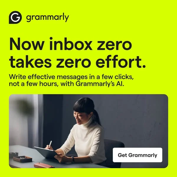
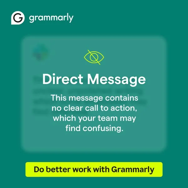
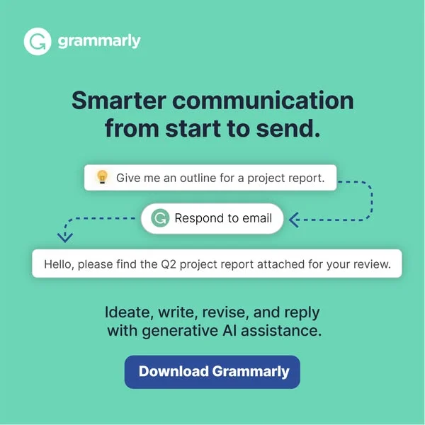
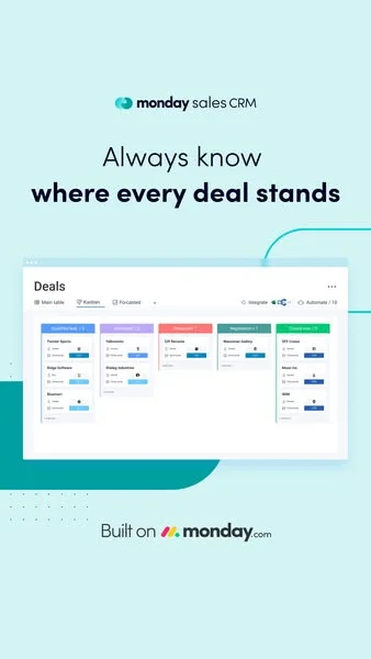
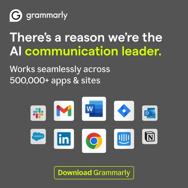
SaaS ads have two jobs and one visual to do both. Jobs: show the problem, show the fix. Visual: almost always a screenshot — a zoomed feature, a dashboard hero, a red-squiggle Grammarly moment, a Linear issue view. Grammarly, HubSpot, Notion, Linear, and Airtable all run variants of this because screenshot-first creative compresses the value prop faster than lifestyle framing. Three moves carry the category: feature zoom inside a phone or browser mockup, before-after of a workflow (typos to clean copy, messy spreadsheet to structured base), and brand-color discipline tight enough that the palette alone identifies the company.

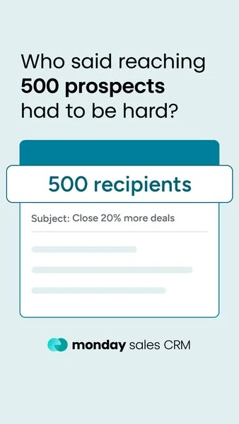
Palette commitment is the SaaS visual signature most categories never match. Grammarly green. HubSpot orange. Notion black-on-cream. Linear deep purple. Airtable orange-coral. Webflow blue-purple. Platform mix follows ICP: LinkedIn Sponsored Content (1.91:1) dominates B2B and enterprise, Meta carries prosumer SaaS at 1:1 and 4:5 portrait, Google Search picks up bottom-funnel intent. Copy stays short and problem-led: "Stop sending emails with typos," "Close faster."

Browse SaaS and tech ad examples pulled from real campaigns — dashboard heroes, feature callouts, before-after workflow screenshots, customer-logo walls, and founder LinkedIn posts. Pick a template, upload your product screenshot, and AdDogs applies your palette across three formats.
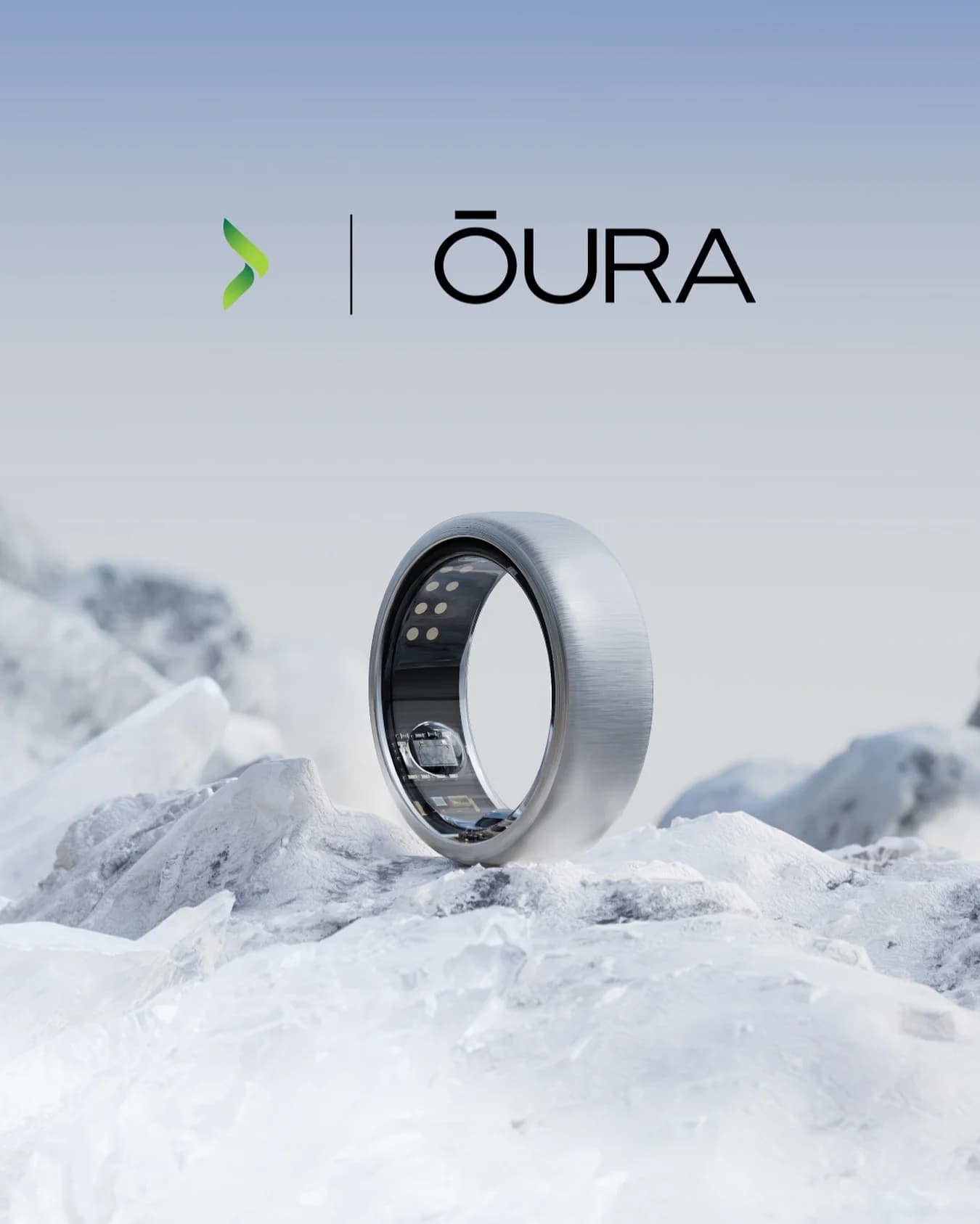

Samsung Portable SSDs — Dynamic Product Array. Brand: Samsung. This ad leverages a minimalist layout with a dynamic product array to highlight Samsung's portable SSDs. The clean white background ensures maximum product visibility, emphasizing the sleek design and vibrant color options. The diagonal composition creates visual interest and a sense of movement, subtly reinforcing the "Transfer faster" message. Text hierarchy is clear: a bold, benefit-driven headline immediately captures attention, followed by a concise descriptor. This design is highly optimized for platforms like Instagram or Facebook, where a clean aesthetic and clear value proposition can quickly stop the scroll. The color psychology of the products (red for energy, black for sophistication, blue for reliability) subtly communicates diverse user appeal while maintaining a professional tech vibe. The low text overlay keeps the focus on the hardware.. Headline: Transfer faster. Store safer.. Primary text: Superfast external storage. Why this ad works: Dynamic Product Arrangement for Engagement — The diagonal, slightly overlapping arrangement of the three SSDs creates visual depth and energy. This breaks the monotony of a static grid, making the ad more engaging and suggesting the products are in motion, aligning with the "Transfer faster" benefit. Benefit-Driven Headline for Immediate Value — The headline "Transfer faster. Store safer." immediately communicates the core benefits. This direct, concise messaging resonates with users seeking practical solutions, quickly establishing the product's value proposition without requiring extensive reading. High Contrast and Negative Space for Clarity — The products are sharply contrasted against a pure white background, ensuring they stand out. Ample negative space around the products and text prevents visual clutter, directing the viewer's eye precisely to the product and its key benefits.. Specs: Brand: Samsung, Industry: Software & Tools, Platform: Instagram, Format: Static, Audience: ProfessionalsCash App — Bold Feature UI Mockup. Brand: Cash App. This ad leverages a high-contrast, dark mode aesthetic with vibrant neon green to immediately capture attention on busy social feeds. The layout strategically positions a bold, left-aligned headline to convey the core benefit, while a dynamic UI mockup of the Cash App card and interface on the right visually demonstrates the feature. The composition uses scattered green coins and an angled phone to create a sense of movement and value. This design is optimized for platforms like Instagram or Facebook, where its striking color palette and clear value proposition cut through visual clutter. Text hierarchy is clear: a dominant headline, a concise call-to-action, and essential legal fine print. The overall effect is modern, energetic, and directly communicates a key user benefit.. Headline: Instant Discounts? Cash App does that.. Why this ad works: High-contrast palette for scroll-stopping impact — The stark contrast between the dark background and the neon green/white text and UI elements creates immediate visual impact. This bold color choice is highly effective on social media platforms, ensuring the ad stands out against organic content and captures user attention within milliseconds, driving higher initial engagement rates. Clear, benefit-driven headline communication — The headline "Instant Discounts? Cash App does that." directly addresses a common user desire and positions Cash App as the solution. This clear, concise value proposition, presented in large, readable text, ensures that the ad's core message is understood quickly, even during a brief scroll, enhancing message retention. Dynamic UI mockup demonstrates feature visually — Featuring the Cash App card within a phone UI, surrounded by floating coins, effectively visualizes the "discounts" feature. This dynamic composition isn't just a static product shot; it shows the app in action, making the benefit tangible and easier for the audience to grasp, which can increase consideration for the product.. Specs: Brand: Cash App, Industry: Finance & Insurance, Platform: Facebook, Format: Static, Audience: GeneralmRotoAI — Dynamic AI Masking Collage. Brand: mRotoAI. This ad for mRotoAI employs a vibrant, mixed-media collage layout to immediately capture attention, likely optimized for platforms like Instagram or TikTok. The composition strategically places the brand name and core benefit ("AI-powered masking") prominently with high contrast against the dark, starry background. The use of diverse, seemingly unrelated imagery (hot air balloon, mountains, people, Final Cut Pro icon) creates a sense of creative possibility and advanced technology, appealing to video editors. Neon outlines and bright colors contribute to a playful yet professional vibe, suggesting ease of use for complex tasks. The "Try for FREE" CTA is a clear, low-friction conversion point. Text hierarchy is clear, guiding the eye from brand to benefit to action, while the overall dynamic arrangement communicates innovation and efficiency in a visually engaging manner. The ad effectively uses visual metaphors to convey the power of AI masking.. Headline: AI-powered masking. Why this ad works: Dynamic collage highlights creative potential — The ad uses a vibrant, surreal collage of disparate elements like mountains, people, and a hot air balloon, unified by neon accents. This visual metaphor effectively communicates the boundless creative possibilities and ease of complex masking tasks offered by mRotoAI, resonating with creative professionals. High-contrast text ensures readability — The white "mRotoAI" and "AI-powered masking" text stands out sharply against the dark, starry purple background. This strong contrast ensures immediate readability and comprehension, crucial for quick-scroll environments where ads have only seconds to convey their core message and brand identity. Clear CTA drives immediate action — The bright yellow "Try for FREE" button is strategically placed at the bottom, offering a clear, low-barrier call to action. Its color contrasts with the background, making it highly visible and encouraging immediate engagement, which is vital for driving trials and lead generation for SaaS products.. Specs: Brand: mRotoAI, Industry: Software & Tools, Platform: Instagram, Format: Mixed, Audience: ProfessionalsAutodesk — Architectural Comparison Split Screen. Brand: Autodesk. This ad employs a split-screen comparison layout to visually articulate the evolution of architectural design and the role of modern tools. The left panel, a black-and-white image of an older building, contrasts sharply with the vibrant, full-color image of a contemporary structure on the right, implicitly showcasing progress. The minimalist composition, with ample negative space, ensures focus on the architectural details and the transformation. Color psychology is used effectively to differentiate eras and highlight the modern aesthetic. Text hierarchy is subtle, providing contextual information below each image, with the brand message "For your vision" and Autodesk logo centrally placed as the unifying element. This approach is optimized for professional platforms, targeting architects and designers by demonstrating capability and inspiring future projects.. Headline: For your vision. Why this ad works: Visual contrast highlights design evolution — The stark difference between the grayscale historical building and the vibrant, modern structure immediately conveys progress. This visual storytelling technique effectively communicates the impact of advanced design tools, implicitly positioning Autodesk as a catalyst for contemporary architectural innovation and inspiring professionals to upgrade their capabilities. Side-by-side comparison demonstrates impact — Presenting two distinct architectural styles side-by-side creates a compelling narrative of transformation. This direct comparison allows the audience to quickly grasp the aesthetic and functional advancements over time, subtly linking Autodesk's software (Revit is mentioned) to the realization of complex, modern designs. Minimalist layout emphasizes architectural detail — The clean, uncluttered layout with significant negative space around each image ensures that the viewer's attention remains on the buildings themselves. This focus on intricate architectural details appeals directly to the professional audience, showcasing the precision and potential enabled by design software without visual distractions.. Specs: Brand: Autodesk, Industry: Software & Tools, Platform: Google, Format: Static, Audience: ProfessionalsRise App — Story-Driven Text with Aura Figures. Brand: Rise. This ad employs a text-heavy, narrative-driven layout, balancing a compelling story on the left with ethereal, glowing human figures on the right. The dark background with vibrant blue and pink aura-like visuals creates a mystical yet energetic feel, symbolizing transformation and inner balance. This composition effectively draws the eye from the headline down through the personal testimonial, making it highly engaging for social platforms like Instagram or Facebook where long-form content can capture attention. The clear text hierarchy, starting with a bold problem-solution headline, guides the reader through the journey. Color psychology uses the dark to represent the problem (burnout) and the bright, flowing light to represent the solution (energy from Rise), reinforcing the app's benefit. The blend of personal story and striking visuals optimizes for consideration by building trust and intrigue.. Headline: How the wrong bedtime burns out millennial women. Primary text: It's hard to believe but it's true. I was waking up at 10am but still felt exhausted and out of control all the time. Then my roommate told me about Rise and it changed everything. The app calculated that my ideal wake up time was actually 5:55am, so I had been on the wrong schedule for years. Since I've been using Rise, I'm waking up with tons of energy, my focus is locked in, and I'm finally able to reclaim my day. A 1 min quiz could literally change your life.. Why this ad works: Relatable Problem & Solution Narrative — The ad masterfully crafts a personal story, beginning with a common pain point for millennial women – exhaustion and lack of control. This narrative approach builds immediate empathy and trust, making the solution (the Rise app) feel authentic and highly relevant. It transforms a product pitch into a shared experience. Intriguing Visuals & Symbolic Colors — The glowing, ethereal human figures on a dark, cosmic background are visually captivating. The vibrant blue and pink hues symbolize energy, transformation, and inner balance, directly aligning with the app's promise of improved sleep and vitality. This aesthetic elevates the ad beyond mere information to an aspirational experience. Strong Hook & Low-Barrier Engagement — The headline immediately addresses a specific, relatable issue ("burns out millennial women"), grabbing the target audience's attention. Concluding with "A 1 min quiz could literally change your life" provides a clear, low-commitment next step, encouraging immediate interaction and moving prospects further down the funnel.. Specs: Brand: Rise, Industry: Health & Wellness, Platform: Instagram, Format: Static, Audience: Women 25-34Dating App — Social Proof Text & Image. This ad employs a high-contrast, text-heavy layout designed for immediate impact on busy feeds. The central image of a happy, relatable couple is framed by a vibrant teal border, drawing the eye to the aspirational outcome of using the service. Bold, rounded black typography against a stark white background ensures maximum readability and scroll-stopping power. The composition strategically places social proof ("TRUSTED BY 10M+ INTROVERTS") prominently, leveraging a strong psychological trigger. The friendly ghost emoji adds a playful, approachable brand personality, subtly reinforcing the "introvert" theme. This direct, no-frills approach is optimized for platforms like Facebook, where clear value propositions and social proof drive consideration. The layout prioritizes message delivery over intricate design, making it highly effective for direct-response campaigns targeting a specific niche.. Headline: TRUSTED BY. Primary text: 10M+ INTROVERTS FOR DATING. Why this ad works: Strong Social Proof for Niche Audience — The "10M+ INTROVERTS" immediately validates the service for its target demographic. This specific number and audience segment builds immense trust and relevance, making introverted users feel seen and understood. It directly addresses a common pain point for introverts in dating. High Contrast & Bold Typography — The black text on a white background with a thick, rounded font ensures maximum readability and visual punch. This high contrast design cuts through feed clutter, making the core message impossible to miss. It's highly effective for quick consumption on mobile devices. Relatable & Aspirational Visual — The image of a happy, genuine couple provides an aspirational yet achievable outcome. It's not overly glamorous, making it relatable to the target audience. The warm tones in the photo contrast nicely with the stark text, adding emotional appeal to the logical social proof.. Specs: Industry: Software & Tools, Platform: Facebook, Format: Static, Audience: GeneralMicrosoft Windows 11 Pro — Bold Offer Layout. Brand: Microsoft. This ad employs a bold, high-contrast layout designed for immediate impact and conversion. The dark blue background, subtly textured with a keyboard, provides a professional yet engaging canvas. A vibrant teal diagonal banner and large, bright teal pricing immediately draw the eye, leveraging color psychology for urgency and value perception. The composition strategically places the product box on the right, balancing the dominant text on the left. Text hierarchy is clear: official license, product name, then the irresistible price, followed by key benefits via checkmarks. This structure guides the viewer through the offer efficiently, optimized for quick comprehension on fast-scrolling platforms like Facebook or Google Display. The overall design prioritizes clarity and a strong call to action, minimizing distractions to drive clicks.. Headline: LICENZA UFFICIALE Microsoft Windows 11 Professional. Primary text: A SOLI 25€! Licenza originale e verificata Attivazione ONLINE Durata PER SEMPRE. Why this ad works: High-contrast colors for immediate attention — The combination of deep blue with vibrant teal and stark white text creates maximum contrast. This visual pop is crucial for cutting through feed clutter on platforms like Facebook, ensuring the ad is noticed instantly. The bright teal specifically highlights the price, making the core offer unmissable and driving initial engagement. Clear value proposition and urgency — The headline "LICENZA UFFICIALE" (Official License) combined with "A SOLI 25€!" (Only 25€!) immediately communicates both authenticity and an exceptional deal. This direct, no-nonsense approach appeals to price-sensitive buyers and drives quick consideration, crucial for conversion-focused campaigns where speed of comprehension matters. Benefit-driven bullet points build trust — The three checkmarked benefits ("originale e verificata", "Attivazione ONLINE", "Durata PER SEMPRE") directly address potential customer concerns regarding legitimacy, ease of use, and longevity. This concise list builds trust and reinforces the value, reducing friction in the purchase decision by proactively answering common questions.. Specs: Brand: Microsoft, Industry: Software & Tools, Platform: Facebook, Format: Static, Audience: ProfessionalsFuture London Academy — Bold Quote Layout. Brand: Future London Academy. This ad employs a bold, high-contrast text-heavy layout, optimized for immediate impact on social feeds. The vibrant blue background paired with crisp white typography ensures maximum readability and scroll-stopping power. The central, oversized quote immediately captures attention, establishing a strong, aspirational message. Compositionally, the large quote dominates, while the smaller attribution provides credibility without clutter. The curved yellow and orange elements at the bottom add a modern, dynamic touch, preventing the design from feeling too static. This visual hierarchy guides the eye from the impactful statement to its authoritative source, effectively positioning Future London Academy as a thought leader in design education. The design is clean, direct, and highly effective for brand awareness and engagement.. Headline: "Designers are the new CEOs". Primary text: - VP of Product Design & Research at Headspace. Why this ad works: High-contrast palette for immediate impact — The striking combination of a vibrant blue background and bold white text creates exceptional contrast. This ensures the core message is instantly readable and highly visible in a crowded social media feed, effectively cutting through noise and grabbing user attention quickly. Aspirational quote drives professional engagement — The powerful, thought-provoking quote, "Designers are the new CEOs," resonates deeply with a professional audience. It taps into career aspirations and industry trends, encouraging agreement, discussion, and further engagement with Future London Academy's content or offerings. Credible attribution builds authority — Attributing the quote to a "VP of Product Design & Research at Headspace" lends significant authority and credibility. This expert endorsement signals that the academy is connected to industry leaders, enhancing trust and positioning them as a reputable source for design education.. Specs: Brand: Future London Academy, Industry: Education, Platform: Instagram, Format: Static, Audience: ProfessionalsShopify Plus — Global Scale Graphic. Brand: Shopify Plus. This ad employs a clean, minimalist layout with a strong top-left visual hierarchy, optimized for B2B platforms like Facebook or LinkedIn. The bold headline, "Deliver a local experience on a global scale," immediately communicates the core value proposition. Below, a vibrant, abstract graphic of interconnected lines and circles visually reinforces the concept of global reach and data flow, adding dynamic interest without distracting from the message. The muted grey background ensures high contrast for the dark text and colorful graphic elements, enhancing readability and a professional aesthetic. This composition effectively balances direct messaging with an engaging visual, aiming to capture the attention of business owners and professionals by clearly articulating a key benefit of Shopify Plus. The low text density keeps the focus on the headline and brand, making it easily digestible in a fast-scrolling feed.. Headline: Deliver a local experience on a global scale.. Why this ad works: Bold headline clearly states core value — The prominent, concise headline immediately communicates Shopify Plus's key benefit: enabling businesses to scale globally while maintaining local relevance. This direct approach quickly captures the attention of target professionals, ensuring the ad's primary message is understood within seconds of viewing, crucial for B2B advertising. Abstract graphic visually reinforces global scale — The colorful, interconnected lines and circles at the bottom abstractly represent data flow, global networks, and seamless integration. This visual metaphor effectively supports the headline's message, providing an engaging, non-literal illustration of the platform's capability without needing complex imagery. It adds depth to the concept. Minimalist design enhances professional credibility — The clean layout, ample negative space, and limited color palette project a professional and sophisticated image. This minimalist approach reduces visual clutter, allowing the brand logo and headline to stand out. It signals efficiency and clarity, appealing to business decision-makers who value straightforward communication and robust solutions.. Specs: Brand: Shopify Plus, Industry: Software & Tools, Platform: Facebook, Format: Static, Audience: ProfessionalsEducational Game App — Playful UI Mockup. This ad effectively uses a mixed layout, combining an adventurous character and a dynamic UI mockup to engage its target audience. The vibrant green and brown color palette immediately evokes a jungle adventure, aligning perfectly with the "FROM A-Z" bamboo-style text at the top. The angled smartphone, featuring a monkey interacting with letters, cleverly showcases the app's gameplay within a fun, immersive environment. Compositionally, the character on the left guides the eye towards the app, while the prominent green oval clearly states the core benefit: "Language Arts Learning Activities." This design is optimized for social platforms like Facebook or Instagram, where its bright, illustrative style and clear educational message can quickly capture parents' attention, positioning the app as both entertaining and beneficial for children's learning.. Why this ad works: Engaging Character & Thematic Visuals — The Indiana Jones-esque character and jungle backdrop immediately draw attention, creating a sense of adventure. This playful theme makes learning appealing to children and signals to parents that the app offers an engaging, non-traditional educational experience, increasing initial interest and click-through rates. Dynamic UI Mockup Showcases Gameplay — Presenting the app's interface on an angled smartphone, with a monkey interacting with letters, effectively demonstrates the core gameplay. This visual "show, don't tell" approach allows prospective users to quickly grasp the interactive nature of the learning activities, boosting consideration for download. Clear Benefit Statement for Parents — The prominent green oval with "Language Arts Learning Activities" directly communicates the app's educational value. This clear, concise messaging immediately informs parents about the product's purpose, addressing their primary need for beneficial content for their children and driving relevance.. Specs: Industry: Kids & Family, Platform: Facebook, Format: Mixed, Audience: ParentsHume Health — Before/After Comparison Layout. Brand: Hume Health. This ad employs a split-screen layout, effectively contrasting a user's past struggles ("WHO I WAS") with their current success ("WHO I AM") using Hume Health. The clean blue and white color palette evokes trust and professionalism, aligning with health and technology. Compositionally, the ad balances text-heavy bullet points in the upper half, detailing pain points and solutions, with visual proof in the lower half, showcasing a traditional scale versus the detailed Hume Health app UI. This structure is optimized for mobile platforms like Instagram, where clear, concise information and compelling visuals drive engagement. Text hierarchy guides the eye from the bold section headers to the bulleted benefits, culminating in the app demonstration and a crucial credibility statement, "98% DEXA Match.". Headline: WHO I WAS vs. WHO I AM. Primary text: WHO I WAS: • Obsessed with the number on the scale • Frustrated by weight fluctuations • Didn't realize I was losing muscle • Felt stuck and unmotivated • Guessing instead of knowing WHO I AM: • Finally SEEING fat loss & muscle gain • Progress charts keep me motivated • Caught muscle loss before it became a setback • Dropped 5 years off my metabolic age • Feel stronger, confident, in control. Why this ad works: Clear Problem/Solution Framing — The explicit "WHO I WAS" vs. "WHO I AM" narrative immediately establishes a relatable pain point and offers a transformative solution. This before-and-after structure is highly effective for engagement, as it allows users to quickly identify with the struggles and envision the benefits, driving consideration for the product. Visual Proof with App Interface — Including the Hume Health app interface, displaying detailed body composition, provides tangible evidence of the product's value. This visual demonstration is more compelling than abstract claims, making the benefits concrete and believable. It shows rather than tells, which is crucial for building trust and understanding in digital advertising. Credibility through Data Validation — The "98% DEXA Match" callout, strategically placed near the app interface, adds a strong layer of scientific credibility. It reassures potential users that the app's data is accurate and reliable, addressing skepticism often associated with health tracking and enhancing the perceived trustworthiness of Hume Health's technology.. Specs: Brand: Hume Health, Industry: Health & Wellness, Platform: Instagram, Format: Static, Audience: Fitness EnthusiastsToast POS System — Bold Product on Background. Brand: Toast. This ad leverages a high-contrast, bold orange background to immediately capture attention, a strategic choice for competitive social feeds. The central placement of the Toast POS system, with a clear UI screenshot, grounds the abstract offer in a tangible product. Text hierarchy is clear: a benefit-driven headline at the top, followed by a compelling zero-cost offer, both in large, white, sans-serif font for maximum readability. The brand logo is subtly placed at the bottom-left, reinforcing identity without distracting from the main message. This composition is optimized for quick comprehension on mobile, using color psychology (orange for energy/urgency) and direct language to appeal to small business owners seeking efficient, affordable solutions. The minimalist approach ensures the core message isn't diluted.. Headline: Diseñado para cada paso del camino.. Primary text: Comience hoy mismo por $0.. Why this ad works: High-contrast orange background grabs attention — The vibrant orange background with stark white text creates an unmissable visual. This high contrast is crucial for cutting through cluttered social feeds, ensuring the ad stops the scroll and immediately draws the viewer's eye to the core message and product, maximizing initial engagement. Clear, benefit-driven headline and offer — The headline "Diseñado para cada paso del camino" (Designed for every step of the way) combined with "Comience hoy mismo por $0" (Start today for $0) clearly communicates value and removes friction. This direct, benefit-oriented messaging resonates strongly with small business owners looking for comprehensive, affordable solutions. Product UI screenshot builds trust and clarity — Featuring a clear screenshot of the POS system's user interface, specifically the tipping screen, provides immediate context and demonstrates functionality. This visual proof helps potential customers understand the product's real-world application, building trust and reducing perceived risk for a SaaS offering.. Specs: Brand: Toast, Industry: Software & Tools, Platform: Facebook, Format: Static, Audience: Small Business OwnersRay-Ban Meta Smart Glasses — Feature Spotlight Close-up. Brand: Ray-Ban. This ad effectively uses a close-up hero shot of the Ray-Ban | Meta smart glasses to highlight a key feature: video calling. The minimalist, off-white background ensures the sleek black product stands out, creating a clean, modern aesthetic. A strong, bold headline immediately communicates the core benefit in German, positioned prominently for quick comprehension. The composition employs negative space to draw the eye directly to the product's camera and the associated WhatsApp and video call icons, clearly illustrating the functionality. This design is optimized for platforms like Instagram, where visual clarity and a direct value proposition are crucial for stopping the scroll. The high text overlay ensures the message is unmistakable, while the overall clean vibe appeals to a tech-savvy, design-conscious audience, driving awareness for this innovative wearable technology.. Headline: TÄTIGE VIDEOANRUFE DIREKT ÜBER DEINE SMART GLASSES. Primary text: Videoanrufe.... Why this ad works: Feature-focused hero shot highlights utility — The ad features a tight, angled close-up of the smart glasses' camera, directly showcasing its primary function for video calls. This immediate visual demonstration of a core capability cuts through noise, allowing viewers to instantly grasp the product's utility. In a crowded digital feed, this direct approach ensures the key selling point is absorbed without needing extensive copy. Clear, benefit-driven headline drives understanding — The prominent, bold German headline, 'TÄTIGE VIDEOANRUFE DIREKT ÜBER DEINE SMART GLASSES,' clearly articulates the product's main benefit. This direct-response oriented copy immediately informs the viewer of what the smart glasses can do, appealing to practical needs. Its large size ensures high readability and impact, making the value proposition undeniable even at a glance. Minimalist design enhances product focus — The ad's minimalist design, featuring a stark off-white background and a limited color palette, effectively eliminates visual clutter. This strategic use of negative space directs the viewer's gaze precisely to the product and its highlighted feature. Such a clean aesthetic enhances perceived sophistication and ensures the core message is delivered without any distracting elements, boosting message retention.. Specs: Brand: Ray-Ban, Industry: Fashion & Apparel, Platform: Instagram, Format: Static, Audience: ProfessionalsAdCreative.ai — Trustpilot Testimonial Layout. Brand: AdCreative.ai. This ad leverages a clean, high-contrast layout to highlight social proof. The central testimonial, rendered in a bold, dark purple font against a stark white background, immediately draws the eye, establishing a clear visual hierarchy. Trustpilot ratings are strategically placed at the top-right and bottom-left, reinforcing credibility without clutter. The minimalist color palette of white, dark purple, and vibrant green for ratings creates a professional yet trustworthy aesthetic, optimized for platforms like LinkedIn or Instagram where B2B audiences appreciate direct, evidence-based messaging. The composition ensures the brand logo is prominent while the testimonial remains the focal point, effectively communicating value and building consideration. Text density is high but well-organized, making the key message digestible.. Headline: Investing in AdCreative.ai's 50% yearly discount has been our top advertising decision this year.. Why this ad works: Prominent Testimonial Builds Instant Credibility — The large, centered testimonial quote immediately captures attention, serving as powerful social proof. Placing it front and center leverages the psychological principle of authority and social validation, making the ad highly persuasive for potential customers considering a similar investment. This direct quote feels authentic and relatable. Strategic Trustpilot Integration Enhances Trust — Featuring Trustpilot ratings at both the top and bottom of the ad, including the "Verified Company" badge, significantly boosts perceived trustworthiness. This repetition reinforces the positive sentiment and assures viewers of the brand's reliability, crucial for a SaaS product where trust is paramount for conversion. High Contrast Typography Ensures Readability — The use of dark purple text against a clean white background provides excellent contrast, making the testimonial highly readable even on smaller mobile screens. This design choice ensures the core message is effortlessly consumed, preventing scroll-past due to illegibility and maximizing message retention for the target audience.. Specs: Brand: AdCreative.ai, Industry: Software & Tools, Platform: Instagram, Format: Static, Audience: ProfessionalsBevel App — Apple Watch UI Testimonial. Brand: Bevel App. This ad leverages a user-generated content (UGC) aesthetic, featuring a hand wearing an Apple Watch displaying the Bevel app interface. The composition is a close-up, vertical shot, optimized for Instagram Stories or Reels. Multiple text bubbles act as a personal testimonial, guiding the viewer through key app features like stress tracking and sleep recovery scores. The natural lighting and plant background contribute to an organic, authentic vibe. The dark watch face with vibrant data points creates visual contrast, drawing attention to the app's functionality. Text hierarchy is conversational, explaining benefits and personal impact, fostering relatability. This approach builds trust and demonstrates the app's value through a credible, user-centric narrative, effectively engaging a health-conscious audience.. Primary text: Hands down my favorite Apple Watch face (information overload, I know 😊 but I like seeing seeing all my stats at a glance) As someone who's health-conscious, one of my favorite complications these days is the Bevel stress graph It helps me identify stress triggers & visualize the impact that even just 1 minute of breathwork can have on my stress levels 🙏 Also a huge fan of the sleep and recovery scores Bevel gives me every morning It tricks the video game nerd in me into getting better sleep so my health bar is never depleted 💪💯. Why this ad works: Authentic UGC style builds trust — The ad's user-generated content aesthetic, featuring a real hand and natural background, significantly enhances credibility. This organic presentation feels less like an ad and more like a genuine recommendation, fostering trust and relatability with the target audience. It bypasses ad fatigue by appearing as native content. Detailed feature explanation via testimonial — The multiple text bubbles meticulously explain specific app features like the stress graph and sleep scores, detailing their personal benefits. This narrative approach educates the viewer on the app's value proposition in a digestible, engaging way, moving beyond generic claims to concrete use cases. Visual proof of data tracking — The clear display of the Bevel app on the Apple Watch face provides immediate visual evidence of its data tracking capabilities. Seeing the graphs and scores in action reinforces the app's functionality and tangibility, making the benefits described in the text bubbles more believable and impactful for potential users.. Specs: Brand: Bevel App, Industry: Health & Wellness, Platform: Instagram, Format: Static, Audience: Fitness EnthusiastsGrammarly — Vibrant Social Proof Layout. Brand: Grammarly. This ad effectively uses a vibrant, high-contrast layout to grab attention on busy social feeds. The central Grammarly logo acts as a focal point, surrounded by diverse user portraits that subtly convey broad appeal and social proof. The bright green background immediately stands out, while the stark black text ensures readability. Text hierarchy is clear: a bold, impactful statistic headline followed by a concise value proposition, culminating in a prominent call-to-action. This composition is optimized for quick consumption, leveraging color psychology for energy and black-and-white imagery for authenticity, making it highly effective for driving consideration and conversion on platforms like Facebook or Instagram. The design balances brand presence with user-centric messaging.. Headline: Over 30 Million Daily Users. Primary text: Enhance your writing with Grammarly.. Why this ad works: Vibrant background creates scroll-stopping contrast — The bright, energetic green background immediately captures attention. This high contrast against typical feed content ensures the ad stands out, increasing initial visibility and stopping the scroll, which is crucial for social media ad performance. It creates an instant visual hook. Social proof through diverse user imagery — The inclusion of four distinct black-and-white user photos around the central logo subtly communicates widespread adoption and relatability. This visual social proof builds trust and encourages potential users to identify with the existing user base, enhancing credibility and perceived value. Clear hierarchy drives immediate value proposition — The ad employs a strong visual hierarchy, starting with a compelling user statistic, followed by a clear benefit statement, and ending with an unmistakable call-to-action. This structured flow guides the viewer efficiently from awareness to conversion intent, minimizing cognitive load.. Specs: Brand: Grammarly, Industry: Software & Tools, Platform: Instagram, Format: Static, Audience: ProfessionalsPhilips Hue Smart Bulbs — Product Hero Shot. Brand: Philips. This ad employs a product-focused hero shot layout, showcasing two Philips Hue smart bulbs against a dark, subtly gradient background. The composition strategically uses a warm light source from the top right, simulating the product's glow, which creates a strong visual anchor. Color psychology leverages high contrast: the bright, illuminated bulbs pop against the deep background, drawing immediate attention. The prominent price and clear call-to-action button are positioned for optimal conversion, making it suitable for platforms like Facebook or Instagram where direct response is key. Text hierarchy places brand logos at the top, product details centrally, and the offer/CTA at the bottom, guiding the viewer's eye efficiently. The overall design is clean and highlights the product's premium, smart home appeal.. Headline: Пазарувай Smart!. Primary text: Philips HUE White Ambiance 79.99лв. Why this ad works: High contrast highlights product and glow — The dark background with a simulated warm light source dramatically contrasts with the bright Philips Hue bulbs. This visual technique ensures the product is the undisputed focal point, immediately communicating its function and premium aesthetic. In a busy feed, this high contrast effectively stops the scroll and draws attention to the offering. Clear pricing and direct call-to-action — The prominent display of "79.99лв" alongside a bright blue "купи онлайн" (buy online) button significantly reduces friction for potential buyers. This direct approach caters to users with high purchase intent, streamlining the path to conversion by making the offer and next step unmistakably clear. Strategic brand placement builds trust — Featuring both the retailer's logo (ATG) and the renowned product brand (Philips Hue) prominently at the top of the ad leverages established brand equity. This dual branding instills confidence and credibility, assuring the audience of both the product's quality and the retailer's legitimacy, which is crucial for driving online purchases.. Specs: Brand: Philips, Industry: Home & Lifestyle, Platform: Facebook, Format: Static, Audience: GeneralTwelve South AirFly — In-Use Testimonial Shot. Brand: twelve south. This ad effectively leverages a user-generated content aesthetic to build trust and demonstrate product utility. The layout places the AirFly device and AirPods case prominently in a hand, connected to an airplane's entertainment system, immediately illustrating the problem (bad airline headphones) and solution. A large, high-contrast testimonial overlay, complete with a 5-star rating, dominates the upper left, acting as the primary headline and social proof. The composition is simple, focusing on the product in its intended environment, which enhances relatability. Color psychology is minimal, relying on the white products against a muted, realistic airplane interior to highlight the tech. Optimized for social feeds like Instagram, its authentic feel and clear value proposition are designed to stop scrolling and drive consideration. The text hierarchy prioritizes the user's positive experience, making the ad feel like a genuine recommendation rather than a hard sell.. Headline: No more awful airline headphones!. Primary text: AirFly paired easily with my AirPods and sound quality was great. Highly recommend!. Why this ad works: Authentic User-Generated Content Feel — The ad mimics a genuine customer photo, showing the product in a real-world, relatable scenario (on an airplane). This authentic, unpolished look builds immediate trust and credibility, making the testimonial feel more believable and impactful than a studio-shot ad. Clear Problem-Solution Demonstration — By showing the AirFly connected to the airline screen alongside AirPods, the ad instantly communicates its purpose. It visually solves a common pain point for travelers – poor airline audio – positioning the product as an essential travel companion without needing extensive explanation. Prominent Social Proof and Endorsement — The large 5-star rating and direct testimonial from a satisfied customer are highly visible. This strong social proof immediately establishes product quality and user satisfaction, significantly reducing perceived risk and encouraging potential customers to consider the AirFly.. Specs: Brand: twelve south, Industry: Home & Lifestyle, Platform: Instagram, Format: Static, Audience: GeneralDoodle Video Software — Playful Illustration. This ad employs a playful, illustrative layout reminiscent of a chalkboard, effectively targeting a broad audience interested in creative tools. The central, rounded text box immediately draws the eye to the core message: "Create Colourful Doodle Videos." Grayscale characters, strategically placed around the text, add a human, engaging element without distracting from the main proposition. Pops of vibrant color in the text and surrounding objects (like the planet and pencil) highlight the "colourful" aspect, reinforcing the product's benefit. The composition uses a visual hierarchy where the central text is paramount, supported by contextual doodles that evoke learning and creativity. This design is well-suited for social platforms like Facebook or Instagram, where its unique aesthetic can stand out amidst more conventional ads, driving initial awareness and engagement. The low text density keeps the visual clean and easily digestible.. Headline: Create Colourful Doodle Videos. Why this ad works: Playful chalkboard aesthetic engages viewers — The dark green chalkboard background with white line-art doodles creates a nostalgic, educational, and creative atmosphere. This unique visual style captures attention and suggests a fun, accessible tool for content creation, resonating with users seeking engaging solutions. Centralized text box ensures clear value proposition — The prominent, rounded white text box acts as a focal point, immediately communicating the ad's core message: "Create Colourful Doodle Videos." This direct approach ensures the key benefit is understood instantly, crucial for quick-scroll social media environments where attention spans are short. Strategic use of color highlights key benefits — While characters are grayscale, the "Colourful" text and surrounding objects pop with vibrant hues. This contrast visually emphasizes the product's promise of adding color and vibrancy to videos, making the benefit tangible and exciting to the target audience.. Specs: Industry: Software & Tools, Platform: Facebook, Format: Static, Audience: GeneralDoorDash — Economic Impact Infographic. Brand: DoorDash. This infographic-style ad for DoorDash effectively leverages a split-screen layout to convey significant economic impact. The left side prominently features a large, dark green circle with "$68.9B", immediately drawing attention to the key data point. This is supported by clear, concise text explaining its context. On the right, a U.S. map with highlighted red states provides a compelling visual metaphor, making the abstract financial contribution relatable and memorable. The clean, light teal background and contrasting colors (green for money, red for attention) create a trustworthy and engaging aesthetic. Optimized for social feeds like Instagram, its clear visual hierarchy and digestible information make it a scroll-stopper, effectively communicating corporate responsibility and scale without overwhelming the viewer. The minimalist design ensures the message is clear and impactful, enhancing brand perception.. Headline: DoorDash contributed. Primary text: in U.S. GDP (larger than the economies of seven U.S. states) through its platform.. Why this ad works: Bold data point commands attention — The "$68.9B" in a prominent dark green circle against the light background immediately draws the eye. This visual emphasis on the key metric ensures the ad's core message of significant economic contribution is instantly understood, even during a quick scroll. It communicates scale and impact efficiently. Relatable map comparison contextualizes impact — Comparing DoorDash's contribution to the economies of seven U.S. states using a visual map makes the abstract number tangible. Highlighting the states in red creates a clear, easy-to-digest visual metaphor, enhancing comprehension and memorability for a general audience by providing a concrete reference point. Strategic color palette builds trust — The use of a calming teal background combined with a deep green for the financial figure evokes trust and growth. This palette, alongside the clean design, positions DoorDash as a stable and impactful economic player, reinforcing a positive brand image beyond just delivery services and fostering credibility with viewers.. Specs: Brand: DoorDash, Industry: Food & Beverage, Platform: Instagram, Format: Static, Audience: GeneralRay-Ban Meta Smart Glasses — Product Hero Shot. Brand: Ray-Ban | Meta. This ad effectively leverages a clean hero shot layout to showcase the Ray-Ban Meta Smart Glasses. The minimalist off-white background ensures the black glasses with green lenses stand out, creating strong visual contrast and immediate product recognition. The composition places the product prominently in the lower half, allowing the bold, direct headline to dominate the upper frame. This clear visual hierarchy guides the viewer's eye from the brand partnership at the top, to the key product benefit, and finally to the product itself. The high contrast black-on-white text is optimized for quick readability across various social platforms, ensuring the call to action and feature highlight are instantly absorbed. The overall design communicates innovation and style, appealing to a tech-forward, fashion-conscious audience. It's designed for scroll-stopping impact on platforms like Instagram or Facebook, where clarity and direct messaging are paramount for conversion.. Headline: ACQUISTA SMART GLASSES CON FOTOCAMERA INTEGRATA HD. Why this ad works: High contrast product isolation — The black smart glasses are presented against a stark, light background, creating maximum contrast. This isolation technique ensures the product is the undisputed focal point, immediately drawing the viewer's attention and enhancing product memorability in a crowded feed. Direct, benefit-driven headline placement — The headline "ACQUISTA SMART GLASSES CON FOTOCAMERA INTEGRATA HD" is large, bold, and positioned centrally above the product. This direct, feature-rich call to action immediately communicates the core value proposition, driving consideration by highlighting the integrated HD camera. Strategic dual-brand logo integration — The Ray-Ban and Meta logos are prominently displayed together at the top. This partnership instantly conveys credibility and innovation, leveraging the established brand equity of both companies to build trust and appeal to consumers interested in cutting-edge wearable technology.. Specs: Brand: Ray-Ban | Meta, Industry: Fashion & Apparel, Platform: Instagram, Format: Static, Audience: ProfessionalsPeak Design — Camera UI Lifestyle Shot. Brand: Peak Design. This ad cleverly uses a camera UI overlay on a captivating wildlife photo to engage its target audience of photographers. The composition frames a relaxed lion, implying ease and success in capturing the moment, a key benefit for camera accessory users. The minimalist white UI elements (brand logo, "GOT IT." headline, ISO/1080 indicators, focus reticle, and exposure meter) create a clean, aspirational aesthetic. This design is highly optimized for visual platforms like Instagram, where striking imagery and subtle branding resonate. The text hierarchy is clear: brand at the top, a confident headline centrally placed, and technical details subtly integrated. The overall dark, natural color palette of the background contrasts effectively with the crisp white overlay, ensuring high visibility and a premium feel.. Headline: GOT IT.. Why this ad works: Camera UI overlay creates relatable context — The simulated camera interface immediately resonates with photographers, placing the viewer directly in the shoes of someone using Peak Design gear. This technique builds an emotional connection by showcasing the *experience* of successful photography, rather than just the product itself, making the ad highly relevant and engaging. Confident headline reinforces brand promise — The bold, simple phrase "GOT IT." perfectly encapsulates the feeling of capturing a difficult or perfect shot. This direct and positive message aligns with the brand's promise of enabling photographers to achieve their goals effortlessly, fostering trust and a sense of accomplishment in potential customers. High contrast ensures visual clarity and impact — The crisp white lines and text of the UI overlay stand out dramatically against the darker, natural tones of the background image. This strong contrast ensures that the brand elements and key message are immediately visible and legible, preventing them from getting lost in the detailed photo, which is crucial for quick ad consumption.. Specs: Brand: Peak Design, Industry: Software & Tools, Platform: Instagram, Format: Static, Audience: ProfessionalsHeadspace — Question-Based Text Layout. Brand: Headspace. This ad leverages a bold, high-contrast color palette of red, black, and white to immediately capture attention in a crowded social feed. The layout is text-heavy and centered, presenting a direct question: "Use the Headspace Mobile App?". This interrogative approach aims to engage the viewer by prompting self-reflection and potential identification with the brand. The use of brushstroke textures behind the text blocks adds a dynamic, slightly raw aesthetic, preventing the design from feeling too sterile despite its simplicity. The Headspace logo is integrated seamlessly, reinforcing brand recognition. Optimized for platforms like Instagram, its square format and clear message cut through visual noise, making it an effective awareness and engagement driver. The strong visual hierarchy ensures the question is the sole focus, driving curiosity and potential interaction.. Headline: Use the headspace Mobile App?. Why this ad works: High-contrast palette demands attention — The stark red, black, and white color scheme creates maximum visual contrast. This bold choice ensures the ad stands out dramatically in a busy social media feed, immediately drawing the eye and stopping the scroll. This high-impact visual strategy is crucial for initial ad visibility and recall. Direct question fosters immediate engagement — Posing a direct question, "Use the Headspace Mobile App?", actively involves the viewer. This interrogative approach encourages self-identification and prompts an internal (or external) response, significantly increasing engagement rates compared to passive statements. It effectively qualifies the audience by identifying current users or those familiar with the brand. Integrated branding reinforces recognition — The Headspace logo is strategically placed alongside the brand name, ensuring instant recognition. This clear and consistent branding within the ad reinforces the company's identity, even for those who might only glance at the creative. It builds trust and familiarity, crucial for a subscription-based service.. Specs: Brand: Headspace, Industry: Health & Wellness, Platform: Instagram, Format: Static, Audience: GeneralWireless Charger — Lifestyle Product In-Use. This ad employs a lifestyle layout, showcasing a wireless charger seamlessly integrated into a casual setting. The composition uses a shallow depth of field, drawing immediate focus to the product and the user's interaction. A muted color palette of pastel pinks, soft greens, and warm background tones creates a clean, approachable, and aesthetically pleasing vibe, appealing to a modern, design-conscious audience. The text hierarchy is clear: a bold, relatable headline "Adulting is complicated." grabs attention, followed by a smaller, problem-solving statement "Charging your devices shouldn't be." This structure effectively frames the product as a solution to a common frustration. The visual cue of a red arrow further guides the eye to the secondary text, reinforcing the message. Optimized for platforms like Instagram, its authentic, aspirational imagery encourages engagement and consideration by presenting the product as an effortless upgrade to daily life.. Headline: Adulting is complicated.. Primary text: Charging your devices shouldn't be.. Why this ad works: Relatable problem-solution headline hooks audience — The headline "Adulting is complicated." immediately resonates by tapping into a universal feeling of modern life's challenges. This sets up the product as a simple, elegant solution to a specific pain point ("Charging your devices shouldn't be."), creating an emotional connection and positioning the product as a valuable life-simplifier from the outset. Authentic lifestyle context builds product desire — By showing the wireless charger in a relaxed, everyday setting with a drink and snack, the ad integrates the product seamlessly into an aspirational lifestyle. This makes the product feel less like a gadget and more like an essential, stylish accessory that enhances daily comfort and convenience, fostering desire and perceived value. Visual cue directs attention to product benefit — The subtle red arrow pointing from the main headline to the secondary text, combined with the product's central placement, creates a clear visual path. This guides the viewer's eye directly from the identified problem to the product's promise, ensuring the core message of simplified charging is effectively communicated and understood without distraction.. Specs: Industry: Home & Lifestyle, Platform: Instagram, Format: Static, Audience: Women 25-34Oneleaf — Neuroscience Head Profile Layout. Brand: Oneleaf. This ad employs a conceptual layout featuring a stylized human head, emphasizing the brain, to visually represent its neuroscience-based weight loss solution. The vibrant, intricate background, resembling neural pathways and cellular structures, immediately grabs attention, suggesting scientific depth. White text overlays create strong contrast, ensuring readability despite the busy backdrop. Text hierarchy guides the eye from the bold headline to supporting claims and a powerful testimonial, culminating in the brand logo. The composition cleverly uses the head's profile to frame the core message. Optimized for platforms like Instagram, its unique visual style and clear value proposition cut through typical feed clutter, appealing to an audience seeking innovative health solutions. The color palette, while complex, maintains a clean, scientific yet approachable feel.. Headline: Shed pounds easily without exercise. Primary text: Best Neuroscience App of 2025 100% drug free “In four months I reached my ideal weight, going from 182 lbs to 147 lbs” Jessica B. Why this ad works: Conceptual imagery highlights scientific approach — The intricate, abstract illustration of a human head, focusing on the brain, immediately conveys the ad's scientific and neurological approach to weight loss. This unique visual stands out significantly from typical fitness or diet ads, capturing attention through curiosity and implying a sophisticated, non-traditional solution. It effectively positions the brand as innovative and science-backed, appealing to a discerning audience. High-contrast text ensures readability and impact — The bold white text against the dark, complex background ensures maximum readability and visual impact. This high contrast is crucial for mobile viewing, allowing the core message 'Shed pounds easily without exercise' to be instantly digestible. It leverages the visual hierarchy to draw the eye directly to the primary benefit, making the ad highly effective in conveying its value proposition quickly. Specific testimonial builds immediate credibility — Integrating a strong testimonial directly into the ad copy provides immediate social proof and builds credibility. The specific numbers ('182 lbs to 147 lbs') make the claim tangible and relatable, addressing potential skepticism about 'easy' weight loss. This personal success story enhances trust and encourages prospective users to believe in the app's efficacy, driving consideration.. Specs: Brand: Oneleaf, Industry: Health & Wellness, Platform: Instagram, Format: Static, Audience: Women 25-34Language Learning App — Price & Benefit Focus. This ad employs a high-contrast, text-heavy layout designed for immediate impact and conversion. The dominant blue background, subtly blurred with a living room setting, provides a relatable context without distracting from the core offer. A bold yellow price point, "$199," paired with a prominent "50% OFF" starburst, immediately anchors the value proposition. The central white text, "Lifetime Subscription Unlimited Languages," clearly communicates the product's main benefit. Compositionally, the four overlapping smartphones showcase diverse international imagery, visually reinforcing the "unlimited languages" claim. This vibrant color palette and clear text hierarchy are optimized for platforms like Facebook, where quick scanning demands direct communication of value. The ad effectively uses color psychology to convey urgency and value, driving consideration for a comprehensive language learning solution.. Headline: $199 50% OFF. Primary text: Lifetime Subscription Unlimited Languages. Why this ad works: Bold price display grabs immediate attention — The large, bright yellow "$199" against the deep blue background creates an unmissable focal point. This high-contrast pairing, amplified by the "50% OFF" starburst, immediately communicates a strong value proposition. It effectively stops the scroll by presenting the core offer upfront, appealing to price-sensitive consumers looking for a deal. Clear value proposition with lifetime access — The headline "Lifetime Subscription Unlimited Languages" is incredibly compelling. It clearly articulates a comprehensive, long-term solution, eliminating recurring costs and offering extensive content. This direct and powerful statement addresses potential customer pain points regarding ongoing expenses and limited language options, positioning the product as a definitive investment. Visual variety hints at global language scope — The four overlapping smartphones, each displaying a distinct image from different cultures (e.g., Russian architecture, a matryoshka doll, European town), cleverly illustrate the "Unlimited Languages" claim. This visual storytelling provides a tangible representation of the product's breadth, making the abstract concept of "unlimited" more engaging and believable to the audience.. Specs: Industry: Education, Platform: Facebook, Format: Static, Audience: GeneralUber Driver Recruitment — Smiling Deliverer Lifestyle. Brand: Uber. This ad effectively utilizes a vertical, human-centric layout optimized for mobile platforms like Instagram Stories. The composition features a smiling delivery partner, creating an immediate sense of approachability and positive experience. The blurred background ensures the focus remains on the individual and the Uber Eats branding on the bag. Color psychology leverages the vibrant green of the Uber Eats bag, associated with growth and energy, against the neutral background. Text hierarchy is clear: a direct value proposition headline, followed by a prominent call-to-action and the core brand logo. The ad works by combining authentic human connection with a clear, concise message, making it highly effective for driver recruitment by showcasing the positive lifestyle aspect of the job. The overall design is clean and direct, minimizing distractions.. Headline: Deliver with your bike or scooter.. Why this ad works: Authentic smile builds immediate rapport — The genuine, wide smile of the delivery partner is highly engaging and immediately builds positive rapport. This human element makes the job seem enjoyable and accessible, directly appealing to potential recruits by showcasing a positive work experience rather than just a task. It fosters a sense of community and satisfaction. Clear value proposition targets specific audience — The headline "Deliver with your bike or scooter" immediately communicates the core opportunity and targets individuals who own or prefer these modes of transport. This specificity reduces friction by setting clear expectations and attracting the most relevant candidates, improving conversion rates for sign-ups. Vertical composition optimizes for mobile engagement — The ad's vertical orientation is perfectly suited for mobile-first platforms, ensuring it fills the screen without awkward cropping. This native fit enhances user experience and reduces the likelihood of users scrolling past, maximizing visibility and engagement within Instagram Stories or similar full-screen placements.. Specs: Brand: Uber, Industry: Food & Beverage, Platform: Instagram, Format: Static, Audience: GeneralBrilliant AI — Bold Text & Topic List. Brand: Brilliant. This ad employs a minimalist, high-contrast layout, strategically placing the brand name at the top, a bold headline centrally, and a pyramid of vibrant topic pills below. The composition leverages ample negative space to ensure the core message, "AI I can do that," with its clever visual strike-through on 'A', immediately grabs attention. Color psychology is used effectively with the stark black text on white background for readability, while the gradient-filled topic pills introduce a playful yet organized visual interest. This design is optimized for platforms like Instagram or Facebook, where its clean aesthetic and clear hierarchy cut through feed clutter. The text hierarchy guides the eye from brand recognition to the key value proposition, then to specific offerings, making complex subjects feel accessible and engaging.. Headline: AI I can do that. Why this ad works: Clever "AI I can do that" headline — The headline uses a striking visual pun, crossing out the 'A' in "I" to form "AI," immediately communicating the brand's focus on artificial intelligence. This creative wordplay is a powerful scroll-stopper, sparking curiosity and making the ad memorable. It effectively conveys the brand's modern and intelligent approach to learning. High-contrast, minimalist design — The stark black text on a pure white background ensures maximum readability and visual impact, crucial for quick consumption on mobile feeds. This minimalist approach eliminates distractions, allowing the core message and the brand's offerings to stand out clearly. It projects a sense of clarity and intelligence, aligning with an educational brand. Engaging, color-coded topic hierarchy — The pyramid of gradient-filled topic pills provides a visually appealing and organized way to present the breadth of subjects offered. Each pill's unique color gradient aids in differentiation and makes the information digestible at a glance. This technique transforms a list of subjects into an interactive and inviting visual element, encouraging exploration.. Specs: Brand: Brilliant, Industry: Education, Platform: Instagram, Format: Static, Audience: ProfessionalsClickUp — Vibrant UI Feature Showcase. Brand: ClickUp. This ad employs a split-screen layout, balancing bold, benefit-driven text on the left with dynamic UI mockups on the right. The vibrant purple-pink-orange gradient background behind the UI elements creates visual energy, contrasting sharply with the clean white space and black typography. This color psychology suggests innovation and collaboration, appealing to modern professionals. Compositionally, the large headline draws immediate attention, while the scattered UI elements demonstrate key features without overwhelming the viewer. The inclusion of diverse faces adds a human touch, fostering relatability. Optimized for platforms like LinkedIn or Facebook, the ad effectively communicates ClickUp's value proposition for team productivity, leveraging social proof at the bottom to build trust and encourage consideration. The text hierarchy guides the eye from the main benefit to the call to action, then to supporting evidence.. Headline: Bring your teams together & get more done. Primary text: Speak to an enterprise productivity expert today. Why this ad works: Bold headline commands immediate attention — The large, sans-serif headline "Bring your teams together & get more done" dominates the left side, immediately communicating the core value proposition. This direct, benefit-oriented messaging quickly captures attention in a crowded feed, ensuring the ad's purpose is understood within seconds of viewing. Vibrant gradient highlights key features — The dynamic purple-pink-orange gradient behind the UI elements creates a visually engaging backdrop. This vibrant color scheme draws the eye to the product's features, making them appear modern and user-friendly. It effectively breaks the monotony of a purely white background, enhancing scroll-stopping power on social platforms. Social proof builds enterprise credibility — The inclusion of recognizable client logos (Samsung, IBM, Booking.com) and the "JOIN 800,000+ HIGHLY PRODUCTIVE TEAMS" statement at the bottom provides strong social proof. This immediately establishes ClickUp's credibility and trustworthiness for enterprise-level adoption, reassuring potential large-scale users of its proven efficacy.. Specs: Brand: ClickUp, Industry: Software & Tools, Platform: Facebook, Format: Static, Audience: ProfessionalsVersatile iPad Stand — Multi-Configuration Showcase. This ad effectively showcases product versatility through a multi-configuration layout on a clean, minimalist white background. The composition strategically places the bold headline on the left, leveraging the natural F-pattern reading behavior, with "Most Versatile" highlighted in red to immediately convey the key benefit. Multiple instances of the iPad stand, presented in various functional positions (desktop, mounted, angled), visually demonstrate its adaptability without needing extensive copy. The consistent white product against the light background ensures clarity and a premium aesthetic, while the colorful iPad screens add a subtle touch of vibrancy. This design is optimized for platforms like Instagram or Pinterest, where clear product visualization and concise messaging drive engagement and consideration. The low text overlay keeps the focus on the product's form and function, allowing the visual story to dominate. The arrangement guides the eye through the product's different uses, reinforcing its core value proposition.. Headline: Meet the Most Versatile iPad Stand Ever. Why this ad works: Multi-configuration layout highlights versatility — By displaying the iPad stand in four distinct setups—desktop, mounted, and angled—the ad immediately communicates its core benefit: extreme versatility. This visual storytelling is more impactful than text alone, allowing potential customers to envision various use cases and understand the product's adaptability at a glance. High-contrast headline grabs attention — The bold, dark gray headline with "Most Versatile" in striking red against the clean white background creates strong visual hierarchy. This contrast ensures the unique selling proposition is instantly readable and memorable, effectively stopping the scroll and drawing the viewer's eye to the ad's primary message. Clean aesthetic reinforces premium product feel — The minimalist white background and consistent product color create a clean, professional aesthetic. This design choice elevates the perceived quality of the iPad stand, aligning it with premium tech accessories. It reduces visual clutter, allowing the product's design and functionality to be the undisputed focal point.. Specs: Industry: Home & Lifestyle, Platform: Instagram, Format: Static, Audience: ProfessionalsCodecademy Data Scientist Prep — Minimalist Illustration. Brand: Codecademy. This ad employs a clean, minimalist layout with a dominant headline to immediately convey its value proposition. The light pastel background and dark, bold typography create high contrast, ensuring excellent readability across various platforms. Compositionally, the Codecademy logo is strategically placed top-left for brand recognition, while the large headline anchors the viewer's attention. The simple line-art illustration of two figures discussing data charts visually reinforces the topic without clutter, adding a subtle human element to the technical subject. This design is optimized for platforms like Instagram or Facebook, where a clear, uncluttered aesthetic helps stop the scroll. The low visual complexity minimizes cognitive load, allowing the core message to be absorbed quickly, making it highly effective for awareness campaigns targeting busy professionals.. Headline: Data Scientist Interview Preparation. Why this ad works: Dominant Headline for Instant Clarity — The large, bold headline "Data Scientist Interview Preparation" immediately communicates the ad's purpose. This direct approach cuts through feed clutter, ensuring the target audience understands the offering within seconds, which is crucial for capturing attention on fast-scrolling platforms and driving initial interest. Minimalist Design Reduces Cognitive Load — By using a simple color palette and sparse illustration, the ad avoids visual overwhelm. This clean aesthetic allows the viewer to focus solely on the message, making it easy to digest and remember. This simplicity enhances message retention and brand recall in a competitive ad environment. Relevant Iconography Reinforces Topic — The illustration of two figures discussing data charts in a speech bubble directly relates to "Data Scientist Interview Preparation." This visual cue quickly contextualizes the ad's content, making it highly relevant and appealing to the intended audience without needing additional descriptive text, improving comprehension.. Specs: Brand: Codecademy, Industry: Education, Platform: Instagram, Format: Static, Audience: ProfessionalsM Analytics — Before/After Egg Comparison. Brand: M. This ad employs a stark before-and-after composition to visually communicate the product's benefit. The dark blue background provides high contrast for the white text and product elements, ensuring readability and scroll-stopping power on various platforms. The layout strategically places the problem (burnt egg) on the left and the solution (perfect egg) on the right, aligning with natural left-to-right reading patterns. The playful, yet clear, metaphor simplifies a complex SaaS offering. Text hierarchy is clear: a bold headline grabs attention, followed by a concise sub-headline detailing the core value proposition. A prominent price callout with a crossed-out original price drives urgency and highlights value, optimizing for conversion-focused campaigns. The minimalist design ensures the core message and visual metaphor are the primary focus, avoiding clutter.. Headline: Save Time with One-Click Report!. Primary text: All Your Analytics in One Dashboard. Zero Hassle.. Why this ad works: Visual Metaphor for Problem/Solution — The burnt egg versus perfect egg immediately conveys "before and after" without needing complex explanations. This simple, relatable visual metaphor makes the abstract benefit of "One-Click Report" tangible and memorable, cutting through digital noise. It's highly effective for quickly communicating value. High Contrast for Readability & Impact — The white text and bright egg imagery against a deep blue background create strong visual contrast. This ensures the headline and key messages are highly readable, even on smaller mobile screens, and helps the ad stand out in a busy feed, increasing initial engagement and message retention. Clear Value Proposition with Urgency — The headline "Save Time with One-Click Report!" directly addresses a pain point. The price bubble with a crossed-out higher price and "LIFETIME" offer creates a strong sense of value and urgency, pushing potential customers towards immediate conversion by highlighting a significant discount.. Specs: Brand: M, Industry: Software & Tools, Platform: Facebook, Format: Static, Audience: Small Business OwnersTopaz Photo AI — Face Recovery Before/After. Brand: Topaz Labs. This ad effectively uses a split-screen layout to visually demonstrate the core benefit of Topaz Photo AI's "Face Recovery AI Model." The dark, minimalist background ensures the vibrant before-and-after comparison and the software UI remain the focal point, preventing visual clutter. Color psychology leverages green accents for innovation and clarity, guiding the eye to key feature callouts. Composition strategically places the product box and descriptive text below the main visual, creating a clear F-pattern hierarchy. This ad is optimized for platforms like Facebook or Instagram, where a direct, problem-solution visual resonates with professionals seeking efficient photo editing tools. The clear visual proof minimizes the need for extensive text, allowing the product's capability to speak for itself.. Headline: Face Recovery AI Model.. Primary text: Face Recovery AI offers remarkable detail enhancement for low-resolution faces.. Why this ad works: Direct before/after visual proof — The split-screen immediately showcases the dramatic improvement from pixelated to clear. This visual evidence is highly persuasive, instantly communicating the product's value proposition without requiring the viewer to read extensive copy. It builds trust and demonstrates efficacy effectively for a technical product. Clear feature spotlight with UI context — Highlighting "Face Recovery AI Model" with a green icon and showing the feature enabled within the software's UI provides crucial context. This allows potential users to visualize the tool in action and understand its specific application, enhancing consideration and perceived utility for photo editors. Dark background enhances visual contrast — The deep charcoal background creates strong contrast for the bright, enhanced face and the white text. This ensures high readability and makes the visual demonstration pop, effectively capturing attention in a busy feed environment and emphasizing the product's transformative power on images.. Specs: Brand: Topaz Labs, Industry: Software & Tools, Platform: Facebook, Format: Static, Audience: ProfessionalsShopify Plus — Guide Cover with Headline. Brand: Shopify Plus. This ad leverages a high-contrast, text-heavy layout to immediately capture the attention of B2B professionals. The dominant headline, "Site speed has a price tag. What is yours costing you?", uses a direct, problem-oriented question to create urgency and curiosity. Below this, a clear visual of "The Ultimate Guide to Site Speed" acts as a valuable resource offer, providing a solution to the problem posed. The black, white, and blue color palette is professional and authoritative, reinforcing Shopify Plus's brand identity. Compositionally, the ad guides the eye from the impactful headline to the detailed guide cover, establishing a clear value proposition. Optimized for platforms like Facebook or LinkedIn, where B2B audiences engage with educational content, the ad's high text overlay and clear value exchange drive consideration. The diagonal lines add subtle dynamism without distracting from the core message.. Headline: Site speed has a price tag. What is yours costing you?. Primary text: A Shopify Plus publication The Ultimate Guide to Site Speed How site speed impacts conversion on your website.. Why this ad works: High-contrast headline demands immediate attention — The bold, black-on-white headline, with a key phrase highlighted in blue, creates strong visual contrast. This ensures immediate readability and scroll-stopping power on busy feeds. The direct, interrogative phrasing directly addresses a pain point for e-commerce businesses, compelling them to consider the cost of poor site performance. Problem-solution framing drives curiosity — The ad masterfully presents a problem ("Site speed has a price tag") and immediately follows with a question that personalizes it ("What is yours costing you?"). This creates a cognitive gap, which the visual of "The Ultimate Guide to Site Speed" then promises to fill, effectively driving curiosity and a desire to learn more. Credibility established with publication asset — Featuring a professional-looking guide cover, explicitly labeled "A Shopify Plus publication," instantly establishes authority and value. This visual cue signals that the content is well-researched and comprehensive, positioning Shopify Plus as a thought leader and trusted resource for critical business insights, enhancing lead quality.. Specs: Brand: Shopify Plus, Industry: Software & Tools, Platform: Facebook, Format: Static, Audience: ProfessionalsInterrio — Before/After Transformation Collage. Brand: Interrio. This ad effectively uses a collage layout to showcase a dramatic before-and-after transformation, centralizing the value proposition. The top-left and bottom-left images depict outdated interiors, contrasted by modern, minimalist designs on the right. A prominent dark green text block anchors the ad, drawing the eye to the core message. The earthy color palette, featuring browns and creams, creates a warm, inviting aesthetic, appealing to homeowners seeking renovation. This composition is highly optimized for visual platforms like Instagram or Pinterest, where aspirational home decor content thrives. The clear text hierarchy, with a bold headline and distinct CTA, ensures the user understands the product's benefit and next steps quickly. The color swatch inclusion subtly reinforces the design capabilities and aesthetic range of the AI tool, enhancing credibility and inspiring creative exploration.. Headline: Instantly decorate any interior with AI. Why this ad works: Clear before-and-after visual storytelling — The ad clearly contrasts 'before' (outdated) and 'after' (modern) images, immediately demonstrating the product's transformative power. This visual storytelling is highly effective for home improvement, as it allows potential customers to instantly grasp the value proposition and envision similar changes in their own spaces, driving engagement and consideration. Prominent headline states clear value proposition — Placing the core message 'Instantly decorate any interior with AI' in a large, contrasting green block ensures it's the first thing viewers read. This direct, benefit-driven headline immediately communicates the solution to a common pain point, capturing attention quickly in a crowded feed and clearly stating the unique selling proposition. Aspirational yet achievable design aesthetic — The use of a warm, neutral color palette throughout the 'after' images and the accompanying color swatches creates an aspirational yet achievable aesthetic. This resonates with a broad audience interested in modern home design, signaling sophistication and ease of integration, which builds trust and encourages exploration of the design tool.. Specs: Brand: Interrio, Industry: Home & Lifestyle, Platform: Instagram, Format: Carousel/Collage, Audience: GeneralMicrosoft Office 2021 — Software Deal Mockup. Brand: Microsoft. This ad employs a bold, high-contrast design to immediately capture attention and convey value. The central monitor mockup clearly showcases the Microsoft Office branding, anchoring the product visually. A dominant purple background with subtle organic patterns provides a vibrant yet professional backdrop, making the bright yellow discounted price pop dramatically. Text hierarchy is strategically designed: a large, clear headline introduces the offer, followed by an unmissable price reduction. The composition guides the eye from the offer to the product, then to key benefits listed below. This layout is optimized for platforms like Facebook or Google where quick comprehension and strong value propositions drive conversion, leveraging color psychology to evoke urgency and excitement around a significant discount.. Headline: LICENZA UFFICIALE PER IL TUO TEAM DI LAVORO Microsoft Office 2021 Pro Plus. Primary text: a soli 576€ 40€ Licenza originale e verificata Attivazione ONLINE Durata per sempre. Why this ad works: High-contrast price highlights massive discount — The striking yellow "40€" against the deep purple background, with the crossed-out original price, immediately communicates an exceptional deal. This visual emphasis on savings is a powerful conversion driver, leveraging the psychological impact of perceived value to stop the scroll and encourage engagement. Clear product visualization via UI mockup — Presenting the Microsoft Office logo within a monitor screen mockup clearly identifies the product and its digital nature. This visual cue helps the target audience, likely professionals or small business owners, quickly understand what is being offered, building trust and relevance without needing extensive descriptive text. Benefit-driven bullet points build trust — The three bullet points ("Licenza originale e verificata", "Attivazione ONLINE", "Durata per sempre") directly address common concerns for software purchases. They provide reassurance about authenticity, ease of activation, and long-term value, effectively removing purchase barriers and reinforcing the credibility of the offer.. Specs: Brand: Microsoft, Industry: Software & Tools, Platform: Facebook, Format: Static, Audience: ProfessionalsMicrosoft Windows Server — Product Box & Offer. Brand: Microsoft. This ad employs a clear, direct-response layout, leveraging a vibrant blue background to command attention and convey professionalism. The composition strategically places the product box on the left, anchoring the visual, while the prominent price point of "55€" dominates the upper-right, highlighted in a contrasting pink for immediate impact. Key benefits are listed with checkmarks on the right, building trust and value. The text hierarchy prioritizes the "Official License" headline, followed by the product name and the irresistible price. This design is optimized for platforms like Facebook, where high contrast and a clear value proposition are crucial for stopping the scroll and driving conversions. The bold, clean aesthetic appeals directly to professionals seeking reliable software solutions at a competitive price, ensuring the core message is instantly digestible.. Headline: LICENZA UFFICIALE MICROSOFT WINDOWS SERVER 2022 STANDARD. Primary text: A SOLI 55€ LICENZA ORIGINALE E VERIFICATA ATTIVAZIONE ONLINE DURATA PER SEMPRE. Why this ad works: High-contrast blue background boosts visibility — The deep blue background provides excellent contrast for the white and pink text, making the core offer instantly readable. This visual pop is crucial for cutting through feed clutter on platforms like Facebook, ensuring the ad captures attention quickly and communicates its value proposition effectively to potential buyers. Prominent price point drives immediate interest — The "55€" price, rendered in large, bold white text with a pink highlight, is the ad's focal point. This direct presentation of value immediately attracts price-sensitive buyers, signaling a compelling deal and encouraging further engagement. It's a classic direct-response tactic for conversion-focused campaigns. Trust signals build confidence in offer — The "LICENZA UFFICIALE" (Official License) headline and the bulleted benefits like "LICENZA ORIGINALE E VERIFICATA" (Original and Verified License) directly address potential skepticism. These trust signals are vital for high-value software purchases, reassuring the audience of legitimacy and reducing perceived risk, which is key for conversion.. Specs: Brand: Microsoft, Industry: Software & Tools, Platform: Facebook, Format: Static, Audience: ProfessionalsDESKY Ergonomic Home Office — Lifestyle Setup. Brand: DESKY. This ad effectively uses a lifestyle layout to showcase DESKY's ergonomic desk and chair within an aspirational home office setting. The composition employs an angled perspective, drawing viewers into a well-organized, productive space. Warm wood tones, lush green plants, and soft ambient lighting create a cozy yet professional aesthetic, leveraging color psychology to evoke feelings of comfort, well-being, and natural productivity. This visual strategy is optimized for platforms like Instagram, where high-quality, inspiring lifestyle content drives engagement and consideration. The minimal text overlay, featuring only the 'DESKY' brand logo, allows the sophisticated visual narrative to speak for itself, subtly positioning the brand as a purveyor of integrated, premium home office solutions rather than just individual items. The overall effect is a harmonious blend of functionality and aesthetic appeal, designed to resonate with those seeking an elevated work-from-home experience.. Why this ad works: Aspirational lifestyle context drives desire — The ad doesn't just show products; it presents a complete, desirable home office environment. This allows potential customers to envision themselves in a similar productive and aesthetically pleasing space, creating a stronger emotional connection and driving aspirational purchase intent beyond mere functionality. Warm, organic palette enhances comfort appeal — The rich wood desk, vibrant green plants, and soft, warm lighting create an inviting and natural ambiance. This color scheme and decor choice effectively communicates comfort, well-being, and a calming work environment, which is highly appealing to remote workers seeking a less sterile setup. Integrated product display showcases synergy — By featuring both the standing desk and ergonomic chair together in a functional setup, the ad highlights how DESKY's products complement each other. This integrated view helps consumers understand the complete solution, suggesting a cohesive and thoughtful approach to home office design and ergonomics.. Specs: Brand: DESKY, Industry: Home & Lifestyle, Platform: Instagram, Format: Static, Audience: ProfessionalsLearn Digital Marketing — Split Screen Visual. This ad employs a split-screen layout, effectively separating a clear, bold headline from an engaging visual. The top section, with its minimalist black text on a white background, ensures maximum readability and establishes a professional tone. The bottom half features hands interacting with a smartphone, overlaid with a subtle, abstract data graph, symbolizing digital engagement and growth. This composition technique directly connects the "Digital Marketing" text with its practical application, making the abstract concept tangible. The warm yellow background in the image adds a touch of approachability and energy, contrasting with the stark professionalism of the text. Optimized for platforms like Instagram or Facebook, this ad leverages strong visual storytelling to capture attention, while the clear text hierarchy immediately communicates the core offering and social proof, encouraging consideration. The overall design balances direct information with aspirational imagery.. Headline: Learn Digital Marketing. Primary text: 69,500 students. Why this ad works: Clear Split-Screen Layout for Focus — The ad uses a distinct split-screen, dedicating the top half to a bold, readable headline and social proof. This ensures the core message "Learn Digital Marketing" is immediately absorbed, while the bottom half provides a relevant, engaging visual without competing for attention. This clarity aids quick comprehension on busy feeds. Visual Metaphor for Digital Growth — The image of hands on a smartphone, combined with an overlaid data graph, cleverly visualizes the essence of digital marketing. It subtly communicates engagement, data analysis, and potential growth, making the abstract concept relatable and aspirational for potential students. Social Proof Enhances Credibility — The inclusion of "69,500 students" directly under the headline provides strong social proof. This numerical validation builds immediate trust and signals the program's popularity and effectiveness, significantly increasing the perceived value and encouraging prospective learners to consider the offering.. Specs: Industry: Software & Tools, Platform: Instagram, Format: Static, Audience: ProfessionalsUniversité Paris 1 — Bold Tech Career UI Mockup. Brand: UNIVERSITÉ PARIS 1 PANTHÉON SORBONNE. This ad leverages a bold, retro aesthetic to capture attention, featuring a prominent, high-contrast headline against a deep purple grid background. The central element is a stylized UI mockup displaying various tech career paths, effectively visualizing the program's scope. Color psychology uses vibrant yellow and white for the headline, signaling energy and clarity, while the teal and yellow buttons within the UI maintain a playful yet professional tone. Compositionally, the ad uses a clear top-to-bottom hierarchy: headline, visual offering, then social proof and financing details. This structure guides the eye efficiently. Optimized for platforms like Facebook, its high contrast and distinct visual style are designed to break through feed clutter. The text hierarchy ensures the "FREE" offer is immediately apparent, driving initial interest.. Headline: KICKSTART YOUR CARRER IN TECH AND DATA NOW FOR FREE. Primary text: 100% financeable training with the Bildungsgutschein. Why this ad works: Bold, high-contrast headline commands attention — The oversized, blocky white and yellow text against the deep purple background creates immediate visual impact. This high contrast ensures readability and scroll-stopping power in a busy social feed, effectively communicating the core value proposition of "FREE" and "TECH AND DATA" instantly. Retro UI mockup visualizes career paths — The stylized computer window with clickable-style buttons for different tech roles makes the abstract concept of "tech and data careers" tangible. This visual metaphor is engaging and clearly illustrates the breadth of opportunities offered, making the program feel accessible and modern despite the retro aesthetic. Strategic use of social proof and financing — Placing the "4.93/5" rating and "100% financeable" details prominently at the bottom builds trust and removes financial barriers. This addresses key objections proactively, enhancing the perceived value and reducing friction for potential enrollees, crucial for conversion-focused campaigns.. Specs: Brand: UNIVERSITÉ PARIS 1 PANTHÉON SORBONNE, Industry: Education, Platform: Facebook, Format: Static, Audience: ProfessionalsCodecademy Data Scientist Prep — Minimalist Illustration. Brand: Codecademy. This ad employs a minimalist layout strategy, leveraging ample negative space on a soft pastel background to highlight its core message. The bold, dark headline, "Data Scientist Interview Preparation," immediately establishes the ad's value proposition, positioned centrally for maximum impact. The simple line-art illustration of two figures discussing data charts reinforces the topic without visual clutter. Color psychology utilizes a calming, professional palette (light green, dark blue) to convey trustworthiness and focus. Compositionally, the ad guides the eye from the brand logo, down to the headline, and then to the illustrative concept. This clean aesthetic is highly optimized for platforms like Instagram or Facebook, where visual clarity and direct messaging cut through feed noise, ensuring the ad's educational purpose is instantly understood. The text hierarchy is clear, prioritizing the course title.. Headline: Data Scientist Interview Preparation. Why this ad works: Clear, bold headline states core value — The prominent, dark "Data Scientist Interview Preparation" headline immediately communicates the ad's purpose. This directness captures attention quickly in a busy feed, ensuring the target audience understands the offering without needing to decipher complex visuals or small text. Minimalist design reduces cognitive load — The ad's clean aesthetic, with significant negative space and simple line art, prevents visual overwhelm. This minimalist approach allows the viewer to focus solely on the key message and brand, making the ad feel professional and easy to process, which is crucial for educational content. Relevant illustration reinforces topic visually — The simple illustration of two figures with a data chart in a speech bubble directly visualizes the concept of data science interview preparation. This visual cue quickly connects with the headline, enhancing comprehension and making the ad more engaging and memorable for the target demographic.. Specs: Brand: Codecademy, Industry: Education, Platform: Instagram, Format: Static, Audience: ProfessionalsShopify Plus Flash Sale — Digital Guide Hero. Brand: Shopify Plus. The ad employs a clean, high-contrast layout, centering the "Flash Sale Checklist" digital guide against a light grey background. The bold headline "Sell out in seconds. Any day of the year." immediately grabs attention, promising a clear benefit. Compositionally, the digital product is framed by subtle, abstract line graphs, hinting at growth and data without clutter. The black book cover with white text ensures readability and a professional, authoritative tone. Text hierarchy is clear: brand logo, then benefit-driven headline, followed by the product title. This design is optimized for platforms like LinkedIn or Facebook, targeting professionals seeking actionable business growth tools. The minimalist approach keeps focus on the value proposition.. Headline: Sell out in seconds. Any day of the year.. Primary text: A handy checklist to help you prep for your next flash sale. Why this ad works: Direct, Benefit-Driven Headline — The headline "Sell out in seconds. Any day of the year." immediately communicates a powerful, aspirational outcome for the target audience. This strong value proposition captures attention quickly, appealing directly to the desire for rapid sales and consistent success in e-commerce, driving initial interest effectively. High-Contrast Visual Hierarchy — The dark book cover against a light background, combined with bold white text, creates excellent readability and visual pop. This contrast ensures that the key information, the guide's title and purpose, is instantly discernible, making the ad effective even during quick scrolls and on busy social feeds. Subtle Growth-Oriented Graphics — The abstract line graphs in the background, with an upward trend, subtly reinforce the ad's message of business growth and success. These visual cues add depth without distracting from the main product, enhancing the overall professional and aspirational vibe, aligning with the target audience's goals.. Specs: Brand: Shopify Plus, Industry: Software & Tools, Platform: Facebook, Format: Static, Audience: Small Business OwnersFramer — Figma to Website UI Mockup. Brand: Framer. This ad effectively uses a split-screen layout, dedicating the top half to a bold, benefit-driven headline and the bottom to a compelling UI mockup. The dark mode aesthetic with high-contrast white text ensures maximum readability and scroll-stopping power, particularly on platforms like Google Display or LinkedIn where visual clarity is key. The composition strategically places the brand logo and headline prominently, establishing the core value proposition immediately. The partially obscured UI demonstrates the product's functionality without overwhelming the viewer, hinting at ease of use and a streamlined workflow. Text hierarchy is clear: brand, then headline, then a strong CTA, guiding the user's eye efficiently. This design is optimized for professionals seeking efficient workflow solutions.. Headline: Go from Figma to website in minutes. Why this ad works: High-contrast dark mode for readability — The stark white text on a deep black background creates exceptional contrast, making the headline instantly readable. This design choice cuts through visual clutter on digital feeds, ensuring the core message is absorbed quickly by the target audience. It projects a modern, professional aesthetic that resonates with tech-savvy users. Benefit-driven headline and clear CTA — The headline "Go from Figma to website in minutes" directly addresses a pain point and offers a rapid, tangible solution. Paired with the direct "Publish Your Site" CTA, it creates a compelling, action-oriented narrative that drives immediate user engagement and consideration by clearly stating the value and next step. Strategic UI mockup for product demonstration — The partially visible UI mockup effectively showcases Framer's interface and the output website. It provides visual proof of the product's capability without requiring a complex explanation, appealing to design-savvy professionals who understand the workflow. This visual evidence builds trust and demonstrates the product's power efficiently.. Specs: Brand: Framer, Industry: Software & Tools, Platform: Google, Format: Static, Audience: ProfessionalsWebflow — Agility Ebook Lead Gen. Brand: Webflow. This ad employs a high-contrast, minimalist design optimized for digital feeds. The black background with white text and Webflow's signature blue creates immediate visual impact and ensures readability. An asymmetrical composition places the brand logo top-left, while a dynamic cluster of blue and white mouse cursors in the top-right corner adds visual interest and symbolizes interaction and focus. This graphic element subtly reinforces the ad's theme of "agility" and digital workflow. The text hierarchy is clear: a prominent headline communicates the core benefit, followed by a direct call-to-action button at the bottom. This layout guides the viewer's eye efficiently from brand to benefit to action. The clean aesthetic and bold color choices are well-suited for platforms like Instagram or LinkedIn, where quick comprehension and strong visual cues are crucial for stopping the scroll and driving lead generation.. Headline: Foster agility across your org. Why this ad works: High-contrast palette ensures visibility — Black background with white text and vibrant blue accents creates maximum contrast. This makes the ad highly visible and readable in busy social feeds, ensuring the message cuts through clutter and captures attention effectively, crucial for immediate engagement and brand recall. Dynamic cursor graphic symbolizes action — The cluster of mouse cursors, especially the prominent white one, visually represents interaction, focus, and digital activity. This abstract yet relevant imagery subtly reinforces the message of "agility" and engagement for a tech-savvy professional audience, driving conceptual understanding. Clear, benefit-driven headline engages professionals — The headline "Foster agility across your org" immediately communicates a valuable benefit to the target professional audience. It addresses a common business challenge, positioning the free ebook as a direct solution and driving relevance for lead generation efforts.. Specs: Brand: Webflow, Industry: Software & Tools, Platform: Instagram, Format: Static, Audience: ProfessionalsBrilliant — Futureproof Yourself Skill List. Brand: Brilliant. This ad employs a high-contrast, text-heavy layout optimized for educational content. The bold white and blue headline against a stark black background immediately grabs attention, leveraging color psychology where blue signifies intelligence and trust. A partially visible list of "Top skills of 2025" creates a curiosity gap, encouraging viewers to engage further. The composition is clean and direct, with a clear visual hierarchy from brand to headline to the informative list, all anchored by a credible source. This design effectively positions Brilliant as a solution for future-proofing careers, making it suitable for platforms like Facebook or LinkedIn where users seek professional development and informative content. The minimal imagery ensures focus remains on the compelling message.. Headline: Futureproof yourself. Primary text: Top skills of 2025 1 Analytical thinking and innovation 2 Active learning 3 Complex problem-solving 4 Critical thinking and analysis 5 Creativity, originality and initiative 6 Leadership and social influence. Why this ad works: High contrast ensures immediate readability — The stark black background paired with bright white and blue text creates maximum contrast, making the headline and list instantly legible. This visual clarity is crucial for stopping the scroll in busy social feeds, ensuring the core message about future skills is absorbed quickly and effectively by the target audience. Curiosity gap with partial skill list — Presenting a list of "Top skills of 2025" but only fully revealing the first four, with subsequent items fading out, generates a strong curiosity gap. This technique compels viewers to click or engage further to discover the complete list, driving higher interaction rates and deeper consideration for Brilliant's offerings. Authoritative source builds instant credibility — Citing the "Future of jobs survey, World Economic Forum 2020" immediately lends significant authority and trustworthiness to the ad's claims. This external validation reassures potential learners that the skills highlighted are genuinely important and relevant, enhancing the perceived value and reliability of Brilliant as an educational platform.. Specs: Brand: Brilliant, Industry: Education, Platform: Facebook, Format: Static, Audience: Professionals
Why Clone Ads

What Makes SaaS & Tech Ads Convert

Screenshot in a mockup beats raw screenshot

A bare product screenshot dropped into an ad reads as a docs page. The same screenshot inside a phone, browser, or laptop frame reads as a product ad. The mockup wrapper does invisible work — it signals "this is the thing you'd open," not "this is reference material."

Callout one feature per ad, never the whole dashboard

A dashboard with fourteen labeled features tells the viewer nothing. One arrow, one feature, one benefit converts. The Grammarly squiggle is one moment. The HubSpot pipeline view is one moment. Build the ad around one part of the product, then test the next feature in the next variant.

Lead with the problem, not the tool

"Grammarly fixes typos" converts worse than "Stop sending emails with typos." "Airtable organizes your data" loses to "Your spreadsheet is hiding a database." Problem-led framing gets the buyer nodding before they see the product — especially on cold prospecting.

Questions

Single-image Sponsored Content at 1.91:1 (1200x627) with a screenshot-led hero and a problem-led headline dominates B2B LinkedIn CTR. Single-image beats carousel for most SaaS because LinkedIn's feed rewards fast comprehension over swipe depth. Document ads (PDF carousels) work well for gated-content funnels — HubSpot built a paid engine on this format. Sponsored video runs higher on brand-awareness but rarely beats static on cost-per-lead once you're past the discovery phase.

Grammarly runs the most prolific consumer-SaaS paid creative — the red-squiggle moment is a hook adapted across hundreds of variants. HubSpot leads B2B content-gated creative with template-download offers and pipeline screenshots. Notion and Linear hold the productivity-tool aesthetic tier with tight palette discipline. Airtable owns the spreadsheet-to-database before-after. Webflow runs designer-targeted creative with site-builder screenshots. Each brand rotates creative weekly.

Three workarounds. First, screenshot the rawest version of the workflow you're solving — a messy inbox, a chaotic spreadsheet, a tab-stuffed browser — and use that as the "before" half of a before-after. Second, use a founder LinkedIn post as the ad creative; founder-led organic-style ads convert on B2B without any product UI in frame. Third, shoot a customer-logo wall with a single outcome quote. Polished UI helps, but problem framing and credibility carry most of the weight.

Meta: $15-60 CPA for free-trial signups on prosumer SaaS, $80-200 for B2B free trials with ICP-targeted audiences. LinkedIn: $150-400 CPA for gated-content leads, $300-800 for demo bookings on mid-market and enterprise. Enterprise SaaS routinely accepts $1,000+ CPA because ACV runs into five or six figures, which makes payback math work even at heavy CPLs. Grammarly and Notion optimize around prosumer CPA. HubSpot, Salesforce, and Gong optimize around enterprise CPL.

Not consistently. Static screenshot-led ads still beat video on CPA in most SaaS categories because the screenshot compresses the value prop in one frame, while video forces the viewer to wait for the payoff. Video wins on top-of-funnel brand-awareness and on complex workflow demos where the product takes a beat to explain. For a first paid launch, static should carry 70-80% of budget — graduate into video once you've found a static hook that's already scaling.

Create Your Own
SaaS & Tech Ad

Clone any saas & tech ad example. Upload your product photo. Seconds later, you have a finished ad ready to launch.

Create your ad
AdDogs ad examples globe