AdDogs

Haircare Ad Examples That Stop the Scroll

Browse 45+ haircare ad examples sourced from high-performing campaigns. Clone any design, swap in your product, and get a finished ad in seconds.

Updated June 2026

Haircare ads live or die on the before-after. You can't smell shampoo through a screen, so the transformation becomes the entire ad. Nutrafol built a $600M brand off the format. Function of Beauty, Prose, and OUAI run it weekly. The hair goes from dry, thinning, or dull in frame one to shiny, full, and styled in frame two — same person, same lighting, same camera angle, different product.

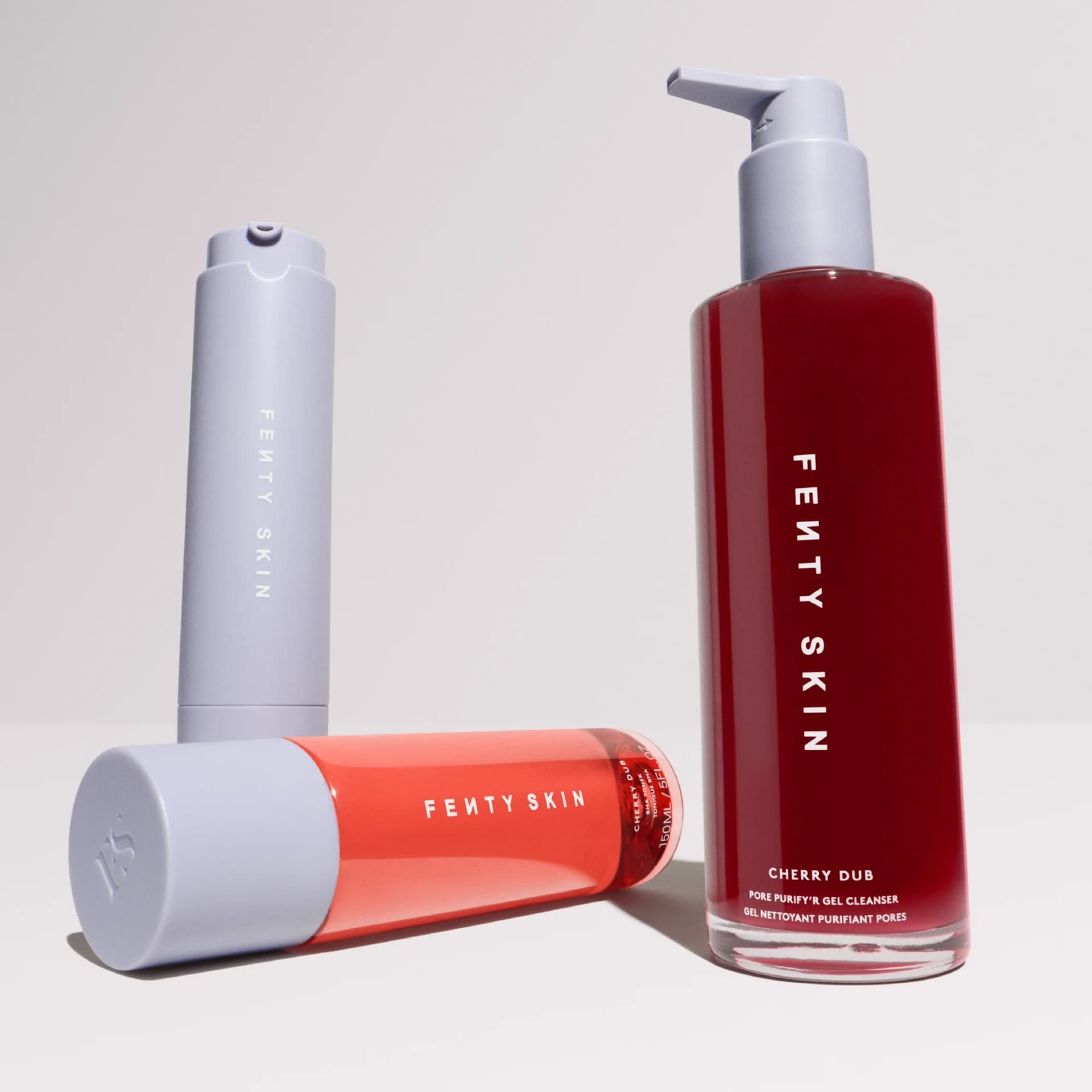
Visual playbook is tight. Warm neutral backgrounds that read as bathroom-adjacent. Product bottle on the left, transformation on the right. Ingredient callouts floating in negative space (saw palmetto, biotin, ashwagandha). Copy leads with the specific problem — hair loss, breakage, flat roots, scalp buildup — not a vague "healthy hair" claim. Meta carries the majority of spend, with YouTube pre-roll running the longer testimonial formats. Facebook feed converts hardest on 1:1 and 4:5.

Browse hair product ad examples from real haircare campaigns — growth supplements, shampoo bottles, styling creams, scalp serums. Pick a template, upload your product, and AdDogs applies your palette across three formats.

Printable Chair Yoga — Playful Text-Heavy Collage. This ad employs a vibrant, collage-style layout on a stark black background, aiming for high contrast and visual pop. The composition is text-heavy, with key information presented in large, clear white font, ensuring readability for its target audience of senior ladies. Surrounding the text, numerous colorful, playful stickers create a friendly, approachable, and slightly retro vibe, softening the directness of the offer. The layout strategy uses these decorative elements to frame and highlight the central message about the free chair yoga workout. Color psychology leverages bright, cheerful hues against black to convey energy and positivity, counteracting any potential perception of yoga being too strenuous. While visually busy, the clear text hierarchy ensures the core offer and benefits are easily digestible, optimized for platforms where a fun, engaging aesthetic can capture attention amidst scrolling. The overall design aims to make fitness accessible and enjoyable.. Headline: TO MY SENIOR LADIES. Primary text: PRINTABLE CHAIR YOGA WORKOUT IS NOW FOR FREE ON TUESDAY, AUGUST 5TH We're kicking off the 28-day Printable Chair Yoga Challenge for beginners By August 12th, you'll feel it. By August 19th, you'll see it. By September 2nd, you'll have a toned body.. Why this ad works: High-contrast text ensures readability — The use of large, bold white text against a solid black background creates maximum contrast. This design choice is crucial for an audience that may have visual impairments, ensuring the core message about the free chair yoga workout is immediately clear and easy to read, reducing friction for engagement. Playful sticker aesthetic creates approachability — The numerous, colorful, and whimsical stickers surrounding the text inject a sense of fun and lightheartedness. This playful vibe helps to demystify yoga and make it seem less intimidating, particularly for senior ladies who might perceive exercise as strenuous, fostering a welcoming and encouraging atmosphere. Clear timeline sets realistic expectations — The ad explicitly outlines a progressive timeline ("By August 12th, you'll feel it. By August 19th, you'll see it. By September 2nd, you'll have a toned body."). This transparency builds trust and manages expectations, motivating the target audience by showing achievable results over a defined period, which is highly effective for fitness programs.. Specs: Industry: Health & Wellness, Platform: Instagram, Format: Static, Audience: Women 45+Hair Gain Gummies — Testimonial Product-in-Hand. Brand: Hair Gain. This ad leverages a user-generated content (UGC) aesthetic, featuring a product held in hand with a prominent testimonial overlay. The layout strategically places the social proof at the top, immediately grabbing attention and building trust before the viewer fully processes the product. The soft pink and black packaging, combined with the natural bathroom background, creates an authentic, relatable vibe. Compositionally, the hand holding the product provides scale and a sense of personal interaction. The text hierarchy prioritizes the glowing review, making it the primary message, while product details on the jar are secondary. This approach is highly effective for platforms like Instagram, where authenticity and peer recommendations drive engagement and consideration. The color palette of the product itself is clean and modern, appealing to a health-conscious audience.. Headline: Great results. Primary text: I have always had thin hair but this product is miraculous, my hair has never been thicker. Why this ad works: Authentic Testimonial Builds Immediate Trust — The large, clear testimonial box at the top, complete with a 5-star rating and "Verified" badge, immediately establishes credibility. This social proof is highly effective, as consumers trust peer reviews more than brand claims, significantly increasing consideration for the product. User-Generated Content Aesthetic Enhances Relatability — The product being held in a hand against a natural, slightly blurred bathroom background mimics organic user content. This unpolished, authentic feel resonates strongly on social platforms, making the ad less intrusive and more trustworthy compared to highly stylized studio shots. Product-in-Hand Provides Scale and Context — Showing the product held by a hand offers a clear sense of its size and encourages viewers to imagine themselves using it. This personal interaction makes the product feel tangible and accessible, bridging the gap between digital ad and real-world experience.. Specs: Brand: Hair Gain, Industry: Health & Wellness, Platform: Instagram, Format: Static, Audience: Women 25-34Printable Chair Workout Plan — Before/After Grid. This ad employs a direct-response, before-and-after layout to showcase a 4-week transformation, targeting an older demographic. The composition features a prominent visual progression at the top, immediately establishing credibility and aspirational results. Below, a detailed 28-day workout grid provides tangible value and reinforces the program's structure. The color palette, while somewhat dated with its olive green background and bright primary shirts, effectively creates contrast, ensuring readability of the black and white text. Text hierarchy is clear: a bold headline states the product, followed by a strong benefit claim, and a direct call to action. Optimized for platforms like Facebook or Pinterest, it aims to stop the scroll with a relatable transformation and a clear, actionable offer. The high text density provides comprehensive information, catering to users seeking detailed program insights.. Headline: PRINTABLE CHAIR WORKOUT PLAN. Primary text: TO LOSE UP TO 22 LBS OF BELLY FAT. Why this ad works: Clear Before/After progression builds trust — The sequential display of the woman's transformation over four weeks immediately establishes credibility and demonstrates tangible results. This visual evidence is highly persuasive for weight loss products, allowing the target audience to envision their own potential success and reducing skepticism about the program's efficacy. Direct benefit-driven headline captures attention — The headline "TO LOSE UP TO 22 LBS OF BELLY FAT" directly addresses a common pain point and offers a specific, measurable outcome. This clear value proposition resonates strongly with the target audience, capturing attention by promising a desired result upfront, which is crucial for direct-response advertising. Detailed workout plan provides immediate value — Including the full 28-day workout plan directly within the ad offers immediate, tangible value to the viewer. This transparency builds trust and allows potential customers to see exactly what they're getting, reducing perceived risk and encouraging immediate engagement with the "Print It Now" call to action.. Specs: Industry: Health & Wellness, Platform: Facebook, Format: Static, Audience: Women 45+Shark Beauty End of Summer Sale — Product Grid. Brand: Shark Beauty. This ad leverages a bold, high-contrast layout to announce a "Shark Beauty End of Summer Sale." The vibrant yellow-orange-red gradient background immediately grabs attention, associating the sale with warmth and urgency. The composition is split: the upper half is dominated by large, white, high-contrast text clearly communicating the sale and its benefit, ensuring immediate comprehension on fast-scrolling feeds. The lower half features a clean, three-panel grid showcasing diverse models actively using different Shark Beauty hair tools. This "in-use" visual strategy provides clear product demonstration and aspirational lifestyle cues, appealing to a broad female audience. The text hierarchy prioritizes the brand, then the sale, then the savings message, before visually reinforcing the product range. This design is optimized for platforms like Facebook or Instagram, where bold visuals and clear value propositions are crucial for engagement and conversion.. Headline: END OF SUMMER SALE. Primary text: Get big savings. Why this ad works: Vibrant Gradient Creates Urgency and Attention — The striking yellow-orange-red gradient background immediately captures attention and evokes a sense of urgency and excitement, perfectly aligning with an "End of Summer Sale." This high-energy palette cuts through feed clutter, signaling a time-sensitive opportunity to potential customers and increasing initial engagement. Clear Text Hierarchy for Instant Value Proposition — The ad prioritizes the "END OF SUMMER SALE" headline in large, bold white text, followed by "Get big savings." This clear, top-down hierarchy ensures the core message and value proposition are instantly understood, crucial for quick scanning on social media platforms where users have limited attention spans. Product-in-Use Grid Demonstrates Versatility — The three-panel grid showcases different models actively using various Shark Beauty tools. This visual strategy effectively demonstrates the products' versatility and real-world application, allowing potential customers to envision themselves using the tools and achieving desired results, building trust and desire for the brand.. Specs: Brand: Shark Beauty, Industry: Health & Wellness, Platform: Facebook, Format: Static, Audience: Women 25-34Caramela Beauty Hair Oil — Handheld Product & Benefits. Brand: Caramela Beauty. This ad employs a clear split-screen layout, dedicating the left to a lifestyle product shot and the right to a numbered list of benefits. The composition effectively uses a warm, neutral background to highlight the product and text, creating a clean and inviting aesthetic. The hand holding the product adds a human touch, enhancing relatability and demonstrating scale. Text hierarchy is strong, with a prominent headline immediately followed by scannable, benefit-driven bullet points, optimized for quick consumption on platforms like Instagram or Facebook. The use of orange accents for numbers draws the eye, guiding the viewer through the key selling points. This strategic design focuses on problem-solving, directly addressing common pain points related to hair removal, making it highly persuasive for its target audience.. Headline: 5 reasons women use our best-selling hair reduction oil. Primary text: no time for wax appointment. shaving irritates the skin. long-lasting results & safe. no more painful waxing strips. no more awkward stubble.. Why this ad works: Problem/Solution Framing Drives Engagement — The headline immediately identifies a common problem ("hair reduction") and promises a solution. The numbered list then elaborates on specific pain points (waxing, shaving irritation) that the product alleviates. This direct problem-solution approach resonates deeply with the target audience, making the ad highly relevant and compelling. Scannable Numbered List for Quick Comprehension — Presenting five distinct benefits in a numbered list format significantly improves readability and information retention. In fast-paced social feeds, users quickly scan for value. The clear, concise points, highlighted by orange circles, allow viewers to grasp the core advantages of the hair reduction oil without extensive reading, boosting message recall. Relatable Handheld Product Shot Adds Authenticity — Featuring a hand holding the product creates a personal, in-use feel, making the ad more authentic and less sterile than a simple hero shot. This human element helps potential customers visualize themselves using the product, fostering a stronger connection and trust. The manicured hand also subtly reinforces the beauty and self-care aspect.. Specs: Brand: Caramela Beauty, Industry: Health & Wellness, Platform: Instagram, Format: Static, Audience: Women 25-34Chair Workout Plan — Before/After & Schedule. The ad strategically combines a compelling before-and-after visual progression with a detailed, actionable workout plan. The four-week transformation of an older woman builds immediate credibility and aspirational appeal for the target demographic. A vibrant green headline against a purple background ensures high visibility and immediate attention-grabbing, leveraging color contrast for impact. The composition guides the eye from the proven results at the top to the practical solution below, fostering a sense of achievable transformation. The grid layout of the 28-day plan offers transparency and structure, reducing perceived effort. While text-heavy, the clear hierarchy, with a dominant headline and prominent CTA, ensures key messages are conveyed. This direct, solution-oriented approach is optimized for platforms where users actively seek practical health and fitness content, driving consideration and conversion through visual proof and clear instructions.. Headline: PRINTABLE CHAIR WORKOUT PLAN TO LOSE UP TO 22 LBS OF BELLY FAT. Why this ad works: Visual proof of transformation builds trust — The sequential before-and-after images over four weeks provide compelling visual evidence of results. This builds immediate trust and demonstrates the program's efficacy, directly addressing the target audience's desire for tangible weight loss outcomes, especially around belly fat, making the promise feel achievable. Clear, actionable value proposition with plan — The detailed 28-day workout plan presented as a grid immediately shows the user what they will receive. This transparency reduces perceived risk and highlights the practical, step-by-step nature of the program, making it feel achievable and valuable. It answers 'what do I get?' instantly. High-contrast, benefit-driven headline grabs attention — The bright green "PRINTABLE CHAIR WORKOUT PLAN TO LOSE UP TO 22 LBS OF BELLY FAT" against the purple background is highly visible and directly addresses a specific pain point with a clear, quantified benefit. This immediate communication captures attention and effectively qualifies the audience.. Specs: Industry: Health & Wellness, Platform: Instagram, Format: Static, Audience: Women 45+Hairbrush Testimonial — Lifestyle with Overlay. This ad effectively leverages social proof through a prominent testimonial overlay on a lifestyle image. The layout features a smiling woman holding two hairbrushes in what appears to be a salon setting, lending authenticity. The composition places the model centrally, drawing the eye to her and the products, while the testimonial box occupies the bottom right, creating a clear secondary focal point. The bright, clean aesthetic, typical of a salon, supports a premium yet approachable vibe. Color psychology is subtle, relying on natural light and the contrast of the white testimonial box with pink stars to capture attention. Optimized for platforms like Instagram, where user-generated content and personal recommendations drive engagement. The text hierarchy within the testimonial is clear: star rating, quote, then professional endorsement, building immediate trust.. Primary text: These hairbrushes are simply the best! They're flying off the shelves in my salon. You have my warmest recommendation - Nikoline, Hairdresser. Why this ad works: Professional Testimonial Builds Trust — The inclusion of a testimonial from "Nikoline, Hairdresser" immediately establishes expert credibility. Consumers are more likely to trust product recommendations from professionals in the relevant field, significantly boosting the perceived value and efficacy of the hairbrushes. This direct social proof is highly persuasive. Authentic Lifestyle Setting Enhances Relatability — Featuring a real person in a salon environment, rather than a sterile studio shot, makes the ad feel genuine and relatable. This authentic context helps potential customers visualize the product in use and connects it to a professional, trusted setting, increasing engagement and belief in the product's quality. Clear Product Display with Human Connection — The model clearly holds both hairbrushes, showcasing their design and size effectively. Her warm, inviting smile creates a positive human connection, making the products seem more appealing and approachable. This combination of clear product visibility and positive human interaction enhances desirability.. Specs: Industry: Health & Wellness, Platform: Instagram, Format: Static, Audience: Women 25-34Olaplex Curly Hair Routine — Elevated Product Display. Brand: Olaplex. Asymmetrical product arrangement on a clean, neutral background with subtle curved elements creates depth without distraction. The muted, earthy tones of off-white and beige, combined with crisp black typography, convey professionalism and a premium aesthetic, aligning perfectly with high-end haircare. The composition strategically staggers the three Olaplex products, guiding the viewer's eye through a complete curly hair routine. The largest product, No.5, is centrally positioned, drawing initial focus, while No.4 and No.10 flank it, suggesting a comprehensive system. This layout is optimized for platforms like Instagram and Facebook, where clean, aspirational product shots with ample negative space effectively stop the scroll in busy feeds. The clear, benefit-driven headline and sub-headline are placed top-left, leveraging natural F-pattern reading behavior to quickly communicate the core promise of visibly healthier curls in just three steps.. Headline: Il ritorno dei ricci. Primary text: Ricci visibilmente più sani in soli 3 passaggi.. Why this ad works: Asymmetrical staging highlights product synergy — The staggered placement of three distinct products on subtle risers creates visual depth and implies a cohesive routine. This arrangement guides the eye through the system, effectively communicating that these products work together for optimal results, rather than as standalone items. Neutral palette conveys premium efficacy — The use of a muted, off-white and beige color scheme with crisp black typography establishes a clean, sophisticated aesthetic. This minimalist approach avoids visual clutter, allowing the product packaging and the promise of professional-grade results to take center stage, appealing to a discerning audience. Clear benefit-driven headline in F-pattern — The prominent headline "Il ritorno dei ricci" (The return of curls) followed by "Ricci visibilmente più sani in soli 3 passaggi" (Visibly healthier curls in just 3 steps) is positioned top-left. This leverages the F-pattern reading habit, quickly communicating the core benefit and ease of use, capturing attention efficiently.. Specs: Brand: Olaplex, Industry: Health & Wellness, Platform: Instagram, Format: Static, Audience: Women 25-34Hairbrush — Authentic Mother-Daughter Lifestyle. This ad effectively leverages an Instagram Story format, mimicking user-generated content to build immediate trust and relatability. The layout strategically uses a Q&A sticker to pose a common parenting pain point: children disliking hair brushing. The subsequent text overlay then presents the product—a hairbrush—as the joyful solution. Compositionally, the candid, eye-level shot captures genuine smiles from both mother and daughter, creating a strong emotional connection. The natural, warm color palette reinforces an authentic, comforting vibe. This seamless integration into the platform's native UI enhances engagement, making the ad feel less intrusive. The clear problem-solution narrative, combined with visible product use and positive emotional cues, persuades viewers by demonstrating tangible benefits and a transformed experience.. Headline: How can your daugther love to getting her hair brushed!?!. Primary text: This hairbrush is the best! It's never been easier 😍. Why this ad works: Authentic UGC format builds trust — The ad mimics an organic Instagram Story, complete with Q&A stickers. This user-generated content (UGC) aesthetic feels less like an ad and more like a genuine recommendation from a peer. This approach significantly boosts trust and relatability, making the product testimonial more credible to the target audience of parents. Directly addresses common parenting pain point — The question "How can your daugther love to getting her hair brushed!?" immediately resonates with parents struggling with tangled hair and reluctant children. The ad then presents the hairbrush as the clear, joyful solution, creating an emotional connection and demonstrating immediate product value. Joyful expressions highlight product benefit — Both the mother and daughter are smiling genuinely, conveying happiness and ease associated with using the hairbrush. This positive emotional framing is highly persuasive, showing not just that the product works, but that it transforms a potentially stressful task into a pleasant, bonding experience.. Specs: Industry: Health & Wellness, Platform: Instagram, Format: Static, Audience: ParentsDESKY Ergonomic Home Office — Lifestyle Setup. Brand: DESKY. This ad effectively uses a lifestyle layout to showcase DESKY's ergonomic desk and chair within an aspirational home office setting. The composition employs an angled perspective, drawing viewers into a well-organized, productive space. Warm wood tones, lush green plants, and soft ambient lighting create a cozy yet professional aesthetic, leveraging color psychology to evoke feelings of comfort, well-being, and natural productivity. This visual strategy is optimized for platforms like Instagram, where high-quality, inspiring lifestyle content drives engagement and consideration. The minimal text overlay, featuring only the 'DESKY' brand logo, allows the sophisticated visual narrative to speak for itself, subtly positioning the brand as a purveyor of integrated, premium home office solutions rather than just individual items. The overall effect is a harmonious blend of functionality and aesthetic appeal, designed to resonate with those seeking an elevated work-from-home experience.. Why this ad works: Aspirational lifestyle context drives desire — The ad doesn't just show products; it presents a complete, desirable home office environment. This allows potential customers to envision themselves in a similar productive and aesthetically pleasing space, creating a stronger emotional connection and driving aspirational purchase intent beyond mere functionality. Warm, organic palette enhances comfort appeal — The rich wood desk, vibrant green plants, and soft, warm lighting create an inviting and natural ambiance. This color scheme and decor choice effectively communicates comfort, well-being, and a calming work environment, which is highly appealing to remote workers seeking a less sterile setup. Integrated product display showcases synergy — By featuring both the standing desk and ergonomic chair together in a functional setup, the ad highlights how DESKY's products complement each other. This integrated view helps consumers understand the complete solution, suggesting a cohesive and thoughtful approach to home office design and ergonomics.. Specs: Brand: DESKY, Industry: Home & Lifestyle, Platform: Instagram, Format: Static, Audience: ProfessionalsBriogeo Haircare — Vibrant Product Assortment Sale. Brand: Briogeo. This Briogeo ad effectively uses a vibrant, gradient background to create an immediate scroll-stopping effect, crucial for competitive social feeds. The layout features four distinct products, strategically placed to convey variety and the "build your own set" offer. Compositionally, the products are arranged dynamically, avoiding a static grid, with the "Allure Readers' Choice" badge adding a layer of social proof and trust. The text hierarchy places the "build your own set" message as a clear value proposition, followed by the prominent discount headline, guiding the viewer's eye towards the offer. The "shop now" CTA is clear and actionable. This ad is optimized for platforms like Instagram, where colorful, aspirational product displays drive engagement and conversion, appealing to consumers seeking personalized value in haircare.. Headline: Enjoy up to 20% off!. Primary text: build your own set. Why this ad works: Gradient background creates scroll-stopping vibrancy — The dynamic, multi-color gradient background immediately grabs attention in a crowded feed. This vibrant choice differentiates the ad from typical minimalist product shots, creating an energetic and modern feel that resonates with a younger, beauty-conscious audience. It enhances product visibility and memorability. "Build your own set" drives perceived value — The "build your own set" proposition, combined with multiple products, empowers consumers with choice and customization. This strategy increases perceived value and encourages larger basket sizes, appealing to those who want tailored solutions and a sense of control over their purchase decisions. Allure badge adds crucial social proof — The visible "Allure Readers' Choice" badge on one product provides instant credibility and social proof. This third-party endorsement significantly boosts consumer trust and confidence in the product's efficacy and quality, making the discount offer even more compelling and trustworthy.. Specs: Brand: Briogeo, Industry: Health & Wellness, Platform: Instagram, Format: Static, Audience: Women 25-34Hair Loss Solution — Problem/Solution Portrait. This ad employs a split-screen layout, featuring a relatable model in the upper half and a prominent text block below. The model's natural grey hair and profile subtly target an audience concerned with hair health. Earthy green and yellow-orange colors evoke natural wellness, creating a trustworthy aesthetic. The composition uses the model to draw initial attention, then directs the eye to the high-contrast text box. This clear visual hierarchy ensures the problem (Traction Alopecia) and solution (Multi-Vitamin Gummies) are immediately understood. Optimized for mobile feeds like Instagram, its square format and bold, readable text ensure scroll-stopping visibility. The ad effectively combines visual relatability with direct, informative copy, making it highly effective for problem-solution marketing.. Headline: TRACTION ALOPECIA MIGHT BE CAUSING YOU HAIR LOSS.... Primary text: Our Multi-Vitamin Gummies are formulated to strengthen hair and promote scalp health which mitigates its effects.. Why this ad works: Problem-Solution Framing for Niche — The headline directly names "Traction Alopecia," a specific and often overlooked cause of hair loss. This precise identification immediately connects with individuals experiencing this particular issue, making the ad highly relevant and increasing the likelihood of engagement. It effectively positions the product as a targeted remedy. Relatable Visual Representation Builds Trust — The ad features a mature woman with natural grey hair, which authentically represents a demographic that may experience hair thinning or loss. This genuine portrayal builds trust and relatability, making the target audience feel seen and understood, rather than presented with an idealized, unachievable image. High-Contrast Text Block Ensures Readability — The use of a solid, warm yellow-orange background for the text box, combined with dark green font, creates exceptional contrast. This design choice ensures that the critical message about hair loss and the product solution is highly legible and easily digestible, even when viewed quickly on a mobile screen.. Specs: Industry: Health & Wellness, Platform: Instagram, Format: Static, Audience: Women 35-44Chair Yoga Program — Benefit-Driven Text Overlay. The ad employs a split-gradient background, transitioning from a muted green to a soft pink, creating a calming and approachable aesthetic. A simple wooden chair with a pink drape serves as the central visual anchor, symbolizing the ease and accessibility of the chair yoga program. Text hierarchy is clear: a large, bold headline immediately addresses the target audience ("senior ladies!") and highlights the free offer. Supporting bullet points around the chair reinforce key benefits and overcome barriers ("Reduce joint pain," "No experience needed"). The composition balances text and image effectively, ensuring readability while maintaining visual interest. This design is optimized for platforms like Instagram or Facebook, where clear, benefit-driven messaging and a gentle, inviting visual can resonate with an older demographic seeking accessible fitness solutions. The strong CTA button provides a clear next step.. Headline: To my senior ladies! Printable Chair Yoga Workout is now for free. Primary text: You don't need a gym. You just need a chair. Reduce joint pain No experience needed Move with ease Just print & try. Why this ad works: Direct audience address and free offer hook — The headline "To my senior ladies! Printable Chair Yoga Workout is now for free" immediately grabs the attention of the target demographic and presents a compelling, no-risk offer. This direct approach fosters a sense of personal connection and urgency, driving initial engagement. Benefit-driven bullet points around visual — Surrounding the central chair with clear, concise benefits like "Reduce joint pain" and "Move with ease" directly addresses common pain points and desires of the target audience. This strategic placement ensures benefits are easily digestible and visually linked to the simple solution. Soft, inviting color palette and simple imagery — The gentle green-to-pink gradient combined with the natural wood chair and soft pink drape creates a warm, non-intimidating atmosphere. This aesthetic is highly appealing to an older demographic, signaling comfort and ease rather than intense athleticism, reducing perceived barriers to entry.. Specs: Industry: Health & Wellness, Platform: Instagram, Format: Static, Audience: Women 45+WEEM Hair Skin Nails — Testimonial Product Display. Brand: WEEM. This ad effectively combines social proof with clear product presentation. The split background, dark green for the testimonial and light grey for the product, creates a distinct visual hierarchy. The testimonial, prominently displayed at the top with a 5-star rating, immediately builds trust and addresses a key pain point. Three product bottles are arranged in a slight diagonal, adding depth and implying abundance, while their consistent branding reinforces recognition. The color palette of deep green, teal, and pink gummies is visually appealing and suggests natural, health-focused benefits. Optimized for platforms like Instagram, the ad leverages a clean aesthetic and direct call-to-action, making it easy for users to understand the product and its perceived efficacy, driving consideration and conversion. The text hierarchy places the social proof first, followed by the product, then the action.. Headline: “I’ve been on this for 6 months. My hair has never been this full!”. Why this ad works: Prominent testimonial builds immediate trust — The large, bold testimonial quote and 5-star rating dominate the upper half, instantly establishing social proof. This direct quote from a satisfied customer resonates strongly, addressing potential skepticism and building credibility faster than generic claims, crucial for supplement advertising. Product repetition implies abundance and value — Displaying three bottles of the product, rather than just one, subtly communicates value and availability. This visual repetition reinforces the brand and product identity, making it more memorable while suggesting a commitment to a regimen, which is common for supplements. High-contrast split background guides eye — The distinct dark green top and light grey bottom create a clear visual separation. This contrast effectively frames the testimonial and then directs the eye down to the product, ensuring both key elements are noticed without competing for attention, enhancing overall readability and focus.. Specs: Brand: WEEM, Industry: Health & Wellness, Platform: Instagram, Format: Static, Audience: Women 25-34Chair Workout Plan — Before/After & Calendar. This ad effectively combines visual proof with a clear action plan. The top section showcases a compelling four-week before/after transformation, using distinct shirt colors to highlight progress and immediately capture attention. This sequential visual narrative builds trust and demonstrates the program's efficacy. Below, a detailed 28-day workout calendar provides immediate perceived value and a structured path for the user. The overall composition guides the eye from the aspirational outcome to the actionable steps. While the olive green background feels somewhat dated, the bright primary colors of the model's attire offer necessary contrast. Text hierarchy is clear, with a bold, benefit-driven headline and a prominent call to action, making it suitable for direct-response platforms like Facebook or Pinterest where users seek tangible solutions and are willing to engage with more detailed content.. Headline: PRINTABLE CHAIR WORKOUT PLAN TO LOSE UP TO 22 LBS OF BELLY FAT. Why this ad works: Sequential before/after builds trust — The four-week visual transformation is immediately compelling. Using distinct, bright shirt colors for each week visually reinforces the progress, making the change undeniable and motivating for the target audience. This builds trust and demonstrates efficacy quickly, crucial for fitness programs. Detailed calendar offers immediate value — The detailed 28-day workout calendar immediately provides perceived value and a clear path to achieving the advertised results. This transparency reduces skepticism and positions the offer as a tangible solution, encouraging immediate engagement from those seeking a structured fitness routine. Specific benefit headline drives relevance — The headline "TO LOSE UP TO 22 LBS OF BELLY FAT" directly addresses a common pain point and offers a specific, aspirational outcome. This strong benefit-orientation immediately resonates with the target demographic, driving relevance and encouraging further engagement with the ad's content.. Specs: Industry: Health & Wellness, Platform: Facebook, Format: Static, Audience: Women 45+Briogeo Hair Oil — User Testimonial Split. Brand: Briogeo. This ad effectively uses a split-screen layout, combining a smiling model with a prominent testimonial. The composition places the model and product on the left, balancing the large quote on the right. The bright, clean background and natural tones of the model's hair evoke a sense of authenticity and health, aligning with the product's benefits. The blue product bottle provides a subtle contrast without clashing. Text hierarchy is clear: five stars and a large quote from "TODAY" immediately convey social proof and credibility. This design is highly optimized for platforms like Instagram, where strong visuals and concise, trustworthy messaging capture attention and drive consideration. The ad focuses on the *result* (shine) and *endorsement*, making it persuasive for potential customers seeking proven hair care solutions.. Headline: If you want the shine, this hair oil is a must.. Why this ad works: Authentic user testimonial builds instant trust — The prominent quote, attributed to a reputable source like 'TODAY' and backed by five stars, acts as powerful social proof. This instantly builds trust and credibility with the audience, suggesting widespread approval and effectiveness. Viewers are more likely to believe a peer or trusted media outlet than direct brand claims, driving higher consideration. Model's genuine smile enhances product appeal — The model's genuine, radiant smile creates an immediate positive emotional connection. Her healthy, shiny hair visually reinforces the product's promise, making the benefits tangible and aspirational. This authentic portrayal helps potential customers envision themselves achieving similar positive results, enhancing the ad's persuasive power. Clear product placement with natural hair — By featuring the product clearly held by the model, the ad demonstrates it in a natural, 'in-use' context. This subtle placement highlights the product as the source of the model's healthy, shiny hair, making the connection between product and benefit explicit without being overly promotional or forced.. Specs: Brand: Briogeo, Industry: Health & Wellness, Platform: Instagram, Format: Static, Audience: Women 25-34K18 Hair Mask — Vivid Before/After Comparison. Brand: K18. This ad effectively leverages a split-screen before/after layout to visually demonstrate product efficacy. The vibrant gradient background (orange to purple) creates a dynamic, attention-grabbing aesthetic, optimized for platforms like Instagram where bold visuals stand out. Compositionally, the damaged hair on the left and repaired hair on the right immediately highlight the problem-solution narrative. The product bottle is strategically placed in the lower-left, providing brand context without distracting from the core comparison. Text hierarchy is clear: a large, benefit-driven headline "hair like new* in 4 minutes" dominates the right, ensuring the key promise is instantly communicated. The scientific labels above the hair samples add credibility. This ad works by providing undeniable visual proof, making a strong case for conversion.. Headline: hair like new* in 4 minutes. Why this ad works: Direct Before/After Visual Proof — The side-by-side comparison of severely damaged hair versus repaired hair after 8x bleach cycles provides undeniable visual evidence of the product's effectiveness. This immediate, clear demonstration builds trust and addresses a common pain point for the target audience, driving consideration and conversion more effectively than descriptive text alone. Bold, Contrasting Color Palette — The vibrant orange-to-purple gradient background, combined with the stark white product bottle and headline, creates high visual contrast. This energetic and modern aesthetic helps the ad pop in a crowded social feed, capturing attention and signaling a contemporary, innovative brand in the hair care space. Clear, Benefit-Driven Headline — The prominent headline "hair like new* in 4 minutes" immediately communicates the core benefit and a rapid timeline. This direct, impactful messaging, combined with the visual proof, addresses the user's desire for quick and effective solutions, compelling them to learn more about the K18 mask.. Specs: Brand: K18, Industry: Health & Wellness, Platform: Instagram, Format: Static, Audience: Women 25-34Pastel Haircare — Organic Product Arrangement. This ad utilizes a clean, organic product arrangement against a soft, warm background, creating a minimalist yet inviting aesthetic. The composition employs varying product heights and angles, drawing the eye across the full range while maintaining balance. Pastel color psychology, with soft greens, yellows, and peaches, evokes natural ingredients and gentle care, appealing to a health-conscious audience. The inclusion of natural elements like coconut and bamboo leaves reinforces the organic theme and adds texture without clutter. Optimized for visual platforms like Instagram or Pinterest, the ad's high-quality photography and serene palette are designed to stop the scroll. Text hierarchy is minimal, relying on clear product labels to convey information, allowing the visual appeal to drive initial engagement. The overall strategy is to communicate purity and premium quality through sophisticated simplicity.. Why this ad works: Harmonious pastel palette signals natural purity — The soft, muted pastel colors of the products (mint, peach, yellow, light green) against a warm off-white background create a serene and natural aesthetic. This palette psychologically communicates gentleness, organic ingredients, and premium quality, resonating with consumers seeking clean beauty products. Organic elements enhance natural product appeal — The strategic placement of fresh green leaves, coconut halves, and a white orchid flower grounds the products in nature. These organic accents reinforce the brand's commitment to natural ingredients and a wholesome lifestyle, adding authenticity and visual interest without distracting from the core products. Varied product heights create dynamic composition — The arrangement uses different product heights and angles, with some bottles elevated on risers, to create a dynamic yet balanced visual flow. This technique prevents the layout from appearing flat or static, guiding the viewer's eye through the entire product line and encouraging exploration of each item.. Specs: Industry: Health & Wellness, Platform: Instagram, Format: Static, Audience: Women 25-34Olaplex N°7 Bonding Oil — Lifestyle Product Shot. Brand: Olaplex. This ad effectively uses a lifestyle layout, featuring a smiling model holding the Olaplex N°7 Bonding Oil close to her face. This composition technique creates an intimate connection, drawing the viewer's eye directly to the product while leveraging the model's vibrant, healthy hair as an implicit testimonial. The clean, bright background ensures minimal distraction, allowing the warm tones of the model's hair and the product itself to stand out. This aesthetic is highly optimized for visual platforms like Instagram, where aspirational imagery and clear product focus drive engagement. The prominent brand and product name at the top establish immediate recognition, while the overall low text overlay keeps the visual primary, encouraging a scroll-stopping moment through human connection and product interaction.. Why this ad works: Direct Gaze & Product Interaction Creates Connection — The model's direct eye contact and the way she holds the product near her face create an immediate, personal connection with the viewer. This intimate interaction makes the product feel approachable and trustworthy, implying personal use and endorsement. It effectively humanizes the brand, fostering relatability and curiosity about the product's benefits. Vibrant Hair Color as Implicit Benefit Proof — The model's striking, healthy-looking red hair serves as a powerful, subtle visual testimonial for Olaplex's efficacy. By showcasing vibrant, well-maintained hair, the ad implicitly communicates the product's benefits without explicit claims. This visual proof is highly persuasive, suggesting that using the bonding oil can lead to similar desirable results. Clean, Minimalist Aesthetic Focuses Attention — The ad's clean, minimalist aesthetic, characterized by a bright, uncluttered background, ensures that the model and the product remain the undisputed focal points. This deliberate lack of distraction communicates sophistication and allows the product's quality and the model's natural beauty to shine, enhancing the premium perception of the brand.. Specs: Brand: Olaplex, Industry: Health & Wellness, Platform: Instagram, Format: Static, Audience: Women 25-34Custom Shampoo — Feature Grid Collage. This ad employs a grid layout to visually present four distinct product features, each paired with a colorful shampoo bottle. The composition uses a clean white background to ensure high contrast, making the vibrant product colors and text blocks pop. The informal, playful arrows guide the viewer's eye between the product and its corresponding benefit, creating a clear visual flow. Text hierarchy is established with a bold, direct headline at the top, followed by concise, benefit-driven bullet points. This structure is optimized for quick scanning on platforms like Instagram, where users rapidly consume content. The "insta-worthy colors" highlight a key aesthetic appeal, leveraging social media trends. The overall design aims for engagement and clear communication of value proposition, appealing to a younger, visually-driven audience.. Headline: WHY THIS IS THE BEST SHAMPOO YOU'LL EVER USE. Primary text: custom formulas natural ingredients helps reach hair goals insta-worthy colors. Why this ad works: Clear feature-benefit pairing for quick understanding — Each shampoo bottle is directly linked to a specific benefit via a colored text box and an arrow. This visual pairing makes it incredibly easy for the viewer to understand the value proposition quickly, reducing cognitive load and improving message retention, crucial for fast-paced social feeds. Vibrant, 'Insta-Worthy' color palette enhances appeal — The use of distinct, pastel yet vibrant shampoo colors, explicitly highlighted as "insta-worthy," directly appeals to a social media-savvy audience. This aesthetic choice enhances product appeal and encourages shareability, aligning with modern beauty trends and driving organic reach. Direct and engaging headline grabs immediate attention — The headline "WHY THIS IS THE BEST SHAMPOO YOU'LL EVER USE" immediately grabs attention and promises a compelling explanation. It creates curiosity and sets an expectation for valuable information, encouraging viewers to read the subsequent feature points and engage with the ad's content.. Specs: Industry: Health & Wellness, Platform: Instagram, Format: Static, Audience: Women 25-34Custom Shampoo — Grid Feature Showcase. This ad employs a clear 2x2 grid layout, effectively showcasing four distinct shampoo variations held in hands against a clean white background. The composition uses contrasting pastel product colors, mirrored in the text block backgrounds, to create visual appeal and differentiate features. Arrows subtly guide the eye, implying a discovery journey or feature comparison. Text hierarchy places key benefit statements adjacent to each product, with a prominent discount offer at the bottom. This design is optimized for visual platforms like Instagram or Pinterest, where a clean aesthetic and quick information absorption are crucial. It efficiently communicates customization, ethical sourcing, and ingredient focus, driving consideration through visual variety and a clear value proposition.. Headline: TRY FOR 20% OFF. Primary text: made just for you effective ingredients vegan + cruelty free choose your color + scent. Why this ad works: Visual Variety & Customization Highlighted — The four distinct pastel colors immediately convey the customizable nature of the product. This visual demonstration of choice is highly engaging, appealing to consumers who value personalization in their beauty routines. It breaks monotony and encourages exploration, making the product feel unique and tailored. Benefit-Oriented Text Placement Enhances Clarity — Each product shot is paired directly with a concise benefit statement ("made just for you," "effective ingredients"). This direct association ensures that the viewer instantly connects a visual product variant with its core value proposition, enhancing message retention and clarity, crucial for quick-scan social feeds. Clear Value Proposition & Strong CTA — The prominent "TRY FOR 20% OFF" at the bottom acts as a strong, undeniable call to action. Placed after the benefits, it capitalizes on generated interest, providing a clear incentive for immediate conversion and reducing purchase friction for potential customers.. Specs: Industry: Health & Wellness, Platform: Instagram, Format: Static, Audience: Women 25-34Before & After Split Screen — Hair Transformation. This ad employs a classic Before/After split-screen layout, directly contrasting a younger appearance with a more mature, stylized look. The composition centers the subject's face in each frame, maintaining direct eye contact and a friendly smile, fostering relatability. The color palette shifts from natural, warm tones in the 'Before' to a striking white hair and luxurious gold/black ensemble in the 'After,' signaling sophistication and transformation. This visual narrative is highly optimized for platforms like Instagram or Facebook, where scroll-stopping transformations capture immediate attention. The minimal text overlay, limited to "Before" and "After" labels, ensures the visual impact is paramount, guiding the viewer's interpretation without distraction. The ad effectively communicates a powerful change, likely for hair color, anti-aging, or a beauty filter, by showcasing a desirable outcome.. Why this ad works: Direct Before/After comparison drives curiosity — The side-by-side format immediately highlights a significant transformation. This direct visual comparison prompts viewers to understand the product's potential effect, creating instant intrigue and a desire to learn more. It leverages the human tendency to compare and contrast, making the ad highly effective for products promising noticeable change. Aspirational 'After' image creates desire — The 'After' image presents a sophisticated, confident, and stylish older woman, adorned with elegant jewelry and attire. This aspirational portrayal makes the depicted transformation highly desirable, suggesting not just a physical change but an enhancement of self-image, status, or personal style. It taps into desires for elegance and aging gracefully. Clear labeling ensures instant comprehension — The prominent and clearly legible 'Before' and 'After' labels remove any ambiguity regarding the ad's purpose. This immediate clarity reduces cognitive load for the viewer, allowing them to instantly grasp the core message of transformation without needing additional context or interpretation, making the ad highly efficient.. Specs: Industry: Health & Wellness, Platform: Instagram, Format: Static, Audience: Women 35-44Hair Care Duo — Boxed Product Shot. This ad employs a casual, lifestyle-oriented product-on-background layout, featuring two hair care bottles nestled in a branded box on a textured green cushion. The composition uses a diagonal line created by the box to guide the eye towards the products. Color psychology leverages the warm, inviting tones of the products (peach and coral) against the earthy green background, suggesting natural ingredients and a gentle approach. The prominent, problem-solution headline immediately addresses a common pain point, creating urgency and relevance for the target audience. A clear discount callout in the bottom right corner acts as a secondary visual anchor and incentive. Optimized for platforms like Instagram, where authentic, slightly unpolished photography resonates, it combines a relatable scenario with a direct offer. Text hierarchy is clear: problem statement first, then product, then incentive.. Headline: if your hair is oily one day after washing, you NEED this.... Primary text: get 20% off. Why this ad works: Problem-solution headline creates urgency — The headline "if your hair is oily one day after washing, you NEED this..." directly addresses a common hair concern. This immediate problem identification resonates deeply with the target audience, making the ad highly relevant and creating a sense of urgency to discover the solution offered by the product. Authentic, lifestyle product presentation — The products are shown in their packaging, nestled in a box on a casual green cushion. This natural, un-staged aesthetic feels authentic and relatable, contrasting with overly polished studio shots. It suggests the product fits seamlessly into a user's everyday life, fostering trust and approachability. Clear discount callout drives conversion — The "get 20% off" circle is strategically placed in the lower right, a common area for CTAs. Its contrasting color (teal) against the warm background makes it pop, immediately communicating a value proposition. This direct incentive is crucial for driving consideration and encouraging immediate action.. Specs: Industry: Health & Wellness, Platform: Instagram, Format: Static, Audience: Women 25-34K18 Hair Mask — Vibrant Product Hero. Brand: K18. This ad effectively uses a high-contrast, vibrant gradient background to make the K18 hair mask pop, ensuring immediate visual attention on crowded social feeds. The product is centrally positioned as a hero shot, with a small dollop of product demonstrating texture and usage, enhancing tangibility. The bold white headline "subscribe & save 15%" is highly legible against the dynamic green-yellow gradient, clearly communicating a direct offer. This composition is optimized for platforms like Instagram, where bright, clean product imagery combined with a clear value proposition drives engagement. The layout prioritizes product visibility and a strong call to action, leveraging color psychology to convey energy and freshness while maintaining a professional, scientific brand image. The minimalist approach to additional text keeps the focus on the product and the discount.. Headline: subscribe & save 15%. Why this ad works: Vibrant Gradient Background for Scroll-Stopping — The energetic green-to-yellow gradient creates a high-contrast backdrop for the white product bottle. This vibrant color choice immediately grabs attention in a busy feed, making the ad stand out against more muted or standard visuals, crucial for initial engagement and breaking through content clutter on social platforms. Clear Value Proposition in Headline — The prominent "subscribe & save 15%" headline is direct and actionable. Placed at the top, it instantly communicates a financial incentive, appealing to cost-conscious consumers and driving consideration for a subscription. This clear offer reduces cognitive load and directly addresses a common purchase barrier. Product Texture and Usage Demonstration — Including a small, perfectly formed dollop of the product next to the bottle visually communicates its texture and suggests application. This subtle detail helps potential customers visualize using the product, adding a tactile element that enhances desire and understanding without needing extra imagery or descriptive text.. Specs: Brand: K18, Industry: Health & Wellness, Platform: Instagram, Format: Static, Audience: Women 25-34Dr Dennis Gross LED Mask — Vibrant Retail Pop-Up. Brand: Sephora X Dr Dennis Gross Skincare. This in-store pop-up leverages a bold, high-contrast design to command attention in a busy retail environment. The central, oversized LED mask display, illuminated with a striking red glow, acts as a powerful hero element, immediately conveying the product's innovative technology. The vibrant orange lighting on the shelves and floor creates a cohesive, energetic brand experience, drawing shoppers in. The "Got Lit" neon sign adds a playful, memorable touch, reinforcing the product's benefit. The layout encourages engagement with consultation chairs and accessible product displays. This design effectively translates the brand's high-tech, premium offering into a visually arresting physical presence, optimized for discovery and interaction in a mall setting.. Why this ad works: Oversized LED mask creates immediate intrigue — The colossal, glowing LED mask display serves as an unmissable focal point, instantly communicating the product's unique selling proposition. Its dramatic scale and internal illumination draw eyes from a distance, sparking curiosity and encouraging shoppers to approach the booth for a closer look and interaction. High-contrast orange lighting grabs attention — The strategic use of vibrant orange backlighting on shelves and the floor creates a dynamic, energetic atmosphere. This high-contrast color scheme against the white booth ensures the display stands out amidst the visual clutter of a mall, effectively stopping foot traffic and guiding the eye towards the products. “Got Lit” neon sign adds playful memorability — The clever "Got Lit" neon sign is a memorable, on-brand slogan that subtly highlights the product's illuminating and transformative effects. Its playful, modern aesthetic resonates with a younger, trend-conscious audience, making the high-tech product feel approachable and shareable, enhancing brand recall.. Specs: Brand: Sephora X Dr Dennis Gross Skincare, Industry: Health & Wellness, Platform: Instagram, Format: Static, Audience: Women 25-34K18 Hair Mask — Before/After Split Screen. Brand: K18. This ad effectively leverages a split-screen before/after layout to visually demonstrate product efficacy, a powerful conversion driver. The vibrant pink background creates a high-contrast, scroll-stopping effect, optimized for platforms like Instagram where visual pop is crucial. The composition strategically places the product bottle in the lower-left, anchoring the brand while allowing the transformative hair images to dominate the upper frame. Text hierarchy is clear: a benefit-driven headline in large white font, "feel like yourself again," followed by specific outcome claims, "stronger, softer, more resilient hair," on a contrasting purple bar. This guides the eye from problem/solution (before/after) to brand, then to the core benefits. The overall design balances scientific credibility, hinted by "Biomimetic Hairscience," with an approachable, vibrant aesthetic, making the technical "molecular repair" feel accessible and desirable to the target audience.. Headline: feel like yourself again with K18 mask. Primary text: stronger, softer, more resilient hair. Why this ad works: Direct Before/After Visual Proof — The side-by-side comparison immediately showcases the product's impact on hair texture and volume. This visual evidence is highly persuasive, building trust and demonstrating tangible results far more effectively than descriptive text alone, driving strong consideration and intent to purchase. Vibrant, High-Contrast Color Palette — The bright pink background with white and purple text creates a visually arresting ad. This bold choice ensures the ad stands out in a crowded social feed, capturing attention quickly and communicating a modern, energetic brand personality that resonates with a beauty-conscious demographic. Clear Benefit-Oriented Headline — The headline "feel like yourself again with K18 mask" taps into an emotional desire for restoration and confidence. This aspirational messaging, combined with the specific benefits "stronger, softer, more resilient hair," directly addresses common hair care pain points and offers a clear, desirable solution.. Specs: Brand: K18, Industry: Health & Wellness, Platform: Instagram, Format: Static, Audience: Women 25-34Weight Loss Quiz — Interactive UI Mockup. This ad employs an interactive UI mockup layout, simulating a quiz to engage users directly. The dark teal background, adorned with vintage botanical illustrations of citrus, creates an organic yet sophisticated aesthetic. The color psychology leverages teal for trust and health, while the contrasting orange highlights key selections, guiding the user's eye through the simulated choices. Text hierarchy is clear, with the provocative headline at the top, followed by structured questions and answers, culminating in a prominent call-to-action. This design is highly optimized for platforms like Instagram Stories or Reels, where interactive elements and quick engagement drive higher swipe-up rates. The composition effectively uses visual breaks and consistent styling to maintain clarity despite multiple text elements, fostering curiosity and participation.. Headline: WHY YOU'RE NOT LOSING WEIGHT. Why this ad works: Interactive quiz format drives engagement — The ad simulates an interactive quiz, prompting users to mentally answer questions about their habits. This gamified approach increases engagement and curiosity, making the ad feel less like a direct sales pitch and more like a personalized assessment. It primes the user for the 'TAKE THE TEST' CTA. Provocative headline creates immediate intrigue — The headline 'WHY YOU'RE NOT LOSING WEIGHT' directly addresses a common pain point, immediately grabbing the attention of the target audience. This direct, question-based approach fosters self-reflection and encourages viewers to seek answers by interacting with the ad, driving higher click-through rates. Organic vintage aesthetic builds trust — The dark teal background with detailed botanical illustrations gives the ad a natural, trustworthy, and slightly retro feel. This aesthetic avoids the sterile look of many health ads, suggesting a holistic or natural approach to weight loss, which resonates well with audiences seeking authentic solutions.. Specs: Industry: Health & Wellness, Platform: Instagram, Format: Static, Audience: GeneralSIHOO Ergonomic Chairs — Dual Gaming Setup. Brand: SIHOO. This ad employs a lifestyle layout, showcasing two SIHOO ergonomic chairs within a modern home office/gaming setup. The composition uses a natural, lived-in scene to demonstrate product integration, with one chair occupied by a gamer and the other by a cat, adding relatability and charm. The color palette is predominantly neutral (greys, whites, wood tones) with subtle pops of color from accessories, conveying a clean, contemporary, and comfortable vibe. This aesthetic is highly optimized for visual platforms like Instagram, where authentic lifestyle content resonates. The brand logo is strategically placed top-left, while a clear "ORDER NOW" CTA banner anchors the bottom, creating a direct visual hierarchy. The ad subtly highlights comfort and suitability for extended use without explicit feature callouts, leveraging visual storytelling over heavy text.. Why this ad works: Relatable Lifestyle Integration — The ad effectively places the ergonomic chairs within a realistic and aspirational home office/gaming environment. This helps potential customers visualize the product in their own lives, making the chairs feel accessible and desirable. The presence of a cat adds an endearing, shareable element that boosts engagement. Dual Product Showcase — By featuring two distinct chair models or color variants side-by-side, the ad efficiently presents choice without overwhelming the viewer. This allows for a subtle comparison and broadens appeal to different aesthetic preferences or functional needs within the target audience. Subtle Comfort & Utility Cues — The image of a person comfortably gaming and a cat relaxing on a chair implicitly communicates the product's primary benefits: comfort and suitability for long periods of use. This visual storytelling is more engaging than explicit feature lists, fostering an emotional connection.. Specs: Brand: SIHOO, Industry: Home & Lifestyle, Platform: Instagram, Format: Static, Audience: ProfessionalsOlaplex N°7 Bonding Oil — In-Use Lifestyle. Brand: Olaplex. This ad employs a close-up, in-use lifestyle composition to showcase Olaplex N°7 Bonding Oil. The model's direct gaze and genuine smile create an immediate, personal connection, enhancing relatability and trust. The product is strategically held near her eye, drawing attention to both the item and the model's vibrant, healthy hair, implying product benefits. A clean white background ensures no distractions, keeping the focus on the model's natural beauty and the golden oil. The prominent brand and product name at the top establish clear identity and reinforce brand recognition. Optimized for social feeds like Instagram, its authentic feel and clear visual hierarchy encourage engagement and brand recall. The warm tones of the model's hair and the product itself add a touch of natural luxury against the minimalist backdrop.. Why this ad works: Direct gaze creates instant connection — The model's eye contact and warm smile immediately engage the viewer, fostering a sense of personal connection and trust. This human element makes the ad feel less like a hard sell and more like a recommendation, significantly increasing relatability and memorability in a crowded feed. Product-in-hand demonstrates scale and usage — Holding the small bottle of bonding oil up close clearly communicates its size and suggests it's a concentrated, precious product. This "in-hand" presentation offers a tangible sense of scale and implies direct application, making the product feel more accessible and understandable to potential users. Minimalist background highlights key elements — The stark white background eliminates visual clutter, ensuring that the model's face, her healthy hair, and the product itself are the undisputed focal points. This clean aesthetic enhances the premium perception of the brand and allows for quick visual processing on fast-scrolling platforms.. Specs: Brand: Olaplex, Industry: Health & Wellness, Platform: Instagram, Format: Static, Audience: Women 25-34Briogeo Scalp Revival — Byrdie Article UI Mockup. Brand: Briogeo. This ad leverages a UI mockup strategy, presenting a Byrdie article featuring Briogeo's new pre-wash oil. The layout strategically frames the product within a trusted editorial context, lending instant credibility. The composition places the product hero shot centrally within the article snippet, ensuring it remains the focal point despite the surrounding text. Color psychology utilizes soft blues, greens, and whites, evoking a sense of natural efficacy and calm, aligning with hair and scalp care. This clean aesthetic is highly optimized for platforms like Instagram, where visually appealing, authentic content performs well. Text hierarchy is clear: the bold article headline immediately grabs attention, followed by the product image, and then the smaller product details. The ad effectively uses a third-party endorsement to build trust and drive consideration, rather than direct conversion.. Headline: Briogeo's New Pre-Wash Oil Gave Me the Best Hair Of My Life. Why this ad works: Third-party endorsement builds instant trust — Featuring a reputable beauty publication like Byrdie immediately elevates the product's credibility. Consumers are more likely to trust editorial reviews than direct brand claims, significantly lowering skepticism and increasing purchase intent by leveraging social proof and expert validation. UI mockup creates native content feel — Presenting the ad as an article snippet makes it feel less like a traditional advertisement and more like organic content. This 'native' approach helps bypass ad fatigue, encouraging users to engage with the content as if they discovered it naturally, leading to higher click-through rates. Organic product styling enhances natural appeal — The product is styled with fresh rosemary and chamomile, reinforcing its natural ingredient profile and benefits. This visual storytelling connects the product to its botanical origins, appealing to consumers seeking clean beauty solutions and enhancing the overall premium, organic vibe.. Specs: Brand: Briogeo, Industry: Health & Wellness, Platform: Instagram, Format: UI Mockup, Audience: Women 25-34Olaplex No. 7 Bonding Oil — Clean Hero Shot. Brand: Olaplex. This ad effectively utilizes a minimalist hero shot layout, placing the Olaplex No. 7 Bonding Oil bottle slightly off-center on a pristine white background. The composition employs a strong vertical visual flow, with golden oil drops strategically positioned above the product, guiding the viewer's eye directly to the bottle. This technique creates an immediate focal point, enhancing product recognition. The vibrant golden hue of the oil provides a striking contrast against the clean white, evoking feelings of richness and efficacy, which aligns with premium hair care. Optimized for platforms like Instagram, its clean aesthetic and direct product focus cut through visual clutter. The absence of additional text overlay ensures the product's visual appeal and brand identity are paramount, making it highly effective for awareness and consideration.. Why this ad works: High-contrast product isolation — The golden oil bottle and drops stand out dramatically against the pure white background. This stark contrast ensures the product is immediately visible and memorable in a busy feed, preventing it from blending in. It communicates purity and premium quality, drawing attention to the product's rich texture and color. Dynamic oil drops guide eye flow — The artful arrangement of oil drops above the bottle creates a natural downward visual path. This subtle compositional technique directs the viewer's gaze from the abstract representation of the oil's essence directly to the tangible product, enhancing engagement and reinforcing the product's core ingredient. Minimalist aesthetic signals premium quality — The clean, uncluttered layout with significant negative space elevates the product's perceived value. This minimalist approach avoids distractions, allowing the product's design and the rich color of the oil to speak for themselves, positioning Olaplex as a sophisticated and high-end hair care solution.. Specs: Brand: Olaplex, Industry: Health & Wellness, Platform: Instagram, Format: Static, Audience: Women 25-34Madison Reed — Discount Offer with Client Collage. Brand: Madison Reed. The ad employs a split-screen layout, dedicating the top half to a prominent discount offer and the bottom to a visual collage. The upper section features a soft lavender background with bold white text, immediately highlighting "20% OFF YOUR FIRST SERVICE." This high-contrast text hierarchy ensures the core value proposition is instantly digestible. Below, three distinct client images showcase diverse hair types and colors, serving as powerful social proof and demonstrating the brand's versatility. The inclusion of a smiling stylist adds a personal, trustworthy touch. The purple color palette, associated with luxury and creativity, subtly reinforces the premium nature of hair services. Optimized for platforms like Instagram, this ad leverages clear visuals and a direct call-to-action ("BOOK NOW") to drive consideration and conversion, effectively stopping the scroll with its compelling offer and relatable imagery.. Headline: 20% OFF YOUR FIRST SERVICE. Primary text: AT A HAIR COLOR BAR NEAR YOU. Why this ad works: Clear, dominant discount offer — The oversized '20% OFF' text immediately captures attention, making the value proposition undeniable. This bold, high-contrast presentation ensures the ad stands out in a crowded feed, driving initial interest. For conversion-focused campaigns, a clear discount is a powerful incentive, prompting viewers to learn more about the first service. Diverse client visuals build trust — The collage showcasing varied hair colors and textures appeals to a broad demographic, making the service feel inclusive and achievable for many. Featuring a smiling stylist also humanizes the brand, building rapport and trust. This visual social proof helps potential clients envision their own positive experience, reducing perceived risk. Strong call to action with urgency — The 'BOOK NOW' button is strategically placed and uses a contrasting dark purple, making it highly visible and actionable. This direct command, combined with the 'first service' offer, creates a sense of urgency, encouraging immediate engagement. A clear CTA is crucial for guiding users directly to the desired conversion point.. Specs: Brand: Madison Reed, Industry: Health & Wellness, Platform: Instagram, Format: Static, Audience: Women 25-34Nutrafol Postpartum — Influencer Testimonial Layout. Brand: Nutrafol. This ad leverages a vertical, testimonial-driven layout optimized for social stories and feeds. The composition strategically places a prominent influencer, Sofia Richie Grainge, interacting with the Nutrafol Postpartum product, drawing the viewer's eye. A large, authentic quote dominates the left, establishing immediate social proof and relatability. The warm, neutral color palette conveys a sense of natural efficacy and premium wellness, aligning with the brand's health focus. The inclusion of "Featured in VOGUE" further elevates brand credibility. Text hierarchy is clear, with the testimonial as the primary message, followed by the endorsement. This design effectively builds trust and consideration by combining celebrity influence with a genuine product experience, ideal for an audience seeking solutions for postpartum hair health.. Primary text: I am not kidding you guys, this Nutrafol Postpartum supplement changed my hair. It looks so thick and healthy. - Sofia Richie Grainge. Why this ad works: Influencer endorsement builds instant credibility — Sofia Richie Grainge's personal testimonial provides powerful social proof. Her authentic quote, prominently displayed, resonates with the target audience, leveraging her aspirational yet relatable image to build trust and drive consideration for the Nutrafol Postpartum supplement. Vertical layout optimizes for mobile consumption — The tall, narrow aspect ratio is perfectly suited for Instagram Stories or Reels, ensuring the ad fills the screen for an immersive experience. This native format reduces friction, making the content feel less like an interruption and more like organic user-generated content, boosting engagement. Strategic text hierarchy emphasizes social proof — The large, easy-to-read testimonial quote is the focal point, immediately conveying the product's benefit through a trusted voice. The "Featured in VOGUE" secondary text reinforces brand authority, creating a compelling narrative that combines personal experience with editorial validation.. Specs: Brand: Nutrafol, Industry: Health & Wellness, Platform: Instagram, Format: Static, Audience: Women 25-34Nutrafol Hair Growth — Product & Testimonial. Brand: Nutrafol. This ad effectively combines social proof with a clear product presentation. The split background, featuring a warm wooden top and a clean white bottom, creates a sophisticated yet approachable aesthetic. Products are centrally placed, flanked by a glass of water and scattered pills, suggesting ease of use. The prominent "Voted #1" headline and US News badge immediately establish credibility, leveraging authority bias. Text hierarchy guides the eye from the bold claim to specific benefits, highlighted by yellow arrows for scannability. Optimized for vertical platforms like Instagram, the composition ensures key information is visible without clutter. The color palette of natural wood, clean white, and product-specific green/blue reinforces a health and wellness vibe, appealing to a broad audience seeking tangible results.. Headline: Voted #1 for hair growth (again).. Primary text: Visibly thicker hair Visibly less shedding Stronger and faster hair growth. Why this ad works: Strong social proof builds immediate trust — The prominent "Voted #1" headline, reinforced by the trusted US News badge, immediately establishes strong credibility. This leverages authority bias, assuring potential customers of the product's efficacy and market leadership. In a crowded health supplement market, third-party validation significantly reduces purchase friction and builds trust, making the ad highly persuasive. Clear product differentiation for targeted needs — Showcasing both "Women" and "Men" versions of Nutrafol side-by-side clearly communicates tailored solutions for different demographics. This direct visual comparison simplifies the decision-making process for the viewer, highlighting inclusivity and specialized care. It addresses specific needs, making the product feel more relevant and effective for a broader audience. Benefit-driven bullet points enhance scannability — The use of clear, concise bullet points like "Visibly thicker hair" directly addresses consumer pain points and desired outcomes. The yellow arrow icons serve as effective visual cues, drawing attention to each benefit and improving scannability. This structure allows for quick comprehension of key advantages, reinforcing the product's value proposition efficiently.. Specs: Brand: Nutrafol, Industry: Health & Wellness, Platform: Instagram, Format: Static, Audience: GeneralCoco & Eve Hair Mask — Problem/Solution Split Screen. Brand: Coco & Eve. This ad effectively utilizes a split-screen, before-and-after layout to visually articulate a common hair problem and its direct solution. The top half showcases dry, damaged hair, clearly identifying multiple pain points with overlaid text. The bottom half presents the same hair transformed, alongside the Coco & Eve product, emphasizing restoration. Color psychology is subtle; the natural hair tones and product packaging's soft pink and green evoke organic, nourishing qualities. The composition guides the eye vertically from problem to solution, enhanced by explicit "PROBLEM" and "SOLUTION" badges. Text hierarchy is clear, starting with a bold question, followed by descriptive points, and culminating in the product name and benefit. Optimized for platforms like Instagram, this visual storytelling approach quickly conveys value, stopping the scroll with relatable imagery and a clear promise.. Headline: DRY, THIRSTY HAIR?. Primary text: Use this ASAP. Rough, dry strands, frizz and flyaways, split ends, knotty and unmanageable hair? Super Nourishing Coconut & Fig Mask will restore hair to its like-a-virgin state!. Why this ad works: Direct Problem/Solution Visual Contrast — The ad powerfully contrasts damaged hair with healthy hair. This immediate visual comparison makes the product's efficacy undeniable and highly relatable to the target audience, driving consideration by clearly addressing a common pain point. This visual proof is highly persuasive. Specific Pain Point Identification — By explicitly listing "Rough, dry strands," "Split ends," "Frizz and flyaways," and "Knotty and unmanageable hair," the ad resonates deeply with viewers experiencing these exact issues. This specificity builds trust and makes the solution feel tailored, increasing perceived relevance and urgency. Clear Product-Benefit Association — The solution section directly links the "Super Nourishing Coconut & Fig Mask" with the promise to "Restore hair to its like-a-virgin state!" This strong association ensures viewers immediately understand what the product is and the transformative outcome it delivers, simplifying the value proposition and boosting intent.. Specs: Brand: Coco & Eve, Industry: Health & Wellness, Platform: Instagram, Format: Static, Audience: Women 25-34Jolie Hair Shedding — Before/After Comparison. Brand: Jolie. This ad effectively uses a split-screen before/after layout to visually demonstrate product efficacy, a powerful conversion driver. The top half directly contrasts hair density, immediately addressing a common concern. Below, a bold, high-contrast headline highlights a key user statistic, leveraging social proof. The minimalist white background with subtle water droplets reinforces a clean, health-focused aesthetic, aligning with the product's function. The product itself, a sleek showerhead, is subtly placed, allowing the results to take center stage. Text hierarchy is clear: problem/solution visual, then quantitative proof, then product. This composition is optimized for platforms like Instagram, where direct visual evidence and concise messaging cut through noise, driving consideration by showcasing tangible benefits.. Headline: 81% OF USERS NOTICED REDUCED HAIR SHEDDING. Primary text: Participants were studied for hair shedding before and after using Jolie for 12 weeks.. Why this ad works: Direct Before/After comparison builds immediate trust — The split-screen visual directly addresses a core pain point (hair shedding) with clear evidence of improvement. This format is highly effective for showing tangible results, building immediate credibility and trust with potential customers. It visually answers "Does it work?" without requiring extensive reading. Quantified social proof enhances product credibility — The bold "81% OF USERS NOTICED REDUCED HAIR SHEDDING" provides a strong, data-backed claim. This statistic acts as powerful social proof, reassuring viewers that the product delivers on its promise. It converts anecdotal evidence into a compelling, trustworthy metric, driving consideration. Clean aesthetic integrates product subtly — The minimalist white background with water droplets creates a fresh, health-oriented vibe, perfectly suiting a shower filter. The sleek Jolie showerhead is positioned to complement the text and visual proof, not overshadow it. This subtle integration allows the results and statistics to be the primary focus, enhancing perceived efficacy.. Specs: Brand: Jolie, Industry: Health & Wellness, Platform: Instagram, Format: Static, Audience: Women 25-34Rose Skin Co Lumi — Authentic Testimonial Flat Lay. Brand: Rose Skin Co. This ad leverages a flat lay composition with a strong user-generated content (UGC) aesthetic, ideal for platforms like Instagram. The soft, pastel color palette, featuring pinks and creams, creates a feminine and inviting vibe, appealing directly to the target demographic. The primary focus is on two prominent text overlays, presenting authentic testimonials that address a sensitive, relatable problem (PCOS-related facial hair) with a life-changing solution. Products are subtly integrated into the scene, reinforcing the testimonial without overtly pushing a sale. This composition builds trust and credibility, prioritizing social proof over direct product features, making it highly effective for consideration-stage marketing goals by fostering genuine connection and relatability. The text hierarchy ensures the personal stories are the first elements consumed.. Why this ad works: Authentic User Testimonial Builds Trust — The ad prominently features a personal, raw testimonial about a sensitive issue like PCOS and facial hair. This user-generated content style feels genuine and relatable, fostering immediate trust with potential customers who may share similar struggles. It acts as powerful social proof, often more effective than brand-produced claims. Relatable Problem-Solution Narrative Engages — By directly addressing the challenge of coarse facial hair due to PCOS, the ad connects deeply with a specific audience. The testimonial then offers a clear, positive outcome ("more sparse," "doesn't grow overnight anymore"). This problem-solution narrative is highly engaging, demonstrating empathy and providing a tangible benefit through a personal story. Soft, Feminine Aesthetic Attracts Target — The overall visual aesthetic, characterized by pastel pinks, creams, and delicate accessories, creates a soft, feminine, and aspirational mood. This color psychology and styling resonate strongly with the target demographic, making the ad visually appealing and aligning with self-care and beauty product expectations. It feels approachable and gentle.. Specs: Brand: Rose Skin Co, Industry: Health & Wellness, Platform: Instagram, Format: Static, Audience: Women 25-34Heights Multivitamin — Authentic Handheld Testimonial. Brand: Heights. This ad leverages a user-generated content (UGC) format, typical of Instagram Stories, to build authenticity. The composition places the product prominently in hand, creating an "in-use" feel that enhances relatability. Text overlays, mimicking Instagram's native story features, present a personal testimonial, establishing a clear problem-solution narrative. The color palette is natural and subdued, focusing attention on the product and the text. Text hierarchy is informal, using chat-bubble styling to guide the eye through the testimonial before revealing the product. This approach optimizes for platform engagement by blending seamlessly with organic content, making the ad feel less intrusive and more trustworthy, especially for an older demographic seeking genuine recommendations. The overall strategy is to foster consideration through social proof.. Headline: Since I hit my 50s I just felt like I was slowing down.... Primary text: No energy, struggling to keep up with the family. I've been on Heights for a month now and honestly, I feel sharp again... like the old me!. Why this ad works: UGC format builds immediate trust — The ad's appearance as an Instagram Story from a real user, complete with profile name and "Added to Supplements I Swear By," instantly establishes credibility. This native format bypasses typical ad skepticism, making the testimonial feel genuine and relatable to the target audience, who value authentic recommendations. Problem-solution narrative resonates deeply — The testimonial starts with a clear pain point ("slowing down... No energy") and progresses to a solution ("feel sharp again... like the old me!"). This narrative structure is highly effective for supplements, as it directly addresses common concerns and offers a tangible benefit, driving consideration by showing a transformation. Product shown in-hand enhances relatability — Presenting the Heights product being held by a user's hand makes it feel tangible and accessible. This "in-use" shot, combined with the casual background, grounds the product in everyday life, allowing potential customers to easily visualize themselves using it and experiencing its benefits.. Specs: Brand: Heights, Industry: Health & Wellness, Platform: Instagram, Format: Static, Audience: Women 45+HigherDose Hat — Lifestyle Split Screen. Brand: HigherDose. This ad effectively uses a split-screen layout to combine aspirational lifestyle imagery with clear product benefits. The top section features a concise headline and bullet points, strategically pointing to the product (the hat) worn by the model in the larger, engaging bottom section. The natural blue sky and beach backdrop evoke a sense of wellness and outdoor activity, aligning with the brand's health-focused identity. Color psychology leverages the calming blue and natural skin tones for a clean, approachable feel. The composition places the smiling model prominently, fostering connection, while the inset image provides a subtle alternative view. Optimized for vertical platforms like Instagram, the ad balances visual appeal with direct communication of the hat's hair growth benefits, ensuring high text readability against the clear sky.. Headline: The Habit That Does The Work For You. Primary text: stimulates hair growth reduces shedding maintains healthy hair. Why this ad works: Lifestyle context elevates product appeal — Placing the product on a smiling model in a natural, aspirational setting immediately connects it to a desired lifestyle. This approach helps potential customers visualize themselves using the product, shifting focus from just a hat to a wellness solution integrated into a healthy routine. Clear benefit communication with visual cue — The concise bullet points "stimulates hair growth," "reduces shedding," and "maintains healthy hair" clearly articulate the product's value proposition. The subtle line connecting these benefits directly to the hat reinforces the product's function, making the ad highly informative without being text-heavy. Split-screen enhances product storytelling — The ad cleverly uses a split-screen. The larger bottom image creates an emotional connection with the model, while the smaller inset provides a slightly different angle, hinting at the product's versatility or subtle design. This technique allows for both broad appeal and specific detail within a single frame.. Specs: Brand: HigherDose, Industry: Health & Wellness, Platform: Instagram, Format: Static, Audience: Women 25-34Feel Hair Support — Gradient Product Offer. Brand: Feel. This ad effectively uses a vibrant gradient background, transitioning from soft pink to purple, to create a clean yet engaging visual field. The primary product, Feel Hair Support, is prominently placed on the left, balanced by a "FREE Collagen Gels" offer on the right, creating a clear value proposition. The composition employs a question-based headline ("Thinning Hair?") to immediately engage the target audience, followed by a strong clinical claim. Color psychology leverages purple for luxury and wellness, while the pink adds a touch of approachability. Optimized for social feeds, its vertical format and clear hierarchy ensure readability and impact, driving consideration through a compelling offer and problem-solution framing. The low text overlay keeps the focus on the product and offer.. Headline: Thinning Hair?. Primary text: Clinically proven results in 90 days WORTH £77 • FREE GIFT WORTH £77 • FREE GIFT. Why this ad works: Problem-solution headline engages instantly — The direct question "Thinning Hair?" immediately addresses a pain point, drawing in the target audience. This technique creates instant relevance, making viewers feel understood and prompting them to seek the solution offered by the product, increasing initial engagement and click-through rates. Clear value proposition with free gift — The ad prominently features a "FREE Collagen Gels" offer, clearly communicating added value. This incentive, coupled with the "WORTH £77" text, enhances perceived value and urgency, effectively motivating potential customers towards conversion by reducing the perceived risk of purchase. Vibrant gradient background for scroll-stopping appeal — The smooth, colorful gradient from pink to purple creates a visually appealing and modern backdrop. This aesthetic choice helps the ad stand out in a crowded social feed, capturing attention without distracting from the product. The colors also subtly convey a sense of wellness and premium quality.. Specs: Brand: Feel, Industry: Health & Wellness, Platform: Instagram, Format: Static, Audience: Women 25-34L'ange Airflow Multi-Styler — Feature Spotlight. Brand: L'ange. This ad employs a split-screen layout, dedicating the left to feature-benefit copy and the right to a dynamic product display. The soft pink and rose gold palette against a clean white background evokes a modern, feminine, and premium aesthetic, appealing to a target audience seeking sophisticated styling tools. The product is angled to create visual interest and depth, preventing a static feel. Text hierarchy is clear: a bold, unique selling proposition headline, followed by easily digestible bullet points with illustrative icons. This design is optimized for visual platforms like Instagram or Pinterest, where high-quality product photography and concise information effectively stop the scroll and drive consideration by highlighting key differentiators.. Headline: The First & Only. Primary text: Airflow Multi-Styler with Curved Plates Curved plates create effortless curl perfection and add lift at the roots Patent-pending tension technology for loose to tight curls in an instant Enhanced ion generator minimizes frizz and enhances shine Exterior vents cool cuticles instantly after heating to lock-in styles Perfect for both beginners and styling experts. Why this ad works: Feature-benefit pairing with clear icons — The ad effectively pairs each product feature with a concise benefit and a simple, relevant icon. This visual shorthand allows for quick comprehension of complex technology, making the product's value proposition immediately clear to the viewer. It reduces cognitive load, enhancing message retention in a fast-scrolling feed environment. Aspirational and feminine color palette — The use of soft pink and rose gold for the product, set against a pristine white background, creates an aspirational and feminine aesthetic. This color choice positions the styling tool as a premium beauty accessory rather than a mere appliance, resonating with consumers who value style and self-care in their purchases. Dynamic product angle and composition — The multi-styler is presented at a dynamic angle, showcasing its unique curved plates and sleek design from multiple perspectives. This composition adds depth and visual interest, making the product appear more engaging and sophisticated than a flat, static shot. It subtly communicates innovation and premium quality.. Specs: Brand: L'ange, Industry: Health & Wellness, Platform: Instagram, Format: Static, Audience: Women 25-34Prose Sale — Lock Screen Notifications. Brand: Prose. This ad leverages a native UI mockup, simulating a phone lock screen with multiple incoming messages, to announce a Prose haircare sale. The layout strategically places the brand name and time at the top, followed by three stacked notification bubbles. This composition creates a sense of urgency and social proof, as if friends are excitedly sharing the news. The muted green-grey background and clean white notification boxes maintain a minimalist aesthetic, typical of modern smartphone interfaces. Bolded "50% off" within each message ensures the core offer is immediately visible. Optimized for platforms like Instagram Stories or feeds, this format cleverly bypasses traditional ad fatigue by mimicking organic content, encouraging engagement through its relatable and urgent presentation. The text hierarchy emphasizes the discount, driving immediate consideration.. Primary text: OMG did you hear? Prose haircare is 50% off Wake up! Prose is having a 50% off sale on all haircare Girl! Prose. Sale. Now. P.S. Love your new hair ✨✨✨. Why this ad works: Native UI format builds immediate trust — Mimicking a phone's lock screen notifications creates an instant sense of familiarity and authenticity. Users are accustomed to receiving messages, making this ad feel less like an interruption and more like a personal alert, increasing initial engagement and reducing ad skepticism. Stacked notifications create urgency and excitement — The three distinct messages, appearing to arrive sequentially, build narrative tension and urgency. Each message reinforces the 50% off offer, with the final message adding a playful, direct call, compelling viewers to act quickly before the perceived "sale" ends. Clear, repetitive discount offer drives action — The "50% off" message is prominently featured and repeated across all three notifications. This consistent emphasis ensures the core value proposition is unmistakable and memorable, directly appealing to price-sensitive consumers and prompting immediate conversion intent.. Specs: Brand: Prose, Industry: Health & Wellness, Platform: Instagram, Format: UI Mockup, Audience: Women 25-34Gisou Honey Gloss — Illustrated Routine Guide. Brand: Gisou. This ad effectively uses an illustrated, step-by-step layout to demystify a multi-product hair care routine. The warm, minimalist color palette, dominated by soft beige and honey tones, evokes natural ingredients and a gentle, luxurious experience, aligning with premium beauty branding. Compositionally, the sequential flow, guided by dotted lines and numbered steps, ensures clear comprehension, ideal for platforms like Instagram where users seek quick, digestible information. Text hierarchy is well-defined, with bold routine titles and concise step descriptions, making the process easy to follow. This educational approach builds consideration by demonstrating product utility and benefits, optimizing for engagement rather than immediate conversion. The hand-drawn aesthetic adds an approachable, organic feel.. Headline: NEW! Gisou Honey Gloss Ceramide Therapy Routine. Why this ad works: Clear Step-by-Step Visual Guidance — The numbered steps and connecting dotted lines create an intuitive visual flow. This technique simplifies a complex routine into easily digestible segments, reducing perceived effort for the user and making product integration feel natural and achievable. It's highly effective for product education. Organic, Approachable Illustration Style — The hand-drawn, watercolor-like illustrations convey a natural, gentle, and premium aesthetic. This style avoids the harshness of photography, making the routine feel less intimidating and more inviting. It resonates with consumers seeking authentic and wholesome beauty solutions. Warm, Cohesive Brand Color Palette — The consistent use of soft beige, honey yellow, and brown tones reinforces Gisou's brand identity, which is centered around honey. This warm palette creates a sense of comfort and natural goodness, enhancing the perception of the products as nourishing and beneficial.. Specs: Brand: Gisou, Industry: Health & Wellness, Platform: Instagram, Format: Static, Audience: Women 25-34Hims Hair Regrowth — Before/After & Product. Brand: Hims. This ad effectively leverages a split-screen before/after layout to showcase product efficacy, a powerful consideration-stage tactic. The top section immediately presents visual proof of hair regrowth, anchoring the ad's credibility. Below, a playful yet direct headline, "Let it go grow.", captures attention, followed by a clear benefit statement and the Hims brand. The minimalist product shot reinforces brand identity without distracting from the primary message. A warm, earthy color palette (red-brown, cream, beige) fosters a sense of trust and natural efficacy, avoiding a sterile clinical feel. Optimized for mobile feeds like Instagram, its vertical composition and clear visual hierarchy guide the eye from problem/solution to product and brand, making it highly scannable and impactful. The ad strategically combines visual proof with concise, benefit-driven copy.. Headline: Let it go grow.. Primary text: Regrow hair in 3-6 months with finasteride and minoxidil. Why this ad works: Direct Before/After Visual Proof — The prominent before/after comparison immediately addresses the core problem and presents a tangible solution. This visual evidence builds trust and demonstrates efficacy more powerfully than text alone, crucial for health-related products where skepticism can be high, driving stronger consideration. Benefit-Driven, Playful Headline — "Let it go grow." is a clever, memorable headline that directly speaks to the desired outcome (regrowth) while adding a touch of personality. It grabs attention, creates intrigue, and primes the viewer for the solution offered by Hims, enhancing engagement. Trustworthy, Earthy Color Palette — The use of warm red-brown, cream, and beige tones creates a natural, approachable, and trustworthy aesthetic. This avoids the cold, clinical feel often associated with medical products, making the solution feel more accessible and less intimidating, which resonates with a broader audience.. Specs: Brand: Hims, Industry: Health & Wellness, Platform: Instagram, Format: Static, Audience: Men 25-34Vegamour GRO Hair Serum — Before/After Results. Brand: Vegamour. This ad effectively uses a clean, minimalist layout to showcase the transformative results of Vegamour's GRO Hair Serum. The vertical composition is optimized for mobile feeds, drawing the eye from the bold headline to the compelling before-and-after circular images. The soft, neutral color palette reinforces a sense of natural efficacy and premium quality, avoiding harsh clinical tones. By placing the product centrally with clear visual cues ("DAY 0" and "DAY 120"), the ad establishes a strong visual narrative of improvement. The text hierarchy is clear: a prominent benefit-driven headline, followed by a time-bound promise, and then the visual proof. This direct approach, focusing on tangible outcomes, aims to build trust and drive consideration by visually answering the "does it work?" question. The overall design prioritizes clarity and impact, making it highly effective for platforms like Instagram.. Headline: Thicker, Fuller, Healthier Looking Hair. Primary text: In as soon as 3 months*. Why this ad works: Direct Before/After Visual Proof — The circular "DAY 0" and "DAY 120" images provide undeniable visual evidence of hair improvement. This direct comparison is highly persuasive, immediately addressing potential customer skepticism and building trust by showcasing tangible results, which is crucial for products promising physical transformation. Benefit-Driven Headline & Timeframe — The headline "Thicker, Fuller, Healthier Looking Hair" immediately communicates the core benefit. Coupled with "In as soon as 3 months*", it sets realistic expectations while offering a clear, desirable outcome. This combination effectively captures attention and motivates further engagement by promising a solution to a common concern. Clean, Minimalist Aesthetic — The muted beige background and uncluttered layout create a sophisticated and trustworthy impression. This minimalist approach allows the product and its results to be the undisputed focal point, preventing visual overload. It aligns with a premium brand image, suggesting natural efficacy without relying on excessive claims or busy graphics.. Specs: Brand: Vegamour, Industry: Health & Wellness, Platform: Instagram, Format: Static, Audience: Women 25-34
Why Clone Ads

What Makes Haircare Ads Convert

Before-after beats bottle hero

A split-frame transformation will out-convert a clean bottle shot by 2-3x in haircare. Keep both frames identical except for the product variable. Same person, same angle, same crop, different hair state. If you can't show transformation, show ingredient proof.

Lead with the specific problem

"Healthy hair" is a dead ad hook. "Thinning at the crown," "breakage at the ends," "flat second-day roots" — those are the claims people search for and click on. Write the problem like your customer would describe it in a text to their sister, not in a marketing brief.

Ingredient names outperform benefit verbs

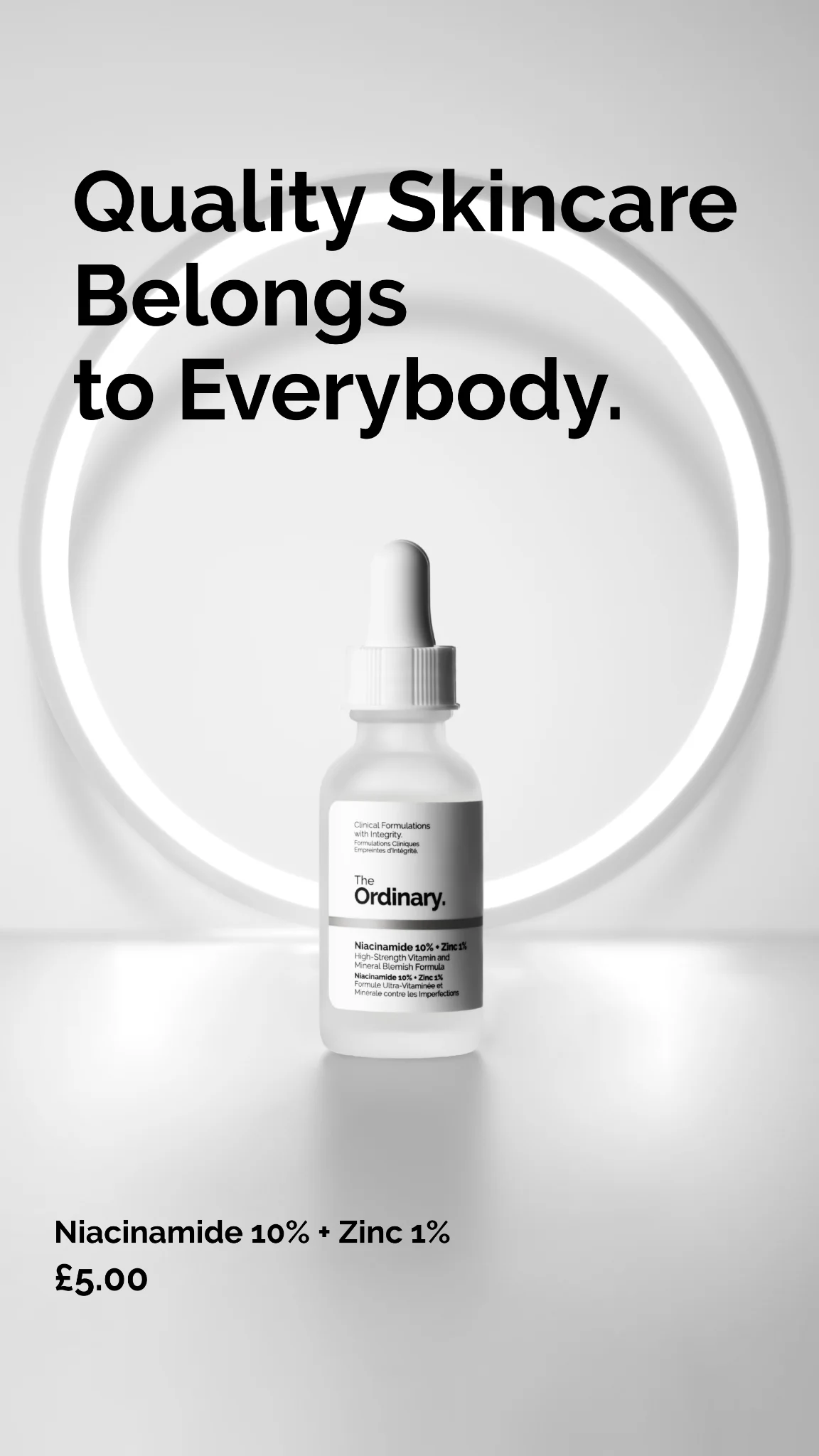
"Saw palmetto and biotin" beats "strengthens and nourishes" every time. Specific ingredients read as real. Benefit verbs read as marketing. If your product has a hero ingredient with any recognizability — even slight — put the name on the ad.

Questions

Before-after split frames dominate haircare CTR — 1:1 for Facebook feed, 4:5 for Instagram feed, 9:16 for Stories and Reels. Video timelines (day 1 vs day 90) perform second best because they imply a credible duration. Static bottle heroes underperform unless paired with a transformation carousel or an ingredient callout with specific mg or percentage claims.

Nutrafol, Function of Beauty, OUAI, Vegamour, and Prose run the heaviest sustained spend in haircare DTC. Nutrafol alone runs into eight figures annually on Meta. Vegamour built a growth brand on plant-based positioning with weekly creative rotation. Function of Beauty owns the custom-formula quiz funnel. Each has a recognizable visual system worth studying frame-by-frame.

Never use "regrow," "reverse," or before-after framing that shows dramatic scalp change. Safe language: "supports growth," "visibly thicker," "improves density." Keep testimonials third-person and avoid "I was bald and now I'm not" arcs. Nutrafol's copy bank is worth screenshot-studying — every claim is adjacent to medical but never crosses the line. Plan for 20-30% initial rejection rate on new creative.

15-20 minimum, split across before-after, ingredient hero, problem-led copy, and UGC testimonial formats. Haircare buyers have high consideration — they're shopping for a 3-6 month commitment. Cold audiences need multiple hooks to find the one that matches their specific hair concern. Rotate creative every 10-14 days as frequency climbs past 3.

Short for top-of-funnel, longer for retargeting. 5-10 words of hook copy on cold audiences because shoppers decide on the visual transformation. For retargeting, longer-form founder or customer story copy (80-120 words) reconverts considerers who need more proof. OUAI and Prose both run this split.

Create Your Own
Haircare Ad

Clone any haircare ad example. Upload your product photo. Seconds later, you have a finished ad ready to launch.

Create your ad
AdDogs ad examples globe