AdDogs

Supplement Ad Examples (Compliant + High-CTR)

Browse 45+ supplement and vitamin ad examples sourced from high-performing campaigns. Clone any design, swap in your product, and get a finished ad in seconds.

Updated June 2026

Supplement ads live in a weird middle ground. Too scientific and nobody reads. Too hype-driven and the FTC shows up. Brands that win — AG1, Nutrafol, Ritual, ARMRA — thread the needle with three moves: a single-SKU bottle hero, an ingredient callout that reads like a menu, and a podcast-host quote that borrows third-party trust.

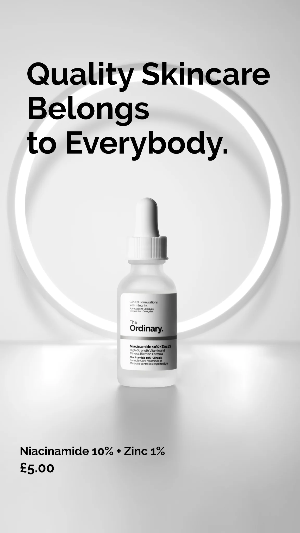
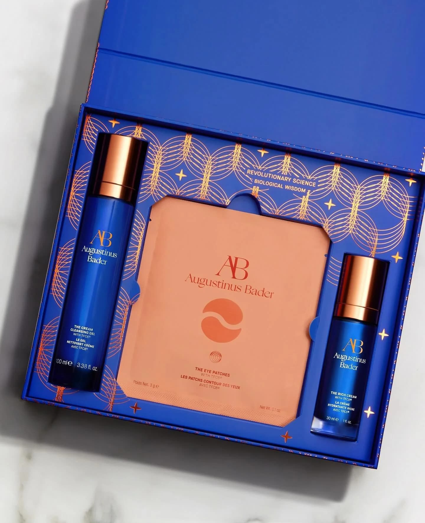
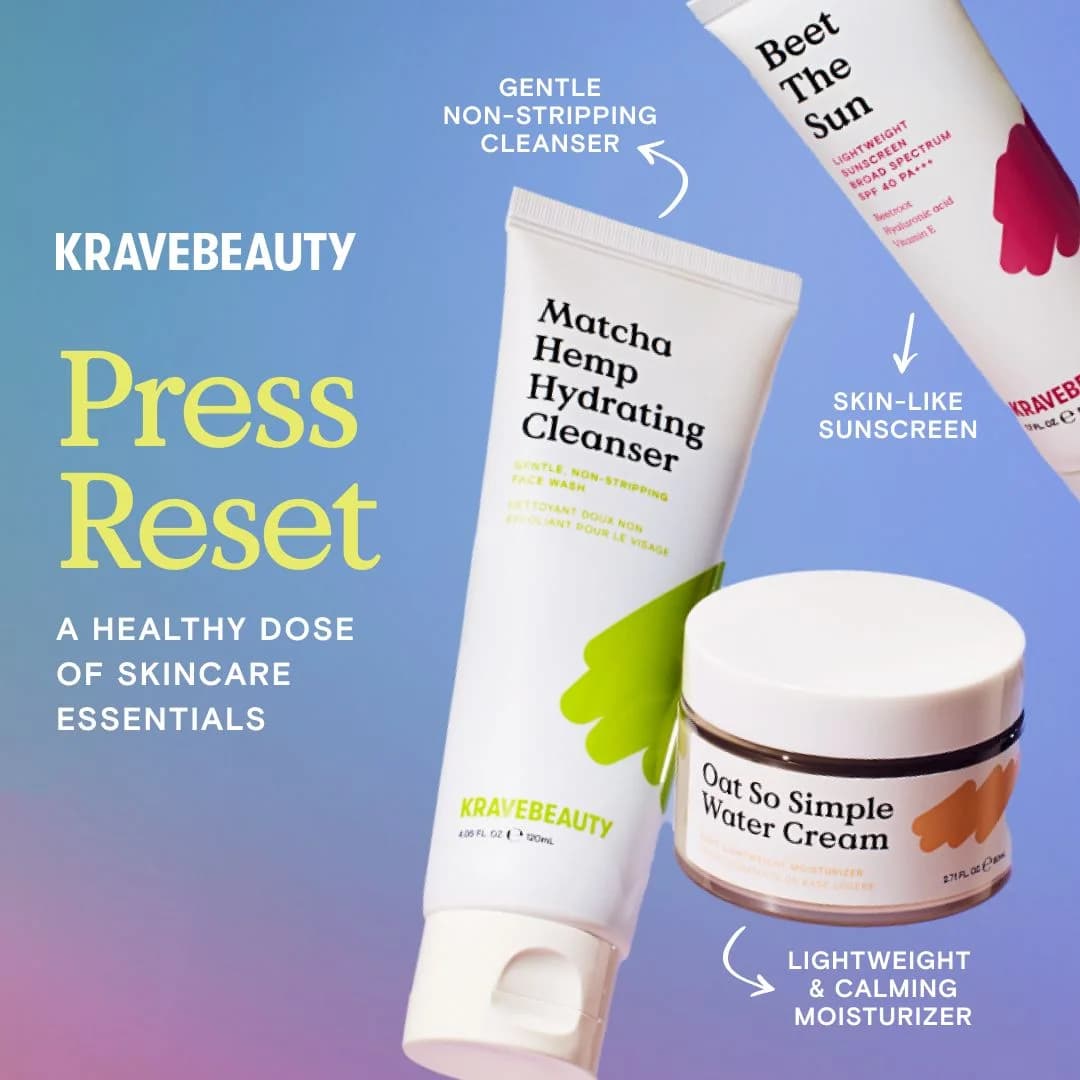
The visual recipe is consistent. Bottle centered, shot at slight angle, on a warm-neutral background. Callout boxes naming active ingredients (75 vitamins and minerals, 1000mg collagen, 5 billion CFU probiotics). A price anchor or "try risk-free" framing. Facebook and Instagram feed dominate the spend, with YouTube pre-roll carrying longer testimonial formats. Bottle shots crop to 1:1 or 4:5 for feed, with 9:16 extensions for Stories.

Browse supplement ad examples pulled from daily-vitamin bottles, collagen powders, sleep tinctures, and biohacker stacks. Pick a template, upload your SKU, and AdDogs rebuilds the layout with your product and colors in three formats.

Vital Proteins Collagen — Dual Product Hero Shot. Brand: Vital Proteins. This ad employs a minimalist, clean layout featuring two Vital Proteins products against a neutral, sunlit background. The composition strategically uses natural light and shadows to add depth and realism, enhancing product appeal without clutter. Color psychology is evident with the soft pink for "Beauty Collagen" and bold blue for "Collagen Peptides," effectively differentiating products while maintaining brand cohesion. Ample negative space ensures the products are the undeniable focal point, optimizing for platforms like Instagram where visual clarity and aesthetic appeal drive engagement. The text hierarchy on the product labels is clear, highlighting key benefits and ingredients, allowing for quick comprehension without an explicit ad headline, relying on product packaging to communicate value.. Why this ad works: Distinctive color palette for product differentiation — The ad effectively uses a soft pink for "Beauty Collagen" and a vibrant blue for "Collagen Peptides." This clear color coding instantly differentiates the two products and their intended benefits, allowing consumers to quickly identify the relevant product in a busy feed environment, enhancing recognition and recall. Natural light and shadow create depth — The use of natural light casting soft shadows across the background adds significant depth and realism to the image. This technique elevates the product photography beyond a simple studio shot, making the products feel more tangible and inviting, which can increase perceived quality and engagement on visual platforms. Generous negative space focuses attention — By dedicating a large portion of the frame to a clean, uncluttered background, the ad ensures the two Vital Proteins products are the absolute focal point. This minimalist approach prevents visual distraction, guiding the viewer's eye directly to the products, which is crucial for scroll-stopping effectiveness on social media.. Specs: Brand: Vital Proteins, Industry: Health & Wellness, Platform: Instagram, Format: Static, Audience: Women 25-34HEALTHLETIC BPC-157 — Hand & Product Value Shot. Brand: HEALTHLETIC. This ad employs a split-screen composition, juxtaposing a human element (pills in hand) with the product bottle and a strong value proposition. The layout strategically uses the human hand to ground the product in a relatable, personal context, immediately connecting the supplement to the user's daily life. A high-contrast color palette, featuring a deep teal text overlay against skin tones and a vibrant blue bottle, ensures high visibility and readability, crucial for mobile feed environments like Instagram. The text hierarchy is clear: a large, bold statement dominates the left, drawing the eye with a compelling cost-benefit comparison. This direct approach, combined with a clean, minimalist aesthetic for the product itself, positions the supplement as an accessible yet impactful health investment. The visual connection between the pill and bottle reinforces product identity, optimizing for quick comprehension and consideration.. Primary text: At $1.77 per pill, it's cheaper than a latte. AND it's the one investment in your health that will pay off the most.. Why this ad works: Relatable cost comparison drives value — The ad immediately frames the product's cost against an everyday expense like a latte. This makes the $1.77 price point feel incredibly affordable and justifiable, overcoming potential price resistance by anchoring it to a common, often unconsidered, daily spend. Human element creates immediate connection — Showing the pills in a human hand provides a tangible, relatable scale and context. This personalizes the product, making it feel less like an abstract pharmaceutical and more like a direct, accessible part of the viewer's wellness routine, fostering trust and consideration. High-contrast text overlay ensures readability — The bold white text on a dark teal background creates excellent contrast, making the crucial value proposition highly readable even on small mobile screens or when quickly scrolling. This ensures the core message is absorbed efficiently, maximizing impact in a fast-paced digital environment.. Specs: Brand: HEALTHLETIC, Industry: Health & Wellness, Platform: Instagram, Format: Static, Audience: Fitness EnthusiastsPetLabCo. Probiotic Chew — Dynamic Discount Layout. Brand: PetLabCo.. This ad effectively combines a clear product shot with a compelling offer and social proof. The diagonal split background, featuring vibrant purple and clean white, creates a dynamic visual flow that draws the eye from the discount offer to the product. The prominent "20% OFF" and "4.3 (Excellent) 6,700+ reviews" are strategically placed in the upper left, leveraging the F-pattern reading behavior to immediately communicate value and trust. The product, PetLabCo. Probiotic chew, is angled to add depth and visual interest, making it feel less static. This composition is highly optimized for social feeds like Instagram, where quick comprehension of value proposition and strong visuals are crucial for stopping the scroll and driving conversion. The text hierarchy prioritizes the discount and social proof, followed by the product, guiding the viewer efficiently towards the "SHOP NOW" CTA.. Headline: 20% OFF. Primary text: 4.3 (Excellent) 6,700+ reviews. Why this ad works: Prominent Social Proof Builds Immediate Trust — The "4.3 (Excellent) 6,700+ reviews" is highly visible, immediately establishing credibility and reducing perceived risk. This leverages the psychological principle of social proof, making potential customers more confident in their purchase decision, especially for a health-related pet product. Clear Discount Drives Urgent Action — The large "20% OFF" is the dominant visual element, creating a strong incentive for immediate action. This direct-response approach is highly effective in driving conversions, as it clearly communicates a tangible benefit and encourages viewers to capitalize on the offer before it expires. Dynamic Diagonal Layout Enhances Engagement — The split purple and white background, combined with the angled product, creates a visually engaging and non-static composition. This dynamic layout prevents the ad from blending into a busy feed, capturing attention more effectively than a flat, centered product shot, and guiding the eye across the frame.. Specs: Brand: PetLabCo., Industry: Pets & Animals, Platform: Instagram, Format: Static, Audience: GeneralVital Proteins Collagen — Feature Spotlight Flat Lay. Brand: Vital Proteins. This ad employs a split-screen composition, dedicating the left side to key product benefits and the right to a hero shot of the collagen powder. The rich, earthy brown background evokes natural ingredients and premium quality, while the contrasting white text and icons ensure high readability. The golden spoon with the dark powder adds texture and visual interest, making the product tangible. Text hierarchy is clear: brand at the top, followed by a scannable list of benefits with supporting icons, optimized for quick comprehension on mobile feeds like Instagram. This layout effectively communicates product features and benefits, aiming to educate and build consideration by visually anchoring the claims to the product itself. The minimalist approach focuses attention without distraction.. Headline: VITAL PROTEINS COLLAGÈNE. Primary text: 20g Peptides de collagène Peau, cheveux et ongles Os & muscles Sans sucres. Why this ad works: Clear Iconography for Benefit Communication — The use of distinct white icons alongside concise French text immediately conveys the core benefits of the collagen. This visual shorthand allows for rapid information processing, crucial for scroll-heavy platforms. Viewers can quickly grasp "skin, hair, nails," "bones & muscles," and "no sugar" without deep reading, enhancing ad recall and comprehension. Earthy Palette Signals Natural Premium Quality — The deep brown background, combined with the golden spoon and dark collagen powder, creates an organic and sophisticated aesthetic. This color psychology suggests natural origins and high quality, resonating with health-conscious consumers seeking trustworthy supplements. It avoids clinical sterility, fostering a sense of warmth and approachability for a wellness product. Product Texture Enhances Tangibility and Appeal — The close-up shot of the collagen powder in the spoon, with some spillage, highlights its fine texture and natural appearance. This visual detail makes the product feel more tangible and authentic, allowing potential customers to imagine its use. It adds a sensory dimension, reinforcing the product's natural and unrefined quality, which is appealing in the health supplement market.. Specs: Brand: Vital Proteins, Industry: Health & Wellness, Platform: Instagram, Format: Static, Audience: Women 25-34Vital Proteins Collagen — Dual Product Display. Brand: Vital Proteins. This ad effectively utilizes a clean, minimalist layout to showcase two Vital Proteins collagen products against a vibrant blue gradient background. The symmetrical composition places the products centrally, drawing immediate attention. The cool blue palette evokes trust, health, and freshness, aligning well with a wellness brand. Text hierarchy is clear: brand and product type at the top, an engaging question in the middle, and a clear call to action at the bottom. This structure guides the viewer's eye efficiently. Optimized for social feeds like Instagram, its simplicity and strong color contrast ensure visibility and scroll-stopping power, while the low text density keeps the focus on the product packaging and brand identity, fostering brand recognition and initial interest in collagen benefits.. Headline: VITAL PROTEINS COLLAGÈNE. Primary text: Vous souhaitez en savoir plus sur les bénéfices du collagène ?. Why this ad works: Clear product differentiation through color-coding — The two collagen products are distinctively color-coded (light blue vs. teal) against the gradient background. This subtle visual cue immediately communicates different product variants without needing extensive text, allowing viewers to quickly identify and differentiate between "Collagen Peptides" and "Marine Collagen." Engaging question drives curiosity and interaction — The central question, "Vous souhaitez en savoir plus sur les bénéfices du collagène ?", directly addresses the viewer. This interactive approach acts as a soft hook, prompting consideration and making the ad feel less like a hard sell and more like an invitation to learn, increasing engagement for awareness campaigns. Trustworthy blue palette reinforces health benefits — The dominant blue gradient background combined with the product packaging colors creates a cohesive and calming visual. Blue is psychologically associated with trust, reliability, and health, which is highly effective for a supplement brand. This color choice subtly communicates product efficacy and brand credibility.. Specs: Brand: Vital Proteins, Industry: Health & Wellness, Platform: Instagram, Format: Static, Audience: Women 25-34PetLabCo. Probiotic Chew — Discount Hero Shot. Brand: PetLabCo.. This ad effectively employs a split-focus layout, dedicating the left side to a prominent discount offer and the right to a clear product hero shot. The large "20% OFF" in a bold blue circle immediately grabs attention, leveraging urgency with "Hurry While Stocks Last." The product, PetLabCo. Probiotic chew, is centrally positioned on the right, showcasing its packaging and key benefits. A subtle, purple-tinted dog image in the background adds emotional appeal without distracting from the main elements. The clean, cream background and brand-consistent blue cap reinforce a sense of trustworthiness and quality. This composition is optimized for platforms like Instagram or Facebook, where clear value propositions and appealing product visuals drive conversion. Text hierarchy prioritizes the discount, followed by the call to action, then product details, guiding the viewer efficiently.. Headline: 20% OFF. Primary text: Hurry While Stocks Last. Why this ad works: Prominent discount drives immediate attention — The large "20% OFF" in a contrasting blue circle acts as a powerful scroll-stopper. Placing the discount on the left, where eyes typically start, ensures it's the first element processed, immediately communicating value and urgency to potential customers. This direct approach is highly effective for conversion-focused campaigns. Clear product presentation with key benefits — The PetLabCo. product is cleanly displayed, allowing easy readability of its name, "Probiotic chew," and "Supports gut health." Including details like "Pork flavor," "30 chews," and "For all dogs 6 months+" addresses common consumer questions upfront. This transparency builds trust and helps qualify interested buyers quickly. Subtle emotional appeal with pet imagery — The faded, purple-tinted dog in the background provides an emotional connection without overshadowing the product or offer. This visual cue reminds pet owners of their beloved companions, subtly reinforcing the product's benefit for their pet's well-being. It adds warmth and relatability to an otherwise functional ad.. Specs: Brand: PetLabCo., Industry: Pets & Animals, Platform: Instagram, Format: Static, Audience: ParentsHELO Vitamin B12 — Hands-on Product Benefits. Brand: HELO. This ad effectively uses a split-screen composition, showcasing two product variants held in hands against a clean, neutral background. The vibrant product packaging colors (orange, green/pink) pop, drawing immediate attention and signaling distinct flavors. Text hierarchy is clear: a bold, direct headline at the top establishes exclusivity and a direct-to-consumer model, while benefit callouts use lines to connect specific claims to the products. This visual strategy is optimized for platforms like Instagram, where product-in-hand shots and clear benefit communication drive engagement. The composition balances prominent product visibility with informative text, ensuring viewers understand both what the product is and its core advantages. The overall clean aesthetic and direct messaging aim to build trust and highlight the unique availability, appealing to an audience seeking convenient wellness solutions. The use of hands adds a human, relatable touch.. Headline: Not on Shelves. Not on Amazon. Only Here.. Primary text: Natural support for mental clarity and focus Smooth, steady energy to power your day, without the crash Designed for your on-the-go lifestyle Support a healthy metabolism and energized lifestyle, naturally. Why this ad works: Direct-to-consumer exclusivity headline — The bold headline "Not on Shelves. Not on Amazon. Only Here." immediately establishes a unique selling proposition and scarcity. This creates urgency and positions the brand as exclusive, driving traffic directly to their owned channels. It bypasses retail competition, fostering a direct relationship with the customer. Hands-on product demonstration and scale — Featuring hands holding the products provides immediate context for size and usability. This human element makes the product relatable and suggests ease of use for an "on-the-go lifestyle." It helps potential customers visualize themselves interacting with the product, enhancing consideration and perceived value. Clear benefit callouts with visual cues — The use of lines connecting specific benefits to each product variant ensures clarity and easy comprehension. This technique breaks down complex information into digestible points, allowing viewers to quickly grasp the value proposition without extensive reading. It enhances the ad's educational aspect efficiently.. Specs: Brand: HELO, Industry: Health & Wellness, Platform: Instagram, Format: Static, Audience: ProfessionalsBiossance Squalane Cream — Doctor Testimonial Layout. Brand: BIOSSANCE. This ad effectively combines expert endorsement with product visualization, leveraging a split-composition layout. The left side features a dermatologist's image and a compelling testimonial, establishing immediate credibility and trust. The right showcases the Biossance Squalane + Omega Repair Cream, emphasizing its texture and premium packaging with dynamic water splashes. The soft, warm neutral background color palette evokes a sense of calm and luxury, aligning with high-end skincare. Text hierarchy places the doctor's quote prominently, followed by product benefits, guiding the viewer's eye. Optimized for platforms like Instagram, its clean aesthetic and clear value proposition are designed to stop the scroll and build consideration, appealing to an audience seeking scientifically-backed beauty solutions. The composition balances information and visual appeal.. Headline: THIS LIPID-RICH CREAM FEELS LIKE THE HUG YOUR SKIN BARRIER DESPERATELY NEEDS.. Primary text: WITH A FULL FORMULATION OF NOURISHING INGREDIENTS, OMEGA REPAIR CREAM RESTORES AND SUPPORTS HYDRATED AND HEALTHY SKIN.. Why this ad works: Expert endorsement builds immediate trust — Featuring a dermatologist's quote and image instantly elevates the product's credibility. This third-party validation bypasses skepticism, assuring potential customers of the cream's efficacy and scientific backing. It directly addresses the need for trustworthy information in the crowded skincare market, driving consideration. Visual texture and hydration cues — The product shot not only displays the cream but also uses water splashes to visually communicate hydration and freshness. The visible creamy texture inside the jar further reinforces the "lipid-rich" description from the testimonial, creating a cohesive sensory experience that enhances product appeal and perceived benefits. Balanced composition for information and product — The ad masterfully divides the frame, dedicating significant space to both the expert testimonial and the product shot. This ensures that viewers receive both the persuasive narrative and a clear visual of what they are buying, preventing either element from being overshadowed. It's effective for educating and engaging.. Specs: Brand: BIOSSANCE, Industry: Health & Wellness, Platform: Instagram, Format: Static, Audience: Women 25-34Vital Proteins Collagen — Dual Product Display. Brand: Vital Proteins. This ad leverages a clean, minimalist layout with two product containers centered against a vibrant blue background. The color palette, dominated by varying shades of blue and white, evokes trust, purity, and health, aligning well with a wellness product. The composition places the products prominently, creating a clear focal point. Text hierarchy is simple: brand and product type at the top, a direct question engaging the viewer in the middle, and a clear call to action at the bottom. This structure guides the eye effectively. Optimized for platforms like Instagram, its high contrast and straightforward message cut through visual clutter, making it effective for awareness campaigns. The design prioritizes product visibility and brand recognition over complex visuals, ensuring quick comprehension.. Headline: VITAL PROTEINS COLLAGÈNE. Primary text: Vous souhaitez en savoir plus sur les bénéfices du collagène ?. Why this ad works: High-contrast blue palette builds trust — The dominant blue and white color scheme immediately communicates purity, trust, and health, which are crucial for supplement brands. This high-contrast combination ensures readability and visual impact, making the ad stand out in a busy feed and reinforcing brand credibility through color psychology. Clear product focus with simple layout — By featuring two distinct product variants centrally on a solid background, the ad ensures immediate product recognition. This straightforward "product on background" layout minimizes distractions, allowing the viewer to quickly identify the offerings and their key visual differences, which is essential for product comparison and selection. Engaging question drives initial interest — The headline poses a direct question, "Vous souhaitez en savoir plus sur les bénéfices du collagène ?", which acts as an effective hook. This interactive approach encourages viewers to pause and consider their own interest in the product's benefits, fostering initial engagement beyond a simple product display.. Specs: Brand: Vital Proteins, Industry: Health & Wellness, Platform: Instagram, Format: Static, Audience: Women 25-34Norvia Mushroom Gummies — Feature Callout Layout. Brand: Norvia. This ad employs a vibrant, busy layout centered around the Norvia mushroom gummies product. A radial composition technique highlights key ingredients and their benefits, drawing the eye outwards from the central product bag. The use of bright purple, pink, and green creates a playful yet energetic vibe, suitable for health supplements targeting a broad audience on platforms like Instagram. Text hierarchy is somewhat fragmented, with a large headline at the top, followed by numerous smaller callouts for each ingredient. While visually engaging, the high density of information might overwhelm some viewers, potentially hindering quick comprehension. The ad aims for conversion, leveraging a prominent "Buy 1 Get 1" offer and a clear "Order Now" CTA, driving immediate action. The overall design prioritizes feature explanation and direct response within a visually stimulating environment.. Headline: FOCUS-BOOSTING MUSHROOM GUMMIES. Primary text: ASHWAGANDHA Keeps you cool. LION'S MANE Unlock focus. REISHI & CHAGA Stronger immunity. CORDYCEPS No jitters, just energy. TURKEY TAIL Gut loves it. 2500MG FUNCTIONAL MUSHROOMS PER SERVING. BUY 1 GET 1. 20% MORE GUMMIES.. Why this ad works: Radial Composition for Feature Spotlight — The ad effectively uses a radial composition, positioning the product at the center and radiating key ingredient benefits outwards. This technique creates a dynamic visual flow, guiding the viewer's eye through multiple selling points without feeling static. It ensures that each functional mushroom and its associated benefit receives dedicated attention, enhancing product understanding. Vibrant Palette for Engagement — The ad leverages a high-contrast, vibrant color palette, combining deep purple with bright pink, green, and yellow accents. This energetic scheme immediately grabs attention in a crowded feed, signaling vitality and a modern approach to health supplements. The playful colors also make the product feel approachable and appealing to a wider, younger demographic. Clear Value Proposition & CTA — The ad prominently features a "BUY 1 GET 1" offer and a "20% MORE GUMMIES" badge, creating a strong sense of value and urgency. Coupled with a direct "ORDER NOW" call-to-action, this clear conversion-focused messaging reduces friction and encourages immediate purchase. This strategy is highly effective for driving lower-funnel conversions.. Specs: Brand: Norvia, Industry: Health & Wellness, Platform: Instagram, Format: Static, Audience: GeneralAnkhway Mushroom Gummies — Authentic Selfie Lifestyle. Brand: Ankhway. This ad leverages an authentic, user-generated content (UGC) aesthetic, featuring a woman holding the Ankhway Mushroom Gummies product in a close-up selfie. The composition places the product prominently, held slightly above eye level, drawing immediate attention. The direct gaze of the woman creates a personal connection, fostering trust and relatability, crucial for health supplements. The natural, unpolished lighting and background reinforce the organic, everyday lifestyle vibe, suggesting the product seamlessly integrates into a user's routine. While text on the packaging is present, its small size means the ad's primary communication relies on visual storytelling and the implied endorsement from the individual. This approach is highly optimized for social platforms like Instagram or Facebook, where authenticity often outperforms highly polished, staged advertisements, driving engagement and consideration through perceived real-world usage. The warm, natural color palette further enhances this approachable and trustworthy feel.. Why this ad works: Authentic User-Generated Content Feel — The selfie format with natural lighting and an unpolished background creates a highly authentic, user-generated content (UGC) feel. This builds immediate trust and relatability with the audience, as it appears to be a genuine endorsement rather than a staged advertisement, which is highly effective for health supplements. Direct Gaze Fosters Personal Connection — The woman's direct eye contact with the viewer establishes an immediate and personal connection. This technique draws the audience in, making them feel directly addressed and increasing engagement. It creates a sense of shared experience, which is powerful for products promoting wellness and personal improvement. Prominent Product Display in Relatable Context — Despite the selfie style, the product packaging is held clearly and prominently in the foreground. This ensures brand and product recognition while placing it within a relatable, everyday context. It subtly communicates ease of use and integration into a daily routine, enhancing consideration.. Specs: Brand: Ankhway, Industry: Health & Wellness, Platform: Instagram, Format: Static, Audience: Women 45+Nature Heart Essential Starter Paket — Product Grid. Brand: Nature Heart. This ad effectively uses a clean, bright layout to showcase a supplement bundle. The central arrangement of five products, including four bottles and one dropper, creates a clear visual hierarchy, emphasizing the "Starter Paket" concept. The vibrant green accents on product labels and text elements reinforce a natural, health-focused brand identity, aligning with the "Nature Heart" name. The bold, contrasting typography for the headline and call-to-action ensures readability and immediate comprehension, crucial for quick scanning on social feeds. The "5 Must Haves" text acts as a strong value proposition, while the "Trusted Guarantee" badge builds credibility. This composition is optimized for platforms like Facebook or Instagram, where clear product presentation and direct messaging drive consideration and conversion. The overall design communicates efficacy and trustworthiness.. Headline: Essential Starter Paket. Primary text: 5 Must Haves für deine Routine. Why this ad works: Clear Product Grouping for Bundle Appeal — The ad strategically groups five distinct products, visually communicating a comprehensive "Starter Paket." This arrangement immediately conveys value and convenience, appealing to consumers looking for an all-in-one solution rather than individual purchases. The "plus" sign further reinforces the bundle concept and perceived savings. Vibrant Green Palette Signals Natural Health — The dominant use of bright green, both in text and product labels, strongly associates the brand with nature, vitality, and health. This color psychology effectively communicates the organic and beneficial qualities of the supplements, resonating with health-conscious audiences and reinforcing the "Nature Heart" brand identity. Credibility Badge Builds Trust Instantly — The "Trusted Guarantee" badge prominently displayed on each product bottle acts as a powerful trust signal. In a competitive supplement market, such third-party validation or brand promise significantly reduces perceived risk and enhances consumer confidence, driving purchase intent and brand loyalty.. Specs: Brand: Nature Heart, Industry: Health & Wellness, Platform: Facebook, Format: Static, Audience: GeneralNature Heart Supplements — Feature-Rich Product Display. Brand: Nature Heart. This ad employs a clear product-on-background layout, featuring three Nature Heart supplements prominently against a warm, light background. The dominant headline "DEIN TÄGLICHER BODYGUARD" immediately establishes a benefit-oriented message. Color psychology leverages natural greens and earthy tones, reinforcing the organic and health-focused brand identity. Composition uses a triangular arrangement for the products, creating visual stability, while arrows connect specific product features to their respective benefits, guiding the viewer's eye. Text hierarchy is strong, with the large headline at the top, followed by smaller, benefit-driven callouts. This design is optimized for platforms like Facebook or Instagram, where clear product presentation and benefit communication are crucial for engagement. The overall clean aesthetic, combined with strong textual cues, aims to inform and attract health-conscious consumers. The "LABOR GEPRÜFT" (lab tested) tags add credibility.. Headline: DEIN TÄGLICHER BODYGUARD. Why this ad works: Benefit-driven headline creates immediate relevance — The headline "DEIN TÄGLICHER BODYGUARD" (Your Daily Bodyguard) frames the supplements as essential protection, resonating with health-conscious individuals seeking proactive wellness solutions. This strong, emotional hook immediately communicates value beyond just listing ingredients, capturing attention effectively in a crowded feed. Clear feature-benefit callouts enhance understanding — Arrows connect specific product ingredients (e.g., "200mg OPC Extrakt") to their direct benefits ("Unterstützt dein Immunsystem"). This visual technique simplifies complex information, making it easy for the audience to grasp the value proposition of each supplement quickly and efficiently without extensive reading, crucial for mobile consumption. Natural color palette reinforces brand values — The use of earthy greens, light beige, and brown glass bottles creates an organic, trustworthy aesthetic. This color scheme aligns perfectly with a health and wellness brand, subtly communicating natural ingredients and purity, which builds consumer confidence and appeal, especially for those seeking natural remedies.. Specs: Brand: Nature Heart, Industry: Health & Wellness, Platform: Instagram, Format: Static, Audience: GeneralWeightWorld Back to Routine Sale — Product Flat Lay. Brand: WeightWorld. This ad effectively leverages a vibrant, text-heavy layout to promote a "Back to Routine" sale. The top half is dominated by bold, high-contrast typography, immediately communicating a "Flat 20% Off" discount. Below this, a dynamic flat lay composition showcases three distinct WeightWorld supplement bottles, emerging from a casual bag alongside everyday items like headphones and a mouse. This arrangement subtly integrates the products into a daily routine, enhancing relatability. The bright green and orange text against a light blue gradient background creates an energetic and optimistic vibe, optimized for scroll-stopping on platforms like Instagram. The inclusion of a Trustpilot rating prominently boosts credibility, addressing potential buyer skepticism. While text-dense, the clear hierarchy ensures the core offer is instantly digestible, driving consideration and conversion for health-conscious consumers.. Headline: Back to Routine SALE LIVE. Primary text: Flat 20% Off* Sitewide* Limited Time Offer *Offer applicable on all products except devices and combos. Why this ad works: Bold, high-contrast discount messaging — The "Flat 20% Off" headline uses a large, vibrant green font against a light background, making the core offer immediately visible. This strong visual hierarchy ensures the primary value proposition is absorbed within milliseconds, crucial for capturing attention in fast-scrolling feed environments and driving click-throughs. Lifestyle flat lay for routine integration — Products are artfully arranged with everyday items like a bag and headphones, suggesting seamless integration into a daily routine. This subtle lifestyle context helps potential customers visualize how these supplements fit into their lives, moving beyond just product features to a more aspirational benefit. Trustpilot rating builds immediate credibility — The prominent display of a "Rated 4.5/5 Trustpilot" badge provides instant social proof and builds consumer trust. This external validation from a reputable review platform significantly reduces perceived risk, making potential buyers more confident in the brand and more likely to convert on the sale offer.. Specs: Brand: WeightWorld, Industry: Health & Wellness, Platform: Instagram, Format: Static, Audience: GeneralWeightWorld — Back to Routine Dynamic Product Arrangement. Brand: WeightWorld. The ad utilizes a dynamic split layout, dedicating the upper half to a clear, urgent sales message and the lower half to lifestyle-infused product imagery. Products are arranged diagonally, appearing to spill from a bag with everyday items, effectively visualizing a "back to routine" narrative. Color psychology leverages vibrant green for health and a high-contrast orange for urgency, ensuring the sale stands out. The light blue background maintains a clean, fresh aesthetic. Compositionally, the diagonal product placement creates movement, while scattered accessories subtly integrate supplements into an active lifestyle. This design is optimized for social platforms like Instagram or Facebook, where bold text and relatable visuals capture attention. Text hierarchy is clear: brand, then urgent sale, then specific discount, followed by crucial social proof, guiding the viewer efficiently through the offer.. Headline: Back to Routine SALE LIVE. Primary text: Flat 20% Off* Sitewide* Limited Time Offer *Offer applicable on all products except devices and combos Rated 4.5/5 Trustpilot. Why this ad works: Vibrant color palette creates urgency — The strategic use of bright orange for "SALE LIVE" immediately grabs attention and signals urgency, contrasting effectively with the fresh green of the brand and discount. This high-impact color choice ensures the primary call to action is unmissable, driving immediate engagement in a crowded social feed. Lifestyle product arrangement contextualizes use — By depicting supplements spilling from a bag alongside everyday items like headphones and a mouse, the ad subtly integrates the products into a busy, active routine. This lifestyle context makes the supplements more relatable and less clinical, helping potential customers visualize how they fit into their daily lives. Clear text hierarchy emphasizes discount — The ad effectively uses varying font sizes and colors to guide the viewer's eye. The "Flat 20% Off" is the largest and most prominent, ensuring the core value proposition is instantly understood. This clear hierarchy minimizes cognitive load, allowing for quick comprehension of the sale details.. Specs: Brand: WeightWorld, Industry: Health & Wellness, Platform: Instagram, Format: Static, Audience: Fitness EnthusiastsAPE Grass-Fed Organs — Hands-on Callout Shot. Brand: APE. This ad effectively uses a human element to ground its product, presenting a handful of capsules against a soft, natural background. The composition centers the product within open hands, creating an immediate sense of trust and tangibility. Strategic callouts radiate from the capsules, detailing benefits and sourcing, which establishes a clear visual hierarchy for information absorption. The earthy color palette, dominated by greens and browns, reinforces the "nature's multivitamin" claim and aligns with an organic, health-conscious brand identity. Optimized for platforms like Instagram, its detailed yet clean presentation encourages engagement by providing comprehensive information directly within the visual, appealing to users seeking transparency and natural wellness solutions. The high text overlay ensures key selling points are communicated upfront.. Headline: PRODUCT SPOTLIGHT: GRASS-FED BEEF ORGANS. Primary text: NATURE'S MULTIVITAMIN / GRASS-FED & FINISHED INGREDIENTS / HEALTHY SKIN, HAIR & NAILS / IMPROVE ENERGY & FOCUS / SUPERIOR QUALITY, SOURCED FROM REGENERATIVE FARMS / IMPROVE SLEEP & MENTAL CLARITY. Why this ad works: Human hands holding product builds trust — The direct presentation of the capsules in human hands creates an immediate, relatable connection. This tactile visual implies naturalness and approachability, fostering trust with the audience, especially for a product like organ supplements that might otherwise seem intimidating. It personalizes the health benefit. Clear callouts highlight diverse benefits — The ad uses multiple, well-placed callouts to articulate various benefits, from "Healthy Skin, Hair & Nails" to "Improve Energy & Focus." This comprehensive approach addresses a wide range of potential customer needs, making the product appealing to a broader health-conscious demographic and justifying its value. Earthy tones support natural ingredient claims — The muted greens and browns of the background, combined with the natural color of the capsules, strongly reinforce the "Grass-Fed" and "Real Food Nutrition" claims. This organic visual language subtly communicates purity and authenticity, aligning the product with a holistic, nature-derived wellness philosophy.. Specs: Brand: APE, Industry: Health & Wellness, Platform: Instagram, Format: Static, Audience: GeneralWeightWorld — Back to Routine Sale Flat Lay. Brand: WeightWorld. This ad effectively combines a clear promotional message with a lifestyle-oriented product display. The top-heavy text hierarchy immediately communicates the "Back to Routine SALE LIVE" and "Flat 20% Off* Sitewide*", utilizing contrasting colors (orange, green) against a light blue gradient to grab attention. The composition places three distinct supplement bottles in a dynamic flat lay, surrounded by subtle 'back to routine' accessories like headphones and a mouse, subtly implying integration into daily life. This visual strategy, combined with the Trustpilot rating, builds credibility. Optimized for platforms like Instagram, the bright, clean aesthetic and direct discount offer are designed to stop the scroll and drive immediate conversion, appealing to consumers looking to re-establish healthy habits. The overall design balances promotional urgency with product visibility.. Headline: Back to Routine SALE LIVE. Primary text: Flat 20% Off* Sitewide* Limited Time Offer *Offer applicable on all products except devices and combos Rated 4.5/5 Trustpilot. Why this ad works: Clear, prominent discount messaging — The "SALE LIVE" in orange and "Flat 20% Off*" in large green text immediately convey value. This direct approach cuts through noise, making the primary offer undeniable and highly effective for driving immediate clicks and conversions on platforms where users scan quickly for deals. Lifestyle flat lay with product focus — The arrangement of three distinct supplement bottles amidst everyday items like headphones and a mouse subtly integrates the products into a "back to routine" narrative. This composition makes the supplements feel approachable and relevant to daily life, enhancing relatability without distracting from the core product offerings. Credibility through Trustpilot rating — Including the "Rated 4.5/5 Trustpilot" with star icons directly below the main offer adds a crucial layer of social proof. This builds trust and reduces perceived risk for potential buyers, especially important in the health and wellness sector where product efficacy and brand reputation are key purchasing factors.. Specs: Brand: WeightWorld, Industry: Health & Wellness, Platform: Instagram, Format: Static, Audience: Generalsweetgreen x Function — Omega Salad Hero Shot. Brand: sweetgreen. This ad employs a dynamic hero shot composition, showcasing sweetgreen's new Omega Salad with an engaging dressing pour. The dark background provides high contrast, making the vibrant, fresh ingredients pop and immediately drawing the eye to the product. Strategic callouts highlight key nutritional benefits like protein and healthy fats, appealing directly to health-conscious consumers. The bold, all-caps headline "A JANUARY RESET NEVER TASTED SO GOOD" establishes a clear seasonal and aspirational message. Optimized for visual platforms like Instagram, the ad leverages strong food photography and clear value propositions to drive consideration. Text hierarchy guides the viewer from the overarching benefit to specific features and a direct call to action, ensuring message clarity.. Headline: A JANUARY RESET NEVER TASTED SO GOOD. Why this ad works: Dynamic Action Shot Enhances Engagement — The inclusion of hands pouring dressing into the salad creates a sense of immediacy and interaction. This dynamic element makes the ad feel less static and more experiential, drawing viewers into the moment and making the food appear fresh and appealing, significantly boosting scroll-stopping power on busy feeds. Clear Nutritional Callouts Drive Value — Strategically placed text bubbles highlighting "30G OF PROTEIN" and "VITAMIN D + HEALTHY FATS" directly address the health benefits. This data-driven approach appeals to a health-conscious audience, providing tangible reasons to choose the product and reinforcing its value proposition beyond just taste, aiding consideration. High Contrast Composition Elevates Product — The dark, almost black background provides a stark contrast to the brightly lit, colorful salad. This technique ensures the food is the undisputed focal point, making the fresh ingredients visually "pop." High contrast is crucial for visibility and impact on mobile screens, enhancing memorability and appetite appeal.. Specs: Brand: sweetgreen, Industry: Food & Beverage, Platform: Instagram, Format: Static, Audience: GeneralEmbark Supplements — Stacked Product Launch. Brand: Embark Supplements. This ad employs a vibrant split-screen layout, dedicating the left side to bold, benefit-driven text and the right to a dynamic stack of three product containers. The bright yellow background, a color associated with happiness and energy, ensures high visibility and positive emotional resonance, ideal for pet wellness products. Products are arranged vertically, creating a clear visual hierarchy and showcasing the range. The circular 'FORMULATED BY VETS' badge acts as a crucial trust signal, reinforcing scientific backing. Text hierarchy is strong, with a prominent headline and clear sub-headline. This composition is optimized for mobile feeds, where its high contrast and clear messaging effectively stop the scroll and communicate value quickly.. Headline: Science, now served daily.. Primary text: Introducing our Multi, Allergy, and Joint Supplements.. Why this ad works: Vibrant Yellow Background Drives Attention — The bright, energetic yellow background immediately captures attention in a crowded feed. This bold color choice is psychologically linked to happiness and optimism, resonating well with pet owners seeking healthy, happy pets. It ensures high visibility and creates a memorable brand association, making the ad stand out against more subdued content. Clear Product Stacking Highlights Variety — Stacking three distinct product containers clearly showcases the range of supplements being introduced. Each product label is visible, allowing for quick identification of 'Multi,' 'Allergy,' and 'Joint' benefits. This visual organization simplifies the user's understanding of the product line, making it easy to grasp the breadth of offerings at a glance. Credibility Badge Builds Trust Instantly — The 'FORMULATED BY VETS • ENDORSED BY GENETICISTS' badge provides immediate scientific credibility and a strong trust signal. Placed prominently, this visual element reassures pet owners about the product's efficacy and safety, which is crucial for health-related purchases. It differentiates the brand by highlighting expert backing.. Specs: Brand: Embark Supplements, Industry: Pets & Animals, Platform: Instagram, Format: Static, Audience: GeneralWellness Supplements & Smoothie — Candid Flat Lay. The image presents a candid, unstyled flat lay of various health supplements and powders, suggesting a daily wellness routine. Its strength lies in authenticity, appealing to an audience seeking genuine, unpolished content over highly produced ads. The composition, while seemingly accidental, creates a sense of "real life," fostering relatability. The vibrant natural colors of the powders (green, red, purple) subtly communicate health and vitality, leveraging color psychology to imply natural goodness. The lack of overt text or a clear focal point means it relies on visual intrigue and product recognition. This raw aesthetic is best suited for platforms like Instagram or TikTok where user-generated content or authentic lifestyle shots perform well, resonating with audiences tired of overly polished marketing. The implicit narrative is one of comprehensive health support, inviting viewers to imagine integrating these elements into their own lives.. Why this ad works: Authentic, unpolished aesthetic builds relatability — The candid, almost messy arrangement of health products mimics real-life usage, fostering a strong sense of authenticity. This unstyled approach can build trust and relatability with an audience fatigued by overly polished, aspirational advertising, making the products feel more accessible and genuine. Visual variety hints at comprehensive wellness — The assortment of powders, a blended drink, and various pills suggests a holistic approach to health. This visual breadth implies that the products cater to multiple wellness needs, appealing to consumers looking for comprehensive solutions rather than single-benefit items, thus broadening potential interest. Natural color palette signals health — The vibrant greens, deep purples, and rich reds from the powders and drink are inherently associated with natural ingredients and vitality. This color psychology subtly communicates health benefits and organic origins, appealing to consumers seeking natural and wholesome dietary supplements.. Specs: Industry: Health & Wellness, Platform: Instagram, Format: Static, Audience: GeneralCanine Clear MobilityMax — Product with Dog Focus. Brand: CANINE CLEAR. This ad effectively combines product focus with emotional appeal, leveraging a hero shot of the MobilityMax product against a blurred, natural background featuring a golden retriever's nose. The composition strategically places the product front and center, with the chews stacked on top, immediately drawing the eye to the tangible offering. The dog's presence in the background creates an instant emotional connection, implying trust and well-being for pets. The vibrant green on the label reinforces natural ingredients and health, contrasting well with the white packaging for a clean aesthetic. Text hierarchy on the label clearly presents the brand, product name, and key benefits, guiding the viewer through the product's value proposition. Optimized for platforms like Instagram, this visual strategy aims to stop the scroll of pet owners by blending product information with relatable imagery, driving consideration for pet health supplements.. Headline: CANINE CLEAR MobilityMax Joint Care. Primary text: For Strong, Flexible Joints RELIEVE JOINT PAIN IMPROVE MOBILITY DECREASE INFLAMMATION. Why this ad works: Emotional Connection with Pet Imagery — The blurred golden retriever in the background immediately evokes feelings of love and care for pets. This emotional anchor makes the product relatable and trustworthy, tapping into the core motivation of pet owners to ensure their animal's health and happiness, driving stronger engagement. Clear Product Benefits Hierarchy — The product label clearly lists "For Strong, Flexible Joints" and bulleted benefits like "Relieve Joint Pain." This direct communication of value propositions ensures viewers quickly understand what the product offers, addressing pain points and facilitating informed decision-making for potential buyers. Natural & Trustworthy Color Palette — The dominant use of green on the product label, combined with the white container and natural brown chews, conveys a sense of health, natural ingredients, and trustworthiness. This palette aligns with consumer expectations for pet wellness products, enhancing brand perception and credibility.. Specs: Brand: CANINE CLEAR, Industry: Health & Wellness, Platform: Instagram, Format: Static, Audience: GeneralNeutrogena Collagen Bank — Split Screen Lifestyle. Brand: Neutrogena. This ad employs a classic split-screen layout, effectively balancing a relatable lifestyle image with product information. The left side features a close-up of a woman, her finger gently touching her cheek, creating a sense of personal connection and highlighting skin health. Her direct gaze draws the viewer in. On the right, the Neutrogena logo establishes trust, followed by the product shot of 'Collagen Bank Moisturizer.' The clean white background emphasizes the product's clinical efficacy, reinforced by the 'Beauty to a Science' tagline. The prominent headline, 'Stronger collagen, visibly plumper skin,' clearly communicates the primary benefit. The use of Neutrogena's signature blue on the product packaging and the overall minimalist aesthetic is optimized for platforms like Instagram, where clean, aspirational visuals perform well. Text hierarchy guides the eye from brand to benefit to supporting technology, making the ad informative yet visually appealing. The inclusion of the Chemist Warehouse logo subtly signals retail availability and trust.. Headline: Stronger collagen, visibly plumper skin.. Primary text: Strengthen the collagen you have, with Patented Micro-Peptide technology. Why this ad works: Split screen balances aspiration and information — The split-screen design expertly juxtaposes a relatable human element with clear product communication. The model's natural expression and gesture invite empathy, while the right panel delivers brand credibility and product benefits directly. This dual approach ensures both emotional resonance and logical persuasion, making the ad effective for both awareness and consideration phases by addressing both aspirational and informational needs. Model's gaze and gesture create engagement — The model's direct eye contact and subtle finger gesture towards her cheek create an immediate, personal connection with the viewer. This technique not only captures attention but also implicitly directs the viewer's focus to the desired outcome – healthy, plump skin – and subsequently to the product that promises this benefit, enhancing engagement significantly. Brand credibility reinforced by scientific positioning — Neutrogena leverages its established reputation for scientific skincare, reinforced by the 'Beauty to a Science' tagline and 'Dermatologist Recommended' on the product. This clinical positioning, combined with the clean aesthetic, instills trust and credibility. For consumers seeking effective solutions, this scientific backing is a powerful differentiator, converting skepticism into confidence in the product's efficacy.. Specs: Brand: Neutrogena, Industry: Health & Wellness, Platform: Instagram, Format: Static, Audience: Women 25-34Vital Proteins Collagen — Outdoor Wellness Lifestyle. Brand: Vital Proteins. This ad effectively uses a lifestyle layout to integrate Vital Proteins collagen into a wellness routine. The composition places the two product tubs prominently on a yoga mat, surrounded by elements like a water bottle, dumbbell, and plants, signaling health and activity. The cool blue palette of the products and accessories, contrasted with natural greens and wood tones, evokes a fresh, clean, and organic feel, aligning with wellness aspirations. Text hierarchy is clear: the large brand name and product type dominate the lower left, followed by a benefit-oriented tagline. A "N°1" claim bubble adds social proof. This visual strategy is optimized for platforms like Instagram, where aspirational lifestyle imagery resonates, encouraging consideration by showing the product's seamless fit into a healthy daily regimen. The overall design communicates efficacy and natural integration.. Headline: VITAL PROTEINS COLLAGÈNE. Primary text: Maximisez votre potentiel. Why this ad works: Lifestyle context enhances product appeal — Placing the collagen products alongside a yoga mat, water bottle, and dumbbell immediately associates them with an active, healthy lifestyle. This visual storytelling helps potential customers envision how the product fits into their daily wellness routine, making it more relatable and desirable than a simple product shot. Color palette reinforces health and freshness — The dominant blues of the product packaging and accessories, combined with natural greens and wood, create a clean, refreshing, and trustworthy aesthetic. This color psychology effectively communicates the product's natural origins and health benefits, appealing to consumers seeking pure and effective supplements. Clear text hierarchy guides viewer's eye — The large, bold "VITAL PROTEINS COLLAGÈNE" immediately establishes brand and product. The supporting tagline "Maximisez votre potentiel" offers a clear benefit, while the "N°1" claim provides strong social proof. This layered text approach ensures key messages are absorbed quickly, even during a brief scroll.. Specs: Brand: Vital Proteins, Industry: Health & Wellness, Platform: Instagram, Format: Static, Audience: Women 25-34Embark Allergy — Product-in-Hand Ingredient Spotlight. Brand: embark. This ad employs a clean, product-focused layout with a human touch, featuring a hand gently holding the "embark allergy" supplement. The composition strategically places the product centrally, allowing for clear readability of its label and the prominent ingredient list below. A bright turquoise badge, "FORMULATED BY VETS ENDORSED BY GENETICISTS," provides instant credibility and trust, leveraging scientific authority. The natural wood background offers a warm, organic feel, contrasting effectively with the product's clinical packaging. Text hierarchy prioritizes ingredient benefits, making it easy for pet owners to understand the product's value proposition at a glance. Optimized for platforms like Instagram, its clear visuals and concise information effectively communicate efficacy and build confidence, driving consideration among target audiences seeking pet health solutions. The overall design balances scientific backing with an approachable aesthetic.. Primary text: Omega-3 fatty acids for a healthy coat Turmeric for immunity support Sunflower oil maintains skin's moisture Evening primrose oil for skin & coat care. Why this ad works: Human element adds relatable trust — The hand holding the product creates an immediate connection and implies ease of use. This personal touch makes the product feel tangible and trustworthy, enhancing relatability for pet owners. It subtly suggests the product is part of a daily routine, moving beyond a sterile product shot. Clear ingredient transparency builds confidence — Listing key ingredients (Omega-3, Turmeric, Sunflower oil, Evening primrose oil) alongside their specific benefits directly addresses consumer needs. This transparency builds trust and allows pet owners to quickly identify how the product solves their pet's allergy or skin issues, driving informed consideration. Scientific endorsement badge provides credibility — The prominent "FORMULATED BY VETS ENDORSED BY GENETICISTS" badge provides powerful social proof and scientific validation. This instantly elevates the product's credibility, reassuring pet owners that the supplement is expertly developed and backed by professionals, which is crucial for health-related products.. Specs: Brand: embark, Industry: Pets & Animals, Platform: Instagram, Format: Static, Audience: ParentsHealthletic BPC-157 — Lifestyle Product Shot. Brand: HEALTHLETIC. This ad employs a split-screen composition, contrasting a fatigued athlete with a vibrant product. The layout strategically places the problem (tired man) on the left, leading the eye to the solution (BPC-157 supplement) on the right. A cool blue gradient background for the text area evokes calm and trust, while the product's bold blue bottle stands out against a desaturated gym setting. Text hierarchy is clear: a relatable question headline, followed by three distinct benefit points with icons, guiding the viewer through the product's value proposition. This design is optimized for platforms like Instagram, where lifestyle imagery combined with clear, concise benefits can effectively stop the scroll and drive consideration for health and wellness products, appealing to those seeking recovery and performance enhancement. The composition effectively communicates the product's purpose at a glance.. Headline: Remember when workouts felt easier?. Primary text: Repair Muscle Tissue, Support Joint Health, Reduce inflammation & accelerate healing. Why this ad works: Problem-solution visual narrative — The ad effectively uses a visual juxtaposition: a tired, contemplative athlete on the left and the product on the right. This immediately establishes a problem-solution narrative, resonating with the target audience experiencing workout fatigue or recovery issues. It creates an emotional connection before presenting the product as the direct answer. Clear, icon-driven benefit communication — Three distinct benefits ("Repair Muscle Tissue," "Support Joint Health," "Reduce inflammation & accelerate healing") are presented with simple, relevant icons. This visual shorthand allows for quick comprehension of the product's multifaceted advantages, making complex information digestible and memorable for a busy audience scrolling through their feed. High contrast product visibility — The bright blue product bottle with its black label strongly contrasts against the desaturated, monochromatic background of the gym setting. This deliberate color choice ensures the product is the focal point, drawing the eye directly to the solution offered, preventing it from getting lost amidst the lifestyle imagery.. Specs: Brand: HEALTHLETIC, Industry: Health & Wellness, Platform: Instagram, Format: Static, Audience: Men 25-34Adapt Naturals Biome Protect — Outdoor Product Shot. Brand: Adapt Naturals. This ad leverages a native social media post format to present a health supplement, Adapt Naturals Biome Protect. The product is centrally placed on an earthy pedestal against a blurred natural green background, conveying an organic and trustworthy aesthetic. The composition uses a lightbulb emoji and a conversational headline to create an "aha!" moment, drawing the viewer into a discovery narrative about gut health. Color psychology relies on natural greens and browns, reinforcing the product's wholesome nature. The ad's text hierarchy prioritizes the engaging headline, followed by product details on the packaging. This approach is optimized for platforms like Facebook, where it blends seamlessly with organic content, encouraging engagement and educating the audience about a complex health topic in an accessible way. The overall design aims for consideration by positioning the product as an informed solution.. Headline: That moment when you find out your gut needs 4 things working together, not just probiotics 💡. Primary text: A 4-in-1 blend of prebiotics, probiotics, postbiotics, and polyphenols. Why this ad works: Native Social UI Enhances Trust — The ad is framed within a familiar social media post interface, complete with "Like, Comment, Share" buttons. This design choice makes it feel like an organic post from a trusted source, significantly reducing ad skepticism and encouraging higher engagement rates compared to traditional ad formats. Curiosity-Driven Problem/Solution Headline — The headline "That moment when you find out your gut needs 4 things working together, not just probiotics 💡" immediately hooks the viewer. It identifies a common misconception and promises a new insight, positioning the product as the informed solution to a previously misunderstood problem. Organic Aesthetic Builds Credibility — The product is displayed on a natural, textured pedestal against a soft-focus green background. This earthy, clean visual language aligns perfectly with health and wellness products, subtly communicating natural ingredients, purity, and efficacy, thereby building trust and brand credibility.. Specs: Brand: Adapt Naturals, Industry: Health & Wellness, Platform: Facebook, Format: Static, Audience: GeneralBPC-157 Peptide — Bold Product & Benefits. This ad employs a high-contrast, product-on-background layout, optimized for immediate impact on platforms like Facebook. The dominant blue and white color scheme conveys trust and clinical efficacy, aligning with health supplement branding. Compositionally, the large, bold headline "#1 HIGH PERFORMANCE PEPTIDE" immediately grabs attention, establishing authority. The product bottle is prominently placed on the right, balanced by a clear list of benefits on the left, creating a strong visual hierarchy. This split-screen approach ensures both product and value proposition are absorbed quickly. Text density is high but organized, making complex information digestible. The overall design aims for direct communication, leveraging strong typography and a clean aesthetic to inform and persuade potential buyers about the product's specific advantages.. Headline: #1 HIGH PERFORMANCE PEPTIDE. Primary text: Tissue healing & regeneration. Pain & inflammation reduction. Gut & digestive health support. Joint & tendon regeneration. SUPPORTS Muscle Growth, Tissue Repair, Muscle Strength, Healthy Inflammation Pathways.. Why this ad works: High-contrast palette for immediate attention — The stark blue and white color scheme creates maximum contrast, ensuring the ad stands out in a busy feed. This visual punch helps stop the scroll, drawing the viewer's eye directly to the bold headline and product, which is crucial for initial ad engagement on platforms like Facebook. Clear benefit list drives consideration — Presenting key benefits like "Tissue healing & regeneration" and "Pain & inflammation reduction" in a bulleted list on the left side makes the value proposition easily digestible. This direct approach allows potential customers to quickly understand the product's relevance to their needs, fostering consideration. Prominent product shot builds credibility — The large, well-lit image of the BPC-157 bottle, complete with "THIRD PARTY TESTED" tag and "60 CAPSULES" detail, instills trust. Seeing the actual product and its key features upfront helps build credibility and transparency, which is vital for supplement purchases.. Specs: Industry: Health & Wellness, Platform: Facebook, Format: Static, Audience: Fitness EnthusiastsHair Loss Solution — Problem/Solution Portrait. This ad employs a split-screen layout, featuring a relatable model in the upper half and a prominent text block below. The model's natural grey hair and profile subtly target an audience concerned with hair health. Earthy green and yellow-orange colors evoke natural wellness, creating a trustworthy aesthetic. The composition uses the model to draw initial attention, then directs the eye to the high-contrast text box. This clear visual hierarchy ensures the problem (Traction Alopecia) and solution (Multi-Vitamin Gummies) are immediately understood. Optimized for mobile feeds like Instagram, its square format and bold, readable text ensure scroll-stopping visibility. The ad effectively combines visual relatability with direct, informative copy, making it highly effective for problem-solution marketing.. Headline: TRACTION ALOPECIA MIGHT BE CAUSING YOU HAIR LOSS.... Primary text: Our Multi-Vitamin Gummies are formulated to strengthen hair and promote scalp health which mitigates its effects.. Why this ad works: Problem-Solution Framing for Niche — The headline directly names "Traction Alopecia," a specific and often overlooked cause of hair loss. This precise identification immediately connects with individuals experiencing this particular issue, making the ad highly relevant and increasing the likelihood of engagement. It effectively positions the product as a targeted remedy. Relatable Visual Representation Builds Trust — The ad features a mature woman with natural grey hair, which authentically represents a demographic that may experience hair thinning or loss. This genuine portrayal builds trust and relatability, making the target audience feel seen and understood, rather than presented with an idealized, unachievable image. High-Contrast Text Block Ensures Readability — The use of a solid, warm yellow-orange background for the text box, combined with dark green font, creates exceptional contrast. This design choice ensures that the critical message about hair loss and the product solution is highly legible and easily digestible, even when viewed quickly on a mobile screen.. Specs: Industry: Health & Wellness, Platform: Instagram, Format: Static, Audience: Women 35-44IM8 Supplements — Testimonial & Product Shot. Brand: I·M·8. This ad effectively combines product visualization with strong social proof. The split background subtly separates the product display (capsules and drink) from the brand logo, creating a clean yet dynamic composition. The vibrant red of the drink and testimonial box immediately draws the eye, contrasting with the muted background and capsule colors. The composition places the product prominently in the upper half, with the brand logo acting as a visual anchor before leading to the compelling testimonial. This hierarchy guides the viewer from product recognition to trust-building. Optimized for platforms like Instagram or Facebook, the vertical format and clear text hierarchy ensure readability and impact on mobile. The testimonial's placement and star rating build immediate credibility, driving consideration for health-conscious audiences.. Primary text: “I have been enjoying your product for a few months now and have really found a difference in my gut health. That being, I don’t have the bloating feeling I used to have. I am a 60 year old female who is pretty active still and feel much better having my ‘shake’ in the morning. Gives me fuel for the whole day!” — Alice F.. Why this ad works: Testimonial-first layout builds immediate trust — The prominent placement of a detailed, relatable testimonial, complete with star rating and review count, immediately establishes social proof. This is crucial for health supplements, as it addresses skepticism and builds trust by showcasing real-world results from a specific demographic, directly influencing consideration. Visual product representation clarifies offering — Displaying both the capsules and the prepared drink clearly illustrates the product's form and usage. This visual clarity helps potential customers understand what they are buying and how to integrate it into their routine, reducing cognitive load and making the product more tangible and appealing. High-contrast red elements grab attention — The bold red color of the drink and the testimonial box creates strong visual anchors against the neutral background. This high contrast ensures these critical elements are immediately noticed, drawing the viewer's eye to both the product's consumption method and the persuasive social proof.. Specs: Brand: I·M·8, Industry: Health & Wellness, Platform: Instagram, Format: Static, Audience: Women 45+I·M·8 Daily Essentials — Dynamic Product Shot. Brand: I·M·8. This ad employs a dynamic product-on-background layout, featuring the I·M·8 supplement jar tilted with powder spilling, creating a sense of action and natural energy. The composition uses a strong diagonal line from the jar, leading the eye upwards to the bold, benefit-driven headline. The dark red text against a light blue-grey background ensures high contrast and readability, crucial for quick consumption on mobile feeds. Color psychology leverages the earthy red of the product and powder against a cool, calming background, suggesting natural efficacy and modern wellness. Text hierarchy is clear: a prominent headline states key value propositions, followed by specific ingredient benefits with checkmarks, guiding the viewer through the product's advantages. Optimized for platforms like Instagram, its clean yet energetic aesthetic and clear value proposition are designed to stop the scroll and inform.. Headline: One Scoop. 92 Ingredients. 8 Benefits.. Primary text: Magnesium + B-vitamins Adaptogens & electrolytes Nootropics or focus. Why this ad works: Dynamic product shot creates engagement — The tilted jar and spilling powder inject dynamism, making the static image feel active. This visual movement captures attention more effectively than a simple product display, suggesting vitality and the product's immediate impact, which is crucial for supplement advertising in a crowded feed environment. Bold headline highlights key value proposition — "One Scoop. 92 Ingredients. 8 Benefits." immediately communicates high value and efficiency. This concise, benefit-driven headline acts as a powerful hook, quickly informing potential customers about the product's comprehensive nature and encouraging further engagement with the ad copy, driving consideration. High contrast text ensures readability — The dark red text against the light blue-grey background provides excellent contrast, making the headline and benefit points easily scannable. This design choice is vital for mobile advertising, where users quickly scroll, ensuring the core message is absorbed even with a fleeting glance, maximizing message retention.. Specs: Brand: I·M·8, Industry: Health & Wellness, Platform: Instagram, Format: Static, Audience: GeneralActivaWell BPC-157 — Split Screen Product & Benefits. Brand: ActivaWell. This ad effectively utilizes a split-screen layout, dedicating the left side to a clear hero shot of the ActivaWell BPC-157 product and the right side to its key benefits. The clean white background behind the product bottle, contrasted with the dark grey panel for benefits, creates a strong visual hierarchy. The blue accents in the brand logo and product label, echoed in the benefit icons, evoke trust and a clinical feel, essential for health supplements. Compositionally, the product is centered on its panel, while the benefits are vertically aligned with clear icons, ensuring easy readability and quick comprehension. This design is optimized for platforms like Facebook or Instagram, where a clear, informative static image can quickly convey value. Text hierarchy prioritizes the product name and then the digestible, icon-supported benefits, making complex information accessible.. Primary text: RE-GENERATE BPC-157 Muscle Function & Cardiovascular Health DNA Repair & Cell Repair Healthy Aging & Anti-Aging Properties Metabolic Health & Cognitive Function. Why this ad works: Split-screen layout for clear information delivery — The ad's split-screen design efficiently separates product presentation from benefit communication. This prevents visual clutter, allowing viewers to quickly identify the product and then scan its advantages. This dual focus strategy is highly effective for supplements, where both product recognition and understanding "what it does" are crucial for conversion. Iconography enhances benefit comprehension — Each key benefit is paired with a distinct, simple icon (muscle, DNA, gears, molecules). This visual shorthand significantly improves information processing, allowing users to grasp complex health claims at a glance. On fast-scrolling feeds, icons act as powerful visual cues, making the ad more memorable and engaging than text-only lists. Blue and white palette signals trust and efficacy — The dominant use of white and blue, particularly the vibrant blue in the ActivaWell logo and product label, psychologically communicates cleanliness, professionalism, and trustworthiness. This color strategy is vital for health products, building consumer confidence in the product's quality and scientific backing, which is a key purchase driver.. Specs: Brand: ActivaWell, Industry: Health & Wellness, Platform: Facebook, Format: Static, Audience: GeneralIM8 Daily Essentials — Ingredient Spotlight Layout. Brand: I.M.8. This ad leverages a dynamic product-on-background layout, featuring the IM8 supplement bottle against a vibrant, liquid-like olive green backdrop with subtle oil drops. This composition creates a sense of natural efficacy and premium quality. The color palette, combining deep red-orange for the product and earthy green, evokes organic health and vitality, resonating with wellness-focused audiences. Text hierarchy is clear: a bold headline introduces the "Gold Standard," followed by a detailed ingredient breakdown with illustrative icons, guiding the viewer's eye down the left side. The product is positioned on the right, balancing the visual weight. The ad is optimized for platforms like Instagram, where its striking colors and clear value proposition can capture attention amidst scrolling feeds, effectively communicating both brand identity and product benefits. The CTA is prominent, driving action.. Headline: IM8: The New Gold Standard. Primary text: Prebiotics (Agave Inulin) Probiotics (BC99 & DE111) Postbiotics (Lactobacillus casei 327) Digestive Enzymes, adaptogens & super mushrooms complex. Why this ad works: Dynamic Background Enhances Product Appeal — The olive-green, liquid-like background with suspended droplets creates a visually engaging and organic feel. This natural texture suggests purity and efficacy, enhancing the perception of the supplement as a natural health solution. It effectively differentiates the ad from sterile, clinical competitors. Clear Ingredient Breakdown with Visual Cues — The ad effectively uses distinct, illustrative icons for each key ingredient (Prebiotics, Probiotics, Postbiotics, Digestive Enzymes). This visual segmentation makes complex information digestible and memorable, allowing potential customers to quickly grasp the comprehensive benefits of the product. Strategic Color Contrast for Scroll-Stopping Impact — The rich, deep red-orange of the IM8 product bottle stands out boldly against the earthy olive-green background. This high contrast immediately draws the eye to the product, ensuring it's the focal point while communicating a sense of energy and vitality.. Specs: Brand: I.M.8, Industry: Health & Wellness, Platform: Instagram, Format: Static, Audience: Women 25-34Zapply Testo Charge — Product & Benefits Breakdown. Brand: Zapply. This ad effectively uses a clean, high-contrast layout to highlight Zapply's "Testo Charge" supplement. The central composition features a large, transparent capsule revealing its contents, immediately drawing the eye. Benefit callouts (Energy, L*bido, Drive) with universally recognized emojis simplify complex information, making it digestible for a mobile-first audience. The bold, sans-serif typography for the headline and CTA ensures readability and impact. Color psychology leverages a stark black and white background with a vibrant blue lightning bolt, signaling potency and modernity. The inclusion of Trustpilot ratings and user count builds immediate social proof, crucial for health supplements. Optimized for platforms like Instagram, its direct visual communication and clear value proposition are designed to stop the scroll and drive consideration.. Headline: THE ALL-IN-ONE SUPPLEMENT FOR MEN. Why this ad works: Clear Visual Breakdown of Product Benefits — The ad cleverly dissects the capsule, using arrows and simple emojis to illustrate key benefits like "Energy," "L*bido," and "Drive." This visual storytelling immediately communicates value without requiring extensive reading, making it highly effective for quick consumption on social feeds. Strong Social Proof Builds Immediate Trust — The prominent display of "Trustpilot" ratings and "+30.000 Daily users" at the bottom of the ad provides powerful social proof. This instantly validates the product's efficacy and popularity, significantly reducing perceived risk for potential customers in a competitive supplement market. High-Contrast Design for Scroll-Stopping Impact — The stark black packaging and bold white text against a clean white background, accented by a vibrant blue lightning bolt, create a high-contrast visual. This design choice ensures the ad stands out in a busy feed, capturing attention and making the product and its core message instantly recognizable and memorable.. Specs: Brand: Zapply, Industry: Health & Wellness, Platform: Instagram, Format: Static, Audience: Men 25-34NAD+ Supplement — Before/After Testimonial. This ad leverages an authentic user-generated content (UGC) style, presenting a compelling before-and-after visual comparison of skin texture around the eye. The layout directly confronts a common aging concern, with the "before" image on the left showing prominent wrinkles and the "after" on the right displaying noticeable improvement. The natural, unedited appearance of the photos enhances credibility, crucial for health supplements. The accompanying testimonial text, positioned above the images, provides a personal narrative of benefits beyond just skin, like increased energy, reinforcing a holistic appeal. This design is highly optimized for social platforms like Instagram or Facebook, where genuine testimonials and visual proof drive engagement and consideration, effectively cutting through skepticism with raw, relatable results. The text hierarchy places the personal story first, drawing viewers in before the visual evidence seals the message.. Headline: Only 30 days on this NAD+ supplement and I'm honestly shocked. Primary text: my energy is back, my skin looks smoother, and I just feel younger overall. I wasn't expecting results this visible, but the after photo says it all.. Why this ad works: Authentic UGC style builds trust — The ad's raw, unpolished aesthetic mimics organic social media content, immediately fostering trust. This user-generated feel bypasses typical ad skepticism, making the results appear more genuine and attainable. Viewers are more likely to believe a peer's experience than a polished brand claim, significantly boosting credibility for health supplements. Direct visual proof of efficacy — The side-by-side "before and after" images offer undeniable visual evidence of the product's impact on skin texture. This direct comparison is incredibly persuasive, allowing viewers to instantly grasp the transformation. It provides concrete proof that resonates more powerfully than descriptive language alone, driving strong consideration for the NAD+ supplement. Relatable testimonial narrative — The accompanying text provides a personal, enthusiastic account of the user's experience, detailing benefits beyond just skin, such as increased energy and feeling younger. This holistic, relatable narrative connects with a broader audience, addressing multiple pain points and aspirations. It humanizes the product, making the potential benefits feel more tangible and desirable.. Specs: Industry: Health & Wellness, Platform: Instagram, Format: Static, Audience: Women 35-44edenboost Alpha Cleanse — Problem-Solution Hero Shot. Brand: edenboost. This ad employs a problem-solution layout, immediately engaging viewers with a direct question about common health concerns. The product, Edenboost Alpha Cleanse, is centrally positioned on a rustic wooden surface against a soft, natural green background, reinforcing its organic claims. The dominant green color palette throughout the product label and background evokes nature, health, and vitality, aligning with the supplement's purpose. Text hierarchy is clear: a bold, attention-grabbing headline at the top poses a direct question, followed by the product name and key benefits on the label. This composition is optimized for platforms like Facebook or Instagram, where a clear product shot combined with a relatable problem statement can effectively stop the scroll and prompt consideration. The overall clean aesthetic with medium text overlay ensures the message is digestible and visually appealing.. Headline: “FATTY LIVER? HIGH LIVER ENZYMES?”. Why this ad works: Direct question headline hooks relevant audience — The bold, interrogative headline "FATTY LIVER? HIGH LIVER ENZYMES?" immediately addresses a specific health concern. This acts as a powerful filter, grabbing the attention of individuals experiencing or worried about these issues, making the ad highly relevant and increasing click-through rates by targeting pain points directly. Natural green palette reinforces health claims — The consistent use of green, from the product label to the blurred natural background, psychologically links the product to nature, health, and wellness. This color choice builds trust and credibility for a dietary supplement, subtly communicating its organic and beneficial properties without explicit claims, enhancing brand perception. Clear product shot highlights key benefits — The product bottle is prominently displayed with its label clearly legible, detailing "Alpha Cleanse" and "Supports purification for: Colon | Kidney | Liver | Blood." This direct presentation allows potential customers to quickly understand the product's purpose and benefits, reducing cognitive load and facilitating rapid decision-making in a fast-scrolling feed environment.. Specs: Brand: edenboost, Industry: Health & Wellness, Platform: Facebook, Format: Static, Audience: GeneralAdapt Naturals Biome Protect — 2x2 Meme Grid. Brand: Adapt Naturals. This ad leverages a 2x2 grid meme format to tell a relatable problem-solution narrative, highly optimized for social platforms like Instagram. The layout strategically places the problem (many supplements, still suffering) in the top panels, creating empathy and recognition. The bottom-left introduces the solution, Adapt Naturals Biome Protect, with a clear product shot and a key benefit statement. The final panel uses an emoji reaction to summarize the user's realization. Color psychology employs earthy, muted tones in the problem panels to ground the struggle in reality, while the product shot uses natural green to suggest organic efficacy. The text hierarchy is driven by the meme bubbles, guiding the viewer sequentially through the pain point and the unique selling proposition. This approach capitalizes on platform trends, encouraging engagement through humor and relatability, making the product feel like an intuitive answer to a common frustration.. Headline: Biome Protect has a unique 4-in-1 formula that addresses the root cause of gut dysfunction. Primary text: Me: takes a bunch of different gut health supplements. Also me: still has digestive issues. Biome Protect has a unique 4-in-1 formula that addresses the root cause of gut dysfunction. Me: 👁️👄👁️. Why this ad works: Relatable meme format drives engagement — The 2x2 grid uses a popular meme structure to instantly connect with the audience. By presenting a common struggle (taking many supplements without results) in a humorous, self-deprecating way, it fosters relatability and stops the scroll. This approach significantly boosts shareability and organic reach on social platforms. Problem-solution narrative builds desire — The ad effectively frames a prevalent issue (digestive problems despite efforts) before introducing the product as the clear solution. This narrative arc creates a sense of urgency and positions Biome Protect as the answer to a deeply felt frustration, making the product highly desirable to those experiencing similar issues. Visual contrast highlights product solution — The stark contrast between the cluttered, frustrating "before" panels and the clean, natural "after" product shot immediately draws attention to Biome Protect. The product's simple packaging against a green, organic background visually communicates ease and natural efficacy, making it stand out as a streamlined, effective alternative.. Specs: Brand: Adapt Naturals, Industry: Health & Wellness, Platform: Instagram, Format: Carousel/Collage, Audience: Generalbb company Provitalize & Previtalize — Product Pair Shot. Brand: bb company. This ad features two 'bb company' supplement bottles, Provitalize and Previtalize, presented side-by-side on a decorative, slightly blurred floral background with the word "Together" subtly visible. The layout strategy emphasizes product pairing, suggesting a comprehensive wellness solution. Color psychology leverages natural blues and greens on the labels, conveying health, trust, and natural efficacy, contrasted by dark bottles for a premium feel. The composition places the products centrally, drawing the eye, while the soft-focus background adds a relatable, organic touch without distraction. Optimized for platforms like Instagram, where visually appealing product shots with a hint of lifestyle resonate. Text hierarchy prioritizes brand and product names, with smaller benefit claims, encouraging a closer look for interested users. The overall aesthetic is clean yet warm.. Why this ad works: Paired products highlight synergistic benefits — Showing both "Provitalize" and "Previtalize" together immediately communicates a comprehensive solution. This visual pairing suggests that the products are designed to work in tandem, enhancing perceived efficacy and encouraging a dual purchase. It simplifies the customer journey by presenting a complete regimen. Natural color palette conveys health and trust — The use of blue and green on the labels, combined with the dark bottles, evokes feelings of nature, health, and clinical reliability. These colors are commonly associated with wellness and supplements, building immediate trust and aligning with the product's health-focused benefits. Subtle background adds relatable, organic feel — The slightly blurred floral background and the "Together" text beneath the products create a more personal and less sterile presentation than a plain white backdrop. This adds a touch of lifestyle and warmth, making the products feel more approachable and integrated into daily life.. Specs: Brand: bb company, Industry: Health & Wellness, Platform: Instagram, Format: Static, Audience: Women 35-44Collagen Summer Recipes — Informative Grid. This ad employs a clean, minimalist grid layout to present six distinct ways to consume collagen, optimizing for scannability and visual appeal. The stark white background ensures maximum contrast, making the vibrant food and drink images pop, which is crucial for engagement on visual platforms like Instagram or Pinterest. Compositionally, each item occupies an equal segment of the grid, creating balance and an easy-to-digest visual hierarchy. The large, clear headline immediately communicates the ad's educational value, while smaller, descriptive labels below each image provide context without clutter. This strategy leverages color psychology through natural, appetizing hues to inspire healthy lifestyle choices. The ad effectively educates the audience on product versatility, fostering consideration by demonstrating practical, appealing applications.. Headline: 6 EINFACHE WEGE, COLLAGEN IM SOMMER ZU GENIESSEN. Why this ad works: Grid layout enhances scannability — The symmetrical six-item grid allows for quick visual processing, making complex information digestible. This layout is highly effective on mobile feeds, enabling users to rapidly scan diverse options without feeling overwhelmed. It maximizes content delivery within a single ad unit, boosting engagement. Educational content drives consideration — By offering "6 simple ways" to enjoy collagen, the ad provides practical value beyond a direct product pitch. This educational approach builds trust and demonstrates the product's versatility, moving potential customers from awareness to consideration by showing tangible, appealing applications. Vibrant food photography creates desire — The clean, high-quality images of appetizing food and drinks leverage natural, vibrant colors against a white background. This visual appeal triggers desire and makes the idea of incorporating collagen into daily life seem enjoyable and accessible, enhancing product perception.. Specs: Industry: Health & Wellness, Platform: Instagram, Format: Static, Audience: Women 25-34UltimaPeak Shilajit Gold — Lifestyle Product Shot. Brand: UltimaPeak. This ad employs a high-contrast, multi-section layout to maximize impact. The bold, provocative headline in red immediately captures attention, positioned against a clean white background for maximum visibility. Below, a warm, intimate lifestyle image grounds the product in a relatable scenario, visually communicating the desired outcome rather than just the product itself. The product packaging is strategically placed within this scene, making it part of the aspirational narrative. The bottom section utilizes minimalist black with white iconography to clearly articulate key benefits, ensuring quick comprehension. This design is optimized for platforms like Facebook or Instagram, where a strong hook, aspirational imagery, and clear benefits are crucial for engaging a male audience and driving consideration for a performance-enhancing supplement.. Headline: MAKE HER MELT. Primary text: TRY ULTIMAPEAK SHILAJIT GUMMIES. Why this ad works: Provocative Headline Grabs Immediate Attention — The headline "MAKE HER MELT" is intentionally bold and suggestive, designed to stop the scroll and evoke strong curiosity. Its large, red font against a white background ensures maximum visibility and impact, effectively cutting through the visual clutter of social media feeds and directly appealing to the target demographic's desires. Lifestyle Context Visually Communicates Benefit — Placing the product within an intimate bedroom scene with a confident male and an implied partner effectively visualizes the desired outcome. This aspirational lifestyle imagery makes the abstract benefits of a supplement tangible and relatable, helping the audience connect the product to their personal goals and desires for improved performance and intimacy. Clear Iconography for Digestible Benefits — The bottom section uses simple, high-contrast white icons and text on a black background to quickly convey the core product advantages: stamina, performance, and immunity. This visual hierarchy ensures that even a quick glance provides a clear understanding of the product's value proposition, making it easy for users to grasp key benefits.. Specs: Brand: UltimaPeak, Industry: Health & Wellness, Platform: Facebook, Format: Static, Audience: Men 25-34Huel Ingredient Breakdown — Explainer Bottle Shot. Brand: Huel. This ad effectively utilizes a clean, minimalist layout to spotlight Huel's ingredients and nutritional benefits. The central composition features a transparent bottle filled with layered ingredients, clearly labeled with connecting lines. This visual breakdown immediately answers the headline's question, "What is Huel made of?". The neutral grey background ensures high contrast for both the product and the bold white text, optimizing readability across various platforms like Instagram or Facebook. Key nutritional facts (protein, vitamins, minerals) and pricing are strategically placed on the right, creating a clear visual hierarchy that guides the viewer from ingredients to benefits to value. The overall design prioritizes clarity and transparency, building trust and driving consideration by demystifying the product's composition. The high text overlay is well-managed, integrating seamlessly with the visual explanation.. Headline: What is Huel made of?. Why this ad works: Transparent product visualization builds trust — The ad uses a transparent bottle to visually break down Huel's ingredients. This literal transparency demystifies the product, allowing consumers to see exactly what they're consuming. This approach fosters trust and credibility, especially important for health and wellness products, by directly addressing common ingredient concerns. Clear informational hierarchy for quick understanding — The layout strategically places the headline, ingredient labels, and key benefits (protein, vitamins, price) in distinct, easy-to-scan zones. This clear hierarchy allows viewers to quickly grasp the product's composition and value proposition, making the ad highly effective for busy social media feeds where attention spans are short. Directly answers common consumer questions — The headline "What is Huel made of?" directly addresses a fundamental question potential customers have about meal replacement products. By providing a clear, visual answer within the ad itself, it reduces friction in the customer journey and positions Huel as a transparent and informative brand.. Specs: Brand: Huel, Industry: Health & Wellness, Platform: Instagram, Format: Static, Audience: GeneralParaGon Supplement — Dark Product & Benefits. Brand: ParaGon. This ad employs a dark, high-contrast layout to immediately grab attention, particularly effective on platforms with lighter UIs. The composition strategically places the problem-focused headline at the top-left, addressing a pain point directly. Below, a clear list of benefits with supporting icons guides the viewer's eye down the left side, establishing a logical flow. The product bottle, prominently featured on the right, acts as the solution, its dark purple and gold accents conveying a sense of premium efficacy. Color psychology leverages dark tones for seriousness and trust, while the purple highlights on the product and headline draw focus. Text hierarchy is well-defined, moving from problem to solution, with key benefits easily scannable. This design is optimized for quick comprehension, ideal for social feeds where users scroll rapidly.. Headline: Struggling with Low Energy No Matter What You Eat?. Primary text: How It Helps Repairs gut lining and supports healthy digestion Boosts brain clarity by reducing parasite toxin Restores energy by freeing up your immune system Targets parasites at every stage — eggs, larvae, and adults. Why this ad works: Problem-solution framing for immediate engagement — The headline "Struggling with Low Energy No Matter What You Eat?" directly addresses a common pain point, immediately resonating with the target audience. This problem-first approach captures attention by validating the viewer's experience before presenting the product as the solution, driving higher initial engagement. High-contrast dark aesthetic for scroll-stopping visibility — The dark background with contrasting light text and product imagery creates a powerful visual pop. This high-contrast design stands out significantly in a crowded social feed, where many ads use lighter palettes. It ensures the ad is noticed, increasing the likelihood of stopping the scroll and engaging with the content. Clear benefit-driven bullet points with icons — The "How It Helps" section uses concise bullet points paired with simple, relevant icons. This visual aid breaks down complex information into easily digestible chunks, improving readability and comprehension. Each point clearly articulates a specific benefit, building a strong case for the product's value proposition quickly and effectively.. Specs: Brand: ParaGon, Industry: Health & Wellness, Platform: Facebook, Format: Static, Audience: GeneralBloom Supplement — In-Use Lifestyle Shot. Brand: Bloom. This ad leverages an authentic, user-generated content (UGC) aesthetic, perfectly suited for Instagram Stories. The in-car setting and casual hand-holding of the Bloom bottle create a relatable, everyday scenario, subtly integrating the product into a healthy lifestyle. The interactive "Ask me anything" sticker transforms a passive ad into an engagement opportunity, encouraging direct interaction and fostering community. Color psychology is natural and inviting, with the vibrant pink supplement stick providing a pop against the muted car interior and clear bottle, drawing the eye to the product's active use. Composition places the product centrally, framed by hands, ensuring clear visibility. Text hierarchy is driven by the story sticker, posing a direct question that prompts user thought and potential response, optimizing for platform-specific engagement metrics. The overall strategy is to blend seamlessly into organic content, building trust and consideration.. Primary text: What's your gym routine essential?. Why this ad works: UGC Aesthetic Drives Authenticity — The casual, unpolished look of the ad, shot in a car, mimics user-generated content. This authenticity builds trust and relatability with the audience, making the product feel more accessible and less like a traditional, overly polished advertisement. It resonates strongly on platforms like Instagram Stories. Interactive Sticker Boosts Engagement — The "Ask me anything" sticker with the prompt "What's your gym routine essential?" directly invites user interaction. This not only increases engagement metrics but also provides valuable insights into audience preferences and creates a sense of community around the brand. Contextual Product Integration — Placing the Bloom bottle and supplement stick within a real-life, "on-the-go" scenario (in a car, likely heading to/from the gym) effectively demonstrates its practical use. This lifestyle integration helps potential customers visualize how the product fits seamlessly into their own daily routines.. Specs: Brand: Bloom, Industry: Health & Wellness, Platform: Instagram, Format: Static, Audience: Women 25-34Orgain Wild Omega-3 — Multi-Shot Product Grid. Brand: Orgain. This ad utilizes a three-panel grid layout to showcase Orgain Wild Omega-3, effectively demonstrating the product, its packaging, and its physical form. The bright, clean aesthetic with natural lighting reinforces a sense of health and trustworthiness. Compositionally, the use of hands interacting with the product creates a relatable, in-use scenario, enhancing perceived tangibility. The blue and white color scheme on the label, combined with the natural yellow of the capsules, evokes a clinical yet approachable feel, aligning with wellness products. Optimized for platforms like Instagram, the collage format allows for detailed product exploration within a single post, while the clear text on the bottle provides key benefits without needing additional ad copy, making it highly informative and conversion-focused. The visual hierarchy guides the eye from the overall product to its specific form.. Why this ad works: Multi-panel grid for comprehensive view — The three-panel layout allows for a detailed presentation of the product, from its packaging and branding to the individual capsule. This comprehensive visual information builds trust and answers potential questions about the product's appearance and form, crucial for supplements where transparency is valued by consumers. Hands-on interaction builds relatability — Featuring hands holding the bottle and a single capsule creates a sense of direct interaction and tangibility. This technique makes the product feel more accessible and real to the viewer, fostering a subconscious connection and implying ease of use in daily routines, which is vital for health supplements. Clean aesthetic signals health and trust — The bright, well-lit environment and minimalist background emphasize the product's purity and efficacy. This clean visual language is psychologically associated with health, wellness, and reliability, positioning Orgain as a trustworthy brand in the competitive supplement market and appealing to health-conscious consumers.. Specs: Brand: Orgain, Industry: Health & Wellness, Platform: Instagram, Format: Carousel/Collage, Audience: GeneralMUSCLEMAX Shilajit Gummies — Bold Product & Price Split. Brand: MUSCLEMAX. This ad employs a high-contrast, split-screen layout to maximize impact and convey a direct-response message. The left side features the MUSCLEMAX Shilajit Gold Gummies product against a clean white background, emphasizing its premium black and gold packaging. The right side dominates with a provocative, large red headline and a striking price reduction, leveraging color psychology for urgency and attention. The composition strategically places the product and its benefits alongside a clear value proposition. Text hierarchy is bold and direct, with the headline grabbing immediate attention, followed by the discounted price. This design is optimized for platforms like Facebook or Instagram where scroll-stopping visuals and clear value propositions drive conversions, appealing to an audience seeking performance-enhancing supplements. The overall aesthetic is unapologetically bold and focused on immediate consumer action.. Headline: Babe I need to tap out!. Primary text: is what your wife will be saying.... Why this ad works: Provocative headline grabs immediate attention — The bold, red headline "Babe I need to tap out!" coupled with the sub-headline "is what your wife will be saying..." creates instant intrigue and a strong emotional hook. This controversial approach is designed to stop the scroll and engage the target male audience, leveraging shock value to ensure the ad is noticed amidst feed clutter. High-contrast pricing drives conversion — The stark price comparison, with "$100" crossed out and a large "$49" prominently displayed, immediately communicates significant value. The use of red for the strikethrough price and large black font for the discounted price creates a clear visual hierarchy, emphasizing the deal and encouraging immediate purchase consideration. Clean product display with key benefits — Despite the bold text, the product itself is clearly presented on a white background, allowing its black and gold packaging to stand out. Essential information like "3000 mg" and key ingredients (Ashwagandha, Black Musli, Gokshura) are visible, providing crucial product details without overwhelming the viewer, balancing direct response with product credibility.. Specs: Brand: MUSCLEMAX, Industry: Health & Wellness, Platform: Facebook, Format: Static, Audience: Men 25-34Vital Proteins Collagen Peptides — Kitchen Lifestyle Shot. Brand: Vital Proteins. This ad effectively uses a clean, bright kitchen setting to position Vital Proteins Collagen Peptides within a daily routine. The product is centrally placed, leveraging the rule of thirds for strong visual anchoring, making it the immediate focal point. The vibrant blue of the packaging stands out against the neutral marble countertop and light cabinetry, creating high contrast that grabs attention on platforms like Instagram. The composition employs a shallow depth of field, blurring the background slightly to keep the product sharp and prominent. Text hierarchy is embedded directly on the product label, clearly stating the brand, product type, and key benefits, which aligns with an awareness goal. The overall aesthetic is clean and trustworthy, appealing to health-conscious consumers seeking integration into their lifestyle. This design choice optimizes for mobile feeds where quick comprehension and visual appeal are crucial for stopping the scroll.. Why this ad works: Product prominence in relatable daily setting — Placing the Vital Proteins container centrally in a clean kitchen environment immediately grounds the product in the viewer's daily life. This lifestyle context makes the supplement feel accessible and easy to integrate, fostering relatability and reducing perceived barriers to purchase for health-conscious consumers. High contrast packaging for scroll-stopping — The bold, bright blue of the Vital Proteins packaging sharply contrasts with the light, neutral tones of the kitchen background. This deliberate color choice ensures the product pops off the screen, effectively capturing attention in a crowded social media feed and enhancing brand recognition. Clean aesthetic builds trust and premium feel — The minimalist and tidy kitchen backdrop, combined with the clear product labeling, conveys a sense of cleanliness, quality, and trustworthiness. This aesthetic supports a premium positioning for the health supplement, appealing to consumers who prioritize purity and efficacy in their wellness choices.. Specs: Brand: Vital Proteins, Industry: Health & Wellness, Platform: Instagram, Format: Static, Audience: Women 25-34
Why Clone Ads

What Makes Supplement Ads Convert

Lead with the ingredient count

AG1 built an empire off "75 ingredients in one scoop." Specific numbers outperform vague benefit claims. If your supplement has a countable hook — milligrams, strains, servings — put it in the hero. Vague wellness copy gets scrolled past.

Borrow podcast-host trust

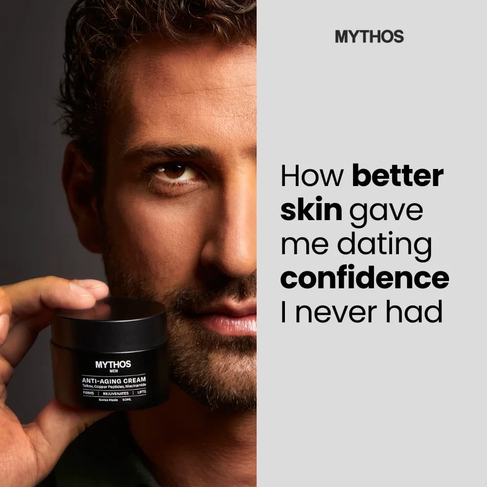
ARMRA, AG1, and Pique all run ads featuring Andrew Huberman and Peter Attia framing. You don't need the exact names, but the format — expert-quote overlaid on product — compresses trust. If your brand has any credible endorsement, it belongs in your top 3 ad variants.

Warm neutrals over clinical whites

Sage, cream, sand, and warm-beige backgrounds outperform sterile white in supplement ads. White reads pharmaceutical and feels defensive. Warm neutrals read wellness and feel aspirational. Swap the background and measure the CTR lift.

Questions

A specific ingredient claim, a clean bottle hero, and third-party trust — that's the whole formula. AG1 runs it. Nutrafol runs it. Ritual runs it. Vague wellness copy loses to specific milligram counts every time. If your ad says "supports health," rewrite it until it says what molecule does what and at what dose.

Meta (Facebook and Instagram) carries 60-70% of DTC supplement spend, with Instagram feed and Stories leading. YouTube pre-roll handles longer testimonial formats. TikTok has grown for Gen-Z supplements (ashwagandha, creatine, electrolytes). Platform restrictions on health claims are tight — keep copy factual, never medical, and plan for rejection cycles on new creative.

Avoid "cure," "treat," "reverse," and any before-after weight-loss framing. Meta's health-claim policy flags these automatically. Safe patterns: ingredient plus function ("ashwagandha for stress support"), outcome-adjacent framing ("wind down easier" rather than "fall asleep faster"), and user quotes with "*"-marked disclaimers. Brands like Ritual and AG1 keep a legal-reviewed copy bank for scaling.

20+ creatives minimum. Supplement CPMs are expensive ($35-60 on Meta for health audiences), so creative fatigue hits fast and cold audiences need variety to find the hook. Split across three angles: ingredient-led (AG1 style), testimonial-led (Nutrafol style), and podcast-host-trust-led (ARMRA style). Kill bottom performers weekly.

$35-60 CPM on cold supplement audiences in the US, depending on subcategory. Women's health and hair-loss sit on the high end ($50-75) because of policy restrictions and competitive spend from Nutrafol, Hers, and Olly. Sleep and stress supplements run mid-range. Creatine and basic electrolytes are cheaper ($20-30) because they pull younger, broader audiences.

Create Your Own
Supplement Ad

Clone any supplement ad example. Upload your product photo. Seconds later, you have a finished ad ready to launch.

Create your ad
AdDogs ad examples globe