AdDogs

Glossier Ad Examples

Browse 45+ Glossier ads ad examples sourced from high-performing campaigns. Clone any design, swap in your product, and get a finished ad in seconds.

Updated June 2026

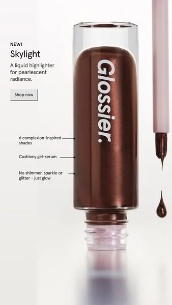
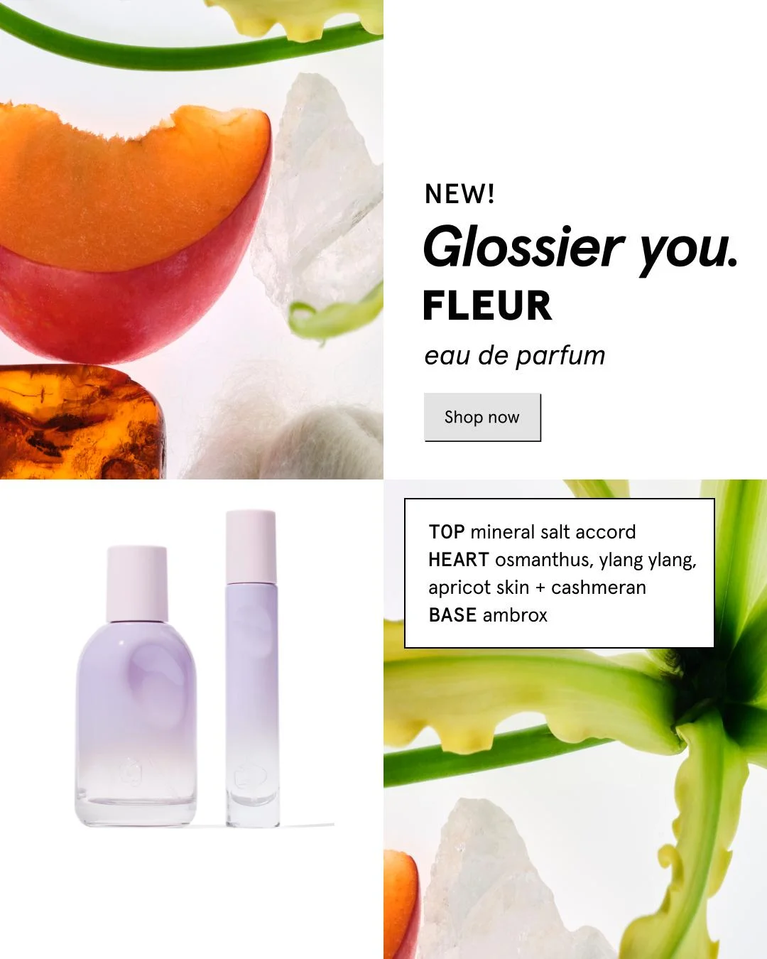
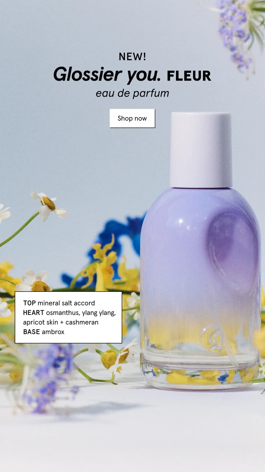
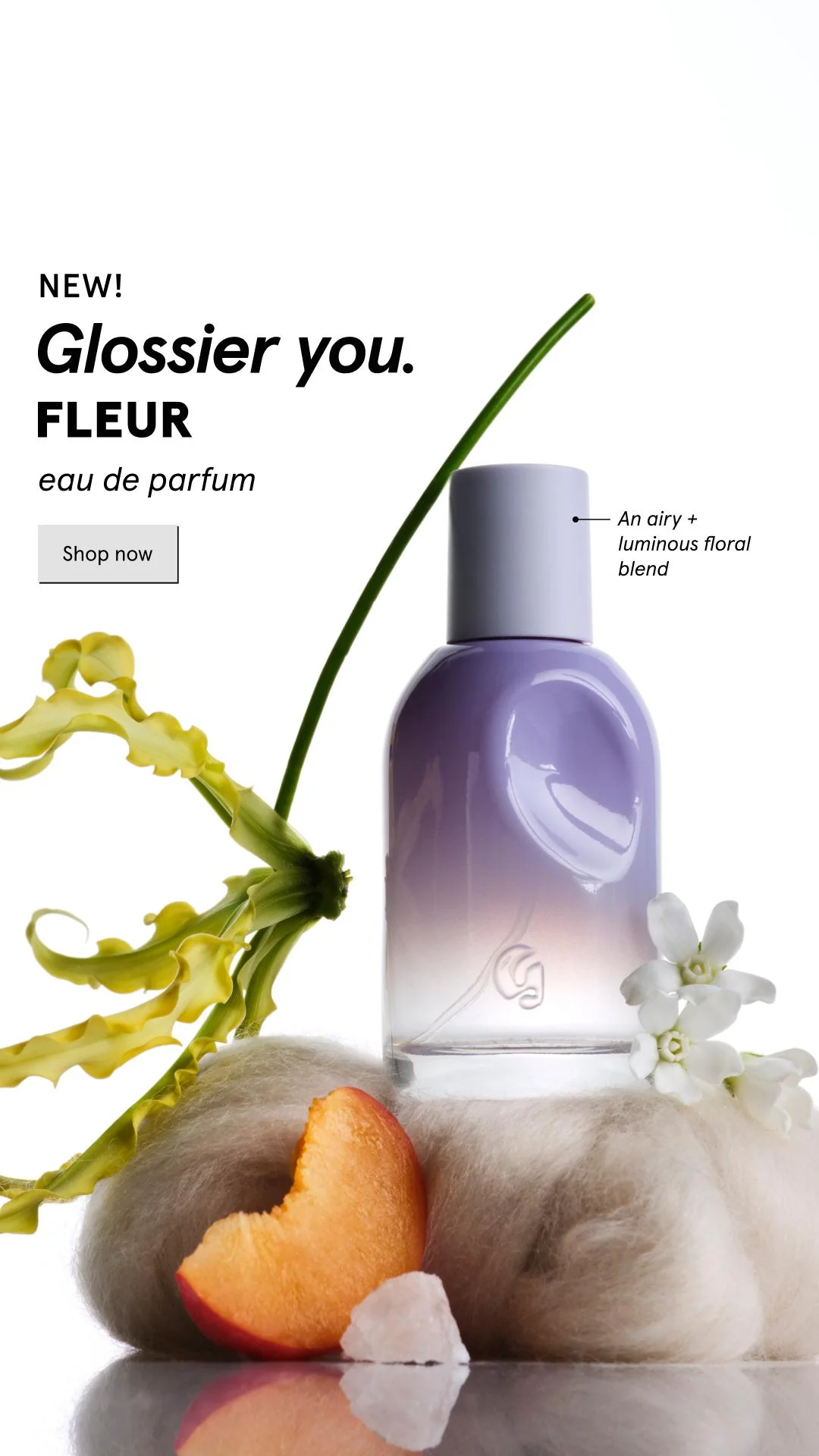
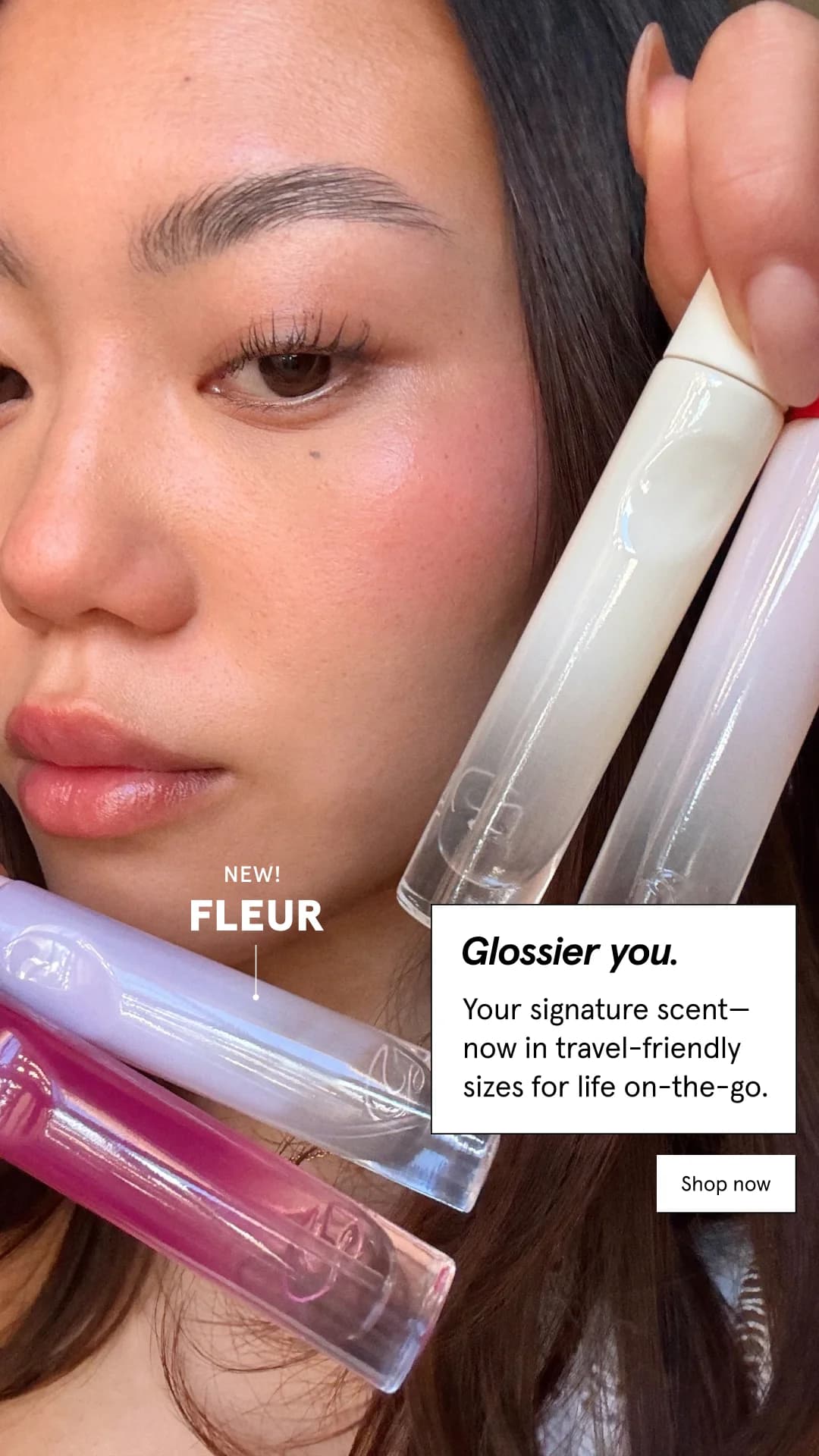
Glossier's ads almost never show the product doing anything. A pastel wall, a single tube of Balm Dotcom, a freckle-covered cheek. Zero hard selling. Glossier sells identity, not formula — and every ad is built as a belonging cue, not a feature sheet.

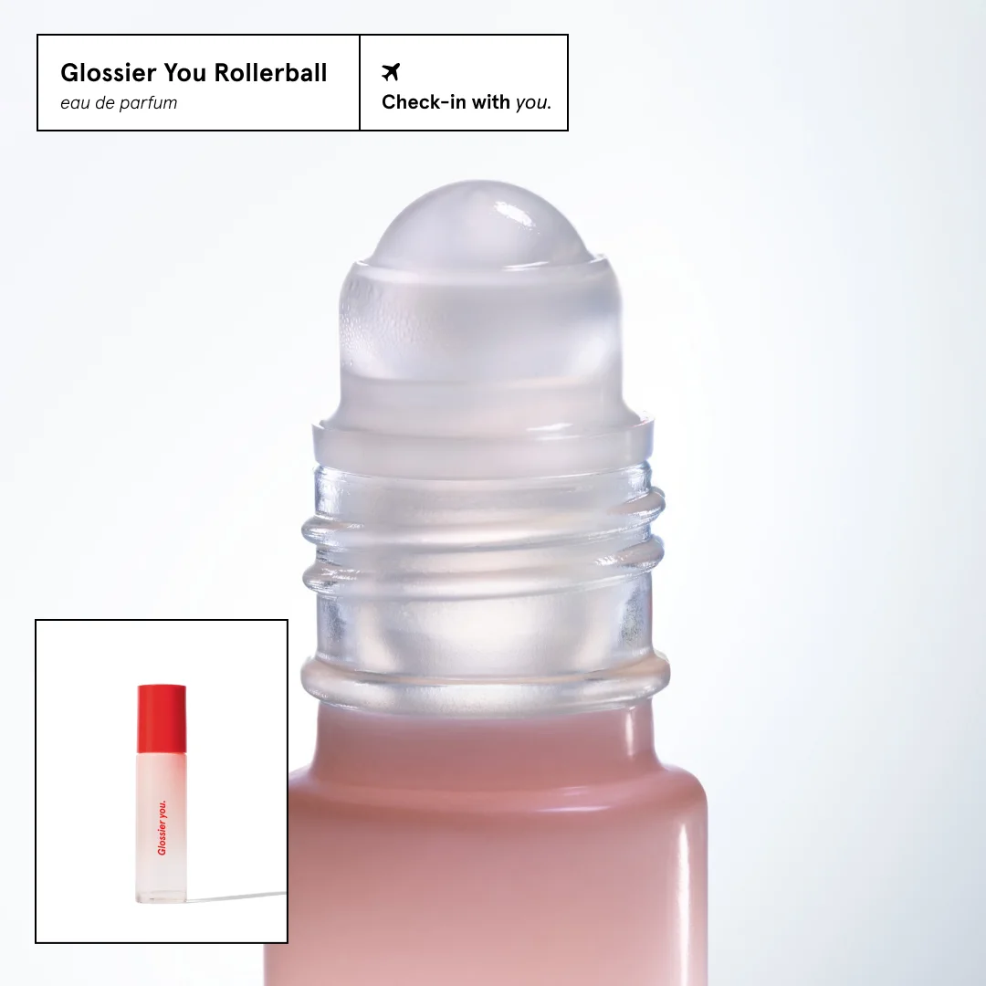
Look across their Instagram feed and the same recipe repeats. Millennial pink and dusty peach backgrounds. Negative space taking up 60-70% of the frame. Human hands holding the product, or UGC-style selfies with visible pores. Copy stays short and conversational — five to seven words, lowercase, no marketing-speak. Platforms skew hard to Instagram and TikTok, where the aesthetic reads native rather than sponsored.

Our Glossier ad examples collection pulls product shots, UGC posts, and campaign stills that defined the brand. Filter by format to find the pastel hero shots, skin close-ups, and tube-in-hand flat lays that repeat across every launch. Each entry links to the composition patterns, palette cues, and copy length choices that drove the original placement — receipts for what the brand runs in real campaigns, not generic DTC theory.

Glossier You — In-Use Testimonial Shot. Brand: Glossier. This ad effectively uses an in-use product shot combined with a testimonial overlay to build trust and desire. The composition places the product, Glossier You, centrally in the frame, being sprayed onto an arm, creating an immediate connection to personal use and demonstrating application. Natural lighting and soft, organic shadows contribute to a clean, authentic aesthetic, aligning perfectly with Glossier's minimalist and approachable brand identity. The testimonial pop-up, strategically placed in the lower-left, mimics a native UI element, making it feel organic and trustworthy on a social platform like Instagram. This technique leverages powerful social proof without disrupting the primary visual focus on the product experience. The overall minimalist color palette of warm neutrals, skin tones, and the product's subtle pink hue enhances the premium, yet accessible, feel. Text hierarchy is simple, focusing solely on the impactful review, which is easy to digest quickly. This ad is optimized for vertical viewing, typical of Instagram Stories or Reels, where authenticity and quick information absorption are key.. Why this ad works: Authentic In-Use Shot Builds Relatability — Showing the product being actively used on skin immediately makes it relatable and aspirational. This "show, don't tell" approach demonstrates the product's purpose and texture, allowing the audience to visualize themselves using it. This fosters a stronger emotional connection than a static product shot. Native UI Testimonial Enhances Credibility — The testimonial presented as a clean, minimalist pop-up window feels like a genuine user review or a screenshot from a social platform. This design choice bypasses traditional ad skepticism, making the "Heaven in a bottle" quote feel more authentic and trustworthy, leveraging social proof effectively. Soft Lighting & Shadows Create Organic Vibe — The use of natural, soft lighting and subtle wall shadows adds depth and an organic, unforced aesthetic. This avoids a sterile, overly-produced look, reinforcing Glossier's brand image of effortless beauty. It creates a warm, inviting atmosphere that resonates with a premium, self-care audience.. Specs: Brand: Glossier, Industry: Health & Wellness, Platform: Instagram, Format: Static, Audience: Women 25-34Glossier Boy Brow — Before/After Eye Close-up. Brand: Glossier. This ad effectively utilizes a split-screen before/after layout, focusing intensely on the eye and brow area to showcase the transformative power of Glossier's Boy Brow. The composition employs a direct, side-by-side comparison, making the product's impact immediately evident without needing extensive text. Natural skin tones and lighting maintain an authentic, relatable aesthetic, appealing to a demographic valuing subtle enhancement over heavy makeup. The minimal text hierarchy, limited to "before" and "after boy brow" labels, ensures the visual narrative is paramount. This approach is highly optimized for visual-first platforms like Instagram, where quick comprehension and compelling visual evidence drive engagement and consideration. The close-up detail allows viewers to scrutinize the results, building trust and desire for the product's specific benefit.. Why this ad works: Direct Before/After comparison highlights efficacy — The split-screen layout provides an instant, undeniable visual comparison of the brow's appearance. This direct evidence of transformation is highly persuasive, allowing potential customers to immediately grasp the product's benefit. It effectively communicates results without relying on lengthy descriptions, crucial for fast-paced social feeds. Hyper-focused close-up emphasizes product detail — By zooming in on the eye and brow, the ad forces attention onto the specific area where the product works. This detailed view allows viewers to observe the texture, fullness, and definition achieved, making the benefit tangible. It builds confidence in the product's ability to deliver precise, noticeable results. Authentic, natural aesthetic builds relatability — The use of natural lighting and minimal makeup on the model's skin creates an authentic and approachable vibe. This resonates with an audience seeking natural beauty enhancements rather than dramatic transformations. It positions the product as an everyday essential that enhances one's existing features, fostering trust and desire.. Specs: Brand: Glossier, Industry: Health & Wellness, Platform: Instagram, Format: Static, Audience: Women 25-34Glossier Body Hero — Minimalist Product Shot. Brand: Glossier. Single-product hero layout on a clean, minimalist background, leveraging natural light and shadow for depth. The Glossier bottle, with its distinctive red cap, is positioned slightly off-center, creating visual interest while maintaining balance. Ample negative space on the left is utilized for the playful, conversational text, "Who smells good? It's you." This direct engagement strategy is optimized for social platforms like Instagram, where quick, relatable messages resonate. The color palette of soft pink, white, and bold red is characteristic of the brand, signaling a clean, approachable, yet premium aesthetic. The composition ensures the product is the undeniable focal point, encouraging immediate recognition and brand association.. Headline: Who smells good?. Primary text: It's you.. Why this ad works: Conversational headline creates immediate engagement — The direct question "Who smells good? It's you." immediately grabs attention and fosters a personal connection. This playful, confident tone resonates well with a younger, social media-savvy audience, encouraging self-affirmation and product association. It's highly effective for awareness campaigns by breaking through the scroll. Bold red cap provides striking contrast — The vibrant red cap on the soft pink bottle creates a powerful visual anchor. This high contrast immediately draws the eye to the product, making it stand out against the minimalist background. It's a strategic use of color to highlight a key brand element and drive focus, enhancing brand recognition. Natural light and shadows enhance product form — The use of natural light casting soft shadows adds depth and texture to the minimalist scene. This technique prevents the image from feeling flat, highlighting the bottle's unique shape and the product's subtle sheen. It creates an authentic, aspirational aesthetic without artificiality, appealing to modern consumers.. Specs: Brand: Glossier, Industry: Health & Wellness, Platform: Instagram, Format: Static, Audience: Women 25-34Glossier Skin Tint & Concealer — Clean Product Showcase. Brand: Glossier. This ad employs a minimalist product showcase layout, featuring two Glossier products on a soft, light blue surface against a clean white background. The composition uses a slight overhead angle, creating a natural, approachable feel. The color palette is bright and airy, leveraging Glossier's signature aesthetic to evoke a sense of freshness and simplicity, appealing to a younger, beauty-conscious demographic. Text hierarchy is presented in two distinct, clean pop-up boxes, clearly associating benefits with each product. This format is highly optimized for Instagram and Pinterest, where clean visuals and easily digestible information capture attention. The natural lighting and subtle shadows add depth without clutter, reinforcing the brand's 'skin-first' philosophy. The ad effectively highlights product features through concise, benefit-driven copy, encouraging consideration.. Why this ad works: Dual product focus with clear differentiation — The ad effectively showcases two complementary products side-by-side. Each product has its own dedicated text box, clearly outlining unique benefits. This allows the audience to quickly understand the purpose of each item and how they might fit into their routine, driving consideration for both. This clarity is crucial for product education. Clean aesthetic reinforces brand identity — The minimalist setup, soft lighting, and pastel color palette are quintessential Glossier. This consistent visual language immediately communicates the brand's ethos of natural beauty and effortless style. It resonates strongly with their target audience who value authenticity and a 'no-makeup makeup' look, building brand affinity. Benefit-driven text boxes enhance clarity — Using distinct, pop-up style text boxes for each product's benefits is highly effective. The concise, bulleted descriptions ("sheer + breathable," "moves with your skin") make the key selling points instantly digestible. This direct communication helps potential customers quickly grasp the value proposition without effort, aiding decision-making.. Specs: Brand: Glossier, Industry: Health & Wellness, Platform: Instagram, Format: Static, Audience: Women 18-24Glossier You Rollerball — Minimal Product Focus. Brand: Glossier. This ad employs a minimalist hero shot, focusing on the Glossier You Rollerball with a close-up, intimate perspective. The composition strategically places the main product off-center, drawing the eye to its frosted texture and soft pink hue against a clean white background. A smaller inset image provides the full product view, offering context without distracting from the primary detail. The soft, muted color palette of nude pink and frosted white evokes a sense of clean luxury and approachability, aligning perfectly with Glossier's brand identity. Text hierarchy is subtle, with brand and product information neatly boxed in the top-left, complemented by a playful tagline top-right. This design is optimized for platforms like Instagram, where high-quality, aesthetically pleasing product photography and minimal text effectively capture attention and convey premium branding.. Headline: Glossier You Rollerball. Primary text: Check-in with you.. Why this ad works: Macro shot highlights product texture and detail — The extreme close-up of the rollerball emphasizes its frosted glass and smooth mechanism. This intimate view creates a tactile experience for the viewer, suggesting quality and a luxurious feel. It draws attention to the unique design elements, fostering curiosity and a desire to experience the product firsthand. Inset image provides essential product context — Including a smaller, full-view image of the rollerball in the bottom-left corner is a clever design choice. It allows the main shot to focus on detail while still giving the viewer a complete understanding of the product's form factor and branding, preventing any confusion about the item being advertised. Minimalist aesthetic reinforces brand identity — The clean white background, soft color palette, and sparse text align perfectly with Glossier's signature minimalist and approachable luxury aesthetic. This visual consistency strengthens brand recognition and appeals to an audience that values understated elegance and a focus on essential, high-quality products.. Specs: Brand: Glossier, Industry: Health & Wellness, Platform: Instagram, Format: Static, Audience: Women 25-34Glossier Futuredew — Product Testimonial Close-up. Brand: Glossier. This ad effectively leverages a close-up product shot of Glossier's Futuredew, strategically overlaid with a customer testimonial. The composition places the product slightly off-center, drawing the eye to its texture and the subtle shine, which visually reinforces the "glowy skin" promise. The soft, neutral background enhances the product's natural aesthetic, aligning with Glossier's minimalist and aspirational brand identity. The testimonial box, designed like a pop-up notification, creates an interactive feel, making the social proof feel authentic and immediate. This layout is highly optimized for Instagram, where user-generated content and clean visuals perform well. The text hierarchy prioritizes the customer's glowing review, making it the primary persuasive element, while the brand and product name provide context. This approach aims to build trust and drive consideration by showcasing real-world results through a relatable voice.. Primary text: I get so many compliments on my glowy skin. Why this ad works: Testimonial overlay for social proof — The prominent testimonial overlay acts as powerful social proof, directly addressing potential customers' desire for visible results. By featuring a verified customer's positive experience, the ad builds immediate trust and credibility, making the product's benefits feel tangible and achievable. This technique is highly effective in driving consideration among skeptical audiences. Product close-up with 'glow' effect — A close-up shot of the Futuredew bottle, with product visibly oozing and a subtle sparkle, effectively communicates the 'glowy' effect. This visual cue directly supports the testimonial, allowing viewers to connect the product to the desired outcome. The tactile and luminous presentation enhances product desirability and perceived efficacy. Soft, aspirational color palette — The ad's soft, warm, and minimalist color palette, dominated by muted neutrals and the product's natural hue, aligns perfectly with Glossier's brand aesthetic. This creates an aspirational yet approachable vibe, appealing to consumers seeking a natural, healthy glow rather than heavy makeup. It reinforces a clean, premium product image.. Specs: Brand: Glossier, Industry: Health & Wellness, Platform: Instagram, Format: Static, Audience: Women 25-34Glossier x KATSEYE Lip Glaze — Diverse Grid. Brand: Glossier. This ad employs a grid-based collage layout, showcasing Glossier's new Lip Glaze in collaboration with KATSEYE. Six diverse models, each wearing a different shade, occupy the central visual space, emphasizing inclusivity and product versatility. The clean white background and minimalist aesthetic align with Glossier's brand identity, allowing the vibrant lip colors and natural skin tones to pop. Text hierarchy places the brand collaboration prominently at the top, followed by the bold "Lip Glaze New!" headline, then individual shade names, and a clear "Shop now" CTA. This composition is highly optimized for visual platforms like Instagram, where scroll-stopping diversity and clear product demonstration drive engagement and consideration. The close-up shots effectively highlight the product's finish and texture.. Headline: Lip Glaze New!. Primary text: KATSEYE wears the next-generation lip oil.. Why this ad works: Diverse Model Grid Showcases Inclusivity — The ad strategically features six models of varying ethnicities and skin tones. This inclusive representation broadens the ad's appeal, making the product feel relevant and accessible to a wider audience. It reinforces Glossier's modern, community-focused brand image, fostering connection and resonance. Clear Shade Swatches Enhance Product Understanding — Each model is explicitly labeled with the shade name and a corresponding color swatch. This direct visual mapping helps consumers easily identify and differentiate between the product's various offerings. It reduces purchase friction by providing immediate clarity on how each shade appears on diverse complexions. Prominent Brand Collaboration Leverages Influence — The "Glossier x KATSEYE" branding is strategically placed at the top, immediately signaling a high-profile partnership. This collaboration leverages KATSEYE's existing audience and credibility, generating immediate buzz and interest for the new Lip Glaze. It positions the product as a must-have, endorsed by a recognized entity.. Specs: Brand: Glossier, Industry: Fashion & Apparel, Platform: Instagram, Format: Static, Audience: Women 18-24Glossier Crème de you — Hand In-Use Shot. Brand: Glossier. This ad effectively uses a dynamic in-use shot to introduce a new product. The composition places the product and its application in the foreground, creating an immediate connection with the viewer. The vibrant red packaging of "Crème de you" provides a strong color contrast against the neutral background and skin tone, ensuring the product stands out. Text hierarchy is clear: "New!" acts as an immediate hook, followed by the product name and key benefits, then a clear CTA. The ad is optimized for platforms like Instagram, where authentic-looking, yet polished, user-generated content (UGC) style visuals perform well. The inclusion of fragrance notes adds a sensory dimension, appealing to a holistic skincare experience beyond just moisturizing. The overall clean aesthetic with focused elements prevents visual clutter, enhancing message retention.. Headline: Crème de you.. Primary text: New! delight your senses + moisturize skin. Why this ad works: Dynamic In-Use Shot for Relatability — The image features a hand applying the cream, instantly demonstrating product texture and use. This "in-action" visual is highly relatable and allows potential customers to envision themselves using the product, fostering a stronger emotional connection and reducing perceived risk. High-Contrast Product Highlight — The bold red packaging of "Crème de you" stands out dramatically against the neutral background and fair skin tone. This strong color contrast ensures the product is the undeniable focal point, capturing attention quickly in a busy feed and reinforcing brand identity. Clear, Segmented Text Hierarchy — The ad uses distinct text boxes for "New!", product name, benefits, and CTA. This segmentation creates a clear visual path for information absorption, making it easy for viewers to quickly grasp the core message and next steps without feeling overwhelmed by dense copy.. Specs: Brand: Glossier, Industry: Health & Wellness, Platform: Instagram, Format: Static, Audience: Women 25-34Glossier Cloud Paint — Split Screen Product & In-Use. Brand: Glossier. This ad leverages a compelling split-screen layout, effectively showcasing both the product's appealing texture and its natural, in-use effect. The left panel features Glossier Cloud Paint, with a generous swatch demonstrating its creamy consistency, while the right panel highlights a model applying the blush, emphasizing a healthy, radiant glow. The warm, peachy color palette, consistent across product and application, evokes a natural, approachable beauty aesthetic. The aspirational headline, "Blush like the sky at sunset," uses evocative language to connect the product to a desirable, effortless look. Optimized for visual-first platforms like Instagram, the composition balances product focus with lifestyle appeal, making it highly engaging. The clear text hierarchy guides the viewer from product name to aspirational benefit, culminating in a prominent call to action.. Headline: Blush like the sky at sunset. Primary text: cloud paint™. Why this ad works: Split-screen layout demonstrates product efficacy — The ad's split-screen design masterfully pairs the product's tactile appeal with its real-world application. This dual focus allows viewers to visualize the creamy texture and then immediately see the natural, flattering result on skin. This technique builds trust and reduces purchase friction by clearly illustrating the product's benefit and ease of use. Evocative headline creates aspirational connection — The headline "Blush like the sky at sunset" is highly poetic and aspirational, moving beyond mere product features. It taps into emotional desires for natural beauty and effortless radiance, aligning with Glossier's brand identity. This language helps the ad resonate deeply with consumers seeking a feeling, not just a cosmetic. Warm, natural palette enhances brand aesthetic — The consistent use of soft, peachy-pink tones across the product, swatch, and model's skin reinforces a natural, healthy glow. This color psychology aligns perfectly with Glossier's minimalist and "no-makeup makeup" philosophy. It communicates approachability and authenticity, attracting an audience that values understated elegance over heavy glam.. Specs: Brand: Glossier, Industry: Health & Wellness, Platform: Instagram, Format: Static, Audience: Women 25-34Glossier Futuredew — Product in Hand Feature Callouts. Brand: Glossier. This ad leverages a clean, high-contrast composition to spotlight the Glossier Futuredew product. The layout strategically places the product in a diverse hand, creating an immediate human connection and implying real-world use. The stark white background ensures the product and the hand pop, enhancing visual clarity crucial for mobile feeds. Text hierarchy is clear: the prominent brand logo at the top, followed by the product name, then benefit-driven callouts that guide the eye around the bottle. The minimalist aesthetic, combined with the direct feature highlights, optimizes for quick comprehension on platforms like Instagram. Color psychology uses the product's soft, natural tones against the bold black text and white space to convey both efficacy and approachability. The overall design effectively balances brand presence with product education, driving consideration.. Why this ad works: Diverse hand model creates relatable appeal — Featuring a hand with a darker skin tone holding the product immediately broadens the ad's appeal and inclusivity. This subtle choice communicates that the product is "for all skin types" visually, reinforcing the text callout and fostering a stronger connection with a diverse audience, enhancing brand loyalty. Feature callouts provide instant product education — The use of clear, labeled callouts ("oil serum hybrid," "all day glow," "for all skin types") allows viewers to quickly grasp key product benefits and attributes without needing to read extensive body copy. This direct, scannable information is highly effective for fast-paced social media consumption, driving immediate understanding and interest. High contrast on white background maximizes visibility — The product and hand are sharply contrasted against a pure white background. This minimalist approach eliminates distractions, making the product the undeniable focal point. On busy social feeds, high-contrast visuals are proven to capture attention more effectively and improve ad recall, ensuring the message cuts through the noise.. Specs: Brand: Glossier, Industry: Health & Wellness, Platform: Instagram, Format: Static, Audience: Women 25-34Glossier Body Collection — Stacked Product Hero. Brand: Glossier. This ad employs a clean, minimalist layout with a light grey background, allowing the Glossier Body Collection products to stand out. The stacked composition efficiently showcases multiple items, signaling a comprehensive collection while maintaining visual order. Color psychology is key, with Glossier's signature pastel hues (mint, blush, cream) conveying a sense of gentle care and modern luxury. The bright yellow CTA button provides a high-contrast focal point, guiding the user's eye directly to the desired action. Text hierarchy is clear: brand, engaging question, collection details, then CTA. This design is optimized for platforms like Instagram, where a clean aesthetic and clear call to action effectively capture attention and drive consideration, leveraging brand recognition and a distinct visual identity to stop the scroll.. Headline: Are you team zen or team energy?. Primary text: THE FULL BODY COLLECTION IN SANDSTONE + ORANGE BLOSSOM NEROLI. Why this ad works: Engaging Headline Promotes Interaction — The headline "Are you team zen or team energy?" directly addresses the viewer, creating an immediate, personalized connection. This interactive approach encourages mental engagement beyond passive viewing, prompting consideration of the product's potential benefits and aligning with individual preferences, which can increase click-through rates. Signature Pastel Palette Reinforces Brand — Glossier's distinctive use of soft, pastel colors for its product packaging is a powerful brand identifier. This consistent aesthetic communicates a clean, modern, and approachable luxury. It helps the ad instantly register as Glossier, building trust and familiarity while appealing to its target demographic's preference for sophisticated, understated design. Stacked Product Display Showcases Collection — The vertical stacking of various products effectively presents the full "Body by Glossier" collection in a single frame. This composition technique allows viewers to quickly grasp the breadth of the offering without feeling overwhelmed, promoting the idea of a complete body care routine and encouraging exploration of the entire range.. Specs: Brand: Glossier, Industry: Health & Wellness, Platform: Instagram, Format: Static, Audience: Women 25-34Glossier Lip Glaze — Multi-Swatch Product Showcase. Brand: Glossier. This ad effectively leverages a multi-panel layout to showcase Glossier's new Lip Glaze. The top panel features diverse arm swatches, immediately addressing inclusivity and demonstrating shade range on various skin tones, a key consideration for makeup. The clean white background ensures the product colors pop, while the "New!" sticker and bold "Lip Glaze" headline establish a clear product launch. Text hierarchy is well-defined, guiding the eye from the product name to its benefit and then to the brand and CTA. The macro shot at the bottom adds a tactile, luxurious element, emphasizing texture and finish. Optimized for visual platforms like Instagram, its bright, clean aesthetic and clear product demonstration are designed to stop the scroll and drive consideration. The composition balances aspirational imagery with practical product information.. Headline: Lip Glaze. Primary text: The next-generation lip oil.. Why this ad works: Diverse Swatches Build Inclusivity & Trust — The use of multiple skin tones for swatches immediately communicates inclusivity, a vital aspect for modern beauty brands. This visual demonstration helps potential customers envision how shades will look on their skin, reducing purchase friction and building trust. It's a highly effective way to showcase product versatility. Clear Visual Hierarchy for Product Launch — The "New!" sticker, prominent "Lip Glaze" headline, and descriptive sub-headline "The next-generation lip oil." create a strong visual hierarchy. This ensures the ad's core message—a new product launch with a clear benefit—is immediately understood, guiding the viewer efficiently from announcement to product type. Macro Texture Shot Enhances Desire — The large, detailed image of the lip glaze's texture at the bottom adds a sensory dimension. It highlights the product's glossy, rich quality, appealing to tactile and visual desires. This close-up detail elevates the product's perceived luxury and encourages engagement by showcasing its unique finish.. Specs: Brand: Glossier, Industry: Health & Wellness, Platform: Instagram, Format: Static, Audience: Women 25-34Glossier Lash Slick — Split Screen Product Focus. Brand: Glossier. This ad employs a split-screen layout, effectively showcasing both product application and detailed product features. The top half features a close-up of an eye with mascara being applied, emphasizing the natural, enhanced look. This lifestyle shot immediately conveys the product's benefit. The bottom half transitions to a clean, minimalist display of the mascara wand itself, highlighting its unique brush design, alongside the product name and a benefit-driven tagline. The warm, natural skin tones contrasted with the neutral grey background create an authentic, approachable vibe, aligning with Glossier's brand identity. Text hierarchy is clear: product name, benefit statement, and a prominent CTA. This vertical composition is optimized for mobile platforms like Instagram, ensuring high engagement by delivering both aspirational imagery and crucial product details in a single, scroll-stopping unit. The focus on natural beauty and product efficacy is well-communicated.. Headline: Lash Slick. Primary text: Baby lash extensions with every flick.. Why this ad works: Dynamic Split-Screen Storytelling — The ad effectively uses a split-screen format to tell a concise story. The top half immediately engages viewers with a close-up of mascara application, demonstrating the product in use. This visual proof of concept is then complemented by the bottom half, which highlights the unique brush design and key messaging, creating a comprehensive and persuasive narrative within a single ad unit. Authentic Close-Up Enhances Relatability — The tight crop on the eye and visible skin texture in the top section creates an authentic, relatable feel. This avoids overly retouched perfection, resonating with a target audience seeking natural beauty solutions. By showing the product in a real-world application, it builds trust and allows potential customers to envision the results on themselves more easily. Benefit-Driven Copy Highlights Key Outcome — The primary text, "Baby lash extensions with every flick," is highly effective because it immediately communicates a tangible benefit and desirable outcome. It uses evocative language ("baby lash extensions") to paint a clear picture of the results, making the product's value proposition instantly understandable and appealing to consumers looking for enhanced, yet natural-looking, lashes.. Specs: Brand: Glossier, Industry: Health & Wellness, Platform: Instagram, Format: Static, Audience: Women 25-34Glossier Body Spritz — Organic Collage Layout. Brand: Glossier. This ad employs a dynamic collage layout on a dark, organic background, immediately setting an immersive, natural vibe. The deep green, leafy texture contrasts effectively with the bright yellow accents, drawing the eye to key interactive elements like "NEW!" and "Shop now." Compositionally, multiple product-in-use shots and a textural detail are arranged asymmetrically, creating visual interest without overwhelming. The text hierarchy uses a playful, meme-aware headline, "TOUCH GRASS WITHOUT TOUCHING GRASS.", to engage a digitally native audience, followed by the brand's signature tagline. This design is optimized for platforms like Instagram, where its unique aesthetic and pseudo-interactive elements encourage longer dwell times and stand out from more conventional product ads, effectively communicating a lifestyle aspiration alongside a new product launch.. Headline: TOUCH GRASS WITHOUT TOUCHING GRASS.. Primary text: Body by Glossier.. Why this ad works: Interactive UI elements for engagement — The use of yellow circles and underlines around text options ("Sandstone", "Body Spritz") mimics website navigation, inviting interaction and exploration within a static ad. This gamified approach enhances engagement by making the ad feel less like passive consumption and more like a discovery experience, increasing dwell time and perceived value. Organic, dark aesthetic creates immersive mood — The deep green, leafy background immediately transports the viewer to a natural, serene environment, aligning with the "escape" theme. This dark, rich palette stands out against typical bright, minimalist beauty ads, creating a distinct, sophisticated brand atmosphere that resonates with the product's promise of freshness and natural connection. Playful, relatable headline drives curiosity — "TOUCH GRASS WITHOUT TOUCHING GRASS." is a clever, meme-aware phrase that resonates with a younger, digitally native audience. It promises an experience (nature, freshness) in a humorous, accessible way, making the product feel relevant and sparking interest in its unique benefit, encouraging further engagement with the ad.. Specs: Brand: Glossier, Industry: Health & Wellness, Platform: Instagram, Format: Mixed, Audience: Women 25-34Glossier — Biggest Sale Product Grid. Brand: Glossier. This ad employs a clear, top-down visual hierarchy, leveraging a clean white background to emphasize the bold blue headline and discount. The layout strategically places the compelling "Biggest sale of the year" at the top, immediately followed by the tiered offer details and a prominent "Shop now" CTA. Below, a vibrant product grid showcases Glossier's popular Balm Dotcom range, appealing to brand loyalists and new customers alike. The bright product colors and swatches add visual interest against the minimalist backdrop, optimizing for platforms like Instagram where visual appeal and clear value propositions drive engagement. The "UP TO 30% OFF" circle acts as a strong visual anchor, ensuring the discount is unmissable. Text hierarchy guides the eye from the main offer to the product display, reinforcing the sale message.. Headline: Biggest sale of the year. Primary text: The bigger your cart, the better the savings with 25% off, or 30% off $100+.. Why this ad works: Clear Value Proposition & Urgency — The bold headline "Biggest sale of the year" immediately communicates a significant event, creating urgency and high perceived value. This direct approach cuts through feed clutter, signaling a must-see offer to potential customers and driving immediate interest in the promotion. Tiered Discount Incentivizes Larger Purchases — Offering "25% off, or 30% off $100+" strategically encourages a higher average order value. This pricing structure motivates customers to increase their cart size to unlock a better deal, maximizing revenue during the sale period and enhancing perceived savings. Vibrant Product Grid Highlights Range & Appeal — The organized grid of colorful product tubes and corresponding swatches visually highlights the breadth and appeal of the Balm Dotcom range. This allows potential buyers to quickly see the variety available, increasing product desire and reinforcing brand identity through visual richness.. Specs: Brand: Glossier, Industry: Health & Wellness, Platform: Instagram, Format: Static, Audience: Women 25-34Glossier Lip Glaze — Before/After & Product Detail. Brand: Glossier. This ad employs a split-screen layout, effectively combining a compelling before/after visual with a high-impact product detail shot. The left side features a clear "Before" and "After" comparison of lips, immediately showcasing the product's transformative effect. On the right, an extreme close-up of the applicator laden with the "Melty" lip glaze emphasizes texture and richness. The minimalist white background ensures maximum contrast, making the product and its results pop. Text hierarchy is clear: "New!" draws attention, "Lip Glaze" is the main headline, followed by a benefit-oriented sub-headline. The "Shop now" CTA is prominent. This design is optimized for platforms like Instagram, where visual storytelling and direct product appeal drive engagement and conversion. The overall clean aesthetic aligns perfectly with Glossier's brand identity.. Headline: Lip Glaze. Primary text: The next-generation lip oil.. Why this ad works: Direct Before/After Visual Proof — The prominent "Before" and "After" comparison on the left immediately demonstrates the product's effect, building trust and desire. This visual proof is highly effective for beauty products, allowing potential customers to instantly grasp the benefit without extensive reading. It directly addresses a common consumer question: "What will this do for me?" High-Impact Product Texture Detail — The extreme close-up of the applicator, laden with the "Melty" lip glaze, creates a strong sensory appeal. It highlights the product's luxurious texture and rich color, engaging viewers on a visceral level. This detailed shot communicates quality and indulgence, reinforcing the premium feel of the "next-generation lip oil." Minimalist Design with Clear Hierarchy — The clean white background and strategic placement of elements ensure that the product and its benefits are the undisputed focus. The "New!" tag, large headline, and concise sub-headline guide the eye effortlessly. This minimalist approach reduces cognitive load, making the ad easy to digest and highly effective in fast-scrolling feed environments.. Specs: Brand: Glossier, Industry: Fashion & Apparel, Platform: Instagram, Format: Static, Audience: Women 25-34Glossier Balm Dotcom — Colorful Product Stack. Brand: Glossier. This ad effectively uses a split-screen layout, dedicating the left half to clear, benefit-driven copy and the right to a vibrant product display. The vertical stack of Glossier Balm Dotcom tubes, arranged in a visually appealing, slightly chaotic yet organized manner, immediately draws the eye with its spectrum of colors. Each tube is accompanied by a corresponding swatch, enhancing product understanding and appeal. The minimalist white background ensures the colorful products pop, creating high contrast ideal for social feeds like Instagram. Text hierarchy is clear: a bold product name, followed by concise bullet points highlighting key features, and a prominent call to action. This composition is optimized for quick consumption, allowing users to grasp product benefits and visual variety at a glance, driving both awareness and consideration. The playful yet clean aesthetic aligns perfectly with Glossier's brand identity.. Headline: balm dotcom. Primary text: Up to 12-hr hydration 12 addictive flavors Sheer color + tint All of the above. Why this ad works: Vibrant product stack showcases variety — The vertical arrangement of numerous colorful Balm Dotcom tubes immediately communicates the wide range of available shades and flavors. This visual abundance is highly engaging, encouraging viewers to explore the full collection rather than just a single product, effectively driving curiosity and consideration. Clear feature checklist drives understanding — The use of a simple checklist format with concise bullet points ("Up to 12-hr hydration," "12 addictive flavors," "Sheer color + tint") quickly conveys key product benefits. The "All of the above" option cleverly summarizes, making the ad highly scannable and easy for the audience to grasp the value proposition instantly. Product swatches enhance color accuracy — Placing a distinct swatch next to each product tube provides immediate visual context for the color and texture. This helps potential customers visualize the actual tint on skin, reducing purchase hesitation and increasing confidence in their color choice, a crucial factor for cosmetic products.. Specs: Brand: Glossier, Industry: Fashion & Apparel, Platform: Instagram, Format: Static, Audience: Women 18-24Glossier You — Black Friday Sale Product Card. Brand: Glossier. This Glossier ad effectively leverages a clean, high-contrast layout to promote a Black Friday sale. The central product, Glossier You, is framed within a white card, drawing immediate attention. A dominant "30% OFF" headline in bold blue instantly communicates value, supported by clear "WAS/NOW" pricing. The brand's signature pink product, red cap, and blue text create a vibrant yet minimalist aesthetic, optimized for quick scanning on platforms like Instagram. The composition guides the eye from the discount, to the price comparison, then to the product detail and "Shop now" CTA. This direct visual hierarchy ensures the core offer and action are immediately understood, driving conversion for a time-sensitive promotion. The repeated "BLACK FRIDAY SALE" banner reinforces urgency and context.. Headline: 30% OFF. Primary text: WAS $116 NOW $81.20. Why this ad works: Bold discount immediately grabs attention — The prominent "30% OFF" at the top immediately grabs attention, signaling a significant value proposition. This bold, blue text acts as a primary hook, crucial for cutting through feed clutter and attracting users actively seeking deals during a major sales event like Black Friday. Framed product with clear price comparison — The product is presented within a clean, rounded-rectangle frame, isolating it from distractions. This composition technique, combined with the clear 'WAS' and 'NOW' pricing, creates a mini product detail page within the ad, simplifying the decision-making process for potential buyers. High-contrast brand colors enhance visibility — Glossier's distinct brand colors—white background, bold blue text, and the product's soft pink with a red cap—create a high-contrast, recognizable visual identity. This palette is both eye-catching and consistent with the brand's playful yet sophisticated image, enhancing memorability and brand recall.. Specs: Brand: Glossier, Industry: Health & Wellness, Platform: Instagram, Format: Static, Audience: Women 25-34Glossier Milky Jelly Cleansing Balm — Before/After Split. Brand: Glossier. This ad utilizes a classic before/after split-screen layout to powerfully demonstrate product efficacy. The composition features a close-up of a woman's face, with the "Before" shot showing subtle makeup and the "After" shot revealing clean, fresh skin, directly emphasizing the cleansing balm's benefit. The minimalist white background and crisp black text create a clean, clinical yet approachable aesthetic, aligning perfectly with Glossier's brand identity. Text hierarchy is clear and intuitive: the product name is prominently displayed at the top, followed by the visual proof, a concise benefit statement, and a clear call to action. This direct, results-oriented approach is highly effective for conversion-focused campaigns, particularly on platforms like Instagram where visual proof and concise messaging resonate strongly. The use of a mature model broadens the ad's appeal beyond typical younger skincare demographics, suggesting inclusivity and universal efficacy. The high contrast ensures optimal readability and visual impact, cutting through feed clutter.. Headline: NEW! MILKY JELLY™ CLEANSING BALM. Primary text: removes makeup + cleanses skin in one step. Why this ad works: Direct Before/After Visual Proof — The split-screen immediately showcases the product's primary benefit—makeup removal and cleansing. This visual evidence is highly persuasive, building trust and demonstrating efficacy faster than text alone, crucial for quick-scan social feeds where users demand instant value propositions. Minimalist Aesthetic for Brand Alignment — The clean white background and simple black typography reinforce Glossier's signature minimalist, "skin first" brand identity. This consistent visual language helps in brand recognition and positions the product as essential and uncomplicated, appealing to a sophisticated audience that values clarity. Inclusive Model Representation Broadens Appeal — Featuring a mature woman as the model broadens the ad's appeal beyond Glossier's traditionally younger demographic. This inclusivity suggests the product's universal efficacy and gentle nature, potentially attracting a wider customer base interested in effective, non-irritating cleansers across age groups.. Specs: Brand: Glossier, Industry: Health & Wellness, Platform: Instagram, Format: Static, Audience: Women 35-44Glossier Cookie Butter Balm — Split Screen Product. Brand: Glossier. This ad employs a dynamic split-screen layout, effectively balancing product focus with aspirational lifestyle imagery. The left side prominently features the Glossier Cookie Butter Balm, cleverly positioned atop a stack of cookies, creating an immediate, playful association with its flavor profile. On the right, close-ups of diverse lips showcase the balm's glossy effect, emphasizing inclusivity and real-world application. The warm, inviting color palette of browns, reds, and natural skin tones evokes comfort and deliciousness, aligning with the "cold-weather craving" theme. Text hierarchy is clear: a benefit-driven headline, product name, and a subtle CTA. Optimized for visual platforms like Instagram, this composition uses strong visual metaphors and relatable imagery to stop the scroll and drive consideration for a seasonal product.. Headline: The ultimate cold-weather craving. Primary text: COOKIE BUTTER BALM DOTCOM. Why this ad works: Visual metaphor creates instant flavor association — Placing the Cookie Butter Balm directly on a stack of cookies immediately communicates its flavor and texture. This clever visual shortcut bypasses lengthy descriptions, creating an emotional connection and desire for the product, especially effective for a seasonal, comfort-food-inspired item. Split screen balances product and aspirational use — The ad's vertical split effectively showcases both the product's packaging and its desirable effect on lips. This dual focus allows viewers to understand what they're buying and visualize the benefits, catering to both practical and aspirational purchase drivers within a single, cohesive frame. Diverse lip models enhance product relatability — Featuring close-ups of lips with varying skin tones broadens the ad's appeal and reinforces inclusivity. This strategic choice helps a wider audience visualize themselves using the product, increasing relatability and demonstrating the balm's universal appeal, which is crucial for a beauty brand like Glossier.. Specs: Brand: Glossier, Industry: Health & Wellness, Platform: Instagram, Format: Carousel/Collage, Audience: Women 25-34Glossier Milky Jelly Cleansing Balm — Product Feature. Brand: Glossier. This ad leverages a clean, minimalist layout to highlight Glossier's Milky Jelly Cleansing Balm. The product is positioned diagonally, drawing the eye towards the prominent "96%" social proof statistic, which acts as the primary headline. A subtle product texture swatch reinforces the sensory experience. The signature Glossier pink contrasts effectively with the stark white background, maintaining brand identity while ensuring high visibility on platforms like Instagram. Text hierarchy prioritizes the compelling statistic, followed by the product name and a clear call to action, guiding the viewer efficiently. The "NEW!" badge signals a product launch, creating urgency and interest. This composition is optimized for quick consumption, making it effective for scroll-stopping on mobile feeds.. Headline: 96% of users agree product removes makeup and cleanses skin in one step. Primary text: MILKY JELLY™ CLEANSING BALM. Why this ad works: Prominent social proof drives immediate trust — The large "96%" statistic immediately establishes credibility and efficacy. This strong social proof, positioned centrally, captures attention and addresses potential user skepticism upfront. For a new product, this data-backed claim significantly reduces perceived risk and encourages clicks, leveraging the psychological principle of consensus. Visual texture swatch enhances product appeal — The subtle yet clear swatch of the product's texture near the top right provides a visual cue of its consistency and feel. This small detail helps consumers imagine the product experience, adding a sensory dimension that is crucial for skincare. It complements the product shot by demonstrating its actual form, enhancing engagement. Consistent brand aesthetic reinforces recognition — The ad effectively uses Glossier's iconic millennial pink and minimalist design, instantly recognizable to its target audience. This consistent branding across visuals and product packaging reinforces brand identity and trust. The clean white background ensures the product and text pop, aligning with Glossier's aspirational yet approachable brand image.. Specs: Brand: Glossier, Industry: Health & Wellness, Platform: Instagram, Format: Static, Audience: Women 25-34Glossier Black Cherry Lip — Playful Product Drop. Brand: Glossier. This ad leverages a playful, high-impact visual of abundant cherries spilling within a car interior, creating a sense of spontaneous luxury and desirability. The composition is dynamic, using deep reds and blacks to evoke the "Black Cherry" product line while ensuring high contrast for mobile visibility. A social media-style chat bubble delivers the headline, fostering a direct, friendly connection with the target audience. This conversational approach, combined with the vibrant imagery, is perfectly optimized for Instagram Stories or Reels, where authenticity and quick engagement are key. The text hierarchy is clear: engaging headline, prominent brand logo, and a direct call-to-action, guiding the viewer seamlessly from intrigue to purchase intent. The overall design effectively communicates a product restock as an exciting, must-have event.. Headline: BESTIE. Black Cherry Lip Line is back in stock.. Why this ad works: Conversational text bubble drives engagement — The "BESTIE" opening in a chat bubble mimics direct messages, creating an intimate, urgent feel. This personal tone resonates strongly with younger audiences on social platforms, fostering a sense of exclusivity and immediate connection, which significantly boosts click-through rates compared to traditional headlines. Abundant cherry imagery creates desire — The overflowing pile of vibrant cherries visually communicates the "Black Cherry" theme with sensory richness. This abundance evokes indulgence and desirability, making the product feel luxurious and exciting. It's a powerful, non-literal representation that sparks curiosity and reinforces the product's unique flavor or shade. High-contrast palette ensures scroll-stopping visibility — The bold interplay of deep red cherries against the dark car interior, contrasted with the bright white text bubble, creates a visually striking ad. This high contrast ensures the ad stands out in a busy social feed, immediately capturing attention and making the key message highly readable, crucial for quick consumption.. Specs: Brand: Glossier, Industry: Health & Wellness, Platform: Instagram, Format: Static, Audience: Women 18-24Glossier Cloud Paint — Testimonial & Product Grid. Brand: Glossier. This ad employs a split-screen layout, dedicating the left panel to a prominent testimonial and the right to a three-panel grid showcasing the product in use on diverse models. The minimalist white background with subtle pink brushstrokes maintains a clean, aspirational aesthetic. Color psychology leverages natural skin tones and soft pinks to convey approachability and a "no-makeup makeup" vibe. Compositionally, the testimonial box acts as a strong focal point, balanced by the visual proof of the product's natural finish across different complexions. Optimized for Instagram, its visual-first approach and authentic social proof resonate well with users scrolling through feeds. Text hierarchy clearly presents the brand, product, and review, guiding the viewer's eye to the "Shop now" CTA. The ad effectively combines social proof with visual demonstration, driving consideration.. Primary text: Glossier. cloud paint™ Great formula and so easy to blend. Looks so natural I am obsessed!! - Sandy. Why this ad works: Authentic testimonial builds trust instantly — The review box mimics a social media pop-up, making the testimonial feel organic and relatable. Five-star rating and positive language ("so easy to blend," "so natural," "obsessed") directly address common product concerns, boosting credibility and purchase intent among target consumers. Diverse model representation for broad appeal — Featuring three distinct skin tones and facial structures demonstrates the product's versatility and natural finish across a wide audience. This inclusive approach resonates with modern consumers, fostering a sense of belonging and increasing relatability for potential buyers, expanding market reach. Split-screen layout balances social proof and visual proof — The ad effectively divides attention between the compelling written testimonial on the left and the visual demonstration of the product's effect on diverse skin tones on the right. This dual-pronged approach addresses both logical and emotional drivers, reinforcing the product's claims visually and verbally.. Specs: Brand: Glossier, Industry: Health & Wellness, Platform: Instagram, Format: Mixed, Audience: Women 25-34Glossier Body Collection — Aesthetic Grid Collage. Brand: Glossier. This ad employs a sophisticated grid collage layout, segmenting two distinct body care collections. Each collection receives a dedicated product shot and a mood-setting lifestyle panel, effectively showcasing both product aesthetics and aspirational benefits. The color psychology is expertly leveraged: the Sandstone collection uses earthy greens and dark, textured backgrounds for a grounding feel, while the Orange Blossom Neroli collection features soft pinks against warm skin tones for a vibrant, uplifting mood. This visual segmentation allows for clear differentiation and targets varied emotional desires. Text hierarchy is clear, with collection names as prominent headers and evocative descriptors as supporting primary text. The overall design is optimized for Instagram, where visually rich, multi-faceted content performs well, encouraging exploration and engagement within a single post. The "Shop now" CTA is strategically placed on a contrasting yellow bar for high visibility.. Headline: Body by Glossier.. Primary text: _GROUNDING + AROMATIC _CALMING + RELAXING _WHERE THE MOUNTAINS MEET THE SEA _VIBRANT + INVIGORATING _UPLIFT + ENERGIZE YOUR MOOD _LIKE A VACATION IN A BOTTLE. Why this ad works: Dual Collection Visual Segmentation — The 2x2 grid effectively separates two distinct product lines (Sandstone and Orange Blossom Neroli). This allows Glossier to showcase variety and cater to different consumer preferences within a single ad unit, maximizing exposure and appeal without visual clutter. Aspirational Lifestyle & Product Pairing — Each collection pairs a clean product hero shot with an evocative, abstract lifestyle image. This combination builds desire by showing both the tangible product and the intangible feeling or experience it promises, resonating deeply with the target audience's emotional drivers. Strategic Color Palette & Contrast — The ad masterfully uses contrasting color palettes for each collection – earthy greens/dark tones versus soft pinks/warm skin tones. This not only differentiates the collections but also creates visual interest across the collage, ensuring each quadrant stands out and contributes to the overall premium, clean aesthetic.. Specs: Brand: Glossier, Industry: Health & Wellness, Platform: Instagram, Format: Carousel/Collage, Audience: Women 25-34Glossier Fragrance Trio — Minimal Product Display. Brand: Glossier. This ad effectively utilizes a minimalist product display to introduce Glossier's fragrance trio. The composition features three distinct perfume bottles arranged diagonally on a clean, light gray background, creating a sense of depth and elegance. Strategic use of negative space in the upper half draws immediate attention to the prominent headline and brand name, followed by the product array. The muted color palette of the background allows the vibrant product colors and their associated descriptive text to pop, enhancing readability and product differentiation. The text hierarchy is clear: brand, headline, sub-headline, then product details, guiding the viewer's eye. This clean aesthetic is highly optimized for platforms like Instagram, where visual simplicity and aspirational branding resonate strongly, encouraging scroll-stopping engagement and consideration for a new product line.. Headline: A new way to be you.. Primary text: Three distinct personalities, one perfect size.. Why this ad works: Diagonal Product Arrangement Creates Dynamic Flow — The three perfume bottles are arranged diagonally, creating a visual path that guides the viewer's eye from the top-left to the bottom-right. This dynamic composition prevents the ad from feeling static and adds a subtle sense of movement, making the product display more engaging than a simple horizontal or vertical lineup. Clear Text Hierarchy for Brand Storytelling — The ad establishes a strong visual hierarchy, starting with the prominent "Glossier" brand name, followed by the aspirational headline "A new way to be you." and then the descriptive sub-headline. This structured presentation ensures the brand message and product concept are absorbed efficiently, building awareness before detailing individual product attributes. Descriptive Callouts Enhance Product Differentiation — Each fragrance bottle is accompanied by a concise callout (e.g., "YOU: warm, soft + familiar"). These specific, evocative descriptions help consumers quickly understand the unique personality of each scent. This direct labeling aids in product selection and reduces cognitive load, making the offering more appealing and understandable.. Specs: Brand: Glossier, Industry: Health & Wellness, Platform: Instagram, Format: Static, Audience: Women 25-34Glossier You Fragrance — Lifestyle Product Shot. Brand: Glossier. This ad employs an intimate, close-up lifestyle composition, fostering a personal connection with the viewer. The model's natural, dewy skin and relaxed expression evoke authenticity, aligning perfectly with Glossier's minimalist-luxury brand identity. Products are subtly integrated, held casually near the face, suggesting effortless use and personal connection rather than overt selling. The clean white text box provides clear communication without distracting from the primary visual, optimizing for Instagram's feed where quick comprehension is paramount. Color psychology relies on natural skin tones and the soft, iridescent hues of the product packaging to convey gentle luxury and approachability. The text hierarchy is simple: a bold brand statement, a clear benefit highlighting convenience, and a direct call to action, guiding the eye efficiently from awareness to consideration.. Headline: Glossier you.. Primary text: Your signature scent— now in travel-friendly sizes for life on-the-go.. Why this ad works: Intimate close-up builds personal connection — The tight crop on the model's face and hand holding the products creates an immediate, personal feel. This direct gaze and proximity make the ad feel like a friend's recommendation, fostering trust and relatability crucial for beauty brands on social platforms. Natural aesthetic reinforces brand authenticity — The model's natural makeup, dewy skin, and effortless pose perfectly embody Glossier's "skin first" philosophy. This authentic portrayal resonates with an audience seeking genuine beauty, enhancing the perceived trustworthiness and aspirational yet achievable quality of the product. Clear text box drives benefit and action — The strategically placed white text box stands out against the darker background, ensuring readability. It clearly communicates the product's key benefit—travel-friendly sizes—and provides an immediate "Shop now" CTA, efficiently moving the viewer from interest to potential conversion.. Specs: Brand: Glossier, Industry: Health & Wellness, Platform: Instagram, Format: Static, Audience: Women 25-34Glossier Skylight — Minimalist Product Hero with Testimonial. Brand: Glossier. This ad masterfully employs a minimalist hero shot to spotlight Glossier's new Skylight liquid highlighter. The product is centrally positioned against a clean white background, complemented by a large, organic swatch of the product's shade, "PRISM," which adds texture and visual interest without clutter. The soft, monochromatic pink palette evokes a sense of gentle luxury and natural beauty, aligning perfectly with Glossier's brand identity. Text elements are strategically placed on the left, following a natural reading flow, with a clear headline, product descriptor, and a compelling user testimonial. The "Shop now" CTA is prominent. This composition is highly optimized for platforms like Instagram, where its clean aesthetic and clear visual hierarchy effectively capture attention and convey product benefits efficiently, leveraging social proof for conversion.. Headline: NEW! Skylight. Primary text: liquid highlighter "I LOVE this highlighter. Easily my new go to. It sparkles so nicely, and it layers lovely with my other makeup." -Emma. Why this ad works: Minimalist Hero Shot with Product Swatch — The central placement of the product bottle, combined with the large, textured swatch, creates an immediate focal point. This composition effectively showcases the product's color and texture, allowing viewers to visualize its application and effect. The clean background minimizes distractions, ensuring the product remains the star, which is crucial for new product launches. Strategic Use of Social Proof — Integrating a five-star testimonial directly into the ad copy provides powerful social proof. The quote "I LOVE this highlighter..." from "Emma" builds trust and credibility, addressing potential customer skepticism. This technique is highly effective on social platforms, converting passive viewers into interested prospects by leveraging peer recommendations. Soft Monochromatic Palette for Brand Alignment — The ad's consistent use of soft pink and nude tones, from the product packaging to the background swatch, reinforces Glossier's signature aesthetic. This gentle, approachable color scheme communicates a sense of natural beauty and effortless elegance, resonating deeply with the brand's target audience and enhancing brand recognition and appeal.. Specs: Brand: Glossier, Industry: Health & Wellness, Platform: Instagram, Format: Static, Audience: Women 25-34Glossier Balm Dotcom — Playful Product Arrangement. Brand: Glossier. This ad employs a clean, minimalist layout with a playful product arrangement to highlight Glossier's Balm Dotcom. The products are dynamically positioned against a stark white background, creating visual interest and emphasizing the variety of shades. Color psychology leverages the brand's signature pastel and vibrant hues, appealing to a youthful, beauty-conscious audience. The composition uses negative space effectively, drawing the eye to the product tubes and the informative text box. Optimized for platforms like Instagram, its bright, clean aesthetic and clear product focus ensure high visibility and engagement. The text hierarchy, placed in a distinct box, clearly presents product benefits and a call to action, guiding the viewer through key information without cluttering the main visual. This ad effectively balances product showcase with essential details.. Headline: Glossier. balm dotcom. Primary text: Available in 10 flavors _Ultra-rich + nourishing formula _Full of antioxidants to combat dryness _Lasting hydration you can feel + taste. Why this ad works: Dynamic Product Arrangement Grabs Attention — The tubes are arranged in a slightly askew, almost falling manner, which creates a sense of playful spontaneity. This unconventional composition breaks the monotony of typical product shots, making the ad more memorable and engaging for a younger, trend-aware audience scrolling through feeds. Clear Feature Callouts Drive Consideration — The distinct text box clearly lists key benefits like "Ultra-rich + nourishing formula" and "Lasting hydration." This direct communication of value propositions helps potential customers quickly understand the product's advantages, moving them from awareness to active consideration by addressing common skincare needs. Vibrant Color Palette Highlights Variety — Showcasing multiple balm dotcom flavors with their distinct, vibrant colors immediately communicates the product's range and personalization options. This visual diversity appeals to consumers who value choice and self-expression, encouraging them to explore the full collection and find their perfect shade.. Specs: Brand: Glossier, Industry: Health & Wellness, Platform: Instagram, Format: Static, Audience: Women 18-24Glossier x KATSEYE Lip Glaze — Diverse Lifestyle Grid. Brand: Glossier. This ad effectively leverages a lifestyle grid composition to launch the Glossier x KATSEYE Lip Glaze. A diverse group of models, each subtly showcasing the product's aesthetic, occupies the central frame, fostering relatability and broad appeal. The clean white background and minimalist layout emphasize the models and product details. Color psychology employs soft pastels on the models, contrasting with the vibrant pink product shot at the top, signaling freshness and modern luxury. Text hierarchy is clear: brand collaboration at the top, large product name, followed by a benefit-driven sub-headline and clear color swatches. This design is optimized for Instagram, where its clean aesthetic and diverse representation can stop the scroll and resonate with a beauty-conscious audience. The composition balances aspirational imagery with practical product information, guiding the viewer from brand recognition to purchase consideration.. Headline: Lip Glaze. Primary text: The next-generation lip oil.. Why this ad works: Diverse Casting Enhances Relatability and Inclusivity — Featuring a diverse group of models across various ethnicities and styles immediately broadens the ad's appeal. This strategy makes the product feel accessible and relevant to a wider audience, fostering a sense of community and inclusivity that resonates strongly with modern consumers, particularly on social platforms like Instagram. Clear Swatches and Names Aid Product Selection — The inclusion of distinct color swatches alongside descriptive names ("ICY a clear blue," "FROSTY a clear lilac") provides crucial product information at a glance. This practical element helps potential customers visualize the shades and make informed decisions, reducing friction in the purchase journey and enhancing the user experience. Strategic White Space Creates Premium, Clean Aesthetic — The generous use of white space around the models and text elements contributes to a minimalist and premium feel. This uncluttered composition prevents visual overload, allowing key elements like the product, models, and text to stand out. It aligns with Glossier's brand identity, signaling sophistication and approachability.. Specs: Brand: Glossier, Industry: Fashion & Apparel, Platform: Instagram, Format: Static, Audience: Women 18-24Glossier Boy Brow — Testimonial & Application Sequence. Brand: Glossier. This ad for Glossier's Boy Brow effectively combines social proof with visual product demonstration. The layout features a prominent testimonial block at the top, mimicking a review UI, immediately establishing credibility with a 5-star rating and user quote. Below, a three-panel sequence visually guides the viewer through the product's application and effect on an eyebrow. This composition technique ensures a clear narrative flow, from 'why it's good' to 'how it works.' The minimalist black and white color palette, contrasted with natural skin tones, maintains a clean, premium aesthetic consistent with Glossier's brand. This high-contrast design is optimized for social feeds like Instagram, ensuring scroll-stopping visibility. Text hierarchy prioritizes the product name and testimonial, allowing the visuals to provide non-verbal instruction, making the ad highly persuasive and easy to digest for its target audience.. Headline: boy brow™ ★★★★★. Primary text: The best brow product that I have found to help thicken my sparse brows! - Sondra S.. Why this ad works: Visual testimonial integration builds trust — The ad cleverly integrates a 5-star review and testimonial directly into the ad creative, mimicking a UI element. This builds immediate social proof and credibility, leveraging user-generated content psychology to overcome skepticism and encourage engagement. It's more impactful than just a text-only claim, making the ad highly trustworthy and relatable for potential customers. Sequential product demonstration clarifies utility — The three-panel close-up sequence visually explains the product's application and immediate effect. This 'show, don't tell' approach is highly effective for beauty products, allowing potential customers to envision the results and understand the product's utility without needing lengthy descriptions. It addresses common 'how-to' questions visually and efficiently. Minimalist aesthetic ensures high visual impact — The clean white background with black text and product details creates a minimalist, premium feel, characteristic of the Glossier brand. This high contrast ensures readability and makes the product and testimonial stand out, capturing attention in a crowded social feed. It reinforces brand identity while ensuring maximum visual impact and clarity.. Specs: Brand: Glossier, Industry: Health & Wellness, Platform: Instagram, Format: Static, Audience: Women 25-34Glossier Mini Ultralip Trio — Clean Product Lineup. Brand: Glossier. This ad employs a minimalist, product-centric layout, featuring three Glossier Ultralip products vertically aligned against a stark white background. The generous negative space ensures the product trio is the undisputed focal point, enhancing visual clarity crucial for mobile feed environments like Instagram. Color psychology leverages soft pink packaging and natural lip shades, conveying a sense of gentle beauty and approachability, aligning with Glossier's brand identity. Compositionally, the products are centered, with detailed callouts for each shade providing essential information without clutter. The text hierarchy guides the eye from the intriguing headline to the product name, then to the clear CTA, and finally to the descriptive product details. This clean aesthetic is optimized for platforms where visual appeal and quick comprehension drive engagement.. Headline: think inside the gift box.. Primary text: MINI ULTRALIP TRIO pony+: a sheer and shimmery version of our rosy taupe Pony shade villa+: a sheer and shimmery version of our dusty rose Villa shade trophy: a clear gold shimmer topper. Why this ad works: Minimalist layout emphasizes product detail — The extensive white negative space surrounding the three Ultralip products immediately draws the viewer's attention to the items. This minimalist approach removes distractions, allowing the subtle product details, like the shade names and descriptions, to be easily absorbed. It creates a premium, uncluttered feel, ideal for beauty products. Clear product differentiation with callouts — Each Ultralip shade is clearly identified with a descriptive callout ("pony+", "villa+", "trophy:"). This technique effectively communicates the unique attributes of each product in the trio, helping potential customers understand the value proposition of the gift set quickly and efficiently. It aids in informed decision-making. Brand identity reinforced through color and font — The consistent use of Glossier's signature soft pink on the product packaging, combined with its distinct minimalist font for the main text, strongly reinforces brand identity. This cohesive visual language builds recognition and trust, making the ad instantly identifiable as Glossier, even before seeing the logo at the bottom.. Specs: Brand: Glossier, Industry: Health & Wellness, Platform: Instagram, Format: Static, Audience: Women 25-34Glossier You Fleur — Organic Hero Shot. Brand: Glossier. This ad masterfully employs a minimalist layout with organic elements to launch a new fragrance. The clean white background provides ample negative space, ensuring the Glossier bottle and its accompanying natural props are the undisputed focal point. A vibrant green stem creates a dynamic diagonal line, subtly guiding the viewer's eye towards the product. The color palette, featuring soft lavender, fresh green, and warm peach, evokes a sensory experience of the fragrance's "airy + luminous floral blend." Text hierarchy is clear: "NEW!" grabs attention, followed by the prominent product name, a concise benefit, and a clear CTA. Optimized for visual platforms like Instagram, its sophisticated yet approachable aesthetic resonates with a target audience seeking premium, natural-inspired beauty products, driving both awareness and consideration for the new launch.. Headline: NEW! Glossier you. FLEUR eau de parfum. Primary text: An airy + luminous floral blend. Why this ad works: Organic props create sensory appeal — The inclusion of a peach slice, delicate flowers, and fluffy cotton wool appeals directly to the senses of smell and touch. These natural elements visually communicate the fragrance's notes and texture, making the product more tangible and desirable, fostering an emotional connection beyond just sight, which is crucial for perfume advertising. Diagonal line guides eye flow effectively — The long, elegant green stem forms a strong diagonal line that naturally directs the viewer's gaze from the upper left towards the perfume bottle. This dynamic composition technique prevents the eye from wandering, ensuring the primary product is the first and most prominent element absorbed, enhancing message retention in a busy feed environment. Minimalist layout highlights product essence — The generous use of white space around the product and props ensures maximum clarity and focus. This minimalist approach prevents visual clutter, allowing the sophisticated design of the Glossier bottle and the natural beauty of the accompanying elements to shine. It communicates premium quality and effortless elegance, aligning with the brand's aesthetic.. Specs: Brand: Glossier, Industry: Fashion & Apparel, Platform: Instagram, Format: Static, Audience: Women 25-34Glossier Skylight — Product Hero with Features. Brand: Glossier. This ad employs a clean hero shot layout, centering the Glossier Skylight product against a stark white background. This minimalist composition ensures the product is the undisputed focal point, leveraging negative space to enhance visual clarity and premium perception. The rich, metallic brown of the product provides a strong contrast, drawing the eye immediately. Text hierarchy is clear: "NEW!" acts as an immediate hook, followed by the product name and a concise benefit statement. Bulleted features on the left provide quick information, optimized for fast mobile scanning. The subtle dropper element with falling drops adds a dynamic, textural appeal, hinting at the product's liquid nature. This design is highly effective for Instagram, where clean aesthetics and direct product presentation drive engagement and consideration for new launches.. Headline: NEW! Skylight. Primary text: A liquid highlighter for pearlescent radiance. 6 complexion-inspired shades Cushiony gel-serum No shimmer, sparkle or glitter – just glow. Why this ad works: Dominant Product Focus with Negative Space — The large, centered product against a vast white background creates an immediate, uncluttered focal point. This minimalist approach eliminates distractions, ensuring the viewer's attention is solely on the Glossier Skylight. In crowded social feeds, this visual clarity is crucial for stopping the scroll and communicating premium brand positioning. Clear Feature Callouts Enhance Understanding — The use of bulleted text with connecting lines directly addresses potential customer questions and highlights key product attributes. This visual organization makes complex information digestible at a glance, improving comprehension and perceived value. It effectively communicates benefits like "cushiony gel-serum" without overwhelming the clean aesthetic. Dynamic Dropper Visual Communicates Texture — The inclusion of the product's dropper with two falling drops adds a dynamic element, visually demonstrating the liquid texture and application. This subtle motion implies ease of use and the product's consistency, which is vital for a liquid highlighter. It engages the viewer's imagination about the product experience.. Specs: Brand: Glossier, Industry: Health & Wellness, Platform: Instagram, Format: Static, Audience: Women 25-34Glossier Lip Glaze — Product Feature Spotlight. Brand: Glossier. This ad employs a minimalist product-on-background layout, centering the Glossier Lip Glaze against a stark white backdrop. The vibrant pink product and applicator immediately draw the eye, leveraging color psychology to evoke playfulness and femininity, aligning with the brand's aesthetic. Compositionally, the product is split, showcasing both the bottle and the applicator with a "New!" sticker adding a sense of urgency and novelty. Text hierarchy is clear: a bold headline, a descriptive sub-headline, and a "Shop now" CTA, followed by feature callouts with connecting lines. This design is optimized for Instagram, where clean, high-contrast visuals and concise information effectively stop the scroll and communicate key benefits quickly, making it ideal for a product launch.. Headline: Lip Glaze. Primary text: The next-generation lip oil.. Why this ad works: Feature Callouts Enhance Clarity and Benefits — The use of connecting lines to specific product features (hydration, cooling, texture, shine) provides immediate, digestible information. This technique ensures that key benefits are understood at a glance, crucial for fast-scrolling social feeds, directly addressing potential customer questions without overwhelming them. Playful "New!" Sticker Creates Urgency and Excitement — The playful, hand-drawn style "New!" sticker effectively highlights the product's recent launch. This visual cue taps into consumer desire for novelty and exclusivity, driving early interest and encouraging immediate action, which is vital for successful product introductions and driving initial sales. Brand-Consistent Aesthetic Reinforces Identity and Trust — The ad's minimalist design, vibrant pink product, and clean typography are quintessential Glossier. This consistent visual language instantly communicates brand identity and values, building trust and familiarity with the target audience and reinforcing brand loyalty across various touchpoints.. Specs: Brand: Glossier, Industry: Health & Wellness, Platform: Instagram, Format: Static, Audience: Women 18-24Glossier Skincare Routine — Annotated Product Showcase. Brand: Glossier. This ad leverages a vertical, product-focused layout, strategically positioning three Glossier skincare items with clear, annotated callouts. The composition uses a subtle diagonal flow, guiding the eye from the engaging headline down through each product's benefit. A muted, soft-focus background and natural lighting enhance the clean, minimalist aesthetic, aligning perfectly with Glossier's brand identity. This design is highly optimized for vertical social feeds like Instagram Stories or TikTok, where quick, digestible information and appealing visuals are key. The text hierarchy effectively uses a large, conversational headline to hook the viewer, followed by concise product descriptions in distinct boxes, making complex information easy to absorb. This approach educates the audience on a multi-step routine while maintaining a premium, approachable vibe.. Headline: Dry skin? We don't know her.. Primary text: CLEAN Milky Jelly Cleanser Conditioning face wash leaves skin soft, and smooth. HYDRATE After Baume Locks in hydration for up to 24hrs. GLOW Futuredew Our oil serum hybrid for instant dewiness.. Why this ad works: Conversational Headline Engages Instantly — The playful question "Dry skin? We don't know her." immediately grabs attention and creates a relatable, aspirational tone. This direct address fosters a connection with the target audience, positioning the brand as a solution to a common problem with a confident, modern voice, encouraging further engagement with the ad's content. Annotated Callouts Drive Feature Education — Clearly labeled boxes for "CLEAN," "HYDRATE," and "GLOW" with concise benefit descriptions (e.g., "Locks in hydration for up to 24hrs.") efficiently educate the viewer. This technique breaks down product information into digestible chunks, making it easy to understand the purpose and value of each item in a routine, enhancing consideration. Clean Aesthetic Reinforces Brand Identity — The ad's soft lighting, muted background, and minimalist product packaging perfectly embody Glossier's signature clean, approachable, and premium brand image. This consistent visual language builds trust and familiarity, resonating with an audience that values understated elegance and efficacy in their skincare choices, strengthening brand loyalty.. Specs: Brand: Glossier, Industry: Health & Wellness, Platform: Instagram, Format: Static, Audience: Women 25-34Glossier Boy Brow Arch — In-Use Close-Up. Brand: Glossier. This ad employs a dynamic, close-up composition, featuring a model applying Glossier's new "boy brow™ arch" product. The diagonal angle of the model's face and arm creates visual tension and draws the eye directly to the product in action, emphasizing its ease of use and immediate effect. The minimalist background ensures the focus remains on the model's natural beauty and the product application. Color psychology leans into clean, fresh tones, aligning with Glossier's natural aesthetic. Text hierarchy is clear: "New!" grabs attention, followed by the product name, a benefit-driven tagline, brand name, and a prominent "Shop now" CTA. This vertical format is highly optimized for Instagram Stories or Reels, where immersive, full-screen visuals and clear calls to action drive engagement and consideration for new product launches.. Headline: boy brow™ arch. Primary text: New! we've done it again. another gamechanger for your brows.. Why this ad works: Dynamic close-up creates immediate engagement — The tight crop and diagonal composition of the model's face and hand applying the product create an intimate, immersive experience. This direct, in-action visual immediately captures attention in a busy feed, making the viewer feel connected to the product's application and potential results. Product-in-action demonstrates clear benefit — By showing the "boy brow™ arch" being actively used on the model's eyebrow, the ad effectively communicates the product's purpose and ease of application. This visual demonstration builds trust and allows potential customers to envision the desired outcome, enhancing product understanding and desire. Minimalist text boxes highlight key information — The use of clean, white text boxes against the image ensures readability without overwhelming the visual. This strategic placement of "New!", product name, tagline, and CTA guides the viewer through the ad's message efficiently, maintaining Glossier's signature clean and approachable brand aesthetic.. Specs: Brand: Glossier, Industry: Health & Wellness, Platform: Instagram, Format: Static, Audience: Women 18-24Glossier Body Spritz — Outdoor Lifestyle Shot. Brand: Glossier. This ad leverages a vibrant, outdoor lifestyle composition to launch Glossier's new body spritz. The products are strategically placed on a textured boat chair, implying a relaxed, summery experience. The deep blue water background provides high contrast, making the pastel products and bright yellow text pop, optimized for scroll-stopping on visual platforms like Instagram. Text hierarchy is clear: "NEW!" grabs attention, "Body by Glossier." establishes the line, and the product names inform, all leading to a prominent "Shop now" CTA. The overall clean yet playful vibe aligns perfectly with Glossier's brand identity, appealing to a youthful, aspirational audience seeking effortless beauty. The composition feels authentic and unposed, enhancing relatability.. Headline: Body by Glossier.. Primary text: Orange Blossom Neroli + Sandstone Body Spritz. Why this ad works: Vibrant color contrast for scroll-stopping — The deep blue water background sharply contrasts with the bright yellow text and pastel products. This high visual distinction immediately captures attention in a busy feed environment, ensuring the ad stands out against less dynamic content and effectively draws the viewer's eye to the key elements. Lifestyle context implies aspirational use — Placing the body spritzes on a boat chair by the water suggests a carefree, luxurious outdoor experience. This lifestyle framing sells the feeling and aspiration associated with the product, rather than just its features, resonating strongly with the target demographic seeking an elevated self-care routine. Clear hierarchy with 'NEW!' and brand — The 'NEW!' callout in a bright yellow circle immediately signals a fresh offering, driving curiosity and urgency. This, combined with the prominent 'Body by Glossier.' headline, effectively introduces the product line and reinforces brand recognition from the outset, guiding the viewer's attention efficiently.. Specs: Brand: Glossier, Industry: Health & Wellness, Platform: Instagram, Format: Static, Audience: Women 18-24Glossier Black Friday Sale — Product Focus. Brand: Glossier. This ad employs a high-contrast, text-heavy layout optimized for immediate impact on social feeds. The dominant royal blue against a light grey background instantly grabs attention, signaling a significant sale event. Large, bold typography for "30% OFF" establishes a clear value proposition, while the "BLACK FRIDAY SALE" callout reinforces urgency. The Glossier brand name is strategically placed for recognition. A minimalist product shot of "boy brow" in a clear container anchors the bottom, subtly reminding viewers of the brand's aesthetic. The "Shop now" CTA is prominent. This composition prioritizes rapid information transfer, leveraging color psychology for urgency and clear hierarchy to drive conversion, making it highly effective for time-sensitive promotions on platforms like Instagram.. Headline: UP TO 30% OFF*. Primary text: BLACK FRIDAY SALE. Why this ad works: Bold blue color commands immediate attention — The vibrant royal blue used for key text and accents creates high contrast against the light background. This color choice is psychologically effective for urgency and importance, ensuring the ad stands out in a busy feed and instantly communicates a significant event, prompting viewers to stop scrolling. Dominant discount percentage drives urgency — The "UP TO 30% OFF*" is the largest visual element, making the value proposition undeniable. This clear, bold display of savings directly appeals to consumer desire for deals, effectively communicating the scale of the Black Friday promotion and encouraging immediate action to capitalize on the limited-time offer. Brand-consistent minimalist product anchor — Despite the text-heavy sale focus, the inclusion of a recognizable Glossier product ("boy brow") in its signature minimalist packaging grounds the ad. It maintains brand identity and aesthetic, reassuring existing customers while subtly showcasing a popular item, reinforcing the brand's premium yet approachable image amidst the sale messaging.. Specs: Brand: Glossier, Industry: Health & Wellness, Platform: Instagram, Format: Static, Audience: Women 25-34Glossier You — Testimonial Split Screen. Brand: Glossier. This ad employs a split-screen layout, pairing a user-generated style product shot with a prominent testimonial box. The left panel, designed as a clean UI pop-up, immediately conveys social proof with a 5-star rating and a compelling review highlighting the "clean, refreshing scent" and "compliments." This text-heavy section uses a minimalist black-on-white palette, ensuring readability and a sophisticated, clean aesthetic. The right panel features a close-up, slightly out-of-focus shot of the Glossier You perfume bottle being held, adding an authentic, personal touch. This composition is optimized for Instagram, where user-generated content and testimonials build trust and engagement. The visual hierarchy guides the eye from the strong social proof to the product, then to the clear "Shop now" CTA, effectively driving consideration and conversion by leveraging peer endorsement. The overall vibe is clean and authentic, resonating with a target audience seeking genuine product experiences.. Headline: Glossier you.. Primary text: I love the clean, refreshing scent. I get compliments every time I wear it! - Dawn. A. Why this ad works: Authentic Testimonial UI Drives Trust — The ad leverages a simulated pop-up UI for its testimonial, complete with a 5-star rating and a user quote. This format feels native to online browsing, immediately establishing credibility and social proof. It effectively communicates product benefits through a peer's voice, which is highly persuasive for consideration-stage consumers. Split-Screen Balances Proof and Product — The ad's split-screen design expertly balances the testimonial with a direct product visual. This ensures that while the social proof builds desire, the viewer simultaneously sees the product itself, creating a clear mental link. This dual focus is crucial for both brand recognition and conversion intent. User-Generated Aesthetic Enhances Relatability — The slightly blurry, close-up product shot on the right mimics authentic user-generated content. This informal, personal style feels less like a polished ad and more like a friend's recommendation, fostering a stronger emotional connection and relatability with the target audience, especially on platforms like Instagram.. Specs: Brand: Glossier, Industry: Health & Wellness, Platform: Instagram, Format: Static, Audience: Women 25-34Glossier Black Friday — Product Lifestyle Sale. Brand: Glossier. This ad masterfully blends Glossier's signature minimalist aesthetic with urgent promotional messaging. The layout features a naturalistic product arrangement on a bathroom counter, creating an aspirational lifestyle context. The bright blue headline, CTA button, and discount circle immediately grab attention, leveraging strong color contrast against the soft product palette to highlight the Black Friday sale. Text hierarchy is clear, prioritizing the sale message and call to action. The large, semi-transparent Glossier logo overlay reinforces brand identity without detracting from the products or offer. Optimized for Instagram, this ad effectively balances brand building with direct-response goals, encouraging conversion while maintaining a premium feel. The composition is clean and visually appealing, designed to stop the scroll.. Headline: Biggest sale of the year. Why this ad works: High-contrast blue highlights sale urgency — The vibrant blue used for the 'Biggest sale of the year' headline, 'Shop now' button, and 'UP TO 30% OFF' circle creates an immediate visual pop. This stark contrast against the soft product colors and white background effectively draws the eye directly to the promotional offer, signaling urgency crucial for Black Friday campaigns. Authentic product placement enhances relatability — The products are artfully arranged on a tiled bathroom counter, mimicking a real-life setting rather than a sterile studio shot. This lifestyle approach makes the products feel more accessible and desirable, allowing the target audience to easily envision them within their own daily routines, fostering a stronger connection and desire. Prominent brand overlay reinforces identity — The large, semi-transparent 'Glossier.' text overlay at the bottom of the image ensures the brand name is unmistakably visible. This strategic placement reinforces brand recognition and recall, even for viewers quickly scrolling through their feed, without obscuring the product details or the primary sale message.. Specs: Brand: Glossier, Industry: Health & Wellness, Platform: Instagram, Format: Static, Audience: Women 25-34Glossier Black Friday Sale — Bold Text Layout. Brand: Glossier. The ad employs a bold, minimalist layout strategy, leveraging a vibrant royal blue background with stark white text to create maximum contrast. This high-impact color psychology immediately grabs attention on busy social feeds, making it highly optimized for platforms like Instagram. The composition is centered around the dominant "25% OFF" headline, establishing a clear visual hierarchy that prioritizes the discount. Secondary text like "(ALMOST) EVERYTHING" and "BLACK FRIDAY SALE" provides context without clutter. The repeated "SALE" motif along the top and bottom frames the core message, reinforcing the promotional nature. This design ensures rapid comprehension, driving immediate consideration for the sale.. Headline: 25% OFF (ALMOST) EVERYTHING. Primary text: BLACK FRIDAY SALE *Exclusions apply. Why this ad works: High-contrast palette for immediate attention — The electric blue background paired with crisp white text creates an unmissable visual. This stark contrast is highly effective in cutting through visual clutter on social media feeds, ensuring the ad captures user attention instantly and communicates its core message without delay, maximizing scroll-stopping power. Dominant discount percentage as hero element — Placing "25% OFF" as the largest, most central element immediately conveys the value proposition. This direct approach appeals to price-sensitive consumers and those actively seeking deals, making the ad highly effective for driving conversion during a sale event by clearly highlighting the primary benefit. Clear and concise messaging for quick comprehension — The ad uses minimal text, focusing solely on the discount, the brand, and the call to action. This brevity ensures that the message is understood within seconds, reducing cognitive load and increasing the likelihood of engagement, especially on mobile devices where attention spans are fleeting.. Specs: Brand: Glossier, Industry: Health & Wellness, Platform: Instagram, Format: Static, Audience: Women 25-34Glossier Balm Dotcom — Glossy Lips Split Screen. Brand: Glossier. The ad employs a split-screen layout, dedicating the top half to a macro shot of glossy lips, immediately showcasing the product's desirable effect. The bottom half features a vibrant yellow background with clear text, creating a strong visual contrast and hierarchy. A small product thumbnail is strategically embedded within the lip image, subtly connecting the visual benefit to the specific item. The cheerful yellow background, combined with the natural pink of the lips, evokes a sense of freshness and playfulness, perfectly aligning with Glossier's brand and the "banana pudding" theme. This composition is highly effective for visual-centric platforms like Instagram, where aspirational imagery and bold colors capture attention. The text hierarchy, starting with "NEW!", followed by the product name, benefit-driven description, and a clear "Shop now" CTA, guides the viewer seamlessly from intrigue to action. The overall clean aesthetic ensures high readability and scroll-stopping power.. Headline: banana pudding balm dotcom. Primary text: Fresh and creamy with a sheer yellow tint.. Why this ad works: Macro lip shot for instant benefit visualization — The extreme close-up of hydrated, glossy lips immediately communicates the product's primary benefit. This visual storytelling is more impactful than just showing the product, creating aspiration and desire. It allows potential customers to instantly visualize the desired outcome, enhancing product appeal. Vibrant split-screen contrast captures attention — The stark contrast between the natural lip tones in the top half and the bright, cheerful yellow background in the bottom half is highly effective. This split-screen design creates a dynamic visual break, making the ad pop in a busy feed while clearly separating the aspirational imagery from the product information. Clear product launch messaging drives interest — The prominent "NEW!" combined with the product name and a concise benefit statement ("Fresh and creamy with a sheer yellow tint") clearly communicates a product launch. This direct approach informs the audience quickly and builds excitement around the new offering, encouraging immediate exploration.. Specs: Brand: Glossier, Industry: Health & Wellness, Platform: Instagram, Format: Static, Audience: Women 25-34Glossier Clear Mini Bag — Clean Product Shot. Brand: Glossier. This ad effectively uses a minimalist layout to highlight the new Glossier Clear Mini Beauty Bag. The product is positioned dynamically, cropped to create intrigue while showcasing its transparent blue and yellow accents. Ample white space above the product draws the eye to the clear, concise text hierarchy: "NEW!", followed by the product name and a benefit-driven sub-headline. The vibrant blue and yellow color palette evokes a playful, summery feel, aligning with the "your summer sidekick" copy. This clean aesthetic is highly optimized for platforms like Instagram, where visual clarity and brand recognition drive engagement. The "LIMITED EDITION!" banner creates urgency, while the prominent "Shop now" CTA facilitates direct conversion. The overall composition balances product focus with brand messaging, making it an effective launch ad.. Headline: Clear Mini Beauty Bag. Primary text: your summer sidekick. Why this ad works: Vibrant color contrast for visual pop — The bright yellow zipper against the clear blue bag and white background creates high visual contrast. This color combination is eye-catching and playful, instantly grabbing attention in a busy feed, signaling summer and fun, which resonates with the target audience's aspirations for the season. Strategic cropping creates intrigue and focus — Cropping the beauty bag to show only its upper half, with the Glossier logo subtly visible, generates curiosity. This technique encourages viewers to pause and engage, imagining the full product while focusing on key details like the zipper and material, making the ad feel less like a hard sell and more like a discovery. Clear hierarchy with urgency messaging — The ad effectively uses "NEW!" and "LIMITED EDITION!" to create immediate interest and scarcity. The product name is bold and central, followed by a benefit-oriented tagline. This clear text hierarchy, combined with the urgency, guides the viewer from awareness to action, making the "Shop now" CTA highly effective.. Specs: Brand: Glossier, Industry: Fashion & Apparel, Platform: Instagram, Format: Static, Audience: Women 18-24Glossier Rose Balm Dotcom — Product on Floral Background. Brand: Glossier. This ad employs a visually appealing split composition, featuring the Glossier Rose Balm Dotcom prominently on the left against a soft, blurred floral background. The product's minimalist design and pastel packaging harmonize with the natural pink rose petals, evoking a sense of organic beauty and gentle care. The composition uses a vertical format, optimizing for mobile platforms like Instagram Stories or Pinterest, where aesthetic appeal drives engagement. A clean white text box on the right provides key product information and a clear call to action, maintaining visual balance. The color psychology leverages soft pinks and greens to convey freshness, femininity, and natural ingredients, aligning with the brand's clean beauty ethos. The text hierarchy is straightforward, guiding the eye from product name to benefit and then to the CTA, ensuring quick comprehension.. Headline: ROSE BALM DOTCOM. Primary text: swipe on a sweet and floral scent with a baby pink tint. Why this ad works: Product-centric focus with organic backdrop — The Glossier Rose Balm Dotcom is positioned centrally on the left, immediately drawing the eye. The soft-focus floral background of pink roses and green stems creates an organic, inviting atmosphere without distracting from the product. This natural setting enhances the product's appeal, suggesting gentle, natural ingredients and a fresh, feminine experience, resonating with the target audience. Harmonious pastel palette evokes natural beauty — The ad's color scheme, dominated by soft pinks from the roses and the product packaging, complemented by the product's green cap and background foliage, creates a cohesive and calming visual. This pastel harmony communicates a sense of natural beauty, gentleness, and approachability. It aligns perfectly with Glossier's brand identity, appealing to consumers seeking a fresh, understated aesthetic. Clear, concise product benefit statement — The white text box clearly presents the product name and its core benefit: "swipe on a sweet and floral scent with a baby pink tint." This direct and benefit-oriented copy immediately informs the viewer about the product's sensory experience and aesthetic outcome. The concise phrasing ensures quick readability and understanding, crucial for fast-scrolling mobile environments, driving consideration effectively.. Specs: Brand: Glossier, Industry: Health & Wellness, Platform: Instagram, Format: Static, Audience: Women 25-34Glossier Black Friday Sale — Clean Product & Offer Layout. Brand: Glossier. This ad effectively leverages a clean, minimalist layout to highlight a Black Friday sale. The dominant white background with Glossier's signature blue creates a high-contrast, premium feel, optimized for platforms like Instagram where visual clarity is key. The composition strategically places the main sale headline and CTA at the top, immediately grabbing attention. Below, two distinct discount offers are presented in clear, boxed elements, guiding the eye through the value proposition. Product elements—mascara and swatches—are subtly integrated at the bottom, grounding the ad in beauty while maintaining focus on the sale. Text hierarchy is clear, with large, bold sale messaging and smaller, precise offer details. This design balances brand aesthetic with direct-response urgency.. Headline: BLACK FRIDAY SALE. Primary text: 30% OFF ORDERS $100* 25% OFF ALMOST EVERYTHING*. Why this ad works: High-contrast branding for immediate recognition — The stark white background paired with Glossier's iconic blue text creates instant brand recognition and visual pop. This color combination is highly effective for cutting through feed clutter, ensuring the ad is noticed quickly by target audiences familiar with the brand's aesthetic. Clear, tiered discount presentation — Presenting two distinct offers ("30% OFF ORDERS $100+" and "25% OFF ALMOST EVERYTHING*") in separate, framed boxes simplifies complex information. This allows viewers to quickly identify the best deal for them, reducing cognitive load and encouraging faster decision-making, crucial for time-sensitive sales. Strategic product integration supports offers — The mascara and makeup swatches are positioned subtly at the bottom, not as the main focus, but as a visual anchor. This reminds the viewer of the product category without distracting from the sale message. It reinforces the brand's beauty identity while prioritizing the promotional call to action.. Specs: Brand: Glossier, Industry: Health & Wellness, Platform: Instagram, Format: Static, Audience: Women 25-34
Why Clone Ads

What Makes Glossier Ads Convert

Sell the mood, fill less of the frame

Glossier's best-performing ads run 70% negative space, 30% product. Cramming every pixel with features, arrows, and badges kills the scroll-stop. One product, one hand, one pastel wall. Breath beats clutter.

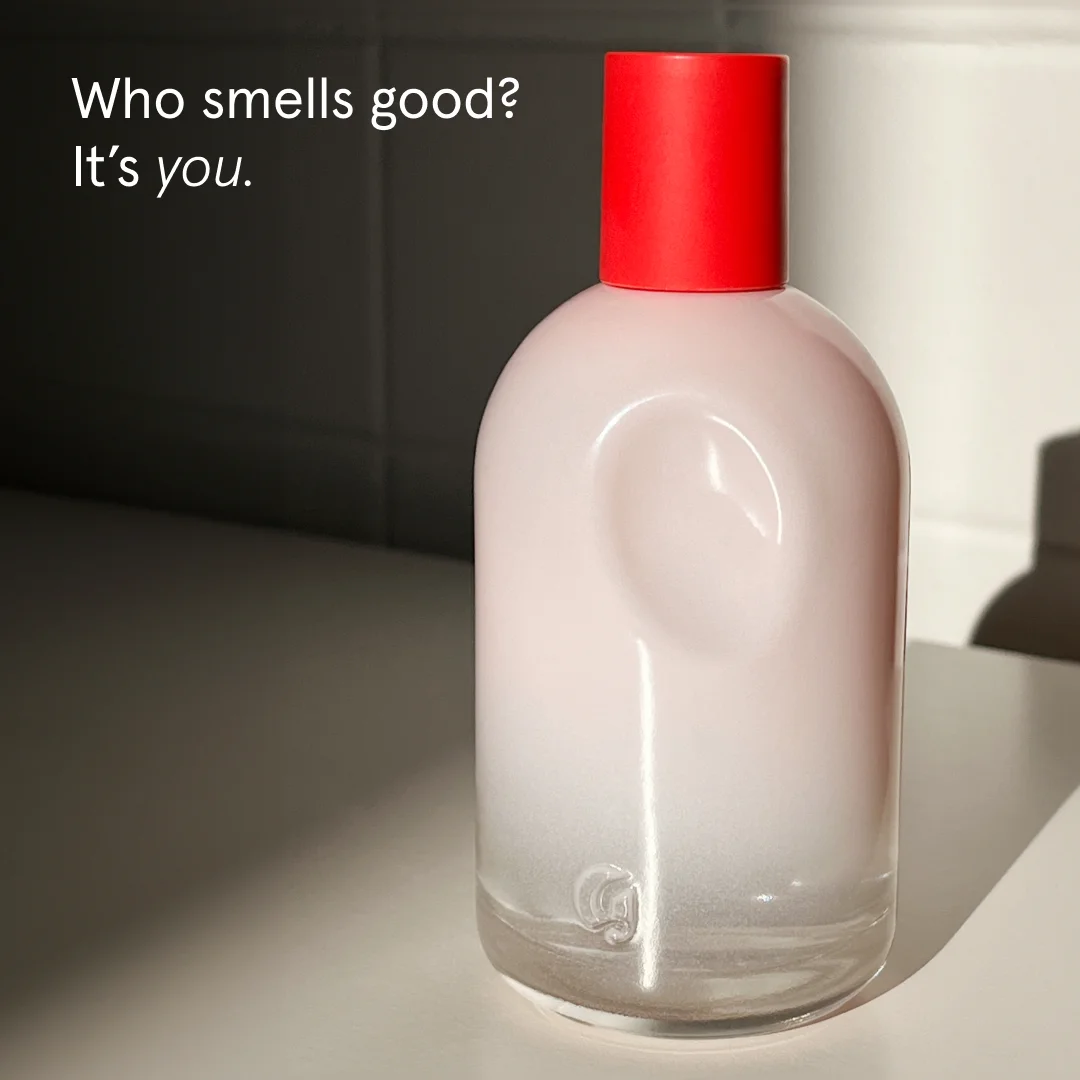
Pastel is a positioning choice, not a color choice

Dusty pink, cream, and sage signal a specific millennial-femme mood that reads as friendly rather than clinical. Brands playing in beauty, wellness, or lifestyle see pastel backgrounds outperform white studio shots on Instagram. Worth testing against any current control.

Lead with skin, not marketing copy

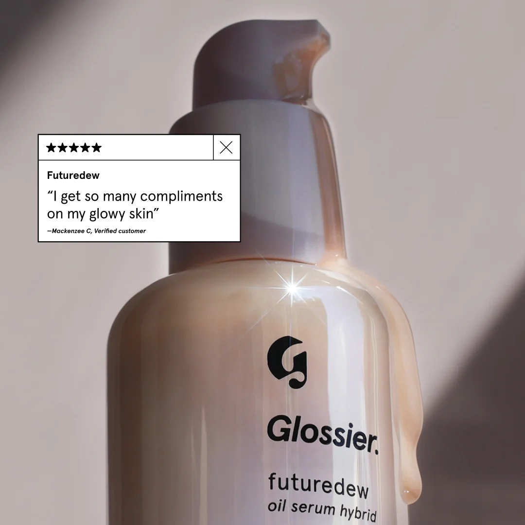
Glossier ads regularly show skin close-ups with freckles, pores, and redness visible. No retouching to oblivion. Realism is the brand promise — and it's why their UGC converts. Any product applied to a body should show the body honestly.

Questions

Glossier ads work because they sell identity rather than product features. Pastel palettes, negative space, and UGC-style close-ups create a feed-native aesthetic that reads as friend-recommendation rather than advertisement. Copy stays short and lowercase — no claims, no countdowns, no CTAs shouting at you. Consistent brand colors across every asset compound into a visual signature shoppers recognize before they read a word.

Minimalist, pastel, and UGC-forward. Backgrounds stick to millennial pink, dusty peach, cream, and occasional sage. Product usually sits centered or slightly off-axis, held by a hand or floating on a flat surface. Skin close-ups with visible freckles and pores show up across launches. Typography — when it appears at all — runs lowercase serif or clean sans-serif, never bold screamers. Editorial, not promotional.

Instagram carries the primary spend by a wide margin, followed by TikTok. Facebook and Pinterest get spillover. Glossier built its brand on Instagram's grid starting in 2014, and ad creative still treats that platform as home base — portrait 4:5 and 9:16 vertical dominate, with square 1:1 as backup. YouTube and Google Display stay rare because the aesthetic depends on feed context to read correctly.

UGC sits at the center of the strategy, not bolted on as an afterthought. Glossier regularly runs customer selfies as paid ads with light brand styling — logo in a corner, a pastel frame, a price. Customers tag @glossier, the brand reposts, and top posts get ad budget. Content looks like a friend's selfie rather than a studio shoot, which holds scroll-stopping attention longer than polished creative.

Early Glossier (2014-2018) ran almost entirely on organic Instagram and community — ads were light because the feed was doing the selling. From 2019 onward, paid spend scaled on Facebook, Instagram, and TikTok, but creative stayed loyal to the pastel-UGC formula. Recent shifts include more video product demos, a push into makeup-application Reels, and Sephora retail integration visible in fall-campaign creative.

Create Your Own
Glossier Ad

Clone any glossier ad example. Upload your product photo. Seconds later, you have a finished ad ready to launch.

Create your ad
AdDogs ad examples globe