AdDogs

Skincare Ad Examples That Actually Convert

Browse 45+ skincare ad examples sourced from high-performing campaigns. Clone any design, swap in your product, and get a finished ad in seconds.

Updated June 2026

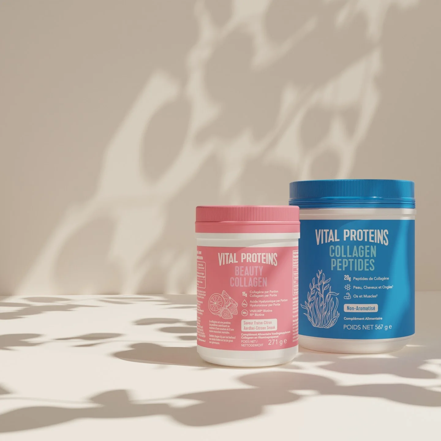
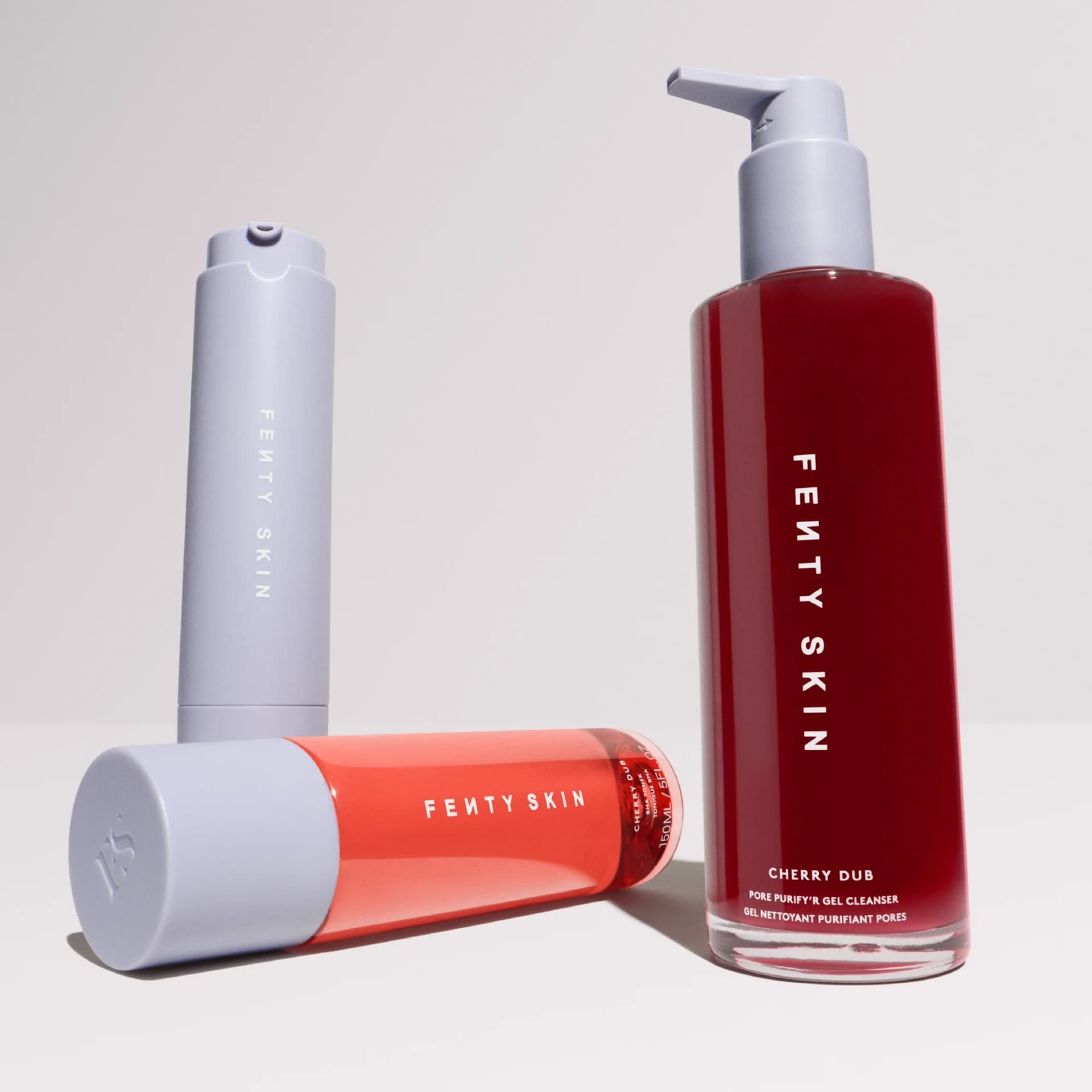
Skincare ads win or lose on product photography. Pull any top-performing serum ad and you'll see three moves repeating: clean backgrounds that let the product breathe, macro textures that telegraph quality, and split-screen before-afters that prove results without a headline.

Color carries more weight in skincare than almost any other category. Pastels and cream backgrounds read as clinical credibility, Glossier-style. Bold pinks and corals read as Gen-Z routine. Warm amber and black lean luxury. Most ads in this collection run on Instagram Reels and Stories where 9:16 dominates, with 1:1 as the Facebook feed backup. Copy stays under 10 words because skincare shoppers scroll — they don't read.

Browse skincare ad examples pulled from real DTC campaigns — Glossier, The Ordinary, Topicals, Bubble, ILIA, and dozens of smaller brands running paid on Meta and TikTok. Filter by format to find carousel routines, single-product heroes, or before-after transformations. Pick a template, upload your product, and AdDogs clones the layout with your colors applied across three formats.

The Ordinary Niacinamide — Minimalist Hero Shot. Brand: The Ordinary. This ad employs a minimalist hero shot layout, centering The Ordinary's Niacinamide serum against a stark white background with a subtle glowing ring. This composition technique draws immediate focus to the product, reinforcing its scientific, no-frills brand identity. The monochromatic color palette of white, grey, and black communicates clinical efficacy and transparency, aligning with the brand's ethos. The prominent headline, "Quality Skincare Belongs to Everybody," establishes a clear value proposition and inclusive brand message, while the product name and price at the bottom provide essential information. This ad is optimized for platforms like Instagram, where clean aesthetics and direct messaging cut through visual clutter, effectively driving awareness and consideration for an affordable, high-quality product. The text hierarchy guides the eye from the overarching brand philosophy to specific product details and price.. Headline: Quality Skincare Belongs to Everybody.. Primary text: Niacinamide 10% + Zinc 1% £5.00. Why this ad works: Minimalist Aesthetic Reinforces Scientific Credibility — The stark white background and simple product shot, framed by a subtle glowing ring, create a clean, laboratory-like aesthetic. This minimalist approach strips away distractions, allowing the product's efficacy and the brand's scientific integrity to take center stage, resonating with consumers seeking transparent skincare solutions. Clear Value Proposition and Inclusive Messaging — The bold headline "Quality Skincare Belongs to Everybody." directly communicates the brand's mission of accessibility and affordability. This powerful statement, combined with the visible £5.00 price point, immediately positions the product as high-value and inclusive, appealing to a broad demographic looking for effective yet budget-friendly options. Strong Visual Hierarchy Guides Viewer's Focus — The ad strategically uses text size and placement to direct the viewer's eye. The large, impactful headline captures attention first, followed by the centrally placed product. Finally, the specific ingredient and price at the bottom provide crucial details, ensuring key information is absorbed efficiently without overwhelming the user.. Specs: Brand: The Ordinary, Industry: Health & Wellness, Platform: Instagram, Format: Static, Audience: GeneralAugustinus Bader — Luxury Gift Set Flat Lay. Brand: Augustinus Bader. This ad features a meticulously arranged flat lay of an Augustinus Bader luxury skincare gift set, presented in an open royal blue box. The layout strategically uses the box as a framing device, drawing the viewer's eye directly to the premium products within. Deep royal blue and shimmering gold/copper accents communicate opulence and scientific sophistication, while the contrasting peach of the eye patches adds a subtle warmth. The symmetrical composition ensures visual balance and highlights the curated nature of the set. Optimized for visual-first platforms like Instagram or Pinterest, its high-quality aesthetic and clear product presentation are designed to stop the scroll. Minimal text, primarily brand and product names, maintains a clean, high-end feel, letting the luxurious packaging speak for itself and subtly reinforcing the brand's 'Revolutionary Science' ethos.. Why this ad works: Luxury packaging elevates product perception — The deep royal blue box with intricate gold patterns and custom inserts immediately signals high-end luxury. This premium presentation enhances the perceived value of the products, attracting a discerning audience willing to invest in prestige skincare. It transforms a simple product display into an aspirational experience. Color palette communicates sophistication and trust — The combination of rich blue and metallic gold/copper creates a sophisticated and trustworthy aesthetic. Blue is often associated with reliability and science, while gold signifies luxury and quality. This palette effectively positions Augustinus Bader as a premium, science-backed brand in the competitive skincare market. Flat lay composition highlights curated set — The overhead flat lay view of the open gift box allows for a clear, comprehensive display of all included products. This composition is excellent for showcasing product bundles or gift sets, making it easy for the viewer to understand the value proposition and the range of items offered, driving consideration.. Specs: Brand: Augustinus Bader, Industry: Health & Wellness, Platform: Instagram, Format: Static, Audience: Women 35-44KraveBeauty Skincare Essentials — Angled Product Showcase. Brand: KraveBeauty. The ad utilizes an angled product showcase layout against a vibrant gradient background, effectively highlighting three distinct skincare products. The composition employs a dynamic diagonal arrangement, guiding the eye from the top-right to the bottom-left, where the main call to action text resides. Color psychology is leveraged through the bright, clean product packaging contrasting with the playful blue-to-pink gradient, signaling freshness and approachability. Text hierarchy is clear: the brand name is prominent, followed by a bold, yellow headline ("Press Reset") and a supportive sub-headline, ensuring key messages are easily digestible. Arrows and short benefit descriptions enhance product understanding. This design is optimized for platforms like Instagram, where visually engaging, informative content with a clean aesthetic performs well, encouraging scroll-stopping engagement and product discovery. The overall effect is inviting and educational.. Headline: Press Reset. Primary text: KRAVEBEAUTY A HEALTHY DOSE OF SKINCARE ESSENTIALS GENTLE NON-STRIPPING CLEANSER SKIN-LIKE SUNSCREEN LIGHTWEIGHT & CALMING MOISTURIZER. Why this ad works: Dynamic Diagonal Composition Guides Eye — The angled arrangement of products creates a natural visual flow, leading the viewer's eye across the ad. This dynamic composition prevents static boredom and ensures each product, along with its associated benefit text, is encountered sequentially, enhancing message retention and overall ad engagement. Vibrant Gradient Background Creates Contrast — The blue-to-pink gradient background provides a lively yet clean canvas that makes the white product packaging pop. This high contrast ensures product visibility and adds a modern, playful touch, appealing to a younger, digitally native audience on social platforms, increasing scroll-stopping power. Clear Product-Benefit Association with Arrows — The use of arrows directly linking each product to its key benefit ("Gentle Non-Stripping Cleanser," "Skin-Like Sunscreen," "Lightweight & Calming Moisturizer") simplifies complex information. This visual cue enhances clarity and allows for quick comprehension of each product's primary value proposition, aiding rapid decision-making.. Specs: Brand: KraveBeauty, Industry: Health & Wellness, Platform: Instagram, Format: Static, Audience: Women 25-34Navy Skin Sale — Organic Lifestyle Shot. Brand: Navy. This ad employs a lifestyle shot within a clean, organic bathroom setting to promote a "Skin Sale." The composition uses a shallow depth of field, subtly blurring the background to keep the focus on the foreground products and the prominent text overlay. The muted color palette of creams, greens, and gold accents evokes a sense of calm and natural luxury, aligning with a premium skincare brand. Text hierarchy is clear: "Skin Sale" and "20% off Skin Collection" are large and central, immediately communicating the offer. The "Use Code: HYDRATE" call to action is strategically placed in a contrasting, yet harmonious, bottom banner. This aesthetic is highly optimized for visual platforms like Instagram or Pinterest, where aspirational lifestyle imagery and clear value propositions drive engagement. The overall design balances product visibility with an inviting, lived-in feel, aiming to connect emotionally with the target audience.. Headline: Skin Sale. Primary text: 20% off Skin Collection. Why this ad works: Muted palette conveys natural luxury — The soft greens, creams, and natural wood tones create an organic, calming aesthetic. This color choice subtly communicates premium quality and natural ingredients without explicit claims, appealing to consumers seeking a sophisticated and gentle skincare experience. It differentiates from clinical or overly vibrant competitors. Lifestyle setting builds aspirational connection — Placing products within a well-styled bathroom environment makes the brand feel integrated into a desirable lifestyle. This approach helps potential customers visualize the products in their own homes, fostering an emotional connection and increasing perceived value beyond just the product's function. Clear sale offer drives immediate attention — The large, central "Skin Sale 20% off Skin Collection" text immediately communicates a strong value proposition. This directness, combined with the distinct "Use Code: HYDRATE" banner, ensures that the primary marketing message is instantly understood, prompting quick consideration and action.. Specs: Brand: Navy, Industry: Health & Wellness, Platform: Instagram, Format: Static, Audience: Women 25-34Porn Brain vs. Reset Brain — Before/After Split. This ad employs a powerful split-screen, before/after layout to visually communicate a transformation. The left panel uses a distressed facial expression, dark red lighting, and a glitchy red brain outline with "Porn Brain" text, immediately evoking pain and a problem state. The right panel contrasts sharply with a calm, confident expression, clear blue lighting, and a bright yellow glowing brain with "Reset Brain" text, signaling a solution and positive outcome. This direct visual juxtaposition leverages color psychology—red for warning/distress, blue for calm, yellow for clarity/enlightenment—to create an immediate emotional impact. The bold, high-contrast text ensures readability and reinforces the core message, making it highly effective for scroll-stopping on platforms like Instagram or Facebook where quick comprehension is key. The composition guides the eye from problem to solution, optimizing for rapid understanding of the value proposition.. Why this ad works: Direct Visual Contrast for Problem/Solution — The split-screen design immediately presents a stark before-and-after narrative. This visual shorthand allows viewers to instantly grasp the problem (distress, "Porn Brain") and the desired solution (calm, "Reset Brain") without needing extensive copy. This rapid comprehension is crucial for engaging audiences on fast-paced social feeds. Emotional Resonance Through Facial Expressions — The contrasting facial expressions—distress and pain on the left versus calm and confidence on the right—create a strong emotional connection. Viewers experiencing similar struggles can instantly identify with the "before" state, while the "after" offers a clear, aspirational vision of relief and improvement. This emotional mirroring drives engagement. Strategic Color Psychology Reinforces Message — The ad masterfully uses color psychology: deep, glitchy red on the left signifies danger, pain, and a disordered state, while the serene blue background and bright, glowing yellow brain on the right represent clarity, peace, and enlightenment. This color contrast powerfully amplifies the problem-solution narrative, making the ad's intent unmistakable.. Specs: Industry: Health & Wellness, Platform: Instagram, Format: Static, Audience: Men 25-34MYTHOS MEN Anti-Aging Cream — Product & Benefit List. Brand: MYTHOS MEN. This ad effectively uses a clean, high-contrast layout to highlight the MYTHOS MEN Anti-Aging Cream. The product is positioned on the right, balanced by a clear, benefit-driven headline and bulleted features on the left. The stark black-on-white color scheme exudes a modern, masculine, and premium feel, aligning with the product's anti-aging claims. Compositionally, the ad employs a split-screen approach, guiding the viewer's eye from the bold headline to the detailed benefits, then to the product itself. This structure is highly optimized for platforms like Facebook or Instagram, where quick readability and clear value propositions are crucial for stopping the scroll. The text hierarchy prioritizes a provocative headline, followed by digestible bullet points, ensuring key information is absorbed rapidly. The overall design communicates efficacy and sophistication, appealing directly to men seeking practical skincare solutions.. Headline: Don't buy this if you're not ready for compliments.. Primary text: Reduces signs of fatigue and aging in under 10 seconds a day Reduces Fine Lines Hydrates the Skin Boosts Confidence Reduces Razor Burns None drying formula. Why this ad works: Provocative Headline Grabs Attention — The headline "Don't buy this if you're not ready for compliments." creates immediate intrigue and a sense of exclusivity. This psychological trigger leverages social validation, making the target audience curious and more likely to engage with the ad's content. It shifts focus from product features to desired outcomes. Clear Benefit-Driven Bullet Points — The use of checkmarks and concise bullet points on the left clearly articulates the product's advantages. This format is highly scannable and allows viewers to quickly grasp the core benefits, such as "Reduces Fine Lines" and "Boosts Confidence," without extensive reading. It directly addresses common male skincare concerns. High Contrast & Minimalist Aesthetic — The black product on a pure white background, combined with black text, creates a strong visual contrast. This minimalist approach conveys sophistication and efficacy, resonating with a male audience that often prefers straightforward, no-fuss branding. It ensures readability and a premium perception on busy social feeds.. Specs: Brand: MYTHOS MEN, Industry: Health & Wellness, Platform: Instagram, Format: Static, Audience: Men 25-34CALECIM PROFESSIONAL — Bold Text on Abstract Background. Brand: CALECIMPROFESSIONAL. The ad leverages a bold, abstract red-pink background to create visual intrigue, immediately drawing the eye. This vibrant, almost organic texture hints at biological processes, aligning with the scientific claims. The layout is text-heavy, centrally positioned, using strong contrast (white text on dark red) for maximum readability. The hierarchy emphasizes the market launch ("NOW IN IRELAND") and the unique selling proposition ("IT'S PTT-6®"), positioning the brand as a leader in advanced skincare. While visually striking for platforms like Instagram, the density of text and scientific terminology suggest a target audience of professionals or highly engaged consumers. The explicit website and tagline reinforce a direct-to-consumer or professional-facing approach, aiming for awareness and education. The overall composition is designed to convey authority and innovation.. Headline: NOW IN IRELAND. Primary text: It's not just Exosomes IT'S PTT-6®. Why this ad works: Clear Market Entry Announcement — The prominent 'NOW IN IRELAND' immediately captures attention, signaling a new opportunity for local audiences. This direct approach creates urgency and relevance for potential customers in the region, driving initial interest and awareness for the brand's expansion. It effectively targets a specific demographic with a clear call to attention. Unique Ingredient as Core Differentiator — Highlighting 'PTT-6®' as a proprietary ingredient elevates the product beyond generic 'Exosomes.' This positions the brand as innovative and scientifically advanced, appealing to a discerning audience seeking cutting-edge solutions. It builds perceived value and exclusivity, justifying a premium offering in the market. High-Contrast Text on Abstract Background — The stark white text against the swirling red-pink background ensures maximum readability and visual impact. This contrast makes the key messages pop, cutting through visual clutter in a busy feed. The abstract texture adds depth and sophistication, hinting at the product's scientific complexity without being overtly clinical.. Specs: Brand: CALECIMPROFESSIONAL, Industry: Health & Wellness, Platform: Instagram, Format: Static, Audience: ProfessionalsStarface Super Star Bundle — Playful Product Arrangement. Brand: Starface. This ad leverages a vibrant, high-contrast color palette of neon green and bright purples, yellows, and blues to immediately capture attention, especially on scroll-heavy platforms like Instagram. The dynamic arrangement of the three product boxes creates visual interest and a sense of abundance, reinforcing the "bundle" offer. The playful typography and star motifs align perfectly with the brand's youthful, approachable identity, making skincare feel fun rather than clinical. Text hierarchy is clear: the main offer "super star bundle" is prominent vertically, while the benefit-driven headline "a star for every spot!" and the conversion-focused "three packs of patch favs with free shipping" are strategically placed to guide the eye. This composition is optimized for mobile, ensuring all key information is visible and legible, appealing directly to a Gen Z audience with its bold aesthetic.. Headline: a star for every spot!. Primary text: super star bundle. Why this ad works: High-contrast, vibrant palette grabs attention — The electric green background paired with bright product packaging (purple, blue, yellow) creates an immediate visual pop. This high-contrast design is highly effective on social feeds, cutting through visual clutter and stopping the scroll, especially appealing to a younger demographic accustomed to bold digital aesthetics. Playful branding and typography resonate with youth — The use of chunky, rounded fonts and the iconic Starface smiley-face logo on each product box injects a sense of fun and approachability into skincare. This lighthearted tone effectively de-stigmatizes acne treatment, fostering a positive brand connection with teens and young adults. Dynamic product arrangement emphasizes bundle value — Stacking and angling the three different product boxes creates a visually engaging composition that clearly showcases the "super star bundle." This arrangement not only highlights the variety of patches but also visually communicates the value of receiving multiple items, driving consideration for the offer.. Specs: Brand: Starface, Industry: Health & Wellness, Platform: Instagram, Format: Static, Audience: TeensPeach & Lily Cleanser — In-Use Application Shot. Brand: Peach & Lily. This ad effectively uses an in-use product demonstration to build trust and illustrate texture. The composition centers on hands dispensing the gel cleanser, creating an intimate, relatable moment. Warm, natural lighting highlights the product's clear, hydrating consistency, reinforcing its gentle and effective qualities. The coral and white color palette of the packaging, echoed by the discount bubble, creates a cohesive brand identity that feels fresh and approachable. Text hierarchy places the brand and product name clearly on the tube, while a prominent "15% OFF" bubble acts as the primary call to value. Optimized for visual platforms like Instagram, this ad leverages authentic-feeling imagery to stop the scroll and drive immediate conversion through a clear incentive. The focus on hands and product texture communicates efficacy without needing excessive text.. Headline: 15% OFF YOUR FIRST PURCHASE. Primary text: POWER CALM HYDRATING GEL CLEANSER Deep Cleanse + Soothe. Why this ad works: In-use demonstration builds product trust — Showing the product actively being used, with the gel dispensing into hands, provides immediate visual proof of its texture and application. This direct demonstration helps potential customers visualize themselves using the product, reducing purchase friction and building confidence in its hydrating claims more effectively than a static product shot. Warm, natural lighting enhances organic appeal — The soft, warm lighting creates a natural and inviting atmosphere. It suggests a gentle, effective product that aligns with clean beauty trends. This aesthetic choice makes the product feel more approachable and less clinical, appealing to consumers seeking a holistic and pleasant skincare experience, enhancing brand perception. Prominent discount call-out drives immediate action — The bright coral "15% OFF YOUR FIRST PURCHASE" bubble immediately grabs attention and clearly communicates a strong incentive. Placed strategically in the upper right, it acts as a secondary focal point after the product, directly addressing conversion. This clear, value-driven message is crucial for new customer acquisition campaigns.. Specs: Brand: Peach & Lily, Industry: Health & Wellness, Platform: Instagram, Format: Static, Audience: Women 25-34Biossance Squalane Serum — Product In-Hand Shot. Brand: BIOSSANCE. This ad employs an in-use product shot, featuring the Biossance serum held in a hand with a dropper poised above, creating an immediate sense of application and efficacy. The warm, natural color palette, dominated by skin tones and the serum's golden hue, evokes a sense of organic ingredients and gentle care. Compositionally, the product is centered, drawing the eye, while the large "96%" social proof stat is strategically placed for maximum impact, leveraging a clear visual hierarchy. This design is optimized for platforms like Instagram, where authentic, lifestyle-oriented imagery combined with strong, concise claims effectively stops the scroll. The minimal background blur keeps focus on the product and its benefits, while the prominent partnership with Sephora adds significant retail credibility. Text is layered, with the key statistic dominating, followed by brand and product details, and a crucial disclaimer.. Headline: 96% AGREE THEIR SKIN LOOKED LIFTED IN 1 WEEK*. Primary text: NEW SQUALANE + FIRM AND LIFT DUAL SERUM Visibly Tightens • Hyaluronic Acid. Why this ad works: Human Element & In-Use Context — The product held gently in a hand, with a dropper poised, creates an immediate, relatable connection. This "in-use" visual demonstrates the product's scale and suggests direct application, making the benefits feel more tangible and accessible to the viewer, fostering trust and desire. Prominent Social Proof & Efficacy Claim — The large, bold "96% AGREE..." statistic immediately grabs attention and provides powerful social proof. This clear, quantifiable claim builds instant credibility and trust, addressing potential skepticism and highlighting the product's effectiveness, which is crucial for driving consideration in skincare. Strategic Retail Partnership Leverage — The "BIOSSANCE: x SEPHORA" branding at the bottom instantly elevates the product's perceived value and accessibility. This partnership signals quality and availability at a trusted, high-end retailer, reassuring potential customers and streamlining the path to purchase by indicating where the product can be found.. Specs: Brand: BIOSSANCE, Industry: Health & Wellness, Platform: Instagram, Format: Static, Audience: Women 25-34Biossance Firm & Lift Serum — Clinical Proof Layout. Brand: Biossance. This ad effectively combines product visualization with strong scientific claims. The layout strategically places the product's texture, represented by the serum droppers and liquid, on the right, balancing it with prominent statistical benefits on the left. The warm, golden-beige color palette evokes a sense of luxury and natural efficacy, avoiding clinical coldness while still conveying professionalism. Compositionally, the diagonal lines of the droppers add dynamic interest, drawing the eye towards the product's essence. This design is highly optimized for platforms like Instagram, where visually appealing, high-quality imagery combined with clear, benefit-driven text can quickly capture attention. The text hierarchy ensures that key performance metrics are immediately visible, building trust and driving consideration for the 'NEW FIRM AND LIFT DUAL SERUM' from Biossance and Sephora.. Headline: NEW FIRM AND LIFT DUAL SERUM. Primary text: 96% SAW MORE LIFTED SKIN IN JUST 1 WEEK* 100% SAW MORE SCULPTED FACIAL FEATURES IN 1 WEEK* 92% SAW IMMEDIATE IMPROVEMENT OF FINE LINES AND WRINKLES*. Why this ad works: Visualizing efficacy with product texture — The close-up of the serum droppers and liquid creates a tangible sense of the product's texture and purity, making the scientific claims feel more real and immediate. It visually communicates hydration and potent ingredients, enhancing the perceived quality and effectiveness of the firming serum. Bold statistical claims build immediate trust — Prominently displaying "96%", "100%", and "92%" immediately grabs attention and provides concrete, data-backed evidence of the serum's effectiveness. This quantitative proof is highly persuasive for consumers seeking verifiable results, boosting credibility and purchase intent quickly. Warm, clean aesthetic signals premium quality — The soft, golden-beige background combined with the clear serum and water droplets creates a luxurious yet approachable feel. This palette avoids clinical sterility, positioning the product as a high-end, effective solution for discerning customers who value both efficacy and a sophisticated brand experience.. Specs: Brand: Biossance, Industry: Health & Wellness, Platform: Instagram, Format: Static, Audience: Women 35-44Sephora Supergoop! Sunscreen — Vibrant Product Showcase. Brand: Sephora | Supergoop!. This ad effectively leverages a vibrant, multi-color gradient background to create an energetic and fresh aesthetic, perfectly suiting sun protection products. The layout strategically positions three distinct Supergoop! products diagonally, adding dynamism and showcasing variety. A prominent "ENJOY UP TO 20% OFF" in high-contrast blue immediately captures attention, driving the core offer. Text hierarchy guides the eye from the dual branding (Sephora | Supergoop!) at the top, through the offer, to the product details and a "Bestseller" badge, reinforcing credibility. The clean composition with ample white space around product details ensures readability. Optimized for platforms like Instagram, its bright colors and clear value proposition are designed to stop the scroll and encourage engagement, balancing brand awareness with a strong conversion incentive.. Headline: ONLINE & IN-STORE. Primary text: ENJOY UP TO 20% OFF. Why this ad works: Vibrant Gradient Background Captures Attention — The smooth, multi-color gradient from blue to green to yellow creates a visually engaging and fresh backdrop. This dynamic color scheme stands out effectively in a crowded social feed, immediately drawing the viewer's eye and establishing a positive, energetic mood that aligns well with outdoor and sun protection themes. Clear, High-Contrast Discount Offer — The large, bold "ENJOY UP TO 20% OFF" in a deep blue against the lighter background is instantly recognizable. This prominent placement and strong contrast ensure the primary value proposition is absorbed immediately, effectively driving consideration and encouraging clicks by highlighting a compelling financial incentive. Strategic Product Placement and Variety Showcase — Displaying three different Supergoop! sunscreens (Unseen, Matte, Glow) in a diagonal arrangement not only adds visual interest but also demonstrates the brand's diverse offerings. This approach caters to a broader audience by suggesting options for various skin needs, enhancing the ad's relevance and potential for conversion.. Specs: Brand: Sephora | Supergoop!, Industry: Health & Wellness, Platform: Instagram, Format: Static, Audience: Women 25-34Skincare Before/After — Direct Comparison Layout. This ad effectively utilizes a classic side-by-side before/after layout to visually demonstrate product efficacy. The composition directly contrasts the "BEFORE" image, showing significant skin imperfections, with the "AFTER 6 WEEKS" image, revealing noticeable improvement. This direct comparison is a powerful persuasion technique, immediately communicating the product's benefit. The clean white background and simple green text boxes maintain a clinical yet approachable vibe, reinforcing trust and results. Optimized for platforms like Instagram or Facebook, where users quickly scroll, this visual proof stops the scroll and encourages closer inspection. The minimal text overlay ensures the focus remains entirely on the transformative visual evidence, making the ad easily digestible and impactful.. Why this ad works: Direct Before/After Visual Proof — The side-by-side comparison immediately showcases the product's transformative power. This visual evidence is highly persuasive, allowing potential customers to see tangible results without needing extensive text. It builds credibility and trust, directly addressing common skin concerns and offering a clear solution. Clear Timeframe Establishes Expectation — Specifying "AFTER 6 WEEKS" sets a realistic expectation for results, enhancing the ad's trustworthiness. This transparency helps manage customer expectations, reducing potential dissatisfaction and building a stronger relationship with the brand. It suggests a consistent, effective treatment rather than an overnight miracle. Minimalist Design Focuses on Results — The clean white background and simple green text boxes eliminate distractions, ensuring the viewer's attention is solely on the skin transformation. This minimalist approach conveys professionalism and confidence in the product's efficacy, allowing the visual proof to speak for itself without clutter or overwhelming design elements.. Specs: Industry: Health & Wellness, Platform: Instagram, Format: Static, Audience: Women 25-34The Inkey List 360 Serum — Angled Product Shot. Brand: The Inkey List. This ad employs a dynamic product-on-background layout, featuring The Inkey List's serum angled diagonally across the frame. This composition technique creates visual flow, guiding the viewer's eye across the product label and its key information. The monochromatic color palette of black, white, and grey, complemented by subtle natural textures in the background, establishes a clean, clinical, and trustworthy aesthetic. This minimalist approach effectively communicates efficacy without distraction, resonating with consumers seeking results-driven skincare. Optimized for visual platforms like Instagram, the high-quality photography and clear product focus ensure scroll-stopping appeal. Text hierarchy is primarily embedded on the product packaging, with additional branding from SpaceNK and a reinforcing product name at the bottom, ensuring all critical information is readily available.. Headline: The Inkey List 360 Skin Clearing Serum. Primary text: Daily, multi-action support for blemishes. Why this ad works: Dynamic diagonal composition for engagement — The product is angled, creating a dynamic line that draws the eye across the frame. This avoids a static, flat presentation, making the product appear more engaging and natural, as if it's just been placed down. It adds visual interest, helping the ad stand out in a busy feed, capturing attention effectively. Clear product labeling as information hub — The product bottle itself serves as the primary information carrier. The brand name, product type ("Skin Clearing Serum"), and key ingredients ("Dioic and Salicylic Acid") are all clearly legible on the label. This directness builds trust and immediately informs the viewer about the product's purpose and formulation, aiding quick comprehension. Neutral palette conveys clinical trust — The dominant black, white, and grey tones, combined with subtle natural textures, convey a sense of clinical efficacy and no-nonsense skincare. This minimalist approach avoids visual clutter and positions the product as serious and effective. It appeals to consumers seeking transparent, results-driven solutions over aspirational luxury, fostering credibility.. Specs: Brand: The Inkey List, Industry: Health & Wellness, Platform: Instagram, Format: Static, Audience: Women 25-34Skin Collection Sale — Muted Text Overlay. This ad employs a minimalist, text-heavy layout on a muted olive-taupe background, strategically using color contrast and font variation to establish hierarchy. The large "20" acts as a dominant visual anchor, immediately conveying the discount. Overlaid script text ("Sale," "Skin Collection") adds a touch of elegance and softness, appealing to a premium skincare audience. The color palette, featuring soft whites and a deep olive, evokes a sense of natural, sophisticated branding, suitable for Instagram or Pinterest where aesthetic consistency is valued. The call to action, "Use Code: HYDRATE," is clearly presented in a button-like element at the bottom, guiding the user's eye through the offer. This design prioritizes clarity and a serene aesthetic over vibrant urgency, aiming for a considered conversion.. Headline: Skin Sale. Primary text: 20% off* Skin Collection. Why this ad works: Dominant "20%" grabs immediate attention — The oversized "20" with "% off" is the first thing the eye sees, instantly communicating the core offer. This bold numerical display is highly effective in a scroll-heavy feed, cutting through visual clutter and clearly stating the value proposition upfront, driving initial engagement. Muted color palette conveys premium aesthetic — The sophisticated olive-taupe background paired with soft white and dark grey text creates a clean, luxurious feel. This avoids the harshness of bright sale ads, aligning with premium skincare branding. It signals quality and elegance, resonating with an audience seeking refined products rather than just cheap deals. Clear CTA with relevant code — The "Use Code: HYDRATE" in a distinct button-like element provides a clear, actionable next step. The code itself, "HYDRATE," is directly relevant to skincare, reinforcing the product category and making it memorable and easy for the consumer to recall during checkout.. Specs: Industry: Health & Wellness, Platform: Instagram, Format: Static, Audience: Women 25-34Biossance Squalane Cream — Doctor Testimonial Layout. Brand: BIOSSANCE. This ad effectively combines expert endorsement with product visualization, leveraging a split-composition layout. The left side features a dermatologist's image and a compelling testimonial, establishing immediate credibility and trust. The right showcases the Biossance Squalane + Omega Repair Cream, emphasizing its texture and premium packaging with dynamic water splashes. The soft, warm neutral background color palette evokes a sense of calm and luxury, aligning with high-end skincare. Text hierarchy places the doctor's quote prominently, followed by product benefits, guiding the viewer's eye. Optimized for platforms like Instagram, its clean aesthetic and clear value proposition are designed to stop the scroll and build consideration, appealing to an audience seeking scientifically-backed beauty solutions. The composition balances information and visual appeal.. Headline: THIS LIPID-RICH CREAM FEELS LIKE THE HUG YOUR SKIN BARRIER DESPERATELY NEEDS.. Primary text: WITH A FULL FORMULATION OF NOURISHING INGREDIENTS, OMEGA REPAIR CREAM RESTORES AND SUPPORTS HYDRATED AND HEALTHY SKIN.. Why this ad works: Expert endorsement builds immediate trust — Featuring a dermatologist's quote and image instantly elevates the product's credibility. This third-party validation bypasses skepticism, assuring potential customers of the cream's efficacy and scientific backing. It directly addresses the need for trustworthy information in the crowded skincare market, driving consideration. Visual texture and hydration cues — The product shot not only displays the cream but also uses water splashes to visually communicate hydration and freshness. The visible creamy texture inside the jar further reinforces the "lipid-rich" description from the testimonial, creating a cohesive sensory experience that enhances product appeal and perceived benefits. Balanced composition for information and product — The ad masterfully divides the frame, dedicating significant space to both the expert testimonial and the product shot. This ensures that viewers receive both the persuasive narrative and a clear visual of what they are buying, preventing either element from being overshadowed. It's effective for educating and engaging.. Specs: Brand: BIOSSANCE, Industry: Health & Wellness, Platform: Instagram, Format: Static, Audience: Women 25-34Gaétan's Skincare — Founder's Letter UI Mockup. This ad leverages an authentic iPhone Notes app UI mockup to create a personal, founder-led narrative. The minimalist layout, featuring black text on a white background, mimics a genuine message, immediately breaking through typical ad clutter on platforms like Instagram. Compositionally, the text is the sole focus, with clear hierarchy established by the bold headline and structured paragraphs. This approach fosters trust and transparency, positioning the brand as honest and purpose-driven. The lack of traditional ad visuals forces the audience to engage with the compelling story of why the brand was created. It's optimized for scroll-stopping authenticity, appealing to a discerning male audience looking for genuine, high-quality skincare without the 'BS' often found in competitor products. The personal tone aims to build a strong initial connection and brand loyalty.. Headline: TO OUR LEGENDARY GENTS.... Primary text: I didn't plan on starting a skincare brand. But after seeing what's hidden in most men's products, I knew I couldn't ignore it. Every formula we make is clean, powerful, and made in Switzerland — no hormone disruptors, no shortcuts, no BS. It's skincare you can trust, built for men who expect more. — Gaétan, Founder. Why this ad works: Authentic UI Mockup Breaks Scroll — The iPhone Notes app format creates an immediate sense of authenticity and personal communication, distinguishing it from polished, traditional ads. This unexpected visual stops the scroll by appearing as organic content, making viewers pause and read rather than scroll past. It leverages platform familiarity to build trust. Founder's Personal Narrative Builds Trust — The 'I didn't plan on starting...' opening and founder's signature humanize the brand. This personal story fosters a deeper connection and trust with the audience, especially for a product like skincare where ingredients and transparency matter. It positions the brand as purpose-driven, not just profit-driven. Direct, Benefit-Driven Language for Men — Phrases like 'no hormone disruptors, no shortcuts, no BS' directly address common concerns and desires of men seeking straightforward, effective skincare. This clear, no-nonsense messaging resonates with a male audience, promising efficacy and integrity. It speaks to a desire for quality and transparency.. Specs: Industry: Health & Wellness, Platform: Instagram, Format: UI Mockup, Audience: Men 25-34Dermalogica Skincare Lineup — Discount Offer. Brand: Dermalogica. This ad effectively uses a clean, minimalist layout to showcase a range of Dermalogica products, immediately drawing attention to the brand's professional aesthetic. The composition places the products centrally, with generous white space ensuring visual clarity and a premium feel. A prominent circular graphic in the upper right corner clearly communicates a first-order discount, establishing a clear value proposition. The neutral color palette of white, grey, and subtle metallic accents reinforces a clinical, trustworthy brand image, appealing to an audience seeking efficacy. Text hierarchy is clear: a bold headline at the top, followed by the offer details, making it optimized for quick scanning on platforms like Instagram where users rapidly consume content. The ad balances brand presentation with a strong call to action.. Headline: EXCLUSIVE FIRST ORDER OFFER. Primary text: spend $250+ 15% off use code SKINCARE15. Why this ad works: Clear Offer Placement Drives Urgency — The circular graphic prominently displays the "15% off" and "SKINCARE15" code in the upper right. This placement ensures the discount is immediately visible, creating a strong incentive for conversion. It stands out against the clean product display without overwhelming it, guiding the viewer's eye directly to the value proposition. Professional Aesthetic Builds Trust — The minimalist packaging, neutral color scheme (white, grey, silver, gold), and clean white background project a professional, clinical image. This design choice aligns with Dermalogica's brand identity as a serious skincare solution, fostering trust and credibility among consumers who prioritize efficacy and science-backed products. Product Lineup Showcases Range — Featuring five distinct products, the ad effectively communicates the breadth of Dermalogica's offerings. This allows potential customers to see various solutions, hinting at a comprehensive skincare regimen. It encourages exploration beyond a single product, potentially increasing average order value by suggesting complementary items.. Specs: Brand: Dermalogica, Industry: Health & Wellness, Platform: Instagram, Format: Static, Audience: Women 25-34Skin Collection Sale — Cozy Lifestyle Flat Lay. This ad leverages a warm, inviting flat lay composition to promote a "Skin Sale." The layout integrates a beauty product (likely a lash/brow serum) within a cozy, natural setting featuring a mug, cookie, and woven doily. This lifestyle approach aims to create an emotional connection, positioning the product as part of a relaxing self-care routine. The color palette of earthy browns, creams, and soft greens evokes a sense of organic purity and comfort. Text hierarchy is somewhat muddled by the large, overlapping "20% off Skin Collection" text, which competes with the product for attention. The clear call to action, "Use code HYDRATE," is presented in a distinct button, guiding the user towards conversion. Optimized for platforms like Instagram or Pinterest, where aesthetic appeal and lifestyle integration drive engagement.. Headline: Skin Sale 20% off Skin Collection. Why this ad works: Cozy lifestyle aesthetic builds emotional connection — The warm color palette, soft textures of the doily, and comforting elements like the coffee cup and cookie create an inviting, relatable scene. This positions the beauty product not just as an item, but as part of a desirable self-care ritual, fostering emotional resonance and making the ad feel less like a hard sell. Clear discount offer drives immediate action — The prominent "20% off" text, despite its decorative style, immediately communicates a value proposition. This direct incentive, combined with the "Use code HYDRATE" call to action, creates a sense of urgency and encourages viewers to capitalize on the limited-time offer, boosting conversion potential. Organic visual cues enhance product perception — The use of natural materials like the bamboo cap on the product and the woven doily, alongside the earthy color scheme, subtly communicates an organic or natural product ethos. This aligns with current consumer preferences for clean beauty, enhancing the perceived quality and health benefits of the "Skin Collection.". Specs: Industry: Health & Wellness, Platform: Instagram, Format: Static, Audience: Women 25-34Drunk Elephant Autumn Routine — Vibrant Product Display. Brand: Drunk Elephant. This Drunk Elephant ad leverages a vibrant, playful aesthetic to promote an autumn skincare routine. The composition features multiple product miniatures and a branded gift bag, arranged on a minimalist, gradient background that shifts from pink to purple. This clean layout ensures each product is visible, while the bright colors (neon yellow text, hot pink, orange) create a high-energy, youthful appeal. The text hierarchy places the seasonal offer prominently at the top, immediately communicating value. Optimized for platforms like Instagram, its bold color palette and clear product focus are designed to capture attention in a busy feed. The overall design balances premium product presentation with an approachable, fun brand personality, encouraging engagement and conversion through a compelling gift-with-purchase incentive. The visual clarity and strong color contrast make it highly scannable.. Headline: Votre routine d'automne. Primary text: 5 cadeaux offerts dès 100€ d'achat!. Why this ad works: High-contrast, vibrant color palette — The ad uses a striking combination of neon yellow text against a pink-to-purple gradient, with bright orange and hot pink product accents. This vibrant palette immediately grabs attention in a crowded feed, signaling a playful yet premium brand. It effectively differentiates Drunk Elephant from competitors using more subdued, clinical aesthetics. Clear product display with gift incentive — Multiple miniature products are neatly arranged alongside a branded gift bag, clearly showcasing the "5 gifts" offer. This direct visual representation of value, combined with the "Autumn Routine" theme, creates an immediate desire and understanding of the promotion. It simplifies the message, driving consideration and potential conversion. Strategic use of negative space — Despite featuring multiple items, the layout utilizes ample negative space around the products and text. This prevents visual clutter, allowing each element to breathe and ensuring the headline and offer are easily digestible. The clean background keeps the focus on the colorful products, enhancing their perceived value and aesthetic appeal.. Specs: Brand: Drunk Elephant, Industry: Health & Wellness, Platform: Instagram, Format: Static, Audience: Women 25-34Mythos Men Anti-Aging Cream — Bold Product Focus. Brand: Mythos Men. This ad employs a stark, minimalist layout with a dominant black-and-white color scheme, effectively highlighting the Mythos Men anti-aging cream. The product is positioned on the right, balanced by a bold, benefit-driven headline on the left, creating a strong visual hierarchy. Two small circular insets provide supporting visual proof: a texture shot and a lifestyle image of a man using the product, adding credibility and aspirational appeal. The composition is clean, leveraging ample negative space to ensure the product and key message stand out, optimizing for quick comprehension on platforms like Instagram or Facebook. The text hierarchy uses large, impactful font for the main claim, followed by a smaller, descriptive sub-headline, guiding the viewer's eye from the unique ingredient proposition to the desired outcome. The overall design communicates efficacy and a no-nonsense approach to men's skincare.. Headline: BEEF FAT+ PEPTIDES = YOUR SKIN'S BEST UPGRADE. Primary text: Skin That Actually Looks Younger. Why this ad works: Unique Ingredient Hook Grabs Attention — The headline "BEEF FAT+ PEPTIDES = YOUR SKIN'S BEST UPGRADE" is highly unconventional and immediately piques curiosity. This bold, almost controversial ingredient claim acts as a powerful scroll-stopper, forcing viewers to pause and process the unexpected combination, making the ad memorable in a crowded feed. Strong Visual Hierarchy and Contrast — The ad uses a high-contrast black-on-white design with a large, bold headline. This ensures maximum readability and immediate impact. The product itself, a matte black jar, stands out prominently against the white background, drawing the eye directly to the brand and product details, enhancing brand recall. Supporting Visuals Build Trust and Aspiration — The two small circular insets — a texture close-up and a man using the product — provide crucial context. The texture shot offers a glimpse of the product's quality, while the lifestyle image creates aspirational appeal and demonstrates real-world use, subtly reinforcing the product's benefits and target audience.. Specs: Brand: Mythos Men, Industry: Health & Wellness, Platform: Instagram, Format: Static, Audience: Men 25-34Dr. Brandt No More Baggage — Bold Guarantee Layout. Brand: Dr. Brandt. This ad employs a direct-response layout, placing a bold, benefit-driven headline prominently above the product. The central text, highlighted with white boxes, immediately communicates a strong, time-bound guarantee, addressing a key pain point. The minimalist composition, with ample negative space on a soft gradient background, ensures the message and product are the sole focus. The color palette, a gentle blue-to-pink gradient, evokes a sense of calm and clinical efficacy, suitable for skincare. Text hierarchy is clear: the large, impactful headline dominates, followed by the product. This design is optimized for platforms like Instagram or Facebook, where quick comprehension and a strong value proposition are crucial to stop the scroll. The ad effectively leverages a money-back guarantee to build trust and urgency, driving consideration.. Headline: IF YOUR BAGS AREN'T GONE IN 5 MINUTES GET YOUR MONEY BACK. Why this ad works: Bold money-back guarantee builds trust — The headline "IF YOUR BAGS AREN'T GONE IN 5 MINUTES GET YOUR MONEY BACK" is a powerful, risk-reversal statement. This direct challenge and guarantee immediately addresses skepticism, building immense trust and confidence in the product's efficacy, which is crucial for new customers. Time-bound promise creates urgency — Specifying "5 MINUTES" creates an immediate, tangible expectation and a sense of urgency. This short timeframe implies rapid results, making the product highly appealing to consumers seeking quick fixes for under-eye bags, driving faster consideration and conversion. Minimalist layout focuses on core message — The clean, uncluttered design with generous negative space ensures the bold headline and product are the only visual elements. This minimalist approach prevents distraction, allowing the powerful guarantee to be absorbed instantly, maximizing message retention and impact on busy social feeds.. Specs: Brand: Dr. Brandt, Industry: Health & Wellness, Platform: Instagram, Format: Static, Audience: Women 25-34Neutrogena Ultra Sheer — Handheld Product Shot. Brand: Neutrogena. This ad leverages a handheld, in-store product shot to create immediate relatability and authenticity, positioning Neutrogena's Ultra Sheer Fluid Sunscreen. The composition places the product and its packaging centrally, allowing for clear readability of key benefits like SPF 50 and active ingredients. A blurred retail background subtly reinforces availability and encourages in-store purchase intent without distracting from the product. The prominent "SPF meets skincare" headline clearly communicates the dual benefit, appealing to consumers seeking multi-functional products. The informal, vertical format is optimized for mobile platforms like Instagram or TikTok, where user-generated content styles perform well. Text hierarchy prioritizes the benefit-driven headline, followed by essential product details on the packaging, and a necessary disclaimer. This approach effectively combines product education with a casual, trustworthy presentation.. Headline: SPF meets skincare ✨. Primary text: Always read the label and follow the directions for use. Wear protective clothing, hats and eyewear when sun exposed. Avoid prolonged sun exposure. Use and re-apply frequently.. Why this ad works: Handheld perspective builds instant trust — The ad's handheld presentation mimics a user's personal discovery, fostering authenticity and relatability. This informal, "real-life" shot resonates strongly on social platforms, making the product feel accessible and trustworthy, rather than a staged studio ad. It encourages viewers to imagine themselves holding the product. In-store background cues immediate availability — By subtly blurring a retail shelf background, the ad implicitly communicates product availability. This visual cue reduces purchase friction by suggesting the product is easily found in stores, converting consideration into action. It grounds the product in a familiar shopping environment, enhancing its perceived accessibility. Clear product & packaging highlights benefits — Both the product bottle and its box are prominently displayed, allowing consumers to clearly read key information like SPF 50, "Age Shield," and "Vitamin C & E, Niacinamide & Hyaluronic Acid." This transparency builds confidence and educates the viewer on the product's comprehensive skincare benefits, driving informed consideration.. Specs: Brand: Neutrogena, Industry: Health & Wellness, Platform: Instagram, Format: Static, Audience: Women 25-34Summer Fridays — Multi-Product Flat Lay. Brand: Summer Fridays. This ad employs a multi-product flat lay composition, showcasing a range of Summer Fridays' skincare essentials. The layout strategically arranges products in an appealing, organic yet organized manner, inviting exploration. A soft, neutral background enhances the pastel and earthy tones of the packaging, creating a clean and aspirational aesthetic. The prominent white script headline, "Shop Our Self-Care Essentials," guides the viewer's eye, while the brand name "SUMMER FRIDAYS" is subtly reinforced at the bottom. This composition is highly optimized for Instagram, where visually rich, lifestyle-oriented flat lays perform well, encouraging discovery and engagement. The color psychology evokes a sense of calm and natural beauty, aligning with self-care themes. Text hierarchy is clear, with the main message drawing attention first, followed by brand reinforcement. The overall design communicates premium quality and a holistic approach to skincare, appealing to a discerning audience.. Headline: Shop Our Self-Care Essentials. Why this ad works: Aspirational flat lay showcases full product range — The overhead flat lay effectively displays a diverse collection of Summer Fridays products. This composition allows potential customers to visualize the breadth of offerings and imagine integrating multiple items into their self-care routine, fostering a sense of aspiration and discovery rather than just a single product focus. Soft color palette conveys natural, premium feel — The harmonious blend of pastel and earthy tones in the product packaging, set against a light, neutral background, creates a visually soothing experience. This color psychology evokes feelings of calm, natural beauty, and premium quality, aligning perfectly with the "self-care essentials" message and attracting an audience seeking sophisticated skincare. Clear text hierarchy guides user engagement — The large, elegant script "Shop Our Self-Care Essentials" immediately captures attention, clearly stating the ad's purpose. The brand name "SUMMER FRIDAYS" at the bottom reinforces identity without distracting from the main message or product display. This hierarchy ensures the viewer understands the call to action and brand identity efficiently.. Specs: Brand: Summer Fridays, Industry: Health & Wellness, Platform: Instagram, Format: Static, Audience: Women 25-34Good Molecules Eye Gel — Vibrant Split Screen. Brand: Good Molecules. This ad employs a dynamic split-screen layout, effectively dividing attention between product and information. The left side features the Good Molecules Yerba Mate Eye Gel against a vibrant, multi-colored background, creating high visual contrast that immediately grabs attention in a busy feed. The product is angled, subtly guiding the eye towards the right panel. The right side utilizes a solid teal background, providing a clean, readable canvas for the value proposition. Text hierarchy is clear: a bold headline, prominent price point, and concise bulleted benefits. This combination of bright colors and direct communication is optimized for platforms like Instagram, where quick comprehension and visual appeal are crucial for stopping the scroll and driving consideration. The ad efficiently communicates both product identity and key benefits, appealing to a target audience seeking effective, affordable skincare solutions.. Headline: WAKE UP THOSE TIRED EYES!. Primary text: $6 Yerba mate delivers natural antioxidants and polyphenols to protect from UV light. Caffeine & peptide reduce puffiness and swelling. Hyaluronic acid helps plump fine lines. Fragrance-free Cruelty-free Vegan. Why this ad works: High-contrast split screen commands attention — The vibrant, multi-colored background behind the product sharply contrasts with the solid teal information panel. This visual dynamism creates an immediate scroll-stopping effect, ensuring the ad stands out in a crowded social feed. It effectively segments the ad into "show" and "tell" sections. Clear value proposition with prominent pricing — Placing the $6 price point directly below the headline and above the benefits immediately communicates affordability. This transparency reduces friction for price-sensitive consumers and positions the product as an accessible solution, driving consideration by addressing a key purchase barrier upfront. Benefit-driven bullet points enhance readability — The use of concise, checked bullet points for key ingredients and their benefits (antioxidants, caffeine, hyaluronic acid) makes the information easily digestible. This format allows viewers to quickly grasp the product's efficacy without reading dense paragraphs, improving message retention and perceived value.. Specs: Brand: Good Molecules, Industry: Health & Wellness, Platform: Instagram, Format: Static, Audience: Women 25-34Augustinus Bader — Dua Lipa Mirror Selfie. Brand: Augustinus Bader. This ad leverages an authentic-looking celebrity mirror selfie, strategically placing Augustinus Bader products in the foreground. The composition draws the eye from the recognizable influencer, Dua Lipa, to the subtly featured luxury skincare items. The dark, opulent bathroom setting enhances the premium feel, aligning with the brand's high-end positioning. This lifestyle approach, optimized for Instagram, capitalizes on aspirational appeal rather than direct product features. The lack of overt ad copy or text overlay makes the post feel organic, fostering trust and engagement typical of influencer content. Color psychology is subtle, with the product's blue and gold packaging contrasting against the dark backdrop, signaling sophistication. The overall strategy is to drive brand awareness and consideration through association with a credible, stylish figure, making the product part of a desirable routine.. Why this ad works: Dua Lipa's authentic celebrity endorsement — Featuring a global celebrity like Dua Lipa creates instant aspirational appeal and trust. Her mirror selfie format makes the endorsement feel organic and relatable, rather than a staged ad. This leverages her massive following to drive brand awareness and consideration among her engaged audience, associating the product with her desirable lifestyle. Subtle product placement in lifestyle context — The Augustinus Bader products are visible but not overtly highlighted, making the ad feel less intrusive. This soft sell approach integrates the products into Dua Lipa's personal routine, suggesting natural use and efficacy. It allows viewers to discover the brand organically within a trusted, aspirational setting, enhancing perceived authenticity. High-end aesthetic reinforces luxury brand — The dark, luxurious bathroom setting and Dua Lipa's relaxed yet chic appearance align perfectly with Augustinus Bader's premium positioning. This visual language communicates exclusivity and sophistication, appealing to a target audience that values luxury and quality. The overall vibe elevates the brand's perceived value and desirability.. Specs: Brand: Augustinus Bader, Industry: Health & Wellness, Platform: Instagram, Format: Static, Audience: Women 25-34SK-II Pitera Set — Bold Split-Screen Offer. Brand: SK-II. This ad employs a high-contrast split-screen layout, effectively dividing attention between the hero product and the compelling offer details. The iconic SK-II Facial Treatment Essence bottle occupies the left, rendered cleanly against a white background, signifying purity and premium quality. The right panel, a vibrant red, immediately grabs attention, leveraging color psychology for urgency and excitement. Text hierarchy is clear: the limited-time offer and discount are prominent, followed by a strong call to action and details of valuable free gifts. This composition is optimized for e-commerce platforms like LazMall, where direct-response messaging and clear value propositions drive conversions. The bold red ensures high visibility in a crowded feed, while the luxury product imagery maintains brand prestige. The overall design balances aspirational branding with aggressive sales tactics.. Headline: PITERA™ Set. Primary text: Harga Rp 3,080,000 | Senilai Rp 4,790,000. Why this ad works: High-contrast split-screen drives focus — The stark division between the elegant product shot (white) and the vibrant offer panel (red) creates immediate visual interest. This contrast ensures both the premium product and the compelling discount are noticed, preventing either from being overlooked in a busy feed, effectively stopping the scroll. Urgency and value communicated clearly — The prominent "4.4 EKSKLUSIF | HANYA 4 - 5 APRIL" combined with the striking price comparison and "HADIAH GRATIS" immediately signals a limited-time, high-value opportunity. This direct approach effectively leverages scarcity and perceived value, prompting quick purchase decisions from engaged viewers. Strategic use of brand colors — The signature red of SK-II and LazMall is used boldly to highlight the promotional aspect, associating the brand's luxury image with an exciting sales event. This reinforces brand identity while simultaneously driving conversion through a visually arresting and memorable color scheme that stands out.. Specs: Brand: SK-II, Industry: Health & Wellness, Platform: Instagram, Format: Static, Audience: Women 25-34CeraVe Baby Skincare — Product & Lifestyle Split. Brand: CeraVe. This ad employs a dynamic split-screen layout, diagonally separating an empathetic lifestyle image of baby feet from a clear product display. The cool blue background evokes trust and calm, while the white product packaging reinforces cleanliness and medical efficacy. A subtle red patch on the baby's foot immediately establishes a problem-solution narrative, drawing the target audience's attention to the product's restorative benefits. The prominent headline, "Developed with ceramides to restore developing skin," clearly communicates the unique selling proposition. This composition is optimized for platforms like Instagram, where strong visuals and a direct, benefit-driven message resonate. The text hierarchy prioritizes the core message, ensuring quick comprehension.. Headline: Developed with ceramides to restore developing skin.. Why this ad works: Emotional connection through relatable imagery — The close-up of baby feet, particularly with a visible irritation, immediately creates an emotional connection with parents. This visual empathy makes the ad highly relatable, positioning CeraVe as a trusted solution for common infant skin concerns, driving initial engagement. Clear problem-solution narrative established — The subtle yet noticeable red patch on the baby's foot acts as a visual cue for a common skin issue. This immediately frames the CeraVe products as the direct solution, effectively communicating their purpose without needing extensive descriptive text. Strong brand presence and product clarity — The CeraVe logo is prominently displayed, reinforcing brand recognition and trust. The product lineup is clearly arranged and well-lit, allowing viewers to easily identify the specific items being advertised and their distinct packaging.. Specs: Brand: CeraVe, Industry: Health & Wellness, Platform: Instagram, Format: Static, Audience: ParentsMYTHOS MEN Anti-Aging Cream — Testimonial Hero Shot. Brand: MYTHOS MEN. This ad effectively leverages a clean, high-contrast layout to target men interested in skincare. The product, a black jar, is centrally positioned against a stark white background, creating immediate visual focus and a sense of premium simplicity. Text hierarchy is clear: a bold, empowering headline addresses potential male insecurities about skincare, followed by social proof from Men's Health. The minimalist color palette of black and white exudes sophistication and clinical efficacy, aligning with a masculine aesthetic. Composition uses ample negative space to prevent clutter, ensuring the product and key messages are easily digestible. Optimized for platforms like Instagram or Facebook, its direct messaging and strong endorsement aim to build trust and drive consideration among a discerning male audience.. Headline: NO SHAME IN WANTING BETTER SKIN.. Primary text: There's a reason Men's Health featured us. “The Crème the la crème” Men'sHealth. Why this ad works: Bold Headline Addresses Male Skincare Stigma — The headline "NO SHAME IN WANTING BETTER SKIN." directly confronts a common barrier for men entering skincare. This empathetic approach builds immediate rapport and trust, making the product more approachable. It positions self-care as strength, not vanity, resonating deeply with the target demographic. Men's Health Endorsement Builds Credibility — Featuring "Men's Health featured us" and a direct quote from the publication provides powerful third-party validation. This social proof is highly effective in advertising, as it leverages an authoritative source to overcome skepticism and establish product efficacy, significantly boosting consumer confidence and purchase intent. High-Contrast Minimalist Design for Clarity — The stark black product against a pure white background creates maximum contrast, making the product pop and ensuring readability of all text elements. This minimalist aesthetic communicates sophistication and efficiency, appealing to a male audience that often values directness and avoids overly ornate or 'feminine' branding in skincare.. Specs: Brand: MYTHOS MEN, Industry: Health & Wellness, Platform: Instagram, Format: Static, Audience: Men 25-34Kinvara Rosehip Serum — Hand-Held Product Shot. Brand: Kinvara. This ad for Kinvara Natural Skincare employs a clean, vertical layout optimized for mobile platforms like Instagram. The composition strategically places a hand holding the product in the bottom right, creating an engaging visual anchor. Dominant blue background evokes trust and naturalness, perfectly complementing the brand's "NATURAL SKINCARE" ethos. The large, bold white text "97% said skin feels moisturised after 28 days*" immediately captures attention, establishing a strong proof point. Text hierarchy is clear: the compelling statistic leads, followed by the smaller disclaimer, and the brand logo subtly reinforces identity. This design effectively balances product visibility with a strong, data-backed claim, encouraging consideration. The human element of the hand adds relatability and implies direct use, enhancing product appeal and perceived efficacy.. Headline: 97% said skin feels moisturised after 28 days*. Primary text: *2024 consumer trial (n=108). Why this ad works: Data-backed headline builds immediate trust — The prominent "97% said skin feels moisturised after 28 days*" immediately provides social proof and a tangible benefit. This quantitative claim is highly persuasive, reducing skepticism and building trust with potential customers. It positions the product as effective and reliable, crucial for skincare purchases. Human element enhances product relatability — Featuring a hand holding the product creates a sense of personal interaction and real-world use. This human touch makes the product feel more accessible and relatable than a sterile product shot. It subtly suggests the product is for *them*, fostering a stronger connection and imagining its benefits. High-contrast blue background ensures readability — The deep blue background provides excellent contrast for the white text and the amber product bottle. This ensures maximum readability, even on smaller mobile screens or in varied lighting conditions. The color choice also aligns with natural, clean aesthetics, reinforcing the brand's identity and product benefits effectively.. Specs: Brand: Kinvara, Industry: Health & Wellness, Platform: Instagram, Format: Static, Audience: Women 25-34Biossance Firm & Lift Serum — Close-up Testimonial. Brand: Biossance. This ad leverages a powerful close-up portrait, focusing on a model with natural skin texture to convey authenticity. The composition places the model's face slightly off-center, allowing ample space on the left for prominent statistical claims. A warm, natural color palette, dominated by skin tones, fosters a sense of approachability and trust, avoiding overly retouched perfection. The text hierarchy is clear: large percentage figures immediately grab attention, followed by specific benefit statements, and finally, brand logos. This layout is highly optimized for Instagram and Facebook feeds, where a direct, human connection and clear value proposition are crucial for stopping the scroll. The "NEW FIRM AND LIFT DUAL SERUM" banner at the top clearly states the product, while the scientific claims build credibility.. Headline: NEW FIRM AND LIFT DUAL SERUM. Primary text: 96% SAW MORE LIFTED SKIN IN JUST 1 WEEK* 100% SAW MORE SCULPTED FACIAL FEATURES IN 1 WEEK* 92% SAW IMMEDIATE IMPROVEMENT OF FINE LINES AND WRINKLES*. Why this ad works: Authentic skin texture builds trust — By showcasing a model with visible freckles and natural skin texture, the ad fosters authenticity. This approach resonates with consumers tired of overly airbrushed imagery, building trust and making the product's claims feel more believable and achievable for real people. Prominent statistical proof drives credibility — The large, bold percentage figures (96%, 100%, 92%) immediately convey strong efficacy. Placing these front and center, directly on the model's face, creates an undeniable visual impact that reinforces the product's benefits with scientific backing, compelling viewers to believe the results. Direct gaze creates personal connection — The model's direct eye contact and gentle touch on her face create an intimate, personal connection with the viewer. This technique draws the audience in, making them feel addressed directly and fostering empathy, which is crucial for products promising personal transformation and self-improvement.. Specs: Brand: Biossance, Industry: Health & Wellness, Platform: Instagram, Format: Static, Audience: Women 35-44Space NK The Inkey List — Product Flat Lay. Brand: Space NK. This ad employs a clean, minimalist flat lay composition, strategically placing The Inkey List products within a textured white bowl. The monochromatic product packaging (black and white) against a neutral background creates a sophisticated, clinical yet approachable aesthetic, appealing to a discerning skincare audience. The diagonal arrangement of products guides the viewer's eye, while the prominent "Free Gift" pink circle acts as a strong visual anchor, immediately highlighting the offer. Text hierarchy places the Space NK brand at the top, the offer callout centrally, and the detailed incentive at the bottom. Optimized for platforms like Instagram, its high-quality product photography and clear value proposition are designed to stop the scroll and drive conversion through a direct, uncluttered message. The overall design emphasizes product efficacy and value.. Headline: Free Gift. Primary text: Receive a free gift when you spend £25 on The Inkey List. Why this ad works: Prominent 'Free Gift' callout drives urgency — The vibrant pink circle with "Free Gift" immediately captures attention, breaking the ad's monochrome palette. This visual cue creates an instant value proposition, encouraging viewers to engage further and understand the offer, significantly boosting click-through rates for promotional campaigns. Minimalist flat lay highlights product range — Arranging multiple products in a clean, organized flat lay within a bowl effectively showcases a curated selection from The Inkey List. This composition avoids clutter, allowing each product to be visible while reinforcing the brand's clean, scientific aesthetic, appealing to consumers seeking effective, no-frills skincare. Monochromatic palette signals clinical efficacy — The dominant black and white packaging of The Inkey List products, set against a neutral, textured background, conveys a sense of scientific rigor and trustworthiness. This minimalist color scheme suggests a focus on ingredients and results rather than superficial frills, resonating with a target audience prioritizing efficacy.. Specs: Brand: Space NK, Industry: Health & Wellness, Platform: Instagram, Format: Static, Audience: Women 25-34LANEIGE Bestsellers — Playful Product Flat Lay. Brand: LANEIGE. This ad employs a vibrant flat lay composition, showcasing LANEIGE's bestselling skincare products against a cheerful pink background. The dynamic arrangement, enhanced by product swatches and guiding arrows, creates an engaging visual flow that directs the viewer's eye through the product categories: Mask, Hydrate, Protect. The bright, youthful color palette, combining pastel pink with the distinct hues of the product packaging, evokes a sense of freshness and approachability, resonating well with a younger, beauty-conscious demographic. Optimized for visual-first platforms like Instagram, the ad leverages strong visual appeal to stop the scroll. Text hierarchy is clear, with the brand name at the top, benefit-oriented labels, and a prominent call to "Discover Our Bestsellers," effectively driving product exploration and brand awareness. The overall design communicates efficacy and a delightful user experience.. Headline: DISCOVER OUR BESTSELLERS. Primary text: MASK, HYDRATE, PROTECT. Why this ad works: Dynamic flat lay composition engages viewers — The artful arrangement of products, complete with creamy swatches and directional arrows, creates a visually engaging narrative. This non-linear layout encourages exploration, making the ad feel less like a static display and more like an interactive discovery, driving higher engagement on social feeds and capturing attention effectively. Vibrant, youthful color palette attracts target audience — The bright pink background paired with the colorful product packaging (blue, orange, red, light blue) exudes a playful and fresh aesthetic. This color strategy targets a younger demographic, signaling a brand that is modern, fun, and effective, which helps differentiate it in a crowded skincare market and build brand affinity. Clear visual guidance with benefit labels simplifies choice — The use of arrows pointing to product categories like "MASK," "HYDRATE," and "PROTECT" simplifies complex product information. This visual shorthand allows viewers to quickly grasp the utility of each product, reducing cognitive load and making the diverse product range easily digestible and appealing, encouraging further exploration.. Specs: Brand: LANEIGE, Industry: Health & Wellness, Platform: Instagram, Format: Static, Audience: Women 25-34Summer Fridays — Effortless Product Collection. Brand: Summer Fridays. This ad employs a clean, minimalist product-on-background layout, showcasing a curated collection of Summer Fridays skincare. The composition uses a subtle pyramid-like arrangement, drawing the eye to the center and then across the various product forms. A dark, cool-toned background provides strong contrast, making the pastel and earthy product packaging pop, signaling a sophisticated and premium brand aesthetic. The generous negative space above the products, featuring only the brand name and a benefit-oriented headline, creates a sense of calm and luxury. This design is highly optimized for visual platforms like Instagram, where scroll-stopping aesthetics and clear product presentation are key. The low text overlay ensures the visual appeal remains paramount, allowing the product design to communicate quality and brand identity effectively, aligning with the brand's 'effortless' promise.. Headline: Effortless Beauty Essentials. Why this ad works: Muted palette elevates premium brand feel — The combination of dark, cool background with soft, earthy product tones creates a sophisticated and premium aesthetic. This color strategy avoids harshness, appealing to a target audience seeking luxurious self-care. It differentiates the brand from more clinical or overly vibrant competitors, reinforcing an "effortless beauty" message. Centralized product cluster commands attention — The products are artfully arranged in a slightly staggered, centralized cluster. This composition technique naturally guides the viewer's eye to the core offering, making it easy to absorb the breadth of the collection quickly. It creates a strong visual anchor, preventing the eye from wandering off the frame on busy social feeds. Strategic negative space highlights brand message — The significant negative space above the product cluster, featuring only the brand name and headline, creates an uncluttered and elegant presentation. This deliberate emptiness allows the core message "Effortless Beauty Essentials" to resonate without visual competition, reinforcing the brand's promise of simplicity and efficacy.. Specs: Brand: Summer Fridays, Industry: Health & Wellness, Platform: Instagram, Format: Static, Audience: Women 25-34Tubby Todd — Baby Skincare Lifestyle Shot. Brand: Tubby Todd Bath Co.. This ad employs a diagonal composition, effectively splitting the frame into two compelling halves. The left features bold, inviting text and clearly displayed Tubby Todd products, while the right showcases a heartwarming interaction between a mother and baby, reinforcing the product's use. The color palette of soft greens, warm wood, and contrasting blue text evokes a sense of natural freshness and gentle care, perfectly aligning with baby skincare. This visual strategy is highly optimized for platforms like Instagram, where authentic lifestyle imagery and clear, legible headlines capture attention. The text hierarchy is strong, with the main message dominating the left, guiding the viewer's eye to the product and then the emotional scene. This composition builds trust and positions the brand as a natural, caring choice for new parents, making it highly effective for awareness and consideration campaigns.. Headline: Baby's first (extra fresh) skincare routine. Why this ad works: Emotional connection through authentic interaction — The genuine smiles and tender interaction between the mother and baby create an immediate emotional connection. This authenticity builds trust and resonates deeply with parents, who prioritize safety and care for their children. By showcasing a loving moment, the ad effectively communicates the brand's values and the gentle nature of its products, making it highly relatable and persuasive. Clear product placement in contextual setting — The Tubby Todd products are strategically placed on the bathroom counter, clearly visible and associated with the 'skincare routine' depicted. This contextual placement helps viewers visualize the products in their own homes and understand their role in a baby's daily care. It moves beyond a simple product shot to demonstrate utility and integration into family life. Balanced visual hierarchy with engaging text — The headline 'Baby's first (extra fresh) skincare routine' uses a playful mix of bold and script fonts, drawing the eye immediately. This clear and inviting text establishes the ad's purpose quickly, while the visual elements provide the emotional context. The text is large enough to be easily read on mobile feeds, ensuring the core message is delivered effectively.. Specs: Brand: Tubby Todd Bath Co., Industry: Kids & Family, Platform: Instagram, Format: Static, Audience: ParentsDrunk Elephant — Playful Autumn Flat Lay. Brand: Drunk Elephant. This ad employs a vibrant flat lay composition, strategically showcasing multiple Drunk Elephant products spilling from a colorful pouch. The playful purple and orange background, contrasted with bright product packaging, immediately grabs attention on visually-driven platforms like Instagram. The diagonal arrangement creates dynamic movement, guiding the eye across the diverse product range. Color psychology leverages bright, energetic hues to convey a fun, approachable brand identity, appealing to a younger, premium skincare demographic. Text hierarchy is clear: a large, yellow headline announces the seasonal theme, followed by a smaller, high-contrast offer. This layout is optimized for mobile feeds, providing a rich visual experience while clearly communicating a value proposition, encouraging engagement and consideration through its aesthetic appeal and clear incentive.. Headline: Votre routine d'automne. Primary text: 5 cadeaux offerts dès 100€ d'achat!. Why this ad works: Vibrant, playful color palette captures attention — The bold combination of purple, orange, and neon yellow creates a high-energy visual that stands out in a crowded social feed. This vibrant aesthetic aligns perfectly with Drunk Elephant's brand identity, attracting a younger, design-conscious audience and stopping the scroll effectively. Dynamic flat lay showcases product variety — The "organized chaos" of products spilling from a pouch creates an inviting, discovery-oriented feel. This flat lay technique allows the brand to feature multiple items, hinting at a comprehensive routine, which encourages exploration and increases the perceived value of the "gifts with purchase" offer. Clear, high-contrast offer drives immediate action — The headline "Votre routine d'automne" sets a seasonal context, while the sub-headline "5 cadeaux offerts dès 100€ d'achat!" is immediately visible and compelling. The bright yellow text on purple ensures readability, clearly communicating the incentive and prompting conversion-focused engagement.. Specs: Brand: Drunk Elephant, Industry: Health & Wellness, Platform: Instagram, Format: Static, Audience: Women 25-34Supergoop! Unseen Sunscreen — Dual Product Comparison. Brand: Supergoop!. This ad effectively uses a dual-product layout on a vibrant blue-to-yellow gradient, immediately evoking summer and sun protection. The composition strategically places two Supergoop! Unseen Sunscreen tubes, highlighting a smaller "#1 bestseller" size and a larger "1.5x more!" option. This direct comparison provides clear value and social proof, guiding consumer choice. The bright, high-contrast background ensures strong visibility on platforms like Instagram, where cheerful aesthetics resonate. The iridescent "UNSEEN SUNSCREEN" text adds a premium, modern touch, suggesting innovation. Text hierarchy is clear: brand, product name, then key selling points via overlays. The overall clean yet playful vibe positions the product as both effective and desirable, appealing to a health-conscious audience seeking quality sun care. Reflections add depth and visual interest without clutter.. Primary text: #1 bestseller 1.5x more!. Why this ad works: Vibrant Gradient Background Captures Attention — The bright blue-to-yellow gradient is eye-catching and perfectly aligns with the product's use case (sunscreen, summer). This high-contrast, cheerful background helps the ad stand out in a busy feed, evoking positive emotions associated with outdoor activities and sun protection, making it highly effective for scroll-stopping on visual platforms like Instagram. Clear Value Proposition with Comparison — Presenting two sizes with "#1 bestseller" and "1.5x more!" clearly communicates both popularity and value. This side-by-side comparison helps consumers quickly understand the options and the benefit of the larger size, driving consideration and potential upsell by offering a clear choice and emphasizing product success. Iridescent Product Name Adds Premium Appeal — The holographic/iridescent effect on "UNSEEN SUNSCREEN" elevates the product's perceived value and modernity. This subtle yet striking detail makes the product feel innovative and luxurious, appealing to consumers looking for high-quality, aesthetically pleasing skincare. It adds a premium visual cue without needing additional complex design elements.. Specs: Brand: Supergoop!, Industry: Health & Wellness, Platform: Instagram, Format: Static, Audience: Women 25-34Biossance Firm & Lift Serum — Dynamic Product Cluster. Brand: Biossance. This ad employs a dynamic product cluster layout against a serene mint green background, effectively drawing the eye through a scattered arrangement of serum bottles. The composition leverages the rule of thirds, placing key information and product elements strategically. The color palette, combining the fresh mint with the warm, golden amber of the serum, evokes a sense of natural efficacy and premium quality, appealing to a health-conscious demographic. Text hierarchy is clear: a bold statistical claim immediately captures attention, followed by the product name and brand collaboration. This visual strategy is highly optimized for platforms like Instagram, where visually rich, clean aesthetics and clear value propositions drive engagement and scroll-stopping power. The overall design communicates scientific backing and luxurious results.. Headline: 100% SAW MORE SCULPTED FACIAL FEATURES IN 1 WEEK*. Primary text: Based on participant questionnaires from a 28-day clinical study on 26 subjects, ages 25-65 with twice-daily use.. Why this ad works: Bold statistical claim builds immediate trust — The "100% saw more sculpted facial features in 1 week*" claim is highly compelling. This specific, quantifiable result, backed by a visible disclaimer, establishes strong credibility and urgency. It directly addresses a key consumer desire, making the product's benefit undeniable and motivating immediate interest in the target audience. Dynamic product cluster creates visual interest — Instead of a single hero shot, the ad features multiple serum bottles arranged dynamically. This cluster creates a sense of abundance and visual depth, making the ad more engaging than a static, singular presentation. The scattered arrangement encourages the viewer's eye to explore the frame, increasing dwell time on the product. Fresh color palette signals natural efficacy — The combination of a soft, cool mint background with the warm, golden amber of the serum creates a harmonious and inviting palette. This color choice subtly communicates natural ingredients and gentle yet effective results. It positions the product as both luxurious and wholesome, appealing to consumers seeking clean beauty solutions.. Specs: Brand: Biossance, Industry: Health & Wellness, Platform: Instagram, Format: Static, Audience: Women 25-34Skincare Testimonials — Textured Background. This ad leverages social proof through a testimonial-focused layout. A prominent 5-star rating immediately establishes trust at the top, drawing the eye. Below, three distinct text blocks present customer reviews, strategically placed to create a natural reading flow without feeling cluttered. The warm, muted red/pink background, featuring a subtle, glossy texture, adds a premium, tactile feel without distracting from the text. This color choice evokes warmth and self-care, aligning well with skincare products. The composition is optimized for platforms like Instagram, where authentic user feedback is highly valued. Text hierarchy is clear: stars first, then individual testimonials, making the ad easily scannable and digestible for mobile users. The design effectively communicates product efficacy through relatable customer experiences.. Why this ad works: Prominent 5-star rating builds instant trust — The large, golden 5-star rating at the top immediately signals high customer satisfaction. This visual cue acts as a powerful trust indicator, quickly conveying product quality and reliability to potential customers scrolling through their feed, making them more likely to pause and read. Varied testimonials highlight diverse benefits — The three distinct testimonials showcase different positive outcomes: "flawless," "Glass Skin," and "smoother, brighter, less acne-prone." This multi-faceted approach addresses a broader range of customer needs and concerns, increasing the ad's relevance to a wider audience and demonstrating comprehensive product efficacy. Subtle textured background adds premium feel — The glossy, wave-like texture in the muted red background provides visual depth and a luxurious aesthetic without competing with the text. This sophisticated backdrop enhances the perception of a high-quality skincare product, contributing to a premium brand image and making the ad more visually engaging than a plain solid color.. Specs: Industry: Health & Wellness, Platform: Instagram, Format: Static, Audience: Women 25-34Curology — Authentic Lifestyle Product Shot. Brand: Curology. This ad effectively uses an authentic lifestyle shot to connect with its target audience. The composition features a smiling individual holding the Curology product, creating a relatable and trustworthy image. The split layout, with a solid lavender panel on the left, provides a clean backdrop for the headline, ensuring high readability. The color palette of soft lavender and natural skin tones evokes a sense of calm and care, aligning with skincare benefits. The text hierarchy places the aspirational headline prominently, drawing attention to the long-term value proposition. This design is optimized for social platforms like Instagram, where genuine user-generated content or lifestyle imagery performs well, encouraging engagement and consideration for personalized skincare. The overall clean aesthetic reinforces the brand's professional yet approachable identity.. Headline: Skincare for now you and future you. Why this ad works: Authentic Smile Fosters Trust and Relatability — The genuine, unposed smile of the model creates an immediate emotional connection with the viewer. This authenticity makes the brand feel more approachable and trustworthy than highly stylized or clinical imagery, which is crucial for a personalized skincare service that relies on user confidence and long-term engagement. Strategic Color Blocking for Headline Readability — The solid lavender block on the left side of the ad provides a high-contrast, clean canvas for the white headline. This design choice ensures the key message, "Skincare for now you and future you," is instantly legible and stands out, preventing it from getting lost against the busy background of the model's face. Lifestyle Context Visualizes Product Use and Benefits — Showing the product held by a happy user immediately communicates its purpose and benefit in a real-world scenario. This "in-use" context helps potential customers visualize themselves using the product and experiencing positive results, fostering stronger consideration and making the abstract benefit feel tangible.. Specs: Brand: Curology, Industry: Health & Wellness, Platform: Instagram, Format: Static, Audience: Women 25-34Herbivore Super Nova — Vibrant Product Cluster. Brand: Herbivore. This ad employs a vibrant product cluster layout, leveraging a high-contrast color palette of neon lime green and bright yellow to command attention. The central product jar, "Super Nova Brightening Eye Cream," is sharply focused, surrounded by other slightly blurred jars, creating depth and emphasizing abundance. The "NEW" starburst graphic immediately signals a product launch, driving urgency and curiosity. Text hierarchy is clear: brand at the top, product name prominently displayed in a bold, sans-serif font, followed by key ingredients, and a direct call to action. This composition is highly optimized for Instagram feeds, where its vivid colors and clear messaging cut through visual clutter, making it a scroll-stopper. The overall aesthetic is clean yet bold, appealing to a modern, health-conscious consumer seeking effective, visually appealing skincare.. Headline: SUPER NOVA BRIGHTENING EYE CREAM. Primary text: 5% VITAMIN C + CAFFEINE. Why this ad works: Vibrant color palette commands attention — The striking combination of neon lime green and bright yellow creates an energetic, high-contrast visual. This bold choice ensures the ad stands out immediately in a crowded social feed, effectively stopping the scroll and drawing the viewer's eye to the product, boosting initial engagement. “NEW” graphic drives launch urgency — The prominent, starburst-shaped “NEW” sticker instantly communicates a fresh product offering. This visual cue taps into consumer desire for novelty and innovation, encouraging immediate engagement and clicks from those eager to discover the latest in skincare, crucial for a product launch. Product cluster creates visual abundance — Featuring multiple jars, with one in sharp focus and others subtly blurred, conveys a sense of product availability and desirability. This technique makes the product feel substantial and popular, subtly suggesting a robust line rather than a single item, enhancing perceived value and brand trust.. Specs: Brand: Herbivore, Industry: Health & Wellness, Platform: Instagram, Format: Static, Audience: Women 25-34Kiehl's Ultra Facial Cream — Dynamic Product Hero. Brand: Kiehl's. This ad employs a dynamic product-on-background layout, leveraging a vibrant blue to create high contrast and immediate visual impact, optimized for scroll-stopping on platforms like Instagram. The composition strategically places the product jar in the foreground, with illustrative elements like stylized mountains and a jumping penguin adding a sense of adventure and efficacy, reinforcing the "Glacial Glycoprotein" ingredient. The bold "72-HOUR HYDRATION" headline, presented on a torn paper strip, creates a strong visual hierarchy, drawing the eye to the primary benefit. The "National Eczema Association Accepted" seal builds trust and credibility. Text on the jar provides detailed product information, catering to informed consumers. The overall design balances scientific claims with an adventurous, clean aesthetic, effectively communicating both performance and brand identity.. Headline: 72-HOUR HYDRATION. Primary text: 24-Hour, Daily Lightweight Hydrating Formula with 4.5% Squalane and Glacial Glycoprotein. Why this ad works: Vibrant blue background creates high contrast — The striking blue background immediately grabs attention, making the white product jar and bold black text pop. This high-contrast design is highly effective on social feeds, cutting through visual clutter and ensuring the ad is noticed, leading to increased viewability and initial engagement. Credibility seal builds immediate trust — The "National Eczema Association Accepted" seal prominently displayed acts as a powerful third-party endorsement. This instantly communicates product safety and efficacy for sensitive skin, addressing potential concerns and building consumer confidence without needing extensive copy, crucial for health-conscious buyers. Dynamic illustration enhances product story — The stylized mountains and jumping penguin visually reinforce the "Glacial Glycoprotein" ingredient and the product's ability to thrive in severe climates. This creative storytelling adds an adventurous, robust quality to the product, making the scientific claims more engaging and memorable than plain text.. Specs: Brand: Kiehl's, Industry: Health & Wellness, Platform: Instagram, Format: Static, Audience: Women 25-34Skin Collection Sale — Minimalist Text Overlay. This ad employs a minimalist, text-heavy layout centered around a prominent "20%" discount. The muted sage green background, paired with white and light grey typography, creates a clean and sophisticated aesthetic, aligning with premium skincare branding. The large "20" acts as a strong visual anchor, immediately communicating the value proposition. Text hierarchy is established by size and color, with "Skin Sale" and the discount being most prominent, followed by "Skin Collection" and the actionable "Use Code: HYDRATE" button. This composition is optimized for platforms like Instagram, where clean, aesthetically pleasing static images can effectively stop the scroll. The overall design prioritizes clarity of the offer over complex visuals, aiming for direct conversion by highlighting the discount and providing a clear call to action. The subtle color choices evoke a sense of calm and natural quality.. Headline: Skin Sale. Primary text: 20% off* Skin Collection. Why this ad works: Dominant discount offer for immediate impact — The large '20%' immediately communicates value. This direct approach cuts through noise, signaling a clear benefit to potential customers. It's a strong hook for conversion-focused campaigns, ensuring the primary message is absorbed instantly, driving urgency and interest in the sale. Muted color palette for premium brand feel — The soft sage background and subtle text colors evoke a sense of natural, high-quality skincare. This aesthetic avoids aggressive sales tactics, appealing to an audience seeking sophisticated and gentle products. It effectively positions the brand as premium, fostering trust and desirability among target consumers. Clear, actionable CTA with specific code — The 'Use Code: HYDRATE' in a distinct button-like element provides a clear, memorable call to action. This direct instruction reduces friction, guiding the user precisely on how to redeem the offer. Such clarity is crucial for optimizing conversion rates by making the next step unambiguous.. Specs: Industry: Health & Wellness, Platform: Instagram, Format: Static, Audience: Women 25-34Peach & Lily Glass Skin — Testimonial Hand Shot. Brand: Peach & Lily. This ad effectively combines social proof with product visibility, optimized for engagement on visual platforms like Instagram. The split composition dedicates the left two-thirds to a prominent five-star rating and a compelling user testimonial, leveraging social influence. The right third features a hand holding the Peach & Lily serum, showcasing the product in a relatable, in-use context. The vibrant coral background creates a high-contrast, energetic backdrop that grabs attention, while the white text and product bottle ensure readability and a clean aesthetic. The composition guides the eye from the testimonial's credibility to the product itself, fostering trust and desire. The text hierarchy prioritizes the testimonial, with the brand logo subtly placed at the bottom, reinforcing brand association after the message is absorbed. This design strategy aims to convert passive viewers into interested prospects by building immediate credibility.. Primary text: "I cannot go a day without using this serum!" — Laura K.. Why this ad works: Testimonial-first layout builds instant trust — By placing the 5-star rating and testimonial prominently on the left, the ad immediately establishes social proof. This strategy leverages psychological principles where consumers trust peer reviews more than direct brand claims, making the product more appealing and credible before the viewer even fully registers the item. Vibrant coral background captures attention — The bold, warm coral background creates a high-energy, eye-catching visual that stands out in a crowded feed. This color choice evokes feelings of vitality and youth, aligning well with skincare benefits. Its contrast with the white product and text enhances readability and ensures the ad is noticed during rapid scrolling. Relatable hand model showcases product use — Featuring a hand holding the serum bottle provides a human element, making the product feel tangible and approachable. The visible product texture and the natural grip suggest real-world application, allowing potential customers to envision themselves using the serum, which increases perceived value and desire.. Specs: Brand: Peach & Lily, Industry: Health & Wellness, Platform: Instagram, Format: Static, Audience: Women 25-34The Ordinary Moisturizer — Clean Product & Benefits Split. Brand: The Ordinary. The ad employs a clean, split-screen layout, dividing attention between the product and its key benefits. The Ordinary's minimalist branding is reinforced by the stark white background and simple product shot, conveying clinical efficacy and transparency. Compositionally, the product is anchored on the left, balanced by a clear, bulleted list on the right, guiding the viewer's eye efficiently. The high contrast of black text on white ensures readability, optimized for quick consumption on platforms like Instagram or Facebook where users scroll rapidly. The use of bolding within the benefit text creates a clear hierarchy, highlighting crucial selling points. This direct, no-frills approach aligns with The Ordinary's brand identity, appealing to a discerning audience seeking straightforward product information without excessive visual clutter. The clear acrylic elements add a subtle touch of sophistication without distracting from the core message.. Headline: This clear gel moisturizer:. Primary text: • Is lightweight and oil-free. • Immediately boosts hydration in your skin. • Hydrates all day, after only one application.. Why this ad works: Clear split-screen layout for dual focus — The distinct division between the product image on the left and the benefit-driven text on the right creates a balanced visual hierarchy. This ensures viewers can quickly grasp both what the product is and what it does, optimizing for rapid information processing in a busy feed environment. High-contrast text enhances readability — Black text on a pure white background offers maximum contrast, making the ad copy exceptionally easy to read at a glance. This design choice is crucial for mobile platforms where screen size and varied lighting conditions can impact legibility, ensuring the core message is effectively communicated. Minimalist aesthetic reinforces brand values — The clean, uncluttered design, devoid of excessive props or elaborate styling, perfectly aligns with The Ordinary's brand identity of transparency and scientific efficacy. This minimalist approach communicates a focus on ingredients and results, appealing to consumers who value simplicity and substance over superficial marketing.. Specs: Brand: The Ordinary, Industry: Health & Wellness, Platform: Instagram, Format: Static, Audience: Women 25-34
Why Clone Ads

What Makes Skincare Ads Convert

Lead with texture, not flat lay

Close-up serum pours, cream swatches, and oil droplets outperform product-on-white every time. Tactile shots make the viewer's hand want to reach out. If your reference ad is a product on a plain background, you're leaving scroll-stop on the table.

Before-after beats hero shots

Split-screen before-after formats drive the highest CTR in skincare paid media. Keep the angle, crop, and lighting identical between frames. One differentiator changes — the product. That's the whole promise.

Under 10 words of copy, always

Skincare audiences scroll at speed. One benefit claim, one CTA, and the product photo does the rest. If you need a paragraph to explain the ad, the ad isn't working. Trim until the visual carries the message alone.

Questions

Split-screen before-afters still top every CTR benchmark for skincare, followed by close-up texture pours (serum drops, cream swatches) and carousel routines that walk through an AM or PM lineup. Static hero shots on white are the weakest format — they read as stock catalog. Reels-native vertical video with a single-hand application shot has overtaken static carousel in Gen-Z audiences over the last 18 months.

Instagram Reels and Stories are non-negotiable — that's where skincare shoppers live. TikTok next for anyone targeting under 30, where dermfluencer-style UGC dominates. Pinterest converts well on routine and ingredient-research content. Hold off on YouTube pre-roll and Meta search until you've validated creative on Reels. A cold Reels campaign with $500 spend tells you more about product-market fit than a month of Pinterest.

Minimum 15 creatives across three hooks (ingredient, problem, transformation) and three formats (static, carousel, Reels). Anything less and you can't separate creative fatigue from audience fit. Brands like Topicals and Bubble launch with 30+ variants because skincare CPM is high enough that creative variance drives 60-70% of ROAS variance. Volume wins the testing stage.

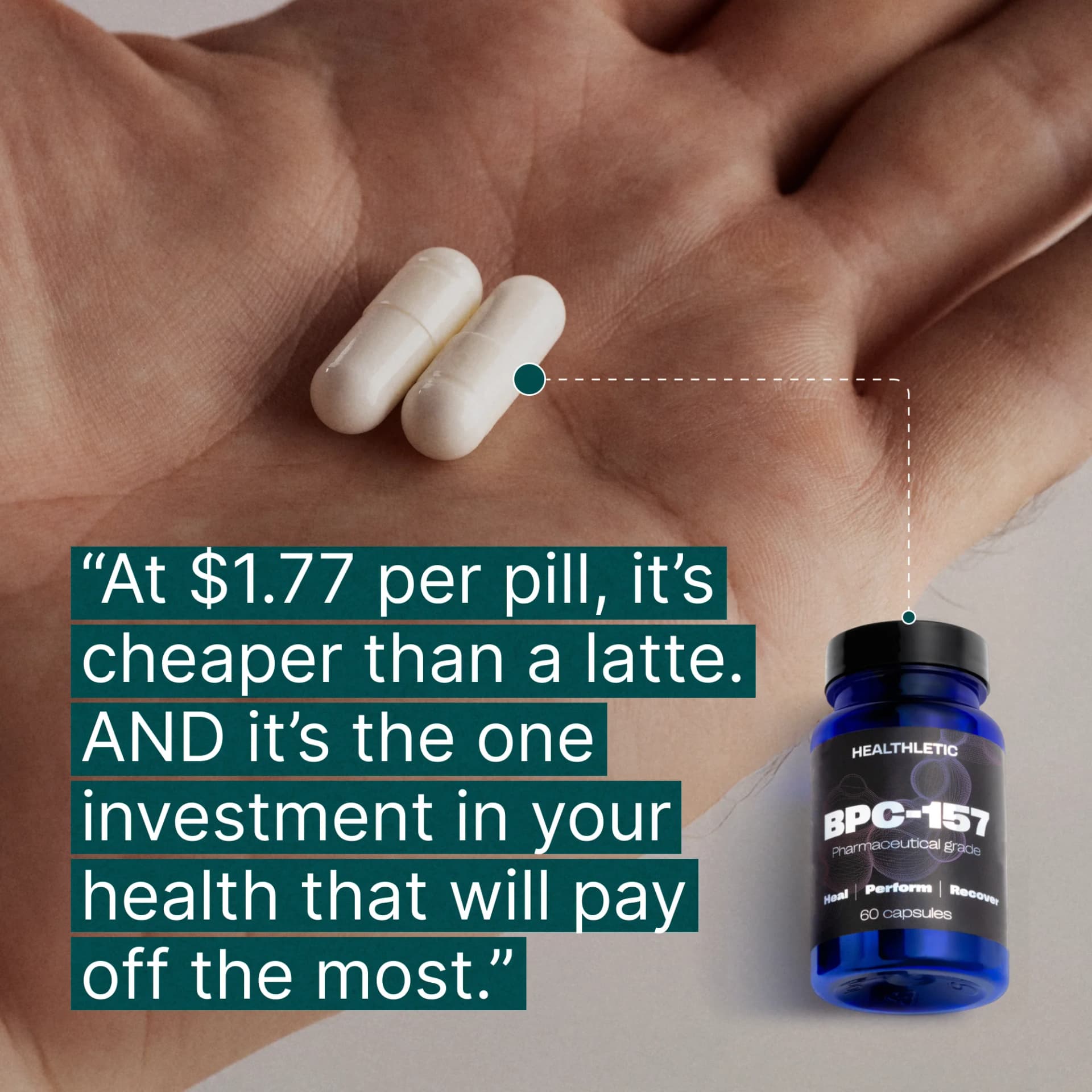
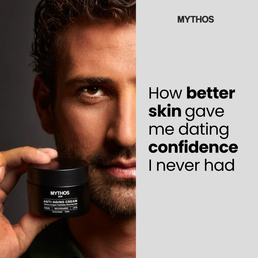
Ingredient callouts named at specific concentrations (5% niacinamide, 0.5% retinol), derm or pharmacist endorsements in the frame, and clinical testing stats in small type. Glossier, The Ordinary, and Paula's Choice all layer these because skincare buyers have been burned by vague claims. Pastel palettes and serif typography read as apothecary credibility. Neon gradients and bold sans-serif read as hype — useful for Gen-Z audiences, risky for mass.

Frequency above 3.5 with falling CTR is the clearest signal. For skincare specifically, CPC climbing by 20% week-over-week with flat conversion rate means the hook is burning out. Rotate new creative before CPM spikes — waiting until ROAS craters costs you two weeks of spend. Most DTC skincare brands rotate creative every 10-14 days on cold audiences.

Create Your Own
Skincare Ad

Clone any skincare ad example. Upload your product photo. Seconds later, you have a finished ad ready to launch.

Create your ad
AdDogs ad examples globe