AdDogs

Facebook Ad Examples That Still Win in 2026

Browse 45+ Facebook ad examples sourced from high-performing campaigns. Clone any design, swap in your product, and get a finished ad in seconds.

Updated June 2026

Facebook ad examples run on different logic than Instagram. Audience skews 35+, text overlay tolerance is softer than Meta's old 20% rule suggested, and static images still out-ship video across most DTC verticals. Feed placements carry the budget. Right-column is where cheap retargeting lives. Both reward creative that looks like a Facebook post, not a billboard dropped into the feed.

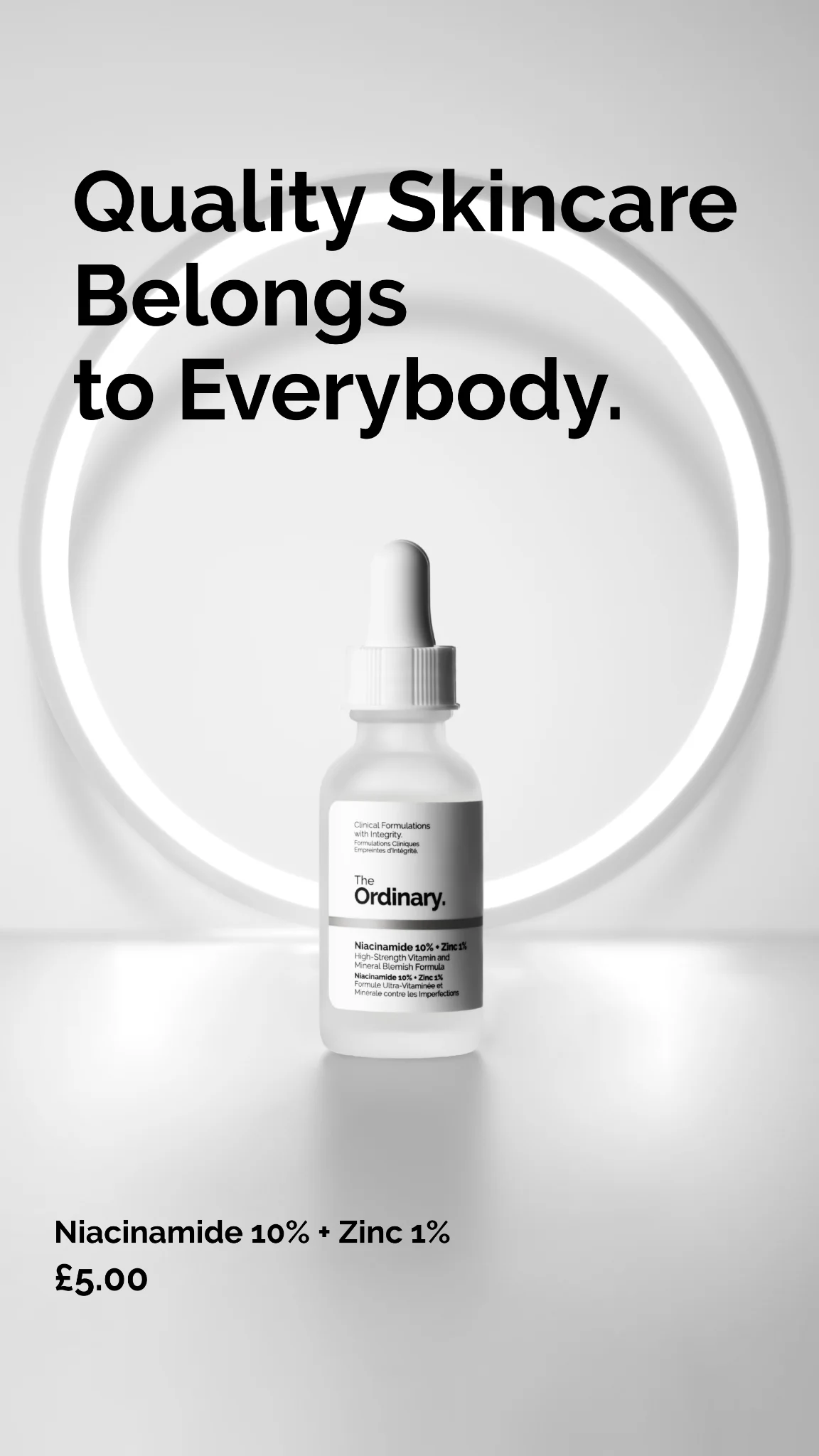
Sizes matter: Feed runs 1:1 at 1200x1200 or 4:5 portrait at 1080x1350 (portrait gets more screen real estate on mobile and tends to win on CTR). Right-column banners run 1200x628. Winning Facebook static ads share three patterns — a clear product hero, one readable headline, and social proof baked in (5-star graphic, review pull-quote, press logo row). Audience is older, more deliberate, and more likely to read the copy than Instagram users.

Every ad below ran on Facebook Feed or right-column at scale. Filter by format, copy the layout, and rebuild it with your product swapped in.

UltimaPeak Shilajit Gold — Bold Product & Benefit Layout. Brand: UltimaPeak. This ad utilizes a dark, minimalist background to create a bold, premium feel for UltimaPeak's Shilajit Gold gummies. The layout strategically places a large, attention-grabbing headline in gold and white, immediately communicating a benefit. Below, a clear bulleted list of product advantages is presented, ensuring easy readability and quick absorption of key selling points. The product packaging, featuring a prominent mountain logo, is positioned on the right, creating a visual balance and reinforcing brand identity. The high contrast between the dark background and the gold/white text and product highlights ensures strong visibility across various platforms like Facebook or Instagram. The composition effectively guides the eye from the headline to the benefits and then to the product, establishing a clear hierarchy. The overall design aims to convey strength and efficacy.. Headline: SAY HELLO to Enhanced Manhoo. Primary text: 3 Powerful potent ingredients Improves circulation in 60 days Elevates Strength and Stamina Zero side effects. Why this ad works: High-contrast text for immediate impact — The gold and white text against the dark background creates excellent readability and visual pop. This contrast ensures the headline and benefit points are easily digestible, crucial for capturing attention in fast-scrolling social feeds. It communicates a premium, powerful aesthetic that aligns with the product's claims and brand identity. Clear benefit-driven bullet points — The concise list of four benefits directly addresses potential customer needs and concerns. This format allows for quick scanning and understanding of the product's value proposition without overwhelming the viewer with dense copy. It efficiently communicates key selling points, making the ad highly informative and persuasive for consideration-stage users. Strategic product placement and branding — Placing two product packages on the right, slightly overlapping, adds depth while keeping the focus on the benefits. The prominent UltimaPeak logo and "Shilajit Gold" on the packaging reinforce brand recognition and product identity. The mountain motif subtly hints at the "Himalayan" origin, adding authenticity and a sense of premium sourcing.. Specs: Brand: UltimaPeak, Industry: Health & Wellness, Platform: Facebook, Format: Static, Audience: Men 25-34Huuuge Casino — Celebrity & Game Collage. Brand: Huuuge Casino. This ad employs a high-energy, collage-style layout designed to maximize visual impact and capture attention in a crowded feed. The composition strategically places a recognizable celebrity, David Hasselhoff, alongside key game elements like a slot machine and a game screen, creating multiple focal points. A vibrant color palette of deep purples, fiery reds, and celebratory golds, accented by neon pinks and a bright green CTA, evokes excitement and a sense of occasion, reinforced by fireworks and balloons. Text hierarchy prioritizes "New Slots" and a clear "PLAY NOW" call-to-action, while the "10th Anniversary" banner adds a celebratory and time-sensitive element. This busy, maximalist approach is optimized for platforms like Facebook or Instagram, where bold visuals are crucial for scroll-stopping engagement, appealing to a broad audience seeking entertainment and potential wins.. Headline: New Slots. Primary text: 10th ANNIVERSARY. Why this ad works: Celebrity Endorsement Drives Instant Recognition — Featuring David Hasselhoff immediately grabs attention and leverages his established persona for trust and entertainment value. This strategy cuts through noise, making the ad memorable and implying a fun, high-quality experience, which is crucial for attracting new players to a mobile casino app. Multiple Visual Hooks Engage Diverse Interests — The ad cleverly combines a classic slot machine, a modern game screen, and a large jackpot display. This multi-faceted approach appeals to different player preferences, showcasing variety and potential rewards. It ensures that various aspects of the game experience are highlighted, increasing the ad's broad appeal. Vibrant, Celebratory Palette Creates Excitement — The use of bright purples, golds, reds, and fireworks against a dark background creates a dynamic and festive atmosphere. This high-contrast, celebratory color scheme instantly communicates fun, excitement, and the thrill of winning, aligning perfectly with the emotional drivers of casino gaming and encouraging impulsive engagement.. Specs: Brand: Huuuge Casino, Industry: Media & Entertainment, Platform: Facebook, Format: Mixed, Audience: GeneralVAHDAM Ashwagandha Coffee — Handheld Product & Benefit Overlay. Brand: VAHDAM INDIA. This ad employs a direct-response strategy, combining a product-in-hand shot with prominent text overlays to convey urgency and benefits. The layout places the product centrally, held by a hand, creating a relatable, in-use context. Bold, high-contrast typography dominates the upper half, immediately addressing a specific pain point ("MENOPAUSAL WEIGHT GAIN") and offering a solution. Color psychology leverages a vibrant red for the "FLAT 50% OFF" callout, creating a strong focal point and urgency. The overall composition is busy but intentionally so, packing information for a conversion-focused goal. Optimized for platforms like Facebook or Instagram, where clear value propositions and discounts drive clicks. Text hierarchy is clear, with the main headline grabbing attention, followed by product identification and benefit bubbles.. Headline: PRIME DAY SALE GOODBYE, MENOPAUSAL WEIGHT GAIN ASHWAGANDHA COFFEE IS HERE!. Primary text: Supports Weight loss Curb Cravings Supports Hormonal Balance FLAT 50% OFF. Why this ad works: Directly addresses specific pain point — The headline "GOODBYE, MENOPAUSAL WEIGHT GAIN" immediately resonates with a niche audience, creating instant relevance and stopping the scroll. This highly specific targeting ensures the ad speaks directly to those most likely to convert, increasing click-through rates and reducing wasted impressions. High-contrast sale callout creates urgency — The bright red "FLAT 50% OFF" circle is visually dominant, leveraging color psychology to draw immediate attention to the discount. This urgency-driven element is crucial for conversion-focused campaigns, signaling a limited-time opportunity and incentivizing immediate action from interested prospects. Benefit-driven text bubbles for quick value — Strategically placed bubbles like "Supports Weight loss," "Curb Cravings," and "Supports Hormonal Balance" provide quick, digestible value propositions. These reinforce the product's efficacy in solving the target audience's problems, making the ad highly persuasive without requiring extensive reading.. Specs: Brand: VAHDAM INDIA, Industry: Health & Wellness, Platform: Facebook, Format: Static, Audience: Women 45+Little Spoon Meals — Stacked Product Display. Brand: Little Spoon. This ad employs a product-on-background layout, showcasing a variety of Little Spoon's baby food containers and pouches alongside fresh ingredients. The vibrant, natural color palette, dominated by greens, oranges, and purples, visually reinforces the healthy, fresh nature of the product, appealing directly to health-conscious parents. The composition is somewhat cluttered but aims to convey abundance and variety. Text overlays are strategically placed to address common pain points for mothers, creating an immediate connection. This ad is optimized for social feeds like Facebook or Instagram, where its direct address to "MOMS!" and clear value proposition can quickly capture attention. The text hierarchy uses a bold headline to grab attention, followed by a bulleted list of benefits, making it easy to digest the core message.. Headline: PSA TO ALL MOMS! Little Spoon's delivered meals mean.... Primary text: No more food tantrums Less time cooking Less clean up Healthier meals More time back. Why this ad works: Directly addresses target audience pain points — The headline "PSA TO ALL MOMS!" immediately grabs the attention of the primary demographic. The subsequent bullet points directly tackle common parental struggles like food tantrums, cooking time, and cleanup, offering Little Spoon as a clear solution. This problem-solution framing is highly effective for engagement. Vibrant, natural product presentation — The colorful packaging and inclusion of fresh fruits (apple, lime, avocado) visually communicate the natural and healthy ingredients. This vibrant aesthetic is crucial for food products, especially for children, reassuring parents about the quality and appeal of the meals. It stands out in a busy feed. Clear, benefit-driven value proposition — The bulleted list "No more food tantrums," "Less time cooking," "Less clean up," "Healthier meals," and "More time back" clearly articulates the tangible benefits. This concise, easy-to-read format allows busy parents to quickly understand the core advantages of the service, driving consideration.. Specs: Brand: Little Spoon, Industry: Food & Beverage, Platform: Facebook, Format: Static, Audience: ParentsRocket Money — Before/After Problem/Solution Split. Brand: Rocket Money. This ad effectively uses a split-screen, before-and-after layout to highlight a clear problem and solution. The left side employs a dark background with red text and a negative balance, creating a sense of financial distress. The right side shifts to a vibrant purple, showcasing a positive balance and actionable benefits, evoking relief and success. Compositionally, the mobile UI mockups provide relatable context, while bullet points with expressive emojis simplify complex financial concepts. The high contrast and direct messaging are optimized for social platforms like Facebook, where quick comprehension and emotional resonance drive engagement. Text hierarchy is clear, with prominent headlines and a strong, unmissable call to action.. Headline: Before Rocket Money / After Rocket Money. Primary text: Balance - $537.58. Card Declined. No $$ in Savings Account. Paying for ex GF's Netflix. Balance $39,486.55. Cancel Subscriptions in app. Suggests Ways to Save. Easy-to-read budget tracker.. Why this ad works: Clear Before/After Contrast for Problem/Solution — The stark visual and textual contrast between the "Before" (negative balance, declined card) and "After" (positive balance, actionable solutions) immediately communicates the product's value proposition. This direct comparison leverages psychological principles of pain and gain, making the benefits tangible and urgent for the viewer. Emotional Resonance through Visual Cues — The use of red for negative financial states and thumbs-down emojis on the "Before" side, contrasted with positive balances and rocket emojis on the "After" side, creates strong emotional resonance. This visual shorthand quickly conveys the user's potential journey from financial struggle to stability, enhancing relatability and desire. Actionable Benefits with Simplified Language — The "After" section clearly lists specific, actionable benefits like "Cancel Subscriptions" and "Suggests Ways to Save" in simple, digestible bullet points. This approach breaks down the app's features into immediate, understandable advantages, making it easy for potential users to grasp how Rocket Money can directly improve their financial situation.. Specs: Brand: Rocket Money, Industry: Finance & Insurance, Platform: Facebook, Format: Static, Audience: GeneralAnti-Inflammatory Weight Loss — Food Collage Grid. This ad employs a grid-like collage layout, presenting a four-week meal plan visually around a central, bold headline. The composition uses vibrant, high-quality food photography to create an aspirational and appealing visual narrative. The cracked, earthy background provides a rustic, organic feel, contrasting with the crisp food images and the strong blue text. Text hierarchy is clear: the main challenge title dominates, followed by weekly breakdowns with nutritional data, and a crucial disclaimer at the bottom. This design is optimized for platforms like Facebook or Pinterest, where visually rich, informational content about health and lifestyle challenges performs well. The ad effectively communicates a structured plan, leveraging visual appeal to drive consideration for a health program.. Headline: Anti-Inflammatory weight loss challenge. Primary text: WEEK 1 Proteins 22g Carbs 7g Fats 6g 181 Kcal WEEK 2 Proteins 44g Carbs 11g Fats 12g 326 Kcal WEEK 3 Proteins 31g Carbs 8g Fats 5g 210 Kcal WEEK 4 Proteins 21g Carbs 7g Fats 4g 172Kcal Please consult your physician before starting. Sticking to recommended diet and exercise plans is essential for your fitness journey and can significantly affect outcomes. Most users can expect to lose up to 1-2 pounds per week over 4 weeks. Individual results may vary.. Why this ad works: Visualizing the weekly plan reduces friction — The ad effectively breaks down the "challenge" into four distinct weeks, each represented by a diverse array of appealing dishes. This visual roadmap reduces perceived complexity and commitment, making the weight loss journey seem manageable and exciting. It showcases variety, which is key for long-term adherence. (54 words) Benefit-driven headline clarifies value proposition — The central headline "Anti-Inflammatory weight loss challenge" immediately communicates the core value proposition. It targets specific health concerns (inflammation) while promising a desired outcome (weight loss), directly appealing to the audience's needs and motivations. This clear messaging grabs attention quickly. (54 words) Aspirational food photography drives desire — High-quality, vibrant images of healthy and delicious-looking meals are strategically placed. This visual feast makes the diet plan appear enjoyable and sustainable, counteracting the common perception of restrictive diets. It creates desire and positive association with the challenge. (53 words). Specs: Industry: Health & Wellness, Platform: Facebook, Format: Static, Audience: GeneralCash App — Bold Feature UI Mockup. Brand: Cash App. This ad leverages a high-contrast, dark mode aesthetic with vibrant neon green to immediately capture attention on busy social feeds. The layout strategically positions a bold, left-aligned headline to convey the core benefit, while a dynamic UI mockup of the Cash App card and interface on the right visually demonstrates the feature. The composition uses scattered green coins and an angled phone to create a sense of movement and value. This design is optimized for platforms like Instagram or Facebook, where its striking color palette and clear value proposition cut through visual clutter. Text hierarchy is clear: a dominant headline, a concise call-to-action, and essential legal fine print. The overall effect is modern, energetic, and directly communicates a key user benefit.. Headline: Instant Discounts? Cash App does that.. Why this ad works: High-contrast palette for scroll-stopping impact — The stark contrast between the dark background and the neon green/white text and UI elements creates immediate visual impact. This bold color choice is highly effective on social media platforms, ensuring the ad stands out against organic content and captures user attention within milliseconds, driving higher initial engagement rates. Clear, benefit-driven headline communication — The headline "Instant Discounts? Cash App does that." directly addresses a common user desire and positions Cash App as the solution. This clear, concise value proposition, presented in large, readable text, ensures that the ad's core message is understood quickly, even during a brief scroll, enhancing message retention. Dynamic UI mockup demonstrates feature visually — Featuring the Cash App card within a phone UI, surrounded by floating coins, effectively visualizes the "discounts" feature. This dynamic composition isn't just a static product shot; it shows the app in action, making the benefit tangible and easier for the audience to grasp, which can increase consideration for the product.. Specs: Brand: Cash App, Industry: Finance & Insurance, Platform: Facebook, Format: Static, Audience: GeneralAG1 Heart Health — Split Screen Offer. Brand: AG1. This ad employs a split-screen layout, effectively balancing aspirational lifestyle imagery with clear product information and a compelling offer. The dominant dark green background evokes natural health and trust, while vibrant green accents highlight key benefits and the call to action, creating a strong visual hierarchy. The composition places the target demographic (older man) prominently on the right, fostering relatability, while product shots are clearly displayed on the left. Text hierarchy is well-defined, with a large, emotional headline leading to a specific offer. This design is optimized for platforms like Facebook or Instagram, where a clear value proposition and relatable imagery can drive consideration. The curved division adds a touch of organic softness to an otherwise direct-response layout, appealing to a health-conscious audience. The "NEW FORMULA" badge adds urgency and novelty.. Headline: Listen to your heart!. Primary text: Get your free Omega 3 now and support your heart function*.. Why this ad works: Split-screen balances lifestyle and offer — The ad effectively uses a curved split-screen to combine a relatable lifestyle image of a healthy older man with a direct-response offer and product display. This dual approach addresses both emotional aspiration and practical value, appealing to a broad segment of the health-conscious audience. Strategic color contrast highlights value — The deep green background provides a strong, trustworthy base, while the bright neon green used for the offer text and CTA creates high contrast. This strategic use of color immediately draws the eye to the core value proposition, ensuring the "free Omega 3" message is unmissable and drives engagement. Relatable demographic builds trust — Featuring an older, healthy-looking man in a natural setting directly targets the demographic concerned with heart health and long-term wellness. This authentic representation builds immediate trust and relatability, making the product feel more relevant and credible to potential customers in a similar age group.. Specs: Brand: AG1, Industry: Health & Wellness, Platform: Facebook, Format: Static, Audience: Men 45+Voice Test — Engaging Grid Layout. This ad employs a dark, high-contrast grid layout to immediately capture attention. The central headline, "HOW SEXY IS YOUR VOICE?", leverages curiosity, directly addressing the viewer. Six distinct, visually rich spheres represent different voice characteristics, each with a percentage, creating an interactive, quiz-like feel. The composition guides the eye from the intriguing question, through the diverse options, to a clear, prominent "TAKE TEST" call to action. The vibrant, varied colors of the spheres pop against the minimalist dark background, ensuring high visibility and scroll-stopping power on social platforms like Facebook. Text hierarchy is clear, with the headline dominating, followed by smaller, legible labels and a bold CTA, optimizing for quick comprehension and engagement. This design effectively primes users for interaction, making it ideal for awareness and lead generation campaigns.. Headline: HOW SEXY IS YOUR VOICE?. Why this ad works: Intriguing headline sparks curiosity — The direct question "HOW SEXY IS YOUR VOICE?" immediately piques personal interest and self-reflection. This psychological trigger is highly effective on social feeds, compelling users to stop scrolling and engage with the content to satisfy their curiosity about a personal attribute. Diverse sphere visuals represent voice types — Each of the six spheres features a unique texture and color, visually differentiating the voice characteristics. This creative abstract representation makes the options more engaging and memorable than plain text, enhancing the ad's overall appeal and making the concept more tangible for the viewer. Prominent CTA drives immediate interaction — The "TAKE TEST" button is strategically placed at the bottom, large, and in high contrast against the dark background. This clear, singular call to action reduces decision fatigue and provides an obvious next step, guiding users directly towards the desired engagement or conversion point.. Specs: Industry: Health & Wellness, Platform: Facebook, Format: Static, Audience: GeneralVitamix Blender — Durability Hero Shot. Brand: Vitamix. The ad employs a clean hero shot layout, prominently featuring the Vitamix blender filled with vibrant, fresh fruits, immediately conveying health and quality. The composition uses a subtle diagonal line from the blender to the cutting board, guiding the eye. Color psychology leverages the bright, natural hues of the fruit to evoke freshness and vitality, contrasting with the blender's robust grey to suggest durability. The light, minimalist background ensures the product and its key benefit stand out. Text hierarchy places the brand logo at the top, followed by a bold, benefit-driven headline ("10X LONGER"), and a clear call-to-action. This structure is optimized for quick scanning on platforms like Facebook or Instagram, where a strong visual and concise value proposition are crucial for engagement and conversion. The ad effectively communicates superior product longevity through a visually appealing and direct approach.. Primary text: Vitamix® blenders last up to 10X LONGER than an average blender.. Why this ad works: Bold Longevity Claim Drives Value Perception — The "10X LONGER" headline immediately communicates a significant competitive advantage. This specific, quantifiable claim resonates with consumers seeking durable, high-value appliances, justifying the premium price point often associated with Vitamix. It directly addresses a common pain point of appliance longevity. Vibrant Produce Enhances Health & Freshness Appeal — Filling the blender with colorful, fresh fruits and placing more on the cutting board visually reinforces the healthy lifestyle associated with Vitamix. This not only makes the product more appealing but also subtly suggests the quality of ingredients users will process, linking the blender to fresh, nutritious outcomes. Clear Visual Hierarchy for Rapid Message Absorption — The ad strategically places the brand logo, the core benefit, and the CTA in a clear, top-to-bottom flow. This visual hierarchy allows viewers to quickly grasp the brand, understand the key selling proposition (durability), and know the next step, making the ad highly efficient for fast-scrolling social feeds.. Specs: Brand: Vitamix, Industry: Home & Lifestyle, Platform: Facebook, Format: Static, Audience: GeneralWeekly Lottery — Cute Pony Hero Shot. Brand: Weekly Lottery. This ad leverages a hero shot of a friendly pony, establishing an immediate emotional connection crucial for charity-linked lotteries. The composition places the pony centrally, making direct eye contact, which is highly engaging on social feeds. Vibrant teal and pink banners provide strong contrast against the natural background, ensuring key messaging like "WEEKLY LOTTERY" and "Play now for £1" is instantly readable. The layout is optimized for broad appeal, likely on platforms like Facebook or Instagram, where scroll-stopping imagery and clear, concise calls to action perform well. Text hierarchy is clear: brand identity top-left, value proposition mid-frame, and essential disclaimers at the bottom, guiding the viewer efficiently through the ad's core message. The overall vibe is approachable and positive, encouraging participation.. Headline: WEEKLY LOTTERY. Primary text: Play now for £1. Why this ad works: Emotional animal imagery creates instant connection — The close-up of a friendly pony looking directly at the viewer creates an immediate emotional bond. This technique is highly effective for charity-based initiatives, fostering empathy and making the audience more receptive to the lottery's message, thereby increasing engagement and potential participation rates. High-contrast banners ensure message clarity — The use of bright teal and pink banners against the natural, muted background ensures that the 'WEEKLY LOTTERY' branding and the 'Play now for £1' call to action stand out prominently. This high contrast improves readability and ensures the core message is absorbed quickly, even during rapid scrolling on social media platforms. Clear, low-friction call to action with price — The prominent 'Play now for £1' clearly communicates the low entry barrier and the immediate action required. This explicit pricing and simple call to action reduces cognitive load and friction, making it easier for potential players to decide to participate, especially for impulse-driven lottery purchases.. Specs: Brand: Weekly Lottery, Industry: Pets & Animals, Platform: Facebook, Format: Static, Audience: GeneralAnti-Aging Hand Treatment — Before/After Comparison. This ad uses a classic before/after split-screen layout to visually demonstrate product efficacy. The stark black background provides high contrast, making the skin tones and textural differences immediately apparent. The composition is simple, focusing entirely on the hands, with a clear vertical division emphasizing the transformation. White text "Day 1" and "Day 60" acts as a direct, undeniable visual hierarchy, guiding the viewer's eye from the problem to the solution. This format is highly effective for platforms like Facebook and Instagram, where quick, impactful visual proof drives consideration. The direct comparison leverages social proof and the desire for tangible results, making the product's benefit undeniable. The minimalist design ensures the message is clear and uncluttered, optimizing for mobile viewing.. Why this ad works: Direct Before/After Visual Proof — The side-by-side comparison of "Day 1" and "Day 60" provides immediate, undeniable visual evidence of the product's effectiveness. This direct proof bypasses skepticism, allowing viewers to instantly grasp the benefit without needing extensive copy. It's highly persuasive for products promising visible transformation. High Contrast Black Background — The deep black background creates a strong contrast with the skin tones, making the texture and subtle improvements in the "after" image more pronounced. This visual pop ensures the ad stands out in a busy feed, drawing attention directly to the product's results and enhancing perceived efficacy. Clear, Unambiguous Text Hierarchy — The large, white "Day 1" and "Day 60" text is positioned directly below each hand, creating an intuitive left-to-right reading flow. This clear labeling immediately contextualizes the images, reinforcing the progression and making the ad's core message instantly understandable, even at a glance.. Specs: Industry: Health & Wellness, Platform: Facebook, Format: Static, Audience: Women 35-44Pampers Diapers — Product Lineup with Benefit Headline. Brand: Pampers. This ad effectively uses a vibrant teal background to create a clean, trustworthy aesthetic, aligning with the brand's focus on baby care. The composition features three distinct Pampers product lines arranged on a wooden surface, providing visual variety while showcasing the breadth of offerings. A dominant, high-contrast white text overlay immediately communicates the core benefit: "up to 100% LEAKPROOF PROTECTION." This bold headline, positioned centrally, leverages a clear hierarchy to capture attention quickly, crucial for fast-scrolling social feeds like Facebook or Instagram. The secondary text, "delivered straight to your door," adds a convenience factor, appealing directly to busy parents. The overall design is optimized for mobile, ensuring readability and product recognition, while the bright colors and smiling babies evoke positive emotions associated with parental peace of mind.. Headline: up to 100% LEAKPROOF PROTECTION. Primary text: delivered straight to your door. Why this ad works: Bold Benefit Headline Dominates Visual — The "up to 100% LEAKPROOF PROTECTION" headline is large, white, and centered against a high-contrast teal background. This immediate communication of the primary benefit addresses a key parental concern, stopping the scroll and quickly conveying value before the viewer even processes the individual products. Product Lineup Showcases Variety — Featuring three distinct Pampers product lines (Cruisers, Swaddlers, Pure Protection) allows the brand to appeal to a wider range of parental needs and preferences within a single ad. This broadens the ad's relevance, potentially increasing engagement across different segments of the target audience. Teal Background Evokes Trust and Calm — The prominent use of a clean, bright teal background is psychologically effective. Teal is often associated with freshness, reliability, and tranquility, which are highly desirable attributes for baby care products. This color choice subtly reinforces the brand's promise of protection and peace of mind for parents.. Specs: Brand: Pampers, Industry: Health & Wellness, Platform: Facebook, Format: Static, Audience: ParentsBIOTEX Winter Sale — Bold Discount Layout. Brand: BIOTEX. The ad leverages a high-contrast, dark background with vibrant neon pink and teal accents to command attention on busy social feeds. The central placement of the BIOTEX logo within a bold pink brushstroke immediately establishes brand presence. The large, prominent "30%" discount, highlighted in white with a pink outline, creates a clear value proposition, driving conversion intent. Text hierarchy prioritizes the discount, followed by the brand, with "WINTER" providing context. The overall composition, while energetic, uses diagonal lines and a textured background to add dynamism, suitable for platforms like Facebook where bold, direct messaging can cut through noise. The color psychology of dark and neon suggests modernity, urgency, and excitement, appealing to an audience looking for deals. The visual chaos, paradoxically, creates a unique, memorable aesthetic that stands out from more minimalist competitors.. Headline: WINTER 30%. Why this ad works: High-contrast neon palette grabs attention — The stark contrast between the dark, textured background and the electric pink and white text immediately captures viewer attention. This vibrant color scheme is highly effective on social media feeds, cutting through visual clutter and ensuring the ad is noticed amidst more subdued content, making it a powerful scroll-stopper. Prominent discount drives immediate interest — The large, centrally placed "30%" with its bold outline is the undeniable focal point. This clear, unmissable discount percentage acts as a powerful incentive, directly communicating value and urgency. This direct approach is crucial for driving clicks and conversions in a sale-focused campaign, appealing to deal-seeking consumers. Dynamic background elements create visual energy — The diagonal teal lines and the expressive pink brushstroke behind the logo add a sense of movement and modernity to the composition. This energetic design prevents the ad from feeling static, reinforcing a bold and innovative brand image, which aligns well with the "UNDERWEAR INNOVATOR" tagline and captures a youthful, active audience.. Specs: Brand: BIOTEX, Industry: Fashion & Apparel, Platform: Facebook, Format: Static, Audience: GeneralNURABEAM Thigh Wrap — Direct Before/After Comparison. Brand: NURABEAM. This ad effectively leverages a direct before-and-after comparison layout to showcase the NURABEAM Thigh Wrap's efficacy. The dark, minimalist background ensures maximum contrast, making the skin texture and the product's red light glow highly visible. Compositionally, the split-screen format immediately highlights the desired transformation, drawing the viewer's eye from the "Before" to the "After" state. The prominent, quantifiable claim "20 MIN = 700 SQUATS" acts as a powerful hook, establishing a clear value proposition. Text hierarchy is well-structured, moving from a benefit-driven headline to specific features and a strong discount offer. This design is optimized for direct-response platforms like Facebook or Instagram, where scroll-stopping visuals and clear, concise benefits drive immediate consideration and conversion. The bold claims and visual evidence aim to overcome skepticism quickly.. Headline: Thigh Wrap for Cellulite & Slimming. Primary text: 20 MIN = 700 SQUATS • Lymphatic Drainage • Targets Stubborn Fat • Remove 1.5 Inches or Full Refund 50% OFF + 2 FREE GIFTS. Why this ad works: Direct Before/After Comparison for Impact — The side-by-side comparison immediately communicates the product's benefit, visually demonstrating the transformation. This technique is highly effective in direct-response advertising, as it bypasses lengthy explanations and directly addresses the pain point, building trust and desire instantly. Quantifiable Benefit Statement Builds Credibility — The bold claim "20 MIN = 700 SQUATS" provides a clear, impressive, and easily digestible metric of efficacy. This type of social proof and benefit statement resonates strongly with audiences seeking quick, tangible results, making the product's value proposition undeniable and memorable. High-Contrast Dark Background Enhances Product — Utilizing a dark background creates stark contrast for both the skin tone and the glowing red light of the NURABEAM device. This not only makes the product stand out but also lends a sophisticated, almost clinical feel, enhancing the perceived premium quality and effectiveness of the technology.. Specs: Brand: NURABEAM, Industry: Health & Wellness, Platform: Facebook, Format: Static, Audience: Women 25-34Learn Stock Trading — Split Screen Text & Image. This ad employs a clear split-screen layout, dedicating the top half to bold, high-contrast text and the bottom to a relevant, aspirational visual. The layout strategy immediately communicates the core offering ("Learn Stock Trading") with strong text hierarchy, using a large, serif font for authority. The social proof "180,000 students" is strategically placed below, adding credibility without clutter. Color psychology is minimal, leveraging stark black on white for clarity and professionalism, while the bottom image uses cool blues and greens with warm highlights to evoke a dynamic, tech-driven financial environment. Compositionally, the top half is text-heavy and direct, while the bottom provides context and aspiration. This design is optimized for platforms like Facebook or Instagram, where clear messaging and a visually engaging, yet professional, image can stop the scroll. The high text overlay ensures the primary message is instantly conveyed.. Headline: Learn Stock Trading. Primary text: 180,000 students. Why this ad works: Clear Split-Screen Layout for Dual Focus — The distinct division between text and image allows for immediate comprehension of the offer and visual context. This prevents cognitive overload, ensuring the headline is read first, followed by the aspirational imagery, making the ad highly efficient in conveying its message. Strong Social Proof Enhances Credibility — The inclusion of "180,000 students" with an icon provides powerful social proof. This statistic builds trust and reduces perceived risk, signaling that many others have found value in the offering, which is crucial for educational products. High Contrast Text Ensures Readability — The use of bold, black serif text on a pure white background creates maximum contrast. This ensures the headline "Learn Stock Trading" is highly readable and impactful, even on smaller mobile screens, effectively capturing attention in a busy feed.. Specs: Industry: Education, Platform: Facebook, Format: Static, Audience: ProfessionalsPlus Size Compression Socks — Split Screen Sale. The ad employs a split-screen layout, contrasting a lifestyle image of legs wearing compression socks with a prominent sale offer. The composition uses a large circular cutout for the product-in-use shot, drawing the eye to the floral-patterned socks. A vibrant, pastel background provides a soft, approachable feel, while the bold, red pricing immediately grabs attention, signaling urgency and value. Text hierarchy prioritizes "PLUS SIZE" for audience targeting, followed by the "Flash Sale" and the overwhelming "$6.99 ONLY" price point. This design is optimized for platforms like Facebook or Instagram, where clear value propositions and relatable imagery drive impulse purchases, cutting through feed clutter with a direct, conversion-focused message. The high text overlay ensures the core offer is unmistakable.. Headline: PLUS SIZE. Primary text: Flash Sale, Big Savings. Why this ad works: Direct price callout drives urgency — The oversized "$6.99 ONLY" in bold red within a contrasting circle immediately communicates an irresistible deal. This aggressive pricing strategy is highly effective for impulse buys on social feeds, creating a sense of urgency and perceived value that compels immediate action from price-sensitive consumers. Inclusive imagery broadens appeal — Featuring a "PLUS SIZE" model wearing the compression socks directly addresses and validates a specific target demographic. This inclusive representation builds trust and relatability, assuring potential customers that the product is designed for and suitable for their needs, thereby reducing purchase friction and increasing conversion rates. Clear product benefit stated — The inclusion of "20-30mmHg Compression" within the price bubble clearly communicates a key functional benefit. This detail, while small, adds credibility and informs the target audience about the product's therapeutic value, appealing to those actively seeking specific compression levels for health or comfort.. Specs: Industry: Health & Wellness, Platform: Facebook, Format: Static, Audience: Women 25-44Mediterranean Challenge — Meal Plan & Quiz. This ad employs a clear, text-heavy layout on a dynamic, ocean-inspired background. The dark blue-green background evokes the Mediterranean theme, while contrasting white and bright cyan text ensures readability. The composition is structured with a prominent headline and call-to-action at the top, immediately grabbing attention. Below, a three-column grid details meal plans, providing value upfront. This layout strategy aims to inform and engage, positioning the ad as a resource rather than a hard sell. The bright cyan CTA "TAKE A QUIZ" stands out, guiding the user's next step. Text hierarchy is clear, with the main challenge statement being the largest, followed by the CTA, and then the smaller, detailed meal plans. Optimized for platforms where detailed information can be consumed, like Facebook or Pinterest, it balances aspirational messaging with practical content.. Headline: MEDITETZRRANEAN CHALLENGE TO LOSE UP TO 40 LBS. Primary text: BREAKFAST Greek yogurt with honey and nuts Omelet with vegetables (tomatoes, spinach, mushrooms) and feta Toast with avocado and lightly salted fish Fruit salad with Greek yogurt Quinoa with berries and almond flakes Pancakes with cottage cheese and herbs LUNCH Potato soup with olives and spinach Couscous with orange and herbs Tagliatelle aglio oglio (pasta with garlic and oil) Squid baked with lemon and herbs Chicken thighs in lemon marinade Baked eggplant with tomatoes and herbs Risotto with wild mushrooms DINNER Roast pork with potatoes and rosemary Couscous with orange and herbs Mediterranean salad with tuna and vegetables Pasta with shrimps and cherry tomatoes Fish fillet with lemon and herbs Greek yogurt with honey and nuts Omelette with vegetables Please consult your physician before starting. Sticking to recommended diet and exercise plans is essential for your fitness journey and can significantly affect outcomes. Most users can expect to lose up to 1-2 pounds per week over 4 weeks. Individual results may vary.. Why this ad works: Clear value proposition in headline — The headline "Mediterranean Challenge to lose up to 40 lbs" immediately communicates a significant benefit and a clear program. This direct approach captures attention by addressing a common desire (weight loss) with a specific, aspirational outcome, motivating users to engage further with the ad's content. High-contrast CTA drives engagement — The "TAKE A QUIZ" call-to-action is rendered in a vibrant cyan within a matching border, sharply contrasting with the dark background. This visual pop ensures the CTA is the primary focal point after the headline, effectively guiding users towards the desired interaction and increasing click-through rates for lead generation. Detailed meal plans build credibility — Providing extensive breakfast, lunch, and dinner options upfront establishes credibility and demonstrates the program's tangible value. This transparency helps potential participants visualize the diet, reducing skepticism and building trust, which is crucial for health and wellness offers, encouraging deeper consideration.. Specs: Industry: Health & Wellness, Platform: Facebook, Format: Static, Audience: Women 25-34Mediterranean Diet Calories — Data Visualization Layout. This ad employs a question-driven layout, immediately engaging the audience with a common dietary query. The deep blue background instills trust, while the central shell-shaped plate acts as a unique visual anchor for the data. Four distinct blue boxes present simplified nutritional information, making complex data digestible. The vibrant orange shrimp on a fork provides a contrasting, appetizing food element, connecting the abstract diet concept to tangible results. Compositionally, the elements are balanced, drawing the eye from the headline to the data, then to the clear "CALCULATE FOR FREE" call to action. Optimized for platforms like Facebook, its educational yet visually appealing nature aims to stop the scroll. The text hierarchy guides the user from problem to solution, with a prominent headline and actionable CTA, supported by a necessary disclaimer.. Headline: HOW MANY CALORIES SHOULD I EAT A DAY ON MEDITERRANEAN DIET?. Why this ad works: Question-based headline hooks audience — The direct question "HOW MANY CALORIES SHOULD I EAT A DAY ON MEDITERRANEAN DIET?" immediately addresses a common user query. This problem-solution approach grabs attention and positions the ad as a valuable resource, increasing click-through rates for information-seeking users. Data visualization simplifies complex info — Presenting nutritional data within distinct, easy-to-read blue boxes on the shell simplifies complex dietary information. This visual breakdown makes the ad highly scannable and digestible, allowing users to quickly grasp the value proposition without feeling overwhelmed by dense text. Contrasting food element adds appeal — The vibrant orange shrimp on a fork provides a strong visual contrast against the deep blue background and data boxes. This food element makes the abstract nutritional data more relatable and appetizing, connecting the diet concept to tangible, desirable outcomes and enhancing engagement.. Specs: Industry: Health & Wellness, Platform: Facebook, Format: Static, Audience: GeneralAFP — Bold Text Call to Action. Brand: AFP. This ad from AFP utilizes a high-contrast, text-heavy layout designed for immediate impact on social feeds. The dominant red and white color scheme, punctuated by bold black text, leverages color psychology to evoke urgency and clarity. Red grabs attention, while white provides a clean canvas for the critical message. The composition centers the main call to action, "RESTORE CIVIL DEBATE!", ensuring it's the first and most prominent element seen. A secondary, reinforcing statement, "Yes, please!", acts as an agreement prompt, subtly inviting engagement. This design is optimized for platforms like Facebook or Instagram, where large, legible text and strong visual contrast are crucial for stopping fast-scrolling users. The minimal use of imagery keeps the focus squarely on the political or social message, aiming for direct communication and opinion alignment rather than product showcasing. The text hierarchy is clear, guiding the eye from the brand to the primary message, then to the supportive sentiment, making it highly effective for awareness and engagement campaigns.. Headline: RESTORE CIVIL DEBATE!. Why this ad works: High contrast for scroll-stopping power — The stark contrast between the vibrant red background, crisp white panels, and bold black typography immediately draws the eye. This high-contrast design ensures maximum visibility in a crowded social media feed, preventing users from scrolling past. It leverages basic visual principles to create an unmissable ad, crucial for capturing fleeting attention and delivering an urgent message effectively. Direct, urgent headline commands attention — The headline "RESTORE CIVIL DEBATE!" is an imperative statement, direct and unambiguous. Its large, bold font and central placement make it the undeniable focal point. This directness cuts through noise, clearly articulating the ad's core message and intent, which is vital for advocacy campaigns seeking to quickly communicate a specific stance or call to action. Reinforcing secondary text invites agreement — The phrase "Yes, please!" serves as a powerful, yet simple, engagement prompt. Positioned below the main headline, it acts as an immediate, positive affirmation, subtly encouraging viewer agreement and emotional buy-in. This technique fosters a sense of shared sentiment, making the audience feel part of the movement rather than just a passive observer.. Specs: Brand: AFP, Industry: Media & Entertainment, Platform: Facebook, Format: Static, Audience: GeneralDating App — Social Proof Text & Image. This ad employs a high-contrast, text-heavy layout designed for immediate impact on busy feeds. The central image of a happy, relatable couple is framed by a vibrant teal border, drawing the eye to the aspirational outcome of using the service. Bold, rounded black typography against a stark white background ensures maximum readability and scroll-stopping power. The composition strategically places social proof ("TRUSTED BY 10M+ INTROVERTS") prominently, leveraging a strong psychological trigger. The friendly ghost emoji adds a playful, approachable brand personality, subtly reinforcing the "introvert" theme. This direct, no-frills approach is optimized for platforms like Facebook, where clear value propositions and social proof drive consideration. The layout prioritizes message delivery over intricate design, making it highly effective for direct-response campaigns targeting a specific niche.. Headline: TRUSTED BY. Primary text: 10M+ INTROVERTS FOR DATING. Why this ad works: Strong Social Proof for Niche Audience — The "10M+ INTROVERTS" immediately validates the service for its target demographic. This specific number and audience segment builds immense trust and relevance, making introverted users feel seen and understood. It directly addresses a common pain point for introverts in dating. High Contrast & Bold Typography — The black text on a white background with a thick, rounded font ensures maximum readability and visual punch. This high contrast design cuts through feed clutter, making the core message impossible to miss. It's highly effective for quick consumption on mobile devices. Relatable & Aspirational Visual — The image of a happy, genuine couple provides an aspirational yet achievable outcome. It's not overly glamorous, making it relatable to the target audience. The warm tones in the photo contrast nicely with the stark text, adding emotional appeal to the logical social proof.. Specs: Industry: Software & Tools, Platform: Facebook, Format: Static, Audience: GeneralStepprs. Flip Flops — Problem/Solution Comparison. Brand: stepprs.. This ad employs a clear problem/solution comparison layout, effectively using a split screen to contrast a "Regular Flip Flop" with the "stepprs." product. The vibrant red and green color blocks, paired with a prominent 'X' and checkmark, immediately signal negative and positive attributes, respectively. This high-contrast design is optimized for quick comprehension on busy platforms like Facebook, where users scan for relevant solutions. Text hierarchy is strong, with a bold, benefit-driven headline at the top, followed by concise bullet points detailing pain points and product advantages. The composition is direct, centering the products for easy visual comparison. This strategy effectively targets individuals with Plantar Fasciitis, educating them on why the advertised product is a superior choice. The overall design prioritizes clarity and direct communication, ensuring the value proposition is instantly understood.. Headline: 3 REASONS TO DITCH YOUR OLD FLIP FLOPS IF YOU HAVE PLANTAR FASCIITIS. Primary text: Regular Flip Flop: Thin footbed lacking support and causing pain; Squeaky & slippery footbeds causing toe clenching; Straps break loose after a few months. Stepprs.: 1.2 inch arch support with deep heelcup; Provides stability and alignment during walks; One-piece design providing durability for years.. Why this ad works: Clear Problem/Solution Visual Contrast — The stark contrast between the red "problem" side and the green "solution" side, reinforced by the 'X' and checkmark, instantly communicates the ad's core message. This visual shorthand allows viewers to quickly grasp the value proposition, making it highly effective for scroll-stopping on crowded social feeds and for audiences seeking immediate solutions to a specific pain point. Benefit-Oriented Bullet Points — The ad effectively uses concise bullet points to highlight both the drawbacks of regular flip-flops and the specific advantages of Stepprs. By focusing on benefits like "1.2 inch arch support" and "provides stability," it directly addresses the pain points of individuals with Plantar Fasciitis, making the product's value clear and compelling to the target audience. Strong, Direct Headline Targeting Pain Point — The headline "3 REASONS TO DITCH YOUR OLD FLIP FLOPS IF YOU HAVE PLANTAR FASCIITIS" is highly effective. It immediately identifies the target audience and their specific problem, creating instant relevance and urgency. This direct approach ensures that individuals suffering from this condition are immediately engaged, making the ad highly efficient in reaching its intended demographic.. Specs: Brand: stepprs., Industry: Health & Wellness, Platform: Facebook, Format: Static, Audience: GeneralSteady Freddy Delay Spray — Product & Feature List. Brand: Steady Freddy. This ad employs a minimalist product-on-background layout, centering the Steady Freddy spray bottle on a stark white canvas. The composition strategically places a bold headline at the top, immediately followed by key benefit bullet points to the right of the product. This creates a clear F-pattern reading flow, guiding the viewer from the core promise to supporting features. The high contrast of black text and product against white background ensures maximum readability and scroll-stopping power on platforms like Facebook or Instagram, where visual clutter is common. Color psychology leverages the product's red accent for urgency and attention, while the overall clean aesthetic aims for a trustworthy, clinical feel. Text hierarchy is strong, with the main headline dominating, followed by easily digestible bullet points, optimizing for quick information absorption.. Headline: BETTER CONTROL LONGER MOMENTS. Primary text: - HELPS DELAY THE FINISH LINE - WORKS IN JUST 5-10 MINUTES - NO PARTNER-TRANSFER WHEN USED CORRECTLY - TRUSTED BY EXPERTS, LOVED BY USERS. Why this ad works: High-contrast design for readability — The black text and product against a pure white background create maximum contrast. This ensures the ad copy is highly legible, even on smaller mobile screens, making it effective for quick consumption in a busy social feed environment where clarity is paramount for stopping the scroll. Clear F-pattern visual hierarchy — The headline at the top, product on the left, and bullet points on the right naturally guide the eye in an F-pattern. This aligns with how users scan web content, ensuring critical information like benefits and product identity are absorbed efficiently and without requiring excessive cognitive load from the viewer. Benefit-driven bullet points — The ad immediately lists specific, actionable benefits ("HELPS DELAY THE FINISH LINE," "WORKS IN JUST 5-10 MINUTES"). This direct approach addresses potential customer pain points and provides clear value propositions, driving consideration for the product by highlighting its immediate and tangible advantages.. Specs: Brand: Steady Freddy, Industry: Health & Wellness, Platform: Facebook, Format: Static, Audience: Men 25-34Mediterranean Diet Carbs — Text Over Olives. This ad employs a text-heavy layout over a thematic background of olives, aiming to capture attention with a direct question. The headline, in bright yellow, immediately addresses a common diet query, establishing an informational tone. Conditional weight loss promises are presented clearly, using contrasting blue numbers to highlight the benefits. The composition places key information centrally, guiding the viewer's eye from the question to the potential solution and finally to the bright yellow CTA button. Color psychology leverages yellow for attention and blue for trust and health, while the green olives reinforce the Mediterranean diet theme. Optimized for platforms like Facebook, its high-contrast text ensures readability in a busy feed, driving consideration by offering a "free" calculation. The overall design prioritizes information delivery and a clear call to action, making the background secondary to the textual content.. Headline: How many carbs should I eat a day on mediterranean diet. Primary text: Weight 155-180 lbs -20 lbs Weight 180-200 lbs -30 lbs Weight 200-220 lbs -40 lbs. Why this ad works: Direct Question Headline Engages — The headline "How many carbs should I eat a day on mediterranean diet" directly addresses a common user pain point and information need. This question-based approach immediately draws in individuals actively seeking diet guidance, increasing relevance and initial engagement in a crowded ad feed. It positions the ad as a helpful resource rather than a sales pitch. Benefit-Oriented Conditional Statements — Presenting specific weight loss outcomes tied to different weight ranges (e.g., "-20 lbs" for "155-180 lbs") creates a personalized and tangible value proposition. This technique helps potential users visualize their own results, making the offer more appealing and increasing the perceived likelihood of success, which is crucial for diet programs. High-Contrast, Action-Oriented CTA — The bright yellow "CALCULATE FOR FREE" button stands out prominently against the dark background, ensuring high visibility. The word "FREE" significantly lowers the barrier to entry, encouraging clicks by promising value without immediate commitment. This direct and clear call to action effectively guides users to the next step in the conversion funnel.. Specs: Industry: Health & Wellness, Platform: Facebook, Format: Static, Audience: Women 35-44Origin Institute — Construction Training Question Layout. Brand: Origin Institute. This ad effectively uses an in-use layout, overlaying text on a relevant background image of a construction worker. The visual immediately establishes context for "White Card" training, targeting the intended audience. Bold primary colors (blue, yellow, and red in the logo) create high contrast against the sky and wood, ensuring excellent text readability. The prominent yellow highlight for "White Card" draws immediate attention to the core offering. Compositionally, the worker on the right creates an upward visual flow, while text blocks are strategically placed on the left and center, avoiding visual clutter. This design is well-suited for platforms like Facebook or Instagram, where direct, benefit-driven ads for vocational training perform strongly. The clear text hierarchy, from a large question headline to benefit bullet points, guides the viewer from problem identification to solution and key advantages, optimizing for quick information absorption.. Headline: Need a Victorian White Card?. Primary text: Over 16 training locations in VIC Easy online booking Same day interim card WorkSafe Victoria approved training. Why this ad works: Direct Question Headline Grabs Attention — The "Need a Victorian White Card?" headline directly addresses a common need for construction workers, immediately qualifying the audience. This direct approach cuts through noise on social feeds, making the ad highly relevant to its target demographic, prompting immediate self-identification and engagement from potential students. Contextual Imagery Reinforces Relevance — The background image of a construction worker amidst roof framing perfectly illustrates the industry requiring a White Card. This strong visual context instantly communicates the ad's purpose, building trust and engagement with the target audience of tradespeople. It reinforces the practical application of the training. Clear Benefit-Driven Bullet Points — The ad effectively lists key benefits like "Over 16 training locations," "Easy online booking," and "Same day interim card." These concise points address common pain points and offer compelling reasons to choose Origin Institute. Highlighting convenience and speed directly appeals to busy professionals, driving consideration.. Specs: Brand: Origin Institute, Industry: Education, Platform: Facebook, Format: Static, Audience: ProfessionalsToast POS System — Bold Product on Background. Brand: Toast. This ad leverages a high-contrast, bold orange background to immediately capture attention, a strategic choice for competitive social feeds. The central placement of the Toast POS system, with a clear UI screenshot, grounds the abstract offer in a tangible product. Text hierarchy is clear: a benefit-driven headline at the top, followed by a compelling zero-cost offer, both in large, white, sans-serif font for maximum readability. The brand logo is subtly placed at the bottom-left, reinforcing identity without distracting from the main message. This composition is optimized for quick comprehension on mobile, using color psychology (orange for energy/urgency) and direct language to appeal to small business owners seeking efficient, affordable solutions. The minimalist approach ensures the core message isn't diluted.. Headline: Diseñado para cada paso del camino.. Primary text: Comience hoy mismo por $0.. Why this ad works: High-contrast orange background grabs attention — The vibrant orange background with stark white text creates an unmissable visual. This high contrast is crucial for cutting through cluttered social feeds, ensuring the ad stops the scroll and immediately draws the viewer's eye to the core message and product, maximizing initial engagement. Clear, benefit-driven headline and offer — The headline "Diseñado para cada paso del camino" (Designed for every step of the way) combined with "Comience hoy mismo por $0" (Start today for $0) clearly communicates value and removes friction. This direct, benefit-oriented messaging resonates strongly with small business owners looking for comprehensive, affordable solutions. Product UI screenshot builds trust and clarity — Featuring a clear screenshot of the POS system's user interface, specifically the tipping screen, provides immediate context and demonstrates functionality. This visual proof helps potential customers understand the product's real-world application, building trust and reducing perceived risk for a SaaS offering.. Specs: Brand: Toast, Industry: Software & Tools, Platform: Facebook, Format: Static, Audience: Small Business OwnersIBS Sufferers — Text-Heavy Explainer with Illustrations. This ad employs a text-heavy, educational layout, strategically using a problem-solution framework to engage a specific audience. The composition guides the eye from the direct address ("My dear IBS sufferers") to the bold solution ("PRINTABLE VAGUS NERVE RESET"). Red highlights create a clear text hierarchy, drawing attention to the program's name and weekly benefits. The simple line-art illustrations provide visual breaks and demonstrate the exercises, enhancing comprehension without overwhelming the viewer. Optimized for platforms like Facebook or Pinterest, where users might be seeking solutions to health issues. The clean, minimalist background ensures readability, while the sequential "WEEK 1, 2, 3" structure builds anticipation and outlines a clear path to relief. The direct, benefit-driven language targets pain points effectively.. Headline: My dear IBS sufferers, Tomorrow we're kicking off the PRINTABLE VAGUS NERVE RESET FOR GUT HEALTH. Primary text: For beginners ready to overcome bloating, constipation, heartburn, and nausea. Just 7 minutes a day. No pills. No restrictive diets.. Why this ad works: Direct Problem-Solution Framing — The ad immediately addresses "IBS sufferers" and presents a clear solution. This direct approach resonates deeply with a niche audience experiencing specific pain points, increasing relevance and stopping the scroll by validating their struggle. It establishes immediate rapport and positions the product as a direct answer. Clear Sequential Benefit Progression — The "WEEK 1, WEEK 2, WEEK 3" structure effectively communicates a journey and tangible outcomes. This builds trust and manages expectations, showing a clear path to relief rather than an an instant fix. This progressive disclosure makes the program feel achievable and credible for health-related solutions. Visual Clarity and Simplicity — The use of simple, line-art illustrations alongside concise text prevents cognitive overload. These visuals clarify the exercises without requiring complex imagery, making the program appear accessible and easy to follow, reinforcing the "7 minutes a day" promise. This minimalist approach maintains focus on the core message.. Specs: Industry: Health & Wellness, Platform: Facebook, Format: Static, Audience: Women 25-34Dr. Squatch Buy 3 Get 3 Free — Product Grid. Brand: Dr. Squatch. This ad effectively leverages a direct-response layout with a prominent value proposition. The "Buy 3 Get 3 Free" headline dominates the top, immediately grabbing attention with its bold, distressed font and high contrast against the earthy orange background. Three distinct Dr. Squatch soap bars are centrally arranged, showcasing product variety and natural textures. The rustic color palette of browns and oranges reinforces the brand's organic and masculine identity. Compositionally, the ad uses a clear visual hierarchy: offer first, then product display, followed by reinforcing callouts at the bottom. This structure is optimized for quick scanning on platforms like Facebook, ensuring the core message is instantly conveyed to drive conversion. The distressed font and rugged aesthetic align perfectly with the target audience's preferences.. Headline: BUY 3 GET 3 FREE IS NOW BACK!!. Why this ad works: Clear, bold value proposition — The "BUY 3 GET 3 FREE" headline is large, high-contrast, and immediately communicates a significant discount. This direct approach is highly effective for driving conversions on social media, cutting through clutter by highlighting immediate financial benefit and urgency to the viewer. Consistent brand aesthetic and identity — The rustic, earthy color palette and distressed font perfectly match Dr. Squatch's rugged, natural brand identity. This consistency builds trust and reinforces brand recognition, appealing directly to their target demographic who values authenticity and natural products in their personal care. Product variety showcase and appeal — Displaying three different soap bars (Gold Moss, Wood Barrel Bourbon, Cold Brew Cleanse) highlights the range of offerings. This visual diversity encourages exploration and suggests a broader product line, potentially increasing average order value by prompting customers to try multiple scents and grit levels.. Specs: Brand: Dr. Squatch, Industry: Health & Wellness, Platform: Facebook, Format: Static, Audience: Men 25-34Microsoft Windows 11 Pro — Bold Offer Layout. Brand: Microsoft. This ad employs a bold, high-contrast layout designed for immediate impact and conversion. The dark blue background, subtly textured with a keyboard, provides a professional yet engaging canvas. A vibrant teal diagonal banner and large, bright teal pricing immediately draw the eye, leveraging color psychology for urgency and value perception. The composition strategically places the product box on the right, balancing the dominant text on the left. Text hierarchy is clear: official license, product name, then the irresistible price, followed by key benefits via checkmarks. This structure guides the viewer through the offer efficiently, optimized for quick comprehension on fast-scrolling platforms like Facebook or Google Display. The overall design prioritizes clarity and a strong call to action, minimizing distractions to drive clicks.. Headline: LICENZA UFFICIALE Microsoft Windows 11 Professional. Primary text: A SOLI 25€! Licenza originale e verificata Attivazione ONLINE Durata PER SEMPRE. Why this ad works: High-contrast colors for immediate attention — The combination of deep blue with vibrant teal and stark white text creates maximum contrast. This visual pop is crucial for cutting through feed clutter on platforms like Facebook, ensuring the ad is noticed instantly. The bright teal specifically highlights the price, making the core offer unmissable and driving initial engagement. Clear value proposition and urgency — The headline "LICENZA UFFICIALE" (Official License) combined with "A SOLI 25€!" (Only 25€!) immediately communicates both authenticity and an exceptional deal. This direct, no-nonsense approach appeals to price-sensitive buyers and drives quick consideration, crucial for conversion-focused campaigns where speed of comprehension matters. Benefit-driven bullet points build trust — The three checkmarked benefits ("originale e verificata", "Attivazione ONLINE", "Durata PER SEMPRE") directly address potential customer concerns regarding legitimacy, ease of use, and longevity. This concise list builds trust and reinforces the value, reducing friction in the purchase decision by proactively answering common questions.. Specs: Brand: Microsoft, Industry: Software & Tools, Platform: Facebook, Format: Static, Audience: ProfessionalsAnti-Inflammatory Cleanse — Vibrant Grid Layout. Grid-based text blocks are framed by a vibrant, organic pattern, creating distinct zones for information while balancing readability with visual interest. High-contrast black and yellow blocks ensure text legibility, while the psychedelic pink and orange background adds a playful, energetic vibe, contrasting with the serious health topic. The central grid acts as a focal point, segmenting information into digestible chunks: headline, testimonial, description, and CTA. This composition is optimized for platforms like Facebook or Instagram, where a visually distinct, text-rich static image can stand out against endless scrolling. The bold colors and clear text hierarchy are designed for quick comprehension on mobile. A clear headline, supporting details, a compelling testimonial, and a prominent CTA guide the user's eye, with "2 weeks -20 Lbs" acting as a strong, benefit-driven sub-headline to capture immediate attention and convey value.. Headline: Anti-Inflammatory Cleanse. Primary text: 2 weeks -20 Lbs A 21-day inflammation reset designed for women juggling it all: balance, joint pain, and the exhaustion no one talks about. "My mother told me aging was just something you 'push through,' but I knew there had to be a better way. The balance issues, the stiffness—it was wearing me down. Now, I feel stronger, steadier, and back in control." - Sharon. Why this ad works: High-contrast grid for information segmentation — The black and yellow blocks with contrasting text ensure maximum readability for multiple text elements. This allows complex information (headline, testimonial, benefits) to be presented clearly without overwhelming the viewer. The grid makes it easy to scan and digest key points quickly, enhancing user comprehension and engagement in a busy feed environment. Vibrant, unique background pattern grabs attention — The psychedelic pink and orange pattern immediately grabs attention and differentiates the ad from typical health and wellness content. This bold aesthetic creates a memorable visual identity, breaking through the noise of a crowded feed and signaling a fresh, non-traditional approach to wellness, appealing to a specific, adventurous demographic. Benefit-driven headline with clear, tangible results — The headline "Anti-Inflammatory Cleanse" combined with "2 weeks -20 Lbs" provides a strong, tangible promise upfront. This direct approach appeals to users seeking specific outcomes, increasing relevance and driving immediate interest by highlighting a significant, measurable benefit that addresses common pain points directly.. Specs: Industry: Health & Wellness, Platform: Facebook, Format: Static, Audience: Women 35-44Shopify Plus — Global Scale Graphic. Brand: Shopify Plus. This ad employs a clean, minimalist layout with a strong top-left visual hierarchy, optimized for B2B platforms like Facebook or LinkedIn. The bold headline, "Deliver a local experience on a global scale," immediately communicates the core value proposition. Below, a vibrant, abstract graphic of interconnected lines and circles visually reinforces the concept of global reach and data flow, adding dynamic interest without distracting from the message. The muted grey background ensures high contrast for the dark text and colorful graphic elements, enhancing readability and a professional aesthetic. This composition effectively balances direct messaging with an engaging visual, aiming to capture the attention of business owners and professionals by clearly articulating a key benefit of Shopify Plus. The low text density keeps the focus on the headline and brand, making it easily digestible in a fast-scrolling feed.. Headline: Deliver a local experience on a global scale.. Why this ad works: Bold headline clearly states core value — The prominent, concise headline immediately communicates Shopify Plus's key benefit: enabling businesses to scale globally while maintaining local relevance. This direct approach quickly captures the attention of target professionals, ensuring the ad's primary message is understood within seconds of viewing, crucial for B2B advertising. Abstract graphic visually reinforces global scale — The colorful, interconnected lines and circles at the bottom abstractly represent data flow, global networks, and seamless integration. This visual metaphor effectively supports the headline's message, providing an engaging, non-literal illustration of the platform's capability without needing complex imagery. It adds depth to the concept. Minimalist design enhances professional credibility — The clean layout, ample negative space, and limited color palette project a professional and sophisticated image. This minimalist approach reduces visual clutter, allowing the brand logo and headline to stand out. It signals efficiency and clarity, appealing to business decision-makers who value straightforward communication and robust solutions.. Specs: Brand: Shopify Plus, Industry: Software & Tools, Platform: Facebook, Format: Static, Audience: ProfessionalsVagus Nerve Health — Problem/Solution Layout. This ad employs a problem-solution layout, immediately addressing a common misconception about "shaky hands" to capture attention. The bold, all-caps headline establishes a clear pain point and introduces a novel explanation, creating intrigue. The dual-tone blue background, with geometric overlays, provides a clean, trustworthy aesthetic, aligning with health-related content. Compositionally, the text dominates, supported by two small, illustrative images that visually reinforce the problem. Text hierarchy is clear: large headline, then body text, followed by a prominent CTA button. This structure is optimized for platforms like Facebook, where users scroll quickly, demanding immediate clarity and a strong value proposition. The ad aims to educate and recruit, using a direct, informative tone.. Headline: SHAKY HANDS IS NOT TIREDNESS. IT'S A VAGUS NERVE RESPONSE.. Primary text: We are looking for 15 people aged 20-70 who'd like to reset their vagus nerve. If you need help to manage your stress, overcome anxiety, and break free from survival mode, try out our new easy and simple plan. In just 12 weeks you'll become your best self and regain your inner peace and resilience.. Why this ad works: Problem-solution headline hooks audience — The headline directly challenges a common belief, immediately engaging users who experience shaky hands. This creates a knowledge gap, prompting them to read further for the "vagus nerve response" explanation and potential solution. Clear call to action for engagement — The "TAKE A TEST" CTA is direct and low-commitment, encouraging initial interaction. This soft conversion approach is effective for complex health topics, allowing the brand to gather leads and educate potential participants further down the funnel. Benefit-driven copy promises transformation — The body copy moves beyond just solving a problem, promising "inner peace and resilience" in "just 12 weeks." This aspirational language taps into deeper emotional desires, motivating individuals seeking holistic well-being beyond just symptom relief.. Specs: Industry: Health & Wellness, Platform: Facebook, Format: Static, Audience: GeneralCanine Clear MobilityMax — Educational Product Layout. Brand: Canine Clear. This ad employs a hybrid layout, blending educational graphics with product display to inform and persuade. The top half features a clear anatomical diagram alongside bulleted benefits, creating a logical flow for understanding "How MobilityMax Restores Joint Function." The dominant green color palette, associated with health, nature, and trust, reinforces the product's natural and beneficial claims, while white provides a clean, clinical backdrop. Compositionally, the eye moves from the explanatory headline and diagram to the detailed benefits, then down to the product bottles and strong social proof. This structure is optimized for platforms like Facebook or Google where users seek solutions, providing immediate value and credibility. Text hierarchy is clear, with the main headline drawing attention, followed by scannable benefit points and impactful testimonials, ensuring key information is easily digestible for pet owners.. Headline: How MobilityMax Restores Joint Function. Primary text: Replenishes synovial fluid Rebuilds worn cartilage Reduces joint inflammation Vet Recommended 2500+ reviews. Why this ad works: Clear educational headline and benefits — The headline "How MobilityMax Restores Joint Function" immediately sets an educational tone. Paired with clear, concise bullet points, it directly addresses a common pet owner concern. This approach builds trust and positions the product as a credible solution, engaging users actively seeking information. Anatomical diagram simplifies complex benefits — The stylized joint diagram visually explains the product's mechanism of action. This visual aid simplifies complex biological information, making it accessible and understandable for the average pet owner. It enhances comprehension and reinforces the scientific basis of the product's claims, boosting perceived efficacy. Strong social proof builds immediate trust — The "Vet Recommended" badge and "2500+ reviews" with 4.5 stars provide powerful social proof. These elements immediately establish credibility and alleviate skepticism, assuring potential customers of the product's effectiveness and widespread acceptance. This is crucial for high-consideration purchases like pet health supplements.. Specs: Brand: Canine Clear, Industry: Pets & Animals, Platform: Facebook, Format: Static, Audience: GeneralEducational Game App — Playful UI Mockup. This ad effectively uses a mixed layout, combining an adventurous character and a dynamic UI mockup to engage its target audience. The vibrant green and brown color palette immediately evokes a jungle adventure, aligning perfectly with the "FROM A-Z" bamboo-style text at the top. The angled smartphone, featuring a monkey interacting with letters, cleverly showcases the app's gameplay within a fun, immersive environment. Compositionally, the character on the left guides the eye towards the app, while the prominent green oval clearly states the core benefit: "Language Arts Learning Activities." This design is optimized for social platforms like Facebook or Instagram, where its bright, illustrative style and clear educational message can quickly capture parents' attention, positioning the app as both entertaining and beneficial for children's learning.. Why this ad works: Engaging Character & Thematic Visuals — The Indiana Jones-esque character and jungle backdrop immediately draw attention, creating a sense of adventure. This playful theme makes learning appealing to children and signals to parents that the app offers an engaging, non-traditional educational experience, increasing initial interest and click-through rates. Dynamic UI Mockup Showcases Gameplay — Presenting the app's interface on an angled smartphone, with a monkey interacting with letters, effectively demonstrates the core gameplay. This visual "show, don't tell" approach allows prospective users to quickly grasp the interactive nature of the learning activities, boosting consideration for download. Clear Benefit Statement for Parents — The prominent green oval with "Language Arts Learning Activities" directly communicates the app's educational value. This clear, concise messaging immediately informs parents about the product's purpose, addressing their primary need for beneficial content for their children and driving relevance.. Specs: Industry: Kids & Family, Platform: Facebook, Format: Mixed, Audience: ParentsKUANGMI Knee Brace — Lifestyle & Product Collage. Brand: KUANGMI. This ad employs a high-contrast split-screen layout to maximize impact and convey a clear value proposition. The left panel features a dynamic lifestyle shot of a runner wearing the knee brace, demonstrating in-use functionality and targeting fitness enthusiasts. This grounds the product in real-world application. The right panel presents a clean, isolated product shot against a neutral background, highlighting design details and material. A vibrant blue background with bold white text for "SALE" and "UP TO 50% OFF" creates an unmissable visual hierarchy, immediately communicating a strong discount. This composition is optimized for platforms like Facebook or Instagram, where scroll-stopping visuals and direct offers drive conversion. The overall design effectively balances product utility with an urgent promotional message, ensuring key information is absorbed quickly.. Headline: SALE. Primary text: UP TO 50% OFF. Why this ad works: High-contrast blue and white grabs attention — The vibrant blue background paired with bold white text creates an immediate visual pop. This high contrast ensures the "SALE" message is instantly readable and stands out in a crowded social feed, effectively stopping the scroll and drawing the viewer's eye to the promotional offer. Lifestyle and product shots build trust — Combining an in-use lifestyle image with a clean product shot effectively addresses both aspiration and detail. The runner demonstrates the product's practical application and benefit, while the isolated product view allows for closer inspection of its design and features, building credibility and purchase intent. Prominent discount drives immediate action — The large, centrally placed "SALE" and "UP TO 50% OFF" text immediately communicates a strong incentive. This direct approach to highlighting the discount creates urgency and encourages quick decision-making, crucial for conversion-focused campaigns on platforms where users scroll rapidly.. Specs: Brand: KUANGMI, Industry: Health & Wellness, Platform: Facebook, Format: Mixed, Audience: Fitness EnthusiastsSACE LADY 8.8 Sale — Product Explosion Collage. Brand: SACE LADY. This ad employs a vibrant, high-energy product explosion layout, strategically designed to capture attention during a major sale event. Multiple SACE LADY cosmetic products are dynamically arranged against a gradient sky background, creating a sense of abundance and excitement. The dominant red and gold color palette, combined with confetti elements, evokes urgency and celebration, aligning perfectly with a "BIG SALE" theme. Text hierarchy is clear: the "8.8 BIG SALE" banner is the primary focal point, followed by the scarcity-driven "First 1000 Buyers Get" offer. This composition is optimized for platforms like Facebook or Instagram, where bold visuals and clear value propositions are crucial for scroll-stopping and driving immediate conversion. The busy, yet organized, arrangement ensures that while many products are shown, the overall message of a massive sale is paramount. The design successfully communicates a festive, unmissable shopping opportunity, leveraging visual cues for immediate impact and driving purchase intent.. Headline: 8.8 BIG SALE. Primary text: First 1000 Buyers Get. Why this ad works: Urgency-driven scarcity offer highlights value — The "First 1000 Buyers Get" headline immediately creates a sense of urgency and exclusivity. This psychological trigger encourages quick action, as potential customers fear missing out on a limited-time, high-value offer. It effectively converts passive browsing into active consideration and purchase intent. Vibrant color palette signals festive sale — The combination of bright reds, golds, and a gradient sky background creates a celebratory and energetic mood. This vibrant palette is highly effective for a "BIG SALE" announcement, drawing the eye and associating the brand with excitement and positive shopping experiences. It cuts through visual clutter on social feeds. Product explosion showcases diverse offerings — By displaying a variety of makeup products in a dynamic, scattered arrangement, the ad effectively communicates the breadth of SACE LADY's range. This "explosion" layout allows potential customers to quickly see multiple items, increasing the likelihood of finding something appealing and encouraging exploration of the full sale.. Specs: Brand: SACE LADY, Industry: Health & Wellness, Platform: Facebook, Format: Static, Audience: Women 25-34Nationwide Supplies — Outdoor Space Guide Split Screen. Brand: Nationwide Supplies. This ad effectively uses a split-screen layout to visually inspire potential customers with two distinct outdoor living space examples. The vibrant orange border creates a strong visual break, drawing attention to the aspirational imagery before guiding the eye downwards. A deep blue background for the text block conveys professionalism and trust, contrasting sharply with the white, legible headline. The text hierarchy is clear: a prominent headline states the value proposition, followed by the brand logo for recognition, and a clear call-to-action button. This composition is optimized for lead generation on platforms like Facebook, where engaging visuals combined with a direct offer for valuable content can drive high click-through rates. The overall design balances visual appeal with clear, actionable information, positioning the brand as a helpful resource.. Headline: Read our ultimate guide to creating indoor spaces outdoors.. Why this ad works: Split-screen visuals inspire immediate interest — The side-by-side comparison of two distinct outdoor structures immediately captures attention. This visual storytelling technique quickly communicates the potential and versatility of "indoor spaces outdoors," sparking inspiration and curiosity in the target audience, driving them to learn more. High-contrast text block ensures readability — The bold white text against a deep blue background provides excellent contrast, making the headline and call-to-action highly legible. This ensures that the core message and the desired action are easily understood, even during quick scrolls, maximizing the ad's effectiveness in conveying its offer. Clear value proposition with direct CTA — The headline "Read our ultimate guide..." clearly states the value being offered, while the "Free PDF Download" CTA provides a low-friction entry point. This direct approach reduces cognitive load for the user, making it easy to understand what they will get and how to get it, boosting conversion rates.. Specs: Brand: Nationwide Supplies, Industry: Home & Lifestyle, Platform: Facebook, Format: Static, Audience: GeneralBeyond Burger — Nutritional Comparison Layout. Brand: Beyond Burger. This ad employs a clear split-screen comparison layout, directly contrasting Beyond Burger's nutritional profile against traditional beef. The dark green background provides a strong, earthy foundation, while vibrant green highlights key positive stats, leveraging color psychology to emphasize health benefits and naturalness. Compositionally, the side-by-side product images establish the comparison immediately, followed by a vertical hierarchy of data points, each supported by intuitive icons for quick comprehension. Optimized for platforms like Facebook or Instagram, where users can pause to digest detailed information, it aims to educate and persuade through data. The prominent text hierarchy, from bold product names to detailed stats and a conclusive, action-oriented headline, guides the viewer through the compelling evidence, positioning Beyond Burger as the superior, healthier choice. The high text density is justified by the ad's informative, fact-based approach.. Headline: OUR STATS SPEAK FOR THEMSELVES.. Primary text: NO GMOS, NO ADDED HORMONES OR ANTIBIOTICS**. Why this ad works: Direct comparison drives clear persuasion — The side-by-side layout immediately establishes a clear contrast between Beyond Burger and beef. This direct comparison, supported by specific nutritional data, allows consumers to quickly grasp the product's advantages, making a compelling, fact-based case for switching to plant-based options. Color-coded data for quick scan — Using bright green for Beyond Burger's superior stats (0mg Cholesterol, 2g Sat. Fat) against the dark background draws the eye and visually reinforces the positive attributes. This color coding simplifies complex nutritional information, enabling rapid comprehension and highlighting key benefits at a glance. Iconography enhances data readability and recall — The inclusion of simple, universally recognized icons (bicep for protein, heart for cholesterol, droplet for saturated fat) alongside the numerical data significantly improves readability and recall. These visual cues make the health benefits more accessible and impactful, even for a quick glance in a busy feed.. Specs: Brand: Beyond Burger, Industry: Food & Beverage, Platform: Facebook, Format: Static, Audience: GeneralDog Training — Illustrative Mistake Highlight. This ad employs a minimalist, illustrative layout to highlight a common dog training error. The black and white line art immediately draws attention to the interaction between the dog and human, with a bold, handwritten text overlay "Your 2nd mistake" directly pointing to the action. This composition technique ensures instant comprehension of the problem. The stark contrast and simple visual are highly optimized for platforms like Facebook or Instagram, where quick scroll-stopping visuals are crucial. The text hierarchy is singular and impactful, serving as a provocative headline that sparks curiosity and implies a solution is needed. The red border further frames the issue, subtly signaling urgency or importance without being overtly aggressive. This ad effectively uses visual simplicity to communicate a complex behavioral issue.. Headline: Your 2nd mistake. Why this ad works: Clear visual communication of common problem — The simple line drawing instantly conveys a relatable scenario for dog owners: a dog jumping up. This immediate recognition creates an emotional connection and identifies a pain point without needing extensive explanation, making the ad highly effective for problem-solution marketing. Provocative, curiosity-driven headline — The text "Your 2nd mistake" acts as a compelling headline. It's direct, slightly challenging, and immediately makes the viewer wonder what their "first mistake" was and what the solution might be. This drives engagement and click-through rates by leveraging curiosity. Minimalist aesthetic for broad appeal — The black and white illustration with minimal detail ensures the ad is clean and uncluttered. This minimalist approach has broad appeal, preventing visual fatigue and allowing the core message to stand out. It makes the ad feel approachable and less like a hard sell, increasing receptivity.. Specs: Industry: Pets & Animals, Platform: Facebook, Format: Static, Audience: GeneralDoubleDown Casino — Festive Character Offer. Brand: DoubleDown Casino. This ad leverages a vibrant, character-centric layout to celebrate New Year and promote a massive free chip offer. A cheerful, sombrero-wearing chili pepper mascot dominates the central composition, holding champagne flutes, immediately conveying festivity and fun. The dark, starry background with a subtle cityscape provides high contrast for the bright, bold text and character, ensuring visibility in a busy feed. Color psychology uses celebratory gold and red, alongside a prominent green CTA button, signaling action and reward. Text hierarchy is clear: "HAPPY NEW YEAR!" at the top, followed by the enormous "100,000,000 FREE CHIPS" offer, culminating in a direct "PLAY NOW" call to action. This design is optimized for mobile platforms like Facebook, where bold visuals and clear value propositions are crucial for stopping the scroll and driving immediate conversions. The overall composition is dynamic and engaging, designed to capture attention quickly.. Headline: HAPPY NEW YEAR! CELEBRATE WITH UP TO. Primary text: 100,000,000 FREE CHIPS. Why this ad works: Engaging Mascot Drives Instant Recognition — The animated chili pepper mascot, adorned with a sombrero and champagne, creates an immediate emotional connection. Its joyful expression and celebratory pose are highly shareable and memorable, cutting through feed clutter. This character-driven approach builds brand personality and makes the offer feel more festive and approachable, enhancing recall. Clear, High-Value Offer Dominates Visual Hierarchy — The "100,000,000 FREE CHIPS" text is exceptionally large and centrally placed, making the value proposition undeniable. This bold presentation ensures the core benefit is absorbed instantly, appealing directly to the user's desire for reward and free play. Such a clear, massive offer is a powerful conversion driver in competitive gaming markets. High-Contrast Design for Scroll-Stopping Impact — The dark, deep purple background sharply contrasts with the bright gold text, red mascot, and green CTA button. This high-contrast palette ensures maximum visibility and legibility on mobile screens, making the ad pop in a crowded social feed. It effectively draws the eye to key information and the call to action, boosting engagement rates.. Specs: Brand: DoubleDown Casino, Industry: Media & Entertainment, Platform: Facebook, Format: Static, Audience: GeneralPULSE — Sensational Headline Split Screen. Brand: PULSE. This ad employs a split-screen layout, mimicking a native advertorial to maximize click-through rates. The top half features a sensational, clickbait-style headline, "I Went To The ER 3 Times For Heart Problems - What Doctors Found Will Absolutely Shock You," designed to pique curiosity and leverage a problem-solution narrative. The bottom half presents an intriguing in-use image of a woman with a mysterious green light on her neck, hinting at a potential therapy or beauty device. The high-contrast black text on a white background ensures readability, while the green light adds a focal point and an element of intrigue. A diagonal black banner at the bottom introduces urgency with a "SALE ends soon + 60-day risk-free trial!" offer. This composition is optimized for platforms like Facebook, where native-style content often outperforms traditional ads by blending seamlessly into the user's feed, driving consideration through curiosity and a strong value proposition.. Headline: I Went To The ER 3 Times For Heart Problems - What Doctors Found Will Absolutely Shock You. Primary text: BY REBECCA HART. Why this ad works: Native Ad Format for High CTR — The ad's design cleverly mimics a news article or blog post, a tactic known as native advertising. This format blends seamlessly into social feeds, reducing ad fatigue and increasing perceived credibility. The sensational headline acts as a powerful hook, driving significantly higher click-through rates by leveraging curiosity and a personal narrative, making users eager to discover the "shocking" solution. Intriguing Visual Sparks Curiosity — The image of a woman with a mysterious green light on her neck immediately captures attention. This visual ambiguity creates a strong curiosity gap, prompting viewers to click to understand what the light signifies and how it relates to the headline's health claims. This technique effectively stops the scroll by presenting an unsolved visual puzzle. Urgency and Risk Reversal Drives Action — The prominent black banner at the bottom, "SALE ends soon + 60-day risk-free trial!", introduces both urgency and a strong incentive. The time-sensitive sale encourages immediate action, while the risk-free trial removes purchase barriers. This combination is highly effective for converting curious clicks into engaged prospects, accelerating the decision-making process.. Specs: Brand: PULSE, Industry: Health & Wellness, Platform: Facebook, Format: Mixed, Audience: Women 35-44Printable Chair Workout Plan — Before/After Grid. This ad employs a direct-response, before-and-after layout to showcase a 4-week transformation, targeting an older demographic. The composition features a prominent visual progression at the top, immediately establishing credibility and aspirational results. Below, a detailed 28-day workout grid provides tangible value and reinforces the program's structure. The color palette, while somewhat dated with its olive green background and bright primary shirts, effectively creates contrast, ensuring readability of the black and white text. Text hierarchy is clear: a bold headline states the product, followed by a strong benefit claim, and a direct call to action. Optimized for platforms like Facebook or Pinterest, it aims to stop the scroll with a relatable transformation and a clear, actionable offer. The high text density provides comprehensive information, catering to users seeking detailed program insights.. Headline: PRINTABLE CHAIR WORKOUT PLAN. Primary text: TO LOSE UP TO 22 LBS OF BELLY FAT. Why this ad works: Clear Before/After progression builds trust — The sequential display of the woman's transformation over four weeks immediately establishes credibility and demonstrates tangible results. This visual evidence is highly persuasive for weight loss products, allowing the target audience to envision their own potential success and reducing skepticism about the program's efficacy. Direct benefit-driven headline captures attention — The headline "TO LOSE UP TO 22 LBS OF BELLY FAT" directly addresses a common pain point and offers a specific, measurable outcome. This clear value proposition resonates strongly with the target audience, capturing attention by promising a desired result upfront, which is crucial for direct-response advertising. Detailed workout plan provides immediate value — Including the full 28-day workout plan directly within the ad offers immediate, tangible value to the viewer. This transparency builds trust and allows potential customers to see exactly what they're getting, reducing perceived risk and encouraging immediate engagement with the "Print It Now" call to action.. Specs: Industry: Health & Wellness, Platform: Facebook, Format: Static, Audience: Women 45+Shark Beauty End of Summer Sale — Product Grid. Brand: Shark Beauty. This ad leverages a bold, high-contrast layout to announce a "Shark Beauty End of Summer Sale." The vibrant yellow-orange-red gradient background immediately grabs attention, associating the sale with warmth and urgency. The composition is split: the upper half is dominated by large, white, high-contrast text clearly communicating the sale and its benefit, ensuring immediate comprehension on fast-scrolling feeds. The lower half features a clean, three-panel grid showcasing diverse models actively using different Shark Beauty hair tools. This "in-use" visual strategy provides clear product demonstration and aspirational lifestyle cues, appealing to a broad female audience. The text hierarchy prioritizes the brand, then the sale, then the savings message, before visually reinforcing the product range. This design is optimized for platforms like Facebook or Instagram, where bold visuals and clear value propositions are crucial for engagement and conversion.. Headline: END OF SUMMER SALE. Primary text: Get big savings. Why this ad works: Vibrant Gradient Creates Urgency and Attention — The striking yellow-orange-red gradient background immediately captures attention and evokes a sense of urgency and excitement, perfectly aligning with an "End of Summer Sale." This high-energy palette cuts through feed clutter, signaling a time-sensitive opportunity to potential customers and increasing initial engagement. Clear Text Hierarchy for Instant Value Proposition — The ad prioritizes the "END OF SUMMER SALE" headline in large, bold white text, followed by "Get big savings." This clear, top-down hierarchy ensures the core message and value proposition are instantly understood, crucial for quick scanning on social media platforms where users have limited attention spans. Product-in-Use Grid Demonstrates Versatility — The three-panel grid showcases different models actively using various Shark Beauty tools. This visual strategy effectively demonstrates the products' versatility and real-world application, allowing potential customers to envision themselves using the tools and achieving desired results, building trust and desire for the brand.. Specs: Brand: Shark Beauty, Industry: Health & Wellness, Platform: Facebook, Format: Static, Audience: Women 25-34Philips Hue Smart Bulbs — Product Hero Shot. Brand: Philips. This ad employs a product-focused hero shot layout, showcasing two Philips Hue smart bulbs against a dark, subtly gradient background. The composition strategically uses a warm light source from the top right, simulating the product's glow, which creates a strong visual anchor. Color psychology leverages high contrast: the bright, illuminated bulbs pop against the deep background, drawing immediate attention. The prominent price and clear call-to-action button are positioned for optimal conversion, making it suitable for platforms like Facebook or Instagram where direct response is key. Text hierarchy places brand logos at the top, product details centrally, and the offer/CTA at the bottom, guiding the viewer's eye efficiently. The overall design is clean and highlights the product's premium, smart home appeal.. Headline: Пазарувай Smart!. Primary text: Philips HUE White Ambiance 79.99лв. Why this ad works: High contrast highlights product and glow — The dark background with a simulated warm light source dramatically contrasts with the bright Philips Hue bulbs. This visual technique ensures the product is the undisputed focal point, immediately communicating its function and premium aesthetic. In a busy feed, this high contrast effectively stops the scroll and draws attention to the offering. Clear pricing and direct call-to-action — The prominent display of "79.99лв" alongside a bright blue "купи онлайн" (buy online) button significantly reduces friction for potential buyers. This direct approach caters to users with high purchase intent, streamlining the path to conversion by making the offer and next step unmistakably clear. Strategic brand placement builds trust — Featuring both the retailer's logo (ATG) and the renowned product brand (Philips Hue) prominently at the top of the ad leverages established brand equity. This dual branding instills confidence and credibility, assuring the audience of both the product's quality and the retailer's legitimacy, which is crucial for driving online purchases.. Specs: Brand: Philips, Industry: Home & Lifestyle, Platform: Facebook, Format: Static, Audience: GeneralMy Pet Pee — Bold Discount Product Shot. Brand: My Pet Pee. This ad employs a high-contrast, bold red background to immediately grab attention, a common tactic for sale-focused campaigns on platforms like Facebook. The two product bottles are centrally placed, creating a clear focal point, though slightly obscured by the discount text. The layout strategy prioritizes urgency and value, with "Coupon Code" prominently displayed top-left and a large "15% OFF" dominating the right side. Color psychology leverages red for excitement and urgency, while the white text ensures readability against the vibrant backdrop. Composition is straightforward, aiming for direct communication rather than subtle aesthetics. Text hierarchy is clear: coupon offer first, then discount details, culminating in a direct call-to-action. This design is optimized for quick consumption, driving immediate clicks for a conversion-focused goal.. Headline: Coupon Code. Primary text: $37 15% OFF. Why this ad works: High-contrast red background demands attention — The vibrant red gradient immediately draws the eye, signaling urgency and excitement. This color choice is highly effective for discount promotions, cutting through visual clutter in a busy social feed and prompting users to stop scrolling and engage with the offer. Clear discount hierarchy drives urgency — The ad prominently features "Coupon Code" and a large "15% OFF" with a strikethrough price. This direct, no-nonsense presentation of the discount creates an immediate sense of value and encourages quick action, crucial for conversion-oriented campaigns. Direct call-to-action button — The "Get My Coupon Deal" button is clearly visible and actionable. Its contrasting yellow color against the red background makes it pop, guiding the user directly to the next step in the conversion funnel and minimizing decision fatigue.. Specs: Brand: My Pet Pee, Industry: Pets & Animals, Platform: Facebook, Format: Static, Audience: Parents
Why Clone Ads

What Makes Facebook Ads Convert

Go portrait 4:5, not square

Portrait ads take 25% more vertical screen space in Facebook's mobile Feed, which means more pixels working for you against the scroll. Square still works on desktop, but 70% of Facebook traffic is mobile. Default to 1080x1350 and let square be the backup export.

Bake in social proof

Facebook's 35+ audience reads before they click. A 5-star graphic, a customer quote, or a press logo row added to the creative lifts CTR on Feed ads more reliably than better copy alone. Clone a testimonial-layout reference, drop your quote in, and the trust signal ships with the creative.

Headline readable at 4 inches

Facebook's mobile Feed renders ads at roughly a 4-inch display height. If the headline needs squinting at that size, it's dead on arrival. Use 60-point type minimum, high-contrast background, and keep it to 5-7 words. Subheadlines go in the ad caption, not the image.

Questions

Facebook CPMs run $8-15 for cold prospecting in most DTC verticals — meaningfully cheaper than Instagram. Retargeting CPMs climb to $20-35 on warm audiences. Finance, insurance, and B2B verticals face $30-60 CPMs because of competitive bidding. Right-column placements stay cheap at $2-6 CPM but convert worse than Feed, making them best for retargeting rather than prospecting.

Static ads still win for cold traffic in most DTC verticals — lower production cost, faster to iterate, and the platform's 35+ audience converts well on still images. Video wins for mid-funnel retargeting and storytelling-heavy brands. A sensible split: 80% static for testing, 20% video once you've found a static winner worth animating.

Portrait 4:5 (1080x1350) beats square 1:1 on mobile Feed CTR because it takes 25% more vertical screen real estate before a user scrolls past. Square still works on desktop, but mobile drives 70%+ of Facebook traffic. Right-column placements run 1200x628 horizontal. Design portrait-first and export square as the backup.

Every 10-14 days on active campaigns. Frequency above 4 on a single ad drives CPMs up 30-50% and tanks CTR. Brands running aggressive refresh cadences (new variants weekly) maintain lower CPMs over 90-day windows than brands who let creative run stale. Budget for creative refresh like a line item, not an afterthought.

Inspiration is fine — ad layouts, composition patterns, color usage, and visual hierarchy aren't copyrightable. Direct copies of another brand's photography or trademarked logos are not. Cloning a layout as a structural guide and filling it with your product and brand assets produces original creative that's yours to run.

Create Your Own
Facebook Ad

Clone any facebook ad example. Upload your product photo. Seconds later, you have a finished ad ready to launch.

Create your ad
AdDogs ad examples globe