
Twilio User Authentication e-Book — UI Mockup — SaaS & Tech Ad Example
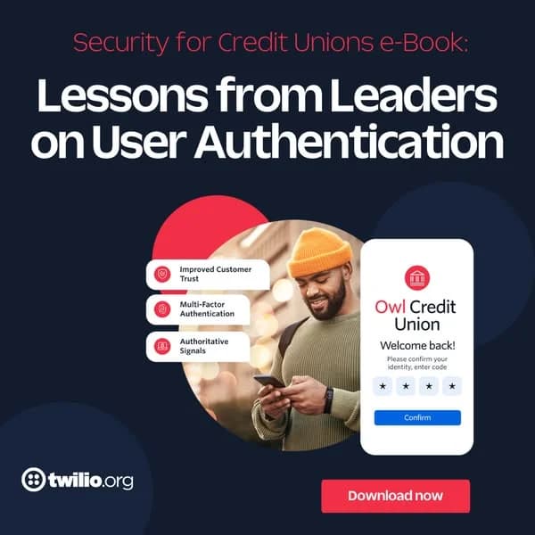
This ad employs a strong top-heavy text layout, immediately communicating its value proposition for credit unions. The dark blue background provides a professional and secure feel, effectively contrasted by the vibrant red accents and white text, which draw the eye to key information and the call to action. Compositionally, the ad balances a clear, benefit-driven headline with a compelling visual narrative in the lower right, featuring a lifestyle image of a user interacting with a clean UI mockup. This combination grounds the abstract concept of 'user authentication' in a relatable, human context. The bullet points act as digestible proof points, enhancing the ad's persuasive power. Optimized for B2B platforms like LinkedIn or Facebook, its high contrast and clear hierarchy ensure readability and engagement, guiding the viewer from problem (security) to solution (e-book) with a direct 'Download now' CTA.
Why This Ad Works
High-contrast palette commands attention
The deep navy background with bright white text and vibrant red accents creates strong visual contrast. This ensures the headline and key information are highly readable and stand out in a busy feed, crucial for B2B ads targeting busy professionals who quickly scan content for relevance and value.
Benefit-driven bullet points clarify value
The concise bullet points ("Improved Customer Trust," "Multi-Factor Authentication," "Authoritative Signals") quickly communicate the core benefits of the e-book's content. This allows busy viewers to grasp the value proposition and understand the relevance of the offering without reading extensive body copy.
Visualizing abstract tech with UI mockup
Pairing a lifestyle image of a user with a clear UI mockup of an authentication screen effectively translates the abstract concept of "user authentication" into a tangible, relatable experience. This helps potential leads envision the solution in action, making the e-book's topic more accessible.
Ad Specs
Color Palette
Original Ad Copy
How to Clone This Ad
From reference to ready-to-run ad
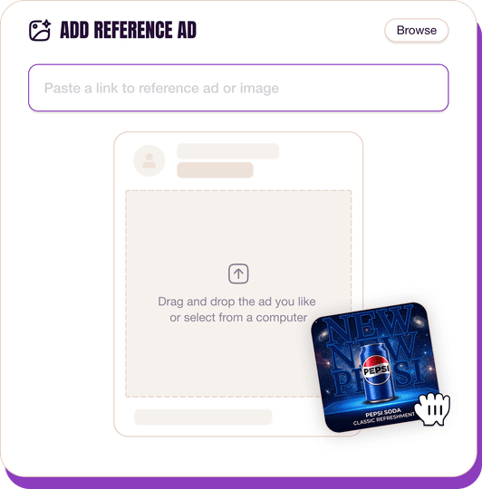
Pick a reference ad
Browse the library or upload any ad spotted in the wild.
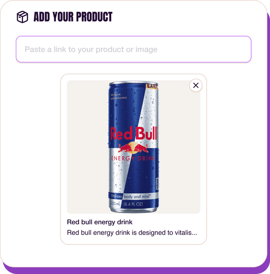
Upload a product photo
Any angle, any background. One photo is enough.
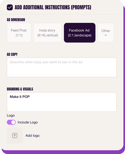
Customize the ad
Pick dimensions, add ad copy, upload your logo — AdDogs handles the rest.
Get your ad in every format, for every platform
Instagram, Facebook, TikTok, LinkedIn, Google — every ad size generated in one shot.
What You Could Improve
Streamline headline for mobile impact
The current headline is quite long and may be truncated on smaller screens or in certain ad placements. Shortening it to a more concise phrase like "User Authentication: Lessons for Credit Unions" could improve immediate comprehension and impact, especially on mobile devices.
Incorporate social proof for credibility
While the e-book is from "Leaders," adding a specific social proof element like "Trusted by 500+ Credit Unions" or a small quote could significantly boost credibility and encourage downloads. B2B audiences often rely on peer validation before committing to a download.
Questions
AdDogs rebuilds the ad with your product photo and extracts your brand colors automatically from your logo. Same layout and composition — your product, your brand.
Pick your dimension per generation. Basic includes 3 dimensions: square (1:1) for Instagram and Facebook feeds, portrait (9:16) for Stories and Reels, landscape (16:9) for Google Display and YouTube. Pro and Ultimate unlock all 14, including Pinterest (2:3), cinematic (21:9), and banners.
Built for software & tools and finance & insurance products. The UI Mockup composition works best when the product photo carries the persuasion. Any background, any angle — AdDogs handles the cutout.
One credit. $0.40 on the Basic plan ($12/mo for 30 credits), $0.33 on Pro. One credit produces one finished ad in the dimension you pick.
Single-image Sponsored Content at 1.91:1 (1200x627) with a screenshot-led hero and a problem-led headline dominates B2B LinkedIn CTR. Single-image beats carousel for most SaaS because LinkedIn's feed rewards fast comprehension over swipe depth. Document ads (PDF carousels) work well for gated-content funnels — HubSpot built a paid engine on this format. Sponsored video runs higher on brand-awareness but rarely beats static on cost-per-lead once you're past the discovery phase.
Grammarly runs the most prolific consumer-SaaS paid creative — the red-squiggle moment is a hook adapted across hundreds of variants. HubSpot leads B2B content-gated creative with template-download offers and pipeline screenshots. Notion and Linear hold the productivity-tool aesthetic tier with tight palette discipline. Airtable owns the spreadsheet-to-database before-after. Webflow runs designer-targeted creative with site-builder screenshots. Each brand rotates creative weekly.
More SaaS & Tech Ad Examples
View all





By Industry
By Format
Clone Your First Ad
Pick a template. Upload your product. Seconds later, you have an ad ready to launch. No design skills. No Photoshop.
Create your ad
