AdDogs

Shopify Ad Examples

Browse 23 Shopify ads ad examples sourced from high-performing campaigns. Clone any design, swap in your product, and get a finished ad in seconds.

Updated June 2026

Shopify ads don't sell software. They sell the promise of someone else's business — a candle maker quitting her corporate job, a sneaker reseller scaling to seven figures, a bakery in Brooklyn that now ships nationwide. Product comes in as the invisible engine underneath every success story, and the ads barely mention features.

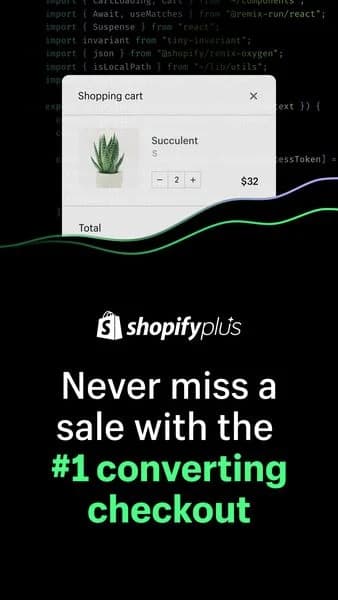
Visual patterns across the brand stay consistent. Shopify green anchors the palette, paired with white, soft gray, and occasional warm accent tones pulled from merchant brands. Dashboard screenshots appear often — stylized, with real-looking sales numbers and product rows. Big-logo carousels ("Gymshark, Allbirds, Fashion Nova, and 1M+ merchants") run as social proof. CTA copy nearly always runs action-oriented: "Start your business," "Try Shopify free," "Start your free trial." Creative adapts by channel — Facebook for solo founders, LinkedIn for enterprise, Instagram for creators, YouTube for longer merchant-story spots. TV and CTV handle the broader brand campaigns.

Our Shopify ad examples collection pulls merchant testimonials, dashboard statics, and big-logo carousels that built the platform. Filter by format to find the founder-with-product stills, the dashboard-screenshot statics, and the logo-wall social proof carousels that serve different buyer segments. Each entry surfaces how the green palette stays locked, where the merchant revenue stat sits, and which funnel segment the creative opens with.

Shopify — E-commerce UI Mockup. Brand: Shopify. This ad effectively uses a clean UI mockup to visually communicate Shopify's e-commerce capabilities. The central monitor acts as a canvas, displaying diverse product types (sunglasses, headphones, scarf, plant) floating around it, symbolizing the platform's versatility for various businesses. A prominent analytics graph on the right reinforces the data-driven insights Shopify offers. The minimalist white and blue color scheme evokes professionalism and clarity, aligning with a SaaS brand. Compositionally, the floating elements create a dynamic yet organized feel, guiding the eye across the platform's features. Optimized for B2B platforms like Google or LinkedIn, this visual clearly targets small business owners by showcasing product management and performance tracking in an easily digestible format. The low text overlay keeps the focus on the visual narrative.. Why this ad works: Diverse product representation highlights versatility — The ad features a wide array of products—sunglasses, headphones, a scarf, and a potted plant—floating around the monitor. This visual strategy immediately communicates Shopify's ability to support diverse e-commerce niches, from fashion to home goods, appealing to a broad spectrum of potential small business owners. Visual metaphor for platform capabilities — The monitor displaying a generic product page, combined with floating product images and an analytics graph, serves as a powerful visual metaphor. It clearly illustrates Shopify's core functions: product display and sales tracking, making complex software features instantly understandable to a B2B audience. Clean, professional aesthetic builds trust — The minimalist design, dominated by white, light blue, and the crisp Shopify logo, conveys professionalism and ease of use. This clean aesthetic is crucial for a SaaS platform, as it subtly reassures potential users that the software is intuitive and reliable, fostering trust and reducing perceived complexity.. Specs: Brand: Shopify, Industry: Software & Tools, Platform: Google, Format: Static, Audience: Small Business OwnersShopify x Flying Tiger — Testimonial Quote Layout. Brand: Shopify. This ad leverages a testimonial layout to build B2B credibility. The dark background with a subtle green gradient exudes a professional, modern vibe, aligning with a tech-forward SaaS brand. Compositionally, the ad uses a clear top-to-bottom hierarchy: partner logos establish trust, followed by a prominent quote acting as the primary message and social proof. The attribution below reinforces authenticity. High contrast white text against the dark background ensures excellent readability, crucial for platforms like LinkedIn or Facebook where professionals quickly scan content. The minimalist design focuses entirely on the message, avoiding distractions. This strategy is optimized for consideration-stage audiences, encouraging deeper engagement through the case study CTA. The layout is clean and direct, effectively communicating value through a third-party endorsement.. Primary text: Shopify has accelerated the brand's international expansion, as well as the interoperability piece as it connects back into other systems within the enterprise landscape.. Why this ad works: Prominent testimonial builds B2B trust — The large, centered quote from a recognizable brand like Flying Tiger Copenhagen immediately establishes strong social proof. This third-party validation is highly effective in B2B marketing, as it directly addresses potential customers' need for proven solutions and reduces perceived risk, driving consideration for Shopify's services. High contrast ensures maximum readability — The use of bright white and lime green text against a dark, subtly gradient background creates exceptional contrast. This design choice ensures the critical testimonial message is easily readable, even on smaller mobile screens or in varied lighting conditions, preventing scroll-past and maximizing message absorption for busy professionals. Clear visual hierarchy guides user flow — The ad employs a logical visual hierarchy, starting with partner logos for immediate brand association, followed by the impactful quote, then the credible attribution, and finally the clear call-to-action. This structured flow guides the viewer's eye seamlessly through the ad's key elements, ensuring the core message and desired action are understood.. Specs: Brand: Shopify, Industry: Software & Tools, Platform: Facebook, Format: Static, Audience: ProfessionalsShopify — Founder Testimonial Collage. Brand: Shopify. This ad effectively uses a collage layout to tell a compelling founder story, positioning Shopify as an enabler for small businesses. The central image of a smiling founder holding her product creates an authentic, relatable connection. Surrounding smaller images visually reinforce the brand's origin and product type, adding context without clutter. The clean, minimalist background ensures the focus remains on the founder and her quote. Text hierarchy is clear: Shopify logo for brand recognition, a prominent testimonial for social proof, and founder attribution. This composition is optimized for platforms like Instagram, where visual storytelling and authentic narratives resonate strongly with entrepreneurial audiences, driving consideration for Shopify's platform.. Primary text: I love that we can sell to anyone in the world.. Why this ad works: Authentic Founder Storytelling — The ad centers on a happy founder, Lia Heifetz, holding her product. This humanizes the brand, creating an emotional connection and demonstrating real-world success. It builds trust and makes Shopify's value proposition tangible for aspiring entrepreneurs, fostering aspirational engagement with the platform. Visual Collage Reinforces Brand Narrative — The surrounding smaller images of kelp, a boat, and a product bottle provide rich context for Barnacle Foods. This visual storytelling enhances the testimonial, showing the journey from sourcing to finished product, making the success feel more earned and inspiring for the target audience. Prominent Testimonial for Social Proof — The large, clear quote, "I love that we can sell to anyone in the world," directly addresses a key pain point for small businesses: market reach. This powerful social proof from a peer is highly persuasive for potential Shopify users, validating the platform's global capabilities.. Specs: Brand: Shopify, Industry: Software & Tools, Platform: Instagram, Format: Static, Audience: Small Business OwnersShopify POS Hardware — Split Screen In-Use. Brand: Shopify. This ad employs a split-screen layout, effectively contrasting product demonstration with a clear value proposition. The top half showcases Shopify's POS hardware in action, with hands interacting with the card reader and tablet, immediately conveying functionality. The bottom half utilizes Shopify's distinctive dark green brand color, creating a strong visual identity and trust. Text hierarchy is well-defined: prominent logo, a bold, benefit-driven headline, supporting text, and a clear call-to-action. This composition is optimized for platforms like Facebook or Instagram, where a quick visual hook followed by concise messaging drives consideration. The clean aesthetic and direct messaging target small business owners seeking reliable sales solutions. The overall design prioritizes clarity and brand reinforcement.. Headline: Make every sale without fail. Primary text: New hardware from Shopify. Why this ad works: Split-screen effectively demonstrates product utility — The top visual immediately shows the Shopify POS hardware in a real-world transaction, making its function clear and tangible. This "in-use" context helps potential customers visualize the product's benefits, reducing cognitive load and increasing relevance for small business owners considering new payment solutions. Strong brand color reinforces identity and trust — The bottom section's deep green background is instantly recognizable as Shopify's brand color. This consistent branding builds trust and familiarity, leveraging existing brand equity. The high contrast with white text ensures readability, making the core message stand out effectively in a busy feed environment. Benefit-driven headline addresses pain point directly — The headline "Make every sale without fail" directly speaks to a critical pain point for small businesses: missed sales due to unreliable hardware. This clear, concise promise resonates strongly with the target audience, positioning Shopify's new hardware as a reliable and essential solution for their operations.. Specs: Brand: Shopify, Industry: Software & Tools, Platform: Facebook, Format: Static, Audience: Small Business OwnersShopify POS — Product & Offer Shot. Brand: Shopify. This ad effectively utilizes a clean, minimalist layout to highlight the Shopify POS device and its compelling offers. The product is positioned off-center, creating dynamic visual interest while leaving ample negative space for the value proposition. The neutral color palette of the background (light tiles) and the device itself ensures the bright green text overlay stands out, immediately drawing the eye to the key benefits. Text hierarchy is clear, presenting three distinct offers in a bullet-like format, making them easily digestible. This composition is well-suited for platforms like Instagram, where a clean aesthetic and clear, concise messaging can quickly capture the attention of small business owners scrolling through their feeds. The focus on tangible savings and support directly addresses potential pain points, driving consideration and conversion.. Primary text: Free hardware. Free migration & setup support. Save 25% on POS costs.. Why this ad works: Clear value proposition with text overlay — The ad immediately communicates three strong benefits: free hardware, free migration, and 25% savings. Highlighting these directly on the image with a contrasting background ensures they are the first thing a potential customer sees, driving immediate interest and demonstrating clear ROI for small business owners. Product-in-context visual cues — The Shopify POS device is shown in a realistic, clean setting, implying ease of use and integration into a modern retail environment. The screen displaying a transaction total ($107.34) provides a tangible example of its function, making the abstract concept of a POS system more concrete and relatable for merchants. High contrast text for readability — The bright, almost neon green highlight behind the white text creates exceptional contrast against the light background. This ensures maximum readability, even on smaller mobile screens or in varied lighting conditions, making the critical offer details impossible to miss and enhancing message retention.. Specs: Brand: Shopify, Industry: Software & Tools, Platform: Instagram, Format: Static, Audience: Small Business OwnersShopify — Instagram UI Mockup. Brand: Shopify. This ad effectively leverages an Instagram UI mockup to demonstrate Shopify's seamless integration for small businesses. The vertical composition is optimized for Stories or Reels, capturing attention with a relatable unboxing scene. A bold, white headline, "SELL IN ALL THE PLACES," dominates the upper frame, immediately communicating the core value proposition. The color palette is clean and professional, with the vibrant blue product and natural cardboard contrasting against the muted background, drawing focus to the product being prepared for sale. The composition places the human element and product within the familiar social media frame, enhancing relatability and trust. Text hierarchy prioritizes the brand logo, then the large, benefit-driven headline, followed by a subtle product tag, guiding the viewer's eye through the key information. This strategic layout and clear messaging efficiently targets aspiring entrepreneurs, showcasing ease of use and broad market reach across various platforms.. Headline: SELL IN ALL THE PLACES. Why this ad works: Instagram UI Mockup for Platform Relevance — By framing the ad content within a familiar Instagram post UI, Shopify immediately signals its relevance and integration with social selling. This technique makes the value proposition tangible, showing how a small business can appear professional and sell directly on platforms where their audience already spends time, building trust and familiarity. Bold Headline Communicates Core Value Instantly — The prominent, all-caps headline "SELL IN ALL THE PLACES" is impossible to miss. It directly addresses a key pain point for small business owners – market reach – and positions Shopify as the solution. This immediate, clear value proposition is crucial for capturing attention in fast-scrolling feeds and quickly conveying the ad's purpose. Relatable Unboxing Scene for Aspirational Entrepreneurs — Featuring a person unboxing a product within the ad creates an authentic, aspirational scenario for aspiring or current small business owners. It visualizes the tangible process of preparing products for sale, making the abstract concept of e-commerce more concrete and appealing. This human element fosters connection and demonstrates the ease of starting.. Specs: Brand: Shopify, Industry: Software & Tools, Platform: Instagram, Format: UI Mockup, Audience: Small Business OwnersShopify — Text-Heavy Informational Ad. Brand: Shopify. This ad employs a minimalist, text-heavy layout on a soothing gradient green background, optimized for vertical viewing platforms like Instagram Stories or Reels. The Shopify logo is prominently placed in the top-left, establishing immediate brand recognition. The central headline, "5 tactics to improve in-store customer experiences," uses a clean, sans-serif font with excellent contrast against the muted green, ensuring readability. The composition prioritizes direct communication of value, leveraging ample negative space around the text to prevent visual clutter. This design strategy aims to quickly convey a clear, actionable benefit to small business owners, encouraging engagement by promising valuable insights. The calm color palette subtly reinforces professionalism and trustworthiness, aligning with Shopify's brand identity as a reliable business partner.. Headline: 5 tactics to improve in-store customer experiences. Why this ad works: Clear, benefit-driven headline — The headline immediately communicates a specific, actionable benefit: "5 tactics to improve in-store customer experiences." This direct approach appeals to professionals seeking practical solutions, driving higher click-through rates by promising valuable content upfront. It effectively targets the pain points of small business owners. Strong brand presence and recognition — The Shopify logo is strategically placed at the top-left, the primary scanning point for most viewers. This ensures instant brand association with the valuable content offered. For a SaaS company, consistent brand visibility in content marketing builds trust and reinforces its position as an industry leader. Minimalist design enhances message focus — The ad's clean, minimalist aesthetic, featuring bold black text on a simple green gradient, eliminates distractions. This design choice ensures the viewer's attention is solely on the headline and the brand. In crowded social feeds, simplicity often cuts through noise more effectively, improving message retention and engagement.. Specs: Brand: Shopify, Industry: Software & Tools, Platform: Instagram, Format: Static, Audience: Small Business OwnersShopify x Blakely — Split Screen Case Study. Brand: Shopify. This ad employs a split-screen layout, effectively dividing the frame into a text-dominant top section and a brand-visual bottom. The top half leverages a clean white background with a subtle green-blue gradient, providing excellent contrast for the bold, black headline. This immediately highlights a compelling success metric (85% conversion boost) from a Shopify client, Blakely, positioning Shopify as a powerful growth partner. The composition guides the eye from the brand logos to the key benefit, then to a clear call-to-action. The bottom half grounds the abstract success with a tangible product shot, reinforcing Blakely's brand identity. This blend of data-driven messaging and aspirational imagery is optimized for platforms like Instagram, where a vertical format and strong visual hierarchy are crucial for stopping the scroll and driving consideration among business owners. The minimalist aesthetic with high-impact numbers appeals to a professional audience seeking proven solutions.. Headline: How Blakely enhanced the customer experience and boosted conversion rate by 85%. Why this ad works: Clear Value Proposition & CTA — The headline immediately communicates a significant business benefit – an 85% conversion rate boost – and a clear call to action. This directly addresses the pain points and growth goals of potential Shopify users, positioning the platform as a solution provider. This direct, results-oriented messaging is highly effective for driving consideration among business owners. Visual Client Brand Reinforcement — The bottom half visually showcases the client brand, Blakely, through their product. This provides tangible proof of the type of successful businesses Shopify supports and adds a relatable, aspirational element for other e-commerce entrepreneurs. Seeing a real-world application strengthens the case study's credibility and impact. High-Contrast Text Readability — The white text on a subtle gradient background in the top section ensures excellent readability, making the crucial performance metric and headline easily digestible. The black CTA button with contrasting white text further enhances visibility, ensuring the primary action stands out effectively against the lighter background, minimizing friction for engagement.. Specs: Brand: Shopify, Industry: Software & Tools, Platform: Instagram, Format: Static, Audience: ProfessionalsShopify Derek Rose — Split Screen Case Study. Brand: Shopify. This ad effectively uses a split-screen layout, combining a real-world retail storefront with a clear call to action. The top half showcases the Derek Rose London store, subtly featuring Shopify POS hardware, grounding the SaaS solution in a tangible, premium retail environment. The bottom half employs a dark green background with contrasting white text, ensuring high readability and brand consistency with Shopify's visual identity. The composition strategically places the Shopify logo and a compelling headline above a clear CTA, guiding the viewer's eye. This vertical format is optimized for mobile feeds like Instagram, where scroll-stopping visuals and concise messaging are key to driving consideration for a B2B audience. The ad leverages social proof by highlighting a successful client.. Headline: Learn how Derek Rose uses Shopify POS to create premium in-store experiences. Why this ad works: Visual Storytelling with Real-World Context — The ad immediately connects Shopify POS to a high-end fashion brand, Derek Rose. This visual association with a reputable client builds trust and demonstrates the product's applicability in a premium retail setting, making the abstract SaaS solution tangible and desirable for other business owners. Clear Value Proposition and Call-to-Action — The headline clearly states the benefit ("create premium in-store experiences") and identifies the solution (Shopify POS). Paired with a prominent "Read the case study" CTA, it directly guides interested professionals towards deeper engagement, optimizing for consideration-stage leads. High Contrast for Readability and Brand Identity — The dark green background for the text block, combined with white typography and a light green CTA button, creates excellent contrast. This ensures the message is easily readable on mobile devices and reinforces Shopify's brand colors, enhancing recognition and professional appeal.. Specs: Brand: Shopify, Industry: Software & Tools, Platform: Instagram, Format: Mixed, Audience: ProfessionalsShopify Black Friday — Notification Mockup. Brand: Shopify. This ad effectively uses a dark, high-contrast layout to command attention, ideal for scroll-heavy mobile feeds. The composition strategically places a bold, benefit-driven headline at the top, immediately followed by a compelling visual of an iPhone displaying a "new order" notification. This visual cue directly taps into the aspirational goal of small business owners: increased sales, especially for Black Friday. The vibrant pink highlight in "EARN BIG" and the phone's background adds a modern, energetic feel against the minimalist black, preventing the ad from feeling sterile. Text hierarchy is clear, guiding the eye from the urgent headline to the aspirational notification. Optimized for platforms like Instagram or TikTok, its vertical aspect and clear message are designed for quick comprehension and emotional resonance, driving consideration for Shopify's platform.. Headline: BE READY TO EARN BIG BY BLACK FRIDAY. Why this ad works: Urgency-driven headline with color accent — The headline "BE READY TO EARN BIG BY BLACK FRIDAY" immediately creates urgency and highlights a significant benefit. The pink accent on "EARN BIG" draws the eye, emphasizing the core value proposition. This combination effectively captures attention and aligns with seasonal sales goals, motivating immediate action from potential merchants. Aspirational UI notification visual — The iPhone mockup showing a "Your store has a new order" notification is a powerful psychological trigger. It allows the viewer to visualize the desired outcome of using Shopify – success and sales. This direct, relatable visual proof point is highly effective in driving consideration and intent among entrepreneurial audiences. High-contrast dark mode aesthetic — The predominantly black background with white and pink text, combined with the vibrant phone display, creates a striking high-contrast visual. This ensures maximum visibility and readability on any platform, cutting through visual clutter. The dark mode also lends a sophisticated, modern vibe, appealing to a professional audience.. Specs: Brand: Shopify, Industry: Software & Tools, Platform: Instagram, Format: UI Mockup, Audience: Small Business OwnersShopify Site Speed — Data Comparison Layout. Brand: Shopify. This ad effectively uses a dark, gradient background with vibrant green and blue accents to convey a modern, tech-focused aesthetic, ideal for a SaaS platform. The layout strategically employs a problem-solution framework, starting with a direct question headline that immediately engages the target audience. Two prominent circular gauges visually compare a blurred 'Your speed' against a clear 'Shopify average,' creating an instant, compelling data-driven narrative. This composition is optimized for mobile platforms like Instagram, where clear visual hierarchy and high contrast elements help stop the scroll. The text hierarchy is well-defined, moving from a large, attention-grabbing question to concise data points, culminating in a brightly contrasted call-to-action, guiding the user seamlessly through the ad's message.. Headline: Does your site speed stack up?. Why this ad works: Problem-solution framing creates urgency — The headline 'Does your site speed stack up?' immediately poses a relevant problem for e-commerce business owners. This question-based approach directly addresses a potential pain point, prompting self-reflection and establishing a need for the solution that Shopify implicitly offers, driving initial engagement and curiosity. Visual data comparison provides instant proof — The side-by-side circular gauges offer a clear, digestible comparison of 'Your speed' (blurred, implying poor performance) versus 'Shopify average' (a precise, desirable 1.2 seconds). This visual proof quickly communicates Shopify's superior performance, building trust and demonstrating a tangible benefit without requiring extensive text. High-contrast CTA drives immediate action — The 'Get free audit' button is rendered in a bright, almost neon green against the dark background. This stark color contrast ensures the call to action is highly visible and immediately draws the eye, making it impossible to miss. This design choice significantly increases the likelihood of a click-through.. Specs: Brand: Shopify, Industry: Software & Tools, Platform: Instagram, Format: Static, Audience: Small Business OwnersShopify — Laptop In-Use Lifestyle Shot. Brand: Shopify. This ad employs a clean, minimalist layout with a central lifestyle shot of a user interacting with a laptop displaying the Shopify dashboard. The generous white space frames the action, drawing immediate attention to the product in use. Color psychology leverages the professionalism of black and white, accented by Shopify's signature green, to convey reliability and growth. The composition is optimized for mobile-first platforms like Instagram, where its vertical orientation and clear visual hierarchy ensure scroll-stopping impact. The prominent headline, "Your business. Your way.", establishes a direct, empowering message, while the brand logo anchors the bottom. This ad effectively communicates ease of use and autonomy, targeting entrepreneurs seeking a streamlined business solution.. Headline: Your business. Your way.. Why this ad works: User interaction highlights platform ease — The ad prominently features hands actively using the laptop, showcasing the Shopify dashboard. This direct visual demonstration of engagement implies ease of use and accessibility, making the platform feel approachable for potential users who might be intimidated by complex software. Empowering headline resonates with entrepreneurs — The concise headline "Your business. Your way." directly addresses the core desire of small business owners for autonomy and control. This message aligns perfectly with Shopify's value proposition, creating an emotional connection and reinforcing the brand as a tool for independent success. Minimalist design enhances platform focus — The generous white space surrounding the central image and text creates a clean, uncluttered aesthetic. This minimalist approach reduces visual distractions, ensuring that the viewer's attention remains squarely on the laptop screen and the empowering message, conveying professionalism and clarity.. Specs: Brand: Shopify, Industry: Software & Tools, Platform: Instagram, Format: Static, Audience: Small Business OwnersShopify AI — UI Mockup with Product. Brand: Shopify. This ad leverages a vibrant, dark-themed UI mockup to highlight Shopify's new AI capabilities. The layout strategically places a large, attention-grabbing headline at the top, immediately communicating the core benefit: "Sell like magic with Shopify AI." The deep purple, starry background creates a sense of innovation and possibility, contrasting effectively with the bright pink headline and the warm, inviting armchair illustration. Compositionally, the ad guides the eye from the brand logo and headline down to the interactive UI elements, culminating in a clear "Generate Text" call to action. This visual hierarchy effectively demonstrates the AI's function, making it tangible. Optimized for platforms like Instagram, its square format and high contrast ensure visibility and scroll-stopping power, while the text overlay clearly explains the feature without overwhelming the viewer. The overall design positions Shopify AI as an accessible, powerful tool for small business owners.. Headline: Sell like magic with Shopify AI. Why this ad works: High-contrast palette commands attention — The deep purple, starry background provides a striking contrast to the bright pink headline and white Shopify logo. This high-contrast design is crucial for cutting through visual clutter on social feeds, immediately drawing the viewer's eye and increasing ad recall. It ensures the core message is instantly legible. Clear value proposition in headline — The headline "Sell like magic with Shopify AI" directly addresses a pain point for small business owners – generating compelling product descriptions – and offers an innovative, easy solution. This immediate benefit-driven messaging resonates strongly, positioning the AI as a powerful, almost effortless tool for growth. Visual demonstration of AI functionality — By showcasing a UI mockup with input fields and a "Generate Text" button, the ad visually explains how Shopify AI works. This concrete demonstration demystifies the technology, making it relatable and actionable for users. The example of generating product descriptions for an armchair provides immediate context.. Specs: Brand: Shopify, Industry: Software & Tools, Platform: Instagram, Format: UI Mockup, Audience: Small Business OwnersShopify POS — Clean Product & Feature Spotlight. Brand: Shopify. This ad employs a strong split-screen layout, effectively dividing the frame to highlight both the core message and the physical product. The upper black half provides high contrast for the white headline, ensuring immediate readability and scroll-stopping power on mobile feeds. Below, the Shopify POS hardware is presented on a clean, light blue-grey surface, conveying professionalism and modern design. The composition uses a clear visual hierarchy: headline first, followed by concise, benefit-driven bullet points in a refreshing mint green, drawing the eye to key advantages. This minimalist approach, combined with clear product imagery, optimizes for quick comprehension, making it suitable for platforms like Instagram or Facebook where users rapidly scan content. The color palette of black, white, and light blue with mint accents signals efficiency and ease of use, appealing to businesses seeking streamlined operations.. Headline: Simplify your operations in store and online. Primary text: Better insights Smooth payments One back office. Why this ad works: High contrast ensures immediate message clarity — The stark black background with white text creates exceptional contrast, making the headline instantly readable even during rapid scrolling. This design choice is crucial for capturing attention in busy social feeds, ensuring the primary value proposition is absorbed quickly by the target audience of busy small business owners. Split-screen layout organizes information effectively — The ad's vertical split clearly separates the textual benefits from the product imagery. This strategic division prevents visual clutter, allowing viewers to process the "why" (headline/benefits) and the "what" (POS hardware) independently yet cohesively. It guides the eye through a logical information flow, enhancing comprehension. Benefit-driven bullet points simplify value proposition — Presenting key features as concise, checked bullet points ("Better insights," "Smooth payments," "One back office") immediately communicates tangible benefits. This format is highly scannable and digestible, making complex software advantages accessible and appealing to small business owners looking for practical solutions to operational challenges.. Specs: Brand: Shopify, Industry: Software & Tools, Platform: Instagram, Format: Static, Audience: Small Business OwnersShopify Plus — UI Mockup with Headline. Brand: Shopify. This ad employs a split-screen layout, effectively combining a product UI mockup with a bold, benefit-driven headline. The top section showcases a clean "Shopping cart" interface, subtly demonstrating the product's functionality. Below, a dark background with vibrant green and white text creates high contrast, ensuring the core message "Never miss a sale with the #1 converting checkout" is instantly legible. This composition is optimized for platforms like Facebook or LinkedIn, targeting professionals who quickly scan for value. The text hierarchy prioritizes the Shopify Plus brand, followed by the compelling value proposition, with the green highlight drawing immediate attention to the key benefit. The overall design is clean, direct, and focuses on a single, powerful claim to drive consideration.. Headline: Never miss a sale with the #1 converting checkout. Why this ad works: Split layout balances feature and benefit — The ad strategically uses a split layout to first visually demonstrate the product's UI (the shopping cart) and then immediately follow with the core benefit. This dual approach educates the viewer on what the product does and why it matters, creating a comprehensive understanding in a single glance, crucial for busy professionals. High-contrast text highlights key value — The dark background combined with bright white and a vibrant green accent ensures maximum readability and impact. Highlighting "#1 converting checkout" in green immediately draws the eye to the unique selling proposition, reinforcing the ad's central message and making it memorable, which is vital for quick-scan social feeds. UI mockup demonstrates direct product utility — By featuring a clear, albeit small, UI mockup of a shopping cart, the ad provides tangible proof of the product's functionality. This visual anchor helps potential customers immediately connect the abstract benefit of "converting checkout" to a real-world application, making the value proposition more concrete and believable for a B2B audience.. Specs: Brand: Shopify, Industry: Software & Tools, Platform: Facebook, Format: Mixed, Audience: ProfessionalsShopify B2B — UI Mockup with Product. Brand: Shopify. This ad leverages a high-contrast, dark background to make its key elements pop, optimizing for mobile feed visibility. The layout strategically places the Shopify logo and B2B sub-brand at the top, establishing credibility before presenting the core value proposition. A vibrant yellow sofa anchors the visual, representing the tangible products managed by the software, while translucent UI mockups overlay it, directly demonstrating the platform's functionality. This composition clearly illustrates the "out of the box" solution. The text hierarchy guides the eye from brand to benefit to a prominent, action-oriented CTA. The clean, professional aesthetic, combined with direct feature visualization, effectively targets business owners seeking streamlined wholesale operations on platforms like Instagram or LinkedIn. The dark mode friendly design ensures strong performance across various digital environments.. Headline: Next-level wholesale, out of the box. Primary text: SHOPFY B2B. Why this ad works: High-contrast palette for scroll-stopping visibility — The dark green background sharply contrasts with the bright yellow sofa, white text, and light green CTA. This high-contrast design ensures the ad stands out in a busy social feed, immediately drawing the eye and improving ad recall. It effectively uses color to command attention and stop the scroll. UI mockups demonstrate platform functionality — By showcasing actual UI elements like volume pricing and a checkout summary, the ad directly illustrates the software's capabilities. This visual proof of concept helps potential B2B clients quickly understand how Shopify can streamline their wholesale operations, reducing cognitive load and increasing comprehension of the offering. Clear, benefit-driven headline communicates value — The headline "Next-level wholesale, out of the box" clearly articulates the primary benefit: an advanced, ready-to-use solution for wholesale. This direct messaging resonates with business owners looking for efficient, powerful tools without extensive setup, driving immediate interest and relevance for the target audience.. Specs: Brand: Shopify, Industry: Software & Tools, Platform: Instagram, Format: UI Mockup, Audience: ProfessionalsShopify Webinar — Professional Grid Layout. Brand: Shopify. This ad employs a clean, professional design optimized for B2B audiences on platforms like Facebook or LinkedIn. The dark background with contrasting light text ensures high readability, immediately drawing attention to the compelling headline. A strong visual hierarchy places the Shopify logo and webinar topic prominently, followed by two expert speaker profiles. This dual-speaker composition technique enhances credibility and perceived value, crucial for webinar sign-ups. The minimalist aesthetic, devoid of clutter, focuses the viewer on the core message and the experts delivering it. It leverages a direct, informative approach, making it effective for driving consideration among target professionals by clearly outlining the value proposition and the expertise involved. The layout is well-suited for various social feed formats without critical information being cropped.. Headline: Why European retailers are unifying their retail tech. Primary text: Adriana Colacicco Senior Account Executive Sarah Rosenberger Senior Solutions Engineer. Why this ad works: High-contrast text ensures readability — The dark, almost black background with crisp white and light green text creates excellent contrast. This design choice ensures the headline and speaker details are immediately legible, preventing scroll-past due to poor visibility. In busy social feeds, clear text hierarchy is paramount for conveying complex B2B messages effectively. Dual expert profiles build credibility — Featuring two distinct speakers, complete with names and professional titles, significantly enhances the webinar's authority. This strategy signals a comprehensive and well-rounded discussion, appealing to professionals seeking diverse perspectives and deep expertise. It leverages social proof and expert endorsement to drive sign-ups. Problem-solution headline engages target audience — The headline "Why European retailers are unifying their retail tech" directly addresses a pressing, relevant challenge for the target demographic. By framing the webinar as a solution to a known industry problem, it immediately captures the attention of European retailers, encouraging them to learn more.. Specs: Brand: Shopify, Industry: Software & Tools, Platform: Facebook, Format: Static, Audience: ProfessionalsShopify Cheak — Case Study UI Mockup. Brand: Shopify. This ad effectively combines a strong performance claim with visual proof, optimized for mobile platforms. The layout strategically places the compelling statistic at the top, immediately grabbing attention with a question-and-answer format. Below, the product imagery from Cheak, presented as a UI mockup with a "Launch" button, visually reinforces the e-commerce success story. The clean white background ensures high contrast for both text and images, enhancing readability and visual clarity. The blue gradient in the headline and CTA button draws the eye to key information and action points, signaling growth and innovation. This composition is ideal for platforms like Instagram or TikTok where quick comprehension and visual appeal are paramount, positioning Shopify Plus as a catalyst for tangible business growth. The text hierarchy uses bolding and color to guide the viewer from the problem/solution statement to the visual outcome.. Headline: 20% traffic growth month-on-month? cheak made it happen with Shopify Plus.. Why this ad works: Direct-response headline with question hook — The headline "20% traffic growth month-on-month?" immediately poses a desirable outcome as a question, engaging the viewer before providing the solution. This direct, benefit-driven approach captures attention quickly, especially for business owners seeking growth and tangible results from their platforms. Visual proof via UI mockup — Presenting Cheak's products within a simulated e-commerce interface, complete with a "Launch" button and cursor, provides tangible evidence of Shopify Plus's impact. This visual storytelling makes the abstract concept of "traffic growth" concrete and relatable to potential users, demonstrating real-world application. High contrast for readability — The stark white background paired with bold black and vibrant blue text ensures maximum readability. This high contrast design is crucial for mobile ad environments where users scroll quickly, allowing the key message to be absorbed instantly without visual strain, improving message retention.. Specs: Brand: Shopify, Industry: Software & Tools, Platform: Instagram, Format: Mixed, Audience: Small Business OwnersShopify — Lifestyle Collage with Central Text. Brand: Shopify. This Shopify ad employs a clean, minimalist collage layout, strategically placing four small lifestyle images around a prominent central text block. The dominant white background ensures high contrast for the brand logo, headline, and call-to-action, optimizing for mobile feed visibility on platforms like Instagram. The composition uses negative space effectively, drawing the eye directly to the core message: "Turn your passion into your business." Color psychology is subtle, with warm, inviting tones in the mini-images suggesting creativity and personal fulfillment. Text hierarchy is clear, guiding the viewer from brand recognition to aspirational promise, then to an actionable CTA. This design works by conveying versatility and ease of use, appealing to diverse entrepreneurial aspirations while maintaining a professional, approachable vibe.. Headline: Turn your passion into your business.. Why this ad works: Central text block ensures message clarity — The ad strategically uses a central text block to deliver its core message, "Turn your passion into your business." This ensures immediate comprehension, preventing the message from getting lost amidst the surrounding visual elements. In a fast-scrolling feed, direct messaging is crucial for capturing attention and communicating value efficiently, driving higher message retention. Diverse lifestyle images broaden appeal — The four small, distinct lifestyle images effectively showcase the diverse range of businesses Shopify supports, from crafting to e-commerce and retail. This visual variety broadens the ad's appeal, allowing potential entrepreneurs to envision their own unique ventures thriving on the platform, fostering a sense of inclusivity and possibility. Minimalist aesthetic communicates professionalism and ease — The predominantly white background and clean typography create a minimalist aesthetic that communicates professionalism and ease of use. This uncluttered design reduces cognitive load, making the ad feel modern and trustworthy. It aligns with the aspirational yet practical mindset of small business owners, enhancing brand perception.. Specs: Brand: Shopify, Industry: Software & Tools, Platform: Instagram, Format: Carousel/Collage, Audience: Small Business OwnersShopify POS — Unified Experience Split Layout. Brand: Shopify. This ad utilizes a high-contrast split-screen composition to bridge the gap between abstract software benefits and tangible hardware reality. The top half uses Shopify’s signature olive green to establish brand authority, while the lime green accent on 'unifies experiences' highlights the core value proposition. By placing a mobile-style notification UI element directly over the seam of the two sections, the design creates a psychological bridge between the digital order and the physical storefront. This UI mockup technique is highly effective for SaaS products as it visualizes the 'moment of truth' for a business owner. The vertical 9:16 aspect ratio is perfectly optimized for Instagram Stories or TikTok, where the clean typography and realistic lifestyle photography stand out against cluttered user-generated content. The hierarchy is clear: brand first, then the bold claim, followed by the visual proof of the hardware in action.. Headline: The only point of sale that truly unifies experiences. Why this ad works: UI notification mockup visualizes real-time utility — The 'New pickup order' notification acts as a bridge between the headline's promise and the hardware's function. It provides immediate context for 'unified experiences' by showing exactly how the software alerts a merchant, making a complex SaaS concept feel concrete and manageable for busy retail owners. High-contrast split layout separates benefit from reality — The division between the solid green text area and the warm lifestyle photo creates a clear cognitive path. The top half handles the intellectual sell (the 'why'), while the bottom half handles the physical proof (the 'how'), allowing the viewer to process both brand messaging and product design simultaneously. Strategic color accentuation highlights the core USP — Using a lime green font for 'unifies experiences' against the darker olive background creates a focal point within the headline. This color-blocking technique ensures that even a passive scroller absorbs the most important part of the value proposition without needing to read the entire sentence.. Specs: Brand: Shopify, Industry: Software & Tools, Platform: Instagram, Format: Mixed, Audience: Small Business OwnersShopify POS — Unified Experience UI Mockup. Brand: Shopify. This ad effectively uses a split-screen layout to combine a strong value proposition with a visual demonstration. The top half, dominated by Shopify's signature green, anchors the brand and delivers a bold headline in contrasting white, ensuring high readability and immediate impact. The bottom half showcases the Shopify POS system in a realistic retail environment, featuring a prominent notification that highlights a key feature: managing pickup orders. This composition technique grounds the abstract benefit in a tangible user experience. The clean aesthetic, minimal clutter, and clear text hierarchy are optimized for platforms like Instagram or Facebook, where quick comprehension and visual appeal are crucial for stopping the scroll. The ad successfully communicates efficiency and integration.. Headline: The only point of sale that truly unifies experiences. Primary text: New pickup order Prepare 8 items.. Why this ad works: Split-screen layout for clear message delivery — The ad intelligently divides the frame, dedicating the top to a bold, benefit-driven headline and the bottom to a functional product demonstration. This clear separation prevents visual clutter, allowing the viewer to quickly grasp both the core promise and its practical application, enhancing comprehension and recall in a fast-scrolling feed. Brand green anchors trust and visibility — Shopify's distinctive green dominates the upper half, instantly signaling brand identity and professionalism. This strong, recognizable color creates a powerful visual anchor, making the ad highly visible in a crowded feed. It also psychologically conveys growth and reliability, aligning perfectly with a business-focused solution. UI notification demonstrates real-world value — The simulated "New pickup order" notification on the tablet is a powerful compositional element. It provides a direct, actionable example of the POS system's capability, demonstrating how it unifies experiences in a tangible way. This mini-story within the ad makes the abstract benefit concrete and relatable for potential users.. Specs: Brand: Shopify, Industry: Software & Tools, Platform: Instagram, Format: Static, Audience: Small Business OwnersShopify — Bold Testimonial Text Ad. Brand: Shopify. This ad leverages a bold, text-heavy layout optimized for mobile-first platforms. The vibrant neon green background with stark black typography creates extremely high contrast, designed to immediately capture attention in a busy feed. The composition centers a powerful testimonial, acting as the primary visual element, with the Shopify logo strategically placed in the top-left for brand recognition. This direct approach prioritizes the message and social proof over complex imagery. The text hierarchy is clear: the large, impactful quote dominates, followed by the smaller attribution, and finally the brand logo. This design effectively communicates value and credibility, making it highly effective for platforms like Instagram Stories or Reels where quick, impactful messages thrive.. Headline: WITH SHOPIFY, SALES GROWTH HAS BEEN HUGE. NOW WE DO ALMOST A YEAR'S WORTH OF SALES IN ONE MONTH.. Why this ad works: High-contrast palette demands attention — The electric neon green background paired with bold black text creates an unmissable visual. This extreme contrast is highly effective for cutting through visual clutter on social feeds, ensuring the ad stops the scroll and immediately draws the viewer's eye to the powerful testimonial. Direct, impactful social proof testimonial — The ad prominently features a strong, quantifiable testimonial ("almost a year's worth of sales in one month"). This direct social proof builds immediate credibility and trust, speaking directly to the core pain points and aspirations of potential small business owners considering Shopify. Mobile-first, text-dominant design — The vertical format and large, central text are perfectly suited for mobile viewing environments. The design prioritizes readability and impact on small screens, ensuring the key message is absorbed quickly and effectively, without requiring users to zoom or strain their eyes.. Specs: Brand: Shopify, Industry: Software & Tools, Platform: Instagram, Format: Static, Audience: Small Business OwnersShopify — Unified Platform Split Screen. Brand: Shopify. This ad employs a split-screen layout, dedicating the upper half to a bold, benefit-driven headline and the lower half to illustrative product UI. The dominant Shopify green background establishes strong brand recognition and signals growth and reliability, aligning with the brand's identity. High-contrast white text ensures immediate readability, crucial for quick consumption on mobile feeds. The composition effectively visualizes the "one platform" message by juxtaposing an in-store POS device with an e-commerce product page, demonstrating integrated functionality. This design is optimized for platforms like Instagram or Facebook, where a clear, concise message combined with direct visual evidence resonates with small business owners seeking comprehensive solutions. The text hierarchy prioritizes the core value proposition, making the ad's purpose instantly clear and driving home the unified commerce message.. Headline: In store and online. One platform.. Why this ad works: Clear headline communicates core benefit — The headline "In store and online. One platform." immediately conveys Shopify's value proposition. This direct messaging cuts through noise, ensuring that the target audience of small business owners quickly grasps the integrated solution being offered, driving higher relevance and engagement. Visual juxtaposition demonstrates platform unity — By placing an in-store POS system next to an online store interface, the ad visually reinforces the "one platform" message. This side-by-side comparison makes the abstract concept of unified commerce tangible and easily understandable, showing rather than just telling the integrated experience. Brand-consistent color palette for recognition — The ad leverages Shopify's signature green, creating instant brand recognition. This consistent use of brand colors builds trust and familiarity, making the ad feel authentic and professional. The high contrast with white text also ensures maximum readability and visual impact in a busy feed.. Specs: Brand: Shopify, Industry: Software & Tools, Platform: Instagram, Format: Static, Audience: Small Business Owners
Why Clone Ads

What Makes Shopify Ads Convert

Sell the customer's business, not your product

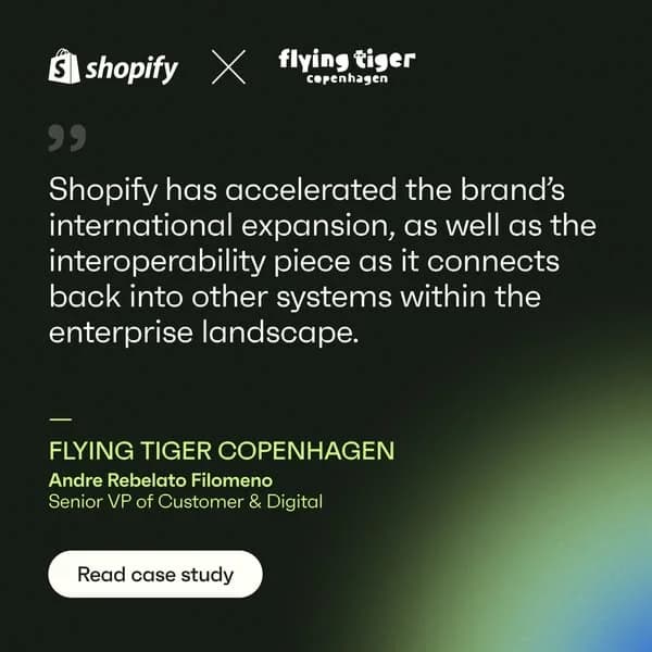
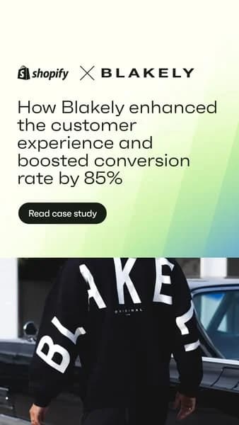
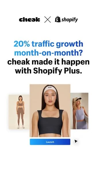
Shopify's best-performing ads feature a merchant — their name, their product, their founder story. Shopify itself stays almost invisible. Platforms that enable customer outcomes (sales, growth, bookings) should turn the customer into the hero. Your product becomes the implicit backbone rather than the explicit pitch.

Big-logo carousels are the cheapest social proof you can run

Shopify ads regularly feature "Gymshark, Allbirds, Fashion Nova, and 1M+ others" — recognizable brand names doing credibility work in a single frame. Recognizable brands using your product should appear as logos in an ad. Permission required, obviously. Recall lift versus generic testimonial copy is substantial.

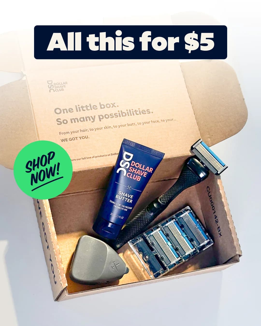
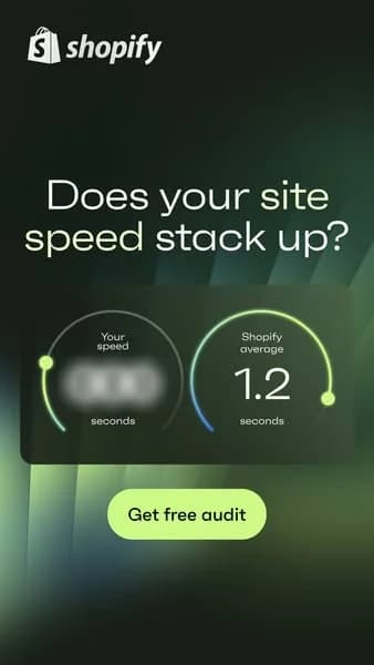
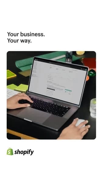
Show the dashboard with believable numbers

Shopify ads often show the admin dashboard with realistic sales figures — $47,382 month-to-date, not $1,000,000. Believability is the point. Fake numbers read as marketing; realistic ones read as proof. Products with a dashboard should mock screenshots with numbers at the scale a new customer would see on day one.

Questions

Shopify ads work because they sell merchant outcomes rather than platform features. Shopify built an ad system around customer stories — a founder, a product, a sales number — and let the software itself recede into the background as the implicit engine. Green brand cues keep visuals recognizable, big-logo carousels handle social proof, and dashboard screenshots give buyers a concrete mental picture of what they'd see after signup. Every ad runs as an aspiration story with a free-trial CTA.

Shopify green — a specific bright, slightly sage-adjacent green — is the hero color across every ad. Secondary palette includes white, soft gray, black for typography, and warm accent tones pulled from featured merchant brands. Creative occasionally includes color from merchant logos (Allbirds blues, Gymshark blacks, Fashion Nova pinks), which brings more tonal variety than most SaaS ad programs. Green stays constant; merchant colors flex around it.

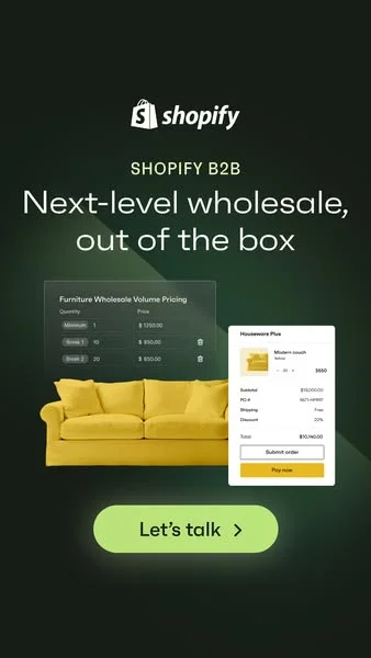
Three distinct buyer segments. Solo founders and side-hustlers thinking about starting a store — targeted on Facebook and Instagram. Growing DTC brands doing $50K-500K/year in revenue — targeted on LinkedIn and retargeted across display. Enterprise merchants and agencies — targeted with Shopify Plus-specific creative on LinkedIn and industry publications. Ad creative shifts tone and proof points by segment, with visual system staying consistent.

Merchant stories run as the central creative device. A single founder, their product, their journey, and usually a specific milestone ("from zero to $1M in 18 months"). Video ads tell the story longer; statics freeze a single frame — the founder holding their product, the warehouse shot, the website on a laptop. Specificity of the merchant (their name, their city, their product) separates the creative from generic "success story" testimonials most SaaS brands run.

Shopify's total sales and marketing spend runs into the billions annually per public filings, with paid media a substantial portion. Estimates place Meta and Google combined spend in the hundreds of millions per year, not counting CTV, Super Bowl slots, and partnership marketing with creators like MrBeast. Volume sits across thousands of merchant-story variants, which is why the green-and-white visual system and the customer-as-hero formula need to stay lockstep across placements.

Create Your Own
Shopify Ad

Clone any shopify ad example. Upload your product photo. Seconds later, you have a finished ad ready to launch.

Create your ad
AdDogs ad examples globe