
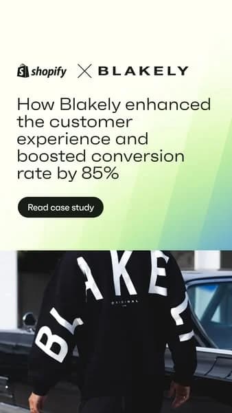
Shopify x Blakely — Split Screen Case Study — Fashion Ad Example
This ad employs a split-screen layout, effectively dividing the frame into a text-dominant top section and a brand-visual bottom. The top half leverages a clean white background with a subtle green-blue gradient, providing excellent contrast for the bold, black headline. This immediately highlights a compelling success metric (85% conversion boost) from a Shopify client, Blakely, positioning Shopify as a powerful growth partner. The composition guides the eye from the brand logos to the key benefit, then to a clear call-to-action. The bottom half grounds the abstract success with a tangible product shot, reinforcing Blakely's brand identity. This blend of data-driven messaging and aspirational imagery is optimized for platforms like Instagram, where a vertical format and strong visual hierarchy are crucial for stopping the scroll and driving consideration among business owners. The minimalist aesthetic with high-impact numbers appeals to a professional audience seeking proven solutions.
Why This Ad Works
Clear Value Proposition & CTA
The headline immediately communicates a significant business benefit – an 85% conversion rate boost – and a clear call to action. This directly addresses the pain points and growth goals of potential Shopify users, positioning the platform as a solution provider. This direct, results-oriented messaging is highly effective for driving consideration among business owners.
Visual Client Brand Reinforcement
The bottom half visually showcases the client brand, Blakely, through their product. This provides tangible proof of the type of successful businesses Shopify supports and adds a relatable, aspirational element for other e-commerce entrepreneurs. Seeing a real-world application strengthens the case study's credibility and impact.
High-Contrast Text Readability
The white text on a subtle gradient background in the top section ensures excellent readability, making the crucial performance metric and headline easily digestible. The black CTA button with contrasting white text further enhances visibility, ensuring the primary action stands out effectively against the lighter background, minimizing friction for engagement.
Ad Specs
Color Palette
Original Ad Copy
How to Clone This Ad
From reference to ready-to-run ad
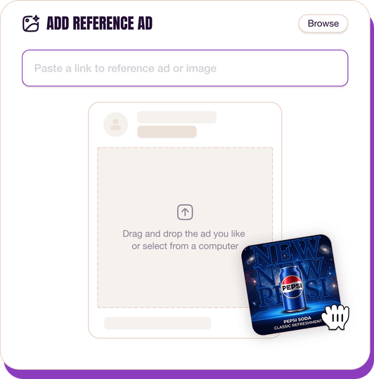
Pick a reference ad
Browse the library or upload any ad spotted in the wild.
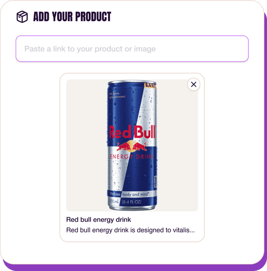
Upload a product photo
Any angle, any background. One photo is enough.
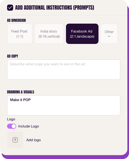
Customize the ad
Pick dimensions, add ad copy, upload your logo — AdDogs handles the rest.
Get your ad in every format, for every platform
Instagram, Facebook, TikTok, LinkedIn, Google — every ad size generated in one shot.
What You Could Improve
Integrate a direct testimonial quote
While the case study headline is strong, adding a short, impactful quote from Blakely's founder could personalize the success story. Direct testimonials often build more trust and emotional connection, enhancing relatability and making the success feel more attainable for the target audience.
Add subtle animation for engagement
For dynamic platforms like Instagram Stories, a subtle animation (e.g., a slight zoom on the product or a text reveal) could significantly increase engagement. Static ads can be overlooked; dynamic elements capture attention more effectively in fast-paced feeds, encouraging longer view times.
Questions
AdDogs rebuilds the ad with your product photo and extracts your brand colors automatically from your logo. Same layout and composition — your product, your brand.
Pick your dimension per generation. Basic includes 3 dimensions: square (1:1) for Instagram and Facebook feeds, portrait (9:16) for Stories and Reels, landscape (16:9) for Google Display and YouTube. Pro and Ultimate unlock all 14, including Pinterest (2:3), cinematic (21:9), and banners.
Built for software & tools and fashion & apparel products. The Split Screen composition works best when the product photo carries the persuasion. Any background, any angle — AdDogs handles the cutout.
One credit. $0.40 on the Basic plan ($12/mo for 30 credits), $0.33 on Pro. One credit produces one finished ad in the dimension you pick.
Fit-comparison split frames and on-model lifestyle — in that order for direct-response, reversed for brand-builders. Fit-comparison teaches shoppers why your cut is worth the price tag in under two seconds. Lifestyle builds long-term aided recall. Skip studio-on-white product shots at launch — they read as Amazon, not as brand.
True Classic, Quince, and Mack Weldon lead men's DTC. Aritzia, Vuori, and Alo Yoga lead women's premium athleisure. Everlane and Skims run the heaviest transparency-priced and shapewear spend respectively. Each brand has a weekly creative rotation worth studying — True Classic alone runs 200+ active variants at any time on Meta.
More Fashion Ad Examples
View all

By Industry
By Format
Clone Your First Ad
Pick a template. Upload your product. Seconds later, you have an ad ready to launch. No design skills. No Photoshop.
Create your ad
