AdDogs

Vuori Ad Examples

Browse 30 Vuori ads ad examples sourced from high-performing campaigns. Clone any design, swap in your product, and get a finished ad in seconds.

Updated June 2026

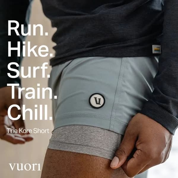
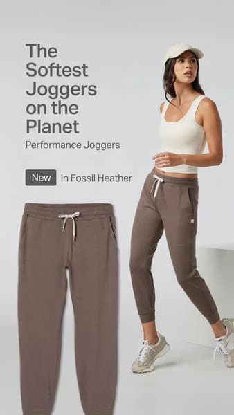
Vuori ads sit in a category Lululemon built and then vacated — performance apparel that doesn't look like performance apparel. Every frame shows a guy or woman mid-motion on a beach, in a hiking trail, on a coastal boardwalk. Shorts and joggers look like loungewear. That blur between gym clothes and real life is the whole product, and the ads sell it relentlessly.

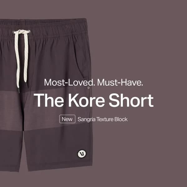
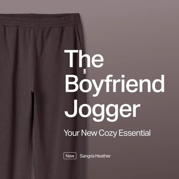
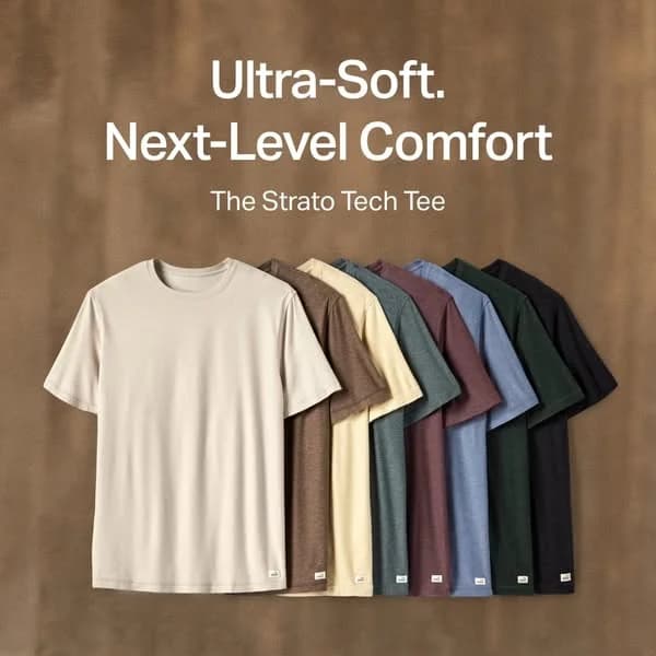
Visual system runs on earth tones. Warm sand, olive, charcoal, dusty blue, and cream. Backgrounds stay California coast — beaches, cliffs, desert trails, pine-tree golden hour. Models move through the frame rather than posing in it. Copy stays short and product-forward: "Our most comfortable jogger," "The pant you'll live in," "Built for every move." Instagram dominates the channel mix, Facebook runs secondary, and Pinterest drives discovery for the women's line. YouTube pre-roll handles longer lifestyle spots. Typography runs minimal — often a brand logo and a price, letting photography carry the load.

Our Vuori ad examples collection captures lifestyle stills, in-motion apparel shots, and outdoor-scene carousels that built the brand. Filter by format to find the golden-hour jogger shots, the surf-to-coffee lifestyle stills, and the minimal-typography product statics that repeat across placements. Each entry notes where the horizon line sits, how the earth-tone palette maps to the product colorway, and which location does the silent brand-building work.

Vuori Performance Joggers — Stacked Product Offer. Brand: Vuori. This ad effectively utilizes a clean, minimalist layout to highlight a product offer. A diagonal stack of Vuori performance joggers, showcasing various colors and textures, is positioned against a soft blue background. This composition creates visual interest and leads the eye directly to the product. The prominent "20% Off" text immediately conveys value, while the smaller supporting text clarifies the offer and product type. The muted color palette of the apparel complements the background, contributing to a premium and approachable brand aesthetic. Optimized for platforms like Instagram, its uncluttered design and clear value proposition are designed to stop the scroll and drive consideration. The text hierarchy guides the viewer from brand, to offer, to details, ensuring key information is easily digestible.. Headline: 20% Off. Primary text: Your First Purchase with Email Sign-up. Why this ad works: Clear, prominent discount messaging — The large, bold '20% Off' headline immediately captures attention and communicates a clear value proposition. This direct approach is highly effective in driving initial interest and urgency, prompting viewers to learn more about the offer. It leverages the psychological trigger of scarcity and savings, crucial for conversion-focused campaigns. Product stack showcases variety and quality — The neatly arranged stack of joggers effectively showcases the product's range of colors and quality fabric. This visual presentation allows potential customers to appreciate the variety and texture without needing multiple images, reinforcing the brand's commitment to diverse, high-quality activewear options. Clean, minimalist aesthetic enhances brand perception — The ad's clean aesthetic, with ample negative space and a soothing blue background, creates a premium and sophisticated brand image. This minimalist approach helps the product stand out, avoiding visual clutter and communicating a sense of calm and quality, which resonates well with the target activewear audience.. Specs: Brand: Vuori, Industry: Fashion & Apparel, Platform: Instagram, Format: Static, Audience: Women 25-34Vuori Women's Joggers — Colorful Product Lineup. Brand: Vuori. This ad effectively utilizes a clean, minimalist layout to showcase Vuori's Women's Performance Joggers. The vertical composition, with products neatly aligned against a soft lavender background, is optimized for mobile feed scrolling, particularly on platforms like Instagram. The color palette, featuring a range of muted yet distinct jogger colors, subtly communicates variety and premium quality without overwhelming the viewer. Text hierarchy is clear: the brand name is prominent, followed by a large, attention-grabbing discount, and then the condition for the offer. This direct approach, combined with the visual appeal of the product lineup, aims to drive immediate consideration and conversion. The generous negative space around the text and products ensures readability and a sophisticated brand image.. Headline: 20% Off. Primary text: Your First Purchase with Email Sign-Up. Why this ad works: Clear discount offer drives immediate action — The "20% Off" headline is the largest text element, immediately grabbing attention and communicating a strong incentive. This direct-response approach is highly effective for conversion-focused campaigns, reducing friction and encouraging users to click through and claim the offer. Product lineup showcases variety and quality — Displaying multiple joggers in different colors allows potential customers to visualize the range of options available. The neat, uniform presentation against a simple background highlights the product itself, suggesting a focus on quality and design, appealing to those seeking both style and comfort. Soft, inviting color palette creates premium feel — The pastel lavender background combined with the muted, earthy tones of the joggers creates a sophisticated and approachable aesthetic. This color choice avoids harshness, aligning with a lifestyle brand that emphasizes comfort and well-being, resonating with a target audience seeking premium activewear.. Specs: Brand: Vuori, Industry: Fashion & Apparel, Platform: Instagram, Format: Static, Audience: Women 25-34Vuori Kore Short — Diagonal Product Array. Brand: Vuori. This ad leverages a clean, minimalist layout to effectively showcase the Vuori Kore Short collection. A dynamic diagonal arrangement of multiple color variants creates visual interest and implies a wide selection, with the lead short prominently displayed. The deep blue background provides excellent contrast, making the product colors pop and signaling a premium, athletic brand aesthetic. Text hierarchy is simple and effective: a bold, benefit-driven headline "One Short. Every Sport." immediately communicates versatility, followed by the product name "Kore Short." This composition is optimized for platforms like Instagram, where strong visuals and concise messaging quickly capture attention. Ample negative space ensures readability and focuses viewer attention squarely on the product line, reinforcing brand identity through consistent logo placement. The overall design conveys functionality and style, appealing to an active audience.. Headline: One Short. Every Sport.. Why this ad works: Diagonal product array highlights variety — The shorts are arranged diagonally, creating a dynamic visual flow that draws the eye across the product line. This technique effectively showcases multiple color options without clutter, implying a wide selection and versatility. It's visually engaging and prevents the ad from feeling static, appealing to active consumers seeking choice. Bold headline communicates core benefit instantly — The headline "One Short. Every Sport." is concise, impactful, and immediately conveys the product's key selling proposition: versatility. This direct messaging resonates with active individuals seeking multi-functional apparel, quickly establishing value and relevance. Its prominent placement ensures high visibility and immediate comprehension, crucial for scroll-stopping ads. High contrast background enhances product visibility — The deep blue background provides a strong, clean contrast against the various short colors, making each product stand out distinctly. This strategic color choice enhances visual clarity and ensures the shorts are the undeniable focal point. High contrast is vital for mobile feed visibility, where ads compete for attention against diverse content.. Specs: Brand: Vuori, Industry: Sports & Fitness, Platform: Instagram, Format: Static, Audience: Men 25-34Vuori Kore Short — Multi-Color Product Lineup. Brand: Vuori. This ad effectively utilizes a clean, minimalist layout to showcase the Vuori Kore Short in multiple colorways. The diagonal composition of the shorts creates dynamic visual interest while maintaining order, guiding the viewer's eye across the product range. A deep blue background provides strong contrast, making the product colors pop and signaling a premium, athletic aesthetic. The prominent headline, "One Short. Every Sport.", immediately communicates the product's core value proposition and versatility, optimized for quick comprehension on mobile feeds like Instagram. Text hierarchy is clear: a bold, benefit-driven headline followed by the product name, ensuring key information is easily absorbed. The overall design leverages color psychology with cool, earthy tones, appealing to an active, style-conscious male audience seeking functional yet fashionable athletic wear. The low text density keeps the focus on the product's visual appeal and quality.. Headline: One Short. Every Sport.. Why this ad works: Diagonal Product Lineup for Visual Flow — The shorts are arranged diagonally, creating a sense of movement and guiding the eye from the prominent lead product through the color variations. This dynamic composition prevents a static feel, making the ad more engaging and encouraging exploration of the full range of options available to the consumer. Strong Color Contrast for Product Pop — The deep, solid blue background provides a high-contrast canvas for the various short colors. This strategic choice ensures each product stands out distinctly, enhancing visual appeal and making the different options immediately noticeable in a busy social feed, capturing attention effectively. Clear, Benefit-Driven Headline — The headline "One Short. Every Sport." is concise and powerful, immediately communicating the product's versatility and core value proposition. This direct messaging resonates with active consumers looking for multi-functional apparel, quickly establishing relevance and driving consideration for the product's utility.. Specs: Brand: Vuori, Industry: Sports & Fitness, Platform: Instagram, Format: Static, Audience: Men 25-34Vuori Kore Short — Multi-Color Product Lineup. Brand: Vuori. This ad effectively utilizes a clean product-on-background layout to showcase the Vuori Kore Short. The diagonal arrangement of multiple colorways creates a dynamic visual flow, guiding the viewer's eye across the product range and emphasizing variety. The muted, earthy color palette conveys a sense of premium versatility, aligning with modern athletic wear trends. Compositionally, the shorts occupy the upper half, leaving generous negative space at the bottom for clear, impactful text. The bold headline, "One Short. Every Sport.", immediately communicates the product's core benefit. This aesthetic is highly optimized for visual platforms like Instagram, where high-quality product photography and concise messaging drive engagement and scroll-stopping power. The low text overlay ensures product focus.. Headline: One Short. Every Sport.. Primary text: Kore Short. Why this ad works: Diagonal composition highlights product variety — The angled, overlapping presentation of multiple shorts effectively showcases the product's diverse colorways. This dynamic visual guides the eye across the entire range, emphasizing choice and versatility without appearing cluttered. It's more engaging than a static grid, drawing viewers deeper into the product offering. Muted color palette signals premium versatility — The selection of earthy, desaturated tones communicates a sophisticated, versatile aesthetic. This avoids overly bright, generic athletic wear, appealing to a demographic seeking understated style that transitions seamlessly from workout to casual wear, reinforcing the 'Every Sport' message with a premium feel. Benefit-oriented headline drives immediate engagement — The headline "One Short. Every Sport." immediately communicates the product's core value proposition: ultimate versatility. This concise, powerful statement resonates with active consumers looking for multi-functional apparel, directly addressing a common need in the fitness market and clearly defining the product's utility.. Specs: Brand: Vuori, Industry: Sports & Fitness, Platform: Instagram, Format: Static, Audience: Men 25-34Vuori Kore Short — Diagonal Product Array. Brand: Vuori. This ad effectively utilizes a clean, minimalist layout to showcase product versatility and range. The diagonal composition of multiple shorts in a gradient of muted colors creates visual interest and implies a comprehensive collection. The generous negative space of the grey background allows the products to stand out without distraction. Text hierarchy is clear: a bold, benefit-driven headline "One Short. Every Sport." immediately communicates the product's core value, followed by the product name "Kore Short." This design is optimized for platforms like Instagram, where scroll-stopping visuals and concise messaging are key. The color palette, featuring natural and versatile tones, appeals to an active, style-conscious audience, reinforcing the brand's premium yet functional positioning. The arrangement subtly guides the eye across the product line, encouraging exploration.. Headline: One Short. Every Sport.. Primary text: Kore Short. Why this ad works: Diagonal Product Array for Visual Flow — The diagonal arrangement of shorts creates a dynamic visual flow, guiding the viewer's eye across the product range and different color options. This technique adds sophistication beyond a simple grid, making the collection feel curated and inviting exploration, crucial for apparel consideration and engagement on visual platforms. Benefit-Driven Headline for Immediate Value — The bold headline "One Short. Every Sport." immediately communicates the product's primary benefit: versatility. This direct, concise messaging resonates with active consumers seeking multi-functional apparel, quickly establishing value and relevance in a crowded feed environment and driving initial interest. Muted Color Palette Signals Modern Functionality — The selection of muted, earthy tones for the shorts, set against a neutral grey background, conveys a sense of modern, understated style and functionality. This color psychology appeals to a demographic that values performance wear that also looks good for everyday wear, enhancing brand perception and broadening appeal.. Specs: Brand: Vuori, Industry: Sports & Fitness, Platform: Instagram, Format: Static, Audience: Men 25-34Vuori Kore Short — Multi-Color Product Array. Brand: Vuori. This ad effectively uses a clean, minimalist layout to showcase the Vuori Kore Short's versatility and color range. The diagonal composition of multiple shorts creates visual interest and implies abundance, while the consistent branding (Vuori logo) reinforces recognition. The deep blue background provides a strong, masculine contrast, making the product colors pop and signaling reliability and performance. Text hierarchy is clear: a bold, benefit-driven headline "One Short. Every Sport." immediately communicates value, followed by the product name "Kore Short." This simple, direct approach is optimized for platforms like Instagram, where quick comprehension and strong visuals drive engagement. The ample negative space ensures the product remains the hero, preventing visual clutter and focusing the viewer's attention on the product's aesthetic and implied functionality.. Headline: One Short. Every Sport.. Primary text: Kore Short. Why this ad works: Diagonal Product Array Highlights Variety — The shorts are arranged diagonally, showcasing multiple colorways simultaneously. This composition technique effectively communicates the product's range and versatility, appealing to consumers who value choice and can envision themselves in different styles. It's more dynamic than a flat lay, drawing the eye across the selection and implying movement and activity. Benefit-Driven Headline for Immediate Value — The headline "One Short. Every Sport." is concise and powerful, immediately conveying the core benefit of the Kore Short: its multi-functional utility. This direct messaging resonates with active audiences seeking versatile apparel, driving consideration by addressing a common need and promising a single solution for diverse activities. Strong Brand Integration and Recognition — The visible Vuori logo on each short, though subtle, reinforces brand identity across the product display. This consistent visual cue builds brand recognition and trust, especially important for DTC brands where brand loyalty is cultivated through repeated, positive visual associations. It subtly communicates quality and authenticity without being overtly promotional.. Specs: Brand: Vuori, Industry: Sports & Fitness, Platform: Instagram, Format: Static, Audience: Men 25-34Vuori Halo Set — Lifestyle & Product Split. Brand: Vuori. This ad employs a clever split-screen layout, effectively showcasing both the product's individual detail and its aspirational lifestyle application. On the left, the apparel is presented flat, highlighting texture and design elements, while the right features a model embodying the brand's relaxed, active aesthetic. The earthy brown palette, set against a serene blue sky and concrete backdrop, evokes a sense of natural comfort and versatility, appealing to a target audience seeking both style and functionality. Text hierarchy is clear, with the product names prominently displayed on a contrasting dark block, ensuring readability and guiding the viewer towards the "Shop The Look" call to action. This composition is well-optimized for social feeds like Instagram, where a blend of product clarity and lifestyle inspiration drives engagement and consideration. The overall clean and minimalist vibe reinforces the premium positioning of the activewear.. Headline: The Halo Baby Tee + The Halo Essential Wideleg. Primary text: Featured in Java. Why this ad works: Split Layout for Detail & Aspiration — The ad strategically uses a split layout to present the product in two ways. On the left, the individual garments allow for close inspection of fabric and design, while the right features a model wearing the outfit, providing aspirational context and demonstrating fit. This dual approach caters to both practical and emotional buying triggers. Earthy Palette Signals Versatility & Comfort — The choice of a rich brown ("Java") against a soft blue sky and concrete background creates a natural, grounded aesthetic. This earthy color palette communicates comfort, versatility, and a connection to an active, outdoor lifestyle, resonating with consumers seeking functional yet stylish activewear that transcends gym use. Clear Text Hierarchy on Contrasting Block — The dark lower section with white text ensures excellent readability for the product names and call to action. By isolating this information, the ad effectively guides the viewer's eye from the visual content to the purchase prompt, reducing cognitive load and improving the efficiency of the ad's message delivery.. Specs: Brand: Vuori, Industry: Fashion & Apparel, Platform: Instagram, Format: Static, Audience: Women 25-34Vuori Boyfriend Jogger — Minimal Product Shot. Brand: Vuori. This ad employs a clean, split-screen layout, positioning the Vuori Boyfriend Jogger prominently on the left, cropped to highlight its texture and fit. The monochromatic color scheme, featuring a rich 'Sangria Heather' brown, evokes warmth, comfort, and understated luxury, aligning perfectly with the athleisure market. White text provides excellent contrast, ensuring immediate readability on mobile platforms like Instagram. The composition uses negative space effectively on the right to present a clear text hierarchy: the large product name, followed by a concise benefit statement, and finally, newness and color details. This structure guides the viewer's eye efficiently. Optimized for social feeds, its minimalist design and strong visual contrast are designed to stop the scroll, communicating brand aesthetic and product appeal quickly without overwhelming the user. The focus is on product quality and comfort.. Headline: The Boyfriend Jogger. Primary text: Your New Cozy Essential. Why this ad works: Monochromatic Palette for Brand Cohesion — The ad leverages a sophisticated monochromatic color scheme, using varying shades of 'Sangria Heather'. This creates a harmonious, premium feel that reinforces Vuori's brand identity for elevated comfort wear. It allows the product to blend seamlessly yet stand out, signaling quality and style. Strategic Cropping Highlights Product Detail — The close-up, cropped view of the jogger focuses attention on the fabric texture, waistband, and pocket detail. This technique builds intrigue and emphasizes the garment's quality and comfort features, inviting viewers to imagine the feel and fit without showing the full product. Clear Text Hierarchy for Quick Comprehension — The ad uses a distinct text hierarchy, with "The Boyfriend Jogger" as the dominant headline, followed by the benefit "Your New Cozy Essential," and then product specifics. This guides the viewer's eye efficiently, ensuring the key message and product identity are absorbed instantly, crucial for fast-scrolling feeds.. Specs: Brand: Vuori, Industry: Fashion & Apparel, Platform: Instagram, Format: Static, Audience: Women 25-34Vuori Performance Set — Lifestyle & Product Showcase. Brand: Vuori. This ad effectively blends aspirational lifestyle imagery with clear product presentation, optimized for visual platforms like Instagram. The composition features a model wearing the outfit on the right, set against a serene beach backdrop, while isolated product shots of the top and joggers float on the left. This split layout allows viewers to visualize the apparel in context and examine individual items. The earthy, muted color palette of the clothing harmonizes with the natural environment, evoking comfort, versatility, and an active, relaxed lifestyle. Text hierarchy is simple: a prominent "Shop The Look" callout guides engagement, followed by specific product names. This clean, direct approach minimizes visual clutter, focusing attention on the premium activewear and its desirable aesthetic.. Headline: Shop The Look. Primary text: The Halo Performance Crop + The Performance Jogger. Why this ad works: Integrated lifestyle and product display — By showcasing the outfit on a model in an aspirational outdoor setting, alongside clear, isolated product shots, the ad addresses both emotional desire and practical detail. This dual approach helps potential customers visualize themselves in the clothing while also inspecting the items closely, streamlining the path to purchase. Natural, earthy color palette — The ad's muted brown tones, complemented by the sandy beach and distant ocean, create a cohesive and calming aesthetic. This natural color scheme resonates with wellness and outdoor activities, conveying comfort, authenticity, and versatility. It effectively positions the brand within a healthy, active lifestyle segment. Clear product identification and call to action — The prominent "Shop The Look" text, immediately followed by specific product names, provides clear guidance. This direct textual hierarchy reduces cognitive load, making it effortless for viewers to understand what's being offered and how to explore it further. This clarity is crucial for driving engagement and conversion intent.. Specs: Brand: Vuori, Industry: Fashion & Apparel, Platform: Instagram, Format: Mixed, Audience: Women 25-34Vuori DreamKnit — Multi-Panel Lifestyle Showcase. Brand: Vuori. This vertical multi-panel ad effectively showcases Vuori's new DreamKnit™ collection, leveraging a collage layout to tell a comprehensive product story. The top panel highlights fabric detail and pocket functionality, the middle introduces the model and product name, and the bottom provides a full-body view, creating a holistic impression. The soft "Sea Spray Heather" color palette evokes tranquility and comfort, aligning with the brand's relaxed, active lifestyle positioning. Text hierarchy places the aspirational "California Dreaming" prominently, followed by product specifics, guiding the viewer's eye. Optimized for vertical platforms like Instagram Stories or Reels, its clean composition and inviting imagery are designed to stop the scroll and build brand affinity, emphasizing both aesthetic appeal and practical wearability.. Headline: California Dreaming. Primary text: New In DreamKnit™ Sea Spray Heather vuori. Why this ad works: Multi-panel layout for comprehensive product storytelling — The vertical collage effectively breaks down product features and benefits. The top panel focuses on material and detail, the middle on brand and newness, and the bottom on the full lifestyle look. This layered approach provides more information than a single shot, engaging viewers through progressive disclosure and building a complete picture of the apparel. Soft color palette evokes comfort and tranquility — The "Sea Spray Heather" color, a muted teal, combined with a neutral background, creates a calming and inviting aesthetic. This color psychology aligns perfectly with activewear designed for comfort and relaxation, appealing to consumers seeking a serene and effortless lifestyle. It subtly communicates the product's soft feel and wearability. Aspirational lifestyle combined with product detail — The ad successfully blends aspirational lifestyle imagery (the relaxed model, the "California Dreaming" text) with specific product details like the fabric name and close-up of the garment. This combination allows the ad to sell both the emotional benefit of the lifestyle and the tangible features of the clothing, appealing to both desire and practicality.. Specs: Brand: Vuori, Industry: Fashion & Apparel, Platform: Instagram, Format: Carousel/Collage, Audience: Women 25-34Vuori Sunday Jogger — Multi-Color Product Display. Brand: Vuori. This ad effectively showcases Vuori's Sunday Performance Jogger in new colors using a clean, minimalist layout. The staggered arrangement of four joggers creates depth and highlights the color variety, appealing to visual shoppers on platforms like Instagram. The cool blue-grey background provides a subtle contrast that makes the product colors pop without being distracting. Text hierarchy is clear: the main product name is prominent, followed by key features like "4-Way Stretch" and "Made With 88% Recycled Materials," which resonate with eco-conscious and active consumers. The composition is optimized for mobile, ensuring all critical information and product details are visible within a vertical frame. The overall aesthetic communicates comfort, performance, and sustainability, aligning with the brand's premium activewear positioning. The negative space around the products allows for easy visual processing.. Headline: The Sunday Performance Jogger. Primary text: New Colors 4-Way Stretch Made With 88% Recycled Materials. Why this ad works: Staggered product display highlights variety — The arrangement of four joggers, slightly overlapping and receding, effectively showcases the new color range. This visual technique allows consumers to quickly grasp the available options, driving interest and perceived value in a single glance. It's more engaging than a simple grid, encouraging exploration of the collection. Clear feature callouts enhance value — Key benefits like "4-Way Stretch" and "Made With 88% Recycled Materials" are presented with simple icons, making them easy to digest. This immediately communicates the product's functional advantages and ethical sourcing, appealing to target audiences who prioritize both performance and sustainability in their activewear choices. Minimalist background ensures product focus — The muted blue-grey background provides a clean, uncluttered canvas that allows the joggers' colors and textures to be the primary focus. This minimalist approach prevents visual distraction, ensuring the product itself is the hero, which is crucial for direct-to-consumer apparel advertising on visual platforms like Instagram.. Specs: Brand: Vuori, Industry: Fashion & Apparel, Platform: Instagram, Format: Static, Audience: Men 25-34Vuori Kore Short — Testimonial Product Grid. Brand: Vuori. This ad effectively combines social proof with product variety in a clean, mobile-first layout. The top half is dominated by a compelling customer testimonial and strong review count, immediately establishing trust and product benefit. The muted green background provides a natural, activewear-appropriate palette, allowing the various short colors to pop without visual clutter. The grid composition in the lower half showcases product diversity, appealing to different style preferences. Text hierarchy is clear: product name, then social proof, then the testimonial as the primary message. This structure is optimized for quick consumption on platforms like Instagram, where users scroll rapidly, ensuring key selling points are absorbed efficiently. The overall clean aesthetic reinforces the brand's premium, active lifestyle positioning.. Headline: The Kore Short. Primary text: "Super Versatile. Maximum Comfort In Every Application!" — Matt F. Verified Customer. Why this ad works: Prominent social proof builds immediate trust — The ad strategically places a 5-star rating and "22k+ 5 Star Reviews" directly above a powerful customer testimonial. This immediate display of social proof at the top of the ad quickly establishes credibility and reduces purchase friction, making the product more appealing to new customers. Testimonial highlights key product benefits — The chosen testimonial, "Super Versatile. Maximum Comfort In Every Application!", directly addresses core benefits of activewear: versatility and comfort. This speaks to the target audience's needs and desires, providing a relatable and persuasive endorsement from a verified customer, enhancing perceived value. Product grid showcases variety and choice — Displaying six different colorways of the Kore Short in a clear grid format effectively communicates the product's range. This visual variety allows potential customers to quickly identify a style that suits them, increasing engagement and the likelihood of clicking through to explore options.. Specs: Brand: Vuori, Industry: Fashion & Apparel, Platform: Instagram, Format: Static, Audience: Men 25-34Vuori Kore Short — Product Hero Shot. Brand: Vuori. This ad effectively utilizes a minimalist product hero shot to highlight the Vuori Kore Short. The layout positions the product prominently on the left, with ample negative space on the right for concise, impactful text. The monochromatic color palette, featuring a deep sangria background matching the shorts, creates a sophisticated and cohesive visual identity, reinforcing brand aesthetic. High contrast between the white text and dark background ensures readability, optimized for quick scanning on platforms like Instagram. The composition guides the eye from the product to the bold product name, then to the descriptive sub-text, establishing a clear hierarchy. This design strategy prioritizes product visibility and brand recognition, making it highly effective for new product variant launches.. Headline: Most-Loved. Must-Have.. Primary text: The Kore Short New Sangria Texture Block. Why this ad works: Monochromatic palette enhances brand sophistication — The deep sangria background perfectly complements the shorts, creating a harmonious and premium feel. This color choice avoids visual clutter, allowing the product's texture and details to stand out subtly. It reinforces Vuori's elevated athletic wear positioning, appealing to a discerning audience. Strategic negative space for clear focus — By placing the product on the left and dedicating significant space to the right for text, the ad achieves visual balance. This negative space prevents the image from feeling crowded, directing the viewer's attention directly to the product and the key messaging without distraction, improving message retention. Clear text hierarchy drives immediate understanding — The ad employs a clear hierarchy: "Most-Loved. Must-Have." as a strong hook, followed by the large product name "The Kore Short," and then the "New Sangria Texture Block" detail. This guides the viewer through the information efficiently, communicating desirability and novelty quickly.. Specs: Brand: Vuori, Industry: Fashion & Apparel, Platform: Instagram, Format: Static, Audience: Men 25-34Vuori Strato Tech Tee — Stacked Product Display. Brand: Vuori. This ad employs a clean, minimalist layout with a diagonal composition of stacked t-shirts, drawing the eye towards the highlighted "Pool Blue Heather" tee. The muted blue background provides a serene canvas, enhancing the product's soft, comfortable appeal through color psychology. White, sans-serif typography creates a clear hierarchy: a bold, benefit-driven headline ("Ultra-Soft. Next Level Comfort.") immediately captures attention, followed by the product name and a "New" color callout. This vertical format is optimized for mobile platforms like Instagram, where its uncluttered design and strong visual focus on product quality can effectively stop the scroll. The ample negative space ensures readability and a premium brand perception, aligning with Vuori's activewear aesthetic.. Headline: Ultra-Soft. Next Level Comfort.. Primary text: The Strato Tech Tee. Why this ad works: Diagonal Product Stacking for Visual Flow — The diagonal arrangement of multiple t-shirts creates a dynamic visual path, guiding the viewer's eye from the top-right down to the prominent blue tee and accompanying text. This technique adds depth and showcases color variety without clutter, making the ad feel organized and premium, ideal for apparel browsing. Benefit-Driven Headline with Clear Hierarchy — The large, white headline "Ultra-Soft. Next Level Comfort." immediately communicates key product benefits. Its prominent placement and size ensure instant comprehension, appealing to consumer desires for quality and feel. The smaller product name and new color highlight provide essential details without overwhelming the primary message. Calming Color Palette Enhances Comfort Message — The muted blue background combined with the earthy tones of the shirts creates a harmonious and calming aesthetic. This color psychology reinforces the "comfort" aspect of the product, evoking feelings of relaxation and ease. It positions the brand as sophisticated and approachable, resonating with a lifestyle-focused audience.. Specs: Brand: Vuori, Industry: Fashion & Apparel, Platform: Instagram, Format: Static, Audience: Men 25-34Vuori Aspen Shirt Jacket — Minimalist Hero Shot. Brand: Vuori. This ad employs a minimalist hero shot layout, centering the Vuori Aspen Shirt Jacket against a clean, light background. The monochromatic neutral color palette of beige and off-white conveys a sense of understated luxury and versatility, appealing to a sophisticated audience. Compositionally, the product hangs naturally, drawing the eye directly to its texture and form. The clear text hierarchy features a bold, benefit-driven headline, "Crafted Like A Shirt. Built Like A Jacket.", immediately communicating the product's unique value proposition. Supporting text details key features like water-resistance. Optimized for vertical platforms like Instagram Stories or Reels, the ad's clean aesthetic and strong visual focus cut through feed clutter, ensuring high readability and product prominence. The overall design effectively positions the garment as a premium, functional staple.. Headline: Crafted Like A Shirt. Built Like A Jacket.. Primary text: Water-resistant, breathable, and designed to stop wind chill.. Why this ad works: Clean, minimalist aesthetic highlights product — The simple background and neutral colors ensure the shirt jacket is the undisputed focal point. This reduces cognitive load and allows the viewer to appreciate the product's texture and form without distraction, signaling premium quality and effortless style to the target demographic. Benefit-driven headline creates intrigue — "Crafted Like A Shirt. Built Like A Jacket." immediately communicates the product's dual functionality and unique selling proposition. This concise, impactful phrasing piques interest and clearly defines the product's value, appealing to practical consumers seeking versatile, high-performance apparel. Monochromatic palette conveys versatility and quality — The use of a single, soft neutral color scheme for both the product and background creates a harmonious, sophisticated look. This palette suggests the garment's adaptability for various outfits and occasions, while subtly reinforcing a premium, durable brand image.. Specs: Brand: Vuori, Industry: Fashion & Apparel, Platform: Instagram, Format: Static, Audience: Men 25-34Vuori Strato Tech Tee — Multi-Color Product Lineup. Brand: Vuori. This ad effectively utilizes a clean, minimalist layout to showcase the Vuori Strato Tech Tee in multiple colorways. The staggered arrangement of the five shirts creates a sense of depth and variety, drawing the eye from the prominent white tee to the darker shades. Ample negative space, provided by the warm, earthy background, ensures the products remain the focal point, enhancing visual clarity. The color palette, featuring natural tones, aligns with Vuori's active lifestyle brand identity, suggesting comfort and versatility. Text hierarchy is clear: a large, bold headline introduces the product, followed by a concise benefit statement and feature icons, guiding the viewer through key information. This vertical format is optimized for platforms like Instagram Stories or Reels, where clean aesthetics and quick information absorption are crucial for engagement. The composition is simple yet effective, communicating product range and core benefits efficiently.. Headline: The Strato Tech Tee. Primary text: Made for every day and every move. 4-Way Stretch Moisture-Wicking. Why this ad works: Staggered product lineup highlights variety — The diagonal, staggered arrangement of five shirts immediately communicates the product's color range. This visual technique allows viewers to quickly grasp the available options without clutter, making the ad efficient for showcasing product diversity in a single frame, which is crucial for engagement on fast-scrolling feeds. Earthy color palette reinforces brand identity — The warm, neutral background complements the natural tones of the shirts, creating a cohesive and inviting aesthetic. This color choice aligns perfectly with Vuori's brand image of active, comfortable, and versatile wear, resonating with an audience seeking understated quality and a connection to nature. Clear feature callouts drive product understanding — Below the product, distinct icons and concise text highlight "4-Way Stretch" and "Moisture-Wicking." This direct presentation of key benefits helps potential customers quickly understand the functional advantages of the Strato Tech Tee, addressing practical needs and enhancing product appeal in a glance.. Specs: Brand: Vuori, Industry: Fashion & Apparel, Platform: Instagram, Format: Static, Audience: Men 25-34Vuori Halo Hoodie — Clean Product Showcase. Brand: Vuori. This ad effectively utilizes a minimalist product-on-background layout to highlight the Vuori Halo Performance Hoodie. The muted blue-grey background complements the "Smoke Blue Heather" product, creating a cohesive and calming aesthetic that signals comfort and quality. The central placement of the hoodie ensures immediate product recognition, while the prominent headline "The Softest Hoodie Ever" establishes a key benefit upfront. Below, three distinct icons visually communicate core features like 4-way stretch and moisture-wicking, enhancing perceived value without clutter. This composition is optimized for platforms like Instagram, where clean visuals and clear value propositions capture attention, making it ideal for a product launch aiming for broad awareness and consideration. The text hierarchy guides the eye from the aspirational headline to the functional benefits.. Headline: The Softest Hoodie Ever. Primary text: Halo Performance Hoodie. Why this ad works: Muted Color Palette Enhances Product Focus — The harmonious blue-grey background perfectly complements the hoodie's "Smoke Blue Heather" color. This low-contrast, monochromatic approach prevents visual distraction, allowing the product to be the undisputed focal point, which is crucial for apparel advertising where product clarity drives interest and consideration. Clear Feature Callouts with Icons — The use of three distinct icons for "4-Way Stretch," "Moisture-Wicking," and "Made With Recycled Materials" provides quick, digestible information. This visual shorthand effectively communicates key benefits, appealing to consumers who quickly scan ads for relevant product attributes and value propositions, boosting engagement. Benefit-Driven Headline Establishes Value — The headline "The Softest Hoodie Ever" immediately communicates a strong, desirable benefit. This aspirational claim creates intrigue and sets a high expectation for comfort and quality, directly addressing a common consumer desire for activewear and casual apparel, driving initial interest and click-throughs.. Specs: Brand: Vuori, Industry: Fashion & Apparel, Platform: Instagram, Format: Static, Audience: Fitness EnthusiastsVuori Meta Pant — Multi-Color Product Showcase. Brand: Vuori. This ad employs a clean, product-focused layout, showcasing multiple colorways of "The Meta Pant" in a dynamic diagonal arrangement against a warm, muted background. The left side is dedicated to a clear text hierarchy: a bold headline, followed by the product name, and then three key features with intuitive icons. This composition effectively balances product display with benefit communication. The earthy color palette conveys sophistication and versatility, aligning with the brand's premium activewear positioning. Optimized for visual platforms like Instagram, the ad's high contrast white text against the warm background ensures readability and scroll-stopping power. The strategic use of negative space around the product draws the eye, while the feature icons enable quick information absorption, making it effective for driving initial product awareness.. Headline: The Ultimate Commuter Pant. Primary text: The Meta Pant 4-Way Stretch Quick-Drying Moisture-Wicking. Why this ad works: Diagonal product display highlights variety — The diagonal arrangement effectively showcases multiple colorways without clutter. This visual technique implies breadth of choice and versatility, appealing to consumers who value options. It also creates a dynamic flow, making the ad more engaging than a static grid of individual products. Clear feature icons enhance readability — Pairing concise text with universally understood icons for "4-Way Stretch," "Quick-Drying," and "Moisture-Wicking" significantly improves information absorption. This visual shorthand allows for quick scanning, ensuring key benefits are communicated efficiently, especially on mobile platforms where attention spans are short and visuals dominate. Muted color palette conveys sophistication — The choice of a warm, muted background combined with the earthy tones of the pants creates a premium yet approachable aesthetic. This palette avoids harshness, aligning with a lifestyle brand that emphasizes comfort and understated style, attracting a discerning audience seeking quality and versatility in their apparel.. Specs: Brand: Vuori, Industry: Fashion & Apparel, Platform: Instagram, Format: Static, Audience: Women 25-34Vuori Joggers — Product Lineup with Offer. Brand: Vuori. This ad employs a clean, minimalist layout to showcase a range of Vuori joggers. The staggered arrangement of multiple product colors creates visual depth and highlights variety without clutter. A neutral grey background ensures the apparel colors pop, appealing to a demographic valuing understated style and versatility. The text hierarchy is clear: brand at the top, followed by a prominent '20% Off' headline, and a smaller, conditional sub-headline. This direct offer is optimized for platforms like Instagram, where quick comprehension and a clear value proposition drive engagement. The composition balances product display with effective promotional messaging, making it highly effective for conversion-focused campaigns.. Headline: 20% Off. Primary text: Your First Purchase with Email Sign-Up. Why this ad works: Clear Discount Offer Drives Action — The prominent '20% Off' headline immediately captures attention, signaling a strong value proposition. This direct approach is highly effective for driving immediate action and attracting new customers, especially when paired with a low-friction entry point like email sign-up. It leverages urgency and perceived value effectively. Product Variety Showcases Options — Displaying multiple colorways of the same jogger style effectively communicates product versatility and choice. This visual strategy helps potential customers envision the product fitting into their existing wardrobe, increasing appeal and reducing decision fatigue by presenting options upfront in a single glance, which is crucial for apparel. Clean, Aspirational Aesthetic Resonates — The minimalist layout with a neutral background and neatly arranged products aligns with Vuori's premium, active lifestyle brand image. This clean aesthetic enhances product focus, making the joggers appear high-quality and desirable. It resonates with an audience that values simplicity and sophisticated design in their activewear choices.. Specs: Brand: Vuori, Industry: Fashion & Apparel, Platform: Instagram, Format: Static, Audience: Men 25-34Vuori Performance Joggers — Split Product & Lifestyle. Brand: Vuori. This ad effectively uses a split-screen composition to showcase Vuori's joggers. The left side features a clean flat-lay product shot, highlighting the garment's texture and color, while the right side presents a lifestyle shot of a model wearing the joggers, demonstrating fit and real-world appeal. The minimalist grey background ensures the product and model remain the focal point, aligning with a clean, premium athleisure aesthetic. Text hierarchy is clear, with a bold headline immediately communicating the key benefit, followed by product type and new color details. This layout is optimized for Instagram, where visual storytelling and product detail are crucial for engagement and consideration. The muted, earthy color palette reinforces the brand's natural, comfortable vibe, appealing to an audience seeking comfort and style. The overall composition balances aspirational imagery with tangible product presentation, driving both awareness and consideration effectively.. Headline: The Softest Joggers on the Planet. Primary text: Performance Joggers New In Fossil Heather. Why this ad works: Dual product view enhances understanding — By combining a flat-lay and an in-use shot, the ad provides comprehensive product information. Viewers see the garment's material and detail up close, alongside how it drapes and fits on a real person, answering both "what it looks like" and "how it wears" questions simultaneously. This reduces friction in the consideration phase. Benefit-driven headline captures attention — The headline "The Softest Joggers on the Planet" immediately communicates a strong, desirable benefit. This bold claim creates intrigue and positions the product as superior, compelling the target audience to learn more. It's highly effective for scroll-stopping on platforms like Instagram where quick value propositions are key. Muted color palette conveys premium comfort — The use of earthy tones and a neutral background creates a sophisticated yet approachable aesthetic. This color psychology signals comfort, quality, and versatility, aligning perfectly with the athleisure market. It avoids overly bright or aggressive colors, appealing to a demographic seeking understated luxury and everyday wearability.. Specs: Brand: Vuori, Industry: Fashion & Apparel, Platform: Instagram, Format: Static, Audience: Women 25-34Vuori Performance Pants — GQ Award Product Display. Brand: Vuori. This ad effectively leverages social proof through a clean, vertical product display. The layout positions three pairs of Vuori performance pants against a muted teal background, creating a harmonious color palette that feels premium and understated. The GQ Fitness Awards logo and testimonial are prominently placed in the upper half, establishing immediate credibility and value proposition. The composition uses a slight diagonal arrangement for the pants, adding dynamic interest while maintaining a minimalist aesthetic. Text hierarchy is clear: the award logo draws initial attention, followed by the bold testimonial, and then its attribution. Optimized for vertical platforms like Instagram Stories or Reels, this ad aims to build consideration by associating the brand with recognized quality, appealing to an audience seeking comfort and luxury in their activewear. The low text-to-image ratio keeps the focus on the product and the powerful endorsement.. Headline: "IMPLAUSIBLY SOFT, BARELY-THERE FLEXIBLE, AND JUST LUXE ENOUGH". Primary text: — GQ 2024 Fitness Awards. Why this ad works: GQ Award testimonial builds instant credibility — Featuring the "GQ 2024 Fitness Awards" logo and quote immediately establishes a high level of trust and quality. This third-party endorsement acts as powerful social proof, significantly reducing perceived risk for potential customers and driving consideration for a premium product. Muted color palette signals premium quality — The deep teal background paired with the dark, earthy tones of the pants creates a sophisticated and minimalist aesthetic. This color choice avoids bright, aggressive marketing, instead conveying a sense of calm, luxury, and high-end performance, aligning with the "just luxe enough" testimonial. Vertical layout optimized for mobile feeds — The ad's vertical aspect ratio is perfectly suited for mobile-first platforms like Instagram Stories or Reels. This full-screen immersion captures attention more effectively than horizontal formats, ensuring the product and testimonial dominate the user's view, minimizing distractions and maximizing engagement.. Specs: Brand: Vuori, Industry: Fashion & Apparel, Platform: Instagram, Format: Static, Audience: Men 25-34Vuori Halo Collection — Lifestyle Product Shot. Brand: Vuori. This ad effectively blends lifestyle imagery with direct product information. The central model, wearing the full Vuori Halo Modern Collection, creates an aspirational yet approachable feel. The blurred outdoor background ensures the focus remains on the apparel, while the rich, earthy color palette of the clothing grounds the image, signaling comfort and versatility. Text hierarchy is clear: a prominent collection name, a key fabric highlight, and specific product callouts. This layered approach optimizes for platforms like Instagram, where users scroll quickly, offering both an engaging visual and immediate product identification. The overall composition balances aesthetic appeal with actionable shopping cues, driving interest in the new DreamKnit™ line.. Headline: The Halo Modern Collection. Primary text: New In DreamKnit™. Why this ad works: Lifestyle context enhances product appeal — The model in an urban outdoor setting showcases the apparel's versatility for everyday wear, not just active use. This broader context appeals to a wider audience, suggesting comfort and style beyond the gym, increasing perceived value and desirability, and broadening the product's market. Clear product callouts aid discovery — Specific labels for "The Halo Modern Full Zip" and "The Halo Modern Sweatpant" directly identify items. This eliminates guesswork, allowing viewers to quickly understand what they're seeing and potentially search for specific pieces, streamlining the path to purchase and reducing friction. “New In DreamKnit™” highlights innovation — Positioning the collection with "New In DreamKnit™" immediately signals innovation and a unique selling proposition. This creates intrigue and suggests superior comfort or performance, encouraging clicks from consumers seeking the latest and best in activewear fabrics, driving early adoption.. Specs: Brand: Vuori, Industry: Fashion & Apparel, Platform: Instagram, Format: Static, Audience: Women 25-34Vuori Fall Collection — Lifestyle Grid Layout. Brand: Vuori. This ad effectively uses a mixed layout, featuring a dominant lifestyle hero shot at the top, complemented by a three-panel product grid below. This composition strategy first captures attention with aspirational imagery, then provides detailed product views and variety. The color palette, dominated by muted, earthy tones like cream, grey, and subtle blues/purples, evokes comfort and versatility, perfectly aligning with fall fashion and activewear trends. The main model's gaze and the clear text placement in negative space guide the viewer's eye. Optimized for platforms like Instagram, where lifestyle visuals and multi-product displays drive engagement. The text hierarchy, with "Shop New Arrivals" as an introductory call and "Cozy. Comfortable. Fall-Ready." as benefit-driven headlines, is clear and readable, enhancing the ad's overall persuasive power.. Headline: Cozy. Comfortable. Fall-Ready.. Primary text: Shop New Arrivals. Why this ad works: Hero shot establishes aspirational lifestyle — The large top image features a model exuding comfort and style in an urban setting. This immediately connects with the target audience's desire for versatile, fashionable activewear that transitions seamlessly from workout to daily life, driving emotional resonance and brand appeal for Vuori. Multi-panel grid showcases product versatility — The three smaller images below effectively display additional products and styling options, including a close-up of a feature (pocket). This diverse visual offering allows potential customers to see the breadth of the fall collection and imagine themselves in different pieces, encouraging exploration and consideration. Benefit-driven copy resonates with seasonal needs — The headline "Cozy. Comfortable. Fall-Ready." directly addresses key consumer desires for autumn apparel. This concise, evocative language taps into seasonal trends and emotional comfort, making the product offering highly relevant and appealing to the target demographic and increasing click-through intent.. Specs: Brand: Vuori, Industry: Fashion & Apparel, Platform: Instagram, Format: Mixed, Audience: Women 25-34Vuori Daily Form Legging — Diagonal Product Display. Brand: Vuori. This ad effectively introduces a new product using a clean, minimalist layout optimized for mobile feeds. The diagonal arrangement of multiple leggings creates dynamic visual interest while showcasing color variety. A soft blue background provides ample negative space, ensuring the product remains the focal point. Text hierarchy is clear: "New" acts as an immediate hook, followed by the product name, "The Daily Form Legging," in a prominent, readable font. Color swatches reinforce choice. The composition is clean and uncluttered, leveraging color psychology with a calming blue to evoke comfort and versatility, aligning with an active lifestyle brand. This design is highly effective for Instagram, where visual appeal and quick information absorption are key for product launches.. Headline: The Daily Form Legging. Why this ad works: Diagonal Composition for Dynamic Appeal — The diagonal arrangement of the leggings creates a sense of movement and depth, making the static image more engaging. This technique draws the eye across the frame, showcasing multiple product variants without feeling cluttered, which is crucial for scroll-stopping on platforms like Instagram. Clear Product Launch Messaging — The prominent "New" badge combined with the large, clear product name "The Daily Form Legging" immediately communicates a product launch. This direct approach ensures viewers quickly understand the ad's purpose, driving early interest and consideration for the fresh offering. Color Swatches Enhance Product Choice — Including small, clickable color swatches directly below the headline visually reinforces the available options. This subtle design element helps potential customers visualize the product in their preferred shade, reducing friction in the decision-making process and encouraging engagement.. Specs: Brand: Vuori, Industry: Fashion & Apparel, Platform: Instagram, Format: Static, Audience: Women 25-34Vuori Halo Pullover — Lifestyle Product Shot. Brand: Vuori. This ad effectively uses a lifestyle product shot to convey comfort and style. The model, wearing the Halo Modern Pullover, occupies the majority of the frame, creating an immediate connection with the viewer. The clean, light background minimizes distractions, ensuring the vibrant purple garment stands out. Text hierarchy is clear: a bold, benefit-driven headline "Premium Feel. Effortless Style." immediately communicates value, followed by the product name and color options. This composition is optimized for platforms like Instagram, where aspirational imagery and concise messaging drive engagement. The color psychology of purple suggests luxury and creativity, aligning with the "premium" claim. The overall design balances product visibility with an inviting, relatable aesthetic, encouraging consideration.. Headline: Premium Feel. Effortless Style.. Primary text: The Halo Modern Pullover. Why this ad works: Benefit-driven headline captures attention — “Premium Feel. Effortless Style.” directly addresses desired outcomes. This concise, impactful phrasing immediately resonates with the target audience seeking comfort and aesthetic appeal in their activewear, driving higher engagement and click-through rates by articulating value upfront. It clearly positions the product's core value proposition. Vibrant product color against clean background — The bright purple pullover pops against the neutral, light background. This high contrast ensures the product is the undeniable focal point, making it visually striking in a busy feed and highlighting the garment's color options effectively. It aids in brand recognition and product recall for the specific item. Relatable model pose and expression — The model's relaxed, confident pose and direct gaze create an authentic, aspirational connection. She embodies the "effortless style" promised, making the product feel attainable and desirable. This human element significantly boosts engagement and encourages identification with the brand's lifestyle, fostering trust.. Specs: Brand: Vuori, Industry: Fashion & Apparel, Platform: Instagram, Format: Static, Audience: Women 25-34Vuori Strato Tech Tee — Multi-Color Product Lineup. Brand: Vuori. The ad employs a clean, minimalist layout, showcasing the Vuori Strato Tech Tee in multiple colorways against a warm, earthy background. The composition uses a staggered, overlapping arrangement to present product variety without clutter, guiding the eye from the prominent front tee to the receding colors. The large, bold white text "Ultra-Soft. Next-Level Comfort" immediately communicates key benefits, leveraging a clear hierarchy above the product name. This design is optimized for platforms like Instagram, where visual appeal and quick comprehension are crucial. The earthy color palette of both background and product line evokes a sense of natural comfort and premium quality, aligning with the brand's active lifestyle positioning. The ad effectively highlights product features and breadth of choice.. Headline: Ultra-Soft. Next-Level Comfort. Primary text: The Strato Tech Tee. Why this ad works: Benefit-driven headline highlights key product features — The prominent "Ultra-Soft. Next-Level Comfort" headline immediately communicates the primary value proposition. This direct approach quickly captures attention and informs the viewer about the product's core advantages, crucial for stopping scroll on busy feeds and driving initial interest in performance apparel. Staggered product lineup displays color options — Presenting multiple T-shirts in a staggered, receding line effectively showcases the breadth of available colorways. This visual strategy allows potential customers to quickly grasp the variety, encouraging exploration and increasing the likelihood of finding a preferred option, which is vital for apparel sales. Earthy color palette reinforces natural comfort — The warm, muted brown background paired with the natural tones of the T-shirts creates an inviting and organic aesthetic. This color psychology aligns with Vuori's brand identity, suggesting comfort, quality, and a connection to an active, balanced lifestyle, appealing to a target audience seeking premium, versatile apparel.. Specs: Brand: Vuori, Industry: Fashion & Apparel, Platform: Instagram, Format: Static, Audience: Men 25-34Vuori Halo Set — Lifestyle & Flat Lay Combo. Brand: Vuori. This ad effectively combines a lifestyle shot with product flat lays against a serene beach backdrop, creating a cohesive visual narrative. The layout strategically places the aspirational model on the right, balanced by the individual product components on the left, allowing viewers to visualize the full look and its constituent parts. Color psychology leverages the earthy "Java" tone, conveying comfort and natural elegance, harmonizing with the natural environment. Composition uses a clear visual hierarchy: "Shop The Look" acts as a primary callout, followed by product names, and finally the brand logo. This is optimized for platforms like Instagram, where lifestyle imagery and clear product presentation drive engagement. The minimal text overlay ensures the focus remains on the premium aesthetic and product versatility. The overall design promotes a relaxed, active lifestyle.. Headline: Shop The Look. Primary text: The Halo Baby Tee + The Halo Essential Wideleg Featured in Java. Why this ad works: Dual product display for comprehensive view — By showcasing both the model wearing the outfit and the individual pieces in a flat lay, the ad provides a complete understanding of the product. This allows potential customers to appreciate the fit and style on a body, while also seeing the fabric and details of the separate items, reducing purchase friction. Lifestyle backdrop enhances brand aspiration — The serene beach setting with a clear blue sky positions Vuori not just as activewear, but as a lifestyle brand. This aspirational backdrop connects the clothing to feelings of relaxation, wellness, and outdoor activity, resonating with the target audience's desired experiences beyond just the product itself. Clear product naming and color callout — The ad clearly identifies "The Halo Baby Tee + The Halo Essential Wideleg" and specifies "Featured in Java." This direct and unambiguous labeling helps customers easily find the exact products on the website, streamlining the path to purchase and improving conversion rates by eliminating guesswork.. Specs: Brand: Vuori, Industry: Fashion & Apparel, Platform: Instagram, Format: Static, Audience: Women 25-34Vuori Kore Short — Lifestyle Activity List. Brand: Vuori. This ad for Vuori's Kore Short utilizes a strong vertical text overlay to immediately convey the product's multi-activity versatility. The composition features a close-up, in-use shot of the shorts on a model, grounding the ad in authenticity and relatability. Muted, earthy tones in the apparel and background create a clean, approachable aesthetic, aligning with a premium yet understated brand image. The large, stacked list of activities ("Run. Hike. Surf. Train. Chill.") acts as the primary headline, drawing the eye down to the product name and subtle brand logo. This visual hierarchy is optimized for mobile feeds like Instagram, where clear, benefit-driven visuals and minimal clutter effectively stop the scroll. The ad successfully positions the Kore Short as an essential, versatile item for an active lifestyle, appealing to consumers seeking both performance and comfort without overt commercialism.. Headline: Run. Hike. Surf. Train. Chill.. Primary text: The Kore Short. Why this ad works: Vertical activity list highlights versatility — The prominent, stacked list of activities ("Run. Hike. Surf. Train. Chill.") immediately communicates the product's multi-functional appeal. This ad copy strategy addresses diverse use cases, resonating with active consumers seeking one short for many pursuits. It effectively positions the Kore Short as an all-in-one solution, saving the viewer from needing multiple specialized items. Authentic in-use shot builds relatable trust — The close-up, in-use shot on a diverse model feels authentic and unposed, showcasing the shorts in a natural context. This approach builds trust by demonstrating the product's fit and comfort on a real body, rather than a stylized mannequin. It allows potential customers to visualize themselves wearing the shorts, enhancing relatability and perceived utility. Subtle branding maintains lifestyle focus — The Vuori logo on the shorts is a small, tasteful patch, and the brand name is discreetly placed at the bottom-left. This subtle branding approach avoids overt commercialism, allowing the lifestyle message and product benefits to take center stage. It reinforces a premium, understated aesthetic, appealing to consumers who value quality and experience over flashy logos.. Specs: Brand: Vuori, Industry: Fashion & Apparel, Platform: Instagram, Format: Static, Audience: Men 25-34Vuori Strato Tech Tee — Dynamic Lifestyle Collage. Brand: Vuori. This ad employs a dynamic collage layout, showcasing the Vuori Strato Tech Tee in multiple contexts. The main image on the right features a model stretching, conveying active lifestyle and comfort. Two smaller inset images on the left provide additional angles and demonstrate versatility, one with a jump rope, another a full-body shot. The muted raisin heather color palette, set against a clean, light grey background, evokes a sophisticated yet approachable athletic aesthetic. Text hierarchy is clear, with the main headline "Every Day. Every Move." capturing attention, followed by product details and a "New Color" callout. This composition is optimized for Instagram, where a mix of lifestyle and product focus resonates, encouraging engagement and highlighting the garment's adaptability for various activities. The clean design and soft colors appeal to a premium activewear audience.. Headline: Every Day. Every Move.. Primary text: The Strato Tech Tee New Color Raisin Heather. Why this ad works: Multi-pose collage highlights versatility — The ad effectively uses a multi-panel layout, featuring the main model in an active stretch alongside two smaller, distinct poses. This immediately communicates the garment's adaptability for various activities, from intense workouts to casual wear, appealing to a broad active lifestyle audience. Lifestyle imagery drives aspirational connection — By depicting the model actively stretching and posing with a jump rope, the ad connects the product to a desired active lifestyle. This aspirational imagery helps potential customers envision themselves using the product, fostering emotional engagement beyond just functional benefits. Muted color palette signals premium quality — The choice of a sophisticated "Raisin Heather" color against a clean, light grey background elevates the product's perceived value. This understated, earthy palette avoids overly bright or aggressive tones, aligning with a premium activewear brand identity and appealing to a discerning customer base.. Specs: Brand: Vuori, Industry: Fashion & Apparel, Platform: Instagram, Format: Carousel/Collage, Audience: Men 25-34
Why Clone Ads

What Makes Vuori Ads Convert

Shoot in motion, not in poses

Vuori rarely uses static model shots. Runners mid-stride, surfers walking up the beach, yogis mid-flow. Motion implies the product works — that it moves with you. For any performance or comfort apparel brand, motion shots outperform studio poses because they show the product doing its job rather than sitting still.

Earth tones outperform black on lifestyle apparel

Nike and Lululemon default to black and high-contrast performance palettes. Vuori went earth tones — sand, olive, dusty blue — and opened up the "performance-lifestyle" positioning that didn't exist before. Palette is a positioning choice. When the category defaults to black, warm neutrals feel like a different brand entirely.

Let the location carry the aesthetic

Vuori ads shoot on specific California coastal locations — Del Mar, Encinitas, Big Sur — that do half the brand-building work. Shoppers associate the product with a place and a lifestyle. Brands with geographic identity (Colorado, Brooklyn, Austin) should lean into it in every ad. Generic studio backgrounds are forgettable; place-specific backgrounds compound recall.

Questions

Vuori ads convert because they sell a lifestyle that the apparel happens to fit into. Earth-tone palette, coastal California locations, and in-motion photography position the brand as performance-wear that doubles as loungewear — a positioning gap Lululemon left open. Short, product-forward copy ("the most comfortable jogger you'll own") pairs with imagery to close the sale without leaning on discount tactics.

Warm sand, olive green, dusty blue, charcoal, cream, and muted terracotta make up the core palette. Product colors skew earth-toned to match the lifestyle aesthetic — heather grays, sage greens, warm browns. Backgrounds run natural environments that reinforce the palette (beach sand, forest greens, sunset oranges). Overall feel reads outdoor-casual rather than gym-athletic, which is the entire positioning wedge.

Affluent 25-50 buyers who want performance apparel that works for yoga, hiking, travel, and coffee runs without changing outfits. Customer skews slightly male-first historically, though the women's line is growing. Buyers overlap heavily with Patagonia, Lululemon, and Outdoor Voices. Geographic skew runs coastal — California, Pacific Northwest, Northeast — and psychographic skew hits "outdoorsy but not hardcore."

Instagram runs as the primary channel — the aesthetic was built for the grid. Facebook handles retargeting and broader reach. Pinterest drives discovery for the women's line, where moodboard-style content performs. YouTube pre-roll runs longer lifestyle spots. TikTok is growing for younger-skewing content. Creative stays consistent across platforms: same palette, same locations, same motion-forward photography.

Four patterns repeat. Golden-hour natural light, never studio flash. Specific California locations tagged into the composition (Del Mar boardwalk, Encinitas coast). Product colors drawn from the background palette, so the apparel and environment share a tonal family. Typography minimal or absent — a logo in the corner, occasional price tag. Any single pattern improves an ad; all four together define the Vuori signature.

Create Your Own
Vuori Ad

Clone any vuori ad example. Upload your product photo. Seconds later, you have a finished ad ready to launch.

Create your ad
AdDogs ad examples globe