AdDogs

Dollar Shave Club Ad Examples

Browse 44 Dollar Shave Club ads ad examples sourced from high-performing campaigns. Clone any design, swap in your product, and get a finished ad in seconds.

Updated June 2026

Dollar Shave Club built its ad brand on picking a fight. A 2012 launch video opened with the founder saying "Our blades are f***ing great" and mocking Gillette's bloated pricing. Every ad since has run on the same energy — irreverent copy, direct competitor comparisons, and comedy where other razor brands ship stock photography.

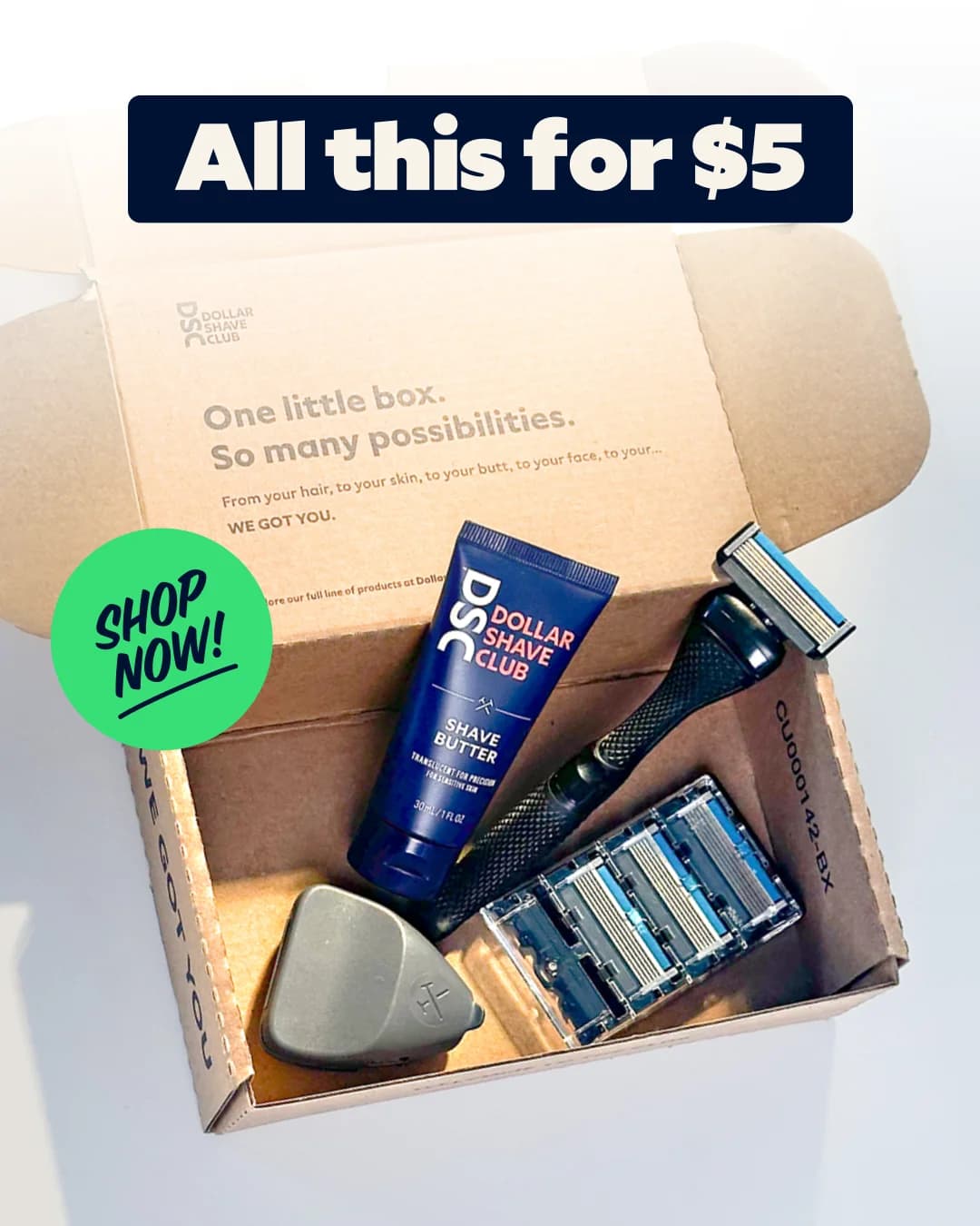
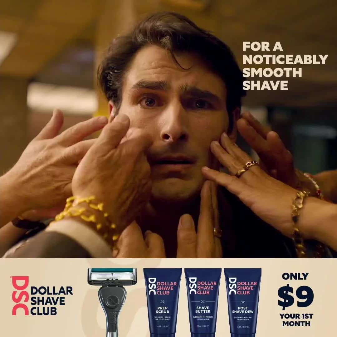
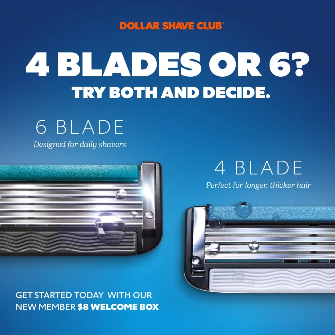
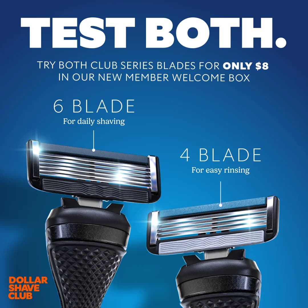
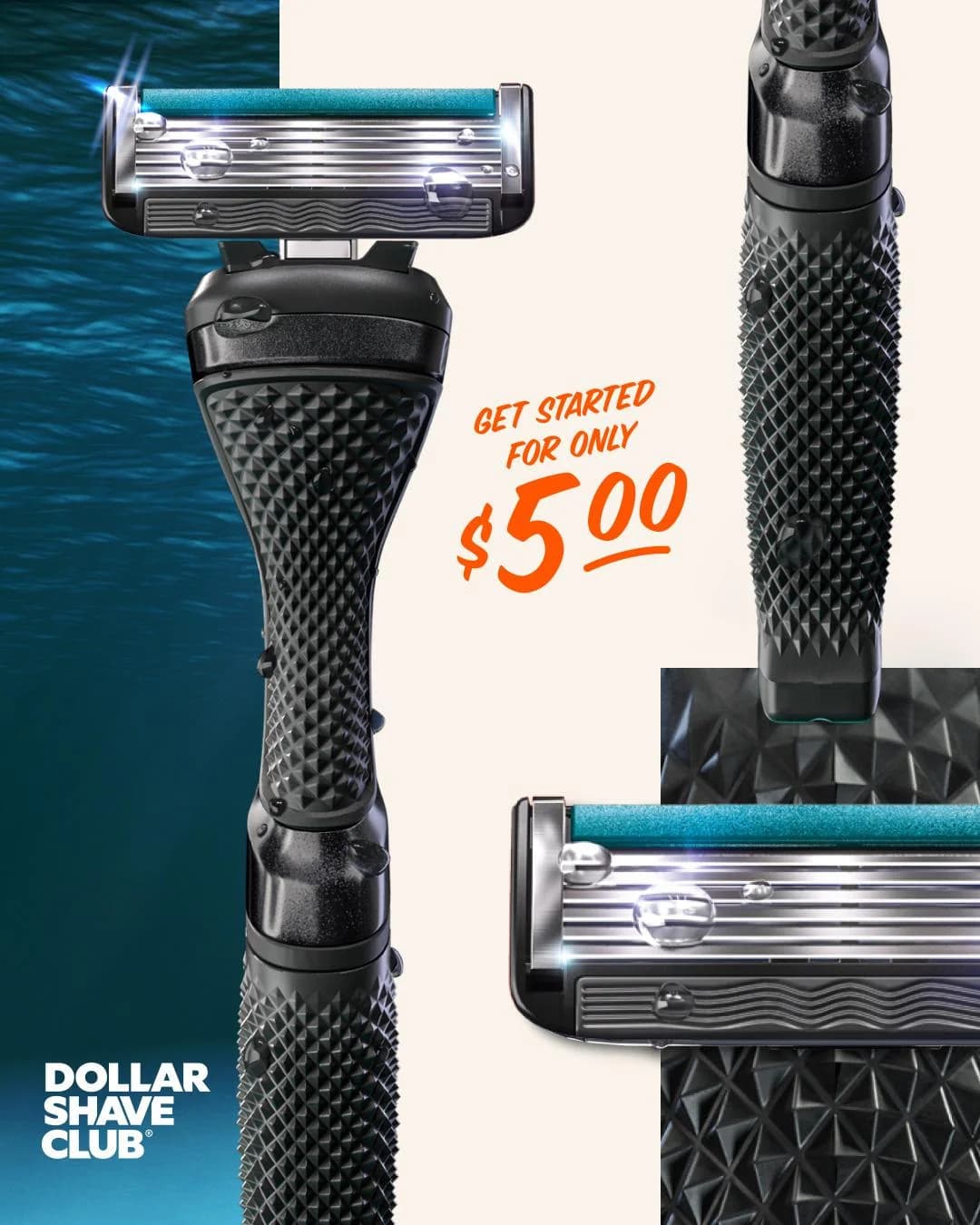
Visually, creative sticks to a narrow system. Royal blue and white, bold sans-serif typography, product laid flat on neutral backgrounds or paired with a blunt caption. Copy is the star: "Shave time, shave money" and "A great shave for a few bucks a month" do more work than any hero image. Static ads often compare Dollar Shave Club's price directly to Gillette's five-pack at the drugstore — receipts, literally, in the ad frame. Facebook and YouTube carry the comedy videos; Instagram leans heavier on product stills and UGC from subscribers.

Our Dollar Shave Club ad examples collection pulls founder video stills, price-comparison statics, and UGC posts that defined the category. Filter by format to find the meme-style typographic ads, the side-by-side drugstore-receipt comparisons, and the founder-to-camera video spots that still run in rotation. Each entry surfaces which comedy beat the ad leans on and how the blue-and-white palette stays locked across a decade of creative.

Dollar Shave Club — Blade Comparison Layout. Brand: Dollar Shave Club. This ad employs a clear comparison layout, presenting two razor blade options side-by-side against a vibrant blue gradient background. The bold, high-contrast headline immediately poses a question, drawing the viewer into a decision-making process. Color psychology leverages blue for trust and freshness, while the brand's orange logo provides a pop of energetic contrast. Compositionally, the products are centered, with water droplets adding a tactile sense of sharpness and cleanliness. Text hierarchy guides the eye from the overarching question to specific blade benefits, culminating in a clear offer at the bottom. Optimized for social feeds like Facebook or Instagram, its direct messaging and strong visual contrast are designed to stop the scroll and engage users in product consideration. The ad effectively educates while prompting action, simplifying a choice for potential customers.. Headline: 4 BLADES OR 6? TRY BOTH AND DECIDE.. Primary text: GET STARTED TODAY WITH OUR NEW MEMBER $8 WELCOME BOX. Why this ad works: Direct Comparison Simplifies Choice — The ad directly compares two blade types, simplifying the decision for potential customers. By presenting "4 Blades" and "6 Blades" with their specific benefits, it helps users self-identify their needs, reducing cognitive load and friction in the consideration phase. This direct approach is highly effective for driving product understanding. Bold, Contrasting Headline Grabs Attention — The large, white headline "4 BLADES OR 6? TRY BOTH AND DECIDE." stands out powerfully against the blue background. This high contrast and direct question immediately engages the viewer, prompting interaction. It leverages curiosity and offers a solution, making the ad highly effective at stopping the scroll in a busy feed. Visual Cues Enhance Product Appeal — The inclusion of water droplets on the razor blades visually communicates freshness, cleanliness, and sharpness. These subtle yet effective visual cues enhance the perceived quality and performance of the product. This detail adds a sensory dimension, making the razors appear more appealing and effective to the target audience.. Specs: Brand: Dollar Shave Club, Industry: Health & Wellness, Platform: Facebook, Format: Static, Audience: Men 25-34Dollar Shave Club — Humorous Split Screen Offer. Brand: Dollar Shave Club. This ad employs a split-screen layout, contrasting an attention-grabbing, humorous top visual with a clear product and offer section below. The top half features a man's expressive face, surrounded by hands, creating an immediate emotional and slightly absurd hook that aligns with the brand's playful tone. The bottom half transitions to a clean, product-focused display with the brand logo and a prominent price offer. Color psychology uses warm, slightly desaturated tones for the top, contrasting with the crisp white background and dark blue products below, ensuring visual clarity. Text hierarchy places the benefit-driven headline in the top right and the conversion-focused price offer in the bottom right, guiding the viewer's eye. This composition is optimized for social platforms like Facebook or Instagram, where a scroll-stopping visual combined with a direct, value-driven proposition effectively drives consideration and conversion.. Headline: FOR A NOTICEABLY SMOOTH SHAVE. Why this ad works: Contrasting split-screen layout grabs attention — The ad's split design effectively uses an absurd, humorous visual in the top half to immediately capture viewer attention. This emotional engagement is then seamlessly transitioned to a clear, rational presentation of products and a compelling offer in the bottom, creating a powerful and memorable ad experience. Humorous visual sets brand tone — The distressed man's face being touched by multiple hands creates an unexpected and comedic scenario. This visual perfectly embodies Dollar Shave Club's irreverent and relatable brand personality, making the ad highly shareable and memorable while resonating with an audience that appreciates humor in advertising. Clear value proposition drives conversion — The prominent display of "ONLY $9 YOUR 1ST MONTH" in the bottom right corner is a strong, direct call to value. This clear pricing strategy lowers the barrier to entry and appeals directly to price-sensitive consumers, effectively driving immediate consideration and conversion for new subscribers.. Specs: Brand: Dollar Shave Club, Industry: Health & Wellness, Platform: Facebook, Format: Static, Audience: Men 25-34Dollar Shave Club — Unboxing with Handwritten Offer. Brand: Dollar Shave Club. This ad leverages an authentic, user-generated content aesthetic to promote Dollar Shave Club. The top-down composition frames the unboxed razor and blades within their branded cardboard packaging, immediately communicating the subscription experience. A handwritten sticky note prominently displays the "£5" offer, creating a sense of personal connection and urgency. The casual staging on a dark bedspread, contrasted with the product's clean lines, suggests real-life usage rather than a sterile studio shot. This approach is highly optimized for social platforms like Instagram or Facebook, where such organic visuals often outperform polished ads by fostering trust and relatability. Text hierarchy guides the eye from the brand's aspirational tagline inside the box to the clear, value-driven offer.. Headline: One little box. So many possibilities.. Primary text: Get ALL this for Just £5. Why this ad works: Authentic UGC feel builds immediate trust — The casual, un-staged photography on a bedspread mimics user-generated content, which significantly boosts relatability and trust. This authenticity helps overcome ad skepticism, making the offer feel more genuine and less like a corporate sales pitch, leading to higher engagement rates. Handwritten offer creates personal connection — The handwritten "Get ALL this for Just £5" on a sticky note adds a personal, informal touch. This breaks through the noise of polished digital ads, making the offer feel more exclusive and directly addressed to the viewer, driving curiosity and perceived value for new members. Unboxing experience highlights product value — Presenting the product within its original packaging emphasizes the unboxing experience inherent to subscription services. It visually communicates the value proposition of receiving a complete kit, including the razor and multiple blades, directly to the customer's door, reinforcing the convenience and completeness of the offer.. Specs: Brand: Dollar Shave Club, Industry: Health & Wellness, Platform: Instagram, Format: Static, Audience: Men 25-34Dollar Shave Club — Humorous Split Screen. Brand: Dollar Shave Club. This ad effectively uses a split-screen layout to combine humor with a clear product benefit. The top half features a man's exaggerated reaction to being touched, implying the discomfort of rough skin, which immediately grabs attention and evokes empathy or amusement. This visual storytelling is crucial for scroll-stopping on platforms like Facebook or Instagram. The bottom half transitions to a clean product shot of the Dollar Shave Club razor, paired with a direct value proposition. The color palette is warm and slightly desaturated in the top, contrasting with the clean, branded white and red in the bottom, creating a clear visual break. Text hierarchy is simple: prominent brand logo and a concise headline, optimizing for quick comprehension. The composition cleverly uses the man's face as a focal point, leading the eye down to the solution.. Headline: FOR A NOTICEABLY SMOOTH SHAVE. Why this ad works: Humorous Scenario Grabs Immediate Attention — The top image depicts an exaggerated, slightly uncomfortable scenario with multiple hands touching a man's face. This unexpected and humorous visual creates intrigue, making viewers pause and process the image, significantly increasing dwell time on social feeds. Clear Problem-Solution Visual Narrative — The ad effectively sets up a problem (implied rough, unshaven skin causing discomfort) in the top frame and immediately presents the solution (Dollar Shave Club razor for a smooth shave) in the bottom. This direct visual storytelling simplifies the message and highlights the product's core benefit. Strong Brand Identity and Value Proposition — The prominent DSC logo and "Dollar Shave Club" text, combined with the clear headline "FOR A NOTICEABLY SMOOTH SHAVE," reinforce brand recognition and communicate the primary benefit instantly. This ensures that even a quick glance conveys the brand and its promise.. Specs: Brand: Dollar Shave Club, Industry: Health & Wellness, Platform: Facebook, Format: Static, Audience: Men 25-34Dollar Shave Club — Dual Razor Comparison. Brand: Dollar Shave Club. This ad leverages a direct comparison layout to showcase two distinct Dollar Shave Club razor blades. The bold blue background creates high contrast, making the white headline "TEST BOTH." and the metallic razors visually pop, effectively grabbing attention on busy social feeds like Instagram. The composition strategically places the 6-blade and 4-blade options side-by-side, with clear annotations detailing their specific benefits, guiding the viewer's eye through the product features. Text hierarchy prioritizes the compelling $8 trial offer, driving immediate consideration and encouraging new member sign-ups. This direct-response approach, combined with clear product differentiation, aims to convert by offering a low-friction trial, aligning with a functional and masculine brand identity.. Headline: TEST BOTH.. Primary text: TRY BOTH CLUB SERIES BLADES FOR ONLY $8 IN OUR NEW MEMBER WELCOME BOX. Why this ad works: Direct product comparison clarifies choice — The side-by-side presentation of the 6-blade and 4-blade razors, each with a distinct use case, simplifies the decision-making process. This clear comparison helps potential customers quickly understand the options and identify the best fit for their shaving needs, reducing friction in the conversion funnel for a trial offer. Bold headline and offer drive immediate interest — The prominent "TEST BOTH." headline immediately engages the viewer, followed by a compelling, value-driven offer of "ONLY $8" for a new member welcome box. This direct and attractive proposition creates a strong incentive to click, effectively converting passive viewers into active prospects by highlighting a clear benefit and low barrier to entry. High-contrast design ensures visual impact — The vibrant blue background paired with crisp white text and bright, reflective product highlights ensures maximum readability and visual appeal. This high contrast makes the ad stand out in a crowded social feed, ensuring the key message and product details are easily absorbed, which is crucial for effective direct-response advertising performance.. Specs: Brand: Dollar Shave Club, Industry: Health & Wellness, Platform: Instagram, Format: Static, Audience: Men 25-34Dollar Shave Club — Product Showcase with Offer. Brand: Dollar Shave Club. This ad employs a vibrant, split-background composition to highlight a new member offer. The bold, contrasting color palette of blue, orange, and black immediately grabs attention, optimized for scroll-stopping on platforms like Instagram. The layout strategically places the main headline at the top, followed by a clear value proposition and product array. The "FOR ONLY $800" (assuming $8.00) price point is emphasized with an orange burst, creating urgency and value perception. Product features, like blade counts and handle colors, are clearly presented, guiding the viewer through the offering. The text hierarchy is clear, with large, impactful fonts for the main message and smaller, descriptive text for details. The overall design balances product detail with a strong call to action, making it effective for conversion-focused campaigns. The use of a terrazzo-like surface grounds the products, adding a touch of modern aesthetic.. Headline: TEST BOTH.. Primary text: & CHOOSE YOUR OWN COLOR HANDLE. Try both club series blades in our new member welcome box.. Why this ad works: Bold Color Contrast for Scroll-Stopping — The striking combination of a bright blue background with bold orange and dark blue text creates high visual contrast. This design choice is highly effective on crowded social feeds, immediately drawing the eye and preventing passive scrolling. It communicates energy and modernity, aligning with the brand's direct-to-consumer approach. Clear Value Proposition and Price Anchor — The "TEST BOTH" headline combined with the "FOR ONLY $800" (likely $8.00) price burst immediately communicates value and a low barrier to entry. This direct approach targets consideration and conversion, making the offer irresistible for potential new subscribers. It clearly outlines what the customer gets for their money. Comprehensive Product Feature Showcase — The ad effectively displays multiple product components—razor, shave butter, blade types, and handle colors—without clutter. Each element is clearly labeled or visually distinct, allowing the audience to quickly grasp the breadth of the welcome box. This detailed yet clean presentation builds confidence in the product offering.. Specs: Brand: Dollar Shave Club, Industry: Health & Wellness, Platform: Instagram, Format: Static, Audience: Men 25-34Dollar Shave Club — Starter Kit Unboxing Deal. Brand: Dollar Shave Club. This ad employs an overhead flat lay composition, presenting an open product box to simulate an unboxing experience. This layout strategy effectively showcases all included items, building transparency and perceived value. The dominant dark blue text overlay, contrasting sharply with the cardboard, immediately communicates a compelling "NEW DEAL" and price point, optimizing for quick information absorption on fast-scrolling platforms. The earthy tones of the box, combined with the bold blue packaging, create a clean yet direct aesthetic. Text hierarchy prioritizes the deal, followed by the product introduction inside the box lid. This ad is well-suited for platforms like Instagram or Facebook, where clear product visualization and strong value propositions drive conversion, leveraging a direct-to-consumer model effectively.. Headline: NEW DEAL: All this for $5. Primary text: MEET YOUR NEW RAZOR. Why this ad works: Unboxing layout creates immediate value perception — The overhead shot of the open box simulates an unboxing experience, allowing viewers to see every item included in the $5 deal. This transparency builds trust and clearly communicates the value proposition, making the offer highly appealing to potential customers by showing exactly what they get. Bold price overlay drives urgent action — The dark blue banner with "NEW DEAL: All this for $5" is impossible to miss. This direct, value-driven headline immediately grabs attention and highlights the affordability, crucial for impulse purchases. It effectively communicates a low barrier to entry for a subscription service, encouraging immediate consideration. High contrast colors enhance readability and impact — The dark blue overlay against the light cardboard box, and the dark blue product packaging, create strong visual contrast. This ensures the key message and brand elements pop, making the ad highly readable and visually impactful in a busy social feed, improving scroll-stopping power and message retention.. Specs: Brand: Dollar Shave Club, Industry: Health & Wellness, Platform: Instagram, Format: Static, Audience: Men 25-34Dollar Shave Club — 3-Step Product Showcase. Brand: Dollar Shave Club. This ad effectively utilizes a split-screen layout with a vibrant orange top section for the headline and a clean, product-focused bottom section. The dominant orange and deep blue product packaging create high visual contrast, instantly grabbing attention on busy feeds. Products are arranged sequentially, clearly numbered 1-3, guiding the viewer through a simple shaving routine. This instructional composition, combined with the razor and blade refills, clearly communicates the full solution. The vertical format is optimized for mobile platforms like Instagram Stories or Reels, ensuring maximum screen real estate. Text hierarchy is clear: a bold, benefit-driven headline at the top, followed by concise labels for each product, making the ad easy to scan and understand quickly.. Headline: THREE STEPS TO SMOOTHNESS. Primary text: 1 PREP SCRUB 2 SHAVE BUTTER 3 POST SHAVE DEW. Why this ad works: Sequential Product Display for Clarity — The ad clearly numbers and arranges the three products in a logical sequence, from "Prep Scrub" to "Post Shave Dew." This instructional approach simplifies the shaving routine for the viewer, making the multi-step process feel achievable and easy to understand, which is crucial for driving consideration for a product line. High-Contrast Brand Colors Command Attention — The bold orange background paired with the deep blue product packaging leverages Dollar Shave Club's iconic brand colors. This high-contrast palette is visually striking and instantly recognizable, helping the ad stand out in a crowded feed. It reinforces brand identity while drawing the eye directly to the product lineup. Implied Lifestyle Context with Bathroom Setting — Placing the products and razor on a bathroom counter, complete with a subtle gold faucet detail, grounds the ad in a realistic, everyday setting. This contextualization helps potential customers visualize how these products would fit into their own routine, enhancing relatability and making the product offering more tangible and desirable.. Specs: Brand: Dollar Shave Club, Industry: Health & Wellness, Platform: Instagram, Format: Static, Audience: Men 25-34Dollar Shave Club — Google Search Mockup. Brand: Dollar Shave Club. This ad cleverly employs a Google Image search UI mockup to immediately capture attention, leveraging a provocative and relatable search query: "how do I shave my balls." The layout mimics a familiar digital experience, making the ad feel native and less intrusive. Compositionally, a grid of four images—a tennis ball, two razor shots, and a man with a shocked expression—creates a humorous narrative that directly addresses the query. The diverse color palette (beige, blue, white, yellow) adds visual dynamism, with the bright yellow background of the surprised man drawing the eye. This approach is highly optimized for social feeds like Facebook, where its unexpected format and bold humor disrupt scrolling behavior. The text hierarchy is minimal, focusing on the search query, brand name, and a clear "Shop Now" CTA, allowing the visual storytelling to drive engagement and brand recall.. Why this ad works: Provocative search query grabs immediate attention — The explicit and humorous search term "how do I shave my balls" directly addresses a common, yet often unvoiced, male grooming concern. This bold approach immediately stops the scroll and creates a strong, relatable connection with the target audience, leveraging shock value for engagement and driving curiosity about the solution. UI mockup leverages platform familiarity — Mimicking a Google Image search page creates instant recognition and trust, as users are accustomed to this interface. This clever format bypasses traditional ad fatigue by presenting the ad content as a natural search result, making it feel less like an interruption and more like a helpful discovery within their feed. Humorous visual narrative builds brand personality — The combination of the tennis ball metaphor, the razor, and the shocked man forms a clear, humorous narrative. This lighthearted approach effectively communicates the product's purpose while reinforcing Dollar Shave Club's irreverent and approachable brand identity, making the ad memorable and shareable across social platforms.. Specs: Brand: Dollar Shave Club, Industry: Health & Wellness, Platform: Facebook, Format: UI Mockup, Audience: Men 25-34Dollar Shave Club — Value Box Flat Lay. Brand: Dollar Shave Club. This ad effectively uses a flat lay composition to showcase the value proposition of Dollar Shave Club. The open box layout immediately communicates a subscription or starter kit, inviting curiosity. The bold, high-contrast headline "All this for $5" instantly grabs attention, leveraging a strong value offer. Color psychology is at play with the deep blue product packaging conveying trust and quality, contrasted with the vibrant green CTA button that demands action. The overall composition is clean and direct, optimized for quick consumption on social feeds like Instagram or Facebook. Text hierarchy is clear: headline first, then the engaging copy inside the box, culminating in the unmissable CTA. This ad works by combining visual clarity with a compelling price point, directly addressing potential customer pain points around cost and convenience. The casual, relatable copy inside the box reinforces brand personality.. Headline: All this for $5. Primary text: One little box. So many possibilities. From your hair, to your skin, to your butt, to your face, to your... WE GOT YOU.. Why this ad works: Bold Value Proposition Headline — The prominent "All this for $5" headline immediately communicates exceptional value. This direct, benefit-driven approach cuts through noise, attracting price-sensitive consumers and driving high click-through rates by setting clear expectations upfront for a compelling offer. Clear Product Unboxing Experience — The open box flat lay visually demonstrates what a customer receives. This transparency builds trust and reduces purchase friction, allowing viewers to quickly grasp the product offering and quantity. This visual clarity is crucial for subscription-based models to set expectations and drive conversions. High-Contrast CTA Drives Action — The bright green "SHOP NOW!" button stands out dramatically against the muted cardboard and product colors. Its vibrant hue and clear command create an urgent focal point, effectively guiding the viewer towards the desired conversion action and improving click-through rates on social platforms.. Specs: Brand: Dollar Shave Club, Industry: Health & Wellness, Platform: Instagram, Format: Static, Audience: Men 25-34Dollar Shave Club Razor — Split Background Hero. Brand: Dollar Shave Club. This ad effectively utilizes a split-screen layout with a dominant product hero shot to highlight Dollar Shave Club's new razor. The bold blue and light blue color block creates strong visual separation, drawing the eye to the product and key messaging. High-contrast orange accents, like the "NEW!" burst and CTA button, strategically guide user attention and evoke urgency and excitement. The composition places the razor prominently, angled to suggest action and modernity. Text hierarchy is clear: a bold headline declares the product's superiority, followed by concise bullet points detailing new features, culminating in a direct call-to-action. This vertical format is optimized for mobile platforms like Instagram Stories or Reels, where its vibrant colors and clear value proposition can quickly capture attention and drive conversions.. Headline: OUR BEST RAZOR EVER. Primary text: - SHARPER, LONGER-LASTING BLADES - NEW JUICY LUBE STRIP PACKED WITH ALOE & VITAMIN E. Why this ad works: High-contrast color blocking commands attention — The distinct dark blue and light blue background, combined with vibrant orange accents, creates a visually arresting ad. This high contrast ensures the ad stands out in a busy feed, immediately drawing the viewer's eye to the product and key messaging, crucial for scroll-stopping performance on platforms like Instagram. Clear feature bullet points drive value — The ad effectively communicates the razor's improvements through concise, easy-to-read bullet points. This direct approach quickly informs potential customers about the "sharper, longer-lasting blades" and "new juicy lube strip," addressing common pain points and highlighting tangible benefits without overwhelming the viewer. Prominent "NEW!" badge creates urgency and curiosity — The prominent orange starburst with "NEW!" immediately signals innovation and a fresh offering. This psychological trigger taps into consumers' desire for the latest and greatest, encouraging them to learn more about the updated product and potentially subscribe, driving early adoption and engagement.. Specs: Brand: Dollar Shave Club, Industry: Health & Wellness, Platform: Instagram, Format: Static, Audience: Men 25-34Dollar Shave Club — Starter Kit Product Shot. Brand: Dollar Shave Club. This ad employs a minimalist product-on-background layout, strategically placing Dollar Shave Club's starter kit items. The composition utilizes ample negative space on a warm, neutral background, ensuring the razor, blades, and grooming creams are the undisputed focal points. A clear visual hierarchy guides the eye from the brand logo at the top, through the product offerings, to the compelling "Get stocked, Stay loaded." headline, culminating in the highly visible "$15" offer. The dark blue product packaging contrasts effectively with the background and the vibrant orange price, optimizing for scroll-stopping on platforms like Instagram and Facebook. Text is concise, focusing on the value proposition, making it easy to digest quickly and efficiently. The clean aesthetic and direct offer are designed to drive immediate consideration and conversion.. Headline: Get stocked, Stay loaded.. Primary text: GET STARTED FOR ONLY $15. Why this ad works: Clear product grouping and negative space — The ad effectively groups the razor/blades and the creams, using significant negative space to prevent clutter. This clean arrangement allows each product to be clearly seen and understood, enhancing product recognition and perceived value, which is crucial for a starter kit offering. High-contrast price offer for immediate impact — The "$15" price point is rendered in a bold, orange font that strongly contrasts with the muted background and product colors. This visual pop immediately draws the eye, highlighting the affordability and value of the starter kit, crucial for conversion-focused direct response campaigns. Consistent brand aesthetic reinforces trust — The ad leverages Dollar Shave Club's established brand identity with its prominent logo and consistent product packaging. The overall clean and uncluttered aesthetic reinforces a sense of simplicity and efficiency, aligning with the brand's promise of hassle-free, premium grooming.. Specs: Brand: Dollar Shave Club, Industry: Health & Wellness, Platform: Instagram, Format: Static, Audience: Men 25-34Dollar Shave Club Starter Box — Overhead Flat Lay. Brand: Dollar Shave Club. This ad employs a clear flat lay composition, showcasing Dollar Shave Club's starter box contents. The overhead shot, set against a clean white background, ensures product visibility and highlights the value proposition. A bold, high-contrast headline "All this for $5" immediately grabs attention, leveraging a strong price anchor. The vibrant green "SHOP NOW!" CTA circle further reinforces the call to action, creating a clear visual path for the viewer. The layout is optimized for mobile feeds like Instagram, where quick comprehension and a strong offer are crucial. Color psychology uses the brand's signature dark blue for products, contrasting with the natural cardboard and bright white, signaling reliability and value. The text hierarchy prioritizes the offer, followed by the CTA, making it highly conversion-focused.. Headline: All this for $5. Primary text: One little box. So many possibilities. From your hair, to your skin, to your shins, to your face, to your WE GOT YOU.. Why this ad works: Clear Value Proposition with Price Anchor — The prominent "All this for $5" headline instantly communicates exceptional value. This direct, low-friction offer is highly effective for driving initial conversions, especially for a subscription service where the first purchase is a trial, reducing perceived risk and encouraging immediate action. High-Contrast Call to Action — The bright green "SHOP NOW!" circle stands out dramatically against the muted tones of the box and products. This strategic color choice ensures the CTA is unmissable, guiding the user's eye directly to the desired action point on a busy social media feed, boosting click-through rates. Product Display in Contextual Packaging — Showcasing the products within their branded starter box provides immediate context and tangibility. This flat lay composition allows viewers to clearly see exactly what they receive, building trust and transparency, which is crucial for new customers considering a subscription service.. Specs: Brand: Dollar Shave Club, Industry: Health & Wellness, Platform: Instagram, Format: Static, Audience: Men 25-34Dollar Shave Club — Dual Product Split Screen. Brand: Dollar Shave Club. This ad employs a high-contrast split-screen layout, leveraging Dollar Shave Club's signature vibrant orange and deep navy. The top section, dominated by orange, features bold white typography highlighting the multi-functionality of the devices ("TRIM, SHAVE, AND SHAPE. IN 1 DEVICE"). Two black electric grooming tools are centrally positioned, creating a strong visual anchor. The color psychology of orange conveys energy and urgency, while the dark blue base grounds the offer. Text hierarchy is clear: brand, benefit, then a prominent discount call-out. The circular price badge draws immediate attention to the value proposition. This vertical composition is optimized for mobile-first platforms like Instagram Stories or TikTok, where bold visuals and clear value propositions are crucial for engagement and conversion, cutting through the noise with direct messaging.. Headline: TRIM, SHAVE, AND SHAPE. IN 1 DEVICE. Primary text: 50% OFF ALL ELECTRICS. Why this ad works: High-contrast color blocking for impact — The stark orange and deep blue create immediate visual separation. This bold contrast ensures the ad stands out in a busy feed, grabbing attention effectively. It also clearly delineates the benefit-driven headline from the discount offer, guiding the viewer's eye through the ad's key messages. Clear value proposition with price anchoring — The "50% OFF ALL ELECTRICS" headline combined with the crossed-out original price and new price in a circle immediately communicates a strong deal. This direct approach reduces friction and drives conversion intent by highlighting significant savings, appealing to price-sensitive consumers. Benefit-driven headline and product focus — The headline "TRIM, SHAVE, AND SHAPE. IN 1 DEVICE" clearly articulates the core benefit and versatility of the product. Placing the two devices centrally reinforces this message, visually demonstrating the tools that deliver the promised functionality and simplifying the user's grooming routine.. Specs: Brand: Dollar Shave Club, Industry: Health & Wellness, Platform: Instagram, Format: Static, Audience: Men 25-34Dollar Shave Club — Vibrant Handheld Product Shot. Brand: Dollar Shave Club. This ad employs a dynamic, vibrant composition to introduce Dollar Shave Club's "Heatwave Handle." The bright blue, textured background creates a stark contrast with the iridescent razor handle and the fiery orange call-to-action, ensuring high visibility in a crowded feed. The razor is held diagonally by a hand, adding a human touch and implying immediate use, enhancing relatability. Text hierarchy is clear: brand at the top, bold headline "BRING THE HEAT," followed by a sub-headline and an urgent, price-anchored CTA. The playful, energetic color palette and informal typography are optimized for social platforms like Instagram, appealing to a younger, style-conscious male demographic. The overall design effectively balances product spotlight with a clear, actionable offer, driving consideration and conversion.. Headline: BRING THE HEAT. Primary text: WITH THE HEATWAVE HANDLE. Why this ad works: High-contrast, vibrant palette grabs attention — The ad leverages a striking contrast between the cool blue background and the warm, iridescent razor handle, amplified by the bright orange CTA. This vibrant color scheme is highly effective for social media feeds, instantly catching the eye and stopping the scroll, crucial for initial ad engagement. Dynamic hand-held product presentation — Featuring the razor held in a hand adds a human element and suggests immediate usability. This "in-use" perspective makes the product feel tangible and relatable, allowing potential customers to visualize themselves using it, which builds desire and reduces perceived risk. Clear, urgent call to action with price — The prominent orange burst with "START NOW FOR $18" provides a direct, low-friction entry point. Coupled with the "GET IT WHILE IT'S HOT" urgency cue, it motivates immediate action, converting interest into clicks by clearly stating the initial investment.. Specs: Brand: Dollar Shave Club, Industry: Health & Wellness, Platform: Instagram, Format: Static, Audience: Men 25-34Dollar Shave Club — Dual Blade Comparison. Brand: Dollar Shave Club. This ad employs a split-product hero layout against a gradient dark blue background, effectively highlighting two distinct razor blade options. The bold white and orange text creates a strong visual hierarchy, immediately addressing a common customer pain point: "Which blade is right for me?". The composition places the razors centrally, drawing the eye downwards from the headline to the product details and then to the clear value proposition. The high contrast color palette (dark blue, bright white, vibrant orange) is optimized for scroll-stopping on platforms like Instagram, ensuring visibility amidst diverse content. The text is concise, guiding the user through the decision-making process, and the circular call-out for the $5 offer acts as a strong conversion trigger, leveraging urgency and value. The overall design is direct and functional, aligning with the brand's no-nonsense approach.. Headline: THE "WHICH BLADE IS RIGHT FOR ME?" WELCOME BOX. Primary text: 6 BLADE FOR DAILY SHAVING / 4 BLADE FOR EASY RINSING. Why this ad works: Problem-solution headline drives engagement — The headline "THE 'WHICH BLADE IS RIGHT FOR ME?' WELCOME BOX" directly addresses a common customer dilemma. This immediate relevance captures attention and positions the product as the solution, fostering a sense of understanding and guiding the user towards a personalized choice. Clear product differentiation and benefits — By presenting two distinct blade types (6-blade for daily, 4-blade for easy rinsing) side-by-side with concise descriptions, the ad simplifies the decision-making process. This clarity helps potential customers quickly identify which option best suits their needs, reducing friction in the consideration phase. High-contrast palette ensures visibility and impact — The combination of a deep blue background with bright white and vibrant orange text creates a powerful visual contrast. This color scheme makes the ad pop in a busy feed, ensuring readability and drawing immediate attention to key messages and the compelling $5 offer, driving higher engagement rates.. Specs: Brand: Dollar Shave Club, Industry: Health & Wellness, Platform: Instagram, Format: Static, Audience: Men 25-34Dollar Shave Club Starter Kit — Value Flat Lay. Brand: Dollar Shave Club. This ad employs a direct, value-driven flat lay composition, showcasing the Dollar Shave Club starter kit on a rustic wooden surface. The overhead shot clearly presents all included items, emphasizing transparency and the tangible value proposition. A prominent, high-contrast text overlay immediately communicates the irresistible $5 price point, acting as the primary call to action and scroll-stopper. The brand's playful, retro aesthetic is evident in the box design, appealing to a younger, value-conscious male demographic. Optimized for mobile feeds like Instagram or TikTok, the vertical format and clear product presentation ensure legibility and impact. The simple background minimizes distractions, allowing the product and price to dominate the visual hierarchy, driving immediate consideration and conversion.. Headline: Get all this for $5. Why this ad works: Direct headline highlights irresistible value — The "Get all this for $5" overlay immediately communicates the core offer. This direct, low-friction entry point is highly effective for acquisition campaigns, reducing mental effort for the viewer and driving clicks by clearly stating the benefit and price upfront, which is crucial for early results performance. Flat lay showcases all included items — The overhead flat lay clearly displays every component of the starter kit. This transparency builds trust and manages expectations, allowing potential customers to see exactly what they're getting for their money, which is crucial for subscription-based products where value perception is key to conversion. High-contrast overlay grabs immediate attention — The white text on a dark blue banner creates strong contrast against the warm wooden background and product packaging. This visual pop ensures the critical price message is instantly readable and acts as a powerful scroll-stopper in busy social feeds, compelling users to pause and engage with the offer.. Specs: Brand: Dollar Shave Club, Industry: Health & Wellness, Platform: Instagram, Format: Static, Audience: Men 25-34Dollar Shave Club Starter Set — Product Highlight. Brand: Dollar Shave Club. This ad effectively leverages a clean, grid-patterned blue background to present the Dollar Shave Club Starter Set. The product is centrally positioned, drawing immediate attention, with key features highlighted by guiding arrows. The dominant headline, "STARTER SET FOR ONLY $4.99," combined with the prominent "FREE SHIPPING" callout in contrasting orange, creates a compelling value proposition. The cool blue palette evokes freshness and cleanliness, ideal for a shaving product, while the orange adds a pop of urgency and highlights the deal. Optimized for social feeds like Instagram, its square format and clear visual hierarchy ensure readability and impact on mobile. The minimal text overlay, beyond the core offer, keeps the focus on the product and its affordability, driving conversion for new subscribers.. Headline: STARTER SET FOR ONLY $4.99. Primary text: + FREE SHIPPING. Why this ad works: Direct Value Proposition & Price Anchor — The ad immediately presents a clear "Starter Set for Only $4.99" and "Free Shipping." This direct, low-friction offer is highly effective for acquisition campaigns, reducing perceived risk and encouraging immediate conversion by highlighting affordability and added value upfront. Strategic Color Contrast for Offer Visibility — The cool blue background and product colors are effectively contrasted by the vibrant orange "FREE SHIPPING" bubble. This high-contrast element immediately draws the eye to the additional incentive, enhancing the overall value proposition and increasing the likelihood of engagement and click-throughs. Guided Feature Callouts for Quick Education — White arrows and concise text labels ("Diamond Grip Handle," "The Signature 6 Blade Razor") quickly educate the viewer on key product benefits. This visual guidance allows for rapid comprehension of the razor's quality features without requiring extensive reading, supporting a quick decision-making process.. Specs: Brand: Dollar Shave Club, Industry: Health & Wellness, Platform: Instagram, Format: Static, Audience: Men 25-34Dollar Shave Club — Value Proposition List. Brand: Dollar Shave Club. This Dollar Shave Club ad leverages a clear, list-based layout on a bright blue background to highlight an irresistible value proposition. The composition strategically places the brand and main offer, "ALL THIS FOR $8," prominently at the top, using a large, vibrant orange font for immediate impact. Below, a detailed itemized list with original and discounted prices transparently builds perceived value. The clean, high-contrast color palette of blue, white, and orange ensures readability and visual pop, optimized for scroll-stopping on platforms like Instagram. Text hierarchy guides the eye from the overarching deal to the specific components, culminating in a circled final price. This direct, benefit-driven approach minimizes visual clutter, focusing entirely on the financial incentive and product bundle, making it highly effective for conversion-focused campaigns.. Headline: ALL THIS FOR $8. Primary text: + CHOOSE YOUR OWN COLOR HANDLE. Why this ad works: Clear Value Stacking Quantifies Savings — The ad explicitly lists each item's original price and its discounted contribution to the total, then clearly states "TOTAL SAVINGS $26.00." This transparent breakdown builds immediate trust and makes the "$8" offer incredibly compelling. It quantifies the deal, making the perceived value undeniable and driving purchase intent. High-Contrast Price Dominance — The large, vibrant orange "$8" at the top, and the circled "USD $8.00" at the bottom, immediately grab attention against the light blue background. This strategic use of color and scale ensures the core offer is the first thing a viewer registers, driving curiosity to understand "all this" for such a low price. Actionable Customization Prompt — The "+ CHOOSE YOUR OWN COLOR HANDLE" line adds a layer of personalization and engagement early in the ad. It suggests an immediate, enjoyable decision point, making the offer feel less like a generic deal and more like a tailored opportunity. This subtle interactive element can increase perceived value and conversion likelihood.. Specs: Brand: Dollar Shave Club, Industry: Health & Wellness, Platform: Instagram, Format: Static, Audience: Men 25-34Dollar Shave Club Heatwave Razor — Dynamic Hand Shot. Brand: Dollar Shave Club. This ad leverages a vibrant, high-contrast palette to immediately grab attention on busy social feeds. The electric blue background provides a strong base for the iridescent razor, held dynamically by a hand, suggesting active use and engagement. The composition employs a strong diagonal line from the razor to the hand, guiding the viewer's eye across the frame. Text hierarchy is clear: the large, bold "THE HEATWAVE HANDLE IS HERE." acts as the primary announcement, supported by a benefit-driven speech bubble and an urgency-creating "BUT NOT FOR LONG!". This layout is optimized for mobile-first platforms like Instagram, where its bold colors and clear product focus cut through clutter. The overall design communicates a playful yet confident brand identity, perfectly suited for a summer product launch. The visual energy aligns with a younger, active male demographic.. Headline: THE HEATWAVE HANDLE IS HERE.. Primary text: A smarter shave for a smarter summer. BUT NOT FOR LONG!. Why this ad works: High-contrast palette demands attention — The electric blue background paired with the vibrant, iridescent razor and bold orange text creates an extremely high-contrast visual. This color strategy is highly effective on social platforms, immediately stopping the scroll and ensuring the ad stands out amidst more subdued content, driving initial engagement. Dynamic diagonal composition engages — The hand holding the razor creates a strong diagonal line across the frame, leading the viewer's eye from the top-left towards the bottom-right. This dynamic composition adds energy and movement, making the product feel active and in-use rather than static, enhancing viewer connection and interest. Urgency-driven copy boosts consideration — The prominent "BUT NOT FOR LONG!" text, strategically placed next to the main product announcement, creates a sense of scarcity and urgency. This psychological trigger encourages immediate action and reduces procrastination, pushing potential customers from awareness to consideration and ultimately, conversion, for this limited-time offering.. Specs: Brand: Dollar Shave Club, Industry: Health & Wellness, Platform: Instagram, Format: Static, Audience: Men 25-34Dollar Shave Club No Frills — Product Spotlight. Brand: Dollar Shave Club. This ad employs a vertical, product-centric layout, showcasing the Dollar Shave Club "No Frills Starter Set" against a clean blue background. The razor is prominently positioned, drawing immediate attention. A vibrant orange price callout bubble strategically highlights the low cost and free shipping, acting as a primary conversion driver. Text hierarchy guides the eye from the brand and offer to specific product features like the "6 Blade Razor" and "Diamond Grip Handle." The cool blue palette evokes freshness and reliability, while the contrasting orange injects urgency. Optimized for mobile platforms like Instagram Stories or Reels, its clear visual hierarchy and strong value proposition are designed to capture attention and drive immediate consideration. The composition ensures key information is visible even with platform UI elements.. Headline: NO FRILLS STARTER SET. Primary text: FOR JUST $4.99 & FREE SHIPPING THE SIGNATURE 6 BLADE RAZOR DIAMOND GRIP HANDLE. Why this ad works: Prominent Value Proposition Drives Conversion — The large, contrasting orange bubble immediately communicates a compelling offer ($4.99 & FREE SHIPPING). This direct, low-friction entry point is crucial for DTC brands, significantly lowering the barrier to trial and accelerating conversion rates by appealing to price-sensitive consumers and new customers. Clear Product Feature Callouts — Arrows and concise text highlight key product benefits: "6 Blade Razor" and "Diamond Grip Handle." This quickly educates the viewer on the product's quality and design advantages without overwhelming them, reinforcing the value proposition beyond just price and justifying the purchase. Vibrant Color Contrast for Scroll-Stopping — The bright orange price bubble against the cool blue background creates high visual contrast. This strategic color choice is highly effective on busy social feeds, ensuring the ad stands out and captures user attention, making it more likely to stop the scroll and engage potential customers.. Specs: Brand: Dollar Shave Club, Industry: Health & Wellness, Platform: Instagram, Format: Static, Audience: Men 25-34Dollar Shave Club — Flat Lay Product Offer. Brand: Dollar Shave Club. This ad employs a clean flat lay composition, strategically placing Dollar Shave Club products on a light marble background. The central, prominent text box acts as a focal point, immediately communicating the compelling "ALL THIS for just $5!" offer. Product elements—razor, shave butter, blade refills, and a razor cover—are scattered around this central message, creating a visual inventory of the value. The muted color palette of dark grays and blues against the white marble ensures the products and the offer text stand out. This vertical format is highly optimized for Instagram Stories or Reels, where quick comprehension and a clear call to action are crucial for driving immediate conversions. The simple layout minimizes distractions, focusing entirely on the value proposition and encouraging a direct click.. Headline: ALL THIS for just $5!. Why this ad works: Clear value proposition drives immediate action — The prominent "ALL THIS for just $5!" text box immediately communicates a strong, undeniable value. This direct pricing strategy cuts through noise, appealing to price-sensitive consumers and driving quick conversion decisions by clearly stating the benefit and cost upfront, reducing friction. Flat lay composition showcases product bundle — The flat lay arrangement effectively displays multiple products included in the offer. By scattering the razor, shave butter, and blade refills around the central price, the ad visually reinforces the "ALL THIS" claim, allowing viewers to quickly grasp the breadth of the bundle without needing additional descriptive text. Minimalist background enhances product focus — The light, subtly textured marble background provides a clean, uncluttered stage for the products and the offer. This minimalist approach prevents visual distraction, ensuring that the dark-colored products and the white text box pop, directing the viewer's attention precisely where the advertiser intends: the product and its compelling price.. Specs: Brand: Dollar Shave Club, Industry: Health & Wellness, Platform: Instagram, Format: Static, Audience: Men 25-34Dollar Shave Club — Collegiate Razor Grid. Brand: Dollar Shave Club. This ad effectively leverages a split background design, combining a dark blue textured top with a lighter, grid-patterned bottom, creating visual interest and clear segmentation. The main product, a collegiate-branded razor, is prominently displayed with a dynamic, slightly angled composition, immediately drawing the eye. Bold, high-contrast typography for the headline "REP YOUR TEAM NOT YOUR STUBBLE" ensures readability and impact, optimized for quick mobile consumption. A grid of various team-colored razor handles below showcases the product's personalization options, appealing directly to fan loyalty. The overall color palette is vibrant and energetic, aligning with a youthful, sports-oriented audience. This vertical format is ideal for platforms like Instagram Stories, where engaging visuals and concise messaging are key to stopping the scroll and driving consideration.. Headline: REP YOUR TEAM NOT YOUR STUBBLE. Primary text: FIND YOUR SCHOOL. Why this ad works: Collegiate branding taps into fan loyalty — The ad cleverly integrates college team branding into the razor handles. This strategy moves beyond basic product utility, tapping into strong emotional connections and identity associated with sports teams. It transforms a functional purchase into a statement of allegiance, significantly increasing perceived value and driving a deeper, more personal connection with the target audience. Dynamic split background adds visual energy — The torn paper effect separating the dark blue and light grid backgrounds creates a visually engaging and informal aesthetic. This dynamic composition breaks the monotony of a single background, adding a playful and energetic vibe that resonates with a younger demographic. It helps the ad stand out in a crowded feed, signaling a brand that is modern and relatable. Grid layout showcases product variety effectively — The organized grid of multiple team-branded razor handles at the bottom of the ad efficiently communicates the extensive range of customization options available. This visual catalog allows potential customers to quickly identify their team or explore other options, fostering a sense of personalization and encouraging deeper engagement with the product line.. Specs: Brand: Dollar Shave Club, Industry: Health & Wellness, Platform: Instagram, Format: Static, Audience: Men 18-24Dollar Shave Club Electric Razor — Feature Spotlight. Brand: Dollar Shave Club. This ad leverages a high-contrast, dynamic layout to immediately capture attention. The vibrant orange background, a brand signature, creates a bold and energetic feel, perfectly contrasting with the sleek black product. The razor is positioned diagonally, adding visual interest and guiding the eye across its key features, which are clearly highlighted with connecting lines and concise text. This composition effectively breaks through scroll fatigue on platforms like Instagram. The prominent "50% OFF" banner and discounted price point are strategically placed for immediate impact, driving conversion intent. Text hierarchy prioritizes the sale and a clear gifting message, followed by detailed product benefits, ensuring quick comprehension for a mobile audience. The overall design is optimized for direct response, combining strong visual appeal with compelling offer details.. Headline: STOP GUESSING. START GIFTING.. Primary text: 50% OFF ALL ELECTRICS 6 BLADE RAZOR WITH PRECISION TRIMMER FOR SHAVING AND EDGING 60 MINUTE CORDLESS RUNTIME USB-C PORT RECHARGEABLE WATER RESISTANT IPX5 CERTIFIED POWER TRIMMER WITH SELF-SHARPENING CERAMIC FACE BLADE. Why this ad works: High-contrast palette demands attention — The signature Dollar Shave Club orange background creates an unmissable visual. This bold color choice, paired with the black product and white text, generates high contrast, making the ad pop in a busy feed. This strategy is crucial for stopping the scroll and ensuring immediate ad recognition. Diagonal product placement highlights features — The electric razor is angled dynamically across the frame, drawing the eye from the blade to the trimmer end. This diagonal composition is more engaging than a static straight shot and allows for clear, organized callouts of multiple product features. It efficiently communicates value without overwhelming the viewer. Prominent discount drives immediate conversion — The "50% OFF ALL ELECTRICS" banner and the striking blue circle with the crossed-out original price and new discounted price are highly visible. This clear and compelling offer immediately signals value, reducing purchase friction and motivating viewers to click through for a quick conversion, especially for gift-givers.. Specs: Brand: Dollar Shave Club, Industry: Health & Wellness, Platform: Instagram, Format: Static, Audience: Men 25-34Dollar Shave Club No Frills — Product Hero Shot. Brand: Dollar Shave Club. This ad for Dollar Shave Club utilizes a clean, product-focused hero shot layout, optimized for vertical mobile viewing. The central composition places the "No Frills Starter Set" razor prominently on a dark blue pedestal, drawing immediate attention. The color palette leverages various shades of blue—from the light tiled background to the deep blue of the product and pedestal—to evoke feelings of cleanliness, trust, and reliability, aligning perfectly with a grooming product. Orange accents on the razor provide a subtle pop, guiding the eye to key features. Text hierarchy is clear: brand name at the top, followed by the product name as the main headline, and then concise feature callouts with arrows. This direct approach ensures quick comprehension, making it effective for fast-scrolling social feeds like Instagram, where clarity and visual appeal are paramount for engagement.. Headline: NO FRILLS STARTER SET. Primary text: DOLLAR SHAVE CLUB. Why this ad works: Centralized Product Focus on Pedestal — The razor is prominently displayed on a dark blue cube, creating a strong visual anchor. This elevation and central placement immediately draws the viewer's eye to the product, ensuring it's the undeniable hero of the ad. This technique is highly effective for product launches on social feeds. Strategic Blue Palette Reinforces Brand — The dominant use of blues, from the light tiled background to the deep blue razor and pedestal, psychologically communicates cleanliness, trust, and reliability. This color choice is ideal for a grooming brand, subtly reinforcing the brand's promise of a consistent, quality shave. Direct Feature Callouts Enhance Value — Arrows and concise text clearly highlight key product features like the "Diamond Grip Handle" and "Signature 6 Blade Razor." This visual guidance educates the viewer quickly about the product's benefits and quality, driving consideration by showcasing tangible value.. Specs: Brand: Dollar Shave Club, Industry: Health & Wellness, Platform: Instagram, Format: Static, Audience: Men 25-34Dollar Shave Club — New Razor Handles Hero Shot. Brand: Dollar Shave Club. This ad effectively uses a vibrant, high-contrast layout to introduce new razor handles. The three razors are prominently displayed against a stylized blue sky, creating a fresh, summery feel that aligns with the "SUMMER" headline. The bold, orange, all-caps headline "NEW. HANDLE. SUMMER." immediately grabs attention, leveraging color psychology for energy and urgency. The composition places the brand name at the top, followed by the impactful headline, and then the products, guiding the eye downwards. A clear price callout in an orange bubble reinforces value. This design is optimized for platforms like Instagram, where bright visuals and direct messaging cut through feed clutter, making it a scroll-stopper for a male audience seeking grooming solutions. The text hierarchy is clear and concise, focusing on key benefits and a strong seasonal hook.. Headline: NEW. HANDLE. SUMMER.. Primary text: ONLY $8.00. Why this ad works: Bold, high-contrast headline for immediate impact — The large, orange, all-caps headline "NEW. HANDLE. SUMMER." against the blue sky creates a powerful visual contrast. This ensures instant readability and captures attention quickly in a busy feed, effectively communicating the core message of newness and seasonality without requiring deep engagement. Seasonal tie-in with "SUMMER" and sky background — The ad cleverly leverages the "SUMMER" keyword in its headline and pairs it with a bright, cloud-flecked blue sky background. This creates an aspirational, fresh, and timely association, making the product feel relevant and desirable for the warmer months and outdoor activities. Clear product display with prominent value proposition — Three distinct razor handles are showcased, allowing viewers to see the variety. The "ONLY $8.00" price bubble is strategically placed and highly visible, providing an immediate value proposition. This transparency helps drive consideration by addressing a key purchase factor upfront.. Specs: Brand: Dollar Shave Club, Industry: Health & Wellness, Platform: Instagram, Format: Static, Audience: Men 25-34Dollar Shave Club Heatwave Handle — Vibrant Product Shot. Brand: Dollar Shave Club. This ad leverages a highly vibrant, gradient background to introduce a new product, the "Heatwave Handle." The dynamic diagonal composition of the razor handle, angled upwards, creates a sense of movement and excitement, drawing the eye from the product to the bold, contrasting blue headline. The color psychology employs warm, energetic hues (yellow, orange, pink) to evoke the "heatwave" theme, while the cool blue text provides high contrast, ensuring readability and immediate impact on busy social feeds like Instagram. Text hierarchy is clear: a dominant headline announces the product, followed by a smaller, urgent call-to-action for limited availability. This vertical format is optimized for mobile viewing, ensuring the product and key message are central and scroll-stopping. The overall design is playful and bold, aligning with Dollar Shave Club's brand personality.. Headline: THE HEATWAVE HANDLE IS HERE.. Primary text: LIMITED TIME! GET IT WHILE IT'S HOT 🔥. Why this ad works: Vibrant Gradient Background Captures Attention — The energetic yellow-orange-pink gradient background immediately grabs attention. This bold color choice, combined with the "heatwave" theme, creates a strong visual identity that stands out in a crowded social feed, effectively stopping the scroll and communicating the product's unique, seasonal appeal. Dynamic Diagonal Composition Creates Energy — The razor handle is positioned on a strong diagonal, breaking the traditional horizontal or vertical product placement. This dynamic angle adds visual interest and a sense of motion, guiding the viewer's eye upwards towards the headline, making the overall composition feel energetic and engaging. High-Contrast Text Ensures Readability & Impact — The use of a bright, solid blue for the main headline against the warm, gradient background provides exceptional contrast. This ensures the key message, "THE HEATWAVE HANDLE IS HERE," is instantly readable and impactful, crucial for quick consumption on mobile platforms where clarity is paramount.. Specs: Brand: Dollar Shave Club, Industry: Health & Wellness, Platform: Instagram, Format: Static, Audience: Men 25-34Dollar Shave Club Razor — Dynamic Split Product Shot. Brand: Dollar Shave Club. This ad employs a dynamic split-screen layout, contrasting a deep blue, aquatic background with a clean, cream canvas to highlight the Dollar Shave Club razor. The composition strategically places the razor across both halves, emphasizing its sleek design and textured grip. Bright orange, handwritten-style text "GET STARTED FOR ONLY $5.00" acts as a clear call-to-action and value proposition, leveraging color psychology for urgency and playfulness. The close-up details of the blade and handle texture reinforce product quality and tactile appeal. Optimized for platforms like Instagram, the ad balances product focus with an engaging visual narrative, ensuring scroll-stopping power while clearly communicating a low-barrier entry offer. The text hierarchy is minimal, allowing the strong visual to lead, supported by the prominent price.. Primary text: GET STARTED FOR ONLY $5.00. Why this ad works: Split Background Enhances Product Detail — The vertical split background effectively segments the visual, allowing the razor to bridge two distinct environments. This technique draws the eye along the product's full length, from the aquatic freshness suggested by the blue to the clean simplicity of the cream, highlighting both its function and design. Prominent Price Point Drives Conversion — The "GET STARTED FOR ONLY $5.00" text is centrally located and uses a vibrant orange, handwritten font. This makes the low-cost entry point immediately clear and appealing, reducing perceived risk and friction for potential new subscribers, which is crucial for DTC conversion goals. Tactile Visuals Build Perceived Quality — Close-up shots of the razor's textured handle and water droplets on the blade emphasize its ergonomic design and functionality. These details create a sense of tangibility and quality, making the product feel premium and effective, which can significantly influence purchase intent in a competitive market.. Specs: Brand: Dollar Shave Club, Industry: Health & Wellness, Platform: Instagram, Format: Static, Audience: Men 25-34Dollar Shave Club — Playful Shaving Lifestyle. Brand: Dollar Shave Club. This Dollar Shave Club ad leverages a vibrant, high-contrast composition to capture attention. The central figure, a man mid-shave, creates an immediate sense of relatability and product-in-use demonstration. The layout strategically places the "NEW MEMBER SPECIAL" headline and "FOR ONLY $15.00" price bubble prominently, utilizing Dollar Shave Club's signature orange for high visibility against the patterned bathroom tile background. This color choice, paired with the dark blue text, ensures strong readability and brand recognition. The composition guides the eye from the offer to the products displayed at the bottom, creating a clear visual hierarchy. It's optimized for platforms like Facebook or Instagram where bold visuals and clear value propositions drive conversion. The playful, slightly messy aesthetic aligns with the brand's approachable personality, making the offer feel accessible rather than overly polished. The text overlay is high, ensuring the core message is instantly conveyed.. Headline: NEW MEMBER SPECIAL. Primary text: FOR ONLY $15.00. Why this ad works: High-contrast branding commands attention — The bold orange and dark blue color scheme, characteristic of Dollar Shave Club, creates immediate visual impact. This high contrast ensures the "NEW MEMBER SPECIAL" and price stand out against the busy background, effectively stopping the scroll on crowded social feeds and reinforcing brand identity. Relatable in-use scenario builds trust — Featuring a man actively shaving makes the product tangible and demonstrates its use in a real-world context. This lifestyle approach helps potential customers visualize themselves using the product, building relatability and trust, which is crucial for subscription-based services. It humanizes the brand. Clear value proposition drives conversion — The prominent "NEW MEMBER SPECIAL" headline combined with the "FOR ONLY $15.00" price bubble immediately communicates a compelling offer. This direct approach to value proposition, placed strategically at the top and mid-right, removes friction and encourages immediate consideration for new customers.. Specs: Brand: Dollar Shave Club, Industry: Health & Wellness, Platform: Instagram, Format: Static, Audience: Men 25-34Dollar Shave Club — Humorous Testimonial Razor Shot. Brand: Dollar Shave Club. This ad cleverly uses a humorous, satirical testimonial to engage the audience, subverting typical review expectations. The bold blue background provides high contrast for the black razor and white text, ensuring visibility on busy feeds. Compositionally, the razor occupies the right third, creating an implied visual flow from the text on the left. The large, clear text hierarchy prioritizes the "review," making it the immediate focal point. This approach is optimized for platforms like Instagram or Facebook, where scroll-stopping content often involves unexpected humor or relatable scenarios. The vibrant color palette and playful tone align perfectly with Dollar Shave Club's brand identity, aiming for high engagement and shareability rather than a hard sell. The ad effectively uses a single, prominent product shot to anchor the message.. Headline: Shaved too many times. Got too many DM's. I'm now over my inbox limit. Don't recommend.. Primary text: -Totally real internet person. Why this ad works: Humorous, ironic testimonial engages audience — The ad uses a negative review with a positive underlying message ("too many DMs" implies attractiveness from shaving). This unexpected twist grabs attention and encourages deeper engagement, making the brand memorable and shareable, which is crucial for social media virality. High-contrast palette ensures visibility — The vibrant blue background sharply contrasts with the white text and black razor. This visual pop ensures the ad stands out in a crowded social feed, immediately drawing the eye to the key message and product, improving initial ad recall and stopping the scroll. Clear visual hierarchy for quick comprehension — The large, bold testimonial text dominates the left side, immediately conveying the core message. The razor on the right provides product context, allowing viewers to quickly grasp the brand, humor, and product in a single glance, optimizing for fast consumption on mobile.. Specs: Brand: Dollar Shave Club, Industry: Health & Wellness, Platform: Instagram, Format: Static, Audience: Men 25-34Dollar Shave Club — Floating Product Kit. Brand: Dollar Shave Club. This Dollar Shave Club ad leverages a dynamic floating product layout on a clean, light cream background to showcase its shaving kit. The central razor acts as an anchor, surrounded by complementary products like shave butter and prep scrub, creating a sense of a complete grooming ritual. The dark blue product packaging conveys trust and masculinity, while the vibrant orange price point immediately grabs attention, signaling value. Text hierarchy is clear: a bold, benefit-driven headline at the top, followed by the prominent offer. Individual product labels provide clarity without clutter. This composition is highly effective for platforms like Instagram, where visual clarity and a strong value proposition are key to stopping the scroll and driving consideration among men seeking a comprehensive, convenient shaving solution. The overall design balances product detail with a clean, approachable aesthetic.. Headline: SHAVE LIKE YOUR FACE DEPENDS ON IT. Primary text: GET STARTED FOR ONLY $15.00. Why this ad works: Dynamic floating composition highlights kit — The dynamic floating arrangement of products around the central razor creates an engaging visual narrative of a complete shaving system. This technique breaks the monotony of a static grid, making the ad feel more premium and curated. It effectively communicates the breadth of the offering in a single glance, encouraging exploration of each component. Clear product labeling enhances understanding — Each product is clearly labeled with its function, such as 'Shave Butter' and 'Prep Scrub,' eliminating guesswork for the consumer. This direct labeling enhances product understanding and highlights the value of the full kit. It reassures potential customers about the comprehensive nature of the Dollar Shave Club experience. High-contrast headline and price grab attention — The bold, dark blue headline 'SHAVE LIKE YOUR FACE DEPENDS ON IT' immediately captures attention with its strong, benefit-oriented message. Coupled with the vibrant orange 'GET STARTED FOR ONLY $15.00,' the ad creates a compelling visual hierarchy that prioritizes urgency and value, driving immediate interest and consideration.. Specs: Brand: Dollar Shave Club, Industry: Health & Wellness, Platform: Instagram, Format: Static, Audience: Men 25-34Dollar Shave Club — Blade Feature Hero Shot. Brand: Dollar Shave Club. This ad effectively uses a split-color background to create visual interest while maintaining brand consistency. The vibrant orange of the blade's moisturizing strip and the CTA button creates a strong focal point, contrasting sharply with the cool blue tones. The composition places the product centrally, allowing the bold, benefit-driven headline to immediately capture attention. Text hierarchy is clear: brand, key benefits, value proposition, and a prominent call to action. The use of a starburst for pricing adds urgency and highlights value. Optimized for platforms like Facebook or Instagram, its high contrast and clear messaging cut through feed clutter, driving direct response. The wet blade suggests freshness and performance, reinforcing the "juicier glide" claim. This design balances product focus with compelling value communication.. Headline: LONGER-LASTING BLADES. JUICIER GLIDE.. Primary text: Same Great Price. Why this ad works: High-contrast palette grabs immediate attention — The bold combination of bright orange against the two shades of blue creates a dynamic visual tension. This high contrast is crucial for stopping the scroll on busy social feeds, ensuring the ad stands out from organic content and competitor ads, driving initial engagement. Benefit-driven headline promises clear value — “LONGER-LASTING BLADES. JUICIER GLIDE.” directly addresses common pain points for shaver users: blade longevity and shaving comfort. This clear, concise value proposition resonates quickly with the target audience, communicating immediate benefits without requiring further investigation. Prominent CTA button drives conversion intent — The large, bright orange “SUBSCRIBE AND SAVE” button is impossible to miss. Its color matches the blade's accent, creating visual harmony while clearly indicating the desired action. This direct call to action reduces friction and guides users towards conversion effectively.. Specs: Brand: Dollar Shave Club, Industry: Health & Wellness, Platform: Facebook, Format: Static, Audience: Men 25-34Dollar Shave Club — Authentic iMessage UI Mockup. Brand: Dollar Shave Club. This ad cleverly uses an iMessage UI mockup to simulate an authentic, organic product recommendation. The conversational layout draws the viewer in, mimicking a personal chat. The color palette is the familiar iMessage interface, leveraging user recognition and trust. Compositionally, the dialogue unfolds naturally, guiding the eye from problem (smooth face, no irritation) to solution (Dollar Shave Club). This format is highly optimized for social platforms like Instagram or Facebook, where it stands out from traditional product shots by offering a relatable, story-driven experience. The text hierarchy is conversational, with the brand reveal acting as the punchline, subtly building desire through social proof rather than direct selling. This approach fosters consideration by presenting a genuine use case and endorsement.. Why this ad works: Authentic UI Mimicry Builds Trust — The ad perfectly replicates an iMessage conversation, creating instant familiarity and trust. This 'native' feel makes the ad feel less like an advertisement and more like a genuine peer recommendation, significantly increasing relatability and credibility for the Dollar Shave Club brand. Social Proof Drives Product Discovery — The dialogue centers on a positive product experience ("smooth. Like no breakouts, no irritation") shared between friends. This indirect endorsement from a trusted source (even if fictional) is a powerful form of social proof, prompting viewers to consider Dollar Shave Club for their own shaving needs. Relatable Problem-Solution Narrative — The conversation starts with a common desire (smooth skin, no irritation) and progresses to a relatable extension (using it for legs). The brand reveal at the end provides a clear, satisfying solution, engaging the audience through a narrative that mirrors their own potential shaving concerns.. Specs: Brand: Dollar Shave Club, Industry: Health & Wellness, Platform: Instagram, Format: UI Mockup, Audience: Women 25-34Dollar Shave Club — Juicier Glide Product Shot. Brand: Dollar Shave Club. This ad utilizes a high-contrast split-background strategy to create immediate visual depth, separating the product-focused upper half from the action-oriented lower half. The use of complementary colors—vibrant orange against deep and sky blues—leverages color psychology to evoke feelings of trust and energy simultaneously. The central composition features a hand-held product shot, which adds a tactile, human element that increases relatability and perceived value. Text hierarchy is expertly managed; the bold, sans-serif headline captures attention, while the orange starburst provides a secondary focal point for price anchoring. This layout is optimized for mobile-first platforms like Instagram Stories, where the vertical orientation and clear CTA button at the bottom align with natural thumb-scrolling behavior. By emphasizing a product upgrade at the same price, the creative addresses the primary consumer pain point of inflation while maintaining brand loyalty through consistent visual identity.. Headline: JUICIER GLIDE. SAME PRICE.. Why this ad works: Complementary color palette drives high visual impact — The use of orange accents against a dual-tone blue background creates a striking visual pop. This high-contrast pairing ensures the ad stands out in a fast-moving social feed, drawing the eye directly to the price point and the CTA button, which are the most critical conversion elements. Tactile product presentation increases perceived quality — Showing the razor held in a hand provides a sense of scale and ergonomics that a floating product shot lacks. This in-use perspective helps the viewer visualize the physical experience of the product, bridging the gap between a digital impression and a physical purchase decision. Clear price anchoring reduces purchase friction — The orange starburst graphic effectively highlights the price point. By placing this near the product and headline, the ad immediately answers the consumer's most pressing question about value, making the Subscribe and Save call to action feel like a logical and low-risk next step for the viewer.. Specs: Brand: Dollar Shave Club, Industry: Health & Wellness, Platform: Instagram, Format: Static, Audience: Men 25-34Dollar Shave Club — Playful Flat Lay Offer. Brand: Dollar Shave Club. This ad employs a vibrant, high-contrast flat lay composition, leveraging a playful pun to introduce Dollar Shave Club's "Shave Butter" and a compelling "Welcome Box" offer. The dominant orange background immediately grabs attention, while the central placement of the product on a white plate, alongside a butter knife, creates a humorous visual metaphor. Text hierarchy is clear: the large, bold headline "Please pass the BUTTER." is the primary hook, followed by the prominent "WELCOME BOX ONLY $5" offer. This layout is optimized for social feeds like Instagram, where bright colors and clever concepts drive engagement. The composition uses negative space effectively around the central elements, ensuring product visibility. The overall design communicates a fun, accessible brand personality, aiming for high scroll-stopping power and direct conversion through its clear value proposition.. Headline: Please pass the BUTTER.. Primary text: WELCOME BOX ONLY $5. Why this ad works: Playful pun headline grabs attention — The "Please pass the BUTTER." headline is a clever, unexpected pun that immediately creates intrigue and humor. This lighthearted approach cuts through ad fatigue, making the viewer pause and engage with the visual metaphor of the shave butter and actual butter knife, increasing memorability and brand affinity. Vibrant, high-contrast color palette — The bold orange background paired with the dark blue product and white plate creates a striking visual contrast. This high-energy palette is highly effective on social media platforms, ensuring the ad stands out in a crowded feed and captures immediate attention, driving higher initial engagement rates. Clear, value-driven offer placement — The "WELCOME BOX ONLY $5" offer is prominently displayed in a circular badge, making it impossible to miss. This direct, low-friction entry point clearly communicates value to potential new customers, reducing decision paralysis and directly driving conversion for a subscription-based business model.. Specs: Brand: Dollar Shave Club, Industry: Health & Wellness, Platform: Instagram, Format: Static, Audience: Men 25-34Dollar Shave Club — Bold Product Hero Shot. Brand: Dollar Shave Club. This ad leverages a bold hero shot composition with a strong diagonal emphasis, positioning the razor prominently against a deep blue background. The dark, rich color palette, combined with the metallic sheen of the product, exudes a masculine and premium feel, aligning with the brand's established identity. Text hierarchy is clear: the brand name, a provocative headline, and a prominent discount circle immediately capture attention. The vertical format and high contrast are optimized for mobile feeds like Instagram, ensuring scroll-stopping visibility. The inclusion of the blade cartridge reinforces value. This design effectively communicates both product quality and a compelling offer, driving consideration and conversion through direct, impactful visuals and copy. The overall aesthetic is clean yet aggressive, appealing to the target demographic.. Headline: HEAVY F**KING HANDLE. Primary text: 40% OFF BLADES INCLUDED!. Why this ad works: Bold Headline Captures Brand Voice — The "HEAVY F**KING HANDLE" headline immediately grabs attention with its provocative, authentic brand voice. This direct, slightly irreverent language resonates strongly with Dollar Shave Club's target male audience, fostering brand recognition and engagement by breaking through typical ad clutter with personality. High Contrast for Scroll-Stopping Impact — The metallic razor and bright white text pop against the deep blue background, creating exceptional visual contrast. This design choice ensures the ad is highly visible and attention-grabbing in a busy social media feed, effectively stopping the scroll and drawing the eye directly to the product and key offer. Dynamic Composition Highlights Product Features — The large, angled razor handle dominates the frame, emphasizing its substantial feel and premium design. The secondary placement of the blade cartridge, with an arrow pointing to "BLADES INCLUDED!", clearly communicates the value proposition of a complete shaving solution. This composition effectively showcases both form and function.. Specs: Brand: Dollar Shave Club, Industry: Health & Wellness, Platform: Instagram, Format: Static, Audience: Men 25-34Dollar Shave Club Heatwave — Vibrant Product Display. Brand: Dollar Shave Club. This ad leverages a dynamic split-screen composition with a vibrant, gradient background that transitions into a solid electric blue. The layout strategically places a hand holding the iridescent razor in the upper half, creating an immediate human connection and showcasing the product in an implied "in-use" context. Below, the full product set is neatly arranged, reinforcing the offering. The bold, brush-stroke "HEATWAVE" headline, coupled with the prominent "$18" price in a starburst, establishes clear value and urgency. The high-contrast color palette of neon pinks, yellows, and blues is optimized for scroll-stopping on platforms like Instagram, appealing to a younger, style-conscious male demographic. Text hierarchy is clear, guiding the eye from the energetic headline to the price and brand logo, ensuring key information is easily digestible.. Headline: HEATWAVE LIMITED EDITION SET. Primary text: $18. Why this ad works: Vibrant, high-contrast color palette — The ad's energetic blend of iridescent product colors against a gradient background and electric blue base creates a powerful visual magnet. This bold choice ensures the ad stands out dramatically in a crowded social feed, immediately capturing attention and conveying a fun, summer-ready brand personality, ideal for impulse purchases. Dynamic hand-holding product shot — Featuring a hand actively holding the razor provides a crucial human element, making the product feel tangible and relatable. This "in-use" perspective helps viewers visualize themselves using the product, enhancing aspiration and demonstrating the product's ergonomic design and unique aesthetics effectively for grooming products. Clear price and limited edition scarcity — The prominent "$18" in a starburst directly addresses purchase friction, while "LIMITED EDITION SET" creates urgency. This combination effectively communicates value and prompts immediate action, crucial for driving conversions in a fast-paced social media environment. It leverages psychological triggers for impulse buying and exclusivity.. Specs: Brand: Dollar Shave Club, Industry: Health & Wellness, Platform: Instagram, Format: Static, Audience: Men 25-34Dollar Shave Club — Product Showcase on Sink. Brand: Dollar Shave Club. This Dollar Shave Club ad employs a product-on-background layout, showcasing multiple items on a clean bathroom sink, implying real-world use. The composition uses a strong diagonal line from the sink's edge to guide the eye, creating depth while keeping products clearly visible. The brand's signature dark blue and orange palette provides high contrast and instant recognition, effectively stopping the scroll. Text hierarchy is clear: a prominent, benefit-driven headline ("Shave Smarter, not harder") at the top, followed by a compelling price point and specific blade feature callouts. This structure optimizes for quick information absorption on platforms like Instagram or Facebook. The use of emojis adds a touch of playful, relatable brand personality, enhancing engagement. The overall design balances product detail with a clean, aspirational aesthetic, driving consideration and conversion by highlighting value and efficacy.. Headline: Shave Smarter, not harder. Primary text: FOR ONLY $8.00 6 BLADE For daily shaving 4 BLADE For easy rinsing. Why this ad works: Clear feature callouts drive informed choice — The ad effectively highlights the '6 BLADE' for daily shaving and '4 BLADE' for easy rinsing. This specific feature breakdown educates the consumer on product benefits and use cases, allowing them to make an informed decision. This clarity reduces purchase friction by directly addressing potential questions about blade utility and value. Strong brand identity with consistent palette — Dollar Shave Club's distinctive dark blue and bright orange color scheme is immediately recognizable. This consistent branding across product packaging, text overlays, and the price callout reinforces brand recall and trust. The high contrast ensures visibility in a busy feed, making the ad stand out and connect with existing brand familiarity. Benefit-driven headline and clear value proposition — The headline 'Shave Smarter, not harder' with accompanying emojis immediately communicates a core benefit and brand ethos. Coupled with the prominent 'FOR ONLY $8.00' price point, the ad clearly articulates value and ease. This combination appeals to consumers seeking efficiency and affordability, directly addressing common pain points in the shaving experience.. Specs: Brand: Dollar Shave Club, Industry: Health & Wellness, Platform: Instagram, Format: Static, Audience: Men 25-34Dollar Shave Club — Playful Product & Character Intro. Brand: Dollar Shave Club. This ad employs a vibrant, playful layout to introduce Dollar Shave Club's "Summer Club" and a new razor. The composition cleverly combines a large, angled product shot in the foreground with a fun, polaroid-style lifestyle image in the mid-ground, creating depth and personality. The bright blue background and orange text evoke summer and fun, aligning with the brand's irreverent tone. Text hierarchy guides the eye from the product offer ("Mixed Blade Starter Set $8.00") to the character introduction ("Wet Willy") and finally to the overarching campaign message ("Meet The Summer Club"). This multi-layered approach is optimized for scroll-stopping on platforms like Instagram, balancing product visibility with engaging, character-driven storytelling. The casual, bold typography reinforces the brand's approachable and humorous identity.. Headline: MEET THE SUMMER CLUB. Primary text: MIXED BLADE STARTER SET $8.00 WET WILLY Go To: Club Series Diamond Grip Handle. Why this ad works: Layered composition creates visual depth — The large razor in the foreground, the polaroid-style photo of "Wet Willy" in the mid-ground, and the solid blue background create a dynamic, multi-layered visual. This technique adds depth and interest, preventing the ad from feeling flat and drawing the viewer's eye through different elements. Playful character introduces product personality — Featuring "Wet Willy" in a fun, relatable summer context immediately injects personality and humor into the ad. This human element makes the brand more approachable and memorable, resonating with an audience that values authenticity and lightheartedness over sterile product shots, fostering engagement. Vibrant color palette signals summer and fun — The bright blue background, combined with the orange text and colorful swim trunks, creates an energetic and summery vibe. This palette is highly effective for seasonal campaigns, instantly communicating the theme and associating the product with positive, carefree feelings, enhancing brand recall and appeal.. Specs: Brand: Dollar Shave Club, Industry: Health & Wellness, Platform: Instagram, Format: Static, Audience: Men 25-34Dollar Shave Club — Vibrant School Spirit Grid. Brand: Dollar Shave Club. This ad employs a vibrant grid layout to showcase Dollar Shave Club's school spirit razors. The composition strategically divides the frame into distinct color blocks, each featuring a razor matching a university's palette, creating a visually engaging collage. The central green "grass" texture acts as a strong anchor, immediately associating the product with sports and collegiate culture. Color psychology is leveraged through bold, recognizable team colors, evoking strong emotional connections and loyalty. The text hierarchy places the punchy headline "THE OFFICIAL RAZOR OF SCHOOL SPIRIT." prominently in white against the green, ensuring high contrast and readability. This ad is optimized for platforms like Facebook or Instagram, where its colorful, segmented design can effectively stop the scroll and appeal to a target audience of college students and alumni. The clear product presentation within a themed context drives brand relevance and engagement.. Headline: THE OFFICIAL RAZOR OF SCHOOL SPIRIT.. Primary text: DOLLAR SHAVE CLUB. Why this ad works: Vibrant Color Blocking for Instant Recognition — The use of distinct, bold university colors for each razor and its background creates immediate visual appeal and brand association. This technique leverages existing emotional connections to college teams, making the product instantly relatable and desirable to fans and alumni. It cuts through feed clutter effectively. Strategic Grid Layout Highlights Product Variety — The organized grid presentation allows for showcasing multiple product variants simultaneously without overwhelming the viewer. Each razor is a hero within its own color block, demonstrating the breadth of the "school spirit" collection and encouraging viewers to find their specific team. Thematic Background Reinforces Campaign Message — The central "grass" texture background for the headline powerfully reinforces the "school spirit" theme, directly linking the razors to sports, campus life, and collegiate pride. This contextual element adds depth to the message, making the ad more memorable and impactful.. Specs: Brand: Dollar Shave Club, Industry: Health & Wellness, Platform: Facebook, Format: Static, Audience: Men 18-24Dollar Shave Club — Testimonial & Product Shot. Brand: Dollar Shave Club. This ad employs a split-screen composition, dedicating the left half to a bold, benefit-driven testimonial and the right to a hero shot of the product. The vibrant blue background, a brand signature, evokes trust and reliability, while the contrasting white text and orange accents ensure high readability and visual pop, optimized for fast-scrolling social feeds like Facebook or Instagram. The large, left-aligned text establishes a clear F-pattern reading flow, drawing the eye from the brand logo, through the testimonial, and then across to the product. The inclusion of five stars reinforces social proof, building immediate credibility. The product itself is presented cleanly on a simple white pedestal, maintaining focus. This layout effectively combines direct response messaging with strong product visualization, aiming for both awareness and consideration.. Primary text: THESE BLADES PROVIDE A GOOD SHAVE WITHOUT WORRYING ABOUT CUTS OR INGROWN HAIRS.. Why this ad works: Bold testimonial drives benefit focus — The large, prominent testimonial immediately addresses common shaving pain points (cuts, ingrown hairs). By leading with a direct quote, it leverages social proof and speaks directly to the user's needs, creating an instant connection and highlighting a key product benefit. This approach builds trust effectively. High contrast blue and white commands attention — The deep blue background paired with crisp white text creates a high-contrast visual that stands out in a busy feed. This color combination is not only on-brand for Dollar Shave Club but also highly effective for readability and attracting immediate attention, ensuring the core message is quickly absorbed. Strategic product placement balances text — The razor is positioned on the right, balancing the heavy text block on the left. It's angled dynamically on a simple white stand, making it visually appealing without distracting from the testimonial. This composition ensures both the product and its key benefit are clearly communicated within a single glance.. Specs: Brand: Dollar Shave Club, Industry: Health & Wellness, Platform: Facebook, Format: Static, Audience: Men 25-34Dollar Shave Club — New "It" Set Product Display. Brand: Dollar Shave Club. This Dollar Shave Club ad leverages a high-contrast split background of sky blue and vibrant orange to immediately capture attention, optimized for fast-scrolling mobile feeds like Instagram. The central composition groups the "It" Set products – razor, shave butter, and blades – creating a clear focal point. Strategic callouts with arrows annotate each component, enhancing product understanding and perceived value without clutter. The bold, sans-serif typography for the main headline, "THE NEW 'IT' SET," establishes a clear hierarchy, followed by the reassuring "Same Great Price" and a prominent "ONLY $8.00" price tag. This direct approach, combining product spotlight with clear value communication, drives conversion by minimizing cognitive load and highlighting the offer's affordability and completeness. The overall aesthetic is energetic and functional, aligning with the brand's accessible, no-nonsense appeal.. Headline: THE NEW "IT" SET. Primary text: Same Great Price. ONLY $8.00. Why this ad works: High-contrast color palette grabs attention — The vibrant blue and orange color block creates an immediate, high-contrast visual pop. This bold palette is highly effective on crowded social feeds, cutting through visual noise to grab user attention. It also reinforces Dollar Shave Club's energetic and approachable brand identity, making the ad memorable and distinct from competitors. Annotated product features build value — Each component of the 'It' Set is clearly labeled with callout text and arrows. This technique educates the viewer on the product's contents and features at a glance, building perceived value and transparency. It reduces purchase friction by answering common questions about what's included in the bundle. Clear price point drives conversion — The prominent 'ONLY $8.00' price point, highlighted in a starburst, immediately communicates affordability and value. This direct pricing strategy is crucial for conversion-focused campaigns, especially for a DTC brand. It removes guesswork and positions the offer as an accessible, low-risk purchase for new customers.. Specs: Brand: Dollar Shave Club, Industry: Health & Wellness, Platform: Instagram, Format: Static, Audience: Men 25-34Dollar Shave Club Starter Set — Product Arrangement. Brand: Dollar Shave Club. This ad leverages a direct-response layout with a clear value proposition. The central product arrangement showcases the Dollar Shave Club starter set against a warm, neutral background, ensuring high visibility. A dominant, bold headline immediately communicates a 75% off discount, drawing the eye. The bright orange "Try it for $5" callout acts as a secondary focal point, reinforcing the affordability. Color psychology uses the brand's signature deep blue for product packaging, signifying trust and quality, contrasted with the energetic orange for the offer. The composition is optimized for quick scanning on platforms like Facebook, where bold text and clear offers drive clicks. Text hierarchy prioritizes the discount, followed by the specific price, making the conversion path explicit. The overall design is clean and functional, minimizing distractions to focus solely on the promotional offer and product.. Headline: Join the Club 75% OFF STARTER SET. Primary text: Try it for $5. Why this ad works: Prominent discount immediately grabs attention — The "75% OFF" headline is the largest element, immediately communicating significant value. This bold, high-contrast text against the light background ensures instant visibility in a crowded feed, effectively stopping the scroll for price-sensitive consumers and driving consideration. This direct approach maximizes initial engagement. Clear product display of starter set — The ad clearly displays all components of the starter set – razor, shave butter, and blade refills. This transparency builds trust and helps potential customers visualize exactly what they're getting, reducing purchase friction and managing expectations effectively for a subscription service. It answers 'what do I get?' instantly. Dual value proposition reinforces offer — The ad presents two compelling offers: "75% OFF STARTER SET" and "Try it for $5." This dual approach caters to different mental models of value, making the deal irresistible. The low entry price point ($5) significantly lowers the barrier to trial, boosting conversion rates by appealing to immediate affordability.. Specs: Brand: Dollar Shave Club, Industry: Health & Wellness, Platform: Facebook, Format: Static, Audience: Men 25-34Dollar Shave Club — Bold Offer Product Showcase. Brand: Dollar Shave Club. This ad employs a vertical, product-centric layout optimized for mobile feeds like Instagram. The bold, provocative headline, "HATE MONEY? KEEP SCROLLING.", immediately grabs attention and aligns with Dollar Shave Club's irreverent brand voice, effectively filtering for value-conscious consumers. A vibrant orange callout highlights a compelling $8 trial offer, creating a clear conversion pathway. The composition strategically places key product features—6-blade for daily shaving and 4-blade for easy rinsing—alongside the items, educating the viewer efficiently. The blue color palette evokes cleanliness and trust, contrasting sharply with the orange to ensure the offer stands out. Text hierarchy guides the eye from the attention-grabbing headline to the value proposition, then to product benefits, and finally brand reinforcement at the bottom. This design maximizes scroll-stopping power and communicates value quickly.. Headline: HATE MONEY? KEEP SCROLLING.. Primary text: TEST BOTH FOR JUST $8.00 6 BLADE For daily shaving 4 BLADE For easy rinsing. Why this ad works: Provocative Headline Hooks Attention — The "HATE MONEY? KEEP SCROLLING." headline is a classic pattern interrupt, leveraging curiosity and a touch of reverse psychology. It immediately challenges the viewer, making them pause and engage with the ad to understand the implied value. This bold, confident tone resonates with the brand's established personality and helps cut through feed clutter. Clear, Value-Driven Offer — The prominent orange bubble clearly communicates a low-cost entry point: "TEST BOTH FOR JUST $8.00." This specific, tangible offer reduces perceived risk and friction, encouraging immediate consideration. Placing it visually close to the products reinforces the value proposition, making it highly effective for driving initial trials and conversions. Feature-Benefit Clarity — The ad effectively highlights key product differentiators with concise text: "6 BLADE For daily shaving" and "4 BLADE For easy rinsing." This direct approach educates potential customers on the specific use cases and advantages of each blade type, helping them understand the value proposition quickly and making an informed decision.. Specs: Brand: Dollar Shave Club, Industry: Health & Wellness, Platform: Instagram, Format: Static, Audience: Men 25-34
Why Clone Ads

What Makes Dollar Shave Club Ads Convert

Put your competitor's price in the ad

Dollar Shave Club regularly runs ads with "$25 at the drugstore vs $3 a month with us." Naming the comparison is what made the brand. Any brand cheaper than an incumbent should put their price in the ad, with a dollar sign. Vague "more affordable" language cedes the fight. Specific prices win it.

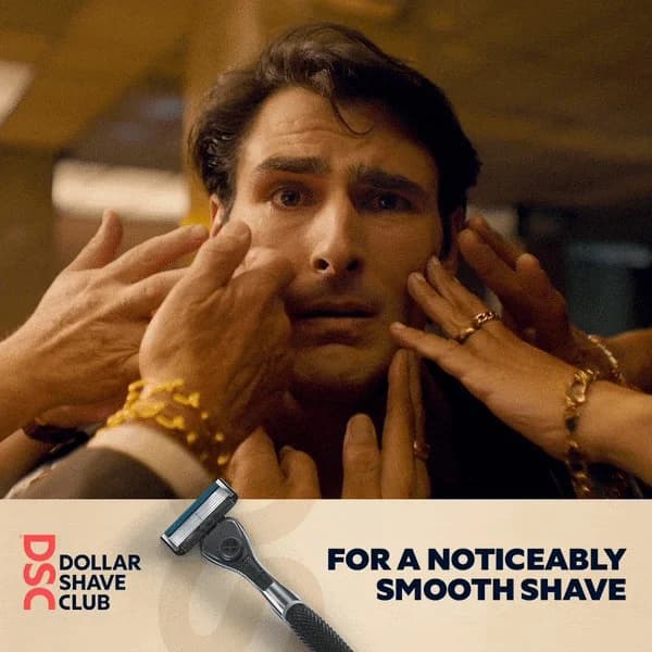
Comedy outperforms polish in commodity categories

Razor blades are boring. Dollar Shave Club made them interesting by being funny. Categories where every competitor looks the same (razors, socks, paper towels, supplements) give humor a positioning moat. Most brands won't risk it. That's the opportunity.

Bold typography can replace hero photography

Many Dollar Shave Club ads run as big typography on a solid blue background — no product hero, no model. Copy is the ad. If your headline is good enough, you can skip the product shot entirely, which is cheaper to produce and often higher CTR on mobile. Worth testing a copy-only ad against a polished control.

Questions

Dollar Shave Club ads work because they pick a fight with a specific, named competitor (Gillette) and back the fight with real math ($3/mo vs $25 drugstore). Comedy tone — sardonic, irreverent, willing to curse — stands out in a category dominated by stock athleticism and chrome product photography. Royal blue and white keep visuals consistent, and direct price comparisons give copy a proof point stronger than adjectives ever could.

Irreverent, blunt, and slightly self-aware. Scripts sound like a friend texting you about a subscription they like, not a brand marketing to you. Tone names competitors, curses occasionally (tactically, not gratuitously), and jokes about how boring the category is. Other razor brands play serious; Dollar Shave Club plays amused. Contrast is the whole positioning.

Royal blue is the core brand color — it shows up on packaging, the website, and nearly every ad. White and light gray backgrounds keep the blue popping. Typography runs bold, condensed sans-serif that reads as confident without being corporate. Product shots stay clean and flat, usually on solid backgrounds, with copy taking equal or greater real estate than the product. Whole system is designed to be readable on a thumbnail.

Directly and often. Ads run Gillette's drugstore price next to the DSC subscription price, sometimes with a crossed-out Gillette logo, sometimes with a side-by-side receipt. DSC built its launch on the premise that Gillette was overcharging and mocked the "vibrating handle" arms race Gillette had been running. Naming-names strategy was rare in 2012 and stays under-used by most challenger brands in 2026.

After Unilever acquired the brand in 2016, ads softened slightly — less founder-forward comedy, more product-range promotion across body wash, hair care, and wipes. Recent creative still leans on the blue-and-white visual system and subscription-math framing, but the comedic edge runs closer to lifestyle humor than the "F-bomb launch video" era. A 2021 management buyback brought back more of the original irreverence, visible in 2023-2024 creative rotations.

Create Your Own
Dollar Shave Club Ad

Clone any dollar shave club ad example. Upload your product photo. Seconds later, you have a finished ad ready to launch.

Create your ad
AdDogs ad examples globe