AdDogs

True Classic Ad Examples

Browse 45+ True Classic ads ad examples sourced from high-performing campaigns. Clone any design, swap in your product, and get a finished ad in seconds.

Updated June 2026

True Classic built a half-billion-dollar apparel brand on one observation — most men's t-shirt ads use six-pack models, but most men don't have six-packs. Founder Ryan Bartlett put regular-bodied guys in the ads, priced shirts at $25-30, and ran aggressive before-after fit comparisons. Creative looks almost comically direct next to Lululemon or Ralph Lauren.

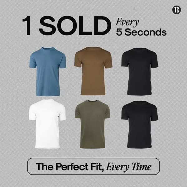
Their ad system stays ruthless about one message: the shirt fits better than the one you're wearing. Every ad is a fit comparison — a baggy shirt on the left, a True Classic on the right, same guy both frames. Palette is simple: navy blue, cream, warm earth tones, and occasional olive. Typography is chunky and direct, often with the price ($25, $29.99) front and center. Models run average-height, average-build — dads, office workers, guys with a gut. Facebook and Instagram carry the heavy rotation, with YouTube running testimonial spots where customers hold up their old shirt next to the new one.

Our True Classic ad examples collection captures fit comparisons, price-forward statics, and testimonial carousels the brand runs. Filter by format to find the split-screen dad-bod comparisons, the price-in-headline statics, and the UGC unboxing videos that repeat across Facebook placements. Annotations point out how the cream backgrounds stay neutral, where the price number sits, and how the posing matches across before and after frames.

True Classic — AirDrop Before/After Mockup. Brand: True Classic. This ad cleverly uses an iOS AirDrop UI mockup to create a native, attention-grabbing experience, mimicking a personal notification. The layout features a prominent before-and-after split screen, visually demonstrating the product's transformative effect on physique and confidence. The 'before' image shows a relaxed, slightly ill-fitting shirt, contrasting sharply with the 'after' image's well-fitted tee and confident posture. Color psychology is subtle, with natural outdoor lighting enhancing the 'after' shot's appeal. Text hierarchy is clear: 'AirDrop' as the sender, a bold, provocative headline, and a direct call to action embedded in the 'Accept' button. This composition is optimized for social feeds, where its unique format and relatable transformation story are designed to interrupt scrolling and drive engagement, leveraging curiosity and aspirational messaging.. Headline: Looking to transform from dad to daddy?. Primary text: Get True Classic.. Why this ad works: Native UI mimicry grabs immediate attention — The AirDrop notification format is highly effective on social platforms, breaking through typical ad blindness. It creates an instant, personal connection, making users pause and engage with what appears to be a system notification rather than an advertisement, boosting initial click-through rates. Provocative headline sparks curiosity and engagement — The "dad to daddy" headline is bold and memorable, directly addressing a common male aspiration for improved appearance and confidence. This specific, slightly humorous language resonates with the target audience, encouraging them to view the transformation and consider the brand's promise. Clear before/after visually sells transformation — The split-screen comparison powerfully illustrates the product's benefit. The 'before' image shows a less flattering fit, while the 'after' showcases a well-fitted shirt and confident demeanor. This direct visual proof is highly persuasive, demonstrating the tangible improvement True Classic offers.. Specs: Brand: True Classic, Industry: Fashion & Apparel, Platform: Instagram, Format: UI Mockup, Audience: Men 25-34True Classic — Problem/Solution Split Screen. Brand: True Classic. This ad effectively uses a split-screen comparison to highlight product benefits. The left panel vividly portrays a common problem: sweat stains and discomfort, creating an immediate, relatable pain point. The right panel offers the aspirational solution, showcasing a confident model in True Classic apparel, emphasizing performance features. Color psychology contrasts the sickly yellow stain against a vibrant green, while the solution side uses natural, muted tones for a clean, active aesthetic. The composition guides the eye from problem to solution, with clear text hierarchy supporting the narrative. This visual storytelling is optimized for platforms like Instagram, where quick, impactful comparisons drive engagement and consideration by directly addressing user needs. The ad's directness and visual clarity make it highly effective.. Headline: LOOK GOOD, FEEL GOOD, SMELL GOOD. Primary text: OTHER BRANDS Traps odors Sweat stains Too rigid TRUE CLASSIC Odor-control Moisture-wicking 4 way stretch. Why this ad works: Direct Problem/Solution Visual Comparison — The split-screen layout immediately contrasts a negative experience with the brand's positive solution. This "before and after" approach is highly effective for direct-response advertising, as it quickly communicates value and addresses common pain points, compelling viewers to consider the product as a superior alternative. Visceral Imagery Creates Strong Pain Point — The prominent sweat stain on the "Other Brands" side is a powerful, relatable visual that evokes discomfort and embarrassment. This visceral imagery creates a strong emotional connection, amplifying the perceived need for a solution and making the benefits offered by True Classic feel more urgent and desirable. Clear Feature List with Benefit-Oriented Icons — The use of concise bullet points alongside intuitive icons for "Odor-control," "Moisture-wicking," and "4 way stretch" on the True Classic side ensures quick comprehension of key benefits. This visual aid enhances readability and allows users to grasp the product's advantages at a glance, crucial for fast-scrolling social feeds.. Specs: Brand: True Classic, Industry: Fashion & Apparel, Platform: Instagram, Format: Static, Audience: Men 25-34True Classic Waffle Hoodie — Feature Callout. Brand: True Classic. This ad employs a clean, minimalist layout, centering the True Classic Waffle Hoodie against a neutral light grey background. The composition uses a clear visual hierarchy: the product name as the main headline, followed by the product itself, and then three distinct feature callouts. Red lines and dots draw the eye directly to key benefits, enhancing readability and quick comprehension. The muted color palette of navy and light grey projects a sophisticated, clean aesthetic, aligning with premium casual wear. This design is highly effective for platforms like Instagram or Facebook, where a clear product focus and concise information capture attention. The prominent "100-Day Perfect Fit Guarantee" acts as a strong trust signal, mitigating purchase risk. The text overlay is medium, balancing visual appeal with essential product information, optimizing for quick scanning.. Headline: The Waffle Hoodie. Primary text: Tailored Fit Lightweight Warmth Incredibly Soft. Why this ad works: Clear Feature Callouts Drive Engagement — Red lines and dots visually connect specific benefits like "Tailored Fit" directly to the product. This technique breaks down complex information into digestible points, allowing viewers to quickly grasp key selling propositions without reading extensive body copy, crucial for fast-scrolling social feeds. Minimalist Layout Enhances Product Focus — By placing the hoodie centrally on a plain, light grey background, the ad eliminates distractions. This clean aesthetic ensures the product is the undisputed hero, making it easy for potential customers to visualize the item and its features, which is vital for apparel advertising. Strong Guarantee Builds Purchase Confidence — The "100-Day Perfect Fit Guarantee" prominently displayed at the bottom acts as a powerful trust-builder. It directly addresses potential customer hesitations regarding fit and quality, significantly lowering perceived risk and encouraging consideration or conversion, especially for online apparel purchases.. Specs: Brand: True Classic, Industry: Fashion & Apparel, Platform: Instagram, Format: Static, Audience: Men 25-34True Classic Pants — Testimonial Product Showcase. Brand: True Classic. This ad effectively combines social proof with a clear product display. The layout prioritizes a prominent customer testimonial at the top, immediately establishing trust and value. Below, three pairs of pants are cleanly arranged against a neutral grey background, showcasing color variety and the "3 Pack" offer. The composition uses a strong vertical hierarchy, guiding the eye from the glowing review to the product, then to the compelling price point. Color psychology is minimal, relying on the product's neutral tones and the stark black-and-white of the text and price box to create contrast. This design is optimized for platforms like Instagram or Facebook, where user-generated content and direct offers perform well. The text hierarchy ensures the key selling points—customer satisfaction and discounted price—are instantly digestible, driving consideration and conversion.. Headline: Premium Pants For An Affordable Price. Primary text: These Pants Are Just Like Their Shirts, Look Great, Feel Great, And At A Great Price. Enough Said!. Why this ad works: Prominent Testimonial Builds Instant Trust — The large, clear testimonial box with a 5-star rating and "Verified" badge immediately establishes social proof. This is crucial for new customers, reducing perceived risk and validating the product's quality and value proposition before they even look at the pants. Clear Value Proposition with Price Anchor — The "3 Pack" badge and the striking price comparison ($59.99 vs $194.97) clearly communicate a significant discount and bundle value. This direct, high-contrast price display captures attention and incentivizes immediate purchase decisions, appealing to budget-conscious buyers. Minimalist Product Display Highlights Variety — The three pants are presented simply on a clean background, allowing their colors and form to be the focus. This minimalist approach prevents visual clutter, making it easy for the viewer to quickly grasp the product offering and appreciate the different color options available in the pack.. Specs: Brand: True Classic, Industry: Fashion & Apparel, Platform: Instagram, Format: Static, Audience: Men 25-34True Classic Tees — Split Screen Lifestyle. Brand: True Classic. This ad effectively utilizes a split-screen layout, juxtaposing a neatly stacked product display with a confident male model wearing the product. The left panel showcases the product's variety and quality through a stack of neutral-colored t-shirts, appealing to practicality. The right panel features a lifestyle shot, allowing the target audience to visualize themselves in the comfortable, well-fitting tee. The overall color palette is muted and clean, emphasizing the product's versatility and everyday appeal. Text hierarchy is clear: a bold headline "Comfortable" immediately communicates the core benefit, reinforced by the sub-headline "(Comfy + Affordable)". The "Gift Yourself" call-to-action is subtly placed, encouraging self-indulgence. This composition is optimized for platforms like Instagram, where visual appeal and quick comprehension are key, balancing product detail with aspirational imagery.. Headline: Comfortable. Primary text: (Comfy + Affordable). Why this ad works: Split-screen balances product and lifestyle appeal — The ad strategically divides the frame, dedicating one side to showcasing the product's physical attributes (colors, fabric texture) and the other to demonstrating its real-world wearability and fit. This dual approach addresses both practical and aspirational buyer motivations, enhancing perceived value and making the product more relatable to the target audience. Clear value proposition highlights key benefits — The headline "Comfortable" immediately communicates the primary benefit, reinforced by "(Comfy + Affordable)". This concise messaging directly addresses common pain points for t-shirt buyers, positioning True Classic as a solution that delivers both quality and value without ambiguity, driving consideration effectively. Neutral color palette enhances versatility perception — The use of muted, earthy tones for the t-shirts and background creates a clean, sophisticated aesthetic. This palette suggests the tees are versatile staples that can be easily integrated into any wardrobe, appealing to a broad male audience seeking timeless and practical apparel that fits seamlessly into their lifestyle.. Specs: Brand: True Classic, Industry: Fashion & Apparel, Platform: Instagram, Format: Static, Audience: Men 25-34True Classic Long Sleeve Polo — Split Product Shot. Brand: True Classic. This ad employs a split-screen layout, effectively showcasing both the full product and intricate details. The top section features a ghost mannequin shot of the new long sleeve polo against a clean, textured light grey background, immediately establishing the product's form and fit. The bottom section zooms into the collar and tag, highlighting material quality and brand authenticity. The muted, masculine color palette of navy and grey reinforces the brand's aesthetic, appealing to its target demographic. Text hierarchy is clear: brand name, prominent product title, and color options, guiding the viewer's eye. Optimized for vertical platforms like Instagram Stories or Reels, this composition ensures key information and visual appeal are maintained, driving initial product awareness through a sophisticated, minimalist presentation. The focus on texture in the close-up adds a tactile dimension, enhancing perceived quality.. Headline: New Long Sleeve Pima Polo. Primary text: While Stock Lasts Available In:. Why this ad works: Split-screen highlights product overview and detail — The ad's vertical split-screen design strategically presents the full product on top and a close-up detail shot below. This dual perspective allows viewers to appreciate both the overall fit and the premium fabric quality, like the Pima cotton, in a single glance. It builds trust by showing, not just telling, the product's craftsmanship. Muted, masculine palette reinforces brand identity — The dark navy polo against a light grey, subtly textured background creates a sophisticated and masculine aesthetic. This color choice aligns perfectly with the True Classic brand, signaling quality and versatility without being overly flashy. It appeals to men seeking classic, reliable wardrobe staples, enhancing brand recognition and resonance. Clear product naming and color availability — The prominent "New Long Sleeve Pima Polo" headline immediately communicates the product. Below, the "Available In:" section with distinct color swatches provides essential purchasing information upfront. This clear, concise presentation reduces cognitive load, allowing potential customers to quickly grasp product options and encouraging further engagement.. Specs: Brand: True Classic, Industry: Fashion & Apparel, Platform: Instagram, Format: Static, Audience: Men 25-34True Classic Tall Fit — Comparison Layout. Brand: True Classic. This True Classic ad effectively uses a comparison layout to highlight its new "Tall Fit" option. Three models, front-facing, tall fit, and back-facing, are strategically positioned to demonstrate the product's key benefit. The central "Tall Fit" model is emphasized by a circular badge, drawing immediate attention. Muted, earthy shirt colors stand out against a subtle textured grey background, ensuring product visibility without distraction. Red lines and concise text annotations clearly illustrate the specific length adjustments (+1 inch sleeves, +2 inches body), making the feature easily digestible. A prominent headline and customer testimonial build trust and communicate value. This composition is optimized for platforms like Instagram, where clear visual communication and problem-solving resonate with the target audience, driving consideration for men seeking better-fitting apparel. The ad successfully educates on a specific product improvement.. Headline: Fresh Colors. Same Perfect Proportions.. Primary text: "Love The New Tall Options!" - Tony S.. Why this ad works: Direct visual comparison highlights product benefit — The ad directly compares the standard and tall fit, using red lines to visually quantify the difference in sleeve and body length. This immediate side-by-side demonstration powerfully communicates the value proposition of the new tall option. For customers struggling with ill-fitting shirts, this visual clarity instantly addresses a pain point and showcases a tangible solution, driving higher engagement and understanding. Customer testimonial builds immediate trust — Including a direct quote from "Tony S." provides authentic social proof, lending credibility to the product's claims. Testimonials like this tap into consumer psychology, as potential buyers trust peer recommendations more than brand statements. This personal endorsement helps to alleviate skepticism and builds a sense of community around the brand, encouraging trial. Clear annotations simplify complex fit details — The use of simple red lines and concise text annotations ("Sleeves are +1 inch longer," "Body is +2 inches longer") effectively breaks down complex sizing information into easily digestible visuals. This technique ensures that the specific benefits of the tall fit are immediately understood, eliminating confusion and clearly communicating the precise improvements without requiring extensive reading.. Specs: Brand: True Classic, Industry: Fashion & Apparel, Platform: Instagram, Format: Static, Audience: Men 25-34True Classic RTO Pant — Split Screen Product Focus. Brand: True Classic. This ad effectively uses a split-screen layout to highlight both product aesthetics and key benefits. The left panel features a close-up of the RTO Pant, emphasizing its fit and material texture with a subtle, professional background. The right panel, on a clean, light grey background, presents the product name, a compelling sub-headline, and three concise benefit-driven bullet points. The neutral color palette of beige and grey maintains a sophisticated, professional vibe, appealing to its target audience of working professionals. Text hierarchy is clear, guiding the eye from the product name to the core value proposition and features. This composition is optimized for platforms like Facebook or Instagram, where clear visual communication and scannable text are crucial for quick comprehension and engagement, driving consideration for a versatile garment.. Headline: The RTO Pant. Primary text: WFH Comfort. Professional Facade. Ultra-Stretchy Extra Soft Never Restrictive. Why this ad works: Split-screen layout for clear communication — The ad divides the frame, dedicating one side to a detailed product shot and the other to concise, benefit-driven text. This separation prevents visual clutter, allowing viewers to quickly grasp both the product's appearance and its core value proposition, enhancing message retention. Benefit-driven headline and features — The headline "WFH Comfort. Professional Facade." immediately addresses a common pain point for professionals, followed by bullet points like "Ultra-Stretchy" and "Never Restrictive." This direct approach resonates with the audience's desire for comfort without sacrificing professionalism. Neutral color palette conveys professionalism — The use of beige for the pants and a light grey background creates a clean, sophisticated aesthetic. This color choice aligns with a professional image, suggesting versatility and timelessness, which is appealing to men seeking practical yet stylish workwear.. Specs: Brand: True Classic, Industry: Fashion & Apparel, Platform: Facebook, Format: Static, Audience: Men 25-34True Classic — Friend Chat UI Mockup. Brand: True Classic. This ad leverages a native chat UI mockup to deliver a peer-to-peer recommendation, effectively bypassing typical ad resistance. The dark mode aesthetic provides high contrast for the chat bubble, ensuring readability and focus. Compositionally, the central chat bubble draws the eye, mimicking organic social interaction. The text hierarchy within the bubble guides the viewer from the brand mention to the compelling 70% off Black Friday offer. This approach is highly optimized for platforms like Instagram or Facebook, where it can blend seamlessly into a user's feed, appearing as a screenshot from a friend. The green 'like' icon subtly reinforces positive sentiment, enhancing the ad's credibility and engagement potential by tapping into social proof and urgency.. Primary text: You know that clothing brand True Classic you were looking at the other day? I've just got an ad from them, they've got a 70% off sale for Black Friday!!! 😍😍😍. Why this ad works: Native UI integration builds trust — Presenting the ad as a screenshot of a friend's message makes it feel organic and less like a traditional advertisement. This 'native' approach reduces ad fatigue and skepticism, making the message more trustworthy and relatable to the target audience, significantly boosting engagement and consideration. Social proof drives immediate consideration — A friend's recommendation carries more weight than direct brand messaging. By framing the discount as a discovery shared by a peer, the ad leverages social proof, encouraging the viewer to investigate True Classic. This peer endorsement is a powerful psychological trigger for driving purchase intent. Clear, urgent value proposition — The '70% off sale for Black Friday' is a highly compelling and time-sensitive offer. This strong discount, combined with the urgency of Black Friday, creates a powerful incentive for immediate action. It clearly communicates significant value, motivating users to explore the brand and sale.. Specs: Brand: True Classic, Industry: Fashion & Apparel, Platform: Instagram, Format: UI Mockup, Audience: Men 25-34True Classic T-Shirts — Stacked Product Sale. Brand: True Classic. This True Classic ad effectively leverages a minimalist product-on-background layout to highlight a compelling discount. A neatly folded stack of t-shirts, presented in a masculine, versatile color palette (navy, grey, olive, teal), forms the central composition. The diagonal arrangement adds subtle dynamism, guiding the eye across the product range. The dominant "Up To 46% Off" headline, positioned prominently at the top, immediately communicates value, establishing a clear text hierarchy. A smaller qualifier below ensures transparency. The clean, light grey background ensures high contrast, making both the product and text pop, optimizing for platforms like Instagram or Facebook where quick comprehension is key. This ad works by directly appealing to value-driven consumers while subtly showcasing product variety and quality. The brand logo is strategically placed at the bottom, reinforcing recognition without distracting from the offer.. Headline: Up To 46% Off. Primary text: *Select Pima Cotton Packs. Why this ad works: Clear discount headline drives immediate attention — The large, bold "Up To 46% Off" headline immediately communicates significant value, crucial for scroll-stopping on platforms like Facebook and Instagram. It leverages urgency and a strong financial incentive to click, appealing directly to price-sensitive buyers looking for a deal on quality basics. This direct approach cuts through feed clutter effectively. Product stack showcases variety and quality — The neatly folded stack of t-shirts in different muted colors effectively displays product range and versatility without clutter. This organized visual implies quality and attention to detail, allowing potential customers to easily envision the value and variety offered within the Pima Cotton Packs, enhancing perceived value. Minimalist background keeps focus on product — The plain, light grey background ensures the colorful t-shirts and the prominent discount text stand out with high contrast. This clean aesthetic prevents visual distractions, making the ad easy to process quickly. It reinforces a premium, uncluttered brand image, which is highly effective for fashion retail on visually-driven platforms.. Specs: Brand: True Classic, Industry: Fashion & Apparel, Platform: Instagram, Format: Static, Audience: Men 25-34True Classic T-Shirts — Social Proof Grid. Brand: True Classic. This ad employs a clear grid layout to showcase True Classic's t-shirts, immediately grabbing attention with a bold social proof headline: "1 SOLD Every 5 Seconds." The composition prioritizes this impressive statistic at the top, leveraging a strong psychological trigger for trust and desirability. Below, six product shots in a muted, masculine color palette are arranged symmetrically against a subtle grey textured background, ensuring product visibility without distraction. The clean aesthetic and direct messaging are optimized for platforms like Facebook and Instagram, where quick consumption and clear value propositions are key. Text hierarchy is effective, moving from the impactful sales claim to the product display, culminating in a benefit-driven tagline, "The Perfect Fit, Every Time," reinforcing the brand's promise. The overall design is simple, direct, and conversion-focused, aiming to build immediate credibility and product interest.. Headline: 1 SOLD Every 5 Seconds. Primary text: The Perfect Fit, Every Time. Why this ad works: Dominant social proof headline builds trust — The "1 SOLD Every 5 Seconds" headline is strategically placed at the top, immediately establishing credibility and urgency. This powerful social proof acts as a strong psychological trigger, signaling popularity and quality to potential customers. It effectively cuts through ad fatigue by providing an immediate, compelling reason to consider the product. Clear product grid showcases variety — Presenting six t-shirts in a clean, organized grid allows viewers to quickly grasp the product's range of colors. This direct visual display eliminates guesswork and helps potential buyers envision the shirts in their wardrobe. The simple, flat-lay style keeps the focus squarely on the product's appearance and available options. Benefit-driven tagline reinforces value — The tagline "The Perfect Fit, Every Time" is prominently displayed at the bottom, directly addressing a common pain point for t-shirt buyers. This benefit-oriented statement reinforces the brand's core promise, adding a layer of perceived value beyond just the product's popularity. It provides a strong, memorable takeaway for the viewer.. Specs: Brand: True Classic, Industry: Fashion & Apparel, Platform: Facebook, Format: Static, Audience: Men 25-34True Classic T-Shirt — Feature Spotlight. Brand: True Classic. This ad employs a clean, product-centric layout to highlight True Classic's t-shirt features. A single coral t-shirt is centrally positioned against a light grey background, ensuring maximum focus. The composition utilizes clear lines and text callouts to explain specific fit benefits like "Fitted Up Top" and "Longer Length," effectively addressing common pain points for taller men. The "Bundle & Save" badge acts as a secondary visual cue, promoting value. The muted color palette of the shirt and background creates an approachable, modern aesthetic. Optimized for platforms like Facebook or Instagram, its clear visual hierarchy and informative text make it suitable for driving consideration by educating the audience on product advantages. The text density is medium, balancing visual appeal with detailed information.. Headline: New Season, New Colors, Same Tall-Friendly Fit. Why this ad works: Clear Feature Callouts Detail Product Benefits — The ad effectively uses direct lines and concise text to highlight specific fit features like "Fitted Up Top" and "Longer Length." This visual explanation immediately clarifies the unique value proposition for the target audience, addressing common frustrations with ill-fitting shirts and converting product attributes into tangible benefits. "Bundle & Save" Badge Drives Immediate Value — The prominent "Bundle & Save" badge in the top right corner acts as a strong value proposition and a subtle call to action. It encourages larger purchases by signaling a discount opportunity, appealing to cost-conscious consumers and potentially increasing average order value without needing an explicit price point. Minimalist Design Enhances Product Focus — By placing the product against a simple, light grey background with minimal distractions, the ad ensures the t-shirt and its features are the sole focus. This clean aesthetic prevents visual clutter, making the ad easy to digest quickly in a busy social feed and reinforcing a premium, no-nonsense brand image.. Specs: Brand: True Classic, Industry: Fashion & Apparel, Platform: Facebook, Format: Static, Audience: Men 25-34True Classic Jeans — Testimonial Product Stack. Brand: True Classic. This ad leverages a testimonial-driven layout, strategically placing a compelling customer quote at the top to immediately build trust and credibility. The composition features three pairs of True Classic jeans, stacked diagonally, effectively showcasing product variety in different washes and hinting at quality. The muted gray background ensures the denim colors and crisp white text pop, creating strong visual contrast optimized for mobile feeds like Instagram Stories or TikTok. Text hierarchy is clear: the brand logo is subtly placed, followed by a large, impactful quote, then its attribution. This vertical format is designed for quick consumption, allowing the social proof to resonate before the product details are fully absorbed, effectively driving consideration through authentic user experience and product display.. Headline: "They fit great, look great and are very comfortable." - Daniel M.. Why this ad works: Prominent testimonial builds immediate trust — Placing the customer quote "They fit great, look great and are very comfortable." at the top of the ad immediately establishes social proof. This direct, relatable endorsement from "- Daniel M." is highly effective for consideration-stage audiences, validating product claims before the viewer even fully processes the product image. Product stack showcases variety and quality — The diagonal stack of three jeans in different washes (light, medium, dark/black) efficiently communicates True Classic's range. This visual technique allows viewers to quickly grasp the available options and perceive the quality of the denim through texture and fit, appealing to diverse style preferences within the target demographic. Vertical format optimized for mobile stories — The ad's vertical aspect ratio and clear, concise layout are perfectly suited for platforms like Instagram Stories or TikTok. This native format ensures the ad fills the screen, minimizing distractions and maximizing engagement. The large, readable text and distinct product display are designed for quick, on-the-go consumption.. Specs: Brand: True Classic, Industry: Fashion & Apparel, Platform: Instagram, Format: Static, Audience: Men 25-34True Classic V-Neck Comparison Grid. Brand: True Classic. This ad employs a comparison grid layout, showcasing three distinct True Classic V-neck styles. The composition uses a clean, minimalist aesthetic with a neutral grey background, ensuring the product and models remain the focal point. Each V-neck is presented in a consistent framed shot, allowing for easy side-by-side evaluation. The text hierarchy is clear: a playful headline at the top, followed by specific product names and their key features beneath each image. This strategy effectively highlights product differentiation. Optimized for vertical platforms like Instagram Stories or Reels, the ad leverages visual clarity and concise feature callouts to inform potential customers, guiding them through product options without overwhelming them. The color palette is subdued, reinforcing a sophisticated, masculine brand identity.. Headline: V-Necks So Good, Crew Necks Get Jealous. Primary text: Classic V-Neck Ultra-Soft Everyday Tee / Premium Pima V-Neck Silky Smooth & Dressy / Active V-Neck Anti-Odor Tech Fabric. Why this ad works: Side-by-side comparison highlights product range — Presenting three distinct V-neck styles side-by-side allows potential customers to quickly grasp the variety and choose based on specific needs. This comparison format reduces decision fatigue by offering clear options, making the selection process efficient and user-friendly for the target audience. Clean, minimalist aesthetic for premium appeal — The neutral grey background and simple framing convey a sense of quality and sophistication. This minimalist approach ensures the focus remains on the product's fit and fabric, appealing to a male demographic that values understated elegance and high-quality basics, reinforcing True Classic's premium positioning. Clear feature callouts drive product differentiation — Each V-neck is accompanied by concise, benefit-driven descriptions like "Ultra-Soft Everyday Tee" or "Anti-Odor Tech Fabric." These specific callouts immediately communicate the unique value proposition of each product, helping customers understand the differences and select the V-neck best suited for their lifestyle.. Specs: Brand: True Classic, Industry: Fashion & Apparel, Platform: Instagram, Format: Static, Audience: Men 25-34True Classic Gym Shirts — Benefit-Driven Grid. Brand: True Classic. This ad employs a split-screen layout, dedicating the left side to compelling, benefit-driven text and the right to a grid of product visuals. The headline, presented as a testimonial, immediately grabs attention by addressing a common pain point. Color psychology utilizes a neutral, textured background, allowing the bold black text and varied shirt colors to pop, ensuring high readability and product visibility. Compositionally, the ad balances information with visual proof, using icons to enhance scannability of key features. Optimized for social feeds like Instagram, its clear hierarchy and direct messaging cut through noise. The text hierarchy prioritizes a strong hook, followed by concise, icon-supported benefits, making the value proposition instantly clear to the target audience.. Headline: I Threw Out All My Old Gym Shirts After Trying This!. Primary text: Makes You Look Jacked Hides Your Belly 4-Way Stretch Performance Material. Why this ad works: Testimonial Headline Hooks Audience — The headline "I Threw Out All My Old Gym Shirts After Trying This!" acts as a powerful, relatable testimonial. This user-generated content style builds immediate trust and curiosity, suggesting a transformative experience. It directly addresses a common pain point, making the ad highly engaging for men seeking better athletic wear. Icon-Driven Benefits Enhance Scannability — The use of clear, simple icons alongside concise benefit statements ("Makes You Look Jacked," "Hides Your Belly") significantly improves information retention. This visual shorthand allows viewers to quickly grasp the core value propositions, which is crucial for fast-scrolling social media environments. It makes complex features digestible and impactful. Product Grid Showcases Variety & Fit — Displaying six different shirt colors on a consistent model in a grid format effectively showcases product variety and consistent fit. This allows potential customers to visualize themselves in the shirts and see the range of options, reducing purchase hesitation. It provides visual proof of the product's aesthetic appeal.. Specs: Brand: True Classic, Industry: Fashion & Apparel, Platform: Instagram, Format: Mixed, Audience: Men 25-34True Classic Sweater Polo — Product Grid Showcase. Brand: True Classic. This ad effectively utilizes a clean, minimalist grid layout to showcase True Classic's 'Sweater Polo' in six distinct colorways. The vertical composition is ideal for mobile-first platforms like Instagram Stories or Reels, ensuring maximum screen real estate. A prominent, elegant headline establishes the product's return, immediately followed by the organized product display. The neutral color palette of the polos against a light grey background ensures visual clarity and allows the product itself to be the hero. A bold, contrasting urgency banner at the bottom, "Selling Out FAST!", creates immediate FOMO and prompts quick action. This clear text hierarchy guides the viewer from product introduction to a strong conversion driver, leveraging scarcity to accelerate purchase intent. The ad's simplicity minimizes distractions, focusing entirely on product appeal and the call to act now.. Headline: The Perfect Sweater Polo Returns. Primary text: Selling Out FAST!. Why this ad works: Efficient product variety display — The 3x2 grid layout effectively presents six distinct color options simultaneously. This allows potential customers to quickly grasp the range available without needing to scroll or click through multiple images. It caters to diverse preferences and highlights the product's versatility, driving broader appeal and consideration. Strategic urgency messaging — The bold "Selling Out FAST!" banner at the bottom creates a powerful sense of scarcity and FOMO (Fear Of Missing Out). This psychological trigger encourages immediate action, pushing fence-sitters towards conversion by implying limited availability and the risk of missing out on a popular item. Clean, minimalist product focus — The light grey background and isolated product shots eliminate distractions, ensuring that the viewer's attention remains solely on the Sweater Polos. This clean aesthetic communicates a premium feel and allows the product's texture, fit, and color options to be clearly appreciated, enhancing perceived value.. Specs: Brand: True Classic, Industry: Fashion & Apparel, Platform: Instagram, Format: Static, Audience: Men 25-34True Classic Tall Tees — Product Spotlight Layout. Brand: True Classic. This ad effectively uses a split-screen layout, dedicating the right side to a clean hero shot of a blue tall t-shirt against a light grey background. The left side features prominent text announcing "New Tall Colors" and a series of color swatches. A "Just Dropped" badge adds a sense of newness and urgency. Red accent lines subtly highlight the shirt's length, reinforcing the "Tall" feature. The minimalist color palette, primarily blue and grey with black text, conveys a clean and modern aesthetic, aligning with the brand's identity. This composition is optimized for social feeds like Instagram, where clear product presentation and concise messaging are crucial for stopping the scroll. The text hierarchy guides the eye from the brand logo to the main announcement, then to the available color options, ensuring key information is quickly absorbed. It's a direct and efficient product launch announcement.. Headline: New Tall Colors. Primary text: Just Dropped. Why this ad works: Clear visual hierarchy for new product — The bold, multi-font 'New Tall Colors' text immediately grabs attention, clearly communicating the ad's purpose. This prominent placement ensures viewers instantly understand the product update. In a crowded feed, this direct messaging cuts through noise, informing the audience about the specific new offering and encouraging further engagement with the brand's latest collection. Visual cue highlights 'Tall' feature — The subtle red bracket visually emphasizes the extended length of the t-shirt, directly illustrating the 'Tall' feature. This clever graphic element provides an instant visual cue, making the product's unique selling proposition clear without requiring additional descriptive text. It effectively communicates the benefit to the target audience seeking specific sizing. Color swatches showcase variety efficiently — Presenting multiple color options as small, distinct swatches efficiently showcases product variety without cluttering the main hero shot. This allows viewers to quickly grasp the range of new colors available, increasing perceived value and choice. It encourages exploration and click-throughs by appealing to individual style preferences.. Specs: Brand: True Classic, Industry: Fashion & Apparel, Platform: Instagram, Format: Static, Audience: Men 25-34True Classic Black Friday — Product Grid & Lifestyle. Brand: True Classic. This ad effectively leverages a grid/collage layout to showcase a True Classic Black Friday deal. The top section prominently features the "Black Friday Deal" headline and discounted price, immediately grabbing attention with a contrasting yellow highlight. Below, a multi-panel display offers a comprehensive product view: a model wearing the tank from front and back, alongside a detailed fabric texture shot. This composition strategy provides extensive visual information, addressing common customer queries upfront. The clean, muted grey background ensures the navy product stands out, reinforcing a masculine and functional aesthetic. Text hierarchy prioritizes the deal, followed by product specifics, guiding the viewer's eye efficiently. Optimized for social feeds, this ad balances urgency with detailed product presentation, driving consideration and conversion.. Headline: Black Friday Deal. Primary text: Navy Sleeveless Active Mesh Tank (3-Pack). Why this ad works: Clear deal highlight drives immediate action — The prominent "Black Friday Deal" and striking yellow price box instantly communicate value. This direct approach capitalizes on seasonal urgency, compelling viewers to act quickly. It reduces friction by clearly stating the offer upfront, which is crucial for conversion-focused campaigns during peak shopping periods. Comprehensive product view builds confidence — By presenting the product from multiple angles—isolated, on a model (front and back), and a detailed fabric shot—the ad addresses potential customer questions proactively. This holistic visual strategy builds trust and confidence, allowing potential buyers to thoroughly assess the garment's fit, style, and material quality before clicking through. Clean, masculine aesthetic resonates with target — The minimalist grey background paired with the deep navy product creates a clean, masculine aesthetic. This design choice effectively targets men seeking functional yet stylish activewear. The straightforward presentation avoids clutter, ensuring the product and its benefits are the undisputed focal point, appealing to a practical male demographic.. Specs: Brand: True Classic, Industry: Fashion & Apparel, Platform: Instagram, Format: Static, Audience: Men 25-34True Classic — Sitewide Sale with Product Lineup. Brand: True Classic. This ad effectively uses a product lineup as a backdrop for a prominent discount message. The diagonal composition of the t-shirts creates depth and visually guides the eye from light to dark, subtly showcasing the range of available colors. The large, bold white text for "20% Off Sitewide" immediately captures attention, establishing a clear value proposition. The red "Upgrade Your Wardrobe" callout adds urgency and a lifestyle benefit. Text hierarchy is clear: discount first, then details, then the code. The clean, minimalist product presentation combined with the direct, high-contrast text is optimized for quick consumption on social feeds like Instagram or Facebook, where a strong offer and clear visuals drive engagement and conversion. The overall design balances product display with promotional messaging, making the sale the undeniable hero.. Headline: 20% Off Sitewide. Primary text: Upgrade Your Wardrobe. Why this ad works: Dominant discount text grabs attention — The "20% Off Sitewide" text is oversized and high-contrast against the product background. This immediate visual impact ensures the core offer is seen first, crucial for scroll-stopping on busy social feeds and driving high-intent clicks for conversion-focused campaigns. Product lineup provides context and range — Displaying multiple t-shirts in various neutral colors behind the text effectively showcases the product's versatility and quality without clutter. This visual context reinforces the "sitewide" aspect of the sale, subtly encouraging exploration of different options and increasing perceived value. Clear, actionable discount code placement — The discount code "INTL-VDAY-20" is presented in a distinct, easy-to-read box at the bottom. This clear placement ensures users can quickly find and copy the code, reducing friction in the conversion funnel and directly supporting the ad's sales objective.. Specs: Brand: True Classic, Industry: Fashion & Apparel, Platform: Instagram, Format: Static, Audience: Men 25-34True Classic Tall Guys — Product Stack with Features. Brand: True Classic. This ad effectively uses a split-screen composition, dedicating the left half to compelling text and the right to a product stack. The minimalist white background ensures high contrast, making both the bold headline and the product stack pop, which is crucial for scroll-stopping on platforms like Instagram. Color psychology is subtle, with the red "Tall Guys" highlighting the target audience and problem solution. The composition strategically places the product stack on the right, aligning with natural eye movement after reading the text. Text hierarchy is clear: a large, benefit-driven headline, followed by a sub-headline and bulleted features with checkmarks, guiding the viewer through key selling points. This structure optimizes for quick information absorption, ideal for mobile users.. Headline: Shirts Built For Tall Guys. Primary text: Look Good. Feel Great. Every Time. Premium Fitted Tall T-Shirts Classic Side Seam For The Best Look & Fit Perfect Fit, 100-Day Made To Last Guarantee. Why this ad works: Clear audience segmentation in headline — The headline "Shirts Built For Tall Guys" immediately identifies the niche target audience. This direct address creates instant relevance and stops the scroll for the intended demographic, ensuring efficient ad spend by attracting highly qualified leads who struggle with finding well-fitting shirts. Feature-rich bullet points with visual cues — The use of bullet points with checkmark icons effectively breaks down key product benefits. This scannable format allows viewers to quickly grasp the value proposition, such as "Premium Fitted" and "100-Day Guarantee," enhancing comprehension and building trust without overwhelming them with dense paragraphs. Minimalist background highlights product and text — The clean, light gray background provides a stark contrast for both the dark text and the stacked t-shirts. This minimalist approach eliminates distractions, ensuring that the product's quality and the ad's core message are the undisputed focal points, driving clarity and perceived premium value.. Specs: Brand: True Classic, Industry: Fashion & Apparel, Platform: Instagram, Format: Static, Audience: Men 25-34True Classic Women's Line — Grid Showcase. Brand: True Classic. This ad employs a grid layout, effectively showcasing True Classic's new women's line. The top-left panel establishes the brand and new offering with clear text hierarchy, while the adjacent panel features a model close-up, emphasizing fit and wearability. A flat lay in the middle-left provides a full product view, complemented by an extreme fabric close-up at the bottom, highlighting the "Premium Fabrics" claim. The monochromatic black and off-white palette exudes a clean, sophisticated vibe, allowing the product's texture and form to take center stage. This composition is optimized for platforms like Instagram, where multiple visual cues in a single static image can convey comprehensive product information and stop the scroll. The design balances aspirational lifestyle with tangible product details, reinforcing the brand's expansion into a new market segment.. Headline: Premium Fabrics Meet Effortless Comfort. Primary text: Now Made For Her. Why this ad works: Multi-panel layout for comprehensive detail — The grid effectively combines brand messaging, lifestyle context, full product view, and texture detail. This comprehensive visual storytelling addresses multiple consumer touchpoints within a single ad unit, enhancing understanding and appeal. It's particularly effective for new product introductions, building trust and interest in the brand's expanded offering. Monochromatic palette emphasizes product quality — The use of black and off-white creates a sophisticated, minimalist aesthetic. This color choice directs attention solely to the product's form, fit, and texture, reinforcing the 'Premium Fabrics' message without visual distractions. It communicates elegance and timelessness, appealing to a discerning audience seeking quality. Strategic close-ups highlight key benefits — The model close-up showcases the garment's fit and how the ribbed fabric drapes on the body, while the extreme fabric shot visually proves the 'premium fabrics' claim. These detailed views provide tangible evidence of quality and comfort, building confidence in the product's value proposition and justifying its price point.. Specs: Brand: True Classic, Industry: Fashion & Apparel, Platform: Instagram, Format: Static, Audience: Women 25-34True Classic T-Shirts — Stacked Product Flat Lay. Brand: True Classic. This ad employs a clean, minimalist flat lay composition to showcase True Classic t-shirts. A centered stack of neutral-colored shirts grounds the visual, immediately drawing the eye to the product. The bold, statistics-driven headline at the top leverages social proof, creating a strong value proposition before the viewer even fully processes the image. Below the product, a clear, concise tagline reinforces the brand's core benefit. The muted color palette of the shirts and background exudes a masculine, no-nonsense vibe, resonating with the target demographic. Optimized for platforms like Instagram and Facebook, its high contrast text against a simple background ensures readability and scroll-stopping power, while the uncluttered layout keeps the focus squarely on the product and its promised benefit. The text hierarchy guides the eye from the compelling statistic to the product, then to the brand promise.. Headline: 81% of Men say they feel more confident in True Classic. Why this ad works: Social proof headline builds immediate trust — The headline "81% of Men say they feel more confident in True Classic" immediately establishes credibility and desirability through a powerful statistic. This social proof acts as a strong psychological trigger, making potential customers more likely to believe in the product's benefits and consider a purchase, especially in a crowded apparel market. Minimalist product stack highlights quality — By presenting a neatly folded stack of t-shirts against a clean, uncluttered background, the ad emphasizes the product itself. This minimalist approach allows the viewer to focus on the fabric texture, colors, and perceived quality without distractions. It communicates a sense of order and premium simplicity, appealing to a masculine aesthetic. Masculine color palette resonates with audience — The selection of navy, olive, white, charcoal, and black for the t-shirts, combined with a neutral grey background, creates a distinctly masculine and versatile aesthetic. This color scheme aligns perfectly with the target audience's preferences for classic, understated apparel, reinforcing the brand's identity and making the product feel relevant and appealing.. Specs: Brand: True Classic, Industry: Fashion & Apparel, Platform: Instagram, Format: Static, Audience: Men 25-34True Classic Pima Crew — Hero & Color Grid. Brand: True Classic. This ad effectively uses a split-focus layout, featuring a prominent hero shot of a Pima Crew tee on the left, complemented by a grid of six additional color options on the right. This composition immediately showcases product fit and variety. The neutral grey background with a subtle texture provides a clean, masculine aesthetic, allowing the product colors to pop without distraction. Text hierarchy is clear: a bold headline announces the "Color Drop," while a red banner highlights the "Up To 46% Off" discount, creating urgency. Optimized for platforms like Facebook or Instagram, the ad leverages visual appeal and a strong value proposition to drive consideration and conversion. The overall design is clean and direct, minimizing clutter to maximize product visibility and promotional impact. The brand logo in the bottom right corner subtly reinforces brand identity.. Headline: Pima Crew Color Drop. Primary text: Up To 46% Off. Why this ad works: Clear Value Proposition with Urgency — The "Up To 46% Off" banner in contrasting red immediately grabs attention. This direct discount messaging, placed prominently below the product name, creates a strong incentive for potential customers. It taps into psychological triggers of saving money, driving immediate consideration and click-through rates for conversion-focused campaigns. Effective Product Showcase & Variety — The ad combines a large, detailed hero shot with a grid of smaller images, effectively displaying both the fit and quality of the Pima Crew tee, alongside the breadth of available colors. This dual approach addresses both product detail and choice, appealing to different aspects of a buyer's decision-making process. Clean, Masculine Aesthetic — The muted grey background with a subtle texture provides a sophisticated yet understated backdrop. This minimalist approach ensures the focus remains entirely on the apparel. The color palette of the shirts themselves, featuring classic and earthy tones, reinforces a masculine and versatile brand image, resonating with the target demographic.. Specs: Brand: True Classic, Industry: Fashion & Apparel, Platform: Facebook, Format: Static, Audience: Men 25-34True Classic Office Pants — UI Card Layout. Brand: True Classic. The ad effectively uses a UI card layout to simulate an e-commerce product page, immediately signaling a direct purchase opportunity. The central product shot focuses on the pants' fit and comfort, emphasized by the relaxed hand-in-pocket pose. Color psychology leverages deep navy for professionalism and versatility, while the crisp white card ensures high contrast and readability against the darker background. Composition places the product prominently within the card, with a clear text hierarchy guiding the eye from the benefit-driven headline to the detailed description and finally to the prominent call-to-action. This design is highly optimized for platforms like Facebook or Instagram, where native shopping features are common, blending seamlessly with organic content while driving strong conversion intent. The "Fancy Sweatpants" tagline cleverly addresses a common pain point for office wear, appealing to comfort-seeking professionals.. Headline: Office Pants For Soft Pants People. Primary text: “Fancy Sweatpants” Ultra-stretchy, extra soft, and never restrictive for everyday comfort.. Why this ad works: UI Card Layout Simulates Purchase Intent — The ad's presentation within a familiar e-commerce card immediately primes the viewer for a shopping experience. This reduces friction by mimicking a known interaction pattern, making the "Add to Cart" button feel like a natural next step rather than an abrupt ad prompt. Benefit-Driven Headline & Sub-copy — "Office Pants For Soft Pants People" directly addresses a desire for comfort in professional attire. The "Fancy Sweatpants" descriptor and "Ultra-stretchy, extra soft" details reinforce the unique selling proposition, clearly communicating the core benefit to the target audience. Product-Focused Composition & Pose — The close-up shot of the pants on a real person, with a hand casually in the pocket, highlights both the fit and the implied comfort and flexibility. This authentic, in-use presentation is more relatable and persuasive than a flat lay or mannequin shot.. Specs: Brand: True Classic, Industry: Fashion & Apparel, Platform: Instagram, Format: Static, Audience: Men 25-34True Classic Waffle Hoodie — Clean Product Shot. Brand: True Classic. This ad employs a classic split-screen layout, dedicating the right half to a clean hero shot of the dark blue waffle hoodie and the left to compelling text. The minimalist light grey background ensures the product's texture and color pop, optimizing for visual clarity on busy social feeds like Instagram. Text hierarchy is clear: the bold product name "The Waffle Hoodie" immediately grabs attention, followed by concise, benefit-driven bullet points. The high contrast between the dark product and light background, coupled with black typography, ensures readability and scroll-stopping power. This composition strategically balances product visualization with key selling points, making it effective for consideration-stage campaigns where users are evaluating features. The square format is versatile for various social placements.. Headline: The Waffle Hoodie. Primary text: Made to Last Waffle-Knit Texture No-Fuss Care. Why this ad works: Split-screen layout balances product and features — The clear division between the product image and text ensures both elements receive adequate attention without competing. This layout effectively showcases the product's aesthetic while simultaneously communicating its key benefits, guiding the viewer through a logical information flow crucial for product evaluation. High contrast enhances product visibility — The dark navy hoodie against a light, neutral background creates strong visual contrast. This makes the product stand out immediately in a crowded feed, drawing the eye and highlighting the garment's details, such as the waffle-knit texture, which is a primary selling point. Benefit-driven bullet points inform quickly — The concise bullet points ("Made to Last," "Waffle-Knit Texture," "No-Fuss Care") quickly convey the hoodie's core advantages. This format is highly scannable, allowing potential customers to grasp key value propositions in seconds, which is essential for retaining attention on fast-paced platforms.. Specs: Brand: True Classic, Industry: Fashion & Apparel, Platform: Instagram, Format: Static, Audience: Men 25-34True Classic Hoodie — Minimal Product Shot. Brand: True Classic. This ad employs a clean, split-screen layout, dedicating the left half to bold typography and the right to a hero shot of the product. The dark navy hoodie stands out against a neutral grey background, creating a high-contrast yet sophisticated visual. This composition effectively guides the eye from the prominent brand name, down to the compelling headline, and then across to the product itself. The minimalist aesthetic, combined with a classic color palette, positions the hoodie as a versatile, essential item. Optimized for platforms like Instagram, its clarity and directness cut through feed clutter, ensuring the product and its core benefit are immediately understood, fostering brand recognition and product consideration. The lack of excessive text keeps the focus on visual appeal.. Headline: The Perfect Hoodie for Every Season. Why this ad works: Split-screen layout ensures product and message clarity — The ad's clear vertical split allocates dedicated space for both the brand message and the product. This prevents visual clutter, allowing the viewer to easily process the headline's promise before visually connecting it to the high-quality product image. This directness is crucial for quick comprehension in fast-scrolling social feeds. Muted, classic color palette signals versatility — The combination of a dark navy hoodie against a light grey background creates a timeless and versatile aesthetic. This color choice subtly communicates that the product is a staple, suitable for various occasions and seasons, aligning with the "Every Season" claim. It appeals to a male audience seeking practical yet stylish apparel. Strong headline positions product as essential — The headline "The Perfect Hoodie for Every Season" uses strong, aspirational language to immediately establish the product's value proposition. This bold claim, presented in a clear, readable font, creates an immediate desire and positions the hoodie not just as clothing, but as a must-have item, driving initial interest and consideration.. Specs: Brand: True Classic, Industry: Fashion & Apparel, Platform: Instagram, Format: Static, Audience: Men 25-34True Classic Tees — Stacked Product Shot. Brand: True Classic. This True Classic ad effectively utilizes a vertical product stack against a muted background, creating a clean, organized aesthetic. The composition draws the eye upwards through the different colored tees, subtly showcasing variety and quality. The headline, 'Travel Light. Look Sharp.', is prominently placed using a classic serif font, conveying aspiration and utility. Below it, bullet points 'Lightweight. Packable. Durable.' reinforce key product benefits. This text hierarchy guides the viewer from aspirational promise to tangible features. The neutral color palette of the shirts appeals to a masculine audience, suggesting versatility and timeless style. Optimized for vertical platforms like Instagram Stories or Reels, its direct, product-focused approach minimizes distractions, ensuring the core message about practical, stylish apparel is immediately clear and impactful, driving consideration for everyday wear and travel.. Headline: Travel Light. Look Sharp.. Primary text: Lightweight. Packable. Durable.. Why this ad works: Vertical product stack showcases variety — The vertical stack of neatly folded t-shirts immediately conveys product variety and organization. This composition technique effectively showcases multiple color options in a single frame, appealing to consumers who value choice and a curated wardrobe. It creates a sense of abundance and quality, making the product feel substantial and desirable without being overwhelming. Muted color palette appeals to target audience — The ad employs a sophisticated, muted color palette of grays, whites, and earth tones. This choice resonates strongly with a male audience, signaling versatility, understated style, and practicality. It avoids overly bright or trendy colors, reinforcing the brand's promise of classic, timeless apparel that integrates seamlessly into any wardrobe. Clear, benefit-driven text hierarchy — The ad's text hierarchy is strategically designed for quick comprehension. The aspirational headline 'Travel Light. Look Sharp.' captures attention, followed by concise, benefit-driven bullet points: 'Lightweight. Packable. Durable.' This structure efficiently communicates both the emotional appeal and the functional advantages of the product, guiding the viewer through key selling points.. Specs: Brand: True Classic, Industry: Fashion & Apparel, Platform: Instagram, Format: Static, Audience: Men 25-34True Classic Active Crew — Feature Spotlight Collage. Brand: True Classic. This ad employs a mixed layout, combining a strong hero shot with detailed feature callouts and a supporting visual collage. The main model, positioned off-center, creates dynamic tension against the left-aligned text, guiding the viewer's eye. Color psychology leverages a muted grey shirt against a warm brick background, signaling authenticity and rugged performance, appealing to a masculine audience. The red dots connecting features to the product draw the eye and reinforce benefits, creating a clear visual path. Optimized for platforms like Facebook or Instagram, the clear text hierarchy and visual proof points aim to stop the scroll. The bottom collage provides tactile evidence of product benefits, enhancing credibility and addressing common apparel concerns. This composition effectively balances aspirational imagery with concrete product information, driving consideration.. Headline: The Active Crew. Primary text: Form Fitting Odor Controlled Moisture Wicking 4-Way Stretch. Why this ad works: Feature Callouts with Visual Cues — Red lines and dots clearly connect product benefits like "Form Fitting" to specific areas on the model's body. This visual linkage makes abstract features tangible and immediately understandable, enhancing product comprehension and perceived value for the target audience, driving consideration effectively. Bottom Collage for Visual Proof — The three small images at the bottom provide close-up, in-use demonstrations of the shirt's properties (stretch, fit). This acts as visual proof, building trust and illustrating the product's quality and functionality in a dynamic way that static text cannot achieve, boosting user confidence. Aspirational Model and Product Focus — The strong, fit male model wearing the shirt creates an aspirational image, aligning the brand with an active, confident lifestyle. His gaze off-camera adds intrigue, while the shirt's fit is prominently displayed, making the product the undeniable hero of the ad and appealing to the target demographic.. Specs: Brand: True Classic, Industry: Fashion & Apparel, Platform: Facebook, Format: Mixed, Audience: Men 25-34True Classic — Sitewide Sale Product Stack. Brand: True Classic. This ad employs a clear, top-heavy layout optimized for mobile vertical feeds, immediately communicating a significant discount. The large, bold yellow "70% Off" dominates the upper frame, leveraging color psychology to grab attention against the dark grey background. A stacked product composition grounds the offer, visually representing the apparel. The "Black Friday Sale" badge adds urgency and context. Text hierarchy is effective, with the discount as the primary visual, followed by "Sitewide" for scope, and the brand logo subtly placed. This design is highly effective for platforms like Instagram Stories or Reels, where quick comprehension and strong visual contrast are crucial for stopping the scroll and driving immediate conversion interest. The minimalist background ensures the focus remains on the offer and product.. Headline: 70% Off Sitewide. Primary text: Up To 70% Off Sitewide Black Friday Sale. Why this ad works: High-contrast text demands attention — The vibrant yellow "70% Off" against the dark grey background creates extreme contrast, making the discount immediately legible and attention-grabbing. This visual pop is crucial for cutting through feed clutter and ensures the core message is absorbed within milliseconds, driving initial engagement. Urgency badge drives immediate action — The "Black Friday Sale" badge, prominently displayed in a red circle, injects a strong sense of urgency and seasonality. This leverages FOMO (Fear Of Missing Out), prompting viewers to act quickly before the limited-time offer expires, significantly boosting conversion rates during peak sale periods. Product stack visually anchors the offer — The neatly folded stack of t-shirts at the bottom provides a tangible representation of the product category being discounted. This visual anchor connects the abstract "70% Off" to actual merchandise, making the offer more concrete and appealing to the target audience interested in apparel.. Specs: Brand: True Classic, Industry: Fashion & Apparel, Platform: Instagram, Format: Static, Audience: Men 25-34True Classic Chinos — Feature-Benefit Grid. Brand: True Classic. This ad effectively uses a multi-panel grid layout to convey both style and comfort for True Classic chinos. The top section features a bold headline addressing a common desire ("Classy Like Slacks. Comfy Like Sweats.") alongside key bulleted benefits and a flat product shot. The bottom section provides detailed visual proof: an on-model shot for fit, a close-up for fabric texture, and a rear view for tailoring. The neutral color palette maintains a clean, versatile aesthetic, appealing to a broad male audience. Text hierarchy is clear, with the headline dominating, followed by easily scannable bullet points. This composition is optimized for social feeds like Instagram or Facebook, allowing quick digestion of information and visual exploration of product features, driving consideration by highlighting both aspirational style and practical comfort.. Headline: Classy Like Slacks. Comfy Like Sweats.. Primary text: Ultra-Stretchy Extra Soft Never Restrictive Everyday Comfort. Why this ad works: Headline addresses core customer desire — The headline "Classy Like Slacks. Comfy Like Sweats." immediately resonates by solving the dilemma between formal appearance and casual comfort. This direct, benefit-driven approach captures attention and communicates the product's unique value proposition effectively, making it highly relevant to the target audience. Multi-panel layout showcases product versatility — The ad strategically uses a grid to display the product from multiple angles: a flat lay, an on-model shot, a fabric close-up, and a detailed rear view. This comprehensive visual presentation allows potential customers to thoroughly understand the product's fit, texture, and quality, building confidence and reducing purchase friction. Checkmark bullet points highlight key benefits — The use of clear, concise checkmark bullet points ("Ultra-Stretchy," "Extra Soft," etc.) makes the product's core features highly scannable and digestible. This visual cue quickly communicates the practical advantages, reinforcing the headline's promise and ensuring key selling points are absorbed even during a quick scroll.. Specs: Brand: True Classic, Industry: Fashion & Apparel, Platform: Instagram, Format: Static, Audience: Men 25-34True Classic Slacks — Multi-Feature Grid Layout. Brand: True Classic. This ad for True Classic utilizes a highly effective grid-based layout that balances aspirational lifestyle imagery with functional product details. The primary headline uses a 'Best of Both Worlds' psychological hook, contrasting 'Classy' with 'Comfy' to address the core pain point of professional attire. By placing the product shot against a clean white background in the top quadrant, the ad establishes immediate visual clarity. The bottom triptych provides social proof through fit and tactile reassurance via a high-resolution fabric macro shot. This multi-angle approach reduces the perceived risk of online apparel shopping. The monochromatic beige palette communicates versatility and timelessness, appealing to a male demographic seeking 'no-brainer' wardrobe staples. Optimized for mobile feeds, the high-contrast black typography ensures readability during fast scrolling, while the checkmark list provides quick-scan value propositions that reinforce the headline's promise of comfort and style.. Headline: Classy Like Slacks. Comfy Like Sweats.. Primary text: Ultra-Stretchy, Extra Soft, Never Restrictive, Everyday Comfort. Why this ad works: Contrast-driven headline addresses dual consumer needs — By positioning the product as both 'Classy' and 'Comfy,' the copy directly solves the trade-off men often face between style and comfort. This dual-benefit framing increases the product's perceived value and utility, making it an easy choice for both office and casual environments. Macro texture shot provides tactile product reassurance — Including a close-up of the fabric weave is a powerful conversion tool for DTC apparel. It allows the viewer to 'feel' the quality through the screen, overcoming the primary barrier of online shopping. This visual detail builds trust in the 'Extra Soft' claim made in the text. Checkmark list offers rapid benefit scanning — The use of icons and short phrases creates a high-speed information delivery system. Mobile users often scan rather than read; this layout ensures that even a half-second glance communicates four distinct product advantages, increasing the likelihood of a click-through for users seeking specific features.. Specs: Brand: True Classic, Industry: Fashion & Apparel, Platform: Facebook, Format: Carousel/Collage, Audience: Men 25-34True Classic Tall Tees — Split Screen Product Showcase. Brand: True Classic. This ad employs a split-screen layout, effectively showcasing True Classic's new tall-fit t-shirts. The top panel features bold text announcing "New Tall Colors" alongside a clean flat-lay product shot, immediately establishing the product and its novelty. Below, a three-panel grid provides a lifestyle view of the shirt on a model (front and back) and a close-up texture shot, addressing fit and material quality. The vibrant blue product against a neutral grey background ensures high contrast and visual pop, optimized for mobile feed scrolling. Text hierarchy is clear: large headline, sub-headline, and concise bullet points highlight key benefits, directly appealing to the target audience's pain points regarding t-shirt fit. This multi-faceted composition maximizes information delivery within a single static image.. Headline: New Tall Colors. Primary text: Just Dropped Fitted Up Top Looser Torso Buttery Soft Longer Length. Why this ad works: Multi-panel layout for comprehensive product view — The ad cleverly uses a split-screen with a three-panel grid below. This allows for a hero product shot, detailed feature list, and lifestyle imagery (front, back, texture) within one ad unit. This comprehensive visual storytelling addresses common apparel concerns, building confidence and reducing friction for potential buyers. Direct address of tall-fit pain points — The bullet points "Fitted Up Top," "Looser Torso," and "Longer Length" directly speak to the specific fit challenges tall men face with standard t-shirts. This targeted messaging creates immediate relevance and demonstrates product understanding, resonating deeply with the niche audience and highlighting a clear solution. High contrast text on clean background — The bold, dark typography against a light, textured grey background ensures excellent readability and visual prominence. This clean aesthetic allows the product features and benefits to be absorbed quickly, crucial for fast-scrolling social feeds. The vibrant blue shirt further pops against this neutral canvas, drawing the eye.. Specs: Brand: True Classic, Industry: Fashion & Apparel, Platform: Instagram, Format: Mixed, Audience: Men 25-34True Classic Waffle Hoodie Feature Callout. Brand: True Classic. This True Classic ad utilizes a minimalist hero shot strategy to emphasize product quality and fit. By placing the navy hoodie against a neutral light grey background, the creative creates high visual contrast that immediately draws the eye to the garment. The use of a sophisticated serif font for the headline suggests a premium, classic feel, while the rounded sans-serif callout boxes provide a modern, approachable touch. These callouts act as visual anchors, guiding the viewer through the product's key value propositions—comfort, fit, and style—without cluttering the frame. The centered composition and balanced distribution of text elements create a sense of stability and reliability, which is essential for a brand focused on timeless essentials. This layout is highly optimized for mobile feeds, where clear, legible text and a singular focal point are necessary to capture attention during rapid scrolling.. Headline: The Waffle Hoodie. Why this ad works: High-contrast callouts highlight key value propositions — The white callout boxes with black text create a stark contrast against the dark navy hoodie. This technique ensures that the product benefits are the first thing a user reads. By isolating specific features like 'Perfect Fit,' the ad addresses common consumer pain points in apparel shopping immediately and effectively. Sophisticated typography mix establishes brand authority — Combining a traditional serif headline with a modern sans-serif for the callouts creates a balanced brand identity. The serif font communicates heritage and quality, while the sans-serif feels contemporary and accessible. This duality appeals to the target demographic of men looking for elevated yet practical everyday basics. Neutral color palette emphasizes product versatility — Using a muted grey background allows the navy blue of the hoodie to pop without being overwhelming. This clean, organic color scheme reinforces the 'timeless' messaging. It suggests that the product is a versatile staple that can easily integrate into any wardrobe, reducing the perceived risk for the buyer.. Specs: Brand: True Classic, Industry: Fashion & Apparel, Platform: Facebook, Format: Static, Audience: Men 25-34True Classic Waffle Hoodie — Product Feature Spotlight. Brand: True Classic. This ad for True Classic's Waffle Hoodie employs a minimalist hero shot layout to effectively spotlight key product features. The dark navy hoodie is centrally positioned against a neutral, light grey background, creating strong visual contrast that immediately draws the viewer's eye to the product. Feature callouts such as "Soft & Cozy," "Perfect Fit," and "Timeless Look" are strategically placed in clean white boxes around the garment, guiding the eye to specific benefits without introducing visual clutter. The overall clean aesthetic, combined with a clear text hierarchy—starting with the product name, then feature highlights, and finally the brand logo—makes this ad highly effective for visual-first platforms like Instagram. The classic color palette reinforces the "Timeless Look" claim, appealing to a target audience seeking enduring style. The balanced composition ensures all elements are easily digestible, optimizing for mobile scroll-stopping power and quick information absorption.. Headline: The Waffle Hoodie. Why this ad works: Clear feature callouts for quick understanding — The distinct, labeled boxes for "Soft & Cozy," "Perfect Fit," and "Timeless Look" immediately communicate key benefits. This direct approach cuts through noise, allowing viewers to quickly grasp the value proposition. On fast-scrolling feeds, this rapid information delivery is crucial for engagement and consideration, driving interest efficiently. Strong product focus with minimalist composition — By centering the dark hoodie against a plain, light background, the ad ensures the product is the undisputed hero. This minimalist composition eliminates distractions, forcing the viewer's attention directly to the garment. This technique is highly effective for e-commerce, driving product recognition and desire by simplifying the visual message. Clean, trustworthy aesthetic builds brand credibility — The combination of a simple background, clear typography, and a classic color palette (navy, white, grey) creates a clean and trustworthy brand image. This minimalist vibe resonates with audiences seeking quality and reliability, reinforcing True Classic's positioning as a brand for essential, well-made apparel, fostering trust and perceived value.. Specs: Brand: True Classic, Industry: Fashion & Apparel, Platform: Instagram, Format: Static, Audience: Men 25-34True Classic 10-Day Trial Hero Shot. Brand: True Classic. This ad utilizes a high-contrast, monochromatic palette to establish immediate brand authority and product clarity. By centering the black t-shirt against a textured light grey background, the composition creates a powerful focal point that minimizes cognitive load. The typography employs a clear hierarchy, leading with the brand name followed by a high-value '10-Day Free Trial' offer in a bold, serif-italic mix that conveys both urgency and premium quality. The bottom row of icons serves as a trust-building anchor, addressing common e-commerce friction points like returns and upfront costs. This layout is perfectly optimized for mobile scrolling, where the central image captures attention and the surrounding text provides quick, digestible value propositions. The use of negative space ensures that the core message—risk-free trial—is the primary takeaway, effectively driving conversion through a low-friction entry point.. Headline: 10-Day Free Trial. Primary text: TRUE CLASSIC. Why this ad works: High-contrast product centering eliminates visual noise — By placing a deep black garment against a light, textured background, the ad creates maximum visual pop. This technique ensures the product is the first thing a user sees while scrolling, effectively stopping the thumb and focusing attention entirely on the core offering without any distracting lifestyle elements. Trust-building iconography reduces consumer purchase friction — The three icons at the bottom—Try Before You Buy, Free Returns, and Pay For What You Keep—directly address the primary psychological barriers to online apparel shopping. By visualizing these benefits, the ad builds immediate credibility and lowers the perceived risk of the 'Free Trial' offer. Bold typography hierarchy emphasizes the primary value proposition — The '10-Day Free Trial' headline uses a mix of bold sans-serif and elegant italics to create visual interest. This specific typographic treatment makes the offer feel substantial and exclusive, ensuring the user understands the unique selling point within milliseconds of viewing the creative on mobile.. Specs: Brand: True Classic, Industry: Fashion & Apparel, Platform: Instagram, Format: Static, Audience: Men 25-34True Classic 10-Day Trial — Product on Background. Brand: True Classic. This ad employs a minimalist product-on-background layout, centering a black t-shirt against a light grey, subtly textured backdrop. The vertical composition is optimized for mobile feeds like Instagram Stories, ensuring the core message and product are immediately visible. Color psychology leverages high contrast between the black product and light background, drawing the eye directly to the item. Text hierarchy is clear: brand at the top, followed by a prominent "10-Day Free Trial" headline that acts as the primary value proposition. Below, three icon-led benefits ("Try Before You Buy," "Free Returns," "Pay For What You Keep") reduce perceived risk, encouraging engagement. The clean aesthetic and direct offer aim to stop the scroll and drive consideration for a low-friction purchase path.. Headline: 10-Day Free Trial. Primary text: Try Before You Buy Free Returns Pay For What You Keep. Why this ad works: Clear, low-friction trial offer — The prominent "10-Day Free Trial" headline immediately communicates a risk-free opportunity. This strategy significantly lowers the barrier to entry for new customers, converting hesitant browsers into engaged prospects by allowing them to experience the product directly before committing to a purchase. Visual hierarchy guides user attention — The ad effectively uses size and placement to guide the viewer's eye. Starting with the brand, then the bold offer, and finally the supporting benefits at the bottom, it creates a natural F-pattern scan. This ensures key information is absorbed efficiently, maximizing message retention in fast-paced feed environments. Minimalist design for product focus — By stripping away unnecessary elements, the ad places the black t-shirt and the trial offer at the forefront. The high contrast against the light background ensures the product stands out, while the clean layout prevents visual clutter, allowing the core value proposition to resonate clearly with the audience.. Specs: Brand: True Classic, Industry: Fashion & Apparel, Platform: Instagram, Format: Static, Audience: Men 25-34True Classic Hoodie — Testimonial Product Shot. Brand: True Classic. This ad leverages a minimalist product-on-background layout to highlight a True Classic hoodie, strategically placing a compelling customer testimonial above and strong social proof below. The high-contrast black text on a clean white background ensures readability and a direct, no-frills aesthetic, suitable for direct-response platforms like Facebook or Instagram. The centered product shot maintains visual focus, while the testimonial acts as the primary hook, addressing comfort and style benefits through an authentic voice. The 5-star rating and "Over 5 Million Customers" provide immediate credibility, reducing purchase friction. This composition is optimized for quick consumption, allowing the viewer to grasp product appeal and trust signals rapidly, driving consideration.. Headline: "Only problem is I will wear this one too often, so comfortable, warm, and dang I look good in it!" - Jon S. Why this ad works: Authentic Testimonial Drives Relatability — The direct quote from "Jon S" feels genuine and relatable, immediately addressing common customer desires like comfort and looking good. This personal endorsement builds trust more effectively than generic ad copy, making the product's benefits tangible and believable for potential buyers. Clear Product Focus with Minimalist Layout — By featuring the hoodie centrally on a stark white background, the ad eliminates distractions, ensuring the product is the undisputed hero. This clean presentation allows the viewer to clearly visualize the item, making it easy to understand what's being offered without visual clutter. Powerful Social Proof Builds Instant Trust — The "5 Million Customers" claim, paired with a 5-star rating, provides undeniable social proof. This instantly signals widespread satisfaction and product quality, significantly lowering perceived risk for new customers and accelerating their journey from consideration to conversion.. Specs: Brand: True Classic, Industry: Fashion & Apparel, Platform: Facebook, Format: Static, Audience: Men 25-34True Classic Black Friday — Bold Text Sale. Brand: True Classic. This ad leverages a bold, high-contrast red and white color scheme to immediately grab attention, crucial for scroll-stopping on platforms like Instagram Stories or Reels. The layout is text-heavy, dominated by a large "SAVE UP TO 70%" at the top, establishing a clear and compelling value proposition. Below this, the repetitive "BLACK FRIDAY ON NOW" creates a powerful sense of urgency and reinforces the sale event, ensuring the message is absorbed quickly and memorably. The vertical composition is inherently optimized for mobile viewing, making it highly effective for full-screen placements where directness is key. While lacking a visual product, the direct messaging and strong color psychology of red (excitement, urgency) drive immediate consideration. The text hierarchy prioritizes the discount, followed by the event, making the offer unmistakable and actionable for conversion-focused campaigns. This design maximizes impact through simplicity and repetition.. Headline: SAVE UP TO 70%. Primary text: WHILE SUPPLIES LAST. BLACK FRIDAY ON NOW.. Why this ad works: High-contrast red and white commands attention — The stark contrast between the vibrant red background and crisp white text creates immediate visual impact. This color combination is known to evoke urgency and excitement, making the ad highly effective at cutting through feed clutter and drawing the viewer's eye directly to the core message of a significant discount. Repetitive text reinforces urgency and memorability — The repeated "BLACK FRIDAY ON NOW" acts as a powerful subliminal message, hammering home the event's immediacy. This technique not only ensures the message is clearly understood but also creates a sense of scarcity and limited-time opportunity, prompting quicker action from potential customers who might otherwise scroll past. Dominant discount percentage drives immediate value — Placing "SAVE UP TO 70%" in large, prominent typography at the top instantly communicates the ad's primary benefit. This clear, bold statement of value is a strong motivator for price-sensitive consumers, immediately capturing interest and encouraging them to learn more about the substantial savings available.. Specs: Brand: True Classic, Industry: Fashion & Apparel, Platform: Instagram, Format: Static, Audience: GeneralTrue Classic Seasonal Styles — Flat Lay Product Shot. Brand: True Classic. This ad employs a clean flat lay composition, showcasing True Classic's seasonal apparel against a minimalist white background. The layout strategically places the products—a puffer jacket, a grey tee, and a black tee—to suggest layering and versatility, appealing to a male audience seeking practical style. The dominant text, "Almost Sold Out," creates immediate urgency, leveraging scarcity to drive conversion. Color psychology utilizes earthy tones (olive, grey, black) which are inherently masculine and versatile, ensuring broad appeal. The vertical format is optimized for mobile-first platforms like Instagram Stories or Reels, where quick, impactful visuals and clear messaging are crucial. Text hierarchy is effective, with the large, bold headline grabbing attention, followed by a reinforcing secondary message. The overall design is direct, focusing on product appeal and a strong call to action through scarcity.. Headline: Almost Sold Out. Primary text: Our Favorite Seasonal Styles. When They're Gone, They're Gone.. Why this ad works: Urgency-driven headline creates scarcity — The prominent "Almost Sold Out" headline immediately triggers a sense of urgency and fear of missing out (FOMO). This psychological tactic is highly effective in driving immediate purchase decisions, especially for seasonal or limited-stock items. It compels viewers to act quickly rather than deferring their shopping. Flat lay composition highlights versatility — The flat lay arrangement effectively showcases multiple products—a jacket and two shirts—demonstrating how they can be layered or combined. This visual strategy helps potential customers envision the items as part of a complete outfit, increasing perceived value and encouraging multiple item purchases. Neutral color palette ensures broad appeal — The selection of olive green, grey, and black for the apparel creates a versatile and timeless aesthetic. These neutral, masculine colors appeal to a wide demographic, making the products easily integrated into existing wardrobes and suitable for various occasions, maximizing market reach.. Specs: Brand: True Classic, Industry: Fashion & Apparel, Platform: Instagram, Format: Static, Audience: Men 25-34True Classic Jeans — Feature Spotlight, Rear View. Brand: True Classic. This ad employs a close-up, in-use product shot from the rear, effectively showcasing True Classic jeans' key benefits. The vertical composition is optimized for mobile feeds, immediately drawing attention to the product's fit and features. Feature callouts, strategically placed with guiding lines, highlight "high recovery fabric," "4-way streeetch," and "instant butt lift," providing clear value propositions. The aspirational headline, "GET A REAR VIEW THAT STOPS TRAFFIC," creates an emotional connection and desire. The muted color palette of grey jeans and a teal shirt maintains a clean, authentic aesthetic, reinforcing the brand's focus on everyday wearability and subtle enhancement. This design effectively educates potential customers on product advantages without overwhelming them, driving consideration.. Headline: GET A REAR VIEW THAT STOPS TRAFFIC. Primary text: high recovery fabric 4-way streeetch instant butt lift. Why this ad works: Direct visual proof of product benefits — The ad immediately shows the jeans on a real person, demonstrating the "instant butt lift" and fit. This visual proof is highly effective for apparel, allowing potential customers to envision the product's impact on their own physique, building trust and desire more than text alone. Clear feature callouts guide viewer's eye — Specific benefits like "high recovery fabric" and "4-way streeetch" are highlighted with clean lines pointing directly to relevant areas. This technique ensures viewers quickly grasp the technical advantages, making the ad highly informative and converting product features into tangible benefits for the target audience. Aspirational headline creates strong emotional appeal — The headline "GET A REAR VIEW THAT STOPS TRAFFIC" uses bold, benefit-driven language to tap into the audience's desire for confidence and attractiveness. This emotional hook immediately grabs attention and frames the product not just as clothing, but as a tool for self-enhancement and social impact.. Specs: Brand: True Classic, Industry: Fashion & Apparel, Platform: Instagram, Format: Static, Audience: Men 25-34True Classic Active Tank — Multi-Panel Product Showcase. Brand: True Classic. This True Classic ad employs a strong grid layout, segmenting the frame into bold text banners and a three-panel product showcase. The monochromatic black, white, and grey palette conveys a clean, performance-oriented aesthetic, appealing to a masculine audience. Compositionally, the central image highlights the mesh fabric and fit from the back, while flanking action shots demonstrate versatility and movement. This visual strategy is highly optimized for feed-based platforms like Instagram, where clear product focus and high contrast drive engagement. Text hierarchy is prominent, with large, benefit-driven headlines ("You Bring The Goals. We Bring The Fit.") immediately capturing attention. Smaller text provides product details and crucial social proof, reinforcing trust. The overall design effectively communicates product value and performance, encouraging consideration.. Headline: You Bring The Goals. We Bring The Fit.. Primary text: Sleeveless Active Mesh Tank 4.6 OUT OF 5. Why this ad works: Benefit-driven headline hooks fitness audience — The "You Bring The Goals. We Bring The Fit." headline creates an immediate connection by acknowledging the user's ambition and positioning the product as the enabler. This aspirational messaging resonates strongly with fitness enthusiasts, driving consideration by aligning product value with personal achievement and motivating them to explore further. Multi-panel visual showcases product versatility — The three distinct images—an action shot, a detailed back view, and a dynamic movement pose—effectively demonstrate the tank's fit, material (mesh), and suitability for various activities. This comprehensive visual presentation answers potential customer questions about performance and aesthetics, reducing purchase friction and building confidence in the product's utility. Social proof builds immediate product credibility — Displaying "4.6 OUT OF 5" stars and the product name "Sleeveless Active Mesh Tank" directly on the ad provides instant social proof. This quantitative validation from other customers significantly boosts trust and perceived quality, making the product more appealing to new buyers who value peer recommendations and seek reliable performance gear.. Specs: Brand: True Classic, Industry: Sports & Fitness, Platform: Instagram, Format: Static, Audience: Men 25-34True Classic T-Shirt — Model Hero Shot. Brand: True Classic. This ad employs a clean, split-screen composition, featuring a smiling male model on the left, showcasing the product in a lifestyle context. The right side is dedicated to brand identity, a product graphic, and a compelling value proposition. The neutral background ensures the dark t-shirt and khaki pants pop, emphasizing the product's fit and style. Text hierarchy is clear: brand name at the top, product type, and then the core message, guiding the viewer's eye efficiently. Optimized for platforms like Instagram, its minimalist aesthetic and clear messaging cut through feed clutter, appealing to a male audience seeking quality and value in everyday wear. The overall design balances aspirational lifestyle with direct product information.. Headline: Premium Quality Without The Premium Price.. Primary text: Curved Hem Crew. Why this ad works: Relatable model pose builds immediate trust — The model's genuine smile and relaxed pose with hands in pockets create an approachable, relatable image. This human element fosters trust and makes the product feel accessible, rather than just a generic item, significantly increasing engagement and perceived value for the target audience. Split composition balances lifestyle and detail — The ad effectively uses a split layout, dedicating one side to a full-body model shot and the other to product specifics and branding. This dual focus allows viewers to visualize the shirt in a real-world context while also providing key product details like the curved hem and color options, catering to both aspirational and practical buying motivations. Clear value proposition addresses price sensitivity — The prominent headline "Premium Quality Without The Premium Price" directly tackles a common consumer barrier. This messaging immediately positions True Classic as a smart choice, appealing to value-conscious buyers who desire high-quality apparel without the associated luxury cost, driving consideration by alleviating potential price concerns upfront.. Specs: Brand: True Classic, Industry: Fashion & Apparel, Platform: Instagram, Format: Static, Audience: Men 25-34True Classic T-Shirt — Comparison Grid. Brand: True Classic. This ad employs a high-contrast, comparison-based layout optimized for mobile feeds. The dark, textured background provides a strong visual anchor for the white text and product images, ensuring readability and scroll-stopping power. A prominent social proof headline immediately establishes credibility, followed by a clear side-by-side visual comparison of product fit. Below the visuals, a bulleted list directly contrasts competitor flaws with True Classic's benefits, reinforcing the value proposition. The text hierarchy guides the eye from a bold claim to visual evidence, then to detailed features. This direct, problem-solution approach is highly effective for driving consideration on platforms like Instagram and Facebook, where users quickly scan for value.. Headline: 1 Sold Every 5 Seconds. Primary text: Other Brands Baggy Fit Color Fades Itchy Fabric TRUE CLASSIC Form Fitting Looser Torso Ultra-Soft. Why this ad works: Direct Visual Comparison Highlights Superiority — The split-screen layout immediately showcases True Classic's superior fit against "Other Brands." This visual evidence is highly persuasive, allowing potential customers to instantly grasp the product's key benefit without extensive reading. It leverages visual processing for quick impact. Powerful Social Proof Builds Instant Trust — The headline "1 Sold Every 5 Seconds" combined with "69,850 Reviews" provides undeniable social proof. This quantitative validation reduces perceived risk and builds immediate trust, signaling widespread popularity and satisfaction, which is crucial for new customer acquisition. Clear Feature-Benefit Contrast Addresses Pain Points — The bulleted lists effectively contrast competitor weaknesses (baggy, fades, itchy) with True Classic's strengths (form fitting, looser torso, ultra-soft). This directly addresses common pain points of the target audience, positioning True Classic as the ideal solution.. Specs: Brand: True Classic, Industry: Fashion & Apparel, Platform: Instagram, Format: Static, Audience: Men 25-34True Classic Jeans — Multi-Product Grid. Brand: True Classic. This ad employs a clean, minimalist layout to effectively communicate value and product variety. The composition strategically places a bold, benefit-driven headline at the top, immediately capturing attention by addressing both quality ("Like Premium Brands") and affordability ("Half The Price"). This direct comparison is a powerful persuasion technique. Below, a horizontal array of six jeans in various washes provides clear visual evidence of choice and style versatility without overwhelming the viewer. The subtle grey background with a faint dot pattern offers a professional, non-distracting canvas, ensuring high contrast for both text and product imagery. Text hierarchy guides the eye from the product name, to the compelling value proposition, and then to the product range, reinforced by an urgency statement. This design is highly optimized for social platforms like Facebook or Instagram, where clear messaging, product visibility, and a strong value proposition are crucial for stopping the scroll and driving consideration towards conversion. The overall aesthetic is clean and direct, appealing to a pragmatic male audience.. Headline: Like Premium Brands But Half The Price. Primary text: True Classic Straight High-Stretch Jeans Selling Out Fast. Why this ad works: Direct Value Proposition Headline — The headline "Like Premium Brands But Half The Price" immediately addresses common consumer concerns: quality and cost. This direct comparison creates perceived value and trust, positioning True Classic as a smart choice for budget-conscious buyers seeking high-end aesthetics. It's a powerful hook for conversion. Product Variety Showcase — Displaying six different washes of jeans in a clean, horizontal line effectively communicates choice and versatility. This visual catalog allows potential customers to quickly see available options, increasing the likelihood of finding a preferred style. It reduces friction by answering "what colors are available?" upfront. Urgency and Scarcity Cue — The "Selling Out Fast" statement creates a sense of urgency and scarcity. This psychological trigger encourages immediate action, prompting viewers to click and purchase before their desired item is gone. It adds a powerful conversion-driving element to the ad's overall message.. Specs: Brand: True Classic, Industry: Fashion & Apparel, Platform: Facebook, Format: Static, Audience: Men 25-34True Classic New Color Drop — Grid Showcase. Brand: True Classic. This True Classic ad effectively uses a grid layout to showcase a 'New Color Drop,' presenting six distinct t-shirt colors on models. The consistent posing and neutral background ensure the focus remains on the product variety and fit. A clear text hierarchy places the 'New Color Drop' headline prominently, followed by an urgent 'Selling Out Fast!' banner, driving immediate interest. The ad leverages social proof with a 4.5-star rating and high review count at the bottom, building trust and encouraging conversion. Optimized for platforms like Instagram, its clean, repetitive visual structure and strong call-outs for newness and scarcity are designed to capture attention and prompt action within a busy feed, appealing to men seeking comfortable, stylish basics. The overall composition is direct, minimizing distractions to maximize product impact and purchase intent.. Headline: New Color Drop. Primary text: Selling Out Fast!. Why this ad works: Grid layout for diverse product showcase — The grid layout efficiently displays six distinct new colors, allowing viewers to quickly compare options without scrolling. This visual variety within a single frame caters to browsing behavior on social platforms, making it easy for potential customers to find a color that appeals to them, increasing engagement and consideration for purchase. Urgency messaging drives immediate action — The prominent 'Selling Out Fast!' banner creates immediate urgency and a fear of missing out (FOMO). This psychological trigger encourages quick decision-making, prompting viewers to click through and explore the new collection before their preferred colors are gone, boosting conversion rates. Social proof builds trust and credibility — Including a 4.5-star rating from over 6,000 reviews provides powerful social proof. This instantly builds trust and credibility for the brand and product quality. High review counts signal popularity and satisfaction, significantly reducing purchase hesitation for new customers and increasing conversion likelihood.. Specs: Brand: True Classic, Industry: Fashion & Apparel, Platform: Instagram, Format: Static, Audience: Men 25-34
Why Clone Ads

What Makes True Classic Ads Convert

Put the price in the headline, not the footer

True Classic ads regularly lead with "$29 t-shirt that fits" — the price is the hook, not a footnote. Brands priced sharper than the category average should lead with the number. Most apparel brands bury the price because they're ashamed of it. If you're cheaper and the product holds up, the price is the best copy you have.

Cast the customer, not the model

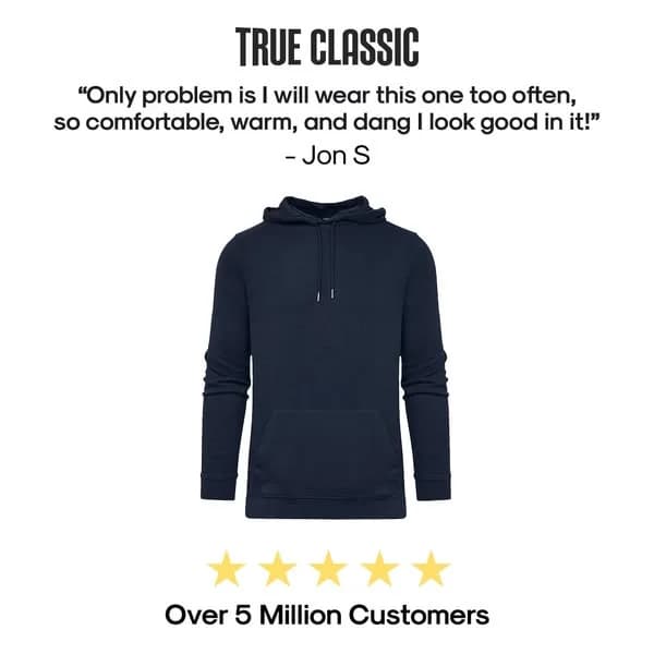
True Classic uses average-bodied men in ads because that's the customer. Six-pack models work for aspiration categories like fitness apparel. They fail for comfort categories like everyday t-shirts. If your buyer is a 35-year-old dad with a gut, a 22-year-old fitness model in the ad creates a believability gap that drops CTR.

Before-after fit comparisons outperform lifestyle shots

True Classic's highest-performing ads run as side-by-side fit comparisons — old shirt vs True Classic on the same guy. It's the apparel version of Nutrafol's hair transformations. Any product where fit or outcome differs from the competitor should show the difference in the frame. Lifestyle shots are pretty; comparisons convert.

Questions

True Classic ads work because they cast the actual customer — average-bodied men in their 30s and 40s — rather than the fitness model apparel brands default to. Before-after fit comparisons give shoppers a concrete reason to believe the product performs differently than what's in their closet. Prices ($25-30) sit in the headline, not buried at the bottom, which signals confidence rather than shame. Whole system is built to kill the "that shirt won't fit me" objection before it forms.

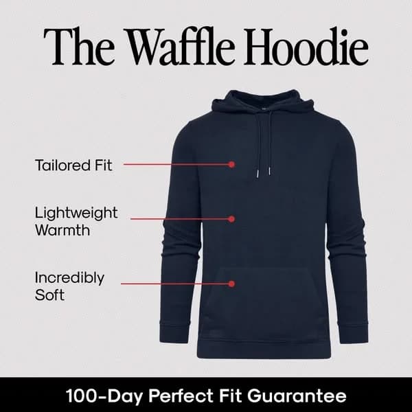
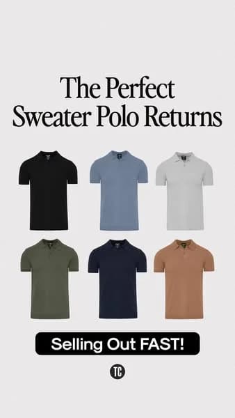
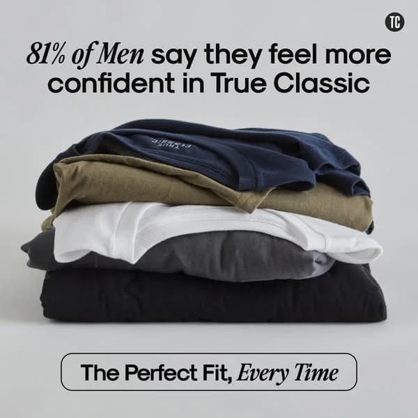
Navy blue, cream, warm beige, and olive dominate. Backgrounds run flat cream or soft gray — no busy lifestyle environments. Models shoot against neutral walls or simple interiors, which keeps focus on shirt fit rather than scene. Typography stays bold, chunky sans-serif, with prices in large numerals. Overall palette reads approachable masculine — not the chrome-and-black of performance apparel, not the pastel of DTC beauty.

Men 30-55 with average build who've given up on department store shirts because the fit is wrong — shoulders too wide, torso too long, sleeves too short. Price-sensitive buyers who think a Ralph Lauren polo shouldn't cost $95. Ads specifically exclude the fitness-model aesthetic and speak to the dad bod, the desk-job body, the guy who wants to look sharp at a barbecue without pretending to be shredded.

Fit comparisons run as their signature creative. A customer stands in a before shot wearing a baggy Hanes or department store shirt, then an after shot in the same pose wearing True Classic. Same guy, same angle, different shirt. Sometimes a side-by-side static, sometimes a quick-cut video. Comparison kills the "my old shirt is fine" objection faster than any copy could. Any apparel brand can borrow this directly.

Facebook and Instagram carry the heaviest spend — the fit-comparison format reads well in feed, and the 30-55 male demo still lives on Meta platforms. YouTube pre-roll runs longer testimonial spots with customers holding up their old shirt on camera. TikTok creative is growing with UGC-style unboxings and "which shirt fits better" polls. Pinterest and Snapchat run limited, mostly retargeting.

Create Your Own
True Classic Ad

Clone any true classic ad example. Upload your product photo. Seconds later, you have a finished ad ready to launch.

Create your ad
AdDogs ad examples globe