AdDogs

Grammarly Ad Examples

Browse 44 Grammarly ads ad examples sourced from high-performing campaigns. Clone any design, swap in your product, and get a finished ad in seconds.

Updated June 2026

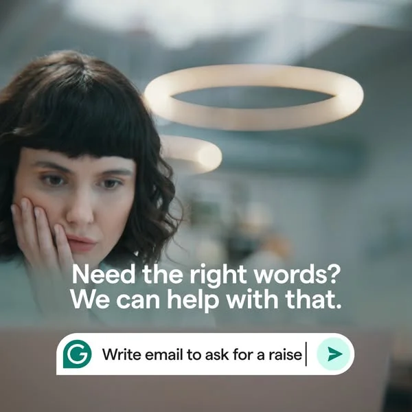
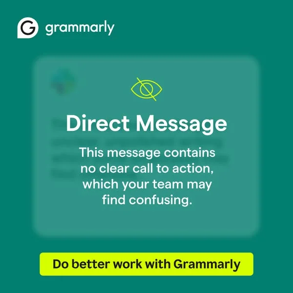
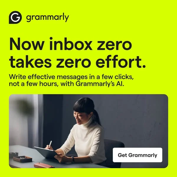
Grammarly ads earn their click with a single visual trick — the red squiggle. You've seen it 10,000 times: a sentence with a mistake, then the Grammarly popover fixing it in real time. That's the whole ad. No hero shot, no lifestyle photography, a product demo frozen at the aha moment.

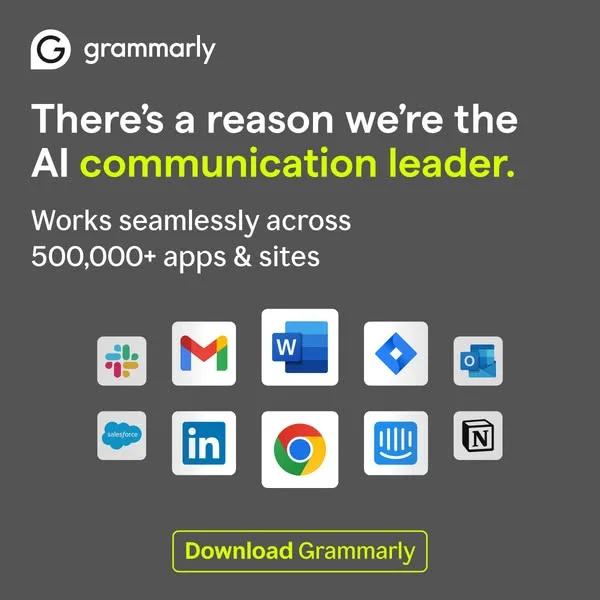
Across paid channels, the pattern holds. Bright green branding, white or soft-gray backgrounds, screenshot-first composition. Copy stays problem-led: "Say what you mean," "Write with confidence," "Stop second-guessing every email." Ad placements split across Facebook, LinkedIn, and YouTube pre-roll — LinkedIn for B2B and enterprise, Facebook and YouTube for students and casual writers. Video ads follow the same demo structure, showing the extension running inside Gmail, Docs, or LinkedIn.

Our Grammarly ad examples collection captures product demos, testimonial carousels, and before-after copy fixes that define the brand. Filter by format to find the screenshot-in-context statics, the talking-head founder spots, and the LinkedIn case-study carousels that each serve different parts of the funnel. Annotations call out where the squiggle sits, what copy leads the frame, and how the palette stays locked across years of creative.

Grammarly — Vibrant Social Proof Layout. Brand: Grammarly. This ad effectively uses a vibrant, high-contrast layout to grab attention on busy social feeds. The central Grammarly logo acts as a focal point, surrounded by diverse user portraits that subtly convey broad appeal and social proof. The bright green background immediately stands out, while the stark black text ensures readability. Text hierarchy is clear: a bold, impactful statistic headline followed by a concise value proposition, culminating in a prominent call-to-action. This composition is optimized for quick consumption, leveraging color psychology for energy and black-and-white imagery for authenticity, making it highly effective for driving consideration and conversion on platforms like Facebook or Instagram. The design balances brand presence with user-centric messaging.. Headline: Over 30 Million Daily Users. Primary text: Enhance your writing with Grammarly.. Why this ad works: Vibrant background creates scroll-stopping contrast — The bright, energetic green background immediately captures attention. This high contrast against typical feed content ensures the ad stands out, increasing initial visibility and stopping the scroll, which is crucial for social media ad performance. It creates an instant visual hook. Social proof through diverse user imagery — The inclusion of four distinct black-and-white user photos around the central logo subtly communicates widespread adoption and relatability. This visual social proof builds trust and encourages potential users to identify with the existing user base, enhancing credibility and perceived value. Clear hierarchy drives immediate value proposition — The ad employs a strong visual hierarchy, starting with a compelling user statistic, followed by a clear benefit statement, and ending with an unmistakable call-to-action. This structured flow guides the viewer efficiently from awareness to conversion intent, minimizing cognitive load.. Specs: Brand: Grammarly, Industry: Software & Tools, Platform: Instagram, Format: Static, Audience: ProfessionalsGrammarly — UI Mockup with Benefit Headline. Brand: Grammarly. This Grammarly ad effectively leverages a UI mockup layout to instantly convey its core value proposition. The deep blue background provides high contrast for the white and light blue text, ensuring excellent readability and visual impact in a crowded social feed. Compositionally, the brand logo is strategically placed top-left, followed by a benefit-driven headline that immediately addresses a user pain point. The central UI example, demonstrating a common grammatical correction, serves as compelling visual proof of the product's efficacy. Supporting text at the bottom-left elaborates on features, while a prominent pink CTA button guides the user towards conversion. This clear hierarchy and direct demonstration are optimized for platforms like Facebook or Instagram, where quick comprehension and actionable prompts drive engagement and downloads.. Headline: Mistake-free writing. Try it for free.. Primary text: Automatically correct grammar, spelling, & more.. Why this ad works: Clear UI demonstration highlights core value — The UI snippet showing 'their' corrected to 'there' immediately illustrates Grammarly's core function. This visual demonstration is far more impactful than mere textual claims, allowing users to grasp the product's value proposition within seconds. It directly addresses a common writing pain point, making the solution tangible and desirable for anyone seeking improved writing accuracy. High-contrast color palette grabs attention — The stark contrast between the deep blue background and the white/light blue text, along with the vibrant pink CTA, ensures maximum visibility and readability. This high-contrast palette is crucial for cutting through feed clutter on mobile devices, drawing the eye directly to the key message and action, thereby increasing ad recall and click-through rates. Benefit-driven headline with clear call to action — The headline 'Mistake-free writing. Try it for free.' is a powerful hook, promising a clear benefit and removing barriers to trial. This direct, value-first approach, combined with the clear 'Download Grammarly' CTA, creates a compelling user journey, driving immediate consideration and encouraging direct conversion by offering a no-cost entry point.. Specs: Brand: Grammarly, Industry: Software & Tools, Platform: Facebook, Format: UI Mockup, Audience: ProfessionalsGrammarly — Benefit-Driven UI Mockup. Brand: Grammarly. This ad employs a clean, direct-response layout on a deep blue background, leveraging high contrast for immediate impact. The composition follows a clear top-to-bottom hierarchy: brand logo, a compelling benefit-driven headline, a visual UI mockup demonstrating the core product value (error correction), supporting text, and a prominent call-to-action. The blue background evokes trust and professionalism, while the white text and pink CTA button ensure excellent readability and visual pop, optimized for scroll-stopping on platforms like Facebook or Instagram. The UI mockup effectively illustrates the "before and after" of Grammarly's function, making the abstract benefit tangible. This design efficiently communicates value and guides the user towards conversion with minimal cognitive load.. Headline: Mistake-free writing. Try it for free.. Primary text: Automatically correct grammar, spelling, & more.. Why this ad works: Clear benefit headline drives immediate value — The headline "Mistake-free writing. Try it for free." immediately communicates the core benefit and a low-friction entry point. This direct approach cuts through noise, appealing to users seeking practical solutions and encouraging clicks by offering a free trial, maximizing initial engagement. UI mockup visually demonstrates product value — The embedded UI mockup effectively shows Grammarly in action, highlighting a common grammatical error ("their" to "there") and its correction. This visual proof makes the abstract concept of "mistake-free writing" tangible and instantly understandable, building trust and illustrating the product's utility. High-contrast palette enhances readability and focus — The deep blue background provides a strong, professional foundation, while white text and the vibrant pink CTA button create excellent contrast. This color strategy ensures all key information is highly readable and visually distinct, guiding the viewer's eye efficiently through the ad's message and action points.. Specs: Brand: Grammarly, Industry: Software & Tools, Platform: Facebook, Format: UI Mockup, Audience: ProfessionalsGrammarly Testimonial — Vibrant Quote Layout. Brand: Grammarly. This ad leverages a testimonial layout, prominently featuring a quote from a CCO to build immediate professional credibility. The vibrant green background with a subtle plus-sign pattern and contrasting pink accents (quote marks, CTA button) creates an energetic yet professional aesthetic, optimized for scroll-stopping on platforms like Instagram. The composition strategically places the large quote at the top, guiding the eye to the attribution, then to a black-and-white image depicting collaborative work, reinforcing the professional context. A clear, benefit-driven caption below the image further solidifies the product's value. The brand logo and a direct call to action are positioned at the bottom, creating a clear visual hierarchy that moves the viewer from social proof to engagement. This design effectively balances trust-building with a modern, approachable brand image.. Headline: Grammarly's generative AI makes it easier to kick off and refine our writing.. Primary text: - Michael Roseman CCO at OneSource Virtual AI-writing assistance trusted by professionals.. Why this ad works: Prominent testimonial builds immediate trust — The large, centrally placed quote from a named professional immediately establishes credibility. This social proof is highly effective, as users trust peer recommendations more than direct brand claims. It leverages authority bias to quickly overcome skepticism and build rapport with the target audience. Vibrant color palette enhances memorability — The energetic green background paired with bright pink accents creates a distinctive and memorable visual identity. This bold choice helps the ad stand out in a crowded feed, increasing recall and brand association. It signals a modern, approachable brand, contrasting with more traditional, corporate software advertising. Clear visual hierarchy guides user flow — The ad effectively uses text size, color, and placement to guide the viewer's eye. From the large quote to the attribution, then the supporting image caption, and finally the prominent CTA, the flow is intuitive. This ensures key messages are absorbed and the desired action is clear, optimizing for conversion.. Specs: Brand: Grammarly, Industry: Software & Tools, Platform: Instagram, Format: Static, Audience: ProfessionalsGrammarly AI — Workflow UI Mockup. Brand: Grammarly. This ad effectively uses a UI mockup layout to visually demonstrate Grammarly's AI capabilities, guiding the viewer through a simplified workflow. The vibrant teal background creates high contrast with the dark text and white UI elements, ensuring readability and scroll-stopping power, particularly on platforms like Instagram or Facebook. Compositionally, the brand logo is top-left, followed by a clear headline, then the central visual explanation, and finally a strong CTA at the bottom. This F-pattern text hierarchy and visual flow optimize for quick comprehension. The clean, modern aesthetic, combined with a clear value proposition, targets professionals seeking efficiency. The ad successfully communicates complex AI assistance in an easily digestible, actionable format, driving consideration and conversion.. Headline: Smarter communication from start to send.. Primary text: Ideate, write, revise, and reply with generative AI assistance.. Why this ad works: Visual workflow demonstration clarifies AI utility — The ad uses a clear, step-by-step visual representation of Grammarly's AI in action. This "show, don't just tell" approach makes the abstract concept of AI assistance tangible and immediately understandable, significantly improving comprehension and perceived utility for busy professionals. High-contrast palette ensures readability and attention — The vibrant teal background paired with crisp white and dark blue text creates excellent visual contrast. This color strategy ensures the ad stands out in a busy social feed, capturing attention and making all text elements highly legible, which is crucial for conveying the product's benefits quickly. Clear value proposition leads to direct CTA — The headline "Smarter communication from start to send" immediately highlights the core benefit. This is reinforced by the visual workflow and the concise body copy, leading directly to a prominent "Download Grammarly" CTA. This directness minimizes friction for conversion.. Specs: Brand: Grammarly, Industry: Software & Tools, Platform: Instagram, Format: UI Mockup, Audience: ProfessionalsGrammarly — Bold Headline & Demo Layout. Brand: Grammarly. This ad employs a vibrant, split-background layout, combining a bold headline with a lifestyle element and product demonstration. The dominant teal background with a contrasting yellow accent creates an energetic yet trustworthy aesthetic. The large, white headline, "Improve Your English Writing," immediately communicates the core value proposition, ensuring quick comprehension in fast-paced social feeds. Compositionally, the smiling user on the right, engaged with her laptop, subtly directs attention to the Grammarly correction bubble, visually illustrating the product's function. The text hierarchy is clear: brand logo, primary benefit headline, visual proof, and a prominent call-to-action. This design is optimized for platforms like Facebook or Instagram, where its high contrast and direct message cut through clutter, effectively driving awareness and consideration by showcasing both the benefit and the 'how it works' in a single glance.. Headline: Improve Your English Writing. Primary text: Make your writing mistake free.. Why this ad works: High-contrast colors grab immediate attention — The bold teal background paired with the bright yellow accent and crisp white text creates a visually arresting ad. This high contrast ensures the ad stands out in a busy social feed, immediately drawing the viewer's eye and improving stop-scroll rates, crucial for initial ad engagement. Clear benefit-driven headline dominates — The headline "Improve Your English Writing" is large, direct, and positioned prominently. It immediately communicates the primary value proposition without ambiguity. This clarity helps potential users quickly understand the ad's relevance to their needs, driving higher click-through rates for consideration-stage users. Visual product demo reinforces core value — The inclusion of the "mistake free" correction bubble visually demonstrates Grammarly's core function. This 'show, don't just tell' approach provides instant proof of concept, making the benefit tangible and trustworthy. It helps users quickly grasp how the product solves their problem.. Specs: Brand: Grammarly, Industry: Software & Tools, Platform: Instagram, Format: Static, Audience: ProfessionalsGrammarly — UI Mockup with Benefit Headline. Brand: Grammarly. This ad effectively leverages a split-focus layout, combining a bold benefit-driven headline with a clear UI demonstration. The dominant brand green background creates strong contrast with the white and blue text, immediately drawing the eye to the core message: "Mistake-free writing. Try it for free." The embedded UI mockup visually explains how Grammarly works, showing a common spelling error and its correction, which is crucial for a SaaS product. Text hierarchy is clear, moving from the main headline to the explanatory sub-text and finally to the prominent pink CTA. Optimized for platforms like Facebook, its high contrast and direct value proposition aim to stop the scroll and drive immediate consideration or conversion, appealing to users seeking practical writing solutions. The composition balances brand identity with a clear product demonstration.. Headline: Mistake-free writing. Try it for free.. Primary text: Automatically correct spelling, grammar, & more.. Why this ad works: Direct UI demonstration clarifies product value — The embedded UI snippet showing "definetely" corrected to "definitely" instantly communicates the product's core function and benefit. This visual proof-of-concept is more effective than abstract claims, reducing cognitive load and building trust quickly for potential users, driving higher engagement and understanding of the product's utility. High-contrast brand colors command attention — The vibrant green background paired with stark white and light blue text creates a high-contrast visual that stands out in a crowded feed. This bold color choice, consistent with Grammarly's branding, ensures immediate visibility and reinforces brand recognition while conveying a sense of clarity and efficiency, crucial for scroll-stopping performance. Clear benefit-driven headline and CTA — The headline "Mistake-free writing. Try it for free." immediately addresses a pain point and offers a no-risk solution. Coupled with the prominent "Download Grammarly" CTA, the ad guides the user directly from problem awareness to a clear, actionable next step, optimizing the funnel for immediate consideration and conversion.. Specs: Brand: Grammarly, Industry: Software & Tools, Platform: Facebook, Format: UI Mockup, Audience: ProfessionalsGrammarly — Benefit-Driven UI Mockup. Brand: Grammarly. This ad effectively uses a split-composition strategy, dedicating the upper two-thirds to a bold, benefit-driven headline and supporting text, while the lower third visually demonstrates the product's core functionality. The dark teal background provides high contrast for the white text and vibrant brand green CTA, ensuring excellent readability and scroll-stopping power on busy feeds. Color psychology leverages green for growth and correctness, reinforcing Grammarly's value proposition. The composition guides the eye from the problem statement (headline) to the solution's visual proof (UI mockup) and finally to the clear call-to-action. This layout is optimized for platforms like Facebook or Instagram, where a strong visual hook combined with concise, impactful messaging drives consideration. The text hierarchy is clear, with the main benefit prominently displayed, followed by a brief explanation and a direct action prompt.. Headline: Improve Your English Writing. Primary text: Working to master your English skills? Grammarly can help. Try now.. Why this ad works: High contrast ensures immediate readability — The dark teal background with bright white text creates exceptional contrast, making the headline instantly legible even during quick scrolling. This visual pop captures attention effectively, crucial for breaking through the noise on social media feeds and ensuring the core message is absorbed quickly. Visual UI mockup demonstrates core value — The inclusion of a clear UI mockup showing a "mistake free" correction directly illustrates Grammarly's primary benefit. This visual proof is more compelling than text alone, allowing potential users to immediately grasp the product's utility and how it solves a common pain point in writing. Clear problem-solution narrative engages users — The ad establishes a clear problem ("Improve Your English Writing," "master your English skills?") and immediately presents Grammarly as the solution. This direct narrative resonates with users actively seeking improvement, positioning the product as an indispensable tool for their writing needs.. Specs: Brand: Grammarly, Industry: Software & Tools, Platform: Facebook, Format: Mixed, Audience: ProfessionalsGrammarly — UI Mockup Problem-Solution. Brand: Grammarly. This ad effectively uses a UI mockup to demonstrate Grammarly's core value proposition: correcting contextual errors. The layout strategically places the problem (incorrect word in a message) and solution (Grammarly's suggestion) in a clear, sequential flow, guiding the viewer's eye. The vibrant teal background provides high contrast for the white UI elements and the bright yellow CTA, ensuring strong visibility on busy platforms like Facebook or Instagram. Color psychology leverages red for error and green for correction, reinforcing the product's utility. Text hierarchy is clear: brand at the top, problem/solution in the middle, and a prominent call-to-action at the bottom, optimized for quick comprehension and conversion. The ad directly addresses a common pain point for professionals and students.. Headline: Find the right words with Grammarly. Primary text: Hey Isha! We just got the signed contact for the new season of our podcast. Let's get the first episode started! Spelling contact -> contract The word contact doesn't seem to fit this context. Consider replacing it with a different one.. Why this ad works: Direct Problem-Solution Visual Demonstration — The ad immediately showcases a common writing error and Grammarly's precise, context-aware correction. This visual "before-and-after" within a UI mockup instantly communicates product value, making it highly persuasive for users experiencing similar communication challenges. High-Contrast Color Palette for Attention — The vibrant teal background paired with crisp white UI elements and a bright yellow CTA button creates strong visual contrast. This color scheme ensures the ad stands out in a crowded feed, drawing the eye directly to the product's functionality and the clear call to action. Clear, Action-Oriented Text Hierarchy — The ad features a prominent headline "Find the right words with Grammarly" that reinforces the product's benefit, followed by a highly visible "Download Grammarly" CTA. This direct, benefit-driven copy and clear action step guide the user effectively towards conversion.. Specs: Brand: Grammarly, Industry: Software & Tools, Platform: Instagram, Format: UI Mockup, Audience: ProfessionalsGrammarly — Split Screen UI & Lifestyle. Brand: Grammarly. This ad employs a split-screen layout, contrasting a deep blue background on the left with a warm brown on the right. The left showcases Grammarly's UI, demonstrating its rephrasing feature on an email, highlighting a problem-solution narrative. Overlaid UI elements guide the eye from the original text to the suggested improvement, emphasizing the "Make it sound more inspirational" prompt. On the right, a smiling professional using a laptop humanizes the technology, suggesting ease and satisfaction. The vibrant green CTA button "Get Grammarly" provides a clear conversion point. This composition effectively communicates product utility and user benefit, optimized for platforms like LinkedIn or Facebook where professionals seek productivity tools. The color contrast ensures visual separation and draws attention to key elements.. Why this ad works: Split screen contrasts problem and solution — The ad cleverly uses a split-screen design to juxtapose an unpolished email (problem) with Grammarly's suggested, more professional version (solution). This visual storytelling immediately communicates the product's value proposition, allowing viewers to quickly grasp how Grammarly improves communication, driving relevance for professionals seeking efficiency. UI overlay demonstrates direct product value — By layering the Grammarly interface directly over the email, the ad provides a clear, in-context demonstration of its rephrasing feature. This "show, don't tell" approach is highly effective, allowing potential users to visualize the tool in action and understand its practical benefits without needing extensive explanatory text. Human element adds relatability and aspiration — The inclusion of a smiling professional on the right side of the ad adds a crucial human element. This lifestyle shot connects the technical solution to a positive user experience, fostering relatability and aspirational appeal. It suggests that using Grammarly leads to confidence and success in professional communication.. Specs: Brand: Grammarly, Industry: Software & Tools, Platform: Facebook, Format: Mixed, Audience: ProfessionalsGrammarly — AI Leadership App Integration Grid. Brand: Grammarly. This ad employs a high-contrast, text-heavy layout on a dark grey background, strategically optimized for professional platforms. The bold headline immediately establishes Grammarly's authority as an "AI communication leader," with a yellow highlight drawing the eye to key differentiators. Below, a clear value proposition details extensive app integration, reinforcing utility. A grid of recognizable app icons visually validates this claim, leveraging brand recognition to build trust and demonstrate seamless workflow. The composition prioritizes information delivery, using a clear hierarchy from brand to headline, then supporting details, and finally a prominent call-to-action. The minimalist color palette, primarily dark grey, white, and a pop of yellow, conveys professionalism and clarity, ensuring readability and strong visual impact in a busy feed environment. This design effectively communicates value and credibility to a professional audience.. Headline: There's a reason we're the AI communication leader.. Primary text: Works seamlessly across 500,000+ apps & sites. Why this ad works: Strong headline establishes immediate authority — The headline "There's a reason we're the AI communication leader" immediately positions Grammarly as an industry authority. The yellow highlight on "communication leader" draws the eye, creating a powerful, memorable claim that builds trust and curiosity, crucial for attracting professional users. Visual proof of widespread integration — The grid of familiar app icons (Slack, Gmail, Word, Salesforce, LinkedIn, Chrome, etc.) provides instant visual validation for the claim "Works seamlessly across 500,000+ apps & sites." This concrete evidence reduces skepticism and demonstrates practical utility, making the product's value tangible. High contrast ensures readability and impact — The dark grey background with white text and a bright yellow highlight/CTA button creates exceptional contrast. This design choice ensures maximum readability on various screen types and lighting conditions, making the ad highly effective at cutting through visual clutter in a user's feed and capturing attention.. Specs: Brand: Grammarly, Industry: Software & Tools, Platform: Facebook, Format: Static, Audience: ProfessionalsGrammarly — Professional Lifestyle with Text Overlay. Brand: Grammarly. This ad employs a split-screen composition, featuring a relatable lifestyle image of a professional working on a laptop above a prominent text block. The deep teal background, a core brand color, provides a strong, consistent visual identity, while the bright yellow CTA button offers high contrast, drawing immediate attention. The composition strategically places the aspirational image to evoke relatability and the text block below to deliver a clear problem-solution message. Text hierarchy is effective: a compelling headline identifies a common pain point, followed by the solution, and a direct call to action. Optimized for platforms like Instagram or Facebook, its square format and bold color scheme ensure visibility and scroll-stopping power, making it effective for engaging a professional audience.. Headline: If you cringe at old writing mistakes.... Primary text: It's time to go typo-free with Grammarly. Why this ad works: Relatable lifestyle image connects with professionals — The image of a focused man working on a laptop directly resonates with the target audience of professionals and students. This visual immediately establishes context and empathy, making the ad feel relevant and personal, which is crucial for engagement on social platforms where users seek connection. Problem-solution headline drives immediate relevance — The headline "If you cringe at old writing mistakes..." directly addresses a common pain point, creating an instant connection with anyone who has experienced writing anxiety. This problem-solution framing effectively hooks the viewer, positioning Grammarly as the direct remedy to a relatable struggle. High-contrast brand colors enhance visibility — The use of Grammarly's signature deep teal background paired with a vibrant yellow CTA button creates a powerful visual contrast. This color strategy not only reinforces brand identity but also ensures the call to action stands out prominently, guiding the user's eye and improving click-through rates on busy feeds.. Specs: Brand: Grammarly, Industry: Software & Tools, Platform: Instagram, Format: Static, Audience: ProfessionalsGrammarly — Vibrant Flowchart Benefit Ad. Brand: Grammarly. This ad employs a vibrant, flowchart-inspired layout to communicate Grammarly's value proposition. The teal background provides a high-contrast canvas for the colorful text bubbles (purple, light green, orange, light blue), immediately grabbing attention in a busy social feed. Compositionally, arrows and icons guide the viewer's eye from the problem/desire ("Make every college paper as unique as you") to the solution (Grammarly's AI agents), culminating in a clear call to action. The playful yet clean aesthetic, combined with bold typography, is optimized for platforms like Instagram, appealing directly to a student demographic. Text hierarchy is effectively managed, with the main benefit prominently displayed in segmented bubbles, followed by supporting details and a distinct lime-green CTA button. This design prioritizes quick comprehension and engagement.. Headline: Make every college paper as unique as you. Primary text: Write with integrity using Grammarly's AI agents. Why this ad works: Vibrant color palette commands attention — The high-contrast, vibrant color palette against the teal background creates immediate visual interest. This ensures the ad stands out in a crowded social feed, capturing the attention of the target audience effectively. The playful yet professional hues resonate strongly with a student demographic, signaling an engaging and modern solution for academic writing needs. Flowchart layout guides eye movement — The bubble-based, arrow-connected layout naturally directs the viewer's eye through the key message in a logical sequence. This sequential presentation breaks down the value proposition into digestible chunks, making complex information about AI agents and uniqueness easy to process quickly. It effectively communicates a clear path to a desired outcome. Clear, benefit-driven headline segmentation — Breaking the aspirational headline "Make every college paper as unique as you" into distinct, colorful bubbles significantly enhances readability and visual impact. Each phrase receives its own visual emphasis, making the core benefit memorable and easy to grasp at a glance. This segmentation prevents cognitive overload, especially on mobile screens.. Specs: Brand: Grammarly, Industry: Software & Tools, Platform: Instagram, Format: Static, Audience: StudentsGrammarly AI — Bold Text & Icon. Brand: Grammarly. This ad employs a bold, high-contrast design optimized for scroll-stopping on social feeds. The layout is text-heavy, with a large, left-aligned headline immediately communicating the core benefit: speed in email replies using AI. The vibrant teal background paired with white and neon yellow text/icon leverages Grammarly's brand identity, creating strong visual pop. Compositionally, the text occupies the left two-thirds, balanced by a simple, abstract hourglass icon on the right, visually reinforcing the "time-sensitive" message. The clear call-to-action, "Try it for free," is strategically placed at the bottom-left, guiding the viewer's eye after absorbing the main message. This direct, no-frills approach prioritizes clarity and immediate value proposition, ideal for busy professionals.. Headline: Reply to time-sensitive emails with AI in the time it takes to read this.. Why this ad works: High-contrast brand colors command attention — The striking combination of deep teal, bright white, and neon yellow creates immediate visual impact. This high contrast ensures readability and stands out against typical social feed content, effectively leveraging Grammarly's established brand palette to capture user attention quickly and efficiently. Benefit-driven headline highlights immediate value — The headline directly addresses a common pain point for professionals – time-sensitive emails – and offers an AI-powered solution with a clear, quantifiable benefit ("in the time it takes to read this"). This instantly communicates value, driving engagement by promising efficiency and problem-solving. Abstract hourglass icon visually reinforces speed — The simple, abstract hourglass-like icon on the right side of the ad serves as a powerful visual metaphor for speed and efficiency. It subtly reinforces the ad's core message about saving time with AI, adding a non-verbal layer of communication that enhances memorability and understanding without cluttering the design.. Specs: Brand: Grammarly, Industry: Software & Tools, Platform: Instagram, Format: Static, Audience: ProfessionalsGrammarly — Spelling Quiz Problem/Solution. Brand: Grammarly. This ad effectively uses a problem-solution layout to engage the audience. The top section presents a common spelling dilemma, immediately establishing relevance and creating an interactive "quiz" feel. The gradient purple-to-blue background, associated with creativity and intelligence, provides a clean, non-distracting canvas. Compositionally, the two white text boxes are balanced, drawing the eye to the central "or" element, which acts as a visual pivot. The text hierarchy is clear: brand name at the top, problem statement mid-frame, and the solution/CTA prominently at the bottom. This structure is optimized for platforms like Facebook or Instagram, where quick comprehension and direct problem-solving resonate. The high contrast between dark text and light boxes ensures readability, while the overall clean aesthetic reinforces Grammarly's professional image. The ad leverages a common pain point to drive conversion.. Headline: With Grammarly, you will definitely get it right.. Why this ad works: Interactive quiz highlights common user pain point — The ad immediately presents a common user pain point (spelling errors) in an engaging, interactive format. This "quiz" approach captures attention by inviting the viewer to self-identify with the problem. By showcasing a clear mistake and its correct form, it subtly highlights the value proposition before explicitly stating it, making the solution (Grammarly) more impactful. High contrast ensures readability and guides eye — The layout uses distinct white text boxes against a vibrant gradient background, ensuring high readability. The dark, bold text within these boxes and for the main headline creates strong contrast. This clear visual hierarchy guides the viewer's eye from the problem statement to the brand's solution and finally to the call to action, optimizing for quick information absorption on busy feeds. Purple/blue gradient reinforces brand intelligence and trust — The purple and blue gradient background evokes feelings of intelligence, creativity, and trust, aligning perfectly with Grammarly's brand identity as a writing assistant. The consistent use of purple for the "or" and CTA button reinforces brand recognition and creates a cohesive visual experience. This color choice subtly communicates professionalism and reliability.. Specs: Brand: Grammarly, Industry: Software & Tools, Platform: Instagram, Format: Static, Audience: ProfessionalsGrammarly — Interactive Quiz Layout. Brand: Grammarly. This ad leverages an interactive quiz-like layout on a vibrant green background, immediately engaging the viewer. The question-and-answer format, with a clear solution highlighted, guides the eye through a logical progression. Color psychology is key: the bright green evokes growth and productivity, while the contrasting yellow highlight draws attention directly to the brand's solution. The composition uses a clear top-to-bottom text hierarchy, starting with a pain point question, offering solutions, and culminating in a direct call to action. This design is highly optimized for platforms like Facebook or Instagram, where native-feeling content and direct engagement prompts perform well. The text density is medium, balancing information with visual clarity, ensuring the core message is quickly absorbed without overwhelming the user. The ad effectively positions Grammarly as the comprehensive solution to professional stress.. Headline: How can professionals stress less at work?. Primary text: a. Tackle projects with impactful writing b. Turn first drafts into final drafts c. Get an AI tool that saves a month's worth of work d. Use Grammarly for all of the above!. Why this ad works: Quiz format drives engagement and curiosity — The multiple-choice question format naturally piques curiosity, encouraging viewers to read through the options before revealing the answer. This interactive approach, even in a static ad, increases dwell time and cognitive engagement, making the ad feel less like a direct sales pitch and more like a helpful content piece. Problem-solution narrative with clear highlight — The ad opens with a relatable pain point ("stress less at work?") and presents various solutions, culminating in Grammarly as the ultimate answer. The bright yellow highlight on option 'd' immediately draws the eye to the brand's offering, creating a strong visual and logical connection between the problem and its resolution. High-contrast branding for scroll-stopping — The bold green background with stark white text and a vibrant yellow highlight creates significant visual contrast. This color scheme is highly effective at cutting through busy social feeds, ensuring the ad captures attention. The brand's distinctive green is instantly recognizable, reinforcing brand identity even with a quick glance.. Specs: Brand: Grammarly, Industry: Software & Tools, Platform: Instagram, Format: Static, Audience: ProfessionalsGrammarly — Problem/Solution Professional Scene. Brand: Grammarly. This ad effectively uses a problem-solution narrative within a professional context. The composition features a relatable user experiencing a common workplace dilemma, immediately establishing empathy. Her pensive expression draws the viewer in, creating a moment of shared understanding. The text overlay, strategically placed in the lower half, directly addresses this pain point ("Need the right words?") and offers Grammarly as the solution ("We can help with that."). The UI mockup at the bottom provides a clear, actionable demonstration of the product's utility, enhancing conversion intent by showing a specific, high-stakes use case. Color psychology leverages muted, professional tones for the background, contrasting with Grammarly's vibrant green, which draws the eye to the solution. The layout is optimized for social feeds, where quick comprehension and direct value propositions are key to stopping the scroll and driving engagement. Text hierarchy guides the viewer from problem to solution to direct action, making the value proposition instantly clear.. Headline: Need the right words? We can help with that.. Why this ad works: Relatable problem-solution narrative — The ad opens with a common professional struggle – finding the right words – personified by the thoughtful woman. This immediate relatability creates an emotional connection, making the viewer feel understood. Grammarly is then positioned as the direct, empowering solution to this everyday challenge, fostering trust and relevance. Clear UI demonstration as CTA — Instead of a generic "Learn More," the ad integrates a specific UI element showing Grammarly in action: "Write email to ask for a raise." This concrete example instantly clarifies the product's utility and value, acting as a powerful, low-friction call to value rather than just a call to action. Strategic text placement and contrast — The white text stands out boldly against the darker, blurred background, ensuring high readability even on small mobile screens. Placing the main message centrally and the interactive UI element at the bottom guides the viewer's eye naturally, facilitating quick comprehension of the problem, solution, and next step.. Specs: Brand: Grammarly, Industry: Software & Tools, Platform: Instagram, Format: Static, Audience: ProfessionalsGrammarly — Diverse User Collage. Brand: Grammarly. This ad employs a dynamic collage layout, featuring diverse individuals smiling and engaged, creating an immediate sense of relatability and aspiration. The dark teal background provides a strong, professional contrast to the bright, authentic user photos, enhancing visual pop in a busy feed. The large, clear headline "Work smarter and reach your potential" establishes a compelling value proposition upfront, while the prominent green CTA button "Get Grammarly for free" offers a low-barrier entry point. Compositionally, the overlapping images suggest a connected community and widespread utility. Optimized for social platforms like Facebook or Instagram, its strong visual appeal and clear benefit-driven messaging effectively capture attention and drive consideration by showcasing diverse success stories.. Headline: Work smarter and reach your potential. Why this ad works: Diverse representation fosters broad relatability — Featuring a multi-ethnic, multi-gender group of smiling individuals immediately broadens the ad's appeal. This inclusive visual strategy helps potential users from various backgrounds see themselves benefiting from Grammarly, increasing engagement and perceived relevance across diverse target demographics. Clear, benefit-driven headline captures attention — The headline "Work smarter and reach your potential" is concise and directly addresses user aspirations. It focuses on outcomes rather than features, resonating with professionals seeking efficiency and growth. This strong value proposition quickly communicates the core benefit, driving initial interest. High-contrast branding and inviting CTA — The dark teal background with white text and a bright green CTA button creates excellent visual contrast, making key information highly readable. The "Get Grammarly for free" call-to-action is a powerful conversion driver, minimizing perceived risk and encouraging immediate action for user acquisition.. Specs: Brand: Grammarly, Industry: Software & Tools, Platform: Facebook, Format: Carousel/Collage, Audience: ProfessionalsGrammarly Testimonial — Clean Quote Card. Brand: Grammarly. This Grammarly ad leverages a clean, high-contrast quote card layout to deliver a powerful testimonial. The dark teal background provides a professional, trustworthy feel, allowing the white quote box to pop and draw immediate attention. The composition strategically places the Grammarly logo at the top, reinforcing brand identity before the user reads the social proof. The testimonial itself is the primary text, presented in a large, readable font, followed by the credible attribution of "Rhett Burden, Director - DEIB." A clear "Get Grammarly" CTA button is positioned bottom-right, guiding the eye through a natural F-pattern scan. This design is optimized for platforms like Facebook or Instagram, where a strong, text-based value proposition can cut through visual clutter, appealing directly to professionals seeking productivity tools. The minimalist approach ensures the message is the hero, avoiding distractions.. Primary text: “Grammarly’s suggestions help me communicate effectively and boost my productivity and confidence in every written task at work.”. Why this ad works: High-contrast colors for readability and brand — The stark contrast between the vibrant teal background and the crisp white quote card immediately captures attention. This color choice not only aligns with Grammarly's brand identity but also enhances readability, making the testimonial easy to digest. High contrast is crucial for scroll-stopping effectiveness on busy social feeds, ensuring the message is seen. Authentic testimonial builds strong social proof — Featuring a direct quote from a named professional, Rhett Burden, provides strong social proof. The testimonial highlights tangible benefits like 'communicate effectively' and 'boost productivity and confidence,' directly addressing pain points of the target audience. This authentic voice builds trust and credibility far more effectively than generic ad copy. Clear visual hierarchy guides user engagement — The ad employs a clear visual hierarchy, starting with the Grammarly logo, then the large testimonial, followed by the credible attribution, and finally the prominent call-to-action. This structured flow guides the viewer's eye logically from brand recognition to problem-solution, culminating in a clear next step, optimizing engagement and conversion.. Specs: Brand: Grammarly, Industry: Software & Tools, Platform: Facebook, Format: Static, Audience: ProfessionalsGrammarly — Playful UI Mockup with Emojis. Brand: Grammarly. This ad effectively uses a dynamic UI mockup to illustrate a common communication struggle. The diagonal composition draws the eye from the "wailing" emojis, representing frustration, towards the clear, diplomatic solution offered by Grammarly's interface. The vibrant teal background provides a strong contrast for the white headline and the translucent UI, enhancing readability and visual appeal on busy social feeds. Color psychology leverages green for growth and resolution, subtly reinforcing Grammarly's problem-solving utility. Text hierarchy is clear: a large, relatable headline grabs attention, while the in-app text concisely explains the product's function. This design is optimized for platforms like Instagram, where engaging visuals and clear value propositions drive consideration.. Headline: Wanna wail in email?. Primary text: Write candid, send diplomatic. Just highlight for Grammarly to bail you out.. Why this ad works: Problem-solution visual metaphor is instantly clear — The ad brilliantly uses a stream of distressed emojis transforming into composed ones, flowing directly into the Grammarly interface. This visual narrative immediately communicates the problem (emotional emails) and the solution (Grammarly's help), making the ad highly relatable and impactful for anyone who struggles with professional communication. Relatable, playful headline grabs attention — The headline "Wanna wail in email?" uses informal, engaging language to address a common pain point with humor. This approach lowers the barrier to engagement, inviting the viewer to identify with the scenario before presenting the solution, making the ad feel less like a hard sell and more like a friendly suggestion. Clear in-app demonstration of core feature — The ad shows Grammarly's functionality directly within a familiar email interface (Gmail). Highlighting the text and showing the suggested diplomatic rewrite clearly demonstrates the product's value proposition—transforming emotional language into professional communication—without needing extensive explanation, making it highly persuasive.. Specs: Brand: Grammarly, Industry: Software & Tools, Platform: Instagram, Format: Static, Audience: ProfessionalsGrammarly — AI Prompt UI Mockup. Brand: Grammarly. This ad leverages a bold, high-contrast design to immediately capture attention. The vibrant teal background, a signature Grammarly color, creates a scroll-stopping effect, optimized for busy social feeds like Instagram or Facebook. The layout employs a clear top-to-bottom hierarchy: a concise, benefit-driven headline at the top, followed by an interactive UI mockup demonstrating the product's AI capabilities, and finally, the brand logo and a direct call-to-action at the bottom. This composition guides the viewer's eye seamlessly through the ad's core message. The simulated input field makes the abstract AI feature tangible and actionable, inviting mental engagement. Minimalist design with ample negative space ensures clarity, preventing visual clutter and reinforcing the product's promise of streamlined efficiency. The text hierarchy is intuitive, moving from problem/solution to demonstration and finally, action.. Headline: Go from first draft to finished. Fast.. Primary text: Write a proposal outline. Why this ad works: Vibrant brand color for instant recognition — The striking teal background, synonymous with Grammarly, instantly grabs attention in a crowded feed. This bold color choice creates high contrast with the black text and white UI element, ensuring legibility and making the ad pop. It leverages color psychology to evoke energy and innovation, aligning with a productivity tool. Interactive UI mockup clarifies AI feature — Presenting the AI prompt as a clickable UI element makes the abstract concept of AI assistance tangible. It visually demonstrates a specific use case ("Write a proposal outline"), allowing potential users to immediately grasp the product's utility and ease of interaction. This visual storytelling is highly effective for SaaS products. Clear, benefit-driven headline and CTA — The headline "Go from first draft to finished. Fast." directly addresses a common pain point and offers a clear, concise benefit. Coupled with the direct "Get Grammarly" CTA, the ad provides a complete narrative arc from problem to solution to action, minimizing cognitive load for the viewer.. Specs: Brand: Grammarly, Industry: Software & Tools, Platform: Instagram, Format: UI Mockup, Audience: ProfessionalsGrammarly — UI Mockup with Headline. Brand: Grammarly. This ad employs a split-screen UI mockup layout on a vibrant teal background, immediately grabbing attention. The top card visually demonstrates Grammarly's intelligent suggestions within a familiar document interface, showcasing direct product utility. Below, a large, empathetic headline "You've got ideas. We've got your back." establishes an emotional connection. The composition uses high contrast between the white cards, black text, and teal background, ensuring readability and scroll-stopping power on busy social feeds like Instagram. Grammarly's signature green is strategically used for the brand logo and the clear "Get Grammarly" CTA, reinforcing brand identity and guiding the user to action. The text hierarchy moves from problem/solution to benefit/action, optimizing for quick comprehension.. Headline: You've got ideas. We've got your back.. Primary text: In Q3, we suggest building a message scheduling feature. Define the users who will benefit from this feature. Why this ad works: Vibrant background commands immediate attention — The bold, saturated teal background creates a high-contrast environment, making the white content cards pop. This visual strategy is crucial for cutting through the noise on social media feeds, ensuring the ad is seen and registered by the target audience, significantly boosting initial engagement. UI demonstration clarifies product value instantly — The top card effectively showcases Grammarly's core functionality—providing intelligent, context-aware suggestions within a document. This "show, don't tell" approach allows potential users to immediately grasp the product's utility and how it can improve their professional communication, fostering quick understanding and interest. Empathetic headline builds user connection — The headline "You've got ideas. We've got your back." directly addresses a common professional pain point—having ideas but needing support to articulate them perfectly. This message resonates deeply, positioning Grammarly not just as a tool, but as a supportive partner, which can significantly enhance brand affinity and consideration.. Specs: Brand: Grammarly, Industry: Software & Tools, Platform: Instagram, Format: UI Mockup, Audience: ProfessionalsGrammarly — Tone Suggestion UI Mockup. Brand: Grammarly. This ad effectively uses a UI mockup to demonstrate Grammarly's tone suggestion feature, placing the user directly into the product experience. The layout strategically highlights the core value proposition: improving communication. The high-contrast black and white color scheme, accented by Grammarly's signature green, creates a clean, professional, and attention-grabbing visual. Text hierarchy is clear, with the bold question immediately engaging the viewer, followed by a direct call to action. The simulated keyboard with tone options visually reinforces the product's utility and ease of use. This composition is optimized for platforms like Facebook or Instagram, where a clear problem-solution visual can quickly capture the attention of professionals and students seeking to enhance their writing, driving consideration and engagement.. Headline: How does that message to your team sound?. Why this ad works: UI Mockup Demonstrates Core Value Instantly — By presenting a direct UI mockup, the ad immediately shows the product in action, illustrating how Grammarly helps refine messages. This experiential approach is highly effective for SaaS, allowing potential users to visualize the benefit without needing extensive explanation, fostering quick understanding and consideration. High Contrast Palette Grabs Attention — The stark contrast between the dark background and the bright white text box, coupled with the vibrant green CTA, creates strong visual pop. This high-contrast design is crucial for cutting through feed clutter on social platforms, ensuring the ad is noticed and the key message is easily readable, improving ad recall. Engaging Question Drives User Empathy — The headline "How does that message to your team sound?" directly addresses a common professional pain point. This question-based approach fosters immediate empathy and relevance, prompting the viewer to consider their own communication challenges and how Grammarly could provide a solution, enhancing engagement.. Specs: Brand: Grammarly, Industry: Software & Tools, Platform: Instagram, Format: UI Mockup, Audience: ProfessionalsGrammarly — Playful Quiz Invitation. Brand: Grammarly. This ad employs a vibrant, playful layout to engage users with a quiz. The composition features a large, bold headline positioned prominently in the upper left, leveraging natural F-pattern eye movement. Abstract, friendly character-like shapes with large eyes fill the background, creating a whimsical and approachable atmosphere. The color palette combines soft pastels (lime green, lavender) with darker, grounding tones (brown, dark teal), ensuring high contrast for readability while maintaining a lighthearted vibe. The clear "Take the quiz" CTA button is strategically placed beneath the headline, guiding immediate action. This design is optimized for platforms like Instagram, where scroll-stopping visuals and interactive content drive high engagement, appealing to a broad audience with its inviting and non-intrusive approach to lead generation.. Headline: What's your inner AI animal?. Why this ad works: Playful abstract characters create curiosity — The large, simple, cartoon-like shapes with prominent eyes immediately draw attention and evoke a sense of fun and mystery. This playful aesthetic lowers the barrier to engagement, making the quiz feel less like a marketing ploy and more like an entertaining diversion, which is highly effective for social media platforms. High-contrast headline ensures readability — The bold, dark text "What's your inner AI animal?" stands out sharply against the lighter, textured background shapes (lime green and lavender). This strong contrast ensures the headline is instantly readable, even on small mobile screens, effectively communicating the ad's core message and inviting interaction without visual strain. Clear, action-oriented CTA placement — The "Take the quiz" button is strategically placed directly below the headline, making the next step obvious and effortless. Its dark color provides excellent contrast against the background, ensuring it's easily spotted. This direct placement minimizes cognitive load, encouraging immediate clicks and maximizing conversion rates for the quiz.. Specs: Brand: Grammarly, Industry: Software & Tools, Platform: Instagram, Format: Static, Audience: GeneralGrammarly — App Integration Grid. Brand: Grammarly. This ad effectively leverages a clean, high-contrast layout to communicate Grammarly's extensive integration capabilities. The dark blue background evokes professionalism and trust, while the bright white and cyan text ensures readability and highlights key numbers. A clear visual hierarchy guides the eye from the brand logo, to the bold headline emphasizing broad compatibility, then to the supporting sub-headline, and finally to a grid of recognizable app icons. This grid serves as powerful social proof, instantly demonstrating the product's utility across common professional platforms. The composition is optimized for digital feeds like Facebook or LinkedIn, where quick comprehension and strong visual cues drive engagement. The prominent call-to-action button provides a clear next step, making this ad highly conversion-oriented.. Headline: Works across 500,000+ apps & sites.. Primary text: All-in-one AI communication assistance. Why this ad works: Visual proof of extensive platform integration — The grid of familiar app logos (Slack, Gmail, Word, LinkedIn, Chrome) provides immediate, undeniable proof of Grammarly's wide compatibility. This visual evidence builds trust and reduces friction, showing users exactly where they can benefit from the service without needing to read lengthy explanations. Clear, benefit-driven headline with strong numbers — The headline "Works across 500,000+ apps & sites" immediately communicates a key benefit and scale. The use of a large, bold number (500,000+) grabs attention and quantifies the value proposition, making the ad highly impactful for users seeking broad utility. High-contrast branding and professional aesthetic — The deep blue background paired with crisp white and cyan text creates a professional, trustworthy aesthetic. This high contrast ensures excellent readability on various screen types and helps the ad stand out in busy social feeds, reinforcing Grammarly's brand as a reliable tool for professionals.. Specs: Brand: Grammarly, Industry: Software & Tools, Platform: Facebook, Format: Static, Audience: ProfessionalsGrammarly Productivity — Split Screen Benefit. Brand: Grammarly. This Grammarly ad employs a clear split-screen layout, dedicating the left half to a bold, benefit-driven headline and the right to a relatable image of hands typing on a laptop. The vibrant teal background, a color associated with focus and productivity, contrasts sharply with the bright yellow used for key phrases and the call-to-action, ensuring high visibility. The composition guides the eye from the impactful headline to specific use-case examples, then to the prominent "Download Grammarly" button. This structure is highly effective for platforms like Facebook or Instagram, where quick comprehension and a clear value proposition are crucial to stop the scroll. The text hierarchy is well-defined, leveraging size and color to emphasize the core message and actionable steps, making the ad immediately understandable and persuasive.. Headline: Stop breaking focus. Start crushing goals.. Primary text: -> Write proposal -> Generate timeline -> Summarize report. Why this ad works: Split-screen layout clarifies message and visual — The distinct vertical split effectively separates the core value proposition from the visual context. This ensures that the powerful headline and actionable bullet points are immediately legible without competing with the image, while the image grounds the abstract benefit in a real-world scenario. This clarity boosts comprehension and recall. High-contrast colors command immediate attention — The bold teal background paired with bright white and neon yellow text creates a high-contrast visual that instantly grabs attention in a busy feed. Teal conveys professionalism and focus, while yellow highlights key benefits and the CTA, driving the viewer's eye precisely where the advertiser wants it. Benefit-driven headline with actionable examples — The headline "Stop breaking focus. Start crushing goals." speaks directly to a pain point and desired outcome. This is immediately followed by specific, relatable examples ("Write proposal," "Generate timeline"), which concretize Grammarly's utility. This combination effectively communicates both the aspirational benefit and practical application.. Specs: Brand: Grammarly, Industry: Software & Tools, Platform: Facebook, Format: Static, Audience: ProfessionalsGrammarly AI Detection — Clean UI Mockup. Brand: Grammarly. The ad employs a clean UI mockup layout on a vibrant blue-to-purple gradient background, effectively showcasing Grammarly's AI detection feature. The composition uses a central headline, "Don't let AI flunk you," to immediately address a pain point for students, reinforced by a simulated UI element displaying "Possible AI text detected." Playful 3D elements like the large quotation marks and a magnifying glass add visual interest without clutter. The bright, inviting color palette (blue, purple, white) conveys a sense of modernity and trustworthiness, aligning with a tech-forward solution. This ad is optimized for platforms like Instagram, where its crisp visuals and clear value proposition can quickly capture attention, guiding the viewer's eye from the brand logo to the problem statement and the solution's visual representation. The text hierarchy is clear, with the main headline dominating, supported by smaller UI text.. Headline: Don't let AI flunk you. Why this ad works: Direct headline addresses student pain point — "Don't let AI flunk you" immediately resonates with students worried about academic integrity and AI use. This direct, problem-solution approach grabs attention, making the ad highly relevant and emotionally impactful for the target audience, driving immediate connection and curiosity about the solution. UI mockup visually demonstrates feature — The inclusion of a "Possible AI text detected" progress bar and a "Check it for plagiarism" button provides a clear, tangible preview of Grammarly's functionality. This visual proof builds trust and helps users understand the product's value proposition instantly, reducing cognitive load and demonstrating utility effectively. Vibrant, clean aesthetic for modern appeal — The bright blue-to-purple gradient background combined with crisp white UI elements creates a modern, trustworthy, and approachable vibe. This aesthetic is highly effective on social media, making the ad stand out while reinforcing Grammarly's brand as a sophisticated yet user-friendly tool for a tech-savvy audience.. Specs: Brand: Grammarly, Industry: Software & Tools, Platform: Instagram, Format: Static, Audience: StudentsGrammarly AI Trends Report — Text-Heavy Layout. Brand: Grammarly. This Grammarly ad leverages a clean, text-heavy layout to promote an AI trends report. The dominant dark green background, associated with growth and intelligence, provides high contrast for the white and yellow text, ensuring readability across platforms like Instagram or LinkedIn. The composition strategically places the main headline and body copy on the left, aligning with natural reading patterns, while the call-to-action button stands out with a vibrant yellow. Subtle abstract shapes in the background add visual interest without distracting from the core message. The bulleted list on the right offers a preview of the report's content, creating intrigue and a clear value proposition for professionals. This design effectively guides the viewer's eye from the topic to the benefit and finally to the action, optimizing for lead generation through content download.. Headline: Summer 2025 AI Shortlist: 3 Agentic AI Trends Shaping H2 Plans. Primary text: Prepare for the next stage of AI with expert forecasts and actionable steps for 2025.. Why this ad works: High-contrast text ensures readability — The deep green background provides excellent contrast for the white and yellow text elements. This ensures the headline, body copy, and CTA are immediately legible, crucial for quick consumption on mobile feeds. This design choice minimizes cognitive load, allowing the audience to grasp the ad's value proposition swiftly and efficiently, boosting engagement rates. Clear value proposition with bullet points — The ad effectively uses a bulleted list ("Systems of action," "Agent collaboration," "Agentic ROI") to preview the report's content. This technique immediately communicates the specific insights offered, appealing directly to professionals seeking actionable intelligence. It creates a strong incentive to click by demonstrating tangible benefits upfront. Strategic left-aligned content flow — Placing the main headline, descriptive text, and CTA button on the left side of the ad aligns with typical left-to-right reading habits. This creates a natural visual hierarchy, guiding the viewer smoothly from understanding the report's topic to recognizing its value and finally to the desired action, improving conversion likelihood.. Specs: Brand: Grammarly, Industry: Software & Tools, Platform: Instagram, Format: Static, Audience: ProfessionalsGrammarly — UI Mockup, Direct Headline. Brand: Grammarly. This ad employs a minimalist UI mockup layout on a vibrant, eye-catching teal background, designed to stop the scroll on platforms like Instagram. The dominant black headline, "Write better.", immediately communicates the core value proposition. Compositionally, the headline occupies the top third, drawing the eye, while the central UI element provides a relatable context for the product's use. The high contrast between the background, white UI card, and dark text ensures readability and visual pop, crucial for mobile feeds. The embedded call-to-action within the mockup, "Rewrite for the CEO," clearly demonstrates a specific product feature and its professional benefit, creating a strong visual narrative. Text hierarchy is clear: headline first, then the problem ("Budget review"), followed by the solution/action. This ad effectively uses color psychology to create energy and a clean aesthetic, optimizing for quick comprehension and engagement among busy professionals.. Headline: Write better.. Why this ad works: Vibrant background for scroll-stopping attention — The bright teal background creates high contrast with the black text and white UI element. This bold color choice immediately grabs attention in a crowded social feed, ensuring the ad stands out against more muted content. It signals energy and modernity, aligning with a tech-forward solution. Relatable UI mockup demonstrates clear value — The Gmail-like interface with "Budget review" and "Rewrite for the CEO" presents a highly relatable professional scenario. This visual storytelling immediately shows how Grammarly solves a specific pain point, making the product's benefit tangible and easy for the target audience to understand. Direct, benefit-driven headline for instant clarity — The headline "Write better." is concise, impactful, and directly communicates the core benefit. Its prominent placement and large font ensure it's the first thing viewers read, setting clear expectations and immediately conveying the ad's purpose without requiring further deciphering.. Specs: Brand: Grammarly, Industry: Software & Tools, Platform: Instagram, Format: Static, Audience: ProfessionalsGrammarly Free Grammar Checker UI Mockup. Brand: Grammarly. This ad utilizes a minimalist UI mockup strategy to demonstrate immediate product value through a 'show, don't tell' approach. By placing a simplified version of the software interface at the visual center, it communicates the core utility—identifying and fixing errors—within seconds. The color psychology is highly effective; the red highlight creates a sense of urgency and 'wrongness,' while the green CTA button offers the solution and relief. The layout follows a vertical stack that guides the eye from the brand logo to the problem, then the solution, and finally the action. This composition is optimized for mobile feeds like Facebook or Instagram, where high-contrast text and recognizable UI elements stop the scroll. The generous negative space ensures the message isn't cluttered, making it accessible for a broad audience of professionals and students who value efficiency and clarity in their communication tools.. Headline: Free Grammar Checker. Why this ad works: Visual demonstration of core product utility — Instead of explaining how the tool works, the ad shows a common grammatical error being corrected in real-time. This immediate 'aha' moment reduces cognitive load for the viewer, proving the product's value proposition instantly. It transforms an abstract software service into a tangible, easy-to-understand benefit. High-contrast color coding for problem and solution — The use of red for the error and green for the correction and CTA leverages universal color associations. Red signals a mistake that needs attention, while green represents the 'go' signal and the brand's helpful intervention. This psychological shortcut directs the user's emotional journey from friction to resolution. Strong vertical hierarchy drives user action — The layout is structured to lead the eye downward in a logical progression. Starting with the brand identity, moving to the functional demo, stating the value, and ending with a high-contrast CTA button. This linear flow is perfectly suited for mobile scrolling, ensuring the conversion path is frictionless.. Specs: Brand: Grammarly, Industry: Software & Tools, Platform: Facebook, Format: UI Mockup, Audience: ProfessionalsGrammarly Seamless Workflow — Bold Text Layout. Brand: Grammarly. This ad utilizes a high-contrast color palette of neon chartreuse and deep black to command immediate attention in a cluttered social feed. The layout employs a distinct geometric split, creating a clear visual anchor for the primary value proposition. By using a bold, sans-serif typeface, the creative establishes an authoritative yet modern tone that aligns with professional productivity. The text hierarchy is expertly managed; the headline addresses a common user pain point—integration—while the secondary block provides social proof through a massive "500,000+" figure. This data-driven claim builds trust instantly. The white CTA button provides a final point of high contrast, guiding the user's eye toward the conversion action. This minimalist, text-first approach is optimized for mobile users who scan quickly, ensuring the core message is absorbed within milliseconds of exposure without the need for complex imagery.. Headline: Seamlessly works where you do.. Primary text: Grammarly works in 500,000+ apps & websites – more than any other AI writing tool.. Why this ad works: High-contrast color palette stops the scroll — The use of neon chartreuse against a black background creates a vibrating boundary that is impossible to ignore in a standard white or dark mode feed. This color psychology signals energy and modern tech, ensuring the brand stands out from more traditional, muted corporate competitors. Quantifiable social proof establishes market dominance — Citing "500,000+ apps & websites" provides immediate credibility and addresses the primary barrier to entry for utility software: compatibility. By explicitly stating it works in more places than any other AI tool, the ad positions Grammarly as the undisputed category leader through specific, verifiable scale. Minimalist text-first design reduces cognitive load — By stripping away lifestyle photography or complex UI mockups, the ad focuses entirely on the message. This clarity is essential for B2B or productivity tools where the benefit is functional. The viewer understands the value proposition instantly without having to interpret visual metaphors or busy backgrounds.. Specs: Brand: Grammarly, Industry: Software & Tools, Platform: Facebook, Format: Static, Audience: ProfessionalsGrammarly — Bold Split Screen Text Ad. Brand: Grammarly. This ad employs a high-contrast, split-screen text-heavy layout, leveraging a vibrant neon green against a dark grey background to command attention. The bold color choice and stark contrast are highly effective for scroll-stopping on busy social feeds like Instagram or Facebook. The composition strategically places the brand logo and a benefit-driven headline in the upper, brighter section, immediately establishing value. A curved dark panel below houses detailed social proof and a clear call-to-action, creating a distinct visual hierarchy. The text is large and legible, optimized for mobile consumption. The use of a specific number ("500,000+") provides concrete evidence, enhancing credibility. This design prioritizes direct communication and strong visual impact over imagery, making it highly effective for driving consideration and conversion for a SaaS product.. Headline: Seamlessly works where you do.. Primary text: Grammarly works in 500,000+ apps & websites – more than any other AI writing tool.. Why this ad works: High-contrast palette ensures scroll-stopping visibility — The aggressive neon green paired with deep black creates an immediate, unmissable visual impact. This extreme contrast is highly effective on platforms like Instagram where users rapidly scroll, ensuring the ad captures attention instantly and stands out from more muted content. Strategic text hierarchy guides user focus — The ad effectively uses font size and color to guide the eye. The large, bold headline "Seamlessly works where you do." immediately communicates the core benefit, followed by the specific social proof, and culminating in a clear "Try it for free" CTA. Quantified social proof builds immediate trust — Highlighting "500,000+ apps & websites" provides a powerful, tangible metric of Grammarly's widespread integration and reliability. This specific number acts as strong social proof, reassuring potential users of the tool's established presence and effectiveness.. Specs: Brand: Grammarly, Industry: Software & Tools, Platform: Instagram, Format: Static, Audience: ProfessionalsGrammarly — UI Correction Demo. Brand: Grammarly. This ad effectively uses a clean, minimalist layout to highlight Grammarly's core value proposition: effortless grammar correction. The central UI mockup immediately demonstrates the product's function, showing a common error being fixed, which builds instant credibility and understanding. The muted grey background ensures the vibrant green CTA and the bold black headline stand out, creating a clear visual hierarchy. Optimized for platforms like Facebook or Instagram, its directness and functional demonstration cut through feed clutter, appealing to users seeking practical solutions. The composition guides the eye from the brand, through the problem/solution, to the clear call to action, leveraging a simple, yet powerful, visual narrative. Text hierarchy is clear, with the main benefit prominently displayed, making the ad easily digestible.. Headline: Free Grammar Checker. Why this ad works: Clear UI demonstration builds trust — The ad immediately shows the product in action, correcting a common mistake. This visual proof quickly communicates value and builds trust by demonstrating efficacy, making the benefit tangible and easy to understand for potential users. It answers "what does it do?" instantly. Strong contrast highlights key message — The bold black "Free Grammar Checker" headline against the light grey background, coupled with the bright green CTA, creates excellent visual contrast. This ensures the primary benefit and call to action are immediately noticed and easily readable, driving engagement. Minimalist design reduces cognitive load — The simple layout with ample negative space focuses attention solely on the product's function and the offer. By removing distractions, the ad allows viewers to quickly grasp the message and value proposition, increasing the likelihood of conversion.. Specs: Brand: Grammarly, Industry: Software & Tools, Platform: Facebook, Format: UI Mockup, Audience: ProfessionalsGrammarly Productivity — UI Mockup with Headline. Brand: Grammarly. This ad employs a vibrant, high-contrast layout, utilizing a striking teal background to immediately capture attention in a busy feed. The composition strategically places a bold, benefit-driven headline at the top, followed by a relatable image of a professional interacting with a clear UI mockup of Grammarly. This visual hierarchy guides the eye from the problem/solution statement to the product's practical application. The minimalist design, with ample negative space around the core elements, ensures clarity and focus. Optimized for platforms like Instagram, its bright colors and clear messaging cut through visual clutter. The text hierarchy prioritizes the overarching benefit, then demonstrates the product's ease of use, before clearly presenting the brand and a direct call to action.. Headline: Stay in the zone without zoning out.. Primary text: Write my weekly report. Why this ad works: High-contrast teal background grabs attention — The vivid teal background creates significant contrast with the black text and white UI element. This bold color choice is highly effective for stopping the scroll on visually saturated platforms. It ensures the ad stands out, immediately drawing the viewer's eye to the core message and product demonstration. Relatable UI mockup demonstrates value — Featuring a professional interacting with a Grammarly prompt ("Write my weekly report") directly illustrates the product's utility in a common work scenario. This visual demonstration is more impactful than abstract claims, allowing the target audience to quickly envision how Grammarly integrates into and improves their daily workflow. Benefit-driven headline addresses pain point — The headline "Stay in the zone without zoning out" directly addresses a common productivity challenge. It promises a clear benefit—sustained focus—that resonates deeply with professionals. This immediate articulation of value makes the ad highly relevant and encourages further engagement by offering a solution to a recognized problem.. Specs: Brand: Grammarly, Industry: Software & Tools, Platform: Instagram, Format: UI Mockup, Audience: ProfessionalsGrammarly — Bold Split Screen with Lifestyle. Brand: Grammarly. This ad employs a high-contrast split-screen layout to maximize impact. The upper section features a vibrant, almost neon, lime green background with bold black typography, immediately grabbing attention and conveying energy and modernity. The headline uses clever wordplay to articulate a clear, desirable benefit: "inbox zero takes zero effort." Below, a relatable lifestyle image of a smiling professional using a tablet grounds the abstract benefit in a tangible, aspirational user experience. The composition effectively guides the viewer's eye from the attention-grabbing headline and supporting text to the positive user imagery, culminating in a clear call-to-action. This design is highly optimized for social media feeds, where its visual pop and direct value proposition are crucial for stopping the scroll and driving engagement for a productivity tool.. Headline: Now inbox zero takes zero effort.. Primary text: Write effective messages in a few clicks, not a few hours, with Grammarly's AI.. Why this ad works: High-Contrast Color Palette for Attention — The striking neon green background paired with bold black text creates an extremely high visual contrast. This vibrant choice ensures the ad immediately stands out in crowded social feeds, effectively stopping the scroll. It communicates a modern, energetic brand identity, perfectly aligning with a productivity tool designed to streamline communication and save time. Benefit-Driven Headline with Engaging Wordplay — The headline, "Now inbox zero takes zero effort," is highly effective. It's concise, directly addresses a common professional pain point, and uses memorable alliteration and repetition ("zero effort") to emphasize ease of use. This clever phrasing makes the core benefit instantly clear and appealing, resonating strongly with the target audience's desire for efficiency. Relatable Lifestyle Image Fosters Connection — The image of a smiling, focused professional using a tablet provides a powerful human element. It allows the target audience to easily envision themselves achieving the promised "inbox zero" with the same apparent ease and satisfaction. This visual relatability demonstrates the product's positive impact in a realistic, aspirational context, enhancing user identification and desire.. Specs: Brand: Grammarly, Industry: Software & Tools, Platform: Instagram, Format: Static, Audience: ProfessionalsGrammarly — Message UI Mockup with CTA. Brand: Grammarly. This ad leverages a UI mockup layout to simulate a common workplace communication scenario, instantly resonating with its target audience. The dark teal background provides a professional yet approachable feel, contrasting sharply with the bright yellow CTA button, which acts as a powerful visual anchor. The composition strategically places the Grammarly logo in the top-left for brand recognition, while the central message box draws immediate attention to the problem Grammarly solves. Text hierarchy is clear: a bold headline, followed by a problem statement, culminating in a solution-oriented call to action. This design is optimized for platforms like Facebook or Instagram, where its clean, high-contrast aesthetic and relatable scenario can effectively stop the scroll and drive consideration for a productivity tool. The ad effectively uses color psychology to convey seriousness and urgency.. Headline: Direct Message. Primary text: This message contains no clear call to action, which your team may find confusing.. Why this ad works: UI mockup highlights common communication problem — By mimicking a "Direct Message" interface, the ad immediately establishes a relatable scenario for professionals struggling with unclear communication. This visual metaphor directly illustrates the pain point Grammarly addresses, making the solution feel highly relevant and necessary to the target audience. Bright yellow CTA commands immediate attention — The vibrant yellow call-to-action button sharply contrasts with the dark teal background and the muted message box. This high contrast ensures the CTA is the most prominent interactive element, guiding the viewer's eye directly to the desired action and significantly increasing click-through potential on busy social feeds. Direct problem statement creates immediate relevance — The text "This message contains no clear call to action, which your team may find confusing" directly articulates a common professional frustration. This clear, concise problem statement immediately engages the audience by mirroring their own experiences, positioning Grammarly as the essential tool to prevent such communication breakdowns.. Specs: Brand: Grammarly, Industry: Software & Tools, Platform: Facebook, Format: Static, Audience: ProfessionalsGrammarly — AI Workflow Demonstration UI. Brand: Grammarly. This ad effectively uses a UI mockup layout to demonstrate Grammarly's AI capabilities in a clear, sequential flow. The vibrant teal background creates a clean, modern aesthetic, aligning with a tech-forward brand. Compositionally, the central placement of the interactive bubbles guides the eye through the user journey, from prompt to AI action to generated output, illustrating the product's value proposition directly. The text hierarchy is well-defined: a bold headline captures attention, followed by a concise sub-headline reinforcing benefits, and a prominent CTA. Optimized for platforms like Facebook or Instagram, its clear visual narrative and strong call-to-action are designed to drive consideration and conversion by showcasing direct utility. The minimalist design ensures focus on the product's core function without distractions.. Headline: Smarter communication from start to send.. Primary text: Ideate, write, revise, and reply with generative AI assistance.. Why this ad works: Visual workflow clearly demonstrates AI utility — The sequential chat bubbles and directional arrows effectively illustrate Grammarly's generative AI process. This "show, don't tell" approach makes complex AI functionality immediately understandable, allowing users to visualize how the product integrates into their communication workflow, driving higher comprehension and perceived value. Vibrant brand colors enhance modern appeal — The use of Grammarly's signature teal background with white and blue elements creates a clean, energetic, and trustworthy brand impression. This vibrant, yet professional, color palette helps the ad stand out in a busy feed while reinforcing the brand's identity as a modern, innovative communication tool. Direct benefit-oriented headline captures attention — The headline "Smarter communication from start to send" immediately addresses a core pain point for professionals and students. It promises comprehensive improvement across the entire communication process, resonating strongly with the target audience seeking efficiency and quality in their written output.. Specs: Brand: Grammarly, Industry: Software & Tools, Platform: Facebook, Format: UI Mockup, Audience: ProfessionalsGrammarly — Bold UI Feature Spotlight. Brand: Grammarly. This ad effectively leverages a bold, high-contrast color scheme to immediately capture attention in crowded social feeds. The vibrant red background paired with white and green elements creates strong visual pop, optimized for scroll-stopping on platforms like Instagram. Its layout strategy is minimalist, centering a clear UI mockup that directly demonstrates a key product feature: shortening emails. This visual representation of functionality is highly effective for SaaS products, making the abstract tangible. Text hierarchy is well-defined, with a benefit-driven headline at the top, followed by the interactive UI element, and finally the brand name and clear call-to-action at the bottom. This guides the viewer's eye through the ad's core message efficiently, focusing on problem-solution.. Headline: Get to the point without getting lost.. Primary text: Make my email shorter. Why this ad works: High-contrast palette for immediate attention — The striking red background against the white and green UI elements creates a powerful visual contrast. This bold choice ensures the ad stands out in a busy feed, grabbing user attention instantly and increasing the likelihood of engagement and stopping the scroll. Direct UI mockup demonstrates core value — By showcasing a simple "Make my email shorter" command within a recognizable UI, the ad clearly communicates a direct benefit and how the product works. This visual demonstration simplifies complex software features, making the value proposition immediately understandable to potential users. Benefit-driven headline sets clear expectation — The headline "Get to the point without getting lost" directly addresses a common pain point for professionals: verbose communication. It immediately positions Grammarly as the solution, creating relevance and drawing the target audience into the ad's message with a clear promise.. Specs: Brand: Grammarly, Industry: Software & Tools, Platform: Instagram, Format: UI Mockup, Audience: ProfessionalsGrammarly — Problem/Solution UI Mockup. Brand: Grammarly. This ad effectively uses a split-screen layout to present a problem and its solution. The left side features a bold, contrasting headline in white against a deep teal background, immediately addressing a common pain point for professionals. The right side showcases a clean UI mockup of Grammarly's "Tone Insights" feature, visually demonstrating the product's value proposition. The minimalist design, with subtle background lines and dots, maintains focus while adding a modern touch. Color psychology leverages teal for trust and professionalism, while white text ensures high readability. The clear call-to-action is strategically placed below the headline. This composition is optimized for platforms like Facebook or Instagram, where direct, clear messaging combined with a visual demonstration of utility performs well, stopping the scroll with its high contrast and relevant message for a professional audience. The text hierarchy guides the eye from the problem statement to the solution and then to the brand.. Headline: Writing for work is a must. Struggling with it is not.. Why this ad works: Problem-solution headline hooks professionals — The headline "Writing for work is a must. Struggling with it is not." directly addresses a universal pain point for professionals. This immediate relevance creates an emotional connection and encourages further engagement, positioning Grammarly as the essential solution to a common workplace challenge. Clear UI demonstration of value — The ad effectively uses a clean UI mockup to showcase the "Tone Insights" feature. By visually presenting how Grammarly helps achieve a "Confident" tone, it provides tangible proof of value. This makes the abstract benefit of better writing concrete and desirable, enhancing product understanding and appeal. High contrast ensures readability and impact — The stark contrast between the white text and the deep teal background ensures maximum readability and visual impact. This design choice makes the core message pop, crucial for capturing attention quickly in busy social feeds. It also conveys professionalism and clarity, aligning with the brand's offering.. Specs: Brand: Grammarly, Industry: Software & Tools, Platform: Instagram, Format: Static, Audience: ProfessionalsGrammarly Expert Office Hours — UI Mockup. Brand: Grammarly. This Grammarly ad effectively blends aspirational messaging with a clear product demonstration, optimized for social feeds. The layout strategically divides the frame: the upper half establishes brand and introduces the "Expert office hours" feature with a bold headline and benefit-driven sub-headline. The lower half provides a compelling UI mockup, showcasing the feature in action and offering a glimpse into its value. A soft, warm gradient background (yellow to light pink) creates an inviting and creative atmosphere, contrasting with the brand's signature teal accents which signify precision and correctness. Floating 3D elements add a modern, playful touch, enhancing visual interest and guiding the viewer's eye. This composition balances high-level promise with concrete proof, making it highly effective for driving consideration on platforms like Instagram where visual appeal and quick understanding are paramount. Text hierarchy is clear, moving from brand to feature to benefit, then to a practical example.. Headline: Expert office hours — open 24/7. Primary text: Get stronger ideas you didn't see coming. Why this ad works: Blends aspirational promise with concrete proof — The ad masterfully combines a high-level benefit ("Expert office hours," "stronger ideas") with a tangible UI demonstration. This dual approach addresses both emotional aspiration and practical utility, convincing users of the product's value by showing and telling. It builds trust by offering a glimpse into the actual user experience, making the abstract concrete. Warm gradient background enhances approachability — The soft yellow-to-pink gradient background creates an inviting and creative atmosphere, moving away from a sterile tech aesthetic. This color choice signals innovation and user-friendliness, making the complex idea of "expert office hours" feel accessible. It helps the brand stand out in a crowded feed, attracting users with its gentle vibrancy and modern appeal. UI mockup provides immediate feature validation — Including a clear UI mockup of the "Highlight Gender Politics" feature immediately validates the ad's claims. Viewers can see exactly how Grammarly provides insights, reducing skepticism and increasing perceived value. This visual proof is highly effective on social platforms, allowing users to quickly grasp the product's utility without needing to click away.. Specs: Brand: Grammarly, Industry: Software & Tools, Platform: Instagram, Format: Static, Audience: ProfessionalsGrammarly — Split Screen UI & Lifestyle. Brand: Grammarly. This ad effectively uses a split-screen layout, contrasting a professional lifestyle image with a clear UI demonstration. The deep purple background on the left, a brand color, anchors the Grammarly logo and CTA, creating strong brand recognition. The composition strategically places the UI overlay to bridge both halves, visually connecting the user experience with the professional's workflow. Color psychology leverages purple for sophistication and intelligence, while the vibrant green CTA provides high contrast and actionable urgency. Text hierarchy is clear: brand, then product benefit via UI, then a direct call to action. This design is optimized for platforms like Instagram or Facebook, where a mix of aspirational imagery and functional demonstration can drive consideration among professionals. The ad clearly communicates the product's value proposition by showing it in action within a relevant context.. Primary text: I wanted to share a few time slots that might work. The demo will provide a comprehensive overview of our product's features, tailored to address your specific needs. How does this sound to your team?. Why this ad works: Split-screen effectively demonstrates product in context — The ad masterfully combines a professional lifestyle image with a direct UI demonstration. This split-screen approach immediately shows *who* benefits (a professional) and *how* (Grammarly's real-time suggestions), creating a relatable scenario that enhances the product's perceived value and utility for the target audience. UI overlay bridges lifestyle and product functionality — The Grammarly UI element is strategically positioned to overlap both the purple brand panel and the user's image. This visual bridge seamlessly connects the abstract concept of improved writing with the tangible experience of using the tool, making the product feel integrated into the user's professional life. High-contrast CTA drives immediate action — The bright green "Try Grammarly" button stands out sharply against the deep purple background. This color choice ensures maximum visibility and draws the eye directly to the call to action, reducing friction for conversion and clearly guiding the user on the next step to engage with the brand.. Specs: Brand: Grammarly, Industry: Software & Tools, Platform: Instagram, Format: Static, Audience: ProfessionalsGrammarly — Integrated UI Mockup. Brand: Grammarly. This ad effectively uses a clean UI mockup against a soft, blurred natural background to highlight Grammarly's integrated writing tools. The central placement of the translucent document editor draws immediate focus, while the large, benefit-driven headline clearly communicates the core value proposition. The 3D cursor and subtle sparkles add a modern, engaging touch without distracting from the main message. Optimized for platforms like Instagram, the ad leverages a minimalist aesthetic with clear visual hierarchy, guiding the eye from brand to benefit to call-to-action. The color palette, combining natural greens with clean whites, suggests ease and clarity, reinforcing the product's promise of streamlined writing. This composition ensures readability and strong brand recall.. Headline: Where your writing tools come together to work together. Why this ad works: Clear UI Mockup for Feature Focus — The central, translucent UI mockup immediately showcases the product's interface and core message. This visual demonstration of "tools coming together" is more impactful than abstract text, allowing users to quickly grasp the benefit of integration and understand the product's utility at a glance. Benefit-Driven Headline within Context — Placing the headline "Where your writing tools come together to work together" directly within the simulated document editor provides immediate context. This reinforces the message that Grammarly is the central hub for improved writing, making the value proposition tangible and highly relevant to the visual. Engaging 3D Elements and Cursor — The subtle 3D cursor and sparkle animations add a modern, interactive feel to an otherwise static image. The cursor pointing towards the UI subtly directs attention, enhancing engagement and making the digital product feel more dynamic and approachable, which can increase click-through rates.. Specs: Brand: Grammarly, Industry: Software & Tools, Platform: Instagram, Format: Static, Audience: ProfessionalsGrammarly — Feature Spotlight Mixed Layout. Brand: Grammarly. This ad effectively combines a bold headline, UI snippet, and lifestyle imagery to highlight Grammarly's plagiarism and authorship features. The clean, light background with playful 3D elements creates an approachable yet professional aesthetic. The composition strategically places the headline at the top, drawing immediate attention, followed by the UI showing tangible benefits, and a relatable user image. This F-pattern layout guides the eye efficiently. Color psychology uses a calming cream background with vibrant accent colors (purple, green, blue) to maintain engagement without overwhelming. Optimized for platforms like Instagram or Facebook, its clear hierarchy and visual appeal cut through feed clutter, driving consideration for users concerned with originality and authenticity in their writing. The "Learn more" CTA is prominently placed for easy conversion.. Headline: You're writing it. Make sure it's yours.. Primary text: 3 parts of your text match 3 external sources. To avoid plagiarism, you can cite any text you copy. Copied text detected 7% Citations added 0/3 Prove what you write Use Authorship to certify what you type, copy, or generate with AI.. Why this ad works: Clear problem/solution headline — The headline "You're writing it. Make sure it's yours." directly addresses a core pain point (plagiarism, originality) for writers, immediately engaging the target audience. This creates relevance and urgency, prompting users to consider the solution offered by Grammarly. Visual proof with UI snippet — The "Plagiarism Checker" UI showing "Copied text detected 7%" provides concrete evidence of the feature's utility. This visual demonstration is more impactful than mere text, building trust and illustrating the product's value proposition quickly and effectively. Relatable user imagery — Including a person (implied student or professional) looking at a screen makes the ad more human and relatable. This lifestyle element helps the audience envision themselves using the product, fostering a connection and increasing the ad's overall appeal and memorability.. Specs: Brand: Grammarly, Industry: Software & Tools, Platform: Instagram, Format: Mixed, Audience: StudentsGrammarly Tone Suggestion — UI Mockup. Brand: Grammarly. This ad effectively uses a UI mockup layout to demonstrate Grammarly's tone suggestion feature, immediately showcasing value. The deep purple background provides a strong contrast for the white UI elements and bright green CTA, enhancing readability and visual impact on busy feeds. Compositionally, the brand logo is top-left, followed by the problem-solution UI flow, leading the eye to the prominent headline and call to action at the bottom. This clear hierarchy guides the viewer through the ad's message. Optimized for platforms like Facebook or Instagram, its clean design and direct benefit communication are designed to stop the scroll and drive consideration. The low text overlay within the UI keeps the focus on functionality.. Headline: Find the right words with Grammarly. Why this ad works: Clear UI demonstration of core feature — The ad immediately shows the problem (tentative language) and solution (confident rephrase) within the familiar Grammarly interface. This visual proof-of-concept is highly effective for SaaS products, reducing cognitive load and clearly communicating value proposition. High-contrast color palette for visual impact — The deep purple background against white UI elements and a vibrant green CTA creates excellent contrast. This ensures all critical information is highly readable and the call to action stands out, effectively grabbing attention in a crowded social feed environment. Direct and prominent call to action — The "Download Grammarly" button is large, centrally placed at the bottom, and uses a high-contrast green. This clear, unambiguous CTA reduces friction for conversion, guiding users directly to the desired next step after understanding the product's benefit.. Specs: Brand: Grammarly, Industry: Software & Tools, Platform: Facebook, Format: UI Mockup, Audience: Professionals
Why Clone Ads

What Makes Grammarly Ads Convert

Show the product fixing something, not sitting pretty

Grammarly never runs a static product screenshot. Every ad shows a mistake being caught — an underline, a suggestion popover, a typo turning correct. SaaS buyers scroll past static UI shots; they stop for resolution. Frame every ad as a before-after demo.

Own one color and repeat it across every asset

Grammarly green burns into your retina by the third ad. Not because it's pretty, but because it's consistent. One brand color applied to the logo, the CTA button, and the accent squiggles does 30% of the brand-recall work on its own.

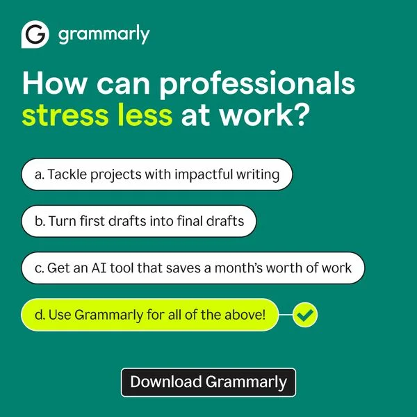
Lead with the writer's doubt, not the feature list

Grammarly's strongest headlines run problem-first: "Does this email sound too aggressive?" They speak the internal monologue of the reader before naming the fix. Feature-led openers ("AI-powered grammar checking") lose scroll battles to doubt-led openers every time.

Questions

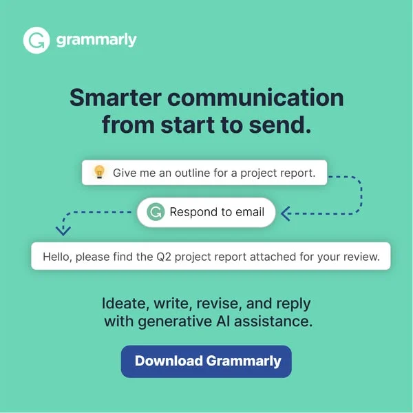
Grammarly ads convert because they run a live product demo inside the ad frame. A typo, an underline, a one-click fix — the entire hook lands in two seconds of scrolling. Pair that with problem-led copy ("Does this sound professional?"), a consistent green palette, and placements on channels where people are actively writing (LinkedIn, Gmail-adjacent Google Display), and the ad does the demo before a user hits the landing page.

Grammarly owns a specific bright green — the green that now reads as "writing tool" across the SaaS industry. Backgrounds skew white, light gray, or soft mint. Red appears only as the error squiggle, and blue sits as secondary accent. Two colors do 90% of the work, with one accent for error-state. Extra color noise would dilute the product recognition Grammarly has spent years building.

Grammarly runs cross-platform with clear audience splits. Facebook and Instagram target students, bloggers, and casual writers. LinkedIn targets professionals and enterprise buyers with team plans. YouTube pre-roll runs testimonial and founder-style spots. Google Display retargets based on visits to productivity and writing sites. Creative adapts slightly per platform — more product demo on Facebook, more testimonial copy on LinkedIn — with green and squiggle staying constant.

Testimonial carousels run as a Grammarly staple, especially on LinkedIn. Format stays consistent: a headshot, a first-name attribution, a specific outcome ("I write 30% faster"), and a product screenshot below. Claims stay concrete and measurable — not "I love Grammarly" but "Closed three more deals last quarter." Specificity separates their testimonial ads from generic case-study card designs most B2B SaaS brands ship.

Short. Primary text runs five to twelve words on Facebook and Instagram, eight to sixteen on LinkedIn where the audience reads longer. Headlines rarely exceed seven words ("Write with confidence," "Know your tone"). CTA text stays action-verb clean — "Get Grammarly," "Try free." Video ads voice-over tighter than 30 seconds, with copy tied to an on-screen product fix rather than standalone narration.

Create Your Own
Grammarly Ad

Clone any grammarly ad example. Upload your product photo. Seconds later, you have a finished ad ready to launch.

Create your ad
AdDogs ad examples globe