
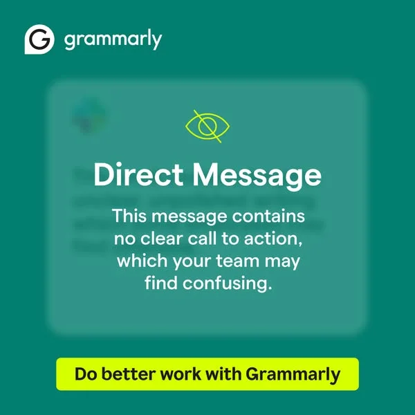
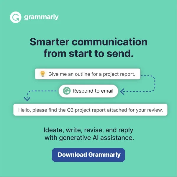
Grammarly — Message UI Mockup with CTA — SaaS & Tech Ad Example
This ad leverages a UI mockup layout to simulate a common workplace communication scenario, instantly resonating with its target audience. The dark teal background provides a professional yet approachable feel, contrasting sharply with the bright yellow CTA button, which acts as a powerful visual anchor. The composition strategically places the Grammarly logo in the top-left for brand recognition, while the central message box draws immediate attention to the problem Grammarly solves. Text hierarchy is clear: a bold headline, followed by a problem statement, culminating in a solution-oriented call to action. This design is optimized for platforms like Facebook or Instagram, where its clean, high-contrast aesthetic and relatable scenario can effectively stop the scroll and drive consideration for a productivity tool. The ad effectively uses color psychology to convey seriousness and urgency.
Why This Ad Works
UI mockup highlights common communication problem
By mimicking a "Direct Message" interface, the ad immediately establishes a relatable scenario for professionals struggling with unclear communication. This visual metaphor directly illustrates the pain point Grammarly addresses, making the solution feel highly relevant and necessary to the target audience.
Bright yellow CTA commands immediate attention
The vibrant yellow call-to-action button sharply contrasts with the dark teal background and the muted message box. This high contrast ensures the CTA is the most prominent interactive element, guiding the viewer's eye directly to the desired action and significantly increasing click-through potential on busy social feeds.
Direct problem statement creates immediate relevance
The text "This message contains no clear call to action, which your team may find confusing" directly articulates a common professional frustration. This clear, concise problem statement immediately engages the audience by mirroring their own experiences, positioning Grammarly as the essential tool to prevent such communication breakdowns.
Ad Specs
Color Palette
Original Ad Copy
How to Clone This Ad
From reference to ready-to-run ad
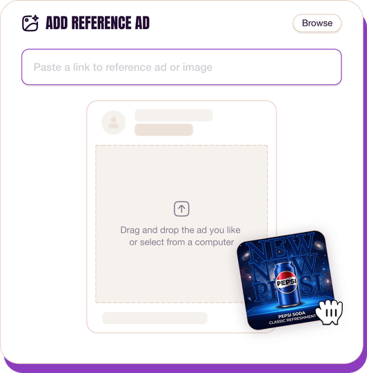
Pick a reference ad
Browse the library or upload any ad spotted in the wild.
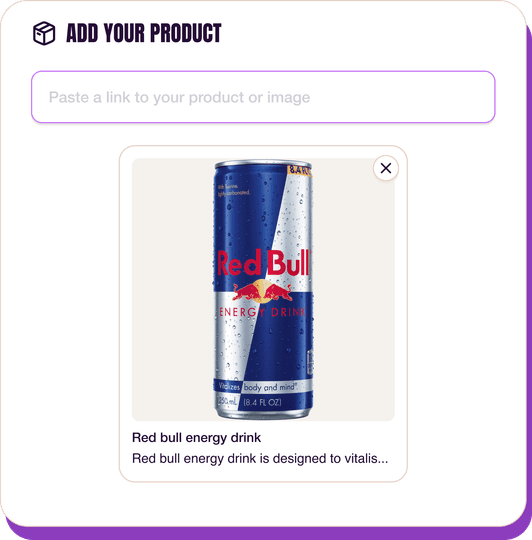
Upload a product photo
Any angle, any background. One photo is enough.
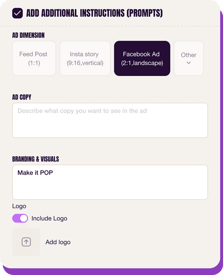
Customize the ad
Pick dimensions, add ad copy, upload your logo — AdDogs handles the rest.
Get your ad in every format, for every platform
Instagram, Facebook, TikTok, LinkedIn, Google — every ad size generated in one shot.
What You Could Improve
Add specific benefit to CTA for stronger pull
While "Do better work" is good, a more specific benefit like "Write clearer emails with Grammarly" or "Eliminate confusion in team messages" could increase conversion. Specificity often resonates more powerfully, providing a tangible outcome that directly addresses the problem presented in the ad.
Experiment with human element for emotional connection
The current ad is very functional. Testing a variant that subtly incorporates a human element, like a small avatar or a blurred background of a collaborative workspace, could add an deeper emotional layer. This might enhance relatability and foster a stronger connection with users, especially on platforms like Instagram.
Questions
AdDogs rebuilds the ad with your product photo and extracts your brand colors automatically from your logo. Same layout and composition — your product, your brand.
Pick your dimension per generation. Basic includes 3 dimensions: square (1:1) for Instagram and Facebook feeds, portrait (9:16) for Stories and Reels, landscape (16:9) for Google Display and YouTube. Pro and Ultimate unlock all 14, including Pinterest (2:3), cinematic (21:9), and banners.
Built for software & tools products. The UI Mockup composition works best when the product photo carries the persuasion. Any background, any angle — AdDogs handles the cutout.
One credit. $0.40 on the Basic plan ($12/mo for 30 credits), $0.33 on Pro. One credit produces one finished ad in the dimension you pick.
Single-image Sponsored Content at 1.91:1 (1200x627) with a screenshot-led hero and a problem-led headline dominates B2B LinkedIn CTR. Single-image beats carousel for most SaaS because LinkedIn's feed rewards fast comprehension over swipe depth. Document ads (PDF carousels) work well for gated-content funnels — HubSpot built a paid engine on this format. Sponsored video runs higher on brand-awareness but rarely beats static on cost-per-lead once you're past the discovery phase.
Grammarly runs the most prolific consumer-SaaS paid creative — the red-squiggle moment is a hook adapted across hundreds of variants. HubSpot leads B2B content-gated creative with template-download offers and pipeline screenshots. Notion and Linear hold the productivity-tool aesthetic tier with tight palette discipline. Airtable owns the spreadsheet-to-database before-after. Webflow runs designer-targeted creative with site-builder screenshots. Each brand rotates creative weekly.
More SaaS & Tech Ad Examples
View all





By Industry
By Format
Clone Your First Ad
Pick a template. Upload your product. Seconds later, you have an ad ready to launch. No design skills. No Photoshop.
Create your ad
