AdDogs

LinkedIn Ad Examples for B2B SaaS

Browse 15 LinkedIn ad examples sourced from high-performing campaigns. Clone any design, swap in your product, and get a finished ad in seconds.

Updated June 2026

LinkedIn ad examples play by different rules. CPMs run 3-5x higher than Meta, audiences are at work, and creative has to earn attention from people actively filtering out noise. B2B brands win here with credibility signals — customer logos, stat callouts, named case studies, testimonial quotes. Playful, lifestyle-heavy creative that converts on Instagram gets ignored on LinkedIn.

Specs favor horizontal and square. Sponsored content ads run 1200x627 landscape or 1:1 square at 1080x1080. Single-image ads lead the format mix, followed by document ads (PDFs inline in Feed) and carousel. Composition patterns skew clean — headline top-left, stat or quote centered, company logo bottom-right. Dark-background creative with a single light-color accent outperforms bright, busy designs. Audience reads, evaluates, and clicks on credibility, not vibes.

LinkedIn ads examples below come from SaaS, B2B services, and enterprise brands running Sponsored Content. Filter by layout pattern — testimonial-forward, stat-forward, logo-forward — then clone the structure with your customer quote or case study number dropped in.

monday.com Core Workshop — Bold Text Layout. Brand: monday.com. This ad leverages a high-contrast, dark background with vibrant text and graphic elements to capture attention. The left-aligned text hierarchy guides the eye from the aspirational headline to the prominent "Core workshop" title, followed by essential details like duration, target audience, and price. A bright yellow circular graphic on the right balances the composition, reinforcing the brand and workshop name. This layout is optimized for professional platforms like LinkedIn, where clear, concise information and a strong call to action are crucial. The bold color palette (dark blue, white, yellow, purple) creates a sense of professionalism and energy, ensuring readability and scroll-stopping power in a busy feed. The overall design effectively communicates value and directs users towards registration.. Headline: Take your monday.com skills to the next level. Primary text: Core workshop • 5 hours • For beginner users • $500 London - Feb 20th, 2024. Why this ad works: High-contrast palette ensures readability — The dark blue background paired with bright white and yellow text creates exceptional contrast. This design choice significantly enhances readability, making the ad's core message instantly digestible even when quickly scrolling through a feed. For professional audiences, clarity and efficiency of information transfer are paramount. Clear value proposition drives interest — Key workshop details—duration, target audience ("beginner users"), and price—are presented upfront and clearly. This transparency allows potential attendees to quickly assess the workshop's relevance and value, reducing friction in the decision-making process and attracting qualified leads interested in skill development. Strong visual hierarchy guides engagement — The large "Core workshop" headline immediately draws attention, establishing the ad's primary focus. Supporting information is strategically placed below, leading the eye naturally to the prominent "Register now" CTA button. This deliberate visual flow ensures users absorb critical information and are prompted to take the desired action.. Specs: Brand: monday.com, Industry: Software & Tools, Platform: LinkedIn, Format: Static, Audience: ProfessionalsWork Innovation Lab — Data-Driven Statistic Card. Brand: The Work Innovation Lab. This ad employs a minimalist, data-driven layout, centering a compelling statistic within a clean white card against a soft, muted background. The large "45%" immediately captures attention, establishing a clear visual hierarchy that draws the eye to the key insight. The composition uses ample negative space to ensure readability and focus, making it highly effective for platforms like LinkedIn or Facebook where professionals quickly scan content. Color psychology leverages a soft pink, which subtly humanizes the corporate message, contrasting with the stark black text for clarity. The small abstract graphic adds a touch of modern design without distracting. Text hierarchy prioritizes the statistic, followed by its explanation, and finally the source, guiding the viewer through the information efficiently. This design is optimized for quick comprehension and professional appeal.. Headline: 45%. Primary text: of an employee's time can be automated with existing technology. Why this ad works: Bold statistic grabs immediate attention — The prominent "45%" acts as a powerful hook, leveraging curiosity and the human tendency to react to numbers. This large, isolated figure immediately conveys a significant, actionable insight, making the ad highly effective at stopping the scroll in a busy professional feed. Clean, minimalist layout enhances readability — The use of a large white card on a soft background, combined with generous negative space, ensures the core message is exceptionally clear. This minimalist approach reduces cognitive load, allowing busy professionals to quickly absorb the key takeaway without visual clutter or distraction. Credible source builds trust and authority — Explicitly citing "The Work Innovation Lab" and its publication immediately lends credibility to the statistic. For a professional audience, demonstrating research and expertise is crucial for building trust and encouraging further engagement with the underlying message or solution.. Specs: Brand: The Work Innovation Lab, Industry: Software & Tools, Platform: LinkedIn, Format: Static, Audience: ProfessionalsYotpo LinkedIn Testimonial — Social Proof Card. Brand: Yotpo. This ad leverages a social media post mockup, specifically a LinkedIn testimonial, to build credibility. The layout features a clean, rounded white card against a dark grey background, creating high contrast for readability. The composition centers the testimonial, drawing immediate attention to the user's positive feedback. Color psychology uses the professional LinkedIn blue subtly in the icon, reinforcing authenticity. Text hierarchy prioritizes the reviewer's name and title, followed by the enthusiastic endorsement, and finally the Yotpo brand logo. This design is optimized for platforms like LinkedIn or Facebook where B2B audiences value peer validation. The clear, concise text and familiar UI pattern enhance trust and engagement, effectively communicating a product launch's impact through a relatable voice.. Primary text: This is major!!! So excited for this launch - truly makes all the difference for a brands segmentation strategy!. Why this ad works: Authentic LinkedIn UI builds instant trust — The ad meticulously mimics a LinkedIn post, including the profile picture, name, title, and "Like | Reply" options. This familiar UI pattern immediately signals authenticity and social proof, making the testimonial feel organic rather than a manufactured ad. Viewers are more likely to trust peer recommendations. Clear, enthusiastic testimonial highlights impact — Olivia Grant's quote, "This is major!!! So excited for this launch - truly makes all the difference for a brands segmentation strategy!", is direct and positive. It clearly articulates the product's value proposition and impact on a key business strategy, resonating with B2B decision-makers. High contrast design ensures readability — The white testimonial card against a dark grey background provides excellent contrast, making the text highly readable on any device. This visual clarity reduces cognitive load, allowing the audience to quickly absorb the message and the associated positive sentiment without effort.. Specs: Brand: Yotpo, Industry: Software & Tools, Platform: LinkedIn, Format: Static, Audience: ProfessionalsRippling — Employee Story Testimonial Card. Brand: Rippling. This ad effectively uses a testimonial-style narrative within a clean, card-based layout to highlight product benefits. The central text block, featuring a user's story, dominates the composition, immediately drawing the eye. A friendly headshot above the text adds a human element, building trust and relatability. The gradient background provides a subtle visual interest without distracting from the core message. Color psychology leverages a warm, inviting palette (cream card, purple/blue gradient) to convey approachability for a B2B SaaS product. Text hierarchy places the compelling story first, followed by a smaller brand tagline and logo, guiding the viewer from problem/solution narrative to brand association. Optimized for professional platforms like LinkedIn, where storytelling and relatable employee experiences resonate, this ad aims for consideration by showcasing real-world impact.. Headline: Olivia provisioned 16 laptops, set up cybersecurity policies for 300 devices, and finally took her son to Legoland.. Primary text: DO MORE WITH. Why this ad works: Relatable User Story Drives Engagement — The narrative about Olivia's work achievements and personal time resonates with busy professionals. It frames Rippling not just as a tool, but as an enabler of work-life balance, directly addressing a common pain point for the target audience. This approach builds emotional connection. Human Element Builds Trust and Connection — Featuring a smiling, approachable headshot of "Olivia" above the story personalizes the ad. This visual anchor helps viewers connect with the narrative on a deeper level, making the benefits feel more tangible and trustworthy than a generic product feature list. Clear, Focused Text Hierarchy — The large, central text block immediately conveys the core message, ensuring high readability. The "DO MORE WITH R Rippling" tagline and logo are positioned clearly below, providing brand context after the user has absorbed the compelling story. This guides the eye effectively.. Specs: Brand: Rippling, Industry: Software & Tools, Platform: LinkedIn, Format: Static, Audience: ProfessionalsTwilio Webinar — Speaker Spotlight Layout. Brand: Twilio. This ad effectively promotes a B2B web seminar using a clean, professional dark blue background with high-contrast white text. The vertical layout is optimized for mobile consumption, likely on platforms like LinkedIn or Facebook, ensuring readability and engagement. The composition strategically places a clear, bold headline at the top, immediately communicating the value proposition. Below, two expert speakers are introduced with their headshots, names, and affiliations, leveraging social proof and credibility. The consistent use of a dark background with white typography creates a serious, trustworthy vibe, essential for financial services topics. Text hierarchy is well-defined, guiding the eye from the event type to the core topic, then to the authoritative figures. The Twilio logo at the bottom provides subtle branding without distracting from the main content. This design prioritizes information delivery and expert endorsement, crucial for driving webinar registrations among professionals.. Headline: Debunking the myth: Balancing security with customer experience in financial services. Primary text: Web Seminar Charles Kirk Director of Engineering, Risk & Identity Chime Adam Elboim Director of Product Management Twilio. Why this ad works: Clear B2B topic immediately qualifies audience — The ad immediately establishes its B2B relevance with a clear 'Web Seminar' tag and a highly specific, industry-focused headline. This direct approach quickly qualifies the audience, ensuring that only professionals interested in financial services security and customer experience will engage. It minimizes wasted impressions by clearly communicating the content upfront. Expert speaker credibility builds trust — Featuring two named speakers with their professional titles and company affiliations (Chime, Twilio) significantly boosts the ad's credibility. This social proof signals that the webinar will offer expert insights, attracting a professional audience seeking authoritative information. It positions the event as a valuable learning opportunity, not just a sales pitch. High-contrast text ensures readability — The dark blue background with crisp white text creates a highly professional and trustworthy aesthetic. This high contrast ensures excellent readability on mobile devices, which is critical for B2B content consumption. The minimalist design avoids clutter, allowing the important textual information and speaker details to stand out clearly and effectively.. Specs: Brand: Twilio, Industry: Software & Tools, Platform: LinkedIn, Format: Static, Audience: ProfessionalsLinkedIn Ads — Text-Heavy Lifestyle Shot. Brand: LinkedIn. This ad employs a split-screen composition, dedicating the top half to a bold, benefit-driven headline and the bottom to a relatable lifestyle image. The large green text on a light grey background ensures high readability and brand recognition, leveraging LinkedIn's corporate color palette to convey trust and growth. The image depicts diverse professionals in a relaxed, collaborative outdoor setting, subtly reinforcing the idea of connection and successful business interactions. This design is optimized for platforms like LinkedIn or Facebook, where a clear value proposition combined with authentic human connection can drive engagement. The text hierarchy is clear: headline first, then brand logo, guiding the viewer's eye efficiently. The overall clean aesthetic positions LinkedIn Ads as a modern, effective solution for business growth.. Headline: Find your next wave of customers with LinkedIn Ads. Why this ad works: Clear, benefit-driven headline captures attention — The headline "Find your next wave of customers with LinkedIn Ads" immediately communicates a strong value proposition. This direct approach quickly answers the "what's in it for me?" question for potential advertisers, crucial for stopping the scroll on busy professional feeds and driving initial interest. Relatable lifestyle image fosters connection — The bottom half features diverse professionals in a relaxed, outdoor setting, subtly suggesting successful collaboration and modern work environments. This human element makes the B2B service feel more approachable and aspirational, allowing the target audience of business owners and marketers to envision their own success. Strong brand reinforcement and trust — The prominent placement of the "LinkedIn Ads" logo directly beneath the headline reinforces brand authority and credibility. Leveraging the established trust associated with LinkedIn, this ensures that the advertising solution is perceived as reliable and effective, a critical factor for B2B decision-makers.. Specs: Brand: LinkedIn, Industry: Software & Tools, Platform: LinkedIn, Format: Static, Audience: ProfessionalsAsana Project Management — Layered UI Mockup. Brand: Asana. This ad effectively uses a layered UI mockup to demonstrate Asana's collaborative and AI-powered project management features. The deep magenta background, a signature brand color, provides a strong contrast for the clean white interface elements, enhancing visual clarity and brand recognition. Overlapping UI cards and chat bubbles create depth and guide the eye through key functionalities like task approval, document sharing, and AI summarization. The composition is optimized for professional platforms, presenting complex software capabilities in an easily digestible visual format. Text hierarchy within the UI is clear, with conversational elements adding a human touch. This design strategy communicates efficiency and innovation, appealing directly to professionals seeking streamlined workflows.. Why this ad works: Layered UI showcases multiple features efficiently — The ad cleverly uses overlapping UI elements to present several Asana features—task management, file sharing, team communication, and AI—within a single frame. This visual density, without feeling cluttered, efficiently communicates the breadth of the platform's capabilities, appealing to users seeking an all-in-one solution. Strong brand color enhances recognition and recall — Asana's distinctive deep magenta background immediately anchors the ad to its brand identity. This bold color choice not only makes the ad stand out in a busy feed but also reinforces brand recognition. The contrast with the clean UI elements ensures readability while maintaining a premium, professional aesthetic. Conversational bubbles explain complex AI features — The inclusion of chat bubbles, particularly "Here's the brief for review" and "AI summarizing context...", humanizes the software experience. These snippets act as micro-explanations, quickly conveying the practical application of Asana's collaboration and AI features, making abstract concepts tangible and relatable for potential users.. Specs: Brand: Asana, Industry: Software & Tools, Platform: LinkedIn, Format: UI Mockup, Audience: ProfessionalsSemrush Forest Scene — Humorous Text Overlay. Brand: Semrush. This Semrush ad cleverly uses a serene forest image to set up a relatable punchline for marketers. The composition features a deep, natural landscape, initially evoking calm, which is then subverted by the overlay text. The dominant green palette, associated with nature and growth, creates an initial sense of peace. Text hierarchy is clear: a large, inviting headline at the top, followed by a smaller, humorous, and demanding follow-up at the bottom, above the brand logo. This juxtaposition of visual tranquility and textual reality is highly effective for platform optimization on professional networks like LinkedIn, where marketers seek both inspiration and tools. The ad leverages emotional resonance and humor to engage its target audience, positioning Semrush as a brand that understands the daily grind of marketing professionals.. Headline: Take a moment to breathe. Primary text: ...now back to work. Remember you're a marketer and KPIs never sleep.. Why this ad works: Relatable Humor Builds Instant Connection — The ad masterfully sets up a moment of peace only to deliver a punchline that resonates deeply with the daily pressures marketers face. This unexpected twist creates a strong emotional connection and a sense of shared understanding, making the brand feel empathetic and relatable to its target audience. Juxtaposition of Serenity and Reality — The visual of a tranquil, mossy forest starkly contrasts with the demanding text about KPIs. This powerful juxtaposition grabs attention by creating cognitive dissonance, forcing the viewer to pause and process the message. It effectively highlights the constant pressure marketers experience, making the ad memorable. Strategic Text Placement Guides Narrative — The headline "Take a moment to breathe" is placed high, drawing the eye to the initial calming message. The follow-up text, positioned lower, delivers the humorous twist. This top-to-bottom reading flow effectively guides the audience through the ad's narrative, ensuring the punchline lands with maximum impact.. Specs: Brand: Semrush, Industry: Software & Tools, Platform: LinkedIn, Format: Static, Audience: ProfessionalsMotion AI — Budget Solution Chat UI. Brand: Motion. This ad effectively uses a relatable business problem-solution narrative, presented through a familiar chat UI mockup. The stark white background and bold, dark blue headline create strong contrast, immediately drawing attention to the core message. The layout strategically places the headline prominently at the top, followed by the chat conversation which unfolds the story, mimicking a real-world interaction. This composition is highly effective for platforms like LinkedIn, where professionals scroll quickly. Color psychology is minimal, relying on high contrast for readability and a clean, professional aesthetic. Text hierarchy guides the eye from the problem (headcount cut) to the solution (AI for projects), with the "Win-win!" acting as a strong closing statement. The ad effectively communicates its value proposition by addressing a common pain point for businesses.. Headline: My CEO is over the moon with the 2025 budget reviews. Primary text: I'm afraid to inform you that we weren't approved for your 2025 headcount. So we got AI to manage all our projects for a *fraction* of the cost. Win-win!. Why this ad works: Relatable Problem-Solution Narrative — The ad immediately hooks professionals with a common pain point – budget cuts and headcount freezes – then swiftly offers a clear, cost-effective AI solution. This narrative structure resonates deeply, making the product's value proposition instantly understandable and desirable to target audiences facing similar challenges in their organizations. Authentic Chat UI Engagement — Utilizing a realistic chat interface creates a sense of authenticity and personal connection, making the ad feel less like a direct sales pitch and more like an overheard conversation or a shared experience. This familiar format encourages deeper engagement and makes the solution feel more accessible and trustworthy to the viewer. Strong Visual Hierarchy with Contrast — The bold, dark blue headline against the clean white background ensures maximum readability and immediate impact. This high-contrast design, combined with the clear progression from headline to chat dialogue, effectively guides the viewer's eye through the ad's key messages without distraction, optimizing for quick comprehension on busy feeds.. Specs: Brand: Motion, Industry: Software & Tools, Platform: LinkedIn, Format: UI Mockup, Audience: ProfessionalsStripe & Turo — Bold Text & Gradient. Brand: Stripe. This ad employs a split-screen layout, dedicating the top half to a clear, concise text-based value proposition and the bottom to a vibrant, abstract gradient and brand logos. The high contrast between the white background and bold black headline immediately grabs attention, while the secondary grey text provides context. The striking magenta gradient adds a modern, energetic feel, signaling innovation and dynamism, which aligns with the B2B tech space. This composition is optimized for platforms like LinkedIn, where professionals quickly scan for relevant information and case studies. The text hierarchy guides the eye from the impactful benefit to the explanatory detail, effectively communicating a key success story for Stripe's platform. The minimalist approach keeps the focus on the message and brand association.. Headline: Turo launches 5x faster in new markets. Primary text: Learn how it unified its payments platform. Why this ad works: High-contrast headline for instant impact — The bold black headline against a stark white background creates maximum contrast, ensuring immediate readability and attention capture. In busy professional feeds, this directness cuts through noise, quickly communicating the core benefit. This design choice prioritizes clarity and speed of message absorption, crucial for B2B advertising effectiveness. Vibrant gradient signals modern innovation — The dynamic magenta gradient in the lower half provides a strong visual anchor without distracting from the text. This modern, energetic color choice conveys innovation and forward-thinking, aligning well with a technology company like Stripe. It adds a memorable brand aesthetic, differentiating the ad from more subdued corporate visuals. Clear value proposition in headline — The headline "Turo launches 5x faster in new markets" immediately presents a tangible, quantifiable benefit. This direct approach appeals to business decision-makers seeking efficiency and growth. By highlighting a specific success metric from a recognizable client, the ad builds credibility and prompts further investigation into Stripe's platform capabilities.. Specs: Brand: Stripe, Industry: Software & Tools, Platform: LinkedIn, Format: Static, Audience: ProfessionalsTines Testimonial — Playful Quote Card. Brand: Tines. This ad employs a testimonial-as-hero layout, presenting a strong customer quote in a visually engaging "quote card" style. The pastel purple background, combined with scattered confetti-like shapes, injects a playful and modern vibe into what is typically a dry B2B context. This color psychology helps Tines appear approachable and innovative, contrasting with traditional corporate aesthetics. The composition prioritizes the large, bolded quote, ensuring immediate readability and impact. Below, the reviewer's details and a prominent G2 rating provide crucial social proof. Optimized for platforms like LinkedIn or Instagram, its distinct visual style and clear value proposition aim to stop the scroll and build trust, encouraging consideration for the SaaS product. Text hierarchy guides the eye from the core message to validation points.. Headline: TLDR: Tines is a must-have tool if you want to save time and focus on what really matters.. Primary text: Hector H., Enterprise (> 1000 emp.). Why this ad works: Prominent testimonial leverages social proof — The large, bolded customer quote immediately communicates a strong endorsement. In B2B marketing, third-party validation from peers, especially from enterprise users, is highly effective. This direct quote builds trust and credibility faster than generic marketing claims, driving consideration. Playful aesthetic stands out in B2B feeds — The pastel purple and confetti elements create a distinct, non-corporate visual identity. This playful vibe helps the ad cut through the often-stiff B2B content on platforms like LinkedIn, making it more memorable and approachable. It signals a modern, user-friendly solution. G2 rating provides instant third-party validation — The inclusion of the G2 logo and a perfect 5.0-star rating offers immediate, verifiable social proof. G2 is a trusted source for software reviews, and its presence quickly validates the testimonial's authenticity and the product's quality, reducing perceived risk for potential customers.. Specs: Brand: Tines, Industry: Software & Tools, Platform: LinkedIn, Format: Static, Audience: ProfessionalsHubSpot — Strategic Blueprint Illustration. Brand: HubSpot. This ad employs a clean, split-screen layout, dedicating the upper left to prominent text and the lower right to a conceptual illustration. The layout strategy effectively balances informational content with visual metaphor, making complex B2B concepts digestible. HubSpot's signature orange is strategically used for emphasis in the headline and illustration, creating strong brand recall and visual interest against the neutral background. The composition guides the eye from the bold headline to the detailed body copy, then to the engaging blueprint illustration, reinforcing the message of strategic planning and integration. Optimized for professional platforms like LinkedIn, its clear hierarchy and minimalist aesthetic ensure readability and engagement, allowing the core value proposition to shine without visual clutter. The low text overlay, despite significant copy, maintains a clean, premium feel.. Headline: Sync your tools. Empower your teams.. Primary text: Get the blueprint to reduce friction, boost productivity, and scale smarter — without compromising customer experience.. Why this ad works: Bold Headline & Body Copy Hierarchy — The headline uses contrasting colors and font weights to immediately grab attention, while the body copy provides clear, concise value. This strong visual hierarchy ensures the core message is understood quickly, crucial for scroll-stopping on busy feeds. It effectively communicates the ad's purpose before the user decides to engage further. Strategic Blueprint Illustration Metaphor — The hand-drawn blueprint illustration effectively visualizes the abstract concept of "reducing friction" and "scaling smarter." This creative metaphor makes the ad more engaging and memorable than a purely text-based approach, helping B2B audiences connect with the strategic benefits of HubSpot's offerings in a relatable way. Consistent Brand Color for Emphasis — The strategic use of HubSpot's distinct orange color for key headline words and elements within the illustration reinforces brand identity. This consistent color application not only highlights important information but also subtly embeds brand recognition, making the ad instantly identifiable and professional without being overly promotional.. Specs: Brand: HubSpot, Industry: Software & Tools, Platform: LinkedIn, Format: Static, Audience: ProfessionalsSuperhuman — AI Email UI Mockup. Brand: Superhuman. This ad effectively leverages a UI mockup to demonstrate Superhuman's core value proposition. The dark, atmospheric background provides a sophisticated canvas, allowing the bright white headline and translucent UI elements to pop. The layout prioritizes a clear, benefit-driven headline at the top, immediately grabbing attention with a quantifiable promise ("Reply to 2x more messages"). Below, the email interface visually reinforces the AI-native claim, with a prominent "124 emails Auto Archived" notification showcasing efficiency. This composition is ideal for platforms like LinkedIn, targeting professionals who value productivity. The text hierarchy guides the eye from the brand, to the main benefit, then to a tangible feature, making the ad highly persuasive by showing, not just telling, the product's power.. Headline: Reply to 2x more messages with AI-native email. Primary text: 124 emails Auto Archived. Why this ad works: Clear, Quantifiable Benefit in Headline — The headline "Reply to 2x more messages with AI-native email" immediately communicates a strong, measurable benefit. This direct approach resonates with busy professionals, promising increased productivity and efficiency, which is crucial for capturing attention in a competitive feed environment. Visual Demonstration of AI Feature — The UI mockup, specifically the "124 emails Auto Archived" notification, provides tangible proof of the AI's capability. This visual evidence helps users quickly grasp how the product works and its immediate impact on their workflow, building trust and understanding more effectively than mere text. Sophisticated Dark Mode Aesthetic — The ad's dark background combined with translucent, modern UI elements creates a premium and professional aesthetic. This design choice appeals to a tech-savvy, professional audience, signaling a sophisticated and high-performance tool, aligning with the brand's positioning as a premium email client.. Specs: Brand: Superhuman, Industry: Software & Tools, Platform: LinkedIn, Format: UI Mockup, Audience: ProfessionalsDatabricks Generative AI Ebook — Split Layout. Brand: Monday.com. This ad effectively uses a top-heavy text layout combined with a prominent ebook hero shot. The deep green background, featuring a subtle geometric pattern, establishes a professional and tech-forward aesthetic, resonating with a B2B audience. High-contrast white typography ensures the core message, "Win with generative AI," is instantly legible, crucial for quick scanning on platforms like LinkedIn. A vibrant yellow circular highlight acts as a secondary focal point, emphasizing "Power AI Breakthroughs." The ebook cover is strategically placed and angled, adding visual interest and clearly presenting the downloadable asset. This composition guides the viewer's eye from the compelling headline to the valuable resource, optimizing for lead generation and consideration within a professional context.. Headline: Win with generative AI. Primary text: How to help teams collaborate. Why this ad works: High-contrast text for immediate impact — The white headline against the dark green background provides excellent readability, ensuring the core message "Win with generative AI" is instantly absorbed. This contrast is vital for quick scanning on busy social feeds, capturing attention effectively within milliseconds. Strategic use of brand colors — The deep green background is consistent with Databricks' brand identity, fostering recognition and trust. The complementary yellow highlight circle effectively breaks the green monotony, drawing the eye to the "Power AI Breakthroughs" message, reinforcing the ad's value proposition. Clear product focus with supporting visual — The ebook cover is prominently displayed, making it clear what the user is being offered. The cover's internal design, with abstract data-related graphics, subtly reinforces the technical topic, while the overall composition clearly signals a valuable, downloadable resource.. Specs: Brand: Monday.com, Industry: Software & Tools, Platform: LinkedIn, Format: Static, Audience: ProfessionalsCalm Health — B2B UI & Lifestyle Collage. Brand: Calm. This ad employs a multi-layered composition, strategically combining a prominent B2B value proposition with a detailed UI mockup and supporting lifestyle imagery. The layout prioritizes a clear text hierarchy at the top, immediately addressing organizational pain points. Below, the central phone UI acts as a product demo, showcasing app features and user experience. Surrounding circular images provide emotional resonance and illustrate diverse use cases, reinforcing the broad applicability of Calm Health. The cool blue gradient background aligns with Calm's brand identity, evoking tranquility and professionalism. This design is optimized for platforms like LinkedIn or Google Display where B2B decision-makers seek clear benefits and product functionality. The visual balance between text and imagery ensures comprehensive communication, driving consideration for organizational adoption.. Headline: Maximize Engagement, Minimize Healthcare Costs. Primary text: Discover Calm Health for Your Organization. Why this ad works: Clear B2B value proposition headline — The headline "Maximize Engagement, Minimize Healthcare Costs" directly addresses key organizational concerns. This immediate articulation of benefits captures the attention of HR or benefits managers, clearly positioning Calm Health as a solution to tangible business problems, driving initial interest and consideration. Central UI mockup demonstrates product value — Placing the detailed app UI mockup centrally effectively showcases the product's features and user experience. This visual demonstration allows potential organizational clients to quickly grasp the platform's capabilities and ease of use, fostering confidence and reducing the perceived risk of adoption. Diverse lifestyle imagery broadens appeal — The surrounding circular images depict a range of users and scenarios, from individual meditation to family interaction and mental health tracking. This diverse representation communicates the broad applicability and inclusivity of Calm Health, appealing to organizations with varied employee demographics and needs.. Specs: Brand: Calm, Industry: Health & Wellness, Platform: LinkedIn, Format: Mixed, Audience: Professionals
Why Clone Ads

What Makes LinkedIn Ads Convert

Stat or quote front-and-center

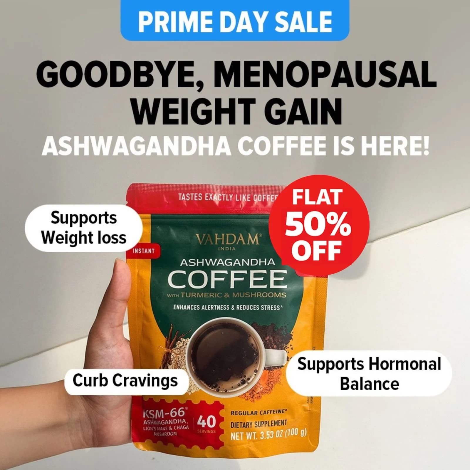
LinkedIn's audience scrolls past anything without a number or a name. Lead with a hard stat (3.2x ROI, $1.4M saved, 70% faster), a named customer quote, or a recognizable logo. Credibility pays CPM on LinkedIn — abstract claims don't.

Horizontal 1200x627 is default

LinkedIn Sponsored Content defaults to landscape 1.91:1 at 1200x627. Square 1:1 works but takes less feed real estate on desktop — where 60% of LinkedIn traffic sits. Design for horizontal first, export square as the mobile backup, and skip vertical altogether unless running LinkedIn Stories.

Keep the logo in the corner

B2B buyers want to know the source before they read the claim. Logo bottom-right, customer logos in a row if running case study creative, and clear attribution on any stat quoted. Unbranded creative on LinkedIn reads as low-trust and gets scrolled past.

Questions

LinkedIn CPMs run $30-60 for Sponsored Content in most B2B verticals — 3-5x higher than Meta. Enterprise SaaS and finance verticals see $70-120 CPMs because competition for decision-maker inventory is brutal. Higher CPM forces creative quality to matter more, because a weak hook costs significantly more per impression than on cheaper platforms.

Sponsored Content runs landscape 1200x627 or square 1080x1080. Landscape is the default and takes more screen space on desktop, where most LinkedIn engagement happens. Square works for mobile-heavy feeds. Design landscape-first and export square as the secondary format for mobile placements.

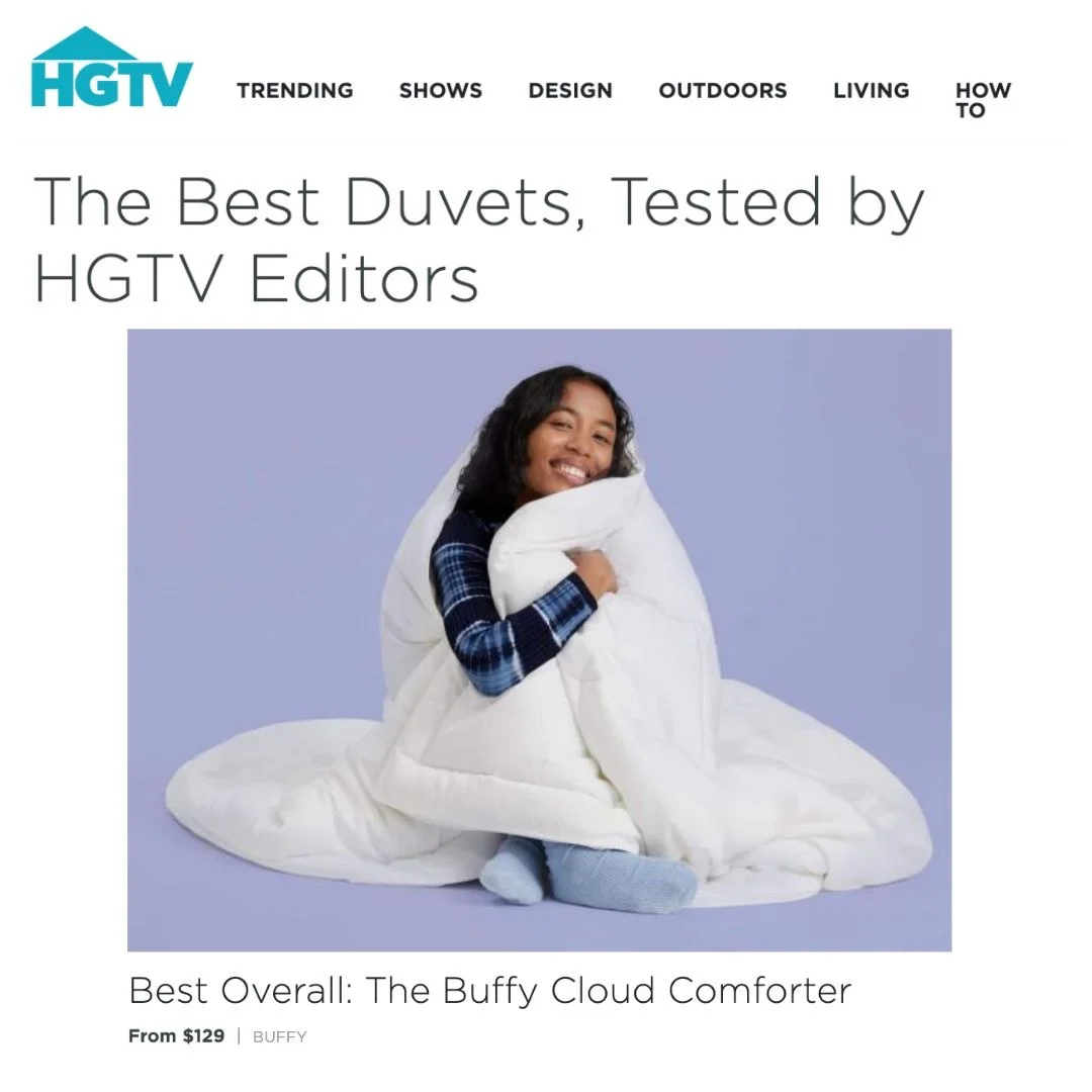
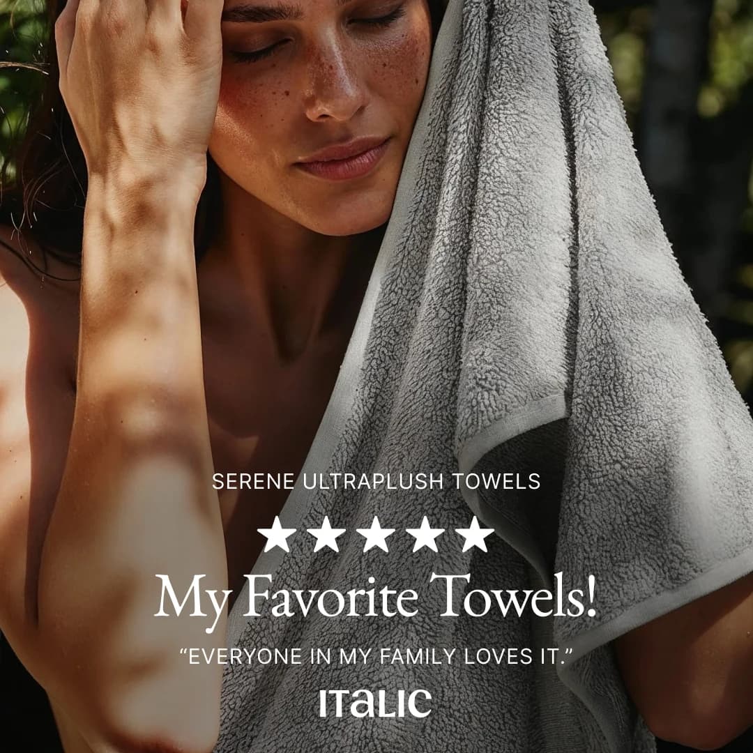
Testimonial-format creative is the highest-performing layout on LinkedIn by a wide margin. B2B buyers trust named customers more than claims — a quote with a face, a title, and a company logo lifts CTR 2-4x over generic product imagery. Spend the effort sourcing strong customer quotes with specific outcomes before spending on better creative.

LinkedIn's audience reads more than Meta's. Headlines of 60-150 characters and body copy of 150-300 characters out-convert short copy in most B2B verticals. Document ads and carousels can run longer because the format rewards scrollers. Cut filler relentlessly, but short-form punchy copy that works on Instagram underperforms in LinkedIn's Feed.

LinkedIn's higher CPM means fewer impressions per dollar, so campaigns usually run 4-6 variants per ad set — enough to find a winner without stretching each variant too thin. Brands running more than 6 variants see statistical noise because individual variants never hit enough impressions to separate from each other. Four is the sweet spot for most ad sets.

Create Your Own
LinkedIn Ad

Clone any linkedin ad example. Upload your product photo. Seconds later, you have a finished ad ready to launch.

Create your ad
AdDogs ad examples globe