AdDogs

TikTok Ad Examples Built for Vertical Scroll

Browse 41 TikTok ad examples sourced from high-performing campaigns. Clone any design, swap in your product, and get a finished ad in seconds.

Updated June 2026

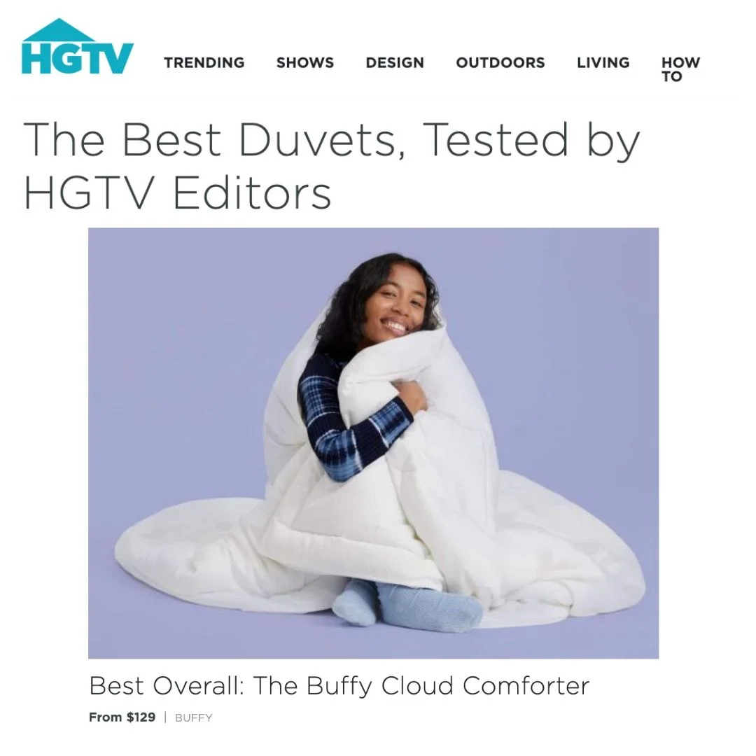
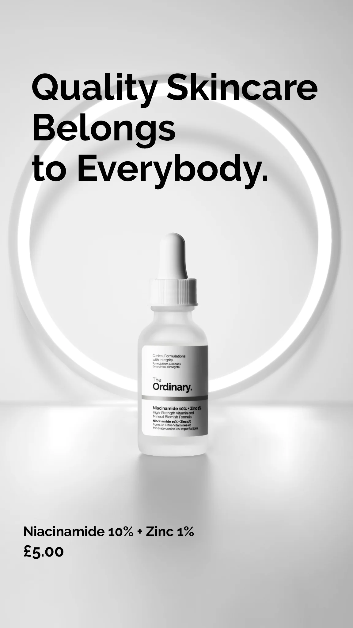
TikTok ads examples die faster than any other platform's creative. Viewers decide by second 2 whether to swipe, which means the hook can't wait for the brand reveal. Ads that look like ads get skipped. Ads that look like a creator holding up a product in their kitchen get watched. Native feel beats production value every single time.

Format is non-negotiable: 9:16 vertical at 1080x1920, full-screen, no letterboxing. Spark Ads let brands boost existing organic posts, which is why UGC creators out-earn studios on TikTok. Composition rules flip from Facebook — center-framed product, creator face in-shot if possible, text overlays at the top (TikTok's UI covers the bottom 15% with captions and CTAs). Audience skews Gen Z, attention spans are brutal, and the first frame is everything.

Ad examples below pull from real TikTok campaigns — UGC-style statics, creator face reveals, low-production hooks. Find a layout that matches your product's vibe, clone it, and export the 9:16 version.

Anti-Stress Candy — Split Screen Video Still. This ad employs a split-screen layout, featuring a relatable video still of a woman in a car, seemingly stressed or tired, in the upper half. The lower half is dominated by a high-contrast black background with bold white and magenta text. This composition immediately grabs attention, especially on fast-scrolling platforms like TikTok, by presenting a problem visually and offering a solution textually. The use of magenta for "PEOPLE SLEEPING IN 3-HOUR SHIFTS" effectively highlights the target audience and their specific pain point, creating an instant connection. The text hierarchy is clear, leading the eye from the intriguing headline to the direct "TAP TO READ" call to action. Color psychology leverages black for seriousness and magenta for urgency and attention, ensuring the core message stands out. This ad is optimized for quick consumption and high engagement, relying on a strong hook to drive consideration.. Headline: THE ANTI-STRESS CANDY REPLACING COFFEE FOR PEOPLE SLEEPING IN 3-HOUR SHIFTS. Why this ad works: Relatable visual hook captures attention — The close-up of a woman with an intense, slightly weary expression immediately resonates with the target audience experiencing stress or sleep deprivation. This authentic, unpolished visual feels native to platforms like TikTok, fostering relatability and stopping the scroll more effectively than a perfectly staged shot. Specific pain point targets niche audience — The headline directly addresses "PEOPLE SLEEPING IN 3-HOUR SHIFTS," creating an incredibly specific and compelling hook for shift workers, new parents, or students. This precision ensures the ad speaks directly to those most likely to benefit, increasing relevance and click-through rates by avoiding generic messaging. High-contrast text with strategic color highlight — The stark white text on a black background ensures maximum readability, while the magenta highlight on "PEOPLE SLEEPING IN 3-HOUR SHIFTS" draws the eye to the core problem and target demographic. This visual hierarchy guides the viewer's focus, making the ad's value proposition instantly clear and impactful.. Specs: Industry: Health & Wellness, Platform: TikTok, Format: Static, Audience: ProfessionalsVertigo Solution — Problem/Solution Text Overlay. This ad employs a direct, problem-solution layout, leveraging a large, high-contrast text overlay to immediately capture attention on a busy feed. The dark background with a medical diagram and a credible-looking older male speaker establishes authority and targets a specific health concern. Compositionally, the text box dominates the upper half, guiding the eye to the core message before dropping to the speaker and a clear call to action. The use of bright yellow for the text box against a dark background ensures maximum visibility and scroll-stopping power, optimized for platforms like TikTok or Facebook where direct communication and educational content perform well. The visual hierarchy prioritizes the bold claim, followed by a simple, actionable next step, making it highly effective for driving consideration.. Headline: THE REAL REASON FOR MY VERTIGO WASN'T MENIERE'S DISEASE — IT WAS AN IMBALANCED VAGUS NERVE. Primary text: JUST TAKE 1-MIN TEST. Why this ad works: High-contrast text box grabs attention — The bright yellow text box against the dark background creates an immediate visual anchor. This high contrast is crucial for cutting through visual clutter on social feeds, ensuring the headline is read first and stopping the scroll. Problem-solution headline creates intrigue — The headline 'THE REAL REASON FOR MY VERTIGO WASN'T MENIERE'S DISEASE — IT WAS AN IMBALANCED VAGUS NERVE' directly addresses a common health issue and offers an alternative, intriguing explanation. This narrative hook encourages viewers to learn more, driving engagement and clicks. Credible spokesperson builds trust — Featuring an older male spokesperson, likely a doctor or someone with lived experience, adds a layer of credibility and relatability. This personal endorsement, combined with the medical diagram, helps build trust and positions the information as authoritative and trustworthy for the target audience.. Specs: Industry: Health & Wellness, Platform: TikTok, Format: Static, Audience: Men 45+Immi Spicy Beef Ramen — Product Feature Shot. Brand: Immi. This ad effectively uses a high-contrast composition, centering the vibrant yellow Immi ramen package against a desaturated background featuring a person eating. This layout strategy immediately draws the eye to the product while subtly implying a lifestyle context. The bold, yellow text overlay highlights key nutritional benefits (protein, fiber, plant-based), creating a clear and concise value proposition. The color psychology leverages bright, energetic yellow for attention and appetite appeal, contrasting sharply with the muted background to make the product pop. Optimized for fast-scrolling mobile platforms like TikTok or Instagram, its vertical orientation and strong visual hierarchy ensure immediate comprehension. The text is strategically placed to be easily readable, reinforcing the product's unique selling points without cluttering the main visual.. Headline: 24g OF PROTEIN. 15g OF FIBER. 100% PLANT-BASED.. Why this ad works: High-contrast palette for instant attention — The stark contrast between the vibrant yellow packaging and the grayscale background immediately captures attention in a crowded feed. This visual technique ensures the product is the undeniable focal point, preventing scroll-by. The bold color choice also evokes energy and appetite, crucial for food advertising, making the product visually irresistible. Benefit-driven text communicates value immediately — Placing the core nutritional benefits as a prominent text overlay directly above the product package ensures instant communication of value. This hierarchy prioritizes what health-conscious consumers seek, allowing for rapid assimilation of key selling points. It efficiently answers 'what's in it for me?' within seconds of viewing. Subtle lifestyle context enhances product appeal — The subtle inclusion of a person eating in the desaturated background provides a relatable, in-use context without distracting from the product. This lifestyle element adds authenticity and aspiration, showing the product being enjoyed. It helps viewers envision themselves consuming the ramen, enhancing emotional connection and product desirability.. Specs: Brand: Immi, Industry: Food & Beverage, Platform: TikTok, Format: Static, Audience: GeneralPurdy & Figg — High Chair Before/After Split. Brand: Purdy & Figg. This ad effectively leverages a stark before/after split-screen layout to demonstrate product efficacy. The "Before" section uses high-contrast, unappealing mess to create immediate problem recognition, while the "After" presents a pristine, aspirational clean. The central, bold yellow text with a black outline ensures maximum readability and acts as a clear value proposition, optimized for quick consumption on mobile platforms like TikTok or Instagram. The composition directly addresses a common pain point for parents, using relatable imagery. Color psychology is simple: dirty vs. clean, creating a strong emotional contrast. The text hierarchy guides the viewer from problem to solution, with the headline framing the product's benefit. This visual strategy is highly effective for driving consideration and awareness by showcasing undeniable results.. Headline: Why plant-based cleaners are the future of home hygiene. Why this ad works: Direct Before/After visual impact — The immediate contrast between the heavily soiled high chair and its spotless counterpart creates a powerful visual narrative. This direct comparison instantly communicates the product's effectiveness, resonating deeply with parents who face similar daily cleaning challenges and seek tangible solutions. High-contrast text ensures readability — The bold yellow text with a thick black outline stands out sharply against both the messy "Before" and clean "After" backgrounds. This ensures the key message, "Why plant-based cleaners are the future of home hygiene," is highly legible and captures attention, crucial for fast-scrolling social feeds. Relatable problem-solution scenario — Featuring a messy high chair taps directly into a universal pain point for parents. This relatable scenario builds immediate empathy and trust, positioning the product as a practical, effective solution for everyday household challenges, thereby increasing engagement and consideration among the target audience.. Specs: Brand: Purdy & Figg, Industry: Home & Lifestyle, Platform: TikTok, Format: Static, Audience: ParentsFulton Insoles — What I Ordered vs. Got. Brand: Fulton Insoles. This ad leverages a popular social media trend, "What I ordered vs. What I got," to present Fulton Insoles. The layout is a clear split screen: the top half features a product hero shot with natural lighting, while the bottom half is a text-heavy list of benefits against a solid dark green background. This composition effectively contrasts initial expectation with positive reality, building trust. The dark green color palette, consistent with the product, evokes a sense of natural, health-focused efficacy and premium quality. Text hierarchy is clear, using bold white text and emojis for scannability, optimized for quick consumption on mobile platforms like TikTok or Instagram Reels. This approach immediately addresses potential skepticism and delivers tangible, relatable benefits, making it highly engaging and shareable.. Headline: What I ordered VS What I got. Primary text: Foot and knee pain is GONE No more overpronation Custom molding cork technology Improved posture Comfort from day one. Why this ad works: Leverages "What I Ordered vs. Got" Trend — This format taps into a highly relatable and popular social media trend, immediately grabbing attention. It sets up an expectation-versus-reality narrative that builds anticipation and delivers a satisfying reveal of product benefits, fostering trust and engagement by mirroring user-generated content styles. Clear Problem-Solution Benefit List — The ad directly addresses common pain points (foot/knee pain, overpronation) and offers clear solutions. Each benefit is concise, impactful, and supported by a relevant emoji, making the information highly scannable and digestible for a mobile audience, driving home the product's value proposition quickly. Consistent Brand Color Palette — The use of a deep, earthy green for both the product and the background reinforces the brand's identity and suggests natural, health-conscious benefits. This color choice creates a cohesive visual experience, enhancing brand recognition and subtly communicating the product's organic or wellness-focused attributes.. Specs: Brand: Fulton Insoles, Industry: Health & Wellness, Platform: TikTok, Format: Static, Audience: GeneralHappy Aging — Split Screen Problem/Solution. Brand: Happy Aging. This ad employs a striking split-screen layout, dedicating the top half to a text-heavy, problem-focused message and the bottom to a vibrant product shot. The black background for the text section, contrasted with white font and yellow checkmarks, creates high readability and urgency, optimized for quick consumption on mobile platforms like TikTok or Instagram Stories. The composition strategically uses a direct, benefit-driven list to address common aging concerns, immediately grabbing attention. Below, the product, a "Happy Aging" shot, is dynamically submerged in an orange liquid, suggesting efficacy and freshness. This visual juxtaposition effectively presents a problem and its tangible solution, leveraging color psychology with bold orange to convey energy and vitality, while the dark top half emphasizes the issues to be resolved. The overall design aims for direct response and high engagement through clear messaging and a visually arresting product presentation.. Headline: What will be gone by 2026. Primary text: Dark circles GONE Crows feet GONE Wrinkles GONE Age spots GONE Dull skin GONE Turkey neck GONE. Why this ad works: Split Screen Problem/Solution Framing — The ad effectively divides the screen into problem (top, text-based) and solution (bottom, product-based). This clear visual separation guides the viewer through a logical narrative, first identifying their pain points with "What will be gone by 2026" and then immediately presenting the product as the answer. This structure is highly persuasive for consideration-stage audiences. High Contrast Text for Readability — The white text on a stark black background, combined with bright yellow checkmarks, ensures maximum readability and visual pop. This high contrast design is crucial for mobile feeds where users scroll quickly, making the message instantly digestible and impactful. It effectively stops the scroll and communicates key benefits without visual clutter. Future-Oriented Benefit-Driven Copy — The headline "What will be gone by 2026" and the subsequent list of "GONE" benefits create a strong sense of future aspiration and immediate relief. This direct, outcome-focused language resonates deeply with an audience seeking tangible results, making the product's value proposition clear and compelling by addressing specific pain points directly.. Specs: Brand: Happy Aging, Industry: Health & Wellness, Platform: TikTok, Format: Static, Audience: Women 35-44Timeleft — Celebrity Reaction Meme Ad. Brand: Timeleft. This ad leverages a popular celebrity meme format, featuring recognizable figures like Taylor Swift and Selena Gomez, to create instant relatability and stop-scroll appeal. The layout strategically places the brand logo at the top, followed by a prominent 'POV' text overlay that defines the humorous scenario. This text acts as the primary narrative driver, mimicking organic social media content and fostering immediate engagement. The composition focuses on the expressive reactions of the celebrities, drawing viewers into the implied social dynamic. Optimized for platforms like TikTok or Instagram Reels, its vertical format and meme-centric approach align perfectly with native content, enhancing shareability. The high-contrast white text on a dark background ensures readability, while the overall playful vibe makes the concept of 'making new friends' approachable and exciting. This ad effectively uses cultural relevance to drive awareness for a social connection service.. Headline: POV: When your friends find out you're making new friends every Wednesday 👀. Why this ad works: Meme format for instant relatability — Utilizing a widely recognized celebrity meme featuring Taylor Swift and Selena Gomez, this ad instantly taps into cultural familiarity. This strategy bypasses traditional ad resistance by presenting content that feels native and shareable, significantly boosting initial engagement and making the brand's message more approachable and memorable to a target audience familiar with internet culture. “POV” text creates immersive scenario — The 'POV' framing immediately places the viewer into the depicted social situation, fostering a sense of personal connection and curiosity. This technique transforms a passive viewing experience into an active, imaginative one, making the ad's premise of 'making new friends' feel directly relevant and intriguing to the individual, encouraging deeper consideration of the service. Celebrity reactions amplify emotional hook — The exaggerated, expressive reactions of the celebrities in the image effectively convey surprise and intrigue, mirroring the intended emotional response to the ad's premise. This visual storytelling amplifies the humor and desirability of the 'new friends every Wednesday' concept, making the social experience offered by Timeleft feel exciting and highly desirable to potential users.. Specs: Brand: Timeleft, Industry: Software & Tools, Platform: TikTok, Format: Static, Audience: Women 25-34Lemme Curb — Handheld Product with Search Overlay. Brand: Lemme. This ad effectively uses a casual, user-generated content (UGC) aesthetic, optimized for platforms like TikTok or Instagram Reels. The composition features the "Lemme Curb" product held in a hand, creating a sense of authenticity and relatability. A prominent search bar overlay, mimicking common user queries like "Best way to curb cravings" and "balance blood sugar," immediately establishes a problem-solution narrative. The pastel purple and orange color palette of the product packaging is vibrant and approachable, aligning with a modern wellness brand. The product is angled to showcase key benefits on its label, while the hand provides scale and a human connection. This layout directly addresses common consumer pain points, positioning the product as the sought-after answer. The text hierarchy prioritizes the search queries for immediate problem identification, followed by the product name as the solution.. Why this ad works: Search bar overlay creates relatable problem — The simulated search bar directly mirrors common health queries, instantly connecting with the viewer's pain points. This technique bypasses traditional ad messaging by framing the product as the direct, organic answer to a user's self-identified need, boosting relevance and engagement. User-generated content style builds authenticity — The casual, handheld shot and natural lighting mimic organic social media content, fostering trust and relatability. This "unpolished" aesthetic feels less like an ad and more like a genuine recommendation from a peer, which significantly increases click-through rates on platforms favoring authentic interactions. Product-in-hand shot provides tangible scale — Presenting the product held in a hand offers immediate context for its size and form factor. This human element makes the product feel more real and accessible, helping potential customers visualize it in their own lives and reducing the abstractness often associated with supplement advertising.. Specs: Brand: Lemme, Industry: Health & Wellness, Platform: TikTok, Format: Static, Audience: Women 25-34Descript Eye Contact Feature — Before/After Split. Brand: Descript. This ad effectively leverages a split-screen, before-and-after layout, mimicking a popular social media meme format to instantly communicate a common video editing problem and its solution. The dark background provides high contrast for the white text and the vibrant blue call-to-action, ensuring readability and visual pop on fast-scrolling feeds. Compositionally, the central focus is the model's face, with the subtle yet impactful change in eye contact clearly demonstrated. A toggle switch graphic reinforces the one-click nature of the feature. This vertical format is highly optimized for platforms like TikTok or Instagram Reels, where quick problem-solution narratives and relatable content perform well. Text hierarchy guides the viewer from the relatable problem statement at the top, through the visual demonstration, to the clear, actionable solution at the bottom, making the value proposition immediately apparent.. Headline: Trying to make eye contact in my videos. Why this ad works: Relatable "How it Started vs. Going" Format — By adopting a widely recognized meme structure, the ad immediately establishes relatability with content creators. This familiar visual language reduces cognitive load, allowing viewers to quickly understand the problem and solution without extensive reading, driving higher engagement on social platforms. Clear Visual Problem-Solution Demonstration — The split-screen directly contrasts the "before" (looking away) and "after" (direct eye contact) states. This visual clarity instantly showcases the product's core benefit, making it easy for users to grasp the value proposition of Descript's eye contact feature in a single glance. High-Contrast Text and Actionable CTA — The white text against a dark background ensures maximum readability, while the bright blue call-to-action bar at the bottom stands out prominently. This color choice for the CTA is psychologically linked to trust and action, effectively guiding the viewer towards the desired next step.. Specs: Brand: Descript, Industry: Software & Tools, Platform: TikTok, Format: Static, Audience: ProfessionalsLumin LED Mask — Handheld Product Shot. Brand: Lumin. This ad features the Lumin LED mask held by a hand against a clean, neutral grey background, creating a minimalist yet impactful hero shot. The vibrant red glow of the mask provides strong visual contrast, immediately drawing attention to the product's key feature and technological appeal. The composition uses a slight diagonal to add dynamic interest without clutter. A prominent text overlay leverages social proof, positioning the mask as a trending item on TikTok, which is highly effective for platforms like TikTok or Instagram. The "Men's Health Tech Awards" badge subtly reinforces credibility. This ad effectively combines product focus with social validation and a clean aesthetic, optimized for quick consumption and scroll-stopping impact, driving awareness and consideration.. Headline: The LED Mask everyone's raving about on TikTok.. Why this ad works: Vibrant product contrast on neutral background — The glowing red LED mask pops against the simple grey backdrop, creating high visual contrast. This ensures the product is immediately noticeable and memorable in a busy feed. The vibrant illumination highlights the mask's key feature, signaling advanced technology and efficacy, crucial for a tech-driven beauty product. Social proof headline drives curiosity — The headline "The LED Mask everyone's raving about on TikTok" leverages social proof and FOMO (Fear Of Missing Out). By highlighting its popularity on a trend-setting platform, it instantly generates curiosity and positions the product as desirable and effective, encouraging viewers to learn more about the viral sensation. Credibility from awards badge integration — The "Men's Health Tech Awards 2025" badge, though partially obscured, adds significant third-party validation. This endorsement from a reputable source builds trust and credibility, assuring potential customers of the product's quality and innovation. It subtly reinforces the product's premium and effective positioning.. Specs: Brand: Lumin, Industry: Health & Wellness, Platform: TikTok, Format: Static, Audience: Men 25-34Backbone Controller — Whiteboard Feature List. Brand: Backbone. This ad leverages a raw, user-generated content aesthetic, presenting the Backbone controller on a simple whiteboard with handwritten text. This informal approach immediately builds authenticity and trust, cutting through the polished skepticism often associated with traditional ads. The product is centrally placed, showcasing its core function of transforming a phone into a gaming console. The composition prioritizes clear, direct communication of value and features, using a bold, interrogative headline to capture attention and create curiosity around the $25 price point. The monochromatic color scheme of black text on white ensures high readability, while the bulleted list breaks down complex information into digestible points. This format is highly optimized for platforms like TikTok or Instagram, where native, unpolished content often outperforms highly produced ads, driving engagement and consideration by feeling less like an interruption and more like a genuine recommendation. The text hierarchy guides the eye from the intriguing question to the core benefit and then to detailed features and payment options, effectively communicating the product's appeal and accessibility.. Headline: How is THIS only $25?. Primary text: Turn your phone into a console - Tactile Feedback - Comfortable design - Play XBOX, PS5, Apple Arcade - Netflix - As low as $25/mo for 4 mo with Afterpay. Why this ad works: Authentic Whiteboard UGC Aesthetic — The ad's raw, whiteboard presentation with handwritten text creates an immediate sense of authenticity and relatability. This user-generated content (UGC) style bypasses typical ad skepticism, making the message feel more like a genuine recommendation from a peer rather than a corporate pitch. It fosters trust and engagement, crucial for early-stage consideration. Curiosity-Driven Price Headline — The headline "How is THIS only $25?" is a powerful hook. It immediately sparks curiosity and frames the product's price as an exceptional value, prompting viewers to read further to understand the offering. This direct, interrogative approach effectively grabs attention in a crowded feed, driving initial engagement and interest. Clear Feature & Compatibility List — The use of bullet points to list features like "Tactile Feedback," "Comfortable design," and extensive compatibility (Xbox, PS5, Apple Arcade, Netflix) makes the product's value proposition incredibly clear and easy to digest. This direct presentation of benefits and broad utility helps potential customers quickly understand what they gain and how versatile the product is.. Specs: Brand: Backbone, Industry: Media & Entertainment, Platform: TikTok, Format: Static, Audience: Men 18-24Grüns — Relatable Meme Problem/Solution. Brand: Grüns. This ad leverages a highly relatable meme format, positioning a common digestive problem (lack of fiber) with a dramatic visual metaphor of a massive wave. The composition places the user (woman) in a vulnerable, yet relatable, stance against an overwhelming force, effectively visualizing the internal struggle. The text hierarchy is clear: a bold, attention-grabbing headline sets the scene, followed by bullet points detailing symptoms, and a concluding relatable statement. The solution, presented in a distinct yellow bubble, offers a clear path forward. The vibrant green and yellow colors, contrasting with the blue wave, create a playful yet urgent tone. This approach is highly optimized for platforms like TikTok or Instagram Reels, where meme culture and quick, relatable problem-solution narratives thrive, encouraging engagement through shared experience. The brand logo is subtly placed, allowing the narrative to build before revealing the product.. Headline: When you haven't had fiber in days. Primary text: My digestive system: Bloat. Craving. Gut sluggishness. Me pretending everything's fine.. Why this ad works: Relatable meme format drives engagement — The ad uses a popular meme structure ("When X... My Y... Me pretending...") combined with a dramatic visual. This instantly resonates with the target audience, fostering a sense of shared experience and making the ad highly shareable and memorable, increasing organic reach and scroll-stopping power on social feeds. Visual metaphor effectively conveys discomfort — The massive wave visually represents the overwhelming feeling of digestive issues like bloat and sluggishness. This powerful, yet humorous, metaphor makes an internal, often abstract, problem tangible and relatable, enhancing emotional connection and problem recognition, which is crucial for health products. Clear problem-solution narrative structure — The ad clearly outlines the problem (lack of fiber, symptoms) before presenting a concise, actionable solution ("Get ahead of the wave with 6g daily fiber"). This direct, benefit-oriented approach guides the viewer from pain point to product, driving consideration without being overly salesy.. Specs: Brand: Grüns, Industry: Health & Wellness, Platform: TikTok, Format: Static, Audience: Women 25-34Dose Liver Support — Testimonial Product Shot. Brand: Dose. This ad leverages a user-generated content (UGC) aesthetic, featuring a hand holding the Dose product against a soft, textured background. The composition prioritizes social proof through multiple text bubbles, strategically placed to guide the eye down the frame. The main headline immediately addresses a key health concern (liver & cortisol), followed by personal testimonials that build credibility and relatability. The warm orange and white color palette of the product packaging and text bubbles creates a clean, approachable vibe, aligning with health and wellness branding. Optimized for vertical platforms like TikTok or Instagram Stories, the ad's high text overlay and conversational tone are designed to stop the scroll and engage users with authentic-feeling endorsements. The text hierarchy moves from problem/solution to personal experience, culminating in a clear call to action, effectively moving the viewer through a narrative arc.. Headline: The key to maintaining my healthy liver & cortisol levels!. Primary text: Tastes like my morning OJ 🍊 Sharing my morning ritual with @dosedaily.co that has completely turned my health around! Just had my follow-up bloodwork and my doctor was impressed with my liver enzyme levels 🙌 And I feel like I've got the energy I had in my 30s back!. Why this ad works: Authentic UGC style builds trust — The ad mimics a personal social media post, featuring a hand holding the product and conversational text bubbles. This authentic, user-generated feel significantly boosts credibility and relatability, making the testimonials more impactful than traditional ad copy. It bypasses ad fatigue by blending seamlessly into organic content. Clear problem-solution headline engages — The initial headline, "The key to maintaining my healthy liver & cortisol levels!", immediately addresses a common health concern. This direct, benefit-oriented approach captures the target audience's attention by promising a solution to a relevant problem, encouraging further engagement with the testimonial content below. Sequential testimonials build narrative — The text bubbles are strategically arranged to tell a story: ritual, doctor's validation, and personal energy improvement. This sequential narrative builds a compelling case for the product, moving from initial use to tangible, verified results, which is highly effective in convincing potential customers of its efficacy.. Specs: Brand: Dose, Industry: Health & Wellness, Platform: TikTok, Format: Static, Audience: Women 35-44Immi High-Protein Ramen — Bold Text Overlay. Brand: Immi. This ad leverages a high-contrast, vibrant yellow background to immediately grab attention, optimized for fast-scrolling platforms like TikTok or Instagram. The layout strategically places a large, engaging question as a headline, creating curiosity and challenging viewer expectations about ramen. The product packaging, held by a hand, occupies the lower half, grounding the ad while showcasing key features like "24g Protein." The bold, white text with a black outline ensures maximum readability against the bright background. Compositionally, the floating ingredients around the package add dynamism and reinforce the product's flavor profile. The use of brain-exploding emojis enhances the playful, surprising tone, making the ad highly shareable and memorable, driving initial awareness and engagement.. Headline: Ramen with 24g of protein? No way!. Why this ad works: High-contrast yellow background commands attention — The electric yellow background creates an immediate visual pop, cutting through feed clutter. This vibrant choice, paired with bold white text, ensures high visibility and scroll-stopping power, crucial for platforms where users rapidly consume content. It evokes energy and excitement, aligning with a disruptive product. Engaging question headline sparks curiosity — The headline "Ramen with 24g of protein? No way!" directly addresses a common perception, creating an immediate hook. This interrogative approach, combined with disbelief emojis, encourages viewers to pause and consider the unexpected benefit, effectively drawing them into the ad's core message. Dynamic product presentation with floating elements — The product packaging is presented dynamically, held by a hand, making it feel tangible and real. The floating ingredients (chili, egg, mushroom, meat) around the package visually communicate flavor and quality, adding depth and interest beyond a static product shot. This enhances appetite appeal.. Specs: Brand: Immi, Industry: Food & Beverage, Platform: TikTok, Format: Static, Audience: Fitness EnthusiastsvidIQ — Creator with Data Overlays. Brand: vidIQ. This ad leverages a direct address composition, featuring a relatable creator figure positioned centrally against a dynamic, growth-oriented background. The layout strategically places the aspirational headline "UNLOCK $ with vidIQ" at the top, immediately establishing value. Below, two prominent data cards highlight key YouTube metrics (subscribers, watch hours) with clear numerical targets and upward arrows, creating an instant visual representation of success. The vibrant green growth graph contrasting with the deep purple background uses color psychology to evoke progress and financial gain. This high-contrast, bold aesthetic is optimized for platforms like TikTok or Instagram Reels, where quick comprehension and strong visual impact are crucial to stop the scroll. Text hierarchy is clear, guiding the eye from the overarching benefit to specific, achievable milestones, reinforcing the product's utility for content creators. The overall design effectively communicates a clear value proposition.. Headline: UNLOCK $ with vidIQ. Why this ad works: Direct gaze and relatable creator persona — The central figure's direct eye contact and approachable demeanor create an immediate connection with the target audience of content creators. This personal touch builds trust and positions vidIQ as a tool endorsed by someone who understands their journey, enhancing credibility and engagement in a crowded feed. Visualizing success with clear metric cards — The prominent display of "1000 Subscribers" and "4000 Watch hours" with green up arrows directly addresses common creator goals. This visual shorthand instantly communicates the product's ability to help achieve these milestones, making the value proposition tangible and highly motivating for aspiring or growing YouTubers. High-contrast colors signify growth and urgency — The bold contrast between the deep purple background and the vibrant green growth graph, combined with bright white text, creates a visually arresting ad. This color scheme not only grabs attention but also psychologically reinforces themes of growth, progress, and financial opportunity, driving immediate interest and perceived value.. Specs: Brand: vidIQ, Industry: Software & Tools, Platform: TikTok, Format: Static, Audience: ProfessionalsGrüns Strong Bones — Playful Lifestyle Ad. Brand: Grüns. This ad effectively uses a dynamic, layered composition, placing a playful Grüns mascot above a straining man lifting weights. The vertical format is optimized for mobile-first platforms like TikTok or Instagram Reels, ensuring high engagement. A dark, muted background makes the vibrant white and yellow text pop, creating a clear visual hierarchy that guides the eye from the bold headline to the informative body copy. The unexpected juxtaposition of a cartoon bear with a serious workout adds a unique, memorable element. This blend of humor and educational content, focusing on the often-overlooked link between muscle and bone health, positions Grüns as an innovative solution. The color psychology leverages high contrast for immediate impact, while the composition tells a mini-story, drawing viewers in with both visual interest and a compelling health message.. Headline: STRONG MUSCLES NEED STRONG BONES. Primary text: Protein alone builds muscle. With Vitamin D & Zinc, it strengthens your whole frame.. Why this ad works: Playful mascot engagement adds memorability — The Grüns mascot, a friendly green bear, adds an unexpected element of humor and approachability to the ad. This playful interaction with the struggling lifter breaks through typical fitness ad seriousness, making the message more memorable and shareable. It humanizes the brand, fostering a connection beyond just product benefits. High-contrast text hierarchy ensures readability — The use of stark white and bright yellow text against a dark, desaturated background ensures maximum readability and immediate impact. The yellow highlights key terms like 'NEED' and 'STRONG BONES,' guiding the viewer's eye to the core message. This high contrast is crucial for visibility on busy social feeds. Relatable struggle visual builds authenticity — The visual of a man genuinely struggling during his workout creates an authentic and relatable scenario for fitness enthusiasts. This raw emotion resonates with the target audience, implying that the product offers a solution to a common challenge, making the ad feel more credible and less like a staged endorsement.. Specs: Brand: Grüns, Industry: Health & Wellness, Platform: TikTok, Format: Static, Audience: Fitness EnthusiastsRitual Multivitamin — UGC Q&A Product Shot. Brand: Ritual. This ad employs a user-generated content (UGC) style, mimicking a social media Q&A to build trust and engagement. The layout strategically places a comment box at the top, posing a common consumer question, immediately drawing the viewer into a relatable scenario. Below, the Ritual multivitamin bottle and capsules held in a hand are presented naturally, emphasizing product tangibility and personal use. A clear text box provides a concise, benefit-driven answer, highlighting the clinical study for credibility. The warm, neutral color palette of creams and skin tones evokes a sense of naturalness and approachability, aligning with health and wellness. This composition is highly optimized for vertical social platforms like TikTok or Instagram Stories, where native text overlays and authentic content thrive. The text hierarchy guides the eye from the initial question to the product, then to the key trust-building message, effectively communicating value in a scroll-stopping format.. Headline: Best multivitamin for women?. Primary text: Ritual's Essential Multivitamin for Women 18+ is one of the only multivitamins with a published clinical study so you know it's a multivitamin you can trust.💛. Why this ad works: UGC-style Q&A builds instant trust — The ad cleverly uses a social media comment box to pose a common question, then answers it directly within the ad. This user-generated content (UGC) style feels authentic and less like a traditional advertisement, fostering immediate trust and engagement with the target audience on platforms where such interactions are common. Product in-hand creates tangible connection — Showing the multivitamin capsules directly in a hand, alongside the bottle, provides a tangible and relatable visual. This human element allows potential customers to visualize themselves using the product, enhancing perceived authenticity and making the supplement feel more accessible and less abstract than a sterile product shot. Clinical study highlight builds scientific credibility — The ad directly addresses a common consumer concern regarding supplement efficacy by stating Ritual is "one of the only multivitamins with a published clinical study." This strong claim, presented clearly, significantly boosts the product's scientific credibility and trustworthiness, reassuring health-conscious buyers about its effectiveness and safety.. Specs: Brand: Ritual, Industry: Health & Wellness, Platform: TikTok, Format: Static, Audience: Women 25-34Thesis Procrastination Grid — Humorous Engagement. Brand: Thesis. This ad employs a dark, minimalist background to highlight a vibrant 3x3 grid of pastel-colored squares. Each square features an emoji and a common procrastination activity, creating a highly relatable and humorous visual. The central headline, "HOW WILL YOU PROCRASTINATE TODAY?", immediately engages the viewer by posing a direct, self-reflective question. This composition technique leverages contrast and visual segmentation to draw attention to each option while maintaining overall clarity. Optimized for social platforms like TikTok or Instagram, its shareable nature and meme-like quality encourage organic reach and discussion. The playful color palette, combined with the bold, clear text hierarchy, ensures high readability and scroll-stopping power, effectively turning a common relatable struggle into an engaging piece of content.. Headline: HOW WILL YOU PROCRASTINATE TODAY?. Why this ad works: Relatable humor drives engagement — The ad taps into universal experiences of procrastination with a humorous, self-aware tone. By listing common, often guilty, pleasures, it creates instant relatability and encourages viewers to identify with the content, fostering comments and shares. This emotional connection is key for social virality. Grid layout creates interactive feel — The 3x3 grid format, reminiscent of a quiz or a game, invites viewers to mentally "choose" their procrastination method. This interactive element, even without a clickable function, significantly boosts engagement and time spent viewing the ad, making it memorable. Contrasting colors enhance readability — The dark gray background provides a strong contrast for the white headline and the pastel-colored squares. This high contrast ensures that all text and emojis are immediately legible, even on smaller mobile screens, preventing visual fatigue and maximizing message retention.. Specs: Brand: Thesis, Industry: Health & Wellness, Platform: TikTok, Format: Static, Audience: TeensZenni Optical Night Driving Glasses — Before/After Comparison. Brand: Zenni Optical. This ad effectively uses a split-screen comparison within a glasses frame to highlight Zenni's night driving solution. The layout immediately presents a common problem (glare) and its clear resolution, making the product benefit tangible. The dark, nighttime color palette sets the scene, while contrasting teal and white text boxes ensure readability against the busy background. Compositionally, the central glasses frame acts as a powerful visual anchor, drawing the eye to the 'before and after' effect. Optimized for vertical platforms like TikTok or Instagram Reels, the concise text hierarchy guides the viewer from problem identification to solution, leveraging strong visual storytelling to quickly convey value. This approach is designed to stop the scroll and engage users with a direct, relatable pain point.. Headline: Car headlights causing too much glare when driving at night? Try Zenni. Primary text: Night driving glasses can help enhance visual response times with reduced glare and sharpened clarity. Why this ad works: Direct visual problem-solution comparison — The ad cleverly uses a split lens to show "Without Zenni" (blurry, glaring) and "With Zenni" (clear, sharp). This immediate visual contrast makes the product's benefit undeniable and easy to understand, addressing a common pain point for drivers. It's highly effective for quick comprehension on fast-paced social feeds. Relatable night driving pain point — By directly asking, "Car headlights causing too much glare when driving at night?", the ad taps into a widespread, frustrating experience. This immediate connection with the audience's real-world problem creates relevance and empathy, making them more receptive to the proposed solution. It establishes a clear need for the product. Clear and concise text hierarchy — The ad employs distinct text boxes for the problem statement, comparison labels, and benefit explanation. The teal box for the headline stands out, followed by simple "Without Zenni" and "With Zenni" labels. This structured text ensures key information is absorbed quickly, preventing cognitive overload in a visually rich ad.. Specs: Brand: Zenni Optical, Industry: Health & Wellness, Platform: TikTok, Format: Static, Audience: GeneralGrüns GLP-1 Meme — Before/After Comparison. Brand: Grüns. This ad leverages a popular meme format (Doge vs. Buff Doge) to address a specific health concern related to GLP-1 medication side effects. The layout employs a clear before-and-after comparison, visually contrasting the negative outcome "Without Grüns" with the positive "With Grüns." The minimalist white background ensures the meme characters and green text pop, creating a high-contrast, scroll-stopping visual. Color psychology uses green to subtly reinforce health and wellness. Text hierarchy is straightforward: a question headline grabs attention, followed by distinct labels for each scenario, and a punchy, relatable benefit statement at the bottom. This ad is optimized for social platforms like TikTok or Instagram, where humor and relatable content drive engagement and shareability, effectively communicating a product benefit without heavy sales language.. Headline: GLP-1 SIDE EFFECTS?. Primary text: Without Grüns Pooping once a week With Grüns Pooping everyday. Why this ad works: Meme format drives relatability and shareability — Utilizing the widely recognized Doge vs. Buff Doge meme instantly connects with a broad audience, fostering immediate relatability and humor. This approach significantly increases the ad's shareability and organic reach on social platforms, making the brand message feel less like an ad and more like engaging content. Direct problem-solution framing is clear — The ad directly addresses a common side effect of GLP-1 medication, presenting Grüns as a straightforward solution. This clear problem-solution narrative resonates with users experiencing this specific issue, positioning the product as a relevant and effective remedy without ambiguity or complex explanations. High contrast, minimalist design for impact — A stark white background combined with bold green text and distinct meme imagery creates a high-contrast visual. This minimalist design ensures maximum readability and immediate comprehension, cutting through visual clutter in busy social feeds. The simplicity focuses attention squarely on the message and the product's benefit.. Specs: Brand: Grüns, Industry: Health & Wellness, Platform: TikTok, Format: Static, Audience: Women 35-44Unbloat — Direct Before/After Split Screen. Brand: Unbloat. This ad effectively leverages a split-screen layout to create a compelling before-and-after narrative, optimized for vertical social platforms like TikTok or Instagram. The left panel showcases the Unbloat product, establishing brand identity, while the right panel presents the desired outcome: a visibly flatter stomach on a real person. The casual, user-generated content (UGC) aesthetic, combined with natural lighting, enhances relatability and authenticity, crucial for building trust in health supplements. The contrasting text overlays ("my probiotic looks like this" vs. "so my tummy thanks me like this") clearly articulate the benefit, guiding the viewer's interpretation without needing a complex headline. This direct comparison, focusing on a common pain point, drives immediate understanding and consideration. The brand's purple and pink colors subtly reinforce a health-conscious, feminine appeal.. Primary text: my probiotic looks like this so my tummy thanks me like this. Why this ad works: Direct Visual Problem/Solution Contrast — The split-screen immediately presents the product alongside its tangible benefit. This visual juxtaposition quickly communicates the "before" (implied bloat) and "after" (flat stomach), making the ad's value proposition clear and compelling to users scrolling quickly through their feeds, driving immediate comprehension and interest. Authentic User-Generated Content Aesthetic — The casual setting, natural lighting, and real person create a strong user-generated content (UGC) feel. This authenticity builds trust and relatability, making the product's claims feel more credible than highly polished, studio-shot advertisements. This approach is particularly effective on platforms where genuine content thrives. Clear, Relatable Text Overlays — The simple, conversational text ("my probiotic looks like this" vs. "so my tummy thanks me like this") speaks directly to a common consumer pain point (bloating) and its desired resolution. This direct language resonates with the target audience, making the message instantly understandable and personally relevant, encouraging engagement.. Specs: Brand: Unbloat, Industry: Health & Wellness, Platform: TikTok, Format: Static, Audience: Women 25-34Lineage Provisions — Before/After Filter Comparison. Brand: Lineage Provisions. This ad effectively uses a split-screen before/after layout to demonstrate the impact of collagen, contrasting a filtered "old man" look with "real life Paul." The vertical format is optimized for mobile platforms like TikTok or Instagram Reels, where authentic, user-generated content thrives. The stark visual difference, highlighted by bold, high-contrast text overlays (red 'X' and green checkmark), immediately communicates the problem and solution. Color psychology uses red for the negative and green for the positive, reinforcing the message. The composition draws attention to the man's face, specifically the eye area, where aging signs are prominent. This direct, relatable approach builds credibility by showing a tangible, albeit simulated, transformation. The text hierarchy is clear, with short, punchy labels guiding the viewer through the comparison.. Why this ad works: Direct Before/After Comparison — The split-screen directly contrasts the "old man filter" with "real life Paul," instantly illustrating the problem (less collagen) and solution (more collagen). This visual storytelling is highly effective for showing product benefits without explicit claims, making it relatable and impactful for a broad audience. Authentic, UGC-Style Presentation — The ad's raw, selfie-like aesthetic and use of a common social media filter lend it an authentic, user-generated content (UGC) feel. This approach bypasses traditional ad skepticism, making the message more trustworthy and engaging for a social media audience accustomed to such formats. Clear Visual Cues & Text Overlays — The prominent red 'X' and green checkmark, paired with bold, contrasting text ("LESS COLLAGEN" vs. "MORE COLLAGEN"), create an undeniable visual hierarchy. This ensures the core message is immediately understood, even during a quick scroll, driving home the product's benefit effectively.. Specs: Brand: Lineage Provisions, Industry: Health & Wellness, Platform: TikTok, Format: Static, Audience: Men 35-44Grüns Gummy Sale — Bold Product Focus. Brand: Grüns. This ad leverages a bold, high-contrast design optimized for scroll-stopping on dynamic platforms like TikTok or Instagram Stories. The central composition features a large, dark green gummy product, immediately establishing the offering. A vibrant red banner at the top, flanked by fire emojis, creates urgency, reinforced by the prominent white "GET OVER 50% OFF" text. The deep green background with subtle, abstract ribbon-like elements adds visual depth without distracting from the core message. A neon green CTA button with fire emojis provides a clear, unmissable call to action. The text hierarchy is direct and impactful, driving immediate attention to the sale and conversion. Color psychology uses energetic reds and greens to convey excitement and health, while the large, sans-serif font ensures readability even on small screens. The vertical layout is perfectly suited for mobile-first consumption.. Headline: OUR BIGGEST SALE EVER. Primary text: GET OVER 50% OFF. Why this ad works: High-contrast palette demands attention — The combination of deep green, bright red, and neon green creates a visually arresting ad. This high contrast ensures the ad pops against typical feed content, immediately drawing the eye. The use of fire emojis further amplifies the urgency and excitement, signaling a hot deal that users shouldn't miss. Urgent, clear value proposition — The headline "OUR BIGGEST SALE EVER" and the prominent "GET OVER 50% OFF" communicate an irresistible offer instantly. This direct, no-nonsense approach cuts through clutter, appealing to users seeking immediate value. The urgency is further amplified by the bold text and fire emojis, driving quick decision-making. Centralized product and text hierarchy — The large gummy product is centrally placed, making it the undeniable hero. Key text elements are stacked vertically around it, guiding the eye from the sale announcement to the discount and finally to the CTA. This clear visual path ensures the core message is absorbed quickly and efficiently, ideal for fast-paced mobile scrolling.. Specs: Brand: Grüns, Industry: Health & Wellness, Platform: TikTok, Format: Static, Audience: GeneralDYPER — Lifestyle with Search Query Overlay. Brand: DYPER. This ad effectively leverages a lifestyle image of a mother and child, immediately establishing an emotional connection and relatability for parents. The dominant search bar overlay strategically addresses common parental concerns regarding diapers, framing the product as the solution to these specific pain points. The warm, natural color palette and soft lighting enhance the authentic, trustworthy vibe. Compositionally, the happy interaction between parent and baby draws the eye, while the search queries guide the viewer's thought process. Optimized for platforms like TikTok or Instagram Reels, its vertical format and UI mimic native content, increasing scroll-stopping power. The text hierarchy uses the search bar to present benefits as questions, engaging the audience directly.. Headline: The best diaper.... Primary text: The best diaper to prevent diaper rash The best diaper with a plastic free liner The best diaper that is gentle on sensitive skin The best diaper that is dermatologist approved. Why this ad works: Search bar overlay addresses direct pain points — The simulated search bar directly mirrors common parental queries about diapers (rash, plastic-free, sensitive skin, dermatologist approved). This technique pre-emptively answers objections and positions DYPER as the ideal solution, creating immediate relevance and trust with the target audience. Authentic lifestyle imagery builds emotional connection — The genuine moment between a mother and her baby evokes feelings of love, care, and trust. This authentic, unposed imagery resonates deeply with parents, making the brand feel relatable and human, which is crucial for products targeting families and young children. Native content format enhances platform fit — The vertical aspect ratio and the UI element (search bar) mimic organic content found on platforms like TikTok or Instagram Reels. This reduces ad fatigue and increases engagement, as the ad blends seamlessly into the user's feed, making it feel less like an interruption and more like a discovery.. Specs: Brand: DYPER, Industry: Health & Wellness, Platform: TikTok, Format: Static, Audience: ParentsUber — Relatable Meme Art Overlay. Brand: Uber. This ad brilliantly leverages a classic painting with a modern, relatable meme caption to create instant engagement. The composition places the large, clear text at the top, immediately drawing the eye and establishing the humorous context. The dark, rich tones of the artwork provide a high-contrast backdrop for the white text, ensuring readability on fast-scrolling platforms like TikTok. The layout strategically uses the painting's figures to subtly reinforce the "me and my bestie" narrative, making the ad feel authentic and shareable rather than overtly promotional. This approach optimizes for platform-native content, driving organic reach and brand affinity through humor and cultural relevance. The lack of a hard CTA encourages soft brand association.. Headline: me and my bestie watching the map in the Uber app as our ride pulls up. Why this ad works: Meme format drives organic virality — The use of a classical painting paired with a modern, relatable caption taps into a popular meme trend. This encourages shares, tags, and comments, extending reach beyond paid impressions and fostering authentic brand engagement, making the ad feel less like an interruption and more like native content. High contrast ensures text readability — The bright white text against the dark, rich background of the painting creates excellent contrast. This design choice ensures the caption is immediately legible, even on small mobile screens or in varied lighting conditions, crucial for quick consumption on social feeds where attention spans are short. Relatable scenario builds brand affinity — The caption "me and my bestie watching the map in the Uber app as our ride pulls up" describes a universally understood experience for ride-share users. This relatability fosters a sense of connection and humor, strengthening positive brand association with Uber by highlighting a common, positive user interaction.. Specs: Brand: Uber, Industry: Software & Tools, Platform: TikTok, Format: Static, Audience: Women 18-24Dr. Squatch Soap Travel Bundle — Bold Product Showcase. Brand: Dr. Squatch. This ad employs a bold, high-contrast layout optimized for mobile feeds, likely TikTok or Instagram Stories. The dark background with a subtle green gradient creates a masculine, impactful aesthetic, making the bright teal text and product imagery pop. Compositionally, the large, colloquial headline immediately grabs attention, followed by a clear visual of the travel soap case and the bundled soaps. An exploded view of the case effectively demonstrates its functionality. Text hierarchy uses size and color to emphasize the problem ("DON'T LEAVE YOUR SOAP BEHIND") and the solution/offer ("FREE TRAVEL CASE," "ONLY 300 REMAIN"). This direct, no-nonsense approach, combined with scarcity, drives immediate consideration and conversion, resonating with a younger male audience seeking practical, value-driven products.. Headline: BRUH, DON'T LEAVE YOUR SOAP BEHIND. Primary text: LIMITED EDITION TRAVEL BUNDLE FREE TRAVEL CASE ONLY 300 REMAIN. Why this ad works: Colloquial headline grabs male audience — The "BRUH, DON'T LEAVE YOUR SOAP BEHIND" headline uses informal, direct language that resonates strongly with the target male demographic. This casual, relatable tone cuts through typical ad clutter, creating an immediate connection and prompting engagement. It leverages humor and a common pain point effectively. Visualizing product utility with exploded view — The exploded diagram of the travel case clearly illustrates its components and how it functions to protect the soap. This visual explanation is highly effective, quickly communicating the product's practical benefits without needing additional text. It builds trust and understanding of the product's value proposition. Scarcity and limited edition drive urgency — The phrases "LIMITED EDITION TRAVEL BUNDLE" and "ONLY 300 REMAIN" create a powerful sense of urgency and exclusivity. This psychological trigger encourages immediate action by implying that the offer is fleeting. It capitalizes on FOMO (Fear Of Missing Out) to accelerate the purchase decision.. Specs: Brand: Dr. Squatch, Industry: Health & Wellness, Platform: TikTok, Format: Static, Audience: Men 25-34Blinkist — Split Screen Personal Testimonial. Brand: Blinkist. This ad employs a striking split-screen layout, contrasting Blinkist's vibrant orange branding and app UI with a mature man's direct gaze. The vertical division creates immediate visual tension, drawing the eye to both the product in use and the implied user. Text hierarchy is clear: a bold, personal headline immediately grabs attention, followed by a benefit-driven sub-headline. The high-contrast color scheme, featuring Blinkist's signature orange against a neutral grey and the dark app interface, is optimized for scroll-stopping on fast-paced platforms like TikTok or Instagram Stories. The composition strategically places the man's face to convey trustworthiness and the app to show functionality, effectively blending personal endorsement with product utility. This design aims to evoke curiosity and position Blinkist as an essential tool for personal transformation.. Headline: I Deleted 43 Apps. Primary text: —now I only use this growth catalyst and it changed my life. Why this ad works: Split-screen layout creates immediate intrigue — The stark vertical division between the bold orange brand color and the user's face, combined with the app interface, instantly captures attention. This visual contrast creates a "before/after" or "problem/solution" dynamic, compelling viewers to understand the connection and stop scrolling. Personal testimonial headline drives curiosity — The headline "I Deleted 43 Apps —now I only use this growth catalyst and it changed my life" uses a first-person narrative to establish relatability and a strong, benefit-driven hook. This personal endorsement builds credibility and makes the viewer curious about the "growth catalyst." Direct gaze builds trust and connection — The man's direct eye contact with the viewer on the right side of the split screen fosters a sense of personal connection and trustworthiness. This technique makes the testimonial feel more authentic and impactful, encouraging the audience to believe in the advertised transformation.. Specs: Brand: Blinkist, Industry: Software & Tools, Platform: TikTok, Format: Static, Audience: ProfessionalsHarry's Hearth Body Wash — Bold Restock Alert. Brand: Harry's. This ad for Harry's Hearth Body Wash employs a bold, high-contrast vertical layout optimized for platforms like TikTok. The central product shot is framed by large, attention-grabbing white text on a vibrant orange background, immediately communicating urgency and scarcity. The composition uses a clear visual hierarchy, with "BACK IN STOCK" dominating the upper half, ensuring instant comprehension. Subtle flame outlines add a dynamic, energetic feel, reinforcing the "Hearth" theme and the product's desirability. The explicit mention of "TIKTOK VIRAL" and "SOLD OUT 3x" leverages powerful social proof, driving immediate interest and perceived value. This design effectively cuts through feed clutter, prompting quick engagement and conversion by highlighting product availability and popularity.. Headline: THE TIKTOK VIRAL BODY WASH IS BACK IN STOCK. Primary text: AVAILABLE FOR A LIMITED TIME ONLY. Why this ad works: Urgency and scarcity messaging drives action — The ad strategically uses phrases like 'BACK IN STOCK,' 'SOLD OUT 3x,' and 'AVAILABLE FOR A LIMITED TIME ONLY.' This combination creates a strong sense of urgency and scarcity, compelling viewers to act quickly. In a fast-paced feed environment, this direct messaging effectively triggers FOMO, driving immediate clicks and potential conversions for a highly desired product. High-contrast, vibrant palette grabs attention — The vibrant orange background paired with bold white text and the product's blue cap creates exceptional visual contrast. This color scheme is highly effective at stopping the scroll on busy social media feeds, particularly on platforms like TikTok where dynamic and eye-catching visuals are paramount. The energetic palette aligns with the product's 'Hearth' theme and brand's modern aesthetic. Leveraging social proof builds instant credibility — Explicitly stating 'THE TIKTOK VIRAL BODY WASH' and showcasing 'SOLD OUT 3x' provides compelling social proof. This instantly validates the product's popularity and quality, leveraging the influence of trends and peer endorsement. For new customers, it builds trust and desirability, while for existing fans, it reinforces their positive perception and encourages repeat purchase.. Specs: Brand: Harry's, Industry: Health & Wellness, Platform: TikTok, Format: Static, Audience: Men 25-34Uber Eats Pickup — Casual Lifestyle Text Overlay. Brand: Uber Eats. This ad effectively leverages a casual lifestyle shot with prominent, benefit-driven text overlay, optimized for mobile-first platforms like TikTok or Instagram. The layout features a relatable young woman, conveying ease and satisfaction, which emotionally connects with the target audience. High-contrast black text on a white background ensures maximum readability, while playful emojis (sparkles, heart, checkmark) enhance engagement and mimic native social content. The composition strategically places the core message, "Convenience? Yes. Fees? No.", at the top-left, following natural eye-scan patterns. This direct address of common pain points immediately highlights the value of Uber Eats Pickup. The overall clean aesthetic and clear text hierarchy make the ad instantly digestible, driving consideration for the service's key features.. Headline: Convenience? Yes. Fees? No.. Primary text: Skip the fees & the line. Order Pickup on Uber Eats. Why this ad works: Direct benefit-driven headline — The headline "Convenience? Yes. Fees? No." directly addresses common pain points for food delivery users, immediately highlighting a key advantage of pickup. This clear, concise value proposition resonates quickly with busy consumers seeking efficiency and cost savings, making the ad highly effective at capturing attention and communicating value. Relatable lifestyle visual — The casual, smiling woman holding a drink creates an authentic, aspirational image. It makes the act of ordering pickup feel effortless and enjoyable, fostering an emotional connection and trust with the target audience. This relatable visual reinforces the convenience message, making the service more appealing. Platform-native text and emoji use — The bold, block text with integrated emojis (sparkles, heart, checkmark) mimics popular social media content styles. This native aesthetic helps the ad blend seamlessly into user feeds, increasing engagement and reducing ad fatigue by feeling less overtly promotional. It leverages platform trends for better organic reach.. Specs: Brand: Uber Eats, Industry: Food & Beverage, Platform: TikTok, Format: Static, Audience: Women 18-24HeyShape Bodysuit — Feature Spotlight on Model. Brand: HeyShape. This ad effectively uses a vibrant, high-contrast layout to command attention on fast-scrolling platforms. The central placement of the model, wearing the HeyShape bodysuit, immediately grounds the product in a lifestyle context. The bold purple background and contrasting yellow "WARNING" banner create an urgent, scroll-stopping visual hook. Feature callouts, strategically placed around the model with clear arrows, educate the viewer on product benefits without overwhelming the primary visual. The text hierarchy prioritizes a strong, confidence-boosting headline, followed by digestible feature points. This design is optimized for mobile feeds, where its directness and clear value proposition can quickly convert interest into consideration, leveraging color psychology for impact and composition for clarity.. Headline: This is How You Get Back Your Confidence. Primary text: Comfortable for every day wear Boost Confidence Adjustable Straps Amplify Your Curves Hook & Eye closure. Why this ad works: High-contrast "WARNING" banner grabs attention — The bright yellow "WARNING" tape against the dark background creates immediate visual disruption. This technique leverages curiosity and urgency, forcing users to pause their scroll on platforms like TikTok or Instagram, where rapid content consumption is the norm. It's an effective pattern interrupt. Central model placement with feature callouts — The model, confidently showcasing the product, is the undisputed focal point. Surrounding her, clear text callouts with arrows highlight specific features like "Adjustable Straps" and "Boost Confidence." This simultaneously demonstrates the product in use and educates the viewer on its key benefits, enhancing understanding and desirability. Empowering headline targets emotional benefit — The headline "This is How You Get Back Your Confidence" directly addresses a core emotional desire of the target audience. By focusing on the outcome (confidence) rather than just the product (shapewear), the ad creates a stronger, more resonant connection, positioning the product as a solution to a personal need.. Specs: Brand: HeyShape, Industry: Fashion & Apparel, Platform: TikTok, Format: Static, Audience: Women 25-34Mira Ultra4 — Viral Product Hero Shot. Brand: Mira Fertility. This ad employs a hero shot layout, centering the Mira Ultra4 device against a rich purple and blue gradient background, accented with organic elements. The composition effectively draws the eye from the bold, attention-grabbing headline at the top-left to the product, then to the clear call-to-action at the bottom. Color psychology leverages deep purples to convey sophistication and innovation, while the light green 'New' badge injects freshness and highlights the update. The headline's 'TikTok's viral' hook is a strong platform optimization for social feeds, immediately establishing relevance and social proof. Text hierarchy is well-defined, guiding the viewer from the viral claim to the specific product benefit ('Egg Count Intelligence') and finally to conversion, making it highly effective for driving immediate interest and action.. Headline: TikTok's viral babymaking machine.. Primary text: Meet Ultra4—Now with Egg Count Intelligence™. Why this ad works: Leveraging social proof with 'TikTok's viral' — The headline 'TikTok's viral babymaking machine' immediately taps into cultural trends and social proof. This creates instant credibility and curiosity, making the ad highly shareable and effective at stopping the scroll on platforms where virality is a key engagement driver for the target audience. Clear value proposition and new feature highlight — The ad clearly introduces 'Ultra4' and highlights its key differentiator: 'Egg Count Intelligence™'. This specific benefit-driven messaging, combined with the 'New' badge, directly addresses the target audience's needs and provides a compelling reason to learn more or purchase, driving consideration and conversion. Sophisticated color palette for tech and fertility — The deep purple and blue gradient, combined with organic elements, creates a sophisticated yet approachable aesthetic. This color choice conveys advanced technology and trustworthiness, while softening the clinical feel often associated with fertility products, appealing to a premium, health-conscious demographic seeking modern solutions.. Specs: Brand: Mira Fertility, Industry: Health & Wellness, Platform: TikTok, Format: Static, Audience: Women 25-34HUM Nutrition Flatter Me Fiber — Bold Sold Out. Brand: HUM Nutrition. This ad leverages a bold, high-contrast vertical layout optimized for fast-scrolling platforms like TikTok or Instagram Stories. The dominant "SOLD OUT" banner, rendered in neon green and black, immediately creates urgency and social proof, implying high demand. Centered below, the HUM Nutrition product bottle, also in a vibrant green, stands out against a dynamic hot pink, bubbly background. This color psychology evokes energy and excitement, aligning with the product's benefits. Text hierarchy is clear: the "SOLD OUT" headline grabs attention, followed by a benefit-driven primary text and a concise checklist of product advantages. The composition effectively communicates scarcity and efficacy, driving curiosity despite the product being unavailable, priming future demand.. Headline: SOLD OUT. Primary text: The viral GLP-1 booster that disappeared faster than your cravings. Why this ad works: "SOLD OUT" banner creates instant urgency — The prominent "SOLD OUT" banner, using bold neon green and black, immediately signals high demand and scarcity. This psychological trigger creates a strong sense of FOMO (Fear Of Missing Out), making the product more desirable even when unavailable. It primes potential customers for future restocks. (55 words) High-contrast, vibrant color palette — The energetic combination of hot pink, neon green, and black creates an eye-catching visual. This bold palette stands out in a crowded feed, instantly grabbing attention. The vibrant colors communicate vitality and a modern, trendy aesthetic, appealing to a younger, health-conscious demographic. (55 words) Clear, benefit-driven checklist — The four-point checklist at the bottom clearly articulates key product benefits: "Doubles GLP-1," "Crushes cravings," "Beats Bloat," and "Curbs appetite." This format is easily scannable and digestible, quickly informing the viewer of the value proposition without requiring extensive reading, enhancing message retention. (58 words). Specs: Brand: HUM Nutrition, Industry: Health & Wellness, Platform: TikTok, Format: Static, Audience: Women 25-34Runna — Relatable POV Search UI. Brand: Runna. This ad leverages a popular "POV" meme format within a simulated search UI, effectively engaging a fitness-conscious audience. The dark gradient background provides a subtle contrast, allowing the bright red and white text elements to pop, optimizing for high visibility on fast-scrolling platforms like TikTok. The composition guides the eye from the relatable "POV" statement, down to the problem-identifying search queries, and finally to the solution-oriented call-to-action. This narrative flow mimics a user's internal thought process, making the ad highly persuasive. Text hierarchy is clear, with the red bubble acting as a headline, the search results as supporting context, and the white button as the direct command. This design is optimized for mobile-first consumption, relying on quick comprehension and emotional resonance.. Headline: POV: Me when the first signs of summer begin to show.... Why this ad works: Relatable "POV" meme format hooks attention — The "POV" structure immediately taps into a familiar internet meme, creating instant relatability and stopping the scroll. This format encourages viewers to identify with the scenario, making the ad feel less like an interruption and more like shared content, which is crucial for engagement on social platforms. Simulated search UI identifies user pain points — Presenting common running-related search queries directly addresses potential user needs and aspirations. This visualizes the user's internal monologue, validating their desire for a training plan and positioning Runna as the intuitive solution to their specific goals, enhancing the ad's relevance. Clear narrative flow from problem to solution — The ad strategically guides the viewer from the initial relatable feeling (summer approaching), through the identified problem (how to train), to the direct solution (personalized training plan). This logical progression minimizes cognitive load and maximizes conversion potential by offering a clear, actionable path.. Specs: Brand: Runna, Industry: Sports & Fitness, Platform: TikTok, Format: Static, Audience: Fitness EnthusiastsARMRA Colostrum — POV Lifestyle Shot. Brand: ARMRA. This ad employs a user-generated content (UGC) aesthetic, leveraging a low-angle, dynamic shot of a man consuming the product against a bright blue sky. The composition places the product prominently in the foreground, while the user's action provides context and relatability. The vibrant blue sky and natural lighting evoke feelings of health and vitality, aligning with the product's benefits. The text overlay, presented in a chat-bubble style, creates a narrative arc, building intrigue and a sense of shared experience, optimized for platforms like TikTok or Instagram Reels where authentic, story-driven content thrives. This approach aims to foster consideration by illustrating a relatable journey from skepticism to satisfaction, making the product feel accessible and effective. The text hierarchy is clear, with the "POV" setting the stage, followed by the narrative, ensuring the message is quickly absorbed.. Headline: POV: You ignored ARMRA ads for months. Then you tried it. Now you get it.. Why this ad works: UGC aesthetic builds trust and relatability — The ad's raw, unpolished look mimics organic social media content, instantly building trust. This "real person" feel bypasses traditional ad skepticism, making the product's benefits seem more authentic and achievable. It resonates strongly with audiences seeking genuine experiences over polished marketing. Narrative text overlay creates engagement — The "POV" text, structured as a mini-story, draws the viewer in by presenting a relatable journey from initial skepticism to eventual understanding. This narrative approach encourages viewers to identify with the experience, fostering curiosity and a desire to "get it" themselves, driving consideration. Dynamic low-angle shot conveys vitality — The low-angle perspective, with the user looking up at the bright sky while consuming the product, projects an image of health, energy, and optimism. This composition visually reinforces the product's promise of "Health Revival" and aligns with an active, vibrant lifestyle, appealing to fitness-conscious demographics.. Specs: Brand: ARMRA, Industry: Health & Wellness, Platform: TikTok, Format: Static, Audience: Men 25-34Quip Toothbrush — Vibrant Testimonial Lifestyle Shot. Brand: Quip. This vertical lifestyle ad leverages a high-energy, monochromatic pink color palette to capture attention in fast-scrolling social environments like TikTok or Instagram Stories. By featuring a creator with vibrant pink hair and matching attire, the brand creates immediate visual cohesion that feels native to influencer-led content rather than a traditional corporate commercial. The composition uses a shallow depth of field to keep the focus on the user’s genuine expression and the product in use. The text hierarchy is strategically placed in the upper-left quadrant, utilizing a five-star rating and a punchy testimonial to provide instant social proof. This layout effectively balances the organic feel of user-generated content with professional-grade lighting and color grading. The quip Rev badge adds a layer of product-specific branding without cluttering the frame, ensuring the primary marketing message remains centered on the positive user experience.. Headline: The best toothbrush I've ever used.. Primary text: I actually look forward to brushing now.. Why this ad works: Monochromatic pink palette drives high visual stopping power — The aggressive use of pink—from the subject's hair to her clothing and the background mirror—creates a striking visual hook. In a crowded social feed, this level of color saturation stops the scroll by breaking the standard color patterns of organic posts, while still maintaining a trendy, aesthetic appeal. Social proof overlay builds immediate consumer trust — Placing a five-star rating and a direct quote from a named customer leverages the power of social proof. By positioning this text in the upper-left, the ad follows natural scanning patterns, ensuring the value proposition is the first thing a viewer processes before seeing the product in the user's hand. Native-style lifestyle photography reduces ad fatigue — The image mimics the style of a high-quality selfie or influencer post. This lo-fi but professional aesthetic bypasses the mental filters users have for traditional ads. By showing the product in an authentic, joyful moment of use, it creates a relatable emotional connection that feels less intrusive to users.. Specs: Brand: Quip, Industry: Health & Wellness, Platform: TikTok, Format: Static, Audience: Women 18-24HeyShape — UGC Testimonial with Text Overlay. Brand: HeyShape. This ad leverages an authentic user-generated content (UGC) style, featuring a full-body shot of a woman wearing the product in a natural home setting. The vertical composition and casual aesthetic are perfectly optimized for platforms like TikTok or Instagram Reels, where raw, unpolished content thrives. Bold, contrasting text overlays in pink speech bubbles immediately grab attention, creating a clear visual hierarchy that guides the viewer from the emotional hook ("UM I'M PISSED") to the compelling offer (30% off + free shipping). The color palette is neutral and realistic, allowing the product and the text to stand out. This approach builds trust and relatability, making the discount feel like a genuine recommendation rather than a hard sell. The ad effectively uses social proof and FOMO to drive consideration and conversion.. Headline: UM I'M PISSED @HEYSHAPE.. Primary text: I bought 5 of these tops full price bc they are AMAZING. NOW they are 30% off + free shipping???. Why this ad works: Authentic UGC builds immediate trust — The ad's raw, unpolished, user-generated feel instantly builds credibility. Viewers are more likely to trust a peer's genuine reaction than a polished brand ad. This approach significantly lowers skepticism, making the product recommendation and discount offer more impactful and relatable for the target audience. Emotional headline captures attention — The "UM I'M PISSED" headline creates an immediate emotional hook and curiosity. This strong, relatable sentiment stands out in a crowded feed, prompting users to stop scrolling and read the full story. It effectively leverages human emotion to drive engagement and ensure the message is absorbed. Clear value proposition drives urgency — The ad clearly communicates a significant discount (30% off + free shipping) on a highly praised product. By framing it as a "missed opportunity" for the user, it creates a sense of urgency and FOMO, encouraging immediate action to capitalize on the current deal before it's gone.. Specs: Brand: HeyShape, Industry: Fashion & Apparel, Platform: TikTok, Format: Static, Audience: Women 25-34ILIA Beauty Concealer — Viral Product Restock. Brand: ILIA Beauty. This ad leverages a clean, natural aesthetic to announce the restock of a "TikTok Viral" product. The layout features four concealer tubes arranged diagonally on a warm wooden surface, creating a dynamic yet organized composition. The natural color palette, combining product shades with the organic wood texture, reinforces ILIA's clean beauty positioning and appeals to an audience seeking authentic products. Text hierarchy is clear: a prominent headline at the top immediately communicates social proof and urgency, while the brand logo is subtly placed at the bottom right. This design is optimized for mobile feeds like TikTok or Instagram, where clear messaging and visually appealing, authentic product displays drive engagement. The ad effectively uses scarcity and trend-following to prompt immediate consideration and conversion, capitalizing on existing buzz.. Headline: TikTok Viral Brightening Concealer is Back in Stock. Why this ad works: Leverages TikTok virality for social proof — The explicit mention of "TikTok Viral" immediately establishes social proof and credibility. This taps into the platform's trend-driven culture, creating a sense of urgency and desirability. Consumers are more likely to trust products validated by their peers, making this a powerful conversion trigger for beauty audiences. Urgency messaging drives immediate action — The phrase "is Back in Stock" directly communicates scarcity and a limited-time opportunity. This creates a fear of missing out (FOMO), prompting viewers to click and purchase quickly before the popular product sells out again. This direct, action-oriented language is highly effective in driving immediate conversions. Natural aesthetic aligns with brand values — The use of a warm wooden background and natural lighting, combined with the product's clean packaging, reinforces ILIA Beauty's commitment to clean and organic ingredients. This aesthetic resonates strongly with the target demographic seeking authentic, health-conscious beauty solutions, building trust and brand affinity.. Specs: Brand: ILIA Beauty, Industry: Health & Wellness, Platform: TikTok, Format: Static, Audience: Women 25-34Everyday Dose — Bold Coffee Benefit Shot. Brand: Everyday Dose. This ad employs a high-contrast, vertical layout optimized for quick consumption on platforms like TikTok or Instagram Stories. The vibrant orange background immediately grabs attention, signaling energy and urgency, while the dark overlay at the bottom grounds the composition. The bold, block-style text hierarchy ensures the core message, "HELP LOWER CORTISOL LEVELS," is instantly legible, addressing a common pain point directly. The product, an iced coffee, is visually appealing and positioned as the solution, subtly integrated with problem-oriented text like "Cortisol Belly." This composition effectively frames the product as a direct answer to specific health concerns, using strong visual cues and clear, benefit-driven messaging to drive consideration. The text overlay is high, but strategically placed to complement, not obscure, the product. The overall design is direct and action-oriented.. Headline: HELP LOWER CORTISOL LEVELS. Primary text: Cortisol Belly Stress Weight Hormone Fat Cortisol Bloat. Why this ad works: High-contrast text blocks for immediate problem identification — The headline uses black text on a white block, creating maximum contrast against the orange background. This ensures the critical message "HELP LOWER CORTISOL LEVELS" is instantly readable, cutting through visual clutter and immediately communicating the core problem this product addresses to the target audience. Benefit-driven headline directly addresses a pain point — The ad leads with a direct solution to a common health concern: lowering cortisol. This problem-solution framing resonates strongly with health-conscious consumers, immediately establishing relevance and positioning the product as a necessary aid for managing stress-related issues like "Cortisol Belly" and "Stress Weight." Visual pairing of product with problem/solution — The appealing iced coffee product is strategically placed alongside text detailing cortisol-related problems and the solution. This visual association helps viewers connect the product directly to the benefits, making the abstract concept of 'lowering cortisol' tangible and desirable through a familiar, enjoyable beverage.. Specs: Brand: Everyday Dose, Industry: Health & Wellness, Platform: TikTok, Format: Static, Audience: Women 25-34Rocket Money — Relatable Testimonial UI Mockup. Brand: Rocket Money. This ad leverages a user-generated content (UGC) aesthetic, mimicking a social media post to build immediate relatability and trust. The dark background provides high contrast for the white text and app UI elements, ensuring readability and visual pop on a busy feed. The layout strategically places the humorous, problem-solving narrative at the top, capturing attention, followed by a clear UI mockup demonstrating the app's solution. This composition guides the viewer from problem identification to solution visualization. Color psychology uses the familiar blue of the "Max" logo and Rocket Money's implied service to suggest reliability. The text hierarchy prioritizes the personal story, then the app's function, making it optimized for platforms like TikTok where authentic, narrative-driven content performs well. The overall design effectively communicates a key benefit through a compelling, informal testimonial.. Headline: My roommate used MY card to sign up for Max! This app canceled Max for me without even having to call customer service (At least now he can ONLY steal my food). Primary text: My roommate used MY card to sign up for Max! This app canceled Max for me without even having to call customer service (At least now he can ONLY steal my food). Why this ad works: Authentic UGC style builds instant trust — The ad mimics a personal social media post, complete with a profile picture and handle. This authentic, user-generated content approach bypasses traditional ad skepticism, making the message feel more genuine and relatable. It leverages social proof to quickly establish credibility and engagement. Relatable problem-solution narrative engages audience — The humorous story about a roommate's subscription misuse creates an immediate, relatable pain point for many young adults. Rocket Money is then presented as the effortless solution, directly addressing the problem with a clear visual of the app's functionality. High-contrast UI highlights app's core value — The bright white UI elements against the dark background ensure the app's functionality is clearly visible and easy to understand. This visual clarity for the "Max" cancellation feature directly showcases Rocket Money's value proposition, reinforcing the narrative's claim effectively.. Specs: Brand: Rocket Money, Industry: Software & Tools, Platform: TikTok, Format: Static, Audience: Men 18-24HUM Nutrition Berberine — Vibrant Product & Benefits. Brand: HUM Nutrition. This ad leverages a bold, high-contrast vertical layout optimized for TikTok's dynamic feed. The vibrant magenta background immediately grabs attention, signaling energy and urgency, while the white text ensures readability. Compositionally, the product bottle is prominently placed on the right, balanced by a clear, benefit-driven text hierarchy on the left. The "Viral on TikTok" callout acts as social proof, strategically positioned to capitalize on platform trends. The inclusion of the raw ingredient alongside the capsules adds a layer of natural authenticity. This design effectively communicates key benefits and product identity, designed to stop the scroll and drive initial awareness and consideration within a fast-paced social environment. The strong visual contrast ensures visibility even on smaller screens.. Headline: Viral on TikTok PURE BERBERINE. Primary text: Supports healthy fat metabolism* Maintains healthy cholesterol levels* Supports healthy glucose levels* Helps with weight management*. Why this ad works: Vibrant, high-contrast color palette — The striking magenta background with white text creates maximum contrast, ensuring high visibility and immediate attention capture in a crowded feed. This bold choice aligns with TikTok's energetic aesthetic, making the ad pop and increasing scroll-stopping power, crucial for initial awareness. Social proof leverages platform virality — The "Viral on TikTok" badge is a powerful psychological trigger, tapping into the platform's trend-driven culture. This immediately establishes credibility and urgency, encouraging viewers to investigate a product already validated by their peers, driving consideration and engagement. Clear benefit-driven text hierarchy — The large "PURE BERBERINE" headline immediately identifies the product, followed by concise, bulleted benefits. This clear hierarchy allows for quick scanning, enabling viewers to grasp the core value proposition efficiently. This structure is ideal for short attention spans on mobile platforms.. Specs: Brand: HUM Nutrition, Industry: Health & Wellness, Platform: TikTok, Format: Static, Audience: Women 25-34Ka'Chava GLP-1 — Benefit-Driven Product Shot. Brand: Ka'Chava. This ad leverages a dynamic, dark aesthetic with a prominent text overlay, optimized for vertical platforms like TikTok or Instagram Stories. The layout places a rich, chocolate-colored shake with a dramatic splash in the background, creating visual interest that stops the scroll. High-contrast white text ensures readability against the dark backdrop, effectively drawing the eye to the core message. The text hierarchy is clear: a bold headline introduces the core benefit, followed by concise, emoji-backed bullet points that quickly convey key advantages. This direct, benefit-driven approach, combined with a slightly provocative tone, aims to capture attention and communicate value efficiently to a health-conscious audience. The composition is designed for quick consumption, typical of short-form content, making it highly effective for engagement in fast-paced feeds. The dark, rich color palette subtly reinforces the product's natural, wholesome ingredients.. Headline: 3 REASONS Ka'Chava makes GLP-1 life better. Primary text: Easy Meal Protein + Superfoods Poop Now. Why this ad works: Direct, benefit-driven headline creates curiosity — The headline "3 REASONS Ka'Chava makes GLP-1 life better" immediately communicates value and creates curiosity. It targets a specific health interest (GLP-1) and promises solutions, making it highly relevant to the target audience. This direct approach cuts through noise effectively on crowded platforms. Emoji-backed bullet points for rapid understanding — Using emojis alongside short benefit statements ("Easy Meal," "Protein + Superfoods," "Poop Now") allows for rapid information processing. Emojis add visual appeal and reinforce the message, making complex benefits instantly digestible, which is crucial for fast-scrolling social feeds and short attention spans. High contrast text on dark, dynamic background — The white text against the dark, rich brown of the shake and background ensures maximum readability. The dynamic splash adds visual interest without distracting from the text, creating an engaging yet clear visual hierarchy that commands attention. This contrast helps the message pop.. Specs: Brand: Ka'Chava, Industry: Health & Wellness, Platform: TikTok, Format: Static, Audience: General
Why Clone Ads

What Makes TikTok Ads Convert

Hook in frame one

TikTok users decide by second 2. Lead with the visual payoff — product in hand, the before state, the number that hooks — not the brand logo. Save the logo for the CTA frame. If the thumbnail looks like a commercial, it's already lost.

Keep the bottom 15% clear

TikTok's native UI covers the bottom sixth of the screen with captions, like buttons, and the CTA. Any headline or product placement in that zone gets blocked. Stack copy and product toward the upper two-thirds of the 9:16 frame, and leave the bottom as dead space on purpose.

Low production beats polish

Best-performing TikTok ads look like phone-camera content, not studio work. Off-angle framing, visible hand, slightly blown-out lighting — all signals the algorithm rewards because the For You feed is built on that aesthetic. Clone a UGC-style reference, not a commercial shot.

Questions

TikTok CPMs run $6-12 for cold prospecting in DTC in 2026 — cheaper than Instagram and Facebook, which is why so many performance brands shifted spend here. Retargeting CPMs climb to $15-25 on warm audiences. Beauty, fashion, and impulse-buy DTC see the lowest CPMs because creator content dominates those categories and Spark Ads keep inventory cheap.

9:16 vertical at 1080x1920 pixels, full-screen. TikTok only accepts vertical. Running a 1:1 square ad means 40% of the screen shows black bars and the delivery algorithm penalizes it hard. Safe zones matter: keep core creative in the middle 80% of the frame because the top UI and bottom captions cover the outer edges.

Yes, but placed carefully. TikTok's UI covers the bottom 15% of the screen with captions and CTAs, so text overlays in that zone get blocked. Put headlines in the top third or center. Keep copy to 5-7 words, high-contrast against the background, and avoid fonts that feel too corporate — TikTok rewards creator-style type, not brand-style type.

Yes, especially as Spark Ad boosts on carousel or single-image posts. Static ads convert well for low-consideration products ($20-80 price range) where the hook is a discount, a stat, or a before/after visual. For higher-consideration buys, video usually wins. Testing static first is the cheap way to find which hooks and angles work before committing to video production.

Spark Ads that boost organic content now get delivery preference over pure paid creative that was never posted organically. Brands that post content to a TikTok brand account, let it breathe for 48-72 hours, then boost the top performers as Spark Ads are seeing 30-50% lower CPAs than brands running cold paid creative. Native-first production is no longer optional.

Create Your Own
TikTok Ad

Clone any tiktok ad example. Upload your product photo. Seconds later, you have a finished ad ready to launch.

Create your ad
AdDogs ad examples globe