Static Ad Examples
Browse 6,092 static product shot ad examples sourced from high-performing campaigns. Clone any design, swap in your product, and get a finished ad in seconds.
Updated October 2026
Static ads are single-image paid creative — one frame, no animation, no video. The format covers product-on-color-block heroes, typography-led promises, lifestyle product stills, data and social-proof callouts, and flat-lay compositions. Any single feed-stopping image qualifies. One image carries hook, product, offer, and CTA. Three moves do the work: one focal point, one readable headline, and color contrast strong enough to read at thumbnail size.
Winning static creative shares a hierarchy problem solved. Eye lands on the focal point first, headline second, CTA third, brand mark last — in that order or the ad dies. Most failures come from visual democracy, where product, headline, badge, and logo all compete and the viewer picks none. The fix is contrast: product against a high-contrast background pops at 150px thumbnail; against a similar-tone background it disappears. Platform mix matters — Facebook Feed, Instagram Feed, and Google Display are static-friendly by default; LinkedIn is the strongest static platform of all; TikTok and Reels reward video but Spark Ads using single-image stills still perform when the hook lands fast.
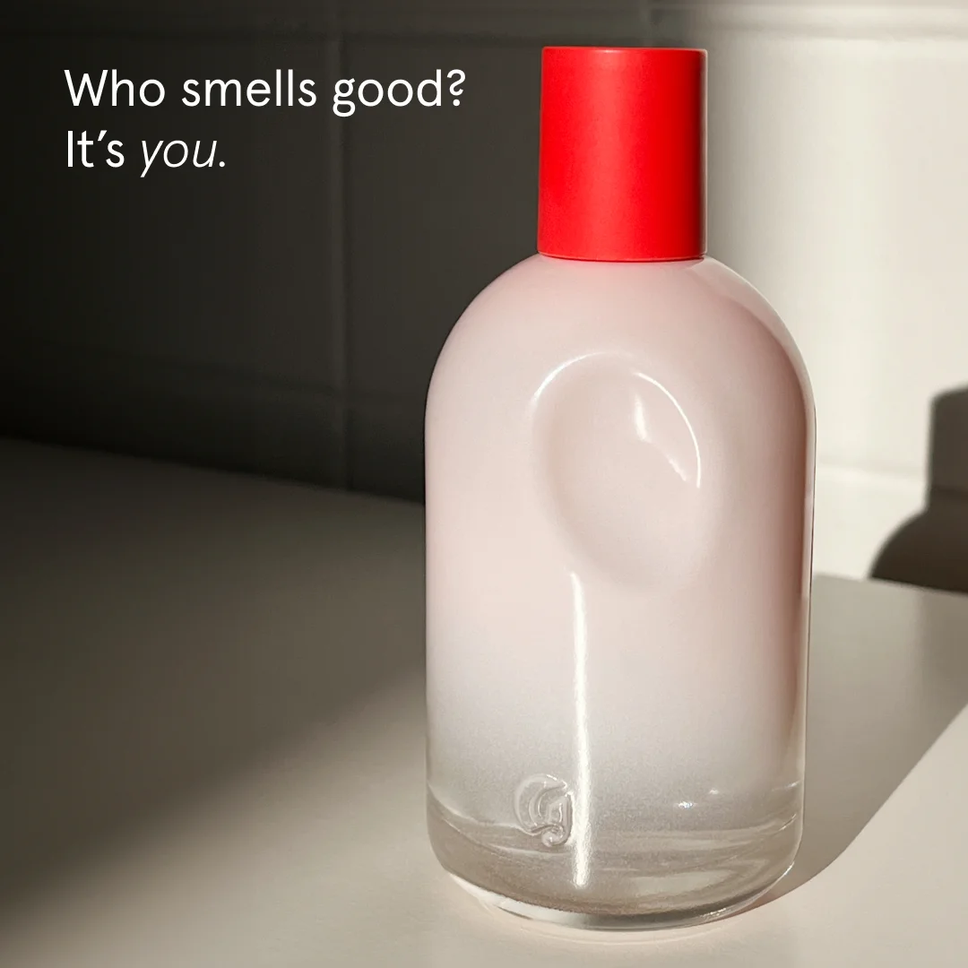
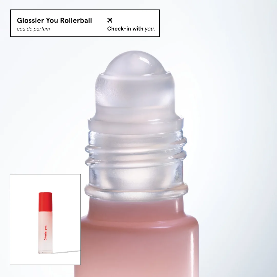
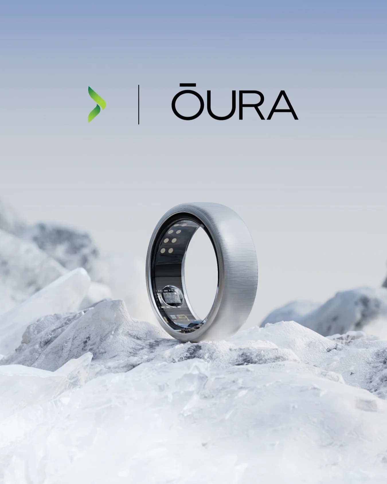
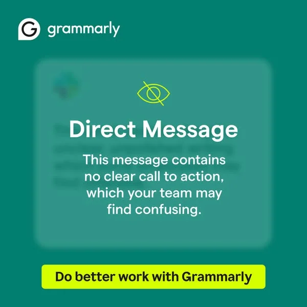
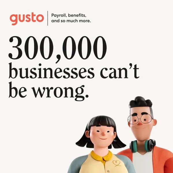
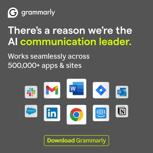
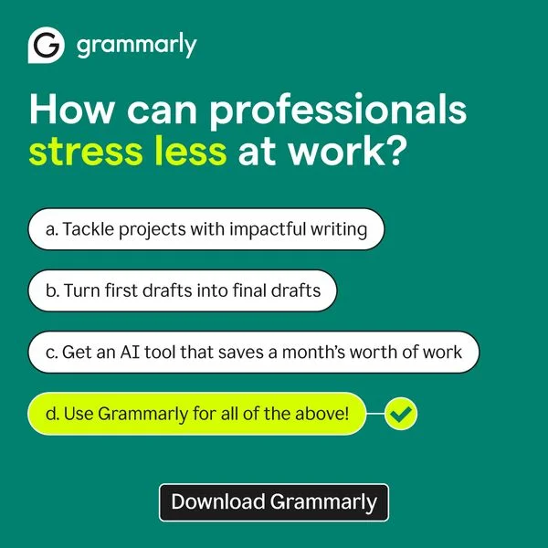
Ad examples below cover static creative from brands across every major category — Allbirds, Notion, Dropbox, Supergoop, Hostage Tape, Eight Sleep, and dozens more. Pick a layout and clone the composition with your product swapped in.



 Why Clone Ads
What Makes Static Ads Convert
One focal point, not three
Static ads die from visual democracy. Product, headline, badge, and logo all competing means the viewer's eye picks none and the ad reads as noise. Lock one element as the hero — the product, a stat, or a transformation — and let everything else play support at half the visual weight. Hierarchy is the whole ballgame at 150px feed size.
Contrast is the budget
Static ads live or die on contrast. A product against a high-contrast background — cream sneaker on charcoal, black bottle on cream, white text on a saturated brand color — gets noticed at thumbnail size. The same product against a similar-tone background vanishes in feed even with a strong headline. Pick the highest-contrast pairing your palette allows.
Headline under 6 words
Static headlines past 6 words get skimmed, not read. Three to five words in large type, placed in the upper third where the eye lands first, beats a clever 12-word line every time on cold prospecting. Short copy carries because the viewer is already deciding to swipe by word four — anything longer is invisible.


Static when you need testing velocity, low production cost, and clean A/B reads. A static variant costs nothing to clone, ships in minutes, and isolates the winning variable cleanly because composition and copy are the only moving parts. Video wins on storytelling, demo-heavy products, and TikTok/Reels-native placements where motion is the language. Most performance budgets on Meta and Google still skew static for prospecting because the cost-per-variant is a fraction of video and the testing loop is faster. Run static for cold testing and creative discovery; layer video into the winners.
Depends entirely on placement and funnel stage. On Facebook Feed and Instagram Feed, static and video run close on CPM, with video pulling ahead 10-30% on engagement metrics but static winning on cost-per-click for direct-response. On Reels and TikTok, video out-converts static by a wide margin because the placement rewards motion. On Google Display and LinkedIn, static beats video on cost-per-lead consistently. The blanket "video beats static" claim is overstated — Meta's own creative benchmarks show static still wins majority of direct-response tests in 2026.
LinkedIn is the strongest static platform — single-image Sponsored Content at 1.91:1 dominates B2B paid creative because text-led, screenshot-led, and stat-led stills out-convert video on lead-gen. Google Display is static-only by design across most placements. Facebook Feed and Instagram Feed reward static for cold prospecting and retargeting alike. TikTok and Instagram Reels reward video natively but Spark Ads using a single static frame still perform when the hook lands fast. Pinterest is static-dominant. Static wins everywhere except the short-form video feeds.
Five to ten variants per campaign launch, varying one axis at a time — background color in one batch, headline length in the next, focal-point object in the third — so the winning variable is readable. Most brands find two or three variants that out-perform the control inside the first 72 hours of spend; the rest get killed. Cloning cheap variants from a working composition beats trying to perfect one hero ad before launch. Volume of focused tests is how static creative scales — the format exists for this exact loop.
Three competing focal points and no clear hero. Headlines past 10 words that nobody reads at thumbnail size. Low-contrast color pairings where product and background blur together in feed. Multiple badges, stamps, and CTAs fighting for attention. Brand logo larger than the headline. All five trigger the same outcome — viewer scrolls past before processing what's on screen. The fix is ruthless subtraction: pick the focal point, pick the headline, pick one CTA, drop everything else two notches in visual weight.
Create Your Own
Static Ad
Clone any static ad example. Upload your product photo. Seconds later, you have a finished ad ready to launch.
Create your ad