AdDogs

Lifestyle Ad Examples

Browse 45+ lifestyle ad examples sourced from high-performing campaigns. Clone any design, swap in your product, and get a finished ad in seconds.

Updated May 2026

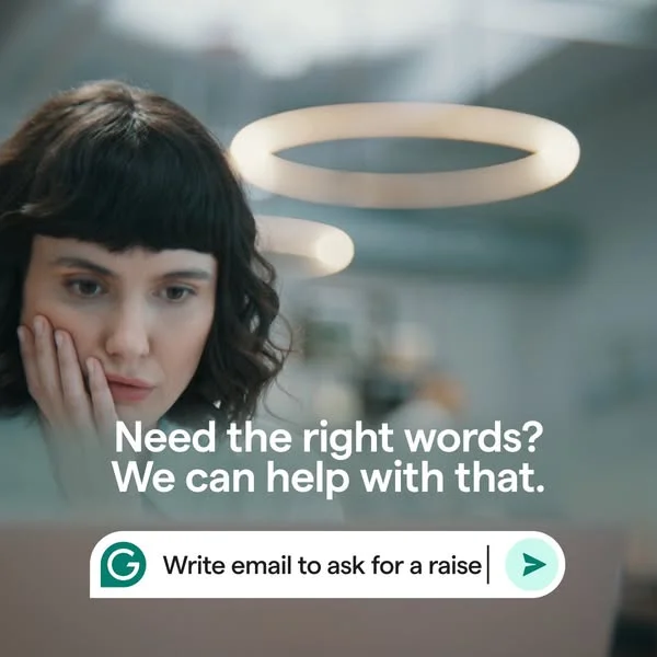
Lifestyle ads sell the feeling of owning the product, not the product itself. A coffee grinder on a kitchen counter next to a morning pour-over out-converts the same grinder on a white background by a wide margin. Context does the selling — showing who uses the product, where, and what life looks like with it in the frame. Vuori shoots joggers on a real porch, Glossier shoots the balm on a bathroom shelf next to toothpaste, Brooklinen shoots sheets on an unmade bed in morning light. Studio photography is the opposite approach and loses on most paid channels in 2026.

Lifestyle creative follows predictable patterns. Natural light (window-lit, not ring-lit), shallow depth of field with the product in focus against a softened background, and a human element — a hand holding, a foot wearing, a desk scene. Palettes skew warm and muted — cream, oat, sage, charcoal. Composition flips: product off-center, environment at 40-60% of frame, visible imperfection (crumbs, wrinkles, a thumbprint) that signals real use. Instagram Reels and TikTok reward this hardest; LinkedIn underperforms against stat-led B2B creative.

Ad examples below pull lifestyle-format creative from DTC brands across food, fashion, home goods, beauty, and personal care — Dr. Squatch, Huggies, MANSCAPED, and dozens more. Pick a layout and clone the in-context framing with your product inserted.
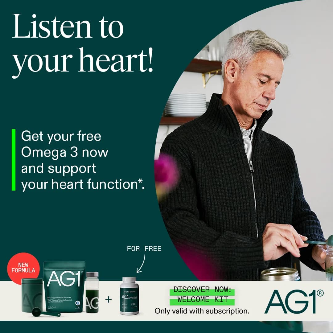
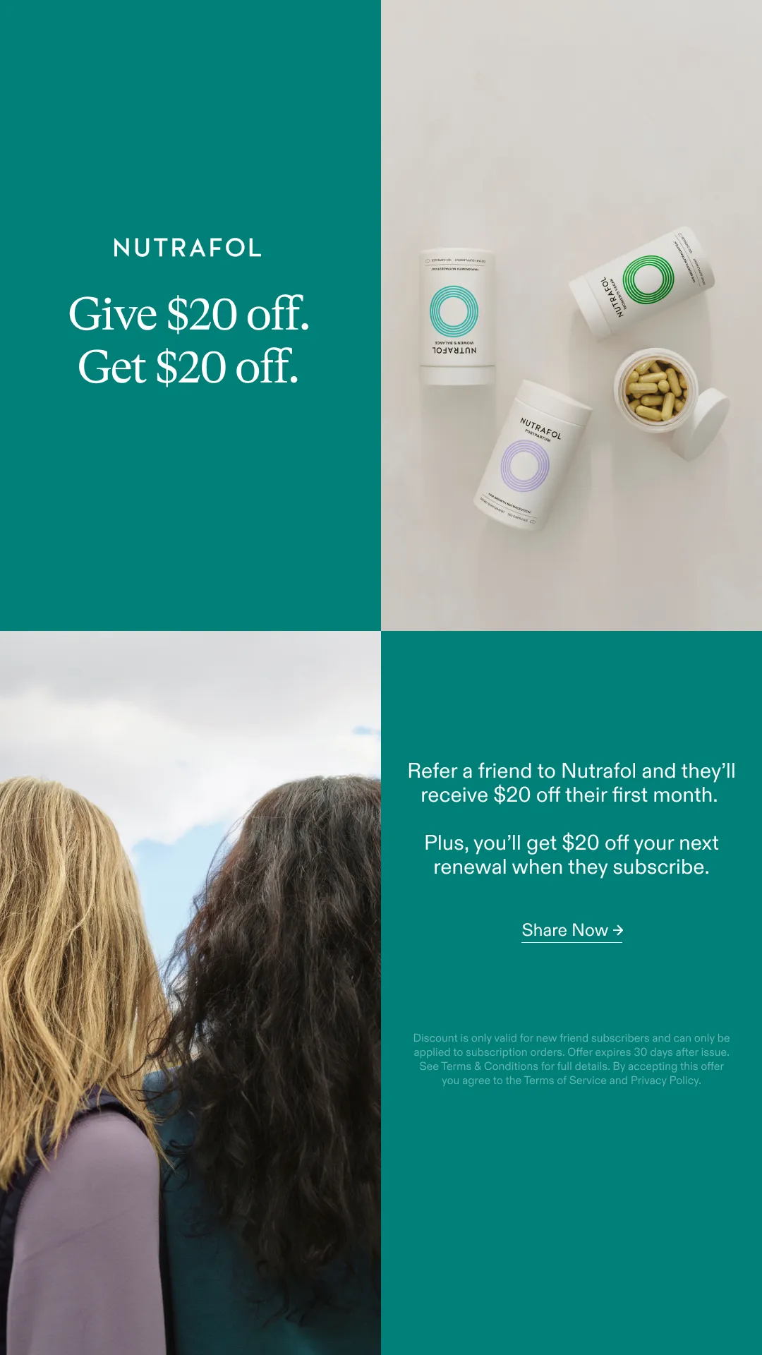
HGTV Buffy Comforter — Playful Lifestyle Shot. Brand: HGTV. This ad leverages a clean, minimalist layout to highlight the comfort of the Buffy Cloud Comforter through a relatable lifestyle shot. A smiling woman, wrapped in the plush white duvet, is centered against a soft lavender background, creating an inviting and serene visual. The composition uses ample negative space to focus attention on the subject and product, while the pastel color palette evokes calm and coziness, aligning perfectly with the product's promise. The HGTV branding and article headline "The Best Duvets, Tested by HGTV Editors" provide strong editorial endorsement, building trust and positioning the product as a top choice. This visual strategy is highly effective for platforms like Instagram or Pinterest, where aesthetic appeal and authentic user experience drive engagement. Text hierarchy is clear: a prominent article title, followed by the image, then a concise product caption and price, guiding the viewer through the content efficiently.. Headline: The Best Duvets, Tested by HGTV Editors. Primary text: Best Overall: The Buffy Cloud Comforter. Why this ad works: Relatable human element creates connection — The smiling woman wrapped in the comforter immediately conveys comfort and happiness. This emotional connection is more powerful than just showing the product in isolation. In a crowded feed, seeing a person genuinely enjoying the product creates instant relatability and makes the ad feel more authentic and aspirational. Expert endorsement builds trust and credibility — The HGTV branding and "Tested by HGTV Editors" headline lend significant credibility to the product. Consumers inherently trust editorial reviews from established authorities like HGTV more than direct brand claims. This third-party validation reduces perceived risk and builds strong confidence in the Buffy Cloud Comforter's quality. Soft color palette enhances comfort appeal — The gentle lavender background combined with the plush white comforter creates a serene and inviting visual experience. This soft, harmonious color palette psychologically reinforces the product's promise of ultimate softness, relaxation, and a peaceful home environment. It appeals directly to the desire for comfort and tranquility.. Specs: Brand: HGTV, Industry: Home & Lifestyle, Platform: Instagram, Format: Static, Audience: GeneralChoice Coops — In-Use Lifestyle Shot. Brand: CHOICE COOPS. This ad effectively leverages a lifestyle layout, showcasing a chicken coop in a natural, lush backyard setting. The composition places the product slightly off-center, allowing for dynamic visual flow while still highlighting its features and scale through the presence of live chickens. The earthy color palette, dominated by greens and beige, evokes a sense of organic living and trustworthiness, resonating with an audience seeking sustainable or wholesome home solutions. Large, bold text for "CHOICE COOPS" ensures immediate brand recognition, while the "tradetested" badge subtly builds credibility. Optimized for platforms like Instagram or Facebook, the square format and clear imagery are designed to stop the scroll. The ad's strength lies in demonstrating the product's purpose and integrating it into an aspirational domestic scene, appealing to emotions rather than just features.. Headline: CHOICE COOPS. Why this ad works: Natural setting evokes aspirational lifestyle — The lush green grass and natural foliage position the coop within an ideal backyard environment, appealing to homeowners seeking a wholesome, self-sufficient lifestyle. This visual context makes the product more desirable than a sterile studio shot, connecting emotionally with the target audience. Product shown in active use with animals — Featuring live chickens inside and around the coop immediately demonstrates its functionality and scale. This visual proof of concept reassures potential buyers about the product's suitability for housing poultry, directly addressing a key purchasing consideration and building trust. Prominent brand name with trust badge — The large, clear "CHOICE COOPS" text ensures strong brand recognition. The smaller "tradetested" badge below acts as a powerful third-party endorsement, instantly communicating quality and reliability. This combination builds both awareness and credibility effectively.. Specs: Brand: CHOICE COOPS, Industry: Home & Lifestyle, Platform: Instagram, Format: Static, Audience: GeneralFly By Jing — Dynamic Culinary Lifestyle Shot. Brand: Fly By Jing. This ad masterfully employs a dynamic lifestyle layout, capturing attention with a wok actively pouring noodles, creating a sense of motion and freshness. The rich, warm color palette, dominated by deep browns, reds, and golden noodles, evokes comfort, authenticity, and a gourmet experience, perfectly aligning with premium food products. Compositionally, the rule of thirds is subtly used, placing key elements like the wok, finished dish, and product jar in visually appealing zones. Wisps of steam add a sensory dimension, suggesting heat and aroma. Optimized for visual platforms like Instagram, its high-quality photography and engaging action are designed to stop the scroll. Text hierarchy is minimal, relying heavily on visual storytelling to convey the brand's essence and product appeal.. Why this ad works: Dynamic action captures culinary excitement — The image of noodles actively being poured from a wok into a bowl creates a powerful sense of movement and immediacy. This dynamic action suggests freshness and the joy of cooking, making the ad highly engaging and visually stimulating, which is crucial for cutting through social media clutter. Rich, warm palette evokes comfort and luxury — The deep, earthy tones of the background, combined with the golden noodles and the dark accents of the candles, create a luxurious yet inviting atmosphere. This color psychology resonates with consumers seeking sophisticated comfort food experiences, positioning the product as a premium ingredient for elevated home cooking. Subtle product integration enhances authenticity — The Fly By Jing chili crisp jar is strategically placed in the foreground, appearing as a natural element within the culinary scene rather than an overt advertisement. This subtle integration makes the product feel essential to the delicious outcome, building trust and desirability without being pushy.. Specs: Brand: Fly By Jing, Industry: Food & Beverage, Platform: Instagram, Format: Static, Audience: Women 25-34BYOMA Body Lotion — Vibrant In-Use Shot. Brand: BYOMA. This ad leverages a dynamic, in-use composition to showcase a body care product, focusing on the aspirational outcome of glowing skin. The vibrant pink and metallic elements create a playful yet bold aesthetic, designed to capture attention on visually-driven platforms like Instagram. The model's pose and the visible sheen on her skin serve as direct visual proof of the product's hydrating or illuminating effects, fostering desire. Color psychology uses bright, energetic hues to appeal to a youthful demographic, while the subtle grey background ensures the subject remains the focal point. The absence of overt text overlay prioritizes visual storytelling, allowing the product's application and immediate results to communicate its value. This strategy is optimized for quick consumption and emotional connection, driving awareness through strong visual impact.. Why this ad works: Dynamic pose highlights product efficacy — The model's active pose, combined with the visible sheen on her skin, directly demonstrates the product's hydrating and glowing effect. This visual proof is highly effective, allowing viewers to immediately grasp the desired outcome and visualize themselves achieving similar results, building aspiration. Vibrant color palette captures attention — The bright pink top and metallic underwear create a high-energy, youthful aesthetic that stands out in a crowded feed. This bold color choice signals a fun, modern brand identity, effectively stopping the scroll and drawing the eye to the product within a lively, engaging context. Authentic application builds connection — Showing the product being actively dispensed and applied creates a relatable and intimate moment. This technique allows the audience to visualize the product as part of their own self-care routine, fostering a sense of aspiration and desire by making the experience tangible and personal.. Specs: Brand: BYOMA, Industry: Health & Wellness, Platform: Instagram, Format: Static, Audience: Women 25-34The Pished Fish — Lifestyle & Product Grid. Brand: The Pished Fish. The ad employs a multi-panel grid layout, combining lifestyle and product shots to build brand trust and showcase variety. The top-left panel features the founder, adding a human, authentic touch, while the top-right highlights product packaging and texture. The bottom-right panel displays a range of products, emphasizing choice and quantity. Earthy tones and natural wood textures create an organic, artisanal vibe, appealing to consumers seeking quality and provenance. The composition balances personal connection with product detail, optimized for social platforms like Instagram where diverse content performs well. Text is minimal, allowing visuals to tell the story, with the playful brand logo acting as a key visual anchor. This approach fosters consideration by presenting both the brand's personality and its offerings effectively.. Why this ad works: Authentic Founder Shot Builds Trust — The top-left image of the founder creates a personal connection, humanizing the brand. This cultivates trust and authenticity, crucial for food products, by showing the face behind the business. It suggests a hands-on approach and passion, resonating with consumers who value artisanal quality. Multi-Panel Layout Showcases Variety — The grid effectively uses multiple panels to display different aspects: the brand story, product detail, and product range. This diverse visual information caters to various viewer interests, keeping engagement high and providing a comprehensive overview of "The Pished Fish" offerings in a single glance. Earthy Tones & Natural Textures Convey Quality — The consistent use of natural wood, kraft paper packaging, and the rich orange of the salmon creates an organic and premium aesthetic. This color palette and texture choice subtly communicates quality, freshness, and a handcrafted feel, aligning with the brand's unique "booze-infused" positioning.. Specs: Brand: The Pished Fish, Industry: Food & Beverage, Platform: Instagram, Format: Carousel/Collage, Audience: GeneralCozy Sofa — Lifestyle with Pets. This ad effectively leverages a lifestyle layout, showcasing a yellow sectional sofa in a bright, modern living space. The composition strategically places two relaxed dogs on the sofa, instantly conveying comfort and durability, appealing to pet owners. The warm yellow of the sofa, complemented by the natural browns of the dogs and the clean white wall, creates an inviting and cozy atmosphere. The ad's aesthetic mimics user-generated content, fostering authenticity and relatability, which is highly effective on platforms like Instagram. The conversational text overlay, positioned clearly without obscuring the main subjects, highlights the product's key benefits—softness and comfort—through a relatable, humorous anecdote. This approach optimizes for engagement, encouraging viewers to connect with the product on an emotional level rather than just a functional one. The overall design is clean and inviting, making it a scroll-stopper in a busy feed.. Primary text: So soft, so comfy, GREAT for naps. The only problem is that my dogs think it's their new bed!. Why this ad works: Emotional connection through pets — The inclusion of two adorable, sleeping dogs immediately creates an emotional connection with viewers, especially pet owners. This technique humanizes the product, implying that the sofa is not just comfortable for humans but also a beloved spot for furry family members, enhancing its appeal and perceived coziness. Authentic, user-generated content feel — The ad's natural lighting, casual arrangement, and conversational text mimic organic social media posts. This authenticity builds trust and relatability, making the ad feel less like a sales pitch and more like a genuine recommendation from a friend, which significantly boosts engagement and credibility on platforms like Instagram. Benefit-driven storytelling copy — The text "So soft, so comfy, GREAT for naps..." directly communicates the sofa's primary benefits. Framing it with a humorous anecdote about the dogs claiming it as their bed makes the message memorable and reinforces the comfort aspect in a charming, relatable way, driving home the product's value proposition.. Specs: Industry: Home & Lifestyle, Platform: Instagram, Format: Static, Audience: GeneralItalic Serene Towels — Lifestyle Testimonial. Brand: Italic. This ad effectively blends lifestyle imagery with social proof to build trust and desire. The composition places the model and product in a natural, serene setting, emphasizing comfort and quality. The warm, earthy tones and soft lighting evoke a sense of calm and luxury, aligning with the "Serene Ultraplush" product name. Text hierarchy is clear: product name, then a prominent 5-star rating, followed by a personal testimonial headline and supporting quote, all anchored by the brand logo. This structure guides the eye from product feature to emotional benefit and social validation. Optimized for platforms like Instagram, where authentic, aspirational content resonates, it leverages a relatable human element to convey product experience rather than just features. The overall design prioritizes emotional connection and perceived quality.. Headline: My Favorite Towels!. Primary text: SERENE ULTRAPLUSH TOWELS "EVERYONE IN MY FAMILY LOVES IT.". Why this ad works: Authentic lifestyle imagery builds emotional connection — The close-up shot of a relaxed woman with closed eyes, gently touching the towel to her face, creates an intimate and sensory experience. This conveys the towel's softness and comfort, allowing the viewer to imagine the feeling, which is more persuasive than just showing the product. Prominent 5-star rating establishes instant trust — Placing a large, clear 5-star rating directly above the testimonial headline immediately signals high quality and customer satisfaction. This visual social proof is a powerful psychological trigger, reducing perceived risk and encouraging consideration for a premium product. Personalized testimonial enhances relatability — The headline "My Favorite Towels!" combined with the quote "EVERYONE IN MY FAMILY LOVES IT." provides a strong, personal endorsement. This makes the ad feel less like a sales pitch and more like a genuine recommendation from a trusted source, resonating deeply with potential buyers.. Specs: Brand: Italic, Industry: Home & Lifestyle, Platform: Instagram, Format: Static, Audience: Women 25-34Samsonite Proxis — Dynamic Lifestyle Shot. Brand: Samsonite. This ad employs a dynamic lifestyle composition, featuring a stylish male model confidently holding a Samsonite Proxis suitcase. The diagonal placement of the luggage and the model's pose create visual movement, drawing the eye across the frame, guiding attention from the model's face to the product. A sophisticated color palette of warm gold and tan for the product and attire contrasts sharply with the cool, metallic grey background, ensuring the premium luggage stands out prominently. Text hierarchy is clear and concise: the Samsonite brand logo anchors the top, followed by an aspirational headline, and finally the product name "PROXIS" with its innovative technology highlight at the bottom. This layout is optimized for platforms like Instagram, where high-quality, aspirational visuals resonate strongly, effectively conveying luxury, durability, and innovation. The minimal text overlay keeps the primary focus on the premium product and the aspirational travel lifestyle it represents.. Headline: TOMORROW IS HERE. Primary text: PROXIS / MADE WITH ROXKIN™ TECHNOLOGY. Why this ad works: Dynamic composition creates visual flow — The model's confident pose and the diagonal orientation of the suitcase generate a sense of movement and purpose. This dynamic arrangement guides the viewer's eye from the model's engaging gaze down to the product, making the ad feel active and less static, which helps capture attention in a busy feed environment. Strategic color contrast highlights product — The warm, rich gold of the Proxis suitcase and the model's tan suit pop against the cool, metallic grey background. This high contrast ensures the product is the undeniable focal point, immediately drawing attention to its premium finish and innovative design, reinforcing its luxury positioning. Aspirational lifestyle connects with audience — The stylish model, sophisticated attire, and sleek luggage evoke a sense of modern, professional travel. This aspirational imagery allows the target audience to envision themselves with the product, associating Samsonite with success, confidence, and cutting-edge travel experiences, driving brand desire.. Specs: Brand: Samsonite, Industry: Fashion & Apparel, Platform: Instagram, Format: Static, Audience: ProfessionalsFreshpet Custom Meals — Lifestyle Delivery Shot. Brand: Freshpet Custom Meals. This ad employs a vertical, lifestyle-driven layout, effectively blending brand messaging with a direct offer. The top section features the Freshpet logo and a bold, green headline, establishing freshness and delivery. Below, a human interacts with product boxes, while a charming dog anchors the scene, creating an emotional connection. A prominent circular callout highlights a "50% OFF" offer, strategically placed to capture attention. The color palette of natural greens, browns, and a clean white background reinforces the brand's organic and wholesome image. This composition is optimized for mobile feed platforms like Instagram, where its clear visual hierarchy and relatable imagery can stop the scroll. The design balances brand building with a strong conversion-focused incentive, guiding the viewer from brand recognition to offer absorption.. Headline: MADE FRESH. DELIVERED FRESH.. Primary text: 50% OFF Your First Order. Why this ad works: Lifestyle imagery builds emotional connection — The inclusion of a small, attentive dog and human hands interacting with the product boxes creates a relatable, authentic scene. This lifestyle approach humanizes the brand, fostering an emotional connection with pet owners who envision their own pets enjoying fresh meals. It moves beyond just product display to show the benefit in a real-world context. High-contrast discount offer drives urgency — The "50% OFF Your First Order" is presented in a bold, white-on-green circle, making it highly visible against the muted background. This strong visual contrast ensures the critical offer stands out immediately, signaling a clear value proposition and creating a sense of urgency for potential customers to act on the discount. Green palette reinforces freshness and natural appeal — The dominant use of green in the brand logo, headline, and discount circle immediately communicates freshness, health, and natural ingredients. This color psychology aligns perfectly with a "fresh dog food" brand, subconsciously assuring consumers of the product's quality and wholesome nature, enhancing brand perception and trust.. Specs: Brand: Freshpet Custom Meals, Industry: Pets & Animals, Platform: Instagram, Format: Static, Audience: GeneralFaherty All Day Shorts — Feature Spotlight Flat Lay. Brand: FAHERTY. This ad employs a split-screen flat lay composition, effectively dividing the background into textured sand and a serene blue, evoking a beach or outdoor setting. The central placement of the blue shorts ensures product prominence, while radial callouts with hand-drawn icons clearly highlight key features like 4-way stretch and recycled materials. The earthy and cool color palette reinforces an organic, lifestyle-oriented brand identity, appealing to environmentally conscious consumers. Text hierarchy places the brand and product name at the top-left, followed by concise feature descriptions, making it easily scannable. This design is optimized for platforms like Instagram, where visual storytelling and quick information absorption are crucial for engagement and consideration.. Headline: FAHERTY ALL DAY SHORTS. Primary text: 4-Way Stretch. Made From Recycled Plastic Bottles. Expertly Tailored. Lightweight and Quick-Drying.. Why this ad works: Split background creates lifestyle context — The torn paper effect dividing a sand texture from a sky blue background instantly evokes a relaxed, outdoor, beach-ready lifestyle. This visual context helps potential customers envision themselves wearing the shorts in relevant scenarios, enhancing desirability beyond just product features. Clear feature callouts with visual icons — Each key feature (4-way stretch, recycled material, tailored, quick-drying) is highlighted with a distinct, simple icon and concise text. This visual shorthand allows for rapid comprehension of product benefits, crucial for quick-scroll environments, and appeals to detail-oriented buyers. Eco-conscious messaging builds brand value — The explicit mention "Made From Recycled Plastic Bottles" directly addresses growing consumer demand for sustainable products. This feature not only highlights an environmental benefit but also positions the Faherty brand as responsible and forward-thinking, attracting a values-driven audience.. Specs: Brand: FAHERTY, Industry: Fashion & Apparel, Platform: Instagram, Format: Static, Audience: Men 25-34Anti-Inflammatory Weight Loss — Food Collage Grid. This ad employs a grid-like collage layout, presenting a four-week meal plan visually around a central, bold headline. The composition uses vibrant, high-quality food photography to create an aspirational and appealing visual narrative. The cracked, earthy background provides a rustic, organic feel, contrasting with the crisp food images and the strong blue text. Text hierarchy is clear: the main challenge title dominates, followed by weekly breakdowns with nutritional data, and a crucial disclaimer at the bottom. This design is optimized for platforms like Facebook or Pinterest, where visually rich, informational content about health and lifestyle challenges performs well. The ad effectively communicates a structured plan, leveraging visual appeal to drive consideration for a health program.. Headline: Anti-Inflammatory weight loss challenge. Primary text: WEEK 1 Proteins 22g Carbs 7g Fats 6g 181 Kcal WEEK 2 Proteins 44g Carbs 11g Fats 12g 326 Kcal WEEK 3 Proteins 31g Carbs 8g Fats 5g 210 Kcal WEEK 4 Proteins 21g Carbs 7g Fats 4g 172Kcal Please consult your physician before starting. Sticking to recommended diet and exercise plans is essential for your fitness journey and can significantly affect outcomes. Most users can expect to lose up to 1-2 pounds per week over 4 weeks. Individual results may vary.. Why this ad works: Visualizing the weekly plan reduces friction — The ad effectively breaks down the "challenge" into four distinct weeks, each represented by a diverse array of appealing dishes. This visual roadmap reduces perceived complexity and commitment, making the weight loss journey seem manageable and exciting. It showcases variety, which is key for long-term adherence. (54 words) Benefit-driven headline clarifies value proposition — The central headline "Anti-Inflammatory weight loss challenge" immediately communicates the core value proposition. It targets specific health concerns (inflammation) while promising a desired outcome (weight loss), directly appealing to the audience's needs and motivations. This clear messaging grabs attention quickly. (54 words) Aspirational food photography drives desire — High-quality, vibrant images of healthy and delicious-looking meals are strategically placed. This visual feast makes the diet plan appear enjoyable and sustainable, counteracting the common perception of restrictive diets. It creates desire and positive association with the challenge. (53 words). Specs: Industry: Health & Wellness, Platform: Facebook, Format: Static, Audience: GeneralLuxury Pet Bed — Cozy Lifestyle Scene. This ad effectively leverages a lifestyle composition to highlight a pet bed, positioning it as an integral part of a comfortable home. The central placement of the dog and bed, with the human interaction, creates an emotional connection, emphasizing comfort and companionship. The neutral color palette, dominated by soft grays, creams, and natural wood tones, evokes a sense of calm, cleanliness, and modern luxury, appealing to pet owners who prioritize aesthetics. The natural lighting and spacious room suggest a premium, aspirational environment. Optimized for platforms like Instagram, where authentic, high-quality lifestyle imagery resonates, the ad's visual narrative is clear without explicit text, relying on visual storytelling to convey product benefits. The composition guides the eye from the human to the pet and the product, subtly showcasing the bed's plush texture and size.. Why this ad works: Emotional connection through human-pet interaction — The gentle interaction between the woman and the dog creates an immediate emotional resonance. This taps into the strong bond pet owners share, making the product feel like an investment in their pet's happiness and well-being, rather than just a functional item. Aspirational lifestyle setting enhances product value — The clean, modern living room with ample natural light positions the dog bed within an aspirational home environment. This elevates the product from a simple pet accessory to a stylish piece that complements a well-designed interior, appealing to consumers who value aesthetics. Texture and comfort communicated visually — The fluffy, plush texture of the dog bed is highly visible and inviting. The dog's relaxed posture further reinforces the comfort aspect. This strong visual cue directly communicates the primary benefit of the product – superior comfort for pets – without needing explicit claims.. Specs: Industry: Home & Lifestyle, Platform: Instagram, Format: Static, Audience: Women 25-34Celsius Live Fit — Dynamic Splash Product Shot. Brand: Celsius. This ad effectively leverages a dynamic hero shot composition to highlight two Celsius Live Fit flavors. The vibrant gradient background, transitioning from cool teal to warm orange, creates a visually arresting contrast that immediately grabs attention on social feeds. The cans, depicted with water droplets and emerging from a splash, evoke extreme refreshment and energy, aligning perfectly with the brand's "Live Fit" promise. The slight off-center placement and varying heights of the cans add visual interest, guiding the eye across both products. Text hierarchy is clear, with the brand and flavor names prominent, followed by key benefits and "0 SUGAR." This ad is optimized for platforms like Instagram, where its high-energy aesthetic and clear product focus can stop the scroll and communicate the brand's core message of vitality and fitness. The composition skillfully balances product detail with an aspirational, active lifestyle feel.. Why this ad works: Dynamic water splash creates refreshment cues — The realistic water droplets and splash effect on the cans instantly communicate extreme coldness and refreshment. This visual cue is crucial for beverages, triggering a physiological desire for the product and reinforcing its invigorating qualities, especially appealing to active consumers seeking immediate revitalization and a cool, crisp taste. Vibrant gradient background enhances product appeal — The striking teal-to-orange gradient background provides a high-contrast, energetic backdrop. This color choice not only makes the white cans pop but also subtly hints at tropical flavors and an active, vibrant lifestyle, aligning with the "Live Fit" brand identity and attracting attention in a busy feed with its eye-catching palette. Clear benefit hierarchy supports quick comprehension — Key benefits like "ESSENTIAL ENERGY," "ACCELERATES METABOLISM," and "BURNS BODY FAT" are clearly listed and easily readable on the cans. This direct communication of functional advantages, alongside the "0 SUGAR" callout, allows viewers to quickly grasp the product's value proposition, catering efficiently to health-conscious and fitness-oriented audiences.. Specs: Brand: Celsius, Industry: Food & Beverage, Platform: Instagram, Format: Static, Audience: Fitness EnthusiastsGold Jewelry Collection — Lifestyle Portrait. This ad leverages a warm, intimate portrait to connect with the audience. The model's direct gaze creates immediate engagement, fostering a sense of authenticity and relatability crucial for social platforms like Instagram. Natural lighting from the left highlights the subtle gleam of the gold jewelry, enhancing its perceived quality and luxury without being overtly flashy. The composition places the model slightly off-center, adhering to the rule of thirds, which is visually pleasing and dynamic. The soft focus background ensures the viewer's attention remains on the model and the products she's wearing. This approach is optimized for feed scrolling, where a genuine human connection can stop users. The minimal text overlay (none visible) keeps the focus purely visual, allowing the product's aesthetic appeal and the model's aspirational yet approachable look to drive consideration. The overall clean aesthetic positions the brand as modern and sophisticated.. Why this ad works: Direct gaze builds instant connection — The model's direct eye contact creates an immediate, personal connection with the viewer. This technique is highly effective on social media, making the ad feel less like an interruption and more like a genuine interaction, increasing scroll-stopping power and fostering trust in the brand. Natural lighting enhances product allure — The soft, natural light illuminates the gold jewelry, showcasing its subtle shine and texture without harsh reflections. This authentic lighting choice makes the products appear more desirable and high-quality, aligning with a premium yet approachable brand image, which resonates well with discerning online shoppers. Lifestyle context promotes relatable aspiration — Presenting the jewelry on a real person in a natural, everyday setting makes the products feel attainable and integrated into a desirable lifestyle. This subtle product placement avoids overt salesiness, allowing the audience to envision themselves wearing the pieces, driving aspirational appeal and consideration more effectively.. Specs: Industry: Fashion & Apparel, Platform: Instagram, Format: Static, Audience: Women 25-34Kids' Apparel — Playful Lifestyle Collage. This ad uses a dynamic collage layout, with a dominant left panel featuring a child in a green shirt and a flower garland, complemented by two smaller lifestyle shots on the right. The warm, earthy color palette of terracotta, muted greens, and soft pastels creates an inviting, organic aesthetic that resonates with natural parenting and comfortable children's wear. Compositionally, the children are captured in natural, playful poses, conveying a sense of freedom and joy. This visual-first approach, devoid of overt text, is highly optimized for platforms like Instagram or Pinterest, where high-quality, aspirational lifestyle imagery drives engagement and consideration. The varied backgrounds and models subtly highlight the versatility and appeal of the clothing line, encouraging exploration of the brand's offerings. The overall vibe is clean, organic, and playful, effectively targeting parents seeking stylish yet comfortable options for their kids.. Why this ad works: Dynamic collage showcases product diversity — The multi-panel layout effectively presents several distinct outfits and models within a single ad unit. This maximizes product exposure and demonstrates the breadth of the collection, appealing to parents looking for varied styles for their children. It prevents visual fatigue by offering multiple points of interest. Earthy color palette evokes natural comfort — The use of warm terracotta, muted greens, and soft pastels creates an inviting and organic feel. This color psychology aligns perfectly with the target audience's desire for natural fibers and comfortable, breathable clothing for children, subtly communicating quality and a gentle aesthetic. Authentic child models create aspirational lifestyle — The children are posed naturally, smiling and engaging with their surroundings, rather than stiffly modeling. This authentic portrayal fosters an aspirational lifestyle image for parents, suggesting that their children will experience similar joy and comfort while wearing these clothes, driving emotional connection.. Specs: Industry: Fashion & Apparel, Platform: Instagram, Format: Carousel/Collage, Audience: ParentsGuilty Pleasure Cleaning — Impressionistic Text Overlay. This ad employs a text-heavy overlay on an impressionistic painting, creating a gentle and inviting aesthetic. The layout strategically places a compelling headline at the top, followed by a narrative-driven primary text block on the left, and a clear call-to-action at the bottom right. The soft, muted pastel color palette, derived from the background artwork, evokes a sense of calm and nostalgia, effectively contrasting with the "overwhelmed" feeling the copy addresses. This composition technique uses the image as a non-distracting backdrop, allowing the extensive text to dominate and tell a story. Optimized for platforms like Pinterest or Facebook, where visual appeal combined with longer-form content can drive consideration. The text hierarchy guides the reader from hook to problem-solution, encouraging engagement and a "Read more" click.. Headline: How Cleaning Suddenly Became My Guilty Pleasure (And the System That Turned Housework Into a Fun Game I'm Obsessed With). Primary text: After years of letting chores pile up and feeling overwhelmed and stressed, I discovered a cleaning system that made it all seem easy and even joyful Suddenly, I was looking forward to cleaning each day, sprinkling in little rewards and racing against the clock..... Why this ad works: Narrative-driven headline hooks reader — The headline masterfully crafts intrigue by promising a transformation from a common household chore into a "guilty pleasure" and a "fun game." This emotional hook immediately resonates with readers struggling with housework, positioning the content as a valuable solution. It effectively stops the scroll by appealing to a universal desire for easier, more enjoyable daily routines. Soft, inviting visual aesthetic — The impressionistic painting style and muted color palette create a calming, non-intrusive background. This gentle visual approach contrasts sharply with the typical stress associated with cleaning, making the ad feel approachable and less like a hard sell. It sets a serene mood that aligns with the promise of an easier, more joyful cleaning experience. Problem-solution storytelling in primary text — The body copy directly addresses a relatable pain point—feeling "overwhelmed and stressed" by chores—and immediately introduces a transformative solution: a "cleaning system." This narrative structure builds empathy and positions the advertised method as a highly desirable outcome, compelling the reader to click and discover how their own life can be improved.. Specs: Industry: Home & Lifestyle, Platform: Pinterest, Format: Static, Audience: Women 25-34West Elm Dining Room — Lifestyle Scene. Brand: West Elm. This West Elm ad masterfully employs a lifestyle layout to evoke warmth and aspiration, centering a beautifully set dining table within a bright, modern home. The composition utilizes natural light and a deep perspective, drawing the viewer into an inviting scene. Earthy tones and natural textures dominate, creating a sense of comfort and understated luxury, perfectly aligning with West Elm's brand identity. The text hierarchy is minimal yet effective; a large, emotional headline 'Bring joy home' immediately captures attention, followed by a supportive sub-headline. This design is highly optimized for visual platforms like Instagram or Pinterest, where high-quality, aspirational imagery drives engagement and brand consideration. The overall effect is one of sophisticated simplicity, encouraging viewers to envision their own celebrations in a West Elm-furnished space.. Headline: Bring joy home. Primary text: Start your celebrations here.. Why this ad works: Aspirational lifestyle imagery connects emotionally — The ad showcases a beautifully styled dining room, not just individual products. This lifestyle approach allows potential customers to envision themselves hosting celebrations in a West Elm-furnished home, fostering emotional connection and aspiration. It moves beyond mere product display to sell an experience, which is highly effective for home goods branding. Warm, inviting color palette signals comfort — The use of natural wood, muted earth tones, and soft lighting creates an incredibly warm and inviting atmosphere. This palette signals comfort, sophistication, and a sense of calm, making the space feel approachable and desirable. It subtly communicates quality and timeless design, aligning perfectly with premium home decor aesthetics. Clear, concise emotional headline resonates deeply — The headline "Bring joy home" is direct, emotionally resonant, and perfectly encapsulates the aspirational message. It focuses on a feeling rather than a product feature, which is highly effective for lifestyle branding. The secondary text, "Start your celebrations here," provides a clear, gentle call to action, reinforcing the celebratory theme.. Specs: Brand: West Elm, Industry: Home & Lifestyle, Platform: Instagram, Format: Static, Audience: Women 25-34Delicate Circle Stud Earring — Model In-Use Shot. This ad employs a close-up, in-use layout strategy, focusing intimately on a delicate circular stud earring worn by a model. The composition utilizes a shallow depth of field, ensuring the earring is sharply in focus while the background remains subtly blurred, drawing the viewer's eye directly to the product. The natural skin tones and light brown hair of the model, combined with a plain, light grey background, create a clean and authentic aesthetic. This minimalist color palette allows the subtle sparkle of the gold and diamonds to stand out without visual competition. Optimized for platforms like Instagram or Pinterest, the high-quality, aspirational imagery is designed to stop the scroll and evoke a sense of understated elegance. The absence of text overlay keeps the visual clean, relying on the product's inherent appeal and the model's natural beauty to convey value and style.. Why this ad works: Intimate close-up highlights product detail — The tight crop on the model's ear and the earring creates an intimate connection, allowing viewers to appreciate the delicate craftsmanship and subtle sparkle. This close-up perspective is crucial for small jewelry items, ensuring that the product's intricate details are clearly visible and compelling, driving desire through perceived quality. Natural model aesthetic enhances relatability — Featuring a model with natural skin texture and minimal makeup fosters authenticity and relatability. This approach helps potential customers envision themselves wearing the jewelry, making the product feel more accessible and less intimidating than overly polished, unattainable imagery. It builds trust and encourages aspirational identification. Minimalist background ensures product focus — The plain, light grey background effectively eliminates any visual distractions, directing the viewer's entire attention to the earring. This clean canvas enhances the product's perceived elegance and sophistication, making it the undeniable hero of the shot. It communicates a premium feel without needing elaborate staging.. Specs: Industry: Fashion & Apparel, Platform: Instagram, Format: Static, Audience: Women 25-34CÎROC Vodka & Drizly — Split Screen Product. Brand: CÎROC. This ad effectively uses a split-screen layout to balance product focus with a clear call to action and partner integration. The left panel showcases the CÎROC vodka bottle and a refreshing cocktail on icy blocks, leveraging a cool blue palette to evoke crispness and premium quality. The composition guides the eye from the product to the right panel, which features a bold headline "BLUE DOT NIGHTS. DELIVERED." and a prominent "SHOP NOW" CTA. The consistent blue gradient across both sections maintains visual harmony. This design is optimized for platforms like Instagram or Facebook, where a clean, high-contrast aesthetic with minimal, impactful text can quickly capture attention and convey the brand's sophisticated yet accessible offering. The partnership with Drizly is clearly highlighted, streamlining the path to purchase. The text hierarchy ensures brand, message, and action are easily digestible.. Primary text: BLUE DOT NIGHTS. DELIVERED.. Why this ad works: Split-screen layout balances product and message — The clear division effectively separates the aspirational product imagery from the direct-response messaging. This allows viewers to first appreciate the premium CÎROC product and then immediately understand the associated lifestyle and convenient delivery, reducing cognitive load and improving message retention. Cool blue palette evokes freshness and premium — The dominant use of various shades of blue, combined with ice elements, creates a strong visual association with coolness, refreshment, and luxury. This color psychology aligns perfectly with a vodka brand, enhancing the perceived quality and desirability of the product, especially for a "Snap Frost" variant. Prominent Drizly partnership simplifies purchase — Integrating the Drizly logo and the "DELIVERED" message directly into the ad copy clearly communicates the ease of acquisition. This direct-to-consumer delivery partnership reduces friction in the conversion funnel, making it incredibly convenient for the target audience to act on their impulse to purchase.. Specs: Brand: CÎROC, Industry: Food & Beverage, Platform: Instagram, Format: Static, Audience: Women 25-34Men's Textured Loungewear — Flat Lay Outfit. This ad employs a clean flat lay composition, showcasing a men's textured loungewear set. The layout strategically positions the t-shirt and pants to highlight their matching geometric pattern and contrasting black textured pockets. The monochromatic grey and black color palette exudes sophistication and versatility, appealing to a discerning male audience. Compositionally, the subtle diagonal folds in the fabric add dynamic interest while maintaining focus on the garment's quality and unique textures. Optimized for visual-first platforms like Instagram or Pinterest, the high-resolution image allows for detailed inspection of the material and design. The absence of text places full emphasis on the product's aesthetic and tactile appeal, encouraging viewers to appreciate the craftsmanship and potential comfort. This approach aims to drive consideration by visually communicating premium quality and style.. Why this ad works: Texture Contrast Highlights Premium Details — The subtle geometric pattern on the main fabric contrasts sharply with the bolder, wave-like texture on the black pockets. This visual interplay draws the eye to the unique design elements, signaling quality and attention to detail. It elevates a simple loungewear set to a more premium offering, appealing to discerning buyers. Monochromatic Palette Conveys Sophistication — The dominant grey and black color scheme projects a sense of understated elegance and versatility. This minimalist approach allows the textures and cut of the garment to speak for themselves, suggesting a timeless and adaptable style. It appeals to men seeking comfort without sacrificing a refined aesthetic. Full Outfit Flat Lay for Styling Context — Presenting the t-shirt and pants together as a complete outfit on a flat lay provides immediate styling context. This helps potential customers visualize how the pieces work together and imagine themselves wearing the full set. It simplifies the purchase decision by showcasing a cohesive look.. Specs: Industry: Fashion & Apparel, Platform: Instagram, Format: Static, Audience: Men 25-34Sandro New Collection — Urban Lifestyle Shot. Brand: Sandro. This ad employs a lifestyle hero shot, featuring a model in a distinct urban setting, likely a loading dock. The composition places the model centrally, utilizing the background elements to frame her without distracting. Color psychology leans into muted, industrial tones, allowing the patterned denim shirt to stand out as the key fashion piece. The direct gaze of the model creates an immediate connection with the viewer, enhancing engagement. Text hierarchy is clear: "SANDRO" dominates, followed by "NEW COLLECTION" and "FALL . WINTER '24", ensuring the brand and message are instantly recognizable. Optimized for Instagram's square format, the ad leverages a strong visual narrative to convey a chic, edgy brand identity, effectively announcing a new collection.. Headline: SANDRO. Primary text: NEW COLLECTION FALL . WINTER '24. Why this ad works: Urban backdrop creates aspirational context — The gritty, industrial setting of a loading dock provides a unique, edgy contrast to the chic fashion. This juxtaposition elevates the brand's aesthetic, positioning it as modern and relevant for a sophisticated urban demographic, fostering aspiration and brand appeal. This helps differentiate the brand from competitors. Bold, clear text hierarchy for instant recognition — The brand name "SANDRO" is prominently displayed in large, white font, ensuring immediate brand recognition. The subsequent "NEW COLLECTION" and seasonal information clearly communicate the ad's purpose, allowing for quick comprehension on a busy feed and driving interest in the new line. Direct model gaze enhances viewer engagement — The model's direct eye contact with the viewer creates a powerful, personal connection. This technique draws the audience in, making the fashion feel more accessible and inviting interaction, which can increase scroll-stopping power and improve brand recall in a competitive feed environment.. Specs: Brand: Sandro, Industry: Fashion & Apparel, Platform: Instagram, Format: Static, Audience: Women 25-34CB2 High Season — Luxurious Lifestyle Scene. Brand: CB2. Aspirational lifestyle layout showcases multiple CB2 products within a grand, festive interior. The deep-focus composition guides the eye from the foreground's luxurious sofa and model in a vibrant red dress to the background's elegantly decorated Christmas tree and staircase. This layered approach creates an immersive, opulent narrative. Color psychology leverages warm neutrals (gold, cream) for elegance, contrasted with rich reds and greens for festive energy and luxury. This palette evokes warmth and celebration, positioning the brand as high-end. Optimized for visual platforms like Instagram, the high-resolution imagery and rich details are designed to stop the scroll and inspire home decor aspirations. Minimal text hierarchy, with "High Season" as the headline and "CB2" logo, allows the powerful visual story to dominate, reinforcing a premium brand identity and encouraging engagement through aesthetic appeal.. Headline: High Season. Why this ad works: Aspirational lifestyle setting creates desire — The grand, festive interior with a well-dressed woman evokes a sense of luxury and aspirational living. This approach sells a dream, not just furniture, making viewers imagine themselves in such an opulent environment, thereby increasing product desirability and brand perception for high-end home goods. Strategic color contrast highlights key elements — The vibrant red dress worn by the model sharply contrasts with the neutral tones of the furniture and room. This contrast immediately draws the eye to the human element, making the scene feel more inviting and relatable, while subtly showcasing the comfort and style of the CB2 sofa. Deep focus composition builds immersive narrative — The layered composition, from the foreground sofa to the distant Christmas tree, creates depth and an immersive experience. This technique encourages viewers to explore the entire scene, discovering various products and details, which increases engagement time and appreciation for the curated collection.. Specs: Brand: CB2, Industry: Home & Lifestyle, Platform: Instagram, Format: Static, Audience: Women 35-44Gold Charm Earrings — Flat Lay Collection. This ad showcases a collection of gold charm earrings in a clean, organized flat lay. The composition strategically places six distinct pairs against a neutral, light background, allowing the vibrant, colorful beads and unique charms to pop. This layout emphasizes variety and customization, appealing to an audience seeking personalized accessories. The bright, playful color palette, combined with the gold elements, creates an inviting and aspirational aesthetic, perfectly suited for visual-first platforms like Instagram or Pinterest. The absence of text directs full attention to the product details, relying solely on visual appeal to drive initial interest and consideration. This approach optimizes for scroll-stopping power through clear product presentation and highlights the diverse range of available styles. The consistent lighting ensures product fidelity.. Why this ad works: Diverse collection highlights customization options — The flat lay arrangement presents six distinct earring designs, immediately communicating variety and customization options. This visual catalog encourages viewers to imagine mixing and matching, fostering a sense of personal style. For fashion accessories, showcasing diverse options upfront can significantly boost engagement and click-through rates by appealing to individual preferences. Vibrant colors create eye-catching contrast — The vibrant, neon-colored beads and charms are strategically contrasted against the warm gold and neutral background. This high-contrast approach ensures each unique detail stands out, capturing attention in a busy feed. The playful colors evoke a sense of fun and individuality, resonating with a target audience looking for expressive accessories. Clean, organized layout enhances product clarity — Each earring pair is meticulously spaced and aligned, creating a clean and orderly grid-like composition. This visual clarity prevents clutter and allows the viewer's eye to easily navigate the collection. A well-organized presentation signals professionalism and attention to detail, enhancing brand perception and product desirability.. Specs: Industry: Fashion & Apparel, Platform: Instagram, Format: Static, Audience: Women 25-34Language Learning App — Bold UI Mockup. This ad employs a vibrant, high-contrast layout, strategically split to maximize impact. The top half features a bold, aspirational headline, "Speak like a pro," with crossed-out alternatives ("okay, good, better") that immediately communicate a transformative value proposition. This visual trick creates a clear 'before/after' mental state, compelling viewers to seek improvement. The bottom half grounds this aspiration with concrete proof: a mobile UI mockup showcasing tutor profiles, ratings, and prices, alongside a compelling statistic of "32,000+ experience tutors." The bright pink background ensures high visibility and scroll-stopping power on platforms like Instagram, appealing to a dynamic, modern audience. Black text provides excellent readability. The composition effectively balances emotional appeal with practical evidence, guiding the viewer from desire to consideration. Text hierarchy is clear, with the main benefit dominating, followed by supporting features, optimized for quick mobile scanning.. Headline: Speak like a pro. Primary text: 32,000+ experience tutors. Why this ad works: Bold headline with strikethroughs creates urgency — The "Speak like a pro" headline with "okay, good, better" crossed out immediately communicates a clear value proposition: rapid, superior improvement. This visual trick creates a sense of dissatisfaction with current skill levels and positions the app as the definitive solution, driving user desire for transformation. Vibrant pink background grabs immediate attention — The high-energy, saturated pink background is a powerful scroll-stopper in crowded social feeds. Its boldness contrasts sharply with typical muted ad aesthetics, ensuring the ad stands out. This vibrant choice appeals to a younger, dynamic audience, signaling a modern and engaging learning experience. App UI mockup provides concrete social proof — Displaying the app's tutor selection screen with ratings and prices offers tangible proof of the service's quality and breadth. This visual evidence, combined with the "32,000+ experience tutors" statistic, builds trust and credibility, directly addressing potential user skepticism about online learning platforms.. Specs: Industry: Education, Platform: Instagram, Format: Static, Audience: StudentsLittle Spoon Meals — Stacked Product Display. Brand: Little Spoon. This ad employs a product-on-background layout, showcasing a variety of Little Spoon's baby food containers and pouches alongside fresh ingredients. The vibrant, natural color palette, dominated by greens, oranges, and purples, visually reinforces the healthy, fresh nature of the product, appealing directly to health-conscious parents. The composition is somewhat cluttered but aims to convey abundance and variety. Text overlays are strategically placed to address common pain points for mothers, creating an immediate connection. This ad is optimized for social feeds like Facebook or Instagram, where its direct address to "MOMS!" and clear value proposition can quickly capture attention. The text hierarchy uses a bold headline to grab attention, followed by a bulleted list of benefits, making it easy to digest the core message.. Headline: PSA TO ALL MOMS! Little Spoon's delivered meals mean.... Primary text: No more food tantrums Less time cooking Less clean up Healthier meals More time back. Why this ad works: Directly addresses target audience pain points — The headline "PSA TO ALL MOMS!" immediately grabs the attention of the primary demographic. The subsequent bullet points directly tackle common parental struggles like food tantrums, cooking time, and cleanup, offering Little Spoon as a clear solution. This problem-solution framing is highly effective for engagement. Vibrant, natural product presentation — The colorful packaging and inclusion of fresh fruits (apple, lime, avocado) visually communicate the natural and healthy ingredients. This vibrant aesthetic is crucial for food products, especially for children, reassuring parents about the quality and appeal of the meals. It stands out in a busy feed. Clear, benefit-driven value proposition — The bulleted list "No more food tantrums," "Less time cooking," "Less clean up," "Healthier meals," and "More time back" clearly articulates the tangible benefits. This concise, easy-to-read format allows busy parents to quickly understand the core advantages of the service, driving consideration.. Specs: Brand: Little Spoon, Industry: Food & Beverage, Platform: Facebook, Format: Static, Audience: ParentsSANDRO New Collection — Urban Lifestyle Shot. Brand: SANDRO. This ad employs a lifestyle composition with a central model showcasing the new collection against an urban backdrop. The layout strategically places the brand name and collection details prominently in the negative space on the left, ensuring immediate recognition. Color psychology leans into muted, realistic tones, with the star-patterned denim providing a focal point against the darker skirt and industrial setting. This contrast helps the apparel stand out without being overly vibrant. The composition uses strong vertical lines from the truck and dolly to frame the model, adding depth and a sense of street style. Optimized for Instagram, the square format and clear text hierarchy make it easily digestible in a fast-scrolling feed. The bold white typography against the darker background ensures readability and brand recall.. Headline: SANDRO. Primary text: NEW COLLECTION FALL . WINTER '24. Why this ad works: Prominent Brand & Collection Announcement — The large, white "SANDRO" text immediately identifies the brand, while "NEW COLLECTION FALL . WINTER '24" clearly communicates the ad's purpose. This direct approach ensures viewers instantly grasp the brand and the new offering, crucial for quick-scan social feeds. Urban Backdrop Enhances Lifestyle Vibe — The gritty, industrial truck and wet street provide an authentic, urban setting. This context elevates the apparel from mere clothing to a lifestyle statement, resonating with a target audience that values contemporary, street-inspired fashion. It adds depth and narrative without distracting from the model. High Contrast Text for Instant Readability — The stark white typography against the dark, muted background of the truck creates excellent contrast. This design choice ensures that the brand name and collection details are highly legible, even on smaller mobile screens, effectively capturing attention and conveying key information quickly in a busy feed.. Specs: Brand: SANDRO, Industry: Fashion & Apparel, Platform: Instagram, Format: Static, Audience: Women 25-34AG1 Heart Health — Split Screen Offer. Brand: AG1. This ad employs a split-screen layout, effectively balancing aspirational lifestyle imagery with clear product information and a compelling offer. The dominant dark green background evokes natural health and trust, while vibrant green accents highlight key benefits and the call to action, creating a strong visual hierarchy. The composition places the target demographic (older man) prominently on the right, fostering relatability, while product shots are clearly displayed on the left. Text hierarchy is well-defined, with a large, emotional headline leading to a specific offer. This design is optimized for platforms like Facebook or Instagram, where a clear value proposition and relatable imagery can drive consideration. The curved division adds a touch of organic softness to an otherwise direct-response layout, appealing to a health-conscious audience. The "NEW FORMULA" badge adds urgency and novelty.. Headline: Listen to your heart!. Primary text: Get your free Omega 3 now and support your heart function*.. Why this ad works: Split-screen balances lifestyle and offer — The ad effectively uses a curved split-screen to combine a relatable lifestyle image of a healthy older man with a direct-response offer and product display. This dual approach addresses both emotional aspiration and practical value, appealing to a broad segment of the health-conscious audience. Strategic color contrast highlights value — The deep green background provides a strong, trustworthy base, while the bright neon green used for the offer text and CTA creates high contrast. This strategic use of color immediately draws the eye to the core value proposition, ensuring the "free Omega 3" message is unmissable and drives engagement. Relatable demographic builds trust — Featuring an older, healthy-looking man in a natural setting directly targets the demographic concerned with heart health and long-term wellness. This authentic representation builds immediate trust and relatability, making the product feel more relevant and credible to potential customers in a similar age group.. Specs: Brand: AG1, Industry: Health & Wellness, Platform: Facebook, Format: Static, Audience: Men 45+Plus Size Compression Socks — Split Screen Sale. The ad employs a split-screen layout, contrasting a lifestyle image of legs wearing compression socks with a prominent sale offer. The composition uses a large circular cutout for the product-in-use shot, drawing the eye to the floral-patterned socks. A vibrant, pastel background provides a soft, approachable feel, while the bold, red pricing immediately grabs attention, signaling urgency and value. Text hierarchy prioritizes "PLUS SIZE" for audience targeting, followed by the "Flash Sale" and the overwhelming "$6.99 ONLY" price point. This design is optimized for platforms like Facebook or Instagram, where clear value propositions and relatable imagery drive impulse purchases, cutting through feed clutter with a direct, conversion-focused message. The high text overlay ensures the core offer is unmistakable.. Headline: PLUS SIZE. Primary text: Flash Sale, Big Savings. Why this ad works: Direct price callout drives urgency — The oversized "$6.99 ONLY" in bold red within a contrasting circle immediately communicates an irresistible deal. This aggressive pricing strategy is highly effective for impulse buys on social feeds, creating a sense of urgency and perceived value that compels immediate action from price-sensitive consumers. Inclusive imagery broadens appeal — Featuring a "PLUS SIZE" model wearing the compression socks directly addresses and validates a specific target demographic. This inclusive representation builds trust and relatability, assuring potential customers that the product is designed for and suitable for their needs, thereby reducing purchase friction and increasing conversion rates. Clear product benefit stated — The inclusion of "20-30mmHg Compression" within the price bubble clearly communicates a key functional benefit. This detail, while small, adds credibility and informs the target audience about the product's therapeutic value, appealing to those actively seeking specific compression levels for health or comfort.. Specs: Industry: Health & Wellness, Platform: Facebook, Format: Static, Audience: Women 25-44Pet-Friendly Laundry Room — Cozy Lifestyle Shot. This ad leverages a warm, inviting lifestyle shot to showcase a pet-friendly home feature. The composition uses the two adorable dogs as the primary focal point, strategically placed on a decorative rug in the foreground, immediately drawing the viewer's eye. The background reveals a functional yet aesthetically pleasing laundry room with a dedicated dog wash station, implying convenience and care. The color palette is dominated by soft neutrals and earthy tones, creating a sense of calm and cleanliness, appealing to homeowners seeking practical and beautiful solutions. Optimized for platforms like Instagram and Pinterest, where aspirational home content and pet imagery perform well. The minimal text (a decorative sign) keeps the focus on the visual storytelling, allowing the scene to convey comfort and utility without explicit ad copy. This approach fosters emotional connection over direct selling.. Why this ad works: Emotional connection through pet presence — The two well-groomed dogs instantly create an emotional bond with pet owners. This humanizes the functional space, making the dog wash station feel like a loving investment rather than just a utility, driving higher engagement and aspirational appeal for pet-related home solutions. Aspirational home feature showcase — The ad subtly promotes a desirable home amenity – a dedicated pet wash station. By presenting it within a clean, stylish laundry room, it inspires homeowners to envision similar upgrades, appealing to their desire for convenience, organization, and pet care integration into their living spaces. Visual storytelling over explicit selling — The absence of overt ad copy or product callouts allows the image to tell a story. Viewers infer the benefits of a pet wash station and a well-designed laundry room through the serene visual, fostering a more authentic and less sales-driven connection, ideal for early-stage awareness.. Specs: Industry: Home & Lifestyle, Platform: Instagram, Format: Static, Audience: ParentsLuxury City View — Balcony Perspective. This ad masterfully employs a strong framing composition, drawing the viewer's eye through the open balcony doors to a sprawling, luxurious city skyline. The strategic use of warm interior tones in the foreground, such as the wooden floor and door frames, creates a comforting contrast with the cool blues and grays of the modern cityscape, effectively conveying depth and premium appeal. The composition subtly guides the gaze towards iconic architectural elements like the Burj Khalifa, emphasizing aspiration and status. This visual strategy is highly effective for platforms like Instagram or Pinterest, where high-quality, aspirational imagery drives engagement. The absence of text places full emphasis on the visual narrative, allowing the viewer to project themselves into this desirable, tranquil urban setting, appealing to those seeking luxury and escape.. Why this ad works: Framing creates aspirational depth — The open balcony doors act as a natural frame, drawing the viewer into the expansive city view. This technique creates a strong sense of depth and invites the audience to imagine themselves in this luxurious setting, fostering aspiration and engagement by making the scene feel accessible yet grand. Warm-cool contrast enhances luxury appeal — The warm, inviting tones of the interior balcony floor and door frame provide a comforting contrast to the cool, sleek blues and grays of the modern city skyline. This color psychology subtly communicates both comfort and sophisticated urban living, effectively appealing to a high-end demographic seeking both elegance and relaxation. Iconic landmark for instant recognition — The prominent inclusion of the Burj Khalifa immediately signals a specific, high-status location (Dubai). This global recognition adds an element of exclusivity and luxury, instantly communicating a premium offering without needing explicit text or branding, making the ad instantly aspirational and identifiable.. Specs: Industry: Home & Lifestyle, Platform: Instagram, Format: Static, Audience: ProfessionalsMYTHOS Men's Anti-Aging — Split Screen Lifestyle. Brand: MYTHOS. This ad employs a powerful split-screen composition, dividing the frame between a confident male model holding the product and a compelling headline. The dark, moody tones on the left, contrasting with the clean, light grey on the right, create visual interest and clear separation for information processing. The model's direct gaze and subtle smile build trust and aspiration, directly linking the product to the promised benefit of "dating confidence." Text hierarchy is clear: the brand name is prominent at the top, followed by a benefit-driven headline in a large, readable sans-serif font, with key terms bolded for emphasis. This layout is highly optimized for platforms like Instagram, where a strong visual hook combined with a relatable, problem-solution narrative can effectively stop the scroll and engage a male audience seeking self-improvement. The ad subtly positions the product as a solution to a common social anxiety.. Headline: How better skin gave me dating confidence I never had. Why this ad works: Relatable Problem-Solution Narrative — The headline directly addresses a common male insecurity – dating confidence – and positions "better skin" as the solution. This emotional connection is highly effective for engaging the target audience, making the product relevant beyond just skincare benefits. It taps into aspirational desires and personal growth. Strong Visual Contrast & Hierarchy — The split-screen design effectively separates the aspirational imagery from the direct-response text. The dark, intimate portrait on the left draws attention, while the bright, clean right panel ensures the headline is highly readable. This clear division guides the viewer's eye efficiently through the ad's key messages. Authentic Male Representation — The model's natural, confident expression and direct eye contact create a sense of authenticity and relatability. He embodies the desired outcome, making the product's promise more tangible and believable for men who might be hesitant about skincare. This fosters trust and aspiration among the target demographic.. Specs: Brand: MYTHOS, Industry: Health & Wellness, Platform: Instagram, Format: Static, Audience: Men 25-34PopSockets Phone Grip — Lifestyle In-Use Shot. Brand: PopSockets. This ad employs a vibrant lifestyle composition, showcasing a PopSocket on a smartphone in active use. The slightly low-angle perspective and rule-of-thirds framing draw the eye to the product, held by a stylish woman. The bright, youthful color palette—a lime green top, lavender phone, and white PopSocket—evokes energy and modernity, resonating with a trend-conscious audience. The composition effectively highlights the ergonomic benefit of the PopSocket without explicit text, relying on visual storytelling. Optimized for visual-first platforms like Instagram, its clean aesthetic and aspirational tone are designed to stop the scroll. The ad's strength lies in demonstrating seamless product integration into daily life, fostering consideration through relatable, authentic imagery rather than direct sales messaging. This approach builds brand affinity and subtly communicates utility.. Why this ad works: Authentic lifestyle context showcases utility — The ad places the PopSocket within a natural, everyday scenario, demonstrating its practical use and seamless integration into a stylish individual's life. This authentic context helps potential customers visualize themselves using the product, making the benefit feel tangible and relatable, driving consideration. Vibrant color palette attracts attention — The bright yellow top and lavender phone case create a visually striking and youthful color combination that immediately captures attention in a busy feed. This energetic palette aligns with a target audience seeking trendy and expressive accessories, enhancing scroll-stopping power and brand recall. Product-in-action highlights ergonomic benefit — By showing the PopSocket actively held, the ad subtly communicates its ergonomic advantage for secure phone handling. The viewer can infer improved grip and comfort, addressing a common pain point for smartphone users. This visual demonstration is more impactful than descriptive text alone.. Specs: Brand: PopSockets, Industry: Home & Lifestyle, Platform: Instagram, Format: Static, Audience: Women 18-24Toniebox — Playful Lifestyle Product Shot. Brand: Toniebox. This ad effectively uses a vibrant, segmented background to frame a circular lifestyle shot of a child interacting with the Toniebox. The playful color palette (purple, yellow, pink, green) immediately signals a product for children, leveraging color psychology to evoke joy and creativity. The composition places the child and product centrally within the circle, drawing the eye directly to the interaction. Text hierarchy is clear: "Toniebox" is prominently displayed at the top-left, followed by the descriptive tagline "A Musical Storybox For Children" wrapping around the bottom-right. This layout is optimized for platforms like Instagram, where visually engaging content with clear product context performs well. The ad focuses on showing the product in natural use, fostering emotional connection and understanding of its purpose without explicit instructions.. Primary text: A Musical Storybox For Children. Why this ad works: Vibrant, segmented background captures attention — The ad's background uses a bold, segmented color block design with primary and secondary colors. This vibrant palette is highly effective for targeting parents and children, immediately conveying a playful and engaging product. It stands out in a crowded feed, drawing the eye and communicating the brand's energetic personality. Lifestyle shot demonstrates product interaction — Featuring a child actively engaging with the Toniebox creates an immediate emotional connection and clearly illustrates the product's use case. This "in-action" shot helps prospective buyers visualize the product in their own homes, reducing purchase friction by showing the benefit and ease of use directly. Clear brand and descriptive product tagline — The prominent "Toniebox" brand name, combined with the descriptive tagline "A Musical Storybox For Children," clearly communicates what the product is and who it's for. This direct messaging ensures that viewers quickly grasp the core value proposition, aiding in brand recognition and product understanding.. Specs: Brand: Toniebox, Industry: Kids & Family, Platform: Instagram, Format: Static, Audience: ParentsJ.CREW — Joyful Beach Lifestyle Shot. Brand: J.CREW. This J.CREW ad leverages a full-body lifestyle shot, centering a joyful model on a serene beach. The composition uses the natural horizon line to frame the subject, creating a sense of openness and freedom. Color psychology employs muted blues of the sky and sea, combined with warm sand tones and the soft grey sweater, evoking a classic, timeless aesthetic. This palette reinforces J.CREW's brand identity of approachable elegance. The prominent brand logo at the top establishes immediate recognition, while the subtle tagline at the bottom introduces the collection. Optimized for visual platforms like Instagram, the ad captures attention through authentic emotion and aspirational imagery, encouraging brand affinity rather than direct conversion. The low text overlay ensures the focus remains on the visual narrative.. Headline: J.CREW. Primary text: NEW COVETABLE CLASSICS. Why this ad works: Authentic emotion builds brand connection — The model's genuine smile and relaxed posture create an immediate emotional connection. This authenticity resonates with viewers, fostering a positive brand association beyond just the clothing. It suggests that wearing J.CREW brings joy and comfort, which is highly effective for lifestyle branding. Natural setting enhances aspirational lifestyle — Placing the model on a tranquil beach instantly evokes feelings of escape, relaxation, and effortless style. This aspirational backdrop positions the clothing not just as garments, but as part of a desirable lifestyle. It subtly communicates versatility and comfort for various occasions. Classic color palette reinforces brand identity — The harmonious blend of soft blues, warm sand, and a muted grey sweater aligns perfectly with J.CREW's established aesthetic. This classic, understated color scheme communicates timelessness and quality, appealing to a demographic that values enduring style over fleeting trends.. Specs: Brand: J.CREW, Industry: Fashion & Apparel, Platform: Instagram, Format: Static, Audience: Women 25-34pureBamboo™ Bedding — Serene Bedroom Lifestyle. Brand: pureBamboo. This ad leverages a serene lifestyle layout to showcase pureBamboo bedding. The muted sage green color palette, combined with natural textures like pampas grass and a fluted side table, evokes a profound sense of calm, comfort, and organic luxury. The composition employs soft, diffused lighting, expertly highlighting the fabric's drape and texture, which subtly communicates premium quality. Optimized for highly visual platforms such as Instagram or Pinterest, the ad strategically relies on aesthetic appeal rather than explicit textual persuasion. The brand logo is subtly placed in the upper left, allowing the visual narrative to dominate the frame. This approach aims to create an aspirational mood, inviting viewers to imagine the product in their own tranquil space, fostering brand affinity and consideration through compelling visual storytelling.. Why this ad works: Calming natural palette evokes comfort — The soft sage green bedding paired with warm beige accents and natural dried grasses creates an instantly calming and inviting atmosphere. This color psychology taps into desires for relaxation and a connection to nature, positioning the product as a gateway to a serene home environment and appealing to eco-conscious consumers. Aspirational lifestyle setting showcases product — Presenting the bedding within a beautifully styled bedroom allows potential customers to easily visualize the product in their own homes. This aspirational context elevates the product beyond mere functionality, selling a desired lifestyle of comfort and tranquility, which is highly effective for home goods advertising. Minimalist design emphasizes product quality — The uncluttered composition and soft, natural lighting draw attention directly to the texture and drape of the bedding itself. By removing distractions, the ad subtly communicates the premium quality and luxurious feel of the bamboo fabric, suggesting superior comfort and craftsmanship without needing explicit claims.. Specs: Brand: pureBamboo, Industry: Home & Lifestyle, Platform: Instagram, Format: Static, Audience: Women 25-34H&M Kids — Adorable Child Lifestyle Shot. Brand: H&M. This ad leverages a close-up, lifestyle composition to create an immediate emotional connection with the viewer. The child's innocent, upward gaze evokes a sense of wonder and joy, effectively associating positive feelings with the H&M brand. The color palette, featuring muted blues, greens, and beige against a dark background, provides a cozy, natural aesthetic while ensuring the child's outfit pops. This contrast is optimized for visual platforms like Instagram, where scroll-stopping imagery is crucial. The minimal text overlay, limited to the prominent H&M logo, keeps the focus entirely on the aspirational visual. This strategy builds brand awareness and emotional resonance, appealing directly to parents seeking stylish and comfortable clothing for their children in a relatable, authentic context.. Why this ad works: Emotional connection through child's gaze — The child's innocent, upward gaze immediately establishes an emotional connection, tapping into parental instincts. This evokes feelings of warmth and joy, transferring positive sentiment directly to the H&M brand and its children's apparel. Such authentic portrayal significantly boosts engagement and memorability on social feeds. Authentic lifestyle portrayal for relatability — The natural outdoor setting and candid pose create an authentic lifestyle scene, making the clothing feel relatable and practical for everyday adventures. This avoids a sterile studio look, positioning H&M's kids' wear as suitable for real-life play, which resonates strongly with parents looking for durable and comfortable options. Cozy color palette evokes comfort and warmth — The muted blue of the jacket, soft beige of the overalls, and grey beanie combine for a harmonious, cozy color palette. These gentle tones evoke comfort and warmth, essential attributes for children's winter wear. This visual softness enhances the ad's overall appeal, suggesting comfort and care.. Specs: Brand: H&M, Industry: Fashion & Apparel, Platform: Instagram, Format: Static, Audience: ParentsBlack Casual Outfit — Minimalist Product Display. This ad employs a minimalist product-on-background layout, centering a black t-shirt and shorts set on dark hangers against a textured, muted background. The strong black and white contrast immediately draws the eye to the apparel, emphasizing its clean lines and subtle texture. The composition utilizes vertical elements from the hangers and the necklace to add visual interest without clutter. This approach is highly effective for visual platforms like Instagram, where clean aesthetics and direct product presentation resonate with users. The absence of overt text allows the product's design and perceived quality to speak for itself, relying on visual appeal to stop the scroll and generate initial interest. The dark, sophisticated color palette suggests versatility and modern style, targeting a demographic seeking effortless casual wear.. Why this ad works: Clear Product Focus with High Contrast — The black outfit against the dark, yet contrasting, background ensures the product is the undisputed focal point. This high-contrast presentation makes the apparel pop, immediately capturing attention in a busy feed. It effectively communicates the product's design without distractions, driving initial interest and engagement from potential customers. Minimalist Aesthetic Appeals to Modern Tastes — The clean lines, simple color scheme, and lack of clutter create a sophisticated, minimalist vibe. This aesthetic resonates strongly with contemporary fashion trends, appealing to consumers who value understated style and versatility. It positions the outfit as effortlessly chic and easy to integrate into any modern wardrobe, broadening its appeal. Subtle Texture and Detail Highlighted — Despite the dark colors, the subtle ribbing on the t-shirt and shorts, along with the white trim and drawstring, are clearly visible. The lighting effectively highlights these textures and details, conveying quality and thoughtful design. This encourages closer inspection, suggesting a premium feel and attention to detail without explicit branding or copy.. Specs: Industry: Fashion & Apparel, Platform: Instagram, Format: Static, Audience: Men 25-34Purple Mattress — Testimonial Lifestyle Shot. Brand: Purple. This ad effectively uses a split-composition layout, dedicating the top half to a large, impactful testimonial and the bottom half to a clean lifestyle shot of the product. The brand's signature purple color is strategically integrated into the background, text, and mattress detail, reinforcing brand identity. The composition places the mattress centrally, grounding the visual, while the testimonial floats above, drawing immediate attention. This design is optimized for social feeds like Instagram, where strong visual branding and social proof quickly capture attention. The clear text hierarchy, from brand name to quote to attribution, guides the viewer through the message, building trust and consideration without overwhelming the eye. The overall clean aesthetic and relatable bedroom setting enhance approachability.. Headline: The perfect combination of soft + firm...conforms to my body while still being supportive. Primary text: GOOD HOUSEKEEPING. Why this ad works: Credibility through third-party endorsement — The prominent "GOOD HOUSEKEEPING" attribution below the testimonial instantly boosts trust and authority. Leveraging a well-known, respected publication validates the product's quality, making the ad more persuasive to potential buyers who value independent verification. This reduces perceived risk. Relatable and benefit-driven testimonial — The quote "The perfect combination of soft + firm...conforms to my body while still being supportive" speaks directly to common mattress pain points and desired benefits. It uses everyday language, making the experience tangible and relatable, which resonates strongly with consumers seeking comfort and support. Strategic brand color integration — The consistent use of Purple's signature color in the background, text, and a subtle stripe on the mattress creates strong brand recognition. This visual cohesion reinforces brand identity, making the ad instantly identifiable and memorable, even in a crowded social media feed.. Specs: Brand: Purple, Industry: Home & Lifestyle, Platform: Instagram, Format: Static, Audience: GeneralModern Dining Room — Minimalist Lifestyle Shot. This ad employs a sophisticated lifestyle layout, showcasing a modern dining room with a focus on furniture and decor. The deep perspective, enhanced by the large windows and the long table, draws the viewer into an aspirational domestic scene. Muted, earthy color psychology—creams, natural wood, and black accents—conveys a sense of calm luxury and timeless design. The composition strategically places black chairs in the foreground, creating depth and framing the central dining setup, which subtly highlights the products within a lived-in context. Optimized for visual platforms like Pinterest or Instagram, its clean aesthetic and high-quality photography are designed to inspire and stop the scroll. The absence of overt text allows the visual narrative to speak for itself, appealing to a discerning audience seeking elegant home solutions.. Why this ad works: Aspirational lifestyle scene creates desire — The ad presents a fully realized, inviting dining space rather than just isolated products. This allows potential customers to envision themselves in the environment, fostering an emotional connection and desire for the entire aesthetic. It sells a dream, not just a chair, which is powerful for home goods. Muted, natural palette conveys sophisticated calm — The consistent use of natural wood, cream walls, and black furniture, combined with ample natural light, creates a serene and sophisticated atmosphere. This color psychology appeals to consumers seeking tranquility and elegance in their homes, positioning the brand as a purveyor of refined taste. Deep perspective guides eye through aspirational space — The composition utilizes a deep perspective, with the large windows and the long table acting as leading lines. This technique draws the viewer's eye through the entire room, allowing them to absorb the details of the furniture and decor, effectively showcasing the breadth of the product offering in context.. Specs: Industry: Home & Lifestyle, Platform: Instagram, Format: Static, Audience: Women 25-34Daily Harvest — Fridge Product Display. Brand: Daily Harvest. This ad effectively utilizes a product-on-background layout, showcasing Daily Harvest items neatly arranged within a clean refrigerator. The composition employs a clear visual hierarchy, with the bold headline "MIX UP THE MENU" immediately capturing attention, followed by the product display, and then the brand tagline. The bright, neutral color palette of the fridge and packaging reinforces a sense of cleanliness and health, aligning with the brand's organic and wholesome image. This visual strategy is well-suited for platforms like Instagram, where lifestyle integration and aspirational product presentation drive engagement. The ad subtly suggests convenience and variety, appealing to busy individuals seeking healthy meal solutions. The text overlay is strategically placed to guide the viewer's eye without overwhelming the product visuals, ensuring brand recall and message clarity.. Headline: MIX UP THE MENU. Primary text: with Daily Harvest. Why this ad works: Authentic product-in-use context — Placing Daily Harvest products directly in a refrigerator provides immediate context for their use. This authentic, relatable setting helps potential customers visualize the products in their own homes, reducing purchase friction and making the convenience aspect tangible. It subtly communicates freshness and accessibility. Clear, bold headline captures attention — The prominent, all-caps headline "MIX UP THE MENU" acts as a strong hook. It directly addresses a common consumer desire for variety and excitement in their diet. Its high contrast against the white background ensures immediate readability and scroll-stopping power on busy social feeds. Clean aesthetic reinforces brand values — The minimalist design of the packaging and the pristine fridge environment communicate cleanliness, health, and simplicity. This visual purity aligns perfectly with Daily Harvest's brand promise of wholesome, easy-to-prepare meals, building trust and appealing to health-conscious consumers.. Specs: Brand: Daily Harvest, Industry: Food & Beverage, Platform: Instagram, Format: Static, Audience: Women 25-34Hyperice Active Lifestyle Product Collage. Brand: Hyperice. This dynamic collage ad effectively showcases Hyperice's ecosystem of recovery and performance products. The fragmented, overlapping layout creates a sense of movement and comprehensive integration into an active lifestyle, appealing to fitness enthusiasts. Predominantly neutral colors in activewear and urban backdrops are punctuated by the brand's signature black products and subtle blue/red tech accents, maintaining a cohesive, high-performance aesthetic. Optimized for visual platforms like Instagram, the ad relies on strong imagery rather than text, making it highly scannable. The composition strategically positions products in various in-use scenarios, demonstrating versatility and immediate utility. This visual strategy communicates a holistic approach to fitness and recovery, reinforcing brand identity and product relevance without explicit messaging.. Why this ad works: Dynamic Collage Storytelling for Ecosystem — The overlapping, fragmented collage creates a narrative of an active lifestyle. It shows multiple products in various real-world scenarios, implying a comprehensive solution for fitness and recovery. This visual storytelling is engaging and communicates versatility, making the brand feel integrated into the user's journey. Product-in-Action Contextualization Boosts Relevance — Instead of isolated product shots, each item is shown being used by athletes in dynamic poses. This immediately demonstrates utility and benefits, allowing the audience to visualize how the products fit into their own fitness routines, enhancing relevance and desire for a performance-driven audience. Consistent Brand Aesthetic Reinforces Identity — Despite the diverse imagery, the consistent use of black/grey products with subtle blue/red accents, combined with clean, modern activewear and urban backdrops, reinforces a cohesive, high-performance brand identity. This visual consistency builds trust and recognition for Hyperice across its product range.. Specs: Brand: Hyperice, Industry: Health & Wellness, Platform: Instagram, Format: Carousel/Collage, Audience: Fitness EnthusiastsCustom Photo Jewelry — In-Use & Gallery. This ad effectively combines a lifestyle demonstration with a product gallery to showcase custom photo jewelry. The main visual features a hand wearing a bracelet, with circular cutouts magnifying the personalized photos within the charms, clearly illustrating the product's core appeal – emotional connection. The neutral background ensures the vibrant personal images stand out, drawing the viewer's eye to the customization aspect. Text hierarchy is clear: a bold headline introduces the product, followed by a value proposition (*Premium & affordable), and a strong financial incentive (Afterpay). This multi-faceted approach is optimized for platforms like Instagram, where visual storytelling and clear calls to action drive engagement. The bottom grid provides immediate visual variety, addressing different styles and preferences, enhancing consideration by showing the breadth of the offering.. Headline: PHOTO JEWELRY. Primary text: *Premium & affordable. Why this ad works: In-use demonstration highlights emotional value — The primary image effectively demonstrates the product in use, showing a hand wearing the bracelet with personalized photos. This immediate visual connection helps potential customers envision themselves or their loved ones with the jewelry. The circular cutouts magnify the photos, emphasizing the unique customization feature and its emotional value, which is crucial for personalized gifts. Clear payment plan reduces purchase friction — Highlighting the 'Afterpay' option for '4 interest free payments' directly addresses a common purchase barrier: cost. This financial incentive makes the product more accessible and appealing, especially for impulse or gift purchases. It signals affordability and flexibility, significantly boosting conversion potential by reducing perceived risk and upfront investment. Dual layout offers product context and variety — The ad's dual composition, featuring a lifestyle shot at the top and a product gallery at the bottom, serves multiple purposes. The top creates emotional engagement and product understanding, while the bottom offers immediate visual variety and choice. This comprehensive approach caters to both aspirational and practical aspects of the buying journey, enhancing overall ad effectiveness.. Specs: Industry: Fashion & Apparel, Platform: Instagram, Format: Mixed, Audience: GeneralErgobaby Carrier — Comforting In-Use Lifestyle Shot. Brand: Ergobaby. This ad effectively leverages an authentic lifestyle shot, centering on a mother and sleeping baby in an Ergobaby carrier. The composition uses a shallow depth of field, blurring the background to keep the focus on the product and the emotional connection. The soft, natural lighting and warm color palette evoke feelings of comfort and security, resonating deeply with parents. Text hierarchy is simple: a prominent price reduction in the top-left, immediately signaling value. This layout is optimized for platforms like Instagram, where aspirational yet relatable imagery performs well. The ad strategically combines emotional appeal with a strong financial incentive, driving consideration and conversion by highlighting both the product's benefit and its current affordability. The overall clean aesthetic reinforces the brand's commitment to quality and user experience.. Headline: WAS $399.95 NOW $279. Why this ad works: Emotional connection through authentic imagery — The image of a mother gently holding her sleeping baby in the carrier evokes strong feelings of love, comfort, and security. This emotional resonance builds trust and desirability for the product, tapping into the core needs and aspirations of new parents. Clear value proposition with prominent pricing — The "WAS/NOW" pricing prominently displayed in the top-left corner immediately communicates a significant discount. This direct approach appeals to budget-conscious parents, creating urgency and a clear incentive to click and learn more about the limited-time offer. Lifestyle context demonstrates product benefits — Showing the carrier in active use, with a baby comfortably asleep, effectively illustrates its practical benefits and ease of use. This visual proof point is more persuasive than a static product shot, helping potential customers envision themselves using and benefiting from the product.. Specs: Brand: Ergobaby, Industry: Kids & Family, Platform: Instagram, Format: Static, Audience: ParentsPersonalized Mom Necklace — Heart Hero Shot. This ad employs a classic hero shot layout, centering a personalized heart necklace against a softly blurred, warm background. The composition strategically uses depth of field to ensure the silver jewelry, with its prominent "MOM" engraving and colorful birthstone-like beads, is the undeniable focal point. The clean aesthetic, combined with the emotional appeal of personalization, positions the product as a thoughtful gift. Color psychology leverages the elegance of silver and the vibrancy of the small gems, creating visual interest without overwhelming the delicate design. Optimized for visual platforms like Instagram, the high-quality photography and clear product presentation are designed to stop the scroll and evoke sentiment, driving consideration for a meaningful purchase. The minimal text overlay keeps the focus purely on the product's visual charm.. Why this ad works: Emotional Connection through Personalization — The "MOM" engraving and customizable name beads directly tap into strong familial emotions. This personalization transforms a generic piece of jewelry into a deeply meaningful keepsake, significantly increasing perceived value and purchase intent for gift-givers seeking unique, sentimental items. Clear Product Focus with Soft Depth — The sharp focus on the necklace against a beautifully blurred, warm background ensures maximum product visibility. This technique eliminates distractions, guiding the viewer's eye directly to the intricate details and craftsmanship of the jewelry, enhancing its premium feel and desirability on crowded feeds. High-Quality, Aspirational Photography — The ad utilizes professional lighting and composition to present the necklace in an elegant, aspirational manner. The metallic sheen and subtle sparkle of the stones are captured effectively, conveying quality and luxury, which is crucial for attracting customers looking for special, lasting gifts.. Specs: Industry: Fashion & Apparel, Platform: Instagram, Format: Static, Audience: ParentsPompeche Tennis Wear — Lifestyle Sale Shot. Brand: Pompeche. This ad employs a dynamic lifestyle composition, featuring a model in Pompeche tennis wear on a clay court. The layout strategically places the model in an active pose, showcasing the apparel in its intended environment, which enhances product desirability. Color psychology leverages the vibrant green of the court and racket against the earthy red clay, creating a visually engaging backdrop that highlights the clean white attire. Text hierarchy is clear, with a prominent "FLASH SALE" callout and a strong discount offer ("BUY 3, GET 15% OFF") positioned centrally, ensuring immediate attention. The website URL is clearly visible for direct action. Optimized for platforms like Instagram, this visual-first approach uses aspirational imagery to connect with fitness enthusiasts, driving consideration and conversion through a compelling offer. The overall aesthetic is clean and energetic, aligning with activewear branding.. Headline: FLASH SALE. Primary text: BUY 3, GET 15% OFF. Why this ad works: Lifestyle context boosts product appeal — Featuring the apparel on a model in an authentic tennis court setting immediately elevates the product beyond mere clothing. This context allows potential customers to visualize themselves wearing the outfit, connecting with the aspirational lifestyle and enhancing perceived value and desirability. High-contrast text ensures readability — The white overlay text "BUY 3, GET 15% OFF" and "FLASH SALE" stands out sharply against the darker, earthy background of the clay court and the model's racket. This strong contrast ensures that the crucial promotional message is instantly legible, even during quick scrolls on mobile feeds, maximizing message retention. Clear call-to-action drives traffic — The explicit "VISIT THE SHOP AT WWW.POMPECHE.COM" provides a direct and unambiguous instruction for interested viewers. This clear, actionable CTA, combined with the enticing discount, reduces friction in the conversion funnel by guiding users directly to the purchase point, improving click-through rates.. Specs: Brand: Pompeche, Industry: Fashion & Apparel, Platform: Instagram, Format: Static, Audience: Women 25-34
Why Clone Ads

What Makes Lifestyle Ads Convert

Natural light beats studio

Ring-lit, evenly-exposed studio product shots read as ads on sight. Window light with visible shadows and a soft warm cast signals real-world use and authenticity. The lighting itself is the credibility signal. Clone references with natural-light patterns — the creative inherits the believable quality that converts on cold traffic.

Off-axis composition over centered hero

Studio shots center the product. Lifestyle ads break that rule — product pushed to a third of the frame, environment carrying two-thirds, the eye led across the scene instead of locked on a hero. The off-axis composition reads as a moment captured, not a product listed. Cloning a lifestyle reference preserves the off-balance that stops the scroll.

Include a partial human

A hand holding the cup, a foot in the shoe, a sleeve at the edge of frame — partial human presence raises CTR meaningfully on lifestyle creative without needing a creator shoot. Full-face-in-frame is stronger but harder to clone reliably. A wrist and a watch beats a clean product shot every time on Meta and TikTok cold prospecting.

Questions

Lifestyle for top-of-funnel testing on Meta and TikTok where cold audiences need context to care. Product-on-white for catalog Shopping Ads, Dynamic Product Ads, and PDP retargeting where the white-grid aesthetic matches the buying moment. Meta's own creative benchmarks show in-context lifestyle imagery out-converts studio product-on-white by 15-40% on cold social, depending on category. The split is rarely either/or — most DTC brands run lifestyle for prospecting and product-on-white for retargeting.

Instagram Reels, Instagram Feed, and TikTok reward lifestyle hardest because the aesthetic matches native organic content. Facebook Feed also favors lifestyle over studio for the 35+ DTC audience. Pinterest converts well on aspirational lifestyle imagery for home, beauty, and food. LinkedIn is the outlier — lifestyle underperforms stat-forward and testimonial-forward B2B creative. Google Display sits in the middle, with lifestyle pulling weight on prospecting and product-on-white winning on retargeting placements.

Specificity. Stock lifestyle photography looks generic because it's shot to fit any brand — neutral hands, neutral kitchen, neutral model. Authentic lifestyle creative shows specific details that signal a real moment: a coffee ring on the table, a branded mug in the background, visible wear on the product, a watch reading 7:14 instead of 10:10. Detail density is the gap. The more specifics a viewer can register in two seconds, the less the ad reads as styled.

Over-styled flat lays with every prop in golden-ratio placement. Models staring directly at camera holding the product out like a hostage. Perfect, uncreased clothing on a perfectly-made bed. Ring-lit interiors with no visible shadows. All four trigger the 'this is an ad' tune-out before the viewer reads the headline. Lifestyle wins when it looks like a candid post and loses when it looks like a commercial. If the scene is too composed, dirty it up — wrinkle a sheet, leave a crumb on the counter.

Clone 10-15 lifestyle variants from existing product photography and run them against your current hero ad as the control. Most brands find 2-3 variants that out-convert the control, and the cost per variant is trivial against booking a lifestyle shoot for every test. Vary one axis per variant — lighting in one batch, composition in the next, human element in the third — so the winning variable is readable. Volume of cheap variants beats perfection of any single hero at the testing stage.

Create Your Own
Lifestyle Ad

Clone any lifestyle ad example. Upload your product photo. Seconds later, you have a finished ad ready to launch.

Create your ad
AdDogs ad examples globe