AdDogs

New Product and Launch Ad Examples

Browse 45+ product launch ad examples sourced from high-performing campaigns. Clone any design, swap in your product, and get a finished ad in seconds.

Updated May 2026

Product launch advertising is paid creative built around a release moment — capsule drops, SKU launches, app feature reveals, or a brand's first product. Launch ads have one window and one job: introduce the thing loud enough to be noticed, specific enough to be remembered. Three visual moves carry almost every launch ad worth cloning: product dead-center as a hero shot, a dark or single-color backdrop that isolates the reveal, and a declarative headline — Introducing, Now Available, Just Dropped. Glossier, Liquid Death, Graza, and True Classic run this playbook on every drop.

Launch composition inverts the lifestyle playbook. Product is the hero in a way it won't be again — this is the one paid moment where pure product focus beats in-context framing. Palette stays tight (brand colors only), typography goes bold and declarative. Scarcity language earns its place when real (Limited Edition, 500 units, drops Sunday) and kills trust when faked. Instagram Reels and TikTok carry DTC drops, LinkedIn Sponsored Content carries B2B SaaS launches, Meta Stories at 9:16 carries retargeting on reveal day.

Ad examples below pull launch creative from DTC, SaaS, fashion, and tech brands across capsule drops, SKU launches, founder-explains-the-why testimonial-launches, and pre-order campaigns. Pick a layout, upload your product, and AdDogs rebuilds the launch frame with your colors.
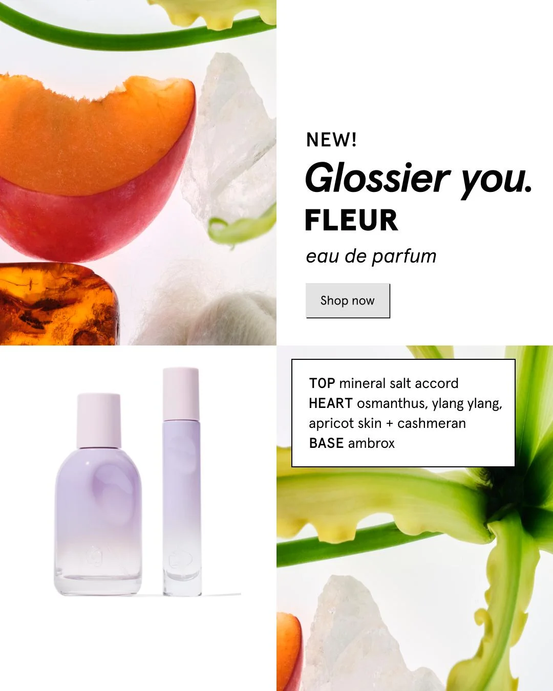
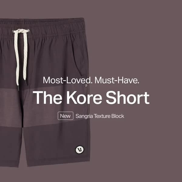
SANDRO New Collection — Urban Lifestyle Shot. Brand: SANDRO. This ad employs a lifestyle composition with a central model showcasing the new collection against an urban backdrop. The layout strategically places the brand name and collection details prominently in the negative space on the left, ensuring immediate recognition. Color psychology leans into muted, realistic tones, with the star-patterned denim providing a focal point against the darker skirt and industrial setting. This contrast helps the apparel stand out without being overly vibrant. The composition uses strong vertical lines from the truck and dolly to frame the model, adding depth and a sense of street style. Optimized for Instagram, the square format and clear text hierarchy make it easily digestible in a fast-scrolling feed. The bold white typography against the darker background ensures readability and brand recall.. Headline: SANDRO. Primary text: NEW COLLECTION FALL . WINTER '24. Why this ad works: Prominent Brand & Collection Announcement — The large, white "SANDRO" text immediately identifies the brand, while "NEW COLLECTION FALL . WINTER '24" clearly communicates the ad's purpose. This direct approach ensures viewers instantly grasp the brand and the new offering, crucial for quick-scan social feeds. Urban Backdrop Enhances Lifestyle Vibe — The gritty, industrial truck and wet street provide an authentic, urban setting. This context elevates the apparel from mere clothing to a lifestyle statement, resonating with a target audience that values contemporary, street-inspired fashion. It adds depth and narrative without distracting from the model. High Contrast Text for Instant Readability — The stark white typography against the dark, muted background of the truck creates excellent contrast. This design choice ensures that the brand name and collection details are highly legible, even on smaller mobile screens, effectively capturing attention and conveying key information quickly in a busy feed.. Specs: Brand: SANDRO, Industry: Fashion & Apparel, Platform: Instagram, Format: Static, Audience: Women 25-34The Dome Shaver Pro — Dark Hero Shot. Brand: The Dome Shaver. This ad employs a dark, minimalist hero shot layout, positioning the new "Dome Shaver Pro" prominently at the bottom of the frame. The composition utilizes a strong vertical hierarchy, with the product name stacked above the glowing shaver head. A rich, dark brown background with a subtle golden glow behind the product creates a luxurious and premium aesthetic, drawing the eye directly to the metallic blades. This high-contrast design is optimized for platforms like Instagram, ensuring scroll-stopping visibility against lighter feed content. The text hierarchy, from the small "INTRODUCING" to the large "DOME SHAVER" and outlined "PRO," effectively guides the viewer's attention, clearly communicating a new, professional-grade grooming tool. The overall effect is sophisticated and product-focused, ideal for a launch campaign targeting discerning male consumers.. Headline: INTRODUCING THE DOME SHAVER™ PRO. Why this ad works: Dark background amplifies product glow — The deep, dark brown background provides a stark contrast to the illuminated shaver head, making the metallic details and golden glow pop. This high-contrast technique is highly effective on social feeds, immediately capturing attention and signaling a premium, high-tech product. It creates a sense of intrigue and sophistication. Clear typographic hierarchy guides attention — The ad effectively uses varying font sizes and styles to create a clear visual path. "INTRODUCING" sets context, "THE DOME SHAVER" dominates for brand recognition, and the outlined "PRO" adds a premium touch. This hierarchy ensures the viewer quickly grasps the core message and product identity without effort. Product-centric hero shot establishes focus — By dedicating the majority of the lower frame to a detailed, well-lit shot of the shaver head, the ad immediately communicates its purpose. There are no distractions, allowing the viewer to appreciate the product's design and perceived quality. This direct approach is crucial for product launches to clearly present the offering.. Specs: Brand: The Dome Shaver, Industry: Health & Wellness, Platform: Instagram, Format: Static, Audience: Men 25-34sweetgreen x COTE — Vibrant In-Use Food Shot. Brand: sweetgreen. The ad effectively uses a dark, textured background to make the vibrant food bowl pop, creating strong visual contrast that commands attention on busy feeds. The central composition, with hands presenting the bowl, establishes an immediate connection and highlights the product as the hero. Color psychology is leveraged through the rich, natural hues of the ingredients, signaling freshness and flavor, while the bright pink "NEW" badge adds urgency and novelty. Text hierarchy is clear: a bold, benefit-driven headline immediately grabs attention, followed by descriptive flavor notes. The "sg rewards" call-to-action is integrated into a distinct, branded button, guiding the user to the next step. This design is optimized for platforms like Instagram, where high-quality, appetizing food photography and clear messaging drive engagement and conversions for new product launches. The overall layout is clean despite the detail, ensuring readability and impact.. Headline: OUR BOLDEST BITE YET. Primary text: SWEET, SAVORY AND SPICY.. Why this ad works: High-contrast food photography drives appetite appeal — The dark background dramatically enhances the vibrant colors of the fresh ingredients and rich sauces. This contrast makes the food visually "pop," stimulating appetite and making the new bowl irresistible to potential customers scrolling through their feeds. "In-use" composition creates immediate connection — Featuring hands holding the bowl directly engages the viewer, making the product feel tangible and ready to be enjoyed. This technique fosters a sense of personal connection and implies freshness and human preparation, which resonates strongly with food consumers. Bold, benefit-driven headline captures attention — "OUR BOLDEST BITE YET" is a strong, confident claim that immediately piques curiosity and promises a unique taste experience. This headline, combined with the "NEW" badge, effectively signals innovation and excitement, crucial for a successful product launch.. Specs: Brand: sweetgreen, Industry: Food & Beverage, Platform: Instagram, Format: Static, Audience: GeneralBirkenstock High Shine — Urban Lifestyle Shot. Brand: BIRKENSTOCK. This ad leverages an urban lifestyle composition to reposition Birkenstock's new collection. The model, dressed in sophisticated dark attire, creates a striking contrast with the vibrant green sandals, drawing immediate attention to the product. The off-center, dynamic pose suggests movement and confidence, aligning with the "Elegance" messaging. The minimalist concrete background ensures the focus remains on the model and footwear, preventing visual clutter. Text hierarchy places the brand prominently at the top, followed by a benefit-driven headline and collection hashtag, optimized for quick scanning on platforms like Instagram. The ad effectively blends aspirational fashion with the brand's comfort heritage, aiming to attract a style-conscious audience. The bold color pop against muted tones is a strong scroll-stopper.. Headline: SLIP INTO ELEGANCE. Primary text: #HIGHSHINECOLLECTION. Why this ad works: Vibrant product color against muted backdrop — The bright green sandals pop against the dark clothing and neutral concrete, immediately drawing the eye to the product. This high contrast ensures the new "High Shine" feature is undeniable, making the footwear the hero despite the full-body shot. It's an effective scroll-stopping technique on busy feeds. Aspirational styling elevates brand perception — Pairing Birkenstock sandals with a chic, long leather coat and elegant pose redefines the brand's image. This sophisticated styling challenges traditional perceptions of Birkenstocks as purely casual, positioning the "High Shine Collection" as a fashion-forward choice suitable for elegant urban wear, appealing to a broader market. Dynamic pose and direct gaze engagement — The model's walking pose conveys confidence and movement, suggesting the sandals are comfortable and stylish for an active, modern lifestyle. Her direct gaze at the viewer creates a personal connection, inviting the audience to imagine themselves embodying this elevated elegance and style, fostering aspirational identification.. Specs: Brand: BIRKENSTOCK, Industry: Fashion & Apparel, Platform: Instagram, Format: Static, Audience: Women 25-34Birkenstock High Shine — Urban Lifestyle Shot. Brand: Birkenstock. This ad effectively positions Birkenstock's new collection with an urban lifestyle shot. The model, dressed in a sophisticated dark coat and vibrant green sandals, walks confidently against a muted concrete backdrop. This composition technique uses strong color contrast to make the product pop, immediately drawing the viewer's eye to the #HIGHSHINECOLLECTION footwear. The model's dynamic pose and direct gaze create engagement, suggesting wearability and style. Text hierarchy is clear: the brand name is prominent, followed by the aspirational headline "SLIP INTO ELEGANCE," which cleverly redefines Birkenstock's image from comfort to fashion-forward. Optimized for platforms like Instagram, the clean aesthetic and focus on product integration within a chic context resonate with a fashion-conscious audience, driving awareness for the new line.. Headline: SLIP INTO ELEGANCE. Why this ad works: Bold green sandals pop against neutral urban setting — The vibrant green of the sandals creates a striking contrast against the muted, concrete urban environment. This strategic use of color ensures the product is the immediate focal point, effectively cutting through visual clutter in a busy feed. It highlights the "high shine" aspect and makes the footwear memorable. Model's gaze and movement engage viewer — The model's dynamic walking pose, combined with her direct eye contact, creates a sense of interaction and confidence. This technique not only showcases the sandals in action but also invites the viewer to imagine themselves wearing them, enhancing relatability and aspirational appeal. Aspirational headline elevates casual product perception — The headline "SLIP INTO ELEGANCE" strategically reframes Birkenstock, traditionally known for comfort, into a sophisticated fashion statement. This messaging targets a broader, style-conscious demographic, elevating the brand's perception and aligning the new collection with high-end fashion trends.. Specs: Brand: Birkenstock, Industry: Fashion & Apparel, Platform: Instagram, Format: Static, Audience: Women 25-34Nuun Sport Hydration — Product Lineup Splash. Brand: Nuun. This ad effectively introduces a new product line using a dynamic, vibrant composition. The diagonal arrangement of the Nuun Sport Hydration sticks creates a sense of energy and movement, reinforced by the water splashes and fresh fruit. This layout strategy draws the eye across all five new flavors, highlighting variety. Color psychology is leveraged through bright, appealing product packaging and natural fruit hues against a clean, light background, signaling freshness and efficacy. The clear text hierarchy, with a prominent headline and a distinct "SHOP NOW" CTA, guides the viewer. Optimized for visual platforms like Instagram, its clean yet energetic aesthetic ensures scroll-stopping appeal, communicating refreshment and newness instantly. The composition allows for easy recognition of each product, crucial for a launch campaign.. Headline: Say Hello to the Newest Members of the Nuun Squad. Why this ad works: Dynamic diagonal composition for energy — The products are arranged on a diagonal axis, creating visual flow and dynamism. This technique prevents the ad from feeling static, implying movement and energy, which is highly relevant for a "Sport Hydration" product. It effectively guides the viewer's eye across the entire new lineup, ensuring all products receive attention. Vibrant colors and fresh fruit appeal — The ad uses a bright, inviting color palette, combining the distinct blue of Nuun packaging with the natural, vivid colors of fresh fruits (strawberries, blueberries, lime, orange). These elements visually communicate natural flavor and refreshment, tapping into positive associations and making the hydration products appear delicious and invigorating. Clear product lineup for new launch — By showcasing all five new flavors prominently with their corresponding fruit visuals and clear labels, the ad effectively communicates a product launch. This direct presentation allows consumers to quickly grasp the variety available, generating excitement and interest in the "Newest Members of the Nuun Squad," a key goal for awareness campaigns.. Specs: Brand: Nuun, Industry: Health & Wellness, Platform: Instagram, Format: Static, Audience: Fitness EnthusiastsLiquid Death — Retail Availability Hero Shot. Brand: Liquid Death. This ad effectively leverages a minimalist hero shot to announce new retail availability. The Liquid Death can, with its distinctive gothic branding and skull artwork, is prominently placed on a stark white background, ensuring maximum product visibility. The composition uses ample negative space, drawing the eye directly to the product and the key message. The "NOW AVAILABLE AT" text is bold and centrally aligned with the 7-Eleven logo, creating a clear visual path for the announcement. The high contrast of the black text and gold accents against the white background ensures readability and scroll-stopping power, especially on platforms like Instagram where clean, impactful visuals perform well. The brand's edgy vibe is maintained even in this simple announcement, reinforcing its unique identity while clearly communicating a crucial distribution update. This layout is optimized for quick comprehension, vital for mobile ad consumption.. Headline: NOW AVAILABLE AT. Why this ad works: High-contrast minimalist layout drives focus — The stark white background and prominent product placement eliminate distractions, forcing the viewer's attention directly to the Liquid Death can and the availability announcement. This clean aesthetic cuts through visual clutter in busy social feeds, ensuring the core message is immediately absorbed. Strategic text placement for immediate clarity — The phrase "NOW AVAILABLE AT" is bolded and positioned directly next to the instantly recognizable 7-Eleven logo. This clear visual pairing communicates the core message efficiently, ensuring viewers grasp the crucial distribution update at a glance without needing to decipher complex imagery. Brand identity maintained through simple execution — Despite the straightforward announcement, the ad retains Liquid Death's unique, edgy aesthetic through its distinct can design and gothic typography. This reinforces brand recognition and personality, even in a functional retail update, appealing directly to its established target audience and brand loyalists.. Specs: Brand: Liquid Death, Industry: Food & Beverage, Platform: Instagram, Format: Static, Audience: Men 25-34Beyond Burger — Product Pack with Headline. Brand: Beyond Burger. This ad employs a split-focus layout, dedicating the upper third to a compelling headline and brand logo, while the lower two-thirds showcase the product packaging. The vibrant yellow and green of the Beyond Burger pack immediately draw the eye, contrasting effectively with the neutral, light background. Compositionally, the product is presented as a hero, with key benefits like "Made with Avocado Oil" and "New 6-Pack!" prominently displayed on the packaging itself. Text hierarchy is clear: brand identity, then the value proposition headline, followed by detailed product features on the pack. This design is optimized for platforms like Instagram, where a clean aesthetic and clear messaging can stop the scroll. It effectively communicates both a new product offering and its core benefits.. Headline: 6-pack burgers: that's clean eating at a lean price.. Why this ad works: Clear Value Proposition in Headline — The headline "6-pack burgers: that's clean eating at a lean price" efficiently communicates quantity, health benefits, and affordability. This direct, benefit-driven messaging immediately resonates with target audiences looking for convenient, healthy, and cost-effective plant-based options, driving immediate understanding and interest. Distinctive Brand Colors & Packaging — Beyond Burger's signature vibrant yellow and green packaging is instantly recognizable and visually appealing. These colors evoke freshness, natural ingredients, and energy, reinforcing the brand's plant-based identity. Using the actual product packaging as the central visual hero leverages existing brand equity and shelf appeal effectively. Prominent Feature & Benefit Callouts — The ad strategically integrates key selling points directly onto the product packaging, such as "Made with Avocado Oil," "NEW 6-PACK!", "75% LESS SATURATED FAT," and "21g OF PROTEIN PER SERVING." This ensures vital information is absorbed alongside the product visual, addressing common consumer concerns and highlighting competitive advantages instantly.. Specs: Brand: Beyond Burger, Industry: Food & Beverage, Platform: Instagram, Format: Static, Audience: GeneralLiquid Death — Retail Availability Hero Shot. Brand: Liquid Death. This ad utilizes a minimalist hero shot layout, placing the Liquid Death can prominently on the left against a stark white background. The composition employs significant negative space, drawing immediate attention to the product. The high contrast between the white background, the can's black and gold branding, and the bold "NOW AVAILABLE AT" text ensures strong visual impact and readability, optimized for quick scanning on platforms like Instagram. The text hierarchy is simple: a clear announcement of new retail availability, followed by the instantly recognizable 7-Eleven logo, effectively communicating a key distribution update. This direct approach leverages brand recognition for both Liquid Death and 7-Eleven, making the message clear and actionable for the target audience.. Headline: NOW AVAILABLE AT. Why this ad works: High contrast ensures immediate visibility — The stark white background combined with the bold black text and product branding creates exceptional contrast. This design choice ensures the ad stands out in a busy feed, grabbing attention quickly and making the core message instantly legible, crucial for effective mobile advertising. Clear availability message drives action — The prominent "NOW AVAILABLE AT" text paired with the instantly recognizable 7-Eleven logo directly communicates new distribution. This clarity reduces cognitive load for the viewer, making it easy to understand where to purchase the product, thereby facilitating conversion intent. Leverages strong brand recognition — The ad effectively uses the established brand identity of both Liquid Death and 7-Eleven. For existing Liquid Death fans, seeing the 7-Eleven logo signals convenient access. For 7-Eleven shoppers, the ad introduces a new, edgy product, broadening its appeal.. Specs: Brand: Liquid Death, Industry: Food & Beverage, Platform: Instagram, Format: Static, Audience: GeneralParachute Bedding — Relaxed Lifestyle Shot. Brand: PARACHUTE. This ad effectively leverages a lifestyle composition to evoke comfort and aspiration. The central figure, a smiling woman, is positioned off-center, drawing the eye naturally across the bed and its new "hue." The muted, earthy color palette of grays and creams, complemented by natural light and a subtle cactus backdrop, creates a serene and inviting atmosphere. This minimalist aesthetic is highly optimized for platforms like Instagram, where high-quality, aspirational imagery resonates with users. The text hierarchy is simple: a prominent headline at the top introduces the new product, while the brand name is clearly anchored at the bottom. The overall composition emphasizes relaxation and quality, subtly promoting the bedding without overt sales tactics, appealing to a desire for comfort and a well-designed home.. Headline: This Season's Latest Hue. Why this ad works: Lifestyle imagery evokes comfort and aspiration — The ad features a relaxed woman enjoying the bedding, creating an aspirational image of comfort and well-being. This approach sells a feeling rather than just a product, which is highly effective for home goods. Viewers can easily project themselves into this serene scene, increasing emotional connection and purchase intent. Muted, earthy palette signals premium quality — The use of soft grays, creams, and natural light conveys a sense of sophistication and tranquility. This color psychology aligns with premium home decor brands, suggesting high-quality materials and a refined aesthetic. It avoids bright, jarring colors, appealing to consumers seeking understated luxury and timeless design. Clear brand presence with minimal text overlay — The headline "This Season's Latest Hue" is prominent yet unobtrusive, while the "PARACHUTE" brand name is boldly placed at the bottom. This minimal text approach keeps the focus on the visual storytelling, allowing the product's aesthetic appeal to dominate. It's effective for brand recall without overwhelming the viewer.. Specs: Brand: PARACHUTE, Industry: Home & Lifestyle, Platform: Instagram, Format: Static, Audience: Women 25-34Warby Parker Eyewear — Minimal Product Shot. Brand: Warby Parker. This ad employs a minimalist product-on-background layout, featuring a pair of Warby Parker glasses against a vibrant orange backdrop. The composition uses a strong diagonal line created by the glasses, drawing the eye across the frame and highlighting the product's form and material. The warm orange color evokes energy and modernity, creating a striking contrast with the translucent, neutral-toned frames, which subtly feature the brand name. Text hierarchy is simple: a clear, concise headline "Just in from Japan" is positioned prominently in the upper left, signaling newness and origin. This design is optimized for platforms like Instagram, where bold colors and clean aesthetics capture attention in a fast-scrolling feed. The low text density ensures the product remains the hero, allowing visual appeal to drive initial engagement and curiosity about the new collection. The overall effect is sophisticated yet approachable, aligning with Warby Parker's brand identity.. Headline: Just in from Japan. Why this ad works: High-contrast color palette grabs attention — The bold orange background provides a high-energy, modern aesthetic that immediately stands out in a crowded social feed. This strong contrast with the neutral-toned glasses ensures the product is clearly visible and memorable, driving initial scroll-stopping power and capturing immediate viewer interest effectively. Diagonal composition creates dynamic interest — The glasses are angled diagonally across the frame, creating a sense of movement and visual dynamism. This non-static arrangement is more engaging than a straight-on shot, guiding the viewer's eye along the product's lines and subtly emphasizing its design and craftsmanship, enhancing visual appeal. Concise headline sparks curiosity and value — The headline "Just in from Japan" is short, intriguing, and immediately communicates a sense of newness and premium origin. This scarcity and quality signal encourages viewers to learn more, effectively driving consideration for the new collection without needing extensive copy, boosting engagement.. Specs: Brand: Warby Parker, Industry: Fashion & Apparel, Platform: Instagram, Format: Static, Audience: GeneralGarden of Life Gummies — Vibrant Product Array. Brand: Garden of Life. This ad employs a vibrant, high-contrast layout designed to capture attention in a busy feed. The deep blue background provides a strong visual anchor, making the colorful product bottles and bright yellow/white headline pop. Compositionally, the ad uses a clear visual hierarchy: the large, playful headline immediately communicates the core benefit, while the hand holding a product adds a human touch and implies interaction. The row of diverse gummy bottles showcases the product range, appealing to a broad audience. The citrus peel elements reinforce the "tasty twist" message, adding a playful, organic feel. Optimized for platforms like Instagram, its bold colors and clear messaging ensure scroll-stopping power, effectively introducing the brand's gummy line and its key differentiator. The text hierarchy guides the eye from the main promise to the product variety.. Headline: Vitamins & Supplements with a TASTY TWIST. Why this ad works: High-contrast palette ensures scroll-stopping visibility — The vibrant royal blue background against the bright yellow and white text, combined with the colorful product bottles, creates extreme contrast. This visual pop is crucial for cutting through feed clutter on platforms like Instagram, immediately drawing the eye and increasing the likelihood of engagement and brand recall in a competitive ad environment. Playful headline font communicates product benefit — The "TASTY TWIST" portion of the headline uses a bubbly, informal font that visually reinforces the message of deliciousness and fun. This stylistic choice aligns perfectly with the product's promise of enjoyable vitamins, making the ad more approachable and memorable, especially for consumers wary of traditional, clinical-looking supplements. Product array showcases variety and broad appeal — Displaying a diverse range of Vitamin Code Gummy bottles, including options for men, women, kids, and prenatal, effectively communicates the breadth of the product line. This visual strategy allows potential customers to quickly identify a product relevant to their specific needs, enhancing perceived value and increasing the ad's overall relevance to a wider demographic.. Specs: Brand: Garden of Life, Industry: Health & Wellness, Platform: Instagram, Format: Static, Audience: GeneralLimited Edition PJ's — Lifestyle Split Screen. This ad employs a clean split-screen layout, featuring a model wearing the product on the left and clear ad copy with a CTA on the right. The neutral color palette of taupe and off-white creates a calming, luxurious, and comfortable aesthetic, perfectly aligning with loungewear. The composition uses ample negative space on the right to ensure the headline and call-to-action stand out, optimizing for quick readability on mobile feeds. Text hierarchy is clear, with the headline drawing immediate attention before guiding the eye to the prominent CTA button. This design is highly optimized for platforms like Instagram, where clean visuals and aspirational lifestyle imagery drive engagement and consideration, effectively introducing a new product line.. Headline: Say hello to our new limited edition PJ's!. Why this ad works: Split-screen layout for clear communication — The ad effectively divides the frame, dedicating the left to product visualization on a model and the right to direct messaging. This clear separation prevents visual clutter, allowing viewers to quickly grasp both the product's aesthetic and the call to action. It's highly effective for conveying information efficiently on mobile feeds. Neutral palette evokes comfort and luxury — The use of soft taupe pajamas against a warm off-white background creates a calming and inviting visual. This neutral color scheme subtly communicates comfort, quality, and a sense of understated luxury, appealing to an audience seeking relaxation and premium loungewear. It avoids harsh contrasts, promoting a serene brand image. Direct, actionable call to action — The CTA "EXPLORE NEW PAJAMAS" is clear, concise, and immediately actionable. Placed within a clean button, it guides the user directly to the next step without ambiguity. This directness reduces friction in the user journey, increasing the likelihood of clicks and conversions, especially on platforms where quick decisions are made.. Specs: Industry: Fashion & Apparel, Platform: Instagram, Format: Static, Audience: Women 25-34Soléa Collection — Model Lifestyle Shot. Brand: Soléa. This ad leverages a clean, aspirational lifestyle layout to introduce the Soléa Collection. The model, positioned left-of-center, wears the hero product, drawing immediate attention to the garment's vibrant blue and white pattern. The composition utilizes negative space effectively on the right, creating a clear visual path for the brand name and collection announcement. The color palette, featuring a warm, neutral background against the bright blue, evokes a Mediterranean or resort feel, aligning with the "Soléa" name. Text hierarchy is simple: brand and collection title prominent, followed by availability details. Optimized for platforms like Instagram, where high-quality imagery and a sense of effortless style resonate, this ad aims to build brand association and drive initial awareness for the new collection, encouraging exploration both online and in physical stores. The overall impression is one of relaxed elegance and quality.. Headline: Soléa Collection. Primary text: AVAILABLE NOW IN STORES & ONLINE. Why this ad works: Model-centric display highlights product wearability — Featuring a model wearing the collection piece immediately showcases its fit, drape, and aesthetic appeal in a real-world context. This helps potential customers visualize themselves in the garment, reducing purchase friction and increasing desirability compared to a flat lay or mannequin shot. Strategic negative space enhances brand focus — The right side of the ad is largely clear, allowing the "Soléa Collection" text to stand out without competition. This intentional use of negative space guides the viewer's eye directly to the brand message, ensuring brand recall and collection awareness are prioritized in a busy feed environment. Mediterranean color palette evokes aspirational lifestyle — The warm, sun-drenched background combined with the vibrant blue and white pattern of the garment creates a distinct Mediterranean-inspired aesthetic. This color psychology evokes feelings of vacation, relaxation, and elegance, subtly associating the brand with a desirable, aspirational lifestyle.. Specs: Brand: Soléa, Industry: Fashion & Apparel, Platform: Instagram, Format: Static, Audience: Women 25-34Language Sprint — Chat UI Mockup. Brand: Language Sprint. This ad effectively leverages a familiar chat UI mockup to create a relatable, testimonial-style narrative. The layout mimics an organic conversation, immediately drawing the viewer in by simulating a peer recommendation. Color psychology uses soft blues and whites, conveying a clean, trustworthy, and approachable brand image, which is ideal for an educational product. The composition guides the eye naturally down the chat thread, establishing a problem, introducing the solution ("Language Sprint"), and building urgency with a clear deadline. This format is highly optimized for social media platforms like Facebook or Instagram, where it can easily blend with user-generated content, making the ad feel less intrusive and more authentic. Text hierarchy is inherent in the chat bubble design, with key information presented sequentially, ensuring the call to action is the final, impactful message.. Why this ad works: Relatable Chat UI for Organic Feel — The ad uses a familiar chat interface to simulate an authentic conversation. This makes the ad feel less like a direct sales pitch and more like a genuine recommendation from a friend, significantly increasing relatability and trust with the target audience, encouraging engagement and belief in the product's efficacy. Problem-Solution Narrative Builds Engagement — The conversation starts with a common language learning struggle ("tongue-tied") and quickly introduces "Language Sprint" as the solution. This narrative structure engages viewers by addressing their pain points directly before offering a clear, peer-validated remedy, making the product's value immediately apparent and relevant. Urgency Creates Immediate Action — Mollie's final message, "Sign-up ends in less than 24h," introduces a strong sense of urgency. This time-sensitive call to action compels potential customers to act quickly, driving higher conversion rates for time-limited offers or enrollment periods by leveraging the fear of missing out.. Specs: Brand: Language Sprint, Industry: Education, Platform: Facebook, Format: UI Mockup, Audience: GeneralSol de Janeiro Perfume Mists — Vibrant Product Lineup. Brand: SOL DE JANEIRO. This ad effectively uses a vibrant product lineup layout to introduce Sol de Janeiro's perfume mists. The composition places the "Rio Radiance" mist centrally and slightly forward, creating a clear hero product while showcasing the range. A warm, tropical color palette, dominated by yellows, oranges, and pinks, evokes a luxurious, summery, and joyful brand experience, aligning perfectly with the brand's Brazilian identity. The prominent orange banner at the top with distinct typography for "PERFUME Mists" and "SOL DE JANEIRO" establishes strong brand recognition and clear messaging hierarchy. Optimized for visual platforms like Instagram, the ad's high contrast and appealing aesthetic are designed to stop the scroll. The overall design communicates aspiration and discovery, encouraging engagement with the new collection.. Headline: Discover PERFUME Mists by SOL DE JANEIRO. Why this ad works: Vibrant color palette evokes tropical luxury — The ad's use of bright yellows, oranges, and pinks, combined with a warm background, instantly communicates a tropical, luxurious, and joyful brand identity. This vibrant palette is highly effective in attracting the target audience seeking aspirational beauty products, creating an emotional connection that resonates with summer and exotic destinations. Clear product lineup with hero focus — By showcasing multiple perfume mists with the "Rio Radiance" bottle positioned slightly forward and centered, the ad effectively highlights a hero product while demonstrating the breadth of the collection. This composition guides the viewer's eye, making it easy to understand the product offering and creating visual interest that encourages closer inspection of the different scents. Distinctive brand typography and banner — The prominent orange banner at the top, featuring "PERFUME Mists" in a bold, playful font and "by SOL DE JANEIRO" in an elegant script, creates a strong and memorable brand presence. This clear text hierarchy ensures the core message is immediately understood, while the unique typography reinforces the brand's fun yet sophisticated identity.. Specs: Brand: SOL DE JANEIRO, Industry: Health & Wellness, Platform: Instagram, Format: Static, Audience: Women 25-34Niloufer A/W 25 — Minimalist Model Shot. Brand: niloufer. This ad employs a minimalist model shot layout, centering the apparel to maximize visual impact. The generous negative space around the model ensures the viewer's focus remains entirely on the new collection. A sophisticated color palette of deep purple and teal against a warm, neutral background evokes luxury and elegance, appealing to a discerning fashion audience. The composition uses implied vertical lines from the flowing fabric to guide the eye, while the model's direct gaze creates an engaging, confident presence. Optimized for visual platforms like Instagram, the high-quality photography and clean aesthetic are designed to stop the scroll. Text hierarchy is minimal, with "NEW LAUNCH" and "niloufer A/W 25" clearly establishing brand and collection, relying on visual appeal for initial engagement rather than heavy copy.. Headline: NEW LAUNCH niloufer A/W 25. Why this ad works: Negative space forces apparel focus — The ample negative space surrounding the model ensures the viewer's attention is solely on the apparel. This deliberate choice creates a premium, uncluttered aesthetic, allowing the intricate design and rich fabric of the dress to be fully appreciated. In a crowded digital feed, this visual clarity effectively cuts through noise, signaling luxury and exclusivity. Sophisticated color palette conveys luxury — The ad's sophisticated color scheme, featuring a deep, rich purple complemented by elegant teal accents against a warm, earthy background, immediately conveys a sense of luxury and refined taste. This harmonious palette enhances the garment's perceived value and appeals to consumers seeking high-end, distinctive fashion pieces. Model's poised stance highlights garment — The model's poised, confident stance and direct, yet neutral, gaze effectively showcase the garment without distracting from it. This professional presentation allows the clothing to be the star, inviting the viewer to imagine themselves wearing the elegant ensemble, thereby enhancing the aspirational quality of the fashion.. Specs: Brand: niloufer, Industry: Fashion & Apparel, Platform: Instagram, Format: Static, Audience: Women 25-34Satchel Quest — Vibrant Game Components Flat Lay. Brand: Satchel Quest. This ad effectively uses a vibrant flat lay composition to showcase the "Satchel Quest" board game. The overhead shot immerses the viewer in the game's world, displaying numerous colorful components like tokens, cards, and character standees against a warm wooden background. This layout strategy highlights the richness and detail of the game, appealing to board game enthusiasts who value tactile components. The bright green "JUST LAUNCHED ON KICKSTARTER" badge serves as the primary focal point and call to action, strategically placed to capture immediate attention. Color psychology leverages bright, inviting hues to convey a sense of adventure and fun, while the rustic background grounds the fantasy elements. Optimized for visual platforms like Instagram or Facebook, the ad's high visual density and clear launch announcement aim to drive immediate consideration and conversion for the crowdfunding campaign. Text hierarchy is minimal, relying heavily on the prominent badge to communicate the core message.. Headline: JUST LAUNCHED ON KICKSTARTER. Why this ad works: Immersive Flat Lay Showcases Game Depth — The overhead flat lay composition effectively displays a multitude of game components, including the box, tokens, cards, and player pieces. This visual richness immediately communicates the depth and complexity of "Satchel Quest," appealing directly to experienced board gamers who appreciate detailed and engaging gameplay experiences. Prominent Kickstarter Badge Drives Urgency — The bright green "JUST LAUNCHED ON KICKSTARTER" badge is strategically placed and highly visible. Its vibrant color and clear message create an immediate sense of urgency and direct the viewer to the crowdfunding platform, effectively converting interest into action for a time-sensitive campaign. Vibrant Fantasy Art Attracts Core Audience — The ad leverages the game's colorful and detailed fantasy artwork across all components. This visual style is highly appealing to the target audience of fantasy and adventure board game players, instantly communicating the game's theme and inviting them into its imaginative world, fostering emotional connection.. Specs: Brand: Satchel Quest, Industry: Media & Entertainment, Platform: Instagram, Format: Static, Audience: GeneralLiquid Death — Retail Availability Hero Shot. Brand: Liquid Death. The ad utilizes a minimalist hero shot layout, centering the Liquid Death can against a stark white background. This high-contrast composition immediately draws the eye to the product, emphasizing its distinct branding. The bold, gothic font of "Liquid Death" and the "Murder Your Thirst" tagline, combined with the skull graphic, convey a rebellious, edgy brand personality. The text hierarchy is clear: product branding first, then the key message "NOW AVAILABLE AT" prominently displayed alongside the instantly recognizable 7-Eleven logo. This direct approach is highly effective for platform optimization on Instagram or Facebook, where quick comprehension is crucial. The clean aesthetic ensures the brand's unique identity stands out, while the partnership announcement drives immediate consideration for purchase. The simple, uncluttered design prevents visual noise, allowing the core message of expanded distribution to resonate clearly with the target audience. The white space ensures adaptability across various ad placements.. Primary text: NOW AVAILABLE AT. Why this ad works: High-contrast product focus — The stark white background and centered product isolate the Liquid Death can, making its unique design and branding pop. This ensures immediate visual recognition in a crowded feed, leveraging the brand's distinct aesthetic to stop the scroll and capture attention effectively amidst competing content. Clear, concise availability announcement — The "NOW AVAILABLE AT" text is bold and positioned directly next to the iconic 7-Eleven logo. This direct, unambiguous message instantly communicates the new retail partnership, reducing cognitive load and driving immediate purchase intent for existing fans by clearly stating where to find the product. Brand personality through design — The gothic font, "Murder Your Thirst" tagline, and skull graphic on the can are integral to Liquid Death's edgy brand identity. This ad effectively showcases this personality, reinforcing brand values while announcing a mainstream retail expansion, appealing to its core demographic that values authenticity and a rebellious spirit.. Specs: Brand: Liquid Death, Industry: Food & Beverage, Platform: Instagram, Format: Static, Audience: GeneralH&M Kids Autumn Arrivals — Warm Lifestyle Shot. Brand: H&M. This H&M ad leverages an intimate, close-up lifestyle shot to evoke warmth and connection, ideal for a family-oriented audience. The composition places two children, one partially cropped, in soft, autumnal puffer jackets, creating a sense of comfort and joy. The color palette of muted browns and soft pinks reinforces the seasonal theme, appealing to emotional resonance rather than stark product display. Text hierarchy is simple: "AUTUMN ARRIVALS" is bold and prominent in the upper left, immediately communicating the ad's purpose. The H&M logo is strategically placed in the lower right, ensuring brand recall without distracting from the primary visual. This layout is optimized for platforms like Instagram, where authentic, emotionally engaging imagery performs well, encouraging scroll-stopping engagement through relatable content. The focus on faces and cozy apparel effectively positions the new collection as desirable for children.. Headline: AUTUMN ARRIVALS. Why this ad works: Emotional Connection through Close-Up — The tight crop on the children's smiling faces and their relaxed posture creates an instant emotional bond. This human element makes the ad highly relatable for parents, fostering a sense of warmth and happiness associated with the brand and its new autumn collection, driving consideration. Warm, Seasonal Color Palette — The use of muted brown and soft pink puffer jackets, combined with the children's natural skin tones, establishes a cozy, autumnal atmosphere. This color psychology effectively communicates comfort and readiness for cooler weather, aligning perfectly with the "Autumn Arrivals" message and appealing to seasonal purchasing intent. Clear, Unobtrusive Branding — The "AUTUMN ARRIVALS" text is prominent yet integrated, clearly announcing the collection. The H&M logo is positioned subtly in the bottom right, ensuring strong brand recall without overpowering the emotional visual. This balance maintains aesthetic appeal while delivering key marketing information efficiently.. Specs: Brand: H&M, Industry: Fashion & Apparel, Platform: Instagram, Format: Static, Audience: ParentsLa Roche-Posay Cicaplast Baume — Product Hero with Text. Brand: La Roche-Posay. This ad employs a clean hero shot layout, featuring the La Roche-Posay Cicaplast Baume B5+ SPF50 prominently against a vibrant blue background. The composition utilizes a diagonal line created by the product, drawing the eye from the brand logo to the product details. The strong blue color evokes trust and clinical efficacy, aligning with the brand's dermatological positioning. Text hierarchy is clear: the new product name and key benefits ("RÉPARATION & PROTECTION UVA-UVB") are large and left-aligned, optimized for quick scanning on mobile platforms like Instagram. The orange "spf50" acts as a visual anchor, highlighting a critical feature. The minimalist background ensures the product and its benefits remain the focal point, preventing visual clutter and enhancing scroll-stopping power. This design effectively communicates a new product launch with clear benefits, suitable for awareness and consideration phases.. Headline: NOUVEAU CICAPLAST BAUME B5+ spf50. Primary text: RÉPARATION & PROTECTION UVA-UVB. Why this ad works: Bold Blue Background Enhances Product Visibility — The vibrant, solid blue background provides high contrast against the white product packaging. This color choice is not only eye-catching but also psychologically associated with trust and professionalism, reinforcing La Roche-Posay's dermatological authority. It ensures the product stands out effectively in a busy feed environment. Clear Text Hierarchy for Instant Benefit Communication — The large, left-aligned text "NOUVEAU CICAPLAST BAUME B5+ spf50" and "RÉPARATION & PROTECTION UVA-UVB" immediately convey the product and its core benefits. The use of orange for "spf50" creates a strong visual cue, guiding the viewer's attention to the crucial sun protection aspect without overwhelming the overall design. Diagonal Composition Creates Dynamic Visual Flow — The product is angled diagonally across the frame, creating a dynamic visual line that leads the eye from the brand logo down to the product's details and the key benefits. This technique adds energy to an otherwise static product shot, making the ad more engaging and less static than a purely vertical or horizontal placement.. Specs: Brand: La Roche-Posay, Industry: Health & Wellness, Platform: Instagram, Format: Static, Audience: Women 25-34HEALTHLETIC BPC-157 — Chat UI Testimonial. Brand: HEALTHLETIC. This ad leverages a native chat UI layout, mimicking a personal conversation to build trust and relatability. The composition strategically places a problem-solution narrative, with the product image embedded naturally as a shared link. The simple color palette of white, grey, and blue reflects typical messaging app aesthetics, making the ad feel less intrusive and more organic. Text hierarchy follows a conversational flow, starting with relatable pain points, introducing the product as a solution, and concluding with a personal testimonial. This approach is highly optimized for platforms like Facebook or Instagram stories/feeds, where it can blend seamlessly with user-generated content, increasing engagement and reducing ad fatigue. The design aims to overcome ad blindness by presenting information in a familiar, peer-to-peer format.. Headline: Body Protection Compound (BPC-157). Primary text: feel like my joints are made of gravel 😭 takes me 3 days to recover from a workout getting old sucks 😩😩😩 been there - try this it's helped my knees, sleep, and energy big time. Why this ad works: Native Chat UI Builds Instant Trust — By simulating a direct message conversation, the ad bypasses traditional ad skepticism. This format feels authentic and personal, making the product recommendation appear as a genuine peer endorsement rather than a paid promotion. This significantly enhances credibility and encourages deeper engagement with the content. Problem-Solution Narrative Drives Relatability — The ad opens with common, relatable pain points like joint pain and slow recovery, immediately resonating with the target audience. Introducing the product as a direct solution to these specific issues creates a clear value proposition, prompting viewers to consider how the product can address their own struggles. Embedded Product Link Mimics Organic Sharing — Presenting the product within a link preview, as if shared by a friend, leverages social proof and reduces perceived sales pressure. This subtle integration encourages clicks by framing the product as a helpful discovery rather than a direct advertisement, increasing click-through rates by blending into the platform's native experience.. Specs: Brand: HEALTHLETIC, Industry: Health & Wellness, Platform: Facebook, Format: UI Mockup, Audience: Fitness EnthusiastsWype Toilet Essential — Playful Product Arrangement. Brand: wype. This ad effectively uses a clean, bright layout to introduce a new product line. The central arrangement of the Wype bottles on a textured tray creates a focal point, drawing the eye to the product variations. The vibrant orange headline "MEET YOUR NEW TOILET ESSENTIAL" immediately grabs attention against the minimalist white background, establishing a clear value proposition. Color psychology is at play with the refreshing teal accents on the products and the warm orange text, suggesting cleanliness and approachability. The inclusion of a prominent "20% OFF" badge and Trustpilot reviews builds immediate trust and urgency, optimizing for conversion on platforms like Instagram where visual appeal and social proof are key. Text hierarchy is clear: brand, headline, then offer and social proof. The overall composition is clean, modern, and engaging, designed to stop the scroll.. Headline: MEET YOUR NEW TOILET ESSENTIAL. Primary text: 20% OFF Excellent ⭐⭐⭐⭐⭐ 7,535 reviews on Trustpilot. Why this ad works: Bold Headline Commands Immediate Attention — The large, vibrant orange headline "MEET YOUR NEW TOILET ESSENTIAL" contrasts sharply with the clean white background. This high contrast ensures immediate readability and scroll-stopping power, effectively communicating the product's purpose and novelty right away, crucial for discovery platforms. Social Proof Builds Instant Trust & Credibility — The "Excellent ⭐⭐⭐⭐⭐ 7,535 reviews on Trustpilot" footer provides powerful social proof. This instantly validates the product's quality and user satisfaction, reducing perceived risk for potential customers. It leverages external validation to accelerate the path to conversion. Playful Color Palette Enhances Brand Personality — The combination of the product's teal accents, the orange headline, and the yellow-orange "20% OFF" badge creates a fresh, modern, and slightly playful aesthetic. This palette differentiates the brand from more sterile hygiene products, making it more approachable and memorable for the target audience.. Specs: Brand: wype, Industry: Health & Wellness, Platform: Instagram, Format: Static, Audience: GeneralTwo Women — Outdoor Lifestyle Shot. This lifestyle image features two women in a relaxed outdoor setting, likely designed for brand awareness or engagement. The natural composition, with subjects slightly off-center, creates an authentic, unposed feel, resonating well on social platforms like Instagram. The warm, earthy color palette of greens, browns, and blues evokes feelings of calm and happiness, subtly associating these positive emotions with the implied brand. Without explicit text or product, the ad relies on visual storytelling and relatability. The composition allows for flexible cropping across various ad placements, maintaining visual integrity. This approach aims to build an emotional connection with the audience before introducing specific products or services, leveraging aspirational yet achievable imagery to stop the scroll.. Why this ad works: Authentic lifestyle imagery builds trust — The natural smiles and relaxed posture of the women, combined with the lush outdoor setting, create an authentic and relatable scene. This approach builds trust with the audience by presenting a genuine moment rather than an overtly staged advertisement. It fosters a connection, making the implied brand feel more human and approachable. Warm color palette evokes positive emotion — The dominant natural greens of the foliage, the inviting blue of the pool, and the warm skin tones of the subjects combine to create a harmonious and positive visual experience. This color psychology subtly evokes feelings of peace, happiness, and well-being, associating these desirable emotions with the brand's overall message or offering. Relatable subjects broaden audience appeal — Featuring two women of different generations broadens the ad's appeal, making it relatable to a wider demographic. This inclusivity suggests that the brand caters to various age groups, enhancing its perceived relevance and market reach. It subtly communicates a message of shared experiences and universal enjoyment.. Specs: Industry: Home & Lifestyle, Platform: Instagram, Format: Static, Audience: GeneralAguirre Filing Cabinet — Split Product Shot. Brand: AGUIRRE OFFICE FURNITURE. This ad employs a split-screen layout, positioning the product on the left against a light, dotted background, while key information is presented on the right against a dark, solid backdrop. This high-contrast design ensures readability and visual separation. The color palette of dark grey, light grey, and a touch of orange from the logo conveys professionalism and security, fitting for office furniture. The product, a filing cabinet with a safety vault, is angled to showcase its features, drawing the viewer's eye to its functionality. Text hierarchy is clear, starting with a 'NEW COLLECTION' banner, followed by the prominent product name, and a concise feature list, culminating in a strong 'ORDER NOW' CTA. The square format is optimized for social media feeds like Facebook and Instagram, where clear product presentation and direct messaging are crucial for engagement and conversion. The dotted pattern adds a subtle modern aesthetic without distracting from the core message or product.. Headline: FILING CABINET + SAFETY VAULT. Primary text: NEW COLLECTION 4 Drawers Filing Cabinet. All Fire-proof. Designed Accommodate files. Centralized Lock and Duplicate keys. Why this ad works: High-contrast split layout for clarity — The ad effectively uses a split background with a light, dotted section for the product and a dark, solid area for text. This high contrast ensures maximum readability for the product name and features, preventing visual fatigue and making the ad's core message immediately digestible in a busy social feed environment. Feature-focused copy highlights key benefits — The primary text clearly lists essential features like "Fire-proof," "Centralized Lock," and "Duplicate keys." This direct approach immediately communicates the product's value proposition, addressing the target audience's need for security and organization, which is crucial for office furniture purchases. Strong visual hierarchy for product and brand — The "NEW COLLECTION" banner, prominent brand logo, and large product title "FILING CABINET + SAFETY VAULT" create a clear visual path. This hierarchy quickly informs the viewer about the offering and its newness, establishing brand recognition and product identity efficiently within the ad's limited viewing time.. Specs: Brand: AGUIRRE OFFICE FURNITURE, Industry: Home & Lifestyle, Platform: Facebook, Format: Static, Audience: Small Business OwnersFAHERTY Knit Seasons Shirt — Diagonal Product Display. Brand: FAHERTY. This ad employs a clean, diagonal product display to showcase Faherty's "Knit Seasons Shirt" in multiple colorways. The composition strategically overlaps shirts, creating depth and emphasizing the range of options. An earthy, muted color palette dominates, signaling natural materials, comfort, and timeless style, appealing to a discerning audience seeking quality over fleeting trends. Text hierarchy is clear: the brand name is top-left for immediate recognition, while the product name is prominent bottom-left, guiding the viewer's focus. Optimized for visual platforms like Instagram, the high-quality photography and organized layout effectively stop the scroll, communicating versatility and premium craftsmanship without excessive text. The overall design effectively introduces a new product line.. Headline: the Knit Seasons Shirt. Why this ad works: Diagonal composition highlights product variety — The diagonal arrangement of shirts effectively showcases multiple colorways and textures in a single frame. This visual flow guides the viewer's eye across the collection, emphasizing the breadth of options for "The Knit Seasons Shirt" and suggesting versatility, which is key for attracting diverse customer preferences. Muted, earthy palette signals quality — The selection of muted, natural colors (charcoal, dusty rose, grey, white, denim blue, olive, dark teal) conveys a sense of timelessness and quality. This palette appeals to consumers seeking sophisticated, versatile wardrobe staples rather than trendy, fleeting fashion, reinforcing the brand's premium positioning and perceived value. Clear text hierarchy informs and brands — The brand name "FAHERTY" is prominently placed at the top left, establishing immediate brand recognition and reinforcing brand identity. The product name "the Knit Seasons Shirt" is clearly legible in a larger font at the bottom left, ensuring the viewer understands the specific offering without visual clutter or ambiguity.. Specs: Brand: FAHERTY, Industry: Fashion & Apparel, Platform: Instagram, Format: Static, Audience: Men 25-34Joey Mattress — Lifestyle with Feature Overlay. Brand: Joey. This ad effectively combines a lifestyle image with clear product feature communication. The layout strategically places a smiling model enjoying the product, immediately conveying comfort and satisfaction. The bright, clean aesthetic, dominated by white and natural wood tones, evokes a sense of freshness and calm, aligning with the promise of good sleep. Text hierarchy is clear: a benefit-driven headline at the top, followed by specific product information (new sizes) with checkmarks for easy readability. The brand logo is subtly placed at the bottom, reinforcing brand recall without distracting from the main message. This composition is optimized for social feeds like Instagram, where aspirational imagery and concise information capture attention, driving both awareness and consideration for new product offerings. The overall impression is inviting and trustworthy.. Headline: Everyone deserves great sleep. Primary text: 2 NEW topper sizes are now available on joeymattress.com ✅ 150x200 ✅ 180x200 (For IKEA beds). Why this ad works: Lifestyle imagery builds emotional connection — The smiling model creates an immediate emotional connection, associating the product with happiness and well-being. This human element makes the ad relatable and aspirational, encouraging viewers to envision themselves experiencing similar comfort and satisfaction. It's more persuasive than a product-only shot for bedding. Clear feature highlight with visual cues — The ad effectively highlights "2 NEW topper sizes" using bold text and green checkmarks. This visual emphasis makes the key information scannable and easy to digest, directly addressing potential customer needs for specific dimensions, especially for common bed frames like IKEA, which is a smart targeting move. Clean aesthetic reinforces product benefits — The bright, minimalist background and natural lighting contribute to a clean and fresh aesthetic. This visual style subtly reinforces the product's promise of a clean, comfortable, and healthy sleep environment, appealing to consumers who value simplicity and quality in their home goods and personal well-being.. Specs: Brand: Joey, Industry: Home & Lifestyle, Platform: Instagram, Format: Static, Audience: Women 25-34DÔSE Ginger Turmeric Shots — Retail Availability. Brand: DÔSE. This ad effectively leverages a vibrant, high-contrast color palette of bright yellow and bold orange/red to command attention in a busy social feed. The layout combines a dynamic lifestyle element (hand holding a product) with multiple product shots, reinforcing product presence and availability. Text hierarchy is clear: brand name, then the prominent "NOW AVAILABLE AT CIRCLE K" message, ensuring immediate comprehension of the key announcement. The composition is optimized for mobile, with central elements and large, readable text. This direct approach, coupled with energetic colors, positions the product as an accessible wellness solution, driving awareness for its new retail distribution. The overall design is clean and impactful, suitable for quick consumption on platforms like Instagram or Facebook, where visual pop is key to stopping the scroll.. Headline: DÔSE. Primary text: NOW AVAILABLE AT CIRCLE K. Why this ad works: High-contrast palette grabs attention — The vivid yellow background paired with bold orange and red text creates an immediate visual pop. This high contrast is crucial for cutting through feed clutter on platforms like Instagram, ensuring the ad is noticed and the core message is seen quickly, maximizing initial engagement and brand recall. Dynamic product interaction enhances appeal — Featuring a hand holding one of the shots adds a human, relatable element. This "in-use" composition makes the product feel tangible and accessible, subtly suggesting ease of consumption and integrating it into a daily routine, which resonates strongly with health-conscious consumers seeking convenient wellness solutions. Clear retail announcement drives action — The prominent "NOW AVAILABLE AT CIRCLE K" text is the ad's central message. Its large, bold font and contrasting color ensure it's instantly readable, effectively communicating the new distribution point. This directness reduces friction for potential customers, guiding them directly to a purchase location and boosting store visits.. Specs: Brand: DÔSE, Industry: Health & Wellness, Platform: Instagram, Format: Static, Audience: GeneralSol de Janeiro — Vibrant Product Launch Layout. Brand: Sol de Janeiro. This ad effectively leverages a vibrant, dynamic background to create immediate visual interest, crucial for social media feeds. The swirling purple, orange, and yellow hues evoke a sense of energy and warmth, aligning with the brand's Brazilian-inspired identity and the "uplifting scent" claim. Products are strategically grouped on the left, creating a clear focal point, while the bold, contrasting text on the right guides the eye through the key benefits and new product announcement. The "ONLY AT SEPHORA" badge adds an exclusivity layer, driving urgency and perceived value. Compositionally, the diagonal background creates movement, preventing the static image from feeling flat. Text hierarchy is clear: brand, main benefits, new product, and retail exclusivity. This design is optimized for platforms like Instagram, where bright, engaging visuals and clear value propositions capture attention quickly and effectively.. Headline: INTENSE MOISTURE. Uplifting scent.. Primary text: New Body Butter & Perfume Mist. Why this ad works: Dynamic, vibrant background grabs attention — The swirling, multi-colored background immediately captures the eye, standing out against typical feed content. This vibrant, energetic aesthetic aligns perfectly with Sol de Janeiro's brand identity, creating an emotional connection and communicating the "uplifting" aspect of the product before the text is even read. Clear product focus and launch messaging — The products are well-arranged, showcasing both the new body butter and perfume mist clearly. The prominent "New Body Butter & Perfume Mist" text directly addresses the launch, ensuring viewers understand the ad's purpose. This clarity is vital for driving consideration for new offerings in a crowded market. Exclusivity call-out drives urgency — The "ONLY AT SEPHORA" badge creates a sense of limited availability and premium access. This exclusivity can motivate immediate action by implying a unique offering not found elsewhere. For beauty consumers, Sephora's endorsement also adds a layer of trusted retail validation, enhancing product appeal.. Specs: Brand: Sol de Janeiro, Industry: Health & Wellness, Platform: Instagram, Format: Static, Audience: Women 25-34Balzac Paris Swimsuit Collection — Lifestyle Model Shot. Brand: BALZAC PARIS. This ad effectively leverages a lifestyle composition to showcase the Balzac Paris Swimsuit Collection 2024. The model, partially in water, creates an aspirational summer vibe, enhanced by the natural lighting and deep blue water contrasting with the warm-toned swimsuit. Her direct gaze engages the viewer, fostering a personal connection. The layout places the model centrally, allowing the product to be seen in context without being overtly product-focused. Text hierarchy is balanced, with the collection name and year on the left, and brand name prominently at the bottom and subtly on the right. This design is optimized for visual platforms like Instagram, where high-quality, aspirational imagery drives engagement and brand awareness, encouraging exploration of the new collection. The clean aesthetic and clear branding reinforce a premium, accessible fashion identity.. Headline: SWIMSUIT COLLECTION 2024. Why this ad works: Engaging model gaze creates personal connection — The model's direct eye contact and confident pose draw the viewer in, establishing an immediate, personal connection. This technique transforms a simple product display into an aspirational lifestyle moment, making the viewer envision themselves in the swimsuit. It significantly boosts engagement on social feeds. High contrast highlights product and aesthetic — The vibrant blue water provides a striking backdrop, making the warm-toned swimsuit and model's skin pop. This strong color contrast ensures the product is clearly visible and appealing, while also conveying a refreshing, luxurious summer aesthetic. It captures attention effectively in a busy feed. Clear collection announcement and branding — The ad clearly announces "SWIMSUIT COLLECTION 2024" and prominently features "BALZAC PARIS" at the bottom, reinforcing brand identity. This direct communication immediately informs the audience about the new offering, driving interest and making it easy for potential customers to identify the brand.. Specs: Brand: BALZAC PARIS, Industry: Fashion & Apparel, Platform: Instagram, Format: Static, Audience: Women 25-34Lululemon Team Canada — Bold Lifestyle Split. Brand: Lululemon. The ad employs a striking split-screen composition, with a vibrant red lifestyle shot on the right dominating the frame. The athlete, Frédérique Turgeon, embodies the spirit of the collection, creating an aspirational connection. On the left, a darker, textured red panel anchors the partnership logos (Olympic, Paralympic, Lululemon), establishing credibility and official status. The bold red color palette evokes patriotism, energy, and strength, aligning perfectly with athletic wear and national pride. Text hierarchy is clear: the main headline "The Team Canada Collection is here." is prominent and centrally placed for immediate impact. This layout is optimized for social feeds like Instagram, where strong visuals and clear, concise messaging capture attention quickly, driving awareness and consideration for a new collection. The minimal text overlay keeps the focus on the product and athlete.. Headline: The Team Canada Collection is here.. Why this ad works: Bold Red Palette Evokes Patriotism — The dominant, rich red color immediately grabs attention and strongly associates the ad with Canada, leveraging national pride. This emotional connection enhances brand affinity and makes the collection feel significant. The color also conveys energy and passion, ideal for athletic apparel. It's a powerful scroll-stopper. Athlete Endorsement Builds Credibility — Featuring Frédérique Turgeon, a Para Alpine Skier, provides an authentic and inspiring endorsement. Her presence connects the apparel to high performance and real athletic achievement, resonating with an audience that values authenticity and aspirational figures. This human element makes the ad relatable and trustworthy. Clear Partnership Logos Establish Authority — The prominent display of the Olympic, Paralympic, and Lululemon logos on the left panel instantly communicates official partnership and high quality. This visual validation builds trust and reinforces the premium positioning of the "Team Canada Collection," leveraging established brand equity and prestige effectively.. Specs: Brand: Lululemon, Industry: Fashion & Apparel, Platform: Instagram, Format: Static, Audience: GeneralDaily Harvest Passion Fruit + Greens Smoothie — Hero Shot. Brand: Daily Harvest. This ad effectively leverages a clean hero shot composition to highlight a new product. The smoothie cup is centrally placed, drawing immediate attention, with vibrant fruit garnishes (passion fruit, mango) adding a pop of color against the muted background. The layout uses ample negative space on the speckled countertop, ensuring the product stands out without visual clutter. The dominant green of the smoothie and the fresh fruit evoke health and natural ingredients, aligning with a clean eating lifestyle. The prominent "Whole30" certification logo acts as a strong trust signal for the target audience. Text hierarchy is minimal, with the product name clearly visible on the cup, supported by the brand's subtle logo. This design is optimized for platforms like Instagram, where aesthetic appeal and quick comprehension are key to stopping the scroll.. Primary text: PASSION FRUIT + GREENS Smoothie. Why this ad works: Vibrant Product Presentation on Clean Background — The bright green smoothie and colorful fruit garnishes pop against the simple white cup and light, speckled background. This high contrast and fresh aesthetic immediately signals health and deliciousness, capturing attention in a busy feed. It visually communicates quality and natural ingredients, appealing directly to health-conscious consumers. Whole30 Certification Builds Trust and Credibility — The prominent "PLANT-BASED WHOLE30" logo in the upper right corner acts as a powerful third-party endorsement. For health-conscious consumers, this instantly communicates compliance with specific dietary goals, reducing perceived risk and increasing the product's appeal and credibility without needing extensive descriptive copy. Minimalist Layout for Clear Product Focus — The ad employs a minimalist layout with the product as the sole focal point. Generous negative space around the cup prevents visual distraction, allowing the viewer's eye to concentrate on the smoothie and its fresh ingredients. This simplicity enhances readability and ensures the core message of a healthy, appealing product is instantly understood.. Specs: Brand: Daily Harvest, Industry: Food & Beverage, Platform: Instagram, Format: Static, Audience: Women 25-34Good Molecules Jumbo Serum — Value Comparison. Brand: Good Molecules. This ad effectively uses a vibrant, high-contrast layout to announce a new product size and emphasize value. The comparison layout, featuring two serum bottles, immediately communicates the "jumbo size" benefit, drawing the viewer's eye to the larger option. A bright green background paired with yellow product labels and magenta price tags creates a playful yet attention-grabbing aesthetic, highly optimized for scroll-stopping on social feeds like Instagram. The composition clearly highlights the size difference and distinct price points, with an explicit "2.5X MORE!" arrow reinforcing the compelling value proposition. Text hierarchy places the main announcement prominently at the top, guiding the eye to the product comparison and associated savings. This direct, visually arresting approach aims to drive immediate conversion by showcasing a clear upgrade option for existing customers or new users seeking better value.. Headline: BEST SELLING SERUM FOR HYPERPIGMENTATION NOW COMES IN JUMBO SIZE. Why this ad works: Visual comparison highlights value proposition — By placing the two serum sizes side-by-side with clear price and volume annotations, the ad instantly communicates the superior value of the jumbo size. This direct visual comparison simplifies the decision-making process for the consumer, making the "2.5X MORE!" benefit immediately apparent and compelling. High-contrast, vibrant palette grabs attention — The bold combination of a bright green background, yellow product labels, and magenta price circles creates a high-contrast visual that stands out in a crowded social feed. This vibrant color psychology is effective for capturing immediate attention and conveying a modern, energetic brand personality. Clear pricing and size annotations drive conversion — Explicitly displaying both the volume and price for each product size, along with the "2.5X MORE!" callout, removes any ambiguity. This transparency and direct value communication are crucial for conversion-focused campaigns, allowing potential customers to quickly assess the economic benefit.. Specs: Brand: Good Molecules, Industry: Health & Wellness, Platform: Instagram, Format: Static, Audience: Women 25-34Goli Nutrition — Outdoor Product Stack. Brand: Goli Nutrition. This ad utilizes a lifestyle product-on-background layout, showcasing three Goli Nutrition gummy bottles stacked pyramid-style against a natural outdoor backdrop with a sunset. The composition aims for an organic, approachable feel, contrasting the vibrant product colors with the muted greens and warm sky. The text overlay is prominent, with a headline introducing "The Goli Trifecta" and a strong call-to-action offering a significant discount code at the bottom. This layout is optimized for platforms like Instagram, where authentic, user-generated content or lifestyle shots perform well. The color psychology leverages the natural setting to imply health and wellness, while the bright product packaging stands out. The text hierarchy places the product grouping as the primary focus, with the discount code driving immediate conversion intent.. Headline: The Goli Trifecta. Primary text: Use Code: BriGuy for savings of over 44%!!!. Why this ad works: Natural backdrop enhances product appeal — Placing the vibrant Goli products against a natural, outdoor setting with a sunset glow creates an aspirational, healthy lifestyle association. This organic backdrop subtly reinforces the wellness benefits of the supplements, making them feel more natural and less clinical. It helps connect the product to a desired lifestyle. Pyramid product stack creates visual interest — The deliberate stacking of the three Goli bottles in a pyramid formation creates a dynamic and balanced composition. This arrangement draws the eye upwards through the product range, encouraging viewers to notice each variant. It also visually implies stability and completeness, reinforcing the "Trifecta" concept. High-contrast discount code drives urgency — The large, white text for the discount code "Use Code: BriGuy for savings of over 44%!!!" stands out significantly against the darker grass background. This high contrast ensures immediate readability and highlights the strong incentive, creating urgency and directly prompting conversion for price-sensitive consumers.. Specs: Brand: Goli Nutrition, Industry: Health & Wellness, Platform: Instagram, Format: Static, Audience: GeneralSatchel Quest — Immersive Board Game Flat Lay. Brand: Satchel Quest. This ad utilizes a detailed flat lay composition to showcase the "Satchel Quest" board game components, appealing directly to tabletop gaming enthusiasts. The game box is prominently positioned on the left, anchoring the visual, while various tokens, cards, and the main board spread across a dark wooden table. A vibrant green badge with a rocket icon, proclaiming "JUST LAUNCHED ON KICKSTARTER," acts as a crucial call-to-action and urgency driver, strategically placed in the upper right. The rich, fantasy-themed color palette from the game's artwork creates an immersive atmosphere, contrasting effectively with the dark background. This visual strategy is optimized for platforms like Instagram or Facebook, where detailed product shots and clear launch announcements capture niche audience attention. The text hierarchy prioritizes the game title and the launch status, guiding the viewer's immediate understanding and encouraging a click.. Headline: JUST LAUNCHED ON KICKSTARTER. Why this ad works: Detailed flat lay highlights game components — The flat lay composition effectively displays the rich variety of game pieces, cards, and the board. This visual abundance appeals directly to board game enthusiasts who value component quality and depth. It creates an immediate sense of value and immersion, encouraging closer inspection and engagement with the ad. Green badge creates launch urgency — The prominent green "JUST LAUNCHED ON KICKSTARTER" badge acts as a clear, urgent call-out. Its bright color and rocket icon immediately grab attention, signaling a new, exciting opportunity. This drives immediate action by leveraging scarcity and novelty, crucial for crowdfunding campaigns. Vibrant fantasy art attracts genre fans — The rich, detailed fantasy artwork on the game box and components immediately communicates the game's genre. This visual language resonates strongly with the target audience of fantasy board game players, pre-qualifying interest and fostering an emotional connection. It promises an immersive, adventurous experience.. Specs: Brand: Satchel Quest, Industry: Media & Entertainment, Platform: Instagram, Format: Static, Audience: GeneralStakt Momentum — Dictionary Definition UI. Brand: Stakt. This ad leverages a familiar dictionary UI mockup to define "Momentum," directly linking it to the brand's value proposition. The dark mode aesthetic provides high contrast, making the white text pop and ensuring scroll-stopping visibility on social feeds. Compositionally, the ad prioritizes text, establishing a problem-solution narrative before introducing the product visually in a smaller, embedded image. This text-heavy approach, combined with a relatable user quote, aims to resonate deeply with an audience concerned about maintaining consistency while traveling. The layout is optimized for platforms like Instagram or Facebook, where a unique visual format can break through content clutter, guiding the viewer through a clear narrative flow from problem identification to brand solution.. Headline: Momentum. Primary text: The force that keeps you moving, even when your routine gets disrupted by travel "Travel used to slow me down, until Stakt helped me keep my momentum." How to move forward? Stakt makes it easy to stay consistent wherever you go. Airports, hotels, new cities, and everything in between.. Why this ad works: Dictionary format builds credibility and context — By framing the ad as a dictionary definition, Stakt immediately establishes authority and clarifies the core concept of "momentum" in a relatable, problem-solving context. This educational approach engages the viewer intellectually, making the brand's solution feel more thoughtful and essential for maintaining a consistent lifestyle. Dark mode UI creates scroll-stopping contrast — The dark background with bright white text creates a stark visual contrast that effectively grabs attention in a busy social feed. This design choice mimics popular app interfaces, making the ad feel native and modern, while ensuring readability and drawing the eye directly to the key message and brand name. Relatable user quote establishes emotional connection — The embedded quote, "'Travel used to slow me down, until Stakt helped me keep my momentum,'" provides immediate social proof and addresses a common pain point for the target audience. This personal testimonial builds trust and empathy, making the brand's solution feel tangible and effective for real-world challenges.. Specs: Brand: Stakt, Industry: Health & Wellness, Platform: Instagram, Format: UI Mockup, Audience: ProfessionalsViome RNA is the new DNA — Bold DNA Strand. Brand: Viome. The ad employs a high-contrast split-screen layout, positioning a bold, intriguing headline against a dynamic, glowing DNA strand. This composition immediately grabs attention, guiding the viewer's eye from the provocative 'RNA is the new DNA' statement to the scientific visual. The deep black background paired with luminous golden-amber DNA and crisp white text creates a premium, authoritative aesthetic, signaling cutting-edge science. This visual strategy is highly effective for platforms like Instagram, where strong visuals and clear text hierarchy are crucial for scroll-stopping power. The large, legible headline and concise body copy ensure the core message is quickly absorbed, while the prominent CTA drives immediate action. The overall design effectively communicates innovation and scientific credibility, crucial for a health tech brand introducing a novel concept.. Headline: RNA is the new DNA. Primary text: Reveal your body's superfoods by testing what your genes actually do with Viome.. Why this ad works: High-contrast palette signals scientific authority — The stark black background combined with the luminous golden-amber DNA and crisp white text creates a powerful visual contrast. This palette instantly communicates a sense of scientific sophistication and cutting-edge technology, positioning Viome as a leader in advanced health diagnostics. It effectively elevates the brand's perceived value and credibility. Intriguing headline sparks immediate curiosity — The headline 'RNA is the new DNA' is a bold, thought-provoking statement that challenges conventional understanding. This immediately piques the viewer's curiosity, compelling them to read the supporting text to understand the innovative premise. It's an excellent hook for an awareness campaign, driving engagement with a complex scientific topic. Dynamic DNA strand reinforces innovation — The visually striking, glowing DNA strand serves as a powerful metaphor for genetic and biological insights. Its dynamic, almost fluid appearance suggests ongoing discovery and advanced research. This visual element not only adds aesthetic appeal but also reinforces the brand's commitment to scientific innovation and personalized health solutions.. Specs: Brand: Viome, Industry: Health & Wellness, Platform: Instagram, Format: Static, Audience: ProfessionalsPique R·E Fountain — Serene Dynamic Shot. Brand: Pique. This ad employs a serene, minimalist aesthetic with a dynamic element to convey its message. The large, soft-focus orb in the background creates a calming, almost ethereal backdrop, drawing the eye to the centrally aligned text. The composition strategically places the hand and spilling liquid in the lower right, introducing movement and refreshment without disrupting the overall tranquility. The cool blue and white color palette reinforces themes of hydration, purity, and calm, aligning with wellness products. Text hierarchy is clear, with the brand name at the top, followed by a problem-solution narrative. This design is optimized for platforms like Instagram, where its clean, aspirational imagery and clear message can effectively stop the scroll and resonate with an audience seeking balance and rejuvenation. The low text overlay ensures visual impact remains paramount.. Headline: EVERY CELL RUNS ON CHARGE. BUT MODERN LIFE RUNS INTERFERENCE.. Primary text: RECHARGE WITH R·E FOUNTAIN. Why this ad works: Dynamic visual metaphor for recharging — The image of water spilling from a glass, set against a serene, almost celestial background, powerfully symbolizes "recharging." This dynamic action visually represents the product's promise of revitalization, making an abstract concept tangible and memorable. It creates an immediate, positive emotional connection with the viewer. Problem-solution narrative with visual harmony — The ad copy effectively sets up a problem ("modern life runs interference") and offers a solution ("recharge with R·E Fountain"). This narrative structure, combined with the calming visuals, creates a sense of relief and aspiration. The visual harmony prevents the problem statement from feeling alarming, instead positioning the solution as a natural, peaceful restoration. Minimalist palette enhances purity & focus — The dominant cool blue and white tones, accented by the natural skin tone, create a minimalist and clean aesthetic. This palette evokes feelings of purity, freshness, and clarity, aligning perfectly with a wellness product focused on cellular recharge. It reduces visual clutter, allowing the core message and product concept to stand out effectively.. Specs: Brand: Pique, Industry: Health & Wellness, Platform: Instagram, Format: Static, Audience: Women 25-34Osea Undaria Algae Body Oil — Feature Spotlight. Brand: Osea. This ad effectively uses a product-on-background layout, centering the Osea Undaria Algae Body Oil bottle against a textured, earthy backdrop. The warm, natural color palette, dominated by the product's golden hue and the kraft-paper-like background, evokes an organic and luxurious feel, aligning with the brand's natural positioning. Compositionally, the palm leaf shadow adds subtle depth and a vacation-like ambiance, reinforcing the headline's theme. Text hierarchy is clear: a large aspirational headline, followed by a sub-headline introducing the product, and then concise feature callouts that highlight key benefits. This structure guides the viewer's eye efficiently. Optimized for vertical platforms like Instagram Stories or Reels, the ad leverages strong visual appeal and clear benefit communication to capture attention and drive consideration, making it effective for a brand focused on natural skincare. The low text density ensures the product remains the hero.. Headline: A Summer Vacation for Your Senses. Primary text: Indulge in bliss with Undaria Algae Body Oil. Non-greasy Hydration. Intoxicating Citrus Scent. Visibly Firms & Tones Skin.. Why this ad works: Clear feature callouts highlight benefits — The ad strategically uses concise text bubbles pointing to the product, detailing "Non-greasy Hydration," "Intoxicating Citrus Scent," and "Visibly Firms & Tones Skin." This direct approach immediately communicates key benefits, making it easy for the audience to grasp the product's value proposition without extensive reading, crucial for fast-scrolling environments. Organic texture and warm color palette — The background's natural, textured appearance, reminiscent of kraft paper, combined with the product's golden oil and the subtle palm shadow, creates an inviting, organic aesthetic. This warm, earthy palette resonates with consumers seeking natural, clean beauty products, enhancing brand perception and evoking a sense of calm and well-being. Aspirational headline sets sensory experience — The headline "A Summer Vacation for Your Senses" immediately creates an aspirational, experiential connection. It positions the body oil as more than just a product, but as an indulgence and a mini-escape. This emotional appeal, paired with the product's visual prominence, effectively draws the viewer into the brand's desired narrative.. Specs: Brand: Osea, Industry: Health & Wellness, Platform: Instagram, Format: Static, Audience: Women 25-34Grüns — Educational News Block Ad. Brand: Grüns. This ad leverages a journalistic text block layout to establish authority and educate the audience about a common health problem: fiber deficiency. The dark green background provides a strong contrast to the white text box, ensuring high readability and visual prominence in a busy feed. The composition mimics a news article, lending credibility and encouraging deeper engagement beyond a typical ad. A clear hierarchy is established with a bold, problem-focused headline, followed by a concise explanatory paragraph. The subtle white arrow directs attention, implying a continuation or solution. This design is optimized for platforms like Instagram or Facebook, where educational content can drive consideration by first creating awareness around a pain point before introducing a product solution. The high text density is intentional, positioning the brand as an expert.. Headline: Americans Don't Eat Enough Fiber. Here's Why That Worries Nutrition Experts.. Primary text: The latest science suggests our fiber-poor diets trigger inflammation and contribute to a range of related diseases. Why this ad works: Journalistic layout builds instant credibility — The ad's design mimics a news article, complete with a "WELLNESS" category tag. This format immediately establishes authority and trustworthiness, making the audience more receptive to the information presented, rather than dismissing it as a direct sales pitch. Problem-focused headline creates urgency — The headline "Americans Don't Eat Enough Fiber. Here's Why That Worries Nutrition Experts." directly addresses a widespread health concern. It creates curiosity and a sense of urgency, compelling the viewer to read the supporting text and understand the implications of this dietary gap. High contrast ensures readability and impact — The stark white text box against a deep green background provides excellent contrast. This design choice ensures that the significant amount of text is highly readable on mobile screens, capturing attention and allowing the educational message to be absorbed effectively, even with a quick scroll.. Specs: Brand: Grüns, Industry: Health & Wellness, Platform: Instagram, Format: Static, Audience: GeneralILIA Barrier Build — Clinical Proof Text Layout. Brand: ILIA Beauty. This ad leverages a text-dominant layout on a minimalist, creamy white background, creating a clean and trustworthy aesthetic. The large "100%" statistic immediately grabs attention, establishing a strong, data-backed claim. The subtle, organic background texture hints at product efficacy and luxurious feel without distracting from the core message. Text hierarchy is clear: brand at top, bold claim central, product detail at the bottom, and a small disclaimer. This composition is highly effective for Instagram, where vertical formats and clear, concise messaging cut through feed clutter. The muted color palette reinforces a sense of clinical efficacy and premium quality, appealing to an audience seeking reliable skincare solutions. The ad prioritizes a key benefit, using social proof to drive consideration and build trust for the new product launch. The overall design communicates sophistication and scientific backing.. Headline: 100% said skin instantly looks calmed + less red/purple*. Primary text: NEW Barrier Build SKIN PROTECTANT CREAM. Why this ad works: Bold 100% claim builds instant credibility — The prominent "100%" statistic immediately captures attention and establishes undeniable efficacy. This direct, data-driven approach bypasses skepticism, leveraging social proof to build trust quickly. For skincare, clinical validation is a powerful conversion driver, making the product feel reliable and effective and encouraging further engagement. Minimalist design focuses attention on claim — The creamy white background with subtle texture ensures no visual distractions. This minimalist approach allows the bold text and product information to stand out, making the ad easy to digest quickly. In a crowded feed, visual simplicity helps the core message resonate without competition, improving message retention. Subtle product reveal supports primary claim — While the claim dominates, the new product is clearly introduced in a clean, contained box at the bottom. This placement allows the primary message to hook the viewer, then seamlessly presents the solution. It creates a natural flow from problem-solving (calmed skin) to product discovery, reinforcing brand association.. Specs: Brand: ILIA Beauty, Industry: Health & Wellness, Platform: Instagram, Format: Static, Audience: Women 25-34Three Ships Lip Treatment — Lifestyle Close-Up. Brand: Three Ships. This ad employs a lifestyle close-up layout, featuring a relatable model applying the new lip treatment. The composition strategically places the model's face and hands, holding the product, on the right two-thirds, balancing it against prominent text on the left. The muted blue background and natural skin tones evoke a clean, trustworthy aesthetic, while the dark blue text ensures high readability. The headline immediately addresses a common pain point, creating an emotional hook. The "NEW" tag and product name clearly communicate novelty and benefit. Optimized for platforms like Instagram, this ad leverages authentic visuals and clear messaging to capture attention and drive consideration for a new product launch. The text hierarchy guides the eye from problem to solution, with the brand subtly anchored at the bottom.. Headline: Dry lips don't do close-ups.. Primary text: NEW SoftServe Barrier-Building Lip Treatment. Why this ad works: Relatable Problem-Solution Headline — “Dry lips don't do close-ups.” Directly addresses a common insecurity, creating instant relatability and positioning the product as the solution. This emotional connection drives engagement and consideration by tapping into a universal desire for flawless appearance, making the product a compelling answer to a visible problem. Authentic Lifestyle Visual — The model applying the product naturally, with a slightly candid expression, feels genuine and aspirational. This avoids overly staged product shots, fostering trust and making the product seem accessible and easy to integrate into daily routines. It subtly suggests the product's efficacy through real-world application. Clear Product Benefit & Novelty — The prominent “NEW” tag and “Barrier-Building” descriptor immediately highlight the product's innovation and core benefit. This communicates value quickly, appealing to consumers seeking effective and updated skincare solutions. It positions the product as a modern, advanced answer to lip care needs.. Specs: Brand: Three Ships, Industry: Health & Wellness, Platform: Instagram, Format: Static, Audience: Women 25-34Satechi Mac Mini M4 Stand & Hub — Product in Hand. Brand: Satechi. This ad effectively leverages a minimalist aesthetic to position the Satechi Mac Mini M4 Stand & Hub as an essential, seamless accessory. The central composition, featuring the product held in a human hand, immediately communicates its compact size and practical integration, addressing potential concerns about bulk. The clean, light background and silver product color meticulously align with Apple's design language, fostering trust and perceived quality among the target audience of tech-savvy professionals. Text hierarchy is clear: a prominent, benefit-driven headline "ADD POWER, NOT BULK" quickly conveys the core value, supported by the product name. Optimized for vertical mobile feeds like Instagram, its high contrast and uncluttered design ensure scroll-stopping visibility, allowing the product's sleek form and function to speak for itself, driving consideration for a new product launch.. Headline: ADD POWER, NOT BULK. Primary text: MAC MINI M4 STAND & HUB. Why this ad works: Hand-held product shows compact size — The human hand cradling the device immediately communicates its compact form factor and ease of integration. This visual cue helps potential buyers visualize the product in their own setup, overcoming concerns about bulkiness. It's a powerful, relatable demonstration of practicality. Minimalist design aligns with Apple ecosystem — The clean, light background and silver product color perfectly mirror Apple's iconic design language. This visual consistency reassures potential buyers that the Satechi hub is a high-quality, seamlessly integrated accessory, enhancing trust and perceived value within the target audience. Benefit-driven headline highlights core value — The headline "ADD POWER, NOT BULK" directly addresses a common pain point for Mac Mini users – the need for more ports without sacrificing desk space or aesthetics. This clear, concise value proposition immediately resonates, positioning the product as an elegant solution rather than just another accessory.. Specs: Brand: Satechi, Industry: Software & Tools, Platform: Instagram, Format: Static, Audience: ProfessionalsJade Leaf Matcha Vanilla Latte — Product & Drink Hero. Brand: Jade Leaf Matcha. This ad effectively uses a split composition, showcasing both the Jade Leaf Matcha Vanilla Latte product packaging and a prepared, iced drink. The vertical layout is optimized for mobile-first platforms like Instagram Stories or Reels, ensuring maximum screen real estate. Color psychology leverages natural greens and warm vanilla tones, evoking freshness, health, and comfort, aligning with the product's natural ingredients. The prominent text hierarchy immediately announces the "NEW VANILLA MATCHA LATTE" and crucially highlights "Available at TARGET," driving both product awareness and clear purchase intent by directing consumers to a trusted retailer. The blurred background ensures the product and text remain the focal point, minimizing distractions. This clean, direct approach efficiently communicates key information to a scrolling audience, making it highly effective for new product launches.. Headline: NEW VANILLA MATCHA LATTE. Primary text: Available at TARGET. Why this ad works: Dual product visualization for clarity — By showcasing both the product packaging and the appealing final prepared drink, the ad helps potential customers visualize the end result. This clarity increases desire and reduces purchase friction, making it easier for consumers to imagine enjoying the new vanilla matcha latte. Strong retail partnership drives purchase intent — Explicitly stating "Available at TARGET" leverages Target's brand trust and widespread accessibility. This immediately answers the crucial "where to buy" question, streamlining the path to purchase and capitalizing on existing consumer shopping habits at a major retailer. High contrast text ensures immediate readability — The bold green and yellow text against a blurred, natural background creates excellent readability and visual pop. This ensures the key message of a "NEW VANILLA MATCHA LATTE" is instantly absorbed, even during quick scrolls, maximizing message retention in a busy feed.. Specs: Brand: Jade Leaf Matcha, Industry: Food & Beverage, Platform: Instagram, Format: Static, Audience: GeneralFable Home Stemless Wine Glasses — Lifestyle Comparison. Brand: Fable Home. This ad effectively uses a comparison layout within a warm, inviting lifestyle setting to launch Fable Home's new stemless wine glasses. The composition places the new product alongside its stemmed counterpart, clearly labeled, guiding the viewer's eye with subtle arrows. Warm, natural lighting and earthy tones from the wooden desk and wine create a comfortable, aspirational vibe, appealing to consumers seeking elevated home aesthetics. The prominent headline, "The five-time sellout, now stem-free," leverages social proof and novelty to generate immediate interest. Optimized for visual platforms like Instagram, the high-quality photography and clear text hierarchy ensure scroll-stopping appeal. The "ION TOUGH" logo subtly reinforces durability, adding a functional benefit to the elegant design. The overall strategy balances aesthetic appeal with clear product communication and a strong call to action.. Headline: The five-time sellout, now stem-free.. Why this ad works: Clear visual comparison highlights new product — The ad effectively places the new stemless glass next to the traditional stemmed glass. This side-by-side comparison immediately showcases the product difference and the "NEW" label draws attention, educating the viewer on the offering without needing extensive text. It simplifies the decision-making process for potential buyers. Authentic lifestyle setting builds aspiration — The natural lighting, wooden desk, and open book create an inviting, lived-in atmosphere. This avoids sterile product photography, instead positioning the wine glasses as part of a desirable, relaxed home aesthetic. It helps consumers visualize the product in their own lives, fostering emotional connection and aspiration. Benefit-driven headline creates urgency — "The five-time sellout, now stem-free." This headline leverages social proof and scarcity ("five-time sellout") while announcing a new, potentially improved version ("now stem-free"). It creates immediate interest and a sense of urgency, implying high demand and a desirable upgrade.. Specs: Brand: Fable Home, Industry: Home & Lifestyle, Platform: Instagram, Format: Static, Audience: Women 25-34
Why Clone Ads

What Makes Product Launch Ads Convert

Product dead-center, nothing else

Launch is the one paid moment where clean-background hero shots beat lifestyle. Every prop, hand, or environmental detail dilutes the moment the viewer is supposed to register the product itself. Save lifestyle framing for the post-launch always-on rotation. Glossier and Mejuri shoot every capsule drop this way before cutting to context.

Bold headline, 3 to 5 words

Introducing. Just Dropped. Now Available. New Arrival. Launch headlines work in heavy type at 3-5 words because the viewer has half a second to register that this is a release, not always-on. Save the founder story and the ingredient list for the caption and the landing page. The ad headline does one job — signal new.

Drop scarcity only when real

Limited Edition. 500 units. Drops Sunday at 9am. Scarcity language converts when inventory actually backs it up. Faked scarcity on a SKU with infinite stock trains the audience to discount every future claim. If inventory is unlimited, skip the scarcity entirely and lean on the reveal itself — the news is the news.

Questions

A product launch ad is paid creative built around a release moment — a new SKU, capsule drop, app feature, flavor, or first-ever product. Launch ads differ from always-on creative in that they have a fixed window (typically the 7-30 days after release), use declarative headlines like Introducing or Just Dropped, and put pure product focus over lifestyle context. After the launch window closes, the same creative usually rolls off rotation and the brand returns to lifestyle, UGC, or comparison formats for steady-state acquisition.

Launch creative wins inside the release window — typically the first 2-4 weeks after a SKU goes live. Past that window, Just Dropped reads as dishonest and converts worse than lifestyle or UGC. Use launch framing when the news itself is the hook (new flavor, new color, new feature, capsule drop). Use lifestyle when the product has been on shelves longer than a month and the audience already knows it exists. Liquid Death runs hero-reveal creative on every flavor launch, then transitions to UGC and humor formats within a few weeks.

Single-color or dark backgrounds isolate the reveal and convert hardest on cold audiences. Black, deep brand color, or a muted cream lets the product hero read in a half-second scroll. Gradient backgrounds work for tech and SaaS launches where the product has a screen-based hero. Lifestyle and busy environmental backgrounds underperform on launch creative by a wide margin — context dilutes the news. Save environmental framing for week 3 onward, once the reveal phase has done its job.

Depends on the launch phase. Tease and reveal creative usually omits price — the news is the product, not the cost. Sale-tier launch ads (drop day, pre-order opens, in-stock notification) include price when it's a competitive wedge ($29 for a DTC tee that competes against $80 designer) and omit it when the brand sits in a premium or mystery-perception bracket. Mejuri and Glossier rarely lead with price on launch creative. Graza and True Classic frequently do because their price point is part of the hook.

Launch week wants 3 distinct creatives running in parallel, not 12 minor variants. A tease frame (silhouette or partial reveal), a hero reveal (product dead-center with Introducing copy), and a CTA frame (Pre-order Now or Limited Edition with a drop date). Run each at $50-150/day on cold prospecting for the first 72 hours, then concentrate budget on whichever creative pulls the lowest CPA. Founder-selfie-plus-product is the workhorse variant small DTC brands add as a fourth — it converts because it borrows the founder's face as social proof when the brand has no other yet.

Create Your Own
Product Launch Ad

Clone any product launch ad example. Upload your product photo. Seconds later, you have a finished ad ready to launch.

Create your ad
AdDogs ad examples globe