Comparison Ad Examples
Browse 1,338 comparison ad examples sourced from high-performing campaigns. Clone any design, swap in your product, and get a finished ad in seconds.
Updated October 2026
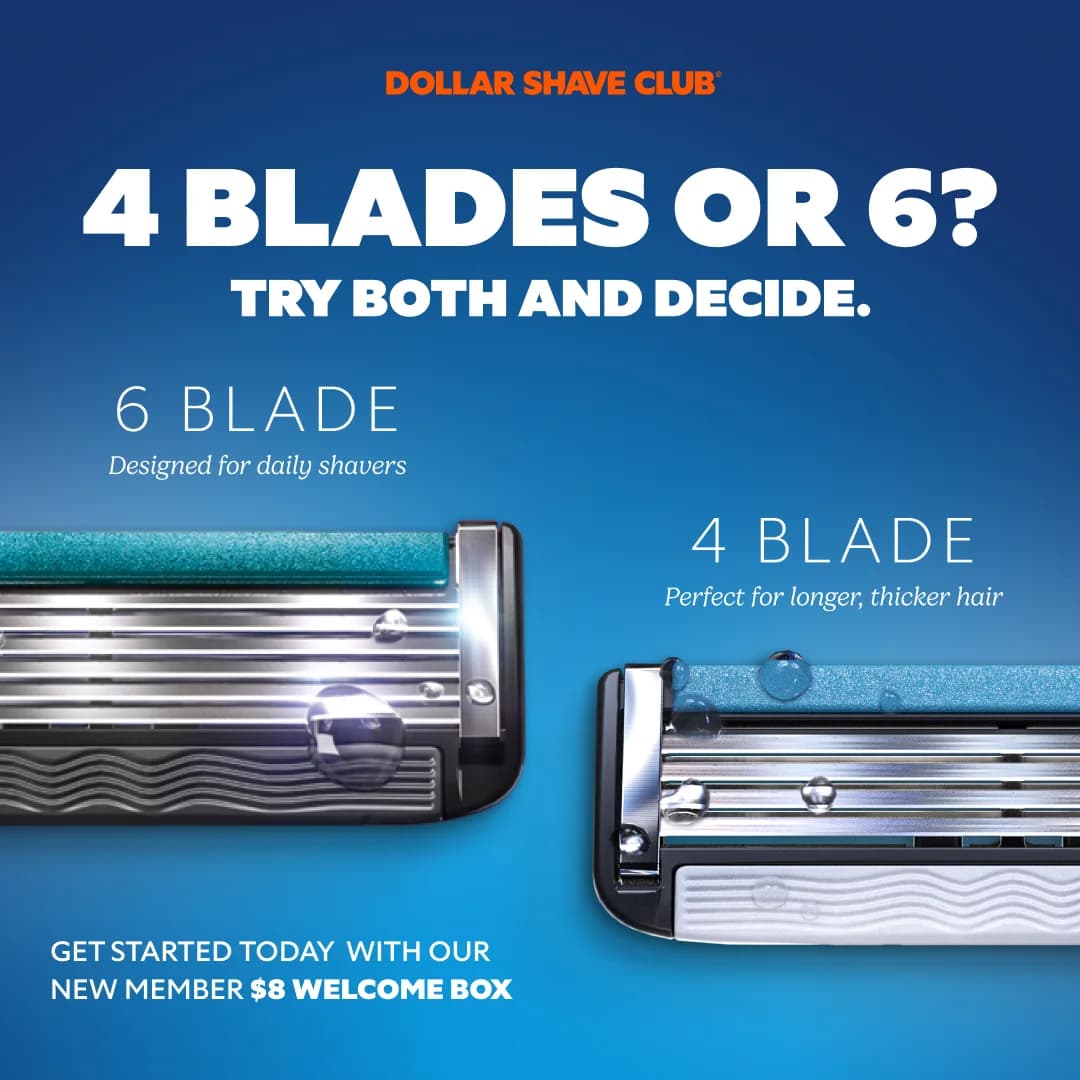
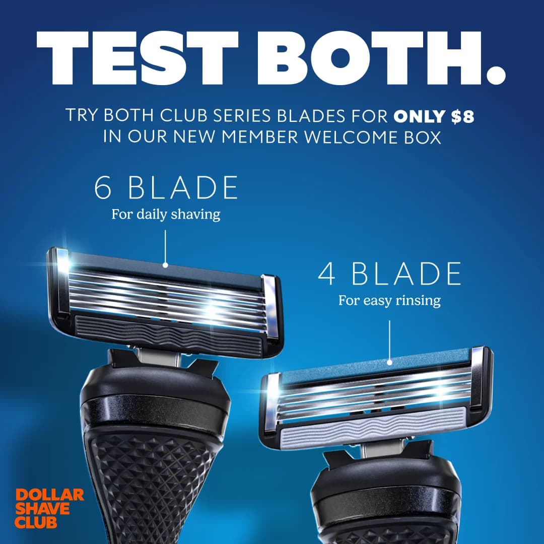
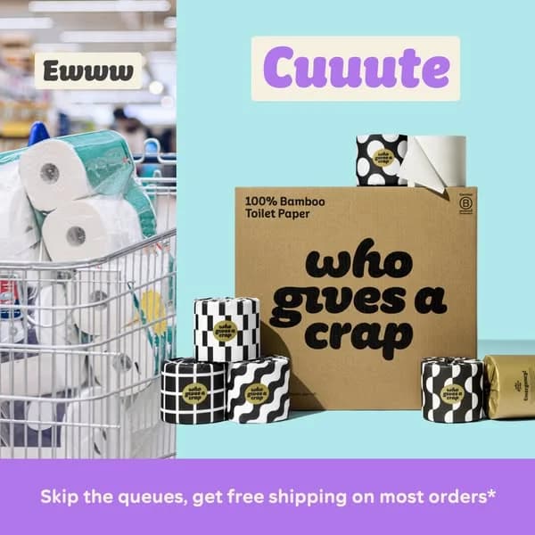
Comparison ads force a decision by making the choice visual. Split-screen layouts with two products in matched lighting, before-after-of-feature stacks, single-frame product shots labeled and color-coded — the mechanic works because viewers process visual contrast before they read a word. Italic runs this against luxury sourcing. Smalls runs it against the dry-kibble status quo. Litter-Robot runs it against the traditional litter box. The brands picking comparison creative are almost always the challenger.
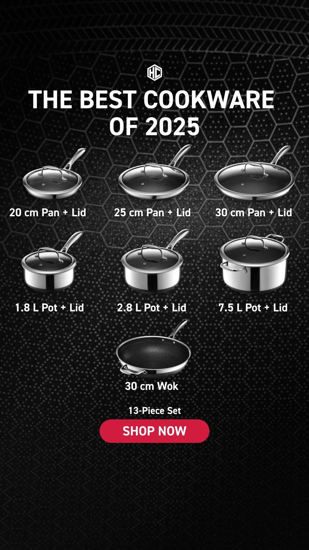
Layout conventions are tight. Vertical split down the middle with both halves shot at the same angle, same focal length, same backdrop — asymmetry kills the comparison instantly. Color coding does the silent work: muted greys or desaturated tints on the losing side; brand color, sharp focus, and saturated lighting on the winning side. Labels stay short and sans-serif. Checkmark-vs-X feature grids work because the grid renders the verdict in under two seconds. Platform mix skews to Meta feeds at 1:1 (cleanest read on a half-and-half split) and LinkedIn Sponsored Content for B2B. Stories and Reels at 9:16 favor top-bottom stacking over horizontal splits.
Ad examples below pull comparison creative from DTC and SaaS brands across food, beauty, home goods, and pets. Pick a layout and clone the split with your product on the winning side.


 Why Clone Ads
What Makes Comparison Ads Convert
Match lighting and angle on both sides
Asymmetry kills the comparison. Warm window light on the winning side and flat studio on the losing side reads as bias before the claim lands. Same lens, same backdrop, same exposure on both halves. Clone references where both sides look like one shoot — the symmetry sells the fairness.
Color-code the verdict, don't rely on labels
Audiences process the visual before the text. Wash the losing side in cool grey or low saturation; put the winning side in brand color and slightly higher exposure. By the time the eye reaches the label, the conclusion has registered. Heavy filters read as manipulative and tank trust.
Place the CTA under the winning side
Centering the button between both halves dilutes the decision. CTA belongs under the side the ad is selling — the upgraded product, the after-state, the brand-color column. A centered button reads as both sides being equal options. Anchor the click to the side the ad just argued for.
Yes in the US and most markets, as long as visual claims are truthful and substantiated. Before-after of a feature in the same product carries no legal exposure. Generic 'old way vs new way' framing stays safe by staying abstract. Direct comparisons labeling a named competitor's product need accurate, sourced claims — FTC guidance allows truthful comparative advertising but punishes misleading implications. When in doubt, label the losing side as 'generic,' 'standard,' or 'before' rather than a brand name.
Comparison creative wins on warm and brand-aware audiences who already recognize the category — retargeting, lookalike-of-customers, and engaged category browsers. Product-focused creative wins on cold prospecting where the viewer has no reference point. Running comparison ads to a fully cold audience burns impressions on viewers who don't know enough to care about the gap. Segment accordingly: product photography for cold, comparison for warm.
Three proven patterns. Vertical split down the middle works for product-vs-product or before-vs-after with matched shoots on both halves. Top-vs-bottom stacking works for 9:16 Stories and Reels where horizontal splits compress. Checkmark-vs-X feature grids work when the comparison is multi-dimensional and the verdict needs to scan in two seconds. Single-axis (price, feature, outcome) maps to splits; multi-axis maps to grids.
On brand-aware and warm retargeting audiences, yes — comparison creative typically converts 15-40% better in most DTC and SaaS verticals because it pre-qualifies the click. The viewer who scrolls past has already decided they don't care; the viewer who clicks has been pre-sold by the visual verdict. On cold prospecting, comparison ads underperform because the comparison confuses viewers who don't recognize either side. Segment audiences before picking the format.
Asymmetric shoots that telegraph bias (warm light on one side, harsh overhead on the other). Heavy filters that make the winning side look manipulated. Labels long enough to require reading rather than scanning. Centered CTAs that dilute which side is being sold. Comparison creative aimed at cold audiences who lack the context to care about the gap. Each weakens the format's core advantage and pulls conversion below product-focused creative on the same spend.
Create Your Own
Comparison Ad
Clone any comparison ad example. Upload your product photo. Seconds later, you have a finished ad ready to launch.
Create your ad