AdDogs

Sale and Promo Ad Examples for Real Campaigns

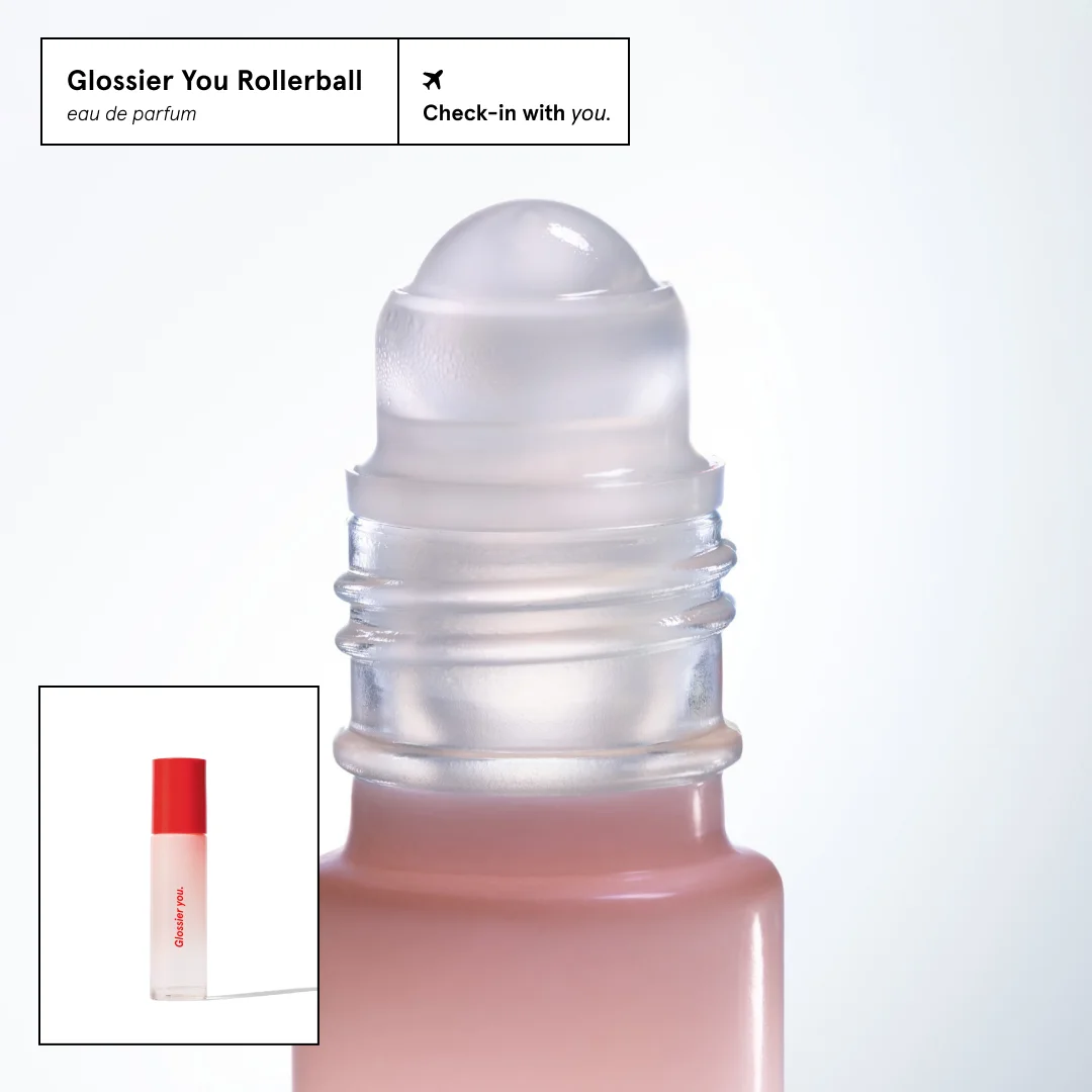
Browse 45+ sale and discount ad examples sourced from high-performing campaigns. Clone any design, swap in your product, and get a finished ad in seconds.

Updated May 2026

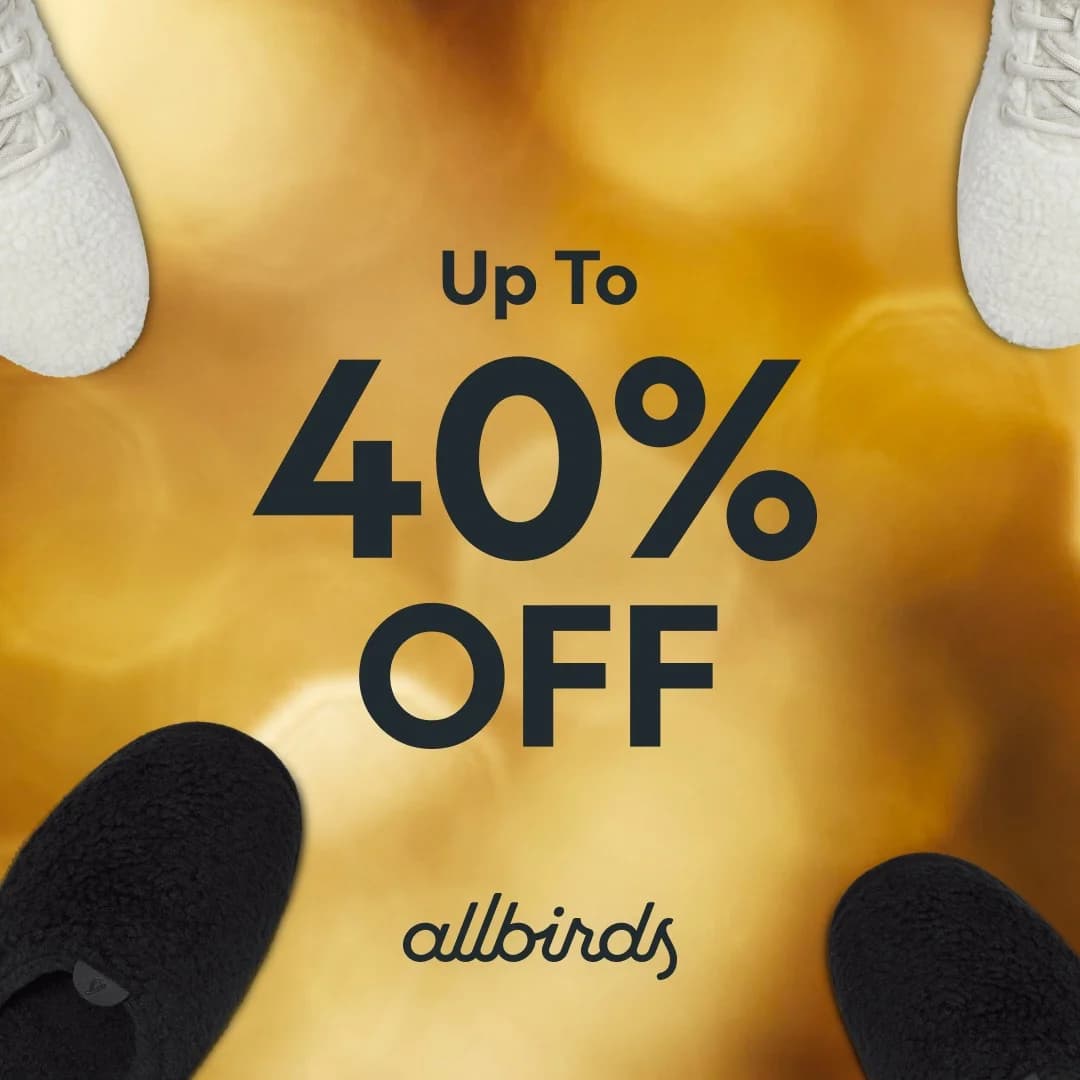
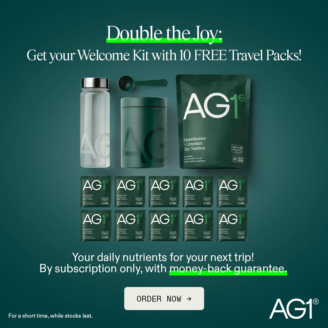
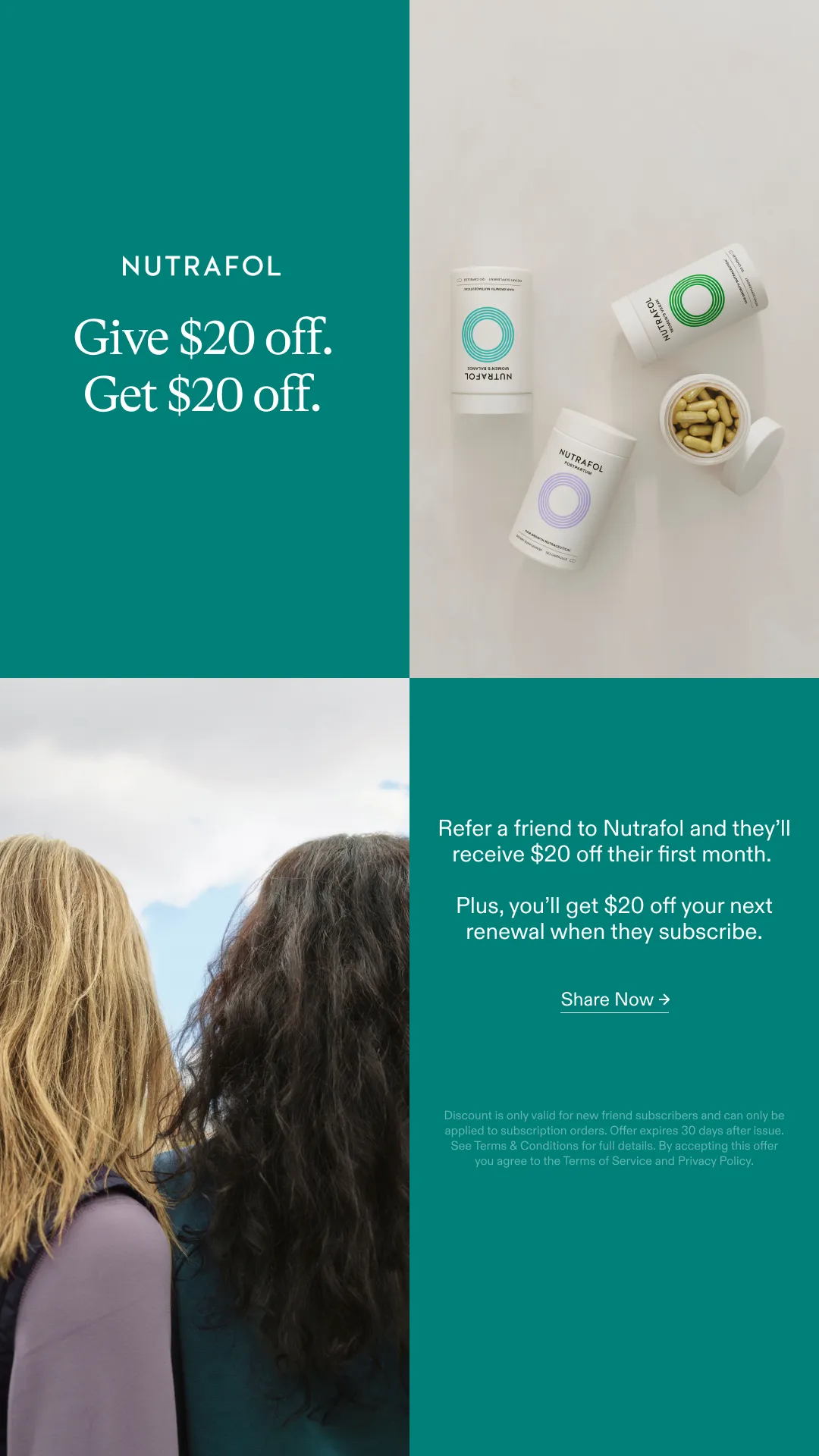
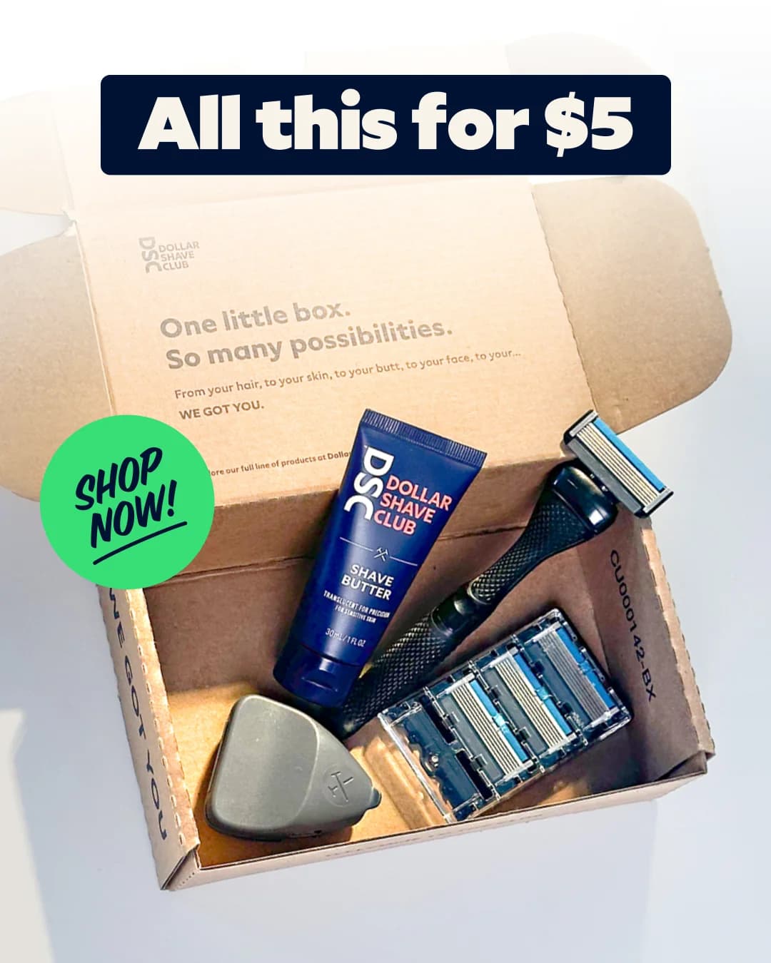
Sale ads have one job — push a decision faster — and every element in the frame either serves urgency or fights it. Brooklinen flash sales, Skims drops, Quip BFCM creative, and Pela Case Earth Day promos all run the same three moves: discount-as-hero scaled bigger than the product, a high-contrast urgency palette (red/yellow/black, navy/orange), and deadline language baked into the composition (ENDS SUNDAY, 48 HOURS LEFT, FLASH SALE).

Composition rules are tight. The percentage off or strikethrough price sits as the largest typographic element, often 2–3x the product size and frequently larger than the brand mark. Even brands with soft palettes flip to red, yellow, or black during sale windows because audiences read those colors as discount at a feed-scroll glance. Platform mix: Meta dominates BFCM and seasonal windows where CPMs spike but promo conversion often doubles, Google Display retargets cart abandoners with offer overlays, TikTok rewards impulse-buy flash sales under 24 hours, LinkedIn is the worst fit because B2B buyers don't convert on urgency.

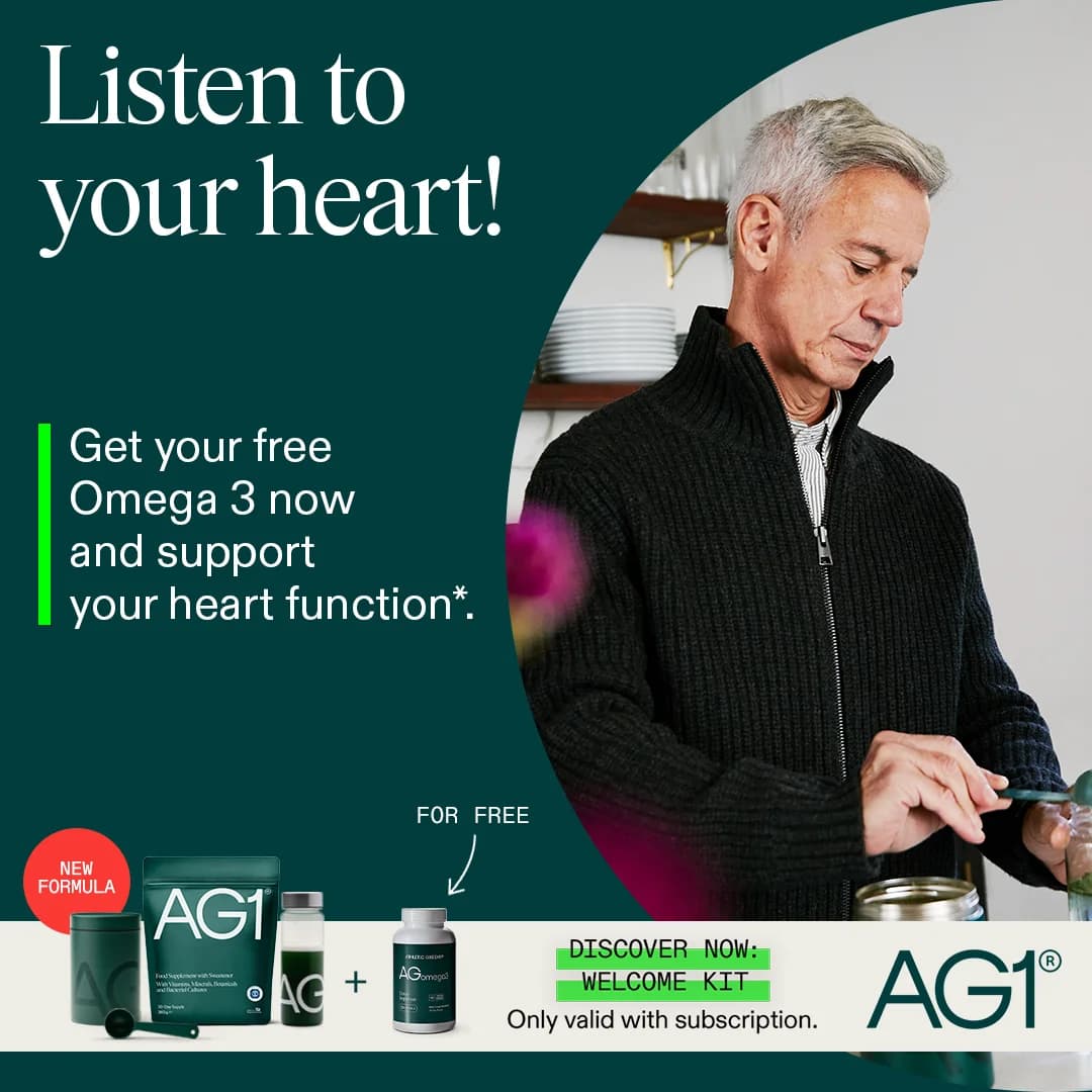
Ad examples below pull sale and promo creative from DTC brands across BFCM, flash sales, member-exclusive drops, and seasonal promotions. Clone a layout, drop your discount and deadline in, and AdDogs rebuilds the urgency hierarchy with your product and colors.
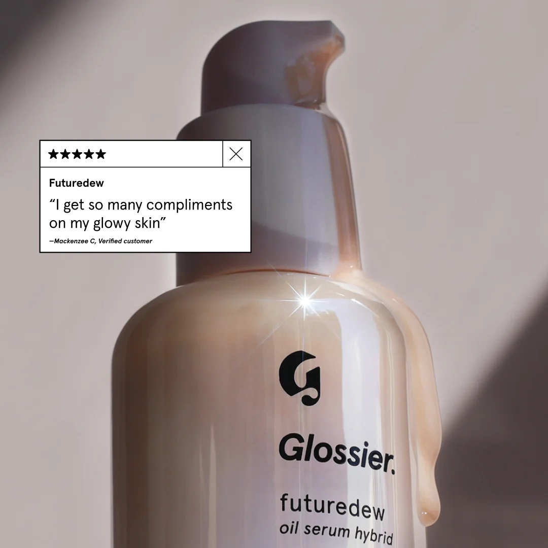
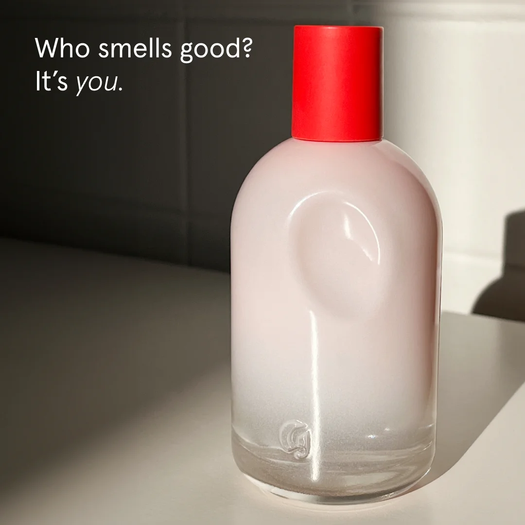
Weight Loss Quiz — Interactive Text Layout. This ad employs a minimalist, text-heavy layout designed to simulate an interactive quiz, immediately engaging the viewer with a direct, relatable question: "Why aren't you losing weight?" The high-contrast black text on a stark white background ensures maximum readability and scroll-stopping power, particularly effective on platforms like Instagram or Facebook where visual clutter is common. The composition uses a clear hierarchy, with the provocative headline at the top, followed by a series of multiple-choice questions that invite self-reflection, and a prominent call-to-action at the bottom. This layout strategy creates a sense of personal relevance, encouraging users to mentally participate before clicking. The simplicity avoids distractions, focusing solely on the user's pain point and offering an immediate solution through the quiz, optimizing for consideration and lead generation.. Headline: Dlaczego nie chudniesz. Primary text: Pora pobudki: 6:00 7:00 8:00 Codzienne posiłki: 1 2 3 4+ Godziny snu: 1 2 3 4 5 6 7 8 Wiek: 18-25 26-35 36-55 56+ Dzienne spożycie wody (szklanki): * * * * * * * * Twoje BMI: 40+ 30+ 25-30 20-25 Harmonogram poszczenia: 13-11 16-8 18-6 20-4. Why this ad works: Direct question creates immediate engagement — The headline "Dlaczego nie chudniesz" (Why aren't you losing weight) directly addresses a common pain point. This immediate, personal challenge prompts self-reflection and curiosity, compelling the viewer to stop scrolling and engage with the ad's content to find an answer. Interactive quiz format drives participation — By presenting a series of questions with selectable answers, the ad mimics an interactive quiz. This gamified approach encourages mental participation, making the user feel invested in finding their "score" or solution, significantly increasing click-through rates to the actual quiz. High contrast ensures optimal readability — The stark black text on a pure white background, with inverse highlighting for selected options, provides exceptional contrast. This design choice maximizes readability across various screen types and lighting conditions, ensuring the message is clear and accessible, which is crucial for text-heavy ads.. Specs: Industry: Health & Wellness, Platform: Instagram, Format: Static, Audience: GeneralChoice Coops — In-Use Lifestyle Shot. Brand: CHOICE COOPS. This ad effectively leverages a lifestyle layout, showcasing a chicken coop in a natural, lush backyard setting. The composition places the product slightly off-center, allowing for dynamic visual flow while still highlighting its features and scale through the presence of live chickens. The earthy color palette, dominated by greens and beige, evokes a sense of organic living and trustworthiness, resonating with an audience seeking sustainable or wholesome home solutions. Large, bold text for "CHOICE COOPS" ensures immediate brand recognition, while the "tradetested" badge subtly builds credibility. Optimized for platforms like Instagram or Facebook, the square format and clear imagery are designed to stop the scroll. The ad's strength lies in demonstrating the product's purpose and integrating it into an aspirational domestic scene, appealing to emotions rather than just features.. Headline: CHOICE COOPS. Why this ad works: Natural setting evokes aspirational lifestyle — The lush green grass and natural foliage position the coop within an ideal backyard environment, appealing to homeowners seeking a wholesome, self-sufficient lifestyle. This visual context makes the product more desirable than a sterile studio shot, connecting emotionally with the target audience. Product shown in active use with animals — Featuring live chickens inside and around the coop immediately demonstrates its functionality and scale. This visual proof of concept reassures potential buyers about the product's suitability for housing poultry, directly addressing a key purchasing consideration and building trust. Prominent brand name with trust badge — The large, clear "CHOICE COOPS" text ensures strong brand recognition. The smaller "tradetested" badge below acts as a powerful third-party endorsement, instantly communicating quality and reliability. This combination builds both awareness and credibility effectively.. Specs: Brand: CHOICE COOPS, Industry: Home & Lifestyle, Platform: Instagram, Format: Static, Audience: GeneralThe Pished Fish — Lifestyle & Product Grid. Brand: The Pished Fish. The ad employs a multi-panel grid layout, combining lifestyle and product shots to build brand trust and showcase variety. The top-left panel features the founder, adding a human, authentic touch, while the top-right highlights product packaging and texture. The bottom-right panel displays a range of products, emphasizing choice and quantity. Earthy tones and natural wood textures create an organic, artisanal vibe, appealing to consumers seeking quality and provenance. The composition balances personal connection with product detail, optimized for social platforms like Instagram where diverse content performs well. Text is minimal, allowing visuals to tell the story, with the playful brand logo acting as a key visual anchor. This approach fosters consideration by presenting both the brand's personality and its offerings effectively.. Why this ad works: Authentic Founder Shot Builds Trust — The top-left image of the founder creates a personal connection, humanizing the brand. This cultivates trust and authenticity, crucial for food products, by showing the face behind the business. It suggests a hands-on approach and passion, resonating with consumers who value artisanal quality. Multi-Panel Layout Showcases Variety — The grid effectively uses multiple panels to display different aspects: the brand story, product detail, and product range. This diverse visual information caters to various viewer interests, keeping engagement high and providing a comprehensive overview of "The Pished Fish" offerings in a single glance. Earthy Tones & Natural Textures Convey Quality — The consistent use of natural wood, kraft paper packaging, and the rich orange of the salmon creates an organic and premium aesthetic. This color palette and texture choice subtly communicates quality, freshness, and a handcrafted feel, aligning with the brand's unique "booze-infused" positioning.. Specs: Brand: The Pished Fish, Industry: Food & Beverage, Platform: Instagram, Format: Carousel/Collage, Audience: GeneralOutrageous Gluten-Free Breads — Variety Display. Brand: Outrageous. This ad employs a straightforward product-on-white layout, showcasing multiple gluten-free bread loaves from "Outrageous." The composition utilizes a grid-like arrangement to highlight product variety, with each item individually wrapped and labeled. Color psychology is minimal, relying on the natural hues of the baked goods against a stark white background, which aims for a clean, honest presentation. While the layout clearly presents the offerings, the lack of dynamic styling or props means it functions more as a catalog image than an engaging ad. Text hierarchy is primarily through the small, circular labels, which are difficult to read, hindering immediate understanding of specific product benefits or flavors. This approach might be optimized for e-commerce listings where users are actively searching, rather than scroll-stopping social feeds. The overall effect is functional but lacks strong visual persuasion for a broad advertising context.. Why this ad works: Clear variety showcase on clean background — The ad effectively displays a range of gluten-free bread products against a simple white background. This direct, uncluttered presentation allows potential customers to quickly grasp the breadth of offerings, which is crucial for brands with diverse product lines. The individual wrapping also signals freshness and portion control. Direct product identification for niche audience — Each product features a distinct label, clearly stating "Gluten-Free" and the specific flavor. This direct identification immediately resonates with the target audience seeking gluten-free options, reducing cognitive load and ensuring the ad speaks directly to their dietary needs and preferences. Functional, no-frills product presentation — The ad's functional aesthetic prioritizes product visibility over elaborate styling. This straightforward approach can build trust by presenting the products without artificial embellishments, appealing to consumers who value transparency and authenticity in their food choices, especially for health-conscious items.. Specs: Brand: Outrageous, Industry: Food & Beverage, Platform: Instagram, Format: Static, Audience: GeneralVAHDAM Ashwagandha Coffee — Handheld Product & Benefit Overlay. Brand: VAHDAM INDIA. This ad employs a direct-response strategy, combining a product-in-hand shot with prominent text overlays to convey urgency and benefits. The layout places the product centrally, held by a hand, creating a relatable, in-use context. Bold, high-contrast typography dominates the upper half, immediately addressing a specific pain point ("MENOPAUSAL WEIGHT GAIN") and offering a solution. Color psychology leverages a vibrant red for the "FLAT 50% OFF" callout, creating a strong focal point and urgency. The overall composition is busy but intentionally so, packing information for a conversion-focused goal. Optimized for platforms like Facebook or Instagram, where clear value propositions and discounts drive clicks. Text hierarchy is clear, with the main headline grabbing attention, followed by product identification and benefit bubbles.. Headline: PRIME DAY SALE GOODBYE, MENOPAUSAL WEIGHT GAIN ASHWAGANDHA COFFEE IS HERE!. Primary text: Supports Weight loss Curb Cravings Supports Hormonal Balance FLAT 50% OFF. Why this ad works: Directly addresses specific pain point — The headline "GOODBYE, MENOPAUSAL WEIGHT GAIN" immediately resonates with a niche audience, creating instant relevance and stopping the scroll. This highly specific targeting ensures the ad speaks directly to those most likely to convert, increasing click-through rates and reducing wasted impressions. High-contrast sale callout creates urgency — The bright red "FLAT 50% OFF" circle is visually dominant, leveraging color psychology to draw immediate attention to the discount. This urgency-driven element is crucial for conversion-focused campaigns, signaling a limited-time opportunity and incentivizing immediate action from interested prospects. Benefit-driven text bubbles for quick value — Strategically placed bubbles like "Supports Weight loss," "Curb Cravings," and "Supports Hormonal Balance" provide quick, digestible value propositions. These reinforce the product's efficacy in solving the target audience's problems, making the ad highly persuasive without requiring extensive reading.. Specs: Brand: VAHDAM INDIA, Industry: Health & Wellness, Platform: Facebook, Format: Static, Audience: Women 45+Factor_ 2-Min Meals — Product Grid & Hero. Brand: FACTOR_. This ad employs a dynamic split-screen layout, combining a hero shot on the left with a product variety grid on the right. The hero image, featuring a hand holding a meal, adds a human touch and scale, while the grid showcases diverse meal options, appealing to varied tastes. Color psychology leverages natural food tones against dark containers, enhancing appetite appeal and product freshness. The composition guides the eye from the prominent "50% OFF" offer to the bold "2-MIN MEALS" headline, establishing immediate value and convenience. Optimized for visual platforms like Instagram, the clean presentation and clear benefit statement cut through feed clutter. Text hierarchy is effective, with the large headline capturing attention and the sub-headline reinforcing the core value proposition.. Headline: 2-MIN MEALS.. Primary text: So you can heat, eat, and go.. Why this ad works: Split-screen layout showcases variety and detail — The ad effectively uses a split-screen, dedicating the left to a detailed, in-hand hero shot, and the right to a grid of three distinct meals. This dual approach simultaneously provides a close-up, relatable view and demonstrates the breadth of meal options, addressing both quality and choice concerns for potential customers. Prominent discount drives immediate conversion intent — The bright yellow "50% OFF YOUR FIRST BOX" callout is strategically placed and visually dominant. This strong incentive immediately grabs attention and communicates significant value, crucial for driving first-time subscriptions. It creates urgency and reduces perceived risk, directly targeting conversion-focused users. Benefit-driven headline targets busy, convenience-seeking audience — The bold "2-MIN MEALS." headline directly addresses a key pain point for the target audience: lack of time. Coupled with the sub-headline "So you can heat, eat, and go.", it clearly articulates the core benefit of speed and convenience, resonating strongly with busy professionals or individuals seeking effortless meal solutions.. Specs: Brand: FACTOR_, Industry: Food & Beverage, Platform: Instagram, Format: Static, Audience: ProfessionalsAura Color Quiz — Vibrant Text Layout. This text-heavy ad leverages a vibrant, multi-color palette to create an engaging personality quiz. The layout is simple and direct, featuring a prominent headline that immediately grabs attention, followed by a clear, color-coded list of 'aura' meanings. This composition is highly optimized for social platforms like Facebook or Pinterest, where interactive content drives shares and comments. The use of distinct colors for each aura type not only aids readability but also psychologically reinforces the unique characteristics, making the content feel personalized. Text hierarchy is well-defined, guiding the viewer from the intriguing question to the interpretive list, culminating in a clear call to action. The overall design aims for maximum engagement through curiosity and self-discovery, rather than direct product promotion.. Headline: Has Vivido Una Vida Llena de Significado, ¡Ahora Mira Qué Color Ha Dejado en Tu Aura!. Primary text: ROJO - Iluminas una habitación. AMARILLO - Haces sonreír a la gente. VERDE - Eres un cuidador natural. AZUL - La gente se siente segura contigo. VIOLETA - Tienes visión de conjunto. ROSA - Diriges con el corazón. ÍNDIGO - Sabes leer a la gente. BLANCO - Irradias calma y claridad. NEGRO - Has pasado por tormentas, pero eres inquebrantable.. Why this ad works: Multi-color text enhances engagement — The ad effectively uses a distinct color for each 'aura' type, enhancing visual appeal and readability. This vibrant segmentation helps differentiate each personality trait, making the content more engaging and memorable. The varied colors also break up the text, preventing visual fatigue and encouraging users to read through the entire list, boosting overall ad dwell time. Quiz format drives high user interaction — The quiz format is a powerful engagement driver, tapping into universal human curiosity about self-identity. By inviting users to discover their 'aura color,' the ad creates an interactive experience that encourages shares and comments. This approach fosters organic reach and builds a community around the content, significantly increasing brand visibility. Bold headline captures immediate attention — The large, bold, and colorful headline immediately captures attention, clearly posing an intriguing question. Its prominent placement at the top ensures it's the first element seen, drawing viewers into the ad's premise. This strong visual hook is crucial for stopping the scroll in a crowded social feed, maximizing initial ad impressions.. Specs: Industry: Media & Entertainment, Platform: Facebook, Format: Static, Audience: GeneralPampers Diapers — Product Lineup with Benefit Headline. Brand: Pampers. This ad effectively uses a vibrant teal background to create a clean, trustworthy aesthetic, aligning with the brand's focus on baby care. The composition features three distinct Pampers product lines arranged on a wooden surface, providing visual variety while showcasing the breadth of offerings. A dominant, high-contrast white text overlay immediately communicates the core benefit: "up to 100% LEAKPROOF PROTECTION." This bold headline, positioned centrally, leverages a clear hierarchy to capture attention quickly, crucial for fast-scrolling social feeds like Facebook or Instagram. The secondary text, "delivered straight to your door," adds a convenience factor, appealing directly to busy parents. The overall design is optimized for mobile, ensuring readability and product recognition, while the bright colors and smiling babies evoke positive emotions associated with parental peace of mind.. Headline: up to 100% LEAKPROOF PROTECTION. Primary text: delivered straight to your door. Why this ad works: Bold Benefit Headline Dominates Visual — The "up to 100% LEAKPROOF PROTECTION" headline is large, white, and centered against a high-contrast teal background. This immediate communication of the primary benefit addresses a key parental concern, stopping the scroll and quickly conveying value before the viewer even processes the individual products. Product Lineup Showcases Variety — Featuring three distinct Pampers product lines (Cruisers, Swaddlers, Pure Protection) allows the brand to appeal to a wider range of parental needs and preferences within a single ad. This broadens the ad's relevance, potentially increasing engagement across different segments of the target audience. Teal Background Evokes Trust and Calm — The prominent use of a clean, bright teal background is psychologically effective. Teal is often associated with freshness, reliability, and tranquility, which are highly desirable attributes for baby care products. This color choice subtly reinforces the brand's promise of protection and peace of mind for parents.. Specs: Brand: Pampers, Industry: Health & Wellness, Platform: Facebook, Format: Static, Audience: ParentsFreshpet Custom Meals — Lifestyle Delivery Shot. Brand: Freshpet Custom Meals. This ad employs a vertical, lifestyle-driven layout, effectively blending brand messaging with a direct offer. The top section features the Freshpet logo and a bold, green headline, establishing freshness and delivery. Below, a human interacts with product boxes, while a charming dog anchors the scene, creating an emotional connection. A prominent circular callout highlights a "50% OFF" offer, strategically placed to capture attention. The color palette of natural greens, browns, and a clean white background reinforces the brand's organic and wholesome image. This composition is optimized for mobile feed platforms like Instagram, where its clear visual hierarchy and relatable imagery can stop the scroll. The design balances brand building with a strong conversion-focused incentive, guiding the viewer from brand recognition to offer absorption.. Headline: MADE FRESH. DELIVERED FRESH.. Primary text: 50% OFF Your First Order. Why this ad works: Lifestyle imagery builds emotional connection — The inclusion of a small, attentive dog and human hands interacting with the product boxes creates a relatable, authentic scene. This lifestyle approach humanizes the brand, fostering an emotional connection with pet owners who envision their own pets enjoying fresh meals. It moves beyond just product display to show the benefit in a real-world context. High-contrast discount offer drives urgency — The "50% OFF Your First Order" is presented in a bold, white-on-green circle, making it highly visible against the muted background. This strong visual contrast ensures the critical offer stands out immediately, signaling a clear value proposition and creating a sense of urgency for potential customers to act on the discount. Green palette reinforces freshness and natural appeal — The dominant use of green in the brand logo, headline, and discount circle immediately communicates freshness, health, and natural ingredients. This color psychology aligns perfectly with a "fresh dog food" brand, subconsciously assuring consumers of the product's quality and wholesome nature, enhancing brand perception and trust.. Specs: Brand: Freshpet Custom Meals, Industry: Pets & Animals, Platform: Instagram, Format: Static, Audience: GeneralDysregulated Nervous System — Symptom Grid Collage. This ad employs a grid collage layout to visually represent common symptoms of a dysregulated nervous system, creating immediate relatability for the target audience. The composition uses a "starter pack" meme format, which is highly engaging and shareable on social platforms. The black and white imagery with minimal color (red highlights, cartoon stomach) keeps the focus on the problem identification. Text hierarchy is clear: a large, bold headline grabs attention, followed by symptom descriptions, and then a clear explanatory paragraph and CTA. This problem-solution narrative is optimized for platforms like Facebook or Instagram, where users scroll quickly and respond to content that mirrors their experiences. The clean, minimalist background prevents visual clutter, ensuring the symptom images and text are easily digestible. The overall strategy is to identify with the audience's pain points before offering a solution.. Headline: DYSREGULATED NERVOUS SYSTEM starter pack. Primary text: Sleeping 8 hours but still tired af Scrolling instead of actually resting Constant tension in your jaw, shoulders or chest Digestive issues... always Feeling guilty when you're not "productive" Overthinking right before bed These aren't random. They're signs your vagus nerve is out of balance. Take the 2-min quiz to find out how to regulate your nervous system naturally.. Why this ad works: Relatable 'starter pack' meme format — The ad leverages the popular "starter pack" meme structure, immediately signaling to the audience that it understands their struggles. This format fosters a sense of community and shared experience, making the ad feel less like a direct sales pitch and more like a relatable piece of content, increasing engagement and click-through rates. Problem-centric visual identification — By showcasing six distinct, common symptoms visually and textually, the ad allows viewers to quickly identify with multiple pain points. This multi-faceted problem presentation ensures a broader appeal and higher likelihood of resonance, effectively pre-qualifying leads who recognize their own experiences within the ad. Clear problem-solution narrative — The ad masterfully transitions from problem identification ("starter pack") to a clear explanation of the underlying cause ("vagus nerve out of balance") and then offers an actionable solution ("Take the 2-min quiz"). This logical flow guides the viewer from recognition to curiosity and ultimately to the desired conversion action.. Specs: Industry: Health & Wellness, Platform: Instagram, Format: Carousel/Collage, Audience: Women 25-34CareFirst & Noom — Empowering Split Screen Offer. Brand: CareFirst | NOOM. This ad employs a split-screen layout, effectively balancing a compelling offer with an aspirational user image. The left side features a clear, benefit-driven headline and a prominent "FREE" value proposition, leveraging a strong financial incentive. The right side showcases a joyful, relatable woman, embodying the positive outcome of the service. The color palette combines a soft, inviting pink with a deep purple accent, creating a vibrant yet trustworthy feel. Text hierarchy is clear, guiding the eye from the brand logos to the main offer, then to the call to action, and finally to the disclaimer. This composition is optimized for social feeds like Facebook or Instagram, where a mix of strong visuals and direct messaging drives engagement and consideration. The overall design communicates empowerment and accessibility, targeting individuals seeking health improvement.. Headline: CareFirst members can qualify to get Noom for FREE!. Primary text: The only thing you have to lose...is weight.. Why this ad works: Clear Value Proposition & Urgency — The "$199 FREE" badge immediately grabs attention, highlighting a significant saving and creating a strong incentive. This direct financial benefit, coupled with the "FREE" offer for members, reduces perceived risk and drives immediate interest, crucial for conversion-focused campaigns. Relatable & Empowering User Image — Featuring a smiling, strong woman who appears to be a "real user" (as per disclaimer) fosters relatability and trust. Her pose conveys achievement and happiness, visually reinforcing the ad's promise of positive transformation, which resonates deeply with the target audience's aspirations. Strategic Color Contrast & Brand Integration — The soft pink background contrasts effectively with the dark text and the vibrant purple accent, ensuring readability and visual appeal. The prominent placement of both CareFirst and Noom logos at the top clearly communicates a trusted partnership, lending credibility to the offer.. Specs: Brand: CareFirst | NOOM, Industry: Health & Wellness, Platform: Instagram, Format: Static, Audience: Women 25-44Celsius Live Fit — Dynamic Splash Product Shot. Brand: Celsius. This ad effectively leverages a dynamic hero shot composition to highlight two Celsius Live Fit flavors. The vibrant gradient background, transitioning from cool teal to warm orange, creates a visually arresting contrast that immediately grabs attention on social feeds. The cans, depicted with water droplets and emerging from a splash, evoke extreme refreshment and energy, aligning perfectly with the brand's "Live Fit" promise. The slight off-center placement and varying heights of the cans add visual interest, guiding the eye across both products. Text hierarchy is clear, with the brand and flavor names prominent, followed by key benefits and "0 SUGAR." This ad is optimized for platforms like Instagram, where its high-energy aesthetic and clear product focus can stop the scroll and communicate the brand's core message of vitality and fitness. The composition skillfully balances product detail with an aspirational, active lifestyle feel.. Why this ad works: Dynamic water splash creates refreshment cues — The realistic water droplets and splash effect on the cans instantly communicate extreme coldness and refreshment. This visual cue is crucial for beverages, triggering a physiological desire for the product and reinforcing its invigorating qualities, especially appealing to active consumers seeking immediate revitalization and a cool, crisp taste. Vibrant gradient background enhances product appeal — The striking teal-to-orange gradient background provides a high-contrast, energetic backdrop. This color choice not only makes the white cans pop but also subtly hints at tropical flavors and an active, vibrant lifestyle, aligning with the "Live Fit" brand identity and attracting attention in a busy feed with its eye-catching palette. Clear benefit hierarchy supports quick comprehension — Key benefits like "ESSENTIAL ENERGY," "ACCELERATES METABOLISM," and "BURNS BODY FAT" are clearly listed and easily readable on the cans. This direct communication of functional advantages, alongside the "0 SUGAR" callout, allows viewers to quickly grasp the product's value proposition, catering efficiently to health-conscious and fitness-oriented audiences.. Specs: Brand: Celsius, Industry: Food & Beverage, Platform: Instagram, Format: Static, Audience: Fitness EnthusiastsNURABEAM Thigh Wrap — Direct Before/After Comparison. Brand: NURABEAM. This ad effectively leverages a direct before-and-after comparison layout to showcase the NURABEAM Thigh Wrap's efficacy. The dark, minimalist background ensures maximum contrast, making the skin texture and the product's red light glow highly visible. Compositionally, the split-screen format immediately highlights the desired transformation, drawing the viewer's eye from the "Before" to the "After" state. The prominent, quantifiable claim "20 MIN = 700 SQUATS" acts as a powerful hook, establishing a clear value proposition. Text hierarchy is well-structured, moving from a benefit-driven headline to specific features and a strong discount offer. This design is optimized for direct-response platforms like Facebook or Instagram, where scroll-stopping visuals and clear, concise benefits drive immediate consideration and conversion. The bold claims and visual evidence aim to overcome skepticism quickly.. Headline: Thigh Wrap for Cellulite & Slimming. Primary text: 20 MIN = 700 SQUATS • Lymphatic Drainage • Targets Stubborn Fat • Remove 1.5 Inches or Full Refund 50% OFF + 2 FREE GIFTS. Why this ad works: Direct Before/After Comparison for Impact — The side-by-side comparison immediately communicates the product's benefit, visually demonstrating the transformation. This technique is highly effective in direct-response advertising, as it bypasses lengthy explanations and directly addresses the pain point, building trust and desire instantly. Quantifiable Benefit Statement Builds Credibility — The bold claim "20 MIN = 700 SQUATS" provides a clear, impressive, and easily digestible metric of efficacy. This type of social proof and benefit statement resonates strongly with audiences seeking quick, tangible results, making the product's value proposition undeniable and memorable. High-Contrast Dark Background Enhances Product — Utilizing a dark background creates stark contrast for both the skin tone and the glowing red light of the NURABEAM device. This not only makes the product stand out but also lends a sophisticated, almost clinical feel, enhancing the perceived premium quality and effectiveness of the technology.. Specs: Brand: NURABEAM, Industry: Health & Wellness, Platform: Facebook, Format: Static, Audience: Women 25-34Beyond Body Glucose Journey — Bold Product Shot. Brand: Beyond Body. This ad employs a high-contrast, text-heavy layout to immediately grab attention on a busy feed. The dark background makes the vibrant pink books and neon-pink headline pop, leveraging color psychology for urgency and excitement. The composition places the product front and center, with a striking "50% DISCOUNT" callout in a playful cupcake graphic, creating a strong visual hierarchy that guides the eye from the problem statement to the solution and then to the incentive. The bold, almost cartoonish typography and imagery suggest an approachable, non-intimidating solution to a complex health topic. Optimized for social platforms like Instagram or Facebook, where direct, benefit-driven headlines and clear discounts drive immediate engagement and conversion. The overall design aims to disrupt the scroll and communicate value quickly.. Headline: MEAL PLANNING DOESN'T WORK MEET GLUCOSE JOURNEY BOOK. Primary text: GRAB YOUR 50% DISCOUNT. Why this ad works: Problem-Solution Headline Grabs Attention — The headline "MEAL PLANNING DOESN'T WORK" immediately addresses a common pain point, creating relatability and stopping the scroll. The strikethrough visually reinforces the rejection of old methods, positioning the "Glucose Journey Book" as the fresh, effective alternative. This direct approach resonates with users seeking new solutions. High-Contrast, Playful Visuals Drive Engagement — The vibrant pinks, greens, and dark background create a high-contrast visual that stands out in a feed. The playful cupcake graphic for the discount, along with the candy-like fruit illustrations on the book covers, makes a potentially serious health topic feel accessible and less intimidating, appealing to a broader audience. Clear Discount Incentive Accelerates Conversion — The prominent "GRAB YOUR 50% DISCOUNT" in a large, eye-catching cupcake graphic acts as a powerful call to action. Placing the discount so visibly reduces friction and provides a strong monetary incentive, encouraging immediate clicks and driving conversion for users already interested in health and wellness solutions.. Specs: Brand: Beyond Body, Industry: Health & Wellness, Platform: Instagram, Format: Static, Audience: Women 25-34Polar Bears on Ice — Serene Wildlife Scene. This image, while a natural scene, functions effectively as an ad by leveraging strong emotional appeal and a minimalist composition. The two polar bears, particularly the cub, create an immediate connection, tapping into themes of family and vulnerability. The expansive blue and white palette offers a clean, calming aesthetic, ideal for platforms like Instagram or Pinterest where visual serenity drives engagement. The composition places the subjects centrally, drawing the eye without distraction, leaving ample negative space for potential text overlays. This allows for flexible messaging, from environmental awareness to promoting products associated with nature or conservation. The lack of explicit branding or text makes it versatile for various campaign goals, primarily awareness or emotional connection.. Why this ad works: Emotional Connection through Wildlife Imagery — The presence of the mother and cub polar bears immediately evokes feelings of tenderness and concern. This emotional resonance is a powerful advertising tool, fostering empathy and making the audience more receptive to messages related to conservation or family-oriented brands. It creates an instant, relatable narrative. Striking Natural Beauty and Color Palette — The stark contrast between the brilliant white ice and the deep blue water creates a visually captivating scene. This cool, clean color scheme is inherently appealing, making the ad a scroll-stopper on visually-driven platforms and conveying a sense of purity and vastness, ideal for environmental messaging. Clear, Uncluttered Composition for Focus — The subjects are prominently featured against a simple, natural backdrop, ensuring immediate focus. This uncluttered layout prevents visual fatigue and allows the viewer to absorb the image's core message quickly, making it highly effective for rapid consumption in social media feeds where clarity is paramount for engagement.. Specs: Industry: Fashion & Apparel, Platform: Instagram, Format: Static, Audience: GeneralLearn Stock Trading — Split Screen Text & Image. This ad employs a clear split-screen layout, dedicating the top half to bold, high-contrast text and the bottom to a relevant, aspirational visual. The layout strategy immediately communicates the core offering ("Learn Stock Trading") with strong text hierarchy, using a large, serif font for authority. The social proof "180,000 students" is strategically placed below, adding credibility without clutter. Color psychology is minimal, leveraging stark black on white for clarity and professionalism, while the bottom image uses cool blues and greens with warm highlights to evoke a dynamic, tech-driven financial environment. Compositionally, the top half is text-heavy and direct, while the bottom provides context and aspiration. This design is optimized for platforms like Facebook or Instagram, where clear messaging and a visually engaging, yet professional, image can stop the scroll. The high text overlay ensures the primary message is instantly conveyed.. Headline: Learn Stock Trading. Primary text: 180,000 students. Why this ad works: Clear Split-Screen Layout for Dual Focus — The distinct division between text and image allows for immediate comprehension of the offer and visual context. This prevents cognitive overload, ensuring the headline is read first, followed by the aspirational imagery, making the ad highly efficient in conveying its message. Strong Social Proof Enhances Credibility — The inclusion of "180,000 students" with an icon provides powerful social proof. This statistic builds trust and reduces perceived risk, signaling that many others have found value in the offering, which is crucial for educational products. High Contrast Text Ensures Readability — The use of bold, black serif text on a pure white background creates maximum contrast. This ensures the headline "Learn Stock Trading" is highly readable and impactful, even on smaller mobile screens, effectively capturing attention in a busy feed.. Specs: Industry: Education, Platform: Facebook, Format: Static, Audience: ProfessionalsGold Jewelry Collection — Lifestyle Portrait. This ad leverages a warm, intimate portrait to connect with the audience. The model's direct gaze creates immediate engagement, fostering a sense of authenticity and relatability crucial for social platforms like Instagram. Natural lighting from the left highlights the subtle gleam of the gold jewelry, enhancing its perceived quality and luxury without being overtly flashy. The composition places the model slightly off-center, adhering to the rule of thirds, which is visually pleasing and dynamic. The soft focus background ensures the viewer's attention remains on the model and the products she's wearing. This approach is optimized for feed scrolling, where a genuine human connection can stop users. The minimal text overlay (none visible) keeps the focus purely visual, allowing the product's aesthetic appeal and the model's aspirational yet approachable look to drive consideration. The overall clean aesthetic positions the brand as modern and sophisticated.. Why this ad works: Direct gaze builds instant connection — The model's direct eye contact creates an immediate, personal connection with the viewer. This technique is highly effective on social media, making the ad feel less like an interruption and more like a genuine interaction, increasing scroll-stopping power and fostering trust in the brand. Natural lighting enhances product allure — The soft, natural light illuminates the gold jewelry, showcasing its subtle shine and texture without harsh reflections. This authentic lighting choice makes the products appear more desirable and high-quality, aligning with a premium yet approachable brand image, which resonates well with discerning online shoppers. Lifestyle context promotes relatable aspiration — Presenting the jewelry on a real person in a natural, everyday setting makes the products feel attainable and integrated into a desirable lifestyle. This subtle product placement avoids overt salesiness, allowing the audience to envision themselves wearing the pieces, driving aspirational appeal and consideration more effectively.. Specs: Industry: Fashion & Apparel, Platform: Instagram, Format: Static, Audience: Women 25-34Kids' Apparel — Playful Lifestyle Collage. This ad uses a dynamic collage layout, with a dominant left panel featuring a child in a green shirt and a flower garland, complemented by two smaller lifestyle shots on the right. The warm, earthy color palette of terracotta, muted greens, and soft pastels creates an inviting, organic aesthetic that resonates with natural parenting and comfortable children's wear. Compositionally, the children are captured in natural, playful poses, conveying a sense of freedom and joy. This visual-first approach, devoid of overt text, is highly optimized for platforms like Instagram or Pinterest, where high-quality, aspirational lifestyle imagery drives engagement and consideration. The varied backgrounds and models subtly highlight the versatility and appeal of the clothing line, encouraging exploration of the brand's offerings. The overall vibe is clean, organic, and playful, effectively targeting parents seeking stylish yet comfortable options for their kids.. Why this ad works: Dynamic collage showcases product diversity — The multi-panel layout effectively presents several distinct outfits and models within a single ad unit. This maximizes product exposure and demonstrates the breadth of the collection, appealing to parents looking for varied styles for their children. It prevents visual fatigue by offering multiple points of interest. Earthy color palette evokes natural comfort — The use of warm terracotta, muted greens, and soft pastels creates an inviting and organic feel. This color psychology aligns perfectly with the target audience's desire for natural fibers and comfortable, breathable clothing for children, subtly communicating quality and a gentle aesthetic. Authentic child models create aspirational lifestyle — The children are posed naturally, smiling and engaging with their surroundings, rather than stiffly modeling. This authentic portrayal fosters an aspirational lifestyle image for parents, suggesting that their children will experience similar joy and comfort while wearing these clothes, driving emotional connection.. Specs: Industry: Fashion & Apparel, Platform: Instagram, Format: Carousel/Collage, Audience: ParentsAllbirds 30% Off — Minimal Text-Heavy Sale. Brand: allbirds. This ad employs a minimalist, text-heavy layout to communicate a clear discount message. The large, centrally placed "30% OFF" immediately captures attention, utilizing a strong visual hierarchy that prioritizes the offer. The brand logo is subtly positioned at the top, while the specific product sale is noted at the bottom, guiding the eye from brand to offer to detail. The muted, earthy color palette of cream, warm orange, and coral aligns perfectly with Allbirds' eco-conscious brand identity, conveying naturalness and approachability without being overtly flashy. This composition is highly optimized for fast-scrolling social feeds like Instagram, where quick comprehension is crucial. The generous negative space ensures the core message is unobstructed, driving direct response by prioritizing the discount over complex visuals, making it an effective scroll-stopper for conversion-focused campaigns.. Headline: 30% OFF. Primary text: TREE RUNNER SALE. Why this ad works: Bold numerical discount creates instant impact — The large "30% OFF" immediately grabs attention, communicating the value proposition without needing a product image. This directness is highly effective for conversion-focused campaigns, cutting through the visual clutter of social media feeds and ensuring the core message is absorbed instantly by the viewer. Brand-aligned earthy color palette reinforces identity — The muted cream background with warm orange and coral text perfectly aligns with Allbirds' natural, sustainable brand image. This subtle color psychology builds trust and reinforces brand values, even in a direct-response ad, creating a cohesive brand experience that resonates with their target audience. Minimalist design ensures clear, singular message — The ad's stark simplicity, with ample negative space surrounding the core message, prevents any visual clutter. This design choice ensures that the "30% OFF" message is the sole and undeniable focus, maximizing comprehension and recall for users quickly scrolling through their busy social media feeds.. Specs: Brand: allbirds, Industry: Fashion & Apparel, Platform: Instagram, Format: Static, Audience: ProfessionalsCÎROC Vodka & Drizly — Split Screen Product. Brand: CÎROC. This ad effectively uses a split-screen layout to balance product focus with a clear call to action and partner integration. The left panel showcases the CÎROC vodka bottle and a refreshing cocktail on icy blocks, leveraging a cool blue palette to evoke crispness and premium quality. The composition guides the eye from the product to the right panel, which features a bold headline "BLUE DOT NIGHTS. DELIVERED." and a prominent "SHOP NOW" CTA. The consistent blue gradient across both sections maintains visual harmony. This design is optimized for platforms like Instagram or Facebook, where a clean, high-contrast aesthetic with minimal, impactful text can quickly capture attention and convey the brand's sophisticated yet accessible offering. The partnership with Drizly is clearly highlighted, streamlining the path to purchase. The text hierarchy ensures brand, message, and action are easily digestible.. Primary text: BLUE DOT NIGHTS. DELIVERED.. Why this ad works: Split-screen layout balances product and message — The clear division effectively separates the aspirational product imagery from the direct-response messaging. This allows viewers to first appreciate the premium CÎROC product and then immediately understand the associated lifestyle and convenient delivery, reducing cognitive load and improving message retention. Cool blue palette evokes freshness and premium — The dominant use of various shades of blue, combined with ice elements, creates a strong visual association with coolness, refreshment, and luxury. This color psychology aligns perfectly with a vodka brand, enhancing the perceived quality and desirability of the product, especially for a "Snap Frost" variant. Prominent Drizly partnership simplifies purchase — Integrating the Drizly logo and the "DELIVERED" message directly into the ad copy clearly communicates the ease of acquisition. This direct-to-consumer delivery partnership reduces friction in the conversion funnel, making it incredibly convenient for the target audience to act on their impulse to purchase.. Specs: Brand: CÎROC, Industry: Food & Beverage, Platform: Instagram, Format: Static, Audience: Women 25-34Rustic Chef Knife — Dark Hero Shot. This ad leverages a dark, dramatic aesthetic to highlight a chef's knife. The product is positioned diagonally, creating a dynamic composition that draws the eye from the sharp blade to the perfectly sliced kiwi, visually demonstrating its efficacy. The dark background and wooden surface provide a rugged, authentic feel, contrasting with the vibrant green of the fruit to emphasize sharpness. Text hierarchy is clear: a bold, benefit-driven headline at the top captures attention, while a strong, discount-led CTA at the bottom drives immediate action. Optimized for social feeds, the high contrast and clear value proposition aim to stop the scroll and convert. The layout effectively uses implied action to convey product quality.. Headline: SHARPER THAN YOU'D EVER EXPECT.. Why this ad works: Visual proof immediately demonstrates sharpness — The perfectly sliced kiwi halves immediately demonstrate the knife's key feature without needing lengthy explanation. This visual evidence is highly persuasive, building trust and desire by showing, not just telling, the product's superior performance. It creates an instant, tangible benefit for the viewer, making the ad highly effective. High contrast and dark aesthetic grabs attention — The dark background and rustic wooden surface create a dramatic, premium feel, making the bright knife blade and vibrant green kiwi pop. This strong contrast ensures the ad stands out in a busy feed, drawing attention directly to the product and its impressive cutting ability, enhancing scroll-stopping power on social platforms. Urgency-driven call to action boosts conversion — The "BUY NOW - 70% OFF" text at the bottom creates immediate urgency and a strong incentive. Combining a direct call to action with a significant discount leverages scarcity and value, compelling potential customers to act quickly before the perceived deal expires, driving higher click-through and conversion rates.. Specs: Industry: Home & Lifestyle, Platform: Instagram, Format: Static, Audience: GeneralVoice Test — Engaging Grid Layout. This ad employs a dark, high-contrast grid layout to immediately capture attention. The central headline, "HOW SEXY IS YOUR VOICE?", leverages curiosity, directly addressing the viewer. Six distinct, visually rich spheres represent different voice characteristics, each with a percentage, creating an interactive, quiz-like feel. The composition guides the eye from the intriguing question, through the diverse options, to a clear, prominent "TAKE TEST" call to action. The vibrant, varied colors of the spheres pop against the minimalist dark background, ensuring high visibility and scroll-stopping power on social platforms like Facebook. Text hierarchy is clear, with the headline dominating, followed by smaller, legible labels and a bold CTA, optimizing for quick comprehension and engagement. This design effectively primes users for interaction, making it ideal for awareness and lead generation campaigns.. Headline: HOW SEXY IS YOUR VOICE?. Why this ad works: Intriguing headline sparks curiosity — The direct question "HOW SEXY IS YOUR VOICE?" immediately piques personal interest and self-reflection. This psychological trigger is highly effective on social feeds, compelling users to stop scrolling and engage with the content to satisfy their curiosity about a personal attribute. Diverse sphere visuals represent voice types — Each of the six spheres features a unique texture and color, visually differentiating the voice characteristics. This creative abstract representation makes the options more engaging and memorable than plain text, enhancing the ad's overall appeal and making the concept more tangible for the viewer. Prominent CTA drives immediate interaction — The "TAKE TEST" button is strategically placed at the bottom, large, and in high contrast against the dark background. This clear, singular call to action reduces decision fatigue and provides an obvious next step, guiding users directly towards the desired engagement or conversion point.. Specs: Industry: Health & Wellness, Platform: Facebook, Format: Static, Audience: GeneralAG1 Heart Health — Split Screen Offer. Brand: AG1. This ad employs a split-screen layout, effectively balancing aspirational lifestyle imagery with clear product information and a compelling offer. The dominant dark green background evokes natural health and trust, while vibrant green accents highlight key benefits and the call to action, creating a strong visual hierarchy. The composition places the target demographic (older man) prominently on the right, fostering relatability, while product shots are clearly displayed on the left. Text hierarchy is well-defined, with a large, emotional headline leading to a specific offer. This design is optimized for platforms like Facebook or Instagram, where a clear value proposition and relatable imagery can drive consideration. The curved division adds a touch of organic softness to an otherwise direct-response layout, appealing to a health-conscious audience. The "NEW FORMULA" badge adds urgency and novelty.. Headline: Listen to your heart!. Primary text: Get your free Omega 3 now and support your heart function*.. Why this ad works: Split-screen balances lifestyle and offer — The ad effectively uses a curved split-screen to combine a relatable lifestyle image of a healthy older man with a direct-response offer and product display. This dual approach addresses both emotional aspiration and practical value, appealing to a broad segment of the health-conscious audience. Strategic color contrast highlights value — The deep green background provides a strong, trustworthy base, while the bright neon green used for the offer text and CTA creates high contrast. This strategic use of color immediately draws the eye to the core value proposition, ensuring the "free Omega 3" message is unmissable and drives engagement. Relatable demographic builds trust — Featuring an older, healthy-looking man in a natural setting directly targets the demographic concerned with heart health and long-term wellness. This authentic representation builds immediate trust and relatability, making the product feel more relevant and credible to potential customers in a similar age group.. Specs: Brand: AG1, Industry: Health & Wellness, Platform: Facebook, Format: Static, Audience: Men 45+Plus Size Compression Socks — Split Screen Sale. The ad employs a split-screen layout, contrasting a lifestyle image of legs wearing compression socks with a prominent sale offer. The composition uses a large circular cutout for the product-in-use shot, drawing the eye to the floral-patterned socks. A vibrant, pastel background provides a soft, approachable feel, while the bold, red pricing immediately grabs attention, signaling urgency and value. Text hierarchy prioritizes "PLUS SIZE" for audience targeting, followed by the "Flash Sale" and the overwhelming "$6.99 ONLY" price point. This design is optimized for platforms like Facebook or Instagram, where clear value propositions and relatable imagery drive impulse purchases, cutting through feed clutter with a direct, conversion-focused message. The high text overlay ensures the core offer is unmistakable.. Headline: PLUS SIZE. Primary text: Flash Sale, Big Savings. Why this ad works: Direct price callout drives urgency — The oversized "$6.99 ONLY" in bold red within a contrasting circle immediately communicates an irresistible deal. This aggressive pricing strategy is highly effective for impulse buys on social feeds, creating a sense of urgency and perceived value that compels immediate action from price-sensitive consumers. Inclusive imagery broadens appeal — Featuring a "PLUS SIZE" model wearing the compression socks directly addresses and validates a specific target demographic. This inclusive representation builds trust and relatability, assuring potential customers that the product is designed for and suitable for their needs, thereby reducing purchase friction and increasing conversion rates. Clear product benefit stated — The inclusion of "20-30mmHg Compression" within the price bubble clearly communicates a key functional benefit. This detail, while small, adds credibility and informs the target audience about the product's therapeutic value, appealing to those actively seeking specific compression levels for health or comfort.. Specs: Industry: Health & Wellness, Platform: Facebook, Format: Static, Audience: Women 25-44Manscaped Performance Package — Product Lineup. Brand: MANSCAPED. This ad employs a bold, dark aesthetic to showcase Manscaped's "The Performance Package 5.0 Ultra." The product lineup is centrally arranged on a reflective surface, creating a sense of depth against a dynamic, glowing background. The dark color palette with metallic and gold accents signals premium quality and a masculine, tech-forward brand identity. Text hierarchy is clear: a large, impactful headline immediately grabs attention, followed by a concise sub-headline defining the kit. The "PLUS 2 Free Gifts" callout acts as a strong value proposition. This composition is optimized for platforms like Facebook or Instagram, where its high contrast and clear offer can effectively stop the scroll and drive consideration among its target male audience. The overall design emphasizes product innovation and value.. Headline: THE PERFORMANCE PACKAGE 5.0 ULTRA. Primary text: All-in-One Men's Grooming Kit. Why this ad works: Dark, dynamic background enhances premium feel — The deep, dark background with subtle, warm light streaks creates a sophisticated, high-tech ambiance. This effectively elevates the perceived value of the grooming kit, positioning it as a premium, aspirational product rather than a basic necessity. It resonates with a male audience seeking quality and performance. Clear product lineup and value proposition — The ad clearly displays all four products in the kit, immediately showing the comprehensive nature of the "All-in-One" package. The prominent "PLUS 2 Free Gifts" callout adds significant perceived value and urgency, acting as a strong incentive for potential customers to explore the offer further and convert. Strong brand presence and product focus — The Manscaped logo is strategically placed at the bottom, reinforcing brand identity. Each product also features the brand name, ensuring consistent recognition. The central arrangement of products, combined with focused lighting, ensures they are the undeniable heroes of the visual, driving product desire and recognition.. Specs: Brand: MANSCAPED, Industry: Health & Wellness, Platform: Facebook, Format: Static, Audience: Men 25-34AG1 Welcome Kit — Product & Bonus Grid. Brand: AG1. This ad effectively leverages a clean, high-contrast layout on a deep teal background to highlight a compelling offer. The main product kit is centrally positioned, drawing immediate attention, while a clear grid of bonus travel packs below visually reinforces the value proposition. The color palette, dominated by deep greens and white, evokes trust, nature, and health, aligning perfectly with a wellness brand. Text hierarchy is well-defined, with a bold headline announcing the offer, followed by descriptive sub-text and a clear call to action. This composition is optimized for platforms like Instagram or Facebook, where visual clarity and a strong value message are crucial for stopping the scroll and driving conversion. The overall design communicates premium quality and a straightforward benefit.. Headline: Double the Joy: Get your Welcome Kit with 10 FREE Travel Packs!. Primary text: Your daily nutrients for your next trip! By subscription only, with money-back guarantee. For a short time, while stocks last.. Why this ad works: Clear Value Proposition with Visual Reinforcement — The ad immediately presents a "Double the Joy" offer, visually backed by 10 free travel packs arranged in a clear grid. This direct, quantifiable bonus reduces perceived risk and friction, making the subscription more appealing to potential customers looking for immediate value and convenience, especially for travel. Brand-Aligned Color Palette for Trust — The deep teal background combined with white and light green text and product elements creates a sophisticated, trustworthy, and health-conscious aesthetic. This color choice aligns perfectly with a wellness supplement, subtly communicating natural ingredients and efficacy, which is crucial for building consumer confidence in health products. Strategic Product Arrangement for Clarity — The main Welcome Kit items are prominently displayed at the top, followed by a neat, repetitive grid of the bonus travel packs. This arrangement ensures visual clarity, allowing the viewer to quickly grasp the full contents of the offer without feeling overwhelmed, enhancing the perceived value and ease of understanding.. Specs: Brand: AG1, Industry: Health & Wellness, Platform: Instagram, Format: Static, Audience: GeneralBIOTEX Winter Sale — Bold Discount Layout. Brand: BIOTEX. The ad leverages a high-contrast, dark background with vibrant neon pink and teal accents to command attention on busy social feeds. The central placement of the BIOTEX logo within a bold pink brushstroke immediately establishes brand presence. The large, prominent "30%" discount, highlighted in white with a pink outline, creates a clear value proposition, driving conversion intent. Text hierarchy prioritizes the discount, followed by the brand, with "WINTER" providing context. The overall composition, while energetic, uses diagonal lines and a textured background to add dynamism, suitable for platforms like Facebook where bold, direct messaging can cut through noise. The color psychology of dark and neon suggests modernity, urgency, and excitement, appealing to an audience looking for deals. The visual chaos, paradoxically, creates a unique, memorable aesthetic that stands out from more minimalist competitors.. Headline: WINTER 30%. Why this ad works: High-contrast neon palette grabs attention — The stark contrast between the dark, textured background and the electric pink and white text immediately captures viewer attention. This vibrant color scheme is highly effective on social media feeds, cutting through visual clutter and ensuring the ad is noticed amidst more subdued content, making it a powerful scroll-stopper. Prominent discount drives immediate interest — The large, centrally placed "30%" with its bold outline is the undeniable focal point. This clear, unmissable discount percentage acts as a powerful incentive, directly communicating value and urgency. This direct approach is crucial for driving clicks and conversions in a sale-focused campaign, appealing to deal-seeking consumers. Dynamic background elements create visual energy — The diagonal teal lines and the expressive pink brushstroke behind the logo add a sense of movement and modernity to the composition. This energetic design prevents the ad from feeling static, reinforcing a bold and innovative brand image, which aligns well with the "UNDERWEAR INNOVATOR" tagline and captures a youthful, active audience.. Specs: Brand: BIOTEX, Industry: Fashion & Apparel, Platform: Facebook, Format: Static, Audience: GeneralDermalogica Daily Microfoliant — Discount Offer Layout. Brand: Dermalogica. The ad features Dermalogica's Daily Microfoliant products arranged diagonally on a soft lavender background. This composition creates a dynamic yet clean aesthetic, guiding the eye across the products. The brand's professional-grade positioning is reinforced by the minimalist color palette of white, grey, and lavender, signaling clinical efficacy without being sterile. A prominent circular overlay highlights a discount offer, strategically placed to capture attention after the product. Text hierarchy is clear: a large headline announces the offer, followed by the discount details within the circle. This layout is optimized for platforms like Instagram, where visually appealing product shots combined with clear, concise promotional messaging drive engagement and conversions. The generous negative space around the products ensures readability and a premium feel, making the offer stand out effectively.. Headline: EXCLUSIVE FIRST ORDER OFFER. Primary text: spend $50+ 10% off use code SKINCARE10. Why this ad works: Diagonal product arrangement creates visual flow — The products are intentionally angled, leading the viewer's eye from the top-left to the bottom-right. This dynamic composition prevents the ad from feeling static and adds visual interest, subtly guiding attention towards the central product and then the offer. Clear discount bubble drives immediate action — The circular overlay with "10% off" and the "SKINCARE10" code is highly visible and contrasts effectively with the background. This direct, actionable callout immediately communicates value, crucial for driving conversions in a competitive ad environment. Professional color palette reinforces brand trust — The use of white, grey, and a muted lavender background aligns with Dermalogica's professional-grade image. This clean, sophisticated palette avoids overly bright or playful tones, instilling a sense of trust and efficacy in the target audience for premium skincare.. Specs: Brand: Dermalogica, Industry: Health & Wellness, Platform: Instagram, Format: Static, Audience: Women 25-34PopSockets Phone Grip — Lifestyle In-Use Shot. Brand: PopSockets. This ad employs a vibrant lifestyle composition, showcasing a PopSocket on a smartphone in active use. The slightly low-angle perspective and rule-of-thirds framing draw the eye to the product, held by a stylish woman. The bright, youthful color palette—a lime green top, lavender phone, and white PopSocket—evokes energy and modernity, resonating with a trend-conscious audience. The composition effectively highlights the ergonomic benefit of the PopSocket without explicit text, relying on visual storytelling. Optimized for visual-first platforms like Instagram, its clean aesthetic and aspirational tone are designed to stop the scroll. The ad's strength lies in demonstrating seamless product integration into daily life, fostering consideration through relatable, authentic imagery rather than direct sales messaging. This approach builds brand affinity and subtly communicates utility.. Why this ad works: Authentic lifestyle context showcases utility — The ad places the PopSocket within a natural, everyday scenario, demonstrating its practical use and seamless integration into a stylish individual's life. This authentic context helps potential customers visualize themselves using the product, making the benefit feel tangible and relatable, driving consideration. Vibrant color palette attracts attention — The bright yellow top and lavender phone case create a visually striking and youthful color combination that immediately captures attention in a busy feed. This energetic palette aligns with a target audience seeking trendy and expressive accessories, enhancing scroll-stopping power and brand recall. Product-in-action highlights ergonomic benefit — By showing the PopSocket actively held, the ad subtly communicates its ergonomic advantage for secure phone handling. The viewer can infer improved grip and comfort, addressing a common pain point for smartphone users. This visual demonstration is more impactful than descriptive text alone.. Specs: Brand: PopSockets, Industry: Home & Lifestyle, Platform: Instagram, Format: Static, Audience: Women 18-24End of Season Sale — Bold Text Overlay. This ad employs a centralized, text-heavy layout with a strong visual hierarchy to immediately convey a promotional message. The dark grey background with a subtle leaf pattern provides a sophisticated base, while the high-contrast yellow "SALE" text instantly grabs attention, leveraging color psychology for urgency and visibility. The composition frames the core message within a rounded white border, adding a touch of premium feel and making it stand out in a busy feed. Optimized for platforms like Instagram or Facebook, its directness and bold typography ensure scroll-stopping power. The text hierarchy clearly guides the eye from the context ("End of Season") to the offer ("SALE") and finally to the implied call to action ("NOW ON!"), making the message highly digestible and actionable for a broad audience.. Headline: End of Season SALE. Why this ad works: High-contrast color palette for impact — The bold yellow "SALE" text against the dark grey background creates exceptional contrast, immediately drawing the viewer's eye. This color combination is highly effective for conveying urgency and importance, ensuring the core promotional message is seen and understood instantly, which is crucial for cutting through digital clutter on social feeds. Clear visual hierarchy drives attention — The significant size and bold font of "SALE" establish it as the primary focal point, while "End of Season" provides necessary context and "NOW ON!" acts as a clear, immediate call to action. This deliberate hierarchy guides the viewer's eye efficiently through the ad's message, maximizing comprehension and engagement in a glance. Framed design creates premium feel — The subtle white border with rounded corners around the main content area gives the ad a polished and contained appearance. This design choice elevates the ad's perceived quality, making it feel more curated and intentional than a simple flat graphic, which can subtly enhance brand perception and encourage a second look from the target audience.. Specs: Industry: Fashion & Apparel, Platform: Instagram, Format: Static, Audience: GeneralBombas Socks — Stacked Product Sale. Brand: Bombas. This ad employs a clear, product-centric layout with a strong promotional message. The diagonal arrangement of various sock styles creates visual interest while showcasing product diversity. A solid, muted green background provides a clean, earthy canvas, allowing the vibrant yellow "25% Off" text to pop effectively, signaling urgency and value. The composition strategically places the discount at the top for immediate impact and the brand name, Bombas, at the bottom for strong recall. This high-contrast, minimalist approach is optimized for platforms like Instagram, where quick readability and clear value propositions drive engagement. The text hierarchy ensures the primary offer is absorbed first, followed by brand recognition, making it effective for direct-response campaigns.. Headline: 25% Off Everything. Why this ad works: Clear, high-contrast discount messaging — The prominent '25% Off Everything' in contrasting yellow and white immediately grabs attention. This clear, bold discount messaging is crucial for driving impulse purchases and is highly effective in competitive ad feeds where users quickly scan for value. It clearly communicates the primary benefit. Product variety showcases options effectively — The ad effectively displays multiple sock styles and colors, providing a sense of variety and choice. This visual merchandising technique allows potential customers to see different options available within the sale, increasing the perceived value of the 'Everything' discount and catering to diverse preferences. Prominent brand name for strong recall — Placing the 'BOMBAS' brand name in large, white, sans-serif font at the bottom ensures strong brand recall. Even if a user doesn't click immediately, the clear branding reinforces recognition for future interactions, building brand equity and trust with every impression.. Specs: Brand: Bombas, Industry: Fashion & Apparel, Platform: Instagram, Format: Static, Audience: GeneralYoga International — Testimonial Grid Layout. Brand: Yoga International. This ad utilizes a testimonial-focused grid layout, strategically placing two positive reviews to build social proof. The soft, watercolor lotus background evokes a sense of calm and healing, aligning with the "Post-Traumatic Growth" theme. Color psychology employs gentle pastels (pinks, greens, blues) to create a soothing, trustworthy atmosphere, contrasting effectively with the crisp white text and review cards for readability. Compositionally, the stacked review cards guide the eye downwards, reinforcing the positive sentiment. Text hierarchy is clear: a prominent headline introduces the course, followed by a sub-headline setting up the testimonials. This design is optimized for platforms like Instagram or Facebook, where user-generated content and social proof are highly effective, encouraging consideration and conversion through authentic endorsements. The overall aesthetic supports a wellness brand, promoting a sense of peace and expertise.. Headline: Yoga for Post-Traumatic Growth. Primary text: Praise for Dr. Arielle Schwartz's New Course. Why this ad works: Stacked testimonials build strong social proof — Two prominent 5-star testimonials are stacked vertically, creating a powerful visual of positive feedback. This repetition reinforces credibility and trust, which is crucial for courses addressing sensitive topics like trauma, significantly boosting consideration for potential enrollees by demonstrating real-world positive impact. Calming watercolor background aligns with topic — The soft, organic watercolor background featuring a lotus flower immediately communicates tranquility and growth. This visual metaphor for healing and renewal resonates deeply with the target audience, setting an empathetic and inviting tone that supports the sensitive nature of "Post-Traumatic Growth" before any text is even read. Clear text hierarchy guides user attention — The large, bold headline "Yoga for Post-Traumatic Growth" immediately grabs attention, followed by a clear sub-headline introducing the testimonials. This ensures the core message and supporting evidence are absorbed efficiently, preventing cognitive overload and directing the viewer's focus effectively towards the social proof.. Specs: Brand: Yoga International, Industry: Health & Wellness, Platform: Instagram, Format: Static, Audience: Women 35-44Healthy Lab Co. PatellaPrime — Testimonial with Product. Brand: Healthy Lab Co. This ad effectively leverages a testimonial-driven layout on a soft pink background to build trust and address a common pain point. The composition strategically places a bold headline and a compelling user review prominently on the left, capturing immediate attention. A bright pink "Buy 1 Get 1 FREE" offer banner creates urgency and highlights value. On the right, a hand holds the product, "Healthy Lab Co PatellaPrime," providing visual proof and grounding the testimonial in a tangible solution. The contrasting dark product against the light background ensures visibility. Text hierarchy prioritizes problem/solution, then social proof, and finally the product, optimized for platforms like Facebook or Instagram where users scroll quickly and respond to direct benefits and social validation. The overall design balances informative text with product visualization, aiming for high engagement and consideration.. Headline: If traditional knee braces have failed you, this is your answer.. Primary text: I have chronic knee pain from old sports injuries that usually keeps me from enjoying activities. After trying countless braces and treatments, I got PatellaPrime two months ago and felt 80% less pain immediately—and now I'm hiking again without any discomfort! My mobility is completely restored. This actually works!. Why this ad works: Strong headline addresses specific pain point — The headline "If traditional knee braces have failed you, this is your answer" directly targets users experiencing chronic knee pain and dissatisfaction with existing solutions. This problem-solution framing immediately resonates, establishing relevance and promising relief, which is crucial for stopping the scroll in a crowded feed. Authentic testimonial builds immediate trust — A detailed, first-person testimonial provides powerful social proof. It outlines chronic pain, failed solutions, and the specific product's efficacy ("80% less pain immediately"). This narrative approach is highly persuasive, converting skepticism into belief by sharing a relatable success story and validating the product's claims. High-contrast product shot provides visual proof — The dark knee brace held by a hand against the light pink background creates excellent visual contrast, making the product stand out. This visual anchor connects the detailed testimonial to a tangible solution, allowing viewers to visualize the product and reinforcing the brand's credibility and the story's authenticity.. Specs: Brand: Healthy Lab Co, Industry: Health & Wellness, Platform: Instagram, Format: Static, Audience: Women 35-44Custom Photo Jewelry — In-Use & Gallery. This ad effectively combines a lifestyle demonstration with a product gallery to showcase custom photo jewelry. The main visual features a hand wearing a bracelet, with circular cutouts magnifying the personalized photos within the charms, clearly illustrating the product's core appeal – emotional connection. The neutral background ensures the vibrant personal images stand out, drawing the viewer's eye to the customization aspect. Text hierarchy is clear: a bold headline introduces the product, followed by a value proposition (*Premium & affordable), and a strong financial incentive (Afterpay). This multi-faceted approach is optimized for platforms like Instagram, where visual storytelling and clear calls to action drive engagement. The bottom grid provides immediate visual variety, addressing different styles and preferences, enhancing consideration by showing the breadth of the offering.. Headline: PHOTO JEWELRY. Primary text: *Premium & affordable. Why this ad works: In-use demonstration highlights emotional value — The primary image effectively demonstrates the product in use, showing a hand wearing the bracelet with personalized photos. This immediate visual connection helps potential customers envision themselves or their loved ones with the jewelry. The circular cutouts magnify the photos, emphasizing the unique customization feature and its emotional value, which is crucial for personalized gifts. Clear payment plan reduces purchase friction — Highlighting the 'Afterpay' option for '4 interest free payments' directly addresses a common purchase barrier: cost. This financial incentive makes the product more accessible and appealing, especially for impulse or gift purchases. It signals affordability and flexibility, significantly boosting conversion potential by reducing perceived risk and upfront investment. Dual layout offers product context and variety — The ad's dual composition, featuring a lifestyle shot at the top and a product gallery at the bottom, serves multiple purposes. The top creates emotional engagement and product understanding, while the bottom offers immediate visual variety and choice. This comprehensive approach caters to both aspirational and practical aspects of the buying journey, enhancing overall ad effectiveness.. Specs: Industry: Fashion & Apparel, Platform: Instagram, Format: Mixed, Audience: GeneralErgobaby Carrier — Comforting In-Use Lifestyle Shot. Brand: Ergobaby. This ad effectively leverages an authentic lifestyle shot, centering on a mother and sleeping baby in an Ergobaby carrier. The composition uses a shallow depth of field, blurring the background to keep the focus on the product and the emotional connection. The soft, natural lighting and warm color palette evoke feelings of comfort and security, resonating deeply with parents. Text hierarchy is simple: a prominent price reduction in the top-left, immediately signaling value. This layout is optimized for platforms like Instagram, where aspirational yet relatable imagery performs well. The ad strategically combines emotional appeal with a strong financial incentive, driving consideration and conversion by highlighting both the product's benefit and its current affordability. The overall clean aesthetic reinforces the brand's commitment to quality and user experience.. Headline: WAS $399.95 NOW $279. Why this ad works: Emotional connection through authentic imagery — The image of a mother gently holding her sleeping baby in the carrier evokes strong feelings of love, comfort, and security. This emotional resonance builds trust and desirability for the product, tapping into the core needs and aspirations of new parents. Clear value proposition with prominent pricing — The "WAS/NOW" pricing prominently displayed in the top-left corner immediately communicates a significant discount. This direct approach appeals to budget-conscious parents, creating urgency and a clear incentive to click and learn more about the limited-time offer. Lifestyle context demonstrates product benefits — Showing the carrier in active use, with a baby comfortably asleep, effectively illustrates its practical benefits and ease of use. This visual proof point is more persuasive than a static product shot, helping potential customers envision themselves using and benefiting from the product.. Specs: Brand: Ergobaby, Industry: Kids & Family, Platform: Instagram, Format: Static, Audience: ParentsBabbel Black Friday — Bold Sale Announcement. Brand: Babbel. This ad leverages a high-contrast, dark mode aesthetic to immediately grab attention, optimized for platforms like Instagram or Facebook. The dominant "Black Friday" text, rendered in a striking metallic 3D effect, serves as the central visual anchor, effectively communicating the core message. The vibrant orange headline "Get access to all languages" and the "70% OFF" badge create a clear value proposition and urgency. Compositionally, the layout guides the eye from the brand, to the benefit, to the offer, and finally to the aspirational closing statement. The use of a black background makes the metallic text and orange copy pop, enhancing readability and impact. This design effectively combines a strong promotional message with brand identity, aiming for direct conversion during a key sales period. The flag icons visually reinforce the product's offering without adding clutter.. Headline: Get access to all languages.. Why this ad works: High-contrast dark mode for scroll-stopping — The black background with vibrant orange and metallic gold text creates extreme contrast. This visual intensity makes the ad stand out dramatically in a busy social feed, immediately drawing the eye and increasing the likelihood of stopping the scroll, crucial for initial ad engagement. Urgency-driven discount badge placement — The "70% OFF" badge, prominently placed in the upper right, leverages a common eye-tracking pattern for discounts. Its circular, 'limited time' framing creates immediate urgency and value perception, compelling viewers to act quickly during the Black Friday sales event. 3D metallic text for premium sale impact — The "Black Friday" text rendered in a glossy, metallic 3D style elevates the perceived value of the sale. This visual richness makes the discount feel significant and premium, rather than cheap, aligning with a brand that offers a valuable educational service.. Specs: Brand: Babbel, Industry: Education, Platform: Instagram, Format: Static, Audience: GeneralPrintable Chair Yoga — Playful Text-Heavy Collage. This ad employs a vibrant, collage-style layout on a stark black background, aiming for high contrast and visual pop. The composition is text-heavy, with key information presented in large, clear white font, ensuring readability for its target audience of senior ladies. Surrounding the text, numerous colorful, playful stickers create a friendly, approachable, and slightly retro vibe, softening the directness of the offer. The layout strategy uses these decorative elements to frame and highlight the central message about the free chair yoga workout. Color psychology leverages bright, cheerful hues against black to convey energy and positivity, counteracting any potential perception of yoga being too strenuous. While visually busy, the clear text hierarchy ensures the core offer and benefits are easily digestible, optimized for platforms where a fun, engaging aesthetic can capture attention amidst scrolling. The overall design aims to make fitness accessible and enjoyable.. Headline: TO MY SENIOR LADIES. Primary text: PRINTABLE CHAIR YOGA WORKOUT IS NOW FOR FREE ON TUESDAY, AUGUST 5TH We're kicking off the 28-day Printable Chair Yoga Challenge for beginners By August 12th, you'll feel it. By August 19th, you'll see it. By September 2nd, you'll have a toned body.. Why this ad works: High-contrast text ensures readability — The use of large, bold white text against a solid black background creates maximum contrast. This design choice is crucial for an audience that may have visual impairments, ensuring the core message about the free chair yoga workout is immediately clear and easy to read, reducing friction for engagement. Playful sticker aesthetic creates approachability — The numerous, colorful, and whimsical stickers surrounding the text inject a sense of fun and lightheartedness. This playful vibe helps to demystify yoga and make it seem less intimidating, particularly for senior ladies who might perceive exercise as strenuous, fostering a welcoming and encouraging atmosphere. Clear timeline sets realistic expectations — The ad explicitly outlines a progressive timeline ("By August 12th, you'll feel it. By August 19th, you'll see it. By September 2nd, you'll have a toned body."). This transparency builds trust and manages expectations, motivating the target audience by showing achievable results over a defined period, which is highly effective for fitness programs.. Specs: Industry: Health & Wellness, Platform: Instagram, Format: Static, Audience: Women 45+Purple Mattress — Bold Discount Text Layout. Brand: Purple. This ad leverages a minimalist, text-heavy layout to maximize the impact of its discount offer. The central composition places the "UP TO $400 OFF" in an oversized, vibrant purple font, immediately drawing the eye. The brand's signature purple color palette is consistently used, reinforcing brand identity while creating high contrast against the lighter background for optimal readability on mobile feeds. The concise headline, "Better sleep? Say less.", acts as a hook, appealing to a broad audience seeking comfort. This design is highly optimized for platforms like Instagram or Facebook where quick scanning is prevalent, ensuring the core message (the discount) is absorbed instantly. The clear hierarchy guides the viewer from brand, to benefit, to the compelling offer, making it an effective conversion-focused ad.. Headline: Better sleep? Say less.. Primary text: UP TO $400 OFF a Purple Mattress. Why this ad works: Dominant discount number for immediate impact — The "UP TO $400 OFF" is the largest visual element, making the offer impossible to miss. This bold numerical presentation grabs attention instantly in a crowded feed, signaling high value and prompting immediate interest from potential customers seeking a deal. Brand-consistent color palette for recognition — Utilizing Purple's signature vibrant purple hues throughout the ad reinforces brand identity. This consistent color scheme aids in instant brand recognition, building trust and familiarity with the audience, even without a product image, making the ad feel authentic to the brand. Concise, benefit-driven headline hook — The headline "Better sleep? Say less." is short, engaging, and directly addresses a core customer need. It creates intrigue and implies a simple solution, effectively setting the stage for the discount offer that follows, appealing to those seeking an easy path to improved rest.. Specs: Brand: Purple, Industry: Home & Lifestyle, Platform: Instagram, Format: Static, Audience: GeneralPompeche Tennis Wear — Lifestyle Sale Shot. Brand: Pompeche. This ad employs a dynamic lifestyle composition, featuring a model in Pompeche tennis wear on a clay court. The layout strategically places the model in an active pose, showcasing the apparel in its intended environment, which enhances product desirability. Color psychology leverages the vibrant green of the court and racket against the earthy red clay, creating a visually engaging backdrop that highlights the clean white attire. Text hierarchy is clear, with a prominent "FLASH SALE" callout and a strong discount offer ("BUY 3, GET 15% OFF") positioned centrally, ensuring immediate attention. The website URL is clearly visible for direct action. Optimized for platforms like Instagram, this visual-first approach uses aspirational imagery to connect with fitness enthusiasts, driving consideration and conversion through a compelling offer. The overall aesthetic is clean and energetic, aligning with activewear branding.. Headline: FLASH SALE. Primary text: BUY 3, GET 15% OFF. Why this ad works: Lifestyle context boosts product appeal — Featuring the apparel on a model in an authentic tennis court setting immediately elevates the product beyond mere clothing. This context allows potential customers to visualize themselves wearing the outfit, connecting with the aspirational lifestyle and enhancing perceived value and desirability. High-contrast text ensures readability — The white overlay text "BUY 3, GET 15% OFF" and "FLASH SALE" stands out sharply against the darker, earthy background of the clay court and the model's racket. This strong contrast ensures that the crucial promotional message is instantly legible, even during quick scrolls on mobile feeds, maximizing message retention. Clear call-to-action drives traffic — The explicit "VISIT THE SHOP AT WWW.POMPECHE.COM" provides a direct and unambiguous instruction for interested viewers. This clear, actionable CTA, combined with the enticing discount, reduces friction in the conversion funnel by guiding users directly to the purchase point, improving click-through rates.. Specs: Brand: Pompeche, Industry: Fashion & Apparel, Platform: Instagram, Format: Static, Audience: Women 25-34ARK DROPS Summer Sale — Product & Lifestyle Collage. Brand: ARK DROPS. This ad effectively combines a bold promotional message with social proof and product focus. The split layout strategically places the "SUMMER SALE" headline and discount prominently on a warm, inviting background, immediately grabbing attention. Below this, a dynamic collage of diverse, smiling individuals holding the product provides strong social validation and aspirational lifestyle imagery, suggesting broad appeal and positive user experience. The large product shot of ARK DROPS anchors the right side, ensuring brand recognition and product clarity. The vibrant color palette of orange, black, and blue creates a high-contrast, energetic feel optimized for platforms like Instagram, where visual impact and quick information processing are key. Text hierarchy is clear, prioritizing the sale message, followed by the brand and product.. Headline: SUMMER SALE. Primary text: UP TO 40% OFF. Why this ad works: Social Proof through Lifestyle Collage — The collage of smiling people holding the product builds immediate trust and aspirational appeal. It visually communicates widespread satisfaction and integrates the product into a desirable lifestyle, making it relatable and trustworthy for potential customers. This human element significantly enhances engagement and credibility. High-Contrast Sale Messaging — The bold "SUMMER SALE" and "UP TO 40% OFF" text against the light orange background ensures maximum visibility and immediate understanding of the offer. This direct, high-impact messaging is crucial for driving quick conversions in a competitive ad environment, capturing attention instantly. Strategic Product Placement — The large, partially cropped product bottle on the right side maintains strong brand presence without overwhelming the sale message or social proof. Its dark, sleek design stands out against the lighter background, reinforcing a premium yet accessible brand image while ensuring product recognition.. Specs: Brand: ARK DROPS, Industry: Health & Wellness, Platform: Instagram, Format: Mixed, Audience: GeneralSunglasses Flash Sale — Product on Background. This ad effectively leverages a clean, high-contrast layout to promote a flash sale. The central placement of the sunglasses against a neutral background ensures immediate product recognition, crucial for scroll-stopping on platforms like Instagram or Facebook. The text hierarchy is clear: "FLASH SALE" grabs attention, followed by the compelling "BUY 1 GET 1 50% OFF" offer. Below the product, social proof with a 4.6-star rating and customer count builds trust. The minimalist composition minimizes distractions, focusing the viewer's eye on the product and the value proposition. Color psychology uses white text for clarity and green stars for positive reinforcement. This design is optimized for quick consumption, driving consideration and conversion.. Headline: FLASH SALE. Primary text: BUY 1 GET 1 50% OFF. Why this ad works: Clear Value Proposition Drives Urgency — The prominent "FLASH SALE" and "BUY 1 GET 1 50% OFF" headline immediately communicates a strong, time-sensitive offer. This direct approach cuts through noise, motivating potential customers to act quickly and capitalize on the perceived high value, boosting conversion rates. Strong Social Proof Builds Immediate Trust — Displaying "RATED 4.6 STAR BY 30,000+ CUSTOMERS" below the product provides powerful social proof. This quantitative validation from a large customer base instills confidence and reduces purchase friction, making the product more appealing to new buyers. High-Contrast Product Shot Ensures Visibility — The sunglasses are sharply rendered against a bright, neutral background, creating excellent contrast. This ensures the product is the undisputed focal point, allowing its design and features to be clearly appreciated, which is vital for visual product-driven platforms.. Specs: Industry: Fashion & Apparel, Platform: Instagram, Format: Static, Audience: GeneralEverlane Curvy '90s Cheeky — In-Use Back Shot. Brand: Everlane. This ad effectively utilizes a lifestyle-oriented, product-in-use composition to highlight the fit of Everlane's "Curvy '90s Cheeky" jeans. The central framing of the model's lower body, specifically the rear, emphasizes the "form-hugging" benefit directly. The muted, urban background ensures the denim's classic blue and texture remain the focal point, while the white top provides a clean contrast. This minimalist approach, combined with the authentic, unposed feel, resonates well on platforms like Instagram, where genuine lifestyle content thrives. Text hierarchy places the product name and key benefit prominently in the mid-frame, immediately communicating the value proposition. The subtle brand logo at the bottom maintains a clean aesthetic, allowing the visual story to lead. The overall design prioritizes product demonstration and relatable appeal over aggressive sales tactics.. Headline: The Curvy '90s Cheeky.. Primary text: Form-hugging in all the right places.. Why this ad works: Directly showcases product fit and benefit — The ad's composition centers on the jeans from behind, directly illustrating the "form-hugging" quality. This visual proof is more compelling than descriptive text alone, allowing potential customers to immediately understand the product's primary selling point and how it might look on them. Authentic, relatable lifestyle aesthetic — The model's natural pose and the simple, urban background create an authentic, unpolished feel. This approach avoids overly stylized fashion photography, making the product feel more accessible and relatable to a broader audience, fostering trust and connection with the brand. Clear, benefit-driven headline copy — The headline "The Curvy '90s Cheeky. Form-hugging in all the right places." is concise and immediately communicates both the product name and its key benefit. This direct messaging quickly captures attention and informs the viewer about what makes these jeans desirable.. Specs: Brand: Everlane, Industry: Fashion & Apparel, Platform: Instagram, Format: Static, Audience: Women 25-34Sternglas Chrono — Back in Stock Hero Shot. Brand: STERNGLAS. This ad effectively leverages a hero shot composition to announce a product restock. The Sternglas watch is prominently displayed, slightly off-center to create dynamic tension, against a dark, textured background that enhances its premium feel. The color palette of deep olive green, rose gold, and subtle orange accents creates a sophisticated, masculine aesthetic, appealing to a discerning audience. The bold, white "BACK IN STOCK!" text overlay immediately communicates urgency and scarcity, driving immediate attention. This high-contrast text against the dark background ensures visibility on busy social feeds like Instagram. The composition allows the product's intricate details to shine, while the text acts as a clear, concise call-out, optimizing for quick comprehension and scroll-stopping power. The subtle background watch adds depth without distraction.. Headline: BACK IN STOCK!. Why this ad works: High-contrast text for immediate impact — The large, white "BACK IN STOCK!" text against the dark background creates strong visual contrast. This ensures the key message is instantly readable and grabs attention, crucial for driving urgency and re-engagement in a crowded feed environment. Sophisticated color palette enhances product value — The combination of olive green, rose gold, and subtle orange accents on the watch itself, set against a dark backdrop, conveys a sense of luxury and refined taste. This color psychology elevates the perceived value of the product, attracting a premium audience. Dynamic hero shot with depth — The primary watch is sharply in focus, positioned slightly off-center, while a blurred watch case in the background adds depth and context. This composition technique highlights the product's craftsmanship and creates visual interest without distracting from the main subject.. Specs: Brand: STERNGLAS, Industry: Fashion & Apparel, Platform: Instagram, Format: Static, Audience: Men 25-34Edgard Cooper — Playful Lifestyle Product Display. Brand: Edgard Cooper. This ad effectively combines emotional appeal with a clear promotional offer. The lifestyle layout features a man affectionately interacting with his dog, immediately establishing a warm, trustworthy brand image for pet owners. Products are prominently displayed in the foreground, showcasing the vibrant and distinct Edgard Cooper packaging. The composition uses a natural, home setting, enhancing relatability. Color psychology leverages bright, contrasting pink and teal overlays for the discount and gift, drawing immediate attention to the value proposition. The text hierarchy prioritizes these promotional elements, ensuring the viewer quickly grasps the incentive. Optimized for platforms like Instagram, the ad balances aspirational lifestyle content with direct-response elements, making it a scroll-stopper that communicates both brand values and a compelling offer.. Why this ad works: Emotional connection builds brand trust — The central image of a man gently feeding his dog creates an instant emotional bond with pet owners. This authentic interaction humanizes the brand, suggesting care and quality, which is crucial for pet food where trust in ingredients is paramount. It fosters a sense of shared values. High-contrast discount captures attention — The bold pink circle with "-15%" and the bright teal "Un cadeau OFFERT" overlay immediately grab the eye. These vibrant, contrasting colors cut through the natural background, ensuring the promotional offer is the first thing viewers notice, driving consideration for a purchase. Lifestyle context enhances product appeal — Placing the products within a natural home environment, surrounded by plants and featuring a happy pet, makes the brand feel approachable and integrated into a healthy lifestyle. This context helps potential customers visualize the products fitting seamlessly into their own lives.. Specs: Brand: Edgard Cooper, Industry: Pets & Animals, Platform: Instagram, Format: Static, Audience: GeneralWealthfront 5.00% APY — Bold Rate Headline. Brand: Wealthfront. This ad leverages a bold, high-contrast visual hierarchy to immediately capture attention on crowded social feeds. The dominant "5.00% APY" in vibrant lime green against a deep purple background creates an unmissable focal point, signaling a compelling financial offer. The retro-futuristic 3D text effect adds a dynamic, modern edge, appealing to a younger, digitally-savvy audience. Text hierarchy is clear: brand at the top, main offer huge, then a clear call to action and key benefit. This design is optimized for quick consumption, ensuring the core message is conveyed instantly, ideal for platforms like Instagram where scroll-stopping visuals are paramount. The minimalist approach, despite the bold numbers, keeps the ad clean and professional, reinforcing trust in a financial product.. Primary text: OPEN A CASH ACCOUNT ZERO ACCOUNT FEES, NO STRINGS ATTACHED. Why this ad works: High-contrast numbers command attention — The striking lime green "5.00% APY" against a deep purple background creates exceptional visual contrast. This color pairing immediately draws the eye, making the ad's core value proposition impossible to miss in a busy feed. It's a powerful scroll-stopper for financial offers. Retro-futuristic 3D text adds dynamism — The layered, shadow-like effect on the large numbers gives them a dynamic, almost animated quality. This retro-futuristic style makes a potentially dry financial offer feel modern and engaging, appealing to a younger demographic looking for innovative financial solutions. Clear benefit-driven headline hierarchy — The ad effectively prioritizes information, with the impressive APY rate as the hero. Secondary text like "OPEN A CASH ACCOUNT" and "ZERO ACCOUNT FEES" provides immediate context and additional benefits, guiding the viewer from interest to understanding with minimal effort.. Specs: Brand: Wealthfront, Industry: Finance & Insurance, Platform: Instagram, Format: Static, Audience: Professionals
Why Clone Ads

What Makes Sale & Promo Ads Convert

Discount typography bigger than the product

Percentage off or price drop has to be the largest typographic element in the frame, often 2–3x the product size. Skims drops and Brooklinen flash sales lead with the number, not the bodysuit or bedding. Discount-as-afterthought layouts underperform discount-first creative.

Borrow the red-yellow-black urgency palette

Promo creative carries predictable color pairs — red/white, black/yellow, red/yellow, navy/orange — because they read as 'sale' across every market. Even Brooklinen and Pela Case flip from muted brand palettes during sale windows. Keep one brand accent; let the urgency pair lead.

Deadline language in the frame, not the caption

Ends Sunday. 48 hours left. While supplies last. Deadline copy belongs inside the creative — under the discount or above the CTA — not buried in the caption where most viewers never read it. Same offer with the deadline stamped in-frame converts fence-sitters caption-only versions lose.

Questions

Sale creative during real promotional windows — BFCM, flash sales, seasonal drops, member-exclusive drops — and brand-building creative for year-round prospecting. Running promo creative outside an actual sale window trains audiences to wait for discounts; brands running promos more than roughly 40% of the year tend to see full-price AOV erode by 15–30% over 12–18 months. The format is a sharp tool reserved for windows when the deadline is real.

High-contrast pairs win — red/white, black/yellow, red/yellow, navy/orange, black/cyan. Audiences have been trained by decades of retail signage and promo creative to read those combinations as discount, so they cut through feeds faster than brand-native palettes. Even Brooklinen and Skims, which run muted neutrals year-round, flip to high-contrast during flash sales. Keep one brand accent for recognition, but let the urgency pair drive the composition.

Lead with the discount. Top-performing promo creative puts the percentage off or strikethrough price as the single largest element in the frame, often 2–3x the product. Product gets secondary placement because viewers scanning a feed decide whether to stop based on the offer, not the SKU. Quip BFCM ads, Pela Case Earth Day creative, and BookBub deal alerts all follow this hierarchy. Product-first layouts with a small discount badge underperform the same offer presented discount-first.

Meta (Facebook and Instagram) leads during BFCM and seasonal windows — CPMs run 30–60% above baseline but conversion rates on promo creative often double or triple during peak shopping periods. Google Display works well for retargeting cart abandoners with offer overlays. TikTok rewards impulse-buy DTC during sub-24-hour flash sales when urgency feels native to the feed. LinkedIn is the worst fit because B2B buyers don't convert on countdowns and discount bursts read as low-trust on that surface.

Four kill the format. Hiding the discount inside a small badge to preserve brand aesthetic — promo creative needs loud commitment, not restraint. Soft brand-native palettes that fail to signal sale at a feed-scrolling glance. Missing or vague deadlines, which makes the ad read as evergreen and trains audiences to wait. Running the same promo creative for 30+ days, which erodes belief in the deadline. Each can drop conversion meaningfully on the exact same underlying offer.

Create Your Own
Sale & Promo Ad

Clone any sale & promo ad example. Upload your product photo. Seconds later, you have a finished ad ready to launch.

Create your ad
AdDogs ad examples globe