AdDogs

HubSpot Ad Examples

Browse 27 HubSpot ads ad examples sourced from high-performing campaigns. Clone any design, swap in your product, and get a finished ad in seconds.

Updated June 2026

HubSpot's ads rarely sell HubSpot directly. They sell a free template, a free guide, a free certification. Product comes later — after the email capture, the nurture sequence, and six weeks of inbox check-ins. That lead-magnet-first approach is the whole brand, and every ad is built to serve it.

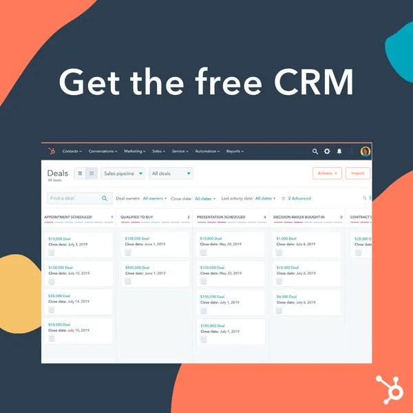
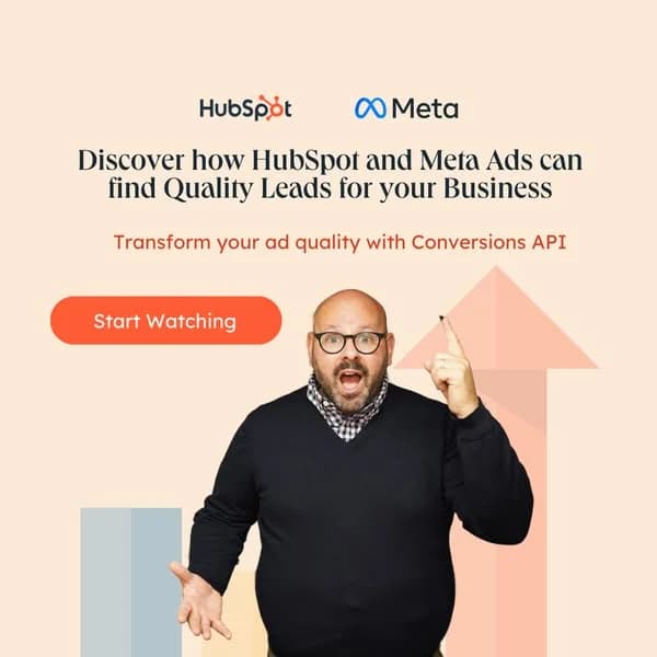
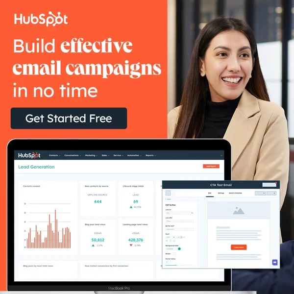
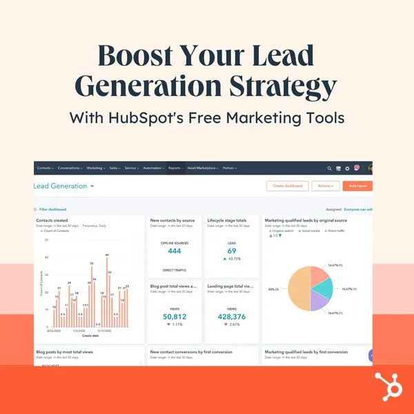
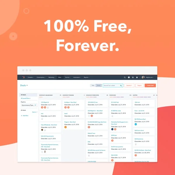
Visual patterns stay tight. HubSpot orange everywhere — the brand color is saturated enough to have become shorthand for "marketing content." Illustrated characters in a flat, friendly style, screenshots of dashboards with fake-but-believable chart data, and bold sans-serif headlines that name a pain point ("Your CRM is a mess") or promise a free download ("Free CRM template"). LinkedIn carries the lead-gen heavy rotation for B2B buyers. Facebook runs retargeting ads and broader marketing guide promotions. YouTube pre-roll handles video testimonials and founder-led education content. Ads almost always include a free asset — rarely a demo request, rarely a pricing page.

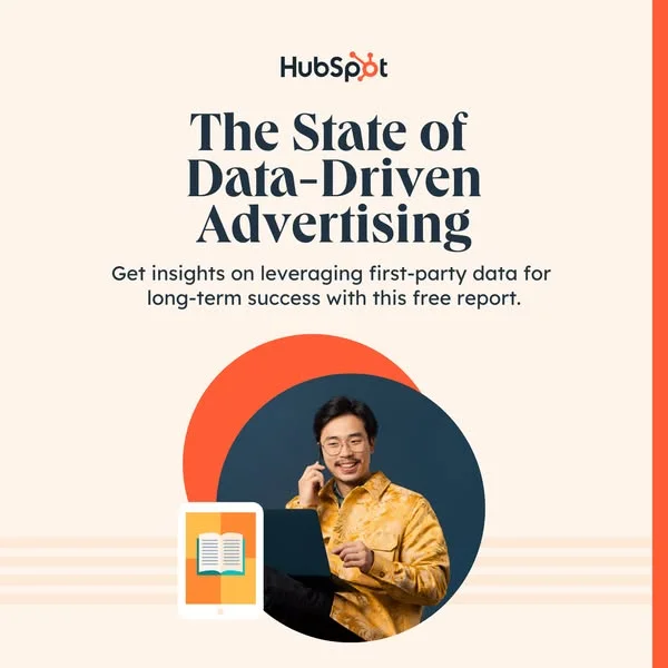
Our HubSpot ad examples collection pulls template downloads, dashboard statics, and B2B testimonial carousels the brand runs. Filter by format to find the gated-report covers, the illustrated-character statics, and the dashboard-screenshot carousels that each serve a different stage of the inbound funnel. Each entry shows how the orange anchors the frame, where the free-asset CTA sits, and which pain-point copy hook the placement opens with.

HubSpot AI Ebook — Split Screen UI Mockup. Brand: HubSpot. This ad effectively uses a split-screen layout, balancing a compelling visual with a clear value proposition. The vibrant orange background immediately grabs attention, while the contrasting yellow square highlights the smartphone visual, suggesting digital interaction and content creation. The composition places the key visual in the upper right, drawing the eye, while the prominent white headline "Using Generative AI to Scale Your Content Operations" dominates the lower left, establishing clear text hierarchy. The dark blue "Free Ebook" button provides a strong call to action. Optimized for platforms like LinkedIn or Facebook, its bold colors and clear messaging cut through feed clutter, targeting professionals interested in leveraging AI for business growth. The visual of a phone with social elements subtly hints at content engagement.. Headline: Using Generative AI to Scale Your Content Operations. Why this ad works: High-contrast palette commands attention — The bold orange background with a yellow accent and dark blue CTA creates significant visual contrast. This vibrant combination ensures the ad stands out in busy social feeds, immediately capturing the viewer's eye and preventing scroll-past, crucial for initial awareness and driving engagement in a competitive digital landscape. Clear value proposition and benefit-driven headline — The headline "Using Generative AI to Scale Your Content Operations" directly addresses a pain point and offers a solution. This benefit-oriented language, combined with the "Free Ebook" offer, clearly communicates the value, driving consideration and clicks from the target audience seeking practical business improvements. Visual metaphor for digital content engagement — The smartphone displaying social-like interactions (profiles, likes, chat bubble) visually represents the "content operations" aspect of the headline. This intuitive visual quickly communicates the ad's relevance to digital content creation and management, reinforcing the topic for the target professional audience and enhancing comprehension.. Specs: Brand: HubSpot, Industry: Software & Tools, Platform: Facebook, Format: Static, Audience: ProfessionalsHubSpot — Professional UI & Lifestyle Split. Brand: HubSpot. This ad employs a dynamic split-screen layout, effectively combining a bold brand message with a human element and product demonstration. The vibrant HubSpot orange background immediately captures attention, creating a strong visual anchor for the headline and CTA. A smiling professional woman on the right adds relatability and aspirational appeal, fostering trust. Below, a clear UI mockup of the HubSpot dashboard and email editor visually reinforces the product's functionality and ease of use. This composition is optimized for platforms like Facebook or Instagram, where a blend of direct messaging, human connection, and tangible product value drives engagement. The text hierarchy is clear: a prominent headline states the core benefit, followed by an actionable 'Get Started Free' CTA, guiding the viewer efficiently through the ad's message.. Headline: Build effective email campaigns in no time. Why this ad works: Bold Brand Color for Attention — The dominant HubSpot orange background serves as an immediate scroll-stopper. This high-contrast color choice effectively leverages brand recognition while drawing the eye directly to the value proposition. It creates a memorable and energetic visual identity that stands out in a crowded feed, enhancing ad recall and initial engagement. Human Element Builds Trust — Featuring a smiling, professional woman adds a crucial human touch, making the complex SaaS solution feel approachable and user-friendly. This lifestyle integration helps potential users envision themselves successfully using the product, fostering relatability and trust. It subtly communicates ease of use and positive outcomes, which is vital for B2B software adoption. UI Demo for Feature Clarity — The inclusion of the actual HubSpot dashboard and email editor provides tangible proof of the product's capabilities. This visual demonstration of the user interface clearly illustrates the "effective email campaigns" benefit, allowing prospects to quickly grasp the software's functionality and potential value before even clicking.. Specs: Brand: HubSpot, Industry: Software & Tools, Platform: Facebook, Format: Mixed, Audience: ProfessionalsHubSpot AI Prompts — Minimalist Text & Illustration. Brand: HubSpot. This ad leverages a clean, minimalist layout to highlight a valuable lead magnet. The dominant text hierarchy places the "FREE OFFER" badge and bold headline "1,000 AI Marketing Prompts" prominently in the upper-left, aligning with natural F-pattern scanning. HubSpot's signature orange acts as a powerful accent color for the CTA button and subtle illustration details, guiding the eye towards the desired action. The simple line-art illustration of a robotic arm writing into an envelope subtly reinforces the AI and marketing theme without visual clutter. Optimized for square formats like Instagram and Facebook, its high contrast against the light background ensures visibility and scroll-stopping power, effectively communicating a clear value proposition for professionals.. Headline: 1,000 AI Marketing Prompts. Primary text: FREE OFFER. Why this ad works: Clear Value Proposition & Free Offer — The prominent "FREE OFFER" badge immediately signals value, while the large, bold headline "1,000 AI Marketing Prompts" clearly states the benefit. This direct approach quickly captures attention and communicates the ad's purpose, reducing cognitive load for busy professionals scrolling through their feeds. Strategic Use of Brand Color — HubSpot's distinctive orange is strategically used for the "Download Now" CTA button and key illustration accents. This consistent branding reinforces recognition and trust, while the high-contrast color effectively draws the eye to the call to action, increasing click-through potential for lead generation. Minimalist Illustration Enhances Theme — The clean, line-art illustration of a robotic arm writing into an envelope subtly yet effectively conveys the ad's AI and marketing theme. Its minimalist style prevents visual clutter, allowing the main headline and CTA to dominate, while still adding a relevant and engaging visual element that supports the overall message.. Specs: Brand: HubSpot, Industry: Software & Tools, Platform: Instagram, Format: Static, Audience: ProfessionalsHubSpot AI Search Grader — UI Mockup. Brand: HubSpot. This ad employs a top-heavy layout, prioritizing a clear value proposition and call to action above a conceptual visual. The warm, inviting peach background, accented with subtle vertical stripes, creates an approachable yet professional aesthetic, leveraging HubSpot's brand orange for high-contrast elements like the CTA button. The composition strategically places the compelling headline at eye-level, followed by a prominent call to action, guiding the viewer's journey. Below, a minimalist UI mockup of an "Analysis" document visually reinforces the tool's function—identifying strengths and weaknesses—without overwhelming with detail. This design is optimized for mobile feed environments like Instagram or Facebook, where quick comprehension and a clear path to action are crucial. The clean visual hierarchy and color psychology effectively communicate the benefit of the AI Search Grader, making a B2B solution feel accessible and valuable to professionals seeking performance improvement.. Headline: Boost your AI search performance by uncovering areas for improvement.. Why this ad works: Direct headline clearly states problem and solution — The headline "Boost your AI search performance by uncovering areas for improvement" immediately addresses a key pain point for professionals. This direct, benefit-driven copy grabs attention and communicates the core value of the AI Search Grader, driving relevance and interest from the target audience. Simplified UI mockup conveys analytical benefit — Instead of a complex screenshot, the ad uses a clean, angled UI mockup highlighting "Strengths" and "Weaknesses." This abstraction effectively communicates the tool's analytical output without requiring deep engagement, making the ad digestible and impactful for busy professionals scrolling through their feeds. Prominent orange CTA button demands attention — The bright HubSpot orange CTA button, "Try our all-new AI Search Grader now," stands out sharply against the lighter background. Its prominent placement and clear, action-oriented text create an undeniable focal point, significantly increasing the likelihood of clicks and conversions for this new tool.. Specs: Brand: HubSpot, Industry: Software & Tools, Platform: Instagram, Format: UI Mockup, Audience: ProfessionalsHubSpot Gen AI — UI Mockup with Text. Brand: HubSpot. This HubSpot ad effectively uses a split-screen layout, combining a bold, benefit-driven headline with a clear UI mockup demonstration. The dark blue background conveys professionalism and trust, while HubSpot's signature orange highlights "Gen AI" and provides a vibrant contrast, drawing the eye to the key feature. The composition places the value proposition prominently at the top, followed by visual proof of the AI's functionality, showing a social media post being generated. The friendly robot character adds an approachable, innovative touch. Text hierarchy is clear, guiding the viewer from the main promise to the offer of a beginner's guide. Optimized for platforms like LinkedIn or Facebook, it targets professionals seeking efficiency, leveraging a clean aesthetic to communicate advanced software capabilities in an easily digestible format, encouraging consideration for the product's potential.. Headline: Scale your content with Gen AI. Primary text: The Ultimate Beginner's Guide. Why this ad works: Clear value proposition for content scaling — The ad immediately presents a strong value proposition: scaling content with AI. This directly addresses a common pain point for marketers and content creators. By highlighting "Gen AI" in a contrasting brand color, it instantly communicates innovation and relevance, capturing the attention of professionals looking for efficient solutions in a competitive digital landscape. Visual demonstration of AI capability — The inclusion of a detailed UI mockup showing a social post being generated provides tangible proof of the AI's capability. This visual demonstration helps potential users immediately grasp the product's function and value, reducing abstract concepts into concrete examples. It builds confidence and illustrates how the tool can directly solve their content creation challenges. Brand color contrast for attention — HubSpot's consistent use of its brand orange against the dark blue background is highly effective. The orange highlights key terms like "Gen AI" and the robot character, acting as a visual anchor. This strong color contrast not only makes the ad visually appealing and memorable but also reinforces brand recognition and signals innovation and energy.. Specs: Brand: HubSpot, Industry: Software & Tools, Platform: Facebook, Format: Mixed, Audience: ProfessionalsHubSpot Ebook — Bold Text & Product Shot. Brand: HubSpot. This ad leverages a high-contrast, split-screen layout to immediately capture attention. The vibrant orange background paired with bold white text creates a dynamic visual hierarchy, drawing the eye to the "FREE" offer and the main headline. A diagonal composition, featuring a tilted ebook, adds visual interest and directs focus towards the resource itself. This design is highly optimized for platforms like Facebook, where scroll-stopping visuals and clear value propositions are crucial. The prominent text hierarchy ensures the core message is instantly digestible, making it effective for lead generation by clearly presenting a valuable, free educational asset. The overall aesthetic is clean and direct, avoiding clutter to maximize message clarity.. Headline: 50 Facebook Ad Examples We Actually Clicked. Primary text: FREE. Why this ad works: High-contrast palette demands attention — The bold orange background with stark white text creates maximum contrast, making the ad pop in a busy social feed. This color choice is psychologically stimulating, signaling energy and urgency, which is effective for driving immediate engagement and click-through rates on platforms like Facebook. Clear value proposition drives clicks — The prominent "FREE" badge and headline "50 Facebook Ad Examples We Actually Clicked" immediately communicate tangible value. This direct, benefit-driven copy reduces cognitive load, allowing users to quickly understand what they gain, which is crucial for converting passive scrollers into active leads. Dynamic diagonal composition engages viewers — The ebook's diagonal placement creates a sense of movement and directs the viewer's eye from the headline towards the product. This non-static composition breaks monotony in the feed, making the ad feel more engaging and less like a typical banner, enhancing visual appeal and retention.. Specs: Brand: HubSpot, Industry: Software & Tools, Platform: Facebook, Format: Static, Audience: ProfessionalsHubSpot Marketing Tools — Lifestyle with Icons. Brand: HubSpot. This ad effectively uses a clean, professional layout to communicate HubSpot's integrated marketing tools. A central, smiling professional wearing a headset immediately establishes a relatable human connection, while a halo of diverse marketing tool icons visually reinforces the "all tools together" message. The brand's signature orange and a soft blue-grey background create a friendly yet authoritative color palette, optimizing for platforms like Instagram or Facebook where clear visuals and direct messaging perform well. Text hierarchy is strong: a bold, benefit-driven headline grabs attention, followed by a clear sub-headline explaining the solution. This composition guides the viewer's eye from the problem (disparate tools) to the solution (HubSpot's marketplace) with visual and textual clarity, driving consideration.. Headline: Bring all of your favorite marketing tools together. Primary text: Browse the Essential Apps for Marketers in HubSpot's App Marketplace. Why this ad works: Relatable human element builds trust — Featuring a smiling, engaged professional creates an immediate connection with the target audience. This human touch makes the complex idea of tool integration feel approachable and user-friendly, fostering trust and reducing perceived friction for potential users considering a new platform. Visual metaphor for integrated solutions — The circular arrangement of diverse marketing tool icons around the central figure brilliantly visualizes the core message: bringing all tools together. This clever composition instantly communicates the benefit of a unified ecosystem, making the abstract concept of an app marketplace tangible and easy to grasp. Clear text hierarchy drives message home — The ad employs a strong visual hierarchy with a large, bold headline stating the core benefit, followed by a smaller, descriptive sub-headline. This ensures the primary message is instantly absorbed, while secondary text provides necessary context, guiding the viewer efficiently through the ad's proposition.. Specs: Brand: HubSpot, Industry: Software & Tools, Platform: Instagram, Format: Static, Audience: ProfessionalsHubSpot Lead Gen — UI Mockup with Headline. Brand: HubSpot. This ad employs a top-heavy layout, prioritizing a bold, benefit-driven headline over a clean UI mockup. The large, dark text immediately communicates the core value proposition: boosting lead generation with HubSpot's free tools. Below, the detailed dashboard screenshot serves as visual proof, showcasing the platform's capabilities and data-driven insights. The color palette leverages HubSpot's signature orange and a soft peach background, reinforcing brand identity while maintaining a professional, approachable aesthetic. This composition is optimized for platforms like LinkedIn or Facebook, where professionals seek solutions. The clear text hierarchy guides the eye from problem/solution to evidence, effectively building trust and driving consideration for the SaaS offering. The ad balances aspirational messaging with tangible proof.. Headline: Boost Your Lead Generation Strategy. Primary text: With HubSpot's Free Marketing Tools. Why this ad works: Clear, benefit-driven headline captures attention — The prominent headline "Boost Your Lead Generation Strategy" immediately addresses a key pain point for businesses. Its large font and dark color against a light background ensure high readability and instant comprehension, effectively stopping the scroll and communicating the primary value proposition upfront to the target audience. Visual proof with detailed UI mockup — The inclusion of a detailed HubSpot dashboard screenshot provides tangible evidence of the platform's capabilities. It visually demonstrates the data and insights users can expect, building credibility and trust. This visual proof is crucial for SaaS products, allowing potential users to envision the tool in action. Strategic brand color usage for recognition — The ad effectively uses HubSpot's signature orange in the lower background and logo, paired with a soft peach upper background. This consistent brand color application enhances recognition and reinforces brand identity. It creates a cohesive, professional look that is instantly identifiable to those familiar with HubSpot, fostering trust.. Specs: Brand: HubSpot, Industry: Software & Tools, Platform: Facebook, Format: UI Mockup, Audience: ProfessionalsHubSpot — Bold Headline & UI Mockup. Brand: HubSpot. This ad leverages HubSpot's distinctive orange branding to create immediate recognition and a bold visual presence. The layout strategically divides the ad into a prominent text-heavy top section and a detailed UI mockup bottom section. The vibrant orange background with contrasting white text and a dark blue CTA button ensures high visibility and scroll-stopping power, optimized for busy social feeds. The headline "The know-it-all, do-it-all CRM" clearly communicates the product's comprehensive value proposition. The layered UI mockups provide tangible proof of the software's capabilities, appealing to professionals seeking practical solutions. Text hierarchy is clear: brand, value proposition, then direct call to action. This composition effectively balances brand awareness with feature demonstration, driving consideration for a free trial.. Headline: The know-it-all, do-it-all CRM. Why this ad works: High-contrast branding for instant recognition — The use of HubSpot's signature vibrant orange background with stark white text creates an unmissable visual. This high contrast ensures the ad stands out in a crowded feed, immediately associating the message with the established brand and improving recall, crucial for brand-building in a competitive market. Clear value proposition in headline — The headline "The know-it-all, do-it-all CRM" is concise and powerful. It directly addresses a common pain point for businesses (fragmented tools) by positioning HubSpot as a comprehensive, integrated solution, compelling the target audience of professionals and small business owners to learn more. Actionable CTA with low barrier to entry — The "Get Started Free" call-to-action is prominently displayed and offers a no-risk entry point. This strategy significantly reduces friction for potential users, encouraging clicks and conversions by allowing them to experience the product's value firsthand before committing financially, boosting lead generation.. Specs: Brand: HubSpot, Industry: Software & Tools, Platform: Facebook, Format: UI Mockup, Audience: ProfessionalsHubSpot — Social Media Template Illustration. Brand: HubSpot. This ad employs a split-screen layout, effectively segmenting information. The top half leverages a dark purple background with high-contrast white text for the headline and a prominent orange CTA, ensuring immediate readability and action. The bottom section uses a lighter purple to showcase a clean, illustrative depiction of a smartphone social media feed, visually reinforcing the ad's topic. This composition technique balances direct messaging with contextual imagery. Color psychology utilizes HubSpot's brand orange for the CTA, drawing the eye, while the purple palette maintains a professional yet approachable vibe. Optimized for platforms like Facebook or Instagram, its clear hierarchy and distinct visual elements are designed to stop the scroll. Text hierarchy is clear: headline first, then CTA, supported by the illustrative context.. Headline: Free Social Media Strategy Template. Why this ad works: High-contrast text ensures readability — The white headline against the dark purple background provides excellent contrast, making the core offer immediately legible. This is crucial for quick consumption in fast-scrolling feed environments, ensuring the value proposition is understood at a glance and reducing cognitive load for the viewer. Illustrative visual reinforces topic — The clean illustration of a social media feed on a smartphone clearly communicates the ad's subject matter without needing additional text. This visual cue quickly establishes relevance for the target audience, indicating that the template is directly applicable to their social media management needs. Strategic use of brand orange for CTA — HubSpot's signature orange is strategically applied to the "Download Now" button. This vibrant color creates a strong focal point, guiding the viewer's eye directly to the desired action. It leverages brand recognition while maximizing click-through potential.. Specs: Brand: HubSpot, Industry: Software & Tools, Platform: Facebook, Format: Static, Audience: ProfessionalsHubSpot — Facebook Ad Examples Collage. Brand: HubSpot. This ad leverages a dynamic collage layout, showcasing various Facebook ad examples within a smartphone UI, effectively demonstrating the value proposition. The vibrant HubSpot orange background immediately grabs attention, creating a strong brand presence and an energetic feel. Compositionally, the angled phone and slightly overlapping ad snippets add visual depth and suggest an abundance of content, enticing the viewer to explore. The clear text hierarchy, with the HubSpot logo prominently placed, a bold, benefit-driven headline, and a concise call-to-action, ensures the core message is easily digestible. Optimized for platforms like Facebook or Instagram, this visual approach targets marketers seeking inspiration, offering a tangible preview of the "50 Facebook ads" guide. The ad's design effectively combines strong brand recognition with a clear educational offering, driving consideration for HubSpot's resources.. Headline: 50 Facebook ads you can learn from. Why this ad works: Contextual display of ad examples — Showing actual Facebook ads within a phone UI immediately demonstrates the product's relevance. It allows the target audience (marketers) to visualize the content they'll receive, increasing perceived value and reducing ambiguity. This direct visual proof builds trust and engagement, making the offer more compelling. Bold brand color commands attention — HubSpot's signature vibrant orange background is highly effective at stopping the scroll. This energetic color creates a strong visual anchor, ensuring the ad stands out in a crowded feed. It reinforces brand identity while drawing the eye directly to the core message, enhancing memorability. Clear, benefit-driven headline — The headline "50 Facebook ads you can learn from" is direct and immediately communicates the value proposition. It targets a specific pain point (needing ad inspiration) and offers a clear solution, enticing the target audience to engage further and download the guide for practical insights.. Specs: Brand: HubSpot, Industry: Software & Tools, Platform: Facebook, Format: Mixed, Audience: ProfessionalsHubSpot CRM — Free Offer UI Mockup. Brand: HubSpot. This ad employs a split-screen layout, dedicating the top half to a bold, benefit-driven headline and the bottom to a detailed UI mockup. The vibrant orange background immediately grabs attention, signaling energy and approachability, contrasting effectively with the clean, professional white and grey of the software interface. The composition strategically places the core value proposition ("100% Free, Forever.") as the primary visual anchor, ensuring instant comprehension. The UI mockup serves as tangible proof, allowing potential users to visualize the product's functionality. This design is optimized for platforms like Facebook or LinkedIn, where a clear, high-contrast message and product demonstration are crucial for stopping the scroll and driving consideration among small business owners. The text hierarchy is simple yet powerful, prioritizing the free offer above all else.. Headline: 100% Free, Forever.. Why this ad works: Bold, benefit-driven headline dominates — The "100% Free, Forever." headline is strategically placed and uses large, high-contrast white text on orange. This immediately communicates the core value proposition, cutting through noise in a busy feed. It addresses a key pain point for small businesses regarding software costs, driving immediate interest and click-through. UI mockup provides tangible product proof — Including a detailed screenshot of the HubSpot Deals pipeline offers visual evidence of the product's functionality and user-friendliness. This transparency builds trust and allows prospects to envision themselves using the software, moving them from awareness to consideration by demonstrating real-world application. High-contrast orange background commands attention — The use of a bright, energetic orange background against white text creates a strong visual pop. This color choice is highly effective for stopping the scroll on social feeds, ensuring the ad stands out. Orange also conveys enthusiasm and warmth, aligning with HubSpot's brand personality and inviting engagement.. Specs: Brand: HubSpot, Industry: Software & Tools, Platform: Facebook, Format: UI Mockup, Audience: Small Business OwnersHubSpot Lead Generation — Split Screen Lifestyle. Brand: HubSpot. This HubSpot ad employs a split-screen layout, effectively balancing human connection with a direct, quantifiable benefit. The top half features a warm, engaging lifestyle image of two professionals collaborating, building trust and relatability. The bottom half leverages HubSpot's iconic vibrant orange, creating a high-contrast, scroll-stopping visual field for the bold white text. This color choice is energetic and brand-identifiable, optimizing for platforms like Instagram where visual pop is crucial. The text hierarchy is clear: brand logo, then a prominent, data-driven headline, followed by a clear call-to-action. This composition guides the eye from aspirational imagery to a concrete solution, driving consideration and conversion by clearly stating the value proposition upfront. The vertical format is ideal for mobile feed placements.. Headline: Increase leads by 105% in just 6 months. Why this ad works: Split screen balances human connection with benefit — The ad effectively uses a split-screen layout, dedicating the top to a relatable lifestyle image of professionals. This builds immediate trust and aspirational connection. The bottom half then delivers a hard-hitting, quantifiable benefit, directly addressing the viewer's business needs. This dual approach maximizes engagement and persuasion. High-contrast brand color commands attention — HubSpot's signature vibrant orange dominates the bottom half, creating a powerful visual anchor. This high-contrast background against the white text ensures readability and makes the ad pop in a busy feed. The color is instantly recognizable, reinforcing brand identity while energetically conveying the ad's message and stopping the scroll. Quantifiable benefit drives credibility and urgency — The headline "Increase leads by 105% in just 6 months" provides a specific, impressive, and time-bound result. This data-driven claim builds immediate credibility and creates a sense of urgency for businesses seeking growth. It directly addresses a core pain point with a clear, measurable solution, compelling action from the target audience.. Specs: Brand: HubSpot, Industry: Software & Tools, Platform: Instagram, Format: Static, Audience: ProfessionalsHubSpot Free CRM — UI Mockup with Headline. Brand: HubSpot. This ad effectively combines a direct value proposition with a clear product demonstration. The layout strategically places the bold headline "Get the free CRM" prominently at the top, immediately addressing a pain point and offering a solution. Below, a clean UI mockup of the HubSpot Deals pipeline provides visual proof of the product's functionality and ease of use. The dark background with abstract, brand-aligned orange and teal shapes creates a professional yet inviting aesthetic, avoiding visual clutter. This composition is optimized for platforms like Facebook or LinkedIn, where professionals seek practical solutions. The text hierarchy is simple: a large, high-contrast headline followed by a visual representation, guiding the viewer's eye from the offer to the product. The overall design communicates efficiency and value, encouraging consideration for the free offering.. Headline: Get the free CRM. Why this ad works: Direct Value Proposition in Headline — The headline "Get the free CRM" immediately communicates a clear, no-cost benefit. This direct approach cuts through noise, appealing to businesses seeking cost-effective solutions. It significantly boosts click-through rates by removing perceived barriers to entry and clearly stating the primary offer upfront. Authentic UI Mockup for Credibility — Featuring a realistic screenshot of the CRM's "Deals" pipeline demonstrates the product's actual functionality and user interface. This visual proof builds trust and helps potential users visualize how the software can manage their sales processes, reducing skepticism often associated with software advertisements and increasing perceived value. Strategic Brand Color Integration — The background uses HubSpot's dark blue/grey with abstract orange and teal shapes. This subtly reinforces brand identity and recognition without overwhelming the core message or product demonstration. It provides a professional, non-distracting backdrop that aligns with the brand's aesthetic, enhancing overall ad recall.. Specs: Brand: HubSpot, Industry: Software & Tools, Platform: Facebook, Format: UI Mockup, Audience: ProfessionalsHubSpot Playbook — Text-Heavy Book Feature. Brand: HubSpot. This ad effectively uses a split-screen composition, dedicating the left two-thirds to compelling text and the right third to a visual representation of the "playbook." The layout strategically guides the eye from the bold headline and benefit-driven body copy to the product image, then to the prominent orange CTA. Color psychology leverages HubSpot's recognizable brand orange for action, contrasted with a clean, muted green and cream background, signaling professionalism and approachability. This composition is optimized for B2B platforms like LinkedIn or Facebook, where clear value propositions and downloadable resources drive consideration. The text hierarchy is clear, with a large, impactful headline, followed by a concise description, and a high-contrast call-to-action, ensuring key information is easily digestible and actionable for busy professionals.. Headline: The Playbook for More Meaningful Interactions. Primary text: Discover AI-powered frameworks that help your teams move faster without sacrificing customer experience.. Why this ad works: Clear Value Proposition in Headline — The headline "The Playbook for More Meaningful Interactions" immediately communicates a key benefit for B2B audiences. It promises a solution to a common business challenge, drawing in professionals seeking to improve customer engagement. This direct approach quickly establishes relevance and encourages further engagement with the ad copy. Strategic Asymmetrical Layout for Focus — The ad employs an asymmetrical layout, with dominant text on the left and the playbook visual on the right. This composition naturally directs the viewer's eye from the problem/solution statement to the tangible resource, then down to the CTA. It creates a clear visual flow, preventing information overload and maintaining focus. High-Contrast, Brand-Consistent CTA — The "DOWNLOAD PLAYBOOK" button in HubSpot's signature orange stands out prominently against the muted background. This high contrast ensures the call-to-action is immediately visible and actionable. Leveraging brand colors reinforces recognition and trust, crucial for driving conversions in a competitive B2B landscape.. Specs: Brand: HubSpot, Industry: Software & Tools, Platform: Facebook, Format: Static, Audience: ProfessionalsHubSpot AI Masterclass — Event Promotion Layout. Brand: HubSpot. This ad effectively uses a vertical layout, optimized for mobile platforms like Instagram Stories. The design strategically places the HubSpot brand and event title prominently at the top, leveraging strong visual hierarchy to capture immediate attention. A clean, professional color palette of lavender, dark purple, and HubSpot's signature orange creates a modern, trustworthy aesthetic. The orange is strategically used for the brand logo and the call-to-action, ensuring high contrast and guiding the user's eye. The bottom illustration, featuring a person and a robot, visually represents the "AI Agents" topic without overwhelming the essential event details. This composition balances informative text with engaging visuals, making complex topics approachable and driving consideration for the masterclass.. Headline: AI Agents in the Real World.. Primary text: LIVE MASTERCLASS Real use cases. Measurable ROI. Live Q&A. 18 March 11AM AEDT | 8AM SGT. Why this ad works: Clear Information Hierarchy for Event Details — The ad prioritizes key information with a top-down flow: brand, event type, headline, benefits, date, and CTA. This logical progression allows busy professionals to quickly grasp the event's value proposition and essential logistics, reducing cognitive load and increasing the likelihood of registration. Strategic Brand Color for Recognition and CTA — HubSpot's distinctive orange is used for the logo and the "REGISTER NOW" button. This consistent application reinforces brand identity and creates a high-contrast, unmissable call-to-action against the lavender background. This color choice effectively guides the user's eye to the desired conversion point. Accessible Illustration for Complex Topic — The minimalist illustration of a person interacting with a robot and data visuals makes the abstract concept of "AI Agents" approachable. It provides a visual anchor for the topic without being overly technical or cluttered, appealing to a broad professional audience interested in practical AI applications.. Specs: Brand: HubSpot, Industry: Software & Tools, Platform: Instagram, Format: Static, Audience: ProfessionalsHubSpot — Educational Text-Heavy Layout. Brand: HubSpot. This ad employs a text-heavy layout on a dark, contrasting background, optimized for immediate readability on platforms like Instagram. The central placement of the headline, "How to Use Instagram for Business," creates a clear focal point, leveraging a mix of sans-serif and script fonts for visual interest and approachability. The dark blue background provides high contrast for the white text, ensuring legibility even on smaller screens, while the abstract, organic shapes in vibrant orange and teal add a touch of playfulness and brand personality without distracting from the core message. This composition effectively communicates an educational value proposition, aiming to attract small business owners seeking practical guidance. The text hierarchy is clear, with the main benefit highlighted, followed by a secondary detail, making it easy to digest quickly.. Headline: How to Use Instagram for Business. Primary text: Now with Stories & Videos!. Why this ad works: High-contrast text ensures instant readability — The stark white text against the dark blue background creates maximum contrast, making the headline immediately legible even at a glance. This is crucial for stopping the scroll on busy social feeds, ensuring the educational value proposition is quickly understood by the target audience. Clear, benefit-driven headline targets specific audience — The headline "How to Use Instagram for Business" directly addresses a pain point and offers a solution for small business owners. This specificity ensures the ad resonates with the intended demographic, signaling relevant content and increasing the likelihood of engagement and click-throughs for educational resources. Playful, organic shapes add brand personality — The abstract, colorful shapes in the corners introduce a modern, friendly vibe without cluttering the main message. These elements break the monotony of a purely text-based ad, adding visual appeal and reinforcing HubSpot's approachable brand identity, which can be effective in attracting a broader audience on social media.. Specs: Brand: HubSpot, Industry: Software & Tools, Platform: Instagram, Format: Static, Audience: Small Business OwnersHubSpot — Tablet UI Mockup. Brand: HubSpot. This HubSpot ad effectively uses a split-screen composition, with the brand's vibrant orange dominating the background, creating high contrast for the white text and logo. The top section features a hand holding a tablet, showcasing the HubSpot UI, which provides a clear product demonstration in context. This layout strategy positions the software as accessible and user-friendly. The bold, sans-serif headline below the tablet leverages color psychology, using white on orange for maximum impact and readability on mobile feeds like Instagram. Text hierarchy is clear: logo, then headline, then a distinct CTA button. The composition is optimized for quick consumption, allowing users to grasp the product's value proposition and take action swiftly, driving consideration for SaaS professionals. The human element of the hand adds relatability.. Headline: With great data comes great content. Why this ad works: High-contrast branding for instant recognition — The vibrant HubSpot orange background creates immediate brand recognition and high contrast against the white text and logo. This bold color choice ensures the ad stands out in a crowded social feed, capturing attention quickly. The strong visual identity reinforces brand recall and positions HubSpot as a dynamic, modern solution for professionals seeking marketing tools. In-context UI demonstration builds trust — Showcasing the actual HubSpot UI on a tablet held by a hand provides a tangible demonstration of the product's functionality. This 'in-use' visual helps potential users visualize themselves interacting with the platform, reducing abstractness. It effectively communicates the software's capabilities and ease of use, fostering trust and encouraging deeper engagement. Benefit-driven headline resonates with audience — The headline 'With great data comes great content' is a powerful, benefit-driven statement that resonates with marketing professionals. It clearly articulates a core value proposition of HubSpot's platform – leveraging data for improved content. The large, clean typography ensures readability and immediate comprehension, driving home the key message efficiently.. Specs: Brand: HubSpot, Industry: Software & Tools, Platform: Instagram, Format: UI Mockup, Audience: ProfessionalsHubSpot Data Report — Text-Heavy Lifestyle Ad. Brand: HubSpot. This ad effectively promotes a HubSpot report using a clean, professional layout. The dominant headline immediately communicates the value proposition, leveraging a strong serif font for authority. Below, concise body copy explains the report's benefit, driving consideration. The composition balances text with a relatable lifestyle image of a professional, making the abstract topic more approachable. Color psychology utilizes HubSpot's signature orange for branding and energy, contrasted with a calming cream background and a dark blue circle for depth. This design is optimized for platforms like Facebook, where clear value propositions and professional imagery capture B2B attention. The hierarchy guides the eye from brand, to headline, to benefit, then to the visual, ensuring key information is absorbed efficiently.. Headline: The State of Data-Driven Advertising. Primary text: Get insights on leveraging first-party data for long-term success with this free report.. Why this ad works: Clear Value Proposition in Headline — The headline "The State of Data-Driven Advertising" is prominent and immediately informs the target audience (professionals in advertising) about the valuable content offered. This directness cuts through feed clutter, attracting relevant clicks by clearly stating the report's focus and benefit. Relatable Professional Lifestyle Imagery — Featuring a smiling professional on a laptop, talking on the phone, humanizes the technical topic of data-driven advertising. This visual connects with the target audience's daily work life, making the report feel more accessible and relevant than a purely abstract graphic, fostering engagement. Strategic Brand Color Integration — HubSpot's signature orange is used effectively in the logo, a large graphic element, and a subtle border. This consistent branding reinforces recognition and trust. The orange adds vibrancy and energy, drawing the eye while maintaining a professional aesthetic, crucial for B2B marketing.. Specs: Brand: HubSpot, Industry: Software & Tools, Platform: Facebook, Format: Static, Audience: ProfessionalsHubSpot Social Media Calendar — Product Mockup. Brand: HubSpot. This ad effectively uses a vibrant, high-contrast color palette of orange and dark teal to immediately grab attention in a busy feed. The layout positions a digital product, a social media content calendar, as tangible objects (a desk calendar and a book), making a digital offering feel more concrete and valuable. The prominent headline "Social Media Content Calendar" clearly communicates the value proposition, supported by a "Free" badge for immediate incentive. Compositionally, the items are angled to create dynamic visual interest, guiding the eye towards the product details. Text hierarchy is clear: large headline, then the "Free" badge, with smaller, less critical text on the mockups. This design is optimized for platforms like Facebook or Instagram, where bold colors and clear value propositions drive engagement and clicks for lead generation. The clean, minimalist background ensures the product remains the focal point.. Headline: Social Media Content Calendar. Primary text: Free. Why this ad works: High-contrast color palette drives attention — The bold orange background starkly contrasts with the dark teal and white text/elements. This high-contrast choice is highly effective for cutting through visual clutter on social feeds, ensuring the ad is noticed and stands out against more muted content, thereby increasing initial engagement. Tangible representation for digital product — Presenting a digital content calendar as physical objects (desk calendar, book) makes the intangible asset feel more valuable and concrete. This technique helps prospects visualize and understand the utility of the free resource, increasing perceived worth and download intent for a lead magnet. Clear value proposition and incentive — The headline "Social Media Content Calendar" immediately communicates the offering, while the "Free" badge acts as a powerful, low-friction incentive. This direct approach reduces cognitive load, making it easy for the target audience to understand the benefit and act quickly, driving consideration.. Specs: Brand: HubSpot, Industry: Software & Tools, Platform: Facebook, Format: Static, Audience: Small Business OwnersHubSpot — Strategic Blueprint Illustration. Brand: HubSpot. This ad employs a clean, split-screen layout, dedicating the upper left to prominent text and the lower right to a conceptual illustration. The layout strategy effectively balances informational content with visual metaphor, making complex B2B concepts digestible. HubSpot's signature orange is strategically used for emphasis in the headline and illustration, creating strong brand recall and visual interest against the neutral background. The composition guides the eye from the bold headline to the detailed body copy, then to the engaging blueprint illustration, reinforcing the message of strategic planning and integration. Optimized for professional platforms like LinkedIn, its clear hierarchy and minimalist aesthetic ensure readability and engagement, allowing the core value proposition to shine without visual clutter. The low text overlay, despite significant copy, maintains a clean, premium feel.. Headline: Sync your tools. Empower your teams.. Primary text: Get the blueprint to reduce friction, boost productivity, and scale smarter — without compromising customer experience.. Why this ad works: Bold Headline & Body Copy Hierarchy — The headline uses contrasting colors and font weights to immediately grab attention, while the body copy provides clear, concise value. This strong visual hierarchy ensures the core message is understood quickly, crucial for scroll-stopping on busy feeds. It effectively communicates the ad's purpose before the user decides to engage further. Strategic Blueprint Illustration Metaphor — The hand-drawn blueprint illustration effectively visualizes the abstract concept of "reducing friction" and "scaling smarter." This creative metaphor makes the ad more engaging and memorable than a purely text-based approach, helping B2B audiences connect with the strategic benefits of HubSpot's offerings in a relatable way. Consistent Brand Color for Emphasis — The strategic use of HubSpot's distinct orange color for key headline words and elements within the illustration reinforces brand identity. This consistent color application not only highlights important information but also subtly embeds brand recognition, making the ad instantly identifiable and professional without being overly promotional.. Specs: Brand: HubSpot, Industry: Software & Tools, Platform: LinkedIn, Format: Static, Audience: ProfessionalsHubSpot 2024 Report — Data Bar Chart. Brand: HubSpot. This ad employs a clean, data-driven layout, effectively presenting the "2024 State of Marketing Report" findings. The central bar chart, with its distinct, vibrant colors (teal, purple, orange, red, pink) against a soft, light peach background, ensures high readability and visual engagement. This color choice balances professionalism with approachability, making complex data digestible. The composition guides the viewer's eye from the prominent headline and sub-headline at the top, through the easily interpretable data points, down to the credible partner logos at the bottom. This clear visual hierarchy optimizes for quick comprehension on platforms like LinkedIn or Instagram, where professionals seek valuable insights. The generous use of negative space around the chart prevents visual clutter, enhancing focus on the key marketing trends. It's designed for quick consumption, delivering information efficiently.. Headline: 2024 State of Marketing Report. Primary text: Top trends that have delivered strong ROI for marketers in the past year. Why this ad works: Simple bar chart for quick data digestion — The horizontal bar chart format is inherently easy to read, allowing viewers to quickly compare trends and their respective ROI percentages. This visual simplicity reduces cognitive load, making the complex information immediately accessible and actionable for busy marketers scrolling through their feeds. Balanced color palette enhances readability — The soft, warm background creates a professional yet inviting tone, while the distinct, bright colors of the bars ensure each data point stands out. This contrast improves data legibility and prevents visual fatigue, making the ad appealing and easy to process for its target audience of marketing professionals. Partner logos build immediate report credibility — Featuring well-known industry partners like Litmus and Search Engine Journal alongside HubSpot at the bottom of the ad significantly boosts the report's perceived authority and trustworthiness. This co-branding acts as a social proof, encouraging marketers to trust the data and engage further with the content.. Specs: Brand: HubSpot, Industry: Software & Tools, Platform: Instagram, Format: Static, Audience: ProfessionalsHubSpot Meta Ads — Explainer with Character. Brand: HubSpot. This ad effectively uses a central character and clear text hierarchy to communicate a B2B partnership benefit. The layout positions the HubSpot and Meta logos prominently at the top, establishing authority, followed by a direct value proposition. A friendly, surprised man points upwards, visually reinforcing the message of improved lead quality and business growth, while also adding a human, approachable touch. The warm peach background creates an inviting atmosphere, making complex software solutions feel accessible. Text hierarchy guides the viewer from the partnership announcement to the specific solution (Conversions API) and a clear call to action. Optimized for platforms like Facebook or LinkedIn, its clean design and engaging visual elements are designed to stop the scroll and drive consideration for lead generation solutions. The composition ensures all critical information is visible and easily digestible.. Headline: Discover how HubSpot and Meta Ads can find Quality Leads for your Business. Primary text: Transform your ad quality with Conversions API. Why this ad works: Engaging human element captures attention — The surprised, pointing man creates an immediate focal point, drawing the viewer in. His expression and gesture make the ad feel more personal and less corporate, increasing relatability and stopping the scroll in a crowded feed, especially for B2B audiences seeking approachable solutions. Clear visual hierarchy guides the eye — Logos at the top establish authority, followed by the main value proposition, then a specific solution, and finally a prominent CTA. The pointing man and upward arrow reinforce this flow, ensuring key information is absorbed efficiently and the ad's core message is quickly understood. Warm, approachable color palette — The soft peach background combined with the contrasting dark text and bright orange CTA button creates an inviting, non-intimidating visual experience. This warm palette helps to demystify complex B2B solutions, making them feel accessible and friendly to potential users, fostering trust and engagement.. Specs: Brand: HubSpot, Industry: Software & Tools, Platform: Facebook, Format: Static, Audience: ProfessionalsHubSpot x Meta Lead Gen Hero Shot. Brand: HubSpot. This co-branded ad leverages the authority of HubSpot and Meta to establish immediate trust through a clean, professional layout. The composition utilizes a central human subject with an expressive, high-energy pose to break the corporate monotony, effectively stopping the scroll on platforms like Facebook. The visual hierarchy is expertly managed: the dual logos anchor the top, followed by a benefit-driven headline in a high-contrast serif font. The use of a peach-toned background provides a warm, approachable feel compared to clinical white, while the upward-pointing arrow and bar chart subtly reinforce the message of growth and data-driven success. The orange CTA button is strategically placed to contrast against the neutral background, drawing the eye toward the primary action. This design works because it balances technical B2B messaging with human relatability and clear directional cues.. Headline: Discover how HubSpot and Meta Ads can find Quality Leads for your Business. Primary text: Transform your ad quality with Conversions API. Why this ad works: Dual-brand authority establishes immediate professional trust — By placing the HubSpot and Meta logos side-by-side at the top, the ad inherits the credibility of two industry giants. This partnership signaling reduces skepticism for B2B decision-makers, making the technical promise of Conversions API feel like a safe, vetted solution for lead generation. High-energy human subject breaks the scroll — The central figure’s expressive face and upward-pointing gesture create a pattern interrupt in a professional feed. Human faces, especially those showing excitement, naturally draw the eye. This technique humanizes a complex software integration, making the content feel more accessible and less like a dry technical manual. Subliminal growth cues reinforce the value proposition — The background features a large upward-pointing arrow and a bar chart, which are universal symbols for business success and scaling. These elements work on a subconscious level to support the headline's promise of finding quality leads, visually proving the growth narrative before the user reads a word.. Specs: Brand: HubSpot, Industry: Software & Tools, Platform: Facebook, Format: Static, Audience: ProfessionalsHubSpot Handbook — Data & UI Mockup. Brand: HubSpot. The ad effectively uses a split-composition layout, balancing a data visualization with a prominent UI mockup of the handbook. The dark blue background provides high contrast for the white text and warm orange/yellow elements, drawing immediate attention and signaling professionalism. Text hierarchy is clear: a bold, impactful headline followed by a concise value proposition, guiding the viewer's eye. The inclusion of a bar chart visually reinforces the "High-Quality Leads Matter" message, appealing directly to data-driven professionals seeking tangible results. The smartphone mockup clearly presents the downloadable asset, enhancing its perceived value and making the offer concrete. This design is optimized for platforms like Facebook or LinkedIn, where educational content and clear calls to action for lead generation perform well. The clean, professional aesthetic aligns perfectly with HubSpot's brand, signaling credibility and expertise in marketing solutions.. Headline: High-Quality Leads Matter. Primary text: Learn why lead quality is crucial for successful marketing campaigns in our free handbook. Why this ad works: High-contrast palette for immediate attention — The deep navy background paired with bright white text and warm orange/yellow accents creates strong visual contrast. This ensures the headline and key visual elements pop, effectively stopping the scroll in a busy feed. It communicates professionalism while being visually engaging, crucial for B2B advertising. Visual data reinforces value proposition — The bar chart, though abstract, immediately communicates data and results, aligning with the "High-Quality Leads Matter" headline. This visual shorthand appeals to a business audience, suggesting measurable benefits and analytical insights from the handbook. It adds credibility without requiring complex interpretation. Clear asset presentation via UI mockup — Presenting the handbook within a smartphone UI mockup makes the digital asset tangible and desirable. It clearly shows what the user will receive, reducing ambiguity and increasing the perceived value of the free download. This technique builds trust and encourages engagement for lead generation.. Specs: Brand: HubSpot, Industry: Software & Tools, Platform: Facebook, Format: Static, Audience: ProfessionalsHubSpot Forbes Award — Bold Text Layout. Brand: HubSpot. This ad leverages a bold, high-contrast text-heavy layout optimized for vertical mobile viewing, likely Instagram Stories or Reels. The dark navy background paired with HubSpot's signature orange and white text creates strong visual impact and brand recognition. The composition strategically places the 5-star rating and "Forbes Award-winning CRM platform" centrally, establishing immediate credibility and authority. The text hierarchy is clear: stars first for visual impact, then the award claim, followed by the brand collaboration at the bottom. This direct approach minimizes cognitive load, ensuring the key message of third-party validation is absorbed quickly. The minimalist design focuses solely on social proof, making it highly effective for building trust and consideration within a professional audience.. Headline: Forbes Award-winning CRM platform. Why this ad works: Strong Credibility through Third-Party Validation — The prominent "Forbes Award-winning" headline, coupled with a 5-star rating, immediately establishes HubSpot's authority and trustworthiness. This social proof from a respected source like Forbes significantly boosts brand perception and encourages consideration among potential B2B customers. High-Contrast, Brand-Consistent Color Palette — The deep navy background with vibrant orange and crisp white text ensures maximum readability and visual punch. This color combination is consistent with HubSpot's branding, reinforcing recognition while creating a bold, professional aesthetic that stands out in a crowded feed. Clear Visual Hierarchy for Quick Comprehension — The layout prioritizes the 5-star rating and award text, drawing the eye directly to the core message. The brand collaboration at the bottom provides context without distracting from the main claim. This hierarchy allows for rapid information processing, crucial for mobile ad environments.. Specs: Brand: HubSpot, Industry: Software & Tools, Platform: Instagram, Format: Static, Audience: ProfessionalsHubSpot Free Templates — Lifestyle with Text Overlay. Brand: HubSpot. This ad employs a split-screen layout, blending a relatable lifestyle shot with a direct value proposition. The top half features a person actively using a laptop, displaying HubSpot's template landing page, which grounds the offering in a practical, user-centric context. The bottom half utilizes HubSpot's signature dark blue and orange palette, with bold white text clearly stating the "Free marketing plan template" offer. This high-contrast text ensures immediate readability and impact. The composition effectively balances visual storytelling with explicit messaging, making it suitable for platforms like Instagram or Facebook where quick comprehension is crucial. The brand's consistent color scheme reinforces recognition, while the clear text hierarchy guides the viewer from the visual context to the specific, actionable benefit.. Headline: Free marketing plan template. Why this ad works: Clear value proposition in bold text — The large, prominent "Free marketing plan template" immediately communicates the core offer. This directness cuts through feed clutter, ensuring users instantly grasp the benefit without needing to decipher complex visuals or small print, driving higher engagement. Relatable lifestyle context for SaaS — Showing a person actively using a laptop creates a relatable scenario for the target audience (professionals, small business owners). This lifestyle shot helps potential users visualize themselves benefiting from HubSpot's tools, fostering a connection beyond just a product screenshot. Strong brand identity with color contrast — The ad effectively leverages HubSpot's distinctive orange against a dark blue background. This high-contrast pairing ensures the brand logo is highly visible and memorable, reinforcing brand recognition while making the white offer text pop for maximum readability and impact.. Specs: Brand: HubSpot, Industry: Software & Tools, Platform: Instagram, Format: Mixed, Audience: Professionals
Why Clone Ads

What Makes HubSpot Ads Convert

Lead with the free download, not the product

HubSpot's ads rarely say "try HubSpot." They say "grab the free CRM template" or "download the sales email guide." Free asset first, product second. B2B ads with "start free trial" CTAs should swap half the spend to lead magnets and measure cost per qualified lead. Funnel math usually wins.

Flat illustration scales cheaper than photography

HubSpot uses custom illustrations — friendly characters, abstract shapes, iconographic dashboards — rather than stock photography. Illustrations keep the visual system consistent across hundreds of ads without a photo shoot per launch. For SaaS brands producing high ad volume, building an illustration library pays back within one campaign cycle.

Name the pain in the headline, specifically

"Your CRM is a mess" works. "Improve your sales workflow" doesn't. HubSpot ads name a specific pain point the buyer would privately admit to — messy pipelines, forgotten follow-ups, lost deals. Generic benefit copy loses to specific pain copy every time, especially on LinkedIn where the reader runs skeptical by default.

Questions

HubSpot ads convert because they lead with a free asset — a template, a guide, a certification — rather than a product pitch. A lead magnet captures the email, a nurture sequence does the selling over weeks, and cost per customer acquisition comes down substantially versus ads pushing straight to demo. Add in a consistent orange palette, friendly illustration style, and pain-point-specific headlines, and the ads work as a system rather than one-off placements.

HubSpot orange — specifically a warm, saturated orange (#FF7A59) — is the hero color across every ad. Secondary palette includes navy blue for text contrast, cream and light peach backgrounds, and occasional teal accents for illustrations. Orange runs saturated enough to stop a LinkedIn scroll but warm enough to avoid reading as urgent or discount-like. Consistency across ads is near-total; brand color does significant recall work.

LinkedIn carries the heaviest spend for B2B sales and marketing team targeting. Facebook and Instagram handle retargeting and broader content promotion. YouTube runs pre-roll for video testimonials and founder-led educational spots. Google Display retargets visitors to competitor sites like Salesforce and Marketo. LinkedIn focus makes sense for HubSpot's ICP — marketing managers, sales leaders, and founders — who stay actively scrolling work feeds during the day.

Lead magnets are the product funnel's front door. A free CRM template, a free email marketing guide, a free HubSpot Academy certification — each one captures an email, drops the user into a nurture sequence, and over six to twelve weeks converts a percentage to paid product trials. Ad creative almost always features the lead magnet cover image as the hero visual, with the download CTA above the product CTA. It's the template most B2B SaaS brands should be running.

HubSpot's total sales and marketing spend runs over $1 billion annually per public filings, with paid media a meaningful slice — industry estimates place LinkedIn and Meta spend combined at $50M+ per year. Spend concentrates on lead-magnet creative and retargeting paths rather than brand-awareness TV or OOH. Volume across hundreds of ad variants means the illustration library and template system carry heavy operational weight.

Create Your Own
HubSpot Ad

Clone any hubspot ad example. Upload your product photo. Seconds later, you have a finished ad ready to launch.

Create your ad
AdDogs ad examples globe