AdDogs

Sports and Fitness Ad Examples

Browse 45+ sports and fitness ad examples sourced from high-performing campaigns. Clone any design, swap in your product, and get a finished ad in seconds.

Updated May 2026

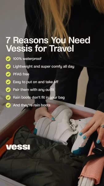
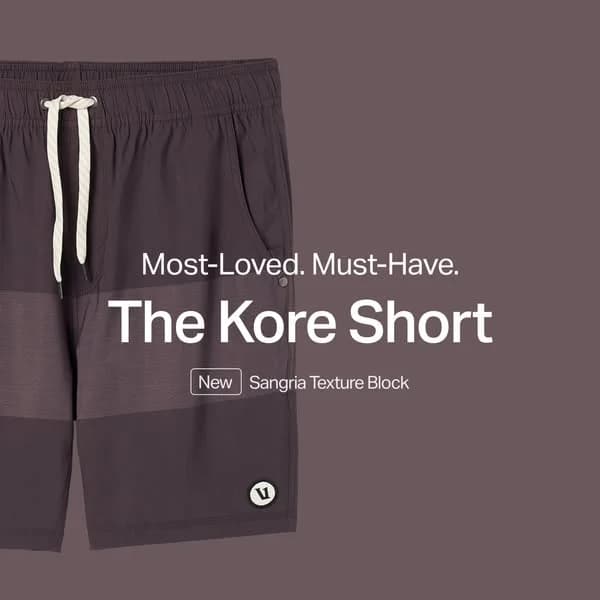
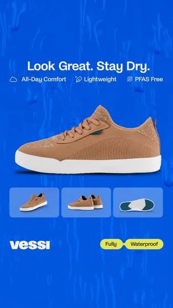
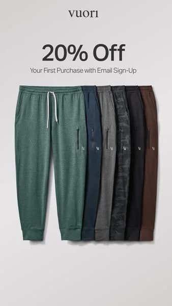
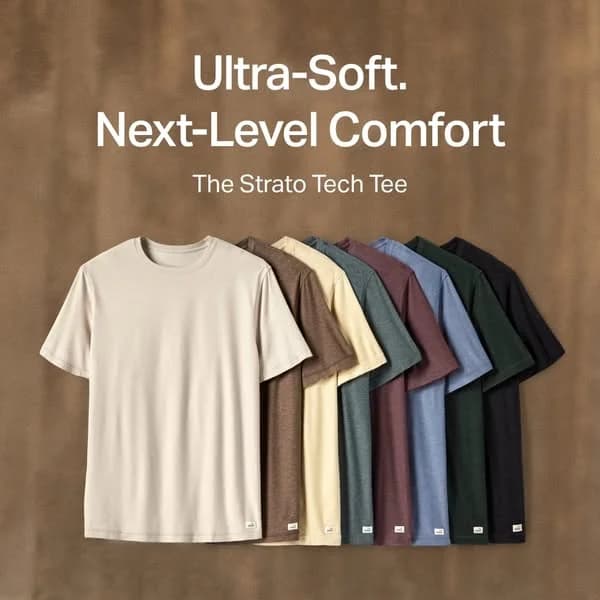
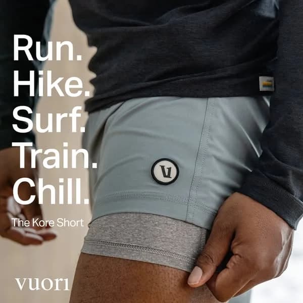
Sports and fitness advertising is paid creative for athletic apparel, equipment, supplements, and recovery products — sold through in-motion imagery rather than catalog photography. Fitness ads split sharply by goal. Performance apparel brands (Vuori, Lululemon, On Running) sell identity through athlete-in-motion editorial with no hard CTA. Equipment and supplement brands (Peloton, Tonal, ARMRA) sell transformation through gear-in-use footage, ingredient callouts, and price-prominent direct response. Three visual moves repeat: athlete mid-stride, equipment mid-rep, and honest before-after body comp.

Palettes follow positioning. Performance apparel runs muted earthy neutrals — sage, charcoal, cream, oat — because that grading reads as premium movement. Home-gym equipment runs bold red, black, and yellow because that palette reads as intensity. Supplements lean clinical white-and-navy or warm cream-and-rust depending on whether the brand sells science or wellness. Meta carries most spend; YouTube pre-roll dominates home-gym demos because the consideration cycle runs 3-6 months. 4:5 portrait holds in-motion apparel; 1:1 holds equipment hero.

Browse sports and fitness ad examples pulled from real campaigns — apparel, equipment, supplements, home gym, recovery gear, training apps. Pick a template, upload your product, and AdDogs applies your palette across three formats.
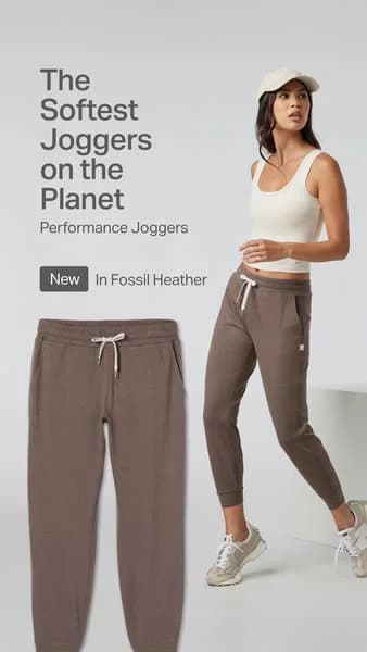
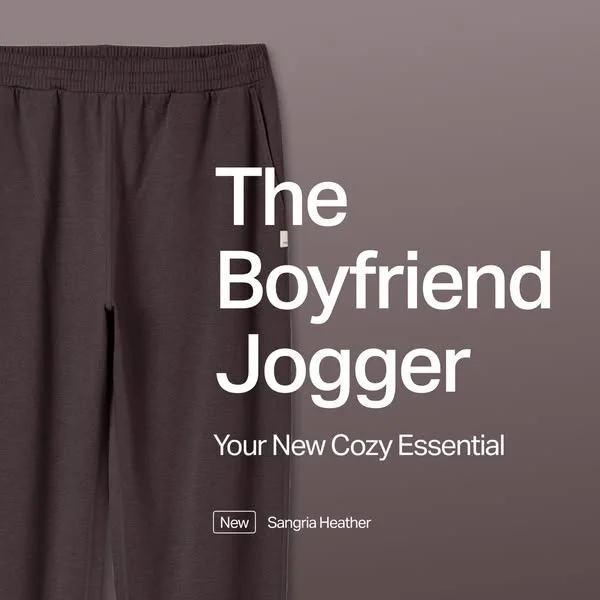
Zapply Testo Charge — Bold Product Shot. Brand: Zapply. This ad employs a high-contrast, bold layout to immediately grab attention, optimized for platforms like Facebook. The central placement of the Zapply product pouch on a wooden surface against a concrete wall creates a grounded yet powerful visual. Color psychology leverages dark tones (black, grey) with vibrant blue accents, signifying strength, energy, and trust, appealing directly to the target demographic seeking performance enhancement. Text hierarchy is clear: a large, aspirational headline at the top, followed by a supporting benefit, and a strong product claim to the right. The lightning bolt motif on the packaging and in the text reinforces the product's energetic promise. This composition effectively communicates efficacy and dominance, aiming to instill confidence and drive consideration for a male-centric supplement. The overall design is direct and impactful, minimizing distractions to focus on the product's core message.. Headline: EMPOWER YOURSELF FOR EVERY CHALLENGE. Primary text: ACHIEVE YOUR GOALS WHILE SUPPORTING YOUR NATURAL TESTOSTERONE.. Why this ad works: High-contrast palette commands attention — The stark black product packaging with a vibrant blue lightning bolt against a muted grey background and warm wood creates strong visual contrast. This ensures the ad stands out in a busy feed, immediately drawing the eye to the product and its energetic branding, crucial for scroll-stopping performance. Bold, benefit-driven headline — The headline "EMPOWER YOURSELF FOR EVERY CHALLENGE" with "EVERY CHALLENGE" in large blue text, combined with the supporting line, directly addresses the target audience's desire for strength and achievement. This aspirational messaging resonates deeply, framing the product as a solution for personal growth. Dominant product claim reinforces efficacy — The large, italicized text "THE STRONGEST T-BOOSTER IN EUROPE" acts as a powerful unique selling proposition. Placed prominently next to the product, it instills confidence and positions Zapply as a market leader, directly appealing to consumers seeking top-tier performance supplements.. Specs: Brand: Zapply, Industry: Health & Wellness, Platform: Facebook, Format: Static, Audience: Men 25-34Celsius Live Fit — Dynamic Splash Product Shot. Brand: Celsius. This ad effectively leverages a dynamic hero shot composition to highlight two Celsius Live Fit flavors. The vibrant gradient background, transitioning from cool teal to warm orange, creates a visually arresting contrast that immediately grabs attention on social feeds. The cans, depicted with water droplets and emerging from a splash, evoke extreme refreshment and energy, aligning perfectly with the brand's "Live Fit" promise. The slight off-center placement and varying heights of the cans add visual interest, guiding the eye across both products. Text hierarchy is clear, with the brand and flavor names prominent, followed by key benefits and "0 SUGAR." This ad is optimized for platforms like Instagram, where its high-energy aesthetic and clear product focus can stop the scroll and communicate the brand's core message of vitality and fitness. The composition skillfully balances product detail with an aspirational, active lifestyle feel.. Why this ad works: Dynamic water splash creates refreshment cues — The realistic water droplets and splash effect on the cans instantly communicate extreme coldness and refreshment. This visual cue is crucial for beverages, triggering a physiological desire for the product and reinforcing its invigorating qualities, especially appealing to active consumers seeking immediate revitalization and a cool, crisp taste. Vibrant gradient background enhances product appeal — The striking teal-to-orange gradient background provides a high-contrast, energetic backdrop. This color choice not only makes the white cans pop but also subtly hints at tropical flavors and an active, vibrant lifestyle, aligning with the "Live Fit" brand identity and attracting attention in a busy feed with its eye-catching palette. Clear benefit hierarchy supports quick comprehension — Key benefits like "ESSENTIAL ENERGY," "ACCELERATES METABOLISM," and "BURNS BODY FAT" are clearly listed and easily readable on the cans. This direct communication of functional advantages, alongside the "0 SUGAR" callout, allows viewers to quickly grasp the product's value proposition, catering efficiently to health-conscious and fitness-oriented audiences.. Specs: Brand: Celsius, Industry: Food & Beverage, Platform: Instagram, Format: Static, Audience: Fitness EnthusiastsBIOTEX Winter Sale — Bold Discount Layout. Brand: BIOTEX. The ad leverages a high-contrast, dark background with vibrant neon pink and teal accents to command attention on busy social feeds. The central placement of the BIOTEX logo within a bold pink brushstroke immediately establishes brand presence. The large, prominent "30%" discount, highlighted in white with a pink outline, creates a clear value proposition, driving conversion intent. Text hierarchy prioritizes the discount, followed by the brand, with "WINTER" providing context. The overall composition, while energetic, uses diagonal lines and a textured background to add dynamism, suitable for platforms like Facebook where bold, direct messaging can cut through noise. The color psychology of dark and neon suggests modernity, urgency, and excitement, appealing to an audience looking for deals. The visual chaos, paradoxically, creates a unique, memorable aesthetic that stands out from more minimalist competitors.. Headline: WINTER 30%. Why this ad works: High-contrast neon palette grabs attention — The stark contrast between the dark, textured background and the electric pink and white text immediately captures viewer attention. This vibrant color scheme is highly effective on social media feeds, cutting through visual clutter and ensuring the ad is noticed amidst more subdued content, making it a powerful scroll-stopper. Prominent discount drives immediate interest — The large, centrally placed "30%" with its bold outline is the undeniable focal point. This clear, unmissable discount percentage acts as a powerful incentive, directly communicating value and urgency. This direct approach is crucial for driving clicks and conversions in a sale-focused campaign, appealing to deal-seeking consumers. Dynamic background elements create visual energy — The diagonal teal lines and the expressive pink brushstroke behind the logo add a sense of movement and modernity to the composition. This energetic design prevents the ad from feeling static, reinforcing a bold and innovative brand image, which aligns well with the "UNDERWEAR INNOVATOR" tagline and captures a youthful, active audience.. Specs: Brand: BIOTEX, Industry: Fashion & Apparel, Platform: Facebook, Format: Static, Audience: GeneralHyperice Active Lifestyle Product Collage. Brand: Hyperice. This dynamic collage ad effectively showcases Hyperice's ecosystem of recovery and performance products. The fragmented, overlapping layout creates a sense of movement and comprehensive integration into an active lifestyle, appealing to fitness enthusiasts. Predominantly neutral colors in activewear and urban backdrops are punctuated by the brand's signature black products and subtle blue/red tech accents, maintaining a cohesive, high-performance aesthetic. Optimized for visual platforms like Instagram, the ad relies on strong imagery rather than text, making it highly scannable. The composition strategically positions products in various in-use scenarios, demonstrating versatility and immediate utility. This visual strategy communicates a holistic approach to fitness and recovery, reinforcing brand identity and product relevance without explicit messaging.. Why this ad works: Dynamic Collage Storytelling for Ecosystem — The overlapping, fragmented collage creates a narrative of an active lifestyle. It shows multiple products in various real-world scenarios, implying a comprehensive solution for fitness and recovery. This visual storytelling is engaging and communicates versatility, making the brand feel integrated into the user's journey. Product-in-Action Contextualization Boosts Relevance — Instead of isolated product shots, each item is shown being used by athletes in dynamic poses. This immediately demonstrates utility and benefits, allowing the audience to visualize how the products fit into their own fitness routines, enhancing relevance and desire for a performance-driven audience. Consistent Brand Aesthetic Reinforces Identity — Despite the diverse imagery, the consistent use of black/grey products with subtle blue/red accents, combined with clean, modern activewear and urban backdrops, reinforces a cohesive, high-performance brand identity. This visual consistency builds trust and recognition for Hyperice across its product range.. Specs: Brand: Hyperice, Industry: Health & Wellness, Platform: Instagram, Format: Carousel/Collage, Audience: Fitness EnthusiastsPompeche Tennis Wear — Lifestyle Sale Shot. Brand: Pompeche. This ad employs a dynamic lifestyle composition, featuring a model in Pompeche tennis wear on a clay court. The layout strategically places the model in an active pose, showcasing the apparel in its intended environment, which enhances product desirability. Color psychology leverages the vibrant green of the court and racket against the earthy red clay, creating a visually engaging backdrop that highlights the clean white attire. Text hierarchy is clear, with a prominent "FLASH SALE" callout and a strong discount offer ("BUY 3, GET 15% OFF") positioned centrally, ensuring immediate attention. The website URL is clearly visible for direct action. Optimized for platforms like Instagram, this visual-first approach uses aspirational imagery to connect with fitness enthusiasts, driving consideration and conversion through a compelling offer. The overall aesthetic is clean and energetic, aligning with activewear branding.. Headline: FLASH SALE. Primary text: BUY 3, GET 15% OFF. Why this ad works: Lifestyle context boosts product appeal — Featuring the apparel on a model in an authentic tennis court setting immediately elevates the product beyond mere clothing. This context allows potential customers to visualize themselves wearing the outfit, connecting with the aspirational lifestyle and enhancing perceived value and desirability. High-contrast text ensures readability — The white overlay text "BUY 3, GET 15% OFF" and "FLASH SALE" stands out sharply against the darker, earthy background of the clay court and the model's racket. This strong contrast ensures that the crucial promotional message is instantly legible, even during quick scrolls on mobile feeds, maximizing message retention. Clear call-to-action drives traffic — The explicit "VISIT THE SHOP AT WWW.POMPECHE.COM" provides a direct and unambiguous instruction for interested viewers. This clear, actionable CTA, combined with the enticing discount, reduces friction in the conversion funnel by guiding users directly to the purchase point, improving click-through rates.. Specs: Brand: Pompeche, Industry: Fashion & Apparel, Platform: Instagram, Format: Static, Audience: Women 25-34HEALTHLETIC BPC-157 — Hand & Product Value Shot. Brand: HEALTHLETIC. This ad employs a split-screen composition, juxtaposing a human element (pills in hand) with the product bottle and a strong value proposition. The layout strategically uses the human hand to ground the product in a relatable, personal context, immediately connecting the supplement to the user's daily life. A high-contrast color palette, featuring a deep teal text overlay against skin tones and a vibrant blue bottle, ensures high visibility and readability, crucial for mobile feed environments like Instagram. The text hierarchy is clear: a large, bold statement dominates the left, drawing the eye with a compelling cost-benefit comparison. This direct approach, combined with a clean, minimalist aesthetic for the product itself, positions the supplement as an accessible yet impactful health investment. The visual connection between the pill and bottle reinforces product identity, optimizing for quick comprehension and consideration.. Primary text: At $1.77 per pill, it's cheaper than a latte. AND it's the one investment in your health that will pay off the most.. Why this ad works: Relatable cost comparison drives value — The ad immediately frames the product's cost against an everyday expense like a latte. This makes the $1.77 price point feel incredibly affordable and justifiable, overcoming potential price resistance by anchoring it to a common, often unconsidered, daily spend. Human element creates immediate connection — Showing the pills in a human hand provides a tangible, relatable scale and context. This personalizes the product, making it feel less like an abstract pharmaceutical and more like a direct, accessible part of the viewer's wellness routine, fostering trust and consideration. High-contrast text overlay ensures readability — The bold white text on a dark teal background creates excellent contrast, making the crucial value proposition highly readable even on small mobile screens or when quickly scrolling. This ensures the core message is absorbed efficiently, maximizing impact in a fast-paced digital environment.. Specs: Brand: HEALTHLETIC, Industry: Health & Wellness, Platform: Instagram, Format: Static, Audience: Fitness EnthusiastsLiquid I.V. — Celebrity Endorsement Split Screen. Brand: Liquid I.V.. This ad employs a dynamic split-screen layout, effectively segmenting celebrity endorsement from product offer. The top half features Abhishek Sharma, a recognizable figure, actively using the product, lending authenticity and aspirational appeal. His genuine smile and the action shot create an immediate emotional connection. The vibrant blue and neon yellow/green color palette is high-contrast, signaling energy and hydration, optimized for scroll-stopping on platforms like Instagram or Facebook. The bottom half clearly presents the product, a special price, and the Amazon purchase point. Water droplets on the blue background subtly reinforce the hydration message. Text hierarchy guides the eye from endorsement to offer, concluding with the purchasing platform, driving consideration and conversion.. Headline: ABHISHEK SHARMA'S Hydration Pick. Primary text: EXCLUSIVE PACK OF 6 SPECIAL PRICE OF ₹698/-. Why this ad works: Celebrity endorsement builds trust and aspiration — Featuring Abhishek Sharma actively using Liquid I.V. immediately leverages his credibility and fan base. This aspirational imagery connects the product with peak performance and a healthy lifestyle, making it more desirable. Viewers are more likely to trust a product endorsed by a familiar, fit personality, driving initial interest and consideration. Split-screen layout clarifies ad messaging — The distinct two-part layout effectively separates the aspirational lifestyle component from the direct offer. This prevents visual clutter, allowing the viewer to first engage with the celebrity and product in use, then easily transition to the specific deal and purchase information. It streamlines the user journey from awareness to conversion. High-contrast colors enhance brand visibility — The bold combination of electric blue and neon yellow/green creates a visually striking ad. This vibrant palette not only captures attention in a crowded feed but also strongly associates the brand with energy, hydration, and a dynamic lifestyle. The contrast ensures readability of key text and product details, boosting recall.. Specs: Brand: Liquid I.V., Industry: Health & Wellness, Platform: Instagram, Format: Static, Audience: Fitness EnthusiastsEDDIY Leggings & Tanks — Product Grid Sale. Brand: EDDIY. This ad employs a clean, multi-product grid layout to showcase activewear, primarily focusing on leggings with a larger hero shot. The composition strategically places a bold, high-contrast sale headline at the top, immediately grabbing attention and communicating value. Below, a clear visual hierarchy presents three tank tops alongside the main leggings product, allowing for product discovery within a single frame. The minimalist white background ensures products pop, while the soft pastel blue palette evokes a sense of calm and freshness, aligning with activewear aesthetics. Optimized for platforms like Instagram, this visual approach combines product display with a strong promotional offer, driving consideration and conversion by presenting variety and value upfront. The "SHOP NOW" CTA is prominent, guiding user action.. Headline: EDDIY STRAIGHT LEGGINGS MID-YEAR BIG SALE. Primary text: BUY 2 GET 15% OFF AUTO DISCOUNT. Why this ad works: Prominent Sale Offer Drives Urgency — The bold, black-on-white headline "EDDIY STRAIGHT LEGGINGS MID-YEAR BIG SALE" and "BUY 2 GET 15% OFF AUTO DISCOUNT" immediately communicates a compelling value proposition. This direct approach cuts through noise, creating urgency and incentivizing immediate action, which is crucial for conversion-focused campaigns on social media. Multi-Product Display Enhances Discovery — By showcasing the main leggings alongside three complementary tank tops, the ad encourages broader product exploration. This grid layout allows potential customers to visualize outfits and discover additional items they might not have initially sought, increasing average order value and engagement with the brand's full range. Clean Aesthetic Highlights Product Details — The use of a stark white background and soft, consistent pastel blue tones for the apparel creates a clean, professional aesthetic. This minimalist approach ensures that the product details, textures, and fit are clearly visible without distraction, building trust and allowing the quality of the activewear to speak for itself.. Specs: Brand: EDDIY, Industry: Fashion & Apparel, Platform: Instagram, Format: Static, Audience: Women 25-34Gymshark — Intense Workout In-Use Shot. Brand: Gymshark. This ad utilizes a close-up, in-use shot, focusing on the subject's raw effort and the brand logo. The composition places the subject slightly off-center, creating dynamic tension that draws the eye. The monochromatic black and white palette emphasizes grit, authenticity, and timelessness, stripping away color distractions to focus on form and emotion, evoking a serious, no-nonsense approach to fitness. The tight crop and focus on the face and upper body convey intense dedication. The blurred background ensures the subject remains the undisputed focal point. Ideal for Instagram or Facebook feeds, this authentic, high-impact imagery drives engagement, with the black and white standing out amidst colorful content. Minimal text, just the brand logo, keeps the visual primary, allowing the image to tell a powerful story of effort and performance.. Why this ad works: Monochromatic palette emphasizes raw effort — The black and white aesthetic strips away distractions, focusing solely on the subject's intense expression and physical exertion. This creates a powerful, authentic, and timeless feel, resonating with fitness enthusiasts who value hard work and dedication over flashy aesthetics. Authentic expression builds relatable brand image — The subject's strained facial expression captures a genuine moment of effort during a workout. This authenticity is highly relatable to the target audience, fostering a deeper connection and trust with the brand by showcasing real, unglamorous aspects of fitness. In-use shot highlights product in action — By featuring the Gymshark logo prominently on the t-shirt during an intense workout, the ad subtly positions the apparel as functional and durable. This "in-use" context demonstrates the product's suitability for serious training, reinforcing its credibility without explicit claims.. Specs: Brand: Gymshark, Industry: Sports & Fitness, Platform: Instagram, Format: Static, Audience: Men 25-34KUANGMI Knee Brace — Lifestyle & Product Collage. Brand: KUANGMI. This ad employs a high-contrast split-screen layout to maximize impact and convey a clear value proposition. The left panel features a dynamic lifestyle shot of a runner wearing the knee brace, demonstrating in-use functionality and targeting fitness enthusiasts. This grounds the product in real-world application. The right panel presents a clean, isolated product shot against a neutral background, highlighting design details and material. A vibrant blue background with bold white text for "SALE" and "UP TO 50% OFF" creates an unmissable visual hierarchy, immediately communicating a strong discount. This composition is optimized for platforms like Facebook or Instagram, where scroll-stopping visuals and direct offers drive conversion. The overall design effectively balances product utility with an urgent promotional message, ensuring key information is absorbed quickly.. Headline: SALE. Primary text: UP TO 50% OFF. Why this ad works: High-contrast blue and white grabs attention — The vibrant blue background paired with bold white text creates an immediate visual pop. This high contrast ensures the "SALE" message is instantly readable and stands out in a crowded social feed, effectively stopping the scroll and drawing the viewer's eye to the promotional offer. Lifestyle and product shots build trust — Combining an in-use lifestyle image with a clean product shot effectively addresses both aspiration and detail. The runner demonstrates the product's practical application and benefit, while the isolated product view allows for closer inspection of its design and features, building credibility and purchase intent. Prominent discount drives immediate action — The large, centrally placed "SALE" and "UP TO 50% OFF" text immediately communicates a strong incentive. This direct approach to highlighting the discount creates urgency and encourages quick decision-making, crucial for conversion-focused campaigns on platforms where users scroll rapidly.. Specs: Brand: KUANGMI, Industry: Health & Wellness, Platform: Facebook, Format: Mixed, Audience: Fitness EnthusiastsPeloton Scope R3D Wheels — Bold Sale Layout. Brand: Peloton. This ad employs a high-contrast, dark background with vibrant neon pink accents to immediately grab attention, optimized for platforms where bold visuals cut through clutter. The layout strategically places the product image in the upper right, while the product name and brand are clearly highlighted. The dominant price display at the bottom, using a striking pink, leverages color psychology to signal urgency and value. Text hierarchy is clear, with the discounted price being the most prominent element, followed by the original price and product details. The overall composition is designed for quick information absorption, making it effective for conversion-focused campaigns by emphasizing the deal.. Headline: R3D WHITE. Primary text: €898. Why this ad works: High-contrast neon pink for urgency — The use of bright neon pink against a dark background creates an immediate visual pop. This color choice is psychologically linked to excitement and urgency, effectively drawing the eye to the discounted price and the brand name, signaling a hot deal that demands attention in a crowded feed. Clear price anchoring for perceived value — Displaying both the discounted price (€898) and the original price (€1498) prominently creates a strong sense of value and savings. This price anchoring technique encourages immediate consideration by highlighting the significant financial benefit, driving conversion intent among price-sensitive buyers. Product-focused layout for quick identification — Despite the busy aesthetic, the product image of the wheels is clearly visible and positioned to allow for quick identification. This ensures that even with the bold graphic elements, the core offering is immediately understood, reducing cognitive load and improving ad recall for relevant audiences.. Specs: Brand: Peloton, Industry: Sports & Fitness, Platform: Instagram, Format: Static, Audience: Fitness EnthusiastsThe North Face Geodesic Dome — Night Hero Shot. Brand: The North Face. This ad effectively uses a high-contrast hero shot to immediately capture attention. The illuminated geodesic tent, a distinctive product, is centrally composed against a stark, dark background, creating a powerful visual anchor. The warm, inviting glow of the tent contrasts sharply with the cold, dark environment, evoking feelings of safety and adventure. This color psychology positions the product as a reliable haven in extreme conditions. The North Face logo is strategically placed on the tent's panels, ensuring brand visibility without needing additional text overlay. Optimized for visual platforms like Instagram, its striking simplicity and strong contrast are designed to stop the scroll. The lack of additional text focuses all attention on the product's unique design and aspirational context.. Why this ad works: High Contrast for Scroll-Stopping Impact — The brilliant yellow-orange glow of the tent against the deep black night and subtle snow creates an immediate, high-contrast focal point. This visual pop is crucial for cutting through cluttered social feeds, ensuring the ad captures attention quickly and effectively, leading to higher view-through rates. Emotional Connection through Warmth and Safety — The illuminated tent acts as a beacon of warmth and security in a harsh, dark environment. This evokes strong positive emotions like comfort, adventure, and resilience, directly associating the product with desirable outdoor experiences and reliable protection, fostering deeper brand loyalty. Integrated Brand Visibility and Product Focus — The North Face logo is seamlessly incorporated into the tent's design, making the brand an intrinsic part of the product's appeal. This avoids overt branding while ensuring recognition, allowing the unique product design and its aspirational context to be the primary focus, enhancing product desirability.. Specs: Brand: The North Face, Industry: Sports & Fitness, Platform: Instagram, Format: Static, Audience: Fitness Enthusiasts28-Day Wall Pilates — Age-Segmented Grid. This ad employs a grid layout to segment its "28-Day Wall Pilates" program by age, effectively targeting diverse older demographics. The clean, illustrative style with 3D avatars performing exercises simplifies complex routines, enhancing approachability. Color psychology uses warm orange for age segmentation, drawing attention to relevant sections, while the overall bright, outdoor background suggests vitality. Compositionally, the clear division into age blocks with distinct workout lists optimizes for quick scanning on platforms like Instagram or Facebook. The high text density, though detailed, is organized hierarchically, allowing users to quickly identify their age group and the corresponding routine, fostering consideration by providing immediate value. This design prioritizes clarity and direct information delivery.. Headline: 28-DAY WALL PILATES GET READY FOR SUMMER. Why this ad works: Age-segmented content boosts relevance — The ad strategically divides the program by specific age ranges (45-50, 50-55, etc.). This hyper-segmentation immediately signals relevance to the viewer, making them feel the content is tailored for their specific needs and physical capabilities, significantly increasing engagement and perceived value. Illustrative avatars simplify complex exercises — Using simple 3D avatars to demonstrate pilates poses makes the exercises easy to understand without needing video. This visual clarity reduces intimidation often associated with new fitness routines, encouraging older audiences to believe they can perform the movements, thus lowering the barrier to entry. Grid layout enhances scannability and information density — The organized grid structure allows for a high volume of information (multiple routines, age groups) to be presented clearly. Viewers can quickly scan for their relevant age bracket and absorb the workout details, making the ad highly informative and efficient for consideration-stage marketing.. Specs: Industry: Health & Wellness, Platform: Instagram, Format: Static, Audience: Women 45+Trans Canada Trail — Man with Informational Sign. Brand: Trans Canada Trail. This ad effectively combines a human element with data visualization to promote the Trans Canada Trail's "Trail Care" program. The smiling man, positioned beside a detailed informational sign, creates an approachable and trustworthy connection to the initiative. The composition places the man and sign prominently, leveraging a natural outdoor backdrop that reinforces the organization's mission. While the background is slightly busy, the clear text hierarchy on the sign guides the viewer through key impact metrics. The overall aesthetic is clean and informative, optimized for social platforms like Instagram where authentic, community-focused content resonates. It aims to build awareness and encourage engagement by showcasing tangible results and the positive impact of volunteers, appealing to those who value outdoor recreation and environmental stewardship.. Headline: TRAIL CARE. Primary text: Every spring, thousands of volunteers help to prepare their trail sections for the summer, through cleanup and improvement projects, ensuring that all users can safely access the benefits of outdoor recreation on the Trans Canada Trail.. Why this ad works: Human Element Builds Trust & Relatability — Featuring a smiling individual next to the informational sign immediately humanizes the cause. This personal connection makes the data more impactful and the organization more approachable. Viewers are more likely to engage with content that feels authentic and represents real people involved in the mission. Clear Data Visualization Shows Impact — The sign effectively uses clear headings, numbers, and a map to convey the program's financial and volunteer impact. Presenting tangible results like "$248,250 in grants" and "$1.2 million total impact" builds credibility and demonstrates the effectiveness of the "Trail Care" initiative, encouraging support. Authentic Outdoor Setting Reinforces Mission — The ad's natural outdoor backdrop, featuring trees and grass, directly aligns with the Trans Canada Trail's mission of trail maintenance and outdoor recreation. This authentic environment visually connects the message to its purpose, enhancing the ad's credibility and appealing to the target audience's values for nature.. Specs: Brand: Trans Canada Trail, Industry: Health & Wellness, Platform: Instagram, Format: Static, Audience: GeneralAdidas Sportswear — Vibrant Split Screen Sale. Brand: Adidas. This Adidas ad employs a dynamic split-screen layout, contrasting a model shot with a product detail to create visual interest. The vibrant color palette, featuring energetic teal, yellow, and orange, evokes a summery, active mood, perfectly aligning with sportswear. Compositionally, the bold diagonal split and large 'UP TO 50% OFF' text dominate the frame, ensuring the core message is immediately clear. This strong text hierarchy prioritizes the discount, driving urgency. Optimized for platforms like Instagram, the square format and high-contrast elements are designed to stop the scroll. The ad effectively balances brand presence with a compelling promotional offer, leveraging color psychology and direct messaging for high engagement and conversion potential.. Primary text: UP TO 50% OFF. Why this ad works: High-contrast split screen grabs attention — The distinct color blocks and subject matter create immediate visual interest, making the ad stand out in a busy feed. This dynamic composition prevents visual monotony and encourages engagement by presenting two complementary yet distinct visual narratives simultaneously, drawing the eye across the frame effectively. Bold discount text drives urgency — 'UP TO 50% OFF' is prominently displayed in large, white, high-contrast font. This clear value proposition immediately communicates a compelling reason to click, leveraging scarcity and savings psychology for conversion. Its dominant placement ensures the primary message is absorbed instantly, driving immediate user action. Vibrant, energetic color palette — The combination of bright teal, sunny yellow, and warm orange backgrounds evokes summer, activity, and positivity. This color choice aligns perfectly with sportswear, creating an aspirational and inviting mood that resonates with the target audience. It visually communicates energy and freshness, enhancing brand perception.. Specs: Brand: Adidas, Industry: Fashion & Apparel, Platform: Instagram, Format: Static, Audience: Women 25-34True Classic — Problem/Solution Split Screen. Brand: True Classic. This ad effectively uses a split-screen comparison to highlight product benefits. The left panel vividly portrays a common problem: sweat stains and discomfort, creating an immediate, relatable pain point. The right panel offers the aspirational solution, showcasing a confident model in True Classic apparel, emphasizing performance features. Color psychology contrasts the sickly yellow stain against a vibrant green, while the solution side uses natural, muted tones for a clean, active aesthetic. The composition guides the eye from problem to solution, with clear text hierarchy supporting the narrative. This visual storytelling is optimized for platforms like Instagram, where quick, impactful comparisons drive engagement and consideration by directly addressing user needs. The ad's directness and visual clarity make it highly effective.. Headline: LOOK GOOD, FEEL GOOD, SMELL GOOD. Primary text: OTHER BRANDS Traps odors Sweat stains Too rigid TRUE CLASSIC Odor-control Moisture-wicking 4 way stretch. Why this ad works: Direct Problem/Solution Visual Comparison — The split-screen layout immediately contrasts a negative experience with the brand's positive solution. This "before and after" approach is highly effective for direct-response advertising, as it quickly communicates value and addresses common pain points, compelling viewers to consider the product as a superior alternative. Visceral Imagery Creates Strong Pain Point — The prominent sweat stain on the "Other Brands" side is a powerful, relatable visual that evokes discomfort and embarrassment. This visceral imagery creates a strong emotional connection, amplifying the perceived need for a solution and making the benefits offered by True Classic feel more urgent and desirable. Clear Feature List with Benefit-Oriented Icons — The use of concise bullet points alongside intuitive icons for "Odor-control," "Moisture-wicking," and "4 way stretch" on the True Classic side ensures quick comprehension of key benefits. This visual aid enhances readability and allows users to grasp the product's advantages at a glance, crucial for fast-scrolling social feeds.. Specs: Brand: True Classic, Industry: Fashion & Apparel, Platform: Instagram, Format: Static, Audience: Men 25-34Athletic Brewing Co. — Hand Holding Can in Water. Brand: Athletic Brewing Co.. This ad employs a dynamic, in-use layout, featuring a hand emerging from splashing water, prominently holding an Athletic Brewing Co. "Run Wild" non-alcoholic IPA can. The composition leverages a bright, natural color palette of blues and whites, evoking freshness, activity, and the outdoors, aligning perfectly with the brand's active lifestyle positioning. The product is the clear focal point, positioned centrally within the action. Below, minimalist icons and text clearly communicate key ingredients, adding transparency and appealing to health-conscious consumers. This visual strategy is highly optimized for platforms like Instagram, where engaging, aspirational lifestyle imagery captures attention. The minimal text overlay keeps the focus on the compelling visual narrative, allowing the product's design and contextual placement to communicate its value proposition effectively.. Why this ad works: Dynamic Action Shot Creates Engagement — The hand dramatically emerging from splashing water immediately grabs attention. This active, in-use context visually communicates the product's association with adventure and refreshment, making it highly relatable for an active target audience and stopping the scroll. Clear Product Focus and Brand Integration — Despite the dynamic background, the can is held prominently and clearly visible. The brand name and product type are legible, ensuring immediate recognition. This seamless integration of product into a lifestyle scene reinforces brand identity effectively, building strong mental associations. Ingredient Transparency Builds Trust — The inclusion of simple, clear icons for water, hops, grain, and yeast at the bottom provides essential product information. This transparency appeals to consumers seeking natural ingredients and reinforces the product's quality and health-conscious appeal, fostering consumer confidence.. Specs: Brand: Athletic Brewing Co., Industry: Food & Beverage, Platform: Instagram, Format: Static, Audience: Fitness EnthusiastsPuma Holiday Sale — Festive Product Stack. Brand: Puma. This ad leverages a vibrant, high-contrast holiday aesthetic to drive immediate conversion. The diagonal composition, featuring stacked Puma gift boxes, creates dynamic visual interest, leading the eye from the prominent "40% OFF HOLIDAY" headline to the "SHOP NOW" call-to-action. The festive red brick background and tinsel reinforce the seasonal theme, tapping into consumer holiday shopping intent. Color psychology uses bold reds and greens for excitement and tradition, ensuring high visibility in a crowded feed. Text hierarchy is clear: the discount is the hero, followed by the actionable CTA, optimized for quick comprehension on mobile platforms like Instagram. The overall design is energetic and direct, minimizing cognitive load for impulse purchases.. Headline: UP TO 40% OFF HOLIDAY. Why this ad works: High-contrast holiday palette grabs attention — The bold combination of deep red, vibrant green, and stark white text immediately signals a holiday sale. This high contrast ensures the ad stands out in a busy social feed, leveraging festive colors to evoke urgency and excitement, crucial for seasonal promotions. Dynamic diagonal composition guides the eye — The arrangement of gift boxes on a diagonal creates a sense of movement and depth. This technique naturally leads the viewer's eye from the top-left headline down towards the bottom-right CTA, ensuring key information is processed efficiently and engagingly. Prominent discount offer drives immediate action — The "UP TO 40% OFF HOLIDAY" text is the largest and most central element, clearly communicating the value proposition. This direct and unmissable discount acts as a powerful incentive, compelling users to click through and explore the sale without delay.. Specs: Brand: Puma, Industry: Fashion & Apparel, Platform: Instagram, Format: Static, Audience: GeneralPrintable Chair Workout — Before/After & Plan. This ad employs a classic before-and-after layout, showcasing a clear progression of weight loss over four weeks, which is highly effective for direct-response campaigns. The visual transformation of the model provides strong social proof and aspirational appeal for the target demographic. Below, a detailed 28-day workout plan grid reinforces the program's structure and tangibility, addressing potential skepticism. The bright, contrasting colors of the model's shirts help differentiate each week's progress, while the olive green background provides a stable, health-oriented feel. Text hierarchy is clear: a bold headline, a specific benefit, and a prominent call to action. Optimized for platforms like Facebook or Pinterest, where users seek actionable solutions and visual proof. The "printable" aspect suggests a tangible, accessible product.. Headline: PRINTABLE CHAIR WORKOUT PLAN. Primary text: TO LOSE UP TO 22 LBS OF BELLY FAT. Why this ad works: Clear Before/After Visual Progression — The four-week visual sequence of the same woman clearly demonstrates the product's efficacy. This before-and-after format is incredibly powerful for weight loss ads, providing immediate, undeniable proof of results. It builds trust and motivates the target audience by showing a relatable transformation over a short, achievable timeframe. Specific Benefit-Oriented Headline — The headline "TO LOSE UP TO 22 LBS OF BELLY FAT" is highly specific and addresses a common pain point directly. Quantifiable results like "22 lbs" and targeting a specific area "belly fat" resonate strongly with the audience, creating a clear value proposition and immediate interest in the solution offered. Actionable, Tangible Workout Plan Display — Presenting the full 28-day workout plan within the ad itself provides transparency and builds confidence. It shows exactly what the user will get, reducing perceived risk and increasing the likelihood of conversion. This detailed preview appeals to users looking for structured, easy-to-follow fitness solutions, reinforcing the "printable" value.. Specs: Industry: Health & Wellness, Platform: Facebook, Format: Static, Audience: Women 45+NUGENIX TOTAL-T2 — Product Lineup Shot. Brand: NUGENIX. This ad employs a direct-response layout, featuring three NUGENIX TOTAL-T2 bottles prominently displayed against a slightly blurred retail background. The bold red 'NEW!' banner immediately captures attention, signaling a product launch. The high-contrast black bottles with white and gold text ensure readability of key benefits. Compositionally, the products are centrally aligned, creating a strong visual anchor. The explicit 'NOT SOLD IN STORES' text at the bottom reinforces a DTC model and creates exclusivity. This design is optimized for platforms like Facebook, where clear product presentation and strong value propositions drive clicks. Text hierarchy prioritizes novelty, then product benefits, and finally the unique distribution channel, guiding the viewer through a persuasive narrative.. Headline: NEW!. Primary text: NOT SOLD IN STORES. BOOST FREE & TOTAL TESTOSTERONE. FEEL STRONGER, LEANER WITH MORE ENERGY. SUPPORT STRONGER DRIVE. NITRIC OXIDE BOOST STARTS IN JUST 3 HOURS.. Why this ad works: Red 'NEW!' banner grabs attention — The prominent red 'NEW!' banner acts as an immediate scroll-stopper, leveraging novelty bias to grab attention. This direct visual cue signals a product launch or update, creating urgency and curiosity. It effectively communicates fresh value, encouraging viewers to learn more about the latest offering from the brand. Exclusivity drives direct-to-consumer purchases — The explicit 'NOT SOLD IN STORES' text creates a sense of exclusivity and reinforces the direct-to-consumer model. This unique selling proposition can drive higher conversion rates by implying a special, unavailable-elsewhere product. It also subtly positions the brand as premium or specialized, bypassing traditional retail channels. Clear product benefits on bottle — Clear, concise benefit bullet points on the product label are highly effective for quick information absorption. Listing 'BOOST FREE & TOTAL TESTOSTERONE' and 'FEEL STRONGER, LEANER' directly addresses target audience pain points. This ensures that even a quick glance conveys the core value proposition, driving interest efficiently.. Specs: Brand: NUGENIX, Industry: Health & Wellness, Platform: Facebook, Format: Static, Audience: Men 35-44Nugenix Total-T2 — Bold Product Hero Shot. Brand: Nugenix. This ad employs a high-contrast, split-screen layout, featuring the Nugenix Total-T2 product prominently on the left against a bright bokeh background. The bold, black headline on the right immediately communicates a direct benefit, "FEEL STRONGER & LEANER IN JUST 2 WEEKS," leveraging a strong value proposition. The color palette of black, white, and gold conveys strength, premium quality, and energy, resonating with the target demographic. Compositionally, the product is anchored on the left, creating a natural visual flow towards the benefit-driven text and the compelling "TRY FOR JUST $5.99" offer at the bottom right. This clear hierarchy ensures key information is absorbed quickly. Optimized for platforms like Facebook or Instagram, its strong visual contrast and direct messaging are designed to stop the scroll and drive immediate consideration, appealing to men seeking tangible fitness and vitality improvements. The text overlay is medium, balancing product details with a powerful headline.. Headline: FEEL STRONGER & LEANER IN JUST 2 WEEKS. Primary text: BOOST FREE & TOTAL TESTOSTERONE* FEEL STRONGER, LEANER WITH MORE ENERGY* SUPPORT STRONGER DRIVE* NITRIC OXIDE BOOST STARTS IN JUST 3 HOURS*. Why this ad works: High-contrast split layout for immediate impact — The ad effectively uses a split layout with a dark product against a light background, contrasting with bold black text. This high contrast ensures maximum readability and visual pop in a crowded feed, immediately drawing the eye to both the product and the core benefit, making it a strong scroll-stopper. Direct benefit headline drives immediate interest — The headline "FEEL STRONGER & LEANER IN JUST 2 WEEKS" is highly specific and benefit-oriented. It addresses a core desire of the target audience with a clear timeframe, creating urgency and a strong value proposition that encourages further engagement and consideration for the product. Clear trial offer reduces purchase barrier — The prominent "TRY FOR JUST $5.99" offer at the bottom right significantly lowers the barrier to entry. This small trial price encourages hesitant prospects to experience the product with minimal financial risk, effectively moving them down the conversion funnel by making the initial commitment easy.. Specs: Brand: Nugenix, Industry: Health & Wellness, Platform: Facebook, Format: Static, Audience: Men 25-34YEOREO Eddy Straight Leggings — Feature Grid. Brand: YEOREO. This ad effectively utilizes a multi-panel grid layout to showcase the YEOREO Eddy Straight Leggings, emphasizing key features from different angles. The clean, high-contrast composition of black leggings against a light grey background ensures the product is the undeniable focal point, optimizing for visual clarity on busy social feeds. Text hierarchy is clear: brand and product name at the top, followed by a prominent discount offer, then detailed visual explanations. This structure guides the viewer from product identification to value proposition, then to feature understanding. The minimalist color palette keeps the focus on the garment's design and fit, appealing to an audience seeking functional yet stylish activewear. It's well-suited for platforms like Instagram where direct product presentation and clear offers drive consideration and conversion.. Headline: YEOREO EDDIY STRAIGHT LEGGINGS. Primary text: BUY 1 GET 10% OFF, BUY 2 GET 15% OFF. Why this ad works: Multi-angle product showcase for feature emphasis — The three-panel layout effectively highlights specific design elements like the V-back contouring, high-waist, and no front seam. This visual breakdown educates the consumer on the product's benefits and quality, addressing potential fit concerns upfront and building confidence in the purchase decision. Prominent discount offer drives immediate conversion — Placing the "BUY 1 GET 10% OFF, BUY 2 GET 15% OFF" offer in a high-contrast black bar immediately below the product name captures attention. This direct incentive reduces purchase friction and encourages higher average order value, making the ad highly effective for conversion-focused campaigns. Clean, high-contrast visuals enhance product clarity — The stark contrast between the black leggings and the light grey background ensures maximum visibility and focus on the product's form and texture. This clean aesthetic prevents visual clutter, making the ad easy to process quickly and allowing the product's design to speak for itself, crucial for apparel advertising.. Specs: Brand: YEOREO, Industry: Fashion & Apparel, Platform: Instagram, Format: Static, Audience: Women 25-34Tactical Black Cylinder — Handheld Hero Shot. This ad employs a stark, minimalist composition, featuring a dark cylindrical product held by a tattooed hand against a pure black background. The high contrast between the subtly lit product and the deep shadows creates a dramatic, premium aesthetic. The layout strategy centers the product, drawing immediate attention to its form and texture, while the human hand provides a sense of scale and implied utility, making the product feel tangible and accessible. The dark color psychology evokes sophistication, strength, and mystery, appealing to an audience that values ruggedness and quality. Optimized for visual platforms like Instagram, its bold simplicity cuts through visual clutter. The absence of text hierarchy forces the viewer to engage solely with the visual, relying on strong product photography to convey its essence and appeal.. Why this ad works: High contrast on dark background — The stark contrast of the dark product against the pure black background creates a powerful visual impact. This technique highlights the product's silhouette and texture, making it stand out dramatically in a busy feed. It communicates a sense of premium quality and robust design, capturing attention effectively through its bold simplicity and sophisticated aesthetic. Human element adds scale and relatability — Including a human hand in the composition serves multiple purposes. It provides immediate scale, allowing viewers to understand the product's size and ergonomics. The tattooed forearm adds a rugged, authentic, and aspirational touch, suggesting the product is for active or discerning individuals. This human element fosters relatability and implies practical use. Minimalist composition focuses product — The minimalist approach, with generous negative space, ensures the product is the undisputed focal point. By eliminating distractions, the ad forces the viewer's eye directly to the item, allowing them to appreciate its design and perceived quality without visual clutter. This clean composition enhances memorability and brand recall.. Specs: Industry: Sports & Fitness, Platform: Instagram, Format: Static, Audience: Men 25-34Outdoor Gear — Organic Texture Shot. This ad subtly showcases a textured product, likely outdoor or wellness gear, within a natural, sun-dappled environment. The shallow depth of field blurs the surrounding dry grass, focusing attention on the product's material and the intricate patterns created by light and shadow. The color palette, dominated by earthy browns and a deep teal/green, evokes a sense of calm and connection to nature. This aesthetic is highly effective for visual-centric platforms like Instagram or Pinterest, where lifestyle imagery and aspirational content thrive. The absence of explicit text or branding fosters curiosity, positioning the ad for initial awareness and engagement by inviting viewers to ponder the product's identity and purpose, appealing to an audience valuing natural experiences and quality design.. Why this ad works: Evokes curiosity through subtle product placement — The product is partially obscured and not immediately identifiable, creating a sense of mystery. This encourages viewers to pause and engage longer with the image, prompting them to wonder what the product is and its purpose, driving initial interest and awareness in a crowded feed environment. Natural aesthetic connects with wellness audience — The use of dry grass, natural light, and earthy tones immediately links the product to outdoor activities, mindfulness, or eco-conscious living. This organic vibe resonates strongly with health and wellness enthusiasts, positioning the product as part of a natural, balanced lifestyle and appealing to their values. Texture and shadow create visual depth — The detailed texture of the product, enhanced by the strong shadows from overhead foliage, adds significant visual interest and a premium feel. This interplay of light and dark, combined with the shallow depth of field, gives the image an artistic quality that captures attention and encourages closer inspection.. Specs: Industry: Sports & Fitness, Platform: Instagram, Format: Static, Audience: GeneralKuangmi Knee Brace — Direct Comparison Layout. Brand: Kuangmi. This ad effectively uses a split-screen comparison layout to highlight product superiority. The contrasting color blocks—a muted grey for competitors and a vibrant blue for Kuangmi—immediately draw the eye to the advertised product. Compositionally, placing the "other" product on the left establishes a common problem, while Kuangmi on the right offers the clear, superior solution, aligning with natural reading patterns. The clear visual hierarchy uses bold headings and distinct icons (red crosses vs. green checkmarks) to guide the viewer through the benefits and pain points. This direct, feature-focused approach is optimized for platforms like Facebook or Google where users are often in a consideration phase, seeking clear value propositions. The high text overlay ensures all key selling points are communicated upfront, minimizing ambiguity and driving conversion intent by directly addressing common frustrations.. Headline: Kuangmi™. Primary text: Other Knee Braces: Just tight fabric, Same old design, Slides, bunches, pinches, Little relief, no support. Kuangmi™: Gel zones for pressure relief, Built-in side stabilizers, Less swelling, more movement, Comfortable all-day fit.. Why this ad works: Direct comparison highlights clear advantages — The side-by-side layout immediately contrasts Kuangmi with generic alternatives. By explicitly listing competitor flaws alongside Kuangmi's solutions, the ad creates a compelling narrative of superiority. This method is highly effective for educating consumers on unique selling points and justifying a purchase decision. Color psychology reinforces value proposition — The use of a dull grey for "other" braces and a vibrant, trustworthy blue for Kuangmi subtly communicates inferiority versus reliability. Red "X" marks for problems and green checkmarks for benefits provide instant visual cues, making the comparison digestible and persuasive even at a glance. Problem-solution narrative drives engagement — The ad first articulates common pain points associated with typical knee braces, resonating with potential customers' existing frustrations. It then immediately presents Kuangmi as the definitive solution, offering specific, tangible benefits. This structure effectively captures attention and builds a strong case for the product.. Specs: Brand: Kuangmi, Industry: Health & Wellness, Platform: Facebook, Format: Static, Audience: Fitness EnthusiastsWilderness Athlete — Dynamic Split Screen Testimonial. Brand: Wilderness Athlete. This ad effectively uses a split-screen layout to combine aspirational lifestyle imagery with direct social proof. The left side features a dynamic, in-action shot of an athlete in a rugged outdoor environment, immediately connecting with the target audience's values. The right side, a dark panel with a topographic map texture, presents the brand logo, a bold testimonial, and product visuals. This contrast in backgrounds creates a clear visual hierarchy, guiding the eye from the aspirational lifestyle to the product benefits and user validation. The color palette blends earthy outdoor tones with the brand's strong black and red, signaling both natural connection and powerful performance. Text hierarchy prioritizes the impactful testimonial quote, followed by the detailed user experience, reinforcing credibility. Optimized for platforms like Instagram or Facebook, this ad leverages visual storytelling and social proof to drive consideration among active individuals.. Headline: IT IS EPIC. Primary text: I ENJOY THIS AS AN ALTERNATIVE TO COFFEE ON MORNINGS & ALSO COMBINE IT WITH HYDRATE AND RECOVER TO MAKE A "SUPERMAN" DRINK ON HIGH DEMAND DAYS - JOHNNY. Why this ad works: Split-screen blends lifestyle and social proof — The ad masterfully divides the frame, dedicating one side to an aspirational outdoor scene and the other to a compelling user testimonial and product display. This dual focus simultaneously inspires potential customers with relatable imagery and builds trust through authentic social proof, making the product relevant to their active lifestyle. Authentic testimonial builds strong credibility — Featuring a direct quote from "Johnny" detailing specific product usage ("alternative to coffee," "combine with Hydrate and Recover") provides tangible value and real-world application. This personal endorsement, complete with a five-star rating, significantly enhances the product's credibility and encourages prospective buyers to envision its benefits in their own routine. Rugged aesthetic resonates with target audience — The combination of the outdoor action shot, the topographic map background, and the brand's bold black and red color scheme creates a powerful, rugged aesthetic. This visual language directly appeals to the "Wilderness Athlete" demographic, signaling that the product is designed for demanding environments and high-performance individuals, fostering immediate brand connection.. Specs: Brand: Wilderness Athlete, Industry: Health & Wellness, Platform: Instagram, Format: Static, Audience: Men 25-34Colorful Smartwatch Bands — Diagonal Product Display. This ad effectively uses a dynamic diagonal composition to showcase three distinct smartwatch bands. The layout creates visual interest, leading the eye from the foreground black band to the vibrant orange in the background, implying variety. Color psychology is leveraged with the bold orange suggesting energy and individuality, while blue offers reliability, and black provides classic versatility. The dark, textured background provides excellent contrast, making the product colors pop, which is crucial for scroll-stopping on platforms like Instagram or Facebook. The minimalist approach, devoid of text overlay, keeps the focus entirely on the product's design and material quality. This composition is optimized for mobile feeds, where clear product visibility and appealing aesthetics drive engagement and consideration, allowing the product's visual appeal to communicate its value.. Why this ad works: Diagonal composition creates dynamic visual flow — The diagonal arrangement of the three watch bands guides the viewer's eye across the image, creating a sense of movement and showcasing product variety effectively. This technique breaks the monotony of a static grid, enhancing engagement and making the ad more visually appealing in a crowded feed. High contrast highlights product colors — The vibrant orange and blue bands, along with the classic black, stand out sharply against the dark, textured background. This strong contrast ensures the products are immediately noticeable, drawing attention to their distinct colors and textures, which is vital for product differentiation and stopping the scroll. Minimalist aesthetic emphasizes product quality — By removing distractions like excessive text or busy props, the ad maintains a clean and minimalist aesthetic. This approach directs all focus to the watch bands themselves, allowing potential customers to appreciate the material, texture, and craftsmanship without visual clutter, signaling premium quality.. Specs: Industry: Fashion & Apparel, Platform: Instagram, Format: Static, Audience: GeneralNuun Sport Hydration — Product Lineup Splash. Brand: Nuun. This ad effectively introduces a new product line using a dynamic, vibrant composition. The diagonal arrangement of the Nuun Sport Hydration sticks creates a sense of energy and movement, reinforced by the water splashes and fresh fruit. This layout strategy draws the eye across all five new flavors, highlighting variety. Color psychology is leveraged through bright, appealing product packaging and natural fruit hues against a clean, light background, signaling freshness and efficacy. The clear text hierarchy, with a prominent headline and a distinct "SHOP NOW" CTA, guides the viewer. Optimized for visual platforms like Instagram, its clean yet energetic aesthetic ensures scroll-stopping appeal, communicating refreshment and newness instantly. The composition allows for easy recognition of each product, crucial for a launch campaign.. Headline: Say Hello to the Newest Members of the Nuun Squad. Why this ad works: Dynamic diagonal composition for energy — The products are arranged on a diagonal axis, creating visual flow and dynamism. This technique prevents the ad from feeling static, implying movement and energy, which is highly relevant for a "Sport Hydration" product. It effectively guides the viewer's eye across the entire new lineup, ensuring all products receive attention. Vibrant colors and fresh fruit appeal — The ad uses a bright, inviting color palette, combining the distinct blue of Nuun packaging with the natural, vivid colors of fresh fruits (strawberries, blueberries, lime, orange). These elements visually communicate natural flavor and refreshment, tapping into positive associations and making the hydration products appear delicious and invigorating. Clear product lineup for new launch — By showcasing all five new flavors prominently with their corresponding fruit visuals and clear labels, the ad effectively communicates a product launch. This direct presentation allows consumers to quickly grasp the variety available, generating excitement and interest in the "Newest Members of the Nuun Squad," a key goal for awareness campaigns.. Specs: Brand: Nuun, Industry: Health & Wellness, Platform: Instagram, Format: Static, Audience: Fitness EnthusiastsLiquid IV — Athlete In-Use Lifestyle Shot. Brand: Liquid IV. This ad leverages an influencer marketing strategy, featuring cricketer Nehal Wadhera preparing a Liquid IV drink. The composition is a casual, in-use shot, making the product integration feel organic and authentic for an Instagram Story. The warm, inviting lighting and natural setting enhance relatability. Text overlays are strategically placed to highlight the influencer's endorsement and the product's function as a "recovery essential." The visual hierarchy guides the eye from the influencer's profile, to the endorsement, then to the product in action, and finally to the call-out for the brand. This approach builds trust through association, optimizing for engagement and awareness within a social feed where authenticity resonates more than polished studio shots. The focus is on demonstrating usage rather than just product display.. Headline: Elite recovery for @nehalwadhera. Primary text: My recovery essential @liquidiv.in. Why this ad works: Influencer Credibility Drives Trust — Featuring a recognizable athlete like Nehal Wadhera immediately lends credibility to Liquid IV. His endorsement as a "recovery essential" suggests professional-grade efficacy, resonating with fitness enthusiasts and younger demographics who follow sports figures. This authentic integration feels less like a direct ad and more like a genuine recommendation. In-Use Demonstration Enhances Relatability — The ad shows the product being actively prepared, illustrating its ease of use and integrating it into a daily routine. This visual demonstration is more compelling than a static product shot, allowing potential customers to envision themselves using Liquid IV for their own recovery needs, fostering consideration. Strategic Text Overlays Guide Engagement — The text boxes "Elite recovery for @nehalwadhera" and "My recovery essential @liquidiv.in" clearly communicate the product's benefit and brand. Placed at the top and bottom, they frame the central action, ensuring key messages are absorbed without distracting from the authentic lifestyle portrayal, driving brand recall.. Specs: Brand: Liquid IV, Industry: Health & Wellness, Platform: Instagram, Format: Static, Audience: Men 18-24YEOREO Eddy Leggings — Product & Model Split. Brand: YEOREO. This ad effectively uses a split-screen layout to showcase both the product's design integrity and its flattering fit on a model. The top banner, in a vibrant red, immediately communicates urgency and value with "FLASH SALE" and "15% OFF," leveraging color psychology to grab attention. Compositionally, the product-only shot on the left provides a clear view of the garment's details, while the model shot on the right demonstrates its real-world appeal and shaping qualities. This dual presentation is optimized for platforms like Instagram, where visual clarity and aspirational imagery drive engagement. Text hierarchy places the compelling offers at the top, ensuring they are seen first, followed by the product name at the bottom for clear identification. The overall clean background ensures the product remains the central focus.. Headline: FLASH SALE New Drops 🔥. Primary text: BUY 2 SAVE 15% OFF AUTO DISCOUNT. Why this ad works: Dual product view highlights form and fit — By presenting both a standalone product shot and an in-use model shot, the ad effectively communicates the leggings' design details and how they enhance the wearer's figure. This dual perspective addresses both practical and aspirational purchase drivers, crucial for apparel. Prominent sale offers drive urgency — The bold red banner at the top, featuring "FLASH SALE" and "15% OFF," immediately captures attention and creates a sense of urgency. This strategic placement ensures the value proposition is the first thing viewers see, encouraging quick action and higher click-through rates. Clear product naming for easy identification — Placing the full product name, "YEOREO EDDIY STRAIGHT LEGGINGS," in a large, clean font at the bottom of the ad ensures immediate brand and product recognition. This clarity helps potential customers easily find the item post-click, reducing friction in the conversion funnel.. Specs: Brand: YEOREO, Industry: Fashion & Apparel, Platform: Instagram, Format: Static, Audience: Women 25-34World Triathlon Athlete — Victory Banner Hero Shot. Brand: World Triathlon. This ad effectively leverages a hero shot composition, placing the triumphant athlete centrally, holding a 'PARIS' banner. The blurred, iconic Parisian backdrop (Les Invalides dome) provides a strong sense of place and prestige without distracting from the main subject. The vibrant blue of the banner and the athlete's kit (featuring red and white) create high contrast against the lighter background, ensuring visual pop. This composition is optimized for social feeds like Instagram, where a clear, aspirational image quickly captures attention. Text hierarchy is minimal, with "PARIS" and "World Triathlon" on the banner serving as key identifiers, supported by sponsor logos on the kit. The overall effect is one of achievement and excitement, designed to engage sports enthusiasts and build event awareness.. Why this ad works: Central athlete and banner create strong focus — The central placement of the athlete and the prominent 'PARIS' banner immediately draws the eye. This strong focal point symbolizes victory and achievement, creating an emotional connection with the audience. In a crowded feed, this clear visual hierarchy ensures the ad's core message of triumph is instantly understood and celebrated. Iconic Paris backdrop adds prestige and context — The blurred but recognizable golden dome of Les Invalides in the background grounds the event in an iconic, prestigious location. This adds a layer of grandeur and global significance, elevating the perceived value and excitement of the World Triathlon event. It subtly communicates a premium experience. Bold primary colors convey energy and pride — The bold use of primary colors—the deep blue banner, the red and white accents of the athlete's kit—creates a dynamic and energetic visual. These colors evoke national pride and the intensity of competition, resonating strongly with sports fans and enhancing the ad's celebratory, high-energy vibe.. Specs: Brand: World Triathlon, Industry: Sports & Fitness, Platform: Instagram, Format: Static, Audience: Fitness EnthusiastsEYEBRED Straight Leggings — Product Showcase Collage. Brand: EYEBRED. This ad effectively utilizes a mixed layout, combining a prominent hero shot of the leggings on a model with a grid of detailed close-ups below. The main product is centered, drawing immediate attention, while the supporting images highlight key features like the waistband and rear fit. The color palette is minimalist, featuring a neutral grey background that allows the product's muted green-grey tone and the bold red discount text to pop. Text hierarchy is clear: product type, then a strong, eye-catching discount offer. This composition is optimized for platforms like Instagram, where visual appeal and quick information absorption are crucial. The multiple angles and close-ups address common customer concerns about fit and fabric, driving consideration. The overall clean aesthetic ensures the product remains the undisputed focal point.. Headline: STRAIGHT LEGGINGS. Primary text: BUY 2 SAVE 15% OFF AUTO DISCOUNT. Why this ad works: Multi-view collage addresses fit concerns — The combination of a full-body shot and detailed close-ups (waistband, rear, fabric stretch) effectively showcases the product from multiple angles. This technique directly addresses common concerns about fit, material, and style, building confidence and reducing purchase friction for potential buyers in the activewear market. High-contrast discount drives urgency — The "15% OFF" text is rendered in a bold, vibrant red against a neutral background, making it highly visible and immediately impactful. This strong visual contrast ensures the discount message is the first thing the viewer registers after the product, effectively creating urgency and incentivizing immediate action. Neutral palette highlights product and offer — The use of a simple light grey background and muted product colors prevents visual clutter. This minimalist approach ensures that the product itself and the critical discount information stand out without competition, allowing for quick comprehension and a clean, professional aesthetic that resonates with activewear consumers.. Specs: Brand: EYEBRED, Industry: Fashion & Apparel, Platform: Instagram, Format: Mixed, Audience: Women 25-34YEORED Apparel — Multi-Product Sale Layout. Brand: YEORED. This ad employs a split-screen layout, effectively showcasing multiple apparel items from YEORED. The top section features three distinct black tops rendered on a light grey background, highlighting product variety and design details. Below, a model wearing black wide-leg pants is presented from two angles on a clean white background, emphasizing fit and silhouette. The stark black-and-white color scheme creates high contrast, ensuring both products and bold text are immediately visible. Text hierarchy is clear: the brand logo, followed by a prominent "MID-YEAR SALE" headline and a strong "UP TO 60% OFF" discount. This composition is optimized for platforms like Instagram, where quick visual processing and clear value propositions drive engagement and conversion. The minimalist background keeps focus squarely on the merchandise and the compelling offer.. Headline: MID-YEAR SALE. Primary text: UP TO 60% OFF. Why this ad works: High-contrast palette maximizes product visibility — The use of black apparel against light grey and white backgrounds creates strong visual contrast. This ensures that each product, from the unique tops to the wide-leg pants, stands out distinctly, capturing immediate attention in a busy feed and making product details easily discernible. Dual product focus broadens appeal effectively — By showcasing both individual tops and a model wearing the pants, the ad appeals to a wider audience looking for different apparel items. This strategy maximizes the ad's relevance, allowing potential customers to quickly identify products of interest within a single visual. Prominent sale messaging drives immediate urgency — The large, bold "MID-YEAR SALE" headline and "UP TO 60% OFF" discount are impossible to miss. This direct and clear communication of value immediately signals a compelling reason to engage, effectively leveraging scarcity and savings to encourage quick action from viewers.. Specs: Brand: YEORED, Industry: Fashion & Apparel, Platform: Instagram, Format: Static, Audience: Women 25-34Therabody RecoveryTherm Cube — In-Use Action Shot. Brand: Therabody. This ad effectively utilizes an in-use action shot to demonstrate the Therabody RecoveryTherm Cube's immediate benefits. The composition places the product directly on the user's arm, highlighted by a vibrant blue therapeutic glow, creating a strong visual anchor. Text hierarchy is clear: the product name and brand are prominent at the top, followed by three benefit callouts linked directly to the product's application area. This visual storytelling, combined with the clean aesthetic, is optimized for platforms like Instagram, where quick comprehension of product utility is key. The cool blue light visually reinforces the "recovery" aspect, signaling pain relief and therapeutic action. The ad focuses on showing, not just telling, how the device integrates into a fitness recovery routine.. Headline: RecoveryTherm™ Cube. Primary text: Reduce inflammation and maximize recovery. Why this ad works: In-use demonstration highlights immediate benefit — Showing the RecoveryTherm Cube actively applied to the arm, with a visible blue glow, immediately communicates its purpose and effect. This visual proof of concept is highly effective for performance marketing, allowing viewers to quickly grasp the product's utility and envision themselves using it for recovery and pain relief. Benefit callouts clarify product efficacy — The three distinct text callouts directly address common pain points for the target audience: reducing inflammation, treating injuries, and relieving aches. Linking these benefits with lines to the product's application area enhances clarity and reinforces the device's problem-solving capabilities, driving strong consideration. Therapeutic blue light reinforces recovery message — The prominent blue light emanating from the device visually signifies a therapeutic, cooling, or healing effect. This color choice is psychologically associated with calm and relief, effectively communicating the product's recovery properties without needing additional descriptive text, enhancing brand perception and trust among potential users.. Specs: Brand: Therabody, Industry: Health & Wellness, Platform: Instagram, Format: Static, Audience: Fitness EnthusiastsPOM PÊCHE — Lifestyle Sale with Product Collage. Brand: POM PÊCHE. This ad effectively combines an aspirational lifestyle shot with detailed product views to drive a sale. The main image features a model exuding confidence and comfort in athletic wear, set against a natural outdoor tennis court, leveraging aspirational imagery. The composition places the model centrally, with the "SALE" overlay prominently positioned over her torso, ensuring immediate attention. Below, a three-image collage provides crucial close-ups of the apparel's design and fit, addressing potential customer queries about product details. The clean white aesthetic of the clothing contrasts well with the earthy tennis court and green foliage, creating a fresh, active vibe. Text hierarchy is clear, with "SALE" as the dominant headline, followed by the discount. This layout is optimized for platforms like Instagram, where visual appeal and quick information delivery are key for engagement and conversion during promotional periods. The overall impression is one of stylish, functional athletic wear.. Headline: SALE. Primary text: UP TO 25%. Why this ad works: Aspirational lifestyle shot drives desire — The main image showcases a confident model enjoying the sun in the brand's activewear on a tennis court. This lifestyle context creates an aspirational connection, making the viewer envision themselves experiencing similar comfort and style. It effectively sells an experience, not just clothing, which is crucial for premium athletic apparel brands. Product detail collage enhances trust — The three smaller images at the bottom provide crucial close-ups of the apparel's design, fit, and features. This addresses common online shopping concerns about material and construction, building trust and reducing purchase friction. It allows potential buyers to visually inspect the product from multiple angles, mimicking an in-store experience. Clear sale overlay grabs immediate attention — The prominent "SALE" headline, combined with "UP TO 25%", is strategically placed over the model's torso, making it impossible to miss. This direct and clear communication of a discount immediately signals value and urgency, effectively stopping the scroll and encouraging viewers to learn more about the limited-time offer.. Specs: Brand: POM PÊCHE, Industry: Fashion & Apparel, Platform: Instagram, Format: Mixed, Audience: Women 25-34Peak Athlete Celebration — Vibrant Lifestyle Shot. Brand: Peak. This ad effectively uses a lifestyle layout to showcase an athlete's achievement, subtly endorsing the Peak brand. The central composition places the smiling athlete and his bronze medal as the primary focal point, immediately drawing attention. The vibrant green palm leaves and lush mountain background create an organic, energetic feel, enhancing the celebratory mood. Color psychology leverages natural greens for freshness and the medal's bronze for success, while the navy jacket provides a strong contrast. Optimized for platforms like Instagram, its high visual appeal and positive emotion are designed to stop the scroll. Text hierarchy is minimal, relying on brand logos and the visual narrative to convey prestige and association with athletic excellence, making it ideal for brand awareness and engagement.. Why this ad works: Authentic Athlete Endorsement Builds Trust — The genuine smile and visible Olympic medal on the athlete create an immediate sense of accomplishment and authenticity. This powerful visual endorsement by a successful individual builds trust and aspirational value for the associated brand, Peak, making the apparel seem linked to high performance and victory. Vibrant Natural Background Enhances Mood — The lush green palm leaves and blurred mountain backdrop provide a vibrant, natural setting. This not only makes the image visually appealing but also associates the brand with an active, outdoor, and healthy lifestyle. The natural light highlights the subject, contributing to a positive and energetic vibe. Celebratory Visual Cues Drive Engagement — The bronze medal and the athlete's 'shaka' hand gesture are universal symbols of success and positive vibes. These strong celebratory cues instantly evoke positive emotions in the viewer, fostering a deeper connection and increasing the likelihood of engagement and sharing on social media platforms.. Specs: Brand: Peak, Industry: Sports & Fitness, Platform: Instagram, Format: Static, Audience: Fitness EnthusiastsWomen's Ripstop Pant — Lifestyle & Product Split. This ad employs a split-screen layout, effectively combining aspirational lifestyle imagery with practical product display. The left side features a model in the pants within an outdoor setting, creating an immediate connection to adventure and utility. The right side showcases multiple color variants of the Ripstop Pant, addressing variety and choice. The earthy color palette, dominated by sandy tones and olive green, reinforces the outdoor theme and suggests durability. Compositionally, the large, white text "Women's Ripstop Pant" acts as a strong focal point, guiding the viewer's eye. This visual strategy is well-suited for platforms like Instagram, where engaging visuals and clear product presentation drive scroll-stopping power. The text hierarchy is clear, prioritizing the product name.. Headline: Adventure out in the Women's Ripstop Pant. Why this ad works: Split-screen layout balances aspiration and utility — The ad cleverly uses a split-screen to show both the aspirational lifestyle of wearing the pants and the practical options available. This dual approach appeals to consumers seeking both inspiration for their adventures and clear product information, making the ad highly effective for consideration. Earth-tone palette reinforces outdoor theme — The consistent use of natural, earthy colors across the model's outfit, the background, and the product variants strongly communicates the pants' suitability for outdoor activities. This color psychology evokes feelings of ruggedness, comfort, and versatility, aligning with the target audience's values. Prominent product name ensures immediate recognition — The large, bold white text "Women's Ripstop Pant" is strategically placed to immediately inform the viewer about the product. This clear and direct naming convention ensures that even a quick glance conveys the core message, enhancing ad recall and product association.. Specs: Industry: Fashion & Apparel, Platform: Instagram, Format: Static, Audience: Women 25-34Lululemon — Diverse Runners Lifestyle Shot. Brand: Lululemon. This Lululemon ad effectively leverages a dynamic lifestyle composition to convey brand values. The two male runners, one with a prosthetic leg, are captured mid-stride in a desert landscape, symbolizing perseverance and inclusivity. The strong diagonal lines created by their movement and the road draw the eye across the frame, enhancing the sense of motion and journey. Earthy tones of the environment complement the activewear, creating an authentic, aspirational vibe. The "FIND FURTHER >>" headline, placed centrally, acts as a powerful call to adventure, reinforced by the forward-pointing arrows. The Lululemon logo is strategically placed in the lower-left, ensuring brand recognition without disrupting the action. Optimized for platforms like Instagram, this ad promotes brand awareness and aspirational connection over direct product features, resonating with an active, diverse audience.. Headline: FIND FURTHER >>. Why this ad works: Inclusive representation drives brand connection — Featuring a runner with a prosthetic leg immediately communicates Lululemon's commitment to inclusivity and diverse athletic capabilities. This broadens appeal beyond traditional demographics, fostering a stronger emotional connection and brand loyalty among a wider audience, enhancing brand perception as progressive and empowering. Dynamic composition creates aspirational movement — The mid-action shot of runners on a winding road, combined with the "FIND FURTHER >>" text, creates a strong sense of forward momentum and aspiration. This visual narrative encourages viewers to associate the brand with personal growth and pushing boundaries, making the ad highly engaging and memorable for active individuals. Strategic logo placement reinforces brand subtly — The Lululemon logo and wordmark are positioned in the lower-left quadrant, prominent enough for brand recognition but not overshadowing the main visual. This subtle integration allows the aspirational lifestyle message to take center stage, ensuring the brand is associated with the positive emotions evoked by the image rather than just product display.. Specs: Brand: Lululemon, Industry: Sports & Fitness, Platform: Instagram, Format: Static, Audience: Men 25-34Puma Running Gear — Dynamic Outdoor Lifestyle. Brand: Puma. This ad effectively uses a dynamic lifestyle layout to showcase Puma's running gear in an aspirational outdoor setting. The composition features two smiling individuals in mid-stride, conveying energy and enjoyment, which psychologically links the brand with positive emotions and active living. The vibrant natural color palette of blue skies, green fields, and bright athletic wear creates a fresh, inviting aesthetic, optimized for visual-first platforms like Instagram where high-quality, engaging imagery stops the scroll. The absence of heavy text overlay keeps the focus entirely on the visual narrative and product in action, allowing the brand's aesthetic and the models' expressions to communicate the message. This approach fosters brand awareness and consideration by presenting an attainable, desirable lifestyle.. Why this ad works: Dynamic action shot conveys energy — The models are captured mid-run, creating a sense of motion and vitality. This dynamic composition immediately communicates the product's intended use and performance, making the gear feel active and effective. It visually inspires viewers to imagine themselves in a similar energetic state, driving aspirational engagement. Aspirational lifestyle connects with audience — The ad portrays a joyful, healthy outdoor lifestyle, which resonates deeply with fitness enthusiasts. By showing happy individuals enjoying their run in a beautiful natural setting, the ad connects Puma's products with positive experiences and well-being, fostering emotional connection and brand loyalty beyond just product features. Vibrant natural palette evokes positivity — The bright blues of the sky and shirt, combined with the lush green grass and colorful shoes, create a visually appealing and positive atmosphere. This color psychology evokes feelings of freshness, freedom, and optimism, aligning perfectly with the mental and physical benefits associated with running and outdoor activity.. Specs: Brand: Puma, Industry: Sports & Fitness, Platform: Instagram, Format: Static, Audience: GeneralApple Watch Ultra — Dynamic Product Hero Shot. Brand: Apple. This ad leverages a dynamic hero shot composition to highlight the Apple Watch Ultra's rugged appeal. The product is positioned off-center, creating visual tension and leading the eye along the vibrant orange band. The dark, textured background provides high contrast, making the watch pop and signaling premium quality. Color psychology is key: the bold orange strap conveys energy, adventure, and durability, aligning with the Ultra's target audience. The minimalist layout, with ample negative space, ensures the product remains the undisputed focal point, optimized for platforms like Instagram where clean, impactful visuals drive engagement. The watch face itself displays functional data, subtly reinforcing its utility without needing explicit text overlay, making it a powerful visual statement.. Why this ad works: High-contrast palette for visual pop — The stark contrast between the vibrant orange watch band and the dark, muted background immediately draws the eye. This color strategy ensures the product stands out in a busy feed, making it highly effective for scroll-stopping on visual platforms like Instagram. It communicates energy and premium quality. Dynamic off-center composition for engagement — Placing the watch slightly off-center and angled creates a sense of movement and dynamism, making the image more engaging than a static, centered shot. This technique guides the viewer's eye across the product, encouraging a longer look and deeper appreciation of its design and features. Minimalist background emphasizes product features — The dark, textured background is intentionally simple, preventing any distraction from the main product. This minimalist approach ensures that every detail of the Apple Watch Ultra, from its robust casing to the intricate watch face and vibrant band, is clearly visible and appreciated, reinforcing its premium positioning.. Specs: Brand: Apple, Industry: Health & Wellness, Platform: Instagram, Format: Static, Audience: Men 25-34Vuori Performance Joggers — Stacked Product Offer. Brand: Vuori. This ad effectively utilizes a clean, minimalist layout to highlight a product offer. A diagonal stack of Vuori performance joggers, showcasing various colors and textures, is positioned against a soft blue background. This composition creates visual interest and leads the eye directly to the product. The prominent "20% Off" text immediately conveys value, while the smaller supporting text clarifies the offer and product type. The muted color palette of the apparel complements the background, contributing to a premium and approachable brand aesthetic. Optimized for platforms like Instagram, its uncluttered design and clear value proposition are designed to stop the scroll and drive consideration. The text hierarchy guides the viewer from brand, to offer, to details, ensuring key information is easily digestible.. Headline: 20% Off. Primary text: Your First Purchase with Email Sign-up. Why this ad works: Clear, prominent discount messaging — The large, bold '20% Off' headline immediately captures attention and communicates a clear value proposition. This direct approach is highly effective in driving initial interest and urgency, prompting viewers to learn more about the offer. It leverages the psychological trigger of scarcity and savings, crucial for conversion-focused campaigns. Product stack showcases variety and quality — The neatly arranged stack of joggers effectively showcases the product's range of colors and quality fabric. This visual presentation allows potential customers to appreciate the variety and texture without needing multiple images, reinforcing the brand's commitment to diverse, high-quality activewear options. Clean, minimalist aesthetic enhances brand perception — The ad's clean aesthetic, with ample negative space and a soothing blue background, creates a premium and sophisticated brand image. This minimalist approach helps the product stand out, avoiding visual clutter and communicating a sense of calm and quality, which resonates well with the target activewear audience.. Specs: Brand: Vuori, Industry: Fashion & Apparel, Platform: Instagram, Format: Static, Audience: Women 25-34Anker SOLIX F2000 — Outdoor Lifestyle In-Use. Brand: Anker SOLIX. This ad employs a lifestyle layout, integrating the Anker SOLIX F2000 power station into an aspirational outdoor camping scene. The dark, nocturnal setting creates high contrast, making the product's illuminated display and the vibrant text pop, optimizing for visibility on busy social feeds like Instagram or Facebook. Compositionally, the product is prominently placed in the foreground, anchoring the scene, while the relaxed man and warm campfire lights evoke a sense of comfort and capability. The clear text hierarchy, with the brand logo at the top and the bold, benefit-driven headline "2400W Ultra-Powerful and Versatile" centrally positioned, immediately communicates the product's core value proposition. This design effectively sells a lifestyle enabled by the product, rather than just the product itself, appealing to adventurous consumers.. Headline: 2400W Ultra-Powerful and Versatile. Primary text: Anker SOLIX F2000. Why this ad works: Aspirational lifestyle integration — By placing the Anker SOLIX F2000 within a cozy, adventurous camping scene, the ad sells an experience, not just a product. This lifestyle integration creates an emotional connection, allowing potential customers to envision themselves enjoying the freedom and convenience the power station provides. It effectively demonstrates utility in a desirable context. High contrast for visual impact — The dark, nighttime backdrop provides a stark contrast for the product's illuminated display, the warm campfire glow, and the bright, multi-colored headline. This high visual contrast ensures the ad stands out in a crowded feed, drawing immediate attention to both the product and its key power benefit. It enhances readability and memorability. Benefit-driven headline highlights power — The prominent headline "2400W Ultra-Powerful and Versatile" immediately communicates the product's core strengths. Using a large, bold font with a distinct color for "2400W" emphasizes the key selling point. This direct, benefit-oriented messaging quickly informs the viewer of the product's high capacity and broad utility, appealing to practical needs.. Specs: Brand: Anker SOLIX, Industry: Home & Lifestyle, Platform: Instagram, Format: Static, Audience: Men 25-34Secretlab Gaming Chair — Immersive Setup Lifestyle. Brand: Secretlab. This ad effectively leverages an immersive lifestyle layout, showcasing the Secretlab gaming chair within a meticulously curated blue-themed gaming setup. The diagonal composition, with the chair prominently in the foreground, guides the viewer's eye through the entire environment, highlighting both the product and its aspirational context. The dominant cool blue palette, accented by crisp whites and blacks, evokes a sense of technological sophistication, calm, and focus, resonating deeply with the target gaming audience. This visual strategy is optimized for platforms like Instagram, where high-quality, aesthetically pleasing lifestyle content drives engagement. The minimal text overlay ensures the visual narrative remains central, allowing the product's design and the overall ambiance to communicate its premium value and user experience. The composition creates a sense of depth, inviting viewers into the world the product enables.. Why this ad works: Immersive blue aesthetic builds brand world — The consistent blue color scheme across the entire setup, from wall paint to monitor backgrounds and accessories, creates an immersive brand world. This cohesive visual identity not only highlights the chair's integration but also appeals to gamers who value themed setups, fostering a strong sense of aspiration and belonging. Lifestyle context showcases product integration — By presenting the Secretlab chair within a complete, high-end gaming station, the ad effectively demonstrates the product's natural environment. This lifestyle context helps potential buyers visualize themselves using the chair, emphasizing comfort and performance as part of a premium gaming experience, rather than just a standalone item. Diagonal composition creates dynamic visual flow — The strong diagonal line created by the desk and the chair's angle draws the eye from the foreground to the background, encompassing all elements of the setup. This dynamic composition adds energy and depth, preventing the image from feeling static and encouraging a thorough visual exploration of the advertised product and its ecosystem.. Specs: Brand: Secretlab, Industry: Home & Lifestyle, Platform: Instagram, Format: Static, Audience: Men 25-34Cotopaxi Packs — Vibrant Lifestyle Sale. Brand: Cotopaxi. This ad effectively combines a dynamic lifestyle image with bold, high-contrast text overlays to promote a sale. The composition features three individuals hiking, showcasing the product (backpacks) in its intended natural environment. The vibrant colors of the Cotopaxi backpacks and the text boxes pop against the muted desert landscape, creating strong visual interest. The text hierarchy is clear: "Shop Packs Under" in large orange boxes, followed by "$100" in a yellow box, immediately communicating the offer. This layout is optimized for platforms like Instagram, where engaging visuals and clear value propositions capture attention. The diagonal placement of text adds dynamism, preventing a static feel. The brand logo is subtly placed at the bottom, reinforcing brand identity without distracting from the offer. The overall design balances aspirational imagery with a direct, conversion-focused message.. Headline: Shop Packs Under. Primary text: $100. Why this ad works: Dynamic Lifestyle Imagery Engages Audience — The ad features people actively hiking with the backpacks, illustrating the product in use. This lifestyle approach connects with the target audience's aspirations for adventure and outdoor activity, making the product more desirable than a simple product shot. It effectively showcases the utility and aesthetic appeal of the packs in a natural setting. High-Contrast Text Drives Offer Clarity — The bold orange and yellow text boxes with white typography stand out dramatically against the earthy background. This ensures the "Shop Packs Under $100" message is immediately legible and impactful, cutting through visual clutter. The strong contrast is crucial for quick comprehension on fast-scrolling social feeds. Brand Integration Enhances Authenticity — The Cotopaxi logo is strategically placed at the bottom center, subtly integrated into the scene. It reinforces brand identity without overshadowing the primary offer. This placement allows the aspirational lifestyle imagery to speak for itself while ensuring brand recognition for those familiar with or interested in the brand.. Specs: Brand: Cotopaxi, Industry: Fashion & Apparel, Platform: Instagram, Format: Static, Audience: GeneralMaleMD Seromorelin — Lifestyle Product Shot. Brand: MaleMD. This ad employs a split-screen layout, juxtaposing a relaxed, fit man in a sauna (lifestyle aspiration) with a clear product shot of MaleMD Seromorelin. The dark, warm wood tones of the sauna evoke masculinity and well-being, while the bright mint green highlights "HGH" in the headline and on the product label, signaling a fresh, scientific approach. Compositionally, the man occupies the left, the product the right, with an arrow guiding the eye from the benefit-driven text to the solution. The text hierarchy is clear: a bold, attention-grabbing headline, a secondary benefit statement, and crucial trust signals at the bottom. This design is optimized for platforms like Facebook or Instagram, where a strong visual hook combined with direct messaging can stop the scroll. The high text overlay ensures the core message and unique selling proposition are immediately communicated.. Headline: MOST MEN FOCUS ON TESTOSTERONE — AND FORGET HGH.. Primary text: HERE'S HOW TO NATURALLY SKYROCKET STRENGTH, ENERGY & PERFORMANCE.. Why this ad works: Split-screen layout balances aspiration and product — The ad effectively uses a split-screen to showcase both the aspirational outcome—a relaxed, fit man—and the specific product solution. This dual focus allows the viewer to immediately connect the desired lifestyle benefits with the MaleMD Seromorelin, making the value proposition clear and compelling for the target audience. Highlighting key benefit with contrasting color — The strategic use of a vibrant mint green for "FORGET HGH" in the headline and on the product label immediately draws the eye. This color choice creates a strong visual anchor, effectively emphasizing the unique selling proposition and differentiating MaleMD's focus from common testosterone-centric messaging in the market. Trust signals build credibility and reduce friction — The prominent display of "DOCTOR GUIDED," "NO BLOODWORK," and "100% ONLINE" at the bottom of the ad serves as powerful trust signals. These concise value propositions directly address common concerns and barriers, reassuring the audience about the product's legitimacy and convenience, which is crucial for health-related DTC offerings.. Specs: Brand: MaleMD, Industry: Health & Wellness, Platform: Facebook, Format: Static, Audience: Men 35-44
Why Clone Ads

What Makes Sports & Fitness Ads Convert

In-motion outperforms static

A mid-stride runner, a mid-rep lift, a mid-stretch pose converts harder than a model standing still on the gym floor. Motion signals function; static signals catalog. On Running and Lululemon both run mid-movement as the cold-audience workhorse and rotate clean hero shots in for retargeting only.

Match palette to position, not to mood

Sage, charcoal, oat, and cream signal premium movement and convert for apparel — Vuori, Lululemon. Saturated red, black, and yellow signal intensity and convert for equipment direct response — Peloton, Tonal. Picking the palette that looks cool over the palette that matches buyer intent is the most common positioning mistake in fitness creative.

Before-after needs discipline, not drama

Honest mid-case transformations out-convert dramatic outlier shots because audiences distrust the extreme. Keep both frames identical — same lighting, same pose, same crop, same time of day. Dramatic outliers also get flagged faster by Meta's ad review on supplement and weight-loss-adjacent products.

Questions

Sports and fitness advertising is paid creative for athletic apparel, equipment, supplements, training programs, and recovery products, sold primarily through in-motion imagery rather than static product shots. The category splits by goal: performance brands (Vuori, Lululemon, On Running) sell identity through editorial athlete creative, while equipment and supplement brands (Peloton, Tonal, ARMRA) sell transformation through gear-in-use footage and ingredient callouts. Meta carries most spend; YouTube handles equipment demos.

Apparel wins on Meta — Instagram Reels and Feed at 4:5 portrait with in-motion athlete shots in editorial grading. Vuori and Lululemon run this pattern at sustained scale. Equipment wins on Meta plus YouTube pre-roll because consideration cycles run 3-6 months and demo footage needs longer-form video. Peloton, Tonal, and Hydrow all run heavy YouTube alongside Meta retargeting. TikTok carries Gen-Z fitness UGC; podcast sponsorships convert for recovery and supplement brands with five-figure AOVs.

Keep before-after frames identical in lighting, pose, and crop, avoid close-up body-part focus (especially ab and weight-loss framing), and never use phrases like 'lose weight,' 'get ripped,' or 'shred.' Safe framing: 'feel stronger,' 'move better,' 'build the habit.' Meta flags aspirational-body content fast on supplement and weight-loss adjacent products. Plan for 20-30% rejection on new creative, keep a compliance-reviewed bank, and submit transformations with realistic timeframes rather than dramatic before-after outliers.

Lululemon and Vuori lead premium athleisure with editorial in-motion creative. Alo Yoga owns studio-plus-lifestyle. Nike DTC runs the heaviest motion-plus-bold spend at sustained scale. On Running cleared $2B in annual revenue and runs cloud-tech performance creative at sustained scale. Peloton and Tonal lead home-gym equipment. ARMRA, Athletic Greens, and Hyperice dominate supplement and recovery direct response. Each brand has a distinct visual system worth studying weekly — particularly Vuori's earthy editorial and Tonal's saturated home-gym hero.

Studio product-on-white shots (read as catalog, not motion), aspirational-body close-ups (Meta flags fast), weight-loss-coded copy on supplements ('lose 10lbs,' 'get ripped'), and lumping apparel-style editorial with equipment-style direct response into one creative concept. Apparel and equipment need separate creative systems — same brand can run both but the ads should look like they came from different agencies. Fake or dramatic-outlier transformations spike short-term CTR and destroy brand trust within a quarter.

Create Your Own
Sports & Fitness Ad

Clone any sports & fitness ad example. Upload your product photo. Seconds later, you have a finished ad ready to launch.

Create your ad
AdDogs ad examples globe