AdDogs

Education Ad Examples

Browse 45+ education and learning ad examples sourced from high-performing campaigns. Clone any design, swap in your product, and get a finished ad in seconds.

Updated May 2026

Education ads convert on outcome, not promise. Duolingo, MasterClass, Skillshare, Coursera, Udemy, Brilliant, and dozens of bootcamps all run some version of the same formula: a student testimonial, a specific outcome (salary, job, streak, portfolio project), and a low-friction CTA. Vague promises like "level up your skills" lose to specific outcomes like "got hired as a data analyst in 6 months." The specific number is the whole ad.

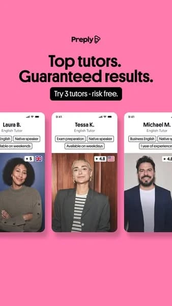
Visual vocabulary splits by education type. B2C course platforms (MasterClass, Skillshare) run celebrity-instructor portraits with their name and expertise. Bootcamps and outcomes-focused programs run student testimonials with before-after career or salary specifics. Language and habit apps (Duolingo, Brilliant) run streak stats, gamification elements, and brand mascots. Palettes follow brand — Duolingo green, MasterClass red, Skillshare orange. Meta, Google, and YouTube carry most spend.

Browse education ad examples from real campaigns — online courses, bootcamps, learning apps, certification programs, language apps. Pick a template, upload your instructor photo, student testimonial, or app screenshot, and AdDogs applies your palette across three formats.
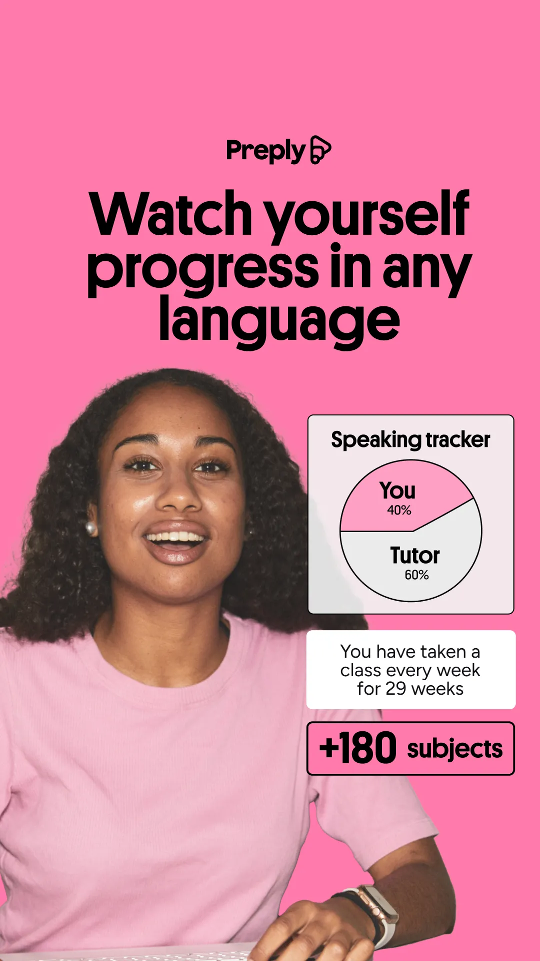
Self-Growth Challenge — Informative Grid. This ad effectively utilizes a clean grid layout to present a "Self-Growth Challenge" featuring 30 book covers. The stark white background ensures maximum visual clarity, allowing the diverse and colorful book covers to stand out prominently. The composition employs a clear numerical progression from 1 to 30, guiding the viewer's eye through a structured journey, implying a comprehensive program. Text hierarchy is well-defined, with a large, bold headline immediately conveying the challenge's core premise, followed by a concise sub-headline detailing its scope. This design is optimized for platforms like Facebook or Instagram, where a clear, information-rich static image can quickly capture attention and communicate value. The visual variety of the book covers broadens appeal, suggesting a holistic and engaging personal development experience for a wide audience.. Headline: Self-Growth Challenge:. Primary text: 30 Days. 30 Books. Hundreds of key insights.. Why this ad works: Grid Layout for Information Density — The 5x6 grid efficiently displays 30 distinct book covers, conveying the vast scope of the "Self-Growth Challenge" at a glance. This high information density, presented cleanly, immediately establishes value and variety, crucial for engaging users on busy social feeds and demonstrating the breadth of content offered. Numbered Progression Creates Engagement — The clear numerical sequence from 1 to 30, coupled with "Start" on the first book, transforms the ad into a visual journey. This gamified approach encourages viewers to imagine participating in the challenge, fostering a sense of commitment and curiosity about the progression, which can lead to higher engagement rates. Diverse Book Covers Broaden Appeal — Featuring a wide array of self-help book genres, from relationships to success and mental well-being, ensures the challenge resonates with a broad demographic. This visual diversity signals inclusivity and comprehensive personal development, attracting varied interests within the self-growth niche and maximizing potential audience reach.. Specs: Industry: Education, Platform: Facebook, Format: Static, Audience: GeneralAutism Spectrum Test — Colorful Grid Quiz. This ad employs a grid layout featuring ten distinct, colorful fish silhouettes, each representing a characteristic of the autism spectrum with a percentage. The vibrant, varied color palette, set against a soft yellow background, effectively makes a complex and sensitive topic feel approachable and less clinical, fostering engagement. The composition uses repetition of the fish motif to create visual rhythm, while the clear text hierarchy guides the viewer from the bold headline to the explanatory sub-headline, and finally to the call to action. This design is optimized for social platforms like Instagram, where its engaging visuals and interactive quiz format can effectively capture attention and drive clicks. The low text density on the main elements ensures quick comprehension, making it suitable for fast-scrolling environments. The overall strategy is to demystify the topic through an inviting, non-intimidating visual approach.. Headline: AUTISM SPECTRUM TEST. Primary text: Take a 2-minute quiz to find out your score. Why this ad works: Colorful, approachable visual metaphor — The use of multiple bright, distinct colors for each fish silhouette, combined with the playful fish motif, transforms a serious topic into an approachable and engaging visual. This color psychology helps to reduce potential intimidation, making viewers more likely to interact with the content and learn about the autism spectrum in a non-clinical, user-friendly way. Clear, benefit-driven headline and sub-headline — The prominent headline 'AUTISM SPECTRUM TEST' immediately communicates the ad's purpose, followed by a clear, benefit-oriented sub-headline: 'Take a 2-minute quiz to find out your score'. This direct approach quickly informs the user of the value proposition and the minimal time commitment, encouraging immediate consideration and action in a busy feed. Interactive quiz format drives engagement — The ad's core mechanism is an interactive quiz, explicitly mentioned in both the sub-headline and the CTA. This format is highly effective for engagement, as it offers a personalized outcome ('find out your score') and taps into natural curiosity. Quizzes often lead to higher click-through rates and longer dwell times compared to static informational posts.. Specs: Industry: Health & Wellness, Platform: Instagram, Format: Static, Audience: GeneralLearn Stock Trading — Split Screen Text & Image. This ad employs a clear split-screen layout, dedicating the top half to bold, high-contrast text and the bottom to a relevant, aspirational visual. The layout strategy immediately communicates the core offering ("Learn Stock Trading") with strong text hierarchy, using a large, serif font for authority. The social proof "180,000 students" is strategically placed below, adding credibility without clutter. Color psychology is minimal, leveraging stark black on white for clarity and professionalism, while the bottom image uses cool blues and greens with warm highlights to evoke a dynamic, tech-driven financial environment. Compositionally, the top half is text-heavy and direct, while the bottom provides context and aspiration. This design is optimized for platforms like Facebook or Instagram, where clear messaging and a visually engaging, yet professional, image can stop the scroll. The high text overlay ensures the primary message is instantly conveyed.. Headline: Learn Stock Trading. Primary text: 180,000 students. Why this ad works: Clear Split-Screen Layout for Dual Focus — The distinct division between text and image allows for immediate comprehension of the offer and visual context. This prevents cognitive overload, ensuring the headline is read first, followed by the aspirational imagery, making the ad highly efficient in conveying its message. Strong Social Proof Enhances Credibility — The inclusion of "180,000 students" with an icon provides powerful social proof. This statistic builds trust and reduces perceived risk, signaling that many others have found value in the offering, which is crucial for educational products. High Contrast Text Ensures Readability — The use of bold, black serif text on a pure white background creates maximum contrast. This ensures the headline "Learn Stock Trading" is highly readable and impactful, even on smaller mobile screens, effectively capturing attention in a busy feed.. Specs: Industry: Education, Platform: Facebook, Format: Static, Audience: ProfessionalsLanguage Learning App — Bold UI Mockup. This ad employs a vibrant, high-contrast layout, strategically split to maximize impact. The top half features a bold, aspirational headline, "Speak like a pro," with crossed-out alternatives ("okay, good, better") that immediately communicate a transformative value proposition. This visual trick creates a clear 'before/after' mental state, compelling viewers to seek improvement. The bottom half grounds this aspiration with concrete proof: a mobile UI mockup showcasing tutor profiles, ratings, and prices, alongside a compelling statistic of "32,000+ experience tutors." The bright pink background ensures high visibility and scroll-stopping power on platforms like Instagram, appealing to a dynamic, modern audience. Black text provides excellent readability. The composition effectively balances emotional appeal with practical evidence, guiding the viewer from desire to consideration. Text hierarchy is clear, with the main benefit dominating, followed by supporting features, optimized for quick mobile scanning.. Headline: Speak like a pro. Primary text: 32,000+ experience tutors. Why this ad works: Bold headline with strikethroughs creates urgency — The "Speak like a pro" headline with "okay, good, better" crossed out immediately communicates a clear value proposition: rapid, superior improvement. This visual trick creates a sense of dissatisfaction with current skill levels and positions the app as the definitive solution, driving user desire for transformation. Vibrant pink background grabs immediate attention — The high-energy, saturated pink background is a powerful scroll-stopper in crowded social feeds. Its boldness contrasts sharply with typical muted ad aesthetics, ensuring the ad stands out. This vibrant choice appeals to a younger, dynamic audience, signaling a modern and engaging learning experience. App UI mockup provides concrete social proof — Displaying the app's tutor selection screen with ratings and prices offers tangible proof of the service's quality and breadth. This visual evidence, combined with the "32,000+ experience tutors" statistic, builds trust and credibility, directly addressing potential user skepticism about online learning platforms.. Specs: Industry: Education, Platform: Instagram, Format: Static, Audience: StudentsBabbel Black Friday — Bold Sale Announcement. Brand: Babbel. This ad leverages a high-contrast, dark mode aesthetic to immediately grab attention, optimized for platforms like Instagram or Facebook. The dominant "Black Friday" text, rendered in a striking metallic 3D effect, serves as the central visual anchor, effectively communicating the core message. The vibrant orange headline "Get access to all languages" and the "70% OFF" badge create a clear value proposition and urgency. Compositionally, the layout guides the eye from the brand, to the benefit, to the offer, and finally to the aspirational closing statement. The use of a black background makes the metallic text and orange copy pop, enhancing readability and impact. This design effectively combines a strong promotional message with brand identity, aiming for direct conversion during a key sales period. The flag icons visually reinforce the product's offering without adding clutter.. Headline: Get access to all languages.. Why this ad works: High-contrast dark mode for scroll-stopping — The black background with vibrant orange and metallic gold text creates extreme contrast. This visual intensity makes the ad stand out dramatically in a busy social feed, immediately drawing the eye and increasing the likelihood of stopping the scroll, crucial for initial ad engagement. Urgency-driven discount badge placement — The "70% OFF" badge, prominently placed in the upper right, leverages a common eye-tracking pattern for discounts. Its circular, 'limited time' framing creates immediate urgency and value perception, compelling viewers to act quickly during the Black Friday sales event. 3D metallic text for premium sale impact — The "Black Friday" text rendered in a glossy, metallic 3D style elevates the perceived value of the sale. This visual richness makes the discount feel significant and premium, rather than cheap, aligning with a brand that offers a valuable educational service.. Specs: Brand: Babbel, Industry: Education, Platform: Instagram, Format: Static, Audience: GeneralOrigin Institute — Construction Training Question Layout. Brand: Origin Institute. This ad effectively uses an in-use layout, overlaying text on a relevant background image of a construction worker. The visual immediately establishes context for "White Card" training, targeting the intended audience. Bold primary colors (blue, yellow, and red in the logo) create high contrast against the sky and wood, ensuring excellent text readability. The prominent yellow highlight for "White Card" draws immediate attention to the core offering. Compositionally, the worker on the right creates an upward visual flow, while text blocks are strategically placed on the left and center, avoiding visual clutter. This design is well-suited for platforms like Facebook or Instagram, where direct, benefit-driven ads for vocational training perform strongly. The clear text hierarchy, from a large question headline to benefit bullet points, guides the viewer from problem identification to solution and key advantages, optimizing for quick information absorption.. Headline: Need a Victorian White Card?. Primary text: Over 16 training locations in VIC Easy online booking Same day interim card WorkSafe Victoria approved training. Why this ad works: Direct Question Headline Grabs Attention — The "Need a Victorian White Card?" headline directly addresses a common need for construction workers, immediately qualifying the audience. This direct approach cuts through noise on social feeds, making the ad highly relevant to its target demographic, prompting immediate self-identification and engagement from potential students. Contextual Imagery Reinforces Relevance — The background image of a construction worker amidst roof framing perfectly illustrates the industry requiring a White Card. This strong visual context instantly communicates the ad's purpose, building trust and engagement with the target audience of tradespeople. It reinforces the practical application of the training. Clear Benefit-Driven Bullet Points — The ad effectively lists key benefits like "Over 16 training locations," "Easy online booking," and "Same day interim card." These concise points address common pain points and offer compelling reasons to choose Origin Institute. Highlighting convenience and speed directly appeals to busy professionals, driving consideration.. Specs: Brand: Origin Institute, Industry: Education, Platform: Facebook, Format: Static, Audience: ProfessionalsFuture London Academy — Bold Quote Layout. Brand: Future London Academy. This ad employs a bold, high-contrast text-heavy layout, optimized for immediate impact on social feeds. The vibrant blue background paired with crisp white typography ensures maximum readability and scroll-stopping power. The central, oversized quote immediately captures attention, establishing a strong, aspirational message. Compositionally, the large quote dominates, while the smaller attribution provides credibility without clutter. The curved yellow and orange elements at the bottom add a modern, dynamic touch, preventing the design from feeling too static. This visual hierarchy guides the eye from the impactful statement to its authoritative source, effectively positioning Future London Academy as a thought leader in design education. The design is clean, direct, and highly effective for brand awareness and engagement.. Headline: "Designers are the new CEOs". Primary text: - VP of Product Design & Research at Headspace. Why this ad works: High-contrast palette for immediate impact — The striking combination of a vibrant blue background and bold white text creates exceptional contrast. This ensures the core message is instantly readable and highly visible in a crowded social media feed, effectively cutting through noise and grabbing user attention quickly. Aspirational quote drives professional engagement — The powerful, thought-provoking quote, "Designers are the new CEOs," resonates deeply with a professional audience. It taps into career aspirations and industry trends, encouraging agreement, discussion, and further engagement with Future London Academy's content or offerings. Credible attribution builds authority — Attributing the quote to a "VP of Product Design & Research at Headspace" lends significant authority and credibility. This expert endorsement signals that the academy is connected to industry leaders, enhancing trust and positioning them as a reputable source for design education.. Specs: Brand: Future London Academy, Industry: Education, Platform: Instagram, Format: Static, Audience: ProfessionalsEducational Game App — Playful UI Mockup. This ad effectively uses a mixed layout, combining an adventurous character and a dynamic UI mockup to engage its target audience. The vibrant green and brown color palette immediately evokes a jungle adventure, aligning perfectly with the "FROM A-Z" bamboo-style text at the top. The angled smartphone, featuring a monkey interacting with letters, cleverly showcases the app's gameplay within a fun, immersive environment. Compositionally, the character on the left guides the eye towards the app, while the prominent green oval clearly states the core benefit: "Language Arts Learning Activities." This design is optimized for social platforms like Facebook or Instagram, where its bright, illustrative style and clear educational message can quickly capture parents' attention, positioning the app as both entertaining and beneficial for children's learning.. Why this ad works: Engaging Character & Thematic Visuals — The Indiana Jones-esque character and jungle backdrop immediately draw attention, creating a sense of adventure. This playful theme makes learning appealing to children and signals to parents that the app offers an engaging, non-traditional educational experience, increasing initial interest and click-through rates. Dynamic UI Mockup Showcases Gameplay — Presenting the app's interface on an angled smartphone, with a monkey interacting with letters, effectively demonstrates the core gameplay. This visual "show, don't tell" approach allows prospective users to quickly grasp the interactive nature of the learning activities, boosting consideration for download. Clear Benefit Statement for Parents — The prominent green oval with "Language Arts Learning Activities" directly communicates the app's educational value. This clear, concise messaging immediately informs parents about the product's purpose, addressing their primary need for beneficial content for their children and driving relevance.. Specs: Industry: Kids & Family, Platform: Facebook, Format: Mixed, Audience: ParentsInformal vs. Formal Language — Comparison Grid. This ad employs a clear comparison layout, utilizing distinct chat bubble graphics to differentiate between informal and formal language. The composition strategically places "INFORMAL" terms on the left in vibrant blue bubbles and their "FORMAL" counterparts on the right in bright green, with arrows guiding the eye. This visual metaphor of text messages makes the educational content highly relatable and digestible, optimized for platforms like Instagram or Pinterest where quick, shareable insights thrive. The high-contrast color palette ensures excellent readability against the light background, crucial for text-heavy visuals. Text hierarchy is simple: bold headings define categories, while consistent sizing for examples maintains visual balance. This design effectively simplifies a linguistic concept, making it engaging and easy to absorb for a broad audience.. Primary text: INFORMAL Deal with Wait for A bit At first Talk about Maybe FORMAL Handle Await A little Initially Discuss Perhaps. Why this ad works: Chat bubble design enhances relatability — The use of chat bubble graphics transforms a potentially dry linguistic lesson into an engaging, modern visual. This design choice resonates with digital natives, making the content feel current and directly applicable to everyday communication. It significantly boosts the ad's shareability and memorability on social platforms. High contrast colors ensure readability — The vibrant blue and green text bubbles stand out sharply against the light grey background. This high contrast is critical for text-based ads, ensuring legibility across various screen sizes and lighting conditions. It minimizes eye strain and allows for rapid information processing, which is essential for scroll-stopping content. Clear left-to-right comparison structure — The consistent layout, with "INFORMAL" on the left and "FORMAL" on the right, linked by clear arrows, creates an intuitive comparison. This structured approach guides the viewer's eye effortlessly through each example, making the educational content easy to understand at a glance and highly effective for quick learning.. Specs: Industry: Education, Platform: Instagram, Format: Static, Audience: ProfessionalsGrammarly — Vibrant Social Proof Layout. Brand: Grammarly. This ad effectively uses a vibrant, high-contrast layout to grab attention on busy social feeds. The central Grammarly logo acts as a focal point, surrounded by diverse user portraits that subtly convey broad appeal and social proof. The bright green background immediately stands out, while the stark black text ensures readability. Text hierarchy is clear: a bold, impactful statistic headline followed by a concise value proposition, culminating in a prominent call-to-action. This composition is optimized for quick consumption, leveraging color psychology for energy and black-and-white imagery for authenticity, making it highly effective for driving consideration and conversion on platforms like Facebook or Instagram. The design balances brand presence with user-centric messaging.. Headline: Over 30 Million Daily Users. Primary text: Enhance your writing with Grammarly.. Why this ad works: Vibrant background creates scroll-stopping contrast — The bright, energetic green background immediately captures attention. This high contrast against typical feed content ensures the ad stands out, increasing initial visibility and stopping the scroll, which is crucial for social media ad performance. It creates an instant visual hook. Social proof through diverse user imagery — The inclusion of four distinct black-and-white user photos around the central logo subtly communicates widespread adoption and relatability. This visual social proof builds trust and encourages potential users to identify with the existing user base, enhancing credibility and perceived value. Clear hierarchy drives immediate value proposition — The ad employs a strong visual hierarchy, starting with a compelling user statistic, followed by a clear benefit statement, and ending with an unmistakable call-to-action. This structured flow guides the viewer efficiently from awareness to conversion intent, minimizing cognitive load.. Specs: Brand: Grammarly, Industry: Software & Tools, Platform: Instagram, Format: Static, Audience: ProfessionalsShift Network — Bioenergetics Event with Speaker. Brand: Shift. This ad employs a split-composition layout, balancing prominent text with a human element. The cosmic background, rich in deep blues and purples, evokes a sense of spirituality and expansive possibility, aligning with the "higher-vibration" theme. White text ensures high contrast and readability against this dark, vibrant backdrop, optimized for quick comprehension on busy social feeds. The speaker's friendly, direct gaze creates an immediate personal connection, fostering trust and approachability. Text hierarchy is clear: a large, bold headline grabs attention, followed by a descriptive sub-headline detailing the event's value proposition. The "Shift" logo is subtly placed, maintaining brand presence without distracting. This design effectively communicates expertise and invitation, ideal for platforms like Facebook or Instagram where educational content thrives through clear messaging and relatable faces. The composition is well-suited for a static square format, ensuring all critical information and the speaker's face are visible.. Headline: Bioenergetics for a Higher-Vibration Life. Primary text: Harness the Science of Energy, Heart Coherence & Lifestyle to Optimize Your Health & Thrive. Why this ad works: Cosmic background enhances aspirational theme — The deep, starry background visually reinforces the "Higher-Vibration Life" concept, immediately setting an aspirational and spiritual tone. This aesthetic choice helps differentiate the ad from typical wellness content, drawing in an audience seeking transformative experiences beyond conventional health advice. Speaker's direct gaze builds trust — Robin Perry Braun's friendly smile and direct eye contact create an instant personal connection with the viewer. This human element is crucial for educational or self-improvement content, as it establishes credibility and approachability, making the "Free Video Event" feel more inviting and trustworthy. Clear text hierarchy guides reader — The ad effectively uses varying font sizes and weights to guide the viewer's eye. The large headline immediately conveys the core topic, followed by a slightly smaller sub-headline explaining the benefits. This clear hierarchy ensures key information is absorbed quickly, maximizing message retention in a fast-scrolling environment.. Specs: Brand: Shift, Industry: Health & Wellness, Platform: Instagram, Format: Static, Audience: Women 45+Garrett Seminary — Historical Split Screen Narrative. Brand: Garrett Seminary. This ad employs a split-screen layout to juxtapose a historical moment with its enduring present, effectively telling a powerful story. The vibrant rainbow gradient border immediately signals themes of inclusivity and pride, drawing the eye and setting an emotional tone. Compositionally, the vertical division creates a clear before-and-after narrative, guiding the viewer's gaze from left to right. Yellow text boxes provide high contrast against the images, ensuring readability of the crucial narrative. Optimized for social feeds like Instagram, its square format and compelling visual story are designed to stop the scroll. The text hierarchy prioritizes the narrative over a direct call to action, aiming for emotional engagement and brand association with progressive values.. Primary text: IN 1971 ROGER LYNN (GARRETT ALUMNUS '64) MARRIED JACK BAKER AND MICHAEL MCCONNEL DEFYING NATIONAL LAW. 53 YEARS LATER, THE WORLD'S FIRST LEGAL MARRIAGE IS STILL GOING STRONG!. Why this ad works: Juxtaposition highlights enduring historical impact — By presenting the past and present side-by-side, the ad powerfully illustrates the longevity and significance of the event. This visual storytelling technique creates an emotional connection, demonstrating resilience and progress over time, which resonates deeply with an audience interested in social justice and historical narratives. Rainbow gradient signals inclusivity and pride — The vibrant rainbow border immediately communicates themes of LGBTQ+ pride and inclusivity. This visual cue acts as a powerful shorthand, instantly aligning the institution with progressive values and attracting an audience that shares these principles. It creates an inviting and celebratory atmosphere around the historical narrative. Clear narrative structure engages emotionally — The ad's clear, concise text blocks guide the viewer through a compelling historical narrative. This direct storytelling approach, combined with the visual evidence, fosters emotional engagement. It allows the audience to quickly grasp the significance of the event and appreciate the enduring strength of the individuals and the message.. Specs: Brand: Garrett Seminary, Industry: Education, Platform: Instagram, Format: Static, Audience: GeneralDog Training — Problem/Solution Visual. This ad employs a high-contrast, dynamic composition on a stark white background, immediately drawing attention to the interaction between the woman and the dog. The handwritten-style red text, "Your first mistake," acts as a bold headline, using an arrow to direct the viewer's eye to the yelling woman, effectively identifying a common problem or misconception in pet ownership. The layout strategy creates a sense of tension and intrigue, optimized for quick consumption on social feeds like Instagram or Facebook. Color psychology leverages red for urgency and attention, while the clean white background ensures the subjects pop. The composition uses negative space to isolate the subjects, making the message clear and impactful. This ad works by sparking curiosity and relatability, hinting at a solution to a prevalent issue without explicitly stating it, encouraging engagement.. Headline: Your first mistake. Why this ad works: Direct problem identification hooks audience — The bold, red text "Your first mistake" immediately identifies a common pain point for pet owners, creating instant relatability. This direct, slightly provocative approach captures attention by challenging existing beliefs or behaviors, making the viewer pause and consider if they are making this "mistake." High contrast, clear hierarchy grabs attention — The vibrant red text and the natural colors of the dog and woman stand out sharply against the pure white background. This high contrast ensures visual elements are easily discernible, while the large text and directional arrow create a clear visual hierarchy, guiding the viewer's eye precisely to the intended focal point. Provocative headline sparks curiosity — The headline "Your first mistake" is inherently intriguing and slightly confrontational, compelling viewers to understand what the mistake is and how to avoid it. This emotional hook drives engagement and encourages clicks, as people are naturally curious about self-improvement or correcting errors, especially regarding their pets.. Specs: Industry: Pets & Animals, Platform: Instagram, Format: Static, Audience: GeneralKip McGrath — Dynamic Split-Screen Opportunity Ad. Brand: Kip McGrath Education Centres. This ad employs a dynamic split-screen layout, blending a vibrant gradient background with an engaging lifestyle image. The top-right quadrant features a smiling teacher and student, immediately establishing a positive, human connection central to education. The bottom-left is dedicated to clear, bold text hierarchy: the brand logo, a compelling headline, and a distinct call-to-action button. The energetic blue-green-pink color palette evokes growth, innovation, and approachability, aligning well with an educational brand. This composition is optimized for social feeds like Instagram, where its bright colors and clear messaging can effectively stop the scroll and communicate a professional opportunity. The visual balance ensures both brand identity and the human element are prominent.. Headline: Business Opportunities For Teachers. Why this ad works: Dynamic Split-Screen Engages Viewers — The ad effectively uses a dynamic, curved split-screen layout. This design visually separates the aspirational human element (teacher and student) from the informational text, yet integrates them seamlessly. This approach captures attention by offering both a relatable scenario and clear messaging, making the ad visually interesting and easy to process in a busy feed. Vibrant Gradient Conveys Modern Education — The multi-color gradient background, transitioning from blue to green to pink, creates a vibrant and modern aesthetic. This color psychology suggests innovation, growth, and a positive learning environment, which is crucial for attracting potential teachers to an education brand. It stands out from more traditional, muted educational advertising. Clear Text Hierarchy Guides Attention — The ad establishes a strong text hierarchy, starting with the prominent brand logo, followed by a large, benefit-oriented headline, and a distinct call-to-action button. This clear progression ensures that the viewer quickly understands the brand, the opportunity, and the next step, optimizing for quick comprehension and driving engagement on social platforms.. Specs: Brand: Kip McGrath Education Centres, Industry: Education, Platform: Instagram, Format: Static, Audience: ProfessionalsDog Training — Illustrative Problem/Solution. This ad employs a minimalist, high-contrast black and white line drawing to convey an instructional message. The layout strategically places the headline "Stop Bribing Your Dog" prominently in the top-left, immediately engaging the viewer with a problem statement. Below, a balanced composition features a person interacting with a dog on a leash, visually representing the training context. The stark white background ensures maximum clarity, while the red border adds a subtle but effective element of urgency and attention-grabbing contrast, optimizing for scroll-stopping on platforms like Facebook or Pinterest. The illustrative style makes the content approachable and less intimidating than photography. The visual hierarchy is clear: text first, then the illustrative scenario, guiding the viewer's understanding of the core topic. This direct approach focuses entirely on the educational premise, making it highly effective for awareness or consideration stages in dog training.. Headline: Stop Bribing Your Dog. Why this ad works: Direct headline identifies common pain point — The headline "Stop Bribing Your Dog" immediately addresses a common, relatable frustration for dog owners. This direct, slightly provocative phrasing creates instant intrigue and positions the ad as a solution to a recognized problem, encouraging engagement from the target audience. Minimalist illustration for clear concept communication — The simple black and white line drawing effectively communicates the core concept of dog training without distractions. This clean visual style ensures the message is easily digestible and universally understood, making it highly effective for conveying instructional content quickly on any platform. High contrast with red border grabs attention — The stark black and white illustration against a pure white background provides excellent contrast, making the image pop in a busy feed. The bold red border further frames the content and adds a sense of urgency or importance, significantly increasing its visibility and scroll-stopping power.. Specs: Industry: Pets & Animals, Platform: Facebook, Format: Static, Audience: GeneralDoodle Video Software — Playful Illustration. This ad employs a playful, illustrative layout reminiscent of a chalkboard, effectively targeting a broad audience interested in creative tools. The central, rounded text box immediately draws the eye to the core message: "Create Colourful Doodle Videos." Grayscale characters, strategically placed around the text, add a human, engaging element without distracting from the main proposition. Pops of vibrant color in the text and surrounding objects (like the planet and pencil) highlight the "colourful" aspect, reinforcing the product's benefit. The composition uses a visual hierarchy where the central text is paramount, supported by contextual doodles that evoke learning and creativity. This design is well-suited for social platforms like Facebook or Instagram, where its unique aesthetic can stand out amidst more conventional ads, driving initial awareness and engagement. The low text density keeps the visual clean and easily digestible.. Headline: Create Colourful Doodle Videos. Why this ad works: Playful chalkboard aesthetic engages viewers — The dark green chalkboard background with white line-art doodles creates a nostalgic, educational, and creative atmosphere. This unique visual style captures attention and suggests a fun, accessible tool for content creation, resonating with users seeking engaging solutions. Centralized text box ensures clear value proposition — The prominent, rounded white text box acts as a focal point, immediately communicating the ad's core message: "Create Colourful Doodle Videos." This direct approach ensures the key benefit is understood instantly, crucial for quick-scroll social media environments where attention spans are short. Strategic use of color highlights key benefits — While characters are grayscale, the "Colourful" text and surrounding objects pop with vibrant hues. This contrast visually emphasizes the product's promise of adding color and vibrancy to videos, making the benefit tangible and exciting to the target audience.. Specs: Industry: Software & Tools, Platform: Facebook, Format: Static, Audience: GeneralDisruptive Communication Workshop — Bold Hero Shot. This ad employs a striking hero shot composition, featuring a charismatic individual in vibrant purple attire against a stark white background. The bold color choice of purple, often associated with creativity and ambition, immediately grabs attention and signals a disruptive message. The layout strategically places the compelling visual at the top, drawing the eye before leading down to the clear, benefit-driven text hierarchy. The headline, "HAZ IMPOSIBLE QUE TE IGNORAN," creates a strong hook, followed by details about the "Disruptive Communication" workshop. The use of bulleted benefits at the bottom reinforces the value proposition, optimizing for quick comprehension on platforms like Facebook. This design leverages high contrast and a memorable visual to cut through noise, positioning the workshop as a powerful solution for professionals seeking to stand out. The clean background ensures the focus remains on the presenter and the core message.. Headline: HAZ IMPOSIBLE QUE TE IGNORAN. Primary text: WORKSHOP ONLINE EN VIVO – Comunicación Disruptiva Descubre los pasos Exactos para crear un impacto con una comunicación Disruptiva. Why this ad works: Bold Purple Visual Commands Attention — The vibrant purple hat and coat create an immediate visual anchor against the pure white background. This high-contrast color choice is highly effective for stopping scroll on busy social feeds, leveraging color psychology to convey creativity and uniqueness, directly aligning with the "disruptive communication" theme. Direct Gaze Establishes Credibility — The subject's direct eye contact with the viewer builds an instant connection and fosters trust. This technique is crucial for educational or workshop promotions, as it positions the presenter as an expert who is engaging and confident, encouraging potential attendees to listen and learn from them. Benefit-Driven Text Hierarchy Guides Engagement — The ad effectively uses a clear text hierarchy, starting with an impactful headline, followed by workshop details, and culminating in three distinct, benefit-oriented calls to value. This structure guides the viewer from intrigue to understanding the direct advantages, maximizing engagement and conversion intent for the target audience.. Specs: Industry: Education, Platform: Facebook, Format: Static, Audience: ProfessionalsVladimir Lenin — Historical Profile Card. This informational graphic effectively utilizes a strong left-to-right composition, anchoring the historical figure, Vladimir Lenin, on the right while dedicating the left two-thirds to clear textual information. The grayscale portrait immediately conveys historical gravitas, contrasting subtly with the textured, muted teal-grey background which adds depth without distracting. A clean, banner-style text box highlights the name, followed by the birth and death years, establishing a clear visual hierarchy. This layout is optimized for quick information absorption, ideal for platforms like Instagram or Facebook where educational content needs to be visually engaging and easily digestible. The minimalist approach ensures focus remains on the subject and key data, making it an effective awareness piece for historical or educational content.. Headline: Vladimir Lenin. Primary text: 1870-1924. Why this ad works: Clear Visual Hierarchy for Information — The prominent banner for "Vladimir Lenin" and the distinct "1870-1924" below it establish an immediate and clear information flow. This direct presentation ensures viewers quickly grasp the subject and key biographical data, crucial for educational or news-oriented content where rapid comprehension is paramount for engagement. Historical Gravitas via Grayscale Portrait — The choice of a black and white portrait instantly signals historical context and seriousness. This aesthetic decision lends an air of authenticity and importance to the subject, effectively communicating that the content pertains to a significant figure from the past, enhancing its perceived credibility and depth. Textured Background Adds Depth and Context — The muted, greenish-grey background features a subtle, distressed texture, preventing the image from appearing flat or sterile. This textural element subtly evokes a sense of age or historical document, enriching the overall visual narrative and adding a layer of atmospheric depth that complements the historical subject matter.. Specs: Industry: Media & Entertainment, Platform: Instagram, Format: Static, Audience: GeneralBabbel — Multi-Language Offer Grid. Brand: Babbel. This ad employs a clean, top-down layout optimized for mobile feeds, effectively guiding the viewer's eye. The prominent headline, "Learn a language. Or 14.", immediately captures attention with a playful, benefit-oriented hook. A warm, inviting color palette, featuring a vibrant orange for the call-to-action, ensures high visibility against the minimalist off-white background. Compositionally, the ad uses negative space around the core message to enhance focus, followed by a visually engaging grid showcasing diverse language options. This structure allows for clear text hierarchy, from the large headline to the smaller, informative details within the grid. The visual elements, like flags and illustrative images, reinforce the product's offering, making it highly effective for platforms like Instagram or Facebook where quick comprehension and visual appeal are key to stopping the scroll and driving consideration.. Headline: Learn a language. Or 14.. Primary text: 50% OFF Lifetime. Why this ad works: Playful headline hook highlights breadth — The headline "Learn a language. Or 14." uses a clever, engaging twist to highlight the breadth of Babbel's offering. This immediately communicates value and choice, appealing to a wide audience. It creates intrigue and encourages further engagement, differentiating it from more generic language learning ads by emphasizing scale. High-contrast offer button drives action — The "50% OFF Lifetime" button in bright orange stands out dramatically against the muted background. This strong visual contrast ensures the primary call to action and incentive are instantly recognizable. Placing the offer directly as the CTA reduces friction and clearly communicates the immediate benefit, driving higher click-through rates. Visual language representation enhances engagement — The use of national flags and illustrative grid elements (chair for French, drink for Spanish, bust for Italian) provides immediate visual cues for the languages offered. This creative approach makes the abstract concept of "learning a language" tangible and relatable, enhancing memorability and demonstrating the product's diverse content in an engaging, non-text-heavy manner.. Specs: Brand: Babbel, Industry: Education, Platform: Instagram, Format: Static, Audience: GeneralMindvalley COACH — Aspirational Lifestyle with Bold Text. Brand: Mindvalley COACH. This ad effectively uses a split-composition layout, balancing a warm, inviting portrait with bold, high-contrast text. The smiling woman occupies the right half, creating an immediate human connection and aspirational appeal, while the left half is dedicated to the value proposition. The vibrant yellow text against a dark, blurred background ensures maximum readability and scroll-stopping power, optimized for platforms like Instagram where visual impact is key. The text hierarchy is clear: a large, impactful headline, followed by a supporting benefit statement, and a prominent "FREE TRAINING" call to action. This strategic placement guides the viewer's eye from the emotional connection to the core offer, leveraging color psychology for urgency and clarity. The overall composition aims to inspire and inform, driving consideration for personal development.. Headline: MAKE A REAL DIFFERENCE. Primary text: Turn your wisdom into your life's work. Why this ad works: Human connection drives aspirational engagement — The smiling, approachable woman directly engages the viewer, fostering trust and relatability. This personal touch makes the abstract concept of "making a real difference" feel achievable and desirable, increasing emotional resonance and click-through rates on social platforms. High-contrast text ensures immediate readability — The bright yellow headline and CTA against the dark, blurred background create exceptional contrast. This design choice ensures the core message is instantly digestible, even when quickly scrolling through a feed, maximizing message retention and reducing cognitive load for the audience. Clear value proposition and low-barrier CTA — The ad clearly states the benefit ("Turn your wisdom into your life's work") and offers a "FREE TRAINING." This combination provides a strong incentive with minimal commitment, effectively lowering the barrier to entry and encouraging initial engagement for lead generation.. Specs: Brand: Mindvalley COACH, Industry: Health & Wellness, Platform: Instagram, Format: Static, Audience: Women 25-34+B French Quiz — Engaging UI Mockup. Brand: +B. This ad leverages an interactive quiz format within a clean UI mockup to drive engagement. The layout centers a distinct question card against a solid blue background, effectively isolating the content and minimizing distractions. The color palette of deep blue and white creates a high-contrast, professional, yet approachable feel, aligning with educational content. Compositionally, the quiz card acts as a focal point, drawing the eye directly to the question and multiple-choice options. This design is highly optimized for social platforms like Instagram, where interactive content encourages comments and shares, boosting organic reach. Text hierarchy is clear: the main question is prominent, followed by equally weighted answer choices, ensuring readability and ease of participation. The small brand logo subtly reinforces identity without interrupting the user experience.. Headline: Where does the accent mark go in l'hopital?. Primary text: translation: the hospital. Why this ad works: Interactive Quiz Format Boosts Engagement — The multiple-choice question directly invites user participation, transforming a passive ad view into an active interaction. This gamified approach increases dwell time and encourages comments, signaling to algorithms that the content is valuable and should be shown to more users. High-Contrast, Clean UI for Readability — The dark blue header and white card with black text provide excellent contrast, making the question and answer options immediately legible. This clean, minimalist design reduces cognitive load, allowing users to quickly understand the task and participate without visual clutter. Subtle Branding Prevents Overt Commercialism — The small "+B" logo in the bottom-left corner is present but unobtrusive. This subtle branding allows the ad to feel more like a helpful educational post rather than a direct sales pitch, fostering trust and making the content more shareable among language learners.. Specs: Brand: +B, Industry: Education, Platform: Instagram, Format: Static, Audience: StudentsMenopause & Nutrition — Bold Text Block. This ad utilizes a stark, text-heavy layout on a vibrant pink background to immediately convey its core message. The composition is extremely direct, prioritizing information delivery over visual aesthetics. The bold black sans-serif typography against the high-contrast pink ensures maximum readability, crucial for quick consumption on mobile feeds. The repetition of "Menopause & Nutrition" establishes the topic firmly, while "FREE 5-Day Course" acts as a clear value proposition and call to action. This design is optimized for platforms where direct, attention-grabbing text and a clear offer can cut through visual clutter, appealing to an audience seeking specific solutions without elaborate imagery. The color choice, while bold, aims for a feminine yet assertive tone, suitable for a health topic.. Headline: Menopause & Nutrition. Primary text: Menopause & Nutrition FREE 5-Day Course. Why this ad works: High-contrast text ensures instant readability — Black text on a bright pink background creates strong contrast, making the message immediately legible even when quickly scrolling. This directness is vital for capturing attention in busy social feeds, ensuring the core offer is understood without effort, which is crucial for educational content where clarity is paramount. Clear, direct value proposition — The "FREE 5-Day Course" is prominently displayed, offering a tangible benefit upfront. This clear incentive reduces friction for potential sign-ups, directly addressing the audience's need for accessible information and solutions related to menopause and nutrition. A free offer significantly lowers the barrier to entry for new leads. Repetition reinforces key topic — Repeating "Menopause & Nutrition" at different sizes ensures the subject matter is undeniably clear and quickly understood. This reinforces the ad's relevance to the target audience, quickly self-selecting those interested in the topic and increasing the likelihood of engagement by immediately communicating the ad's purpose.. Specs: Industry: Health & Wellness, Platform: Instagram, Format: Static, Audience: Women 45+Language Learning App — Price & Benefit Focus. This ad employs a high-contrast, text-heavy layout designed for immediate impact and conversion. The dominant blue background, subtly blurred with a living room setting, provides a relatable context without distracting from the core offer. A bold yellow price point, "$199," paired with a prominent "50% OFF" starburst, immediately anchors the value proposition. The central white text, "Lifetime Subscription Unlimited Languages," clearly communicates the product's main benefit. Compositionally, the four overlapping smartphones showcase diverse international imagery, visually reinforcing the "unlimited languages" claim. This vibrant color palette and clear text hierarchy are optimized for platforms like Facebook, where quick scanning demands direct communication of value. The ad effectively uses color psychology to convey urgency and value, driving consideration for a comprehensive language learning solution.. Headline: $199 50% OFF. Primary text: Lifetime Subscription Unlimited Languages. Why this ad works: Bold price display grabs immediate attention — The large, bright yellow "$199" against the deep blue background creates an unmissable focal point. This high-contrast pairing, amplified by the "50% OFF" starburst, immediately communicates a strong value proposition. It effectively stops the scroll by presenting the core offer upfront, appealing to price-sensitive consumers looking for a deal. Clear value proposition with lifetime access — The headline "Lifetime Subscription Unlimited Languages" is incredibly compelling. It clearly articulates a comprehensive, long-term solution, eliminating recurring costs and offering extensive content. This direct and powerful statement addresses potential customer pain points regarding ongoing expenses and limited language options, positioning the product as a definitive investment. Visual variety hints at global language scope — The four overlapping smartphones, each displaying a distinct image from different cultures (e.g., Russian architecture, a matryoshka doll, European town), cleverly illustrate the "Unlimited Languages" claim. This visual storytelling provides a tangible representation of the product's breadth, making the abstract concept of "unlimited" more engaging and believable to the audience.. Specs: Industry: Education, Platform: Facebook, Format: Static, Audience: GeneralLanguage App — Bold Price Offer Layout. This ad employs a bold, high-contrast layout to immediately grab attention, leveraging a vibrant blue background against bright yellow and white text. The large, central price point with a prominent discount burst acts as the primary visual hook, optimized for quick scanning on mobile feeds. Below, the clear value proposition "Lifetime Subscription Unlimited Languages" reinforces the offer. The scattered smartphone mockups, displaying diverse cultural images, subtly hint at the product's utility and global reach without distracting from the core offer. This composition prioritizes direct response, using color psychology (blue for trust, yellow for attention) and clear text hierarchy to drive consideration for a language learning service. The blurred background adds depth without clutter.. Headline: $199 50% OFF. Primary text: Lifetime Subscription Unlimited Languages. Why this ad works: High-contrast price point captures attention — The oversized yellow "$199" against the deep blue background, coupled with the purple "50% OFF" burst, creates an immediate visual anchor. This high contrast ensures the core offer is seen first, crucial for scroll-stopping on busy social feeds and driving immediate interest in the value proposition. Clear value proposition drives consideration — The phrase "Lifetime Subscription Unlimited Languages" directly addresses a common pain point for language learners and offers a compelling, long-term solution. This clear, concise statement immediately communicates the product's core benefit, converting initial price interest into deeper consideration for the service's utility. Visual cues hint at product utility — The scattered smartphones displaying diverse cultural images (e.g., Japanese temple, European village, Russian doll) subtly illustrate the "unlimited languages" aspect. These visuals provide context and aspiration without explicit product UI, allowing the ad to focus on the offer while still conveying the breadth of the learning experience.. Specs: Industry: Education, Platform: Instagram, Format: Static, Audience: GeneralBrilliant AI — Bold Text & Topic List. Brand: Brilliant. This ad employs a minimalist, high-contrast layout, strategically placing the brand name at the top, a bold headline centrally, and a pyramid of vibrant topic pills below. The composition leverages ample negative space to ensure the core message, "AI I can do that," with its clever visual strike-through on 'A', immediately grabs attention. Color psychology is used effectively with the stark black text on white background for readability, while the gradient-filled topic pills introduce a playful yet organized visual interest. This design is optimized for platforms like Instagram or Facebook, where its clean aesthetic and clear hierarchy cut through feed clutter. The text hierarchy guides the eye from brand recognition to the key value proposition, then to specific offerings, making complex subjects feel accessible and engaging.. Headline: AI I can do that. Why this ad works: Clever "AI I can do that" headline — The headline uses a striking visual pun, crossing out the 'A' in "I" to form "AI," immediately communicating the brand's focus on artificial intelligence. This creative wordplay is a powerful scroll-stopper, sparking curiosity and making the ad memorable. It effectively conveys the brand's modern and intelligent approach to learning. High-contrast, minimalist design — The stark black text on a pure white background ensures maximum readability and visual impact, crucial for quick consumption on mobile feeds. This minimalist approach eliminates distractions, allowing the core message and the brand's offerings to stand out clearly. It projects a sense of clarity and intelligence, aligning with an educational brand. Engaging, color-coded topic hierarchy — The pyramid of gradient-filled topic pills provides a visually appealing and organized way to present the breadth of subjects offered. Each pill's unique color gradient aids in differentiation and makes the information digestible at a glance. This technique transforms a list of subjects into an interactive and inviting visual element, encouraging exploration.. Specs: Brand: Brilliant, Industry: Education, Platform: Instagram, Format: Static, Audience: ProfessionalsCodecademy Data Scientist Prep — Minimalist Illustration. Brand: Codecademy. This ad employs a clean, minimalist layout with a dominant headline to immediately convey its value proposition. The light pastel background and dark, bold typography create high contrast, ensuring excellent readability across various platforms. Compositionally, the Codecademy logo is strategically placed top-left for brand recognition, while the large headline anchors the viewer's attention. The simple line-art illustration of two figures discussing data charts visually reinforces the topic without clutter, adding a subtle human element to the technical subject. This design is optimized for platforms like Instagram or Facebook, where a clear, uncluttered aesthetic helps stop the scroll. The low visual complexity minimizes cognitive load, allowing the core message to be absorbed quickly, making it highly effective for awareness campaigns targeting busy professionals.. Headline: Data Scientist Interview Preparation. Why this ad works: Dominant Headline for Instant Clarity — The large, bold headline "Data Scientist Interview Preparation" immediately communicates the ad's purpose. This direct approach cuts through feed clutter, ensuring the target audience understands the offering within seconds, which is crucial for capturing attention on fast-scrolling platforms and driving initial interest. Minimalist Design Reduces Cognitive Load — By using a simple color palette and sparse illustration, the ad avoids visual overwhelm. This clean aesthetic allows the viewer to focus solely on the message, making it easy to digest and remember. This simplicity enhances message retention and brand recall in a competitive ad environment. Relevant Iconography Reinforces Topic — The illustration of two figures discussing data charts in a speech bubble directly relates to "Data Scientist Interview Preparation." This visual cue quickly contextualizes the ad's content, making it highly relevant and appealing to the intended audience without needing additional descriptive text, improving comprehension.. Specs: Brand: Codecademy, Industry: Education, Platform: Instagram, Format: Static, Audience: ProfessionalsSmarties x Quizlet — Playful Split Screen. Brand: Smarties. This ad employs a vibrant split-screen layout, leveraging high-contrast colors to immediately capture attention on social feeds. The upper half features a playful hand gesture and an engaging headline, drawing the viewer in with relatable, lighthearted copy. Below, the Smarties x Quizlet collaboration is subtly introduced via product packaging, creating a sense of discovery. The bold pink background and bright yellow accents evoke a youthful, energetic vibe, perfectly suited for platforms like Instagram or TikTok where visual pop is paramount. Compositionally, the hand points downwards, guiding the eye from the headline to the product. Text hierarchy prioritizes the witty headline, followed by the brand logos, ensuring the core message and partnership are clearly communicated without overwhelming the viewer. This design effectively builds brand awareness and engagement through its cheerful aesthetic.. Headline: Your brain called. It wants a little treat.. Why this ad works: High-contrast colors grab immediate attention — The bold pink background paired with bright yellow elements and dark blue text creates an extremely high-contrast visual. This vibrant palette is highly effective for stopping scroll on busy social feeds, ensuring the ad stands out amidst organic content and other advertisements. It signals playfulness and energy. (50 words) Playful headline engages target audience — The headline "Your brain called. It wants a little treat." is witty and relatable, especially for students or those needing a mental break. This lighthearted approach fosters immediate connection and curiosity, making the ad feel less like a direct sales pitch and more like a friendly, understanding message. (53 words) Strategic hand gesture guides visual flow — The hand positioned at the top, with fingers slightly curled, subtly directs the viewer's gaze downwards. This natural visual cue leads the eye from the engaging headline to the product packaging below, ensuring the audience processes the key information in a deliberate and effective sequence. (52 words). Specs: Brand: Smarties, Industry: Food & Beverage, Platform: Instagram, Format: Static, Audience: TeensHistory of the United States — Historical Figure Portrait. This ad employs a classic split-screen composition, featuring a prominent historical figure on the right and the product title on the left. The sepia-toned color palette immediately evokes a sense of history and authenticity, aligning perfectly with the educational topic. A strong visual hierarchy is established with the large, glowing headline, ensuring instant comprehension of the ad's core offering. The bright red 'FREE TRIAL' call-to-action button provides a stark, attention-grabbing contrast against the muted background, effectively guiding the viewer's eye towards conversion. Optimized for square formats like Instagram or Facebook feeds, the layout ensures all critical elements are visible and impactful, leveraging the authority of the historical image to build trust and drive engagement for educational content.. Headline: History of the United States. Why this ad works: Historical imagery builds instant authority — Utilizing an iconic figure like Abraham Lincoln immediately establishes credibility and relevance for a history-focused product. This visual shortcut bypasses the need for lengthy explanations, instantly signaling serious, well-researched content. It resonates deeply with audiences seeking authentic historical education, fostering trust and engagement from the first glance. High-contrast CTA drives immediate action — The vibrant red 'FREE TRIAL' button sharply contrasts with the muted sepia background. This strategic color choice creates a powerful visual anchor, making the call-to-action unmissable and urgent. It effectively guides the viewer's eye towards the desired conversion point, leveraging color psychology to prompt immediate clicks and sign-ups. Clear, prominent title communicates core value — The large, glowing 'History of the United States' text immediately informs the viewer about the product's subject matter. Its size, placement, and subtle glow ensure it's the first textual element processed, setting clear expectations and attracting users genuinely interested in educational content. This directness reduces cognitive load and increases ad relevance.. Specs: Industry: Education, Platform: Instagram, Format: Static, Audience: GeneralIH School — Modern Campus Exterior Shot. Brand: IH School. This ad leverages an elevated, wide-angle shot of a modern institutional building, likely a school or university, bathed in the warm glow of golden hour. The composition strategically places the building as a central anchor, while the expansive road and lush trees provide context and depth. The natural, inviting color palette, dominated by the sun's warm hues and vibrant greens, evokes feelings of optimism and welcome. Minimal text hierarchy, primarily featuring the institution's crest, ensures the visual narrative takes precedence. This approach is highly effective for platforms like Instagram or Facebook, where establishing brand identity and aspirational lifestyle through high-quality photography drives initial awareness and consideration, appealing to prospective students and parents by showcasing a clean, well-resourced environment. The overall design prioritizes visual storytelling over direct calls to action, aiming to build an emotional connection.. Why this ad works: Golden hour lighting creates inviting atmosphere — The warm, soft light of the sunset/sunrise bathes the entire scene, creating an inviting and aspirational mood. This natural glow evokes feelings of optimism, new beginnings, and a welcoming environment, which is highly effective for attracting prospective students or their parents by subtly suggesting a positive experience. Modern architecture establishes institutional prestige — The contemporary design of the building, featuring clean lines, stone accents, and large windows, communicates a sense of modernity, quality, and significant resources. This architectural grandeur subtly positions the institution as forward-thinking and well-equipped, appealing to an audience seeking a high-caliber educational experience. Elevated perspective offers comprehensive campus view — Shot from an aerial or elevated viewpoint, the image provides a broad, encompassing view of the building and its surroundings, including the road and natural landscape. This perspective helps establish the institution's presence and scale, offering a sense of openness and accessibility, which can be reassuring for new applicants.. Specs: Brand: IH School, Industry: Education, Platform: Instagram, Format: Static, Audience: StudentsMondly — How-To Text-Heavy Steps. Brand: Mondly. This ad employs a text-heavy, instructional layout against a deep blue, underwater-themed background, creating high contrast for readability. The composition strategically uses a large headline followed by a numbered, step-by-step guide, simplifying the path to improving Thai. The choice of white text on a dark background, with an orange accent for the brand name "Mondly," ensures visual hierarchy and brand recognition. This direct approach is well-suited for platforms like Facebook or Instagram, where users scroll quickly and appreciate clear, actionable content. The ad's design prioritizes information delivery and a clear call to action (downloading the app), making it effective for driving conversions by directly addressing a user's goal with a simple solution. The overall clean aesthetic, despite the text density, maintains a professional and trustworthy vibe.. Headline: How to improve your Thai in 2024. Primary text: 1. Stop what you are doing 2. Download Mondly 3. Use it for 10 minutes a day 4. Practice Thai through real conversations. Why this ad works: Numbered Steps Provide Clear Action Path — The use of a numbered list breaks down the process into easily digestible, actionable steps. This reduces cognitive load and makes the solution appear simple and achievable, directly addressing potential user friction in starting a new language. High Contrast Ensures Mobile Readability — White text on a dark blue background creates excellent contrast, crucial for mobile viewing environments. This design choice ensures the message is immediately legible, preventing users from scrolling past due to difficulty in reading the ad's core value proposition. Benefit-Oriented Headline Drives Engagement — The headline "How to improve your Thai in 2024" directly addresses a user's pain point and offers a solution. This problem-solution framing immediately captures the attention of the target audience interested in language learning, increasing relevance and click-through potential.. Specs: Brand: Mondly, Industry: Education, Platform: Facebook, Format: Static, Audience: GeneralLingoda Spring Sale — Vibrant Text Overlay. Brand: Lingoda. This ad employs a split-screen layout, dedicating the top half to a bold, gradient text block and the bottom to a vibrant, natural scene. The color palette is intentionally high-contrast: a bright pink-to-orange gradient for the text overlay against lush green grass with playful 3D pink/orange '30%' numbers. This composition effectively creates a sense of urgency and excitement. Text hierarchy is clear, with the main headline immediately grabbing attention, followed by the offer details and a prominent discount code. Optimized for social platforms like Instagram, its vivid colors and clear message cut through feed clutter, making it highly scroll-stopping. The playful aesthetic appeals to a broad audience, positioning language learning as an accessible and enjoyable endeavor, driving consideration and conversion for the limited-time offer.. Headline: Lingoda's Spring Sale is almost over. Primary text: Save up to 30% on language courses. Why this ad works: Vibrant color contrast grabs attention — The striking gradient of pink and orange for the text block, paired with the bright green grass and matching 3D numbers, creates exceptional visual contrast. This bold color choice is highly effective on crowded social feeds, immediately drawing the eye and stopping the scroll. It communicates energy and excitement, aligning with a 'spring sale' theme. Clear text hierarchy communicates urgency and offer — The ad effectively uses text size and placement to guide the viewer. The large headline 'Lingoda's Spring Sale is almost over' establishes urgency, followed by the clear 'Save up to 30%' offer. The prominent discount code 'SPRING24' in a contrasting white circle ensures all critical information is easily digestible, driving immediate action. Playful 3D elements enhance engagement — The 3D rendered '30%' numbers, partially submerged in the grass, add a tactile and playful dimension to the ad. This creative visual treatment makes the discount feel more tangible and memorable than flat text. It injects personality and fun, making the offer more appealing and increasing the likelihood of viewer interaction and recall.. Specs: Brand: Lingoda, Industry: Education, Platform: Instagram, Format: Static, Audience: GeneralUniversité Paris 1 — Bold Tech Career UI Mockup. Brand: UNIVERSITÉ PARIS 1 PANTHÉON SORBONNE. This ad leverages a bold, retro aesthetic to capture attention, featuring a prominent, high-contrast headline against a deep purple grid background. The central element is a stylized UI mockup displaying various tech career paths, effectively visualizing the program's scope. Color psychology uses vibrant yellow and white for the headline, signaling energy and clarity, while the teal and yellow buttons within the UI maintain a playful yet professional tone. Compositionally, the ad uses a clear top-to-bottom hierarchy: headline, visual offering, then social proof and financing details. This structure guides the eye efficiently. Optimized for platforms like Facebook, its high contrast and distinct visual style are designed to break through feed clutter. The text hierarchy ensures the "FREE" offer is immediately apparent, driving initial interest.. Headline: KICKSTART YOUR CARRER IN TECH AND DATA NOW FOR FREE. Primary text: 100% financeable training with the Bildungsgutschein. Why this ad works: Bold, high-contrast headline commands attention — The oversized, blocky white and yellow text against the deep purple background creates immediate visual impact. This high contrast ensures readability and scroll-stopping power in a busy social feed, effectively communicating the core value proposition of "FREE" and "TECH AND DATA" instantly. Retro UI mockup visualizes career paths — The stylized computer window with clickable-style buttons for different tech roles makes the abstract concept of "tech and data careers" tangible. This visual metaphor is engaging and clearly illustrates the breadth of opportunities offered, making the program feel accessible and modern despite the retro aesthetic. Strategic use of social proof and financing — Placing the "4.93/5" rating and "100% financeable" details prominently at the bottom builds trust and removes financial barriers. This addresses key objections proactively, enhancing the perceived value and reducing friction for potential enrollees, crucial for conversion-focused campaigns.. Specs: Brand: UNIVERSITÉ PARIS 1 PANTHÉON SORBONNE, Industry: Education, Platform: Facebook, Format: Static, Audience: ProfessionalsCodecademy Data Scientist Prep — Minimalist Illustration. Brand: Codecademy. This ad employs a minimalist layout strategy, leveraging ample negative space on a soft pastel background to highlight its core message. The bold, dark headline, "Data Scientist Interview Preparation," immediately establishes the ad's value proposition, positioned centrally for maximum impact. The simple line-art illustration of two figures discussing data charts reinforces the topic without visual clutter. Color psychology utilizes a calming, professional palette (light green, dark blue) to convey trustworthiness and focus. Compositionally, the ad guides the eye from the brand logo, down to the headline, and then to the illustrative concept. This clean aesthetic is highly optimized for platforms like Instagram or Facebook, where visual clarity and direct messaging cut through feed noise, ensuring the ad's educational purpose is instantly understood. The text hierarchy is clear, prioritizing the course title.. Headline: Data Scientist Interview Preparation. Why this ad works: Clear, bold headline states core value — The prominent, dark "Data Scientist Interview Preparation" headline immediately communicates the ad's purpose. This directness captures attention quickly in a busy feed, ensuring the target audience understands the offering without needing to decipher complex visuals or small text. Minimalist design reduces cognitive load — The ad's clean aesthetic, with significant negative space and simple line art, prevents visual overwhelm. This minimalist approach allows the viewer to focus solely on the key message and brand, making the ad feel professional and easy to process, which is crucial for educational content. Relevant illustration reinforces topic visually — The simple illustration of two figures with a data chart in a speech bubble directly visualizes the concept of data science interview preparation. This visual cue quickly connects with the headline, enhancing comprehension and making the ad more engaging and memorable for the target demographic.. Specs: Brand: Codecademy, Industry: Education, Platform: Instagram, Format: Static, Audience: ProfessionalsShopify Plus Flash Sale — Digital Guide Hero. Brand: Shopify Plus. The ad employs a clean, high-contrast layout, centering the "Flash Sale Checklist" digital guide against a light grey background. The bold headline "Sell out in seconds. Any day of the year." immediately grabs attention, promising a clear benefit. Compositionally, the digital product is framed by subtle, abstract line graphs, hinting at growth and data without clutter. The black book cover with white text ensures readability and a professional, authoritative tone. Text hierarchy is clear: brand logo, then benefit-driven headline, followed by the product title. This design is optimized for platforms like LinkedIn or Facebook, targeting professionals seeking actionable business growth tools. The minimalist approach keeps focus on the value proposition.. Headline: Sell out in seconds. Any day of the year.. Primary text: A handy checklist to help you prep for your next flash sale. Why this ad works: Direct, Benefit-Driven Headline — The headline "Sell out in seconds. Any day of the year." immediately communicates a powerful, aspirational outcome for the target audience. This strong value proposition captures attention quickly, appealing directly to the desire for rapid sales and consistent success in e-commerce, driving initial interest effectively. High-Contrast Visual Hierarchy — The dark book cover against a light background, combined with bold white text, creates excellent readability and visual pop. This contrast ensures that the key information, the guide's title and purpose, is instantly discernible, making the ad effective even during quick scrolls and on busy social feeds. Subtle Growth-Oriented Graphics — The abstract line graphs in the background, with an upward trend, subtly reinforce the ad's message of business growth and success. These visual cues add depth without distracting from the main product, enhancing the overall professional and aspirational vibe, aligning with the target audience's goals.. Specs: Brand: Shopify Plus, Industry: Software & Tools, Platform: Facebook, Format: Static, Audience: Small Business OwnersAmericans for Prosperity — Question-Based Engagement Layout. Brand: Americans for Prosperity. This ad employs a stark, high-contrast layout to immediately capture attention and provoke thought. The dominant black background with bold white text creates a sense of urgency and seriousness, typical for advocacy messaging. The central question, "Should politicians be able to suppress free speech they don't like?", is highlighted with a contrasting yellow "suppress," drawing the eye to the core issue. Below, the "YES" and "NO" buttons, also in bright yellow, act as a clear call for engagement, leveraging a poll-like composition. The laptop visual with a "CENSORED" overlay grounds the abstract concept in a tangible, relatable scenario of digital information suppression. This composition is optimized for social platforms like Facebook or Instagram, where direct questions and interactive elements drive higher engagement rates, encouraging users to click and voice their opinion, thereby increasing reach and data collection for retargeting. The text hierarchy is clear: brand, then provocative question, then interactive choice.. Headline: Should politicians be able to suppress free speech they don't like?. Why this ad works: High-contrast palette demands attention — The stark black background with bold white and yellow text creates maximum visual contrast. This ensures the ad stands out in a busy social feed, immediately drawing the viewer's eye to the critical question and interactive elements, crucial for scroll-stopping power. Direct question drives engagement — Posing a clear, polarizing question ("Should politicians be able to suppress free speech they don't like?") directly engages the audience. This encourages clicks on the "YES" or "NO" buttons, fostering interaction and providing valuable data on audience sentiment, which can be used for segmentation. Visual metaphor reinforces message — The laptop screen displaying "CENSORED" beneath the question provides a powerful visual metaphor. It concretizes the abstract concept of free speech suppression, making the issue more tangible and emotionally resonant for the audience, enhancing the ad's persuasive impact.. Specs: Brand: Americans for Prosperity, Industry: Education, Platform: Facebook, Format: Static, Audience: GeneralBrilliant AI Quiz — UI Mockup Challenge. Brand: Brilliant. This ad employs a high-contrast UI mockup layout to immediately grab attention on busy social feeds. The dark background with subtle geometric patterns provides depth, while the central white quiz card pops, drawing the eye directly to the challenge. Color psychology is used effectively with green for "Human" (correct) and red for "ChatGPT 3.5" (incorrect), creating a clear visual distinction and reinforcing the ad's core premise. The composition strategically places the brand logo at the top, headline below, and the interactive quiz element centrally, guiding the viewer's gaze down to the prominent blue CTA button. This design is optimized for platforms like Instagram or Facebook, where interactive, challenge-based content drives high engagement. Text hierarchy is clear, with the bold headline posing an intriguing question, followed by the quiz details, and a strong call to action, all designed to pique curiosity and encourage a click.. Headline: AI can't pass this quiz. Primary text: 1. Spell "PUPILS" backwards Human SLIPUP ChatGPT 3.5 SILPPU ChatGPT 4 ??????. Why this ad works: Challenge-based headline creates instant intrigue — The headline "AI can't pass this quiz" immediately challenges the viewer's perception and intelligence. This creates a strong hook, leveraging the current fascination with AI and human-vs-machine narratives. It compels users to engage, proving their own cognitive superiority, which is highly effective for educational products. UI mockup drives interactive engagement — Presenting the ad as a simulated quiz interface makes it feel interactive, even as a static image. The clear question and multiple-choice-like answers, along with the "Take the quiz" CTA, prime the user for an engaging experience. This format significantly boosts click-through rates by inviting participation. High-contrast colors emphasize key information — The stark contrast between the dark background and the bright white quiz card ensures maximum visibility. Within the card, the use of green for the correct "Human" answer and red for the incorrect "ChatGPT" response provides immediate visual feedback, making the ad's premise instantly understandable and impactful.. Specs: Brand: Brilliant, Industry: Education, Platform: Instagram, Format: UI Mockup, Audience: GeneralSmiling Student Portrait — University Lifestyle Shot. This ad leverages an authentic lifestyle portrait to evoke a sense of belonging and happiness, ideal for educational institutions. The layout strategically places the smiling subject centrally, drawing immediate eye contact and establishing a personal connection. A shallow depth of field blurs the background, subtly hinting at a university setting without distracting from the primary focus: the student's positive experience. The warm, natural color palette, dominated by the golden glow of the background and the subject's natural tones, creates an inviting and optimistic mood. This composition is highly optimized for platforms like Instagram or Facebook, where genuine human connection and aspirational imagery drive engagement. The lack of overt text allows the visual narrative to speak for itself, relying on emotional resonance over explicit messaging.. Why this ad works: Authentic Smile & Direct Gaze Builds Connection — The subject's genuine smile and direct eye contact immediately engage the viewer. This personal connection fosters trust and relatability, making the ad feel less like a sales pitch and more like a shared positive experience, crucial for attracting prospective students. Shallow Depth of Field Isolates Subject — By blurring the background, the ad effectively isolates the smiling student, ensuring she is the undeniable focal point. This technique eliminates visual clutter and directs the viewer's attention squarely to her positive expression, reinforcing the ad's emotional message without distraction. Warm, Inviting Color Palette — The interplay of the subject's natural tones with the golden, luminous background creates a warm and optimistic visual. This inviting palette subconsciously associates the university environment with positivity and welcome, appealing to emotional drivers for enrollment decisions.. Specs: Industry: Education, Platform: Instagram, Format: Static, Audience: StudentsABCmouse — Playful Device UI Feature Spotlight. Brand: ABCmouse. This ad effectively uses a vibrant, playful aesthetic to target parents. The layout strategically places a clear, benefit-driven headline at the top, immediately followed by supporting text explaining the "Tickets & Rewards System." A prominent smartphone mockup in the center visually demonstrates the in-app experience, making the abstract concept tangible. The bright red-orange gradient background with radial lines creates an energetic and engaging atmosphere, leveraging color psychology to evoke excitement and positivity, crucial for attracting parents to educational content. Text hierarchy is clear, with the main headline in bold white, ensuring readability against the bright background. The composition is optimized for mobile feeds, where the bright colors and clear visual of the device capture attention. The overall design communicates a fun, motivating learning environment, aligning perfectly with the brand's educational mission.. Headline: Your Device Is Your Ticket to Learning. Primary text: Our Tickets & Rewards System helps motivate kids to learn!. Why this ad works: Vibrant color palette captures attention — The bold red-orange gradient background immediately grabs attention in a crowded feed. This high-energy color choice, combined with the radial burst, creates a sense of excitement and fun, effectively signaling a playful and engaging learning experience for children, appealing directly to parents seeking stimulating educational content. Clear text hierarchy communicates value — The ad employs a strong text hierarchy, starting with a large, impactful headline ("Your Device Is Your Ticket to Learning") followed by a concise explanation of the rewards system. This ensures the core benefit and mechanism are quickly understood, guiding the parent's eye from the overarching promise to the specific feature that drives motivation. UI mockup makes abstract feature tangible — Presenting the "Tickets & Rewards System" within a clear smartphone UI mockup makes the feature concrete and understandable. This visual representation helps parents envision their child interacting with the app, reducing cognitive load and demonstrating the practical application of the learning incentive, building trust and interest in the product.. Specs: Brand: ABCmouse, Industry: Kids & Family, Platform: Instagram, Format: Static, Audience: ParentsBlinkist How To Flirt — Daily Book Grid. Brand: Blinkist. This ad employs a structured grid layout on a high-contrast background to promote a "How To Flirt" learning program. Eight white cards, each representing a daily book summary, are neatly arranged against a blurred, dark forest image. The prominent headline "How To Flirt Like a Pro" immediately captures attention. Color psychology leverages the clean, trustworthy white cards against the natural, grounding green, creating a sense of approachable expertise. Composition guides the eye from the overarching program concept to daily actionable steps, then to the clear value proposition at the bottom. Optimized for social feeds like Instagram, its clear visual hierarchy and digestible information chunks make it a scroll-stopper, appealing to users seeking self-improvement through concise, structured content. The low text density on individual cards keeps the ad visually clean.. Headline: How To Flirt Like a Pro. Primary text: Read or listen to powerful ideas in 15 min. Why this ad works: Structured Daily Learning Path — The "1 week learning program" with daily breakdowns provides a clear, actionable roadmap. This systematic approach reduces perceived effort and increases commitment by breaking down a large, potentially intimidating goal into manageable, bite-sized tasks. It fosters a sense of progress and achievement. Curiosity-Driven Content Tease — Each card showcases a book title and author relevant to the "flirting" topic, sparking immediate curiosity without revealing full details. This strategy encourages clicks to explore the Blinkist platform, leveraging the innate human desire for self-improvement and acquiring new social skills effectively. High Contrast for Scroll-Stopping Impact — The bright white, well-defined content cards stand out sharply against the dark, blurred forest background. This strong visual contrast ensures the ad immediately captures attention in a busy social media feed, making it highly effective at stopping the scroll and drawing the viewer's eye to the structured program details.. Specs: Brand: Blinkist, Industry: Education, Platform: Instagram, Format: Static, Audience: GeneralBrilliant — Futureproof Yourself Skill List. Brand: Brilliant. This ad employs a high-contrast, text-heavy layout optimized for educational content. The bold white and blue headline against a stark black background immediately grabs attention, leveraging color psychology where blue signifies intelligence and trust. A partially visible list of "Top skills of 2025" creates a curiosity gap, encouraging viewers to engage further. The composition is clean and direct, with a clear visual hierarchy from brand to headline to the informative list, all anchored by a credible source. This design effectively positions Brilliant as a solution for future-proofing careers, making it suitable for platforms like Facebook or LinkedIn where users seek professional development and informative content. The minimal imagery ensures focus remains on the compelling message.. Headline: Futureproof yourself. Primary text: Top skills of 2025 1 Analytical thinking and innovation 2 Active learning 3 Complex problem-solving 4 Critical thinking and analysis 5 Creativity, originality and initiative 6 Leadership and social influence. Why this ad works: High contrast ensures immediate readability — The stark black background paired with bright white and blue text creates maximum contrast, making the headline and list instantly legible. This visual clarity is crucial for stopping the scroll in busy social feeds, ensuring the core message about future skills is absorbed quickly and effectively by the target audience. Curiosity gap with partial skill list — Presenting a list of "Top skills of 2025" but only fully revealing the first four, with subsequent items fading out, generates a strong curiosity gap. This technique compels viewers to click or engage further to discover the complete list, driving higher interaction rates and deeper consideration for Brilliant's offerings. Authoritative source builds instant credibility — Citing the "Future of jobs survey, World Economic Forum 2020" immediately lends significant authority and trustworthiness to the ad's claims. This external validation reassures potential learners that the skills highlighted are genuinely important and relevant, enhancing the perceived value and reliability of Brilliant as an educational platform.. Specs: Brand: Brilliant, Industry: Education, Platform: Facebook, Format: Static, Audience: ProfessionalsConsent Quote — Minimalist Text-Heavy Layout. This ad employs a minimalist, text-heavy layout to deliver a powerful message on consent. The centered quote, framed by ample negative space on a warm peach background, ensures immediate visual focus. High-contrast black text against the background, with key phrases highlighted in white, creates a clear visual hierarchy, guiding the viewer's eye to the most critical information. This composition is highly effective for platforms like Instagram or Facebook, where shareable, impactful text-based content thrives. The simple, clean aesthetic prevents distraction, allowing the gravity of the message to resonate without visual clutter. The color palette, while warm, maintains a serious tone suitable for the subject matter, optimizing for maximum readability and message retention.. Headline: “Consent can be given (or revoked) at any point, and it needs to be checked for EVERY. SINGLE. TIME.”. Primary text: Cassandra Corrado. Why this ad works: High contrast ensures message readability — The stark contrast between the dark text and the light peach background, coupled with the white highlight, maximizes readability. This design choice ensures the critical message is easily absorbed, even during quick scrolls, making it highly effective for educational or awareness campaigns where clarity is paramount. Strategic highlighting emphasizes key takeaway — Highlighting "EVERY. SINGLE. TIME." in white effectively draws the eye to the core actionable insight of the quote. This visual emphasis reinforces the message's urgency and importance, ensuring viewers grasp the critical nuance of consent, which is crucial for educational content. Centered text with negative space focuses attention — The quote is centrally positioned, surrounded by significant negative space. This uncluttered composition eliminates distractions, forcing the viewer's attention directly onto the text. In a busy social feed, this directness cuts through noise, making the message stand out and improving retention.. Specs: Industry: Health & Wellness, Platform: Instagram, Format: Static, Audience: GeneralSt. Theresa Church/School — Architectural Overview Shot. Brand: ST. THERESA. This image, if repurposed as an advertisement, utilizes a wide architectural overview to establish a sense of place and community. The central building, prominently featuring "ST. THERESA" and a large cross, acts as the primary focal point, drawing the eye with its distinct red brick and roofline. Compositionally, the building is slightly off-center to the right, balanced by the green field on the left, creating a natural visual flow. The color palette of earthy reds, greens, and blues evokes stability and nature, suggesting a welcoming and grounded environment. While lacking explicit ad copy, the clear branding and visual identity could serve as an effective awareness piece on platforms like Instagram, where establishing a strong visual presence is key. The layout allows for easy recognition of the institution.. Why this ad works: Clear Brand Identification via Prominent Signage — The name "ST. THERESA" is clearly visible on the building's facade, ensuring immediate and unambiguous brand recognition. This direct placement on the main subject helps viewers quickly identify the institution, which is crucial for initial awareness campaigns where brand recall is a primary objective. Symbolic Visual Anchor with Universal Appeal — The large, centrally placed white cross serves as a powerful and universally recognized symbol. It immediately communicates the institution's spiritual or educational foundation, conveying core values and purpose without needing additional text, effectively resonating with a target audience seeking such affiliations. Contextual Environment Establishes Community & Setting — The wide shot includes surrounding green spaces, residential buildings, and a clear sky, providing a rich environmental context. This helps to establish the institution as an integral part of a community, suggesting a welcoming and grounded atmosphere that can attract families or individuals looking for a sense of belonging.. Specs: Brand: ST. THERESA, Industry: Education, Platform: Instagram, Format: Static, Audience: GeneralLanguage Sprint — Chat UI Mockup. Brand: Language Sprint. This ad effectively leverages a familiar chat UI mockup to create a relatable, testimonial-style narrative. The layout mimics an organic conversation, immediately drawing the viewer in by simulating a peer recommendation. Color psychology uses soft blues and whites, conveying a clean, trustworthy, and approachable brand image, which is ideal for an educational product. The composition guides the eye naturally down the chat thread, establishing a problem, introducing the solution ("Language Sprint"), and building urgency with a clear deadline. This format is highly optimized for social media platforms like Facebook or Instagram, where it can easily blend with user-generated content, making the ad feel less intrusive and more authentic. Text hierarchy is inherent in the chat bubble design, with key information presented sequentially, ensuring the call to action is the final, impactful message.. Why this ad works: Relatable Chat UI for Organic Feel — The ad uses a familiar chat interface to simulate an authentic conversation. This makes the ad feel less like a direct sales pitch and more like a genuine recommendation from a friend, significantly increasing relatability and trust with the target audience, encouraging engagement and belief in the product's efficacy. Problem-Solution Narrative Builds Engagement — The conversation starts with a common language learning struggle ("tongue-tied") and quickly introduces "Language Sprint" as the solution. This narrative structure engages viewers by addressing their pain points directly before offering a clear, peer-validated remedy, making the product's value immediately apparent and relevant. Urgency Creates Immediate Action — Mollie's final message, "Sign-up ends in less than 24h," introduces a strong sense of urgency. This time-sensitive call to action compels potential customers to act quickly, driving higher conversion rates for time-limited offers or enrollment periods by leveraging the fear of missing out.. Specs: Brand: Language Sprint, Industry: Education, Platform: Facebook, Format: UI Mockup, Audience: GeneralShift — Empath's Guide Event — Vibrant Text-Heavy. Brand: Shift. This ad employs a vibrant, text-heavy layout designed to capture attention on social feeds. The warm gradient background, transitioning from yellow to deep red, evokes energy and spiritual warmth, aligning with the topic of psychic development. A central figure in a meditative pose, radiating pink energy waves, creates a focal point and symbolizes inner peace and connection. The composition uses butterflies to add a touch of lightness and transformation. Text hierarchy is clear: a large, bold headline immediately communicates the event's core, followed by a benefit-driven sub-headline. The "Shift" brand logo and event details are positioned at the bottom, guiding the eye through the information. This design is optimized for platforms like Instagram, where its bright colors and clear messaging can effectively stop the scroll and convey a sense of spiritual growth and opportunity. The overall aesthetic aims to be inviting and empowering.. Headline: The Empath's Guide to Psychic Development. Primary text: Open Your Clairs With Confidence & Compassion. Why this ad works: Gradient background creates energetic warmth — The sunset-like gradient from bright yellow to deep red instantly grabs attention and sets a warm, inviting tone. This color choice psychologically connects with spiritual awakening and inner energy, making the ad feel aligned with the "psychic development" theme. It effectively differentiates from typical feed content. Meditative figure fosters emotional connection — The central image of a woman in a serene, meditative pose with hands over her heart immediately conveys peace and self-connection. This visual cue helps the target audience, likely interested in spiritual growth, instantly relate and feel understood. It creates an emotional anchor for the abstract topic. Clear text hierarchy guides information flow — The ad employs a strong visual hierarchy for its text, starting with a large, bold headline, followed by a slightly smaller, benefit-oriented sub-headline. This ensures key information is absorbed quickly. The event details and brand logo are placed at the bottom, creating a natural reading path for comprehensive understanding.. Specs: Brand: Shift, Industry: Health & Wellness, Platform: Instagram, Format: Static, Audience: Women 25-34Rosetta Stone — Vibrant Benefit-Driven UI Mockup. Brand: Rosetta Stone. The vibrant color scheme immediately grabs attention, signaling an engaging and modern learning experience. The diagonal composition creates dynamic visual flow, guiding the eye from the main headline to the key benefits on the left, and then to the app's visual representation on the right. This split effectively communicates both the "what" (Rosetta Stone Method) and the "how" (app interface). The clear bulleted list highlights unique selling points, addressing common pain points of language learning. The UI mockup provides tangible proof of the product, enhancing credibility and user imagination. This ad is well-suited for platforms like Instagram or Facebook, where its bright, illustrative style and clear value proposition can cut through feed clutter, driving consideration for a digital product.. Headline: Learn a language with the Rosetta Stone Method. Primary text: No Memorization Visual and Audio Lessons Stories by Native Speakers Instant Pronunciation Feedback Live-Streamed Classes from Experts. Why this ad works: Dynamic diagonal layout enhances engagement — The ad employs a strong diagonal split, dividing the frame into a vibrant yellow benefit section and a purple-accented product showcase. This dynamic composition prevents static viewing, guiding the user's eye naturally from the headline and key features to the visual representation of the app, creating a cohesive and engaging narrative flow. High-contrast colors grab immediate attention — The bold combination of bright yellow and deep purple creates a high-contrast visual that instantly stands out in a crowded social feed. This vibrant palette communicates energy and fun, aligning perfectly with the idea of an engaging language learning experience, effectively stopping the scroll and inviting further interaction. Bulleted benefits address user pain points — The clear, concise bulleted list directly addresses common frustrations with language learning, such as "No Memorization" and "Instant Pronunciation Feedback." This direct approach highlights unique value propositions, reassuring potential learners and building trust by showcasing how Rosetta Stone solves their specific challenges effectively.. Specs: Brand: Rosetta Stone, Industry: Education, Platform: Instagram, Format: Static, Audience: General
Why Clone Ads

What Makes Education Ads Convert

Specific outcome beats vague promise

"Learn data science" is a dead ad hook. "Got hired as a data analyst in 6 months at $85k" is a live one. Education shoppers have been burned by vague promises and only trust specific numbers — graduation rates, job placement, salary lifts, project counts. If you don't have a specific outcome, your ad won't convert.

Instructor or student — pick the hero

MasterClass sells the instructor. Lambda School sold the student. Pick which one your program sells better on, and put that face at 50%+ of the frame. Ads that split between instructor credibility and student outcome dilute both. Commit to one hero per ad variant, test both across variants.

Gamification elements work for apps

Duolingo's streak counter, Brilliant's daily puzzle, Khan Academy's skill badges — these visual elements are the ad hook for language and habit-based learning apps. If your product has any gamified element, surface it in the creative. The element itself is what sells the daily-return habit.

Questions

Instructor portrait plus expertise credential plus one specific outcome. MasterClass runs this pattern at massive scale. Skillshare adds project-preview visuals. For bootcamps, student testimonial plus salary outcome beats instructor-led creative because bootcamp shoppers decide on graduate results, not teacher fame. Format split by offering type.

Duolingo runs the most viral education creative on TikTok with the unhinged-owl-mascot aesthetic — a case study in meme-native brand marketing. MasterClass holds the premium-instructor paid tier. Skillshare leads project-based creative. Coursera dominates credential-plus-university-partnership creative. Brilliant owns the daily-puzzle gamified pattern. Each brand rotates creative weekly because education CPMs run high.

Avoid guaranteed-outcome language ("you will make $100k," "guaranteed job placement"). Safe framing: "graduates earn," "students report," "average time to first role." Include asterisks and disclaimer links for outcome stats. Meta and Google both scrutinize education ads with job-or-salary claims closely — plan for a rejection cycle and keep compliance-reviewed copy banks.

Meta for top-of-funnel cold traffic, YouTube for mid-funnel outcome-story content, Google Search for bottom-funnel "best bootcamp for X" intent. LinkedIn works for career-switcher audiences at premium CPAs. Podcast sponsorships work for tech and data bootcamps where the audience overlap is strong. Cohort-based launches benefit from application-deadline urgency creative.

A specific outcome number, a credible face (student or instructor), and a clear next step. Vague copy kills education ads faster than any other category because shoppers have been burned. If your ad doesn't include a number (salary, graduation rate, time to result) or a face (who teaches this, who did this), the conversion rate will stay flat. Specificity is the whole job.

Create Your Own
Education Ad

Clone any education ad example. Upload your product photo. Seconds later, you have a finished ad ready to launch.

Create your ad
AdDogs ad examples globe