AdDogs

Before & After Ad Examples

Browse 45+ before and after transformation ad examples sourced from high-performing campaigns. Clone any design, swap in your product, and get a finished ad in seconds.

Updated May 2026

Before-and-after ads sell transformation, the hardest pitch in advertising when done lazy and the easiest when done right. Entire creative burden sits on the contrast between two states — same angle, same light, only the product's effect changes. Nutrafol, Topicals, Solawave, Branch Basics, and Magic Eraser run paid creative around this mechanic because nothing converts a skeptic faster than controlled visual proof. Three moves carry the format: vertical split with a line down the middle, identical pose across both halves, and timeline labels (Day 1, Week 4) anchoring the result in time.

Composition rules are strict. Vertical split or stacked horizontal — anything diagonal reads as a meme. Both halves at matched angle and light, labels mirrored so the eye trusts the controlled-variable feel. Honest categories own this format: skincare (acne, hydration, glow), haircare (volume, breakage), oral care (whitening), home improvement (cleaning, renos), and fitness handled body-neutral. Instagram Reels and TikTok carry skincare and haircare at 9:16, Meta Feed handles cleaning and oral care at 1:1 and 4:5. LinkedIn rejects the format outright.

Ad examples below pull before-and-after creative from DTC brands across skincare, haircare, oral care, home improvement, and fitness. Pick a layout, supply matched imagery, and AdDogs rebuilds the split-frame with your product and palette.
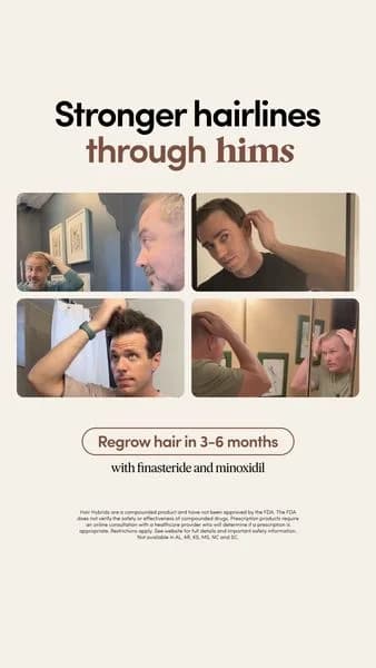
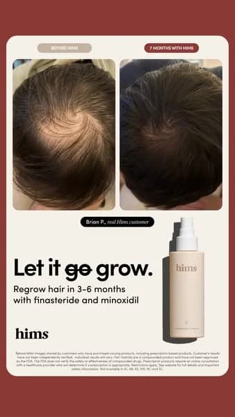
Rocket Money — Before/After Problem/Solution Split. Brand: Rocket Money. This ad effectively uses a split-screen, before-and-after layout to highlight a clear problem and solution. The left side employs a dark background with red text and a negative balance, creating a sense of financial distress. The right side shifts to a vibrant purple, showcasing a positive balance and actionable benefits, evoking relief and success. Compositionally, the mobile UI mockups provide relatable context, while bullet points with expressive emojis simplify complex financial concepts. The high contrast and direct messaging are optimized for social platforms like Facebook, where quick comprehension and emotional resonance drive engagement. Text hierarchy is clear, with prominent headlines and a strong, unmissable call to action.. Headline: Before Rocket Money / After Rocket Money. Primary text: Balance - $537.58. Card Declined. No $$ in Savings Account. Paying for ex GF's Netflix. Balance $39,486.55. Cancel Subscriptions in app. Suggests Ways to Save. Easy-to-read budget tracker.. Why this ad works: Clear Before/After Contrast for Problem/Solution — The stark visual and textual contrast between the "Before" (negative balance, declined card) and "After" (positive balance, actionable solutions) immediately communicates the product's value proposition. This direct comparison leverages psychological principles of pain and gain, making the benefits tangible and urgent for the viewer. Emotional Resonance through Visual Cues — The use of red for negative financial states and thumbs-down emojis on the "Before" side, contrasted with positive balances and rocket emojis on the "After" side, creates strong emotional resonance. This visual shorthand quickly conveys the user's potential journey from financial struggle to stability, enhancing relatability and desire. Actionable Benefits with Simplified Language — The "After" section clearly lists specific, actionable benefits like "Cancel Subscriptions" and "Suggests Ways to Save" in simple, digestible bullet points. This approach breaks down the app's features into immediate, understandable advantages, making it easy for potential users to grasp how Rocket Money can directly improve their financial situation.. Specs: Brand: Rocket Money, Industry: Finance & Insurance, Platform: Facebook, Format: Static, Audience: GeneralNURABEAM Thigh Wrap — Direct Before/After Comparison. Brand: NURABEAM. This ad effectively leverages a direct before-and-after comparison layout to showcase the NURABEAM Thigh Wrap's efficacy. The dark, minimalist background ensures maximum contrast, making the skin texture and the product's red light glow highly visible. Compositionally, the split-screen format immediately highlights the desired transformation, drawing the viewer's eye from the "Before" to the "After" state. The prominent, quantifiable claim "20 MIN = 700 SQUATS" acts as a powerful hook, establishing a clear value proposition. Text hierarchy is well-structured, moving from a benefit-driven headline to specific features and a strong discount offer. This design is optimized for direct-response platforms like Facebook or Instagram, where scroll-stopping visuals and clear, concise benefits drive immediate consideration and conversion. The bold claims and visual evidence aim to overcome skepticism quickly.. Headline: Thigh Wrap for Cellulite & Slimming. Primary text: 20 MIN = 700 SQUATS • Lymphatic Drainage • Targets Stubborn Fat • Remove 1.5 Inches or Full Refund 50% OFF + 2 FREE GIFTS. Why this ad works: Direct Before/After Comparison for Impact — The side-by-side comparison immediately communicates the product's benefit, visually demonstrating the transformation. This technique is highly effective in direct-response advertising, as it bypasses lengthy explanations and directly addresses the pain point, building trust and desire instantly. Quantifiable Benefit Statement Builds Credibility — The bold claim "20 MIN = 700 SQUATS" provides a clear, impressive, and easily digestible metric of efficacy. This type of social proof and benefit statement resonates strongly with audiences seeking quick, tangible results, making the product's value proposition undeniable and memorable. High-Contrast Dark Background Enhances Product — Utilizing a dark background creates stark contrast for both the skin tone and the glowing red light of the NURABEAM device. This not only makes the product stand out but also lends a sophisticated, almost clinical feel, enhancing the perceived premium quality and effectiveness of the technology.. Specs: Brand: NURABEAM, Industry: Health & Wellness, Platform: Facebook, Format: Static, Audience: Women 25-34Language Learning App — Bold UI Mockup. This ad employs a vibrant, high-contrast layout, strategically split to maximize impact. The top half features a bold, aspirational headline, "Speak like a pro," with crossed-out alternatives ("okay, good, better") that immediately communicate a transformative value proposition. This visual trick creates a clear 'before/after' mental state, compelling viewers to seek improvement. The bottom half grounds this aspiration with concrete proof: a mobile UI mockup showcasing tutor profiles, ratings, and prices, alongside a compelling statistic of "32,000+ experience tutors." The bright pink background ensures high visibility and scroll-stopping power on platforms like Instagram, appealing to a dynamic, modern audience. Black text provides excellent readability. The composition effectively balances emotional appeal with practical evidence, guiding the viewer from desire to consideration. Text hierarchy is clear, with the main benefit dominating, followed by supporting features, optimized for quick mobile scanning.. Headline: Speak like a pro. Primary text: 32,000+ experience tutors. Why this ad works: Bold headline with strikethroughs creates urgency — The "Speak like a pro" headline with "okay, good, better" crossed out immediately communicates a clear value proposition: rapid, superior improvement. This visual trick creates a sense of dissatisfaction with current skill levels and positions the app as the definitive solution, driving user desire for transformation. Vibrant pink background grabs immediate attention — The high-energy, saturated pink background is a powerful scroll-stopper in crowded social feeds. Its boldness contrasts sharply with typical muted ad aesthetics, ensuring the ad stands out. This vibrant choice appeals to a younger, dynamic audience, signaling a modern and engaging learning experience. App UI mockup provides concrete social proof — Displaying the app's tutor selection screen with ratings and prices offers tangible proof of the service's quality and breadth. This visual evidence, combined with the "32,000+ experience tutors" statistic, builds trust and credibility, directly addressing potential user skepticism about online learning platforms.. Specs: Industry: Education, Platform: Instagram, Format: Static, Audience: StudentsAnti-Aging Hand Treatment — Before/After Comparison. This ad uses a classic before/after split-screen layout to visually demonstrate product efficacy. The stark black background provides high contrast, making the skin tones and textural differences immediately apparent. The composition is simple, focusing entirely on the hands, with a clear vertical division emphasizing the transformation. White text "Day 1" and "Day 60" acts as a direct, undeniable visual hierarchy, guiding the viewer's eye from the problem to the solution. This format is highly effective for platforms like Facebook and Instagram, where quick, impactful visual proof drives consideration. The direct comparison leverages social proof and the desire for tangible results, making the product's benefit undeniable. The minimalist design ensures the message is clear and uncluttered, optimizing for mobile viewing.. Why this ad works: Direct Before/After Visual Proof — The side-by-side comparison of "Day 1" and "Day 60" provides immediate, undeniable visual evidence of the product's effectiveness. This direct proof bypasses skepticism, allowing viewers to instantly grasp the benefit without needing extensive copy. It's highly persuasive for products promising visible transformation. High Contrast Black Background — The deep black background creates a strong contrast with the skin tones, making the texture and subtle improvements in the "after" image more pronounced. This visual pop ensures the ad stands out in a busy feed, drawing attention directly to the product's results and enhancing perceived efficacy. Clear, Unambiguous Text Hierarchy — The large, white "Day 1" and "Day 60" text is positioned directly below each hand, creating an intuitive left-to-right reading flow. This clear labeling immediately contextualizes the images, reinforcing the progression and making the ad's core message instantly understandable, even at a glance.. Specs: Industry: Health & Wellness, Platform: Facebook, Format: Static, Audience: Women 35-44Autodesk — Architectural Comparison Split Screen. Brand: Autodesk. This ad employs a split-screen comparison layout to visually articulate the evolution of architectural design and the role of modern tools. The left panel, a black-and-white image of an older building, contrasts sharply with the vibrant, full-color image of a contemporary structure on the right, implicitly showcasing progress. The minimalist composition, with ample negative space, ensures focus on the architectural details and the transformation. Color psychology is used effectively to differentiate eras and highlight the modern aesthetic. Text hierarchy is subtle, providing contextual information below each image, with the brand message "For your vision" and Autodesk logo centrally placed as the unifying element. This approach is optimized for professional platforms, targeting architects and designers by demonstrating capability and inspiring future projects.. Headline: For your vision. Why this ad works: Visual contrast highlights design evolution — The stark difference between the grayscale historical building and the vibrant, modern structure immediately conveys progress. This visual storytelling technique effectively communicates the impact of advanced design tools, implicitly positioning Autodesk as a catalyst for contemporary architectural innovation and inspiring professionals to upgrade their capabilities. Side-by-side comparison demonstrates impact — Presenting two distinct architectural styles side-by-side creates a compelling narrative of transformation. This direct comparison allows the audience to quickly grasp the aesthetic and functional advancements over time, subtly linking Autodesk's software (Revit is mentioned) to the realization of complex, modern designs. Minimalist layout emphasizes architectural detail — The clean, uncluttered layout with significant negative space around each image ensures that the viewer's attention remains on the buildings themselves. This focus on intricate architectural details appeals directly to the professional audience, showcasing the precision and potential enabled by design software without visual distractions.. Specs: Brand: Autodesk, Industry: Software & Tools, Platform: Google, Format: Static, Audience: ProfessionalsInterrio AI — Before/After Testimonial Split. Brand: Interrio AI. This ad employs a compelling quadrant layout, effectively combining a visual before-and-after transformation with a user testimonial. The dark background for text and the "before" image creates a stark contrast with the bright, modern "after" image, visually reinforcing the product's impact. The text hierarchy guides the viewer through a narrative problem-solution arc, highlighting the brand "Interrio AI" and culminating in a clear "TRY NOW" call to action. This design is optimized for social feeds, where its strong visual contrast and relatable story are designed to capture attention and drive consideration. The color palette leverages dark tones for sophistication and bright tones for aspiration, appealing to homeowners seeking modern renovations.. Primary text: I didn't have money to hire a designer, but I really wanted to update my kitchen. Then I saw an ad for Interrio AI, and to my surprise, in just one minute I got over 10 design options for my own room. I recommend Interrio AI to everyone planning a renovation to save time and money.. Why this ad works: Stark Before/After Visual Proof — The dramatic visual transformation from a dated, dimly lit bathroom to a modern, bright space powerfully illustrates the product's impact. This side-by-side comparison provides immediate, undeniable proof of value, making the abstract concept of "design options" concrete and highly desirable for users considering home improvements. First-Person Testimonial Builds Trust — The ad leverages a compelling first-person narrative, starting with a common pain point ("didn't have money to hire a designer") and presenting Interrio AI as the accessible solution. This relatable storytelling approach fosters immediate connection and trust with potential customers, making the product's benefits feel more authentic and achievable for their own renovation projects. High-Contrast CTA Drives Immediate Action — The "TRY NOW" call-to-action is strategically placed and designed with high contrast against the dark background, making it impossible to miss. The clean white outline further isolates it, creating a powerful visual magnet that directs user attention and encourages immediate engagement. This clear directive is essential for converting interest into clicks and sign-ups.. Specs: Brand: Interrio AI, Industry: Home & Lifestyle, Platform: Instagram, Format: Mixed, Audience: GeneralTeeth Whitening — Before/After Split Screen. This ad effectively leverages a split-screen before/after layout to visually demonstrate a dramatic transformation in teeth whitening. The close-up composition directly focuses on the problem (yellowed teeth, inflamed gums) and the solution (bright white teeth, healthy gums), making the product's efficacy undeniable. The use of a model's finger to expose the teeth adds a layer of authenticity and relatability, making the results feel achievable. Color psychology is crucial, contrasting the dull, unhealthy 'before' with the vibrant, clean 'after,' immediately communicating the benefit. Optimized for platforms like Instagram, where visual proof and aspirational outcomes drive engagement and conversion. The lack of on-image text places full emphasis on the visual narrative, allowing the transformation to speak for itself, creating a strong, immediate impact.. Why this ad works: Side-by-side comparison highlights dramatic transformation — The split-screen format immediately presents the problem and solution, creating a powerful visual narrative. This direct comparison is highly effective for products offering visible results, as it builds instant credibility and trust by showcasing undeniable efficacy. It quickly communicates the core value proposition to the viewer. Close-up focus on problem area — The tight crop on the model's mouth ensures undivided attention on the product's impact. By isolating the teeth and gums, the ad eliminates distractions, making the transformation the undeniable focal point. This strategic composition maximizes the visual punch, ensuring the viewer grasps the core benefit instantly. Self-demonstration enhances authenticity and relatability — The model's action of pulling her lip to expose her teeth adds a layer of raw authenticity. This self-demonstration technique makes the results feel more genuine and achievable for the target audience, fostering a stronger connection than a perfectly staged, impersonal shot. It implies real-world usage.. Specs: Industry: Health & Wellness, Platform: Instagram, Format: Static, Audience: Women 25-34Rise App — Story-Driven Text with Aura Figures. Brand: Rise. This ad employs a text-heavy, narrative-driven layout, balancing a compelling story on the left with ethereal, glowing human figures on the right. The dark background with vibrant blue and pink aura-like visuals creates a mystical yet energetic feel, symbolizing transformation and inner balance. This composition effectively draws the eye from the headline down through the personal testimonial, making it highly engaging for social platforms like Instagram or Facebook where long-form content can capture attention. The clear text hierarchy, starting with a bold problem-solution headline, guides the reader through the journey. Color psychology uses the dark to represent the problem (burnout) and the bright, flowing light to represent the solution (energy from Rise), reinforcing the app's benefit. The blend of personal story and striking visuals optimizes for consideration by building trust and intrigue.. Headline: How the wrong bedtime burns out millennial women. Primary text: It's hard to believe but it's true. I was waking up at 10am but still felt exhausted and out of control all the time. Then my roommate told me about Rise and it changed everything. The app calculated that my ideal wake up time was actually 5:55am, so I had been on the wrong schedule for years. Since I've been using Rise, I'm waking up with tons of energy, my focus is locked in, and I'm finally able to reclaim my day. A 1 min quiz could literally change your life.. Why this ad works: Relatable Problem & Solution Narrative — The ad masterfully crafts a personal story, beginning with a common pain point for millennial women – exhaustion and lack of control. This narrative approach builds immediate empathy and trust, making the solution (the Rise app) feel authentic and highly relevant. It transforms a product pitch into a shared experience. Intriguing Visuals & Symbolic Colors — The glowing, ethereal human figures on a dark, cosmic background are visually captivating. The vibrant blue and pink hues symbolize energy, transformation, and inner balance, directly aligning with the app's promise of improved sleep and vitality. This aesthetic elevates the ad beyond mere information to an aspirational experience. Strong Hook & Low-Barrier Engagement — The headline immediately addresses a specific, relatable issue ("burns out millennial women"), grabbing the target audience's attention. Concluding with "A 1 min quiz could literally change your life" provides a clear, low-commitment next step, encouraging immediate interaction and moving prospects further down the funnel.. Specs: Brand: Rise, Industry: Health & Wellness, Platform: Instagram, Format: Static, Audience: Women 25-34Anti-Aging Hand Treatment — Before/After Split. This ad employs a highly effective split-screen before/after layout, directly showcasing product efficacy. The stark black background provides maximum contrast, making the skin tone changes and texture improvements immediately apparent. Compositionally, the hands are centered and fill the frame, ensuring the visual transformation is the undisputed focal point. The minimal text, "Day 1" and "Day 90," creates a clear narrative of progression without requiring extensive reading, ideal for quick consumption on platforms like Facebook or Instagram. This direct visual proof leverages a powerful psychological trigger, implying dramatic results and building trust. The high contrast and clear visual message are optimized for scroll-stopping performance, driving consideration and conversion by presenting undeniable evidence.. Why this ad works: Direct Before/After Visual Proof — The split-screen format immediately presents a dramatic transformation of the hand's appearance over 90 days. This visual evidence is highly persuasive, bypassing skepticism by showing tangible results rather than just stating claims. It's a powerful conversion driver for anti-aging products. High Contrast for Scroll-Stopping Impact — The use of a deep black background against the lighter skin tones creates exceptional visual contrast. This design choice ensures the ad stands out in a busy social feed, drawing the eye directly to the product's effect. High contrast images typically achieve better engagement rates. Minimal Text for Instant Comprehension — With only "Day 1" and "Day 90" as text overlays, the ad's message is universally understood at a glance. This reduces cognitive load, allowing viewers to quickly grasp the product's benefit without needing to read lengthy copy, which is crucial for fast-paced mobile environments.. Specs: Industry: Health & Wellness, Platform: Instagram, Format: Static, Audience: Women 45+Porn Brain vs. Reset Brain — Before/After Split. This ad employs a powerful split-screen, before/after layout to visually communicate a transformation. The left panel uses a distressed facial expression, dark red lighting, and a glitchy red brain outline with "Porn Brain" text, immediately evoking pain and a problem state. The right panel contrasts sharply with a calm, confident expression, clear blue lighting, and a bright yellow glowing brain with "Reset Brain" text, signaling a solution and positive outcome. This direct visual juxtaposition leverages color psychology—red for warning/distress, blue for calm, yellow for clarity/enlightenment—to create an immediate emotional impact. The bold, high-contrast text ensures readability and reinforces the core message, making it highly effective for scroll-stopping on platforms like Instagram or Facebook where quick comprehension is key. The composition guides the eye from problem to solution, optimizing for rapid understanding of the value proposition.. Why this ad works: Direct Visual Contrast for Problem/Solution — The split-screen design immediately presents a stark before-and-after narrative. This visual shorthand allows viewers to instantly grasp the problem (distress, "Porn Brain") and the desired solution (calm, "Reset Brain") without needing extensive copy. This rapid comprehension is crucial for engaging audiences on fast-paced social feeds. Emotional Resonance Through Facial Expressions — The contrasting facial expressions—distress and pain on the left versus calm and confidence on the right—create a strong emotional connection. Viewers experiencing similar struggles can instantly identify with the "before" state, while the "after" offers a clear, aspirational vision of relief and improvement. This emotional mirroring drives engagement. Strategic Color Psychology Reinforces Message — The ad masterfully uses color psychology: deep, glitchy red on the left signifies danger, pain, and a disordered state, while the serene blue background and bright, glowing yellow brain on the right represent clarity, peace, and enlightenment. This color contrast powerfully amplifies the problem-solution narrative, making the ad's intent unmistakable.. Specs: Industry: Health & Wellness, Platform: Instagram, Format: Static, Audience: Men 25-34True Classic — AirDrop Before/After Mockup. Brand: True Classic. This ad cleverly uses an iOS AirDrop UI mockup to create a native, attention-grabbing experience, mimicking a personal notification. The layout features a prominent before-and-after split screen, visually demonstrating the product's transformative effect on physique and confidence. The 'before' image shows a relaxed, slightly ill-fitting shirt, contrasting sharply with the 'after' image's well-fitted tee and confident posture. Color psychology is subtle, with natural outdoor lighting enhancing the 'after' shot's appeal. Text hierarchy is clear: 'AirDrop' as the sender, a bold, provocative headline, and a direct call to action embedded in the 'Accept' button. This composition is optimized for social feeds, where its unique format and relatable transformation story are designed to interrupt scrolling and drive engagement, leveraging curiosity and aspirational messaging.. Headline: Looking to transform from dad to daddy?. Primary text: Get True Classic.. Why this ad works: Native UI mimicry grabs immediate attention — The AirDrop notification format is highly effective on social platforms, breaking through typical ad blindness. It creates an instant, personal connection, making users pause and engage with what appears to be a system notification rather than an advertisement, boosting initial click-through rates. Provocative headline sparks curiosity and engagement — The "dad to daddy" headline is bold and memorable, directly addressing a common male aspiration for improved appearance and confidence. This specific, slightly humorous language resonates with the target audience, encouraging them to view the transformation and consider the brand's promise. Clear before/after visually sells transformation — The split-screen comparison powerfully illustrates the product's benefit. The 'before' image shows a less flattering fit, while the 'after' showcases a well-fitted shirt and confident demeanor. This direct visual proof is highly persuasive, demonstrating the tangible improvement True Classic offers.. Specs: Brand: True Classic, Industry: Fashion & Apparel, Platform: Instagram, Format: UI Mockup, Audience: Men 25-34Hume Health — Before/After Comparison Layout. Brand: Hume Health. This ad employs a split-screen layout, effectively contrasting a user's past struggles ("WHO I WAS") with their current success ("WHO I AM") using Hume Health. The clean blue and white color palette evokes trust and professionalism, aligning with health and technology. Compositionally, the ad balances text-heavy bullet points in the upper half, detailing pain points and solutions, with visual proof in the lower half, showcasing a traditional scale versus the detailed Hume Health app UI. This structure is optimized for mobile platforms like Instagram, where clear, concise information and compelling visuals drive engagement. Text hierarchy guides the eye from the bold section headers to the bulleted benefits, culminating in the app demonstration and a crucial credibility statement, "98% DEXA Match.". Headline: WHO I WAS vs. WHO I AM. Primary text: WHO I WAS: • Obsessed with the number on the scale • Frustrated by weight fluctuations • Didn't realize I was losing muscle • Felt stuck and unmotivated • Guessing instead of knowing WHO I AM: • Finally SEEING fat loss & muscle gain • Progress charts keep me motivated • Caught muscle loss before it became a setback • Dropped 5 years off my metabolic age • Feel stronger, confident, in control. Why this ad works: Clear Problem/Solution Framing — The explicit "WHO I WAS" vs. "WHO I AM" narrative immediately establishes a relatable pain point and offers a transformative solution. This before-and-after structure is highly effective for engagement, as it allows users to quickly identify with the struggles and envision the benefits, driving consideration for the product. Visual Proof with App Interface — Including the Hume Health app interface, displaying detailed body composition, provides tangible evidence of the product's value. This visual demonstration is more compelling than abstract claims, making the benefits concrete and believable. It shows rather than tells, which is crucial for building trust and understanding in digital advertising. Credibility through Data Validation — The "98% DEXA Match" callout, strategically placed near the app interface, adds a strong layer of scientific credibility. It reassures potential users that the app's data is accurate and reliable, addressing skepticism often associated with health tracking and enhancing the perceived trustworthiness of Hume Health's technology.. Specs: Brand: Hume Health, Industry: Health & Wellness, Platform: Instagram, Format: Static, Audience: Fitness EnthusiastsARMRA Colostrum — Testimonial & Product Focus. Brand: ARMRA. This ad effectively combines a compelling testimonial with a clear product shot and discount offer, creating a strong conversion-focused message. The layout strategically places the emotional, relatable testimonial prominently in the upper left, leveraging the natural F-pattern reading behavior. The close-up of the woman's skin provides a direct visual connection to the testimonial's claims about skin transformation, enhancing authenticity. The product, ARMRA Colostrum, is clearly visible with its key benefits, while the vibrant yellow-green "30% OFF" circle acts as a high-contrast focal point, driving immediate attention to the offer. The overall clean aesthetic, with natural skin tones and white packaging, reinforces a health and wellness vibe, optimized for platforms like Instagram where authentic user-generated content and clear value propositions perform well. Text hierarchy guides the eye from the impactful testimonial to the product details and then to the urgent discount.. Headline: At 55 I found my skin dull and ARMRA has completely transformed my skin and hair!!!. Primary text: —Verified ARMRA customer. Why this ad works: Authentic testimonial drives emotional connection — The direct quote from a "Verified ARMRA customer" immediately builds trust and relatability. Highlighting age ("At 55") and specific benefits ("transformed my skin and hair") addresses common concerns of the target demographic, making the product's promise tangible and aspirational. This personal endorsement is highly persuasive. High-contrast discount circle captures attention — The bright yellow-green circle with "30% OFF" stands out dramatically against the muted background and product packaging. This color choice and prominent placement ensure the offer is unmissable, acting as a powerful call-out for users scrolling quickly. It creates urgency and incentivizes immediate action for conversion. Visual proof reinforces testimonial claims — The close-up of the woman's skin, subtly showing texture and vitality, visually supports the testimonial's claim of "transformed skin." While not a before/after, it provides a realistic, aspirational image of healthy skin, making the product's benefits feel more achievable and credible to the target audience.. Specs: Brand: ARMRA, Industry: Health & Wellness, Platform: Instagram, Format: Static, Audience: Women 45+NURABAN Slimdown Sale — Before/After Split. Brand: NURABAN. This ad effectively uses a Before/After split layout to visually demonstrate the product's application and implied benefit, directly addressing a common pain point. The soft, spring-themed background with pastel green and floral elements creates an inviting, non-intimidating aesthetic, contrasting with the bold sale messaging. Text hierarchy is clear: the large "SLIMDOWN SALE" headline immediately grabs attention, followed by the discount code and urgency statement. The product, a black band with a red light, stands out against the skin and light background, ensuring visibility. Optimized for platforms like Instagram, the visual comparison and clear offer aim for direct response, leveraging aspirational results to drive conversion. The overall composition balances promotional text with visual proof, making the ad both informative and persuasive.. Headline: SLIMDOWN SALE. Primary text: Use code SPRING10 for 10% OFF LIMITED TIME ONLY. Why this ad works: Clear Before/After visual proof — The side-by-side comparison immediately communicates the product's purpose and potential outcome. This visual storytelling is highly effective for health and wellness products, allowing viewers to quickly grasp the transformation without extensive reading. It builds credibility and directly addresses user aspirations. Urgent, prominent sale messaging — The "SLIMDOWN SALE" headline and "LIMITED TIME ONLY" banner create immediate urgency and value perception. Placing this information at the top ensures it's the first thing seen, driving click-throughs from price-sensitive audiences. The clear discount code further reduces friction for conversion. Contrasting product highlights efficacy — The black NURABAN device with its glowing red light strongly contrasts against the light skin tone and pastel background. This visual pop draws the eye directly to the product in action, subtly implying its active, effective nature. It makes the device the hero of the "After" shot.. Specs: Brand: NURABAN, Industry: Health & Wellness, Platform: Instagram, Format: Static, Audience: Women 25-34Skincare Before/After — Direct Comparison Layout. This ad effectively utilizes a classic side-by-side before/after layout to visually demonstrate product efficacy. The composition directly contrasts the "BEFORE" image, showing significant skin imperfections, with the "AFTER 6 WEEKS" image, revealing noticeable improvement. This direct comparison is a powerful persuasion technique, immediately communicating the product's benefit. The clean white background and simple green text boxes maintain a clinical yet approachable vibe, reinforcing trust and results. Optimized for platforms like Instagram or Facebook, where users quickly scroll, this visual proof stops the scroll and encourages closer inspection. The minimal text overlay ensures the focus remains entirely on the transformative visual evidence, making the ad easily digestible and impactful.. Why this ad works: Direct Before/After Visual Proof — The side-by-side comparison immediately showcases the product's transformative power. This visual evidence is highly persuasive, allowing potential customers to see tangible results without needing extensive text. It builds credibility and trust, directly addressing common skin concerns and offering a clear solution. Clear Timeframe Establishes Expectation — Specifying "AFTER 6 WEEKS" sets a realistic expectation for results, enhancing the ad's trustworthiness. This transparency helps manage customer expectations, reducing potential dissatisfaction and building a stronger relationship with the brand. It suggests a consistent, effective treatment rather than an overnight miracle. Minimalist Design Focuses on Results — The clean white background and simple green text boxes eliminate distractions, ensuring the viewer's attention is solely on the skin transformation. This minimalist approach conveys professionalism and confidence in the product's efficacy, allowing the visual proof to speak for itself without clutter or overwhelming design elements.. Specs: Industry: Health & Wellness, Platform: Instagram, Format: Static, Audience: Women 25-34Nuve Youthlift — Testimonial & Before/After Layout. Brand: Nuve. This ad effectively combines social proof with visual evidence and product information. The layout strategically places a handwritten testimonial sticky note prominently, immediately drawing the eye with its personal, relatable tone. Below it, the product packaging and jar are clearly displayed, providing brand and ingredient details. Crucially, the before/after image of hands offers compelling visual proof of efficacy, a powerful conversion driver. The muted, clean color palette reinforces a sense of trustworthiness and clinical effectiveness. This composition is optimized for platforms like Facebook or Instagram, where authentic testimonials and tangible results resonate strongly, encouraging consideration and conversion by addressing a common pain point directly. The text hierarchy prioritizes the testimonial, followed by visual proof, then product details.. Primary text: I finally found something that works after trying everything else & my hands don't give away my age anymore. Why this ad works: Authentic handwritten testimonial builds trust — The sticky note with a personal, handwritten message feels genuine and relatable. This informal, user-generated content style bypasses ad skepticism, making the claim more believable and immediately connecting with potential customers who share similar concerns about aging hands. Direct before/after visual proof — The side-by-side comparison of hands clearly demonstrates the product's claimed anti-aging effects. This visual evidence is highly persuasive, quickly communicating the benefit without requiring extensive reading, which is crucial for fast-scrolling social feeds. Clear product display with key benefits — The product packaging and jar are well-lit and readable, highlighting "Youthlift Hand Cream" and key benefits like "+HA Firming Moisturizing Protecting." This ensures viewers understand what product is being offered and its core functionalities after being drawn in by the testimonial and visual proof.. Specs: Brand: Nuve, Industry: Health & Wellness, Platform: Instagram, Format: Static, Audience: Women 35-44Printable Chair Workout Plan — Before/After Grid. This ad employs a direct-response, before-and-after layout to showcase a 4-week transformation, targeting an older demographic. The composition features a prominent visual progression at the top, immediately establishing credibility and aspirational results. Below, a detailed 28-day workout grid provides tangible value and reinforces the program's structure. The color palette, while somewhat dated with its olive green background and bright primary shirts, effectively creates contrast, ensuring readability of the black and white text. Text hierarchy is clear: a bold headline states the product, followed by a strong benefit claim, and a direct call to action. Optimized for platforms like Facebook or Pinterest, it aims to stop the scroll with a relatable transformation and a clear, actionable offer. The high text density provides comprehensive information, catering to users seeking detailed program insights.. Headline: PRINTABLE CHAIR WORKOUT PLAN. Primary text: TO LOSE UP TO 22 LBS OF BELLY FAT. Why this ad works: Clear Before/After progression builds trust — The sequential display of the woman's transformation over four weeks immediately establishes credibility and demonstrates tangible results. This visual evidence is highly persuasive for weight loss products, allowing the target audience to envision their own potential success and reducing skepticism about the program's efficacy. Direct benefit-driven headline captures attention — The headline "TO LOSE UP TO 22 LBS OF BELLY FAT" directly addresses a common pain point and offers a specific, measurable outcome. This clear value proposition resonates strongly with the target audience, capturing attention by promising a desired result upfront, which is crucial for direct-response advertising. Detailed workout plan provides immediate value — Including the full 28-day workout plan directly within the ad offers immediate, tangible value to the viewer. This transparency builds trust and allows potential customers to see exactly what they're getting, reducing perceived risk and encouraging immediate engagement with the "Print It Now" call to action.. Specs: Industry: Health & Wellness, Platform: Facebook, Format: Static, Audience: Women 45+Printable Chair Workout — Before/After & Plan. This ad employs a classic before-and-after layout, showcasing a clear progression of weight loss over four weeks, which is highly effective for direct-response campaigns. The visual transformation of the model provides strong social proof and aspirational appeal for the target demographic. Below, a detailed 28-day workout plan grid reinforces the program's structure and tangibility, addressing potential skepticism. The bright, contrasting colors of the model's shirts help differentiate each week's progress, while the olive green background provides a stable, health-oriented feel. Text hierarchy is clear: a bold headline, a specific benefit, and a prominent call to action. Optimized for platforms like Facebook or Pinterest, where users seek actionable solutions and visual proof. The "printable" aspect suggests a tangible, accessible product.. Headline: PRINTABLE CHAIR WORKOUT PLAN. Primary text: TO LOSE UP TO 22 LBS OF BELLY FAT. Why this ad works: Clear Before/After Visual Progression — The four-week visual sequence of the same woman clearly demonstrates the product's efficacy. This before-and-after format is incredibly powerful for weight loss ads, providing immediate, undeniable proof of results. It builds trust and motivates the target audience by showing a relatable transformation over a short, achievable timeframe. Specific Benefit-Oriented Headline — The headline "TO LOSE UP TO 22 LBS OF BELLY FAT" is highly specific and addresses a common pain point directly. Quantifiable results like "22 lbs" and targeting a specific area "belly fat" resonate strongly with the audience, creating a clear value proposition and immediate interest in the solution offered. Actionable, Tangible Workout Plan Display — Presenting the full 28-day workout plan within the ad itself provides transparency and builds confidence. It shows exactly what the user will get, reducing perceived risk and increasing the likelihood of conversion. This detailed preview appeals to users looking for structured, easy-to-follow fitness solutions, reinforcing the "printable" value.. Specs: Industry: Health & Wellness, Platform: Facebook, Format: Static, Audience: Women 45+Vagus Nerve Program — Before/After Banana Split. This ad employs a clear Before/After split-screen layout, using a visual metaphor of bananas to represent transformation. A rotten banana on a muted beige background signifies the 'before' state, while a fresh, vibrant yellow banana on a bright yellow background illustrates the 'after'. This high-contrast color psychology immediately communicates improvement. The composition guides the eye from left (problem) to right (solution), reinforced by corresponding text lists. The prominent headline "VAGUS NERVE RESET PROGRAM" establishes the topic, followed by detailed problem/solution points, and a clear call to action. This direct approach is optimized for platforms like Facebook or Instagram, where users quickly scan for relevant solutions to their pain points. The text hierarchy is effective, though dense, ensuring the core message is conveyed despite the volume of information. The overall design aims for immediate comprehension and emotional resonance.. Headline: VAGUS NERVE RESET PROGRAM. Primary text: BEFORE: Dizziness Insomnia Brain Fog Chronic Fatigue Digestive Issues Neck and shoulder pain Anxiety & Panic Attacks AFTER: Healthy Gut Restful Sleep Total Clarity Childlike Energy Balance and Stability Calm & Relaxed MindNeck and shoulder relaxation. Why this ad works: Visual metaphor for health transformation — The rotten vs. fresh banana powerfully conveys the program's impact on health. This simple, relatable imagery instantly communicates the 'before and after' state, making complex health issues tangible and the solution appealing. It's memorable and easily understood across demographics, cutting through noise with a clear visual narrative that resonates deeply with potential customers. Clear problem-solution structure engages audience — The 'BEFORE' and 'AFTER' lists directly address common pain points and offer desired outcomes. This structure immediately connects with users experiencing these symptoms, positioning the program as a direct remedy. It builds relevance and urgency for the target audience by clearly outlining the problems the program solves and the benefits it delivers. High contrast color psychology reinforces benefits — The dull beige for 'BEFORE' and bright yellow for 'AFTER' visually reinforces the transformation. Yellow is associated with energy, happiness, and vitality, creating a positive emotional response to the 'after' state. This strategic color choice enhances the perceived value of the program's benefits, making the desired outcome feel more achievable and appealing.. Specs: Industry: Health & Wellness, Platform: Facebook, Format: Static, Audience: GeneralThe Purest Co. Sicilian Orange — Before/After Testimonial. Brand: the purest co.. This ad effectively utilizes a split-screen before/after layout, presenting a user's authentic weight loss journey. The warm, inviting orange overlay unifies the two images, subtly reinforcing the "Sicilian Orange" product theme and creating a vibrant, energetic mood. Compositionally, the product bottles are strategically placed in the foreground, anchoring the visual proof and making the solution immediately apparent. The dominant text is a direct, relatable testimonial, positioned to draw the eye after scanning the visual transformation, which significantly boosts credibility. This user-generated content (UGC) approach is highly optimized for social platforms like Instagram or Facebook, where authentic peer reviews and visual evidence drive strong engagement and consideration. The text hierarchy prioritizes the user's voice over overt brand messaging, fostering trust and making the ad feel less like an advertisement and more like a genuine recommendation.. Primary text: I take this 30 mins before eating and it helps me lose kgs faster!. Why this ad works: Authentic User-Generated Content Feel — The ad mimics a personal social media post, featuring a real person's self-taken photos. This authenticity builds immediate trust and relatability with the target audience, making the product's claims feel more credible than polished studio photography. It bypasses ad skepticism. Direct Visual Before/After Proof — The side-by-side comparison clearly illustrates a physical transformation, providing compelling visual evidence of the product's efficacy. This immediate visual impact is highly persuasive, allowing viewers to quickly grasp the potential benefits without needing extensive text. Relatable First-Person Testimonial — The prominent quote, "I take this 30 mins before eating and it helps me lose kgs faster!", is a powerful social proof. It uses simple, direct language from a user, making the product's benefits tangible and believable, directly addressing potential customer pain points.. Specs: Brand: the purest co., Industry: Health & Wellness, Platform: Instagram, Format: Static, Audience: Women 25-34Ancient Diet Program — Testimonial & Food Shot. This ad employs a dark, high-contrast layout to command attention, leveraging a classic black background with stark white typography. The composition strategically places a compelling headline at the top, followed by an evocative sub-headline to build intrigue around "ancient ways of eating." A prominent testimonial provides social proof and a relatable transformation story, enhancing credibility. The visual element, featuring olive oil and rustic cheese/bread, subtly reinforces the Mediterranean diet theme without being overly explicit. Text hierarchy guides the eye from the bold headline to the testimonial, then to key program benefits ("40 days, 12 ingredients, 1 transformation"), creating a clear value proposition. This design is optimized for platforms like Facebook or Instagram, where strong textual hooks and authentic testimonials drive consideration, despite the lack of a direct CTA button. The dark aesthetic conveys seriousness and tradition, aligning with the "ancient" theme.. Headline: EAT LIKE APOSTLES. Primary text: Inspired by ancient ways of eating—and by the strength of those who walked before us. "I wanted to get back in shape, so I started the Mediterranean diet. In three months, I went from 180 lbs to 142 lbs." — Olivia 40 days 12 ingredients 1 transformation. Why this ad works: High-contrast text on dark background — The stark white text against the deep black background creates exceptional readability and visual impact. This contrast ensures the headline and key messages immediately capture attention in a busy feed, preventing passive scrolling and drawing the eye directly to the core proposition, making the ad highly visible and memorable. Relatable testimonial builds trust and aspiration — Featuring a specific, quantifiable testimonial ("I went from 180 lbs to 142 lbs") from "Olivia" provides powerful social proof. This personal success story makes the program feel achievable and trustworthy, significantly increasing consideration by demonstrating real-world results rather than just making abstract claims, fostering aspiration. Benefit-driven summary points for quick understanding — The "40 days, 12 ingredients, 1 transformation" section distills the program's essence into easily digestible, impactful metrics. This concise summary quickly communicates the commitment required and the ultimate reward, appealing to users seeking clear, structured paths to health goals and providing immediate value proposition without extensive reading.. Specs: Industry: Health & Wellness, Platform: Facebook, Format: Static, Audience: GeneralNuve Youthlift Hand Cream — Before/After Split Screen. Brand: Nuve Youthlift. This ad effectively uses a Before/After split-screen layout to visually demonstrate product efficacy. The stark contrast between the "Day 1" and "Day 30" hands immediately captures attention, leveraging the power of transformation. The product, Nuve Youthlift Hand Cream, is strategically placed at the bottom center, acting as the clear solution to the visible problem. The dark background for the hands enhances the visibility of skin texture and wrinkles, making the improvement more dramatic. Below the product, strong social proof—"4,502+ reviews" and endorsements from "COSMOPOLITAN" and "Women's Health"—builds immediate trust and credibility. This composition is highly optimized for visual platforms like Instagram, where quick, impactful visuals drive engagement. The text hierarchy guides the eye from the problem/solution to the supporting evidence, reinforcing the product's benefits and trustworthiness. The clean, direct presentation focuses entirely on results, minimizing distractions.. Why this ad works: Direct Before/After comparison drives impact — The side-by-side comparison of 'Day 1' and 'Day 30' hands provides undeniable visual proof of the product's effectiveness. This direct juxtaposition immediately communicates the transformation, making the benefit tangible and highly persuasive. It eliminates guesswork and builds confidence in the product's claims, a powerful technique for driving consideration. Strong social proof builds immediate credibility — Displaying '4,502+ reviews' alongside endorsements from reputable magazines like Cosmopolitan and Women's Health significantly boosts credibility. This social proof acts as a third-party validation, assuring potential customers of the product's quality and widespread acceptance. It reduces purchase risk and encourages trust in the brand. Clear problem/solution narrative engages audience — The ad clearly presents a common problem—aging hands—and positions Nuve Youthlift Hand Cream as the definitive solution. This narrative structure is highly effective in advertising, as it resonates with the audience's pain points and offers a clear path to resolution. It makes the product immediately relevant and desirable.. Specs: Brand: Nuve Youthlift, Industry: Health & Wellness, Platform: Instagram, Format: Static, Audience: Women 35-44Mediterranean Diet — Rustic Testimonial Layout. This ad employs a split-screen composition, balancing an organic visual on the left with a compelling text-heavy narrative on the right. The warm, earthy color palette, featuring rustic orange and vibrant green, evokes a natural, healthy, and inviting atmosphere, aligning perfectly with the Mediterranean diet theme. The headline strategically creates intrigue, drawing the viewer into a personal weight loss testimonial. Text hierarchy guides the eye from the bold, mysterious headline to the relatable success story, culminating in a small, necessary disclaimer. This design is optimized for platforms like Instagram or Facebook, where personal transformation stories and aspirational lifestyle content resonate strongly, encouraging engagement and consideration through emotional connection rather than direct sales. The natural imagery reinforces the diet's health benefits, enhancing credibility.. Headline: DISAPPEAR FOR 3 MONTH & Keep it private until it's done. Primary text: I wanted to get back in shape, so I started the Mediterranean diet. In three months, I went from 180 lbs to 142 lbs.. Why this ad works: Intriguing headline creates curiosity — The headline "DISAPPEAR FOR 3 MONTH & Keep it private until it's done" masterfully taps into a common desire for personal, unannounced transformation. This creates immediate intrigue and a strong emotional hook, compelling the viewer to read the accompanying testimonial to uncover the secret behind such a private and significant change, driving deeper engagement. Personal testimonial builds relatability — The ad leverages a powerful first-person testimonial, sharing a specific weight loss journey from 180 lbs to 142 lbs. This personal narrative builds immediate relatability and trust with the audience, demonstrating tangible results. Such authentic storytelling is highly effective in inspiring potential customers who see themselves in the shared experience. Organic imagery reinforces natural health — The inclusion of vibrant oranges and green leaves provides a strong visual anchor, immediately connecting the ad to fresh, natural, and healthy eating. This organic imagery reinforces the core principles of the Mediterranean diet, enhancing its appeal and credibility. It subtly communicates health benefits without explicit claims, fostering a positive brand association.. Specs: Industry: Health & Wellness, Platform: Instagram, Format: Static, Audience: Women 25-34M Analytics — Before/After Egg Comparison. Brand: M. This ad employs a stark before-and-after composition to visually communicate the product's benefit. The dark blue background provides high contrast for the white text and product elements, ensuring readability and scroll-stopping power on various platforms. The layout strategically places the problem (burnt egg) on the left and the solution (perfect egg) on the right, aligning with natural left-to-right reading patterns. The playful, yet clear, metaphor simplifies a complex SaaS offering. Text hierarchy is clear: a bold headline grabs attention, followed by a concise sub-headline detailing the core value proposition. A prominent price callout with a crossed-out original price drives urgency and highlights value, optimizing for conversion-focused campaigns. The minimalist design ensures the core message and visual metaphor are the primary focus, avoiding clutter.. Headline: Save Time with One-Click Report!. Primary text: All Your Analytics in One Dashboard. Zero Hassle.. Why this ad works: Visual Metaphor for Problem/Solution — The burnt egg versus perfect egg immediately conveys "before and after" without needing complex explanations. This simple, relatable visual metaphor makes the abstract benefit of "One-Click Report" tangible and memorable, cutting through digital noise. It's highly effective for quickly communicating value. High Contrast for Readability & Impact — The white text and bright egg imagery against a deep blue background create strong visual contrast. This ensures the headline and key messages are highly readable, even on smaller mobile screens, and helps the ad stand out in a busy feed, increasing initial engagement and message retention. Clear Value Proposition with Urgency — The headline "Save Time with One-Click Report!" directly addresses a pain point. The price bubble with a crossed-out higher price and "LIFETIME" offer creates a strong sense of value and urgency, pushing potential customers towards immediate conversion by highlighting a significant discount.. Specs: Brand: M, Industry: Software & Tools, Platform: Facebook, Format: Static, Audience: Small Business OwnersTopaz Photo AI — Face Recovery Before/After. Brand: Topaz Labs. This ad effectively uses a split-screen layout to visually demonstrate the core benefit of Topaz Photo AI's "Face Recovery AI Model." The dark, minimalist background ensures the vibrant before-and-after comparison and the software UI remain the focal point, preventing visual clutter. Color psychology leverages green accents for innovation and clarity, guiding the eye to key feature callouts. Composition strategically places the product box and descriptive text below the main visual, creating a clear F-pattern hierarchy. This ad is optimized for platforms like Facebook or Instagram, where a direct, problem-solution visual resonates with professionals seeking efficient photo editing tools. The clear visual proof minimizes the need for extensive text, allowing the product's capability to speak for itself.. Headline: Face Recovery AI Model.. Primary text: Face Recovery AI offers remarkable detail enhancement for low-resolution faces.. Why this ad works: Direct before/after visual proof — The split-screen immediately showcases the dramatic improvement from pixelated to clear. This visual evidence is highly persuasive, instantly communicating the product's value proposition without requiring the viewer to read extensive copy. It builds trust and demonstrates efficacy effectively for a technical product. Clear feature spotlight with UI context — Highlighting "Face Recovery AI Model" with a green icon and showing the feature enabled within the software's UI provides crucial context. This allows potential users to visualize the tool in action and understand its specific application, enhancing consideration and perceived utility for photo editors. Dark background enhances visual contrast — The deep charcoal background creates strong contrast for the bright, enhanced face and the white text. This ensures high readability and makes the visual demonstration pop, effectively capturing attention in a busy feed environment and emphasizing the product's transformative power on images.. Specs: Brand: Topaz Labs, Industry: Software & Tools, Platform: Facebook, Format: Static, Audience: ProfessionalsChair Workout Plan — Before/After & Schedule. The ad strategically combines a compelling before-and-after visual progression with a detailed, actionable workout plan. The four-week transformation of an older woman builds immediate credibility and aspirational appeal for the target demographic. A vibrant green headline against a purple background ensures high visibility and immediate attention-grabbing, leveraging color contrast for impact. The composition guides the eye from the proven results at the top to the practical solution below, fostering a sense of achievable transformation. The grid layout of the 28-day plan offers transparency and structure, reducing perceived effort. While text-heavy, the clear hierarchy, with a dominant headline and prominent CTA, ensures key messages are conveyed. This direct, solution-oriented approach is optimized for platforms where users actively seek practical health and fitness content, driving consideration and conversion through visual proof and clear instructions.. Headline: PRINTABLE CHAIR WORKOUT PLAN TO LOSE UP TO 22 LBS OF BELLY FAT. Why this ad works: Visual proof of transformation builds trust — The sequential before-and-after images over four weeks provide compelling visual evidence of results. This builds immediate trust and demonstrates the program's efficacy, directly addressing the target audience's desire for tangible weight loss outcomes, especially around belly fat, making the promise feel achievable. Clear, actionable value proposition with plan — The detailed 28-day workout plan presented as a grid immediately shows the user what they will receive. This transparency reduces perceived risk and highlights the practical, step-by-step nature of the program, making it feel achievable and valuable. It answers 'what do I get?' instantly. High-contrast, benefit-driven headline grabs attention — The bright green "PRINTABLE CHAIR WORKOUT PLAN TO LOSE UP TO 22 LBS OF BELLY FAT" against the purple background is highly visible and directly addresses a specific pain point with a clear, quantified benefit. This immediate communication captures attention and effectively qualifies the audience.. Specs: Industry: Health & Wellness, Platform: Instagram, Format: Static, Audience: Women 45+Dental Aligner Testimonial — Before/After Split. This ad effectively utilizes a direct before/after split screen to showcase a clear product transformation. The composition focuses tightly on the user's mouth, making the dental gap and its resolution the undeniable hero. High-contrast purple and white elements, including the "Before" and "After" labels, ensure readability and draw attention to the key visual changes. The testimonial quote at the bottom reinforces the emotional benefit, leveraging social proof. Optimized for visual platforms like Instagram, this layout quickly communicates value and builds trust. The text hierarchy is simple: prominent labels guide the eye through the visual evidence, and the personal quote provides a relatable connection, making the ad highly persuasive for individuals considering similar dental solutions. This design prioritizes impact over complexity, ideal for quick consumption.. Primary text: I always wanted to get rid of my gap.. Why this ad works: Direct Before/After comparison for clear results — The split-screen format immediately highlights the problem and solution. By placing the "Before" and "After" images side-by-side, the ad creates an undeniable visual proof point, crucial for products with tangible physical transformations. This direct comparison builds trust and demonstrates efficacy more powerfully than descriptive text alone. Authentic close-up fosters relatability and trust — The unpolished, close-up nature of the images feels authentic, resembling user-generated content rather than a staged photoshoot. This raw honesty enhances relatability, making potential customers believe the results are achievable for them. It bypasses skepticism often associated with overly polished advertising, fostering genuine trust. Personal testimonial quote adds emotional resonance — The direct quote, "I always wanted to get rid of my gap," taps into a common desire for self-improvement and confidence. This personal statement transforms the visual evidence into an emotional narrative, allowing viewers to connect with the user's journey and envision their own potential transformation, driving consideration.. Specs: Industry: Health & Wellness, Platform: Instagram, Format: Static, Audience: GeneralPET SCY Itch Relief — Before/After Product Shot. Brand: PET SCY. This ad effectively leverages a classic Before/After split-screen layout to visually demonstrate product efficacy for pet skin issues. The composition places the product prominently at the bottom, acting as the solution to the visible problem. Color psychology is subtle, relying on the natural tones of the dog's fur and the product packaging to convey authenticity and trust. The visual hierarchy guides the eye from the problematic "BEFORE" state to the improved "AFTER," with the product serving as the clear link. Optimized for social platforms like Facebook or Instagram, this format quickly communicates a pain point and solution, stopping the scroll for pet owners. Text overlay is minimal, focusing on the product name and key benefits on the label, allowing the visual transformation to be the primary persuasive element. The raw, unpolished aesthetic enhances credibility.. Why this ad works: Direct Before/After visual proof — The split-screen immediately showcases a clear problem (patchy, irritated fur) and a dramatic solution (smooth, healthy coat). This visual evidence is highly persuasive for pet owners seeking remedies for common pet ailments, building instant trust and demonstrating tangible results without needing extensive text. Product as the central solution — The PET SCY Itch Relief product is strategically placed at the bottom center, directly beneath the visual transformation. This placement positions the product as the undeniable cause of the "AFTER" state, reinforcing its role as the effective solution to the "BEFORE" problem, making the connection explicit and memorable. Authentic, relatable imagery — The ad uses unpolished, real-world photos of a pet, rather than studio shots. This raw authenticity resonates deeply with pet owners, making the problem and solution feel more relatable and trustworthy. It suggests genuine results experienced by real pets, fostering a stronger emotional connection and belief in the product's claims.. Specs: Brand: PET SCY, Industry: Health & Wellness, Platform: Instagram, Format: Static, Audience: ParentsInterrio — Before/After Transformation Collage. Brand: Interrio. This ad effectively uses a collage layout to showcase a dramatic before-and-after transformation, centralizing the value proposition. The top-left and bottom-left images depict outdated interiors, contrasted by modern, minimalist designs on the right. A prominent dark green text block anchors the ad, drawing the eye to the core message. The earthy color palette, featuring browns and creams, creates a warm, inviting aesthetic, appealing to homeowners seeking renovation. This composition is highly optimized for visual platforms like Instagram or Pinterest, where aspirational home decor content thrives. The clear text hierarchy, with a bold headline and distinct CTA, ensures the user understands the product's benefit and next steps quickly. The color swatch inclusion subtly reinforces the design capabilities and aesthetic range of the AI tool, enhancing credibility and inspiring creative exploration.. Headline: Instantly decorate any interior with AI. Why this ad works: Clear before-and-after visual storytelling — The ad clearly contrasts 'before' (outdated) and 'after' (modern) images, immediately demonstrating the product's transformative power. This visual storytelling is highly effective for home improvement, as it allows potential customers to instantly grasp the value proposition and envision similar changes in their own spaces, driving engagement and consideration. Prominent headline states clear value proposition — Placing the core message 'Instantly decorate any interior with AI' in a large, contrasting green block ensures it's the first thing viewers read. This direct, benefit-driven headline immediately communicates the solution to a common pain point, capturing attention quickly in a crowded feed and clearly stating the unique selling proposition. Aspirational yet achievable design aesthetic — The use of a warm, neutral color palette throughout the 'after' images and the accompanying color swatches creates an aspirational yet achievable aesthetic. This resonates with a broad audience interested in modern home design, signaling sophistication and ease of integration, which builds trust and encourages exploration of the design tool.. Specs: Brand: Interrio, Industry: Home & Lifestyle, Platform: Instagram, Format: Carousel/Collage, Audience: GeneralPorn Brain vs. Reset Brain — Split Screen Comparison. This ad employs a powerful split-screen layout to starkly contrast a problem state with a desired solution. The left side, "Porn Brain," uses a distressed male face, a glitchy red filter, and a dark, agitated brain graphic, evoking distress and negative consequences. The right, "Reset Brain," features a calm, confident male face, a serene blue-green background, and a glowing golden brain, symbolizing clarity and well-being. This visual dichotomy immediately communicates a before-and-after narrative. Color psychology is expertly used: red for alarm and blue/gold for hope and transformation. The large, impactful headline at the top poses a direct, challenging question, optimized for scroll-stopping on platforms like Facebook or Instagram. Text hierarchy is clear, with bold labels reinforcing the visual message, creating a strong emotional hook for an audience seeking self-improvement.. Headline: HOW MANY MORE YEARS WILL YOU WASTE TO PIXELS ON A SCREEN?. Primary text: PORN BRAIN RESET BRAIN. Why this ad works: Stark visual contrast amplifies problem/solution — The immediate visual shift from red, distressed imagery to calm, blue-toned clarity creates a powerful emotional impact. This "before and after" framing quickly communicates the core message, making the problem relatable and the solution aspirational. It's highly effective for capturing attention in a crowded feed. Direct headline challenges audience's habits — The headline "HOW MANY MORE YEARS WILL YOU WASTE TO PIXELS ON A SCREEN?" directly confronts the viewer with a provocative question. This creates immediate engagement by tapping into potential guilt or desire for self-improvement, compelling them to consider the ad's underlying message and seek the "Reset Brain" solution. Evocative brain graphics visualize internal states — The abstract brain imagery, glowing red with static on one side and radiating golden light on the other, effectively visualizes complex internal states. This metaphorical representation helps the audience understand the mental impact of the "porn brain" and the desired clarity of a "reset brain" without needing extensive text explanation.. Specs: Industry: Health & Wellness, Platform: Facebook, Format: Static, Audience: Men 25-34Glossier Boy Brow — Before/After Eye Close-up. Brand: Glossier. This ad effectively utilizes a split-screen before/after layout, focusing intensely on the eye and brow area to showcase the transformative power of Glossier's Boy Brow. The composition employs a direct, side-by-side comparison, making the product's impact immediately evident without needing extensive text. Natural skin tones and lighting maintain an authentic, relatable aesthetic, appealing to a demographic valuing subtle enhancement over heavy makeup. The minimal text hierarchy, limited to "before" and "after boy brow" labels, ensures the visual narrative is paramount. This approach is highly optimized for visual-first platforms like Instagram, where quick comprehension and compelling visual evidence drive engagement and consideration. The close-up detail allows viewers to scrutinize the results, building trust and desire for the product's specific benefit.. Why this ad works: Direct Before/After comparison highlights efficacy — The split-screen layout provides an instant, undeniable visual comparison of the brow's appearance. This direct evidence of transformation is highly persuasive, allowing potential customers to immediately grasp the product's benefit. It effectively communicates results without relying on lengthy descriptions, crucial for fast-paced social feeds. Hyper-focused close-up emphasizes product detail — By zooming in on the eye and brow, the ad forces attention onto the specific area where the product works. This detailed view allows viewers to observe the texture, fullness, and definition achieved, making the benefit tangible. It builds confidence in the product's ability to deliver precise, noticeable results. Authentic, natural aesthetic builds relatability — The use of natural lighting and minimal makeup on the model's skin creates an authentic and approachable vibe. This resonates with an audience seeking natural beauty enhancements rather than dramatic transformations. It positions the product as an everyday essential that enhances one's existing features, fostering trust and desire.. Specs: Brand: Glossier, Industry: Health & Wellness, Platform: Instagram, Format: Static, Audience: Women 25-34Curology Acne Treatment — Before/After Split Screen. Brand: Curology. This ad effectively leverages a classic before/after split-screen layout to demonstrate product efficacy. The raw, unpolished aesthetic of the "How it started" and "How it's going" images mimics user-generated content, fostering authenticity and relatability. The composition places the problem and solution side-by-side, creating an immediate, compelling visual narrative. Minimal text hierarchy, with simple, direct captions, ensures the visual transformation is the primary focus. The white background and natural lighting keep the focus on the skin, avoiding distractions. Optimized for platforms like Instagram, this format capitalizes on visual storytelling and social proof, encouraging consideration by clearly addressing a common skin concern. The ad's strength lies in its direct, no-frills presentation of tangible results.. Headline: How it started / How it's going. Why this ad works: Authentic Before/After Visual Proof — The side-by-side comparison directly showcases the product's impact on acne. This visual evidence, presented in a raw, unedited style, builds immediate trust and credibility, which is crucial for skincare products. It allows potential customers to envision their own transformation. Relatable User-Generated Content Aesthetic — The ad's informal, selfie-like quality makes it feel less like a polished advertisement and more like a genuine user testimonial. This UGC-style approach significantly increases relatability and engagement, as consumers often trust peer experiences more than brand-produced content. Clear Problem-Solution Narrative — The "How it started" and "How it's going" captions, paired with the contrasting images, instantly communicate a clear problem (acne) and a compelling solution (clearer skin). This direct narrative simplifies the message and resonates quickly with viewers experiencing similar issues.. Specs: Brand: Curology, Industry: Health & Wellness, Platform: Instagram, Format: Static, Audience: Women 18-24Nuve Youthlift — Testimonial & Before/After. Brand: Nuve. This ad employs a multi-layered persuasion strategy, combining a product hero shot with a compelling before-and-after visual and a handwritten testimonial. The informal, desk-like setting and natural lighting contribute to an authentic, user-generated content (UGC) feel, which often resonates strongly on platforms like Instagram or Facebook. The composition strategically places the product prominently, while the inset before-and-after images provide immediate visual proof of efficacy. The handwritten note, acting as the primary text, draws the eye with its personal touch, building trust and relatability. This approach effectively leverages social proof and direct visual evidence to drive consideration, appealing to an audience seeking tangible anti-aging results. The muted color palette of cream, teal, and wood reinforces a clean, trustworthy brand image.. Primary text: A coworker said "your hands look so young!" after I started my retinol routine & my wrinkles disappeared. Why this ad works: Authentic Handwritten Testimonial — The inclusion of a handwritten note provides a powerful sense of authenticity and social proof. This informal, personal touch bypasses typical ad skepticism, making the message feel like a genuine recommendation from a peer rather than a direct sales pitch. It significantly enhances relatability and trust. Direct Visual Before-and-After Proof — The prominent before-and-after images offer immediate, undeniable visual evidence of the product's effectiveness. This direct comparison is highly persuasive, allowing potential customers to quickly grasp the transformative benefits without needing to read extensive copy. It's a strong conversion driver. Multi-Layered Persuasion Strategy — This ad cleverly combines a product display, a personal testimonial, and visual proof within a single frame. This comprehensive approach addresses multiple facets of consumer skepticism and desire, building trust and demonstrating efficacy from several angles, making the ad highly effective for driving consideration.. Specs: Brand: Nuve, Industry: Health & Wellness, Platform: Instagram, Format: Mixed, Audience: Women 35-44Floor Cleaner — Before/After Split Screen. This ad effectively utilizes a classic before-and-after split-screen layout to visually demonstrate product efficacy. The composition directly contrasts the dull, less vibrant "BEFORE" floor with the shiny, reflective "AFTER" section, creating an immediate and compelling visual proof point. The natural wood tones, while not a specific color psychology choice, ground the ad in a realistic home environment. Text hierarchy is minimal, relying on the clear "BEFORE" and "AFTER" labels to guide the viewer's interpretation. This format is highly optimized for platforms like Facebook and Instagram, where users quickly scroll and respond to clear problem-solution visuals. The direct comparison eliminates ambiguity, allowing the product's benefit to be understood instantly, driving consideration for cleaning solutions. The subtle teal divider adds a touch of visual separation without distracting from the core message.. Why this ad works: Direct Before/After comparison highlights efficacy — The side-by-side layout immediately showcases the product's transformative power on the wooden floor. This visual proof is highly persuasive, allowing viewers to instantly grasp the benefit without needing extensive text. It directly addresses a common pain point for homeowners, making the solution tangible and desirable. Clear text labels guide viewer interpretation — The prominent "BEFORE" and "AFTER" labels, strategically placed, eliminate any guesswork about the image's purpose. This simple yet effective text hierarchy ensures the message is understood instantly, even during a quick scroll. It reinforces the visual narrative, making the ad highly digestible and impactful. Realistic setting builds product credibility — The ad features a real-world floor, complete with natural wood grain and reflections, rather than a sterile studio shot. This authenticity makes the results more relatable and believable to the target audience. It suggests that similar results are achievable in their own homes, fostering trust and encouraging engagement.. Specs: Industry: Home & Lifestyle, Platform: Instagram, Format: Static, Audience: GeneralRocket Money — Before/After Problem-Solution Split. Brand: Rocket Money. This ad effectively uses a split-screen, before-and-after layout to highlight a clear problem-solution narrative. The left side, dark with red accents, visually represents financial distress, while the right, vibrant purple with blue, signifies prosperity. This high-contrast color psychology immediately communicates the product's transformative benefit. Compositionally, the mobile phone mockups and bulleted lists guide the eye from negative pain points to positive outcomes, leveraging emojis for quick comprehension on fast-scrolling platforms like Facebook. The prominent, contrasting call-to-action at the bottom ensures clear next steps, optimizing for direct response. Text hierarchy is clear, with bold headlines and concise benefit statements, making it highly scannable and platform-optimized for mobile feeds.. Headline: Before & After Rocket Money. Primary text: Before: Card Declined, No $$ in Savings Account, Paying for ex GF's Netflix. After: Cancel Subscriptions in app, Suggests Ways to Save, Easy-to-read budget tracker.. Why this ad works: Clear Problem/Solution Narrative — The "Before Rocket Money" and "After Rocket Money" split immediately establishes a relatable pain point and offers a direct solution. This structure leverages psychological contrast, making the "After" state significantly more appealing by starkly highlighting the "Before" struggles, driving user desire for transformation. High-Contrast Color Psychology — The ad uses a dark, almost black background with red text for the "Before" section, evoking urgency and negativity. This sharply contrasts with the bright, optimistic purple and blue of the "After" side. This deliberate color choice effectively communicates emotional states and product value at a glance, enhancing memorability. Action-Oriented Visual Cues — The thumbs-down emojis on the "Before" side and the rocket emojis on the "After" side provide quick, universal visual shorthand for negative and positive outcomes. These simple, engaging graphics reinforce the ad's message and guide the viewer's interpretation without requiring extensive reading, ideal for social feeds.. Specs: Brand: Rocket Money, Industry: Finance & Insurance, Platform: Facebook, Format: Static, Audience: GeneralKitchen Floor Renovation — Before/After Split Screen. This ad effectively utilizes a split-screen before/after layout to showcase a dramatic home improvement transformation. The composition places the dull, dated tiled floor on the left ("BEFORE") and the warm, modern wood-look floor on the right ("AFTER"), creating an immediate and compelling visual contrast. Color psychology is leveraged by moving from a cool, uninviting palette to a warm, inviting one, evoking feelings of comfort and modernity. The bold, clear "BEFORE" and "AFTER" text labels ensure instant comprehension, making it highly optimized for quick consumption on platforms like Facebook or Instagram. This direct comparison strategy powerfully communicates the product's benefit, driving consideration by visually solving a common homeowner problem without needing extensive copy.. Why this ad works: Direct Before/After visual contrast — The side-by-side comparison immediately highlights the significant improvement. The stark difference between the old, worn tiles and the fresh, modern flooring creates an aspirational desire for transformation. This visual storytelling is highly effective for home improvement, demonstrating tangible value instantly to potential customers. Relatable problem, aspirational solution — Many homeowners can identify with outdated or difficult-to-maintain flooring. This ad presents a clear solution, transforming a common pain point into an aspirational outcome. By showing the "after" as a clean, inviting space, it taps into the desire for a refreshed home environment, driving emotional connection and interest. Bold, clear text labels for instant comprehension — The large, high-contrast "BEFORE" and "AFTER" text overlays eliminate any ambiguity, ensuring the viewer immediately understands the ad's purpose. This direct labeling enhances the ad's scannability on busy social feeds, allowing the visual impact to be processed quickly and effectively, even without additional ad copy.. Specs: Industry: Home & Lifestyle, Platform: Facebook, Format: Static, Audience: Women 35-44Shapewear Model & Before/After Grid. This ad effectively uses a split-screen layout, combining an aspirational hero shot with a detailed before/after comparison grid. The left side features a confident model, establishing a desirable outcome and aspirational appeal. The right side employs a direct-response strategy with grayscale "before" images highlighting pain points, juxtaposed with "after" images demonstrating specific product benefits through visual cues like arrows. This composition directly addresses common body concerns, leveraging problem-solution framing. The high-contrast black and white palette, with the product in black, emphasizes the garment's sleekness and transformative power. Text hierarchy is clear, with a main headline and a benefit-driven sub-headline. Optimized for platforms like Facebook or Instagram where visual proof and direct benefit communication drive consideration.. Headline: Made For Your Body. Primary text: Crisscross compression you can feel working. Why this ad works: Direct Problem-Solution Visuals — The before/after grid directly addresses common body insecurities like "Flabby Abdomen" and "Saggy Butt & Thighs." By visually contrasting these pain points with the product's solutions, the ad immediately resonates with the target audience's desires for body shaping and confidence. This clear demonstration of efficacy builds trust and perceived value. Aspirational Hero Shot Complements Proof — The confident model on the left provides an aspirational vision, showing the desired end-state of wearing the shapewear. This emotional appeal, combined with the rational proof from the before/after grid, creates a powerful dual-pronged approach. It sells both the feeling and the functional benefit, enhancing overall ad effectiveness. High-Contrast Before/After Clarity — The use of grayscale for "before" images and full color (black product) for "after" images creates stark visual contrast. This immediately draws the eye to the transformation and makes the product's impact undeniable. The added arrows further guide the viewer, highlighting specific areas of improvement and reinforcing the product's targeted benefits.. Specs: Industry: Fashion & Apparel, Platform: Instagram, Format: Mixed, Audience: Women 25-34Labrador Weight Loss — Before/After Split Screen. This ad leverages a classic 'Before/After' split-screen layout to powerfully communicate a transformation. The composition places a heavier dog on the left ('before') and a leaner, more active-looking dog on the right ('after'), creating an immediate visual narrative of improvement. The natural, warm color palette of the dog's fur and the home environment evokes a sense of authenticity and relatability, appealing directly to pet owners. While lacking explicit text hierarchy, the visual contrast alone serves as the primary communication, relying on the viewer's emotional connection to pets and their well-being. This visual-first approach is highly optimized for platforms like Instagram or Facebook, where scroll-stopping imagery and clear problem-solution narratives drive engagement. The ad effectively uses visual storytelling to imply a positive outcome without needing overt product placement, building curiosity.. Why this ad works: Direct visual comparison highlights transformation — The side-by-side 'Before/After' format immediately showcases a significant change in the dog's physique. This direct visual evidence is highly persuasive, allowing viewers to instantly grasp the benefit without needing extensive explanation. It effectively demonstrates a problem solved, which is crucial for consideration-stage marketing. Emotional appeal resonates with pet owners — The ad taps into the deep emotional bond between owners and their pets. Seeing a beloved animal appear healthier and more vibrant after a transformation evokes positive feelings and a desire to provide similar benefits for their own pets. This emotional connection drives higher engagement and recall. Authentic imagery builds trust and relatability — The natural, unposed look of the dog in a home environment feels authentic and less like a staged advertisement. This relatability helps build trust with the audience, suggesting that the depicted transformation is achievable for their own pets, enhancing the ad's credibility and impact.. Specs: Industry: Pets & Animals, Platform: Instagram, Format: Static, Audience: GeneralHavenly Gift Card — Festive Product on Background. Brand: HAVENLY. This ad employs a minimalist, festive layout, centering a digital gift card against a bold, warm red background. The classic holiday color scheme of deep red and forest green immediately signals seasonal relevance, leveraging emotional connections for gift-giving. Compositionally, the headline "Give the gift of a home transformation" is positioned prominently at the top, establishing a clear value proposition. The Havenly gift card, adorned with subtle holiday icons, acts as the visual anchor. A clear call to action, "USE CODE GIVE24," is strategically placed at the bottom, guiding the viewer through a simple F-pattern scan. This design is optimized for platforms like Instagram, where its high contrast and clear message can cut through feed clutter, driving consideration for holiday purchases. The text hierarchy is effective, ensuring the core message and action are easily digestible.. Headline: Give the gift of a home transformation. Why this ad works: Classic Holiday Palette Evokes Warmth — The deep red background paired with the forest green gift card and subtle gold accents instantly communicates a festive, inviting mood. This color psychology taps into the emotional resonance of the holiday season, making the gift of "home transformation" feel warm and desirable, increasing purchase intent for seasonal gifting. Clear Visual Hierarchy Guides Attention — The ad effectively uses size and placement to guide the viewer's eye. The large, central headline grabs initial attention, followed by the prominent gift card, and finally, the actionable discount code at the bottom. This clear flow ensures the message and call to action are absorbed efficiently, reducing cognitive load. Benefit-Oriented Headline Creates Desire — The headline "Give the gift of a home transformation" focuses on the aspirational outcome rather than just the product (a gift card). This benefit-driven approach resonates deeply with gift-givers looking to offer something meaningful and impactful, elevating the perceived value of the Havenly service beyond a simple monetary exchange.. Specs: Brand: HAVENLY, Industry: Home & Lifestyle, Platform: Instagram, Format: Static, Audience: GeneralBaby Skincare — Before/After Comparison. This ad effectively utilizes a split-screen before/after layout to visually demonstrate product efficacy for baby skincare. The composition places the "before" image, showing mild skin irritation, directly beside the "after" image, featuring clear, happy skin. This direct comparison immediately highlights the benefit without needing explicit text on the image. The close-up shots create an intimate, trustworthy feel, leveraging the emotional connection parents have with their children. Color psychology relies on natural, soft tones, enhancing authenticity. Optimized for platforms like Facebook or Instagram, where visual testimonials and relatable content resonate strongly with parents. The lack of on-image text ensures focus remains on the visual transformation, allowing accompanying ad copy to provide details and a call to action. This technique builds immediate credibility and addresses a common parental concern.. Why this ad works: Direct Before/After Comparison for Efficacy — The side-by-side presentation of the baby's skin condition before and after treatment provides undeniable visual proof of efficacy. This format is highly persuasive, immediately addressing a pain point (skin irritation) and offering a clear solution, building trust and credibility with parents seeking solutions for their child's comfort. Emotional Connection through Baby's Expression — The "after" image features a smiling baby with clear skin, evoking positive emotions. This stark contrast with the slightly distressed or neutral expression in the "before" photo creates a powerful emotional pull, suggesting relief and happiness. This resonates deeply with parents, who prioritize their child's well-being and comfort above all else. Authentic, Unfiltered Visuals Build Trust — The close-up, seemingly unretouched nature of the photos enhances authenticity. In an era of polished ads, this raw, real-life depiction of a common baby skin issue and its resolution feels genuine. This fosters trust and makes the product's benefits more believable, increasing the likelihood of parental consideration and purchase.. Specs: Industry: Health & Wellness, Platform: Instagram, Format: Static, Audience: ParentsShift — Empath's Guide Event — Vibrant Text-Heavy. Brand: Shift. This ad employs a vibrant, text-heavy layout designed to capture attention on social feeds. The warm gradient background, transitioning from yellow to deep red, evokes energy and spiritual warmth, aligning with the topic of psychic development. A central figure in a meditative pose, radiating pink energy waves, creates a focal point and symbolizes inner peace and connection. The composition uses butterflies to add a touch of lightness and transformation. Text hierarchy is clear: a large, bold headline immediately communicates the event's core, followed by a benefit-driven sub-headline. The "Shift" brand logo and event details are positioned at the bottom, guiding the eye through the information. This design is optimized for platforms like Instagram, where its bright colors and clear messaging can effectively stop the scroll and convey a sense of spiritual growth and opportunity. The overall aesthetic aims to be inviting and empowering.. Headline: The Empath's Guide to Psychic Development. Primary text: Open Your Clairs With Confidence & Compassion. Why this ad works: Gradient background creates energetic warmth — The sunset-like gradient from bright yellow to deep red instantly grabs attention and sets a warm, inviting tone. This color choice psychologically connects with spiritual awakening and inner energy, making the ad feel aligned with the "psychic development" theme. It effectively differentiates from typical feed content. Meditative figure fosters emotional connection — The central image of a woman in a serene, meditative pose with hands over her heart immediately conveys peace and self-connection. This visual cue helps the target audience, likely interested in spiritual growth, instantly relate and feel understood. It creates an emotional anchor for the abstract topic. Clear text hierarchy guides information flow — The ad employs a strong visual hierarchy for its text, starting with a large, bold headline, followed by a slightly smaller, benefit-oriented sub-headline. This ensures key information is absorbed quickly. The event details and brand logo are placed at the bottom, creating a natural reading path for comprehensive understanding.. Specs: Brand: Shift, Industry: Health & Wellness, Platform: Instagram, Format: Static, Audience: Women 25-34Dr. Melaxin Peel Shot — Before/After Split Screen. Brand: Dr. Melaxin. This ad effectively utilizes a split-screen layout to showcase a direct before-and-after comparison, a powerful conversion driver for skincare. The vibrant pink banner and CTA bubble create high contrast against the skin tones and product, ensuring visibility in a busy feed. Compositionally, the ad combines a relatable lifestyle shot of a smiling woman holding the product with an extreme close-up demonstrating product efficacy. The prominent statistical headline immediately establishes social proof and a clear benefit, addressing a common skin concern. Optimized for platforms like Facebook or Instagram, the direct, problem-solution approach, coupled with an urgent call to action, aims to drive immediate consideration and conversion by visually proving results and offering an incentive.. Headline: 91% stopped buying primers after their texture smoothed out at week 2. Why this ad works: Direct Before/After Visual Proof — The side-by-side close-up comparison of skin texture, from visibly textured to smooth, provides undeniable visual evidence of the product's effectiveness. This direct, problem-solution approach is highly persuasive, allowing potential customers to immediately grasp the benefit without extensive reading, driving strong conversion intent. Compelling Social Proof & Benefit Headline — The headline "91% stopped buying primers after their texture smoothed out at week 2" leverages a strong statistic to build trust and highlight a tangible, time-bound benefit. This addresses a common pain point (texture issues, reliance on primers) and positions the product as a superior, long-term solution. Urgent & Visually Distinct CTA — The "Claim your Special Offer Today!" CTA is presented in a bright, circular bubble, making it highly visible and distinct from the rest of the ad. The language creates a sense of urgency and exclusivity, prompting immediate action and capitalizing on the viewer's interest generated by the visual proof.. Specs: Brand: Dr. Melaxin, Industry: Health & Wellness, Platform: Facebook, Format: Static, Audience: Women 25-34Orthopedic Implants — Before/After X-ray Comparison. This ad leverages a powerful before/after split-screen layout using medical X-ray imagery to visually demonstrate the efficacy of orthopedic implants. The monochromatic color scheme of the X-ray inherently conveys clinical authority and seriousness, while the bright red circle effectively highlights the key intervention point—the hip replacement. This direct visual comparison immediately communicates a clear problem and its solution, making the ad highly persuasive for an audience experiencing joint pain. Optimized for platforms where visual proof is impactful, it relies on strong visual hierarchy to guide the viewer's eye from the 'before' state to the 'after' transformation, implicitly building trust and consideration for the medical solution presented. The lack of text places full emphasis on the compelling visual narrative.. Why this ad works: Direct Before/After X-ray Comparison — The split-screen layout presents a clear visual narrative of transformation. By showing the 'before' state on the left and the 'after' with implants on the right, the ad immediately communicates the problem and its effective solution. This direct comparison is highly persuasive, offering undeniable visual proof of the medical intervention's impact. Clinical Authority via X-ray Imagery — Utilizing actual X-ray images lends significant credibility and authority to the ad. The stark, monochromatic visuals are inherently associated with medical science and diagnosis, fostering trust. This clinical aesthetic bypasses the need for extensive descriptive text, allowing the visual evidence to speak for itself regarding the procedure's legitimacy. Red Circle Guides Viewer's Focus — The prominent red circle strategically draws the viewer's eye directly to the hip replacement on the 'after' image. This compositional technique ensures that the most critical element—the solution provided by the implant—is immediately noticed and understood, preventing visual ambiguity and reinforcing the ad's core message effectively.. Specs: Industry: Health & Wellness, Platform: Facebook, Format: Static, Audience: GeneralRise Sleep App — Storytelling Text-Heavy Ad. Brand: Rise. This ad employs a text-heavy, storytelling layout designed to engage users through a relatable personal narrative. The muted, natural background of a grassy field and single tree provides a subtle, organic backdrop, preventing visual distraction from the dominant text. The pixel art fish introduce a whimsical, unexpected element that breaks the monotony and adds a touch of intrigue, potentially symbolizing progress or a journey. The composition prioritizes readability, with ample line spacing and a clear narrative flow, optimized for platforms like Facebook where users are accustomed to longer-form content. The text hierarchy is established through the problem-solution structure, drawing the reader in with a bold claim and leading them through a personal transformation, culminating in a clear, low-friction call to action. The overall design aims to build trust and relatability rather than relying on polished aesthetics.. Headline: Nobody tells you that the wrong bedtime causes weight gain in millennial women.. Primary text: It's hard to believe but it's true. I was waking up at 10am but I still felt exhausted and was gaining weight fast. Then my roommate told me about Rise and it changed everything. I found out that my ideal wake up time was actually 5:55am, and that I was 17.3 hours in sleep debt which was ruining my metabolism. Since I've been using Rise, my cravings are gone, I've lost 8.3lbs and I finally feel in control of my body.. Why this ad works: Relatable problem-solution narrative engages audience — The ad immediately addresses a common, often overlooked problem for "millennial women" – weight gain linked to sleep. It then provides a personal, specific solution with tangible results (8.3lbs lost), making the story highly relatable and persuasive for the target audience. Specific, compelling data points build credibility — Mentioning "17.3 hours in sleep debt" and "lost 8.3lbs" adds credibility and specificity to the testimonial. These precise numbers make the story feel more authentic and the results more achievable, moving beyond vague claims to concrete evidence of efficacy. Unexpected, whimsical visual element guides eye — The pixel art goldfish, while seemingly out of place, serve as a visual break and add a touch of playful curiosity. They draw the eye down the page, subtly guiding the reader through the narrative without being distracting, and make the ad more memorable amidst typical feed content.. Specs: Brand: Rise, Industry: Health & Wellness, Platform: Facebook, Format: Static, Audience: Women 25-34Senior Dog Energy — Before/After Split. This ad employs a classic before/after split screen layout, powerfully illustrating a pet's transformation. The top half features two contrasting dog images: a sad, lethargic 'before' on the left, and a joyful, energetic 'after' on the right, complete with a playful ball. A clear white arrow guides the viewer's eye, emphasizing the positive change. The bottom half is dominated by a bold, white, all-caps headline against a stark black background, ensuring maximum readability and scroll-stopping impact. The color palette leverages warm, natural tones for the dogs, contrasting sharply with the textual overlay. This composition is highly optimized for social feeds like Facebook or Instagram, where emotional storytelling and strong visual cues drive engagement. The text hierarchy prioritizes the dramatic headline, acting as a clickbait hook, while a subtle 'Health news' label adds a veneer of credibility. This ad effectively taps into pet owners' emotions, promising a tangible benefit.. Headline: VET WAS AMAZED WHEN THIS SENIOR DOG'S ENERGY CAME BACK IN 30 DAYS. Why this ad works: Before/After visual storytelling drives emotion — The side-by-side comparison immediately communicates a clear problem and solution. The 'before' image evokes empathy, while the 'after' image inspires hope and happiness. This visual narrative is incredibly effective for demonstrating product efficacy or lifestyle improvement, making the desired outcome tangible and emotionally resonant for pet owners scrolling through their feed. High-contrast text ensures scroll-stopping readability — The large, white, all-caps text on a solid black background creates extreme contrast, making the headline impossible to miss. This bold choice ensures high readability even on small mobile screens and in busy feed environments. It screams urgency and importance, compelling users to stop scrolling and engage with the dramatic claim, maximizing initial ad visibility. Emotional appeal of pets drives high engagement — Leveraging the universal love for pets, this ad immediately connects with a broad audience. The emotional journey from a sad, tired dog to a vibrant, happy one taps into deep-seated desires for pet well-being. This emotional hook drives higher engagement and click-through rates than ads relying solely on product features, fostering a strong, positive association.. Specs: Industry: Health & Wellness, Platform: Facebook, Format: Static, Audience: General
Why Clone Ads

What Makes Before & After Ads Convert

Same angle, same light, same distance

Visual inconsistency kills the format on sight. Shift the camera six inches or change the light source and the viewer assumes Photoshop. The whole skill is shooting matched pairs — same lens, same window, same pose. Clone references where the controlled-variable feel is locked in.

Timeline labels beat BEFORE / AFTER

Day 1 vs Week 6 grounds the result in measurable time. Nutrafol runs '3 months' and '6 months' on hair-growth creative because specific timelines convert better than vague ones. Vague BEFORE / AFTER labels prompt the viewer to discount the result. Say the exact timeline — never hedge with 'fast results.'

Disclose, or the format breaks

Bake 'results may vary' or 'no retouching' into the composition, not the fine print. FTC requires honest disclosure on US creative, Meta ad review flags exaggerated transformations, and audiences distrust un-captioned proofs. On-image disclosure signals confidence and converts better than hidden small print.

Questions

Skincare (acne, hydration, brightening), haircare (volume, breakage, growth), oral care (whitening, gum health), home improvement (cleaning, renovation, organization), and fitness when handled with body-neutral framing. Any category where the product's effect is visually measurable on a stable subject is a fit. Nutrafol owns haircare transformation creative, Topicals leads on skincare, Magic Eraser carries cleaning, and Branch Basics runs surface before-after. Software, services, and abstract benefits don't translate.

Before-after wins when the proof is visual and the transformation lives on the body, the product, or the surface (skincare, haircare, cleaning, oral care). Testimonial wins when transformation is internal — better sleep, less anxiety, faster workflow — and a face delivering the verdict carries more weight than any image pair could. Run both as variants on the same audience when the category overlaps (supplements, fitness) and let CTR pick the winner rather than choosing upfront.

In the US, yes, with rules. The FTC requires results shown in ads to reflect what a typical customer experiences, or to carry clear disclosure that results vary. Skincare and haircare brands like Topicals and Nutrafol bake 'individual results may vary' directly into the creative. EU ad standards run stricter on health claims and weight-loss imagery. Bake disclosure into the composition rather than the caption — cloning references with on-image disclosure preserves the legal posture.

Instagram Reels and Stories carry skincare, haircare, and beauty before-after at 9:16 — the format matches native feed content and rewards the swipe-stop visual. TikTok holds for the under-30 audience with day-by-day transformation videos. Meta Feed at 1:1 and 4:5 works for cleaning products like Magic Eraser, oral care, and home renovation. Pinterest picks up search-intent traffic for room renos and skincare routines. Google Display underperforms because the format needs context. LinkedIn rejects for most consumer categories.

Mismatched lighting between frames (signals manipulation). Shifted angle, distance, or pose between the two halves. Missing timeline labels. Extreme transformations that read as outliers. No disclosure baked into the image. Stock photography passed off as the 'before' state. And for fitness creative, body framing that reads as shaming rather than result-showing. Any one of those kills trust — and once trust is gone, the ad converts worse than a plain hero shot of the product on a clean background.

Create Your Own
Before & After Ad

Clone any before & after ad example. Upload your product photo. Seconds later, you have a finished ad ready to launch.

Create your ad
AdDogs ad examples globe