Product Collection Ad Examples
Browse 720 multi-product and catalog ad examples sourced from high-performing campaigns. Clone any design, swap in your product, and get a finished ad in seconds.
Updated October 2026
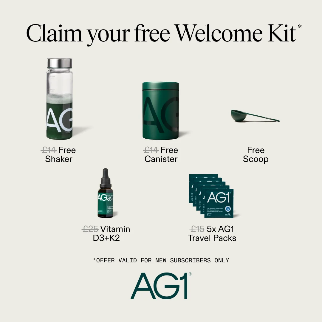
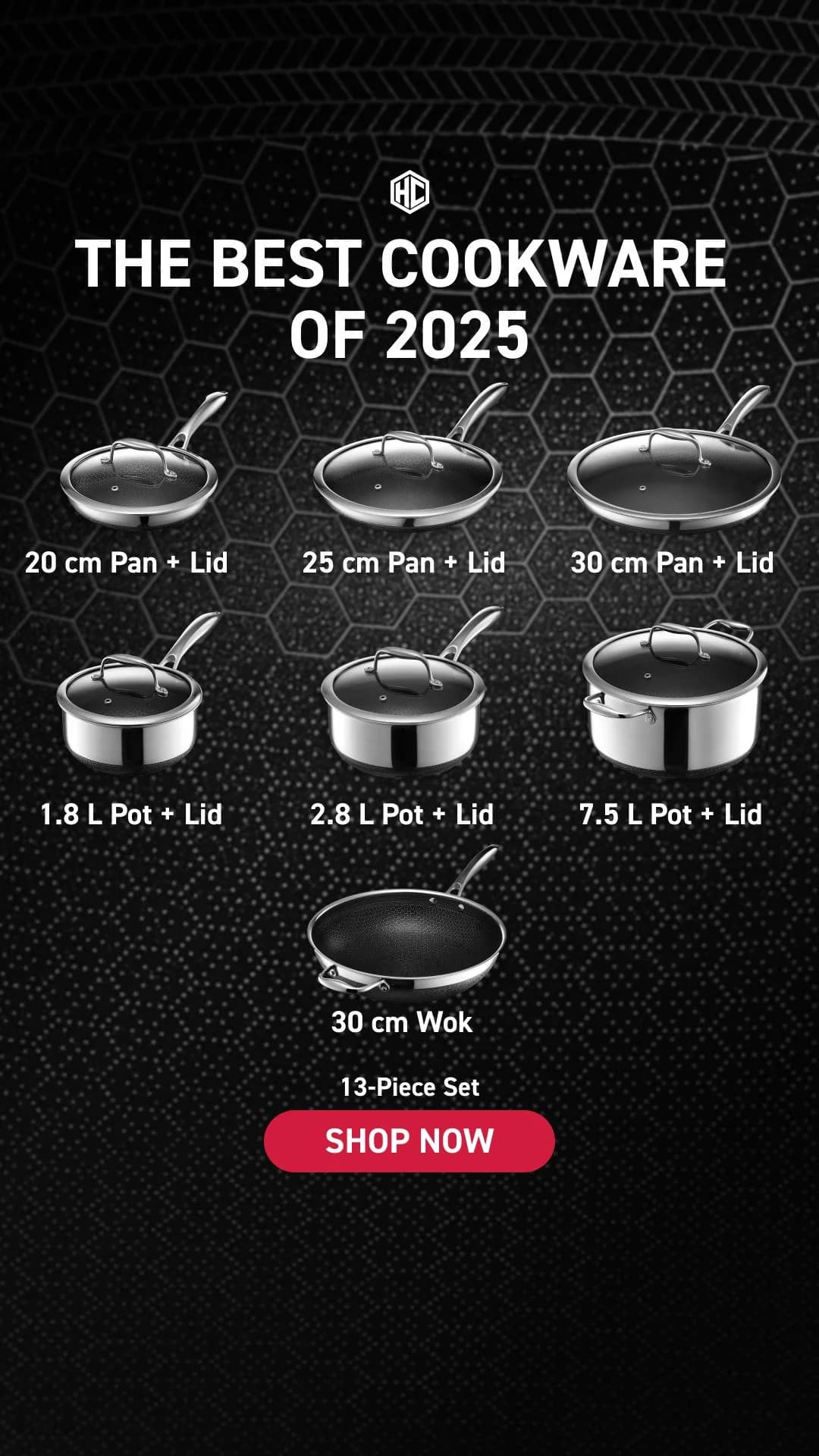
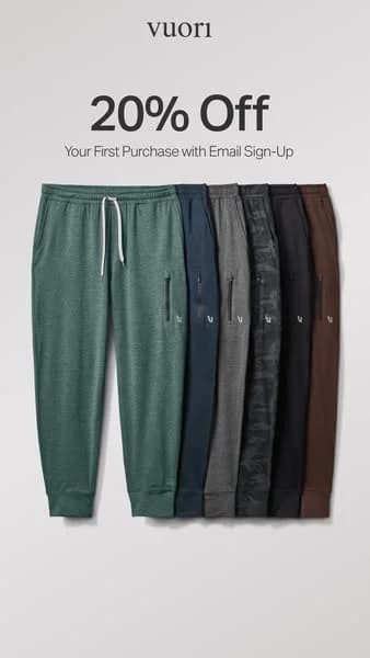
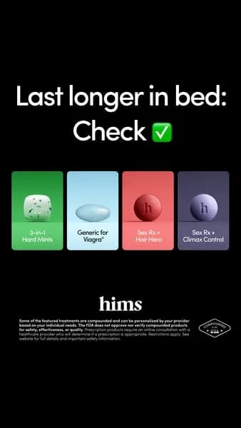
Collection ads showcase multiple products in one creative — a 4-up grid, a lineup-on-shelf flat lay, a catalog-style tile layout, or a shop-the-look outfit composition. On Meta the Collection ad is a specific mobile unit linking each tile to a PDP; the same pattern carries on carousel covers, email hero blocks, and landing-page banners. Collection creative sells the set, not the SKU. Mejuri runs it for gift guides, Aritzia for capsule drops, West Elm for seasonal edits, Glossier for full routines — three visual moves repeat: grid layouts with matched backgrounds, a typographic headline outside the grid, and price-per-item on conversion-led campaigns.
Composition discipline is the format. Backgrounds match across tiles — same color, lighting, angle — so the set reads curated, not scraped. Palettes favor cream, oat, sage, and charcoal for fashion and home; soft pink, peach, and almond for beauty. Grids run 2x2, 3x3, or 4x1; sweet spot is 4-6 products. Platform mix: Meta's Collection unit and 1:1 carousel for DTC, Google Shopping for catalog grids, Pinterest for shop-the-look pins, email for high-AOV warm drops.
Browse collection ad examples pulled from real campaigns — gift guides, capsule edits, shop-the-look grids, and multi-SKU catalog layouts. Pick a layout, supply your product lineup, and AdDogs rebuilds the grid with your palette across three formats.






 Why Clone Ads
What Makes Product Collection Ads Convert
Match backgrounds across every tile
Grid ads die when tile backgrounds clash. Same color, same lighting, same angle across every tile or the collection reads as scraped, not curated. Mejuri and Aritzia shoot collection grids on a single backdrop in one session for this reason. If source imagery has mixed backgrounds, replace them before cloning into a grid.
4-6 products is the sweet spot
Three products in a grid reads thin. Eight overwhelms and each tile drops below mobile-readable size. Four to six per frame balances variety with clarity — West Elm seasonal edits and Glossier full-routine ads both anchor here. For larger collections, split into two themed grids or use Meta's Collection unit instead of cramming one static frame.
Headline outside the grid, always
Forcing text into the same frame as the product tiles creates visual noise the eye can't parse. Put the headline (SHOP THE SET, HOLIDAY EDIT, THE ESSENTIALS) above or below the grid as a separate typographic block. Price labels, when used, sit under each tile in one consistent type size — never inside the product image.
A Collection ad on Meta is a specific mobile-first ad unit that pairs a hero image or video with a grid of 4+ product tiles underneath. Tapping a tile opens an Instant Experience or links to a PDP, which makes it the closest thing Meta offers to a native shopping format. The design pattern — a curated multi-product grid — also runs as a static single-image ad, a carousel cover, or an email hero, but only the native Collection unit gets the in-feed product grid plus instant-load shopping layer.
Collection ads for raising AOV with warm audiences (retargeting, email subscribers, repeat customers) and for seasonal campaigns where breadth matters — gift guides, holiday edits, capsule drops, full-routine builds. Single-product creative for cold prospecting where one clear hero converts faster than a grid. Running collection ads to cold traffic usually underperforms because audiences can't process six products in a single scroll moment. Most DTC brands weight collection toward warm and retargeting, with single-product hero ads carrying cold acquisition.
Four to six products in most cases. For 2x2 grids, four products. For 3x2 grids, six. 1x4 horizontal strips work on landscape placements but feel cramped on square. Three feels thin and undermines the curated-set framing; eight or more overwhelms and each tile drops below the size needed to read on mobile. If the collection has more SKUs than will fit cleanly, split the campaign into themed grids (Earrings, Necklaces, Stackers) rather than cramming everything into one frame.
Meta's native Collection ad format (1:1 hero + product grid) is purpose-built and outperforms static grids in fashion, beauty, and home categories because each tile links to a PDP. Instagram and Facebook carousel placements work for DTC collection storytelling. Google Shopping handles catalog-style collection grids natively. Pinterest converts on shop-the-look pins and seasonal edits. Email is the highest-AOV surface for collection creative because the audience is already opted-in. LinkedIn underperforms — B2B buyers don't browse visually the way DTC shoppers do.
Clashing backgrounds across tiles, where each product looks like it came from a different shoot. Cramming seven or more products into one frame until each tile becomes unreadable on mobile. Missing or buried headline that would have given the set its context. Inconsistent product angles or scales — a flat-lay tile next to a 3/4 product tile breaks the grid logic. Placing the CTA inside the grid where it competes with product imagery rather than sitting outside as a separate block. Each of those five makes the collection read as a catalog dump rather than a curated set, which collapses the format's only advantage.
Create Your Own
Product Collection Ad
Clone any product collection ad example. Upload your product photo. Seconds later, you have a finished ad ready to launch.
Create your ad