
AdDogs

Finance Ad Examples

Browse 45+ finance and insurance ad examples sourced from high-performing campaigns. Clone any design, swap in your product, and get a finished ad in seconds.

Updated May 2026

Finance ads have a trust problem and every layout in the category is a response to it. Chime, Wealthfront, Betterment, SoFi, Robinhood, and Public all run ads with the same building blocks: a phone mockup showing the app, a specific number (APY, fee savings, portfolio return, signup bonus), a credibility signal (FDIC-insured, SEC-registered, SIPC-protected), and short copy. Audiences are pre-calibrated to distrust finance ads — so the ad has to front-load proof.

Visual vocabulary stays clean and credible. Phone mockups holding the app interface — dashboard, transaction list, portfolio chart. Specific dollar amounts or percentages as the hero. Minimal palettes usually leaning green (growth), blue (stability), black (premium), or pastel (consumer fintech — Cash App, Public). Copy is short and number-led: "4.5% APY," "save $500/yr in fees," "24/7 banking." Meta, YouTube, and podcast ads carry most paid spend. LinkedIn relevant for B2B and wealth-management products.

Browse finance ad examples from real campaigns — banking apps, investing platforms, insurance, credit cards, wealth management, fintech SaaS. Pick a template, upload your app screenshot, and AdDogs applies your palette across three formats.

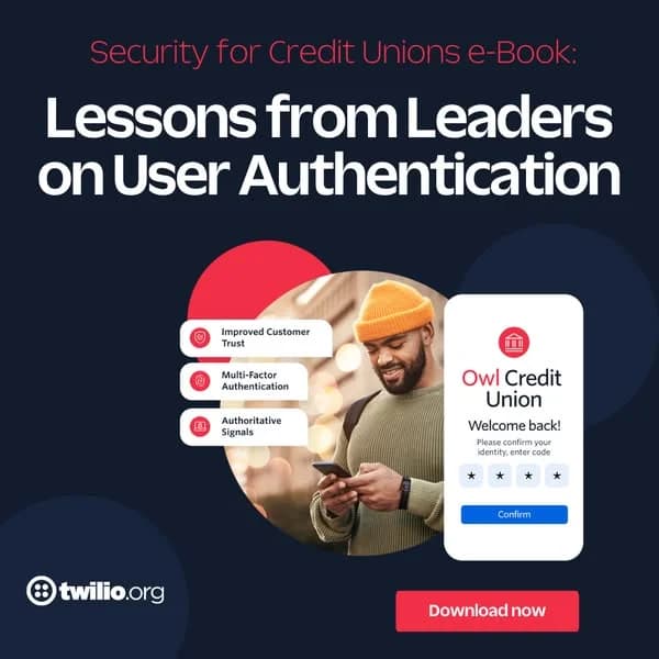
Cash App — Bold Feature UI Mockup. Brand: Cash App. This ad leverages a high-contrast, dark mode aesthetic with vibrant neon green to immediately capture attention on busy social feeds. The layout strategically positions a bold, left-aligned headline to convey the core benefit, while a dynamic UI mockup of the Cash App card and interface on the right visually demonstrates the feature. The composition uses scattered green coins and an angled phone to create a sense of movement and value. This design is optimized for platforms like Instagram or Facebook, where its striking color palette and clear value proposition cut through visual clutter. Text hierarchy is clear: a dominant headline, a concise call-to-action, and essential legal fine print. The overall effect is modern, energetic, and directly communicates a key user benefit.. Headline: Instant Discounts? Cash App does that.. Why this ad works: High-contrast palette for scroll-stopping impact — The stark contrast between the dark background and the neon green/white text and UI elements creates immediate visual impact. This bold color choice is highly effective on social media platforms, ensuring the ad stands out against organic content and captures user attention within milliseconds, driving higher initial engagement rates. Clear, benefit-driven headline communication — The headline "Instant Discounts? Cash App does that." directly addresses a common user desire and positions Cash App as the solution. This clear, concise value proposition, presented in large, readable text, ensures that the ad's core message is understood quickly, even during a brief scroll, enhancing message retention. Dynamic UI mockup demonstrates feature visually — Featuring the Cash App card within a phone UI, surrounded by floating coins, effectively visualizes the "discounts" feature. This dynamic composition isn't just a static product shot; it shows the app in action, making the benefit tangible and easier for the audience to grasp, which can increase consideration for the product.. Specs: Brand: Cash App, Industry: Finance & Insurance, Platform: Facebook, Format: Static, Audience: GeneralLearn Stock Trading — Split Screen Text & Image. This ad employs a clear split-screen layout, dedicating the top half to bold, high-contrast text and the bottom to a relevant, aspirational visual. The layout strategy immediately communicates the core offering ("Learn Stock Trading") with strong text hierarchy, using a large, serif font for authority. The social proof "180,000 students" is strategically placed below, adding credibility without clutter. Color psychology is minimal, leveraging stark black on white for clarity and professionalism, while the bottom image uses cool blues and greens with warm highlights to evoke a dynamic, tech-driven financial environment. Compositionally, the top half is text-heavy and direct, while the bottom provides context and aspiration. This design is optimized for platforms like Facebook or Instagram, where clear messaging and a visually engaging, yet professional, image can stop the scroll. The high text overlay ensures the primary message is instantly conveyed.. Headline: Learn Stock Trading. Primary text: 180,000 students. Why this ad works: Clear Split-Screen Layout for Dual Focus — The distinct division between text and image allows for immediate comprehension of the offer and visual context. This prevents cognitive overload, ensuring the headline is read first, followed by the aspirational imagery, making the ad highly efficient in conveying its message. Strong Social Proof Enhances Credibility — The inclusion of "180,000 students" with an icon provides powerful social proof. This statistic builds trust and reduces perceived risk, signaling that many others have found value in the offering, which is crucial for educational products. High Contrast Text Ensures Readability — The use of bold, black serif text on a pure white background creates maximum contrast. This ensures the headline "Learn Stock Trading" is highly readable and impactful, even on smaller mobile screens, effectively capturing attention in a busy feed.. Specs: Industry: Education, Platform: Facebook, Format: Static, Audience: ProfessionalsWealthfront 5.00% APY — Bold Rate Headline. Brand: Wealthfront. This ad leverages a bold, high-contrast visual hierarchy to immediately capture attention on crowded social feeds. The dominant "5.00% APY" in vibrant lime green against a deep purple background creates an unmissable focal point, signaling a compelling financial offer. The retro-futuristic 3D text effect adds a dynamic, modern edge, appealing to a younger, digitally-savvy audience. Text hierarchy is clear: brand at the top, main offer huge, then a clear call to action and key benefit. This design is optimized for quick consumption, ensuring the core message is conveyed instantly, ideal for platforms like Instagram where scroll-stopping visuals are paramount. The minimalist approach, despite the bold numbers, keeps the ad clean and professional, reinforcing trust in a financial product.. Primary text: OPEN A CASH ACCOUNT ZERO ACCOUNT FEES, NO STRINGS ATTACHED. Why this ad works: High-contrast numbers command attention — The striking lime green "5.00% APY" against a deep purple background creates exceptional visual contrast. This color pairing immediately draws the eye, making the ad's core value proposition impossible to miss in a busy feed. It's a powerful scroll-stopper for financial offers. Retro-futuristic 3D text adds dynamism — The layered, shadow-like effect on the large numbers gives them a dynamic, almost animated quality. This retro-futuristic style makes a potentially dry financial offer feel modern and engaging, appealing to a younger demographic looking for innovative financial solutions. Clear benefit-driven headline hierarchy — The ad effectively prioritizes information, with the impressive APY rate as the hero. Secondary text like "OPEN A CASH ACCOUNT" and "ZERO ACCOUNT FEES" provides immediate context and additional benefits, guiding the viewer from interest to understanding with minimal effort.. Specs: Brand: Wealthfront, Industry: Finance & Insurance, Platform: Instagram, Format: Static, Audience: ProfessionalsRobinhood Automatic Investments — Stacking Coins Illustration. Brand: Robinhood. This Robinhood ad employs a minimalist yet vibrant design to promote automatic investments. The layout strategically places a large, clear headline on the left, balanced by isometric coin stacks on the right, visually reinforcing the "stack" concept. A bright green gradient background, often associated with money, growth, and freshness, creates an energetic and optimistic mood, effectively grabbing attention in a busy feed. The high contrast between the black text and the dynamic green background ensures immediate readability. Text hierarchy prioritizes the core message, with the brand name and a lengthy disclaimer positioned discreetly at the bottom. This composition is optimized for social platforms like Instagram, where bold, clear visuals and a direct value proposition drive engagement and awareness for financial services, appealing to a broad audience seeking financial growth.. Headline: Stack with automatic investments. Primary text: Recurring investments do not ensure a profit or guarantee against a loss. Not all securities on Robinhood are eligible for recurring investments. Recurring investments may result in a purchase of fractional shares, which are illiquid outside of Robinhood and not transferable. For a complete explanation of conditions, restrictions and limitations, visit www.robinhood.com.. Why this ad works: Vibrant green gradient for financial growth — The ad leverages a bright, energetic green gradient, a color universally associated with money, growth, and prosperity. This choice immediately communicates the ad's financial topic and evokes a positive, optimistic feeling, which is crucial for attracting new investors and building trust in a financial service. Isometric coin stacks visualize "stacking" — The use of isometric coin illustrations effectively translates the abstract concept of "stacking" investments into a tangible, visually appealing metaphor. This simple yet powerful graphic helps viewers quickly grasp the benefit of recurring contributions, making the financial product feel more accessible and understandable. Clear, concise headline for instant understanding — The headline "Stack with automatic investments" is direct and benefit-oriented, immediately communicating the core value proposition. Its large, prominent placement ensures it's the first element read, allowing users scrolling quickly through feeds to instantly understand the ad's purpose and relevance.. Specs: Brand: Robinhood, Industry: Finance & Insurance, Platform: Instagram, Format: Static, Audience: GeneralLemonade Pet — Testimonial Text-Heavy Ad. Brand: Lemonade. This ad effectively uses a text-heavy, testimonial-driven layout to communicate value. The composition strategically places the problem statement at the top, followed by the solution, mimicking natural reading flow. A minimalist color palette of grey text on a light background ensures readability, while the vibrant pink highlights key financial figures, drawing immediate attention to the core benefit. The playful script font for "Lemonade Pet" adds a friendly, approachable brand personality. A simple line-art illustration of a dog in a cone adds an emotional touch without distracting from the data. This design is optimized for platforms like Facebook or Instagram, where clear, concise messaging and relatable scenarios resonate with pet owners, driving consideration by directly addressing a common pain point: high vet bills. The clear hierarchy ensures the message is absorbed quickly.. Headline: Dublin's parents had a $15,259 vet bill for his heart disease complications. Primary text: Lemonade Pet covered $14,143. Why this ad works: Direct Problem-Solution Narrative — The ad immediately presents a significant financial problem faced by pet owners, followed by Lemonade's clear solution. This direct, relatable storytelling taps into a common pain point, making the value proposition instantly understandable and compelling for potential customers. Strategic Use of Highlight Color — The vibrant pink color is used sparingly but effectively to highlight the critical financial figures. This draws the eye directly to the cost of the vet bill and the amount covered, emphasizing the tangible benefit and making the ad's core message impossible to miss. Emotional Connection via Illustration — The simple, line-art illustration of a dog wearing a cone of shame evokes empathy and immediately connects with pet owners. It visually reinforces the "complications" mentioned in the text, adding a relatable, emotional layer to the otherwise data-driven testimonial.. Specs: Brand: Lemonade, Industry: Finance & Insurance, Platform: Facebook, Format: Static, Audience: ParentsNancy Pelosi Stock Tracker — Social Proof Layout. Brand: Autopilot. This ad leverages a dark mode social media post format, primarily text-heavy with supporting visual data. The layout strategically places bold, attention-grabbing financial claims at the top, immediately hooking the viewer. High contrast between white text and a dark background ensures readability and makes the sensational numbers pop. Compositionally, it guides the eye from the initial shocking statements to the supporting stock chart and performance summary, building a narrative of incredible returns. The use of a recognizable public figure like Nancy Pelosi is a deliberate tactic for virality and social proof, optimized for platforms like Facebook or X where controversial or high-impact content drives engagement. Text hierarchy prioritizes the profit claims, followed by visual evidence, effectively communicating the service's value proposition without an explicit CTA.. Headline: Unbelievable.. Primary text: ~$2,000,000 of $NVDA profits in just 103 days 11 years worth of salary made on one trade 75% return for those copying her via Autopilot Truly the best to ever do it 🐐. Why this ad works: Leveraging public figure for virality — Using Nancy Pelosi's name and image immediately taps into existing public interest and controversy, making the ad highly shareable and attention-grabbing. This social proof, even if indirect, drives engagement and curiosity about the claimed financial success, leveraging pre-existing narratives for broader reach and discussion. Bold profit claims create instant intrigue — The large numbers like "~$2,000,000" and "11 years worth of salary" are highly effective scroll-stoppers. They promise significant financial gain, directly appealing to the target audience's desire for wealth and financial freedom, compelling them to read further and consider the underlying service. Visual data reinforces credibility — The inclusion of the NVIDIA stock chart with a clear "Date she bought" marker and the YTD Performance sidebar provides concrete, albeit simplified, evidence for the claims. This visual data adds a layer of perceived authenticity and trust to the otherwise sensational text, reinforcing the ad's core message.. Specs: Brand: Autopilot, Industry: Finance & Insurance, Platform: Facebook, Format: Static, Audience: ProfessionalsRobinhood Investment Growth — Illustrative Bar Chart. Brand: Robinhood. This ad effectively uses a vibrant green gradient background to instantly evoke themes of money and growth, capturing attention on platforms like Instagram. The layout employs a simple, illustrative bar chart using stacked coins, visually representing the compounding effect of consistent investment. The clear text hierarchy places a large, benefit-driven headline prominently at the top-left, guiding the viewer's eye to the core message before they scan the incremental growth figures. The composition's left-to-right progression naturally illustrates financial accumulation over time. This visual storytelling simplifies a complex financial concept, making it accessible and aspirational for a broad audience. The high contrast between the dark text and bright background ensures readability, while the overall minimalist illustration style keeps the focus on the data, optimizing for quick comprehension in a busy feed environment.. Headline: If you invest $100 a month, that could be.... Why this ad works: Visual metaphor simplifies investment growth — The use of increasing stacks of coins as a bar chart provides an intuitive, immediate understanding of compounding returns. This visual metaphor demystifies complex financial concepts, making the ad highly accessible and persuasive, especially for new investors who might be intimidated by traditional financial jargon. Vibrant green palette signals wealth and energy — The ad's dominant vibrant green gradient instantly associates with money, growth, and vitality. This color choice creates a positive and energetic impression, effectively drawing the eye and reinforcing the message of financial prosperity. It stands out in a crowded feed, aligning with the brand's modern and approachable image. Clear, benefit-driven headline engages immediately — The prominent headline, "If you invest $100 a month, that could be...", directly addresses a common financial goal and offers a tangible future benefit. This direct approach captures attention by posing a relatable scenario, encouraging viewers to engage with the ad's core message about long-term financial potential.. Specs: Brand: Robinhood, Industry: Finance & Insurance, Platform: Instagram, Format: Static, Audience: GeneralCareFirst Noom Partnership — Text-Heavy Offer. Brand: CareFirst | NOOM. This ad employs a text-heavy, informational layout designed to clearly communicate a valuable partnership offer. The dominant headline immediately presents a free Noom membership, leveraging a strong incentive. A muted, textured background ensures high contrast for the dark typography, enhancing readability. The "SPECIAL OFFER" stamp adds a sense of urgency and exclusivity, drawing the eye. Compositionally, the ad guides the viewer from the brand logos and offer tag at the top, through the main benefit, down to a visually distinct call-to-action embedded within a blueberry image at the bottom right. This strategic placement of the CTA, coupled with an arrow, directs user interaction. The overall design prioritizes clarity and directness, optimizing for platforms where users seek specific information and value, such as Facebook or Google Display. The visual hierarchy effectively funnels attention towards the eligibility check.. Headline: New to CareFirst? You may be eligible for a FREE Noom membership!. Primary text: Jumpstart 2024 with a sustainable weight loss program. Noom is an independent company that provides health improvement management services to CareFirst members. CareFirst is an independent licensee of the Blue Cross Blue Shield Association.. Why this ad works: Clear value proposition drives engagement — The ad prominently features "$199 FREE" and "FREE Noom membership" early in the copy. This immediate articulation of a significant financial benefit captures attention quickly, appealing directly to cost-conscious consumers. It effectively positions the offer as high-value, encouraging further reading and consideration. “Special Offer” stamp creates urgency — The distressed red "SPECIAL OFFER" stamp acts as an eye-catching visual cue. Its placement and distinct color immediately signal importance and potential time-sensitivity, prompting viewers to engage before the opportunity passes. This psychological trigger enhances perceived value and encourages immediate action. Visual CTA guides user interaction — The "SEE IF YOU QUALIFY" text, embedded within the blueberry image and accompanied by a downward arrow, creates a clear, actionable visual prompt. This non-traditional CTA stands out from the main text block, effectively directing the user's eye to the intended interaction point, reducing friction for the next step.. Specs: Brand: CareFirst | NOOM, Industry: Health & Wellness, Platform: Facebook, Format: Static, Audience: GeneralAlly Debit Card — Bold Hero Shot. Brand: Ally. This ad leverages a bold, minimalist hero shot of the Ally debit card against a vibrant purple background, aligning with Ally's distinct brand identity. The layout strategically places the large, high-contrast headline "No hidden fees. Ever." at the top-left, immediately addressing a key consumer pain point in financial services. The angled card adds dynamism, while ample negative space ensures the product and message dominate. The deep purple color palette evokes trust and sophistication, effectively cutting through visual clutter on platforms like Instagram. Text hierarchy is clear: a dominant headline, followed by the brand logo, and essential legal disclaimers, optimizing for quick comprehension and brand recall. This composition is designed for scroll-stopping impact.. Headline: No hidden fees. Ever.. Why this ad works: Direct Headline Addresses Key Pain Point — The headline "No hidden fees. Ever." directly tackles a major consumer concern in banking. This clear, concise promise builds immediate trust and resonates with users tired of opaque financial structures, making the ad highly persuasive and a strong differentiator for Ally. Strong Brand Color and Identity — The ad's dominant deep purple background and card color are instantly recognizable as Ally's brand. This consistent visual identity creates strong brand recall and differentiation in a competitive market, reinforcing Ally's modern and trustworthy image and enhancing memorability. Minimalist Composition for Clarity — By focusing solely on the debit card and a powerful headline, the ad achieves exceptional clarity. The minimalist approach eliminates distractions, ensuring the core message of transparency and the product itself are the undeniable focal points, enhancing message retention and impact.. Specs: Brand: Ally, Industry: Finance & Insurance, Platform: Instagram, Format: Static, Audience: GeneralAlly Bank Giveaway — Vibrant Product on Background. Brand: Ally Bank. This ad effectively utilizes a vibrant, high-contrast color palette to immediately capture attention on mobile feeds, likely Instagram Stories or Reels. The central composition features the Ally Bank branded bucket, overflowing with gift cards, as the undeniable focal point against a blurred, warm background. This strategic use of depth of field ensures the giveaway stands out without visual clutter. Text hierarchy is clear and engaging: "TIME FOR A GIVEAWAY" grabs initial interest, followed by the targeted "Graduate Financially Edition" and the brand's logo. This guides the eye from the general appeal to the specific offer, optimizing for quick comprehension. The playful font and bright colors align with a younger, digitally native audience, making a financial topic approachable and exciting. The vertical format is perfectly optimized for mobile-first consumption, ensuring maximum screen real estate and immersion.. Headline: TIME FOR A GIVEAWAY. Primary text: Graduate Financially Edition GRADUATE FINANCIALLY GIVEAWAY. Why this ad works: Vibrant Color Contrast Demands Attention — The bold purple of the Ally Bank bucket, combined with the bright teal text, creates a high-contrast visual that effectively cuts through feed clutter. This deliberate choice ensures immediate visibility and helps the ad stand out against more subdued content, crucial for initial engagement on fast-scrolling platforms. Direct Value Proposition for Specific Audience — The headline "TIME FOR A GIVEAWAY" instantly communicates value, while "Graduate Financially Edition" clearly targets a specific demographic. This precise messaging resonates deeply with recent graduates, increasing relevance and perceived benefit, which drives higher click-through rates by attracting the right audience. Optimized Vertical Layout for Mobile Engagement — The ad's vertical aspect ratio is perfectly suited for mobile-first platforms like Instagram Stories or TikTok. This full-screen immersion minimizes distractions and maximizes visual impact, providing an engaging viewing experience that captures and holds user attention more effectively than traditional square or landscape formats.. Specs: Brand: Ally Bank, Industry: Finance & Insurance, Platform: Instagram, Format: Static, Audience: StudentsCash App — Dynamic UI Feature Spotlight. Brand: Cash App. The ad leverages Cash App's iconic vibrant green, creating instant brand recognition and high visual impact. A dynamic, tilted smartphone mockup showcases the app's core function – sending money – with a clear "$35" amount, simplifying the user experience. Radial lines behind the phone add energy and direct the eye towards the central action. The bold, white headline "The easiest way to send money." establishes a clear value proposition. This composition is highly optimized for mobile feeds like Instagram or TikTok, where its high contrast and direct message cut through clutter. Text hierarchy is simple: a dominant headline followed by the app's intuitive interface, minimizing cognitive load. The overall design communicates speed, simplicity, and modernity.. Headline: The easiest way to send money.. Why this ad works: Iconic Brand Color Drives Instant Recognition — The dominant, vibrant green background is Cash App's signature color, immediately signaling the brand without needing a logo. This strong color psychology creates instant recognition and recall, crucial for scroll-stopping on busy social feeds, leveraging established brand equity effectively. Dynamic Phone Tilt Enhances Visual Engagement — The smartphone is angled dynamically, breaking the static grid and adding visual interest. This diagonal composition creates a sense of movement and modernity, drawing the viewer's eye into the app's interface. It makes the ad feel less like a flat screenshot and more engaging. Clear Value Proposition with Minimal Text — The headline "The easiest way to send money." directly communicates the primary benefit. Paired with the simple UI showing a transaction, it quickly conveys the app's utility. This minimal text approach reduces cognitive load, allowing for rapid comprehension and strong message retention.. Specs: Brand: Cash App, Industry: Finance & Insurance, Platform: Instagram, Format: UI Mockup, Audience: GeneralAlly Bank — Lifestyle with UI Overlay. Brand: ally. This ad effectively blends lifestyle imagery with clear product feature communication. The layout centers a smiling man enjoying a drink, creating a relatable and aspirational scene. A dominant purple brand color in the upper third provides strong brand recall and a sense of trust, contrasting with the warm, natural background. The key message, "Save while you sip," is prominently displayed, followed by a clean UI overlay that visually explains the "Savings Round Up" feature and its immediate benefit (+$5). This composition is optimized for platforms like Instagram or Facebook, where engaging visuals capture attention. The text hierarchy guides the eye from the bold headline to the feature explanation, making the value proposition instantly clear. The overall design is clean and modern, positioning Ally as an approachable and innovative financial solution.. Headline: Save while you sip.. Primary text: Savings Round Up Brunch 🍹 +$5. Why this ad works: Relatable Lifestyle Imagery — The ad features a happy, relaxed man enjoying a drink in a casual setting. This human element creates an immediate emotional connection, making the financial product feel accessible and integrated into everyday life. It helps potential customers envision themselves benefiting from the service without explicit sales pressure. Clear Feature Communication via UI — The "Savings Round Up Brunch +$5" overlay clearly illustrates the product's core benefit in a digestible, visual format. This direct, in-context explanation simplifies a potentially complex financial concept, showing immediate value and making it easy for viewers to understand how the feature works. Strategic Brand Color and Headline — The prominent purple background, a core Ally brand color, instantly establishes brand identity and trust. Paired with the bold, playful headline "Save while you sip," it captures attention and communicates the benefit concisely. This combination ensures strong brand recall while conveying a modern, user-friendly approach to banking.. Specs: Brand: ally, Industry: Finance & Insurance, Platform: Instagram, Format: Mixed, Audience: Men 25-34Rocket Money — Authentic Napkin Testimonial. Brand: Rocket Money. This ad leverages an authentic, user-generated content (UGC) aesthetic, presenting a handwritten testimonial on a napkin. The layout strategy immediately signals relatability and trust, bypassing polished corporate imagery. The high-contrast black text on a white, textured napkin background ensures maximum readability and draws the eye directly to the personal narrative. Compositionally, the informal setting with subtle hints of a meal (glass, crumbs) grounds the message in everyday life, making the financial struggle and solution feel tangible. This approach is highly optimized for social platforms like Instagram or TikTok, where raw, unscripted content often outperforms highly produced ads by fostering genuine connection and stopping the scroll. The text hierarchy is simple: the entire message is the focus, delivering a clear problem-solution story directly from a peer.. Primary text: When I was broke a friend told me to get Rocket Money - Saved me hundreds by finding & cancelling unknown subscriptions & got refunds for the lost money. Why this ad works: Authentic handwritten testimonial format — The handwritten message on a napkin creates an immediate sense of authenticity and personal connection. This low-production, user-generated style builds trust more effectively than slick corporate ads, making the testimonial feel genuine and relatable to potential users facing similar financial challenges. Relatable problem-solution narrative — The ad directly addresses a common pain point ("When I was broke") and offers a clear, tangible solution ("Saved me hundreds by finding & cancelling unknown subscriptions"). This narrative structure resonates deeply with audiences, demonstrating immediate value and positioning Rocket Money as a practical, accessible financial helper. High contrast ensures message clarity — The dark, clear handwriting against the bright white, textured napkin background provides excellent visual contrast. This ensures the message is easily readable and stands out in a busy social feed, preventing scroll-past and effectively communicating the core benefit without requiring significant cognitive effort from the viewer.. Specs: Brand: Rocket Money, Industry: Finance & Insurance, Platform: Instagram, Format: Static, Audience: GeneralCareFirst Noom — Text-Heavy Benefit Ad. Brand: CareFirst. This ad employs a text-heavy, benefit-driven layout on a calming teal background, optimized for platforms like Facebook where direct messaging can cut through clutter. The composition strategically places the CareFirst and Noom logos at the top, establishing immediate brand credibility and partnership. A prominent "$199 FREE" badge instantly communicates value. The headline, "One of CareFirst's latest and greatest member benefits: Noom," clearly positions the offering. Subsequent text blocks break down the core benefit – "Skip the fad diets. Learn healthier habits and keep the weight off for good." The clear, sans-serif font ensures readability, while the vibrant orange CTA button, "SEE IF YOU QUALIFY," creates a strong visual anchor and directs user action. The overall design prioritizes information delivery and a clear value proposition over elaborate visuals, aiming for direct engagement and conversion by highlighting a tangible member advantage.. Headline: One of CareFirst's latest and greatest member benefits: Noom. Primary text: Skip the fad diets. Learn healthier habits and keep the weight off for good with Noom.. Why this ad works: Clear Value Proposition with Urgency — The "$199 FREE" badge immediately captures attention and signals significant value. This direct, quantifiable benefit acts as a powerful incentive, driving clicks by appealing to a desire for savings and exclusive access. It effectively positions the Noom program as a premium offering made accessible through CareFirst membership. Strong Brand Association and Credibility — Featuring both CareFirst and Noom logos prominently at the top leverages established brand trust. CareFirst's endorsement lends significant credibility to Noom, reassuring potential users about the quality and reliability of the program. This partnership message reduces perceived risk and encourages engagement from existing members. Benefit-Oriented Headline and Sub-text — The headline clearly states the offering as a "greatest member benefit," while the supporting text directly addresses pain points ("fad diets") and offers a solution ("healthier habits," "keep the weight off"). This problem-solution framing resonates with the target audience, highlighting the practical advantages of Noom.. Specs: Brand: CareFirst, Industry: Health & Wellness, Platform: Facebook, Format: Static, Audience: GeneralFamily Protection — Cupped Hands Hero Shot. This ad employs a minimalist hero shot, centering a paper cutout family within cupped hands, symbolizing protection and care. The composition uses a shallow depth of field, drawing immediate focus to the family unit, while the warm skin tones against the stark white paper create a powerful visual contrast. This contrast ensures high visibility and scroll-stopping power on visual platforms like Instagram. The layout strategy is simple yet profound, leveraging universal human emotions associated with family and security. There's no explicit text, allowing the powerful imagery to convey the message, making it highly adaptable across cultures. The clean aesthetic and clear subject matter are optimized for quick comprehension, ideal for an awareness campaign targeting parents.. Why this ad works: Universal Symbolism Evokes Strong Emotion — The image of a family held securely in cupped hands is a universally understood symbol of protection, care, and security. This immediately taps into deep emotional responses in the target audience, fostering a sense of trust and relevance for products or services related to family well-being. High Contrast Ensures Visual Impact — The stark white paper cutouts of the family against the warm, darker skin tones of the hands create a powerful visual contrast. This technique ensures the central message is highly visible and immediately draws the viewer's eye, making the ad effective in busy social media feeds where quick attention capture is crucial. Protective Composition Conveys Security — The way the hands are cupped around the paper family creates a strong visual metaphor for safeguarding and support. This composition technique effectively communicates a core benefit of protection or care, making it highly suitable for advertising insurance, financial planning, or family-oriented health services.. Specs: Industry: Finance & Insurance, Platform: Instagram, Format: Static, Audience: ParentsDebt Consolidation — Clear Comparison Layout. This ad employs a clear, two-part comparison layout to highlight a financial benefit. The top section visually aggregates various debts (mortgage, car, credit cards, other) with corresponding icons and amounts, summing up to a total. The bottom section dramatically presents the reduced payment "after reunification," using a large, bold green number. The clean white background and minimalist iconography ensure high readability and focus. Green is strategically used for positive financial outcomes, leveraging color psychology for trust and relief. Optimized for platforms like Facebook or Instagram, its direct problem-solution narrative and strong numerical contrast are designed to quickly capture attention and convey significant value to users scrolling through their feeds. The text hierarchy emphasizes the "before" total and the much lower "after" payment, making the core message instantly digestible.. Why this ad works: Clear Before-and-After Comparison — The ad effectively uses a two-part visual structure to demonstrate the problem (multiple, high monthly debts totaling 1.390€) and the compelling solution (a single, significantly lower payment of 417€). This stark numerical contrast immediately conveys the value proposition of debt reunification, making the financial benefit undeniable and highly persuasive to potential customers seeking relief. Strategic Use of Green for Positive Outcome — The dominant use of a vibrant green color for the total "before" sum and, crucially, for the dramatically reduced "after" payment, leverages positive color psychology. Green is universally associated with money, growth, and financial health. This choice psychologically primes the viewer to perceive the offer as beneficial and trustworthy, enhancing the ad's persuasive power and signaling financial relief. Simple Icons Enhance Comprehension — The inclusion of small, clear, and universally recognizable icons (house, car, coins, credit cards) alongside each debt type significantly improves the ad's immediate comprehensibility. This visual shorthand allows viewers to quickly grasp the scope of debts being addressed without needing to read extensive text, improving engagement and clarity, especially valuable in fast-scrolling social media environments.. Specs: Industry: Finance & Insurance, Platform: Facebook, Format: Static, Audience: GeneralWealthsimple USD Savings — Clean Text-Heavy Layout. Brand: Wealthsimple. This ad employs a minimalist, text-heavy layout on a calming light blue background, effectively communicating a financial offer. The large, bold headline immediately captures attention with a clear value proposition, "Earn up to 4% interest." The composition uses ample negative space to ensure readability and focus on the core message. Two stylized silver coins subtly reinforce the financial theme without distracting from the text. The color palette of light blue and dark grey text exudes trust and professionalism, crucial for a financial brand. Optimized for mobile platforms like Instagram or Facebook, its vertical format and clear hierarchy ensure the message is quickly digestible. The text hierarchy guides the eye from the main offer to key benefits ("No monthly fees. No minimums."), making the ad highly effective for consideration-stage users.. Headline: Got USD? Earn up to 4% interest.. Primary text: No monthly fees. No minimums.. Why this ad works: Clear Value Proposition Dominates — The headline "Got USD? Earn up to 4% interest." is front and center, immediately addressing a pain point and offering a compelling solution. This direct approach cuts through noise, making the ad highly effective for attracting users actively seeking better savings options and driving initial interest. Minimalist Design Enhances Trust — The clean, uncluttered layout with ample negative space and a soft blue background conveys professionalism and reliability. In finance, a simple, transparent aesthetic builds trust, suggesting straightforward terms and a user-friendly experience, which is vital for attracting new customers in a competitive market. Visual Metaphor Reinforces Message — The two stylized silver coins, one with a dollar sign and the other with an American flag, subtly reinforce the "USD" and "savings" themes. These visual cues are simple yet effective, adding a layer of thematic relevance and visual interest without overwhelming the primary text-based message.. Specs: Brand: Wealthsimple, Industry: Finance & Insurance, Platform: Instagram, Format: Static, Audience: ProfessionalsLemonade Pet Insurance — Cost Question Card. Brand: Lemonade. This ad employs a minimalist, central card layout to address a common pet owner concern directly. The composition strategically uses a question-and-answer format, immediately engaging the viewer by highlighting the potential cost of an emergency vet visit. A vibrant, high-contrast pink is leveraged to emphasize the critical price range and the call-to-action, ensuring these key elements capture attention. The friendly, heart-eyed cat illustration and the playful Lemonade logo inject an approachable and empathetic brand personality, softening the financial topic. Optimized for mobile platforms like Instagram or Facebook, its clean aesthetic and clear visual hierarchy cut through feed clutter. The text hierarchy guides the eye from the pain point (question) to the solution (CTA), making it effective for driving consideration among pet owners.. Headline: How much does an emergency vet visit cost?. Primary text: $100 - $300 before any treatments, medications, x-rays, or surgeries. Why this ad works: Directly addresses user pain point — The headline immediately tackles a common concern for pet owners, creating instant relevance and engagement. By first acknowledging the problem of high vet costs, the ad positions Lemonade as a potential solution provider. This direct approach resonates deeply, prompting viewers to consider how pet insurance can alleviate financial stress, driving initial interest and consideration effectively. Strategic use of high-contrast pink — The vibrant pink is strategically used to highlight the critical cost information and the call-to-action button. This high-contrast color choice ensures these key elements visually pop against the neutral background, effectively guiding the viewer's eye. This emphasis drives immediate attention to the core message and prompts action, significantly boosting click-through potential. Friendly, approachable brand persona — The heart-eyed cat illustration and the playful Lemonade logo soften the potentially stressful topic of vet costs. This design choice builds trust and makes the insurance offering feel less corporate and more empathetic, resonating strongly with pet owners. It fosters a connection, making the brand appear caring and approachable, which is crucial for a service like pet insurance.. Specs: Brand: Lemonade, Industry: Finance & Insurance, Platform: Instagram, Format: Static, Audience: GeneralSoFi Graduation Cap — Minimalist Event Promo. Brand: SoFi. This ad leverages a minimalist, split-color background to create a visually striking composition. The graduation cap, suspended by strings, acts as a symbolic hero object, immediately drawing attention and hinting at education or financial burden. The vibrant color palette of teal and coral creates high contrast, optimized for scroll-stopping on platforms like Instagram. Text hierarchy is clear: a prominent headline states the event's topic, followed by event details, all in a clean, sans-serif font. The composition uses negative space effectively, positioning the key visual centrally while leaving ample room for text at the bottom. This design effectively communicates a serious topic with an approachable, modern aesthetic, suitable for engaging a professional audience on social media. The visual metaphor encourages curiosity without being overly complex.. Headline: How the CARES Act Impacts Employers. Primary text: SoFi Panel Livestream | 4/7 12pm PT. Why this ad works: High-contrast split background grabs attention — The bold teal and coral split background creates immediate visual interest and high contrast, making the ad stand out in a busy feed. This vibrant color blocking is effective for social media platforms where ads compete for attention, ensuring the image is noticed before the user scrolls past. Symbolic visual metaphor engages audience — The graduation cap, suspended precariously, symbolizes education, debt, or perhaps the 'weight' of financial decisions. This clever visual metaphor encourages viewers to pause and interpret, fostering deeper engagement with the ad's underlying message about financial impacts on employers. Clear text hierarchy for event details — The headline is large and bold, immediately conveying the event's topic. The secondary text provides essential livestream details (brand, date, time) in a clear, readable format. This ensures that critical information is easily digestible, guiding the viewer from curiosity to action without cognitive load.. Specs: Brand: SoFi, Industry: Finance & Insurance, Platform: Instagram, Format: Static, Audience: ProfessionalsLemonade Pet Insurance — Cute Cat Cost Awareness. Brand: Lemonade. This ad employs a split-screen composition, dedicating the upper half to informative text and the lower half to an engaging image of a relaxed cat. The layout strategically leverages the emotional appeal of pets to introduce a financial pain point. Color psychology uses a clean, light background with a vibrant pink highlight for the "DID YOU KNOW?" sticker and the critical cost figures, drawing immediate attention to the problem. The cat's relaxed pose creates a relatable, comforting visual, contrasting with the serious financial message, making the information more digestible. Text hierarchy is clear: attention-grabbing question, brand, then bold cost, followed by clarifying details. Optimized for social platforms like Instagram, where visually appealing animal content combined with concise, impactful information effectively stops the scroll and educates pet owners about potential vet expenses.. Headline: An emergency vet visit costs $100-$300. Primary text: before any treatments, medications, x-rays, or surgeries. Why this ad works: Emotional Anchor with Relatable Pet — The adorable, relaxed cat immediately creates an emotional connection with pet owners. This disarms the viewer and makes the subsequent financial information about vet costs more impactful, as individuals can easily project their own pet onto the image. This increases empathy and relevance, making the ad's message about pet insurance more resonant. Highlighting Pain Point with Color Contrast — The strategic use of bright pink for "DID YOU KNOW?" and the specific cost range "$100-$300" effectively draws the viewer's eye to the key financial burden. This strong color contrast against the muted background and black text ensures the critical information stands out, driving home the ad's core message about the often-underestimated costs of emergency vet visits. Clear, Concise Problem Statement — The headline directly addresses a common, often underestimated, financial concern for pet owners. By clearly stating the initial cost of an emergency vet visit and then clarifying it's "before any treatments," the ad educates and creates a sense of urgency. This positions pet insurance as a necessary solution to a tangible problem.. Specs: Brand: Lemonade, Industry: Finance & Insurance, Platform: Instagram, Format: Static, Audience: ParentsAlly Spending Account — Benefit-Driven UI Mockup. Brand: ally. This ad employs a split-screen layout, dedicating the left to clear, benefit-driven text and the right to a compelling UI mockup. The deep purple background, a strong brand color for Ally, creates high contrast with the white text and vibrant pink/green accents, ensuring excellent readability and visual pop on mobile feeds. Compositionally, the headline draws the eye to the top-left, followed by bulleted benefits, then a dynamic app screenshot illustrating "early payday." This F-pattern flow guides the viewer through the value proposition efficiently. Optimized for platforms like Facebook or Instagram, its bold color and clear hierarchy effectively stop the scroll, communicating key features quickly and positioning Ally as a modern, transparent financial solution. The ad effectively balances information with visual proof.. Headline: A Spending Account that gives you more.. Primary text: Get paid early No hidden fees, ever ATM fee reimbursement (up to $10 per statement cycle). Why this ad works: High-contrast brand palette for visibility — The deep purple background paired with bright white text and vibrant pink accents ensures maximum readability and visual impact. This high contrast is crucial for cutting through cluttered social feeds, making the ad instantly recognizable and easy to digest, even on smaller mobile screens, driving initial engagement. Benefit-driven headline and bullet points — The headline "A Spending Account that gives you more" immediately promises value, followed by concise, benefit-oriented bullet points like "Get paid early" and "No hidden fees." This direct approach clearly communicates the core advantages, appealing to consumer pain points and driving consideration by highlighting tangible financial gains. Engaging UI mockup provides visual proof — The inclusion of a mobile app screenshot showing "Spending Account Snapshot" with a balance and a "Payday's here" notification provides concrete visual evidence of the benefits. This UI mockup grounds the abstract financial concepts in a tangible, relatable user experience, enhancing credibility and demonstrating the product's real-world utility.. Specs: Brand: ally, Industry: Finance & Insurance, Platform: Facebook, Format: UI Mockup, Audience: GeneralRocket Money — Before/After Problem-Solution Split. Brand: Rocket Money. This ad effectively uses a split-screen, before-and-after layout to highlight a clear problem-solution narrative. The left side, dark with red accents, visually represents financial distress, while the right, vibrant purple with blue, signifies prosperity. This high-contrast color psychology immediately communicates the product's transformative benefit. Compositionally, the mobile phone mockups and bulleted lists guide the eye from negative pain points to positive outcomes, leveraging emojis for quick comprehension on fast-scrolling platforms like Facebook. The prominent, contrasting call-to-action at the bottom ensures clear next steps, optimizing for direct response. Text hierarchy is clear, with bold headlines and concise benefit statements, making it highly scannable and platform-optimized for mobile feeds.. Headline: Before & After Rocket Money. Primary text: Before: Card Declined, No $$ in Savings Account, Paying for ex GF's Netflix. After: Cancel Subscriptions in app, Suggests Ways to Save, Easy-to-read budget tracker.. Why this ad works: Clear Problem/Solution Narrative — The "Before Rocket Money" and "After Rocket Money" split immediately establishes a relatable pain point and offers a direct solution. This structure leverages psychological contrast, making the "After" state significantly more appealing by starkly highlighting the "Before" struggles, driving user desire for transformation. High-Contrast Color Psychology — The ad uses a dark, almost black background with red text for the "Before" section, evoking urgency and negativity. This sharply contrasts with the bright, optimistic purple and blue of the "After" side. This deliberate color choice effectively communicates emotional states and product value at a glance, enhancing memorability. Action-Oriented Visual Cues — The thumbs-down emojis on the "Before" side and the rocket emojis on the "After" side provide quick, universal visual shorthand for negative and positive outcomes. These simple, engaging graphics reinforce the ad's message and guide the viewer's interpretation without requiring extensive reading, ideal for social feeds.. Specs: Brand: Rocket Money, Industry: Finance & Insurance, Platform: Facebook, Format: Static, Audience: GeneralWealthsimple — Performance Comparison Chart. Brand: Wealthsimple. This ad employs a data-driven comparison chart layout to directly address potential investors' concerns about returns. The dark background with contrasting white and gold text creates a sophisticated, trustworthy aesthetic, aligning with financial services. Compositionally, the ad uses clear visual hierarchy, grouping funds by type and highlighting Wealthsimple's superior performance with a distinct gold color and bold text, guiding the viewer's eye to the key differentiator. Optimized for platforms like Facebook or LinkedIn, where users might engage with informative content, it leverages a direct comparison strategy. The high text density is appropriate for a finance audience seeking detailed information, while the clean, minimalist design prevents visual clutter, ensuring the data remains the focal point. This approach builds credibility and encourages consideration by demonstrating tangible value.. Headline: WEALTHSIMPLE VS POPULAR CANADIAN MUTUAL FUNDS & ETFS. Why this ad works: Data-driven comparison builds immediate trust — The ad directly compares Wealthsimple's performance against established competitors using clear Q1 return percentages. This objective, data-backed approach immediately establishes credibility and provides tangible evidence of value, crucial for attracting discerning financial consumers. Strategic color highlight for brand differentiation — Using a distinct gold color for Wealthsimple's entries against a grey background instantly draws the eye to their superior performance. This visual cue simplifies complex data, allowing viewers to quickly grasp the key message: Wealthsimple outperforms competitors. Clear categorization enhances readability — Grouping funds into "Conservative," "Balanced," and "Growth" categories creates a logical structure. This organization helps users easily navigate the information, understand different investment profiles, and quickly find relevant comparisons, reducing cognitive load and improving message retention.. Specs: Brand: Wealthsimple, Industry: Finance & Insurance, Platform: Facebook, Format: Static, Audience: ProfessionalsFinancial App — Bold UI Mockup. The ad employs a vibrant, high-contrast color palette of bright blue and deep purple, immediately grabbing attention on a busy feed. The layout strategically places a large, benefit-driven headline at the top, followed by a clear UI mockup of a credit score tracking app. This composition establishes a strong visual hierarchy, guiding the eye from the value proposition ("free credit score," "$10 incentive") to the product's interface. The minimalist background, featuring subtle dotted patterns, prevents distraction while adding a touch of modern design. Optimized for mobile platforms like Facebook or Instagram, the bold text and clear visual demonstration ensure readability and quick comprehension, effectively communicating the core offer and product utility. The text hierarchy prioritizes the incentive, driving immediate interest.. Headline: Track your credit score for free. Get $10.*. Why this ad works: High-contrast colors command attention — The striking combination of a vibrant blue background and deep purple text, accented by white, creates significant visual pop. This high contrast is crucial for cutting through visual clutter on social media feeds, ensuring the ad is noticed and the key message is easily legible, maximizing initial engagement. Clear value proposition with incentive — The headline "Track your credit score for free. Get $10." immediately communicates a dual benefit: a valuable free service and a monetary reward. This direct and compelling offer targets user self-interest, significantly lowering the barrier to engagement and driving clicks by providing a clear, tangible reason to interact. UI mockup builds trust and demonstrates utility — Displaying an actual screenshot of the app's credit score interface provides immediate visual proof of the product's functionality. This transparency builds trust and helps potential users visualize the experience, making the abstract concept of "tracking credit" concrete and appealing, thereby increasing consideration.. Specs: Industry: Finance & Insurance, Platform: Facebook, Format: Static, Audience: GeneralCash App — Vibrant Abstract Product Focus. Brand: Cash App. This ad leverages a vibrant, high-contrast aesthetic to immediately capture attention on fast-scrolling platforms. The hot pink background creates a bold, energetic mood, while floating 3D abstract shapes add depth and playfulness without distracting from the core message. The central placement of the headline, "Sending money has never been simpler," ensures immediate comprehension, utilizing a clear, sans-serif font for readability. Below, the iconic Cash App dollar sign logo, rendered in a textured purple, acts as a visual anchor, reinforcing brand identity. The text hierarchy is simple: a large, impactful headline followed by a clear, smaller call-to-action. This minimalist text approach, combined with the dynamic composition, is optimized for mobile feeds where quick visual processing and strong brand association are key to stopping the scroll and driving app downloads.. Headline: Sending money has never been simpler. Why this ad works: Vibrant Color Palette Drives Attention — The electric pink background paired with contrasting purple and yellow elements creates an immediate visual pop. This high-energy palette is highly effective on social feeds, cutting through visual clutter and drawing the eye directly to the ad's core message and brand identity, ensuring scroll-stopping power. Clear, Benefit-Oriented Headline Placement — The headline "Sending money has never been simpler" directly addresses a common pain point and offers a clear solution. Its prominent placement and large, white font ensure it's the first thing users read, immediately communicating the app's primary value proposition and value to the user. Iconic Brand Reinforcement with Visual Anchor — The textured 3D Cash App dollar sign logo is centrally positioned and visually distinct. This strong brand element, combined with the clear call-to-action, ensures that even a quick glance associates the simple money-sending message directly with the Cash App brand, aiding recall and conversion intent.. Specs: Brand: Cash App, Industry: Finance & Insurance, Platform: Instagram, Format: Static, Audience: GeneralLemonade Pet Insurance — Informative Card Layout. Brand: Lemonade. This ad employs a clean, minimalist card layout centered on a light grey background, effectively drawing attention to the core message. The composition uses a strong visual hierarchy, with the question headline immediately followed by the bold, bright pink price range, leveraging color psychology to highlight the financial pain point. A playful cat icon adds an emotional, relatable touch, softening the potentially intimidating topic of vet costs. The bright pink CTA button stands out prominently, guiding the user towards conversion. Optimized for platforms like Instagram, its high contrast and clear, concise messaging ensure readability and engagement on mobile, cutting through feed clutter. Text hierarchy moves from a relatable question to a shocking price, then a solution-oriented call to action, effectively framing the problem and presenting the brand as the answer. The use of negative space around the central card ensures maximum focus.. Headline: How much does an emergency vet visit cost?. Primary text: $100 - $300 before any treatments, medications, x-rays, or surgeries. Why this ad works: Directly addresses pet owner pain point — The ad immediately engages pet owners by posing a question about emergency vet costs, a significant financial concern. This direct approach taps into existing anxieties, making the ad highly relevant and prompting viewers to seek a solution, which the ad then offers as pet insurance. High-contrast pink highlights key info — The vibrant hot pink used for the price range and CTA button creates immediate visual emphasis. This color choice draws the eye directly to the financial impact and the solution, ensuring these critical elements are not missed. It leverages color psychology to evoke urgency and attention effectively. Playful branding softens serious topic — The adorable, heart-eyed cat icon and the friendly "Lemonade" script logo inject a sense of warmth and approachability into the ad. This playful aesthetic counteracts the potentially stressful topic of vet costs, making the brand feel empathetic and trustworthy, which is crucial for insurance products.. Specs: Brand: Lemonade, Industry: Finance & Insurance, Platform: Instagram, Format: Static, Audience: Women 25-34Alchemist Forex 2.0 — Spotlighted Product Display. Brand: ALCHEMIST. This ad employs a bold, dark aesthetic with a central product hero shot to promote "Alchemist Forex 2.0." The layout strategically places the product box on a spotlighted stage, immediately drawing the eye. Surrounding text callouts, connected by lines, detail key benefits like "High-Performance Algorithm" and "5% - 9% per month 100% automated," creating a clear visual hierarchy. The vibrant purple-to-green gradient background, combined with bright white text and spotlights, ensures high contrast, optimizing for scroll-stopping impact on platforms like Instagram or Facebook. The text density is medium-high, but well-organized, guiding the viewer from the main offer to specific advantages and a clear "START NOW" CTA, driving conversion. The overall composition effectively communicates innovation and financial gain.. Headline: FOREX 2.0. Primary text: TRADING WITH AI-TECHNOLOGY High-Performance Algorithm 5% - 9% per month 100% automated No more wasted time in front of the screens LIMITED 50% DISCOUNT. Why this ad works: Central Product Focus with Radiating Benefits — The ad places the "Forex 2.0" product box prominently on a stage, illuminated by spotlights. This central focus immediately anchors the viewer's attention. Key benefits then radiate outwards, connected by lines, ensuring a logical flow of information that educates the user on the value proposition after capturing their initial interest. High-Contrast Dark Mode for Scroll-Stopping Impact — The dark, gradient background (purple to green) provides a striking contrast against the bright white text and product details. This "dark mode" aesthetic is highly effective on social feeds, where it stands out against lighter content. The visual pop helps capture attention and prevents the ad from blending into the endless scroll. Clear Value Proposition with Automated Gains — The ad directly addresses a key desire for financial traders: automated, high-return strategies. Highlighting "5% - 9% per month 100% automated" and "No more wasted time" provides tangible, compelling benefits. This clear articulation of value, combined with the "50% DISCOUNT," strongly motivates potential customers towards conversion by promising significant financial and time-saving advantages.. Specs: Brand: ALCHEMIST, Industry: Finance & Insurance, Platform: Instagram, Format: Static, Audience: ProfessionalsHow to Invest — Step-by-Step Guide. This ad effectively uses a dark, minimalist background to highlight its instructional content, guiding the viewer through two simple investment methods. The layout employs a clear, numbered hierarchy, making complex financial concepts accessible. Compositionally, the visual elements (coffee cup, phone, banknote) are strategically placed to illustrate each step, with a strong directional arrow reinforcing the flow for the first method. The dark background enhances readability of the white text, creating high contrast suitable for various platforms like Facebook or Instagram, where clarity is key. The app store buttons at the bottom serve as a direct call to action, completing the user journey. Color psychology is subtle, with the dark background conveying seriousness and stability, while the bright white text ensures maximum legibility and focus on the educational message. This design prioritizes clear communication over flashy aesthetics, optimizing for user understanding and conversion through app downloads.. Headline: How to invest $1,000 in a year. Primary text: 1. Invest from every purchase Automatic Roundups $3.30 Coffee -> $0.70 Invested 2. Automatically set aside $5/week. Why this ad works: Numbered steps simplify complex information — The ad breaks down a potentially intimidating topic into two simple, actionable steps. This sequential presentation, combined with clear numbering, reduces cognitive load and makes the investment process feel achievable. This approach is highly effective for engaging users who might otherwise be overwhelmed by financial jargon, encouraging them to learn more. High contrast ensures maximum readability — The dark background creates a high-contrast environment for the white text and bright product illustrations. This visual strategy ensures maximum readability and immediate comprehension, which is crucial for information-heavy ads on busy social feeds. The dark palette also subtly conveys seriousness and trustworthiness, aligning with financial services. Relatable visuals clarify abstract concepts — By illustrating abstract financial concepts with relatable, everyday items like a coffee cup and a banknote, the ad makes the investment process tangible. This visual metaphor helps users quickly grasp how small, routine actions can lead to significant financial growth, fostering a sense of empowerment and possibility.. Specs: Industry: Finance & Insurance, Platform: Facebook, Format: Static, Audience: GeneralMan Holding Lion Portrait — Urban Street Scene. This ad employs an intriguing composition, featuring a person holding a framed lion portrait over their head in an urban setting. The central placement of the framed image immediately draws the eye, creating a strong focal point. The unexpected visual of a lion's face where a human face should be generates curiosity and prompts viewers to pause and process the image. The color palette is natural and vibrant in the background, contrasting with the cool, monochromatic tones of the lion, which enhances its visual impact. This layout is highly optimized for platforms like Instagram, where scroll-stopping visuals are paramount. The absence of visible text pushes the viewer to interpret the symbolism, potentially linking the lion's attributes of strength and leadership to an underlying brand message. The composition is simple yet powerful, relying on visual metaphor rather than explicit messaging to engage the audience.. Why this ad works: Intriguing visual hook sparks curiosity — The unexpected sight of a lion's face replacing a human's in a mundane urban setting creates immediate intrigue. This visual anomaly acts as a powerful scroll-stopper on busy social feeds, compelling viewers to pause and engage with the ad to understand its context or message, driving initial attention. Powerful symbolism conveys core values — The lion, universally recognized for strength, leadership, and courage, imbues the ad with potent symbolic meaning. This allows a brand to implicitly communicate desired attributes or values without explicit text, fostering an emotional connection and aspirational appeal with the target audience through visual metaphor. Relatable human element with a twist — Featuring a person in a professional setting makes the ad relatable, grounding the abstract symbolism in a human context. The "twist" of the lion's head prevents it from being a generic lifestyle shot, making it memorable and prompting discussion or further thought about the ad's deeper meaning.. Specs: Industry: Finance & Insurance, Platform: Instagram, Format: Static, Audience: ProfessionalsSoFi CARES Act Livestream — Symbolic Hero Shot. Brand: SoFi. This ad employs a striking symbolic hero shot, featuring a graduation cap suspended by strings, set against a vibrant split-color background of blue and coral. The composition uses a minimalist approach, centering the symbolic object to immediately draw attention. The high-contrast color palette (purple, yellow, blue, coral) is visually arresting, designed for scroll-stopping on platforms like Facebook or Instagram. Text hierarchy is clear: a prominent headline states the topic, followed by event details, ensuring key information is easily digestible. The visual metaphor of the cap, often associated with education and debt, subtly hints at the financial implications of the CARES Act, making it relevant for a professional audience. This ad effectively balances visual intrigue with clear informational delivery, optimizing for engagement and consideration. The layout leaves ample negative space, preventing clutter and enhancing readability.. Headline: How the CARES Act Impacts Employers. Primary text: SoFi Panel Livestream | 4/7 12pm PT. Why this ad works: Symbolic imagery creates instant intrigue — The suspended graduation cap, a powerful symbol of education and student debt, immediately connects to financial topics. This visual metaphor grabs attention and prompts curiosity about the CARES Act's relevance to employers, making the ad memorable and encouraging further engagement with the content. High-contrast color blocking stops scroll — The vibrant split background of bright blue and coral, combined with the purple cap and yellow tassel, creates a visually arresting palette. This strong color contrast is highly effective on social feeds, ensuring the ad stands out amidst competing content and captures immediate viewer attention. Clear text hierarchy for quick comprehension — The headline "How the CARES Act Impacts Employers" is large and bold, immediately conveying the topic. The event details are presented clearly below, allowing viewers to quickly grasp the subject and logistical information without effort, which is crucial for event promotion.. Specs: Brand: SoFi, Industry: Finance & Insurance, Platform: Facebook, Format: Static, Audience: ProfessionalsFundingTraders.com — Bold Discount Offer Layout. Brand: fundingtraders.com. This ad employs a bold, high-contrast layout optimized for immediate impact on social feeds. The central "25% OFF" dominates, leveraging large white typography against a dark blue gradient background with subtle network graphics, signaling a tech-savvy financial offering. The text hierarchy is clear: the main offer is paramount, followed by the prominent "CODE: META" and "APPLY NOW" call to action, then detailed tiered pricing. This direct-response composition is designed for quick comprehension, driving conversions by clearly presenting value and an actionable discount. The blue color palette subtly conveys trust and professionalism, crucial for a financial product. It's highly effective for platforms where users scroll quickly, demanding instant value proposition and a clear path to conversion, making it suitable for Facebook or Instagram.. Headline: ALL CHALLENGES 25% OFF. Primary text: ENDS OCT 31 CODE: META APPLY NOW $25,000 $200 $150 OLD PRICE NEW PRICE $50,000 $300 $225 OLD PRICE NEW PRICE $100,000 $550 $410 OLD PRICE NEW PRICE. Why this ad works: High contrast ensures immediate visibility — The stark white text against the deep blue background creates maximum contrast, making the "25% OFF" instantly readable and attention-grabbing. In a crowded feed, this visual pop ensures the core message is conveyed within milliseconds, stopping the scroll and encouraging further engagement with the offer details. Prominent discount code drives action — Placing "CODE: META" in a bright blue, distinct button-like element makes it unmissable. This clear presentation of the required action reduces friction for potential customers, guiding them directly to the next step. It simplifies the conversion path, which is critical for direct-response campaigns. Tiered pricing clarifies value proposition — Presenting multiple challenge options with both old and new prices clearly communicates the scope of the discount and the potential savings. This allows prospects to quickly identify the tier that best fits their budget and goals, accelerating their decision-making process and reinforcing the value of the offer.. Specs: Brand: fundingtraders.com, Industry: Finance & Insurance, Platform: Facebook, Format: Static, Audience: ProfessionalsLemonade Pet — Financial Impact Story. Brand: Lemonade. This ad effectively uses a minimalist, text-heavy layout to deliver a powerful financial testimonial. The composition places the problem (high vet bill) and solution (Lemonade's coverage) in clear visual hierarchy, with bright pink highlights drawing the eye directly to the key numbers. The simple line drawing of a dog in a cone adds emotional resonance without distracting from the core message. This design is optimized for platforms like Facebook or Instagram, where a clear, concise message with a relatable scenario can quickly capture attention. The clean background ensures high readability, while the contrast of dark text and vibrant pink against grey enhances scannability, making the value proposition immediately apparent. The text hierarchy guides the viewer from the problem to the solution, reinforcing the brand's benefit.. Headline: Dublin's parents had a $15,259 vet bill for his heart disease complications. Primary text: Lemonade Pet covered $14,143. Why this ad works: Clear problem-solution narrative engages pet owners — The ad immediately presents a relatable problem (high vet bill) and offers a clear solution (Lemonade's coverage). This direct approach resonates with pet owners, highlighting the tangible benefit of pet insurance. The financial numbers provide concrete proof of value and address a common pain point. Strategic use of color for emphasis — The bright pink highlights on the dollar amounts ($15,259 and $14,143) immediately draw the eye to the most critical information. This color choice creates a strong visual hierarchy, ensuring the viewer grasps the financial impact and Lemonade's significant contribution at a glance, enhancing message retention. Relatable illustration adds emotional appeal — The simple line drawing of a dog in a cone evokes empathy and immediately connects with pet owners who understand the challenges of pet illness. This visual element grounds the financial story in a relatable, emotional context, making the ad more memorable without overwhelming the core message.. Specs: Brand: Lemonade, Industry: Finance & Insurance, Platform: Instagram, Format: Static, Audience: ParentsCash App — Vibrant Pink Card Lifestyle. Brand: Cash App. This Cash App ad leverages a vibrant, high-contrast composition to capture attention, particularly effective on visually-driven platforms like Instagram. The layout features hands holding two distinct pink debit cards against a clear blue sky, creating a sense of freedom and personalization. Color psychology is key: the bold pink signifies youthfulness and individuality, contrasting sharply with the sky to enhance visibility. The composition places the product centrally, with the hands providing a human element and implying ease of use. Text hierarchy is simple yet impactful, with a large, playful headline directly addressing a key consumer pain point (hidden fees), optimized for quick readability. The overall aesthetic is clean, modern, and engaging, designed to resonate with a younger, tech-savvy audience. The ad effectively communicates brand personality and a core benefit through strong visual storytelling.. Headline: PINK GOES WITH no hidden fees. Why this ad works: High-contrast colors grab attention — The striking combination of vibrant pink cards against a clear blue sky creates immediate visual impact. This high contrast ensures the ad stands out in a busy feed, leveraging color psychology where bright hues evoke energy and modernity, crucial for attracting a younger, digitally native audience and stopping the scroll. Playful headline connects feature to aesthetic — The headline "PINK GOES WITH no hidden fees" cleverly links the card's customizable, playful aesthetic with a core financial benefit. This approach makes a typically dry topic (fees) engaging and memorable, reinforcing Cash App's brand identity as a fun, transparent financial tool, appealing to users seeking both style and substance. Human element enhances relatability and trust — Showing hands holding the cards makes the product tangible and relatable. This "in-use" perspective subtly communicates ease of ownership and personalization, fostering a connection with the viewer. It also implies that the cards are real, accessible, and part of an everyday, aspirational lifestyle, building trust.. Specs: Brand: Cash App, Industry: Finance & Insurance, Platform: Instagram, Format: Static, Audience: TeensSoFi Financial Bundle — Venn Diagram Infographic. Brand: SoFi. This ad employs a clear infographic layout, utilizing a Venn diagram to visually represent the synergistic benefits of SoFi's bundled financial products. The vibrant teal and yellow against a muted purple background create a distinct visual contrast, drawing attention to the key offer: a 0.25% discount. Text hierarchy is established with a prominent headline at the top, followed by the core offerings within the diagram, and the discount as the central focus. This composition is optimized for platforms like Facebook or Google Display where informational yet visually engaging content can capture attention. The clean, corporate vibe communicates trustworthiness and clarity, crucial for financial services. The visual simplicity ensures the complex financial offering is easily digestible, promoting quick understanding of the value proposition.. Headline: Save even more with the SoFi Checking and Savings + Personal Loan Bundle. Primary text: Personal Loans 0.25% DISCOUNT SoFi Checking and Savings. Why this ad works: Venn diagram clarifies bundled value — The visual overlap immediately communicates the combined benefit of "Personal Loans" and "SoFi Checking and Savings," with the discount highlighted at their intersection. This simplifies a potentially complex financial offering, making the value proposition clear and intuitive for the viewer, driving quick comprehension. High-contrast color palette grabs attention — The bold teal and yellow against the softer purple background create strong visual anchors. This vibrant contrast ensures the key information—the product names and the discount percentage—stands out, effectively stopping the scroll in a busy feed environment and guiding the viewer's eye to the core offer. Clear headline sets immediate context — The headline "Save even more with the SoFi Checking and Savings + Personal Loan Bundle" immediately informs the viewer of the ad's purpose and the core offer. This direct approach ensures that the target audience quickly understands the relevance and potential benefit, driving initial interest and engagement.. Specs: Brand: SoFi, Industry: Finance & Insurance, Platform: Facebook, Format: Static, Audience: ProfessionalsWealthfront Crypto — Dynamic UI Mockup. Brand: Wealthfront. This ad effectively leverages a vibrant gradient background, transitioning from warm orange to cool purple, to create a modern and engaging visual. The central UI mockup of the Wealthfront app, showcasing "Ethereum Trust" and "Bitcoin Trust," is framed by dynamically floating gold coins, symbolizing wealth and opportunity. This composition draws the eye to the new cryptocurrency offering. The bold, playful headline "Insert coin. Crypto is in the house." immediately communicates the product update in an accessible manner. Optimized for social feeds like Instagram, its high contrast and clear visual hierarchy ensure scroll-stopping appeal. The "NEW" tag further emphasizes the launch, while the overall design balances sophistication with approachability, targeting a broad audience interested in modern investing.. Headline: Insert coin. Crypto is in the house.. Why this ad works: Dynamic Floating Coins Create Excitement — The scattered, golden cryptocurrency coins (Bitcoin and Ethereum) add a sense of movement and tangible value to the abstract concept of digital assets. This visual dynamism captures attention in a crowded social feed, symbolizing opportunity and making the new crypto offering feel more exciting and accessible to potential investors. Playful, Direct Headline Simplifies Complexity — The headline "Insert coin. Crypto is in the house." uses familiar, engaging language to introduce a complex financial product. This approach reduces perceived barriers to entry for cryptocurrency investing, making it feel approachable and easy. It effectively communicates a new feature launch with a memorable, curiosity-inducing phrase. Gradient Background Enhances Modernity and Depth — The smooth gradient from warm orange to cool purple provides a contemporary aesthetic that signals innovation and sophistication. This background not only makes the dark UI elements pop with high contrast, ensuring readability, but also adds visual depth, making the overall composition more engaging and premium-looking for a financial technology product.. Specs: Brand: Wealthfront, Industry: Finance & Insurance, Platform: Instagram, Format: Static, Audience: ProfessionalsSoFi Personal Loans — Gavel Metaphor. Brand: SoFi. This ad employs a bold, high-contrast visual strategy to communicate a key financial benefit. The deep purple background provides a strong foundation for the bright teal gavel and vibrant red 'HIGH-INTEREST DEBT' text, ensuring immediate visual impact on platforms like Instagram. The composition strategically places the gavel to visually 'strike down' the debt, creating an intuitive metaphor for debt consolidation or elimination. Text hierarchy is clear: the main headline, 'SoFi Personal Loans have no-fee options,' is prominent, followed by the impactful visual. This minimalist yet powerful design is optimized for quick consumption in a busy feed, leveraging color psychology to evoke urgency and solution, while the direct copy addresses a common pain point. The overall layout is clean, focusing attention on the core message and visual narrative.. Headline: SoFi Personal Loans have no-fee options.. Why this ad works: High-contrast palette grabs immediate attention — The striking combination of deep purple, bright teal, and vibrant red creates exceptional visual contrast. This color choice is highly effective at stopping the scroll on social media feeds, where ads compete for attention. The bold palette ensures the ad's core message and visual elements are instantly noticeable and memorable. Visual metaphor simplifies complex financial concept — The 3D gavel positioned to 'strike' the 'HIGH-INTEREST DEBT' text is a powerful and intuitive visual metaphor. It immediately communicates the ad's value proposition of eliminating or consolidating debt without needing extensive explanation. This visual shorthand makes the complex financial service accessible and understandable to a broad audience. Clear, benefit-driven headline highlights solution — The headline, 'SoFi Personal Loans have no-fee options,' is prominently displayed and directly addresses a significant pain point for loan seekers. By highlighting 'no-fee options,' SoFi positions itself as a consumer-friendly solution, driving consideration by clearly stating a competitive advantage upfront in a benefit-oriented manner.. Specs: Brand: SoFi, Industry: Finance & Insurance, Platform: Instagram, Format: Static, Audience: ProfessionalsAI-Powered System — Bold UI Mockup. This ad employs a bold, minimalist layout, prominently featuring a mobile UI mockup against a clean, geometric background. The dominant headline, "AUTOMATE YOUR INCOME WITH AN AI-POWERED SYSTEM," uses a high-contrast blue and black color scheme to immediately grab attention and convey a powerful value proposition. The composition places the aspirational text above the functional UI, establishing a clear hierarchy: promise first, proof second. The blue color in the text and within the app UI subtly reinforces trust and technology. Optimized for platforms like Facebook or Instagram, its stark contrast and clear message cut through visual clutter. The text hierarchy is top-heavy, ensuring the core benefit is absorbed instantly, making it effective for quick-scan environments. The UI itself, though detailed, serves as visual evidence rather than requiring deep engagement.. Headline: AUTOMATE YOUR INCOME WITH AN AI-POWERED SYSTEM. Why this ad works: High-contrast headline demands attention — The use of alternating blue and black bold text against a light background creates immediate visual impact. This contrast ensures the core message, "AUTOMATE YOUR INCOME WITH AN AI-POWERED SYSTEM," is highly legible and acts as a strong scroll-stopper on busy social feeds, effectively communicating the primary benefit instantly. UI mockup provides tangible proof — Displaying a mobile screen with what appears to be trading data offers a visual representation of the "AI-powered system" in action. While the details are small, the presence of numbers and transactions lends credibility and tangibility to the abstract concept of automated income, fostering trust and curiosity. Clear benefit-driven messaging — The headline directly addresses a common desire – automated income – and positions the AI system as the solution. This direct, benefit-oriented approach resonates quickly with potential users, clearly articulating the value proposition without requiring complex interpretation, which is crucial for initial ad engagement.. Specs: Industry: Software & Tools, Platform: Facebook, Format: Static, Audience: ProfessionalsAlchemist Forex 2.0 — Spotlight Product Features. Brand: ALCHEMIST. This ad employs a dark, tech-inspired aesthetic to position "FOREX 2.0" as a sophisticated, high-value solution. The central product, resembling a sleek software box, is dramatically lit by spotlights, immediately drawing the eye. Surrounding text callouts, connected by subtle lines, clearly articulate key benefits like "High-Performance Algorithm" and "5% - 9% per month 100% automated," creating a strong value proposition. The dark background with white text and gold accents conveys professionalism and trust, crucial for financial products. The prominent "LIMITED 50% DISCOUNT" and "START NOW" CTA drive urgency and conversion. Optimized for platforms like Facebook or Instagram, its clear hierarchy and benefit-driven copy aim to capture the attention of busy professionals seeking automated trading solutions.. Headline: FOREX 2.0. Primary text: TRADING WITH AI-TECHNOLOGY High-Performance Algorithm 5% - 9% per month 100% automated No more wasted time in front of the screens LIMITED 50% DISCOUNT. Why this ad works: Central Product Focus with Feature Callouts — The software box is positioned as the hero, illuminated by spotlights, immediately grabbing attention. Surrounding it, clear, concise feature callouts with connecting lines guide the viewer through the product's benefits, making complex information digestible and visually appealing for quick comprehension. Urgency and Value through Discount Offer — The "LIMITED 50% DISCOUNT" is prominently displayed, creating a strong sense of urgency and perceived value. This direct incentive encourages immediate action, leveraging scarcity and a significant price reduction to drive conversions, especially effective for a high-ticket financial product. Professional Dark Mode Aesthetic for Trust — The dark background paired with crisp white text and subtle gold accents establishes a professional, high-tech, and trustworthy vibe. This aesthetic resonates well with the target audience for financial software, signaling sophistication and reliability, which are critical factors in building confidence for investment-related products.. Specs: Brand: ALCHEMIST, Industry: Finance & Insurance, Platform: Facebook, Format: Static, Audience: ProfessionalsGov't Benefits — Urgent Text-Heavy Announcement. This ad employs a high-contrast, text-heavy layout designed for immediate information dissemination. The bold red banner with stark white text creates an urgent visual anchor, drawing the eye to the "GOV'T BENEFITS NOW OPEN APPLICATIONS" headline. Below, a clear hierarchy of bold sub-headers and concise bullet points ensures maximum readability, with a crucial application date highlighted in yellow for emphasis. This direct, no-frills composition prioritizes clarity over aesthetic appeal, making it highly effective for public service announcements on platforms like Facebook or Google where users seek quick, actionable information. The stark color palette and minimal design prevent distractions, focusing the audience solely on the critical details of the application process and eligibility criteria. Text hierarchy guides the viewer from the urgent headline to specific eligibility, optimizing for rapid comprehension.. Headline: GOV'T BENEFITS NOW OPEN APPLICATIONS. Primary text: Application Opens: Open as of September 13, 2023 Application Closed: Closed upon reaching 5,000 applications. Purpose: The govt. has allocated funds to assist households with various needs, including rent, food stamps, unemployment, and more. Eligibility Criteria: To be eligible for this program, individuals must meet one or more of the following criteria: Low-income Unemployed Disabled Homeless Others. Why this ad works: High-contrast colors demand immediate attention — The bold red banner combined with white and black text creates a stark, high-contrast visual. This color combination is known to grab attention instantly, signaling urgency and importance. On crowded social feeds, this design choice ensures the ad stands out, compelling users to stop scrolling and read the critical information presented. Clear text hierarchy for rapid comprehension — The ad uses a well-defined text hierarchy, from the large headline to bold sub-headers and bulleted lists. This structure breaks down complex information into digestible chunks, making it easy for the audience to quickly scan and understand key details like application dates, purpose, and eligibility criteria without feeling overwhelmed. Urgency messaging drives immediate action — Phrases like "NOW OPEN APPLICATIONS" and the specific "Open as of September 13, 2023" create a strong sense of urgency. This encourages potential applicants to act quickly before the program closes, especially with the mention of a 5,000 application limit. This psychological trigger is effective in driving immediate engagement.. Specs: Industry: Health & Wellness, Platform: Facebook, Format: Static, Audience: GeneralRocket Money — Humorous Text Message UI. Brand: Rocket Money. This ad leverages a familiar text message UI mockup to create an engaging, native-feeling experience. The layout strategically unfolds a relatable problem—subscription overpayment and confusion—through a humorous dialogue. The dark background and contrasting blue/grey bubbles ensure high readability, guiding the viewer's eye through the narrative. Compositionally, the back-and-forth conversation builds curiosity and positions Rocket Money as the immediate, simple solution. This format is highly optimized for social media feeds, blending seamlessly with organic content and encouraging higher engagement. The text hierarchy is inherent in the dialogue, with the brand name and core benefit naturally emerging, culminating in a clear call to action within the final message bubble.. Primary text: Did you lock me out of our Netflix account? 😡 MY Netflix account which I pay for $239.88 a year? No, I just canceled it with Rocket Money... Rocket Money?!?! It's an app that tracks your subscriptions and let's you cancel them with a tap So no more "Netflix and chill" on my dime 😉 But am I not paying for our MAX account?!?!. Why this ad works: Relatable Scenario Drives Engagement — The common problem of shared subscriptions and the humorous, slightly exasperated tone resonate with a broad audience. This makes the ad instantly relatable, sparking recognition and encouraging viewers to follow the conversation, increasing dwell time and memorability. Native UI Mimics Organic Content — Presenting the ad as a text message conversation makes it feel less like a traditional advertisement and more like content from a friend or a screenshot shared organically. This reduces ad resistance, increases perceived authenticity, and encourages higher engagement rates on social platforms. Problem-Solution Narrative is Clear — The dialogue effectively sets up a common financial pain point—overpaying for forgotten or shared subscriptions—and immediately positions Rocket Money as the simple, tap-to-cancel solution. This narrative structure educates and persuades simultaneously, highlighting the app's core value proposition.. Specs: Brand: Rocket Money, Industry: Finance & Insurance, Platform: Instagram, Format: UI Mockup, Audience: GeneralCredit Karma — Voter Registration Tweet Testimonial. Brand: Credit Karma. This ad leverages a social proof strategy by presenting a simulated tweet as a testimonial. The layout prominently features the tweet box, mimicking a native social media experience, which enhances credibility. The light blue background and minimalist illustration of a snapping hand with a star (representing a "snap" or "easy" action) create a clean, positive, and approachable vibe. The composition places the tweet centrally, ensuring immediate focus on the user's positive experience. Text hierarchy within the tweet is standard, but the overall ad's hierarchy prioritizes the testimonial. Optimized for platforms like Instagram or Facebook where user-generated content (UGC) resonates strongly, encouraging engagement and trust. The ad subtly connects Credit Karma to civic engagement, broadening its brand perception beyond just financial services.. Primary text: If you need to register to vote, check your registration or request an absentee ballot, @creditkarma is helping people out thru the app! I got an email and just followed the prompts and sent my application for my absentee ballot! Thanks @creditkarma. Why this ad works: Social proof via simulated tweet format — The ad uses a familiar tweet format to present a testimonial. This makes the message feel authentic and relatable, leveraging the trust users place in peer recommendations over direct brand claims. It's a powerful way to build credibility and encourage action, making the brand's civic involvement more believable. Civic engagement broadens brand appeal effectively — By associating with voter registration, Credit Karma taps into a timely and important social issue. This positions the brand as socially responsible and community-minded, appealing to a broader audience who value corporate citizenship beyond core financial services. It fosters a positive brand image. Minimalist design focuses on core message — The simple light blue background and isolated hand graphic ensure the tweet is the undeniable focal point. This clean composition prevents visual clutter, allowing the positive user testimonial to be absorbed quickly and effectively without distractions, enhancing message retention and clarity in a busy feed environment.. Specs: Brand: Credit Karma, Industry: Finance & Insurance, Platform: Instagram, Format: Static, Audience: GeneralAlchemist Forex 2.0 — Spotlighted Product Features. Brand: ALCHEMIST. This ad employs a bold, high-contrast layout, centering the "Alchemist Forex 2.0" product on a vibrant orange stage, illuminated by spotlights. The color palette, dominated by energetic orange and sophisticated black, aims to convey excitement and technological prowess. Compositionally, the product acts as a central anchor, with key benefits like "High-Performance Algorithm" and "5% - 9% per month" radiating outwards, connected by lines for clear visual flow. The text hierarchy prioritizes the main product name, followed by a clear value proposition and actionable discount. Optimized for platforms like Instagram or Facebook, its square format and strong visual elements are designed to stop the scroll. The high text overlay ensures all critical information, including a strong call to action, is immediately visible, driving consideration and conversion for a tech-savvy audience.. Headline: FOREX 2.0 TRADING WITH AI-TECHNOLOGY. Primary text: High-Performance Algorithm 5% - 9% per month 100% automated No more wasted time in front of the screens LIMITED 50% DISCOUNT. Why this ad works: High-contrast orange background grabs attention — The vibrant orange background immediately captures attention in a crowded feed. This bold color choice evokes energy, urgency, and excitement, aligning perfectly with the fast-paced world of forex trading. It ensures the ad stands out, increasing initial viewability and scroll-stopping power for the target audience. Clear feature callouts enhance value proposition — The use of connecting lines and distinct icons for "High-Performance Algorithm," "5% - 9% per month," and "No more wasted time" clearly articulates the product's benefits. This structured presentation allows viewers to quickly grasp the core value, making complex information digestible and persuasive for potential customers. Prominent discount and CTA drive immediate action — The "LIMITED 50% DISCOUNT" is highlighted in a white box, creating a strong sense of urgency and value. Coupled with the contrasting purple "START NOW" button, this strategic placement directly prompts conversion. This clear incentive and call to action are crucial for driving immediate sign-ups or purchases.. Specs: Brand: ALCHEMIST, Industry: Finance & Insurance, Platform: Instagram, Format: Static, Audience: ProfessionalsWealthfront Cash Account — Bold APY Feature Spotlight. Brand: Wealthfront. This ad employs a bold, text-heavy layout to immediately convey its primary value proposition: a high APY. The large "5.00% APY" dominates the upper-mid section, acting as a powerful visual anchor. A vibrant gradient background, transitioning from warm orange to cool purple, creates visual interest and a modern, dynamic feel, while ensuring high contrast for the white text. The composition strategically places the brand logo at the top right for immediate recognition. Key benefits are presented with clear icons and concise bullet points below the main offer, guiding the viewer's eye through a logical hierarchy. This design is optimized for platforms like Facebook or Instagram, where a strong, clear offer and easily digestible information can quickly capture attention and drive consideration, especially within the competitive financial services sector. The high text density is justified by the need to communicate specific financial benefits.. Headline: Earn 5.00% APY. Primary text: with the Wealthfront Cash Account. Free same-day withdrawals to eligible accounts on business days Up to $8M FDIC insurance through partner banks Zero account fees. Why this ad works: Dominant APY headline demands attention — The "5.00% APY" is the largest visual element, immediately communicating the core benefit. This bold numerical display cuts through feed clutter, leveraging the human tendency to notice numbers and percentages, making it highly effective for financial product advertising where specific rates are key selling points. Vibrant gradient enhances modern appeal — The dynamic orange-to-purple gradient background creates a modern and engaging visual. This color choice, while bold, maintains professionalism suitable for finance. It provides excellent contrast for the white text, ensuring readability and making the ad pop in a busy social feed, signaling innovation in a traditionally conservative industry. Clear feature hierarchy drives understanding — After the main APY offer, key benefits like "Free same-day withdrawals" and "FDIC insurance" are presented with simple icons and clear bullet points. This structured approach allows for quick scanning and comprehension of multiple value propositions, reducing cognitive load and building trust by highlighting crucial financial safeguards and conveniences.. Specs: Brand: Wealthfront, Industry: Finance & Insurance, Platform: Facebook, Format: Static, Audience: ProfessionalsCredit Karma — Voter Roadmap Tweet Mockup. Brand: Credit Karma. This ad utilizes a clean, minimalist layout, mimicking a social media tweet to deliver an informational message. The central white tweet box, containing the Credit Karma message, is framed by ample negative space on a soft, light peach background. Small, patriotic-themed star graphics in the corners add subtle visual interest without distracting from the core message. This composition prioritizes readability and direct communication, making it highly effective for platforms like Instagram or Facebook where users scroll quickly. The text hierarchy is flat within the tweet, ensuring the entire message is consumed. The color palette is calming and neutral, lending an air of trustworthiness and non-partisanship to the voting information. It leverages social proof by presenting the information as a shared tweet.. Primary text: If you have a Credit Karma account, your Voter Roadmap will help you check your registration and keep track of your early voting dates and locations.. Why this ad works: Authentic Social Proof via Tweet Mockup — Presenting the message as a tweet from "Maria Allen" (with a profile pic) lends an air of authenticity and social proof. This format feels less like a direct ad and more like shared information, increasing trust and engagement, especially on social platforms. Clear, Centralized Message Delivery — The white tweet box is centrally placed against a soft background, drawing immediate attention to the text. This focused composition ensures the user's eye goes directly to the core message about Credit Karma's Voter Roadmap, minimizing distractions and maximizing message retention. Subtle Thematic Visual Cues — The small, patriotic-themed star graphics in red, white (outline), and blue subtly reinforce the voting topic without being overtly political or distracting. These elements add a touch of visual branding and context, enhancing the overall message's relevance.. Specs: Brand: Credit Karma, Industry: Finance & Insurance, Platform: Instagram, Format: Static, Audience: GeneralClearStart Tax — Audit Form Text Overlay. Brand: ClearStart Tax. This ad employs a split-screen layout, leveraging a fear-based headline at the top to immediately capture attention. The bold, red-highlighted text "intensifies audits" creates urgency, driving viewers to consider "relief solutions." Below, a blurred image of a 1040 tax form with a prominent red "AUDIT" stamp visually reinforces the threat, making the abstract concept tangible. Further down, a news snippet provides social proof and amplifies the message of increased scrutiny. The high text overlay ensures the core message is delivered quickly. This composition is optimized for platforms like Facebook, where news-feed style content and problem-solution framing effectively stop the scroll and prompt engagement from a target audience concerned about financial obligations. The color palette is stark (black, white, red), emphasizing seriousness and urgency.. Headline: Tax obligations looming? As the IRS intensifies audits, consider relief solutions. Primary text: Americans failed to pay record $688 billion in taxes in 2021, IRS says. Look for more audits.. Why this ad works: Fear-based headline creates immediate urgency — The headline directly addresses a common anxiety ("Tax obligations looming?") and immediately introduces a threat ("IRS intensifies audits"). This problem-solution framing, highlighted with red, is a powerful psychological trigger, compelling the target audience to read further and seek the promised "relief solutions" before scrolling past. Visual reinforcement with "AUDIT" stamp — The blurred 1040 form with the stark red "AUDIT" stamp provides a potent visual anchor. This image makes the abstract threat of an audit concrete and personal, enhancing the emotional impact of the headline. It effectively communicates the core problem without needing extensive descriptive text, driving home the ad's message. News snippet builds credibility and urgency — Including a news headline about "record $688 billion in taxes" and "more audits" acts as social proof and external validation. This reinforces the ad's premise, making the threat feel more real and widespread. It adds a layer of journalistic authority, encouraging the viewer to trust the information and consider the advertised solutions.. Specs: Brand: ClearStart Tax, Industry: Finance & Insurance, Platform: Facebook, Format: Mixed, Audience: Professionals
Why Clone Ads

What Makes Finance Ads Convert

Specific number as the hero

"Save on fees" loses to "Save $437/yr on fees." "Earn interest" loses to "4.5% APY." Finance shoppers scan for numbers before they read anything else. Put the biggest, most specific number at 30-40% of the frame. Number-led creative converts harder than copy-led creative in this category every time.

Phone mockup sells the product

A screenshot dropped flat into an ad looks like a support article. The same screenshot inside an iPhone frame looks like a consumer product. For every fintech ad, the mockup is invisible conversion lift — it makes the app look real and usable, and pre-empts the "is this legit" question.

Credibility signals go in the corner

FDIC-insured, SEC-registered, SIPC-protected, or regulatory badges aren't decoration — they're trust passes. Put them small in the corner. Not hero-sized, but present. Their absence is loud. Their presence is silent. Finance shoppers look for them even without consciously realizing they do.

Questions

Finance is the most compliance-heavy category on paid media. Get certified as a financial-services advertiser on Meta and Google before launching. Avoid guaranteed-return language, specific income claims, and "get rich" framing. Safe copy: APY percentages with disclaimer, "no hidden fees," "FDIC-insured." Keep a legal-reviewed copy bank and plan for 30-50% initial rejection rates on new creative.

Chime runs the heaviest consumer-banking DTC paid spend with green-palette app-mockup creative. Wealthfront and Betterment lead robo-advisor paid with portfolio-return and fee-savings numbers. SoFi runs broad fintech-premium creative. Robinhood owns trading-app bold aesthetic. Public leads social-investing with pastel consumer-friendly framing. Cash App dominates Gen-Z peer-to-peer. Each brand has distinct palette discipline worth studying.

Meta and YouTube carry the majority of consumer fintech paid spend. Podcast sponsorships work unusually well — Wealthfront, SoFi, and Betterment all scaled partially on podcast reads. Reddit and niche forums drive high-intent investing audiences. LinkedIn matters for B2B fintech and wealth-management (Altruist, Betterment for Advisors). TikTok is growing for Gen-Z investing apps (Public, Acorns).

Phone mockup plus specific APY plus FDIC-insured badge. Chime runs this at sustained scale. For investing platforms, replace APY with portfolio-return specifics and add SEC-registered or SIPC-protected badges. Video works for app-walkthrough content but static mockups typically win on CPA because the hero number compresses the pitch faster than video exposition.

Short and number-led. 5-10 words. "4.5% APY. FDIC-insured. No fees." is a complete fintech ad. Audiences decide on the number, the credibility signal, and the mockup — not paragraph copy. Long copy kills finance ads because shoppers either already trust fintech or they don't, and paragraph-length explanation doesn't move them.

Create Your Own
Finance Ad

Clone any finance ad example. Upload your product photo. Seconds later, you have a finished ad ready to launch.

Create your ad
AdDogs ad examples globe