AdDogs

UGC Ad Examples

Browse 45+ user-generated and creator ad examples sourced from high-performing campaigns. Clone any design, swap in your product, and get a finished ad in seconds.

Updated May 2026

UGC ads (user-generated content ads) are paid creative built to look like content a real customer or creator would post: phone-camera angle, visible hand holding the product, natural room lighting, no studio polish. UGC wins because it looks like content, not ads. AG1 boosts creator clips of someone scooping powder into a half-finished glass of water. Three visual moves carry the format: handheld angle (slight tilt, never tripod-level), visible human element (hand, foot, partial face), and minimal brand logo so the ad doesn't out itself.

UGC composition inverts every studio rule. Off-center framing, slight motion blur, and visible room context — kitchen counter, bathroom mirror, car interior, unmade bed. Lighting is whatever the room had: overhead LED, harsh bathroom bulb, window light at a bad angle. Text overlays match TikTok-native captions — rough white-on-black sans, sometimes handwritten. Perfect production kills UGC; the authenticity tax pays back as performance. TikTok rewards hardest, Instagram Reels close behind, Meta Feed picks up older audiences cropped 1:1. Aspect ratios skew 9:16.

User-generated content ads below pull from DTC brands running creator campaigns and native-feed creative — Dr. Squatch, Omnilux, The Ridge, ARMRA, and dozens more. Clone a layout that matches the UGC aesthetic and swap your product into the creator's hand or scene.
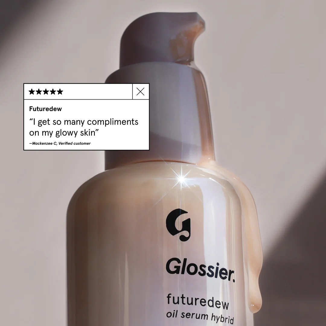
Cozy Sofa — Lifestyle with Pets. This ad effectively leverages a lifestyle layout, showcasing a yellow sectional sofa in a bright, modern living space. The composition strategically places two relaxed dogs on the sofa, instantly conveying comfort and durability, appealing to pet owners. The warm yellow of the sofa, complemented by the natural browns of the dogs and the clean white wall, creates an inviting and cozy atmosphere. The ad's aesthetic mimics user-generated content, fostering authenticity and relatability, which is highly effective on platforms like Instagram. The conversational text overlay, positioned clearly without obscuring the main subjects, highlights the product's key benefits—softness and comfort—through a relatable, humorous anecdote. This approach optimizes for engagement, encouraging viewers to connect with the product on an emotional level rather than just a functional one. The overall design is clean and inviting, making it a scroll-stopper in a busy feed.. Primary text: So soft, so comfy, GREAT for naps. The only problem is that my dogs think it's their new bed!. Why this ad works: Emotional connection through pets — The inclusion of two adorable, sleeping dogs immediately creates an emotional connection with viewers, especially pet owners. This technique humanizes the product, implying that the sofa is not just comfortable for humans but also a beloved spot for furry family members, enhancing its appeal and perceived coziness. Authentic, user-generated content feel — The ad's natural lighting, casual arrangement, and conversational text mimic organic social media posts. This authenticity builds trust and relatability, making the ad feel less like a sales pitch and more like a genuine recommendation from a friend, which significantly boosts engagement and credibility on platforms like Instagram. Benefit-driven storytelling copy — The text "So soft, so comfy, GREAT for naps..." directly communicates the sofa's primary benefits. Framing it with a humorous anecdote about the dogs claiming it as their bed makes the message memorable and reinforces the comfort aspect in a charming, relatable way, driving home the product's value proposition.. Specs: Industry: Home & Lifestyle, Platform: Instagram, Format: Static, Audience: GeneralYoga International — Testimonial Grid Layout. Brand: Yoga International. This ad utilizes a testimonial-focused grid layout, strategically placing two positive reviews to build social proof. The soft, watercolor lotus background evokes a sense of calm and healing, aligning with the "Post-Traumatic Growth" theme. Color psychology employs gentle pastels (pinks, greens, blues) to create a soothing, trustworthy atmosphere, contrasting effectively with the crisp white text and review cards for readability. Compositionally, the stacked review cards guide the eye downwards, reinforcing the positive sentiment. Text hierarchy is clear: a prominent headline introduces the course, followed by a sub-headline setting up the testimonials. This design is optimized for platforms like Instagram or Facebook, where user-generated content and social proof are highly effective, encouraging consideration and conversion through authentic endorsements. The overall aesthetic supports a wellness brand, promoting a sense of peace and expertise.. Headline: Yoga for Post-Traumatic Growth. Primary text: Praise for Dr. Arielle Schwartz's New Course. Why this ad works: Stacked testimonials build strong social proof — Two prominent 5-star testimonials are stacked vertically, creating a powerful visual of positive feedback. This repetition reinforces credibility and trust, which is crucial for courses addressing sensitive topics like trauma, significantly boosting consideration for potential enrollees by demonstrating real-world positive impact. Calming watercolor background aligns with topic — The soft, organic watercolor background featuring a lotus flower immediately communicates tranquility and growth. This visual metaphor for healing and renewal resonates deeply with the target audience, setting an empathetic and inviting tone that supports the sensitive nature of "Post-Traumatic Growth" before any text is even read. Clear text hierarchy guides user attention — The large, bold headline "Yoga for Post-Traumatic Growth" immediately grabs attention, followed by a clear sub-headline introducing the testimonials. This ensures the core message and supporting evidence are absorbed efficiently, preventing cognitive overload and directing the viewer's focus effectively towards the social proof.. Specs: Brand: Yoga International, Industry: Health & Wellness, Platform: Instagram, Format: Static, Audience: Women 35-44FACTOR_ Meal Kit — Whiteboard Benefit Highlight. Brand: FACTOR_. This ad leverages a raw, whiteboard aesthetic to create an authentic, relatable connection. The central Factor_ meal kit box is surrounded by informal, handwritten text, mimicking a quick sketch of a problem and solution. The layout uses a clear visual hierarchy: the "I'm Lazy" headline immediately grabs attention, followed by the prominent "50% off" offer in blue, drawing the eye to the key conversion driver. The monochromatic white background with black text is punctuated by vibrant blue and purple markers, strategically highlighting the discount and ease-of-use. This informal composition is highly optimized for social platforms like Instagram or TikTok, where user-generated content and candid styles perform well. The text hierarchy guides the viewer from problem identification to solution and incentive, making it highly effective for direct-response marketing.. Headline: I'm Lazy. Primary text: 50% off Your first box! this is so easy!. Why this ad works: Relatable problem statement hooks audience — The headline "I'm Lazy" immediately resonates with a broad audience, creating an instant connection and empathy. This direct address positions the product as a solution to a common, everyday struggle. By acknowledging the viewer's pain point upfront, the ad effectively primes them to receive the subsequent offer and benefit, increasing engagement and relevance. Authentic handwritten aesthetic builds trust — The use of whiteboard and marker text breaks through the polished, often sterile, look of many digital ads. This informal, almost user-generated content style fosters trust and authenticity, making the ad feel less like a sales pitch and more like a genuine recommendation or a quick, relatable thought from a peer. Prominent, clear discount drives conversion — The "50% off Your first box!" is written in a contrasting blue marker and pointed to with an arrow, making it the most visually dominant call to action. This direct and generous incentive is crucial for driving immediate conversions, especially for a subscription-based product where initial commitment can often be a significant barrier.. Specs: Brand: FACTOR_, Industry: Food & Beverage, Platform: Instagram, Format: Static, Audience: ProfessionalsDog DNA Test — Testimonial Overlay. This ad effectively leverages user-generated content (UGC) with a split-focus composition. The main subject, a dog, occupies the left and center, drawing immediate attention. A clean, card-style overlay in the upper right presents the "Mixed Ancestry" results, providing key product information. A vibrant yellow speech bubble in the lower left houses a personal testimonial, adding authenticity and relatability. The overall color palette is warm and natural, enhancing the organic feel, which is crucial for pet-related products. The text hierarchy guides the eye from the dog to the results, then to the personal reaction, creating a narrative flow. This layout is optimized for social feeds like Instagram, where authentic stories and clear, digestible information perform well, encouraging engagement and consideration.. Headline: I guessed chow-lab-dachshund! Could totally see the weiner dog in the side profile.. Why this ad works: Authentic UGC drives relatability — The ad uses a genuine photo of a dog and a personal quote, mimicking organic social media posts. This approach builds trust and relatability far more effectively than polished studio shots, making the product feel accessible and real to potential customers who are often skeptical of overly curated ads. Clear visual hierarchy for information flow — The composition guides the viewer from the engaging dog image to the concise ancestry results, then to the user's reaction. This natural progression allows for easy absorption of both the product's output and its emotional impact, reducing cognitive load and enhancing message retention for the audience. Vibrant overlay highlights key message — The bright yellow speech bubble with bold black text immediately draws attention to the testimonial. This high-contrast element ensures the user's personal endorsement is not missed, reinforcing the product's value through social proof in a visually appealing and scroll-stopping manner on busy social feeds.. Specs: Industry: Pets & Animals, Platform: Instagram, Format: Static, Audience: GeneralCasual Menswear — Outdoor Lifestyle Shot. This ad leverages a full-body lifestyle shot, placing the model centrally on a wooden path, creating a clear visual lead. The natural outdoor setting with soft sunlight and lush greenery establishes an organic, approachable vibe. Color psychology uses earthy tones (khaki, green, wood) complemented by a clean white hoodie, suggesting comfort and versatility. The composition employs leading lines from the wooden path to guide the eye towards the smiling model, enhancing engagement. Optimized for platforms like Instagram, it blends seamlessly with user-generated content, making it feel less like an ad and more like a candid moment. The lack of overt text overlay keeps the focus on the apparel and the aspirational lifestyle, relying on visual storytelling to convey brand values. This approach fosters a sense of authenticity and relatability, crucial for attracting a younger, style-conscious audience.. Why this ad works: Authentic lifestyle imagery builds connection — The model's genuine smile and relaxed pose in a natural setting create an authentic, aspirational lifestyle image. This approach resonates with audiences seeking relatable fashion, fostering trust and making the clothing appear effortlessly stylish and comfortable. It encourages viewers to envision themselves in similar scenarios, boosting emotional connection. Natural lighting enhances product appeal — Soft, natural sunlight highlights the textures and colors of the clothing, particularly the vibrant green jacket and neutral khakis. This natural illumination enhances product appeal without artificiality, making the fabrics look comfortable and high-quality. The outdoor setting reinforces the casual, everyday wearability of the apparel. Leading lines guide eye to subject — The wooden path acts as a strong leading line, drawing the viewer's eye directly to the model. This compositional technique effectively centers attention on the apparel and the model's expression, ensuring the primary subject is immediately recognized and engaged with. It creates a clear visual hierarchy, optimizing attention capture.. Specs: Industry: Fashion & Apparel, Platform: Instagram, Format: Static, Audience: Men 18-24Topicals Like Butter — Testimonial with Product. Brand: Topicals. This ad leverages a strong user testimonial to build social proof, strategically placing it as the dominant visual element. The layout prioritizes the review text and a bold headline, immediately communicating product benefits through an authentic voice. The product tubes, "Like Butter" and "Topicals," are subtly angled below, grounding the ad in a tangible offering. A creamy product swatch provides a visual cue of texture and efficacy. The clean white background with a muted yellow product color palette creates a fresh, approachable vibe, optimized for platforms like Instagram where user-generated content and authentic reviews resonate. Text hierarchy guides the eye from the benefit-driven headline to the detailed review and then to the product, effectively building trust and interest.. Headline: SO CALMING & HYDRATING!. Primary text: I really like this mask. It has wonderful calming ingredients and truly feels like butter. It is much more lightweight than I expected, but still has massive hydrating power. I even use it as an overnight sleeping mask sometimes and wake up with restored skin every time.. Why this ad works: Authentic Testimonial Builds Instant Trust — The ad prominently features a detailed, positive customer review, complete with a 5-star rating. This social proof is highly effective, as consumers trust peer recommendations more than brand claims. It provides specific use cases and benefits, making the product relatable and desirable to potential buyers. Visual Product Swatch Reinforces Efficacy — The subtle, creamy product swatch in the background visually demonstrates the product's texture and presence. This tactile suggestion enhances the testimonial's claims of "calming" and "hydrating," offering a tangible representation of the product's quality and feel, which is crucial for skincare purchases. Playful Branding Creates Approachable Identity — The "Like Butter" product name and its retro, bubbly font, combined with the brand's overall aesthetic, create a playful and distinctive identity. This approachability helps differentiate the product in a crowded market, attracting a younger, trend-conscious audience looking for effective yet fun skincare solutions.. Specs: Brand: Topicals, Industry: Health & Wellness, Platform: Instagram, Format: Static, Audience: Women 18-24Hair Gain Gummies — Testimonial Product-in-Hand. Brand: Hair Gain. This ad leverages a user-generated content (UGC) aesthetic, featuring a product held in hand with a prominent testimonial overlay. The layout strategically places the social proof at the top, immediately grabbing attention and building trust before the viewer fully processes the product. The soft pink and black packaging, combined with the natural bathroom background, creates an authentic, relatable vibe. Compositionally, the hand holding the product provides scale and a sense of personal interaction. The text hierarchy prioritizes the glowing review, making it the primary message, while product details on the jar are secondary. This approach is highly effective for platforms like Instagram, where authenticity and peer recommendations drive engagement and consideration. The color palette of the product itself is clean and modern, appealing to a health-conscious audience.. Headline: Great results. Primary text: I have always had thin hair but this product is miraculous, my hair has never been thicker. Why this ad works: Authentic Testimonial Builds Immediate Trust — The large, clear testimonial box at the top, complete with a 5-star rating and "Verified" badge, immediately establishes credibility. This social proof is highly effective, as consumers trust peer reviews more than brand claims, significantly increasing consideration for the product. User-Generated Content Aesthetic Enhances Relatability — The product being held in a hand against a natural, slightly blurred bathroom background mimics organic user content. This unpolished, authentic feel resonates strongly on social platforms, making the ad less intrusive and more trustworthy compared to highly stylized studio shots. Product-in-Hand Provides Scale and Context — Showing the product held by a hand offers a clear sense of its size and encourages viewers to imagine themselves using it. This personal interaction makes the product feel tangible and accessible, bridging the gap between digital ad and real-world experience.. Specs: Brand: Hair Gain, Industry: Health & Wellness, Platform: Instagram, Format: Static, Audience: Women 25-34ARMRA Colostrum — Testimonial & Product Focus. Brand: ARMRA. This ad effectively combines a compelling testimonial with a clear product shot and discount offer, creating a strong conversion-focused message. The layout strategically places the emotional, relatable testimonial prominently in the upper left, leveraging the natural F-pattern reading behavior. The close-up of the woman's skin provides a direct visual connection to the testimonial's claims about skin transformation, enhancing authenticity. The product, ARMRA Colostrum, is clearly visible with its key benefits, while the vibrant yellow-green "30% OFF" circle acts as a high-contrast focal point, driving immediate attention to the offer. The overall clean aesthetic, with natural skin tones and white packaging, reinforces a health and wellness vibe, optimized for platforms like Instagram where authentic user-generated content and clear value propositions perform well. Text hierarchy guides the eye from the impactful testimonial to the product details and then to the urgent discount.. Headline: At 55 I found my skin dull and ARMRA has completely transformed my skin and hair!!!. Primary text: —Verified ARMRA customer. Why this ad works: Authentic testimonial drives emotional connection — The direct quote from a "Verified ARMRA customer" immediately builds trust and relatability. Highlighting age ("At 55") and specific benefits ("transformed my skin and hair") addresses common concerns of the target demographic, making the product's promise tangible and aspirational. This personal endorsement is highly persuasive. High-contrast discount circle captures attention — The bright yellow-green circle with "30% OFF" stands out dramatically against the muted background and product packaging. This color choice and prominent placement ensure the offer is unmissable, acting as a powerful call-out for users scrolling quickly. It creates urgency and incentivizes immediate action for conversion. Visual proof reinforces testimonial claims — The close-up of the woman's skin, subtly showing texture and vitality, visually supports the testimonial's claim of "transformed skin." While not a before/after, it provides a realistic, aspirational image of healthy skin, making the product's benefits feel more achievable and credible to the target audience.. Specs: Brand: ARMRA, Industry: Health & Wellness, Platform: Instagram, Format: Static, Audience: Women 45+Spacegoods Watermelon Electrolytes — Email Testimonial. Brand: Spacegoods. This ad leverages an authentic email testimonial in dark mode, presenting user-generated content as a powerful social proof. The layout mimics a real inbox, enhancing credibility and trust. The dark background with white text creates high contrast, making the message highly readable and scroll-stopping on social feeds. Compositionally, the focus is entirely on the user's enthusiastic review, detailing a specific use case (festival recovery) and product benefit ("new man"). This direct, unpolished approach bypasses traditional ad skepticism. Text hierarchy naturally follows email structure, with the subject line acting as a hook. Optimized for platforms like Instagram or Facebook, it aims to build consideration by showcasing genuine customer satisfaction.. Headline: Re: Unlock the Full Spectrum of Benefits ✨. Primary text: Yo, Your new watermelon electrolytes are SO good. I was flagging hard at a festival last weekend, I didn't think anything could restore me I was so depleted, space goods electrolytes and 15 minutes later I'm a totally new man, genuinely mind-blowing. If I were you I'd be taking it around UK festivals as a rave pep up, I think you'd do well... it's a proper 'sort your life out'! From: Spacegoods <support@spacegoods.com> Date: Thursday, 15 May 2025 at 10:59 To: Peter B Subject: Unlock the Full Spectrum of Benefits ✨. Why this ad works: Authentic Email Format Builds Trust — The ad presents a raw email screenshot, instantly conveying authenticity and bypassing typical ad skepticism. This user-generated content feels genuine, making the testimonial more believable and relatable to potential customers. It's a powerful form of social proof that resonates deeply with audiences. Specific Use Case & Benefit Resonance — The testimonial details a clear problem ("flagging hard at a festival") and a direct solution ("space goods electrolytes... totally new man"). This specific, relatable scenario helps the target audience visualize the product's efficacy in their own lives, driving stronger consideration and perceived value. Dark Mode Enhances Readability & Scroll-Stop — The dark mode email interface provides high contrast for the white text, making the testimonial easy to read quickly. This aesthetic choice also stands out in a feed often dominated by brighter images, effectively stopping the scroll and drawing attention to the textual content of the ad.. Specs: Brand: Spacegoods, Industry: Health & Wellness, Platform: Instagram, Format: Static, Audience: Men 25-34Bevel App — Apple Watch UI Testimonial. Brand: Bevel App. This ad leverages a user-generated content (UGC) aesthetic, featuring a hand wearing an Apple Watch displaying the Bevel app interface. The composition is a close-up, vertical shot, optimized for Instagram Stories or Reels. Multiple text bubbles act as a personal testimonial, guiding the viewer through key app features like stress tracking and sleep recovery scores. The natural lighting and plant background contribute to an organic, authentic vibe. The dark watch face with vibrant data points creates visual contrast, drawing attention to the app's functionality. Text hierarchy is conversational, explaining benefits and personal impact, fostering relatability. This approach builds trust and demonstrates the app's value through a credible, user-centric narrative, effectively engaging a health-conscious audience.. Primary text: Hands down my favorite Apple Watch face (information overload, I know 😊 but I like seeing seeing all my stats at a glance) As someone who's health-conscious, one of my favorite complications these days is the Bevel stress graph It helps me identify stress triggers & visualize the impact that even just 1 minute of breathwork can have on my stress levels 🙏 Also a huge fan of the sleep and recovery scores Bevel gives me every morning It tricks the video game nerd in me into getting better sleep so my health bar is never depleted 💪💯. Why this ad works: Authentic UGC style builds trust — The ad's user-generated content aesthetic, featuring a real hand and natural background, significantly enhances credibility. This organic presentation feels less like an ad and more like a genuine recommendation, fostering trust and relatability with the target audience. It bypasses ad fatigue by appearing as native content. Detailed feature explanation via testimonial — The multiple text bubbles meticulously explain specific app features like the stress graph and sleep scores, detailing their personal benefits. This narrative approach educates the viewer on the app's value proposition in a digestible, engaging way, moving beyond generic claims to concrete use cases. Visual proof of data tracking — The clear display of the Bevel app on the Apple Watch face provides immediate visual evidence of its data tracking capabilities. Seeing the graphs and scores in action reinforces the app's functionality and tangibility, making the benefits described in the text bubbles more believable and impactful for potential users.. Specs: Brand: Bevel App, Industry: Health & Wellness, Platform: Instagram, Format: Static, Audience: Fitness EnthusiastsJones Road Fragrance — Minimalist Testimonial Product Shot. Brand: JONES ROAD. This ad employs a minimalist split-screen composition, featuring the Jones Road product prominently on the left against a clean, light grey background. Water droplets on the bottle subtly evoke freshness and hydration, aligning with a "revived" feeling. On the right, a testimonial is presented on textured beige blocks, providing social proof and a personal touch with Bobbi's signature. The text hierarchy prioritizes the testimonial, drawing the eye to the benefit-driven quote, followed by the brand name and a clear "Back In Stock" call to action. This clean aesthetic is highly optimized for platforms like Instagram, where visual clarity and aspirational imagery resonate. The overall design balances product focus with compelling user-generated content, aiming for both awareness and conversion through scarcity.. Headline: I spray on Shower and I feel revived.. Primary text: xx, Bobbi.. Why this ad works: Credible Testimonial with Personal Touch — The testimonial, attributed with a handwritten signature "xx, Bobbi," adds significant authenticity and trust. This personal endorsement from a recognizable figure (likely Bobbi Brown, the founder) is highly persuasive, making the product's benefit feel genuine and relatable to the target audience, enhancing perceived value and effectiveness. Minimalist Aesthetic Highlights Product Purity — The clean white product against a light grey background, accented by water droplets, creates a fresh, pure, and premium impression. This minimalist approach reduces visual clutter, allowing the product's design and the implied sensory experience of "revived" to take center stage, appealing to a sophisticated audience seeking quality. Scarcity and Urgency with "Back In Stock" — The "*Back In Stock*" banner at the bottom effectively creates a sense of urgency and scarcity. This signals high demand and encourages immediate action, leveraging psychological triggers to drive conversions for a product that consumers might have been waiting for, enhancing its perceived desirability and value.. Specs: Brand: JONES ROAD, Industry: Health & Wellness, Platform: Instagram, Format: Static, Audience: Women 25-34Twelve South AirFly — In-Use Testimonial Shot. Brand: twelve south. This ad effectively leverages a user-generated content aesthetic to build trust and demonstrate product utility. The layout places the AirFly device and AirPods case prominently in a hand, connected to an airplane's entertainment system, immediately illustrating the problem (bad airline headphones) and solution. A large, high-contrast testimonial overlay, complete with a 5-star rating, dominates the upper left, acting as the primary headline and social proof. The composition is simple, focusing on the product in its intended environment, which enhances relatability. Color psychology is minimal, relying on the white products against a muted, realistic airplane interior to highlight the tech. Optimized for social feeds like Instagram, its authentic feel and clear value proposition are designed to stop scrolling and drive consideration. The text hierarchy prioritizes the user's positive experience, making the ad feel like a genuine recommendation rather than a hard sell.. Headline: No more awful airline headphones!. Primary text: AirFly paired easily with my AirPods and sound quality was great. Highly recommend!. Why this ad works: Authentic User-Generated Content Feel — The ad mimics a genuine customer photo, showing the product in a real-world, relatable scenario (on an airplane). This authentic, unpolished look builds immediate trust and credibility, making the testimonial feel more believable and impactful than a studio-shot ad. Clear Problem-Solution Demonstration — By showing the AirFly connected to the airline screen alongside AirPods, the ad instantly communicates its purpose. It visually solves a common pain point for travelers – poor airline audio – positioning the product as an essential travel companion without needing extensive explanation. Prominent Social Proof and Endorsement — The large 5-star rating and direct testimonial from a satisfied customer are highly visible. This strong social proof immediately establishes product quality and user satisfaction, significantly reducing perceived risk and encouraging potential customers to consider the AirFly.. Specs: Brand: twelve south, Industry: Home & Lifestyle, Platform: Instagram, Format: Static, Audience: GeneralAnkhway Mushroom Gummies — Authentic Selfie Lifestyle. Brand: Ankhway. This ad leverages an authentic, user-generated content (UGC) aesthetic, featuring a woman holding the Ankhway Mushroom Gummies product in a close-up selfie. The composition places the product prominently, held slightly above eye level, drawing immediate attention. The direct gaze of the woman creates a personal connection, fostering trust and relatability, crucial for health supplements. The natural, unpolished lighting and background reinforce the organic, everyday lifestyle vibe, suggesting the product seamlessly integrates into a user's routine. While text on the packaging is present, its small size means the ad's primary communication relies on visual storytelling and the implied endorsement from the individual. This approach is highly optimized for social platforms like Instagram or Facebook, where authenticity often outperforms highly polished, staged advertisements, driving engagement and consideration through perceived real-world usage. The warm, natural color palette further enhances this approachable and trustworthy feel.. Why this ad works: Authentic User-Generated Content Feel — The selfie format with natural lighting and an unpolished background creates a highly authentic, user-generated content (UGC) feel. This builds immediate trust and relatability with the audience, as it appears to be a genuine endorsement rather than a staged advertisement, which is highly effective for health supplements. Direct Gaze Fosters Personal Connection — The woman's direct eye contact with the viewer establishes an immediate and personal connection. This technique draws the audience in, making them feel directly addressed and increasing engagement. It creates a sense of shared experience, which is powerful for products promoting wellness and personal improvement. Prominent Product Display in Relatable Context — Despite the selfie style, the product packaging is held clearly and prominently in the foreground. This ensures brand and product recognition while placing it within a relatable, everyday context. It subtly communicates ease of use and integration into a daily routine, enhancing consideration.. Specs: Brand: Ankhway, Industry: Health & Wellness, Platform: Instagram, Format: Static, Audience: Women 45+Athletic Brewing Aftershift — Lifestyle Product Hold. Brand: Athletic Brewing Co.. This ad effectively uses a lifestyle shot to connect the "Aftershift" non-alcoholic brew with a relaxed, social context. The composition places the product prominently in the foreground, held by a relatable individual, creating an immediate personal connection. The warm, inviting background of a wood-fired oven suggests a cozy, authentic atmosphere, reinforcing the idea of unwinding. Color psychology leverages the can's vibrant, playful design against the muted, earthy tones of the background, making the product pop. The shallow depth of field ensures the can is the sharpest element, guiding the viewer's eye directly to the brand and product name. Optimized for social platforms like Instagram, this image blends seamlessly with user-generated content, enhancing authenticity. Minimal text overlay keeps the focus visual, relying on the product's aesthetic appeal and the implied lifestyle to engage the audience.. Why this ad works: Authentic Lifestyle Integration for Enhanced Relatability — The image features a casual, approachable individual holding the product in a warm, inviting setting (likely a restaurant or home with a pizza oven). This creates an aspirational yet achievable lifestyle association, suggesting the non-alcoholic brew fits naturally into social, relaxed moments without the need for alcohol, enhancing relatability for the target audience. Clear Product Focus Through Compositional Hierarchy — Despite being a lifestyle shot, the can is held directly towards the camera, slightly off-center, and in sharp focus. This ensures the product's branding and vibrant design are immediately recognizable. The shallow depth of field effectively blurs the background, making the can the undeniable focal point, crucial for product recognition in a busy feed. Warm, Inviting Color Palette Enhances Authenticity — The rich, warm tones from the wood-fired oven and the subject's skin contrast with the can's cool blues and vibrant patterns. This combination evokes feelings of comfort, authenticity, and enjoyment, aligning with the brand's likely positioning as a premium, enjoyable non-alcoholic option for various occasions, fostering a positive emotional connection.. Specs: Brand: Athletic Brewing Co., Industry: Food & Beverage, Platform: Instagram, Format: Static, Audience: Men 25-34The Purest Co. Sicilian Orange — Before/After Testimonial. Brand: the purest co.. This ad effectively utilizes a split-screen before/after layout, presenting a user's authentic weight loss journey. The warm, inviting orange overlay unifies the two images, subtly reinforcing the "Sicilian Orange" product theme and creating a vibrant, energetic mood. Compositionally, the product bottles are strategically placed in the foreground, anchoring the visual proof and making the solution immediately apparent. The dominant text is a direct, relatable testimonial, positioned to draw the eye after scanning the visual transformation, which significantly boosts credibility. This user-generated content (UGC) approach is highly optimized for social platforms like Instagram or Facebook, where authentic peer reviews and visual evidence drive strong engagement and consideration. The text hierarchy prioritizes the user's voice over overt brand messaging, fostering trust and making the ad feel less like an advertisement and more like a genuine recommendation.. Primary text: I take this 30 mins before eating and it helps me lose kgs faster!. Why this ad works: Authentic User-Generated Content Feel — The ad mimics a personal social media post, featuring a real person's self-taken photos. This authenticity builds immediate trust and relatability with the target audience, making the product's claims feel more credible than polished studio photography. It bypasses ad skepticism. Direct Visual Before/After Proof — The side-by-side comparison clearly illustrates a physical transformation, providing compelling visual evidence of the product's efficacy. This immediate visual impact is highly persuasive, allowing viewers to quickly grasp the potential benefits without needing extensive text. Relatable First-Person Testimonial — The prominent quote, "I take this 30 mins before eating and it helps me lose kgs faster!", is a powerful social proof. It uses simple, direct language from a user, making the product's benefits tangible and believable, directly addressing potential customer pain points.. Specs: Brand: the purest co., Industry: Health & Wellness, Platform: Instagram, Format: Static, Audience: Women 25-34Rocket Money — Authentic Napkin Testimonial. Brand: Rocket Money. This ad leverages an authentic, user-generated content (UGC) aesthetic, presenting a handwritten testimonial on a napkin. The layout strategy immediately signals relatability and trust, bypassing polished corporate imagery. The high-contrast black text on a white, textured napkin background ensures maximum readability and draws the eye directly to the personal narrative. Compositionally, the informal setting with subtle hints of a meal (glass, crumbs) grounds the message in everyday life, making the financial struggle and solution feel tangible. This approach is highly optimized for social platforms like Instagram or TikTok, where raw, unscripted content often outperforms highly produced ads by fostering genuine connection and stopping the scroll. The text hierarchy is simple: the entire message is the focus, delivering a clear problem-solution story directly from a peer.. Primary text: When I was broke a friend told me to get Rocket Money - Saved me hundreds by finding & cancelling unknown subscriptions & got refunds for the lost money. Why this ad works: Authentic handwritten testimonial format — The handwritten message on a napkin creates an immediate sense of authenticity and personal connection. This low-production, user-generated style builds trust more effectively than slick corporate ads, making the testimonial feel genuine and relatable to potential users facing similar financial challenges. Relatable problem-solution narrative — The ad directly addresses a common pain point ("When I was broke") and offers a clear, tangible solution ("Saved me hundreds by finding & cancelling unknown subscriptions"). This narrative structure resonates deeply with audiences, demonstrating immediate value and positioning Rocket Money as a practical, accessible financial helper. High contrast ensures message clarity — The dark, clear handwriting against the bright white, textured napkin background provides excellent visual contrast. This ensures the message is easily readable and stands out in a busy social feed, preventing scroll-past and effectively communicating the core benefit without requiring significant cognitive effort from the viewer.. Specs: Brand: Rocket Money, Industry: Finance & Insurance, Platform: Instagram, Format: Static, Audience: GeneralSolar Ground Lights — Authentic Lifestyle Shot. This ad leverages an authentic, selfie-style lifestyle shot to promote solar ground lights. The composition places a smiling, relatable woman front and center, holding two products, immediately establishing a human connection. Lush green foliage in the background reinforces the outdoor, home improvement context. The bright, natural lighting contributes to an organic and inviting vibe, suggesting ease and enjoyment. This approach is highly effective for platforms like Instagram or Facebook, where user-generated content and authentic testimonials resonate strongly. The lack of explicit text places full emphasis on visual storytelling, allowing the viewer to infer benefits like simplicity and practicality through the model's positive interaction with the product. The direct gaze fosters trust, making the product feel approachable and reliable.. Why this ad works: Authentic Relatability Builds Trust — The smiling, natural appearance of the woman holding the product creates an immediate sense of trust and relatability. This human element makes the solar lights feel accessible and trustworthy, especially for home improvement items where practical, real-world use is key. It suggests a positive, effortless user experience. Product Scale and Context Demonstrated — By having the woman hold the two solar lights, the ad effectively communicates their size and how they might be handled or installed. This "in-use" composition provides immediate context, allowing potential customers to visualize the product in their own outdoor spaces more easily than a static product shot. Positive Outdoor Vibe Enhances Appeal — The bright, natural sunlight and lush green background, combined with the model's genuine smile, evoke feelings of warmth, happiness, and ease. This positive association transfers directly to the product, suggesting that these solar lights will contribute to a pleasant, well-lit outdoor environment, enhancing lifestyle appeal.. Specs: Industry: Home & Lifestyle, Platform: Instagram, Format: Static, Audience: Women 45+Neutrogena Ultra Sheer — Handheld Product Shot. Brand: Neutrogena. This ad leverages a handheld, in-store product shot to create immediate relatability and authenticity, positioning Neutrogena's Ultra Sheer Fluid Sunscreen. The composition places the product and its packaging centrally, allowing for clear readability of key benefits like SPF 50 and active ingredients. A blurred retail background subtly reinforces availability and encourages in-store purchase intent without distracting from the product. The prominent "SPF meets skincare" headline clearly communicates the dual benefit, appealing to consumers seeking multi-functional products. The informal, vertical format is optimized for mobile platforms like Instagram or TikTok, where user-generated content styles perform well. Text hierarchy prioritizes the benefit-driven headline, followed by essential product details on the packaging, and a necessary disclaimer. This approach effectively combines product education with a casual, trustworthy presentation.. Headline: SPF meets skincare ✨. Primary text: Always read the label and follow the directions for use. Wear protective clothing, hats and eyewear when sun exposed. Avoid prolonged sun exposure. Use and re-apply frequently.. Why this ad works: Handheld perspective builds instant trust — The ad's handheld presentation mimics a user's personal discovery, fostering authenticity and relatability. This informal, "real-life" shot resonates strongly on social platforms, making the product feel accessible and trustworthy, rather than a staged studio ad. It encourages viewers to imagine themselves holding the product. In-store background cues immediate availability — By subtly blurring a retail shelf background, the ad implicitly communicates product availability. This visual cue reduces purchase friction by suggesting the product is easily found in stores, converting consideration into action. It grounds the product in a familiar shopping environment, enhancing its perceived accessibility. Clear product & packaging highlights benefits — Both the product bottle and its box are prominently displayed, allowing consumers to clearly read key information like SPF 50, "Age Shield," and "Vitamin C & E, Niacinamide & Hyaluronic Acid." This transparency builds confidence and educates the viewer on the product's comprehensive skincare benefits, driving informed consideration.. Specs: Brand: Neutrogena, Industry: Health & Wellness, Platform: Instagram, Format: Static, Audience: Women 25-34Butter Soft Swim — Mid-section Lifestyle Shot. This ad leverages a tight, vertical crop to create an intimate, aspirational lifestyle shot, ideal for Instagram Stories or Reels. The composition focuses on the model's mid-section, emphasizing the swimwear's fit and the "butter soft" texture through subtle fabric manipulation and water droplets. The high contrast black and white stripes pop against the tanned skin and vibrant blue water, drawing immediate attention. Minimal text, "Butter Soft Swim," acts as a headline, allowing the visual to convey the primary message of comfort and quality. The natural lighting and wet skin add authenticity and a sensory appeal, suggesting a refreshing, luxurious experience. This approach prioritizes visual storytelling over explicit sales copy, aiming for engagement and brand association with desirable summer aesthetics. The influencer tag @katerinakraz subtly builds credibility and reach.. Headline: Butter Soft Swim. Why this ad works: Sensory details enhance product appeal — The water droplets on the skin and the model's hands gently adjusting the swimwear create a tactile and refreshing sensation. This visual cue effectively communicates the "butter soft" claim and the product's suitability for swimming, making the ad feel authentic and desirable. Close-up framing highlights product fit — By focusing tightly on the mid-section, the ad draws attention directly to how the swimwear fits the body. This emphasizes the garment's design, comfort, and flattering silhouette, allowing potential customers to visualize themselves in the product more effectively. Minimal text prioritizes visual storytelling — The ad uses very little text, with "Butter Soft Swim" as the main message. This strategy ensures the visual impact of the model, swimwear, and setting remains paramount, creating an aspirational and engaging experience that encourages viewers to linger and absorb the aesthetic.. Specs: Industry: Fashion & Apparel, Platform: Instagram, Format: Static, Audience: Women 25-34Liquidix Hydration — Influencer In-Use Lifestyle. Brand: Liquidix. This ad leverages an influencer-style, in-use layout, positioning Liquidix as an essential part of an active lifestyle. The vertical composition, typical for Instagram Stories or Reels, places the user centrally, engaging with the product. Color psychology is subtle, with the product's vibrant packaging providing pops of color against the neutral background of the poolside setting. The composition guides the eye from the influencer's face, down to the product being mixed, and then to the additional product sachets, creating a natural visual flow. Text hierarchy is informal, mimicking organic social content, with a top-level endorsement and a personal testimonial. This approach is optimized for platform authenticity, blending seamlessly with user-generated content to build trust and consideration rather than direct conversion. The ad effectively demonstrates product utility in a relatable context.. Headline: @kuldeep_18 has his hydration game on point. Primary text: My recovery essential through a long season @liquidix.in. Why this ad works: Influencer endorsement builds immediate trust — Featuring a recognizable individual like @kuldeep_18 (implied influencer) immediately lends credibility to the product. Viewers are more likely to trust recommendations from perceived peers or respected figures, bypassing typical ad skepticism. This organic feel significantly boosts consideration, especially on social platforms where authenticity is key. In-use demonstration clarifies product utility — The ad clearly shows the product being mixed into water, visually explaining its function. This direct demonstration removes ambiguity and helps potential customers understand how to integrate Liquidix into their routine. Seeing the product in action is far more effective than static product shots for functional items, driving higher engagement and comprehension. Relatable lifestyle context enhances appeal — The poolside setting and "recovery essential through a long season" copy connect the product to an active, aspirational lifestyle. This context helps the target audience envision themselves using Liquidix in similar situations, making the product feel relevant and desirable. It moves beyond just product features to emotional benefits and lifestyle integration.. Specs: Brand: Liquidix, Industry: Health & Wellness, Platform: Instagram, Format: Static, Audience: Fitness EnthusiastsTubby Todd All Over Ointment — User Testimonial. Brand: Tubby Todd. This ad leverages authentic user-generated content, featuring a baby holding the Tubby Todd All Over Ointment. The composition strategically places the product within a real-life context, immediately building trust and relatability for parents. The testimonial block, prominently displayed below the image, reinforces social proof with a 5-star rating and a "Verified purchase" badge. The soft, muted color palette of the baby's clothing and the product label, against a slightly textured white background, evokes a sense of gentleness and safety, crucial for baby products. Text hierarchy is clear: the review text is easily readable, emphasizing the emotional benefit. This ad is optimized for platforms like Instagram, where authentic, lifestyle-oriented content and social proof drive high engagement among parent demographics. The layout effectively combines visual storytelling with direct endorsement.. Primary text: Only moisturizer I trust on my baby's skin. She loves it!. Why this ad works: Authentic UGC builds immediate trust — The image of a real baby holding the product feels genuine, not staged. This user-generated content (UGC) approach is highly effective for baby brands, as it bypasses traditional advertising skepticism and fosters immediate relatability and trust with prospective parents seeking safe products. Prominent testimonial reinforces social proof — The large, clear testimonial block with a 5-star rating and "Verified purchase" stamp provides strong social proof. This direct endorsement from another parent, "Only moisturizer I trust...", directly addresses common concerns and validates the product's efficacy and safety for sensitive baby skin. Soft color palette communicates gentleness — The pastel purple of the baby's outfit and the light blue/green of the product label, set against a soft, textured background, create a gentle and nurturing aesthetic. This color psychology aligns perfectly with a baby skincare product, signaling safety, comfort, and care to the target audience.. Specs: Brand: Tubby Todd, Industry: Health & Wellness, Platform: Instagram, Format: Static, Audience: ParentsErgobaby Omni Breeze — Authentic Mirror Selfie. Brand: Ergobaby. This ad leverages an authentic, user-generated content (UGC) style through a mirror selfie, effectively showcasing the Ergobaby carrier in a real-life context. The layout strategy prioritizes relatability and trust, positioning the product as a natural part of a parent's daily life. Muted, natural color tones of the carrier and subject evoke comfort, reliability, and a gentle aesthetic, resonating with parents seeking practical yet stylish solutions. The close-up composition technique draws focus to the sleeping baby and the carrier's design, subtly highlighting comfort and security. Optimized for platforms like Instagram, this visual blends seamlessly with organic content, enhancing scroll-stopping power without feeling overtly promotional. The absence of overt text hierarchy relies on visual storytelling and brand recognition, making the product the hero.. Why this ad works: Authentic UGC style builds immediate trust — The mirror selfie format and natural appearance of the parent and baby create a highly relatable and trustworthy impression. This authentic approach bypasses traditional advertising skepticism, making the product feel genuinely integrated into a real family's life, which is crucial for parental products. Visual demonstration of comfort and security — The image of a peacefully sleeping baby nestled in the carrier powerfully communicates comfort and security. This visual proof of concept is more impactful than descriptive text, reassuring potential buyers about the product's primary benefits for both parent and child. Emotional connection through the sleeping baby — The universal appeal of a sleeping infant evokes strong positive emotions like tenderness and protection. This emotional resonance helps form a deeper connection with the audience, associating the Ergobaby carrier with moments of peace and well-being for their child.. Specs: Brand: Ergobaby, Industry: Health & Wellness, Platform: Instagram, Format: Static, Audience: ParentsHairbrush Testimonial — Lifestyle with Overlay. This ad effectively leverages social proof through a prominent testimonial overlay on a lifestyle image. The layout features a smiling woman holding two hairbrushes in what appears to be a salon setting, lending authenticity. The composition places the model centrally, drawing the eye to her and the products, while the testimonial box occupies the bottom right, creating a clear secondary focal point. The bright, clean aesthetic, typical of a salon, supports a premium yet approachable vibe. Color psychology is subtle, relying on natural light and the contrast of the white testimonial box with pink stars to capture attention. Optimized for platforms like Instagram, where user-generated content and personal recommendations drive engagement. The text hierarchy within the testimonial is clear: star rating, quote, then professional endorsement, building immediate trust.. Primary text: These hairbrushes are simply the best! They're flying off the shelves in my salon. You have my warmest recommendation - Nikoline, Hairdresser. Why this ad works: Professional Testimonial Builds Trust — The inclusion of a testimonial from "Nikoline, Hairdresser" immediately establishes expert credibility. Consumers are more likely to trust product recommendations from professionals in the relevant field, significantly boosting the perceived value and efficacy of the hairbrushes. This direct social proof is highly persuasive. Authentic Lifestyle Setting Enhances Relatability — Featuring a real person in a salon environment, rather than a sterile studio shot, makes the ad feel genuine and relatable. This authentic context helps potential customers visualize the product in use and connects it to a professional, trusted setting, increasing engagement and belief in the product's quality. Clear Product Display with Human Connection — The model clearly holds both hairbrushes, showcasing their design and size effectively. Her warm, inviting smile creates a positive human connection, making the products seem more appealing and approachable. This combination of clear product visibility and positive human interaction enhances desirability.. Specs: Industry: Health & Wellness, Platform: Instagram, Format: Static, Audience: Women 25-34Augustinus Bader — Dua Lipa Mirror Selfie. Brand: Augustinus Bader. This ad leverages an authentic-looking celebrity mirror selfie, strategically placing Augustinus Bader products in the foreground. The composition draws the eye from the recognizable influencer, Dua Lipa, to the subtly featured luxury skincare items. The dark, opulent bathroom setting enhances the premium feel, aligning with the brand's high-end positioning. This lifestyle approach, optimized for Instagram, capitalizes on aspirational appeal rather than direct product features. The lack of overt ad copy or text overlay makes the post feel organic, fostering trust and engagement typical of influencer content. Color psychology is subtle, with the product's blue and gold packaging contrasting against the dark backdrop, signaling sophistication. The overall strategy is to drive brand awareness and consideration through association with a credible, stylish figure, making the product part of a desirable routine.. Why this ad works: Dua Lipa's authentic celebrity endorsement — Featuring a global celebrity like Dua Lipa creates instant aspirational appeal and trust. Her mirror selfie format makes the endorsement feel organic and relatable, rather than a staged ad. This leverages her massive following to drive brand awareness and consideration among her engaged audience, associating the product with her desirable lifestyle. Subtle product placement in lifestyle context — The Augustinus Bader products are visible but not overtly highlighted, making the ad feel less intrusive. This soft sell approach integrates the products into Dua Lipa's personal routine, suggesting natural use and efficacy. It allows viewers to discover the brand organically within a trusted, aspirational setting, enhancing perceived authenticity. High-end aesthetic reinforces luxury brand — The dark, luxurious bathroom setting and Dua Lipa's relaxed yet chic appearance align perfectly with Augustinus Bader's premium positioning. This visual language communicates exclusivity and sophistication, appealing to a target audience that values luxury and quality. The overall vibe elevates the brand's perceived value and desirability.. Specs: Brand: Augustinus Bader, Industry: Health & Wellness, Platform: Instagram, Format: Static, Audience: Women 25-34Liquid IV — Athlete In-Use Lifestyle Shot. Brand: Liquid IV. This ad leverages an influencer marketing strategy, featuring cricketer Nehal Wadhera preparing a Liquid IV drink. The composition is a casual, in-use shot, making the product integration feel organic and authentic for an Instagram Story. The warm, inviting lighting and natural setting enhance relatability. Text overlays are strategically placed to highlight the influencer's endorsement and the product's function as a "recovery essential." The visual hierarchy guides the eye from the influencer's profile, to the endorsement, then to the product in action, and finally to the call-out for the brand. This approach builds trust through association, optimizing for engagement and awareness within a social feed where authenticity resonates more than polished studio shots. The focus is on demonstrating usage rather than just product display.. Headline: Elite recovery for @nehalwadhera. Primary text: My recovery essential @liquidiv.in. Why this ad works: Influencer Credibility Drives Trust — Featuring a recognizable athlete like Nehal Wadhera immediately lends credibility to Liquid IV. His endorsement as a "recovery essential" suggests professional-grade efficacy, resonating with fitness enthusiasts and younger demographics who follow sports figures. This authentic integration feels less like a direct ad and more like a genuine recommendation. In-Use Demonstration Enhances Relatability — The ad shows the product being actively prepared, illustrating its ease of use and integrating it into a daily routine. This visual demonstration is more compelling than a static product shot, allowing potential customers to envision themselves using Liquid IV for their own recovery needs, fostering consideration. Strategic Text Overlays Guide Engagement — The text boxes "Elite recovery for @nehalwadhera" and "My recovery essential @liquidiv.in" clearly communicate the product's benefit and brand. Placed at the top and bottom, they frame the central action, ensuring key messages are absorbed without distracting from the authentic lifestyle portrayal, driving brand recall.. Specs: Brand: Liquid IV, Industry: Health & Wellness, Platform: Instagram, Format: Static, Audience: Men 18-24Pressed Avocado Greens — Lifestyle Offer Shot. Brand: Pressed. This ad effectively uses a warm, natural lifestyle composition to promote a healthy beverage. The central focus is a woman engaging with the "Pressed Avocado Greens" juice, creating an aspirational yet relatable image. The color palette, dominated by natural greens and warm neutrals, evokes freshness and wholesome goodness, aligning with the plant-based product. Text hierarchy is clear: a bold offer ("One Free Item") immediately captures attention, followed by a benefit-driven sub-headline. The vertical layout and authentic photography are optimized for social platforms like Instagram, where such content performs well by blending seamlessly with user-generated posts. The composition guides the eye from the engaging model and product to the compelling offer, driving consideration and conversion. The overall vibe is clean and organic, reinforcing the brand's healthy image.. Headline: One Free Item. Primary text: Delicious, Plant-Based Nourishment. Why this ad works: Relatable lifestyle shot builds aspiration — The ad features a natural, smiling woman enjoying the product, creating an authentic and aspirational connection. This human element makes the healthy lifestyle feel attainable, encouraging viewers to envision themselves experiencing the same positive feelings, which drives emotional engagement and brand affinity. Clear offer drives immediate action — The prominent "One Free Item" headline immediately communicates a compelling incentive. This direct-response approach cuts through noise, clearly stating the value proposition upfront. For conversion-focused campaigns, a strong, unambiguous offer like this significantly boosts click-through rates and purchase intent by reducing perceived risk. Earthy color palette reinforces brand values — The ad's natural green juice, warm skin tones, and soft background create an organic, wholesome aesthetic. This color psychology subtly communicates freshness, health, and natural ingredients, aligning perfectly with a plant-based nourishment brand. It builds trust and reinforces the product's core benefits visually.. Specs: Brand: Pressed, Industry: Food & Beverage, Platform: Instagram, Format: Static, Audience: Women 25-34Hairbrush — Authentic Mother-Daughter Lifestyle. This ad effectively leverages an Instagram Story format, mimicking user-generated content to build immediate trust and relatability. The layout strategically uses a Q&A sticker to pose a common parenting pain point: children disliking hair brushing. The subsequent text overlay then presents the product—a hairbrush—as the joyful solution. Compositionally, the candid, eye-level shot captures genuine smiles from both mother and daughter, creating a strong emotional connection. The natural, warm color palette reinforces an authentic, comforting vibe. This seamless integration into the platform's native UI enhances engagement, making the ad feel less intrusive. The clear problem-solution narrative, combined with visible product use and positive emotional cues, persuades viewers by demonstrating tangible benefits and a transformed experience.. Headline: How can your daugther love to getting her hair brushed!?!. Primary text: This hairbrush is the best! It's never been easier 😍. Why this ad works: Authentic UGC format builds trust — The ad mimics an organic Instagram Story, complete with Q&A stickers. This user-generated content (UGC) aesthetic feels less like an ad and more like a genuine recommendation from a peer. This approach significantly boosts trust and relatability, making the product testimonial more credible to the target audience of parents. Directly addresses common parenting pain point — The question "How can your daugther love to getting her hair brushed!?" immediately resonates with parents struggling with tangled hair and reluctant children. The ad then presents the hairbrush as the clear, joyful solution, creating an emotional connection and demonstrating immediate product value. Joyful expressions highlight product benefit — Both the mother and daughter are smiling genuinely, conveying happiness and ease associated with using the hairbrush. This positive emotional framing is highly persuasive, showing not just that the product works, but that it transforms a potentially stressful task into a pleasant, bonding experience.. Specs: Industry: Health & Wellness, Platform: Instagram, Format: Static, Audience: ParentsPROVITALIZE — Joyful Lifestyle Sale Announcement. Brand: PROVITALIZE. This ad leverages a lifestyle composition featuring an enthusiastic woman in front of a fountain, creating an authentic, user-generated feel. The layout strategically places the product bottles and discount information as overlays, drawing immediate attention to the offer. Color psychology is less about a curated palette and more about the natural, vibrant outdoor setting, which implies vitality and well-being. The text hierarchy uses two distinct speech bubble overlays to convey the excitement of the sale and the specific discount, guiding the viewer's eye from the emotional hook to the financial incentive. This approach is optimized for platforms like Instagram, where genuine-looking content and clear value propositions can drive engagement and conversions. The overall composition aims to evoke a positive emotional response associated with the product's benefits and the savings.. Headline: Just found out about the 3-bottle bundle sale. Primary text: $13.25 OFF Per Bottle. Why this ad works: Authentic Lifestyle Context Builds Trust — The ad features a real person expressing genuine excitement in a natural setting. This lifestyle approach feels less like a traditional ad and more like a personal recommendation, fostering trust and relatability with the target audience, especially for health supplements. Clear Value Proposition with Overlays — The use of distinct text bubbles for "Just found out about the 3-bottle bundle sale" and "$13.25 OFF Per Bottle" immediately communicates the offer and its benefit. This direct, easy-to-digest information cuts through clutter and drives purchase intent effectively. Emotional Connection Through Expression — The woman's joyful, arms-outstretched pose conveys a strong positive emotion. This visual cue suggests that the product (and its associated sale) brings happiness and satisfaction, creating an aspirational feeling that resonates with potential customers.. Specs: Brand: PROVITALIZE, Industry: Health & Wellness, Platform: Instagram, Format: Static, Audience: Women 35-44RESET Anti-Inflammatory Drink — In-Use Lifestyle. Brand: RESET. The ad effectively uses a problem-solution framework, posing a common health query via a search bar overlay. This immediately engages the target audience by addressing a relevant concern, fostering a sense of shared experience. The composition features a woman naturally consuming the "RESET" drink in a relaxed, everyday setting, enhancing relatability and authenticity. The muted, natural color palette, with the dark bottle contrasting against the skin tones, effectively focuses attention on the product and the user. Optimized for platforms like Instagram or TikTok, this lifestyle shot feels organic, blending seamlessly with user-generated content. The text hierarchy is simple: a prominent question acts as a compelling hook, inviting curiosity and subtly implying the product as the direct answer. This strategy aims to drive initial consideration by first establishing a clear, relatable need before revealing the solution.. Headline: How can I decrease inflammation?. Why this ad works: Problem-Solution Hook Engages Instantly — The "How can I decrease inflammation?" query directly taps into a common health concern. This immediately establishes relevance and positions the product as a potential solution, drawing in viewers actively seeking answers. It creates an instant connection by articulating an internal thought many health-conscious individuals share. Authentic Lifestyle Integration Builds Trust — Showing the product being consumed naturally by a relatable individual in a casual setting enhances credibility. This avoids overly staged advertising, making the product feel like a genuine part of a healthy, attainable lifestyle. It fosters aspirational use and trust among the target demographic. Visual Clarity of Product Use — The close-up shot of the woman drinking the RESET bottle clearly demonstrates the product's form and immediate use. This direct visual communication eliminates ambiguity about what the product is and how it's consumed, making it easy for viewers to understand its purpose at a glance.. Specs: Brand: RESET, Industry: Health & Wellness, Platform: Instagram, Format: Static, Audience: Women 25-34Vaseline Lip Therapy — Authentic In-Use Lifestyle. Brand: Vaseline. This ad leverages an authentic, user-generated content aesthetic, placing a smiling model applying Vaseline Lip Therapy in a natural, sunlit setting. The composition is a close-up, drawing the viewer into a personal moment, enhancing relatability. Warm, natural lighting and the model's genuine expression create a positive, approachable vibe. The product is clearly visible and actively being used, demonstrating its purpose without explicit instructions. This visual strategy is highly optimized for platforms like Instagram, where authenticity and lifestyle content resonate strongly, encouraging engagement and consideration through aspirational yet achievable self-care. The lack of overt text overlay keeps the focus on the visual narrative, allowing the brand to communicate through association and feeling.. Why this ad works: Authentic Lifestyle Portrayal Builds Trust — The ad's candid, sun-kissed aesthetic and the model's genuine smile create a highly relatable and trustworthy image. This "real person" feel, reminiscent of user-generated content, bypasses traditional advertising skepticism, making the product feel like a natural part of an everyday self-care routine. Clear Product Demonstration and Benefit — By showing the model actively applying the lip balm, the ad immediately communicates the product's use and implied benefit (moisturized, healthy lips). This visual storytelling is more effective than text-heavy explanations, allowing viewers to quickly grasp the product's value proposition in a natural context. Warm, Inviting Visuals Drive Positive Association — The golden hour lighting, warm orange hoodie, and natural skin tones create an inviting and comfortable atmosphere. This color psychology evokes feelings of warmth, care, and well-being, subtly associating these positive emotions with the Vaseline brand and its lip therapy product.. Specs: Brand: Vaseline, Industry: Health & Wellness, Platform: Instagram, Format: Static, Audience: Women 18-24Surreal Cereal — Authentic Testimonial. Brand: Surreal. This ad employs a testimonial layout, featuring a real person holding the Surreal High Protein Cereal box, directly addressing a common health concern. The composition places the product prominently in the foreground, creating an immediate focal point. The vibrant, playful design of the cereal box contrasts with the neutral kitchen background, drawing attention to the product itself. A large, bold text overlay delivers the personal testimonial, establishing a clear problem-solution narrative. This approach is highly effective for platforms like Instagram or TikTok, where authentic, user-generated content or testimonial-style ads resonate well. The text hierarchy prioritizes the personal story, leveraging social proof to build trust and drive consideration for a health-conscious audience. The ad effectively communicates a specific benefit (managing pre-diabetes) through a relatable experience.. Headline: I've been so worried about pre-diabetes but this has changed my mornings. Why this ad works: Authentic Testimonial Builds Trust — The ad features a real person, not a model, sharing a personal health concern and solution. This authenticity fosters relatability and trust, making the product's benefits more credible than a generic claim. It directly addresses a pain point, positioning the cereal as a genuine solution for a specific audience. Problem-Solution Framing with Relatability — The headline immediately presents a common health anxiety ("worried about pre-diabetes") and positions the product as the direct answer ("changed my mornings"). This narrative structure resonates deeply with the target audience, who may share similar concerns, making the ad highly relevant and compelling and driving engagement. Product-in-Hand Directness — By having the individual hold the product directly towards the camera, the ad creates an intimate, personal connection. This direct presentation ensures the product is the hero, while the testimonial reinforces its value, making the connection between the problem, solution, and brand explicit and memorable for the viewer.. Specs: Brand: Surreal, Industry: Food & Beverage, Platform: Instagram, Format: Static, Audience: Men 35-44Art Print Collection — Studio Display with Creator. This ad employs a clean, minimalist studio layout to showcase a collection of framed art prints. The central figure, presumably the creator or a representative, interacts with the prints, adding a human element and implied expertise. The composition uses a wide shot with ample white space, allowing each print to be individually appreciated while also presenting them as a cohesive collection. Color psychology leans into calming, natural tones from the artwork against a stark white background, evoking a sense of tranquility and sophistication suitable for home decor. Optimized for visual-first platforms like Instagram or Pinterest, the ad's clean aesthetic and lifestyle context encourage engagement and consideration. The lack of text overlay keeps the focus purely on the visual appeal of the art, relying on the platform's accompanying copy for details. This approach positions the brand as curated and high-quality.. Why this ad works: Human element adds authenticity and connection — The presence of a person interacting with the art makes the collection feel more personal and curated. This human touch builds trust and allows potential customers to envision the art in their own spaces, fostering a stronger emotional connection than a sterile product shot alone would achieve. Minimalist studio setting highlights product variety — The stark white background and floor eliminate distractions, allowing the diverse range of art prints to stand out. This clean canvas ensures that the viewer's attention is solely on the artwork's aesthetic and framing options, effectively showcasing the breadth and quality of the collection without visual clutter. Strategic arrangement creates visual browsing experience — The prints are artfully arranged around the central figure, some leaning, some on the floor. This dynamic yet organized display mimics a gallery or home browsing experience, inviting the viewer to visually "shop" the collection and discover different pieces within the same frame, enhancing engagement.. Specs: Industry: Home & Lifestyle, Platform: Instagram, Format: Static, Audience: GeneralCurology Acne Treatment — Before/After Split Screen. Brand: Curology. This ad effectively leverages a classic before/after split-screen layout to demonstrate product efficacy. The raw, unpolished aesthetic of the "How it started" and "How it's going" images mimics user-generated content, fostering authenticity and relatability. The composition places the problem and solution side-by-side, creating an immediate, compelling visual narrative. Minimal text hierarchy, with simple, direct captions, ensures the visual transformation is the primary focus. The white background and natural lighting keep the focus on the skin, avoiding distractions. Optimized for platforms like Instagram, this format capitalizes on visual storytelling and social proof, encouraging consideration by clearly addressing a common skin concern. The ad's strength lies in its direct, no-frills presentation of tangible results.. Headline: How it started / How it's going. Why this ad works: Authentic Before/After Visual Proof — The side-by-side comparison directly showcases the product's impact on acne. This visual evidence, presented in a raw, unedited style, builds immediate trust and credibility, which is crucial for skincare products. It allows potential customers to envision their own transformation. Relatable User-Generated Content Aesthetic — The ad's informal, selfie-like quality makes it feel less like a polished advertisement and more like a genuine user testimonial. This UGC-style approach significantly increases relatability and engagement, as consumers often trust peer experiences more than brand-produced content. Clear Problem-Solution Narrative — The "How it started" and "How it's going" captions, paired with the contrasting images, instantly communicate a clear problem (acne) and a compelling solution (clearer skin). This direct narrative simplifies the message and resonates quickly with viewers experiencing similar issues.. Specs: Brand: Curology, Industry: Health & Wellness, Platform: Instagram, Format: Static, Audience: Women 18-24Surreal Cereal — UGC Instagram Story Testimonial. Brand: Surreal. This ad cleverly leverages a user-generated content (UGC) style, mimicking an Instagram Story Q&A to build authenticity and trust. The layout places the product, a bowl of cereal, prominently in the foreground, with the branded cereal box providing context in the slightly blurred background. This creates a natural, relatable scene. The color palette is grounded in everyday kitchen tones, with the vibrant blue of the Surreal box providing a distinct brand pop. Composition feels organic, enhancing the 'real user' feel. The strategic placement of text overlays, simulating an interactive Q&A, directly addresses consumer pain points like low sugar and low carb. This format is highly optimized for Instagram, blending seamlessly with organic content and leveraging social proof. The text hierarchy guides the viewer from a question to a personal endorsement, then to specific product benefits, making it highly persuasive for a health-conscious audience.. Primary text: Low sugar breakfast idea? This low sugar cereal from Surreal is my new favourite It's got less than a gram of sugar and it's low carb too so it's great if you're pre-diabetic I've tried a load of different flavours and cocoa has to be my favourite!. Why this ad works: UGC format builds authentic trust — The ad's presentation as an Instagram Story Q&A feels organic and unpolished, mimicking genuine user content. This approach significantly enhances credibility compared to polished studio ads, as consumers trust peer recommendations more. It leverages social proof effectively, making the product feel relatable and endorsed by a real person, which is crucial for food products. Interactive Q&A addresses pain points — The "Low sugar breakfast idea?" prompt directly addresses a common consumer need and immediately grabs attention. The subsequent text boxes provide immediate, personal answers, highlighting key benefits like low sugar and low carb. This interactive, problem-solution narrative engages the viewer and pre-emptively overcomes potential objections, driving consideration effectively. Product-in-use reinforces lifestyle fit — Showing the cereal in a bowl, ready to eat, makes the product tangible and desirable. This "in-use" context allows potential customers to visualize themselves enjoying the product as part of their daily routine. It's more persuasive than just a product shot, connecting the cereal to a healthy lifestyle and making it feel accessible.. Specs: Brand: Surreal, Industry: Food & Beverage, Platform: Instagram, Format: Mixed, Audience: Fitness EnthusiastsNuve Youthlift — Testimonial & Before/After. Brand: Nuve. This ad employs a multi-layered persuasion strategy, combining a product hero shot with a compelling before-and-after visual and a handwritten testimonial. The informal, desk-like setting and natural lighting contribute to an authentic, user-generated content (UGC) feel, which often resonates strongly on platforms like Instagram or Facebook. The composition strategically places the product prominently, while the inset before-and-after images provide immediate visual proof of efficacy. The handwritten note, acting as the primary text, draws the eye with its personal touch, building trust and relatability. This approach effectively leverages social proof and direct visual evidence to drive consideration, appealing to an audience seeking tangible anti-aging results. The muted color palette of cream, teal, and wood reinforces a clean, trustworthy brand image.. Primary text: A coworker said "your hands look so young!" after I started my retinol routine & my wrinkles disappeared. Why this ad works: Authentic Handwritten Testimonial — The inclusion of a handwritten note provides a powerful sense of authenticity and social proof. This informal, personal touch bypasses typical ad skepticism, making the message feel like a genuine recommendation from a peer rather than a direct sales pitch. It significantly enhances relatability and trust. Direct Visual Before-and-After Proof — The prominent before-and-after images offer immediate, undeniable visual evidence of the product's effectiveness. This direct comparison is highly persuasive, allowing potential customers to quickly grasp the transformative benefits without needing to read extensive copy. It's a strong conversion driver. Multi-Layered Persuasion Strategy — This ad cleverly combines a product display, a personal testimonial, and visual proof within a single frame. This comprehensive approach addresses multiple facets of consumer skepticism and desire, building trust and demonstrating efficacy from several angles, making the ad highly effective for driving consideration.. Specs: Brand: Nuve, Industry: Health & Wellness, Platform: Instagram, Format: Mixed, Audience: Women 35-44Patterned Socks — Vibrant Collage Sale. This ad utilizes a dynamic collage layout to showcase a variety of patterned socks, immediately drawing the eye with its vibrant aesthetic. A prominent, high-contrast pink banner centrally displays a "CLEARANCE $6.99 only today" message, leveraging color psychology and urgency to drive immediate conversion. The composition features diverse leg types and patterns, promoting inclusivity and suggesting broad appeal. This user-generated content style fosters relatability and trust, making the product feel accessible and authentic. Optimized for social platforms like Facebook or Instagram, the ad's scroll-stopping visuals and clear value proposition are designed to capture attention and prompt impulse purchases, effectively communicating a limited-time offer through bold text hierarchy and diverse product representation.. Headline: CLEARANCE. Primary text: $6.99 only today. Why this ad works: High-contrast sale banner drives urgency — The bright pink background with bold white text "CLEARANCE $6.99 only today" creates an immediate focal point. This stark contrast against the product images ensures the discount message is the first thing viewers process, effectively leveraging urgency and value perception to prompt quick action in a busy feed. Diverse product display in collage format — The collage showcases multiple sock patterns and colors, offering variety at a glance. This technique allows potential customers to visualize different styles and find one that resonates, increasing perceived value and choice. It's effective for products with many variations, reducing the need for multiple ad creatives. Relatable, authentic user-generated style imagery — The images appear unpolished and authentic, resembling user-generated content rather than professional studio shots. This fosters relatability and trust, as consumers often find UGC more credible than highly produced ads. It suggests real people are wearing and enjoying the product, enhancing social proof and appeal.. Specs: Industry: Fashion & Apparel, Platform: Facebook, Format: Carousel/Collage, Audience: Women 25-34Vacuum Dirt — Gritty Problem Collage. This ad employs a raw, unpolished collage layout, strategically showcasing the sheer volume of dirt and dust collected by a vacuum. The composition uses multiple close-up shots of grime, filters, and vacuum canisters, creating an overwhelming visual narrative of the problem. The muted color palette of grays, browns, and off-whites is deliberately unappealing, leveraging disgust psychology to amplify the need for a cleaning solution. This authentic, almost user-generated content (UGC) aesthetic is highly optimized for platforms like Facebook or TikTok, where such candid, problem-focused visuals often achieve higher engagement due to their relatability and perceived honesty. The lack of overt branding or polished imagery shifts the entire focus onto the visceral problem, compelling viewers to consider a solution without direct persuasion. The repetitive visual motif reinforces the pervasive nature of household dirt, making the implicit call to action for a powerful vacuum or cleaning product highly effective.. Why this ad works: Visceral problem visualization drives urgency — The ad's raw, unedited close-ups of accumulated dirt and dust create a strong, visceral reaction. This direct confrontation with the problem triggers a subconscious desire for a solution, making the implicit call for a powerful cleaning product highly effective by tapping into the viewer's need for a clean home. Authentic, unpolished aesthetic builds trust — The ad's unpolished, almost user-generated content (UGC) style enhances its credibility. It feels less like a corporate advertisement and more like a genuine depiction of a common household issue. This authenticity fosters trust and relatability, making the implied product solution more convincing to potential customers. Repetitive dirt imagery emphasizes problem scale — By presenting multiple angles and quantities of dirt across the collage, the ad effectively communicates the pervasive nature and sheer volume of household grime. This repetition reinforces the magnitude of the problem, subtly convincing the viewer that a robust cleaning solution is not just a convenience, but a necessity for their home.. Specs: Industry: Home & Lifestyle, Platform: Facebook, Format: Carousel/Collage, Audience: GeneralAWAKE Caffeinated Bites — Professional Lifestyle Selfie. Brand: AWAKE. This ad effectively leverages an authentic, user-generated content style to connect with its target audience. The close-up selfie composition, featuring a smiling healthcare professional, immediately establishes relatability and trust. The product, AWAKE Caffeinated Chocolate Bites, is prominently held, creating a clear focal point without feeling overly promotional. The bright, clean background of what appears to be a medical facility restroom reinforces the "on-the-go" energy solution for busy professionals. Color psychology is subtle, relying on natural skin tones and the product's warm packaging to convey a friendly, accessible energy boost. Optimized for platforms like Instagram, this ad capitalizes on personal connection and implied endorsement, making it highly effective for consideration-stage marketing by showcasing practical, real-world utility.. Why this ad works: Authentic, relatable professional endorsement — The image features a genuine smile from a healthcare worker, lending credibility and relatability. This user-generated content style builds trust, suggesting the product is a practical solution for busy professionals needing an energy boost during demanding shifts. Clear product focus within a natural setting — Despite being a selfie, the product is held front and center, ensuring immediate recognition. The natural, unposed environment makes the product's integration into a busy professional's life feel organic, enhancing its appeal as a convenient, everyday solution. Direct eye contact and positive emotion — The subject's direct gaze and wide smile create an immediate, positive connection with the viewer. This emotional resonance makes the ad more memorable and encourages engagement, associating the product with feelings of happiness, energy, and satisfaction.. Specs: Brand: AWAKE, Industry: Food & Beverage, Platform: Instagram, Format: Static, Audience: ProfessionalsWellness Supplements & Smoothie — Candid Flat Lay. The image presents a candid, unstyled flat lay of various health supplements and powders, suggesting a daily wellness routine. Its strength lies in authenticity, appealing to an audience seeking genuine, unpolished content over highly produced ads. The composition, while seemingly accidental, creates a sense of "real life," fostering relatability. The vibrant natural colors of the powders (green, red, purple) subtly communicate health and vitality, leveraging color psychology to imply natural goodness. The lack of overt text or a clear focal point means it relies on visual intrigue and product recognition. This raw aesthetic is best suited for platforms like Instagram or TikTok where user-generated content or authentic lifestyle shots perform well, resonating with audiences tired of overly polished marketing. The implicit narrative is one of comprehensive health support, inviting viewers to imagine integrating these elements into their own lives.. Why this ad works: Authentic, unpolished aesthetic builds relatability — The candid, almost messy arrangement of health products mimics real-life usage, fostering a strong sense of authenticity. This unstyled approach can build trust and relatability with an audience fatigued by overly polished, aspirational advertising, making the products feel more accessible and genuine. Visual variety hints at comprehensive wellness — The assortment of powders, a blended drink, and various pills suggests a holistic approach to health. This visual breadth implies that the products cater to multiple wellness needs, appealing to consumers looking for comprehensive solutions rather than single-benefit items, thus broadening potential interest. Natural color palette signals health — The vibrant greens, deep purples, and rich reds from the powders and drink are inherently associated with natural ingredients and vitality. This color psychology subtly communicates health benefits and organic origins, appealing to consumers seeking natural and wholesome dietary supplements.. Specs: Industry: Health & Wellness, Platform: Instagram, Format: Static, Audience: GeneralSolo Stove Bonfire — Outdoor Lifestyle Testimonial. Brand: Solo Stove. This ad effectively leverages a lifestyle layout, placing the Solo Stove Bonfire at the heart of a communal outdoor experience. The composition strategically positions four smiling individuals around the fire pit, creating an authentic, aspirational scene that resonates with target audiences seeking connection and adventure. Color psychology is key, with the warm, inviting glow of the fire contrasting against the cool, muted tones of the mountain backdrop, emphasizing comfort and warmth in nature. The prominent testimonial and five-star rating serve as powerful social proof, building trust and credibility without explicit sales language. Optimized for social platforms like Instagram and Facebook, its emotional appeal and clear visual narrative encourage engagement. Text hierarchy is simple yet effective: the user-generated quote acts as the primary headline, immediately conveying value, while the subtle brand and product name at the bottom reinforce recognition. This approach prioritizes emotional connection over direct product features, making it highly persuasive.. Headline: We love our Solo Stove! It's been the best investment.. Why this ad works: Authentic lifestyle storytelling builds aspiration — The image captures genuine smiles and interaction around the fire, selling an experience rather than just a product. This aspirational lifestyle content fosters emotional connection, making viewers envision themselves in a similar setting, which is highly effective for outdoor gear. Prominent testimonial provides strong social proof — The large, bold testimonial quote and five-star rating immediately establish trust and credibility. User-generated content, especially positive reviews, significantly influences purchase decisions by validating the product's value through a relatable customer voice. Warm fire glow creates emotional connection — The central fire, with its inviting glow, is a primal symbol of warmth, comfort, and gathering. This visual element evokes strong positive emotions, associating the Solo Stove with cozy, memorable experiences, which is crucial for products enhancing outdoor leisure.. Specs: Brand: Solo Stove, Industry: Home & Lifestyle, Platform: Instagram, Format: Static, Audience: GeneralFly By Jing Costco Launch — Handheld Product Shot. Brand: Fly By Jing. This ad effectively leverages a real-world, user-generated content (UGC) aesthetic to announce a product launch. The layout strategically places the Fly By Jing product in a hand, directly in front of a Costco store, instantly communicating availability and brand association. Vibrant yellow sunbursts and bold red text ("NEW AT Costco," "LIMITED TIME ONLY") create high contrast against the blue sky and neutral building, ensuring immediate scroll-stopping attention. The composition uses a clear visual hierarchy, with the Costco branding as a strong anchor, followed by the urgency message. This approach is highly optimized for social platforms like Instagram, where authentic visuals and clear value propositions drive engagement and conversion. The text overlay is prominent, guiding the viewer's eye to key information without overwhelming the product itself.. Headline: NEW AT Costco. Primary text: LIMITED TIME ONLY. Why this ad works: Leveraging Costco's brand equity — The prominent "NEW AT Costco" headline and the store's facade in the background instantly signal widespread availability and value. This strategic placement acts as a powerful third-party endorsement, building trust and encouraging a broad audience of Costco shoppers to seek out the product. Creating urgency with "Limited Time Only" — The bright yellow starburst prominently displaying "LIMITED TIME ONLY" immediately triggers a sense of scarcity and FOMO. This psychological trigger is highly effective in driving impulse purchases and encouraging consumers to act quickly before the opportunity passes. Authentic, user-generated content feel — The ad's informal composition, featuring a hand holding the product in a real-world setting, mimics organic social media content. This authentic approach builds relatability and trust with the audience, making the ad feel less like a traditional promotion and more like a genuine recommendation.. Specs: Brand: Fly By Jing, Industry: Food & Beverage, Platform: Instagram, Format: Static, Audience: GeneralCurology — Authentic Lifestyle Product Shot. Brand: Curology. This ad effectively uses an authentic lifestyle shot to connect with its target audience. The composition features a smiling individual holding the Curology product, creating a relatable and trustworthy image. The split layout, with a solid lavender panel on the left, provides a clean backdrop for the headline, ensuring high readability. The color palette of soft lavender and natural skin tones evokes a sense of calm and care, aligning with skincare benefits. The text hierarchy places the aspirational headline prominently, drawing attention to the long-term value proposition. This design is optimized for social platforms like Instagram, where genuine user-generated content or lifestyle imagery performs well, encouraging engagement and consideration for personalized skincare. The overall clean aesthetic reinforces the brand's professional yet approachable identity.. Headline: Skincare for now you and future you. Why this ad works: Authentic Smile Fosters Trust and Relatability — The genuine, unposed smile of the model creates an immediate emotional connection with the viewer. This authenticity makes the brand feel more approachable and trustworthy than highly stylized or clinical imagery, which is crucial for a personalized skincare service that relies on user confidence and long-term engagement. Strategic Color Blocking for Headline Readability — The solid lavender block on the left side of the ad provides a high-contrast, clean canvas for the white headline. This design choice ensures the key message, "Skincare for now you and future you," is instantly legible and stands out, preventing it from getting lost against the busy background of the model's face. Lifestyle Context Visualizes Product Use and Benefits — Showing the product held by a happy user immediately communicates its purpose and benefit in a real-world scenario. This "in-use" context helps potential customers visualize themselves using the product and experiencing positive results, fostering stronger consideration and making the abstract benefit feel tangible.. Specs: Brand: Curology, Industry: Health & Wellness, Platform: Instagram, Format: Static, Audience: Women 25-34Casual Denim & Skirt — Lifestyle Full Shot. This ad employs a lifestyle full-body shot, positioning the model slightly off-center against a neutral gray wall. The composition utilizes natural lighting to highlight the outfit's textures and colors, particularly the distressed denim and the sheer black skirt. The casual pose and genuine smile create an approachable, relatable vibe, optimizing for platforms like Instagram where authentic user-generated content or aspirational lifestyle imagery performs well. The muted color palette of light blue, black, white, and beige boots offers versatility for various fashion aesthetics. With no overlaid text, the visual narrative relies entirely on the model's styling and expression to convey a sense of effortless fashion. This approach aims to inspire consideration by showcasing a complete, wearable look rather than focusing on a single product. The overall clean aesthetic ensures the outfit remains the focal point, suitable for organic feed integration.. Why this ad works: Relatable model pose enhances approachability — The model's relaxed stance and genuine smile create an inviting and authentic feel. This approach fosters relatability with the target audience, making the fashion pieces seem more accessible and wearable. It encourages viewers to envision themselves in the outfit, driving consideration for the featured clothing. Muted color palette offers versatile styling — The combination of light blue denim, white top, black skirt, and beige boots presents a versatile and easy-to-replicate outfit. This neutral palette appeals to a broad audience, demonstrating how individual pieces can be mixed and matched. It subtly suggests the clothing's adaptability for various occasions and personal styles. Full-body lifestyle shot inspires outfit ideas — By showcasing a complete outfit rather than isolated products, the ad provides immediate styling inspiration. This full-body presentation helps potential customers visualize how different items come together, reducing purchase friction by offering a ready-made look. It's highly effective for fashion discovery on visual platforms.. Specs: Industry: Fashion & Apparel, Platform: Instagram, Format: Static, Audience: Women 25-34Hug Ring — UGC Lifestyle Shot. This ad leverages a user-generated content (UGC) aesthetic, featuring a close-up of a hand wearing a unique "hug" ring against a natural, blurred background of denim and leaves. The composition centers the hand and ring, drawing immediate attention to the product. A prominent text bubble overlay, mimicking a social media comment, adds an emotional layer, positioning the ring as a desirable gift. The natural lighting and unpolished feel enhance authenticity, crucial for social platforms like Instagram where native content performs well. Color psychology is subtle, with warm skin tones and cool silver, creating a balanced, approachable vibe. The text overlay acts as the primary messaging, driving emotional connection and implied social proof, effectively bypassing traditional ad copy for a more relatable, conversational approach.. Primary text: My heart would melt if they bought me this 🥺. Why this ad works: UGC-style authenticity builds trust — The ad's unpolished, natural aesthetic mimics organic social media content, making it highly relatable. This user-generated feel significantly boosts credibility and trust, as consumers are more likely to believe peer recommendations than direct brand messaging, leading to higher engagement rates on platforms like Instagram. Emotional text overlay drives desire — The "My heart would melt if they bought me this 🥺" text directly taps into strong emotional gifting triggers. This personal, wish-list sentiment creates immediate desire and positions the ring as a thoughtful, cherished item, encouraging viewers to consider it for themselves or a loved one. Product-in-use showcases scale and appeal — By featuring the ring worn on a hand, the ad effectively demonstrates its actual size, fit, and aesthetic appeal in a real-world context. This visual clarity helps potential buyers visualize themselves wearing the product, reducing purchase friction and enhancing perceived value for jewelry items.. Specs: Industry: Fashion & Apparel, Platform: Instagram, Format: Static, Audience: Women 25-34Pain Relief Testimonial — Customer Review Card. This ad effectively leverages social proof through a prominent testimonial card. The layout prioritizes the customer's story, with a bold headline setting a clear benefit proposition. The use of a 5-star rating immediately establishes credibility and trust. The composition places the customer's photo within the testimonial, creating a personal connection and enhancing authenticity. The muted blue background ensures the white testimonial card pops, guiding the eye directly to the persuasive copy. Text hierarchy is clear: benefit-driven headline, bold summary, then detailed experience. Optimized for platforms like Facebook or Instagram where user-generated content and testimonials drive consideration. The overall design is clean and focuses on the emotional appeal of pain relief.. Headline: 15 minutes a day to a pain-free life!. Primary text: Best relief I've had in years. I've had lower back pain for years. This belt works instantly. The heat and stretch combo feels like a therapy session at home. I'm finally waking up pain-free.. Why this ad works: Prominent testimonial builds immediate trust — The large, centered testimonial card with a 5-star rating immediately establishes social proof. In a crowded feed, this visual cue of customer satisfaction quickly grabs attention and builds credibility, making the ad feel less like a sales pitch and more like a genuine recommendation. Benefit-driven headline hooks target audience — “15 minutes a day to a pain-free life!” directly addresses a core pain point with a clear, achievable solution. This headline is highly effective for problem-aware audiences, promising a significant quality-of-life improvement with minimal effort, driving immediate relevance and engagement. Authentic customer photo enhances credibility — Including a photo of “Samantha G.” holding what appears to be the product significantly boosts the testimonial's authenticity. This personal touch makes the review feel more real and relatable, fostering a stronger connection with potential customers and reducing skepticism about the claims.. Specs: Industry: Health & Wellness, Platform: Facebook, Format: Static, Audience: Women 35-44
Why Clone Ads

What Makes UGC Ads Convert

Handheld angle beats tripod

Tripod-stable, perfectly level compositions read as ads on first frame. A slight tilt, a small wobble, and handheld-angled framing signal real-person content shot on a phone. Cloning a UGC reference preserves the off-axis camera position that registers as a candid post — stable leveled footage is the fastest tell of a studio production in disguise.

Visible hand or body in frame

UGC creative with a visible human element — a hand holding the product, a foot in the shoe, a partial face mid-sentence — outconverts clean product-only UGC aesthetic on cold prospecting. Human presence is the trust signal that separates real creator content from staged brand work. A wrist with a Ridge wallet beats the wallet on a counter every test.

Minimal brand logo or none in frame

Aggressive logo placement kills the UGC aesthetic on contact. Front-and-center brand chrome, lower-third watermarks, and large product callouts all signal advertisement before the viewer hears a word. Fix: small logo on packaging visible in-frame, a corner sticker, or no logo at all. Let product shape and color register the brand.

Questions

UGC ads (user-generated content ads) are paid creative built to look like content a real customer or creator would post: phone-camera angle, visible hand, natural lighting, native-feed pacing. The category covers three operational variants — whitelisted ads (a brand running paid promotion through a creator's own handle), Spark Ads (TikTok's boost-an-organic-post format), and branded-content posts where the creator and brand co-sign disclosure. Functionally, all three trade studio polish for native feed feel because the algorithm and the viewer both reward content over ads.

On cold social prospecting, yes — by a wide margin in most DTC verticals. Meta's own creative benchmarks consistently show UGC-style creative pulling lower CPMs and higher CTR than studio product-on-white on prospecting audiences, with the delta often 30-60% depending on category. Retargeting flips: polished hero shots and Dynamic Product Ads carry more weight at the bottom of funnel where the viewer has already met the brand. The portfolio play is UGC for prospecting, studio for retargeting.

Quality is climbing fast but the tell is still the uncanny gap — AI-generated faces, hands, and product interactions read as off in ways that hurt CTR on cold audiences trained to spot fakes. AI UGC works best for B-roll, voiceover-driven product demos, and lower-stakes formats where no creator face is required. For talking-head testimonials and authentic-customer framing, real creator content still converts harder. Disclosure also matters: Meta requires AI-generated likeness labeling under its synthetic-content policy, and the prominent badge cuts into the authenticity premium UGC is supposed to deliver.

TikTok rewards hardest because Spark Ads let the brand boost a creator's own organic post, inheriting the native engagement signal. Instagram Reels close behind, especially for beauty, skincare, and food. Meta Feed picks up older audiences with the same creative cropped 1:1, where UGC still beats studio for 35+ DTC buyers. Pinterest converts on aspirational UGC for home, fashion, and lifestyle categories. YouTube Shorts is a fit for product-demo UGC; pre-roll favors polished work. LinkedIn underperforms — B2B audiences want stat-led or testimonial-led creative, not handheld phone footage.

Detail density. Staged UGC reads neutral — anonymous kitchen, model-grade hand, perfectly framed product. Authentic UGC layers in specifics: a coffee ring on the counter, mail on the table, a phone case in frame, a creator mid-sentence with imperfect diction. Audio is the other tell — clean room-tone with a polished voiceover signals studio; ambient kitchen sound and a slight mic plosive signal phone. Disclose paid partnerships per FTC and platform rules; the disclosure rarely hurts performance when the creator's voice is genuine and the product fit is real.

Create Your Own
UGC Ad

Clone any ugc ad example. Upload your product photo. Seconds later, you have a finished ad ready to launch.

Create your ad
AdDogs ad examples globe