AdDogs

Furniture Ad Examples

Browse 45+ furniture ad examples sourced from high-performing campaigns. Clone any design, swap in your product, and get a finished ad in seconds.

Updated May 2026

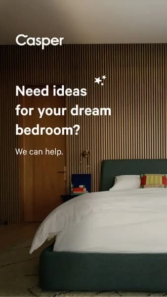
Furniture ads have a conversion problem nobody talks about. A $1,200 sofa is a 6-month consideration purchase for most shoppers, so the ad isn't closing — it's starting a relationship. Article, Floyd, Burrow, West Elm, and Inside Weather run patterns that handle this reality: styled-room heroes for cold traffic, material close-ups for consideration, and modular-assembly demos for conversion.

Visual vocabulary runs wider than almost any DTC category because furniture ads have to sell scale, material, and context at once. Wide-angle room shots with the piece as the focal point. Macro shots of upholstery, wood grain, and metal joinery. Size-scale overlays showing dimensions. Palettes stay earthy and neutral — oat, charcoal, rust, sage — because bold colors make buyers worry about matching their existing room. Meta and Pinterest carry the majority of spend, with Pinterest especially strong during research phase.

Browse furniture ad examples from real campaigns — sofas, tables, chairs, beds, desks, storage. Pick a template, upload your product in a room shot, and AdDogs applies your palette across three formats.

HGTV Buffy Comforter — Playful Lifestyle Shot. Brand: HGTV. This ad leverages a clean, minimalist layout to highlight the comfort of the Buffy Cloud Comforter through a relatable lifestyle shot. A smiling woman, wrapped in the plush white duvet, is centered against a soft lavender background, creating an inviting and serene visual. The composition uses ample negative space to focus attention on the subject and product, while the pastel color palette evokes calm and coziness, aligning perfectly with the product's promise. The HGTV branding and article headline "The Best Duvets, Tested by HGTV Editors" provide strong editorial endorsement, building trust and positioning the product as a top choice. This visual strategy is highly effective for platforms like Instagram or Pinterest, where aesthetic appeal and authentic user experience drive engagement. Text hierarchy is clear: a prominent article title, followed by the image, then a concise product caption and price, guiding the viewer through the content efficiently.. Headline: The Best Duvets, Tested by HGTV Editors. Primary text: Best Overall: The Buffy Cloud Comforter. Why this ad works: Relatable human element creates connection — The smiling woman wrapped in the comforter immediately conveys comfort and happiness. This emotional connection is more powerful than just showing the product in isolation. In a crowded feed, seeing a person genuinely enjoying the product creates instant relatability and makes the ad feel more authentic and aspirational. Expert endorsement builds trust and credibility — The HGTV branding and "Tested by HGTV Editors" headline lend significant credibility to the product. Consumers inherently trust editorial reviews from established authorities like HGTV more than direct brand claims. This third-party validation reduces perceived risk and builds strong confidence in the Buffy Cloud Comforter's quality. Soft color palette enhances comfort appeal — The gentle lavender background combined with the plush white comforter creates a serene and inviting visual experience. This soft, harmonious color palette psychologically reinforces the product's promise of ultimate softness, relaxation, and a peaceful home environment. It appeals directly to the desire for comfort and tranquility.. Specs: Brand: HGTV, Industry: Home & Lifestyle, Platform: Instagram, Format: Static, Audience: GeneralCozy Sofa — Lifestyle with Pets. This ad effectively leverages a lifestyle layout, showcasing a yellow sectional sofa in a bright, modern living space. The composition strategically places two relaxed dogs on the sofa, instantly conveying comfort and durability, appealing to pet owners. The warm yellow of the sofa, complemented by the natural browns of the dogs and the clean white wall, creates an inviting and cozy atmosphere. The ad's aesthetic mimics user-generated content, fostering authenticity and relatability, which is highly effective on platforms like Instagram. The conversational text overlay, positioned clearly without obscuring the main subjects, highlights the product's key benefits—softness and comfort—through a relatable, humorous anecdote. This approach optimizes for engagement, encouraging viewers to connect with the product on an emotional level rather than just a functional one. The overall design is clean and inviting, making it a scroll-stopper in a busy feed.. Primary text: So soft, so comfy, GREAT for naps. The only problem is that my dogs think it's their new bed!. Why this ad works: Emotional connection through pets — The inclusion of two adorable, sleeping dogs immediately creates an emotional connection with viewers, especially pet owners. This technique humanizes the product, implying that the sofa is not just comfortable for humans but also a beloved spot for furry family members, enhancing its appeal and perceived coziness. Authentic, user-generated content feel — The ad's natural lighting, casual arrangement, and conversational text mimic organic social media posts. This authenticity builds trust and relatability, making the ad feel less like a sales pitch and more like a genuine recommendation from a friend, which significantly boosts engagement and credibility on platforms like Instagram. Benefit-driven storytelling copy — The text "So soft, so comfy, GREAT for naps..." directly communicates the sofa's primary benefits. Framing it with a humorous anecdote about the dogs claiming it as their bed makes the message memorable and reinforces the comfort aspect in a charming, relatable way, driving home the product's value proposition.. Specs: Industry: Home & Lifestyle, Platform: Instagram, Format: Static, Audience: GeneralItalic Serene Towels — Lifestyle Testimonial. Brand: Italic. This ad effectively blends lifestyle imagery with social proof to build trust and desire. The composition places the model and product in a natural, serene setting, emphasizing comfort and quality. The warm, earthy tones and soft lighting evoke a sense of calm and luxury, aligning with the "Serene Ultraplush" product name. Text hierarchy is clear: product name, then a prominent 5-star rating, followed by a personal testimonial headline and supporting quote, all anchored by the brand logo. This structure guides the eye from product feature to emotional benefit and social validation. Optimized for platforms like Instagram, where authentic, aspirational content resonates, it leverages a relatable human element to convey product experience rather than just features. The overall design prioritizes emotional connection and perceived quality.. Headline: My Favorite Towels!. Primary text: SERENE ULTRAPLUSH TOWELS "EVERYONE IN MY FAMILY LOVES IT.". Why this ad works: Authentic lifestyle imagery builds emotional connection — The close-up shot of a relaxed woman with closed eyes, gently touching the towel to her face, creates an intimate and sensory experience. This conveys the towel's softness and comfort, allowing the viewer to imagine the feeling, which is more persuasive than just showing the product. Prominent 5-star rating establishes instant trust — Placing a large, clear 5-star rating directly above the testimonial headline immediately signals high quality and customer satisfaction. This visual social proof is a powerful psychological trigger, reducing perceived risk and encouraging consideration for a premium product. Personalized testimonial enhances relatability — The headline "My Favorite Towels!" combined with the quote "EVERYONE IN MY FAMILY LOVES IT." provides a strong, personal endorsement. This makes the ad feel less like a sales pitch and more like a genuine recommendation from a trusted source, resonating deeply with potential buyers.. Specs: Brand: Italic, Industry: Home & Lifestyle, Platform: Instagram, Format: Static, Audience: Women 25-34Luxury Pet Bed — Cozy Lifestyle Scene. This ad effectively leverages a lifestyle composition to highlight a pet bed, positioning it as an integral part of a comfortable home. The central placement of the dog and bed, with the human interaction, creates an emotional connection, emphasizing comfort and companionship. The neutral color palette, dominated by soft grays, creams, and natural wood tones, evokes a sense of calm, cleanliness, and modern luxury, appealing to pet owners who prioritize aesthetics. The natural lighting and spacious room suggest a premium, aspirational environment. Optimized for platforms like Instagram, where authentic, high-quality lifestyle imagery resonates, the ad's visual narrative is clear without explicit text, relying on visual storytelling to convey product benefits. The composition guides the eye from the human to the pet and the product, subtly showcasing the bed's plush texture and size.. Why this ad works: Emotional connection through human-pet interaction — The gentle interaction between the woman and the dog creates an immediate emotional resonance. This taps into the strong bond pet owners share, making the product feel like an investment in their pet's happiness and well-being, rather than just a functional item. Aspirational lifestyle setting enhances product value — The clean, modern living room with ample natural light positions the dog bed within an aspirational home environment. This elevates the product from a simple pet accessory to a stylish piece that complements a well-designed interior, appealing to consumers who value aesthetics. Texture and comfort communicated visually — The fluffy, plush texture of the dog bed is highly visible and inviting. The dog's relaxed posture further reinforces the comfort aspect. This strong visual cue directly communicates the primary benefit of the product – superior comfort for pets – without needing explicit claims.. Specs: Industry: Home & Lifestyle, Platform: Instagram, Format: Static, Audience: Women 25-34West Elm Dining Room — Lifestyle Scene. Brand: West Elm. This West Elm ad masterfully employs a lifestyle layout to evoke warmth and aspiration, centering a beautifully set dining table within a bright, modern home. The composition utilizes natural light and a deep perspective, drawing the viewer into an inviting scene. Earthy tones and natural textures dominate, creating a sense of comfort and understated luxury, perfectly aligning with West Elm's brand identity. The text hierarchy is minimal yet effective; a large, emotional headline 'Bring joy home' immediately captures attention, followed by a supportive sub-headline. This design is highly optimized for visual platforms like Instagram or Pinterest, where high-quality, aspirational imagery drives engagement and brand consideration. The overall effect is one of sophisticated simplicity, encouraging viewers to envision their own celebrations in a West Elm-furnished space.. Headline: Bring joy home. Primary text: Start your celebrations here.. Why this ad works: Aspirational lifestyle imagery connects emotionally — The ad showcases a beautifully styled dining room, not just individual products. This lifestyle approach allows potential customers to envision themselves hosting celebrations in a West Elm-furnished home, fostering emotional connection and aspiration. It moves beyond mere product display to sell an experience, which is highly effective for home goods branding. Warm, inviting color palette signals comfort — The use of natural wood, muted earth tones, and soft lighting creates an incredibly warm and inviting atmosphere. This palette signals comfort, sophistication, and a sense of calm, making the space feel approachable and desirable. It subtly communicates quality and timeless design, aligning perfectly with premium home decor aesthetics. Clear, concise emotional headline resonates deeply — The headline "Bring joy home" is direct, emotionally resonant, and perfectly encapsulates the aspirational message. It focuses on a feeling rather than a product feature, which is highly effective for lifestyle branding. The secondary text, "Start your celebrations here," provides a clear, gentle call to action, reinforcing the celebratory theme.. Specs: Brand: West Elm, Industry: Home & Lifestyle, Platform: Instagram, Format: Static, Audience: Women 25-34CB2 High Season — Luxurious Lifestyle Scene. Brand: CB2. Aspirational lifestyle layout showcases multiple CB2 products within a grand, festive interior. The deep-focus composition guides the eye from the foreground's luxurious sofa and model in a vibrant red dress to the background's elegantly decorated Christmas tree and staircase. This layered approach creates an immersive, opulent narrative. Color psychology leverages warm neutrals (gold, cream) for elegance, contrasted with rich reds and greens for festive energy and luxury. This palette evokes warmth and celebration, positioning the brand as high-end. Optimized for visual platforms like Instagram, the high-resolution imagery and rich details are designed to stop the scroll and inspire home decor aspirations. Minimal text hierarchy, with "High Season" as the headline and "CB2" logo, allows the powerful visual story to dominate, reinforcing a premium brand identity and encouraging engagement through aesthetic appeal.. Headline: High Season. Why this ad works: Aspirational lifestyle setting creates desire — The grand, festive interior with a well-dressed woman evokes a sense of luxury and aspirational living. This approach sells a dream, not just furniture, making viewers imagine themselves in such an opulent environment, thereby increasing product desirability and brand perception for high-end home goods. Strategic color contrast highlights key elements — The vibrant red dress worn by the model sharply contrasts with the neutral tones of the furniture and room. This contrast immediately draws the eye to the human element, making the scene feel more inviting and relatable, while subtly showcasing the comfort and style of the CB2 sofa. Deep focus composition builds immersive narrative — The layered composition, from the foreground sofa to the distant Christmas tree, creates depth and an immersive experience. This technique encourages viewers to explore the entire scene, discovering various products and details, which increases engagement time and appreciation for the curated collection.. Specs: Brand: CB2, Industry: Home & Lifestyle, Platform: Instagram, Format: Static, Audience: Women 35-44PopSockets Phone Grip — Lifestyle In-Use Shot. Brand: PopSockets. This ad employs a vibrant lifestyle composition, showcasing a PopSocket on a smartphone in active use. The slightly low-angle perspective and rule-of-thirds framing draw the eye to the product, held by a stylish woman. The bright, youthful color palette—a lime green top, lavender phone, and white PopSocket—evokes energy and modernity, resonating with a trend-conscious audience. The composition effectively highlights the ergonomic benefit of the PopSocket without explicit text, relying on visual storytelling. Optimized for visual-first platforms like Instagram, its clean aesthetic and aspirational tone are designed to stop the scroll. The ad's strength lies in demonstrating seamless product integration into daily life, fostering consideration through relatable, authentic imagery rather than direct sales messaging. This approach builds brand affinity and subtly communicates utility.. Why this ad works: Authentic lifestyle context showcases utility — The ad places the PopSocket within a natural, everyday scenario, demonstrating its practical use and seamless integration into a stylish individual's life. This authentic context helps potential customers visualize themselves using the product, making the benefit feel tangible and relatable, driving consideration. Vibrant color palette attracts attention — The bright yellow top and lavender phone case create a visually striking and youthful color combination that immediately captures attention in a busy feed. This energetic palette aligns with a target audience seeking trendy and expressive accessories, enhancing scroll-stopping power and brand recall. Product-in-action highlights ergonomic benefit — By showing the PopSocket actively held, the ad subtly communicates its ergonomic advantage for secure phone handling. The viewer can infer improved grip and comfort, addressing a common pain point for smartphone users. This visual demonstration is more impactful than descriptive text alone.. Specs: Brand: PopSockets, Industry: Home & Lifestyle, Platform: Instagram, Format: Static, Audience: Women 18-24pureBamboo™ Bedding — Serene Bedroom Lifestyle. Brand: pureBamboo. This ad leverages a serene lifestyle layout to showcase pureBamboo bedding. The muted sage green color palette, combined with natural textures like pampas grass and a fluted side table, evokes a profound sense of calm, comfort, and organic luxury. The composition employs soft, diffused lighting, expertly highlighting the fabric's drape and texture, which subtly communicates premium quality. Optimized for highly visual platforms such as Instagram or Pinterest, the ad strategically relies on aesthetic appeal rather than explicit textual persuasion. The brand logo is subtly placed in the upper left, allowing the visual narrative to dominate the frame. This approach aims to create an aspirational mood, inviting viewers to imagine the product in their own tranquil space, fostering brand affinity and consideration through compelling visual storytelling.. Why this ad works: Calming natural palette evokes comfort — The soft sage green bedding paired with warm beige accents and natural dried grasses creates an instantly calming and inviting atmosphere. This color psychology taps into desires for relaxation and a connection to nature, positioning the product as a gateway to a serene home environment and appealing to eco-conscious consumers. Aspirational lifestyle setting showcases product — Presenting the bedding within a beautifully styled bedroom allows potential customers to easily visualize the product in their own homes. This aspirational context elevates the product beyond mere functionality, selling a desired lifestyle of comfort and tranquility, which is highly effective for home goods advertising. Minimalist design emphasizes product quality — The uncluttered composition and soft, natural lighting draw attention directly to the texture and drape of the bedding itself. By removing distractions, the ad subtly communicates the premium quality and luxurious feel of the bamboo fabric, suggesting superior comfort and craftsmanship without needing explicit claims.. Specs: Brand: pureBamboo, Industry: Home & Lifestyle, Platform: Instagram, Format: Static, Audience: Women 25-34Purple Mattress — Testimonial Lifestyle Shot. Brand: Purple. This ad effectively uses a split-composition layout, dedicating the top half to a large, impactful testimonial and the bottom half to a clean lifestyle shot of the product. The brand's signature purple color is strategically integrated into the background, text, and mattress detail, reinforcing brand identity. The composition places the mattress centrally, grounding the visual, while the testimonial floats above, drawing immediate attention. This design is optimized for social feeds like Instagram, where strong visual branding and social proof quickly capture attention. The clear text hierarchy, from brand name to quote to attribution, guides the viewer through the message, building trust and consideration without overwhelming the eye. The overall clean aesthetic and relatable bedroom setting enhance approachability.. Headline: The perfect combination of soft + firm...conforms to my body while still being supportive. Primary text: GOOD HOUSEKEEPING. Why this ad works: Credibility through third-party endorsement — The prominent "GOOD HOUSEKEEPING" attribution below the testimonial instantly boosts trust and authority. Leveraging a well-known, respected publication validates the product's quality, making the ad more persuasive to potential buyers who value independent verification. This reduces perceived risk. Relatable and benefit-driven testimonial — The quote "The perfect combination of soft + firm...conforms to my body while still being supportive" speaks directly to common mattress pain points and desired benefits. It uses everyday language, making the experience tangible and relatable, which resonates strongly with consumers seeking comfort and support. Strategic brand color integration — The consistent use of Purple's signature color in the background, text, and a subtle stripe on the mattress creates strong brand recognition. This visual cohesion reinforces brand identity, making the ad instantly identifiable and memorable, even in a crowded social media feed.. Specs: Brand: Purple, Industry: Home & Lifestyle, Platform: Instagram, Format: Static, Audience: GeneralModern Dining Room — Minimalist Lifestyle Shot. This ad employs a sophisticated lifestyle layout, showcasing a modern dining room with a focus on furniture and decor. The deep perspective, enhanced by the large windows and the long table, draws the viewer into an aspirational domestic scene. Muted, earthy color psychology—creams, natural wood, and black accents—conveys a sense of calm luxury and timeless design. The composition strategically places black chairs in the foreground, creating depth and framing the central dining setup, which subtly highlights the products within a lived-in context. Optimized for visual platforms like Pinterest or Instagram, its clean aesthetic and high-quality photography are designed to inspire and stop the scroll. The absence of overt text allows the visual narrative to speak for itself, appealing to a discerning audience seeking elegant home solutions.. Why this ad works: Aspirational lifestyle scene creates desire — The ad presents a fully realized, inviting dining space rather than just isolated products. This allows potential customers to envision themselves in the environment, fostering an emotional connection and desire for the entire aesthetic. It sells a dream, not just a chair, which is powerful for home goods. Muted, natural palette conveys sophisticated calm — The consistent use of natural wood, cream walls, and black furniture, combined with ample natural light, creates a serene and sophisticated atmosphere. This color psychology appeals to consumers seeking tranquility and elegance in their homes, positioning the brand as a purveyor of refined taste. Deep perspective guides eye through aspirational space — The composition utilizes a deep perspective, with the large windows and the long table acting as leading lines. This technique draws the viewer's eye through the entire room, allowing them to absorb the details of the furniture and decor, effectively showcasing the breadth of the product offering in context.. Specs: Industry: Home & Lifestyle, Platform: Instagram, Format: Static, Audience: Women 25-34Purple Mattress — Bold Discount Text Layout. Brand: Purple. This ad leverages a minimalist, text-heavy layout to maximize the impact of its discount offer. The central composition places the "UP TO $400 OFF" in an oversized, vibrant purple font, immediately drawing the eye. The brand's signature purple color palette is consistently used, reinforcing brand identity while creating high contrast against the lighter background for optimal readability on mobile feeds. The concise headline, "Better sleep? Say less.", acts as a hook, appealing to a broad audience seeking comfort. This design is highly optimized for platforms like Instagram or Facebook where quick scanning is prevalent, ensuring the core message (the discount) is absorbed instantly. The clear hierarchy guides the viewer from brand, to benefit, to the compelling offer, making it an effective conversion-focused ad.. Headline: Better sleep? Say less.. Primary text: UP TO $400 OFF a Purple Mattress. Why this ad works: Dominant discount number for immediate impact — The "UP TO $400 OFF" is the largest visual element, making the offer impossible to miss. This bold numerical presentation grabs attention instantly in a crowded feed, signaling high value and prompting immediate interest from potential customers seeking a deal. Brand-consistent color palette for recognition — Utilizing Purple's signature vibrant purple hues throughout the ad reinforces brand identity. This consistent color scheme aids in instant brand recognition, building trust and familiarity with the audience, even without a product image, making the ad feel authentic to the brand. Concise, benefit-driven headline hook — The headline "Better sleep? Say less." is short, engaging, and directly addresses a core customer need. It creates intrigue and implies a simple solution, effectively setting the stage for the discount offer that follows, appealing to those seeking an easy path to improved rest.. Specs: Brand: Purple, Industry: Home & Lifestyle, Platform: Instagram, Format: Static, Audience: GeneralInterrio AI — Before/After Testimonial Split. Brand: Interrio AI. This ad employs a compelling quadrant layout, effectively combining a visual before-and-after transformation with a user testimonial. The dark background for text and the "before" image creates a stark contrast with the bright, modern "after" image, visually reinforcing the product's impact. The text hierarchy guides the viewer through a narrative problem-solution arc, highlighting the brand "Interrio AI" and culminating in a clear "TRY NOW" call to action. This design is optimized for social feeds, where its strong visual contrast and relatable story are designed to capture attention and drive consideration. The color palette leverages dark tones for sophistication and bright tones for aspiration, appealing to homeowners seeking modern renovations.. Primary text: I didn't have money to hire a designer, but I really wanted to update my kitchen. Then I saw an ad for Interrio AI, and to my surprise, in just one minute I got over 10 design options for my own room. I recommend Interrio AI to everyone planning a renovation to save time and money.. Why this ad works: Stark Before/After Visual Proof — The dramatic visual transformation from a dated, dimly lit bathroom to a modern, bright space powerfully illustrates the product's impact. This side-by-side comparison provides immediate, undeniable proof of value, making the abstract concept of "design options" concrete and highly desirable for users considering home improvements. First-Person Testimonial Builds Trust — The ad leverages a compelling first-person narrative, starting with a common pain point ("didn't have money to hire a designer") and presenting Interrio AI as the accessible solution. This relatable storytelling approach fosters immediate connection and trust with potential customers, making the product's benefits feel more authentic and achievable for their own renovation projects. High-Contrast CTA Drives Immediate Action — The "TRY NOW" call-to-action is strategically placed and designed with high contrast against the dark background, making it impossible to miss. The clean white outline further isolates it, creating a powerful visual magnet that directs user attention and encourages immediate engagement. This clear directive is essential for converting interest into clicks and sign-ups.. Specs: Brand: Interrio AI, Industry: Home & Lifestyle, Platform: Instagram, Format: Mixed, Audience: GeneralSaatva Classic — Elegant Bedroom Lifestyle Shot. Brand: Saatva. This ad employs a lifestyle layout, showcasing the Saatva Classic mattress within a serene, aspirational bedroom setting. The composition strategically places the product centrally, yet integrates it seamlessly into the environment, emphasizing comfort and luxury rather than just features. A clean, neutral color palette with warm gold accents and natural light evokes a sense of calm and premium quality, appealing to a discerning audience. The minimalist text overlay keeps the focus on the visual narrative. Optimized for platforms like Instagram or Pinterest, where high-quality imagery and aspirational lifestyle content drive engagement and consideration. The overall design communicates a superior sleep experience, leveraging visual storytelling to build brand perception and desire. This approach subtly positions the mattress as an essential component of a well-designed, comfortable home.. Why this ad works: Aspirational lifestyle integration — The mattress is presented not in isolation, but as the centerpiece of a beautifully designed, naturally lit bedroom. This approach sells a desired lifestyle and feeling of tranquility, rather than just product specifications, resonating deeply with consumers seeking home improvement and comfort and elevating brand perception. Sophisticated neutral and gold palette — The dominant use of soft greys, whites, light wood, and elegant gold accents creates a luxurious and inviting atmosphere. This color scheme signals premium quality and timeless design, aligning the brand with high-end home aesthetics and appealing to an audience that values understated elegance and comfort. Natural light enhances product appeal — Abundant natural light streaming through the large window illuminates the scene, making the bedroom feel open, fresh, and inviting. This lighting technique highlights the mattress's texture and form, subtly suggesting a bright, healthy start to the day, reinforcing the benefits of good sleep and well-being.. Specs: Brand: Saatva, Industry: Home & Lifestyle, Platform: Instagram, Format: Static, Audience: GeneralPeak Design — Humorous Viewfinder Lifestyle. Brand: Peak Design. The ad utilizes a clever "photo-within-a-photo" layout, framing a candid wedding scene with camera UI elements and a bold brand statement. This meta-composition strategically links Peak Design, a camera gear brand, to the successful capture of life's imperfect moments. The natural landscape colors contrast with the crisp white frame and black text, creating visual clarity. Compositionally, the couple is the primary focus, but the unexpected, humorous presence of a dog adds a memorable, relatable twist. The bold "GOT IT." headline asserts confidence and mastery. Optimized for visual platforms like Instagram, its clean aesthetic and surprising humor make it highly shareable and scroll-stopping. The minimal text hierarchy keeps the focus on the powerful visual narrative, reinforcing the brand's ability to help users achieve perfect shots, even with a touch of real-world chaos.. Headline: GOT IT.. Why this ad works: Meta-framing reinforces brand expertise — The ad cleverly uses camera interface elements like ISO settings and a focus reticle to frame the central image. This visual language immediately connects the brand, Peak Design, with the professional act of photography. It subtly communicates that their products enable users to "get the shot," reinforcing brand authority and expertise in a highly engaging, context-rich manner. Unexpected humor boosts engagement and memorability — Introducing a dog pooping in the foreground of a romantic wedding photo is a brilliant, unexpected touch. This injects humor and relatability, making the ad memorable and shareable. It breaks through the typical aspirational advertising, showing that Peak Design understands and celebrates the authentic, sometimes messy, moments of life that photographers aim to capture. Bold, declarative headline conveys confidence — The declarative headline "GOT IT." is short, punchy, and highly effective. It conveys a sense of accomplishment, precision, and confidence in capturing the perfect moment. This powerful statement resonates with photographers who strive for excellence, positioning Peak Design as the enabler of such successful, decisive captures, reinforcing brand trust and capability.. Specs: Brand: Peak Design, Industry: Home & Lifestyle, Platform: Instagram, Format: Static, Audience: ProfessionalsComfy Sleepers — In-Use Lifestyle Shot. Brand: Comfy Sleepers. This ad effectively uses a lifestyle image to connect with its target audience. The composition features a person comfortably sleeping under a pink blanket, immediately conveying the product's benefit. A dark, semi-transparent overlay ensures high contrast for the white text, maintaining readability against the busy background. The headline, "BECOME AN Ex Hot Sleeper," directly addresses a common pain point, creating instant relevance. The "Ice Cooling Blanket" sub-headline clarifies the solution. The prominent "BUY 1 GET 1 FREE" offer acts as a strong conversion driver, strategically placed at the bottom-right for F-pattern scanning. The warm, inviting color palette of the blanket suggests comfort and relaxation, aligning with the product's promise of better sleep. Optimized for social feeds, this ad leverages relatable imagery and a clear value proposition to stop the scroll and encourage engagement.. Headline: BECOME AN Ex Hot Sleeper. Primary text: Ice Cooling Blanket. Why this ad works: Problem-solution headline captures attention — The headline "BECOME AN Ex Hot Sleeper" directly identifies a common discomfort, immediately resonating with the target audience. This problem-solution framing creates an emotional connection and positions the "Ice Cooling Blanket" as the direct remedy, driving curiosity and engagement from those seeking relief. Relatable lifestyle imagery builds desire — Featuring a person comfortably asleep under the product blanket effectively visualizes the desired outcome. This "in-use" shot allows potential customers to easily imagine themselves experiencing the product's benefits, fostering relatability and building desire for a better, cooler night's sleep. It's more persuasive than a simple product shot. High-value promotional offer drives conversion — The "BUY 1 GET 1 FREE" offer is a powerful incentive, significantly increasing the perceived value and urgency. Strategically placed at the bottom, it acts as a strong call to action for users who have absorbed the problem and solution, directly encouraging immediate purchase decisions and maximizing conversion rates.. Specs: Brand: Comfy Sleepers, Industry: Home & Lifestyle, Platform: Instagram, Format: Static, Audience: GeneralEmber Smart Mug — Cozy Lifestyle Sale. Brand: Ember. This ad effectively leverages a lifestyle layout to position the Ember mug within a desirable, cozy routine. The central placement of the product, held by a hand, adds a human touch and implies ease of use. A warm, inviting color palette of deep browns and creams, contrasted by the crisp white mug, evokes comfort and premium quality. The prominent "20% OFF" headline immediately captures attention, followed by a clear benefit statement, establishing a strong value proposition. Optimized for platforms like Instagram, the high-quality photography and relatable scene encourage engagement. Text hierarchy prioritizes the discount and core benefit, guiding the viewer's eye efficiently, while the subtle brand logo maintains a clean aesthetic.. Headline: 20% OFF Mugs & Tumblers. Primary text: Designed for earlier starts. Maintain your ideal drinking temperature for hours.. Why this ad works: Lifestyle context creates aspiration — The ad places the Ember mug within a serene, inviting scene featuring a lit candle and reading glasses. This creates an aspirational lifestyle image, allowing the target audience to envision themselves enjoying the product in a moment of comfort and relaxation, driving emotional connection and perceived value beyond just functionality. Prominent discount drives urgency — The "20% OFF Mugs & Tumblers" headline is immediately visible and compelling. This clear, value-driven offer acts as a strong incentive for immediate action, capitalizing on consumer desire for savings and pushing prospects further down the conversion funnel by creating a sense of urgency. Warm palette enhances product appeal — The rich, warm color scheme, featuring deep browns and soft creams, creates an inviting and cozy atmosphere. This palette psychologically links the Ember mug to feelings of comfort, relaxation, and warmth, reinforcing the product's core benefit of maintaining ideal drinking temperature and enhancing its overall desirability.. Specs: Brand: Ember, Industry: Home & Lifestyle, Platform: Instagram, Format: Static, Audience: ProfessionalsDollar Shave Club — Value Box Flat Lay. Brand: Dollar Shave Club. This ad effectively uses a flat lay composition to showcase the value proposition of Dollar Shave Club. The open box layout immediately communicates a subscription or starter kit, inviting curiosity. The bold, high-contrast headline "All this for $5" instantly grabs attention, leveraging a strong value offer. Color psychology is at play with the deep blue product packaging conveying trust and quality, contrasted with the vibrant green CTA button that demands action. The overall composition is clean and direct, optimized for quick consumption on social feeds like Instagram or Facebook. Text hierarchy is clear: headline first, then the engaging copy inside the box, culminating in the unmissable CTA. This ad works by combining visual clarity with a compelling price point, directly addressing potential customer pain points around cost and convenience. The casual, relatable copy inside the box reinforces brand personality.. Headline: All this for $5. Primary text: One little box. So many possibilities. From your hair, to your skin, to your butt, to your face, to your... WE GOT YOU.. Why this ad works: Bold Value Proposition Headline — The prominent "All this for $5" headline immediately communicates exceptional value. This direct, benefit-driven approach cuts through noise, attracting price-sensitive consumers and driving high click-through rates by setting clear expectations upfront for a compelling offer. Clear Product Unboxing Experience — The open box flat lay visually demonstrates what a customer receives. This transparency builds trust and reduces purchase friction, allowing viewers to quickly grasp the product offering and quantity. This visual clarity is crucial for subscription-based models to set expectations and drive conversions. High-Contrast CTA Drives Action — The bright green "SHOP NOW!" button stands out dramatically against the muted cardboard and product colors. Its vibrant hue and clear command create an urgent focal point, effectively guiding the viewer towards the desired conversion action and improving click-through rates on social platforms.. Specs: Brand: Dollar Shave Club, Industry: Health & Wellness, Platform: Instagram, Format: Static, Audience: Men 25-34Secretlab Gaming Chair — Immersive Setup Shot. Brand: Secretlab. This ad effectively uses an immersive, dark aesthetic to showcase the Secretlab gaming chair within its aspirational environment. The chair, featuring a striking dragon graphic, is centrally composed, drawing immediate attention to the product's design and brand. Vibrant neon lighting in pink, purple, and blue creates a high-energy, premium gaming atmosphere, appealing directly to the target audience's desires for an ultimate setup. The composition leverages depth of field, keeping the chair sharp while the background elements (monitors, awards) provide rich context without distraction. Optimized for visual platforms like Instagram, its strong visual theme and dynamic lighting are highly scroll-stopping. The minimal text (only the brand logo) ensures the product's visual appeal and the lifestyle it represents are the primary focus, encouraging imaginative engagement.. Why this ad works: Immersive environment builds aspirational lifestyle — The neon-lit gaming setup creates a highly desirable context for the chair. By showcasing the product within an ultimate gaming station, the ad sells an aspirational lifestyle rather than just a chair, resonating deeply with gamers who seek to upgrade their experience. Striking product graphic enhances brand identity — The detailed dragon graphic on the chair's back is a powerful visual element. It not only adds unique aesthetic appeal but also signals a premium, customized product. This distinct design helps the chair stand out in a competitive market and reinforces Secretlab's brand as a leader in high-quality gaming gear. Vibrant neon lighting creates scroll-stopping contrast — The dark room contrasted with intense pink, purple, and blue neon lights generates a dynamic and energetic visual. This high-contrast, visually rich aesthetic is highly effective on social media feeds, immediately grabbing attention and communicating a modern, high-tech vibe that appeals to the gaming demographic.. Specs: Brand: Secretlab, Industry: Home & Lifestyle, Platform: Instagram, Format: Static, Audience: Men 18-24Woman Exploring Market — Candid Lifestyle Shot. This ad leverages a candid, lifestyle composition to evoke a sense of aspirational travel and effortless style. The layout places the subject slightly off-center, drawing the viewer's eye into the rich, eclectic background of market stalls and posters, creating depth and visual interest. The natural lighting and earthy color palette, dominated by denim blue, cream, and warm browns, contribute to an authentic, unposed vibe. This organic aesthetic is highly optimized for platforms like Instagram, where users seek relatable yet inspiring content. The absence of overt text or product placement encourages visual storytelling, allowing the audience to project themselves into the scene and associate the implied brand with discovery and adventure, fostering emotional connection rather than direct selling.. Why this ad works: Candid perspective creates relatability and intrigue — The shot from behind the subject creates an authentic, unposed feel, inviting viewers to imagine themselves in the scene. This perspective fosters relatability and intrigue, making the ad feel less like a direct sales pitch and more like a shared experience, which is highly effective for lifestyle branding on social platforms. Rich, immersive background enhances lifestyle narrative — The busy market backdrop, filled with vintage posters and books, adds significant depth and cultural context. This immersive environment tells a story of travel, discovery, and unique experiences. It elevates the ad beyond simple product display, positioning the featured fashion items within a desirable, aspirational lifestyle. Subtle fashion showcasing through aspirational context — The woman's outfit, including the denim culottes, crop top, mules, and cow-print bag, is subtly highlighted within this appealing travel scenario. This indirect product placement allows the fashion to be perceived as part of an effortless, stylish persona, appealing to audiences who value aesthetic and experience over overt branding.. Specs: Industry: Fashion & Apparel, Platform: Instagram, Format: Static, Audience: Women 25-34Purple Mattress — Testimonial Lifestyle Shot. Brand: Purple. This Purple ad effectively combines strong social proof with a relatable lifestyle image. The layout places a smiling customer prominently, conveying comfort and satisfaction, while the bold "98%" statistic immediately grabs attention and builds trust. The brand's signature purple color for the text reinforces brand identity, creating a cohesive visual. Compositionally, the text is strategically placed in the upper half, leaving the lower half for the human element, creating a balanced visual hierarchy that guides the eye. The clean, bright aesthetic with white bedding and natural lighting is optimized for platforms like Instagram, where authenticity and aspirational comfort resonate. The clear text hierarchy guides the eye from the brand to the compelling statistic, then to the satisfied customer, making it a strong consideration-stage ad designed to foster consumer confidence and encourage future engagement.. Headline: 98% of Purple customers would shop with us again.. Why this ad works: Quantifiable social proof builds immediate trust — The prominent '98%' statistic acts as powerful social proof, immediately establishing trust and credibility. In a competitive market, this quantifiable endorsement from existing customers significantly reduces perceived risk for potential buyers. It leverages the psychological principle of consensus, making new customers more likely to consider the brand based on widespread satisfaction. Authentic lifestyle imagery creates emotional connection — Featuring an authentic, smiling customer creates an emotional connection and makes the product benefits tangible. This lifestyle imagery allows viewers to envision themselves experiencing similar comfort and happiness. It humanizes the brand beyond just product features, fostering relatability and aspiration, which is crucial for high-consideration purchases like mattresses. Consistent brand color reinforces identity and recall — The consistent use of Purple's distinctive brand color for the text, along with the prominent brand name, ensures strong brand recall. This visual consistency helps viewers quickly identify the ad's source, reinforcing brand recognition and association with positive customer experiences. It's a subtle yet effective way to embed brand identity.. Specs: Brand: Purple, Industry: Home & Lifestyle, Platform: Instagram, Format: Static, Audience: GeneralEnd of Season Sale — Bold Text Overlay. This ad employs a bold, centralized text-heavy layout to immediately convey an "End of Season SALE." The dark blue-grey background with a subtle leaf pattern provides a sophisticated base, while the high-contrast yellow "SALE" text instantly grabs attention, leveraging color psychology for urgency and excitement. The white "End of Season" text establishes context, creating a clear visual hierarchy. A clean white border frames the core message, enhancing focus and making it suitable for various social platforms like Instagram where a distinct visual boundary helps an ad stand out. The "NOW ON!" banner at the bottom reinforces immediacy, driving consideration. This design prioritizes direct communication over imagery, optimizing for quick comprehension and scroll-stopping power in a busy feed.. Headline: End of Season SALE. Why this ad works: High-contrast "SALE" text demands attention — The prominent, bright yellow "SALE" against the dark blue-grey background creates maximum visual contrast. This immediately draws the eye to the key message, signaling urgency and value. In a crowded feed, this high-impact color pairing ensures the ad is noticed and its core proposition is instantly understood, driving higher engagement rates. Centralized text ensures instant message delivery — The primary message, "End of Season SALE," is centrally positioned and dominates the frame. This direct, no-frills approach ensures that the viewer grasps the ad's purpose within milliseconds. This layout is highly effective for awareness and conversion campaigns, as it minimizes cognitive load and maximizes message retention, especially on mobile. Clean framing enhances focus and premium feel — The distinct white border around the main content area acts as a visual container, separating the ad from surrounding feed content. This framing technique guides the viewer's eye directly to the sale announcement, reducing distractions. It also subtly elevates the ad's perceived quality, suggesting a more premium offering despite the direct sale message.. Specs: Industry: Fashion & Apparel, Platform: Instagram, Format: Static, Audience: GeneralStressless Recliner — Lifestyle Product in Use. Brand: Stressless. This ad employs a lifestyle layout, featuring a woman comfortably reclined in a vibrant red Stressless chair against a stark white background. The composition uses negative space on the left to house multiple brand logos and benefit-driven text, while the product and model dominate the right, creating a dynamic diagonal flow. The bold red chair immediately draws the eye, signaling luxury and comfort. Color psychology leverages red for passion and energy, contrasted with the clean white for sophistication, aiming for a premium feel. Text hierarchy is somewhat fragmented, with a large emotional headline ("Comfort is...") at the top and a prominent sale announcement ("Stressless Clearance Sale") at the bottom, separated by multiple brand logos. Optimized for platforms like Instagram or Facebook, it aims to evoke aspiration and highlight a sale, though the busy branding and scattered text could detract from immediate clarity and scroll-stopping effectiveness in a fast-paced feed environment.. Headline: Comfort is.... Primary text: spoiling yourself with a day off. Why this ad works: Lifestyle imagery evokes aspirational comfort — The visual of a woman relaxing in the chair immediately connects with the viewer's desire for personal comfort and leisure. This approach sells the feeling and experience, not just the furniture, making the product more desirable and relatable to a target audience seeking relaxation. Vibrant red chair commands visual attention — The striking red color of the Stressless recliner stands out dramatically against the minimalist white background. This bold choice ensures the product is the undeniable focal point, grabbing attention in a crowded feed and communicating a sense of luxury and energy. Benefit-driven headline creates emotional resonance — The headline "Comfort is... spoiling yourself with a day off" directly taps into a universal desire for self-care and relaxation. This emotional connection positions the product as a solution to a lifestyle need, making the ad more impactful than a purely product-focused message.. Specs: Brand: Stressless, Industry: Home & Lifestyle, Platform: Instagram, Format: Static, Audience: Women 35-44Philips Hue Smart Bulbs — Product Hero Shot. Brand: Philips. This ad employs a product-focused hero shot layout, showcasing two Philips Hue smart bulbs against a dark, subtly gradient background. The composition strategically uses a warm light source from the top right, simulating the product's glow, which creates a strong visual anchor. Color psychology leverages high contrast: the bright, illuminated bulbs pop against the deep background, drawing immediate attention. The prominent price and clear call-to-action button are positioned for optimal conversion, making it suitable for platforms like Facebook or Instagram where direct response is key. Text hierarchy places brand logos at the top, product details centrally, and the offer/CTA at the bottom, guiding the viewer's eye efficiently. The overall design is clean and highlights the product's premium, smart home appeal.. Headline: Пазарувай Smart!. Primary text: Philips HUE White Ambiance 79.99лв. Why this ad works: High contrast highlights product and glow — The dark background with a simulated warm light source dramatically contrasts with the bright Philips Hue bulbs. This visual technique ensures the product is the undisputed focal point, immediately communicating its function and premium aesthetic. In a busy feed, this high contrast effectively stops the scroll and draws attention to the offering. Clear pricing and direct call-to-action — The prominent display of "79.99лв" alongside a bright blue "купи онлайн" (buy online) button significantly reduces friction for potential buyers. This direct approach caters to users with high purchase intent, streamlining the path to conversion by making the offer and next step unmistakably clear. Strategic brand placement builds trust — Featuring both the retailer's logo (ATG) and the renowned product brand (Philips Hue) prominently at the top of the ad leverages established brand equity. This dual branding instills confidence and credibility, assuring the audience of both the product's quality and the retailer's legitimacy, which is crucial for driving online purchases.. Specs: Brand: Philips, Industry: Home & Lifestyle, Platform: Facebook, Format: Static, Audience: GeneralModern Living Room — Lush Lifestyle Scene. This ad effectively utilizes a lifestyle layout to showcase home furnishings within a serene, inviting environment. The composition employs a diagonal line from the sofa, drawing the eye through the space, emphasizing comfort and spaciousness. A dominant green palette, from the plush sectional to abundant plants, evokes nature, tranquility, and freshness, appealing to a desire for organic living. Natural light floods the scene, enhancing the clean aesthetic and highlighting textures. Optimized for visual platforms like Instagram or Pinterest, its rich detail and aspirational vibe encourage engagement and consideration. The absence of overt text keeps the focus on the visual narrative, allowing the aspirational setting to speak for itself, subtly positioning the furniture as integral to a desirable lifestyle.. Why this ad works: Lush green palette evokes natural comfort — The dominant use of vibrant green in the sofa and numerous plants creates a strong connection to nature and tranquility. This color choice psychologically signals freshness, growth, and relaxation, making the living space feel inviting and comfortable. It effectively positions the furniture as part of a harmonious, organic lifestyle. Aspirational lifestyle scene drives consideration — The ad presents a fully styled, aesthetically pleasing living room rather than just isolated products. This aspirational lifestyle imagery allows potential customers to envision themselves in the space, fostering emotional connection and increasing consideration for the furniture. It sells a dream, not just a product. Natural light enhances texture and spaciousness — Abundant natural light streaming through the windows brightens the scene, highlighting the plush texture of the sofa and the intricate pattern of the rug. This illumination creates a sense of openness and airiness, making the room appear larger and more inviting, which is crucial for home decor appeal.. Specs: Industry: Home & Lifestyle, Platform: Instagram, Format: Static, Audience: GeneralCustom Wifey Sweatshirt — Lifestyle Shot. This ad effectively uses a lifestyle layout to showcase a customizable apparel product. The model, positioned naturally in a cozy bedroom setting, creates an authentic and relatable vibe, appealing directly to the target audience of newly engaged or married women. Color psychology leverages a deep navy for the sweatshirt, conveying comfort and versatility, contrasted with glittery pink text for a celebratory, feminine touch. The prominent yellow callout box immediately highlights the key selling proposition of personalization (name, color, year), driving curiosity. Composition focuses on the product in use, with the model's pose subtly drawing attention to the customized sleeve. Optimized for platforms like Instagram, where aspirational lifestyle content and clear value propositions perform well, the text hierarchy is clear, making the customization message instantly digestible.. Headline: NAME, COLOR & YEAR CAN BE CHANGED. Primary text: WIFEY EST. 2023. Why this ad works: Personalization highlights unique value proposition — The yellow overlay box explicitly states "NAME, COLOR & YEAR CAN BE CHANGED." This immediately communicates the product's core selling point: customization. For celebratory apparel, this feature is a powerful differentiator, attracting customers looking for unique, personalized items for themselves or as gifts, increasing perceived value and relevance. Authentic lifestyle context builds relatability — Featuring the sweatshirt on a model in a relaxed, home environment makes the product feel tangible and desirable. This lifestyle shot allows the target audience to easily envision themselves wearing the item, fostering an emotional connection and demonstrating the comfort and everyday wearability of the apparel, which drives consideration. High-contrast text ensures key message visibility — The glittery pink "WIFEY" text on the navy sweatshirt, along with the bright yellow callout box, creates strong visual contrast. This ensures that the core product message and the customization offer are highly readable and immediately catch the eye, even on a quick scroll through a social media feed, preventing message loss.. Specs: Industry: Fashion & Apparel, Platform: Instagram, Format: Static, Audience: Women 25-34West Elm Bedroom — Cozy Lifestyle Shot. Brand: West Elm. This West Elm ad effectively utilizes a lifestyle layout to showcase a complete bedroom aesthetic, appealing to a target audience seeking sophisticated home decor. The natural wood canopy bed acts as a strong focal point, framed by the soft, neutral color palette of creams, beiges, and terracotta. This organic color scheme evokes warmth, comfort, and a sense of calm, aligning with premium home furnishings. The composition uses leading lines from the bed frame and the subtle texture of the brick wall to add depth without distracting from the product. Optimized for visual platforms like Instagram or Pinterest, the high-quality photography and aspirational setting encourage engagement and consideration. The "west elm" logo is strategically placed at the bottom, ensuring brand recall without disrupting the serene visual hierarchy. The minimal text overlay keeps the focus on the product's aesthetic appeal.. Why this ad works: Aspirational lifestyle setting drives desire — The ad presents a fully styled, inviting bedroom rather than just individual products. This creates an aspirational vision, allowing the viewer to imagine themselves in this comfortable, stylish space. This approach is highly effective for home goods, moving beyond product features to emotional benefits and lifestyle integration. Earthy, neutral palette signals sophistication — The consistent use of natural wood tones, soft creams, and a touch of terracotta creates a harmonious and sophisticated visual. This palette appeals to consumers seeking timeless, high-quality design and evokes a sense of calm and organic luxury, reinforcing West Elm's brand identity. Strong brand presence without distraction — The "west elm" logo is clearly visible at the bottom of the frame. Its placement ensures brand recognition without competing with the primary visual elements. This subtle yet effective branding reinforces the company's identity while allowing the aspirational product display to take center stage.. Specs: Brand: West Elm, Industry: Home & Lifestyle, Platform: Instagram, Format: Static, Audience: Women 25-34Modern Living Room — Aspirational Lifestyle Scene. This ad employs a lifestyle layout, showcasing a modular sofa and accompanying furniture within a meticulously designed modern living space. The wide shot conveys spaciousness and an aspirational aesthetic, ideal for home decor inspiration. The color palette, dominated by cool greys and natural wood tones, evokes sophistication and calm, with subtle green and terracotta accents adding warmth and organic appeal. The sofa serves as the central anchor, balanced by the shelving unit and framed art, creating a harmonious composition. Optimized for visual platforms like Instagram or Pinterest, its clean lines and minimalist vibe are highly shareable. The ad relies entirely on visual storytelling, with no text hierarchy, allowing the premium aesthetic to persuade the viewer.. Why this ad works: Aspirational lifestyle context drives desire — The ad presents the sofa within a beautifully curated, modern living space, not just as a standalone product. This allows potential customers to envision the product in their own homes, tapping into desires for comfort, style, and an elevated living experience, increasing perceived value and purchase intent. Balanced, minimalist composition highlights product — The clean lines, neutral color palette, and uncluttered arrangement create a sense of calm and sophistication. This minimalist approach ensures the sofa remains the focal point without overwhelming the viewer, making the product appear elegant and desirable. It also allows for easy visual processing, which is crucial for quick scroll-stopping. Subtle texture and material contrast adds depth — The ad expertly uses varied textures—the fabric of the sofa, the smooth white and rough wood of the coffee table, the striped and quilted pillows, and the metallic shelving. This interplay of materials adds visual interest and richness, making the scene feel more tactile and luxurious, enhancing engagement and perceived quality.. Specs: Industry: Home & Lifestyle, Platform: Instagram, Format: Static, Audience: ProfessionalsTempur-Pedic Mattress — Hand-on-Product Shot. Brand: TEMPUR-PEDIC. This ad effectively utilizes a clean, tactile composition to highlight the Tempur-Pedic mattress features. The central image of a hand pressing into the mattress creates an immediate sense of comfort and quality, inviting the viewer to imagine the product experience. The cool blue and white color palette reinforces the "ALL-NIGHT COOLING" benefit, aligning visually with the product's promise. Text hierarchy is clear: a bold, benefit-driven headline captures attention, followed by a secondary line directing to the retailer. Three distinct icons with concise descriptions break down key features, making complex benefits easily digestible. Optimized for vertical social feeds like Instagram, its clear visual and benefit-led messaging aims to drive awareness and consideration by showcasing both product innovation and retail availability.. Headline: ALL-NIGHT COOLING. all-day energy.. Primary text: Explore the TEMPUR-Breeze® collection, now at Ashley.. Why this ad works: Tactile imagery conveys immediate comfort — The close-up shot of a hand pressing into the mattress surface creates a strong sensory connection. This visual technique allows potential customers to almost feel the product's texture and support, effectively communicating comfort and quality without explicit words. It's highly effective for products where touch is a key differentiator. Benefit-driven headline captures attention — The headline "ALL-NIGHT COOLING. all-day energy." immediately communicates a powerful dual benefit. It focuses on the outcome for the consumer rather than just product features, linking better sleep directly to improved daily life. This approach resonates deeply with an audience seeking practical solutions for well-being. Iconic feature breakdown for clarity — The use of three distinct icons, each paired with a concise description, effectively breaks down complex product features into easily digestible information. This visual shorthand quickly communicates "Heat diffusing layer," "Cool-to-the-touch cover," and "Pressure relieving materials," enhancing comprehension and retention for users quickly scrolling through their feed.. Specs: Brand: TEMPUR-PEDIC, Industry: Home & Lifestyle, Platform: Instagram, Format: Static, Audience: GeneralFlooringAmerica — AR Visualizer In-Use Mockup. Brand: FlooringAmerica. This ad effectively uses an in-use mockup layout to demonstrate a key product feature: an AR floor visualizer. The central composition of the hand holding the phone immediately draws the eye to the interactive experience. Color psychology employs a neutral palette of grays and whites, conveying reliability and a clean aesthetic suitable for home improvement. The ad is optimized for platforms like Facebook or Instagram, where visual demonstrations of utility perform well. Text hierarchy is clear, with a bold headline "TRY ON OUR FLOORS" capturing attention, followed by a benefit-driven sub-headline "Before You Buy," and a prominent call-to-action. The overall design focuses on problem-solving and convenience, making the complex decision of flooring selection feel accessible and modern. The visual storytelling clearly communicates the value proposition without excessive text.. Headline: TRY ON OUR FLOORS. Primary text: Before You Buy. Why this ad works: Direct demonstration of value proposition — The ad immediately shows the AR tool in action, allowing potential customers to visualize flooring in their own homes. This practical demonstration addresses a common pain point in home renovation, making the abstract concept of "new floors" concrete and interactive. It builds trust and reduces perceived risk. Clear, benefit-driven headline — The headline "TRY ON OUR FLOORS Before You Buy" is powerful and concise. It highlights the core functionality and the direct benefit (reducing purchase uncertainty) in a single glance. This clarity is crucial for quick comprehension on busy social feeds, driving immediate engagement and interest. Strategic use of contrasting backgrounds — The ad cleverly uses two backgrounds: the realistic living room scene for the phone's AR display, and a textured blue pattern for the bottom branding strip. This contrast helps segment information, making the brand logo and CTA stand out, while the main visual remains clean and focused on the product's utility.. Specs: Brand: FlooringAmerica, Industry: Home & Lifestyle, Platform: Instagram, Format: Static, Audience: GeneralInterior Define — Cozy Chair Lifestyle Shot. Brand: INTERIOR DEFINE. This ad effectively uses a lifestyle layout to showcase a cozy chair within a modern, inviting home setting. The composition places the product slightly off-center, drawing the eye naturally while maintaining a sense of realism. The neutral color palette of creams, browns, and muted greens evokes warmth and sophistication, aligning with a premium home decor brand. Text hierarchy is clear: a bold headline immediately communicates the offer, followed by a detailed offer description. This design is well-suited for platforms like Instagram, where aspirational imagery and clear value propositions can drive engagement. The generous negative space around the text ensures readability, preventing it from clashing with the background imagery. The overall aesthetic promotes a feeling of comfort and quality, encouraging consideration for custom furniture.. Headline: Order 10 Free Swatches. Primary text: Order swatches today and save 25% on your custom piece during our End of Year Event.. Why this ad works: Aspirational lifestyle context builds desire — Placing the chair in a beautifully styled, realistic home environment allows potential customers to visualize the product in their own space. This aspirational context moves beyond mere product display, fostering an emotional connection and desire for the comfort and aesthetic the ad portrays, crucial for high-ticket home goods. Clear, prominent offer drives initial interest — The "Order 10 Free Swatches" headline is immediately visible and compelling, offering a low-commitment entry point for potential buyers. This direct value proposition, combined with the 25% discount mention, effectively captures attention and encourages the first step in the purchasing journey for custom furniture. Neutral color palette signals sophisticated design — The ad's dominant use of warm neutrals—creams, beiges, and natural wood tones—creates a serene and sophisticated visual. This palette resonates with target audiences seeking timeless, versatile home furnishings that integrate seamlessly into various interior styles. It subtly communicates quality and understated luxury, enhancing brand perception.. Specs: Brand: INTERIOR DEFINE, Industry: Home & Lifestyle, Platform: Instagram, Format: Static, Audience: Women 35-44Comfortable Sleep Lifestyle — Editorial Guide Layout. The ad employs a lifestyle layout, featuring a smiling woman in luxurious pajamas on a plush bed, immediately conveying comfort and quality sleep. The warm, neutral color palette of browns, creams, and whites creates an inviting, serene atmosphere, aligning with the emotional benefits of a good mattress. Compositionally, the woman is positioned off-center, drawing the eye across the frame towards the implied comfort of the bed, while the tufted headboard adds a touch of luxury. The large text overlay at the bottom clearly defines the ad's purpose as an informational guide, optimizing it for platforms like Pinterest or Google where users seek solutions. The text hierarchy is simple: a prominent, single headline within a solid block, ensuring readability and clear communication of the value proposition. This design aims to attract users interested in improving their sleep environment.. Headline: Mattress Buying Guide: How to Buy the Perfect Mattress for You. Why this ad works: Lifestyle imagery evokes comfort and aspiration — The smiling woman in luxurious pajamas on a well-made bed immediately connects with the desired outcome of a good mattress: comfort, relaxation, and a refreshed feeling. This aspirational imagery helps potential customers visualize themselves enjoying the product's benefits, fostering emotional engagement beyond just features. Warm, neutral palette creates inviting atmosphere — The dominant use of warm browns, creams, and whites throughout the bedding and background creates a soft, inviting, and luxurious ambiance. This color psychology effectively communicates tranquility and premium quality, making the mattress and associated sleep experience feel desirable and high-end, appealing to those seeking comfort. Clear text overlay defines informational value — The prominent, easy-to-read text block at the bottom clearly states "Mattress Buying Guide." This direct approach immediately informs the viewer about the content's educational nature. It targets users in the consideration phase, signaling valuable information and positioning the ad as a helpful resource rather than a hard sell.. Specs: Industry: Home & Lifestyle, Platform: Pinterest, Format: Static, Audience: Women 25-34Saatva Mattresses — Scenic Comparison Layout. Brand: Saatva. This ad leverages an aspirational, panoramic ocean backdrop to elevate the Saatva brand, positioning its mattresses as a luxury lifestyle choice rather than a mere commodity. The layout strategically presents three distinct mattress models side-by-side, immediately signaling a comparison focus. The composition uses the rule of thirds for the horizon, drawing the eye across the serene landscape before settling on the products. A prominent, contrasting text overlay at the bottom ensures the comparison message is instantly clear. The earthy and blue color palette evokes tranquility and premium quality, aligning with the luxury bedding market. Optimized for visual-first platforms like Instagram, the high-quality imagery and clear value proposition are designed to stop the scroll and drive consideration, despite the lack of an explicit CTA. The text hierarchy is simple: a large, bold headline dominates the lower frame, clearly stating the ad's purpose.. Headline: Mattress Comparisons: How Saatva Mattresses Compare to Other Top Brands. Why this ad works: Aspirational, luxury setting elevates brand — The stunning coastal landscape and clear blue sky create an immediate sense of tranquility and premium living. This aspirational backdrop associates Saatva mattresses with a high-end lifestyle, appealing to consumers seeking more than just comfort but an entire experience of luxury and well-being. Side-by-side comparison drives consideration — Presenting three distinct Saatva mattresses together visually reinforces the ad's comparison theme. This layout directly addresses potential customer questions about product variety and differences, encouraging deeper engagement and consideration by inviting viewers to explore the specific features of each model. High-contrast text overlay ensures readability — The large, bold white text set against a dark, semi-transparent brown overlay ensures maximum readability. This strategic choice guarantees that the ad's core message – "Mattress Comparisons" – is immediately understood, even when quickly scrolling through a feed, effectively communicating the ad's purpose.. Specs: Brand: Saatva, Industry: Home & Lifestyle, Platform: Instagram, Format: Static, Audience: ProfessionalsWireless Charger — Lifestyle Product In-Use. This ad employs a lifestyle layout, showcasing a wireless charger seamlessly integrated into a casual setting. The composition uses a shallow depth of field, drawing immediate focus to the product and the user's interaction. A muted color palette of pastel pinks, soft greens, and warm background tones creates a clean, approachable, and aesthetically pleasing vibe, appealing to a modern, design-conscious audience. The text hierarchy is clear: a bold, relatable headline "Adulting is complicated." grabs attention, followed by a smaller, problem-solving statement "Charging your devices shouldn't be." This structure effectively frames the product as a solution to a common frustration. The visual cue of a red arrow further guides the eye to the secondary text, reinforcing the message. Optimized for platforms like Instagram, its authentic, aspirational imagery encourages engagement and consideration by presenting the product as an effortless upgrade to daily life.. Headline: Adulting is complicated.. Primary text: Charging your devices shouldn't be.. Why this ad works: Relatable problem-solution headline hooks audience — The headline "Adulting is complicated." immediately resonates by tapping into a universal feeling of modern life's challenges. This sets up the product as a simple, elegant solution to a specific pain point ("Charging your devices shouldn't be."), creating an emotional connection and positioning the product as a valuable life-simplifier from the outset. Authentic lifestyle context builds product desire — By showing the wireless charger in a relaxed, everyday setting with a drink and snack, the ad integrates the product seamlessly into an aspirational lifestyle. This makes the product feel less like a gadget and more like an essential, stylish accessory that enhances daily comfort and convenience, fostering desire and perceived value. Visual cue directs attention to product benefit — The subtle red arrow pointing from the main headline to the secondary text, combined with the product's central placement, creates a clear visual path. This guides the viewer's eye directly from the identified problem to the product's promise, ensuring the core message of simplified charging is effectively communicated and understood without distraction.. Specs: Industry: Home & Lifestyle, Platform: Instagram, Format: Static, Audience: Women 25-34Destination Baby & Kids — Multi-Product Collage. Brand: Destination Baby & Kids. This ad leverages a split-screen collage layout, combining a dominant lifestyle image with smaller product-focused vignettes. The light blue and white background, accented with subtle star graphics, creates a clean, inviting aesthetic suitable for a family-oriented brand. Text hierarchy is clear: the brand logo and name are prominent, followed by a bold headline and descriptive primary text. The composition strategically places diverse product categories around a central, engaging image of happy children, appealing broadly to parents. This design is optimized for platforms like Facebook, where a mix of emotional lifestyle content and practical product showcases can effectively drive local store awareness and consideration. The overall visual strategy aims to convey a comprehensive solution for parental needs.. Headline: Baby & Kids. Primary text: Visit our physical store & find everything your child needs here!. Why this ad works: Diverse visual showcase for broad appeal — The ad effectively uses a collage to display multiple product categories—strollers, car seats, toys, and nursery furniture. This broad visual representation quickly communicates the store's extensive inventory, appealing to parents with children of various ages and needs, increasing relevance for a wider audience. Clear local call to action and address — The prominent "Stop in today to check out our huge selection!" combined with the full physical address directly below it provides all necessary information for immediate action. This is crucial for driving foot traffic to a local retail business, reducing friction for interested customers. Emotional connection through lifestyle imagery — The large, central image of three happy children in a wagon creates a strong emotional connection. This lifestyle shot resonates with parents by showcasing joy and family moments, subtly associating positive feelings with the products and the brand, making the ad more memorable and engaging.. Specs: Brand: Destination Baby & Kids, Industry: Kids & Family, Platform: Facebook, Format: Mixed, Audience: ParentsFurbo Pet Camera — Lifestyle Sale Layout. Brand: Furbo. This ad effectively combines a strong promotional offer with relatable lifestyle imagery. The layout strategically employs a dual-banner approach, with a prominent red banner at the top announcing an "Anniversary Sale" and a large "SAVE OVER 80%" headline immediately capturing attention. The bottom yellow banner provides a clear call to action with a discount code. The central image features the Furbo products in a home setting with a dog and cat, fostering emotional connection and demonstrating product use. The warm color palette of cream, yellow, and red evokes comfort and excitement, aligning with pet ownership. Composition uses a clear visual split, separating the promotional text from the product-in-use scene. Text hierarchy is well-defined, guiding the viewer from the high-level discount to the specific offer. This ad is optimized for platforms where visual appeal and a clear value proposition drive conversion.. Headline: Anniversary Sale SAVE OVER 80% on our best-selling bundles. Primary text: Use code BIRTHDAY2026 For extra 10% off camera + a lucky draw entry. Why this ad works: Dual-banner structure for clear value proposition — The ad uses distinct top and bottom banners to segment information. The top banner immediately grabs attention with a massive discount, while the bottom banner provides a specific, actionable offer with a code. This clear separation guides the user through the sales funnel, from initial interest to conversion, without visual clutter. Lifestyle imagery builds emotional connection — Featuring a happy dog and a curious cat interacting with the products in a home setting creates instant relatability and trust. This helps potential customers visualize the product's benefits in their own lives, fostering an emotional bond beyond just features and enhancing perceived value for pet owners. High-contrast text highlights urgency and savings — The bold, dark "SAVE OVER 80%" against a light background, combined with the red "Anniversary Sale" banner, immediately communicates significant value and urgency. This visual emphasis on the discount is critical for driving impulse purchases and encouraging quick action during a limited-time offer.. Specs: Brand: Furbo, Industry: Home & Lifestyle, Platform: Instagram, Format: Static, Audience: ParentsAshley TEMPUR-Breeze — In-Use Feature Spotlight. Brand: Ashley. The ad employs a clean, in-use hero shot to highlight the cooling properties of the TEMPUR-Breeze mattress. A hand pressing into the mattress creates an immediate tactile connection, emphasizing the "cool-to-the-touch" feature. The composition uses a shallow depth of field, blurring the background to keep focus on the mattress texture and the hand. Color psychology leverages cool blues and whites, visually reinforcing the "cooling" benefit. Text hierarchy is clear: a benefit-driven headline ("all-day energy") dominates, supported by smaller feature points and a clear call to explore the collection. The three feature icons at the bottom provide digestible information, optimized for quick scanning on platforms like Instagram or Facebook, where visual appeal and concise messaging are key to stopping the scroll and driving consideration for a premium home good.. Headline: all-day energy.. Primary text: ALL-NIGHT COOLING. Explore the TEMPUR-Breeze® collection, now at Ashley.. Why this ad works: Tactile imagery emphasizes product benefit — The close-up of a hand pressing into the mattress creates a sensory experience, immediately communicating the "cool-to-the-touch" and "pressure relieving" features. This direct visual engagement helps potential customers imagine the product's feel, building desire and perceived value for a premium sleep solution. Clear benefit-driven headline — "all-day energy." is a powerful, aspirational benefit that resonates with a broad audience seeking improved well-being. It frames the mattress not just as a product, but as a solution to a common problem, making the ad highly relevant and compelling beyond just technical features. Digestible feature icons for quick understanding — The three circular icons with concise text ("Heat diffusing layer," "Cool-to-the-touch cover," "Pressure relieving materials") break down complex product features into easily scannable points. This visual organization allows viewers to quickly grasp key differentiators, enhancing comprehension and recall in a busy feed environment.. Specs: Brand: Ashley, Industry: Home & Lifestyle, Platform: Instagram, Format: Static, Audience: GeneralMattress Firm — Cozy Couple Lifestyle Ad. Brand: Mattress Firm. This ad employs a warm, inviting lifestyle layout, featuring a couple comfortably asleep on a Mattress Firm product. The composition uses a vertical format, optimized for mobile feeds like Instagram, placing the aspirational headline "Better sleep starts tonight" prominently in the upper-middle, leveraging the natural F-pattern scan. The muted, neutral color palette of beige, cream, and soft grey evokes feelings of calm and luxury, aligning with the emotional benefits of good sleep. The text hierarchy is clear: a small, urgent offer ("BLACK FRIDAY DEALS") at the top, followed by the main benefit-driven headline, and a distinct red call-to-action button at the bottom. This strategic placement guides the viewer's eye from offer to benefit to action, enhancing conversion potential. The overall design prioritizes emotional connection over explicit product features, selling the *feeling* of better sleep.. Headline: Better sleep starts tonight. Primary text: BLACK FRIDAY DEALS. Why this ad works: Emotional Lifestyle Imagery Connects with Audience — The image of a serene couple sleeping peacefully immediately evokes feelings of comfort, security, and well-being. This emotional connection is highly effective for selling products like mattresses, as it taps into the aspirational desire for better rest, making the product's benefit tangible and relatable. Clear Text Hierarchy Guides Viewer Action — The ad effectively uses text hierarchy, starting with the urgent "BLACK FRIDAY DEALS," followed by the benefit-driven "Better sleep starts tonight," and culminating in a prominent "Find In-Store" CTA. This logical flow directs the viewer's attention from the offer to the desired outcome and then to the next step, optimizing for conversion. Warm, Neutral Palette Enhances Brand Trust — The consistent use of warm, neutral tones throughout the image creates a sense of calm, cleanliness, and sophistication. This color psychology helps to position Mattress Firm as a trustworthy and premium brand, reinforcing the idea of a peaceful and high-quality sleep experience, which is crucial for high-consideration purchases.. Specs: Brand: Mattress Firm, Industry: Home & Lifestyle, Platform: Instagram, Format: Static, Audience: Women 25-44Timeless Dining Room — Aspirational Lifestyle Scene. This ad leverages an aspirational lifestyle layout, framing a meticulously styled dining room through elegant arched doorways. The composition draws the viewer's eye towards the central dining table, adorned with a lush floral arrangement, creating a sense of warmth and inviting luxury. The rich color palette, featuring deep blue patterned wallpaper, warm wooden furniture, and a striking red and white tiled floor, evokes a classic yet sophisticated aesthetic. This visual strategy is highly effective for platforms like Instagram or Pinterest, where users seek inspiration for home decor and design. The absence of overt text allows the visual narrative to speak for itself, fostering an emotional connection and positioning the featured elements as desirable components of an ideal home environment. The overall effect is one of curated elegance, designed to resonate with an audience seeking premium home furnishings or design services.. Why this ad works: Arched framing creates inviting depth — The architectural arches in the foreground act as natural frames, drawing the viewer's gaze into the dining room. This technique creates a sense of depth and exclusivity, making the space feel more immersive and aspirational. It effectively captures attention by presenting a curated glimpse into a desirable environment. Rich color palette evokes traditional luxury — The deep blue wallpaper, warm wooden furniture, and contrasting red and white tiled floor combine to create a visually rich and harmonious palette. These colors are traditionally associated with comfort, sophistication, and timeless elegance, appealing to an audience that values classic design and premium aesthetics in their living spaces. Detailed styling builds aspirational lifestyle — Every element, from the patterned wallpaper and chandelier to the set dining table and fresh floral centerpiece, is meticulously chosen. This attention to detail crafts a complete, aspirational lifestyle narrative, allowing viewers to envision themselves in such a refined setting, thereby enhancing the perceived value of any featured products.. Specs: Industry: Home & Lifestyle, Platform: Instagram, Format: Static, Audience: Women 35-44Trader Joe's Diaper Tote — Playful Flat Lay. Brand: Trader Joe's. This ad leverages a flat lay composition to present Trader Joe's tote bags as versatile, trendy diaper bags. The pastel color palette of lavender and pink, combined with the soft textures of the blanket and baby items, evokes a sense of warmth and approachability. The overhead shot creates an intimate, relatable scene for parents. The headline, "Diaper bag, but make it trendy," directly addresses a common parental desire for stylish utility, positioning the product as a clever solution. The informal, slightly off-kilter arrangement suggests authenticity, appealing to a social media audience. This visual strategy is optimized for platforms like Instagram, where lifestyle content and creative product applications resonate strongly. The text overlay is clear and concise, immediately communicating the ad's core message without overwhelming the visual. The overall composition balances product visibility with aspirational lifestyle cues.. Headline: Diaper bag, but make it trendy. Why this ad works: Relatable lifestyle problem-solution — The ad directly addresses a common pain point for parents: the desire for stylish yet functional baby gear. By presenting the Trader Joe's tote as a "trendy diaper bag," it offers an accessible, clever solution, resonating with an audience seeking practical and aesthetic choices for daily life. Playful pastel color palette — The use of soft lavender and pink on the tote bags, combined with the baby items, creates a gentle, inviting, and playful aesthetic. This color psychology appeals to parents, especially mothers, by evoking feelings of comfort, care, and a modern, lighthearted approach to parenting. Authentic flat lay composition — The overhead flat lay, featuring everyday baby essentials like diapers, wipes, and a pacifier, feels authentic and un-staged. This natural presentation builds trust and relatability with the target audience, making the product integration feel organic rather than overtly commercial, which performs well on social feeds.. Specs: Brand: Trader Joe's, Industry: Home & Lifestyle, Platform: Instagram, Format: Static, Audience: ParentsModern Open-Concept Home — Lifestyle Interior Shot. This wide-angle interior shot presents an open-concept living and kitchen area, aiming to evoke a sense of modern comfort and spaciousness. The layout strategy utilizes a deep perspective, drawing the viewer's eye from the foreground seating area towards the kitchen, suggesting flow and functionality. Color psychology leans heavily on a neutral palette of black, grey, white, and warm wood tones, creating a sophisticated yet inviting atmosphere that appeals to a broad demographic. Composition uses leading lines from the floorboards to guide the gaze, while the arrangement of furniture implies a lived-in, functional space. Optimized for platforms like Pinterest or Instagram, it aims to inspire home decor ideas. The absence of explicit text hierarchy keeps the focus entirely on the visual appeal of the space itself.. Why this ad works: Open-concept layout highlights spaciousness — The wide shot effectively showcases the seamless transition between the living room and kitchen. This open-concept design is highly desirable, appealing to modern homeowners seeking functional, connected spaces. It subtly promotes a lifestyle of ease and social interaction within the home. Neutral color palette offers broad appeal — The dominant use of black, grey, white, and natural wood creates a versatile and timeless aesthetic. This neutral scheme allows potential customers to easily envision their own personal touches, making the space feel aspirational yet achievable. It signals sophistication without being overly niche. Lived-in comfort promotes aspirational lifestyle — The arrangement of plush cushions, throws, and a visible candle on the coffee table creates an inviting, comfortable ambiance. This suggests a home that is not just aesthetically pleasing but also functional and relaxing, tapping into the desire for a cozy, well-appointed personal sanctuary.. Specs: Industry: Home & Lifestyle, Platform: Instagram, Format: Static, Audience: Women 25-34Used Furniture Guide — Text Overlay Hero. Vertical, text-heavy overlay on a blurred product shot. The vintage armchair serves as a relevant visual anchor, while the blurred background minimizes distraction, ensuring the prominent text is the primary focus. High-contrast white text with a dark outline against a dark, muted background ensures readability and visual pop. The brown and cream tones of the chair evoke warmth and classic style, aligning with the "used furniture" theme. The central placement of the chair and the large, stacked text creates a strong vertical hierarchy, ideal for mobile scrolling. The text dominates, clearly communicating the ad's purpose. Optimized for vertical platforms like Instagram Stories/Reels or TikTok, where full-screen, text-forward content performs well. The bold text is designed to grab attention quickly, making the headline the entire hierarchy, demanding immediate attention and conveying the value proposition directly.. Headline: A GUIDE TO SCORING GREAT DEALS ON USED FURNITURE. Why this ad works: Dominant Text Overlay Grabs Attention — The large, bold, white text immediately captures the viewer's eye against the darker, blurred background. This ensures the core message is instantly communicated, crucial for fast-scrolling mobile feeds. It effectively stops the scroll by clearly stating the ad's value proposition and inviting engagement with the content. Relevant Visual Reinforces Message — The vintage armchair, though blurred, provides a strong visual context for "used furniture." It grounds the abstract concept of "deals" in a tangible, appealing product, making the guide's topic immediately clear and relatable to the target audience interested in home decor and thrifting. High Contrast Ensures Readability — The stark contrast between the bright white text and its dark, prominent outline against the subdued, darker background maximizes readability. This design choice is critical for mobile viewing, where varying screen conditions and quick glances require text to be effortlessly legible and impactful, even in a busy feed.. Specs: Industry: Home & Lifestyle, Platform: Instagram, Format: Static, Audience: GeneralModern Dining Chairs — Showroom Lifestyle. This ad employs a sophisticated product-on-background layout, showcasing a range of dining chairs in an aspirational lifestyle setting. The diagonal composition of the chairs creates visual depth and guides the eye across the varied textures and neutral color palette, subtly highlighting options without overwhelming. The blurred background ensures the focus remains on the furniture, signaling quality and design. Color psychology leverages warm, earthy tones to evoke comfort and luxury, appealing to a discerning home decor audience. Text hierarchy is minimal, with an evocative tagline positioned in clear negative space, complementing the visual narrative rather than dominating it. Optimized for visual platforms like Instagram, this ad effectively stops the scroll with its clean aesthetic and premium feel, driving consideration.. Headline: See it. Feel it. Make it yours.. Why this ad works: Diagonal Composition Guides Eye — The chairs are arranged diagonally, creating a dynamic visual flow that leads the viewer's eye across the different styles and into the depth of the scene. This technique adds sophistication and encourages exploration of the product variations, making the ad more engaging than a static, front-on shot. Subtle Material Contrast Highlights Options — By showcasing four chairs in similar but distinct neutral tones and textures (velvet, fabric, leather), the ad subtly emphasizes the variety of choices available without overwhelming the viewer. This approach appeals to discerning customers who appreciate quality and customization in their home furnishings. Aspirational Tagline Invites Engagement — The simple, evocative tagline "See it. Feel it. Make it yours." directly addresses the viewer, inviting them to imagine the experience of owning the product. It taps into emotional desires for comfort and personalization, fostering a deeper connection than purely descriptive copy.. Specs: Industry: Home & Lifestyle, Platform: Instagram, Format: Static, Audience: GeneralSolar Ground Lights — Authentic Lifestyle Shot. This ad leverages an authentic, selfie-style lifestyle shot to promote solar ground lights. The composition places a smiling, relatable woman front and center, holding two products, immediately establishing a human connection. Lush green foliage in the background reinforces the outdoor, home improvement context. The bright, natural lighting contributes to an organic and inviting vibe, suggesting ease and enjoyment. This approach is highly effective for platforms like Instagram or Facebook, where user-generated content and authentic testimonials resonate strongly. The lack of explicit text places full emphasis on visual storytelling, allowing the viewer to infer benefits like simplicity and practicality through the model's positive interaction with the product. The direct gaze fosters trust, making the product feel approachable and reliable.. Why this ad works: Authentic Relatability Builds Trust — The smiling, natural appearance of the woman holding the product creates an immediate sense of trust and relatability. This human element makes the solar lights feel accessible and trustworthy, especially for home improvement items where practical, real-world use is key. It suggests a positive, effortless user experience. Product Scale and Context Demonstrated — By having the woman hold the two solar lights, the ad effectively communicates their size and how they might be handled or installed. This "in-use" composition provides immediate context, allowing potential customers to visualize the product in their own outdoor spaces more easily than a static product shot. Positive Outdoor Vibe Enhances Appeal — The bright, natural sunlight and lush green background, combined with the model's genuine smile, evoke feelings of warmth, happiness, and ease. This positive association transfers directly to the product, suggesting that these solar lights will contribute to a pleasant, well-lit outdoor environment, enhancing lifestyle appeal.. Specs: Industry: Home & Lifestyle, Platform: Instagram, Format: Static, Audience: Women 45+TILLIV Compak Vacuum Packs — Testimonial & In-Use. Brand: TILLIV. This ad effectively uses a split-screen composition, dedicating the top half to a prominent customer testimonial and the bottom to a product-in-use demonstration. The bright, airy blue sky background for the text section evokes a sense of freedom and travel, while the sandy beach beneath the luggage grounds the product in a relatable vacation context. The composition strategically places the hand interacting with the vacuum pack, clearly illustrating its functionality without needing explicit instructions. Text hierarchy is clear: brand, product name with social proof (stars), and then the detailed, authentic testimonial. This design is optimized for platforms like Instagram, where visual storytelling combined with social proof drives consideration by showing both utility and user satisfaction. The clean aesthetic and clear demonstration make it highly shareable and understandable at a glance.. Headline: Compak Vacuum Packs ★★★★★. Primary text: I love these travel bags. I used a medium and a small bag for everything, still room for shoes and other things. — Elke R.. Why this ad works: Prominent Testimonial Builds Instant Trust — Placing a five-star testimonial as the ad's headline immediately establishes social proof and credibility. This leverages user-generated content to overcome skepticism, making the product's benefits feel authentic and relatable. Viewers are more likely to trust peer reviews than brand claims, driving higher engagement and consideration. In-Use Visual Demonstrates Product Value — The bottom half visually demonstrates the vacuum pack being placed into a suitcase, clearly showing its purpose and ease of use. This "show, don't tell" approach helps potential customers visualize how the product solves a common travel problem (lack of space), making its value proposition instantly clear and compelling. Relatable Travel Setting Enhances Aspiration — The combination of a clear blue sky and sandy beach background anchors the product in an aspirational travel context. This evokes positive emotions associated with vacations and adventure, subtly linking the product to enjoyable experiences. It positions the vacuum packs not just as a utility, but as an enabler of better travel.. Specs: Brand: TILLIV, Industry: Home & Lifestyle, Platform: Instagram, Format: Static, Audience: GeneralMinimalist Interior Design — Modern Furniture Showcase. This ad leverages a minimalist layout to convey sophistication and luxury. The composition uses strong horizontal and vertical lines, creating a sense of order and calm, drawing the eye through the meticulously placed furniture pieces. The muted, earthy color palette of greys, creams, and warm browns evokes a serene, high-end aesthetic, appealing to discerning consumers. Natural lighting creates soft shadows, adding depth and texture without clutter. This visual strategy is optimized for platforms like Instagram or Pinterest, where aspirational lifestyle content thrives. The absence of text forces the viewer to engage purely with the visual narrative, allowing the quality and design of the furniture to speak for itself, positioning the brand as a purveyor of refined taste and timeless design. The generous negative space enhances the premium feel, suggesting exclusivity and thoughtful curation.. Why this ad works: Minimalist composition highlights design — The sparse arrangement of furniture against a clean, textured background emphasizes each piece's unique design and craftsmanship. This minimalist approach prevents visual clutter, allowing potential customers to appreciate the form and function of the items without distraction, signaling premium quality and thoughtful curation. Muted color palette conveys sophistication — The harmonious blend of greys, creams, and warm wood tones creates a serene and elegant atmosphere. This sophisticated color scheme appeals to an audience seeking timeless design and luxury, subtly communicating the brand's commitment to refined aesthetics and high-quality materials, fostering a sense of aspirational living. Natural light enhances textural details — The soft, natural lighting casts subtle shadows and highlights, bringing out the textures of the concrete floor, the ribbed glass wall, and the furniture materials. This technique adds depth and realism, making the scene feel inviting and tangible, which is crucial for showcasing the tactile quality of home furnishings.. Specs: Industry: Home & Lifestyle, Platform: Instagram, Format: Static, Audience: Women 35-44
Why Clone Ads

What Makes Furniture Ads Convert

Wide room shots beat product heroes

A sofa floating on white loses to a sofa in a styled living room on cold furniture traffic. Shoppers can't visualize $1,200 of upholstery floating in abstract space — they can visualize it in a room that looks like theirs. Show the room, not the piece.

Material close-ups for the consideration stage

Once a shopper has seen the wide shot, the next ad should be a macro detail — weave, wood grain, stitching, metal joinery. Macro close-ups answer the "can I trust the quality" question. Retargeting creative converts harder when it shows material texture that a room shot can't convey.

Size-scale overlays win against text specs

A diagram showing dimensions (80"W x 36"D x 32"H) on top of the sofa outperforms the same specs in text below the ad. Furniture shoppers mentally measure their room while they scroll. Give them the ruler, not the spec sheet.

Questions

Extremely well. Furniture shoppers spend weeks to months researching before buying, and Pinterest is where that research happens. A strong Pinterest ad looks more like a room-inspiration pin than a paid ad. Vertical 2:3, styled-room context, soft brand callout. Article, West Elm, and Floyd all budget Pinterest alongside Meta for the full funnel.

Landscape 16:9 and 1.91:1 for wide room shots on Facebook and desktop. 4:5 portrait for Instagram feed. 1:1 for grid. 2:3 for Pinterest. For retargeting, 1:1 material close-ups outperform wide-shot repeats because the shopper has already seen the room context and now wants quality proof.

Article leads mid-century. Burrow runs heavy modular-sofa spend. Floyd dominates young-apartment furniture. West Elm holds the styled-home lifestyle tier. Inside Weather built a custom-sofa-builder creative pattern worth studying. Each brand has a 3-6 month creative refresh cycle because furniture shoppers see the same ad for months before buying.

Plan creative across three funnel stages. Cold: styled-room hero, brand-lifestyle vibe, no price pressure. Mid-funnel: material close-ups, dimension overlays, customer-home UGC. Bottom: limited-time pricing, financing callouts, shipping guarantees. Shoppers who bookmark a sofa in March won't buy until September — creative has to keep earning the visit across seasons.

Too-bold color palettes (shoppers worry about matching their existing room), studio-white product shots (no scale reference), and crowded room scenes (distracting from the piece). Also: skipping dimension callouts. Half the furniture purchase decision is "will this fit," and ads that don't answer that question leak conversions to brands that do.

Create Your Own
Furniture Ad

Clone any furniture ad example. Upload your product photo. Seconds later, you have a finished ad ready to launch.

Create your ad
AdDogs ad examples globe