AdDogs

Food & Beverage Ad Examples

Browse 45+ food and beverage ad examples sourced from high-performing campaigns. Clone any design, swap in your product, and get a finished ad in seconds.

Updated May 2026

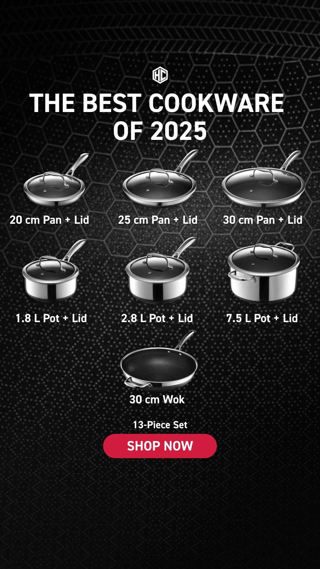
Food ads have three working shots and that's the whole category. Overhead flat lay — product centered, styled napkin or ingredient around it. Ingredient stack — product shot with raw components exploding out of or into it. Packaging hero — the box, bag, or bottle on a clean surface. Magic Spoon, Olipop, Liquid Death, Poppi, and Graza all rotate these three formats with brand-color backgrounds because it works.

What separates winners from losers in food ads is color and craft. Olipop nailed jewel-tone retro palettes. Liquid Death nailed metal tallboy plus heavy-metal aesthetic. Poppi nailed bright saturated fruit palettes. Graza nailed bright green olive oil squeeze bottles. Every one of these brands owns a color so strongly that a one-inch thumbnail is recognizable. Meta dominates paid spend, with TikTok rising fast for Gen-Z CPG brands. Copy lands under 10 words, usually playful.

Browse food ad examples pulled from real beverages, snacks, condiments, breakfast foods, and supplements-adjacent CPG. Pick a template, upload your product, and AdDogs applies your colors across three formats.
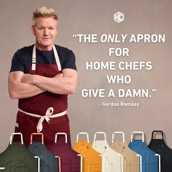
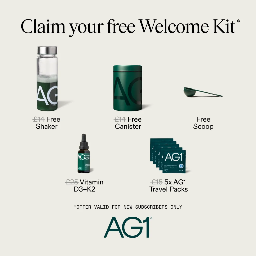
Fly By Jing — Dynamic Culinary Lifestyle Shot. Brand: Fly By Jing. This ad masterfully employs a dynamic lifestyle layout, capturing attention with a wok actively pouring noodles, creating a sense of motion and freshness. The rich, warm color palette, dominated by deep browns, reds, and golden noodles, evokes comfort, authenticity, and a gourmet experience, perfectly aligning with premium food products. Compositionally, the rule of thirds is subtly used, placing key elements like the wok, finished dish, and product jar in visually appealing zones. Wisps of steam add a sensory dimension, suggesting heat and aroma. Optimized for visual platforms like Instagram, its high-quality photography and engaging action are designed to stop the scroll. Text hierarchy is minimal, relying heavily on visual storytelling to convey the brand's essence and product appeal.. Why this ad works: Dynamic action captures culinary excitement — The image of noodles actively being poured from a wok into a bowl creates a powerful sense of movement and immediacy. This dynamic action suggests freshness and the joy of cooking, making the ad highly engaging and visually stimulating, which is crucial for cutting through social media clutter. Rich, warm palette evokes comfort and luxury — The deep, earthy tones of the background, combined with the golden noodles and the dark accents of the candles, create a luxurious yet inviting atmosphere. This color psychology resonates with consumers seeking sophisticated comfort food experiences, positioning the product as a premium ingredient for elevated home cooking. Subtle product integration enhances authenticity — The Fly By Jing chili crisp jar is strategically placed in the foreground, appearing as a natural element within the culinary scene rather than an overt advertisement. This subtle integration makes the product feel essential to the delicious outcome, building trust and desirability without being pushy.. Specs: Brand: Fly By Jing, Industry: Food & Beverage, Platform: Instagram, Format: Static, Audience: Women 25-34The Pished Fish — Lifestyle & Product Grid. Brand: The Pished Fish. The ad employs a multi-panel grid layout, combining lifestyle and product shots to build brand trust and showcase variety. The top-left panel features the founder, adding a human, authentic touch, while the top-right highlights product packaging and texture. The bottom-right panel displays a range of products, emphasizing choice and quantity. Earthy tones and natural wood textures create an organic, artisanal vibe, appealing to consumers seeking quality and provenance. The composition balances personal connection with product detail, optimized for social platforms like Instagram where diverse content performs well. Text is minimal, allowing visuals to tell the story, with the playful brand logo acting as a key visual anchor. This approach fosters consideration by presenting both the brand's personality and its offerings effectively.. Why this ad works: Authentic Founder Shot Builds Trust — The top-left image of the founder creates a personal connection, humanizing the brand. This cultivates trust and authenticity, crucial for food products, by showing the face behind the business. It suggests a hands-on approach and passion, resonating with consumers who value artisanal quality. Multi-Panel Layout Showcases Variety — The grid effectively uses multiple panels to display different aspects: the brand story, product detail, and product range. This diverse visual information caters to various viewer interests, keeping engagement high and providing a comprehensive overview of "The Pished Fish" offerings in a single glance. Earthy Tones & Natural Textures Convey Quality — The consistent use of natural wood, kraft paper packaging, and the rich orange of the salmon creates an organic and premium aesthetic. This color palette and texture choice subtly communicates quality, freshness, and a handcrafted feel, aligning with the brand's unique "booze-infused" positioning.. Specs: Brand: The Pished Fish, Industry: Food & Beverage, Platform: Instagram, Format: Carousel/Collage, Audience: GeneralOutrageous Gluten-Free Breads — Variety Display. Brand: Outrageous. This ad employs a straightforward product-on-white layout, showcasing multiple gluten-free bread loaves from "Outrageous." The composition utilizes a grid-like arrangement to highlight product variety, with each item individually wrapped and labeled. Color psychology is minimal, relying on the natural hues of the baked goods against a stark white background, which aims for a clean, honest presentation. While the layout clearly presents the offerings, the lack of dynamic styling or props means it functions more as a catalog image than an engaging ad. Text hierarchy is primarily through the small, circular labels, which are difficult to read, hindering immediate understanding of specific product benefits or flavors. This approach might be optimized for e-commerce listings where users are actively searching, rather than scroll-stopping social feeds. The overall effect is functional but lacks strong visual persuasion for a broad advertising context.. Why this ad works: Clear variety showcase on clean background — The ad effectively displays a range of gluten-free bread products against a simple white background. This direct, uncluttered presentation allows potential customers to quickly grasp the breadth of offerings, which is crucial for brands with diverse product lines. The individual wrapping also signals freshness and portion control. Direct product identification for niche audience — Each product features a distinct label, clearly stating "Gluten-Free" and the specific flavor. This direct identification immediately resonates with the target audience seeking gluten-free options, reducing cognitive load and ensuring the ad speaks directly to their dietary needs and preferences. Functional, no-frills product presentation — The ad's functional aesthetic prioritizes product visibility over elaborate styling. This straightforward approach can build trust by presenting the products without artificial embellishments, appealing to consumers who value transparency and authenticity in their food choices, especially for health-conscious items.. Specs: Brand: Outrageous, Industry: Food & Beverage, Platform: Instagram, Format: Static, Audience: GeneralVAHDAM Ashwagandha Coffee — Handheld Product & Benefit Overlay. Brand: VAHDAM INDIA. This ad employs a direct-response strategy, combining a product-in-hand shot with prominent text overlays to convey urgency and benefits. The layout places the product centrally, held by a hand, creating a relatable, in-use context. Bold, high-contrast typography dominates the upper half, immediately addressing a specific pain point ("MENOPAUSAL WEIGHT GAIN") and offering a solution. Color psychology leverages a vibrant red for the "FLAT 50% OFF" callout, creating a strong focal point and urgency. The overall composition is busy but intentionally so, packing information for a conversion-focused goal. Optimized for platforms like Facebook or Instagram, where clear value propositions and discounts drive clicks. Text hierarchy is clear, with the main headline grabbing attention, followed by product identification and benefit bubbles.. Headline: PRIME DAY SALE GOODBYE, MENOPAUSAL WEIGHT GAIN ASHWAGANDHA COFFEE IS HERE!. Primary text: Supports Weight loss Curb Cravings Supports Hormonal Balance FLAT 50% OFF. Why this ad works: Directly addresses specific pain point — The headline "GOODBYE, MENOPAUSAL WEIGHT GAIN" immediately resonates with a niche audience, creating instant relevance and stopping the scroll. This highly specific targeting ensures the ad speaks directly to those most likely to convert, increasing click-through rates and reducing wasted impressions. High-contrast sale callout creates urgency — The bright red "FLAT 50% OFF" circle is visually dominant, leveraging color psychology to draw immediate attention to the discount. This urgency-driven element is crucial for conversion-focused campaigns, signaling a limited-time opportunity and incentivizing immediate action from interested prospects. Benefit-driven text bubbles for quick value — Strategically placed bubbles like "Supports Weight loss," "Curb Cravings," and "Supports Hormonal Balance" provide quick, digestible value propositions. These reinforce the product's efficacy in solving the target audience's problems, making the ad highly persuasive without requiring extensive reading.. Specs: Brand: VAHDAM INDIA, Industry: Health & Wellness, Platform: Facebook, Format: Static, Audience: Women 45+Factor_ 2-Min Meals — Product Grid & Hero. Brand: FACTOR_. This ad employs a dynamic split-screen layout, combining a hero shot on the left with a product variety grid on the right. The hero image, featuring a hand holding a meal, adds a human touch and scale, while the grid showcases diverse meal options, appealing to varied tastes. Color psychology leverages natural food tones against dark containers, enhancing appetite appeal and product freshness. The composition guides the eye from the prominent "50% OFF" offer to the bold "2-MIN MEALS" headline, establishing immediate value and convenience. Optimized for visual platforms like Instagram, the clean presentation and clear benefit statement cut through feed clutter. Text hierarchy is effective, with the large headline capturing attention and the sub-headline reinforcing the core value proposition.. Headline: 2-MIN MEALS.. Primary text: So you can heat, eat, and go.. Why this ad works: Split-screen layout showcases variety and detail — The ad effectively uses a split-screen, dedicating the left to a detailed, in-hand hero shot, and the right to a grid of three distinct meals. This dual approach simultaneously provides a close-up, relatable view and demonstrates the breadth of meal options, addressing both quality and choice concerns for potential customers. Prominent discount drives immediate conversion intent — The bright yellow "50% OFF YOUR FIRST BOX" callout is strategically placed and visually dominant. This strong incentive immediately grabs attention and communicates significant value, crucial for driving first-time subscriptions. It creates urgency and reduces perceived risk, directly targeting conversion-focused users. Benefit-driven headline targets busy, convenience-seeking audience — The bold "2-MIN MEALS." headline directly addresses a key pain point for the target audience: lack of time. Coupled with the sub-headline "So you can heat, eat, and go.", it clearly articulates the core benefit of speed and convenience, resonating strongly with busy professionals or individuals seeking effortless meal solutions.. Specs: Brand: FACTOR_, Industry: Food & Beverage, Platform: Instagram, Format: Static, Audience: ProfessionalsFreshpet Custom Meals — Lifestyle Delivery Shot. Brand: Freshpet Custom Meals. This ad employs a vertical, lifestyle-driven layout, effectively blending brand messaging with a direct offer. The top section features the Freshpet logo and a bold, green headline, establishing freshness and delivery. Below, a human interacts with product boxes, while a charming dog anchors the scene, creating an emotional connection. A prominent circular callout highlights a "50% OFF" offer, strategically placed to capture attention. The color palette of natural greens, browns, and a clean white background reinforces the brand's organic and wholesome image. This composition is optimized for mobile feed platforms like Instagram, where its clear visual hierarchy and relatable imagery can stop the scroll. The design balances brand building with a strong conversion-focused incentive, guiding the viewer from brand recognition to offer absorption.. Headline: MADE FRESH. DELIVERED FRESH.. Primary text: 50% OFF Your First Order. Why this ad works: Lifestyle imagery builds emotional connection — The inclusion of a small, attentive dog and human hands interacting with the product boxes creates a relatable, authentic scene. This lifestyle approach humanizes the brand, fostering an emotional connection with pet owners who envision their own pets enjoying fresh meals. It moves beyond just product display to show the benefit in a real-world context. High-contrast discount offer drives urgency — The "50% OFF Your First Order" is presented in a bold, white-on-green circle, making it highly visible against the muted background. This strong visual contrast ensures the critical offer stands out immediately, signaling a clear value proposition and creating a sense of urgency for potential customers to act on the discount. Green palette reinforces freshness and natural appeal — The dominant use of green in the brand logo, headline, and discount circle immediately communicates freshness, health, and natural ingredients. This color psychology aligns perfectly with a "fresh dog food" brand, subconsciously assuring consumers of the product's quality and wholesome nature, enhancing brand perception and trust.. Specs: Brand: Freshpet Custom Meals, Industry: Pets & Animals, Platform: Instagram, Format: Static, Audience: GeneralAnti-Inflammatory Weight Loss — Food Collage Grid. This ad employs a grid-like collage layout, presenting a four-week meal plan visually around a central, bold headline. The composition uses vibrant, high-quality food photography to create an aspirational and appealing visual narrative. The cracked, earthy background provides a rustic, organic feel, contrasting with the crisp food images and the strong blue text. Text hierarchy is clear: the main challenge title dominates, followed by weekly breakdowns with nutritional data, and a crucial disclaimer at the bottom. This design is optimized for platforms like Facebook or Pinterest, where visually rich, informational content about health and lifestyle challenges performs well. The ad effectively communicates a structured plan, leveraging visual appeal to drive consideration for a health program.. Headline: Anti-Inflammatory weight loss challenge. Primary text: WEEK 1 Proteins 22g Carbs 7g Fats 6g 181 Kcal WEEK 2 Proteins 44g Carbs 11g Fats 12g 326 Kcal WEEK 3 Proteins 31g Carbs 8g Fats 5g 210 Kcal WEEK 4 Proteins 21g Carbs 7g Fats 4g 172Kcal Please consult your physician before starting. Sticking to recommended diet and exercise plans is essential for your fitness journey and can significantly affect outcomes. Most users can expect to lose up to 1-2 pounds per week over 4 weeks. Individual results may vary.. Why this ad works: Visualizing the weekly plan reduces friction — The ad effectively breaks down the "challenge" into four distinct weeks, each represented by a diverse array of appealing dishes. This visual roadmap reduces perceived complexity and commitment, making the weight loss journey seem manageable and exciting. It showcases variety, which is key for long-term adherence. (54 words) Benefit-driven headline clarifies value proposition — The central headline "Anti-Inflammatory weight loss challenge" immediately communicates the core value proposition. It targets specific health concerns (inflammation) while promising a desired outcome (weight loss), directly appealing to the audience's needs and motivations. This clear messaging grabs attention quickly. (54 words) Aspirational food photography drives desire — High-quality, vibrant images of healthy and delicious-looking meals are strategically placed. This visual feast makes the diet plan appear enjoyable and sustainable, counteracting the common perception of restrictive diets. It creates desire and positive association with the challenge. (53 words). Specs: Industry: Health & Wellness, Platform: Facebook, Format: Static, Audience: GeneralCelsius Live Fit — Dynamic Splash Product Shot. Brand: Celsius. This ad effectively leverages a dynamic hero shot composition to highlight two Celsius Live Fit flavors. The vibrant gradient background, transitioning from cool teal to warm orange, creates a visually arresting contrast that immediately grabs attention on social feeds. The cans, depicted with water droplets and emerging from a splash, evoke extreme refreshment and energy, aligning perfectly with the brand's "Live Fit" promise. The slight off-center placement and varying heights of the cans add visual interest, guiding the eye across both products. Text hierarchy is clear, with the brand and flavor names prominent, followed by key benefits and "0 SUGAR." This ad is optimized for platforms like Instagram, where its high-energy aesthetic and clear product focus can stop the scroll and communicate the brand's core message of vitality and fitness. The composition skillfully balances product detail with an aspirational, active lifestyle feel.. Why this ad works: Dynamic water splash creates refreshment cues — The realistic water droplets and splash effect on the cans instantly communicate extreme coldness and refreshment. This visual cue is crucial for beverages, triggering a physiological desire for the product and reinforcing its invigorating qualities, especially appealing to active consumers seeking immediate revitalization and a cool, crisp taste. Vibrant gradient background enhances product appeal — The striking teal-to-orange gradient background provides a high-contrast, energetic backdrop. This color choice not only makes the white cans pop but also subtly hints at tropical flavors and an active, vibrant lifestyle, aligning with the "Live Fit" brand identity and attracting attention in a busy feed with its eye-catching palette. Clear benefit hierarchy supports quick comprehension — Key benefits like "ESSENTIAL ENERGY," "ACCELERATES METABOLISM," and "BURNS BODY FAT" are clearly listed and easily readable on the cans. This direct communication of functional advantages, alongside the "0 SUGAR" callout, allows viewers to quickly grasp the product's value proposition, catering efficiently to health-conscious and fitness-oriented audiences.. Specs: Brand: Celsius, Industry: Food & Beverage, Platform: Instagram, Format: Static, Audience: Fitness EnthusiastsCÎROC Vodka & Drizly — Split Screen Product. Brand: CÎROC. This ad effectively uses a split-screen layout to balance product focus with a clear call to action and partner integration. The left panel showcases the CÎROC vodka bottle and a refreshing cocktail on icy blocks, leveraging a cool blue palette to evoke crispness and premium quality. The composition guides the eye from the product to the right panel, which features a bold headline "BLUE DOT NIGHTS. DELIVERED." and a prominent "SHOP NOW" CTA. The consistent blue gradient across both sections maintains visual harmony. This design is optimized for platforms like Instagram or Facebook, where a clean, high-contrast aesthetic with minimal, impactful text can quickly capture attention and convey the brand's sophisticated yet accessible offering. The partnership with Drizly is clearly highlighted, streamlining the path to purchase. The text hierarchy ensures brand, message, and action are easily digestible.. Primary text: BLUE DOT NIGHTS. DELIVERED.. Why this ad works: Split-screen layout balances product and message — The clear division effectively separates the aspirational product imagery from the direct-response messaging. This allows viewers to first appreciate the premium CÎROC product and then immediately understand the associated lifestyle and convenient delivery, reducing cognitive load and improving message retention. Cool blue palette evokes freshness and premium — The dominant use of various shades of blue, combined with ice elements, creates a strong visual association with coolness, refreshment, and luxury. This color psychology aligns perfectly with a vodka brand, enhancing the perceived quality and desirability of the product, especially for a "Snap Frost" variant. Prominent Drizly partnership simplifies purchase — Integrating the Drizly logo and the "DELIVERED" message directly into the ad copy clearly communicates the ease of acquisition. This direct-to-consumer delivery partnership reduces friction in the conversion funnel, making it incredibly convenient for the target audience to act on their impulse to purchase.. Specs: Brand: CÎROC, Industry: Food & Beverage, Platform: Instagram, Format: Static, Audience: Women 25-34Sakara — Editorial Product In-Use Shot. Brand: Sakara. This ad employs an editorial layout, leveraging a prominent image of product consumption flanked by text. The composition strategically places the vibrant green liquid and the user's mouth as the focal point, creating an immediate, visceral connection. High contrast colors—the natural skin tones, the striking green, and the stark black container against a clean white background—ensure visual pop. The "VOGUE" branding at the top instantly confers luxury and credibility, framing the content as premium. Text hierarchy is clear: brand association, bold headline, compelling image, then descriptive body copy. This design is highly optimized for platforms like Instagram, where high-quality, aspirational visuals and concise messaging drive engagement and brand awareness, effectively cutting through typical feed clutter.. Headline: Sakara Cuts Through the Wellness Noise. Primary text: Today, they are cutting through all the chaos and launching a collection of supplement essentials.. Why this ad works: Dynamic In-Use Visual Creates Desire — The close-up shot of the green liquid being consumed is highly engaging, immediately showcasing the product in action. This direct visual demonstration bypasses lengthy explanations, creating an aspirational connection and implying immediate benefits. It effectively communicates the product's purpose and experience, driving curiosity and desire in a scroll-heavy environment. Vibrant Green Color Signals Health & Potency — The striking, almost glowing, green hue of the liquid is a powerful visual cue. Green is universally associated with nature, health, vitality, and freshness. This color choice instantly communicates the product's natural origins and potent benefits, appealing directly to the target audience's desire for wellness and purity without needing explicit claims. Editorial Credibility via VOGUE Branding — The prominent "VOGUE" logo at the top transforms this ad into a piece of sponsored editorial content rather than a direct sales pitch. This association with a high-fashion, lifestyle publication lends immense credibility and aspirational value to Sakara, positioning it as a premium, trusted brand that resonates with a sophisticated audience.. Specs: Brand: Sakara, Industry: Health & Wellness, Platform: Instagram, Format: Static, Audience: Women 25-34Little Spoon Meals — Stacked Product Display. Brand: Little Spoon. This ad employs a product-on-background layout, showcasing a variety of Little Spoon's baby food containers and pouches alongside fresh ingredients. The vibrant, natural color palette, dominated by greens, oranges, and purples, visually reinforces the healthy, fresh nature of the product, appealing directly to health-conscious parents. The composition is somewhat cluttered but aims to convey abundance and variety. Text overlays are strategically placed to address common pain points for mothers, creating an immediate connection. This ad is optimized for social feeds like Facebook or Instagram, where its direct address to "MOMS!" and clear value proposition can quickly capture attention. The text hierarchy uses a bold headline to grab attention, followed by a bulleted list of benefits, making it easy to digest the core message.. Headline: PSA TO ALL MOMS! Little Spoon's delivered meals mean.... Primary text: No more food tantrums Less time cooking Less clean up Healthier meals More time back. Why this ad works: Directly addresses target audience pain points — The headline "PSA TO ALL MOMS!" immediately grabs the attention of the primary demographic. The subsequent bullet points directly tackle common parental struggles like food tantrums, cooking time, and cleanup, offering Little Spoon as a clear solution. This problem-solution framing is highly effective for engagement. Vibrant, natural product presentation — The colorful packaging and inclusion of fresh fruits (apple, lime, avocado) visually communicate the natural and healthy ingredients. This vibrant aesthetic is crucial for food products, especially for children, reassuring parents about the quality and appeal of the meals. It stands out in a busy feed. Clear, benefit-driven value proposition — The bulleted list "No more food tantrums," "Less time cooking," "Less clean up," "Healthier meals," and "More time back" clearly articulates the tangible benefits. This concise, easy-to-read format allows busy parents to quickly understand the core advantages of the service, driving consideration.. Specs: Brand: Little Spoon, Industry: Food & Beverage, Platform: Facebook, Format: Static, Audience: ParentsVitamix Blender — Durability Hero Shot. Brand: Vitamix. The ad employs a clean hero shot layout, prominently featuring the Vitamix blender filled with vibrant, fresh fruits, immediately conveying health and quality. The composition uses a subtle diagonal line from the blender to the cutting board, guiding the eye. Color psychology leverages the bright, natural hues of the fruit to evoke freshness and vitality, contrasting with the blender's robust grey to suggest durability. The light, minimalist background ensures the product and its key benefit stand out. Text hierarchy places the brand logo at the top, followed by a bold, benefit-driven headline ("10X LONGER"), and a clear call-to-action. This structure is optimized for quick scanning on platforms like Facebook or Instagram, where a strong visual and concise value proposition are crucial for engagement and conversion. The ad effectively communicates superior product longevity through a visually appealing and direct approach.. Primary text: Vitamix® blenders last up to 10X LONGER than an average blender.. Why this ad works: Bold Longevity Claim Drives Value Perception — The "10X LONGER" headline immediately communicates a significant competitive advantage. This specific, quantifiable claim resonates with consumers seeking durable, high-value appliances, justifying the premium price point often associated with Vitamix. It directly addresses a common pain point of appliance longevity. Vibrant Produce Enhances Health & Freshness Appeal — Filling the blender with colorful, fresh fruits and placing more on the cutting board visually reinforces the healthy lifestyle associated with Vitamix. This not only makes the product more appealing but also subtly suggests the quality of ingredients users will process, linking the blender to fresh, nutritious outcomes. Clear Visual Hierarchy for Rapid Message Absorption — The ad strategically places the brand logo, the core benefit, and the CTA in a clear, top-to-bottom flow. This visual hierarchy allows viewers to quickly grasp the brand, understand the key selling proposition (durability), and know the next step, making the ad highly efficient for fast-scrolling social feeds.. Specs: Brand: Vitamix, Industry: Home & Lifestyle, Platform: Facebook, Format: Static, Audience: GeneralStruesli Granola — Editorial Product Feature. Brand: Struesli. This ad effectively uses a clean, high-contrast layout to highlight Struesli's grain-free granola. The central white text box, framed by elegant gold ribbons, creates a strong focal point, drawing the eye directly to the product's benefits and unique selling points. The warm, rich tones of the granola in the background provide an appealing textural contrast against the crisp white, signaling natural ingredients and deliciousness. Text hierarchy is clear, with a bold headline and a descriptive body copy emphasizing "grain-free" and "healthy digestion." This composition is optimized for platforms like Instagram, where clear product presentation and informative, yet aesthetically pleasing, content can capture the attention of health-conscious consumers. The overall design communicates premium quality and health benefits, encouraging consideration.. Headline: Struesli Organic Cacao and Coffee Granola Redefined. Primary text: Our editors love this grain-free granola for its rich, no-sugar-added coffee flavor. Instead of grains like oats, Struesli makes a nut- and seed-based granola, including hemp hearts, which promote healthy digestion.. Why this ad works: Editorial-style endorsement builds trust — The "Our editors love this" phrasing lends third-party credibility, making the product claim more trustworthy than direct brand messaging. This leverages social proof, encouraging consumers to view the product as vetted and superior, which is highly effective for new or niche health foods seeking to establish authority and consumer confidence. High-contrast text box ensures readability — Placing the detailed product description within a stark white, gold-framed box against the darker, textured granola background ensures maximum readability. This design choice prevents the text from getting lost in the product's visual elements, allowing the consumer to easily absorb the key benefits and unique ingredients, crucial for informed purchasing decisions. Visual cues reinforce premium, natural appeal — The scattered granola pieces and elegant gold ribbons create a sense of abundance and celebration, subtly elevating the product's perceived value. The natural, earthy tones of the granola itself, contrasted with the clean white, visually communicate wholesome, high-quality ingredients, appealing to consumers seeking premium, healthy food options.. Specs: Brand: Struesli, Industry: Food & Beverage, Platform: Instagram, Format: Static, Audience: GeneralDaily Harvest — Fridge Product Display. Brand: Daily Harvest. This ad effectively utilizes a product-on-background layout, showcasing Daily Harvest items neatly arranged within a clean refrigerator. The composition employs a clear visual hierarchy, with the bold headline "MIX UP THE MENU" immediately capturing attention, followed by the product display, and then the brand tagline. The bright, neutral color palette of the fridge and packaging reinforces a sense of cleanliness and health, aligning with the brand's organic and wholesome image. This visual strategy is well-suited for platforms like Instagram, where lifestyle integration and aspirational product presentation drive engagement. The ad subtly suggests convenience and variety, appealing to busy individuals seeking healthy meal solutions. The text overlay is strategically placed to guide the viewer's eye without overwhelming the product visuals, ensuring brand recall and message clarity.. Headline: MIX UP THE MENU. Primary text: with Daily Harvest. Why this ad works: Authentic product-in-use context — Placing Daily Harvest products directly in a refrigerator provides immediate context for their use. This authentic, relatable setting helps potential customers visualize the products in their own homes, reducing purchase friction and making the convenience aspect tangible. It subtly communicates freshness and accessibility. Clear, bold headline captures attention — The prominent, all-caps headline "MIX UP THE MENU" acts as a strong hook. It directly addresses a common consumer desire for variety and excitement in their diet. Its high contrast against the white background ensures immediate readability and scroll-stopping power on busy social feeds. Clean aesthetic reinforces brand values — The minimalist design of the packaging and the pristine fridge environment communicate cleanliness, health, and simplicity. This visual purity aligns perfectly with Daily Harvest's brand promise of wholesome, easy-to-prepare meals, building trust and appealing to health-conscious consumers.. Specs: Brand: Daily Harvest, Industry: Food & Beverage, Platform: Instagram, Format: Static, Audience: Women 25-34Edgard Cooper — Playful Lifestyle Product Display. Brand: Edgard Cooper. This ad effectively combines emotional appeal with a clear promotional offer. The lifestyle layout features a man affectionately interacting with his dog, immediately establishing a warm, trustworthy brand image for pet owners. Products are prominently displayed in the foreground, showcasing the vibrant and distinct Edgard Cooper packaging. The composition uses a natural, home setting, enhancing relatability. Color psychology leverages bright, contrasting pink and teal overlays for the discount and gift, drawing immediate attention to the value proposition. The text hierarchy prioritizes these promotional elements, ensuring the viewer quickly grasps the incentive. Optimized for platforms like Instagram, the ad balances aspirational lifestyle content with direct-response elements, making it a scroll-stopper that communicates both brand values and a compelling offer.. Why this ad works: Emotional connection builds brand trust — The central image of a man gently feeding his dog creates an instant emotional bond with pet owners. This authentic interaction humanizes the brand, suggesting care and quality, which is crucial for pet food where trust in ingredients is paramount. It fosters a sense of shared values. High-contrast discount captures attention — The bold pink circle with "-15%" and the bright teal "Un cadeau OFFERT" overlay immediately grab the eye. These vibrant, contrasting colors cut through the natural background, ensuring the promotional offer is the first thing viewers notice, driving consideration for a purchase. Lifestyle context enhances product appeal — Placing the products within a natural home environment, surrounded by plants and featuring a happy pet, makes the brand feel approachable and integrated into a healthy lifestyle. This context helps potential customers visualize the products fitting seamlessly into their own lives.. Specs: Brand: Edgard Cooper, Industry: Pets & Animals, Platform: Instagram, Format: Static, Audience: GeneralGreens Drink — Split Screen Benefit Focus. The ad employs a split-screen layout, dedicating the right half to a vibrant product shot of a green drink and the left to clear, benefit-driven copy. This composition effectively balances visual appeal with informational clarity. The dominant green palette, reinforced by the product and text, immediately signals health and natural ingredients, aligning with the "Greens" theme. A high-contrast coral discount circle strategically placed in the upper right corner acts as a strong visual anchor, drawing immediate attention to the offer. Text hierarchy is well-defined: a bold headline "ELEVATE YOUR GREENS" introduces the product, followed by three distinct benefits with supporting icons, making information easily digestible. This design is optimized for platforms like Instagram or Facebook, where quick scanning and clear value propositions are crucial for engagement. The overall clean aesthetic and direct messaging aim for conversion by highlighting both product appeal and tangible benefits.. Headline: ELEVATE YOUR GREENS. Primary text: Supports Immunity Detoxifying Boosts Metabolism. Why this ad works: Split-screen layout balances product and benefits — By dividing the frame, the ad simultaneously showcases the appealing product and its key advantages. This dual focus ensures that viewers quickly grasp both what the product is and why they need it, preventing information overload while maintaining visual interest, crucial for fast-paced social feeds. High-contrast discount circle captures attention — The coral "UP TO 40% OFF" circle stands out dramatically against the muted background and green palette. Positioned in the upper right, a common scan point, it immediately communicates a strong incentive, driving urgency and increasing click-through rates for price-sensitive audiences. Iconography enhances benefit readability and recall — Pairing each benefit ("Supports Immunity," "Detoxifying," "Boosts Metabolism") with a relevant, simple icon makes the information scannable and memorable. Icons break up text, improve comprehension, and visually reinforce the health claims, making the ad more effective for quick consumption on mobile.. Specs: Industry: Health & Wellness, Platform: Instagram, Format: Static, Audience: GeneralFACTOR_ Meal Kit — Whiteboard Benefit Highlight. Brand: FACTOR_. This ad leverages a raw, whiteboard aesthetic to create an authentic, relatable connection. The central Factor_ meal kit box is surrounded by informal, handwritten text, mimicking a quick sketch of a problem and solution. The layout uses a clear visual hierarchy: the "I'm Lazy" headline immediately grabs attention, followed by the prominent "50% off" offer in blue, drawing the eye to the key conversion driver. The monochromatic white background with black text is punctuated by vibrant blue and purple markers, strategically highlighting the discount and ease-of-use. This informal composition is highly optimized for social platforms like Instagram or TikTok, where user-generated content and candid styles perform well. The text hierarchy guides the viewer from problem identification to solution and incentive, making it highly effective for direct-response marketing.. Headline: I'm Lazy. Primary text: 50% off Your first box! this is so easy!. Why this ad works: Relatable problem statement hooks audience — The headline "I'm Lazy" immediately resonates with a broad audience, creating an instant connection and empathy. This direct address positions the product as a solution to a common, everyday struggle. By acknowledging the viewer's pain point upfront, the ad effectively primes them to receive the subsequent offer and benefit, increasing engagement and relevance. Authentic handwritten aesthetic builds trust — The use of whiteboard and marker text breaks through the polished, often sterile, look of many digital ads. This informal, almost user-generated content style fosters trust and authenticity, making the ad feel less like a sales pitch and more like a genuine recommendation or a quick, relatable thought from a peer. Prominent, clear discount drives conversion — The "50% off Your first box!" is written in a contrasting blue marker and pointed to with an arrow, making it the most visually dominant call to action. This direct and generous incentive is crucial for driving immediate conversions, especially for a subscription-based product where initial commitment can often be a significant barrier.. Specs: Brand: FACTOR_, Industry: Food & Beverage, Platform: Instagram, Format: Static, Audience: ProfessionalsCat Person — Playful Product & Pet Lifestyle. Brand: Cat Person. This ad employs a dynamic overhead lifestyle layout, showcasing Cat Person products alongside an engaging kitten. The composition leverages natural light and a warm wooden floor, creating an inviting, authentic atmosphere. Product boxes, featuring vibrant, playful illustrations, are strategically scattered, drawing the eye across the frame. A prominent blue circular overlay highlights a clear discount offer, while a bold, benefit-driven headline anchors the bottom. The text hierarchy guides the viewer from the offer to the product benefits. This design is optimized for social feeds like Instagram, where genuine pet content and clear value propositions drive engagement and consideration among pet owners seeking premium, transparent pet food options. The overall vibe is clean yet playful, effectively communicating brand personality and product quality.. Headline: No grains. No filler. No BS.. Primary text: Get 25% off your Starter Box today. Why this ad works: Authentic pet interaction enhances lifestyle appeal — The inclusion of a curious kitten interacting with the brand's shipping box creates an immediate emotional connection. This authentic, unposed moment transforms the ad from a simple product display into a relatable lifestyle scene, significantly increasing engagement and memorability among pet owners scrolling through their social feeds. Bold, benefit-driven headline cuts through noise — The direct and assertive headline "No grains. No filler. No BS." instantly communicates core product benefits and brand values. This transparent, no-nonsense approach resonates with discerning pet owners, building trust and positioning Cat Person as a premium, health-conscious choice, effectively addressing common concerns in pet nutrition. Playful product packaging adds visual interest — The clean white product boxes are adorned with vibrant, stylized illustrations of the ingredients (fish, chicken). These playful designs not only make the products visually appealing but also clearly communicate the different recipes. This artistic touch elevates the brand's aesthetic, making the ad more engaging and distinctive in a crowded market.. Specs: Brand: Cat Person, Industry: Kids & Family, Platform: Instagram, Format: Static, Audience: Women 25-34Hungry? Eggs & Benefits — Vibrant Split Screen. This ad employs a dynamic split-screen layout, positioning a visually appealing bowl of boiled eggs on the right against a vibrant blue-to-green gradient background on the left. The composition uses a diagonal line to separate the product image from the benefit-driven text, creating an engaging visual flow. Color psychology leverages the fresh, energetic feel of blues and greens, complemented by the natural yellows of the eggs, signaling health and vitality. The large, bold "Hungry?" headline acts as a powerful hook, establishing a clear text hierarchy. Below it, three concise, icon-supported benefit statements are easily scannable, optimizing for quick consumption on platforms like Instagram. This design effectively addresses a pain point and offers solutions, making it highly effective for initial awareness and engagement in a mobile feed environment.. Headline: Hungry?. Primary text: CUT CRAVINGS WITH NATURAL APPETITE CONTROL BOOST METABOLISM FOR FASTER FAT BURN KEEP YOURSELF FOCUSED — NO CRASH, NO NONSENSE. Why this ad works: Direct question hooks audience immediately — The large, bold "Hungry?" headline directly addresses a common pain point, immediately grabbing attention. This question-based hook creates instant relatability and curiosity, prompting viewers to engage further with the ad's proposed solutions for managing hunger and energy. Vibrant gradient background signals vitality — The bright blue-to-green gradient background is visually striking and psychologically links to freshness, nature, and vitality. This color choice creates an energetic and positive mood, reinforcing the health benefits of the product/concept being advertised and making the ad highly noticeable in a busy feed. Icon-driven benefits enhance scannability — Using clear, relevant icons alongside concise benefit statements ("Cut cravings," "Boost metabolism," "Keep yourself focused") significantly improves scannability. This visual shorthand allows viewers to quickly grasp the core value propositions, making the ad effective for fast-paced mobile consumption and improving message retention.. Specs: Industry: Health & Wellness, Platform: Instagram, Format: Static, Audience: Fitness EnthusiastsMÄNNKITCHEN Pepper Cannon — In-Use Testimonial Shot. Brand: MÄNNKITCHEN. This ad effectively leverages a dynamic in-use hero shot to showcase the MÄNNKITCHEN Pepper Cannon. The composition places the product and the action of grinding pepper centrally against a stark black background, creating high contrast that immediately draws the eye. The dark, minimalist aesthetic conveys a sense of premium quality and robust performance. A prominent testimonial from Food Network serves as the primary headline, providing powerful third-party validation and building instant trust. This text is strategically highlighted in blue, ensuring readability and attention. The overall layout is optimized for social feeds like Instagram, where its bold visual and clear value proposition can quickly stop the scroll and drive consideration. The focus is on demonstrating efficacy and authority, rather than just product features.. Headline: Mannkitchen Pepper Cannon is the pepper grinder of all pepper grinders.. Why this ad works: Dynamic action shot highlights product efficacy — The dynamic image of pepper actively grinding and falling immediately demonstrates the product's primary function and power. This visual proof of performance is more compelling than a static product shot, engaging viewers by showing the 'what it does' rather than just 'what it is'. Third-party endorsement builds instant trust — Featuring the 'Food Network' logo prominently next to a strong testimonial from them leverages their established authority and credibility. This acts as powerful social proof, instantly validating the product's quality and performance to a target audience interested in culinary tools. High-contrast dark aesthetic conveys premium quality — The deep black background with the sleek black grinder and subtle lighting creates a sophisticated, high-end visual. This minimalist, bold aesthetic communicates premium quality and durability, appealing to consumers who value robust, well-designed kitchen tools over generic alternatives.. Specs: Brand: MÄNNKITCHEN, Industry: Food & Beverage, Platform: Instagram, Format: Static, Audience: GeneralSabre Paris Cutlery — Playful Flat Lay. Brand: Sabre Paris. This ad employs a minimalist flat lay composition, leveraging vibrant, high-contrast colors to capture attention. The deep blue background, magenta oval plate, bright yellow spoon handle, and green bean create a playful yet sophisticated palette. The layout strategically places the brand name top-left, aligning with natural eye movement. The simple arrangement of the spoon and bean on the plate creates visual interest through color and form, hinting at quality kitchenware. This design is optimized for platforms like Instagram, where bold aesthetics and clean imagery stand out in a busy feed. The low text overlay ensures the product's design and color harmony are the primary focus, appealing to an audience that values modern design and lifestyle. The composition is uncluttered, allowing for easy comprehension and strong brand recall.. Why this ad works: Vibrant, contrasting colors create visual pop — The bold combination of deep blue, magenta, bright yellow, and natural green immediately draws the eye. This high-contrast palette ensures the ad stands out in a crowded social feed, increasing scroll-stopping power and memorability for the brand's distinctive style. Minimalist flat lay highlights product design — By featuring just the spoon and a single green bean on a simple oval plate, the ad focuses entirely on the product's aesthetic. This clean, uncluttered composition emphasizes the spoon's unique yellow handle, signaling premium design and quality without distraction. Strategic brand placement for recall — The "SABRE PARIS" logo is positioned clearly in the upper left quadrant. This prime placement ensures immediate brand recognition as users scan the image, reinforcing brand association with the stylish product and overall vibrant aesthetic.. Specs: Brand: Sabre Paris, Industry: Home & Lifestyle, Platform: Instagram, Format: Static, Audience: GeneralNespresso Barista Frother — In-Use Action Shot. Brand: Nespresso. The ad leverages an "in-use" action shot, dynamically showcasing the Nespresso milk frother pouring frothed milk into a coffee cup. This composition immediately engages viewers by demonstrating the product's function and the aspirational outcome. A sophisticated color palette of deep navy, warm coffee, and crisp white milk creates a luxurious yet inviting atmosphere, with the dark background making the metallic frother and white milk visually pop. The diagonal stream of milk acts as a strong leading line, guiding the eye from product to result. Optimized for visual platforms like Instagram, its clean, professional aesthetic is designed to stop the scroll. The single, bold text line at the bottom reinforces the aspirational message, complementing the visual without overwhelming it, ensuring the product's premium positioning is clear.. Primary text: RÉALISEZ DES CAFÉS COMME UN VRAI BARISTA. Why this ad works: Dynamic action shot engages viewers — The image captures the precise moment of milk being poured into coffee. This dynamic action creates immediate visual interest and demonstrates the product's function in a compelling, engaging way, making the ad feel alive and interactive rather than static, which is crucial for scroll-stopping performance. Aspirational lifestyle messaging resonates strongly — The text "RÉALISEZ DES CAFÉS COMME UN VRAI BARISTA" (Make coffees like a real barista) directly taps into the desire for professional-quality results at home. This aspirational framing elevates the product beyond a simple kitchen appliance, positioning it as a tool for mastering a craft and enhancing daily life. Premium visual contrast enhances product focus — The deep blue background provides a rich, elegant contrast to the shiny metallic frother and the bright white frothed milk. This high contrast not only makes the product stand out prominently but also reinforces a sense of luxury and quality, aligning perfectly with Nespresso's premium brand identity.. Specs: Brand: Nespresso, Industry: Food & Beverage, Platform: Instagram, Format: Static, Audience: GeneralStarbucks Honey Vanilla Coffee — Vibrant Product Display. Brand: Starbucks. This ad leverages a monochromatic yellow palette to create an immediate sense of warmth and energy, perfectly aligning with coffee's stimulating nature. The composition uses varying heights with yellow risers to create dynamic visual interest and hierarchy, guiding the eye from the hero product (coffee bag) to the supporting elements (mug, honey, vanilla). The generous negative space at the top ensures the ad feels clean and premium, preventing clutter despite multiple elements. This bright, high-contrast aesthetic is highly optimized for platforms like Instagram, where vibrant imagery cuts through feed noise. The minimal text overlay keeps the focus on the product's visual appeal and flavor cues, allowing the strong branding and inviting presentation to drive consideration. The arrangement suggests a lifestyle of enjoyment and indulgence, appealing to sensory desires.. Why this ad works: Monochromatic yellow creates vibrant energy — The dominant bright yellow background and risers create a cheerful, energetic mood, instantly grabbing attention. This color choice is strongly associated with happiness and warmth, effectively communicating the inviting nature of coffee and the sweet, mellow flavors of honey and vanilla. It stands out in a crowded feed. Dynamic composition with varied heights — Utilizing yellow risers of different heights for the coffee bag, mug, and honey bowl creates a visually engaging and dynamic composition. This technique adds depth and prevents the layout from appearing flat, guiding the viewer's eye through the product and its key flavor components in an appealing, organized manner. Clear flavor cues enhance product appeal — The inclusion of a honey bowl with a dipper, vanilla flowers, and vanilla pods directly communicates the product's flavor profile. These natural ingredients visually reinforce the "Honey & Madagascar Vanilla" claim, making the product's taste promise tangible and appealing to consumers seeking specific flavor experiences.. Specs: Brand: Starbucks, Industry: Food & Beverage, Platform: Instagram, Format: Static, Audience: GeneralSoylent Creamy Chocolate — Feature-Rich Product Shot. Brand: Soylent. This ad employs a split-screen layout, dedicating the left half to key benefits and the right to a hero shot of the product. The minimalist color palette, primarily white and shades of brown, conveys a clean, scientific, and trustworthy brand image, aligning with the "Science-Backed" claim. Compositionally, the product bottle is strategically placed to the right, balanced by a strong, bold headline and clear iconography on the left. This ensures optimal information absorption for users quickly scrolling through feeds like Instagram or Facebook. The text hierarchy is clear: a prominent headline, followed by easily digestible feature icons, and then product specifics on the bottle. This design effectively communicates both the product's appearance and its core value proposition, making it suitable for platform optimization where quick comprehension is key.. Headline: Complete Nutrition. Science-Backed. Sustainable.. Why this ad works: Split layout for information density — The ad effectively uses a split layout to present both the product and its key benefits simultaneously. This allows viewers to quickly grasp what the product is and why it's valuable without needing to scroll or click away, enhancing immediate comprehension in fast-paced feed environments. Iconography for quick feature comprehension — The use of clean, simple icons for "20g Protein," "Plant Based / Vegan," "Healthy Fats," and "28 Vitamins & Minerals" allows for rapid scanning and understanding of the product's core advantages. This visual shorthand is highly effective for conveying complex nutritional information efficiently. Minimalist palette signals scientific credibility — The predominantly white background with black text and simple line icons, complemented by the product's natural brown, creates a clean and professional aesthetic. This minimalist approach reinforces the "Science-Backed" claim, building trust and positioning Soylent as a reliable, no-nonsense nutritional solution.. Specs: Brand: Soylent, Industry: Health & Wellness, Platform: Instagram, Format: Static, Audience: Fitness EnthusiastsSweetgreen — Overhead Meal Spread. Brand: sweetgreen. This ad employs a dynamic overhead flat lay composition, showcasing multiple Sweetgreen meals to emphasize variety and freshness. The vibrant, natural colors of the food contrast effectively with the warm wooden table, creating strong appetite appeal. A bold, neon yellow headline "YOU DO IT ALL, WE DO DINNER" immediately captures attention, leveraging a pain point (busyness) with a clear solution. The dark green call-to-action button, "Order for pickup or delivery," provides a strong visual anchor and clear next step. Optimized for vertical platforms like Instagram Stories or Reels, the layout is busy but intentionally so, conveying abundance. The text hierarchy prioritizes the value proposition, making it instantly digestible, while the overall aesthetic aligns with a healthy, convenient lifestyle brand.. Headline: YOU DO IT ALL, WE DO DINNER. Why this ad works: Dynamic overhead flat lay showcases variety — The overhead flat lay composition effectively displays multiple meal options, highlighting Sweetgreen's diverse menu. This visual abundance communicates value and choice, appealing to consumers looking for convenient, healthy meals. The dynamic arrangement prevents monotony, keeping the viewer engaged with the various offerings. Vibrant food colors create strong appetite appeal — The rich, natural colors of the ingredients—greens, reds, oranges—are highly saturated and visually appealing. This vibrant palette stimulates hunger and conveys freshness and quality, which are crucial for food advertising. It makes the meals look delicious, wholesome, and ready-to-eat, driving desire. Bold, benefit-driven headline offers clear solution — The large, neon yellow headline "YOU DO IT ALL, WE DO DINNER" immediately addresses a common consumer pain point: lack of time. It positions Sweetgreen as the convenient solution, offering a clear benefit. The high contrast against the background ensures maximum readability and instant impact, grabbing attention quickly.. Specs: Brand: sweetgreen, Industry: Food & Beverage, Platform: Instagram, Format: Static, Audience: GeneralBeyond Burger — Nutritional Comparison Layout. Brand: Beyond Burger. This ad employs a clear split-screen comparison layout, directly contrasting Beyond Burger's nutritional profile against traditional beef. The dark green background provides a strong, earthy foundation, while vibrant green highlights key positive stats, leveraging color psychology to emphasize health benefits and naturalness. Compositionally, the side-by-side product images establish the comparison immediately, followed by a vertical hierarchy of data points, each supported by intuitive icons for quick comprehension. Optimized for platforms like Facebook or Instagram, where users can pause to digest detailed information, it aims to educate and persuade through data. The prominent text hierarchy, from bold product names to detailed stats and a conclusive, action-oriented headline, guides the viewer through the compelling evidence, positioning Beyond Burger as the superior, healthier choice. The high text density is justified by the ad's informative, fact-based approach.. Headline: OUR STATS SPEAK FOR THEMSELVES.. Primary text: NO GMOS, NO ADDED HORMONES OR ANTIBIOTICS**. Why this ad works: Direct comparison drives clear persuasion — The side-by-side layout immediately establishes a clear contrast between Beyond Burger and beef. This direct comparison, supported by specific nutritional data, allows consumers to quickly grasp the product's advantages, making a compelling, fact-based case for switching to plant-based options. Color-coded data for quick scan — Using bright green for Beyond Burger's superior stats (0mg Cholesterol, 2g Sat. Fat) against the dark background draws the eye and visually reinforces the positive attributes. This color coding simplifies complex nutritional information, enabling rapid comprehension and highlighting key benefits at a glance. Iconography enhances data readability and recall — The inclusion of simple, universally recognized icons (bicep for protein, heart for cholesterol, droplet for saturated fat) alongside the numerical data significantly improves readability and recall. These visual cues make the health benefits more accessible and impactful, even for a quick glance in a busy feed.. Specs: Brand: Beyond Burger, Industry: Food & Beverage, Platform: Facebook, Format: Static, Audience: GeneralToast POS System — Bold Product on Background. Brand: Toast. This ad leverages a high-contrast, bold orange background to immediately capture attention, a strategic choice for competitive social feeds. The central placement of the Toast POS system, with a clear UI screenshot, grounds the abstract offer in a tangible product. Text hierarchy is clear: a benefit-driven headline at the top, followed by a compelling zero-cost offer, both in large, white, sans-serif font for maximum readability. The brand logo is subtly placed at the bottom-left, reinforcing identity without distracting from the main message. This composition is optimized for quick comprehension on mobile, using color psychology (orange for energy/urgency) and direct language to appeal to small business owners seeking efficient, affordable solutions. The minimalist approach ensures the core message isn't diluted.. Headline: Diseñado para cada paso del camino.. Primary text: Comience hoy mismo por $0.. Why this ad works: High-contrast orange background grabs attention — The vibrant orange background with stark white text creates an unmissable visual. This high contrast is crucial for cutting through cluttered social feeds, ensuring the ad stops the scroll and immediately draws the viewer's eye to the core message and product, maximizing initial engagement. Clear, benefit-driven headline and offer — The headline "Diseñado para cada paso del camino" (Designed for every step of the way) combined with "Comience hoy mismo por $0" (Start today for $0) clearly communicates value and removes friction. This direct, benefit-oriented messaging resonates strongly with small business owners looking for comprehensive, affordable solutions. Product UI screenshot builds trust and clarity — Featuring a clear screenshot of the POS system's user interface, specifically the tipping screen, provides immediate context and demonstrates functionality. This visual proof helps potential customers understand the product's real-world application, building trust and reducing perceived risk for a SaaS offering.. Specs: Brand: Toast, Industry: Software & Tools, Platform: Facebook, Format: Static, Audience: Small Business OwnersThe Gut Stuff — High Fibre Bar Comparison. Brand: the gut stuff. This ad employs a split-screen comparison layout, effectively contrasting "the gut stuff" bar against an "average high fibre bar." The vibrant pink and muted grey color palette immediately draws attention, with the pink side visually dominating and signaling the brand's energetic personality and health benefits. Compositionally, the product packaging is centrally placed, with clear, bold text hierarchy guiding the viewer through key nutritional differences. The use of checkmarks and crosses provides instant visual cues for benefits and drawbacks, simplifying complex information. This design is optimized for platforms like Instagram or Facebook, where quick, digestible information and strong visual differentiation are crucial for stopping the scroll and driving consideration. The playful yet informative tone makes complex nutritional data accessible and persuasive, highlighting the brand's superior offering.. Headline: Average High Fibre Bar vs. The Gut Stuff High Fibre Bars. Primary text: 3g fibre vs 10g fibre, 150+ calories vs under 130 calories, Nasties: Yes vs No. Why this ad works: Clear split-screen comparison drives differentiation — The ad's core strength is its direct side-by-side comparison. By visually and numerically contrasting "the gut stuff" with an "average" bar, it immediately highlights the brand's superior benefits in fibre, calories, and "nasties." This technique is highly effective for consideration-stage audiences, providing clear reasons to choose the advertised product over competitors. Vibrant color contrast grabs attention — The bold use of bright pink for "the gut stuff" side against a neutral grey for the "average" bar creates strong visual appeal. This vibrant contrast not only makes the ad pop in a busy feed but also psychologically associates the brand with energy, health, and positivity, while the grey implies dullness or lack of excitement from competitors. Iconography and bold text simplify data — The ad effectively uses large, bold text for numerical comparisons and clear checkmark/cross icons. This visual shorthand makes complex nutritional information instantly digestible. Viewers can quickly grasp the key advantages (more fibre, fewer calories, no nasties) without needing to read extensive copy, optimizing for fast-paced mobile consumption and immediate impact.. Specs: Brand: the gut stuff, Industry: Food & Beverage, Platform: Instagram, Format: Static, Audience: Women 25-34Doris Market — Vibrant Produce Section In-Store. Brand: Doris. This ad employs an immersive, wide-angle shot of a grocery store's vibrant produce section, effectively communicating abundance and freshness. The layout strategy focuses on filling the frame with colorful fruits and vegetables, creating a sense of natural bounty. Color psychology leverages the rich reds, greens, and oranges of the produce, evoking health, appetite, and natural goodness. Warm overhead lighting and rustic wooden accents enhance a welcoming, organic vibe. Composition uses depth of field to draw the eye from the foreground tomatoes and avocados to the broader "Italian Garden" display, suggesting a premium, curated selection. Optimized for visual platforms like Instagram, this ad stops the scroll with its appealing, natural aesthetic. Text hierarchy is minimal, relying on in-store signage for pricing, allowing the visual appeal to be the primary persuasive element.. Why this ad works: Abundance and Freshness Display — The overflowing bins of vibrant, colorful produce immediately convey freshness and variety. This visual abundance assures potential customers of a well-stocked store with high-quality, appealing ingredients, directly addressing a key desire for grocery shoppers. It fosters trust and encourages an in-person visit. Inviting, Natural Store Atmosphere — The warm lighting, rustic wooden ceiling accents, and "Italian Garden" backdrop create an inviting, almost artisanal shopping experience. This aesthetic differentiates Doris Market from generic supermarkets, appealing to consumers seeking a more pleasant and premium environment for their grocery shopping. Transparent and Competitive Pricing — The clearly visible chalkboard signs displaying prices for tomatoes ($1.49/lb) and avocados (99¢ ea) offer immediate value perception. This transparency builds trust and can attract price-sensitive shoppers, demonstrating that quality produce is available at competitive rates, encouraging consideration.. Specs: Brand: Doris, Industry: Food & Beverage, Platform: Instagram, Format: Static, Audience: GeneralAnveshan Oils — Health-Focused Product Display. Brand: Anveshan. This ad effectively uses a clean product display layout to highlight Anveshan's range of cold-pressed oils, centered around a strong health benefit. The composition places four product bottles prominently on a minimalist white background, allowing their natural colors to stand out. Green and yellow in the text and background elements evoke natural, healthy connotations, aligning with the "Goodbye Cholesterol" headline. Text hierarchy is clear: the bold headline immediately grabs attention, followed by a supporting tagline and social proof elements. The overall design is optimized for platforms like Facebook or Instagram, where clear product visuals combined with trust signals (reviews, satisfied families) can drive consideration. The subtle leaf elements add an organic touch without clutter.. Headline: Goodbye Cholesterol. Primary text: India's favourite cold-pressed oils. Why this ad works: Clear Health Benefit Headline — The "Goodbye Cholesterol" headline immediately communicates a key health advantage, resonating with a health-conscious audience. This direct, benefit-driven approach captures attention quickly in a crowded feed, making the ad relevant to potential customers seeking healthier cooking options. Strong Social Proof Integration — The "2,500+ 5 Star Reviews on Amazon" and "2,00,000+ Satisfied Families" are prominently displayed. These trust signals build credibility and reduce perceived risk, encouraging potential buyers to consider the product based on widespread positive customer experience. Clean Product Display & Branding — The four oil bottles are neatly arranged against a simple white background, ensuring product clarity. Each bottle's label is readable, reinforcing brand identity and product variety. This clean aesthetic emphasizes the natural quality of the oils without visual distractions.. Specs: Brand: Anveshan, Industry: Health & Wellness, Platform: Facebook, Format: Static, Audience: GeneralAthletics Fit Miami — Kitchen Lifestyle Shot. Brand: Athletics Fit Miami. This ad effectively uses a lifestyle composition to showcase a meal prep service. The central focus is a fit woman unpacking branded meal containers in a modern kitchen, immediately associating the product with a healthy, convenient lifestyle. The bright green cooler bag stands out against the warm, earthy kitchen tones, drawing the eye to the brand. Compositionally, the woman's action creates a natural visual flow, guiding the viewer from the bag to the prepared meals. This ad is optimized for platforms like Instagram, where aspirational lifestyle content resonates strongly with fitness-conscious audiences. The minimal text overlay on the bag provides essential brand information without distracting from the visual narrative, allowing the image to tell the story of ease and wellness. The overall clean aesthetic reinforces the idea of fresh, healthy food.. Why this ad works: Lifestyle integration demonstrates convenience — The ad shows a fit individual seamlessly incorporating meal prep into her daily routine within a modern kitchen setting. This visually communicates the ease and convenience of the service, directly addressing a key pain point for busy, health-conscious consumers. It makes the product aspirational and attainable. Vibrant brand bag creates strong focal point — The bright, almost neon, green cooler bag immediately captures attention against the muted kitchen backdrop and the woman's neutral attire. This high-contrast element ensures the brand's identity and product offering are the first things a viewer notices, enhancing brand recall and product recognition in a busy feed. Authentic portrayal builds audience trust — The ad features a natural-looking woman in a realistic home environment, rather than an overly stylized studio shot. This authenticity fosters relatability and trust with the target audience of fitness enthusiasts, who often value genuine experiences and practical solutions over polished, unrealistic portrayals.. Specs: Brand: Athletics Fit Miami, Industry: Food & Beverage, Platform: Instagram, Format: Static, Audience: Fitness EnthusiastsDiverse Women Friends — Lifestyle Group Shot. This lifestyle ad effectively leverages a diverse group of four smiling women in a warm, inviting outdoor setting. The composition places the subjects centrally, making direct eye contact, which fosters immediate relatability and connection with the viewer. The natural lighting and brick background, adorned with string lights, create an authentic, aspirational atmosphere. Color psychology leans into warm tones, evoking comfort and social belonging, ideal for building brand affinity. Optimized for platforms like Instagram, this visual-first approach thrives on authentic representation and emotional resonance. The absence of overt text keeps the focus entirely on the human element, allowing the genuine expressions and diverse casting to communicate a message of community and shared positive experiences, making it highly effective for awareness and engagement campaigns.. Why this ad works: Authentic smiles build immediate connection — Genuine smiles from diverse models create an instant emotional connection, fostering relatability and trust. This approach bypasses overt sales pitches, instead building brand affinity through positive association. It's highly effective for awareness and engagement campaigns by making the brand feel approachable and human. Diverse casting enhances broad appeal — Featuring a diverse group of women ensures wider audience representation and relatability. This inclusive approach signals a brand that values diversity, resonating positively with a broad demographic and making the ad feel more authentic and less manufactured, thereby increasing its overall reach and impact. Warm, inviting setting creates aspirational mood — The cozy outdoor cafe setting with string lights and brick walls evokes a sense of warmth, community, and relaxed enjoyment. This aspirational lifestyle imagery positions the brand as part of desirable social experiences, enhancing emotional appeal and brand perception, making it highly memorable.. Specs: Industry: Fashion & Apparel, Platform: Instagram, Format: Static, Audience: Women 25-34Vital Proteins Collagen — Feature Spotlight Flat Lay. Brand: Vital Proteins. This ad employs a split-screen composition, dedicating the left side to key product benefits and the right to a hero shot of the collagen powder. The rich, earthy brown background evokes natural ingredients and premium quality, while the contrasting white text and icons ensure high readability. The golden spoon with the dark powder adds texture and visual interest, making the product tangible. Text hierarchy is clear: brand at the top, followed by a scannable list of benefits with supporting icons, optimized for quick comprehension on mobile feeds like Instagram. This layout effectively communicates product features and benefits, aiming to educate and build consideration by visually anchoring the claims to the product itself. The minimalist approach focuses attention without distraction.. Headline: VITAL PROTEINS COLLAGÈNE. Primary text: 20g Peptides de collagène Peau, cheveux et ongles Os & muscles Sans sucres. Why this ad works: Clear Iconography for Benefit Communication — The use of distinct white icons alongside concise French text immediately conveys the core benefits of the collagen. This visual shorthand allows for rapid information processing, crucial for scroll-heavy platforms. Viewers can quickly grasp "skin, hair, nails," "bones & muscles," and "no sugar" without deep reading, enhancing ad recall and comprehension. Earthy Palette Signals Natural Premium Quality — The deep brown background, combined with the golden spoon and dark collagen powder, creates an organic and sophisticated aesthetic. This color psychology suggests natural origins and high quality, resonating with health-conscious consumers seeking trustworthy supplements. It avoids clinical sterility, fostering a sense of warmth and approachability for a wellness product. Product Texture Enhances Tangibility and Appeal — The close-up shot of the collagen powder in the spoon, with some spillage, highlights its fine texture and natural appearance. This visual detail makes the product feel more tangible and authentic, allowing potential customers to imagine its use. It adds a sensory dimension, reinforcing the product's natural and unrefined quality, which is appealing in the health supplement market.. Specs: Brand: Vital Proteins, Industry: Health & Wellness, Platform: Instagram, Format: Static, Audience: Women 25-34Nuun Hydration Chart — Educational Infographic. Brand: Nuun. This ad effectively uses a simple infographic layout to educate on hydration, leveraging a clean, high-contrast design. The bright white background and bold blue text (Nuun's brand color) ensure readability and visual pop on busy social feeds. The numbered list with color swatches creates a clear visual hierarchy, guiding the eye from top to bottom. Playful, conversational language ("What's Ur Urine Telling U?", "You're golden!", "No. Just no.") makes a potentially sensitive topic approachable and engaging. This content-first approach builds brand authority and trust by providing value, subtly positioning Nuun as a solution without a hard sell. It's optimized for platforms like Instagram or Facebook where educational, shareable content thrives, driving engagement and soft awareness.. Headline: What's Ur Urine Telling U?. Primary text: 1 You're in the clear! 2 Hydrated and happy! 3 You're golden! 4 Time to hydrate! 5 Ok, seriously go drink something 6 Please! Hydrate! Now! 7 No. Just no.. Why this ad works: Educational content builds brand authority — By providing valuable, actionable information about hydration, Nuun positions itself as a helpful expert. This soft-sell approach fosters trust and goodwill with the audience, making them more receptive to the brand's products in the future, rather than immediately pushing a sale. Playful language makes health approachable — The use of informal language like "Ur," "U," and phrases such as "You're golden!" or "No. Just no." injects personality and humor into a potentially dry or sensitive topic. This lighthearted tone increases engagement and makes the information more memorable and shareable, appealing to a broader audience. Clear visual hierarchy guides attention — The numbered list, distinct color swatches, and consistent text alignment create a strong visual flow. This clear structure makes the information easy to digest quickly, allowing users to scan and understand their hydration status at a glance, which is crucial for fast-paced social media consumption.. Specs: Brand: Nuun, Industry: Health & Wellness, Platform: Instagram, Format: Static, Audience: Fitness EnthusiastsRaw Brisket & Veggies — St. Patrick's Flat Lay. This ad utilizes a clean flat lay composition, showcasing a raw brisket alongside fresh ingredients like cabbage, potatoes, and spices on a bright marble surface. The overhead shot creates an inviting, organized visual, hinting at a meal preparation context. Color psychology leverages the vibrant red of the meat for appetite appeal, contrasted with natural greens and earthy tones, suggesting freshness and quality. The prominent "FEELING LUCKY" text, in a bold green, acts as a clear, festive call-out, likely tying into a St. Patrick's Day theme. This simple text hierarchy ensures immediate readability. Optimized for visual-first platforms like Instagram or Pinterest, the square format and high-quality food photography are designed to stop the scroll and inspire culinary interest, positioning the ingredients as premium and ready for a celebratory meal. The overall clean aesthetic reinforces a sense of quality and ease of preparation.. Headline: FEELING LUCKY. Why this ad works: Festive text hooks seasonal audience — The bold "FEELING LUCKY" text immediately connects with St. Patrick's Day, leveraging seasonal relevance. This specific, playful phrase creates an emotional hook, making the ad highly resonant for users planning holiday meals or seeking themed content, increasing engagement and recall. This is a strong contextual play. Flat lay composition highlights fresh ingredients — The overhead flat lay effectively showcases all components of a potential meal – raw meat, cabbage, potatoes, and spices. This technique allows viewers to quickly grasp the quality and variety of ingredients, inspiring meal ideas and reinforcing the brand's commitment to fresh, wholesome products, which is key for food marketing. Vibrant colors create strong appetite appeal — The rich red of the meat, fresh green of the cabbage and text, and earthy tones of the spices create a visually appealing palette. These natural, vibrant colors stimulate appetite and convey freshness, making the ingredients look high-quality and desirable, crucial for effective food advertising and driving purchase intent.. Specs: Industry: Food & Beverage, Platform: Instagram, Format: Static, Audience: GeneralCivil Pour — Craft Beverage Assortment Flat Lay. Brand: Civil Pour. This ad effectively utilizes a product-on-background layout to showcase Civil Pour's diverse beverage offerings, from craft coffee to specialty beer. The composition employs a shallow depth of field, sharply focusing on the various drinks and branded merchandise in the foreground, while the cafe interior blurs into an inviting, authentic backdrop. This technique creates visual hierarchy, drawing the viewer's eye directly to the products. The warm, natural color palette of the wooden table and beverages, contrasted with the clean white ceramics and blue branding, evokes a sense of comfort and quality. Optimized for visual platforms like Instagram, the high-quality photography and clear product presentation make it a scroll-stopper. The minimal text, limited to brand logos, ensures the visual narrative is paramount, allowing the aesthetic to communicate the brand's premium, craft-focused identity. This approach fosters brand awareness and lifestyle association.. Why this ad works: Diverse product showcase appeals broadly — The ad strategically presents a range of beverages, from pour-over coffee to espresso and a craft beer. This diverse offering communicates that Civil Pour caters to various tastes and times of day, appealing to a broader audience. It subtly suggests a comprehensive beverage experience, encouraging multiple visits or extended stays within the establishment. Shallow depth of field creates visual focus — A shallow depth of field effectively isolates the products in the foreground, making them pop against the softly blurred cafe background. This technique minimizes distractions and ensures that the viewer's attention is immediately drawn to the meticulously prepared drinks and branded items, enhancing their perceived quality and desirability. Consistent branding reinforces identity and trust — Consistent branding with the 'Civil Pour' logo prominently displayed on both the coffee mug and the beer glass reinforces brand identity. This repetition builds recognition and trust, subtly embedding the brand into the viewer's mind as a purveyor of quality across different beverage categories, strengthening brand recall.. Specs: Brand: Civil Pour, Industry: Food & Beverage, Platform: Instagram, Format: Static, Audience: GeneralRaw Brisket & Spices — Food Hero Shot. This ad employs a close-up, shallow depth of field composition, making the raw meat the undeniable hero. The layout strategy emphasizes texture and freshness, creating an immediate appetite appeal. Color psychology leverages the rich reds of the meat to signify quality and desire, complemented by earthy spice tones and fresh green cabbage, suggesting natural, wholesome ingredients. Text hierarchy uses a bold sans-serif for 'FULL OF FLAVOR AND' and a contrasting script for 'Free,' drawing attention to a key benefit. This visual approach is optimized for platforms like Instagram, where high-quality, mouth-watering food photography captures attention. The prominent text overlay is clear against the blurred background, ensuring readability while maintaining focus on the product. The overall composition effectively communicates culinary potential and ingredient quality.. Headline: FULL OF FLAVOR AND Free. Why this ad works: Appetite-inducing close-up photography — The extreme close-up of the raw meat highlights its texture and freshness, directly appealing to the viewer's appetite. This visual strategy is highly effective for food products, creating an immediate desire and suggesting quality ingredients, which is crucial for stopping the scroll in a busy feed environment. Dual font hierarchy emphasizes key benefit — The use of a bold, clean sans-serif for 'FULL OF FLAVOR AND' combined with a flowing script for 'Free' creates a dynamic visual hierarchy. This contrast draws immediate attention to the word 'Free,' likely signifying 'free from' undesirable ingredients or a promotional offer, making the core message memorable and intriguing. Contextual ingredients build perceived value — Including fresh cabbage and a bowl of aromatic spices subtly communicates a complete meal experience and the quality of accompanying ingredients. These supporting elements enhance the main product's appeal, suggesting culinary potential and a wholesome, flavorful outcome, which resonates strongly with home cooks and food enthusiasts.. Specs: Industry: Food & Beverage, Platform: Instagram, Format: Static, Audience: GeneralAthletic Brewing Co. — Hand Holding Can in Water. Brand: Athletic Brewing Co.. This ad employs a dynamic, in-use layout, featuring a hand emerging from splashing water, prominently holding an Athletic Brewing Co. "Run Wild" non-alcoholic IPA can. The composition leverages a bright, natural color palette of blues and whites, evoking freshness, activity, and the outdoors, aligning perfectly with the brand's active lifestyle positioning. The product is the clear focal point, positioned centrally within the action. Below, minimalist icons and text clearly communicate key ingredients, adding transparency and appealing to health-conscious consumers. This visual strategy is highly optimized for platforms like Instagram, where engaging, aspirational lifestyle imagery captures attention. The minimal text overlay keeps the focus on the compelling visual narrative, allowing the product's design and contextual placement to communicate its value proposition effectively.. Why this ad works: Dynamic Action Shot Creates Engagement — The hand dramatically emerging from splashing water immediately grabs attention. This active, in-use context visually communicates the product's association with adventure and refreshment, making it highly relatable for an active target audience and stopping the scroll. Clear Product Focus and Brand Integration — Despite the dynamic background, the can is held prominently and clearly visible. The brand name and product type are legible, ensuring immediate recognition. This seamless integration of product into a lifestyle scene reinforces brand identity effectively, building strong mental associations. Ingredient Transparency Builds Trust — The inclusion of simple, clear icons for water, hops, grain, and yeast at the bottom provides essential product information. This transparency appeals to consumers seeking natural ingredients and reinforces the product's quality and health-conscious appeal, fostering consumer confidence.. Specs: Brand: Athletic Brewing Co., Industry: Food & Beverage, Platform: Instagram, Format: Static, Audience: Fitness EnthusiastsLuxury Dining Experience — Scenic Food Shot. This ad employs a lifestyle layout, strategically placing a gourmet dish and wine glass in the foreground against a breathtaking, blurred scenic background. The shallow depth of field ensures the food is the undeniable focal point, creating an immediate sense of desire and luxury. Color psychology leverages natural, earthy tones for the table setting and vibrant, fresh hues for the food, signaling quality and an organic experience. The composition uses the rule of thirds, with the main elements occupying the right and bottom sections, leaving ample negative space in the background to convey a sense of expansive tranquility. Optimized for visual platforms like Instagram, its high-quality photography and aspirational setting are designed to stop the scroll. The absence of text places full emphasis on the visual narrative, allowing the image to speak for itself regarding a premium dining experience.. Why this ad works: Scenic background creates aspirational context — The blurred, expansive landscape background immediately elevates the dining experience beyond just food. It suggests a destination, a moment, and a feeling of escape or luxury, appealing to desires for travel and premium experiences. This aspirational framing significantly increases engagement. Shallow depth of field highlights culinary focus — By keeping the food and wine glass sharply in focus while blurring the background, the ad expertly guides the viewer's eye. This technique ensures the gourmet dish is the undeniable hero, emphasizing its quality and presentation, making it visually irresistible and enticing. Natural lighting enhances freshness and appeal — The bright, natural outdoor lighting illuminates the dish, making the ingredients appear fresh, vibrant, and appetizing. This authentic illumination avoids artificiality, contributing to a perception of high-quality, wholesome food and an inviting, pleasant dining atmosphere.. Specs: Industry: Food & Beverage, Platform: Instagram, Format: Static, Audience: GeneralDANBRO Vote & Coffee Offer — Illustrative Hands. Brand: DANBRO. This ad effectively leverages a civic event to drive commercial engagement. The vibrant teal background immediately captures attention, creating a clean yet energetic canvas. Compositionally, the two hands, one displaying an inked finger (symbolizing voting) and the other pointing right, create a clear visual narrative. This guides the viewer's eye from the social message ("EXERCISE YOUR right to vote today") to the brand's offer ("1+1 ON Cappuccino"). Text hierarchy is well-defined, with the voting message prominent, followed by the actionable offer, and the "1+1" highlighted for maximum impact. The minimalist illustrations of coffee elements reinforce the brand's industry. Optimized for social feeds like Instagram, its high contrast and relevant, timely message encourage both engagement and conversion by associating a positive social act with a tangible reward.. Headline: EXERCISE YOUR right to vote today. Primary text: THEN HEAD OVER TO NEAREST DANBRO FOR 1+1 ON Cappuccino. Why this ad works: Leveraging civic duty for brand engagement — The ad cleverly ties a socially significant event, like voting, to a commercial promotion. This strategy taps into current public discourse and civic pride, making the ad highly relevant and shareable. It positions the brand as socially conscious, fostering goodwill and encouraging consumers to visit Danbro after performing their civic duty. Clear visual path with pointing hands — The composition uses two hands to create an intuitive visual flow. The upward-pointing finger with the indelible ink draws attention to the voting message, while the second hand points directly towards the coffee offer. This ensures a seamless transition of focus from the social call to action to the brand's promotional incentive. High-contrast palette for scroll-stopping visibility — The ad employs a vivid teal background contrasted sharply with white text and illustrations, alongside natural skin tones. This bold color scheme ensures maximum visibility and readability in crowded social media feeds. The high contrast effectively grabs user attention, making the dual message of civic participation and coffee reward instantly noticeable.. Specs: Brand: DANBRO, Industry: Food & Beverage, Platform: Instagram, Format: Static, Audience: GeneralFitelo Midnight Craving Swaps — Comparison Grid. Brand: Fitelo. This ad effectively utilizes a clear comparison layout to deliver immediate value, positioning Fitelo as a helpful resource for healthy eating. The grid-based composition, split into "High Calorie" and "Low Calories" columns, allows for quick visual scanning and understanding. Color psychology is strategically employed: orange for higher calories signals caution, while green for lower calories implies health and positivity, reinforcing the message without explicit text. The minimalist white background ensures product images and text remain the focal point, optimizing for platforms like Instagram where clean aesthetics and digestible information drive engagement. Text hierarchy is well-defined, with the main headline drawing attention, followed by clear category labels and item-specific details. This ad works by simplifying complex nutritional information into an actionable, visually appealing format, encouraging consideration for healthier choices.. Headline: MIDNIGHT CRAVING SWAPS. Why this ad works: Clear comparative grid layout — The side-by-side comparison of high vs. low calorie options immediately highlights the value proposition. This structure simplifies complex dietary information, making it digestible and actionable for the audience. It allows for quick scanning, which is crucial for retaining attention in fast-paced social feeds. Strategic color-coding for calorie counts — Using orange for high-calorie items and green for low-calorie alternatives provides an intuitive visual cue. This color psychology instantly communicates the "good" versus "bad" choices, reinforcing the ad's core message without requiring extensive reading, enhancing comprehension and recall. Addresses a common, relatable pain point — The headline "Midnight Craving Swaps" directly speaks to a universal challenge many health-conscious individuals face. By offering practical, easy-to-implement solutions, the ad provides immediate utility, building trust and positioning the brand as a helpful expert.. Specs: Brand: Fitelo, Industry: Health & Wellness, Platform: Instagram, Format: Static, Audience: Fitness EnthusiastsHuel Pasta — Feature Callout with Product Shot. Brand: Huel. This ad employs a high-contrast, minimalist layout with a central product shot of Huel pasta against a stark black background. The composition strategically uses a radial arrangement of benefit callouts, each with a simple icon and comparative nutritional fact, guiding the viewer's eye around the hero product. The bold white headline immediately addresses a common pain point, positioning Huel as a convenient solution. Color psychology leverages black for sophistication and the vibrant food for appetite appeal, ensuring visual pop on busy social feeds. Text hierarchy is clear, moving from problem to solution, then detailed benefits, and finally a compelling price point. Optimized for platforms like Instagram or Facebook, its direct messaging and clear visuals cut through noise, driving consideration for busy individuals seeking quick, nutritious meals.. Headline: No time at lunch? No problem. Primary text: More protein than 4 eggs. All the Vitamin C of an orange. More calcium than a yogurt. More potassium than a banana. 21 meals for $3.76 per meal.. Why this ad works: High contrast design for immediate impact — The stark black background powerfully contrasts with the vibrant orange pasta and crisp white text/icons. This high-contrast approach ensures the ad immediately grabs attention in a crowded social feed, making key information pop and improving readability, which is crucial for quick consumption on mobile. Problem-solution headline drives relevance — The headline "No time at lunch? No problem" directly addresses a common pain point for the target audience. This immediate relevance captures attention and positions Huel as the direct, convenient solution, fostering engagement by speaking directly to the viewer's daily challenges. Quantified benefits with relatable comparisons — Presenting nutritional benefits through relatable comparisons like "More protein than 4 eggs" makes complex information easily digestible and impactful. This technique helps viewers quickly grasp the product's value proposition, reinforcing its nutritional superiority in an understandable and memorable way.. Specs: Brand: Huel, Industry: Food & Beverage, Platform: Instagram, Format: Static, Audience: ProfessionalsDoorDash — Economic Impact Infographic. Brand: DoorDash. This infographic-style ad for DoorDash effectively leverages a split-screen layout to convey significant economic impact. The left side prominently features a large, dark green circle with "$68.9B", immediately drawing attention to the key data point. This is supported by clear, concise text explaining its context. On the right, a U.S. map with highlighted red states provides a compelling visual metaphor, making the abstract financial contribution relatable and memorable. The clean, light teal background and contrasting colors (green for money, red for attention) create a trustworthy and engaging aesthetic. Optimized for social feeds like Instagram, its clear visual hierarchy and digestible information make it a scroll-stopper, effectively communicating corporate responsibility and scale without overwhelming the viewer. The minimalist design ensures the message is clear and impactful, enhancing brand perception.. Headline: DoorDash contributed. Primary text: in U.S. GDP (larger than the economies of seven U.S. states) through its platform.. Why this ad works: Bold data point commands attention — The "$68.9B" in a prominent dark green circle against the light background immediately draws the eye. This visual emphasis on the key metric ensures the ad's core message of significant economic contribution is instantly understood, even during a quick scroll. It communicates scale and impact efficiently. Relatable map comparison contextualizes impact — Comparing DoorDash's contribution to the economies of seven U.S. states using a visual map makes the abstract number tangible. Highlighting the states in red creates a clear, easy-to-digest visual metaphor, enhancing comprehension and memorability for a general audience by providing a concrete reference point. Strategic color palette builds trust — The use of a calming teal background combined with a deep green for the financial figure evokes trust and growth. This palette, alongside the clean design, positions DoorDash as a stable and impactful economic player, reinforcing a positive brand image beyond just delivery services and fostering credibility with viewers.. Specs: Brand: DoorDash, Industry: Food & Beverage, Platform: Instagram, Format: Static, Audience: GeneralBaby Food Testimonial — Split Screen Lifestyle. This ad effectively uses a split-screen layout to combine social proof with a lifestyle visual. The left panel, dominated by a warm orange, features a prominent 5-star rating and a detailed testimonial, establishing immediate trust and addressing key parent concerns like organic ingredients and texture variety. The right panel showcases a happy baby actively enjoying the product in a clean, bright setting, providing aspirational context. The vibrant color palette, with natural food illustrations, reinforces a healthy, organic brand image. Compositionally, the baby's direct gaze creates an emotional connection. Text hierarchy is clear, prioritizing the testimonial. Optimized for social platforms like Instagram, this ad leverages authentic user experience to drive consideration and build brand affinity among parents.. Primary text: Perfect for baby-led weaning! We love that they are organic, plant-based, and expose him to so many textures and flavors.. Why this ad works: Split-screen layout balances proof and product — The ad's split-screen design expertly dedicates space to both compelling social proof and a relatable product-in-use visual. The left side delivers a detailed testimonial, while the right shows a happy baby, creating a holistic message that builds trust and demonstrates product appeal simultaneously for parents browsing social feeds. Authentic testimonial builds immediate trust — A detailed 5-star testimonial from "Matthew L." directly addresses key parent concerns like organic, plant-based, and texture exposure. This specific, positive feedback from a named individual feels genuine and significantly lowers perceived risk, making the product more appealing to potential buyers seeking reliable options for their children. Warm, inviting color palette reinforces brand values — The vibrant orange background, complemented by natural food illustrations (mango, carrot, beans), creates a wholesome and trustworthy aesthetic. This color psychology evokes feelings of happiness, health, and natural goodness, aligning perfectly with the organic and plant-based claims in the testimonial and appealing to health-conscious parents.. Specs: Industry: Kids & Family, Platform: Instagram, Format: Static, Audience: Parentssweetgreen x COTE — Vibrant In-Use Food Shot. Brand: sweetgreen. The ad effectively uses a dark, textured background to make the vibrant food bowl pop, creating strong visual contrast that commands attention on busy feeds. The central composition, with hands presenting the bowl, establishes an immediate connection and highlights the product as the hero. Color psychology is leveraged through the rich, natural hues of the ingredients, signaling freshness and flavor, while the bright pink "NEW" badge adds urgency and novelty. Text hierarchy is clear: a bold, benefit-driven headline immediately grabs attention, followed by descriptive flavor notes. The "sg rewards" call-to-action is integrated into a distinct, branded button, guiding the user to the next step. This design is optimized for platforms like Instagram, where high-quality, appetizing food photography and clear messaging drive engagement and conversions for new product launches. The overall layout is clean despite the detail, ensuring readability and impact.. Headline: OUR BOLDEST BITE YET. Primary text: SWEET, SAVORY AND SPICY.. Why this ad works: High-contrast food photography drives appetite appeal — The dark background dramatically enhances the vibrant colors of the fresh ingredients and rich sauces. This contrast makes the food visually "pop," stimulating appetite and making the new bowl irresistible to potential customers scrolling through their feeds. "In-use" composition creates immediate connection — Featuring hands holding the bowl directly engages the viewer, making the product feel tangible and ready to be enjoyed. This technique fosters a sense of personal connection and implies freshness and human preparation, which resonates strongly with food consumers. Bold, benefit-driven headline captures attention — "OUR BOLDEST BITE YET" is a strong, confident claim that immediately piques curiosity and promises a unique taste experience. This headline, combined with the "NEW" badge, effectively signals innovation and excitement, crucial for a successful product launch.. Specs: Brand: sweetgreen, Industry: Food & Beverage, Platform: Instagram, Format: Static, Audience: General
Why Clone Ads

What Makes Food & Beverage Ads Convert

Own a color hard enough to thumbnail

Olipop is purple. Liquid Death is metallic black. Poppi is coral. Graza is bright green. Your food brand needs a one-color identity that reads in a feed thumbnail. Pick it, commit to it, and let the brand color be 50%+ of your ad frame. Color recognition compounds over time.

Ingredient stacks over single-product heroes

A cereal box by itself is boring. A cereal box surrounded by milk, berries, and a bowl is an ad. Food shoppers want to see what the product becomes in context. Show the ingredients, show the finished plate, show the pour. Isolation kills food ads.

Playful copy beats functional copy

Liquid Death built a $700M brand off "Murder Your Thirst." Food ads have permission to be weird, funny, and culturally aware in a way skincare and fashion don't. If your copy could appear on a supplement label, you're underwriting it. Give it teeth.

Questions

Disproportionately well for Gen-Z CPG. Liquid Death, Poppi, Graza, and Fly By Jing all scaled on TikTok with UGC-style creative and trend-matching. TikTok-native content looks less polished, more irreverent, and short (under 15 seconds). If your food brand skews under 35, a TikTok-first creative strategy likely beats Meta-first for the first $500k in paid spend.

Liquid Death runs the most culturally viral creative in beverage. Poppi and Olipop lead functional soda on Meta and TikTok. Graza owns the DTC olive oil category with bright-green squeeze-bottle aesthetics. Magic Spoon built cereal paid growth on retro-box nostalgia. Fly By Jing dominates Chinese-pantry spice. Each brand has a weekly creative rotation worth studying for hook patterns.

Flat lay plus ingredient stack plus UGC unboxing, in that mix. Flat lay sells the aesthetic, ingredient stack sells craft, UGC sells social proof. Launch with 20-30 variants across the three formats. CPG creative fatigues fast because unit price is low and audiences need fresh hooks — rotate creative every 7-10 days on cold campaigns.

Natural window light at noon, a solid color background, and a few staged ingredients around the hero product handle 80% of food photography needs. Keep the scene under-styled — over-staged food looks like a Shutterstock library photo. Phone on a tripod, shot overhead for flat lays. For pour shots or slow-mo, a phone in slow-motion mode at 240fps is enough.

Meta and TikTok both carry functional beverage (Olipop, Poppi, Athletic Brewing). TikTok wins for Gen-Z discovery and viral moments. Meta wins for subscription and multi-pack conversion. Amazon Sponsored Products becomes critical once the brand is on Amazon — brand-search defense plus Sponsored Display off-competitor pages. Retail media networks grow as the brand enters Whole Foods or Target.

Create Your Own
Food & Beverage Ad

Clone any food & beverage ad example. Upload your product photo. Seconds later, you have a finished ad ready to launch.

Create your ad
AdDogs ad examples globe