
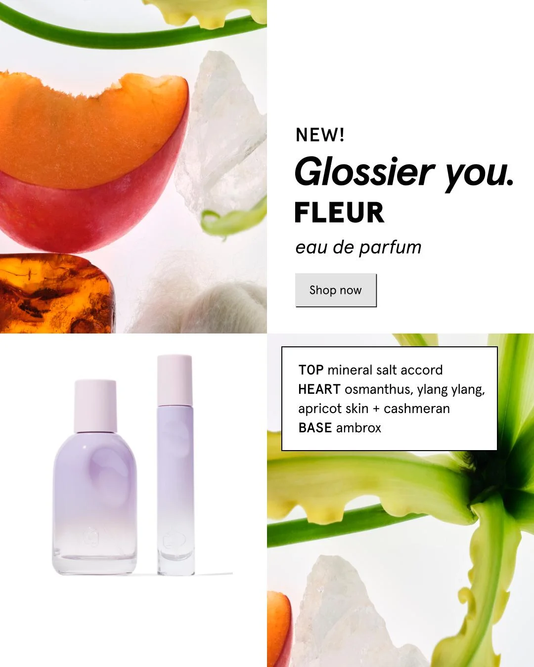
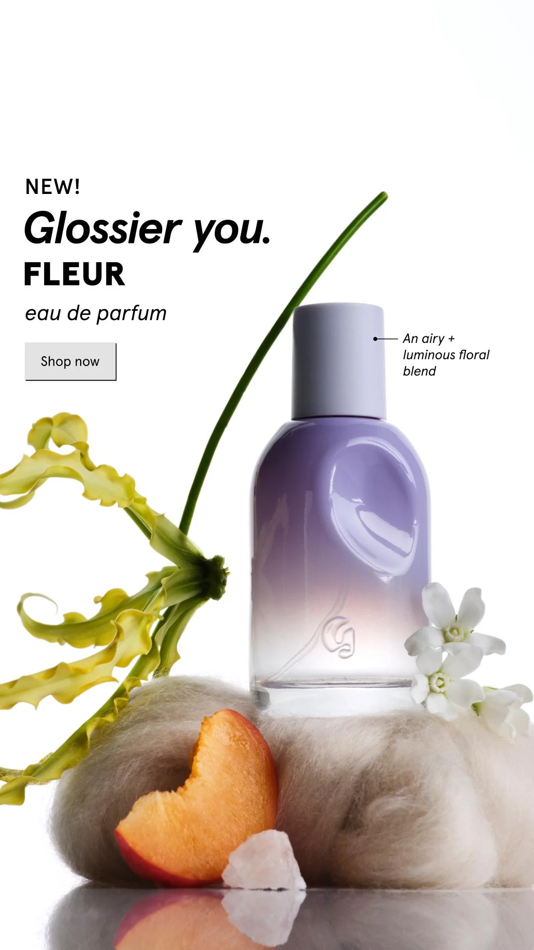
Glossier You Fleur — Dynamic Product Grid — Fashion Ad Example
This ad employs a dynamic quadrant grid layout, balancing abstract ingredient imagery with clear product presentation and textual information. The top-right quadrant features the product launch announcement and CTA, while the bottom-left showcases the two perfume bottles with Glossier's signature minimalist aesthetic. The remaining quadrants display artful, high-key macro shots of natural elements (peach, amber, green stem, crystal) that subtly hint at the fragrance notes, creating an organic and sophisticated feel. The predominantly white background ensures a clean, premium look, optimized for Instagram's visual-first feed. Text hierarchy guides the eye from "NEW!" to the brand/product name, then to the CTA, with the detailed scent profile providing secondary information. This composition effectively communicates a new product launch while maintaining brand elegance.
Why This Ad Works
Dynamic Grid Layout Enhances Engagement
The ad cleverly uses a four-quadrant grid to present diverse visual information without clutter. By separating product, text, and abstract ingredient cues, it maintains visual interest and encourages longer viewing. This multi-faceted approach appeals to different viewer preferences, whether they seek product details or evocative imagery.
Evocative Ingredient Imagery Creates Allure
Abstract macro shots of natural elements like peach, amber, and green foliage are strategically placed. These visuals don't explicitly show ingredients but evoke the fragrance's notes and natural essence. This artistic approach builds intrigue and a sense of luxury, appealing to the emotional and aspirational aspects of perfume purchasing.
Clear Product Presentation Amidst Artistry
Despite the artistic and abstract elements, the bottom-left quadrant provides a clean, unobstructed view of the Glossier You Fleur bottles. This ensures the product itself remains the focal point for conversion, allowing potential customers to clearly see the packaging and form factor, which is crucial for a beauty product launch.
Ad Specs
Color Palette
Original Ad Copy
How to Clone This Ad
From reference to ready-to-run ad
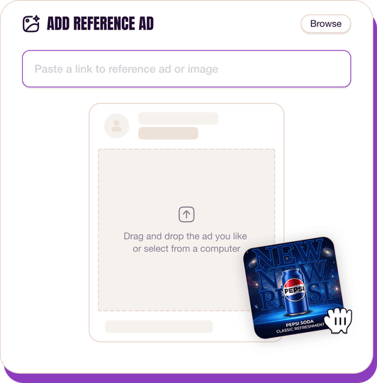
Pick a reference ad
Browse the library or upload any ad spotted in the wild.
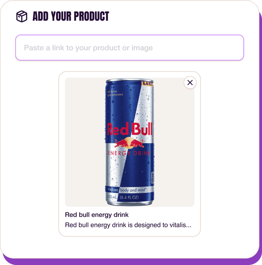
Upload a product photo
Any angle, any background. One photo is enough.
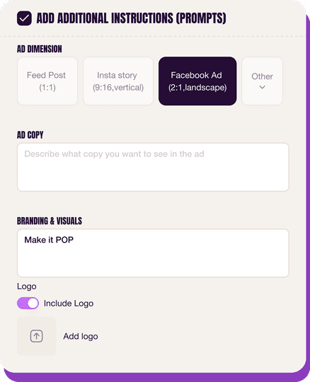
Customize the ad
Pick dimensions, add ad copy, upload your logo — AdDogs handles the rest.
Get your ad in every format, for every platform
Instagram, Facebook, TikTok, LinkedIn, Google — every ad size generated in one shot.
What You Could Improve
Increase CTA Button Contrast and Prominence
The "Shop now" button, a light grey on white, lacks prominence. Increasing its contrast or using a brand accent color would significantly boost visibility and click-through rate. A bolder button could improve conversion metrics by 10-15% on platforms like Instagram, guiding users more effectively.
A/B Test Ingredient Imagery for Clarity
While abstract ingredient shots are artistic, some users might prefer more literal representations or a clearer connection to the fragrance notes. A/B testing variants with more explicit ingredient visuals or subtle text overlays could improve comprehension and resonate with a broader audience segment, potentially boosting engagement.
Questions
AdDogs rebuilds the ad with your product photo and extracts your brand colors automatically from your logo. Same layout and composition — your product, your brand.
Pick your dimension per generation. Basic includes 3 dimensions: square (1:1) for Instagram and Facebook feeds, portrait (9:16) for Stories and Reels, landscape (16:9) for Google Display and YouTube. Pro and Ultimate unlock all 14, including Pinterest (2:3), cinematic (21:9), and banners.
Built for health & wellness and fashion & apparel products. The Grid/Collage composition works best when the product photo carries the persuasion. Any background, any angle — AdDogs handles the cutout.
One credit. $0.40 on the Basic plan ($12/mo for 30 credits), $0.33 on Pro. One credit produces one finished ad in the dimension you pick.
Fit-comparison split frames and on-model lifestyle — in that order for direct-response, reversed for brand-builders. Fit-comparison teaches shoppers why your cut is worth the price tag in under two seconds. Lifestyle builds long-term aided recall. Skip studio-on-white product shots at launch — they read as Amazon, not as brand.
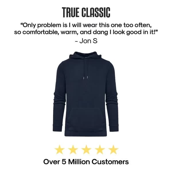
True Classic, Quince, and Mack Weldon lead men's DTC. Aritzia, Vuori, and Alo Yoga lead women's premium athleisure. Everlane and Skims run the heaviest transparency-priced and shapewear spend respectively. Each brand has a weekly creative rotation worth studying — True Classic alone runs 200+ active variants at any time on Meta.
More Fashion Ad Examples
View all






By Industry
By Format
Clone Your First Ad
Pick a template. Upload your product. Seconds later, you have an ad ready to launch. No design skills. No Photoshop.
Create your ad
