
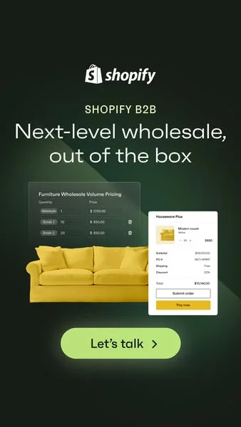
Shopify B2B — UI Mockup with Product — Furniture Ad Example
This ad leverages a high-contrast, dark background to make its key elements pop, optimizing for mobile feed visibility. The layout strategically places the Shopify logo and B2B sub-brand at the top, establishing credibility before presenting the core value proposition. A vibrant yellow sofa anchors the visual, representing the tangible products managed by the software, while translucent UI mockups overlay it, directly demonstrating the platform's functionality. This composition clearly illustrates the "out of the box" solution. The text hierarchy guides the eye from brand to benefit to a prominent, action-oriented CTA. The clean, professional aesthetic, combined with direct feature visualization, effectively targets business owners seeking streamlined wholesale operations on platforms like Instagram or LinkedIn. The dark mode friendly design ensures strong performance across various digital environments.
Why This Ad Works
High-contrast palette for scroll-stopping visibility
The dark green background sharply contrasts with the bright yellow sofa, white text, and light green CTA. This high-contrast design ensures the ad stands out in a busy social feed, immediately drawing the eye and improving ad recall. It effectively uses color to command attention and stop the scroll.
UI mockups demonstrate platform functionality
By showcasing actual UI elements like volume pricing and a checkout summary, the ad directly illustrates the software's capabilities. This visual proof of concept helps potential B2B clients quickly understand how Shopify can streamline their wholesale operations, reducing cognitive load and increasing comprehension of the offering.
Clear, benefit-driven headline communicates value
The headline "Next-level wholesale, out of the box" clearly articulates the primary benefit: an advanced, ready-to-use solution for wholesale. This direct messaging resonates with business owners looking for efficient, powerful tools without extensive setup, driving immediate interest and relevance for the target audience.
Ad Specs
Color Palette
Original Ad Copy
How to Clone This Ad
From reference to ready-to-run ad
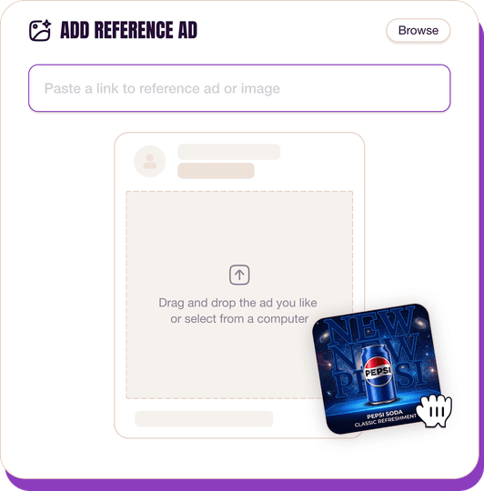
Pick a reference ad
Browse the library or upload any ad spotted in the wild.
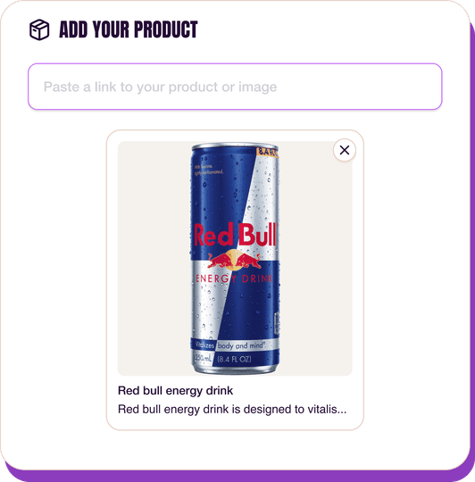
Upload a product photo
Any angle, any background. One photo is enough.
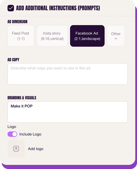
Customize the ad
Pick dimensions, add ad copy, upload your logo — AdDogs handles the rest.
Get your ad in every format, for every platform
Instagram, Facebook, TikTok, LinkedIn, Google — every ad size generated in one shot.
What You Could Improve
Add a concise sub-headline for more detail
While the main headline is strong, a short sub-headline could elaborate on specific benefits or features, like "Streamline orders, manage inventory, and grow your B2B sales." This would provide more context for users who want to quickly grasp deeper value before clicking, improving conversion rates.
Test diverse product examples in UI
The ad uses furniture as an example. Testing UI mockups with different product categories (e.g., electronics, apparel, food) could broaden the appeal to a wider range of B2B businesses. This ensures the ad feels relevant to more potential clients, potentially increasing click-through rates and lead generation.
Questions
AdDogs rebuilds the ad with your product photo and extracts your brand colors automatically from your logo. Same layout and composition — your product, your brand.
Pick your dimension per generation. Basic includes 3 dimensions: square (1:1) for Instagram and Facebook feeds, portrait (9:16) for Stories and Reels, landscape (16:9) for Google Display and YouTube. Pro and Ultimate unlock all 14, including Pinterest (2:3), cinematic (21:9), and banners.
Built for software & tools and home & lifestyle products. The UI Mockup composition works best when the product photo carries the persuasion. Any background, any angle — AdDogs handles the cutout.
One credit. $0.40 on the Basic plan ($12/mo for 30 credits), $0.33 on Pro. One credit produces one finished ad in the dimension you pick.
Extremely well. Furniture shoppers spend weeks to months researching before buying, and Pinterest is where that research happens. A strong Pinterest ad looks more like a room-inspiration pin than a paid ad. Vertical 2:3, styled-room context, soft brand callout. Article, West Elm, and Floyd all budget Pinterest alongside Meta for the full funnel.
Landscape 16:9 and 1.91:1 for wide room shots on Facebook and desktop. 4:5 portrait for Instagram feed. 1:1 for grid. 2:3 for Pinterest. For retargeting, 1:1 material close-ups outperform wide-shot repeats because the shopper has already seen the room context and now wants quality proof.
More Furniture Ad Examples
View all



By Industry
By Format
Clone Your First Ad
Pick a template. Upload your product. Seconds later, you have an ad ready to launch. No design skills. No Photoshop.
Create your ad
