AdDogs

App & UI Ad Examples

Browse 45+ app and UI mockup ad examples sourced from high-performing campaigns. Clone any design, swap in your product, and get a finished ad in seconds.

Updated June 2026

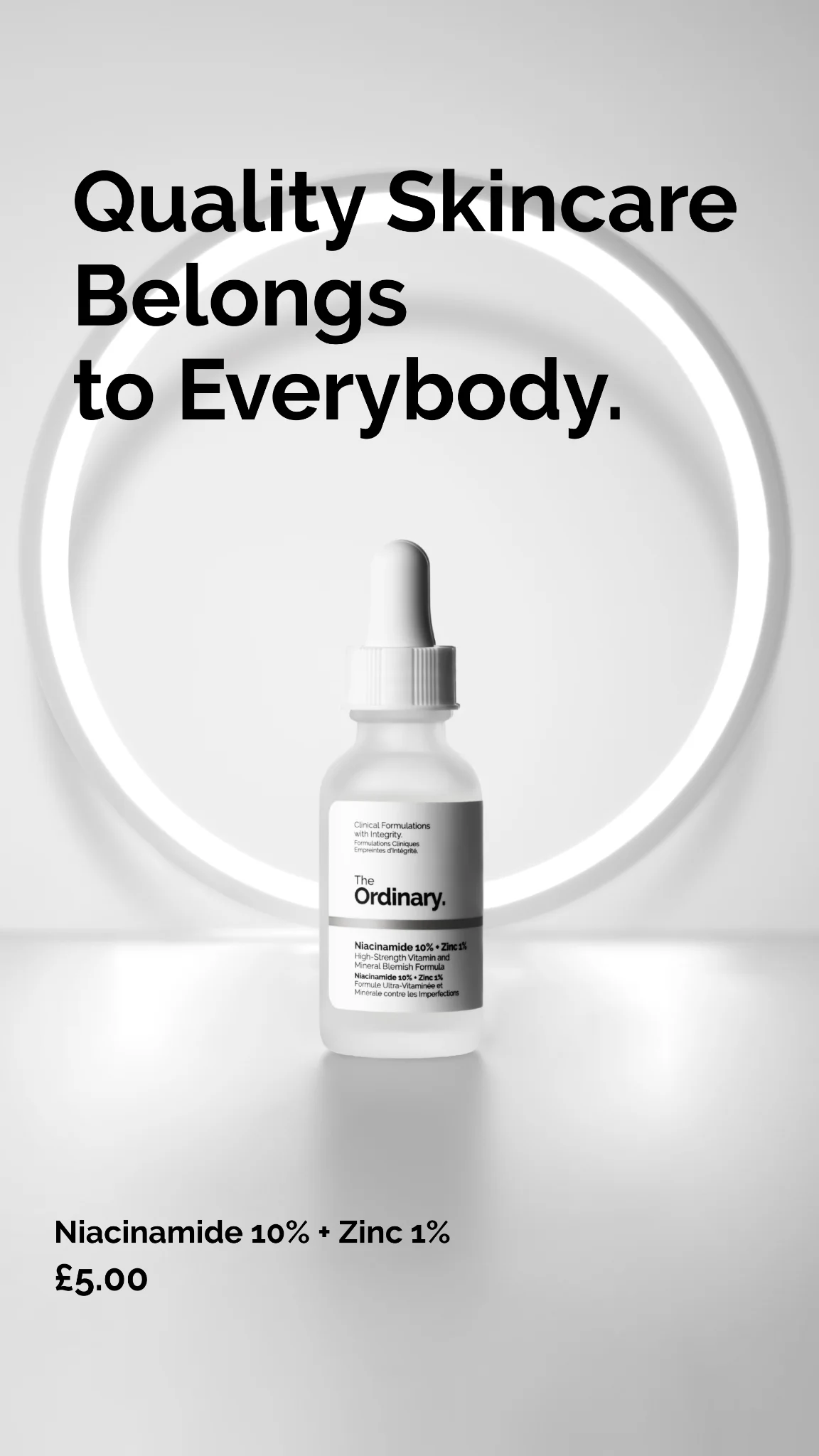
App and UI ads sell software by showing it. iPhone frame mockups with the app screen inside, zoomed-in interface details with callout annotations, before-and-after feature reveals — creative puts the product's interface at the center because that's what the buyer is purchasing. SaaS brands and mobile apps live on this format because descriptions of features underperform screenshots of features. Every top-performing app install ad in 2026 leans on UI-forward creative, not mood imagery or brand photography.

Layout patterns are tight. iPhone frame centered (in Apple-accurate proportions) with the screen filling the full device display area. Or interface zoom-ins showing one feature at close range with arrow callouts. Or dashboard-style hero shots for B2B SaaS. Backgrounds usually stay minimal — single color, gradient, or blurred brand environment — so the UI is the visual hero. Typography outside the frame keeps the interface readable; typography inside the frame competes with the app's actual UI and creates visual chaos.

Ad examples below cover app-install and SaaS interface creative from B2C apps, B2B dashboards, and mobile-first products. Clone a layout and place your app screenshot into the device frame or zoom composition.

Cozy Earth — ChatGPT Recommendation UI. Brand: Cozy Earth. This ad leverages a ChatGPT UI screenshot to present a product recommendation, effectively turning an AI's endorsement into a compelling ad. The dark mode interface with white text ensures high contrast and readability, minimizing visual clutter and focusing the user's attention on the content. The composition uses a clear text hierarchy, starting with a user query, followed by the AI's "thought process," and then the detailed, bulleted recommendation for Cozy Earth. This conversational layout mimics organic discovery, making the endorsement feel authentic. Optimized for mobile platforms like Instagram or Facebook, where screenshots of valuable information are often shared, it capitalizes on the authority of AI and expert lists to drive consideration. The lack of traditional ad elements enhances its native feel.. Headline: Luxury & Most Recommended. Primary text: Here are the top-rated bamboo sheet sets on the market right now, based on expert reviews, lab tests, and real-user feedback: Luxury & Most Recommended Cozy Earth Bamboo Sheet Set. Why it's #1: Cozy Earth consistently tops expert lists (Sleep Foundation, People, Sleepopolis, Time Mag) for its ultra-soft feel, coolness, 20" deep pockets, 100-night trial, and 10-year warranty. sleepfoundation.org +15 . Oprah even named it a favorite sleepopolis.com . Material: 100% bamboo viscose, sateen weave, up to 400 thread-count.. Why this ad works: AI endorsement builds instant credibility — Presenting the product as a top recommendation from ChatGPT immediately establishes high credibility. This leverages the perceived objectivity and authority of AI, making the claim feel more trustworthy than a direct brand statement, which is crucial for premium home goods like sheets. Bullet points highlight key benefits clearly — The use of concise bullet points for "Why it's #1" and "Material" makes complex information easily digestible. This format allows users to quickly scan and grasp the core value propositions, such as "ultra-soft feel" and "10-year warranty," enhancing information retention and persuasive power. Oprah mention leverages celebrity authority — Highlighting that "Oprah even named it a favorite" is a powerful celebrity endorsement. Oprah's long-standing influence and reputation for curating quality products, especially in home and lifestyle, significantly boosts brand trust and desirability among a broad, affluent audience.. Specs: Brand: Cozy Earth, Industry: Home & Lifestyle, Platform: Instagram, Format: UI Mockup, Audience: GeneralGaétan's Skincare — Founder's Letter UI Mockup. This ad leverages an authentic iPhone Notes app UI mockup to create a personal, founder-led narrative. The minimalist layout, featuring black text on a white background, mimics a genuine message, immediately breaking through typical ad clutter on platforms like Instagram. Compositionally, the text is the sole focus, with clear hierarchy established by the bold headline and structured paragraphs. This approach fosters trust and transparency, positioning the brand as honest and purpose-driven. The lack of traditional ad visuals forces the audience to engage with the compelling story of why the brand was created. It's optimized for scroll-stopping authenticity, appealing to a discerning male audience looking for genuine, high-quality skincare without the 'BS' often found in competitor products. The personal tone aims to build a strong initial connection and brand loyalty.. Headline: TO OUR LEGENDARY GENTS.... Primary text: I didn't plan on starting a skincare brand. But after seeing what's hidden in most men's products, I knew I couldn't ignore it. Every formula we make is clean, powerful, and made in Switzerland — no hormone disruptors, no shortcuts, no BS. It's skincare you can trust, built for men who expect more. — Gaétan, Founder. Why this ad works: Authentic UI Mockup Breaks Scroll — The iPhone Notes app format creates an immediate sense of authenticity and personal communication, distinguishing it from polished, traditional ads. This unexpected visual stops the scroll by appearing as organic content, making viewers pause and read rather than scroll past. It leverages platform familiarity to build trust. Founder's Personal Narrative Builds Trust — The 'I didn't plan on starting...' opening and founder's signature humanize the brand. This personal story fosters a deeper connection and trust with the audience, especially for a product like skincare where ingredients and transparency matter. It positions the brand as purpose-driven, not just profit-driven. Direct, Benefit-Driven Language for Men — Phrases like 'no hormone disruptors, no shortcuts, no BS' directly address common concerns and desires of men seeking straightforward, effective skincare. This clear, no-nonsense messaging resonates with a male audience, promising efficacy and integrity. It speaks to a desire for quality and transparency.. Specs: Industry: Health & Wellness, Platform: Instagram, Format: UI Mockup, Audience: Men 25-34Cozy Earth — Notification UI Mockup. Brand: Cozy Earth. This ad leverages a familiar phone notification UI to create an immediate, personal connection. The layout mimics a lock screen, making the ad feel like an organic message rather than a direct advertisement. The soft, muted green palette, consistent across the background and product image, evokes a sense of calm and comfort, aligning perfectly with bedding products. Compositionally, the notification box is centrally placed, drawing the eye directly to the urgent offer and product preview. The casual, direct text "Girl wake up!" targets a specific demographic, enhancing relatability. This format is highly optimized for vertical platforms like Instagram Stories or TikTok, where native-looking content performs well by blending into the user experience, reducing ad fatigue and increasing engagement. The clear text hierarchy within the notification ensures the discount is immediately visible.. Primary text: Girl wake up! Cozy Earth is up to 20% OFF right now!. Why this ad works: Native UI format boosts engagement — By mimicking a phone notification, the ad bypasses typical ad blindness. Users are accustomed to checking notifications, making this format inherently engaging. It creates a sense of urgency and personal relevance, prompting a closer look before the user realizes it's an ad. Urgent, casual copy drives immediate action — The phrase "Girl wake up!" combined with "20% OFF right now!" creates a friendly, urgent call to action. This informal tone resonates with a younger, social media-savvy audience, making the offer feel like a tip from a friend rather than a hard sell, increasing conversion likelihood. Consistent soft green palette enhances brand comfort — The harmonious use of muted green tones throughout the ad, from the background to the bedding product, reinforces the brand's association with comfort, nature, and tranquility. This color psychology creates a soothing visual experience, perfectly aligning with the desire for cozy, quality sleep products.. Specs: Brand: Cozy Earth, Industry: Home & Lifestyle, Platform: Instagram, Format: UI Mockup, Audience: Women 25-34Leesa Wirecutter Review — Editorial Feature. Brand: Leesa. This ad leverages social proof through an editorial feature layout, mimicking a Wirecutter article. The composition strategically embeds the review into a mattress texture background, reinforcing the product. Color psychology is muted, focusing on credibility with black and white text, while the highlighted yellow text draws attention to key benefits and the "Best Hybrid Mattress" claim. The layout uses a nested approach, with the review frame acting as a central focus, optimized for platforms where users scroll quickly and trust third-party endorsements. Text hierarchy within the review is clear, with the main pick highlighted, followed by testimonial quotes, driving consideration through expert validation. The overall design is clean and professional, aligning with a premium mattress brand.. Headline: Our Pick for Best Hybrid Mattress. Primary text: One tester said they “felt like royalty” on Leesa’s Legend Chill Hybrid. Another said that it felt “fluffy and luxurious.”. Why this ad works: Leveraging Third-Party Credibility — The Wirecutter "Our Pick" badge and review are powerful social proof. This builds immediate trust and authority, which is crucial for high-consideration purchases like mattresses. It bypasses direct brand claims, making the message more believable and impactful for potential customers seeking validated quality. Visual Nesting Reinforces Product — Placing the Wirecutter review on a textured mattress background subtly reinforces the product category. This visual layering creates a cohesive experience, reminding the viewer of the product while they absorb the endorsement. This enhances brand recall and relevance, making the ad more memorable and contextually appropriate. Strategic Highlighted Keywords — The yellow highlights on "Best Hybrid Mattress," "felt like royalty," and "fluffy and luxurious" immediately draw the eye to key benefits and the core value proposition. This guides the viewer's attention to the most persuasive parts of the testimonial, ensuring critical information is absorbed even during a quick scroll.. Specs: Brand: Leesa, Industry: Home & Lifestyle, Platform: Instagram, Format: UI Mockup, Audience: Men 25-34Brilliant AI Quiz — UI Mockup Challenge. Brand: Brilliant. This ad employs a high-contrast UI mockup layout to immediately grab attention on busy social feeds. The dark background with subtle geometric patterns provides depth, while the central white quiz card pops, drawing the eye directly to the challenge. Color psychology is used effectively with green for "Human" (correct) and red for "ChatGPT 3.5" (incorrect), creating a clear visual distinction and reinforcing the ad's core premise. The composition strategically places the brand logo at the top, headline below, and the interactive quiz element centrally, guiding the viewer's gaze down to the prominent blue CTA button. This design is optimized for platforms like Instagram or Facebook, where interactive, challenge-based content drives high engagement. Text hierarchy is clear, with the bold headline posing an intriguing question, followed by the quiz details, and a strong call to action, all designed to pique curiosity and encourage a click.. Headline: AI can't pass this quiz. Primary text: 1. Spell "PUPILS" backwards Human SLIPUP ChatGPT 3.5 SILPPU ChatGPT 4 ??????. Why this ad works: Challenge-based headline creates instant intrigue — The headline "AI can't pass this quiz" immediately challenges the viewer's perception and intelligence. This creates a strong hook, leveraging the current fascination with AI and human-vs-machine narratives. It compels users to engage, proving their own cognitive superiority, which is highly effective for educational products. UI mockup drives interactive engagement — Presenting the ad as a simulated quiz interface makes it feel interactive, even as a static image. The clear question and multiple-choice-like answers, along with the "Take the quiz" CTA, prime the user for an engaging experience. This format significantly boosts click-through rates by inviting participation. High-contrast colors emphasize key information — The stark contrast between the dark background and the bright white quiz card ensures maximum visibility. Within the card, the use of green for the correct "Human" answer and red for the incorrect "ChatGPT" response provides immediate visual feedback, making the ad's premise instantly understandable and impactful.. Specs: Brand: Brilliant, Industry: Education, Platform: Instagram, Format: UI Mockup, Audience: GeneralLanguage Sprint — Chat UI Mockup. Brand: Language Sprint. This ad effectively leverages a familiar chat UI mockup to create a relatable, testimonial-style narrative. The layout mimics an organic conversation, immediately drawing the viewer in by simulating a peer recommendation. Color psychology uses soft blues and whites, conveying a clean, trustworthy, and approachable brand image, which is ideal for an educational product. The composition guides the eye naturally down the chat thread, establishing a problem, introducing the solution ("Language Sprint"), and building urgency with a clear deadline. This format is highly optimized for social media platforms like Facebook or Instagram, where it can easily blend with user-generated content, making the ad feel less intrusive and more authentic. Text hierarchy is inherent in the chat bubble design, with key information presented sequentially, ensuring the call to action is the final, impactful message.. Why this ad works: Relatable Chat UI for Organic Feel — The ad uses a familiar chat interface to simulate an authentic conversation. This makes the ad feel less like a direct sales pitch and more like a genuine recommendation from a friend, significantly increasing relatability and trust with the target audience, encouraging engagement and belief in the product's efficacy. Problem-Solution Narrative Builds Engagement — The conversation starts with a common language learning struggle ("tongue-tied") and quickly introduces "Language Sprint" as the solution. This narrative structure engages viewers by addressing their pain points directly before offering a clear, peer-validated remedy, making the product's value immediately apparent and relevant. Urgency Creates Immediate Action — Mollie's final message, "Sign-up ends in less than 24h," introduces a strong sense of urgency. This time-sensitive call to action compels potential customers to act quickly, driving higher conversion rates for time-limited offers or enrollment periods by leveraging the fear of missing out.. Specs: Brand: Language Sprint, Industry: Education, Platform: Facebook, Format: UI Mockup, Audience: GeneralBodyBio Resolvin — Chat UI Testimonial. Brand: BodyBio. This ad leverages a chat UI mockup to simulate an authentic peer-to-peer recommendation, a highly effective social proof strategy. The layout mimics a natural conversation flow, drawing the viewer into a relatable problem-solution narrative. Color psychology uses familiar blue and beige chat bubbles, creating a sense of trust and familiarity, while the final green CTA bubble subtly shifts to action. The composition guides the eye from the initial problem statement and product image, through the conversational exchange, to the concluding call to action. Optimized for mobile social platforms like Instagram or Facebook, it blends seamlessly with organic content. Text hierarchy is conversational, with key product benefits embedded within the dialogue, making the information feel less like an ad and more like a trusted friend's advice.. Headline: Try BodyBio Resolvin for real recovery*. Primary text: Still feeling off since being sick?? I started BodyBio Resolvin and it helped so much with lingering inflammation. Omg yes. I got sick months ago and never felt like I truly recovered 😩 Same here. Resolvin helps your body actually wrap up the immune response so you’re not stuck in that low-grade flare. Okay I NEED this. I’ve been in “almost better” mode forever.. Why this ad works: Simulated peer-to-peer recommendation builds trust — The chat format creates an illusion of a genuine conversation between friends. This builds immediate trust and credibility, making the product recommendation feel organic and less like a direct sales pitch, which significantly boosts engagement and consideration on social platforms. Relatable problem-solution narrative engages audience — The conversation starts with a common pain point ("Still feeling off since being sick??") and progresses to a solution (BodyBio Resolvin). This narrative structure resonates deeply with the target audience, guiding them through a journey that mirrors their own potential experience and need for recovery. Visual integration of product provides context — The small product image within the first chat bubble provides visual proof and context without being overtly promotional. It subtly introduces the product while the conversation explains its benefits, creating a cohesive and informative user experience that feels natural within the chat interface.. Specs: Brand: BodyBio, Industry: Health & Wellness, Platform: Instagram, Format: UI Mockup, Audience: GeneralGrammarly — UI Mockup with Benefit Headline. Brand: Grammarly. This Grammarly ad effectively leverages a UI mockup layout to instantly convey its core value proposition. The deep blue background provides high contrast for the white and light blue text, ensuring excellent readability and visual impact in a crowded social feed. Compositionally, the brand logo is strategically placed top-left, followed by a benefit-driven headline that immediately addresses a user pain point. The central UI example, demonstrating a common grammatical correction, serves as compelling visual proof of the product's efficacy. Supporting text at the bottom-left elaborates on features, while a prominent pink CTA button guides the user towards conversion. This clear hierarchy and direct demonstration are optimized for platforms like Facebook or Instagram, where quick comprehension and actionable prompts drive engagement and downloads.. Headline: Mistake-free writing. Try it for free.. Primary text: Automatically correct grammar, spelling, & more.. Why this ad works: Clear UI demonstration highlights core value — The UI snippet showing 'their' corrected to 'there' immediately illustrates Grammarly's core function. This visual demonstration is far more impactful than mere textual claims, allowing users to grasp the product's value proposition within seconds. It directly addresses a common writing pain point, making the solution tangible and desirable for anyone seeking improved writing accuracy. High-contrast color palette grabs attention — The stark contrast between the deep blue background and the white/light blue text, along with the vibrant pink CTA, ensures maximum visibility and readability. This high-contrast palette is crucial for cutting through feed clutter on mobile devices, drawing the eye directly to the key message and action, thereby increasing ad recall and click-through rates. Benefit-driven headline with clear call to action — The headline 'Mistake-free writing. Try it for free.' is a powerful hook, promising a clear benefit and removing barriers to trial. This direct, value-first approach, combined with the clear 'Download Grammarly' CTA, creates a compelling user journey, driving immediate consideration and encouraging direct conversion by offering a no-cost entry point.. Specs: Brand: Grammarly, Industry: Software & Tools, Platform: Facebook, Format: UI Mockup, Audience: ProfessionalsVitalisys Patch — Search UI Mockup. Brand: Vitalisys Patch. This ad leverages a compelling UI mockup layout, simulating a search engine result to address a common pain point directly. The central "search result" box immediately draws the eye, presenting the problem ("i can't sleep even with melatonin") as a relatable query. The solution, "Vitalisys Patch," is then introduced with clear benefits. The soft blue sky background, pastel balloons, and dream-like icons create a calming, aspirational atmosphere, aligning with the product's promise of natural sleep. This color psychology evokes tranquility and trust. The composition effectively uses a problem-solution narrative, optimized for social platforms like Instagram where engaging, story-driven content performs well. Text hierarchy guides the viewer from problem identification to solution discovery, making the ad highly persuasive.. Headline: i can't sleep even with melatonin. find solutions. Primary text: Vitalisys Patch delivers calming plant-based ingredients through your skin all night. No pills, no effort...just deep, natural sleep.. Why this ad works: UI Mockup for Relatable Problem-Solution — By mimicking a search query, the ad immediately connects with users actively seeking solutions for sleep issues. This format creates a sense of discovery and relevance, making the ad feel less like an interruption and more like a helpful answer. It leverages familiar digital interaction patterns to engage the audience effectively. Clear Problem-Solution Narrative — The ad brilliantly frames a common struggle ("can't sleep even with melatonin") and then presents Vitalisys Patch as the direct, natural solution. This narrative structure is highly effective in advertising, as it validates the user's pain point before offering a compelling, easy-to-understand resolution. It builds trust and relevance quickly. Calming Palette and Dream-like Imagery — The soft blue sky, gentle pastel balloons, and subtle sleep-related icons (moon, stars, clouds) create a serene and inviting visual environment. This color psychology and imagery reinforce the product's promise of "deep, natural sleep," fostering a sense of calm and aspiration. It visually communicates tranquility before the text is even fully processed.. Specs: Brand: Vitalisys Patch, Industry: Health & Wellness, Platform: Instagram, Format: UI Mockup, Audience: GeneralZapier Automation UI Mockup — Clean Feature Highlight. Brand: Zapier. This ad effectively uses a split-screen layout, dedicating the upper portion to a clean UI mockup demonstrating Zapier's core automation functionality. The warm, inviting orange background contrasts sharply with the crisp white UI elements, drawing immediate attention to the product's interface. Color psychology is leveraged with vibrant green "On" toggles, signaling active and successful automation. The composition is simple yet powerful, guiding the eye from the functional demonstration to the bold, reassuring headline at the bottom. Optimized for platforms like Facebook, its clear visual message and minimal text ensure quick comprehension on mobile feeds. The ad demystifies automation, positioning Zapier as the accessible solution, making it highly effective for driving initial awareness and consideration among small business owners.. Headline: Automation isn't magic. It's Zapier.. Why this ad works: UI Mockup simplifies complex automation — The ad cleverly uses a familiar toggle-switch UI to illustrate complex automation workflows. This visual metaphor makes the abstract concept of "Zaps" tangible and easy to understand, immediately communicating the product's value proposition without requiring extensive explanation. It builds trust through clarity. Contrasting colors highlight key actions — The vibrant orange background provides a strong base, while the white UI elements pop, ensuring readability. Crucially, the bright green "On" toggles draw the eye to the active state of automation, visually reinforcing the idea of seamless, working processes. This color contrast enhances message clarity. Direct headline demystifies product — The headline "Automation isn't magic. It's Zapier." directly addresses a common perception of automation as complex or intimidating. By reframing it as a tangible, accessible solution, the ad immediately positions Zapier as a practical tool, building confidence and encouraging further engagement with the brand.. Specs: Brand: Zapier, Industry: Software & Tools, Platform: Facebook, Format: UI Mockup, Audience: Small Business OwnersGrammarly — Benefit-Driven UI Mockup. Brand: Grammarly. This ad employs a clean, direct-response layout on a deep blue background, leveraging high contrast for immediate impact. The composition follows a clear top-to-bottom hierarchy: brand logo, a compelling benefit-driven headline, a visual UI mockup demonstrating the core product value (error correction), supporting text, and a prominent call-to-action. The blue background evokes trust and professionalism, while the white text and pink CTA button ensure excellent readability and visual pop, optimized for scroll-stopping on platforms like Facebook or Instagram. The UI mockup effectively illustrates the "before and after" of Grammarly's function, making the abstract benefit tangible. This design efficiently communicates value and guides the user towards conversion with minimal cognitive load.. Headline: Mistake-free writing. Try it for free.. Primary text: Automatically correct grammar, spelling, & more.. Why this ad works: Clear benefit headline drives immediate value — The headline "Mistake-free writing. Try it for free." immediately communicates the core benefit and a low-friction entry point. This direct approach cuts through noise, appealing to users seeking practical solutions and encouraging clicks by offering a free trial, maximizing initial engagement. UI mockup visually demonstrates product value — The embedded UI mockup effectively shows Grammarly in action, highlighting a common grammatical error ("their" to "there") and its correction. This visual proof makes the abstract concept of "mistake-free writing" tangible and instantly understandable, building trust and illustrating the product's utility. High-contrast palette enhances readability and focus — The deep blue background provides a strong, professional foundation, while white text and the vibrant pink CTA button create excellent contrast. This color strategy ensures all key information is highly readable and visually distinct, guiding the viewer's eye efficiently through the ad's message and action points.. Specs: Brand: Grammarly, Industry: Software & Tools, Platform: Facebook, Format: UI Mockup, Audience: ProfessionalsHEALTHLETIC BPC-157 — Chat UI Testimonial. Brand: HEALTHLETIC. This ad leverages a native chat UI layout, mimicking a personal conversation to build trust and relatability. The composition strategically places a problem-solution narrative, with the product image embedded naturally as a shared link. The simple color palette of white, grey, and blue reflects typical messaging app aesthetics, making the ad feel less intrusive and more organic. Text hierarchy follows a conversational flow, starting with relatable pain points, introducing the product as a solution, and concluding with a personal testimonial. This approach is highly optimized for platforms like Facebook or Instagram stories/feeds, where it can blend seamlessly with user-generated content, increasing engagement and reducing ad fatigue. The design aims to overcome ad blindness by presenting information in a familiar, peer-to-peer format.. Headline: Body Protection Compound (BPC-157). Primary text: feel like my joints are made of gravel 😭 takes me 3 days to recover from a workout getting old sucks 😩😩😩 been there - try this it's helped my knees, sleep, and energy big time. Why this ad works: Native Chat UI Builds Instant Trust — By simulating a direct message conversation, the ad bypasses traditional ad skepticism. This format feels authentic and personal, making the product recommendation appear as a genuine peer endorsement rather than a paid promotion. This significantly enhances credibility and encourages deeper engagement with the content. Problem-Solution Narrative Drives Relatability — The ad opens with common, relatable pain points like joint pain and slow recovery, immediately resonating with the target audience. Introducing the product as a direct solution to these specific issues creates a clear value proposition, prompting viewers to consider how the product can address their own struggles. Embedded Product Link Mimics Organic Sharing — Presenting the product within a link preview, as if shared by a friend, leverages social proof and reduces perceived sales pressure. This subtle integration encourages clicks by framing the product as a helpful discovery rather than a direct advertisement, increasing click-through rates by blending into the platform's native experience.. Specs: Brand: HEALTHLETIC, Industry: Health & Wellness, Platform: Facebook, Format: UI Mockup, Audience: Fitness EnthusiastsRocket Money — Humorous Text Message UI. Brand: Rocket Money. This ad leverages a familiar text message UI mockup to create an engaging, native-feeling experience. The layout strategically unfolds a relatable problem—subscription overpayment and confusion—through a humorous dialogue. The dark background and contrasting blue/grey bubbles ensure high readability, guiding the viewer's eye through the narrative. Compositionally, the back-and-forth conversation builds curiosity and positions Rocket Money as the immediate, simple solution. This format is highly optimized for social media feeds, blending seamlessly with organic content and encouraging higher engagement. The text hierarchy is inherent in the dialogue, with the brand name and core benefit naturally emerging, culminating in a clear call to action within the final message bubble.. Primary text: Did you lock me out of our Netflix account? 😡 MY Netflix account which I pay for $239.88 a year? No, I just canceled it with Rocket Money... Rocket Money?!?! It's an app that tracks your subscriptions and let's you cancel them with a tap So no more "Netflix and chill" on my dime 😉 But am I not paying for our MAX account?!?!. Why this ad works: Relatable Scenario Drives Engagement — The common problem of shared subscriptions and the humorous, slightly exasperated tone resonate with a broad audience. This makes the ad instantly relatable, sparking recognition and encouraging viewers to follow the conversation, increasing dwell time and memorability. Native UI Mimics Organic Content — Presenting the ad as a text message conversation makes it feel less like a traditional advertisement and more like content from a friend or a screenshot shared organically. This reduces ad resistance, increases perceived authenticity, and encourages higher engagement rates on social platforms. Problem-Solution Narrative is Clear — The dialogue effectively sets up a common financial pain point—overpaying for forgotten or shared subscriptions—and immediately positions Rocket Money as the simple, tap-to-cancel solution. This narrative structure educates and persuades simultaneously, highlighting the app's core value proposition.. Specs: Brand: Rocket Money, Industry: Finance & Insurance, Platform: Instagram, Format: UI Mockup, Audience: GeneralZapier Automation UI — Playful Mockup. Brand: Zapier. This ad effectively uses a UI mockup layout to demystify automation, positioning Zapier as a simple solution. The clean, minimalist composition with ample negative space draws attention directly to the three "Zap" examples, illustrating functionality without overwhelming the viewer. A vibrant, playful color palette of orange, lavender, and deep blue against a warm orange background creates an approachable and modern aesthetic, contrasting with typical corporate SaaS visuals. The clear text hierarchy places the brand statement prominently at the bottom, reinforcing the value proposition. Optimized for platforms like Instagram or Facebook, its bold, simple graphics are scroll-stopping, quickly communicating the product's core benefit and ease of use to a professional audience seeking efficiency.. Headline: Automation isn't magic. It's Zapier.. Why this ad works: UI Mockup Simplifies Complex Automation — By presenting automation as simple toggle switches and clear labels ("New lead Zap," "Notify salesperson Zap"), the ad immediately communicates ease of use. This visual metaphor reduces perceived complexity, making Zapier accessible to a broader audience who might be intimidated by traditional automation tools, driving higher consideration. Playful Color Palette Enhances Approachability — The use of bright orange, lavender, and light blue against a warm, muted orange background creates a friendly and inviting atmosphere. This vibrant, non-corporate palette helps Zapier stand out in a typically dry SaaS market, signaling innovation and user-friendliness, which can increase brand recall and positive sentiment. Clear Value Proposition in Concise Headline — The headline "Automation isn't magic. It's Zapier." directly addresses a common perception about automation while immediately offering the brand as the tangible solution. This powerful, concise statement cuts through noise, clearly articulating the product's benefit and establishing Zapier as an accessible, practical tool, enhancing brand understanding.. Specs: Brand: Zapier, Industry: Software & Tools, Platform: Instagram, Format: UI Mockup, Audience: ProfessionalsTravel App — UI Mockup Discount. This ad employs a dynamic UI mockup layout, showcasing a travel-related app within a smartphone on a vibrant yellow background. The composition strategically places the phone on the left, allowing the dominant "$199" price point to command attention on the right. The bright yellow background, subtly featuring blurred furniture, creates an energetic and inviting atmosphere, while the colorful images within the phone add visual interest and context. This high-contrast design is optimized for social platforms like Instagram, where its vividness and clear value proposition (discounted lifetime subscription) can effectively stop the scroll. The text hierarchy prioritizes the large, discounted price, followed by the original price and "Lifetime Subscription," ensuring the core offer is immediately understood. The ad effectively uses visual appeal and a strong financial incentive to drive consideration.. Primary text: $199. Why this ad works: Clear Discount Offer Dominance — The large, bold "$199" immediately captures attention, clearly communicating a significant discount from the struck-through "$299 Lifetime Subscription." This direct and prominent pricing strategy effectively highlights the value proposition, creating urgency and driving immediate interest for potential subscribers looking for a deal. Vibrant, Engaging Color Palette — The ad leverages a bright yellow background, which exudes energy and positivity, effectively cutting through feed clutter. This vibrant base, combined with the rich, diverse colors of the travel images displayed on the phone, creates an inviting and adventurous aesthetic that resonates with the target audience's desire for exploration. Effective UI Mockup for Context — Presenting the product as an app within a smartphone mockup provides immediate visual context, allowing viewers to envision themselves using the service. This technique clearly demonstrates the app's content and functionality, making the abstract concept of a "Lifetime Subscription" tangible and relatable, thereby enhancing perceived utility and engagement.. Specs: Industry: Media & Entertainment, Platform: Instagram, Format: UI Mockup, Audience: GeneralSocial Media Content Calendar — UI Mockup. This ad effectively leverages a clean UI mockup to demonstrate a social media content calendar tool. The grid layout immediately conveys organization and control, appealing directly to marketing professionals. Distinct, vibrant color-coding for each social platform (Instagram pink, Facebook blue, LinkedIn yellow, Twitter teal) allows for rapid visual parsing and understanding of the tool's multi-platform utility. The composition is functional, placing the "Social Media Content Calendar" headline centrally, establishing clear product identity. This visual clarity is optimized for platforms like Google Display or LinkedIn, where users seek practical solutions. The text hierarchy within the calendar entries is clear, showing platform, event type, and associated team members, effectively showcasing the tool's collaborative features without needing additional ad copy.. Headline: Social Media Content Calendar. Why this ad works: Clear UI demonstrates core product functionality — The ad immediately presents the product's primary feature – a content calendar – in a clean, intuitive UI. This direct demonstration eliminates guesswork, allowing potential users to instantly grasp the tool's value proposition for organizing social media efforts, which is crucial for busy professionals. Vibrant color-coding enhances visual organization — The use of distinct, bright colors for different social media platforms (pink for Instagram, blue for Facebook, etc.) creates an immediate visual hierarchy. This color-coding allows users to quickly scan and identify platform-specific content, showcasing the tool's efficiency and ease of use in managing complex schedules. Realistic data populates functional use case — Populating the calendar with realistic, albeit generic, social media tasks (e.g., "Monthly Employee Highlight," "Share press piece") demonstrates the tool in an active, practical context. This helps the target audience visualize how they would use the product in their daily workflow, fostering stronger consideration and relevance.. Specs: Industry: Software & Tools, Platform: Google, Format: UI Mockup, Audience: ProfessionalsFramer — Desktop & Mobile UI Comparison. Brand: Framer. This ad effectively leverages a split-screen UI mockup to highlight Framer's core value proposition: design *and* live site publishing. The dark background with contrasting white text immediately grabs attention on social feeds, while the vibrant green UI mockups provide a fresh, modern aesthetic. The composition clearly presents both desktop and mobile views, demonstrating responsive design capabilities. Text hierarchy is strong, with a bold headline directly addressing a competitor (Figma) and a clear call-to-action. This direct comparison strategy targets a specific audience of designers and developers, positioning Framer as a superior solution for end-to-end web creation. The clean, minimalist design ensures the message is delivered without clutter, optimizing for quick comprehension on platforms like Instagram or LinkedIn.. Headline: It's like Figma but you get a real site. Why this ad works: Direct competitor comparison for clarity — The headline "It's like Figma but you get a real site" immediately positions Framer against a known industry leader. This direct comparison clarifies Framer's unique selling proposition, instantly communicating its value to users familiar with design tools. This strategy effectively targets users seeking a more comprehensive solution. Split-screen UI showcases responsiveness — Presenting both desktop and mobile views side-by-side effectively demonstrates Framer's capabilities in responsive design. This visual proof point reassures potential users that their creations will look great on any device, a critical factor for modern web development. It visually reinforces the "real site" promise. High contrast for scroll-stopping impact — The stark contrast between the black background and white text, combined with the vibrant green UI elements, creates a visually arresting ad. This high-contrast design is highly effective on busy social media feeds, ensuring the ad stands out and captures immediate attention, driving higher engagement and recall.. Specs: Brand: Framer, Industry: Software & Tools, Platform: Instagram, Format: UI Mockup, Audience: ProfessionalsGrammarly AI — Workflow UI Mockup. Brand: Grammarly. This ad effectively uses a UI mockup layout to visually demonstrate Grammarly's AI capabilities, guiding the viewer through a simplified workflow. The vibrant teal background creates high contrast with the dark text and white UI elements, ensuring readability and scroll-stopping power, particularly on platforms like Instagram or Facebook. Compositionally, the brand logo is top-left, followed by a clear headline, then the central visual explanation, and finally a strong CTA at the bottom. This F-pattern text hierarchy and visual flow optimize for quick comprehension. The clean, modern aesthetic, combined with a clear value proposition, targets professionals seeking efficiency. The ad successfully communicates complex AI assistance in an easily digestible, actionable format, driving consideration and conversion.. Headline: Smarter communication from start to send.. Primary text: Ideate, write, revise, and reply with generative AI assistance.. Why this ad works: Visual workflow demonstration clarifies AI utility — The ad uses a clear, step-by-step visual representation of Grammarly's AI in action. This "show, don't just tell" approach makes the abstract concept of AI assistance tangible and immediately understandable, significantly improving comprehension and perceived utility for busy professionals. High-contrast palette ensures readability and attention — The vibrant teal background paired with crisp white and dark blue text creates excellent visual contrast. This color strategy ensures the ad stands out in a busy social feed, capturing attention and making all text elements highly legible, which is crucial for conveying the product's benefits quickly. Clear value proposition leads to direct CTA — The headline "Smarter communication from start to send" immediately highlights the core benefit. This is reinforced by the visual workflow and the concise body copy, leading directly to a prominent "Download Grammarly" CTA. This directness minimizes friction for conversion.. Specs: Brand: Grammarly, Industry: Software & Tools, Platform: Instagram, Format: UI Mockup, Audience: ProfessionalsDoe Beauty — Byrdie Review UI Mockup. Brand: doe beauty. This ad leverages a UI mockup format, presenting a screenshot of a Byrdie article featuring Doe Beauty false lashes. The layout strategically positions the product box centrally within the article frame, drawing immediate attention. The prominent headline, "The 9 Best False Lashes of 2023, Tested and Reviewed," establishes authority and trust, leveraging third-party validation. A playful "BEST LIGHT-WEIGHT" badge adds a specific benefit. The clean white background and light blue product packaging create a minimalist aesthetic, enhancing readability and product focus. This design is optimized for platforms like Instagram, where authentic, review-based content can drive high engagement and consideration. The clear text hierarchy guides the eye from the review title to the product, effectively blending editorial content with direct product promotion. The overall composition aims to build credibility and inform potential customers.. Headline: The 9 Best False Lashes of 2023, Tested and Reviewed. Why this ad works: Leveraging third-party credibility for trust — The "BYRDIE" branding and "Tested and Reviewed" headline immediately establish authority and trust. This social proof is highly effective in the beauty industry, as consumers often rely on expert reviews before purchasing. It reduces perceived risk and builds confidence in the product's quality, driving consideration effectively. UI Mockup creates native ad experience — Presenting the ad as a screenshot of a review article makes it feel less like a direct advertisement and more like organic content. This native ad format can bypass ad fatigue, encouraging users to click through for more information. This approach fosters higher engagement and consideration by blending seamlessly with platform content. Clear product benefit highlight with badge — The "BEST LIGHT-WEIGHT" badge prominently displays a key product differentiator. This specific benefit addresses a common pain point for false lash users (heavy, uncomfortable lashes), making the product immediately appealing to those seeking comfort and a natural feel. It quickly communicates value to the target audience.. Specs: Brand: doe beauty, Industry: Health & Wellness, Platform: Instagram, Format: UI Mockup, Audience: Women 25-34Drops Language Learning — Twitter Testimonial Post. Brand: Drops. This ad leverages a native social media UI mockup, specifically a Twitter post, to create an authentic, user-generated content feel. The layout is text-heavy, mimicking a personal testimonial, which enhances credibility and relatability. The black text on a white background is clean and familiar, ensuring high readability and blending seamlessly into a user's feed. Compositionally, the ad uses a bold headline to grab attention, followed by a conversational narrative that addresses a common pain point (boring language learning methods). The clear call to action is embedded within the personal story, guiding users to "Download Drops." This approach is optimized for platforms where authentic narratives and social proof drive engagement and conversion, making it highly effective for consideration and app downloads.. Headline: Language Learning Hack. Primary text: UNPOPULAR OPINION ALERT! Learning a new language from a book is BOOORING!! I am a visual learner and i just found this app that teaches languages through visual mini games... I. AM. HOOKED. Download Drops & learn languages the fun way with games.. Why this ad works: Native UI for authentic social proof — The ad's presentation as a Twitter post screenshot instantly creates a sense of authenticity and social proof. This native format makes it feel less like a traditional advertisement and more like a genuine recommendation from a peer, significantly boosting trust and engagement compared to overtly branded content. Problem-solution narrative drives engagement — The ad effectively hooks the audience by articulating a common frustration ("Learning a new language from a book is BOOORING!!"). It then immediately positions "Drops" as the fun, visual solution. This relatable problem-solution framework resonates deeply, compelling users to explore the advertised app as a viable alternative. Conversational tone builds immediate rapport — The informal, enthusiastic language ("UNPOPULAR OPINION ALERT!", "I. AM. HOOKED.") mimics natural human conversation. This personal, direct address breaks down the barrier between advertiser and audience, making the message feel more personal and persuasive, encouraging a deeper connection and consideration of the product.. Specs: Brand: Drops, Industry: Education, Platform: Facebook, Format: UI Mockup, Audience: GeneralBrilliant — Future Skills List UI Mockup. Brand: Brilliant. This ad leverages a clean, high-contrast UI mockup layout to immediately capture attention and convey authority. The dark background with vibrant blue and crisp white text creates excellent readability, optimized for mobile feeds where quick comprehension is key. The composition strategically places the brand logo and aspirational headline at the top, followed by a data-backed list of "Top skills of 2025." This establishes a clear problem (future skill gap) that Brilliant implicitly offers to solve. The text hierarchy guides the eye from the overarching promise to specific, credible details, fostering trust. It's well-suited for platforms like Facebook or LinkedIn, targeting professionals seeking career advancement through skill development. The design effectively blends educational content with brand positioning.. Headline: Get an edge on tomorrow. Primary text: Top skills of 2025 1 Analytical thinking and innovation 2 Active learning 3 Complex problem-solving 4 Critical thinking and analysis. Why this ad works: High contrast ensures immediate readability — The stark black background paired with bright blue and white text creates exceptional visual contrast. This design choice ensures the ad's core message is instantly legible, even when quickly scrolling through a busy feed. High contrast is crucial for cutting through digital clutter and maximizing message retention on mobile devices. Credibility established with external data source — Citing the "Future of jobs survey, World Economic Forum 2020" lends significant authority and trustworthiness to the ad's claims about future skills. This external validation reassures the audience that the information is reliable, positioning Brilliant as a relevant and informed solution provider, rather than just another learning platform. Problem-solution framing drives engagement — By presenting a list of "Top skills of 2025," the ad effectively highlights a potential future challenge for the audience. This problem-aware approach creates immediate relevance and curiosity, prompting viewers to consider how they can acquire these skills, thereby subtly positioning Brilliant as the essential solution for personal and professional development.. Specs: Brand: Brilliant, Industry: Education, Platform: Facebook, Format: UI Mockup, Audience: ProfessionalsTeam Brainstorm — SaaS UI Mockup. This ad showcases a SaaS product's UI through a clean, grid-based layout, effectively demonstrating its collaborative brainstorming features. The composition utilizes a familiar Kanban-style board, immediately conveying functionality and ease of use to a professional audience. Color psychology employs a minimalist white and grey palette, punctuated by vibrant tags and user avatars, signaling clarity, organization, and active participation. The visual hierarchy guides the eye from the overarching "Team Brainstorm" title to individual prompts and ideas, making the complex UI digestible. Optimized for platforms targeting professionals, this detailed UI mockup works by directly illustrating product value, reducing cognitive load, and fostering consideration through transparent feature presentation, appealing to teams seeking efficient collaboration tools.. Headline: Team Brainstorm. Why this ad works: Familiar UI pattern reduces learning curve — The Kanban-style board with cards and columns is instantly recognizable to professionals. This reduces the cognitive load for potential users, making the software appear intuitive and easy to adopt. It visually communicates efficiency and organization without explicit explanation, appealing to busy teams. Visualizing collaboration drives team appeal — The inclusion of multiple user avatars assigned to tasks and ideas clearly demonstrates the collaborative nature of the tool. This visual cue directly addresses the pain points of team coordination, positioning the software as a solution for effective group work and shared progress. Clear feature demonstration builds trust — Instead of abstract claims, the ad presents a direct, in-app view of the product's capabilities. This transparency and practical demonstration of features like task assignment, status tags, and idea generation builds credibility and trust, allowing potential users to envision its utility immediately.. Specs: Industry: Software & Tools, Platform: Facebook, Format: UI Mockup, Audience: ProfessionalsGrammarly — UI Mockup with Benefit Headline. Brand: Grammarly. This ad effectively leverages a split-focus layout, combining a bold benefit-driven headline with a clear UI demonstration. The dominant brand green background creates strong contrast with the white and blue text, immediately drawing the eye to the core message: "Mistake-free writing. Try it for free." The embedded UI mockup visually explains how Grammarly works, showing a common spelling error and its correction, which is crucial for a SaaS product. Text hierarchy is clear, moving from the main headline to the explanatory sub-text and finally to the prominent pink CTA. Optimized for platforms like Facebook, its high contrast and direct value proposition aim to stop the scroll and drive immediate consideration or conversion, appealing to users seeking practical writing solutions. The composition balances brand identity with a clear product demonstration.. Headline: Mistake-free writing. Try it for free.. Primary text: Automatically correct spelling, grammar, & more.. Why this ad works: Direct UI demonstration clarifies product value — The embedded UI snippet showing "definetely" corrected to "definitely" instantly communicates the product's core function and benefit. This visual proof-of-concept is more effective than abstract claims, reducing cognitive load and building trust quickly for potential users, driving higher engagement and understanding of the product's utility. High-contrast brand colors command attention — The vibrant green background paired with stark white and light blue text creates a high-contrast visual that stands out in a crowded feed. This bold color choice, consistent with Grammarly's branding, ensures immediate visibility and reinforces brand recognition while conveying a sense of clarity and efficiency, crucial for scroll-stopping performance. Clear benefit-driven headline and CTA — The headline "Mistake-free writing. Try it for free." immediately addresses a pain point and offers a no-risk solution. Coupled with the prominent "Download Grammarly" CTA, the ad guides the user directly from problem awareness to a clear, actionable next step, optimizing the funnel for immediate consideration and conversion.. Specs: Brand: Grammarly, Industry: Software & Tools, Platform: Facebook, Format: UI Mockup, Audience: ProfessionalsBrick — UI Call Screen Mockup. Brand: Brick. This ad brilliantly leverages a familiar mobile UI, mimicking an incoming call screen to engage users immediately. The dark grey background provides high contrast, making the white headline and light grey product pop, ensuring excellent visibility on mobile feeds. Compositionally, the ad guides the eye from the problem statement ("A life without phone addiction is calling...") at the top, to the product (Brick) as the solution in the middle, and a playful, interactive-like call to action ("Slide to answer") at the bottom. This vertical flow and the use of negative space enhance readability and focus. The minimalist color palette, with a vibrant green accent, adds sophistication while signaling a positive, actionable outcome. Optimized for vertical platforms like Instagram and Facebook, its clear text hierarchy and engaging visual metaphor are designed to stop the scroll and prompt consideration.. Headline: A life without phone addiction is calling.... Why this ad works: Familiar UI for instant engagement — The ad cleverly mimics a smartphone's incoming call screen, leveraging users' existing mental models. This immediate familiarity reduces cognitive load and draws viewers in, making the ad feel interactive and relevant within a mobile feed environment. Powerful visual metaphor for solution — Positioning the "Brick" product as the "answer" to the "call" of a life without phone addiction creates a strong, memorable narrative. This metaphorical connection clearly communicates the product's purpose and benefit without needing explicit descriptive text. High contrast, minimalist aesthetic — The dark grey background provides a sophisticated canvas, allowing the white text and light grey product to stand out prominently. This high-contrast, clean design ensures excellent readability and a premium feel, effectively cutting through visual clutter on busy social feeds.. Specs: Brand: Brick, Industry: Health & Wellness, Platform: Instagram, Format: UI Mockup, Audience: GeneralRobinhood Crypto — Mobile UI Mockup. Brand: Robinhood Crypto. This ad employs a minimalist, dark-mode UI mockup to highlight Robinhood Crypto's staking feature. The layout strategically places the brand and headline at the top, followed by a centered smartphone displaying a rising crypto graph, creating a clear visual hierarchy. The dark background with a subtle green gradient provides a sophisticated, trustworthy feel, while the bright white text ensures high contrast and readability, optimized for mobile feed environments like Instagram. The composition draws the eye from the value proposition ("Stake to earn") directly to the in-app experience, visually reinforcing the potential for growth with the upward-trending line. Text density is low, focusing on a single, compelling benefit. The overall design communicates modern financial technology and ease of use, appealing to users seeking passive income opportunities within a familiar platform.. Headline: Stake your ETH and SOL to earn. Why this ad works: Dark Mode UI for Modern Credibility — The dark background and app UI convey a modern, sophisticated financial tech brand. This aesthetic resonates with a tech-savvy audience, signaling security and innovation, which are crucial for crypto platforms. It stands out in a feed, offering a premium visual experience that builds trust and professionalism for a financial service. Clear Headline Highlights Direct Benefit — The headline "Stake your ETH and SOL to earn" immediately communicates the core value proposition. This direct, benefit-driven language quickly informs potential users about the opportunity, reducing cognitive load and increasing the likelihood of engagement for those actively interested in crypto earning features. Visual Growth Reinforces Earning Potential — The upward-trending green graph within the phone screen visually represents financial growth and positive returns. This subtle yet powerful psychological cue reinforces the "to earn" message, making the abstract concept of staking tangible and appealing to users' desire for profit and asset appreciation.. Specs: Brand: Robinhood Crypto, Industry: Finance & Insurance, Platform: Instagram, Format: UI Mockup, Audience: ProfessionalsLOGO App — UI Mockup with Bold Headline. This ad effectively uses a UI mockup to showcase a logo design application, immediately addressing a pain point with a bold, attention-grabbing headline. The layout strategically places the problem statement at the top, followed by the solution (the app interface) and a gallery of diverse logo examples. Color psychology leverages bright orange for "LOGO DESIGN" to highlight the core offering and contrast with the stark black text and light background, ensuring high visibility on social feeds. The composition guides the eye from the headline to the app's functionality, then to the breadth of possibilities. Optimized for platforms like Instagram, its clear visual hierarchy and direct messaging cut through noise, appealing to small business owners seeking an affordable, easy design solution. The low text density within the app UI keeps the focus on visual demonstration.. Headline: STOP WASTING YOUR MONEY ON LOGO DESIGN. Why this ad works: Bold headline challenges user's current spending — The headline "STOP WASTING YOUR MONEY ON LOGO DESIGN" uses a direct, confrontational tone to immediately capture attention. This problem-solution framing resonates with small business owners or individuals who perceive traditional logo design as expensive or complex, positioning the app as a cost-effective alternative. It creates urgency and curiosity. UI mockup demonstrates product functionality — Featuring the app's interface with a logo being edited clearly illustrates the product's core value proposition. This visual proof of concept shows users how easy it is to create a logo, reducing perceived barriers to entry. It's more effective than abstract claims, building trust and demonstrating immediate utility. Diverse logo gallery showcases versatility — The surrounding grid of varied logo examples highlights the app's extensive capabilities and design flexibility. From sports mascots to minimalist branding, this visual array assures potential users that the tool can cater to diverse aesthetic needs and industries, broadening its appeal and perceived value.. Specs: Industry: Software & Tools, Platform: Instagram, Format: UI Mockup, Audience: Small Business OwnersClickUp New Template Center — UI Mockup. Brand: ClickUp. This ad effectively leverages a UI mockup layout to announce a new feature. The split-screen composition clearly presents a categorized list on the left and visual examples of templates on the right, guiding the viewer through the product's new functionality. A vibrant, modern color palette, featuring bold purples, oranges, and yellows against a clean white background, signals innovation and user-friendliness, appealing to a professional audience. The prominent headline "New Template Center!" immediately communicates the core message, while the "FRESH FEATURE" tag adds urgency. The visual hierarchy ensures key information is absorbed quickly, making it suitable for platforms like LinkedIn or Facebook where professionals seek productivity tools. The "NEW" badge on one template example further highlights the fresh content.. Headline: New Template Center!. Primary text: FRESH FEATURE. Why this ad works: UI Mockup clearly demonstrates new feature — By showcasing the actual user interface, the ad provides an immediate, tangible understanding of the "New Template Center." This visual demonstration is highly effective for SaaS products, reducing cognitive load and allowing potential users to quickly grasp the value proposition without needing lengthy explanations or external links. Vibrant color palette signals modern innovation — The use of bright, contrasting colors like purple, orange, and yellow against a clean white background creates a dynamic and inviting aesthetic. This palette aligns with modern software design trends, conveying a sense of innovation, energy, and user-friendliness, which is crucial for attracting professionals seeking efficient and engaging productivity tools. Clear headline immediately communicates value — The bold, prominent headline "New Template Center!" instantly informs the viewer about the ad's purpose. This direct approach ensures that even a quick scroll-through delivers the core message, making it highly effective for awareness campaigns where capturing attention and conveying information rapidly is paramount for engagement.. Specs: Brand: ClickUp, Industry: Software & Tools, Platform: Facebook, Format: UI Mockup, Audience: ProfessionalsBriogeo Scalp Revival — Byrdie Article UI Mockup. Brand: Briogeo. This ad leverages a UI mockup strategy, presenting a Byrdie article featuring Briogeo's new pre-wash oil. The layout strategically frames the product within a trusted editorial context, lending instant credibility. The composition places the product hero shot centrally within the article snippet, ensuring it remains the focal point despite the surrounding text. Color psychology utilizes soft blues, greens, and whites, evoking a sense of natural efficacy and calm, aligning with hair and scalp care. This clean aesthetic is highly optimized for platforms like Instagram, where visually appealing, authentic content performs well. Text hierarchy is clear: the bold article headline immediately grabs attention, followed by the product image, and then the smaller product details. The ad effectively uses a third-party endorsement to build trust and drive consideration, rather than direct conversion.. Headline: Briogeo's New Pre-Wash Oil Gave Me the Best Hair Of My Life. Why this ad works: Third-party endorsement builds instant trust — Featuring a reputable beauty publication like Byrdie immediately elevates the product's credibility. Consumers are more likely to trust editorial reviews than direct brand claims, significantly lowering skepticism and increasing purchase intent by leveraging social proof and expert validation. UI mockup creates native content feel — Presenting the ad as an article snippet makes it feel less like a traditional advertisement and more like organic content. This 'native' approach helps bypass ad fatigue, encouraging users to engage with the content as if they discovered it naturally, leading to higher click-through rates. Organic product styling enhances natural appeal — The product is styled with fresh rosemary and chamomile, reinforcing its natural ingredient profile and benefits. This visual storytelling connects the product to its botanical origins, appealing to consumers seeking clean beauty solutions and enhancing the overall premium, organic vibe.. Specs: Brand: Briogeo, Industry: Health & Wellness, Platform: Instagram, Format: UI Mockup, Audience: Women 25-34Rest Evercool Comforter — Chat Testimonial UI. Brand: Rest. This ad leverages a simulated chat UI to deliver a powerful testimonial, mimicking a genuine conversation between friends. The layout strategically places the product image within the initial message, immediately associating the positive feedback with the Rest Evercool Comforter. Blue chat bubbles against a clean white background create a familiar and trustworthy aesthetic, optimizing for social platforms like Facebook or Instagram where such UI elements are common. The composition guides the eye from an initial question to detailed, benefit-driven answers, building credibility and addressing potential customer skepticism. Text hierarchy is conversational, with key features like "3x cooler" and "ALL night" naturally embedded. This approach bypasses traditional ad resistance, making the message feel authentic and highly relatable, driving consideration through peer-like endorsement.. Why this ad works: Simulated chat UI builds instant trust — The ad's chat interface creates an illusion of a private, authentic conversation. This format bypasses typical ad skepticism, making the testimonial feel like a genuine recommendation from a friend. Viewers are more likely to engage with content that feels organic and less like a direct sales pitch. Directly addresses common customer skepticism — The initial question, "Wait, does the cooling effect actually last??" directly tackles a common concern for cooling products. The subsequent detailed answers provide specific, relatable proof points, effectively pre-empting objections and building confidence in the product's long-term efficacy. Personal endorsement provides strong social proof — The user-generated content (UGC) style, combined with personal anecdotes like "My husband loved mine so much, I had to get another one!", offers powerful social proof. This relatable experience from a "best friend" validates the product's value and encourages potential customers to trust the brand.. Specs: Brand: Rest, Industry: Home & Lifestyle, Platform: Facebook, Format: UI Mockup, Audience: Women 25-34Runna Personalized Coach — UI Mockup. Brand: Runna. This ad leverages a clean UI mockup layout on a dark background, effectively simulating an in-app experience. The central composition guides the eye from the brand logo and headline to the interactive choice bubbles, then to the clear call-to-action. The dark background provides high contrast for the white text and vibrant colored selections (green, orange, red, blue), making key options pop and enhancing readability. This design is optimized for mobile platforms like Instagram or Facebook, where a native-app feel can increase engagement. The clear text hierarchy, starting with a benefit-driven headline, immediately communicates value, encouraging users to visualize their personalized journey before clicking the final CTA. The interactive elements hint at customization, driving consideration.. Headline: Your personalized running coach. Why this ad works: Interactive UI mockup boosts engagement — The ad cleverly uses a UI mockup to simulate an in-app experience, allowing users to "preview" customization options. This interactive feel reduces friction by showing the value proposition (personalized plans) before the click, fostering higher engagement and consideration compared to static, descriptive ads. It makes the user feel involved. High contrast for visual clarity — The dark background provides excellent contrast for the white text and vibrant colored selection bubbles. This ensures maximum readability and visual impact on busy social feeds. The strategic use of accent colors (green, orange, red, blue) draws immediate attention to specific choices, guiding the user's eye and highlighting key features effectively. Benefit-driven headline and clear CTA — The headline "Your personalized running coach" immediately communicates the core benefit and value proposition. Paired with a direct and action-oriented CTA, "Get your personalized plan," the ad creates a clear path for the user. This directness minimizes cognitive load, making it easy for potential customers to understand the offering and next steps.. Specs: Brand: Runna, Industry: Health & Wellness, Platform: Instagram, Format: UI Mockup, Audience: Fitness EnthusiastsDirty Labs — Facebook Testimonial UI Mockup. Brand: Dirty Labs. This ad leverages a Facebook UI mockup to present an authentic customer testimonial, effectively building trust and demonstrating product efficacy. The layout mimics a real conversation thread, immediately establishing social proof. Color psychology is minimal, relying on Facebook's native white and grey palette, which enhances authenticity by not appearing overly "designed." Composition focuses on the dialogue, with the user's initial challenge and subsequent success clearly highlighted. This format is perfectly optimized for Facebook, blending seamlessly into the feed and appearing as organic content rather than a disruptive ad. Text hierarchy is natural, following the flow of a chat, with key phrases like "spotless!!!" and "tablecloth saved" serving as powerful mini-headlines. The ad works by letting the customer's voice drive the narrative, making the product's benefits tangible and relatable.. Primary text: Briana I'm washing a sand colored natural Italian linen $400 tablecloth right now in Dirty Labs. It got red wine and beet juice spilled on it, and meat and salad dressing. Fingers crossed. Dirty Labs Briana Let us know how we do! Briana spotless!!! Tablecloth saved. I did wash it cold, by itself on gentle cycle and added a scoop of the Dirty Labs Bio Enzyme Laundry Booster. I swear that the more you use Dirty Labs, the cleaner your items become. Dirty Labs Briana Woohoo!. Why this ad works: Authentic UI boosts credibility and trust — The ad uses a native Facebook chat UI, making the testimonial feel incredibly authentic and unscripted. This format bypasses typical ad skepticism, presenting the content as a genuine peer-to-peer recommendation, which significantly enhances trust and product credibility for potential customers. Narrative arc demonstrates clear problem/solution — The conversation unfolds as a compelling story: a customer faces a significant stain challenge ("red wine and beet juice" on a "$400 tablecloth"), expresses hope, and then triumphantly reports a "spotless!!!" outcome. This narrative structure effectively showcases the product's problem-solving capability. Social proof leverages user-generated content — Featuring a "Top fan" status and direct interaction with the brand ("Dirty Labs" responding) adds layers of social proof. It not only shows a satisfied customer but also an engaged community, signaling reliability and a positive brand-customer relationship, which encourages consideration.. Specs: Brand: Dirty Labs, Industry: Home & Lifestyle, Platform: Facebook, Format: UI Mockup, Audience: GeneralGusto — Global HR UI Mockup. Brand: Gusto. The ad effectively uses a clean, minimalist layout to convey a complex service simply. A bold, benefit-driven headline immediately captures attention, followed by a clear UI mockup demonstrating the product's ease of use for international hiring. The friendly, modern illustration adds a human touch, softening the technical nature of HR software. Color psychology employs a warm, inviting palette (light beige, muted tones) to create an approachable brand image, contrasting with the bold black text for readability. Composition guides the eye from the headline, down to the product's core feature, and finally to the brand identity. This ad is optimized for platforms like LinkedIn or Facebook, where small business owners seek practical solutions, balancing professional utility with engaging visuals. Text hierarchy is clear, emphasizing the core value proposition.. Headline: Take your business global.. Why this ad works: Clear UI Mockup Demonstrates Value Instantly — The visual representation of "Add an international employee" with country flags immediately communicates the core feature and benefit. This direct demonstration reduces cognitive load, allowing busy business owners to grasp the solution without extensive reading, driving faster comprehension and consideration for Gusto's offering. Benefit-Driven Headline Grabs Attention — "Take your business global." is a powerful, aspirational statement that resonates with entrepreneurs looking for growth. It frames the product not just as a tool, but as an enabler of significant business expansion, appealing directly to ambition and strategic thinking among target users. Friendly Illustration Humanizes Complex Software — The modern, approachable illustration of a person interacting with the UI adds warmth and accessibility to what could otherwise be perceived as dry HR software. This human element builds trust and makes the solution feel less intimidating and more user-friendly, enhancing brand perception for Gusto.. Specs: Brand: Gusto, Industry: Software & Tools, Platform: Instagram, Format: UI Mockup, Audience: Small Business OwnersRunna App — UI Mockup with Headline. Brand: Runna. The ad effectively uses a dark background to make the app UI and smartwatch pop, creating a modern, focused aesthetic. The composition centers around three mobile screens and a smartwatch, showcasing the breadth of the Runna app's features and its integration with wearables. The text hierarchy is clear: a provocative headline at the top, followed by the product demonstration, and a direct call-to-action at the bottom. This layout is optimized for mobile feeds, where the high contrast and clear value proposition can quickly capture attention. The "Think again" challenge in red adds urgency and curiosity, driving consideration. This design efficiently communicates the app's utility for fitness enthusiasts, positioning Runna as an essential tool for optimizing performance and achieving running goals.. Headline: Think you're getting the most out of your running watch? Think again.. Why this ad works: Provocative Headline Drives Curiosity — The "Think again" headline challenges the user's current running routine, immediately creating a problem-solution narrative. This direct address engages the target audience of runners who are already using tech, prompting them to consider Runna as an upgrade, thereby driving initial interest and click-throughs. Clear UI Demonstration Builds Trust — Showcasing multiple app screens and a smartwatch provides tangible proof of the app's features and integration. This visual evidence helps users understand the value proposition quickly, building credibility and reducing perceived risk for potential downloads by demonstrating real-world utility. High Contrast for Scroll-Stopping Impact — The dark background sharply contrasts with the bright app UIs and white smartwatch. This visual pop ensures the ad stands out in a busy social feed, drawing the eye directly to the product's features and the compelling headline, maximizing visibility and initial engagement.. Specs: Brand: Runna, Industry: Health & Wellness, Platform: Instagram, Format: UI Mockup, Audience: Fitness EnthusiastsSkinny Dipped — Playful UI Call Mockup. Brand: Skinny Dipped. This ad leverages a dynamic UI mockup to create an interactive, attention-grabbing experience, optimized for vertical social feeds like Instagram or TikTok. The layout strategically places a blurred model, holding products, behind a prominent "incoming call" overlay. This composition immediately engages the viewer by simulating a familiar phone interaction. A vibrant, warm gradient background (purple to orange) and the model's yellow towel create a playful and energetic mood, reinforced by her direct, surprised gaze. The brand name is clearly visible within the UI, establishing immediate recognition. The "slide to answer" CTA, though not a direct purchase link, encourages interaction and curiosity, driving engagement and brand recall. The overall design prioritizes visual intrigue and a lighthearted tone over explicit product details, aiming for top-of-funnel awareness and connection.. Headline: SKINNY DIPPED calling. Why this ad works: Interactive UI creates immediate engagement — The "incoming call" overlay with "slide to answer" mimics a real phone interaction, compelling users to pause and process the ad. This gamified approach leverages familiar mobile UI patterns, significantly boosting engagement rates and making the ad feel less like a traditional interruption and more like a personal notification. Vibrant color palette signals playful energy — The gradient background, yellow towel, and colorful product packaging create a high-energy, optimistic visual. This vibrant aesthetic aligns perfectly with a snack brand targeting a younger, health-conscious audience, conveying a sense of fun and indulgence without guilt, which is crucial for brand appeal. Direct eye contact builds personal connection — Despite the UI overlay, the model's direct, slightly surprised gaze through the blurred interface creates an intimate, personal connection with the viewer. This technique makes the ad feel like a direct communication, fostering curiosity and making the brand more relatable and memorable in a crowded feed.. Specs: Brand: Skinny Dipped, Industry: Food & Beverage, Platform: Instagram, Format: UI Mockup, Audience: Women 25-34Perplexity AI — Twitter Testimonial UI Mockup. Brand: Perplexity AI. This ad leverages a native Twitter UI mockup to present a powerful user testimonial. The layout strategically places the tweet as the central focus, mimicking authentic social media content. The dark mode color scheme of the tweet, with white text, ensures high readability and contrast, making the message pop against the white background of the ad frame. Compositionally, the inclusion of app icons below the tweet visually reinforces the user's action of removing Google and highlights Perplexity AI's presence. This format is highly optimized for platforms like Instagram or Facebook, where it can blend seamlessly into feeds while delivering a strong social proof message. The text hierarchy prioritizes the user's bold claim, drawing immediate attention to the direct comparison and benefit. This approach builds credibility and encourages consideration by demonstrating real-world user preference.. Headline: I have officially removed Google from my Home Screen.. Primary text: What's the point? Perplexity is just faster and better, no reason to use Google anymore. Why this ad works: Authentic social proof builds instant credibility — Presenting the ad as a genuine tweet from a user, complete with engagement metrics, creates high authenticity. This social proof bypasses typical ad skepticism, making the claim that Perplexity is "faster and better" more believable and persuasive to potential users. Direct competitor comparison highlights superiority — The explicit mention of "removed Google" and "no reason to use Google anymore" directly positions Perplexity AI as a superior alternative. This bold comparison addresses potential user habits head-on, compelling them to consider switching by emphasizing clear advantages over an established giant. Native UI format enhances platform integration — By replicating a Twitter post's exact look and feel, the ad blends naturally into social media feeds. This native format reduces ad fatigue and increases engagement, as users are more likely to pause and read content that appears to be organic rather than overtly promotional, improving click-through rates.. Specs: Brand: Perplexity AI, Industry: Software & Tools, Platform: Instagram, Format: UI Mockup, Audience: ProfessionalsDrinkAid — ChatGPT UI Product Shot. Brand: DrinkAid. This ad leverages a highly engaging UI mockup, simulating a ChatGPT conversation to address common skepticism about hangover pills. The layout strategically places the product within a chat bubble, creating a native, scroll-stopping effect on social feeds. The vibrant lime green background for the product shot contrasts sharply with the minimalist white chat bubbles and soft green gradient background, drawing immediate attention. Text hierarchy is conversational, starting with a user query, followed by an AI-generated, benefit-driven response that builds credibility. This approach optimizes for platforms like Instagram or Facebook by blending advertising with familiar digital interaction, making the ad feel less intrusive and more informative. The composition effectively uses a modern, clean aesthetic to convey efficacy and trustworthiness.. Headline: It works. And it works fast.. Primary text: Be honest... is this hangover pill legit or just a hype? Analyzing DrinkAid... If "legit" means: - No migraine - No puke-y mornings - No being useless potato the next day ...then yes.. Why this ad works: Native UI engagement via ChatGPT simulation — By mimicking a ChatGPT interface, the ad creates an immediate sense of familiarity and engagement. This innovative layout leverages a popular digital tool to deliver its message, making the ad feel less like a traditional promotion and more like a credible, organic conversation. This approach significantly boosts scroll-stopping power on social feeds. AI-driven credibility builds trust — The use of "ChatGPT" as the responder lends an air of objective authority to the product's claims. Framing the benefits as an AI analysis directly addresses consumer skepticism, positioning DrinkAid as a verified solution rather than just a marketing claim. This technique enhances perceived trustworthiness and product legitimacy. Benefit-focused copy addresses pain points — The ad directly tackles common hangover symptoms ("no migraine," "no puke-y mornings," "no being useless potato"). This clear, relatable articulation of benefits resonates deeply with the target audience, immediately demonstrating the product's value proposition. The casual language makes it approachable and memorable.. Specs: Brand: DrinkAid, Industry: Health & Wellness, Platform: Instagram, Format: UI Mockup, Audience: Men 25-34Caraway Bakeware — Google Search UI Mockup. Brand: Caraway. This ad strategically employs a Google search UI mockup to directly address a common consumer query, positioning Caraway as the definitive solution. The layout mimics native search results, fostering immediate trust and reducing ad fatigue. Color psychology leverages the familiar Google palette, combined with Caraway's clean product aesthetics, to convey reliability and modern design. Composition technique focuses on presenting clear product images alongside strong social proof (star ratings), guiding the user's eye from the initial query to the product solutions. Optimized for Google Search and Shopping platforms, this ad seamlessly integrates into the user's information-seeking journey. The text hierarchy prioritizes the user's question, followed by product titles and brand, making the ad highly relevant and actionable.. Headline: Does safe, non-stick ceramic bakeware even exist?. Why this ad works: Native UI integration builds immediate trust — Mimicking Google search results makes this ad feel less like an interruption and more like a helpful, organic answer. This leverages the inherent trust users place in Google's search engine, increasing credibility and reducing the typical skepticism associated with advertising content. Directly addresses user pain point/query — The search query 'Does safe, non-stick ceramic bakeware even exist?' directly targets a common consumer concern and problem. By presenting Caraway products as the immediate results, the ad positions the brand as the authoritative and trustworthy solution to a specific need. Social proof enhances product credibility — The visible '(1k+)' star ratings under each product provide strong social proof. This signals widespread user satisfaction and popularity, significantly reducing perceived risk for potential buyers. This element is crucial for building confidence and driving consideration in a competitive market.. Specs: Brand: Caraway, Industry: Home & Lifestyle, Platform: Google, Format: UI Mockup, Audience: Women 25-34Runna — Interactive Goal Selection UI. Brand: Runna. This ad leverages a UI mockup to simulate an interactive experience, immediately engaging the viewer by prompting goal selection. The dark background with high-contrast white text and a vibrant teal highlight ensures readability and visual pop, especially on social feeds. Compositionally, the central alignment of options creates a clear visual hierarchy, guiding the eye from the overarching question to specific choices, with "Get fitter" strategically highlighted to suggest a popular or recommended path. Emojis add a friendly, relatable touch without detracting from professionalism. This design effectively pre-qualifies leads by encouraging self-identification with a fitness goal, optimizing for platforms like Facebook or Instagram where interactive-feeling content drives higher engagement and consideration. The clear CTA at the bottom provides a direct next step.. Headline: Choose your goal.... Primary text: How can Runna help you? Train for a race Run faster Run further Get fitter Be more motivated to run Run without injury. Why this ad works: Interactive UI drives immediate engagement — Presenting a quiz-like interface directly in the ad encourages viewers to mentally select an option, simulating interaction. This pre-qualifies interest and makes the ad feel less like a passive advertisement and more like a personalized tool, increasing click-through rates. High contrast ensures readability and focus — The dark background combined with bright white text and a vivid teal highlight creates excellent visual contrast. This design choice ensures that the ad's core message and options are easily digestible, cutting through visual clutter on busy social media feeds and capturing attention effectively. Clear goal-oriented value proposition — The ad immediately asks "How can Runna help you?" and presents specific, relatable running goals. This direct approach addresses potential user needs upfront, making the value proposition clear and compelling for anyone looking to improve their running or fitness journey.. Specs: Brand: Runna, Industry: Health & Wellness, Platform: Instagram, Format: UI Mockup, Audience: Fitness EnthusiastsDollar Shave Club — Google Search Mockup. Brand: Dollar Shave Club. This ad cleverly employs a Google Image search UI mockup to immediately capture attention, leveraging a provocative and relatable search query: "how do I shave my balls." The layout mimics a familiar digital experience, making the ad feel native and less intrusive. Compositionally, a grid of four images—a tennis ball, two razor shots, and a man with a shocked expression—creates a humorous narrative that directly addresses the query. The diverse color palette (beige, blue, white, yellow) adds visual dynamism, with the bright yellow background of the surprised man drawing the eye. This approach is highly optimized for social feeds like Facebook, where its unexpected format and bold humor disrupt scrolling behavior. The text hierarchy is minimal, focusing on the search query, brand name, and a clear "Shop Now" CTA, allowing the visual storytelling to drive engagement and brand recall.. Why this ad works: Provocative search query grabs immediate attention — The explicit and humorous search term "how do I shave my balls" directly addresses a common, yet often unvoiced, male grooming concern. This bold approach immediately stops the scroll and creates a strong, relatable connection with the target audience, leveraging shock value for engagement and driving curiosity about the solution. UI mockup leverages platform familiarity — Mimicking a Google Image search page creates instant recognition and trust, as users are accustomed to this interface. This clever format bypasses traditional ad fatigue by presenting the ad content as a natural search result, making it feel less like an interruption and more like a helpful discovery within their feed. Humorous visual narrative builds brand personality — The combination of the tennis ball metaphor, the razor, and the shocked man forms a clear, humorous narrative. This lighthearted approach effectively communicates the product's purpose while reinforcing Dollar Shave Club's irreverent and approachable brand identity, making the ad memorable and shareable across social platforms.. Specs: Brand: Dollar Shave Club, Industry: Health & Wellness, Platform: Facebook, Format: UI Mockup, Audience: Men 25-34Monday.com Sales CRM — Clean UI Mockup. Brand: Monday.com. This ad effectively utilizes a clean UI mockup layout to showcase Monday Sales CRM's core functionality. The central placement of the software interface immediately draws the eye, demonstrating the product's value proposition visually. A bright, inviting light blue background, combined with the vibrant, organized elements within the UI, conveys professionalism and ease of use, appealing to a business audience. The clear text hierarchy, with the brand logo at the top, a benefit-driven headline below, and a reinforcing brand statement at the bottom, guides the viewer's attention. This composition is well-suited for social platforms like Facebook or Instagram, where a clean aesthetic and direct product demonstration can quickly capture attention and communicate complex software benefits without excessive text. The overall design prioritizes clarity and functionality.. Headline: Always know where every deal stands. Why this ad works: Clear UI demonstration highlights core value — The ad prominently features the Monday Sales CRM interface, allowing potential users to immediately grasp its organized, visual deal tracking capabilities. This direct demonstration of the product's functionality is highly effective for SaaS, quickly conveying how the software solves a pain point without needing lengthy explanations. Strategic brand reinforcement builds trust — Placing "monday sales CRM" at the top and "Built on monday.com" at the bottom leverages the established Monday.com brand recognition. This reinforces credibility and assures viewers that the sales CRM is part of a trusted, robust ecosystem, reducing perceived risk for new users considering the product. Vibrant, clean aesthetic enhances user appeal — The light blue background paired with the colorful, organized Kanban-style UI creates a visually appealing and professional impression. This clean design signals modern software that is easy to navigate and pleasant to use, which is crucial for attracting professionals who value efficiency and a positive user experience.. Specs: Brand: Monday.com, Industry: Software & Tools, Platform: Facebook, Format: UI Mockup, Audience: ProfessionalsGusto Payroll — Clean UI Mockup. Brand: Gusto. This ad effectively uses a clean UI mockup to demonstrate Gusto's payroll software. The layout places a bold, benefit-driven headline prominently at the top, immediately communicating value. Below, a mobile UI screenshot occupies the central frame, providing a tangible glimpse into the product's user-friendliness. The soft, off-white background with subtle teal floral accents creates a professional yet approachable aesthetic, avoiding the starkness often associated with B2B software. Compositionally, the ad is balanced, guiding the eye from the headline to the product interface. Optimized for mobile feeds like Instagram, its clarity and directness cut through clutter. The text hierarchy is clear: large headline for immediate impact, smaller, legible text within the UI for detail, reinforcing ease of use.. Headline: Payroll just got easier. Why this ad works: Clear value proposition in headline — The headline 'Payroll just got easier' immediately addresses a common pain point for small businesses and professionals. This direct, benefit-oriented messaging captures attention quickly, promising a solution rather than just introducing a product. It sets a positive, problem-solving tone, crucial for engaging a busy target audience on social feeds. UI mockup demonstrates product functionality — Featuring a clear mobile UI mockup allows potential users to visualize the product in action. This visual proof of concept, showing employee lists and payroll status, builds trust and reduces abstractness. It effectively communicates the software's ease of use and organized interface, making the benefit tangible. Minimalist aesthetic enhances professionalism — The clean, minimalist design with ample negative space and a soft color palette projects professionalism and reliability. This aesthetic is appealing to businesses seeking efficient, modern solutions. The subtle floral accents add a touch of approachability without detracting from the core message, balancing corporate image with user-friendliness.. Specs: Brand: Gusto, Industry: Software & Tools, Platform: Instagram, Format: UI Mockup, Audience: Small Business OwnersPique Creator Platform — Dynamic UI Mockup. Brand: Pique. This ad utilizes a vibrant, high-contrast color scheme with a lime green background and a dark orange UI mockup, immediately grabbing attention on busy social feeds. The central, tilted phone mockup creates a dynamic composition, guiding the eye through key features. Arrows and concise text callouts clearly articulate the platform's benefits: connecting fans, growing followers, increasing streams, and selling tickets. The bold, sans-serif headline "Your one place for everything" establishes a strong value proposition and clear text hierarchy. This layout is optimized for quick consumption on mobile, leveraging visual hierarchy to highlight the multi-faceted utility of the Pique platform for creators. The playful yet direct approach resonates with a creative audience, positioning Pique as an essential, all-in-one solution for managing and monetizing their digital presence.. Headline: Your one place for everything. Why this ad works: High-contrast color palette commands attention — The electric lime green background paired with the deep orange phone creates a striking visual contrast. This bold choice ensures the ad stands out in a crowded social feed, significantly increasing scroll-stopping power and brand recall for the target audience of creators. Dynamic UI mockup showcases multi-functionality — The tilted phone displaying various app sections, combined with directional arrows and benefit-driven text, effectively communicates the platform's diverse capabilities. This visual storytelling quickly educates users on how Pique serves as a comprehensive tool for their creative endeavors. Clear, benefit-driven text hierarchy — The prominent headline "Your one place for everything" immediately states the core value. Subsequent short, action-oriented phrases like "Grow your followers" and "Sell tickets" are strategically placed to highlight specific, tangible benefits, making the ad's proposition instantly understandable and appealing.. Specs: Brand: Pique, Industry: Media & Entertainment, Platform: Instagram, Format: UI Mockup, Audience: ProfessionalsNanit Smart Baby Monitor — UI Feature Spotlight. Brand: Nanit. This ad utilizes a UI mockup layout, showcasing the Nanit app's advanced features within an iPhone frame against a deep navy background. The composition strategically places the product's core benefit—a sleeping baby—at the visual center, surrounded by clear, concise callouts highlighting key functionalities like HD feed, temperature, sleep status, and breathing motion. The dark background provides high contrast for the bright white text and phone screen, optimizing for mobile feed visibility. Color psychology leverages the calming navy to evoke trust and security, crucial for parents. Text hierarchy is clear: brand, then main value proposition, then feature details, guiding the viewer through the product's comprehensive offering. This design effectively communicates value beyond a basic monitor, driving consideration.. Headline: More than just a baby monitor. Why this ad works: UI Mockup Highlights Core Differentiators — Presenting the product as an in-app experience immediately demonstrates value and functionality. The iPhone frame acts as a familiar container, making the advanced features like breathing motion monitoring and sleep tracking tangible and easy for parents to visualize in their daily lives. High Contrast Enhances Readability and Focus — The deep navy background provides excellent contrast for the white text and the bright phone screen. This ensures that the brand name, headline, and feature callouts are highly legible, even on smaller mobile screens, effectively capturing attention and guiding the viewer's eye through the ad's key messages. Benefit-Driven Headline Addresses Parental Needs — The headline "More than just a baby monitor" immediately positions Nanit as a premium solution, addressing common parental anxieties by promising comprehensive care beyond basic surveillance. This aspirational messaging resonates with parents seeking advanced peace of mind and data-driven insights for their child's well-being.. Specs: Brand: Nanit, Industry: Health & Wellness, Platform: Instagram, Format: UI Mockup, Audience: ParentsOrgain Protein — Simulated Chat UI Testimonial. Brand: Orgain. This ad leverages a simulated iMessage UI to create a relatable, organic testimonial. The layout mimics a genuine conversation, immediately drawing the viewer in with a common consumer pain point: finding good-tasting protein. The blue and grey chat bubbles establish a familiar visual context, making the recommendation feel authentic rather than a direct sales pitch. The product image, embedded within a message bubble, naturally follows the conversation flow, providing visual proof of the recommended item. This composition is highly optimized for social platforms like Instagram or Facebook, where native-feeling content often outperforms overt advertising. The text hierarchy is conversational, with the 'friend's' enthusiastic endorsement acting as the primary persuasive element, subtly guiding the audience towards consideration.. Headline: hey! ✨ what's that protein powder you were raving about that actually tastes good?. Primary text: Orgain Plant-Based Protein!! I absolutely love it, it's so smooth and chocolatey, no artificial flavors. I'll share the link 🥰. Why this ad works: Authentic peer recommendation via chat UI — By simulating a text message conversation, the ad bypasses traditional ad skepticism. The recommendation from a "friend" feels genuine and trustworthy, addressing a common consumer desire for products that "actually taste good." This social proof is highly effective for driving consideration. Addresses key pain point directly — The opening question, "what's that protein powder you were raving about that actually tastes good?", immediately resonates with potential customers who struggle to find palatable protein supplements. Orgain's response directly answers this, highlighting taste and natural ingredients, which are critical purchase drivers. Visual product confirmation within context — Placing the product image within its own message bubble provides immediate visual confirmation of the recommended item. This seamless integration ensures the viewer connects the positive testimonial directly to the Orgain product, reinforcing brand recognition and facilitating product identification.. Specs: Brand: Orgain, Industry: Health & Wellness, Platform: Instagram, Format: UI Mockup, Audience: Fitness EnthusiastsProse Sale — Lock Screen Notifications. Brand: Prose. This ad leverages a native UI mockup, simulating a phone lock screen with multiple incoming messages, to announce a Prose haircare sale. The layout strategically places the brand name and time at the top, followed by three stacked notification bubbles. This composition creates a sense of urgency and social proof, as if friends are excitedly sharing the news. The muted green-grey background and clean white notification boxes maintain a minimalist aesthetic, typical of modern smartphone interfaces. Bolded "50% off" within each message ensures the core offer is immediately visible. Optimized for platforms like Instagram Stories or feeds, this format cleverly bypasses traditional ad fatigue by mimicking organic content, encouraging engagement through its relatable and urgent presentation. The text hierarchy emphasizes the discount, driving immediate consideration.. Primary text: OMG did you hear? Prose haircare is 50% off Wake up! Prose is having a 50% off sale on all haircare Girl! Prose. Sale. Now. P.S. Love your new hair ✨✨✨. Why this ad works: Native UI format builds immediate trust — Mimicking a phone's lock screen notifications creates an instant sense of familiarity and authenticity. Users are accustomed to receiving messages, making this ad feel less like an interruption and more like a personal alert, increasing initial engagement and reducing ad skepticism. Stacked notifications create urgency and excitement — The three distinct messages, appearing to arrive sequentially, build narrative tension and urgency. Each message reinforces the 50% off offer, with the final message adding a playful, direct call, compelling viewers to act quickly before the perceived "sale" ends. Clear, repetitive discount offer drives action — The "50% off" message is prominently featured and repeated across all three notifications. This consistent emphasis ensures the core value proposition is unmistakable and memorable, directly appealing to price-sensitive consumers and prompting immediate conversion intent.. Specs: Brand: Prose, Industry: Health & Wellness, Platform: Instagram, Format: UI Mockup, Audience: Women 25-34
Why Clone Ads

What Makes App & UI Ads Convert

Real screenshot, not mockup

Mocked-up interfaces (fake UI with placeholder data) read as untrustworthy. Real app screenshots with genuine data, real copy, and authentic interface states out-convert mockups because buyers can tell the difference. If the feature isn't live yet, wait to ship the ad or blur out non-representative UI elements.

Annotate one feature

App UI ads that try to show five features at once lose on every feature. Annotate one — arrow, callout box, or zoom frame pointing to the single feature the ad is selling. Save the rest for separate ads or the landing page. One feature per ad out-converts multi-feature creative across SaaS verticals.

iPhone frame, accurate proportions

iPhone mockup frames with the wrong aspect ratio, incorrect bezel thickness, or outdated device (iPhone X style in 2026) kill credibility instantly. Use current-generation device frames (iPhone 15/16 with Dynamic Island or bezel-less display) with accurate proportions. Clone references built on current device mockups.

Questions

Dashboard hero shots on LinkedIn (landscape 1200x627), iPhone mobile-app mockups on Meta and TikTok (9:16 portrait), and feature-zoom annotations on Google Display. Each platform rewards different UI ad patterns. Designing once and exporting across three aspect ratios covers every placement without redesigning per channel.

UI-forward creative out-converts lifestyle creative for app installs in most categories because mobile app buyers want to see what they're installing. Lifestyle imagery works for consumer product apps (fitness, food, wellness) where outcome matters more than interface. For utility, productivity, and B2B apps, showing the UI directly is the winning format.

LinkedIn for B2B SaaS dashboard creative — the audience buys on feature reveals and interface quality. Meta and TikTok for B2C app installs where the mobile UI needs to be visible. Google Display for retargeting audiences who visited the product landing page. App Store Connect ads run UI-forward by default because the format demands it.

Fake mocked-up interfaces with placeholder data. Outdated device frames (iPhone X in 2026 ads). Five features annotated in one ad when one should be highlighted. Typography inside the frame competing with actual UI. Screenshots taken at the wrong DPR that look blurry at mobile size. Each mistake erodes the credibility that UI-forward creative exists to build.

Generate 8-10 variants using existing app screenshots — different device frames, different feature callouts, different backgrounds. Run the variants against a control (your current top-performing ad) for 5-7 days at low budget. Top 2-3 performers get scaled; the rest get killed. Creative testing velocity beats creative perfection in the early campaign phase.

Create Your Own
App & UI Ad

Clone any app & ui ad example. Upload your product photo. Seconds later, you have a finished ad ready to launch.

Create your ad
AdDogs ad examples globe