Browse 45+ home decor and lifestyle ad examples sourced from high-performing campaigns. Clone any design, swap in your product, and get a finished ad in seconds.
Updated June 2026
Home decor ads sell vibe, not product. Nobody scrolls Instagram looking for a lamp. They scroll past a photo of a warm, lived-in living room and think "I want that." The lamp shows up in the frame, sure — but the ad sells the room. Parachute, Brooklinen, Article, West Elm, and Floyd all run this pattern because it converts cold traffic that wouldn't click a product hero shot.
Visual recipe is golden-hour lighting, earthy neutral palettes (oat, terracotta, sage, warm white), and styled room shots with 3-5 decor elements in frame. Copy leads with the feeling the room delivers: "mornings in the nook," "warm without effort," "the weekend version of your living room." Instagram and Pinterest carry 60-70% of paid spend. Pinterest especially strong because the platform context is already room-inspiration.
Browse home decor ad examples pulled from real campaigns — lamps, throw pillows, rugs, bedding, wall art, candles. Pick a template, upload your product in a room shot or flat lay, and AdDogs applies your palette across three formats.
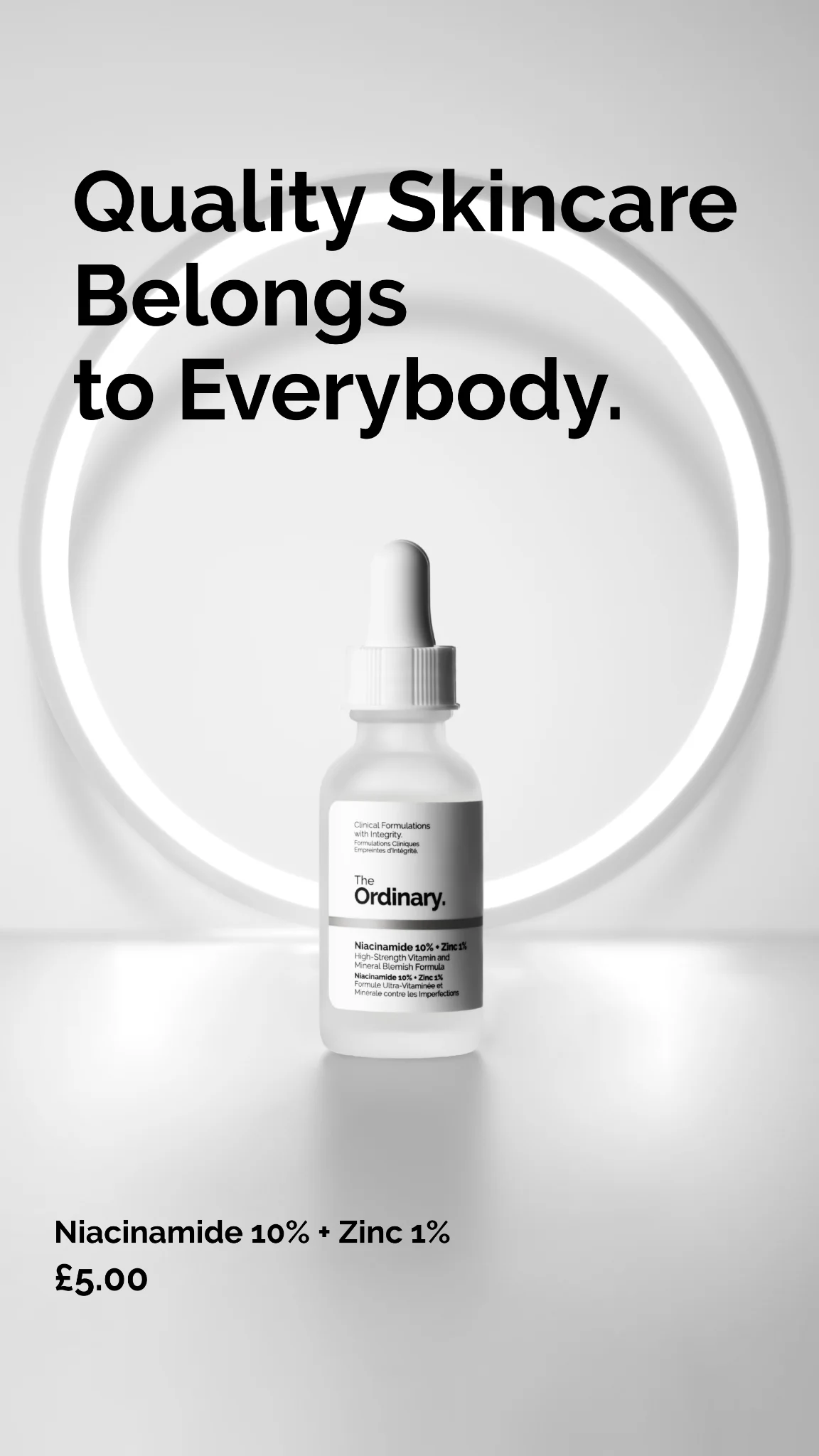
A product floating on a white background will lose to the same product inside a styled room 8 out of 10 times on home decor ads. Context sells. Show the throw pillow on a lived-in couch. Show the lamp next to a stack of books. The product gains meaning from the scene around it.
Golden-hour natural light or warm artificial light (2700K-3000K) outperforms cool studio lighting in home decor ads by a significant margin. Warm light signals "home." Cool light signals "showroom." If your shot looks like a retail catalog, warm the color temperature until it reads like a friend's apartment.
Oat, terracotta, sage, warm white, and charcoal outperform bold color palettes in home decor ads. Bold colors lock the shopper into imagining whether the product matches their specific room. Neutrals let them imagine it works anywhere. Neutrals close more sales.
Disproportionately well. Pinterest users are already in research-and-inspiration mode for home decor — unlike Meta, where they're scrolling casually. A strong Pinterest ad looks more like a mood board pin than a paid ad. Vertical 2:3 aspect ratio, room-context photo, soft brand callout. Parachute, Brooklinen, and Article all run meaningful Pinterest spend in the low-to-mid six figures monthly.
Portrait 4:5 (1080x1350) for Instagram feed matches how rooms are often photographed. 1:1 for Facebook feed and grid. 2:3 (1000x1500) for Pinterest. 9:16 for Reels and Stories. Video walk-throughs of a styled room outperform static images on Reels by a significant margin — the camera movement mimics how a human would scan the space.
Parachute leads bedding and linens. Brooklinen runs the heaviest sustained bedding-category paid spend. Article and Floyd dominate mid-priced furniture lifestyle. Burrow owns modular sofa. Ruggable leads washable rugs. Each brand has a weekly creative rotation — Parachute alone rotates room-context photography by season to keep creative fresh for 12-month-cycle shoppers.
Rule of three: the product plus two supporting elements (a book, a candle, a throw, a plant, a coffee cup). Any more and the frame reads cluttered. Warm light only — turn off overhead cool LEDs, open windows at golden hour. Real clutter helps, not studio-staged perfection. A shot that looks like a friend's apartment converts harder than a magazine-staged scene.
Product floating on white (reads as Amazon catalog), overhead LED lighting (reads as retail showroom), bold competing colors in the scene (distracts from the product), and influencer-staged perfection (reads as paid promotion rather than aspirational-but-real). The closer the shot looks to something a friend would post on Instagram organically, the harder it converts.
Clone any home decor ad example. Upload your product photo. Seconds later, you have a finished ad ready to launch.
Create your ad