33 Facebook static ad examples that actually convert

Most "Facebook ad examples" roundups recycle the same generic screenshots with zero analysis. We pulled 33 Facebook static ad examples from brands spending real money on Meta — HexClad, Harry's, Dollar Shave Club, Huel, and others — and broke down the specific Facebook ad design decisions that make each one convert. Every layout here can be cloned with your product in seconds using AdDogs.
A Facebook static ad — also called a Facebook image ad — is a single-image advertisement (not video, carousel, or collection) displayed in Facebook Feed, Stories, or the Right Column. A Confect.io analysis of 12.7 billion Meta impressions found that image ads deliver a 24% lower cost-per-purchase than video, with 7% higher click-through rate in conversion campaigns. Static ads load instantly, communicate in under two seconds, and scale to thousands of variations cheaply — which is why brands from Pampers to AG1 still rely on them. All ads in this roundup were live on Meta Ad Library as of April 2026.
What's covered in these static ad examples:
- Product hero shots (6) — single product on clean background
- Comparison ads (5) — split-screen layouts that argue visually
- Lifestyle and in-use ads (5) — editorial shots that feel like content
- Offer-driven and promo ads (5) — discount-first Facebook ad creative examples
- Grid and multi-product layouts (5) — multiple products in one frame
- Social proof and benefit-driven ads (5) — testimonials and data-driven layouts
- Premium positioning (2) — restrained, luxury-coded creative
Product hero shots
Hero shots put one product front and center. No distractions, no busy compositions — just the product doing the talking against a clean background. AppsFlyer's 2025 State of Creative Optimization report found that 70-80% of Meta ad performance comes from creative quality — not budget or targeting. Hero shots succeed because they let that creative quality speak without noise.
1. Anker — Dynamic feature highlight that proves speed visually
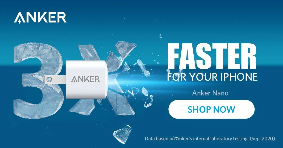
A charger bursting through an ice-blue "3X" numeral, with "FASTER" stamped across the top. Anker doesn't just claim speed — they visualize it. Shattering ice fragments create kinetic energy in a static frame, and the product sits at the exact point of impact, turning a simple charger into something that looks like it broke through a wall.
Blue gradient background serves double duty: it reinforces the "ice" metaphor while keeping the product visually isolated. No lifestyle context, no model, no scene — just the charger proving its own benefit through composition alone. Feature callouts around the product list specs, but you've already understood "fast" before reading a single word.
Best for: Tech consumers · Cold traffic / awareness · Products under $50 · Electronics Clone it: Open AdDogs, pick a product-on-background layout, upload your product, and the AI matches the composition.
2. HexClad — Celebrity endorsement as instant credibility

Gordon Ramsay on the left, a full cookware set arranged on the right. "LUXURY COOKWARE BACKED BY GORDON RAMSAY" anchors the headline. Celebrity endorsement does the heavy lifting — Ramsay's face is the trust signal, the cookware set is the product, and zero additional copy is needed.
Best for: Home cooks 30-55 · Cold traffic / awareness · Products over $100 · Home & kitchen
3. MANSCAPED — Dark aesthetic that signals premium grooming
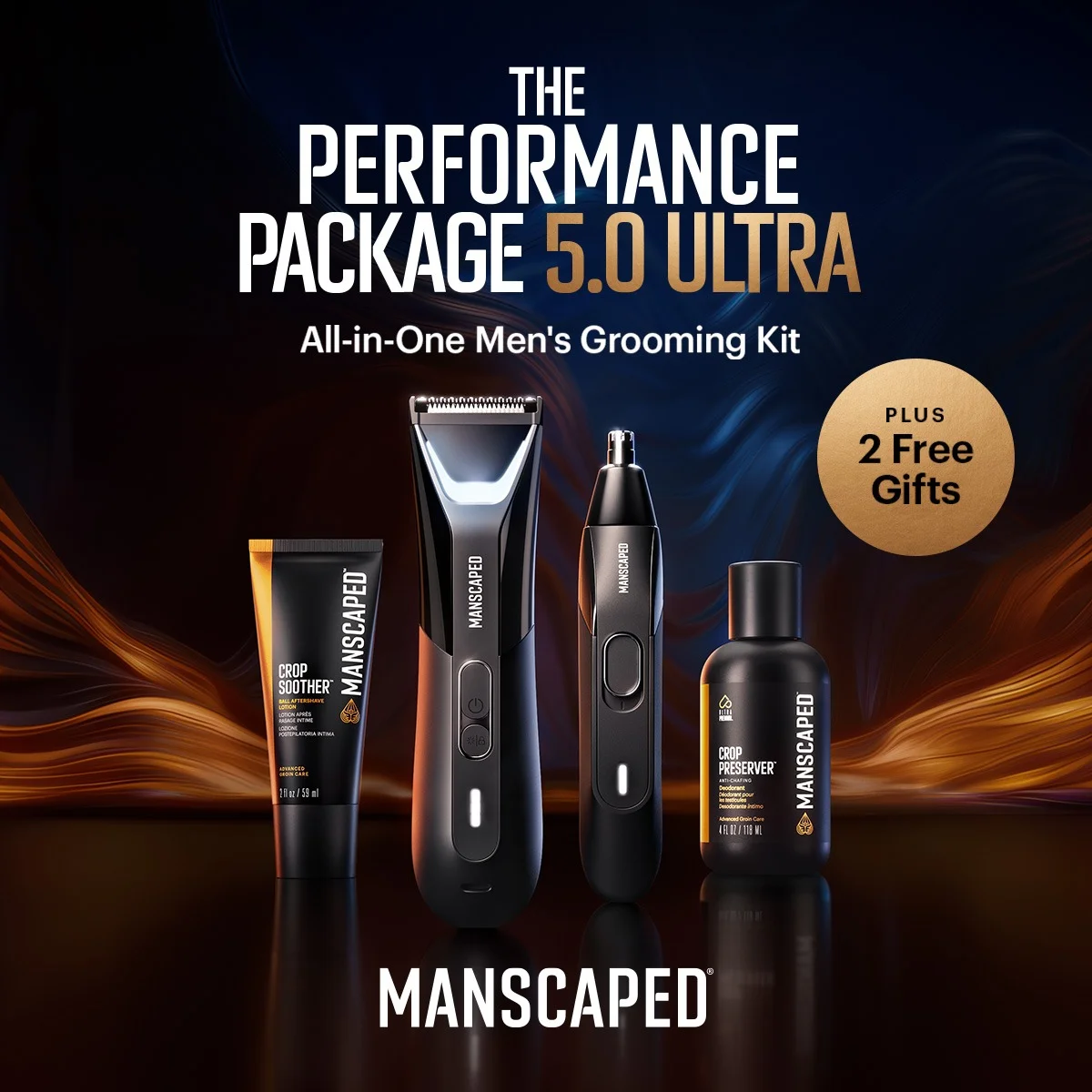
Dark, reflective surface. Five grooming products lined up in a row against a near-black background. "THE PERFORMANCE PACKAGE 5.0 ULTRA" sits bold at top. MANSCAPED uses darkness as a brand signal — a reflective surface beneath the products adds depth without cluttering the frame. Dark backgrounds on Facebook create instant contrast against the platform's white UI, and products with metallic or glossy finishes benefit most from dark surrounds.
Best for: Men 25-34 · Cold traffic / awareness · Gift sets $50-150 · Grooming & personal care
4. Inno Supps — Bold benefit headline on vibrant color
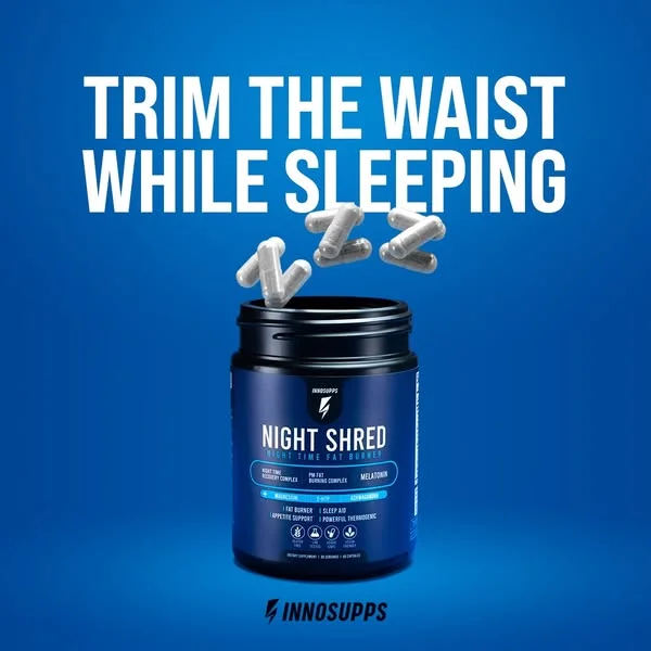
Bold blue gradient background with a single supplement bottle centered and prominent. "TRIM THE WAIST WHILE SLEEPING" sits at top — a benefit headline that targets the exact moment this product works. Vibrant color makes the bottle impossible to miss, and the gradient creates depth behind a simple product shot. Supplements are a regulated category, though — our supplement ad examples post breaks down which layouts convert and which claims get an ad banned.
Best for: Fitness enthusiasts · Cold traffic / awareness · Supplements under $50 · Health & wellness
5. Ridge — Problem-solution hero that opens with a stat
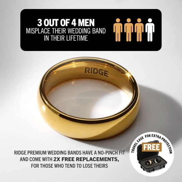
A gold wedding band centered on a dark background. "3 OUT OF 4 MEN MISPLACE THEIR WEDDING BAND IN THEIR LIFETIME" runs across the top. Ridge leads with a statistic that makes the problem feel personal, then positions the product as the solution — all in one frame. Gold on dark creates a luxury feel that justifies the price point.
Best for: Men 25-40, engaged or married · Consideration · Products $50-200 · Accessories & jewelry
6. Pampers — Product lineup with trust-building benefit claim
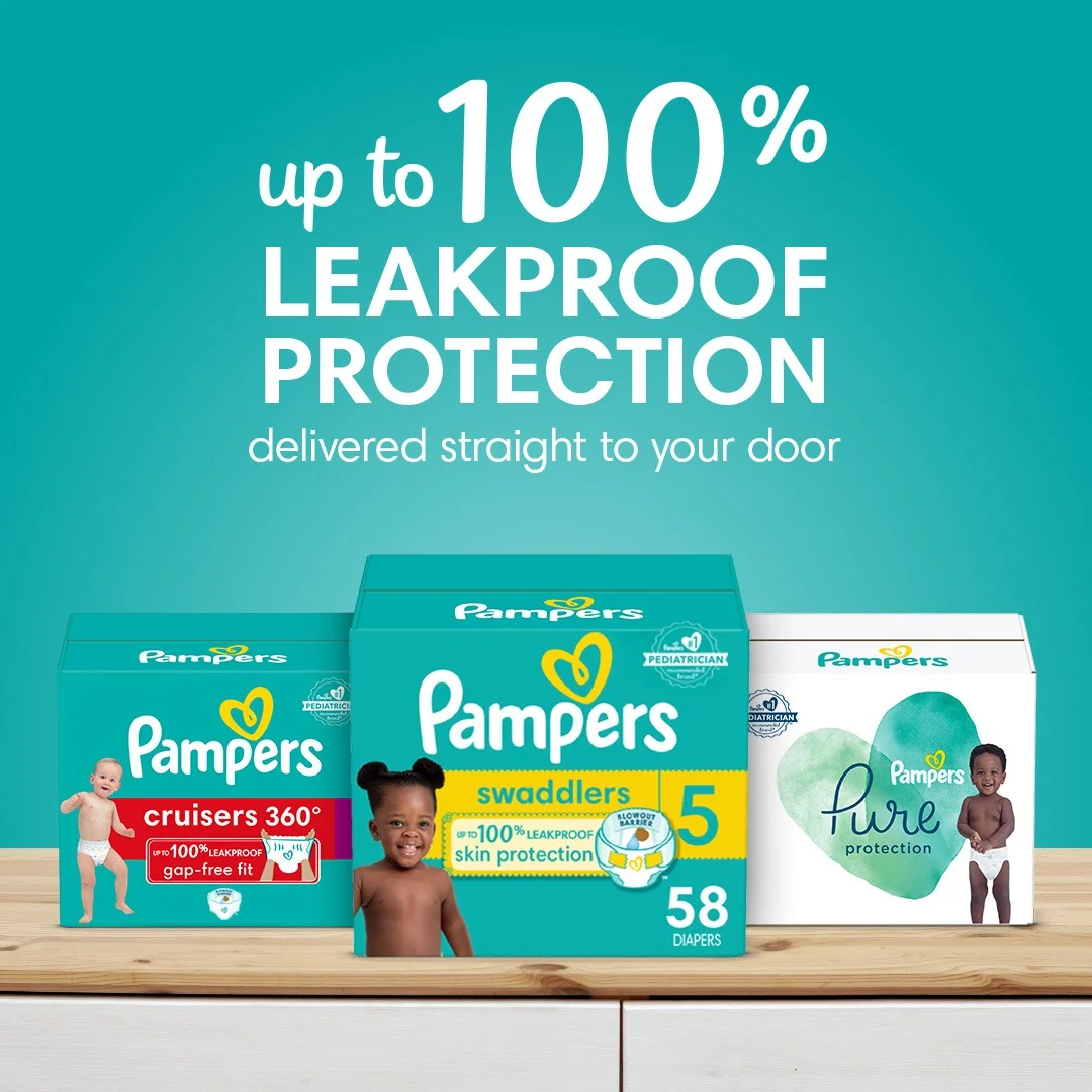
Teal background, three Pampers product lines arranged side by side. "Up to 100% LEAKPROOF PROTECTION" anchors the top. Clean, trustworthy aesthetic with a color palette that signals baby care without being pastel. Showing three product lines in one frame lets parents self-select their match.
Best for: Parents 25-40 · Cold traffic / awareness · Consumables · Kids & family
Comparison ads
Split-screen formats that make the argument visually. Among all Facebook ad examples, comparison layouts consistently earn the highest engagement — side-by-side framing lets the viewer draw their own conclusion without persuasion copy. Comparison ads work best in the consideration stage, where the viewer is already evaluating options and needs a visual push to choose yours.
7. Dollar Shave Club — Comparison that assumes the sale
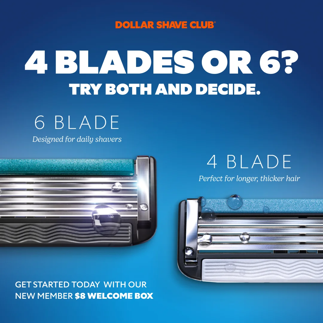
Two razor cartridges side by side against a vibrant blue gradient. "4 BLADES OR 6? TRY BOTH AND DECIDE." in bold white across the top. Water droplets on the metal add a tactile sharpness. Below everything: a $8 welcome box offer.
Clever framing — you're not choosing between DSC and a competitor. You're choosing between two DSC products. Sale already assumed. Blue gradient signals trust and freshness, and the price anchor at the bottom converts curiosity into action.
Best for: Men 22-45 · Consideration · Products under $20 · Grooming & personal care Clone it: Comparison layouts in AdDogs. Upload two product variants, pick the layout.
8. Harry's vs. Gillette — Direct competitor callout that forces a side
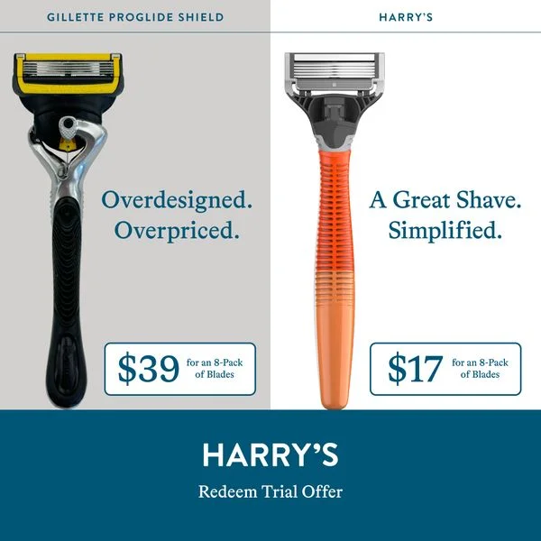
Split screen — Gillette on a muted grey left side, Harry's on a colored right side. No headline needed. Product shots, price points, and feature lists do the talking. Harry's gives itself the visually dominant side while relegating Gillette to the greyed-out "old" position.
Most brands avoid naming competitors directly. Harry's leans into it. A muted grey background for Gillette subconsciously codes it as outdated, while Harry's brighter side reads as the upgrade. Feature-by-feature comparison strips away brand loyalty and forces a rational evaluation — where Harry's wins on price. Split-screen format makes this inevitable. Your eye bounces between both sides, comparing each row, and Harry's designed every row to win.
Best for: Men 25-40 using a competitor · Consideration · Products under $30 · Grooming Clone it: Split-screen comparison layouts in AdDogs. Name your competitor, show your advantage.
9. Hydrant — Category comparison that reframes the alternative
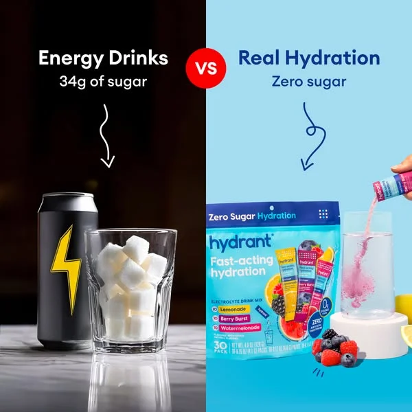
Dark background with an energy drink and a glass of sugary liquid on the left. Clean, bright Hydrant product on the right. "Energy Drinks vs Real Hydration" splits the frame. Hydrant reframes the entire energy drink category as the problem — sugar, crash, artificial ingredients — while positioning itself as the clean alternative. You don't need to name a competitor when you can indict the entire category.
Best for: Health-conscious consumers · Consideration · Products under $40 · Food & beverage
10. Ridge Wallet — Old vs. new that makes the viewer cringe
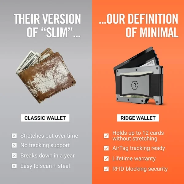
Worn, bulky leather wallet on the left. Sleek Ridge wallet on the right. "THEIR VERSION OF 'SLIM'... ...OUR DEFINITION OF MINIMAL." Stark visual contrast does the persuading — the old wallet looks embarrassing next to the Ridge, and that cringe is the conversion trigger.
Best for: Men 25-40 · Consideration · Products $50-100 · Accessories & EDC
11. Maui Nui Venison — Nutritional comparison that wins on data
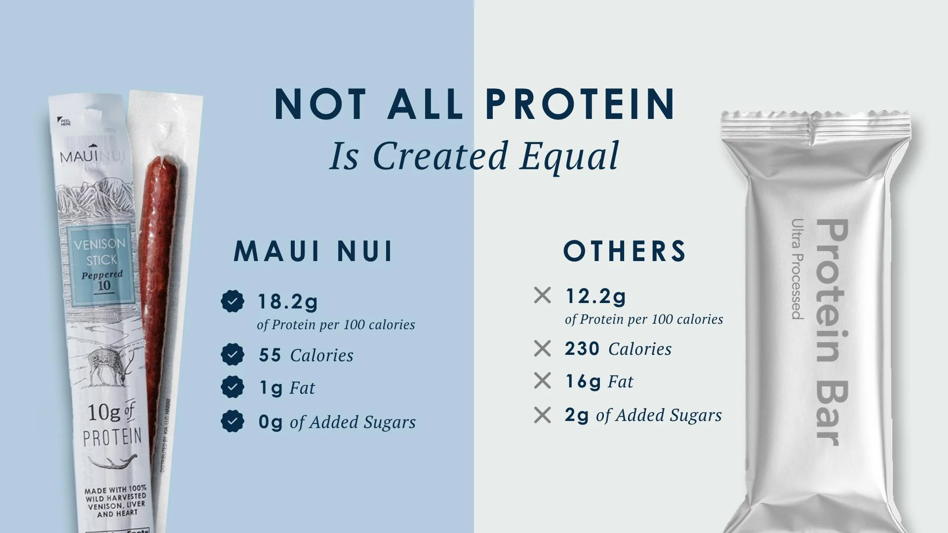
Split-screen nutritional comparison. "NOT ALL PROTEIN Is Created Equal" anchors the frame. Data points compare Maui Nui venison against conventional protein sources, and the numbers do the arguing. Clean visual division draws the eye straight to the differentiator: nutritional density per serving.
Best for: Fitness enthusiasts · Consideration · Premium consumables · Food & health
Lifestyle and in-use ads
Ads that feel like content, not campaigns. Product demos, flat-lays, and editorial-style shots that earn attention before the "Sponsored" tag registers. Motion's analysis of $100M+ in ad spend found that 42% of top-performing Meta ads used lo-fi production — shot on iPhone with minimal editing. Polished studio work isn't required. Authenticity is.
12. Ekster — In-use demo that makes features tangible
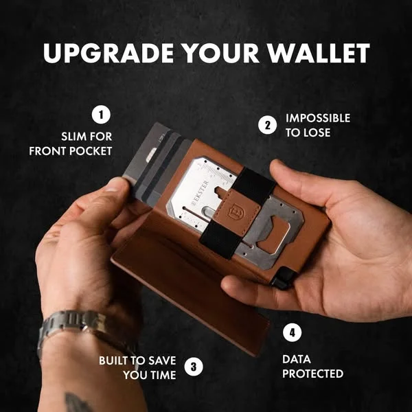
Hands holding an open Ekster wallet against a dark, textured background. "UPGRADE YOUR WALLET" at top. Feature callouts point to specific mechanisms — the card fan, the tracker, the slim profile. Seeing the wallet in hands makes the features tangible in a way that a flat product shot can't.
Best for: Men 25-34 · Consideration · Products $50-100 · Accessories
13. True Classic — Diverse casting as social proof
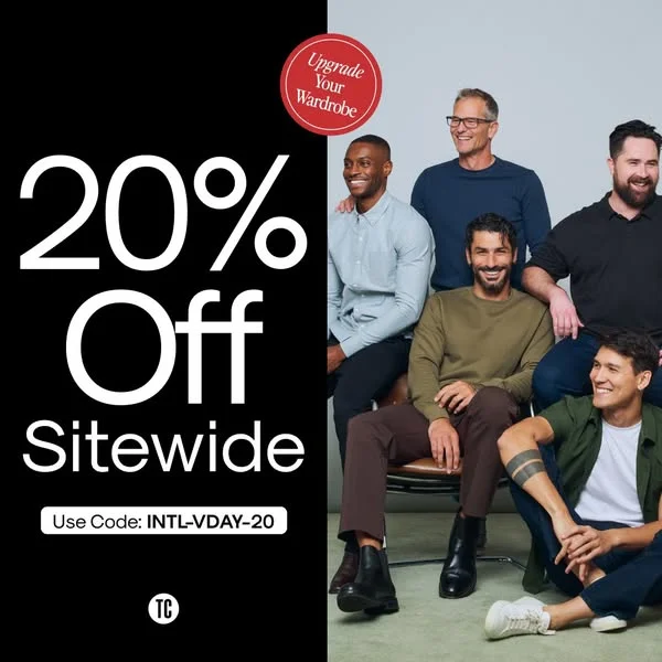
Bold discount text on the left half. Diverse group of men wearing True Classic apparel on the right. "20% Off Sitewide" dominates the visual hierarchy. Showing men of different body types wearing the shirts answers the "will this fit me?" question visually — casting choices are doing the conversion work.
Best for: Men 25-34 · Retargeting / conversion · Apparel under $40 · Fashion
14. Huel — Welcome pack that sells the unboxing
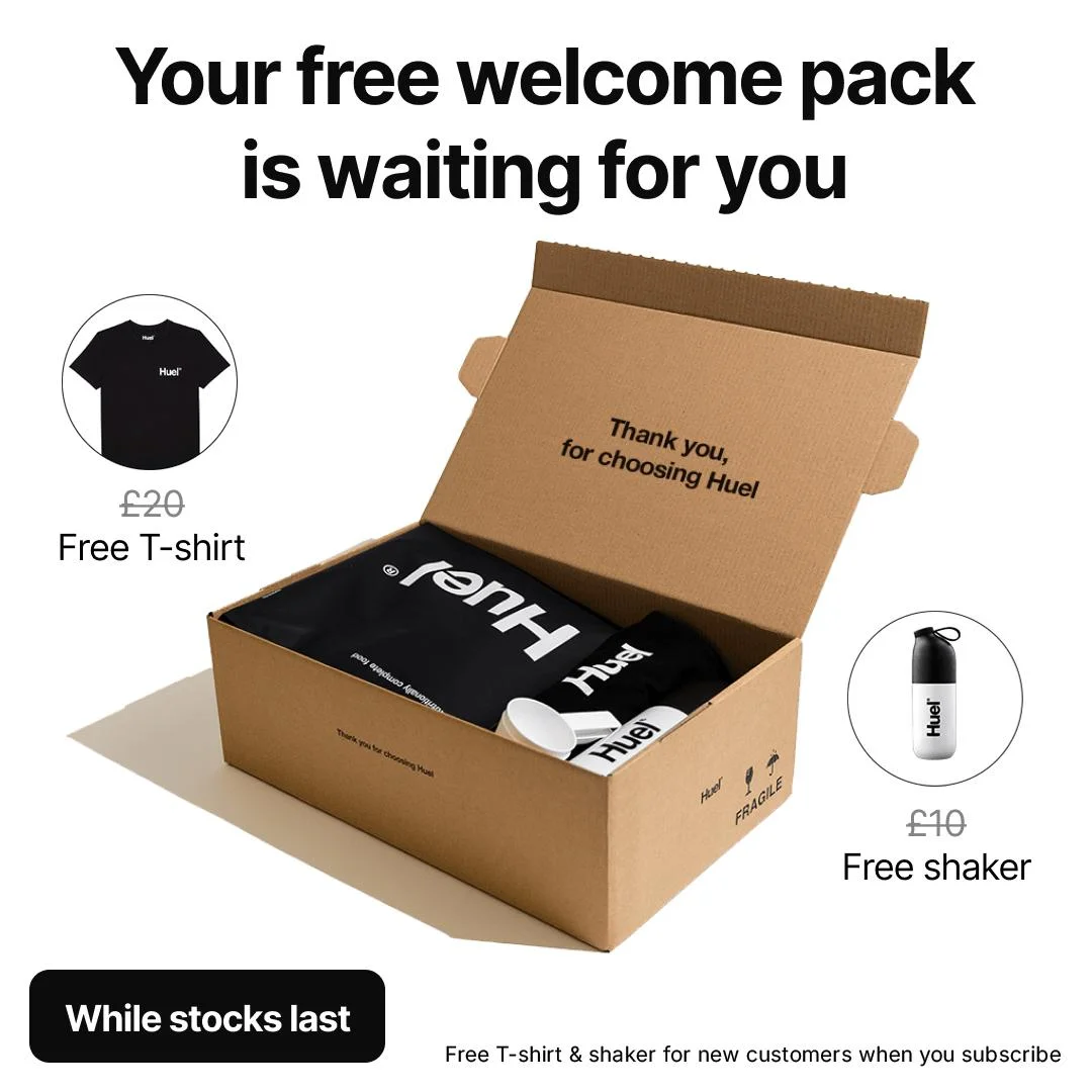
Clean, high-contrast layout showing an open Huel-branded package with everything inside visible. "Your free welcome pack is waiting for you" at top. Unboxing shots work because they answer the question "what do I actually get?" in one frame. Tangible value on display reduces the perceived risk of trying a new brand.
Best for: First-time buyers · Conversion · Subscription products · Food & health
15. Vitamix — Product hero that conveys quality through ingredients
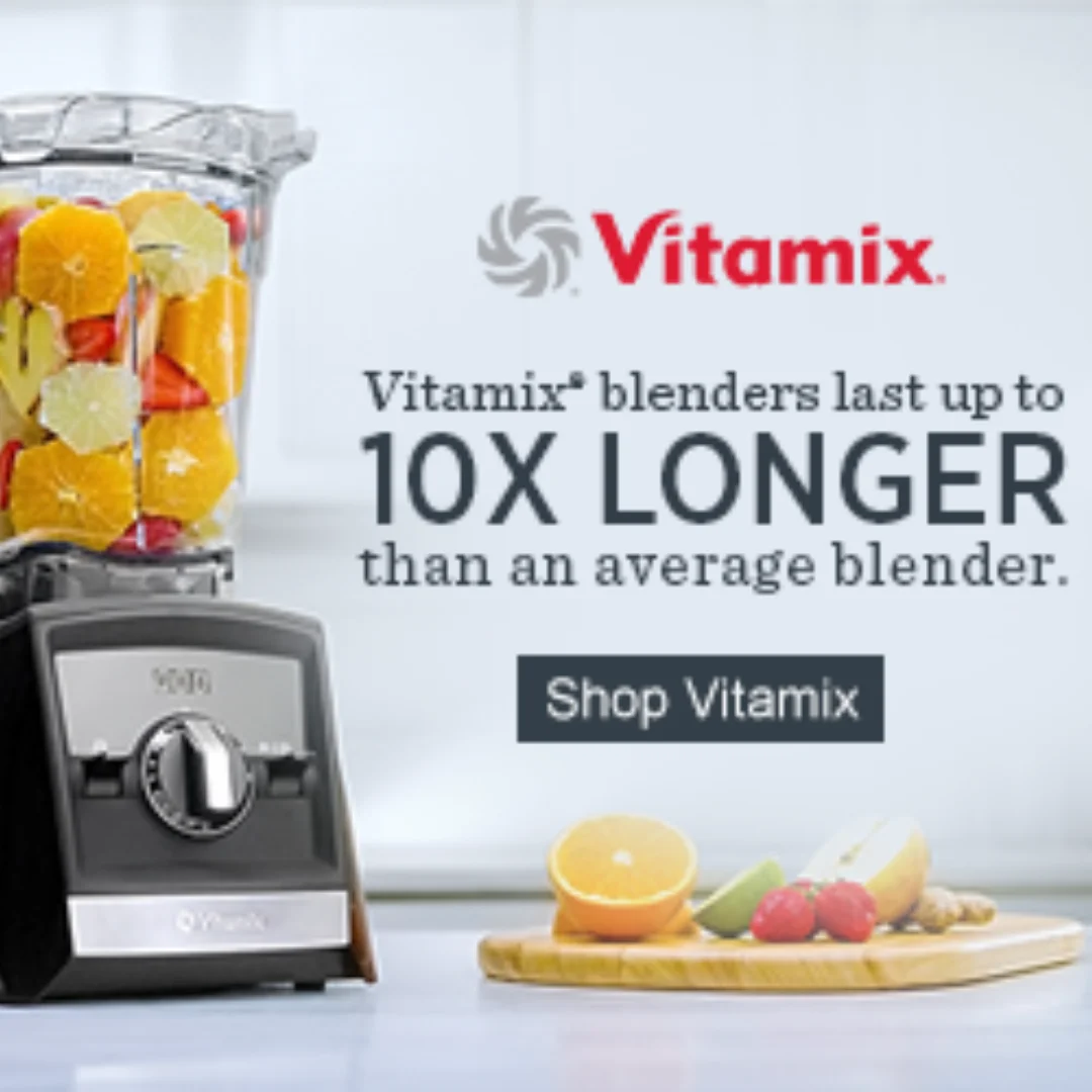
Vitamix blender filled with vibrant, fresh fruits against a clean background. No headline, no price — just the product doing what it does. Fresh fruit inside the blender proves the "healthy lifestyle" promise visually. A subtle diagonal line in the composition adds movement without complexity.
Best for: Health-conscious home cooks · Cold traffic / awareness · Products over $200 · Kitchen
16. SimpliSafe — Product and offer in one balanced frame

SimpliSafe doorbell on the left against a textured wall. Offer text and benefit headline on the right. "Most complete system for peace of mind." balances product visibility with persuasive copy in a clean split-composition. Showing the doorbell mounted on a textured surface makes it feel installed, not boxed.
Best for: Homeowners · Consideration · Products $100-300 · Home security & tech
Offer-driven and promo ads
Sale announcements, discount-first layouts, and value-stacking formats where the offer is the creative. Promo ads work hardest for retargeting — the viewer already knows the brand, and a clear offer removes the last friction point. WordStream's 2025 benchmark data shows the average Facebook CPC for traffic campaigns dropped to $0.70, with apparel ads as low as $0.45 per click — offer-driven creative pushes these numbers even lower.
17. Dr. Squatch — BOGO offer with product proof
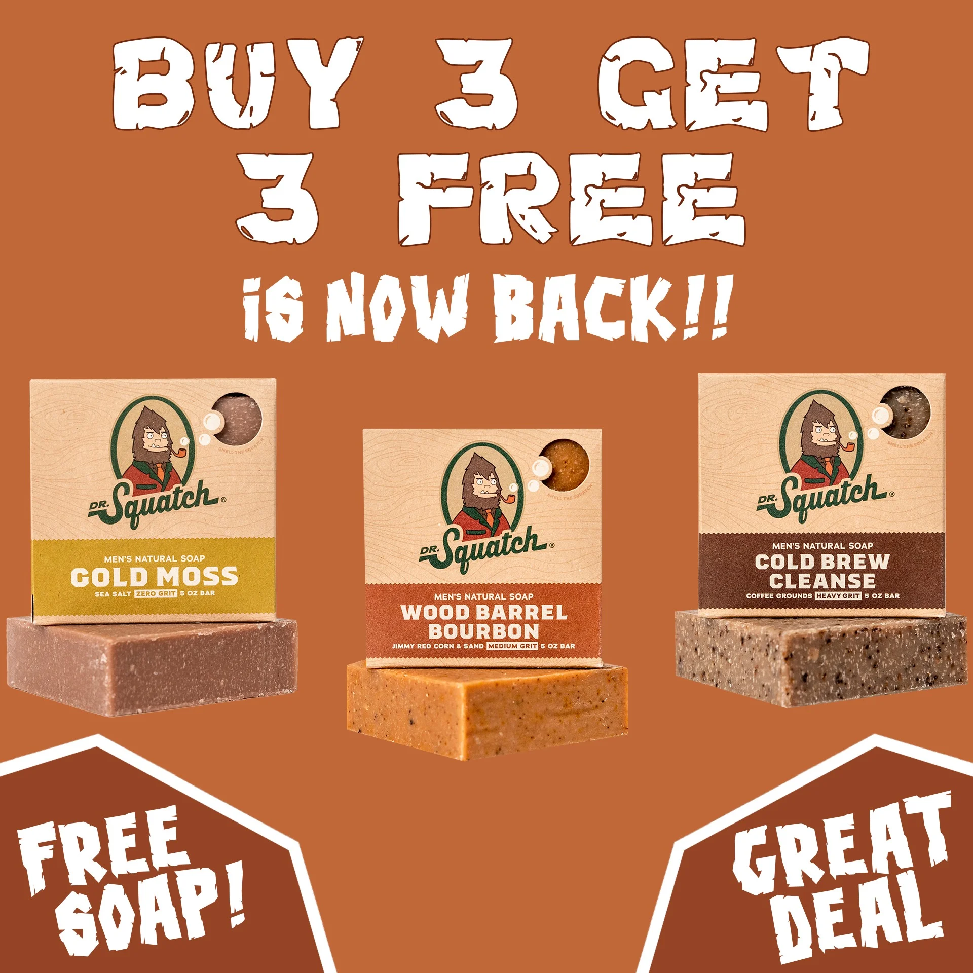
Bold, distressed-font headline dominates the top: "BUY 3 GET 3 FREE IS NOW BACK." Soap products displayed below, each visually distinct. Dr. Squatch leads with the offer and backs it up with product variety — you see exactly what you're getting before clicking through.
Best for: Men 25-34, deal-responsive · Retargeting / conversion · Products under $30 · Grooming
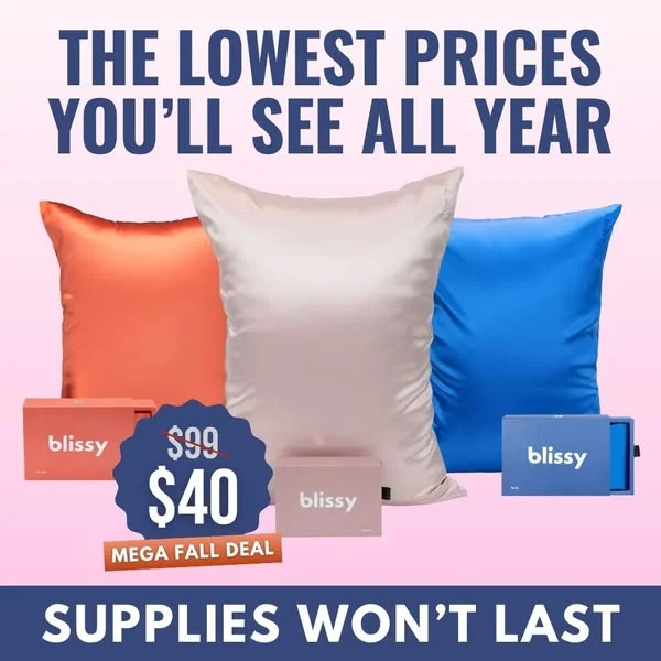
18. Blissy — Urgency-driven sale with product color pop
High-contrast layout with three vibrant silk pillowcases as the centerpiece. "THE LOWEST PRICES YOU'LL SEE ALL YEAR" at top. Bold, immediate, and urgency-driven. Colorful pillowcases against a clean background create visual interest while the headline does the conversion work.
Best for: Women 25-45, gift shoppers · Retargeting / conversion · Products $30-80 · Beauty & home. (For more beauty brand ad breakdowns, see our skincare ad examples.)
19. Barestep — Flash sale with in-hand product proof

Vibrant green background, a hand holding the product front and center. "TODAY ONLY BUY 2 GET 1 FREE" at top. Green acts as both a brand color and an attention signal — it's one of the highest-visibility colors in a Facebook feed. Product in hand adds scale and tangibility.
Best for: Active lifestyle consumers · Retargeting / conversion · Products under $60 · Footwear & fitness
20. AG1 — Educational billboard that challenges skepticism
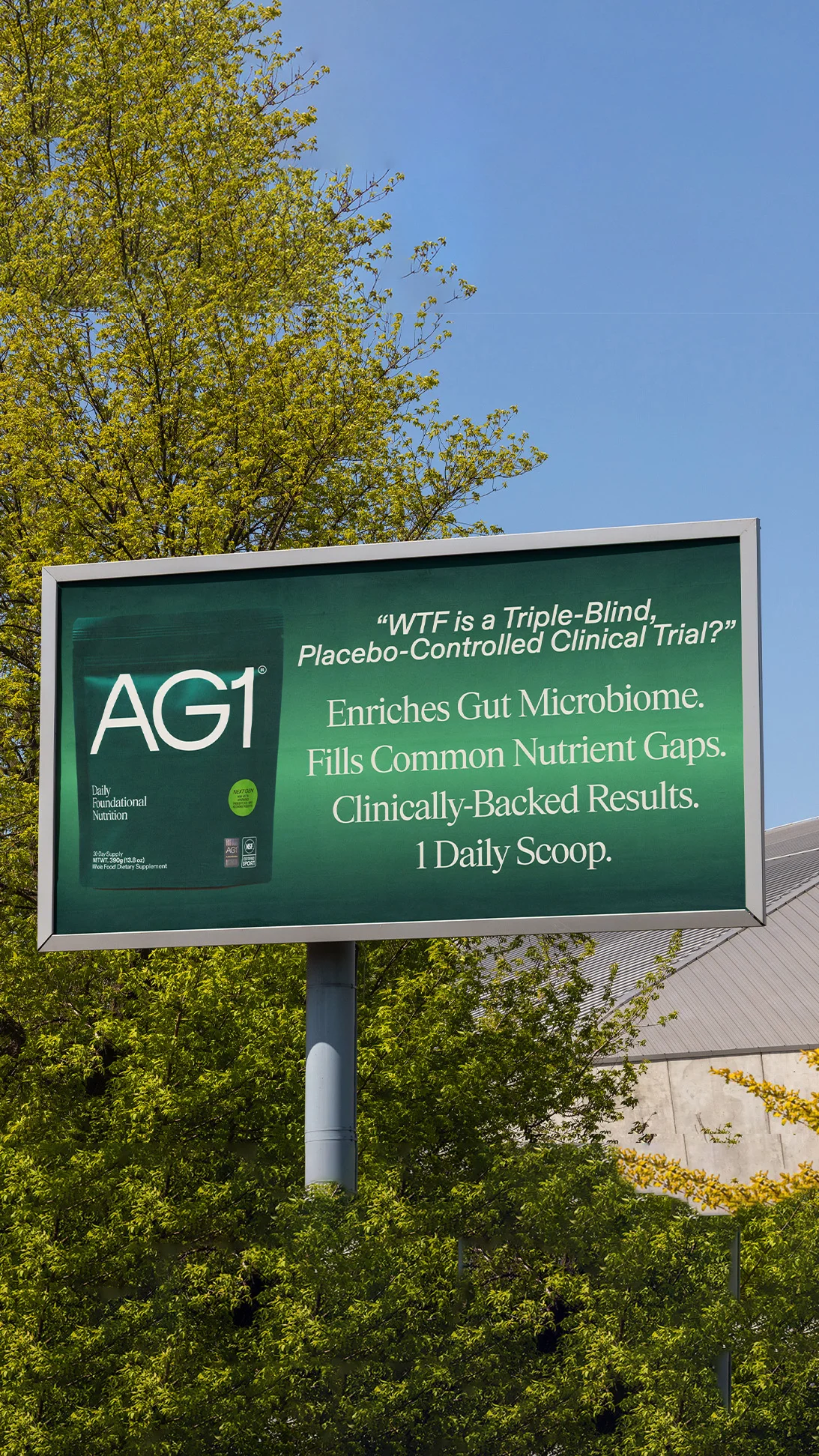
Deep green billboard with a provocative question: "WTF is a Triple-Blind, Placebo-Controlled Clinical Trial?" Product pouch positioned alongside. AG1 doesn't lead with a discount or a benefit claim — they lead with education, targeting the exact objection their audience has.
Supplement skeptics don't trust "clinically proven" labels because every supplement uses them. AG1 addresses that skepticism head-on by asking the question their audience is already asking, then using the ad to explain what makes their clinical testing different. Deep green background is synonymous with the AG1 brand at this point — it's recognition before reading. Provocative copy ("WTF") signals that AG1 speaks like their audience, not like a medical journal.
Best for: Health professionals 30-50, supplement skeptics · Consideration · Premium subscriptions · Health & wellness Clone it: Product-on-brand-color layouts in AdDogs. Pair your product with a headline that addresses your audience's biggest objection.
21. Noom — Minimalist layout that whispers in a feed full of shouting
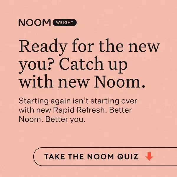
Soft peach background, minimal text: "Ready for the new you? Catch up with new Noom." No product shot, no before-and-after, no aggressive claims. Noom uses restraint as a design strategy — in a feed full of bold weight-loss claims, a quiet pastel ad reads as more trustworthy.
Best for: Women 25-40 · Cold traffic / awareness · App subscriptions · Health & wellness
Grid and multi-product layouts
Formats that showcase multiple products, variants, or features in a single frame. Grid layouts turn product diversity into a visual argument.
22. HexClad — Product grid that earns the "best of" claim
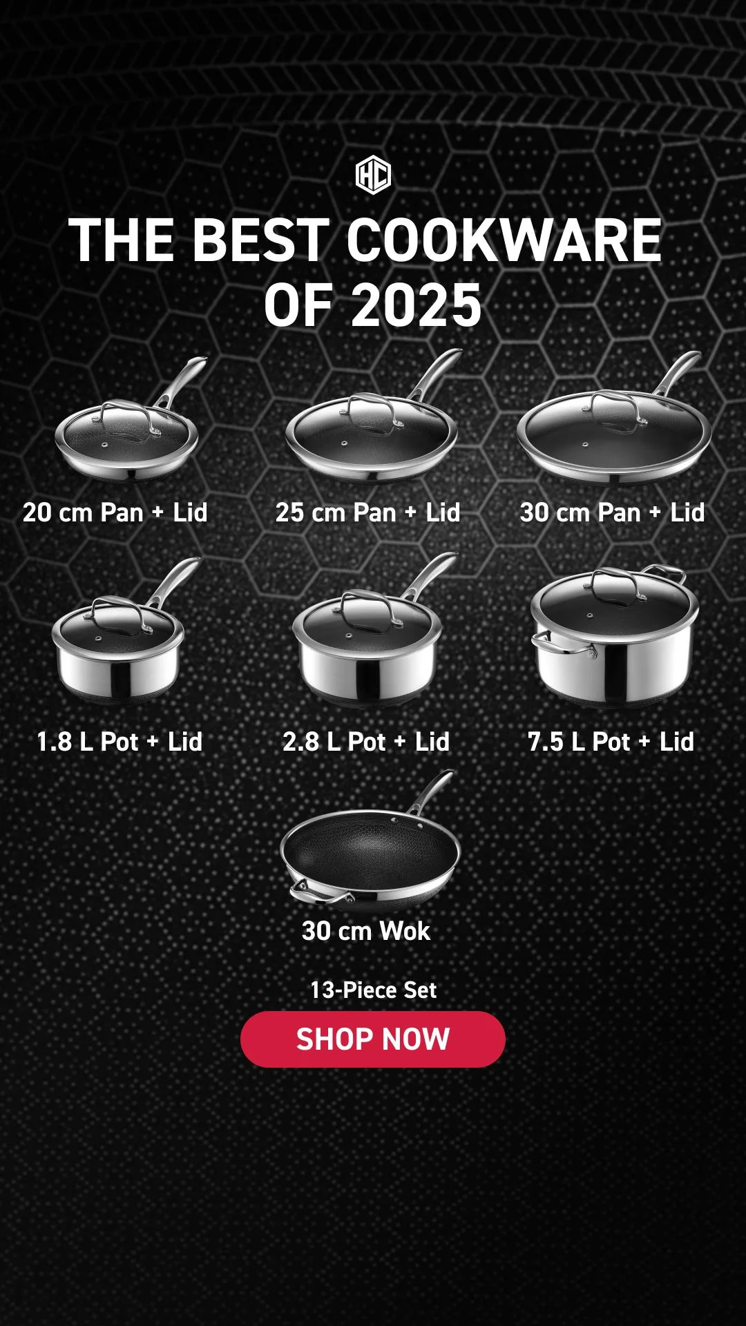
Dark textured background, individual cookware pieces arranged and labeled. "THE BEST COOKWARE OF 2025" at top. HexClad uses a grid layout to do something most single-product shots can't — show the full system.
Each piece has its own label, which transforms browsing into education. Viewers learn the product line while looking at the ad, and that time-in-ad signals engagement to the algorithm. Dark background makes the stainless steel and hex-pattern surfaces glow, and the "best of 2025" claim borrows authority from the awards and reviews that back it up. Labeling each piece by name also reduces purchase friction — a viewer can say "I want the 12-inch pan" without visiting the site first.
Best for: Home cooks 30-55, gift shoppers · Consideration · Product sets over $100 · Kitchen Clone it: Multi-product grid layouts in AdDogs. Upload your product line, and the AI arranges each piece with consistent spacing.
23. Harry's — Four-quadrant grid that stacks value claims
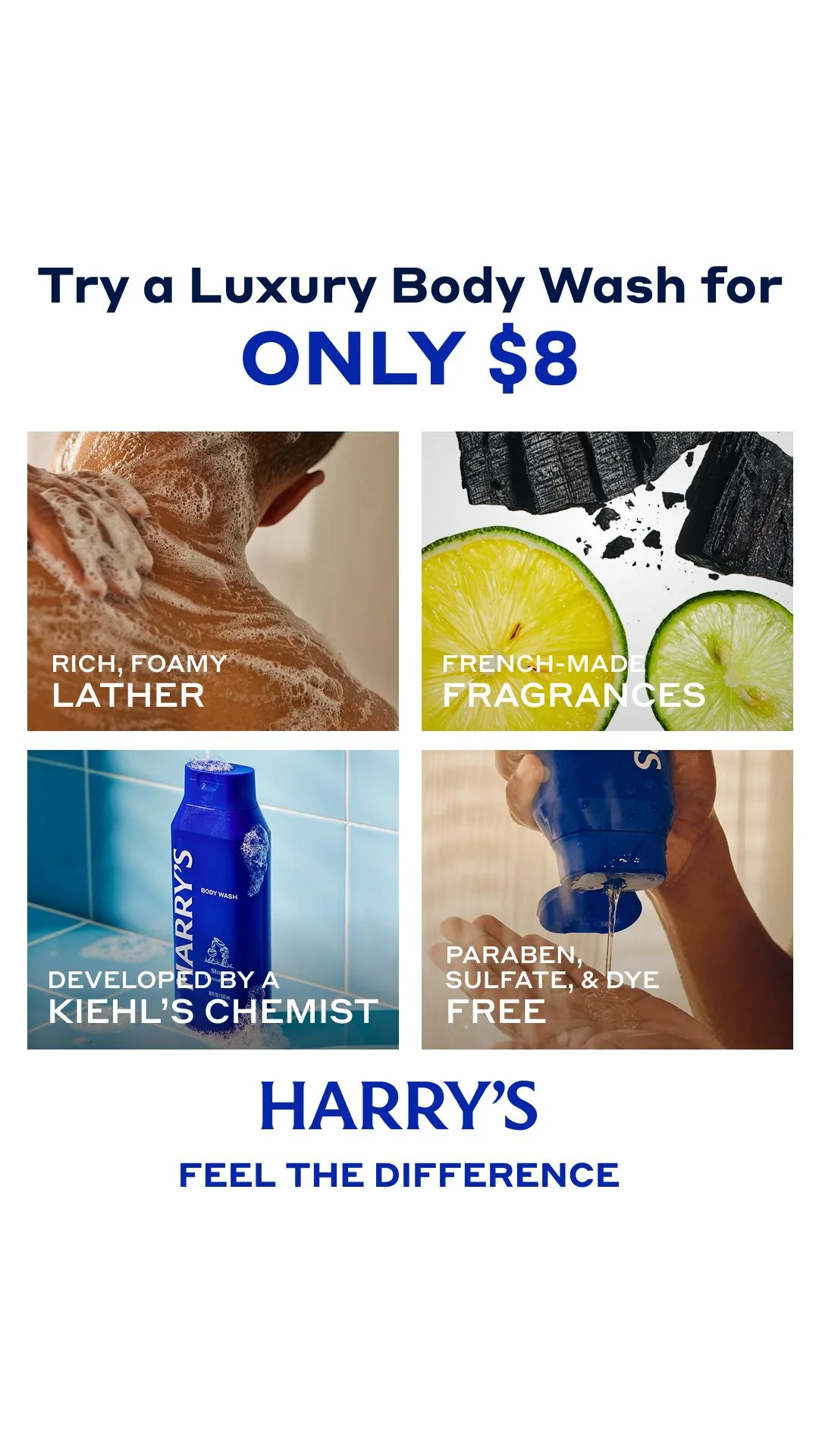
Four-quadrant grid in blue and white, consistent with Harry's branding. "Try a Luxury Body Wash for ONLY $8" anchors the offer. Each quadrant delivers a separate value proposition — ingredient close-ups, the bottle, lifestyle context, and a benefit callout. Four frames in one ad gives Harry's four chances to hook a different viewer motivation.
Best for: Men 25-34 · Consideration to conversion · Products under $15 · Grooming
24. Huel — Dark background that makes food photography pop
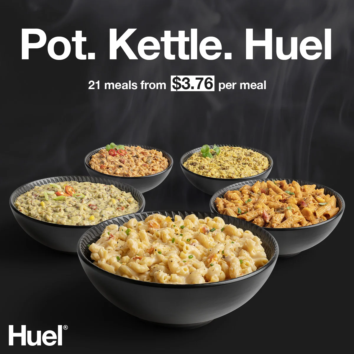
Five vibrant bowls of Huel Hot & Savoury meals arranged in a semi-circle on a black background. "Pot. Kettle. Huel." as the headline. Dark backgrounds make food colors look more vibrant — each bowl becomes a bright focal point. Semi-circular arrangement creates visual flow without a rigid grid.
Best for: Busy professionals · Consideration · Meal subscriptions · Food & beverage
25. Dollar Shave Club — Color-block grid that sells personality
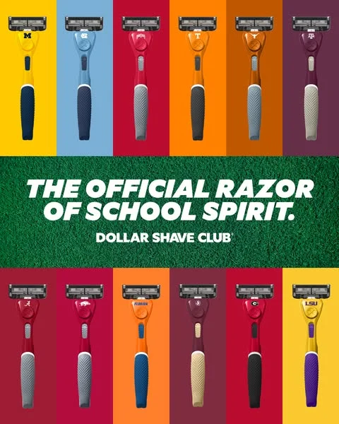
Vibrant color blocks, each featuring a razor that matches its background. "THE OFFICIAL RAZOR OF SCHOOL SPIRIT." DSC turns product variants into a visual identity play — each color connects to a school, making a commodity product feel personal. Grid layout lets the viewer find "their" color instantly.
Best for: Men 18-24, college students · Cold traffic / awareness · Products under $15 · Grooming
26. Inno Supps — Ingredient spotlight that educates and converts
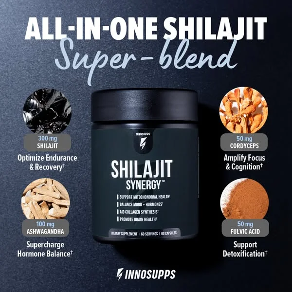
Central supplement bottle surrounded by four ingredient highlight icons. "ALL-IN-ONE SHILAJIT Super-blend" at top. Grid composition turns a single product into a visual breakdown of what's inside. Each ingredient icon reduces the "what is shilajit?" friction for unfamiliar buyers.
Best for: Supplement-educated men 25-40 · Consideration · Products $30-60 · Health & fitness

Create your own facebook product ads
Create your adSocial proof and benefit-driven ads
Ads that teach, prove, or build trust through testimonials, data points, and benefit comparisons. Among these Facebook image ads, social proof formats work hardest for products needing a moment of education before the viewer will buy. Static ads convert 40% better than video in retargeting campaigns — the viewer already knows you, and a clear testimonial or benefit comparison closes the gap.
27. Huel — Nutritional comparison that makes abstract data tangible
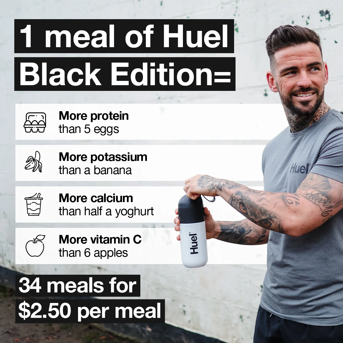
Nutritional comparisons stacked on the left — protein vs. eggs, potassium vs. bananas, calcium vs. yogurt. Aspirational user on the right holding a Huel shaker. "1 meal of Huel Black Edition =" bridges both halves. Huel translates abstract nutrition data into comparisons everyone understands. Nobody knows what "40g of protein" feels like, but "more protein than 5 eggs" clicks instantly.
Best for: Fitness-focused adults 25-40 · Consideration · Meal replacements · Health & nutrition
28. Happy Mammoth — Problem-solution split with bold color
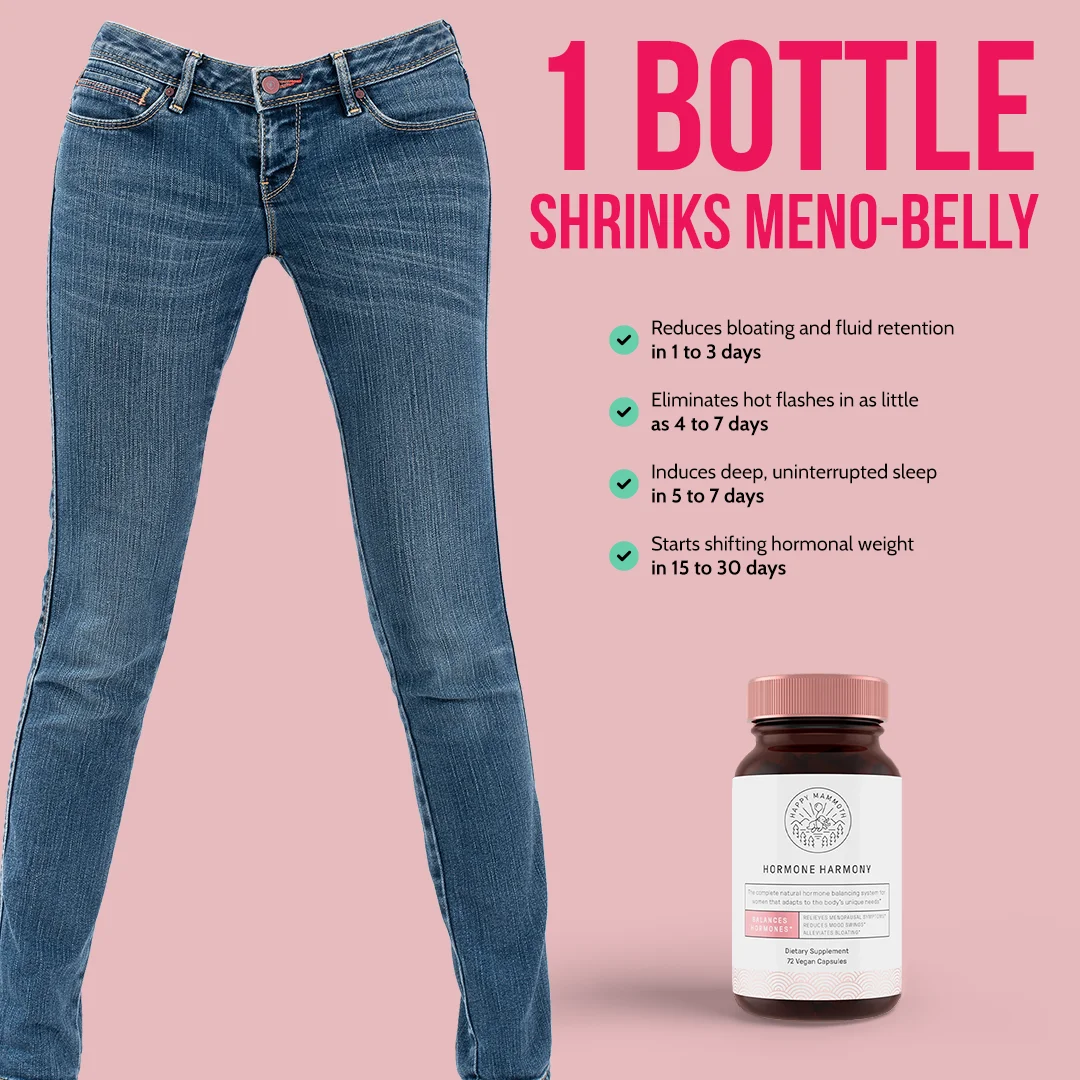
Pink background, empty jeans on the left (the problem), product with benefits listed on the right (the solution). "1 BOTTLE SHRINKS MENO-BELLY" is the headline. Happy Mammoth uses the visual shorthand of loose jeans to represent the outcome without showing a person, which sidesteps body image sensitivity while still communicating the result.
Best for: Women 45+ · Consideration to conversion · Supplements $40-70 · Women's health
29. Ekster — Provocative testimonial that earns the click through outrage
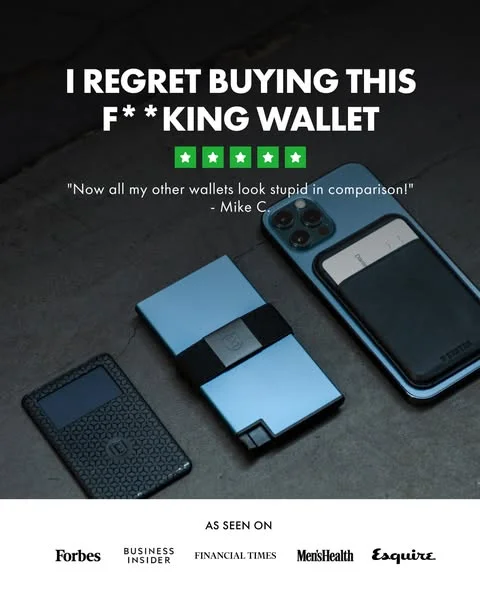
"I REGRET BUYING THIS F**KING WALLET" — that's the headline. 4.5 stars displayed prominently. Product showcase below. Your brain reads "regret" and "wallet" and assumes a negative review, but the stars contradict the headline, forcing you to stop and read. Curiosity gap, opened and closed in a single frame.
Ekster weaponizes the pattern interrupt. Every other ad in the feed is shouting about how great their product is. A seeming negative review breaks that pattern so hard that the viewer can't scroll past without resolving the contradiction. Stars next to a provocative headline create cognitive dissonance — "wait, 4.5 stars but they regret it?" — and that tension is what drives the click. Product below the headline gives the curious viewer something to examine while their brain processes the headline trick. Provocative, memorable, and entirely scroll-proof.
Best for: Men 25-34, impulse buyers · Cold traffic / awareness · Products $50-100 · Accessories Clone it: Testimonial-driven layouts in AdDogs. Lead with your most surprising customer quote.
30. Hollow Socks — Testimonial with product proof below
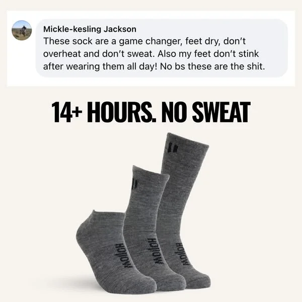
Segmented layout — customer testimonial at top, product display below. "14+ HOURS. NO SWEAT" anchors the claim. Prominent user quote establishes social proof first, then the product display below gives the viewer something concrete to evaluate. Benefit-first, product-second hierarchy.
Best for: Active professionals, healthcare workers · Consideration · Products $15-30 · Apparel
31. Ryze Superfoods — Social media comments as social proof
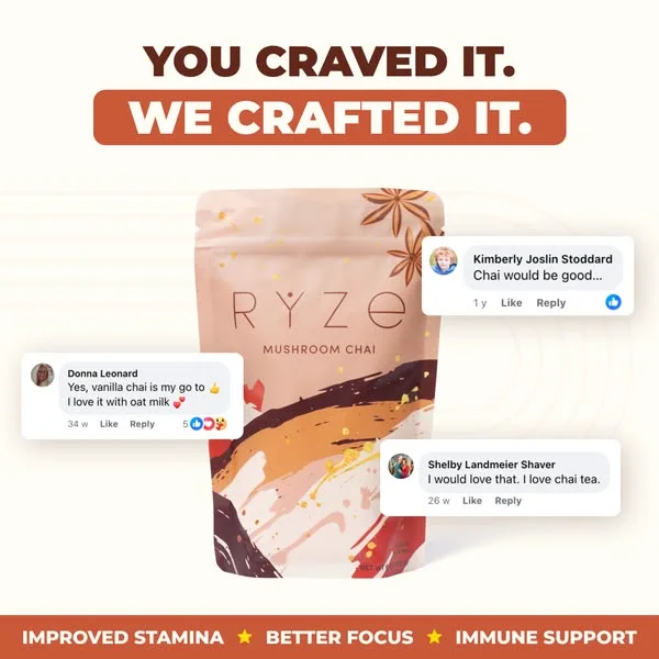
Product pouch flanked by authentic-looking social media comments. "YOU CRAVED IT. WE CRAFTED IT." at top. Ryze turns their community's enthusiasm into ad creative — real comments from real people feel more trustworthy than any polished testimonial. Surrounding the product with demand signals creates a bandwagon effect.
Best for: Wellness community members · Consideration · Subscriptions under $40 · Food & health
Premium positioning
Dark backgrounds, restrained copy, and product photography that signals quality through what it leaves out.
32. Matsato — Craftsmanship story told in one frame
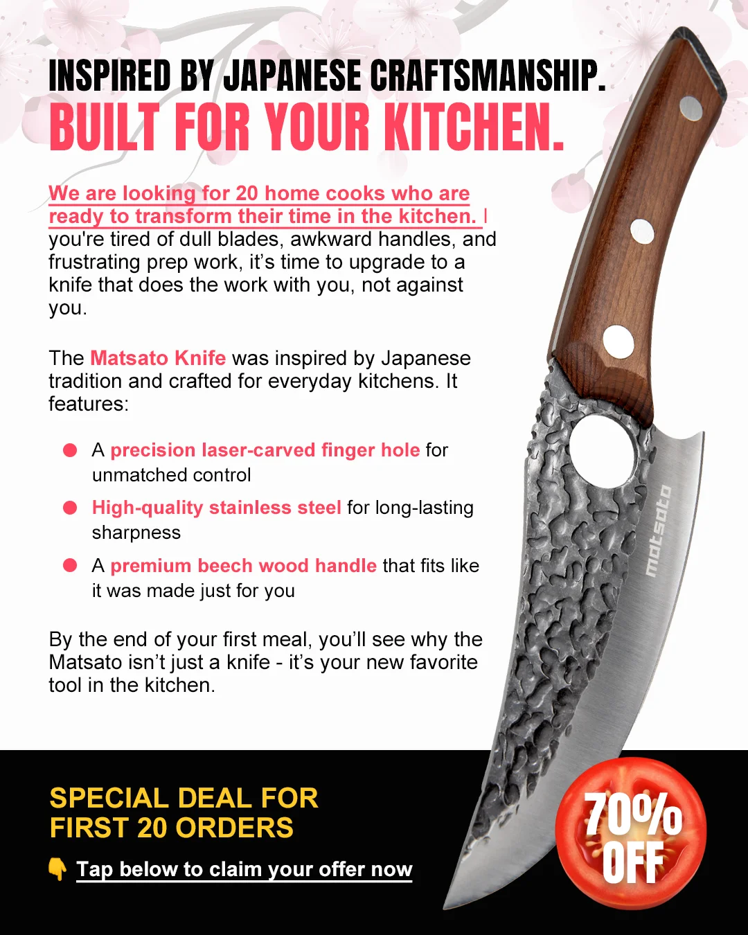
Detailed copy on the left, a dark knife angled against a clean white background on the right. "INSPIRED BY JAPANESE CRAFTSMANSHIP. BUILT FOR YOUR KITCHEN." Split-screen dedicates half the frame to storytelling and half to the product. Copy covers materials, origin, and design philosophy — giving the viewer enough information to justify a premium purchase without clicking through.
Best for: Quality-conscious home cooks, gift shoppers · Consideration · Products $80-200 · Kitchen & home
33. Harry's — Direct challenge hero shot with minimal copy

Single razor on a clean gradient background. "HEY, YOU." — two words. Harry's strips everything down to the product and a direct address. Ample negative space ensures the razor is the undeniable focal point. Minimal copy signals confidence — the product is the message, and the headline just gets your attention.
Best for: Men 25-34, brand switchers · Cold traffic / awareness · Products under $20 · Grooming
Which layout should you use?
Every ad in this list follows a specific layout pattern. Choosing the right one depends on your product, price point, and where the viewer sits in the funnel. Here's the decision framework:
| Your situation | Best layout | Examples from this post | Why it works |
|---|---|---|---|
| Product under $30, cold traffic | Hero shot on bold background | #1 Anker, #4 Inno Supps, #33 Harry's | Single product stops scroll, low price reduces friction — no persuasion needed |
| Product over $50, cold traffic | Comparison (vs. competitor or old way) | #8 Harry's vs Gillette, #10 Ridge Wallet | Higher price needs justification — visual comparison makes the case instantly |
| Retargeting warm audience | Testimonial or social proof | #29 Ekster, #30 Hollow Socks, #31 Ryze | Viewer already knows the brand — social proof closes the trust gap |
| Flash sale or time-limited offer | Promo / offer-first layout | #17 Dr. Squatch, #18 Blissy, #19 Barestep | Urgency + clear offer = direct response. Works best for warm audiences |
| Supplement or health product | Benefit-driven with data | #27 Huel, #20 AG1, #11 Maui Nui | Needs education before purchase — data comparisons build trust faster than claims |
| Multi-SKU product line | Grid or multi-product | #22 HexClad, #23 Harry's, #25 DSC | Shows the full system, lets viewer self-select their match |
| Premium or luxury positioning | Dark background, minimal copy | #3 MANSCAPED, #32 Matsato, #5 Ridge | Restrained copy and dark canvas signal quality without shouting |
What makes Facebook static ads convert
After breaking down these 33 Facebook ad examples, five Facebook ad design patterns keep surfacing. Not coincidences — deliberate decisions that work because of how people scroll the feed. (For a deeper look at when static beats video, see our static vs. video ads breakdown.)
Product isolation beats busy composition
Anker, MANSCAPED, Vitamix, Harry's. High-performing ads in this list put one product on a solid or near-solid background. In a noisy feed, simplicity is the loudest statement. Your eye has nowhere else to go.
Brands using busy lifestyle shots compensate with aggressive discounts (Dr. Squatch, Blissy) or emotional hooks (Ekster's provocative testimonial). Without a strong offer or a curiosity gap, keep it clean.
Comparison layouts convert viewers who are already evaluating
Dollar Shave Club, Harry's vs. Gillette, Hydrant, Ridge Wallet, Maui Nui. Split-screen ads don't ask you to believe a claim — they show you a visual comparison and let you draw the conclusion. Your product vs. the status quo. You can make the same case with text, but it takes 200 words. A split-screen does it in half a second. Comparison ads perform best at the consideration stage, when the viewer is actively weighing options.
One number does more than three paragraphs
Huel: "$2.50 per meal." Harry's: "ONLY $8." Dollar Shave Club: "$8 Welcome Box." Every high-converting ad in this list leads with a single number that anchors the value proposition. A number doesn't need to be impressive — it needs to be specific. Precision separates a claim from proof.
Design for mobile first — 82% of Facebook is mobile-only
81.8% of Facebook users access the platform on mobile only, and mobile-first campaigns deliver 52% higher CTR. Every ad in this post was designed for Feed, but most impressions land on a phone screen. High-contrast colors, large product shots, and text that reads at phone-screen size — these aren't nice-to-haves, they're requirements. An ad that looks great on a 27-inch monitor but becomes illegible at 375px wide is wasting impressions.
Social proof formats blur the ad/content line
Ekster's provocative testimonial, Hollow Socks' customer quote, Ryze's social media comments. Ads that look like organic reviews or user posts get past the mental "ad filter" that experienced scrollers have built up. Testimonial-first layouts build trust before the product pitch even begins.
Ad fatigue: when to refresh your creative
Even winning ads die. Static ad creative typically hits the fatigue wall within 7 days for targeted e-commerce audiences. Under Meta's Andromeda algorithm, creative assets that once lasted 6-8 weeks now fade in 2-3 weeks. Purchase intent drops approximately 16% once viewers see an ad 6+ times.
Early warning signs (catch these before ROAS collapses):
- Frequency score climbing above 3-4
- CTR starts declining — this is the first signal
- CPM rising without audience changes
- ROAS drops last — by the time you see it, you've wasted 3-5 days of budget
How many creatives you need (based on budget):
- Under $5K/month: test 5-10 creatives per product
- $5K-$25K/month: test 15-25 creatives
- $25K+/month: test 40-50+ creatives — top DTC brands produce 50+ new assets monthly The refresh playbook: When a winning ad starts fatiguing, don't create new concepts from scratch. Clone the winning layout with fresh product angles — different product photo, different background color, same proven composition. At seconds per ad with AdDogs, you can have 10 fresh variations of a winning layout queued before the original fully fatigues. For the complete testing system, see our guide on ad creative testing.
Create your own Facebook static ads
Every ad in this list follows a layout you can clone. Same structure, same composition principles, your product in the frame.
AdDogs has over 14,000 ad examples sourced from campaigns that ran and converted. Browse by layout pattern, pick the one that fits your product, upload your photo, and AdDogs rebuilds the ad with your brand colors applied automatically. one credit per ad, finished in seconds.
FAQ
What size should Facebook static ads be?
Facebook Feed performs best at 1:1 (1080x1080px) or 4:5 (1080x1350px). Stories and Reels use 9:16 (1080x1920px). Right Column uses 1:1 at 254x254px. For the complete breakdown across every platform, see our ad sizes and specs guide. AdDogs exports in three standard formats — 1:1, 9:16, and 16:9 — covering Feed, Stories, and display placements automatically.
How many Facebook ad variations should I test?
Budget determines testing volume. Under $5K/month, test 5-10 creatives per product. Between $5K-$25K, test 15-25. Above $25K, aim for 40-50+ — top DTC brands produce 50+ new creative assets monthly on Meta alone. Only 1-3 out of every 10 creatives become true winners, so volume is the only way to give the math a chance. See our ad creative testing guide for the full framework.
How much do Facebook static ads cost to run?
Average Facebook CPC for traffic campaigns is $0.70, with apparel ads as low as $0.45 per click. CPM for image ads averages $13.75. E-commerce brands allocated 68% of total ad budget to Meta in 2025, making it the dominant paid acquisition channel. Static image ads typically deliver 24% lower cost-per-purchase than video ads, based on an analysis of 12.7 billion impressions. For the full 2026 breakdown — media, creative, tools, and the hidden iOS and DST fees most guides skip — see what Facebook ads cost to run.
How do I know when my Facebook ad is fatigued?
Watch frequency and CTR — not ROAS. When frequency climbs above 3-4 and CTR starts declining, your ad is fatiguing. ROAS drops last, which means waiting for ROAS to fall means you've already wasted 3-5 days of budget. For targeted e-commerce audiences, static ads fatigue within 7-14 days. Refresh by cloning the winning layout with different product angles — same proven composition, fresh execution.
What makes a Facebook static ad high-converting?
A single focal point (one product, not five), a specific number or claim in the copy (price, result, stat), and a layout that registers in under 2 seconds. Every high-performing ad in this list has all three. According to AppsFlyer, 70-80% of Meta ad performance comes from creative quality, not budget or targeting — which is why the right layout matters more than the right audience settings.
Which Facebook ad layout works best for e-commerce?
It depends on funnel stage. For cold traffic with products under $50, hero shots on bold backgrounds convert best. For products over $50, comparison ads (your product vs. the competitor or old way) provide the justification needed for higher-priced purchases. For retargeting, testimonial and social proof layouts close the trust gap. See the decision framework table above for specific layout recommendations by situation.
Can I use AI to create Facebook static ads?
AdDogs creates static ads by cloning proven ad layouts — pick an ad example, upload your product photo, and the AI rebuilds the ad with your product and brand colors in seconds.
Are static ads still effective on Facebook in 2026?
Static image ads consistently outperform video on cost-per-purchase on Facebook. A Confect.io analysis of 12.7 billion Meta impressions found static ads deliver 24% lower cost-per-purchase and 7% higher CTR than video in conversion campaigns. Despite the video-first narrative, 60% of SMB ad budgets still go to static imagery on Meta. Brands like HexClad and Harry's run static-heavy creative strategies because the format loads instantly, communicates in under 2 seconds, and scales to thousands of variations cheaply.


