30+ skincare ad examples that convert in 2026

You've scrolled past 200 skincare ads this week. Maybe three made you stop. This post breaks down what those three have in common — and gives you 30 more like them.
We analyzed skincare advertising examples from CeraVe, Glossier, The Ordinary, Drunk Elephant, and 26 other brands across Instagram, TikTok, Facebook, and Google Display. For each ad, we break down the layout, colors, copy technique, and what makes it convert. Every design here is a layout you can clone. Selling in an adjacent regulated category? Our supplement ad examples post runs the same playbook plus the compliance rules supplements add.
Minimalist product shots
Highest-performing skincare ads aren't the busiest. They're the emptiest.
1. Glossier — product and proof in one frame
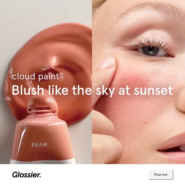
Split-screen perfection. Left side: Cloud Paint tube in shade "Beam" with a gorgeous coral swatch pooling around it. Right side: the product applied on a model's cheek — real skin, real blush, real result. The headline "Blush like the sky at sunset" sits between product and proof. Glossier logo and "Shop now" CTA anchor the bottom.
Why it works: Most beauty ads show you the product OR the result. Glossier shows both in one frame. The left side sells the product (color, texture, tube design). The right side sells the outcome (natural flush on real skin). Your eye moves between them — product, proof, product, proof. The coral tone is warm enough to pop in a feed full of cool-toned clinical ads. And "Blush like the sky at sunset" is the kind of copy that makes you feel something before you've processed the product name.
Clone this layout: Split-screen templates in AdDogs work perfectly here. Upload your product photo for one side, a close-up application shot for the other. The AI matches the layout and applies your brand colors.
2. The Ordinary — making hydration look dramatic
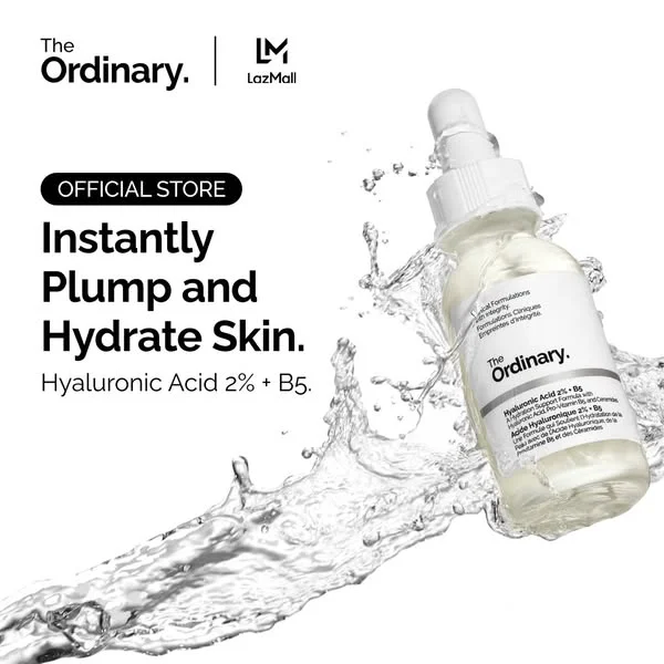
The Ordinary's Hyaluronic Acid 2% + B5 serum mid-splash — water arcing around the bottle in a dynamic freeze-frame. "Instantly Plump and Hydrate Skin." is the headline, bold and direct. The dropper bottle tilts at an angle that creates movement in a static image. The Ordinary logo sits top-left with clean authority.
Why it works: In a category where The Ordinary is known for clinical silence, this ad breaks pattern. The water splash creates energy and motion — rare for a brand built on minimalism. But the black-and-white palette keeps it on-brand. The product name IS the benefit statement ("Hyaluronic Acid 2% + B5"), so the headline just explains what that means in plain language. No adjectives, no emotion, just "this is what it does." The dynamic composition stops the scroll, and the clinical copy closes the deal.
Clone this layout: Upload your product on a clean background. The splash effect creates visual energy that makes static ads feel alive. Works best for hydrating or liquid products where the visual metaphor is obvious.
3. Herbivore Botanicals — the product IS the color story
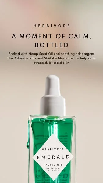
A glass bottle of Herbivore Botanicals' Emerald Facial Oil against a muted, earthy cream background. The oil is vivid green — so vivid it acts as its own visual anchor. The headline reads "A Moment of Calm, Bottled" with ingredients like Ashwagandha and Hemp Seed Oil called out below. Soft, diffused lighting. Zero harsh shadows. The entire frame breathes.
Why it works: When the product itself is colorful, the packaging becomes the design. The high-contrast emerald green against that neutral background does all the scroll-stopping work. The benefit-driven headline ("A Moment of Calm") shifts the positioning from skincare to self-care ritual — a much higher-value frame. The ingredient callouts (Ashwagandha, Shiitake Mushroom) satisfy the "skintellectual" buyer who needs rational proof before emotional purchase.
Platform fit: Instagram Feed and Pinterest. The color saturation and vertical composition perform well on visual-first platforms where distinctiveness determines whether someone stops scrolling.
Clone this layout: Any product with a distinctive color can use this approach. Upload a product photo with the actual product visible. Match the background color using AdDogs' brand extraction.
4. Fenty Skin — product stack meets ingredient proof
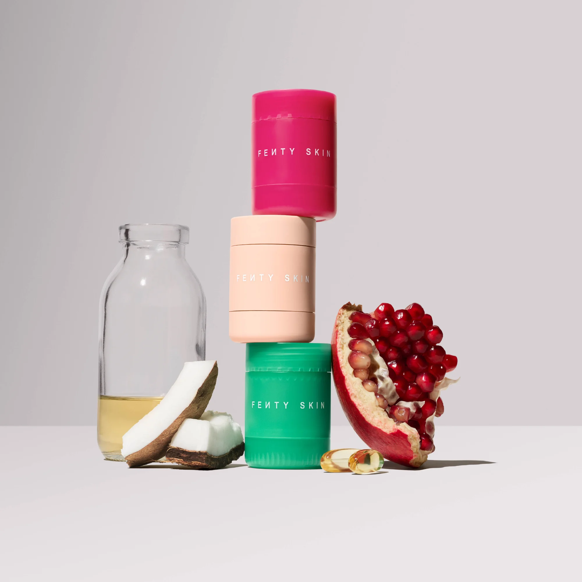
Three Fenty Skin containers — hot pink, peach, green — stacked vertically against a neutral grey background. Surrounding them: real coconut, pomegranate, a glass bottle of oil, a small nut. No models. No copy. The products and their raw ingredients tell the entire story. The saturated packaging colors pop against the muted backdrop like they were engineered for scroll-stopping (because they were).
Why it works: This ad does two things simultaneously. The vibrant product colors create instant visual appeal — hot pink and green packaging in a sea of clinical whites will stop any thumb. And the surrounding natural ingredients answer the "what's in it?" question before the shopper even asks. No marketing language needed. A coconut next to the jar communicates "natural ingredients" faster than any copywriter could.
Platform fit: Instagram Feed and Facebook. The product-ingredient arrangement creates enough visual density for larger placements where the viewer has time to study the composition.
Clone this layout: Use a multi-product template. AdDogs' AI can place your products in a stacked arrangement and the brand color extraction will match your palette.
Before/after and social proof
Before/after is the oldest format in skincare advertising. It still outperforms because it answers the only question the buyer has: "Does this actually work?"
5. Olay — holiday urgency, bold product, zero subtlety
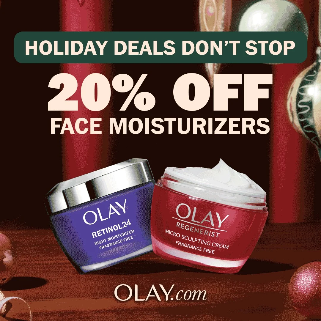
Two Olay moisturizers — Retinol 24 and Regenerist — angled against a deep red background with blurred holiday ornaments. A green banner at the top reads "HOLIDAY DEALS DON'T STOP" in bold white. Below it, large white text on the red background: "20% OFF FACE MOISTURIZERS." At the bottom, the nudge to Olay.com. The entire frame is engineered for one action: click and buy before the deal disappears.
Why it works: This isn't a brand ad. It's a conversion ad. The high-contrast white text on dark red background is impossible to miss. The festive imagery creates seasonal urgency — holiday shoppers are already in buying mode, and this ad catches them with a clear, frictionless offer. Showing two products broadens appeal: whether you're shopping for retinol or general anti-aging, there's something here for you. No ingredient education, no aspirational lifestyle — just a deal, a deadline, and a URL.
Platform fit: Facebook Feed and Instagram. The text-heavy, offer-driven format works in placements where the audience is already in a purchasing mindset.
Clone this layout: Use a bold product-on-background template. Place your products against a strong seasonal color. Make the discount the headline — not the brand name, not the product benefits.
6. ILIA Beauty — the before/after that sells without selling
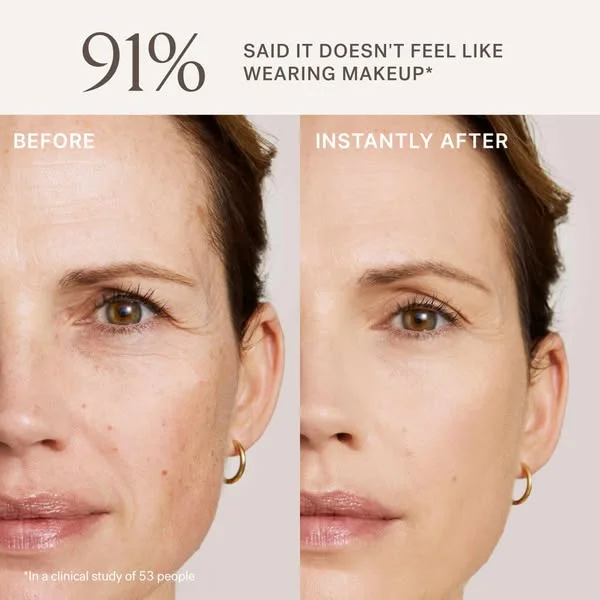
"91% SAID IT DOESN'T FEEL LIKE WEARING MAKEUP." The stat — from ILIA Beauty's Super Serum Skin Tint campaign — sits above a side-by-side before/after of real skin — same woman, same lighting, same angle. Before: visible texture, fine lines, natural skin. Instantly After: smoother, more even, still unmistakably real. No filter. No retouching. Gold hoop earrings visible in both frames. Small type at the bottom: "In a clinical study of 53 people."
Why it works: This ad breaks the before/after format by making the "after" feel attainable rather than aspirational. The skin isn't flawless — it's improved. That's more believable than perfection, and belief is what drives conversion. The 91% stat does the heavy lifting: it's specific, it's sourced (clinical study of 53 people — they actually disclose the sample size), and it addresses the product's real objection ("will it feel cakey?"). The neutral palette and minimal design let the skin speak. No headline could be more persuasive than the side-by-side itself.
Clone this layout: Split-screen templates in AdDogs handle this perfectly. Photograph your product's before and after in identical lighting. Lead with a specific clinical stat. Let the visual evidence close the sale.
7. Paula's Choice — luxury product hero that screams premium
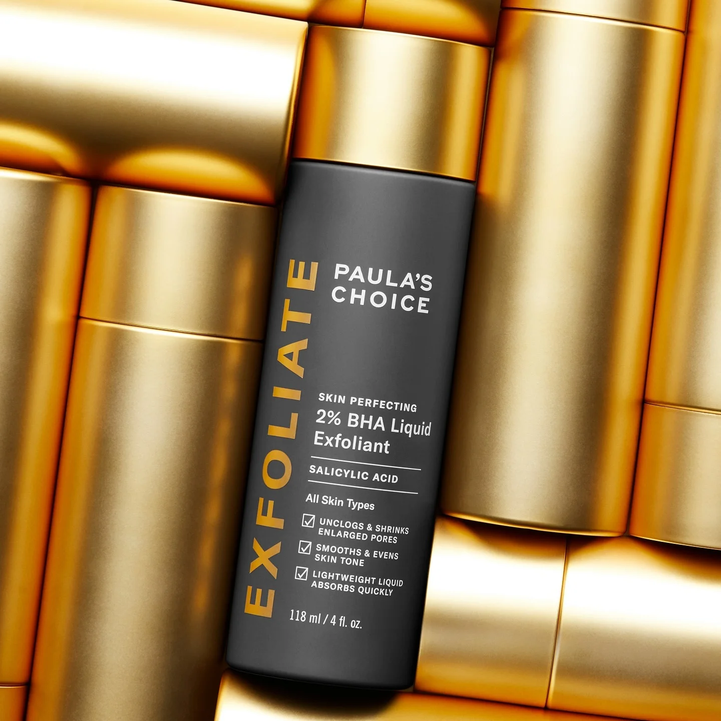
The dark charcoal 2% BHA Liquid Exfoliant bottle set against a backdrop of gold cylindrical shapes. "EXFOLIATE" runs vertically in gold along the left edge. Benefit checkmarks in red: "Unclogs & shrinks enlarged pores," "Smooths & evens skin tone," "Lightweight liquid absorbs quickly." The product details — Salicylic Acid, 118 ml — are clearly readable. Every element says: this is serious skincare.
Why it works: The gold-on-charcoal palette is a masterclass in perceived value. Paula's Choice sells a $35 exfoliant, but this ad positions it alongside luxury skincare ten times the price. The gold cylinders create depth and texture without distracting from the product. The vertical "EXFOLIATE" text adds dynamism — your eye travels the full length of the frame. And the red checkmarks do the selling: three specific benefits, each a mini value proposition. No vague promises. Just "here's what it does, here's the active ingredient, here's the format."
Clone this layout: Use a product hero template with a bold background. Place your product against a textured or metallic backdrop. List 2-3 benefits with checkmarks. Let the packaging do the brand work.
8. CeraVe — ceramides for the most sensitive skin
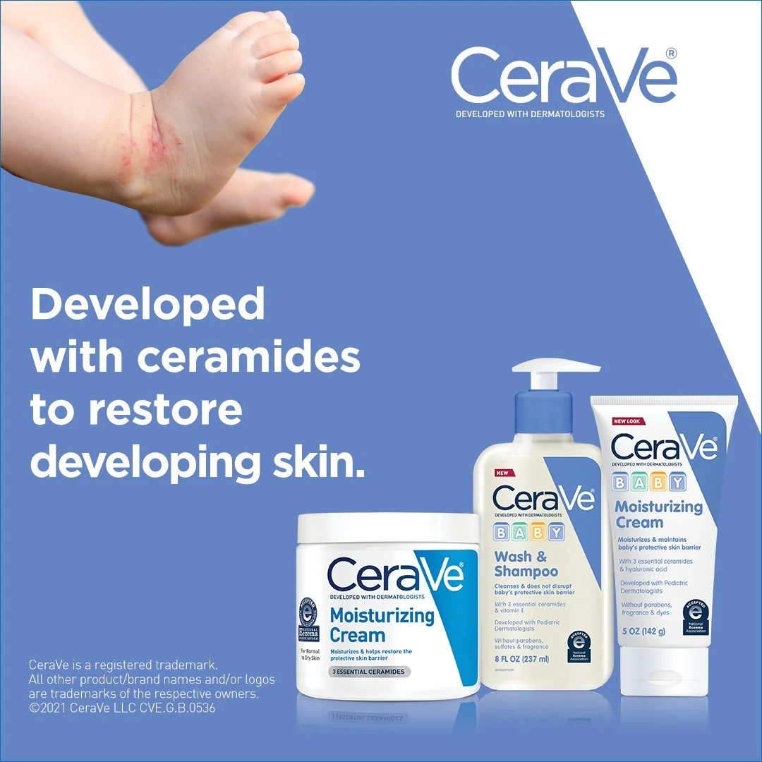
An angled composition: one side shows a baby's arm and hand with visible skin irritation, the other displays the CeraVe Baby product lineup on a cool blue background. The headline: "Developed with ceramides to restore developing skin." The CeraVe logo sits prominently up top. The blue evokes trust and calm — the exact emotions a parent needs when their baby's skin is irritated.
Why it works: This ad nails the problem-solution narrative in a single frame. The visible skin irritation on the baby's arm isn't alarming — it's relatable. Every parent recognizes it. And the CeraVe products on the opposite side are the immediate answer. The "developed with ceramides" messaging does double duty: it educates on the ingredient while reinforcing CeraVe's scientific positioning. The angled composition creates visual dynamism that a standard side-by-side can't match.
Platform fit: Instagram Feed and Facebook. The emotional parent-focused imagery works best in larger feed placements where the details are visible.
Clone this layout: Choose a split-screen template. One side for the problem (skin concern), the other for the solution (your product). Add a credibility line like "Dermatologist recommended" or "Developed with ceramides."
Ingredient-focused ads
In our analysis, ingredient callouts consistently outperform generic product shots. When you name what's inside the bottle, more people buy.
9. The Inkey List — no-BS pimple patches in action
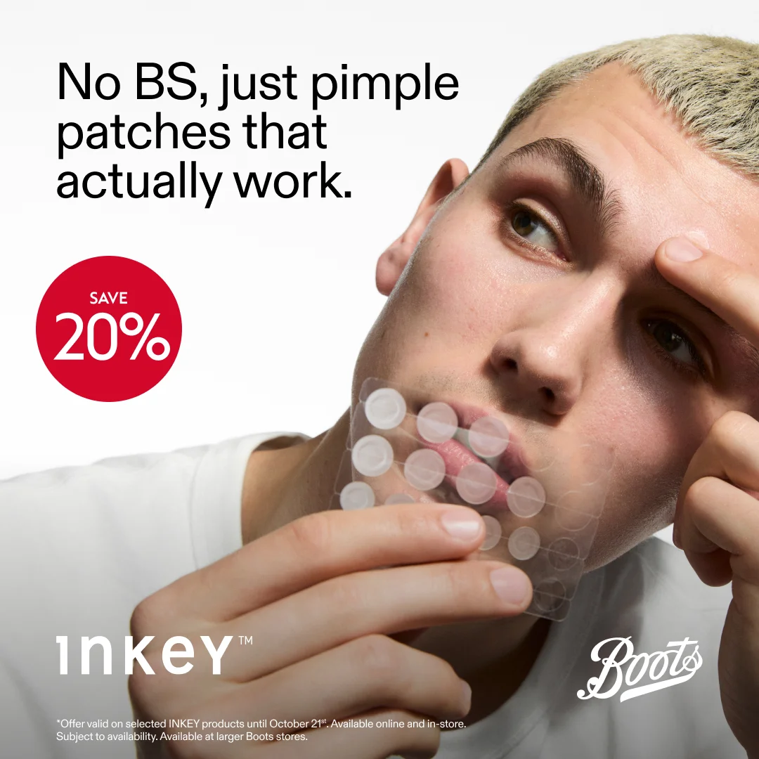
A model applying pimple patches on his face — no retouching, no polish. Bold headline: "No BS, just pimple patches that actually work." A red "SAVE 20%" circle sits in the corner, adding urgency. Boots co-branding is visible, signaling retail availability. The composition is candid, high-contrast black text on white, with the model as the visual anchor. It looks like something a real person would post, not something a brand would approve.
Why it works: The Inkey List built its brand on radical transparency, and this ad extends that ethos from product naming to advertising style. The "No BS" headline uses the exact language their target audience uses. The in-use product demonstration — patches visibly applied to real skin — is proof of concept in one frame. The 20% discount in bold red creates urgency without a countdown timer or "LIMITED TIME" banner. Direct, confident, conversion-focused.
Platform fit: Instagram Feed and Stories. The candid, UGC-adjacent style feels native on platforms where users share real opinions.
Clone this layout: Upload a product with clean ingredient-forward labeling. Use a minimal template. The in-use format works best when the product is visually interesting on skin.
10. Good Molecules — affordable transparency in neon
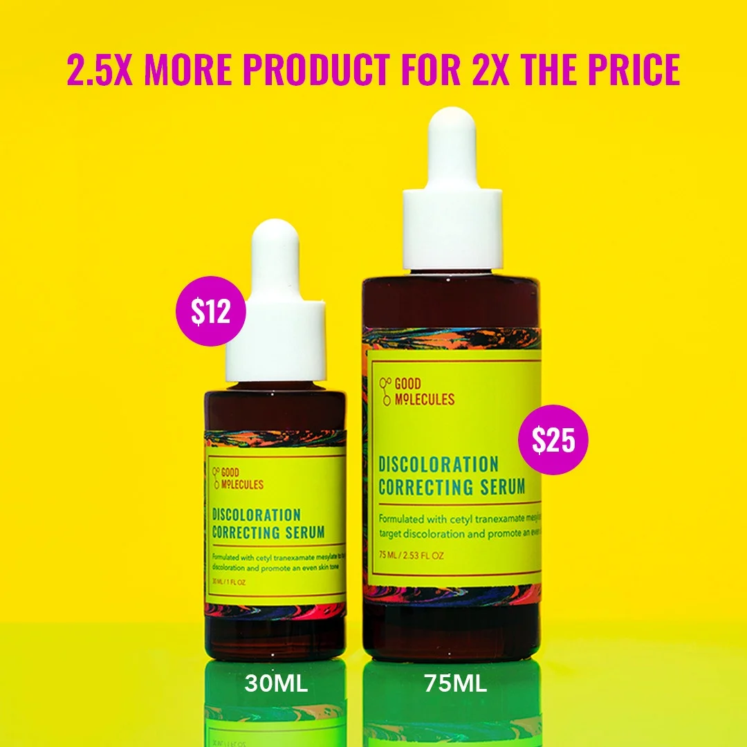
Electric yellow background. Magenta price bubbles. Two product sizes side by side with their respective prices and volumes. The headline: "2.5X MORE PRODUCT FOR 2X THE PRICE." The math does itself. The colors are so loud they practically vibrate on screen — and that's the point.
Why it works: When your value proposition is price, make price the creative element. Good Molecules doesn't bury the cost in a footnote — they make it the entire ad. The neon yellow-and-magenta palette is the visual equivalent of shouting in a library full of whispered clinical claims. The side-by-side volume comparison creates an instant rational case for the larger size. No clinical study needed. The math is the proof.
Platform fit: TikTok and Instagram. Price-forward ads perform well with Gen Z audiences actively seeking "dupes" and affordable alternatives.
Clone this layout: Use a template with prominent text overlay space. Lead with your price if it's a competitive advantage. Add the comparison to lock in the value message.
Bold color and personality
Not every skincare brand needs to look clinical. Some of the best-performing ads use color as a weapon.
11. Drunk Elephant — color riot, brand recognition
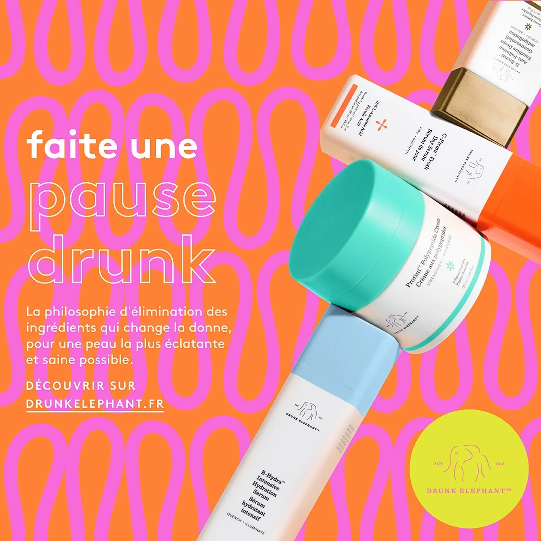
Bold orange background with a repeating pink wavy pattern. Drunk Elephant products arranged in a dynamic diagonal cluster — white and cream tubes with teal caps and a gold-capped bottle, every item identifiable by its distinct packaging color. French text: "faite une pause drunk." Brand philosophy text on the left, products on the right. The composition screams playful luxury.
Why it works: Drunk Elephant's color-coded packaging system means every product is recognizable without reading a single label. The orange-and-pink background is so saturated it practically vibrates in a feed of clinical whites and soft pastels. The diagonal product arrangement creates movement — your eye travels from product to product instead of stalling on a static grid. And the French-language text adds an international premium feel. This ad doesn't just display products — it communicates an entire brand philosophy in one frame.
Platform fit: Instagram Feed and TikTok. The vibrant, playful aesthetic thrives on platforms where visual personality drives engagement.
Clone this layout: For static ads, use a bold background template. Arrange multiple products dynamically. Let the packaging colors do the branding work that logos can't.
12. Bubble — celebrity grid, Gen Z energy
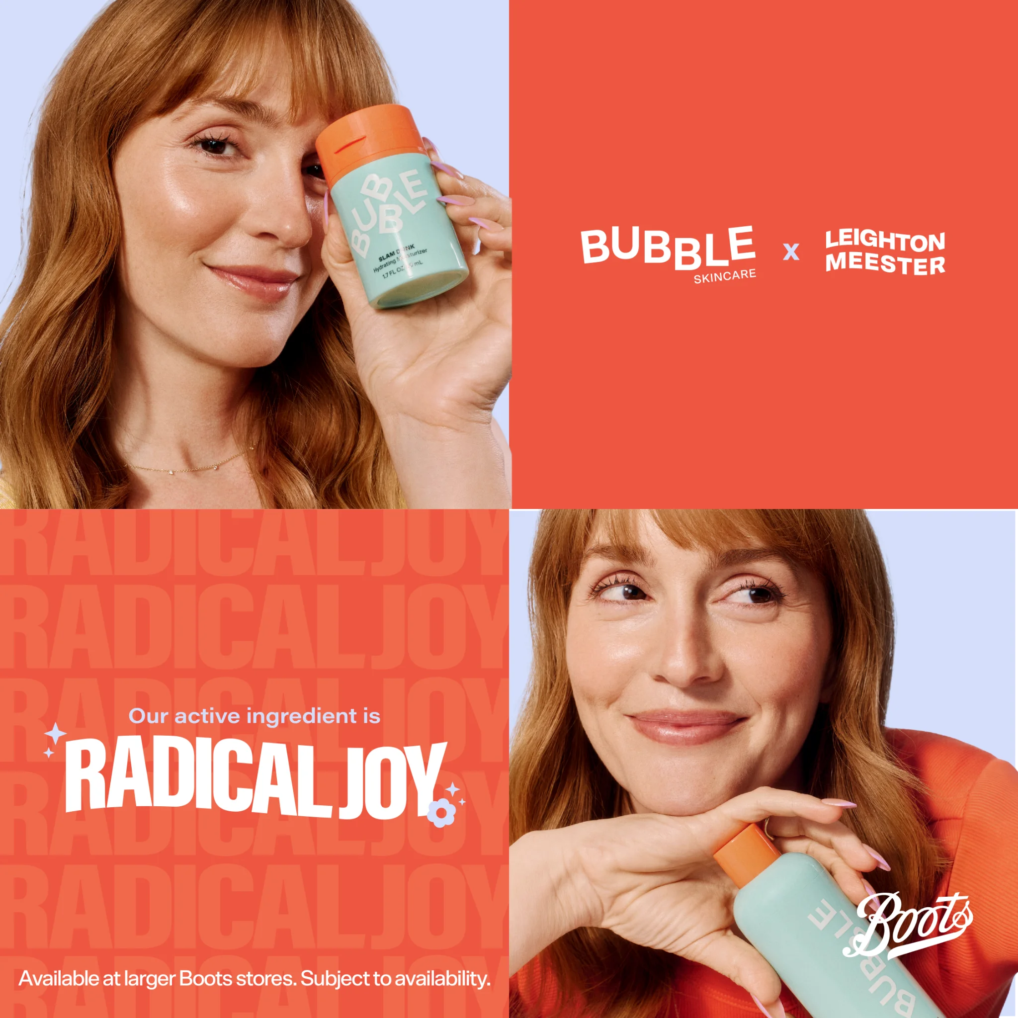
A four-panel grid collage on coral and lavender. Top-left: Leighton Meester holding a mint-green Bubble product next to her face against a lavender background — glowing skin doing the endorsement work. Top-right: "BUBBLE SKINCARE x LEIGHTON MEESTER" in bold white on solid coral. Bottom-left: "Our active ingredient is RADICAL JOY" in playful type, with "RADICAL JOY" repeated in large faded letters filling the coral background. Bottom-right: Meester again, this time in an orange top, cradling the product against lavender, the Boots logo tucked in the corner for retail availability. A small "Available at larger Boots stores" disclaimer runs along the bottom. Four panels, four jobs, one complete brand story.
Why it works: Bubble packs more brand information into one frame than most brands fit into five — without it feeling cluttered. Each quadrant does a different job: celebrity credibility (top-left), collaboration announcement (top-right), emotional positioning with the "Our active ingredient is RADICAL JOY" tagline (bottom-left), and retail accessibility via Boots (bottom-right). The coral-and-lavender palette nails Bubble's demographic: young, energetic, and unapologetically fun. And Meester's natural, product-in-hand poses feel aspirational without being untouchable.
Platform fit: Instagram Feed. The grid format is native to Instagram's visual language, and the multi-panel layout rewards closer inspection.
Clone this layout: For static versions, capture the bright, multi-panel aesthetic. Use bold colors and a grid template to pack multiple messages into one frame.
13. Topicals — the testimonial that does the selling
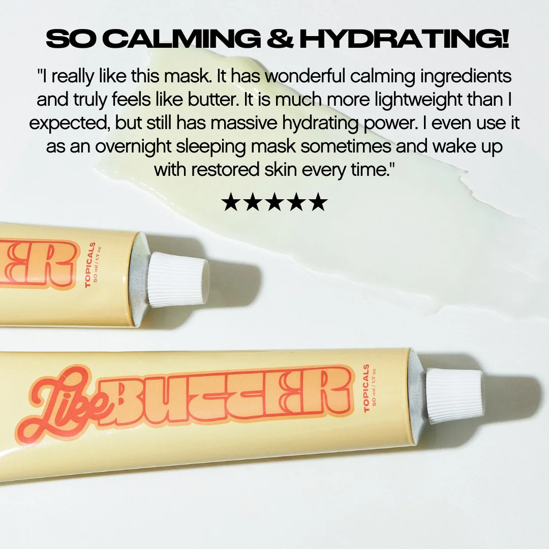
"SO CALMING & HYDRATING!" in bold black caps at the top — the headline does the scroll-stopping. Below it, a full customer review in smaller text describes using Like Butter as an overnight sleeping mask, praising its calming ingredients and lightweight-but-hydrating texture. Five black stars sit underneath the review. At the bottom, two yellow Like Butter tubes from Topicals rest at angles with a white creamy swatch spread between them — visual texture proof on a clean white background. The retro-bubbly "Like Butter" branding on the tubes adds personality without competing with the testimonial. The customer's words do all the heavy lifting.
Why it works: Topicals lets its customer write the ad. The detailed review — complete with specific use cases like overnight masking and real language about texture — is more persuasive than anything a brand copywriter could draft. The 5-star rating beneath is instant social proof. And the product swatch smeared across the white background is a tactile detail — viewers can almost feel the butter-like consistency through the screen. The playful branding differentiates Topicals from clinical competitors and attracts a younger audience who wants effective skincare that doesn't take itself too seriously.
Clone this layout: Best on Instagram Feed and TikTok, where the text-forward, review-based format feels native. Use a testimonial template. Drop in your best customer review as the primary copy. Add the product image below.
14. Tower 28 — intentionally basic, visually impossible to ignore
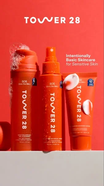
Bold red. Three Tower 28 SOS products — Daily Balancing Gel Cleanser, SOS Facial Spray, and Barrier Recovery Cream — lined up on a white pedestal against a saturated red background. Each product wears the same coral-red packaging with the brand's distinctive split-W logo. Water splashes on the cleanser, cream swatches beside the moisturizer. "Intentionally Basic Skincare for Sensitive Skin" in white italic text on the right. The TOWER 28 logo crowns the frame.
Why it works: When your brand color is this saturated, the background becomes the ad. Tower 28 owns red the way Glossier owns pink — it's instant recognition before you read a single word. "Intentionally Basic" is a positioning statement that doubles as a selling point: in a category drowning in 12-step routines and active cocktails, three products is a relief. The water splashes on the cleanser and cream swatches beside the moisturizer show texture without requiring a model — the products demonstrate themselves. And the uniform packaging across all three products reinforces the message: this is a system, not a collection of individual purchases.
Clone this layout: Line up your product range against a bold brand-color background. Uniform packaging design makes lineup ads work — the repetition becomes the visual pattern.
15. Sol de Janeiro — tropical launch energy
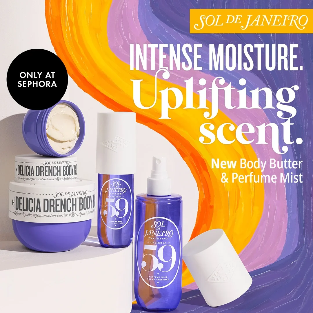
A painted brushstroke background in swirling purple, orange, and yellow — all warmth and energy. On the left, the Delicia Drench Body Butter in purple jars (one open, showing thick cream inside) and the #59 Perfume Mist spray bottle. On the right, bold white text stacks the message: "INTENSE MOISTURE." in heavy caps, "Uplifting scent." in flowing script, and "New Body Butter & Perfume Mist" below. Sol de Janeiro's logo sits at the top right. A solid black "ONLY AT SEPHORA" circle badge on the left locks in retail exclusivity. The brushstroke background turns a static product launch into something that feels alive.
Why it works: Sol de Janeiro sells an experience, not a product. The painted brushstroke background isn't eye candy — it communicates the sensory warmth of the product before you've read a single word. The open jar showing thick cream is a tactile detail that makes you want to reach into the frame. "Uplifting scent." in flowing script works because the swirling visual already suggested it. The Sephora exclusivity badge creates urgency and retail credibility simultaneously. And the product launch framing — "New" — converts browsers into early adopters.
Platform fit: Instagram Feed and Pinterest. The aspirational, lifestyle aesthetic performs best on platforms where users browse for inspiration and discovery.
Clone this layout: Use a lifestyle template with rich, warm colors. If your brand has a strong color palette, let it dominate the composition. Painterly or gradient backgrounds add depth to static product shots.
Luxury and premium positioning
Premium skincare brands use visual restraint, award badges, and rich color palettes to justify their price points.
16. Tatcha — award-winning hydration, golden spoon
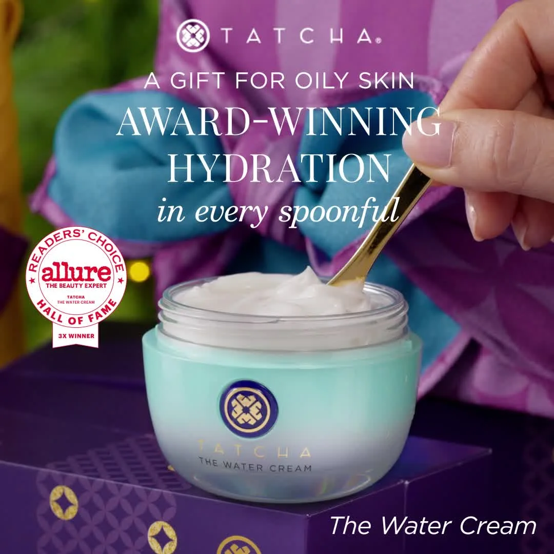
A hand dipping a golden spoon into an open Tatcha Water Cream jar, scooping out thick white cream. The teal and mint jar with gold accents sits on a purple Tatcha box, the product texture fully visible. The Tatcha logo anchors the top, with "A GIFT FOR OILY SKIN" in small caps below it and "AWARD-WINNING HYDRATION" in large bold white caps dominating the center, followed by "in every spoonful" in flowing script. In the bottom-left, an Allure "Readers' Choice Hall of Fame — 3X Winner" badge. The background is rich purple and lavender silk fabric, draped behind the product. "The Water Cream" in white italic sits in the bottom-right corner.
Why it works: The in-use shot with the golden spoon immediately communicates luxury — you don't scoop $68 cream with your fingers. The Allure Readers' Choice "Hall of Fame" badge is the most valuable real estate in the ad: third-party validation that no amount of brand copy can replicate. The purple silk backdrop and teal jar create a palette so distinctive it's immediately recognizable as Tatcha at any size. And the "oily skin" callout narrows the audience to exactly the right buyer, which paradoxically increases conversion by making the ad feel personally relevant.
Platform fit: Instagram Feed and Pinterest. The aspirational, editorial-quality imagery performs best where visual discovery drives purchase intent.
Clone this layout: Use a premium template with dark backgrounds and metallic accents. Upload your product against a backdrop that reinforces your brand story. If you have awards, make them visible.
17. SK-II — red, gold, and the limited-time set
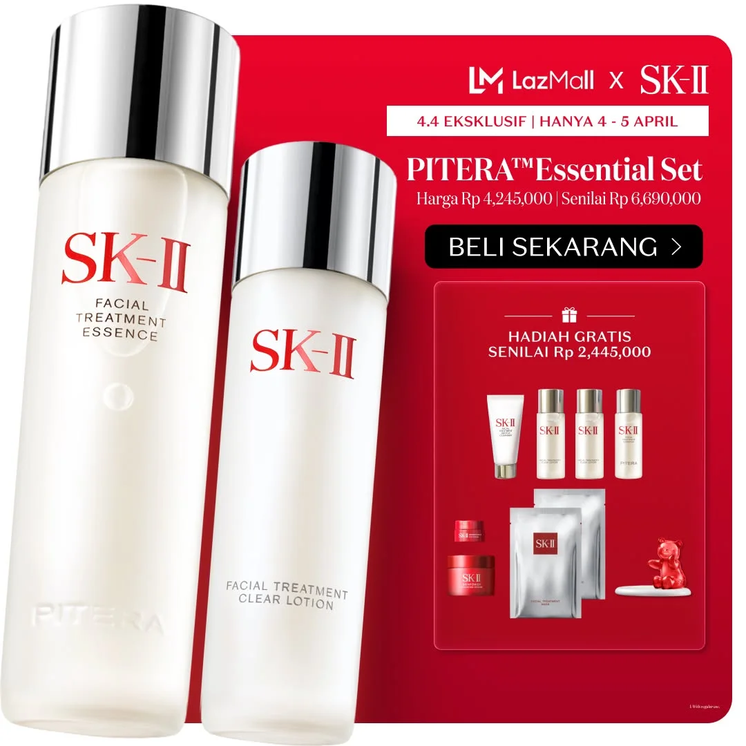
A LazMall x SK-II exclusive for the 4.4 sale event. Left side: two tall SK-II bottles — Facial Treatment Essence and Facial Treatment Clear Lotion — with silver caps on a clean white background, the red "SK-II" branding and "PITERA" text visible on each. Right side: a bold red panel stacking the offer top to bottom — "4.4 EKSKLUSIF | HANYA 4 - 5 APRIL" urgency header, the "PITERA Essential Set" headline, pricing in Rupiah (Rp 4,245,000 vs. the Rp 6,690,000 retail value), a white "BELI SEKARANG" CTA button, and "HADIAH GRATIS SENILAI Rp 2,445,000" with a row of small free-gift product images below. The red-and-white contrast is immediate. The free gift value callout — substantial enough to be its own selling point — stacks on the scarcity.
Why it works: SK-II doesn't discount. They add value. The split-screen lets the left side maintain premium product aesthetics — those tall, elegant bottles — while the right side drives conversion with the offer mechanics. The red panel isn't only attention-grabbing — it's SK-II's brand color, so the promotional side feels on-brand rather than desperate. The two-day-only window ("HANYA 4 - 5 APRIL") tied to a 4.4 sale event creates genuine scarcity. And the free gift value displayed in hard numbers (Rp 2,445,000) makes the offer feel like insider access, not a clearance sale.
Platform fit: E-commerce platforms and Facebook. The offer-heavy format works best in placements where viewers are already in a shopping mindset.
Clone this layout: Use a split-screen template. Product on one side, offer on the other. If you're running a promotion, let the offer panel do the selling while the product panel maintains your brand's premium positioning.
18. Laneige — bestseller flat lay with personality
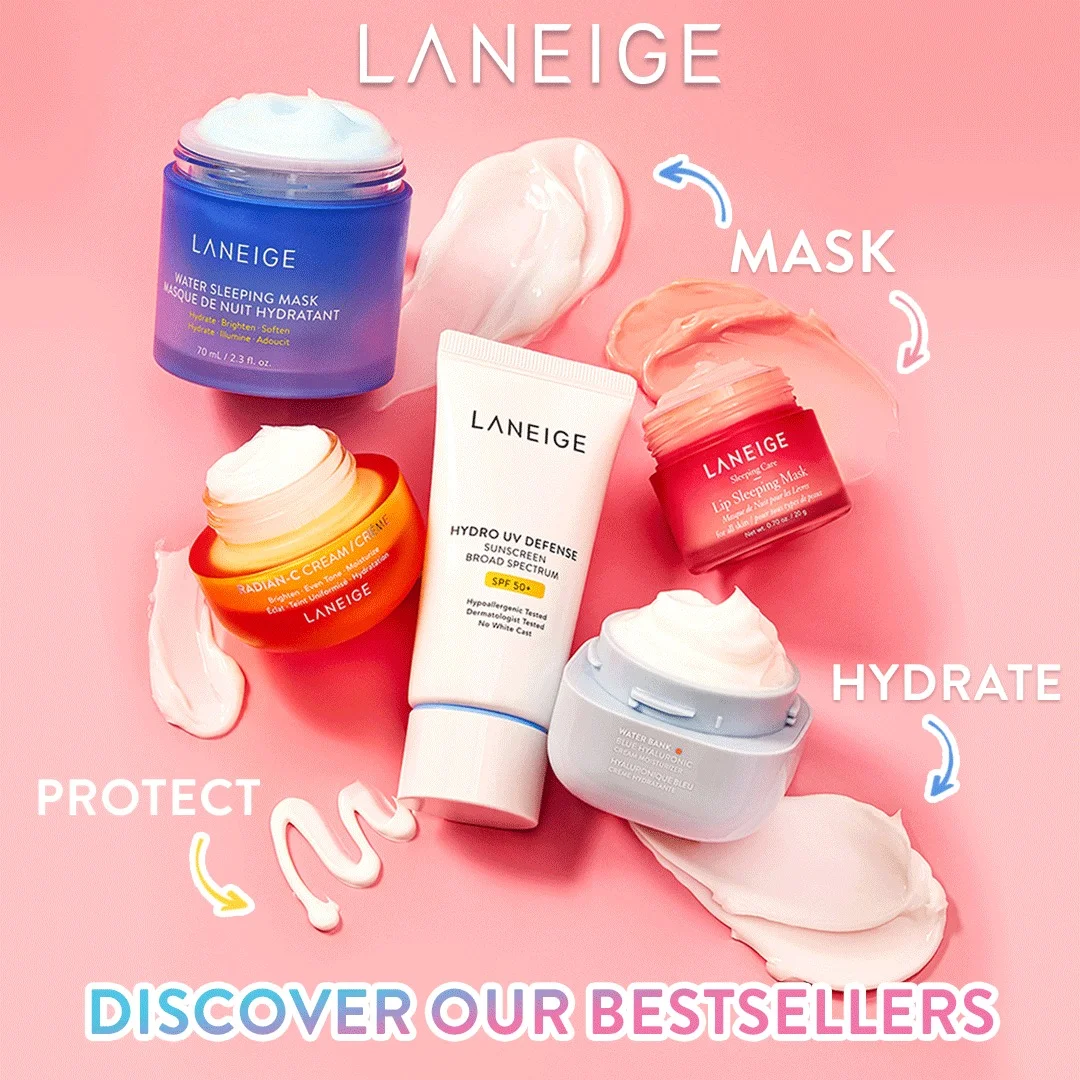
Bright pink background with five Laneige products scattered in a playful flat lay — the blue Water Sleeping Mask jar, the orange Radian-C Cream, the Hydro UV Defense Sunscreen SPF 50+ tube, the iconic Lip Sleeping Mask in its small red jar, and a light blue Water Bank moisturizer. Creamy product swatches are smeared between them, adding real texture. Curved arrows connect each product to a bold category label — "MASK," "HYDRATE," "PROTECT" — and the headline at the bottom reads "DISCOVER OUR BESTSELLERS." It's a guided tour of the range disguised as a flat lay.
Why it works: Most flat lays are static product grids. Laneige turns theirs into a wayfinding system. The arrows and category labels do the heavy lifting — viewers learn what each product does without reading a single ingredient list. Five products could easily feel cluttered, but the pink background and smeared swatches create visual breathing room between items. The "bestsellers" framing adds social proof: these aren't random SKUs, they're the proven lineup. And the color variety across the packaging — blue, orange, white, red, light blue — makes each product instantly distinguishable at scroll speed.
Platform fit: Instagram Feed and Stories. The visually rich, discovery-oriented format performs well where audiences browse for product recommendations.
Clone this layout: Use a flat lay template with cool tones and clean labels. Multiple products work best when organized by function or concern.

Create your own skincare product ads
Create your adPlatform-specific creative
Best-in-class skincare ads aren't repurposed across platforms — they're built for where they'll run. And in skincare, static ads outperform video for initial product discovery more often than most brands expect.
19. Supergoop — invisible sunscreen meets tennis metaphor
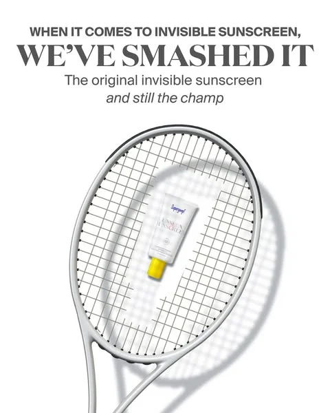
Supergoop's Unseen Sunscreen tube rests on a white tennis racket's string bed against a stark white background. The tube's yellow cap is the only color accent in the entire frame. Above, the headline reads "WHEN IT COMES TO INVISIBLE SUNSCREEN," followed by a bold "WE'VE SMASHED IT." Below that: "The original invisible sunscreen / and still the champ." The racket casts a strong diagonal shadow across the lower half, adding depth to an otherwise minimal composition.
Why it works: Supergoop reframed sunscreen from a boring chore into a confident, competitive flex. The tennis metaphor turns a product claim ("invisible sunscreen") into a visual pun that rewards the viewer for getting it. "We've smashed it" and "still the champ" are the kind of bold, assertive copy most skincare brands are too cautious to run. The stark white background makes the yellow cap impossible to miss — and the racket's dramatic shadow adds enough visual weight to hold attention once the scroll stops.
Platform fit: Instagram Feed. The clean, high-contrast composition works at any size, from feed thumbnail to expanded view.
Clone this layout: A single product on white with one bold color accent and a punchy headline is a format you can clone for any SKU. The key is the unexpected prop — find an object that visually reinforces your product's main claim.
20. Neutrogena — handheld product shot, store aisle energy
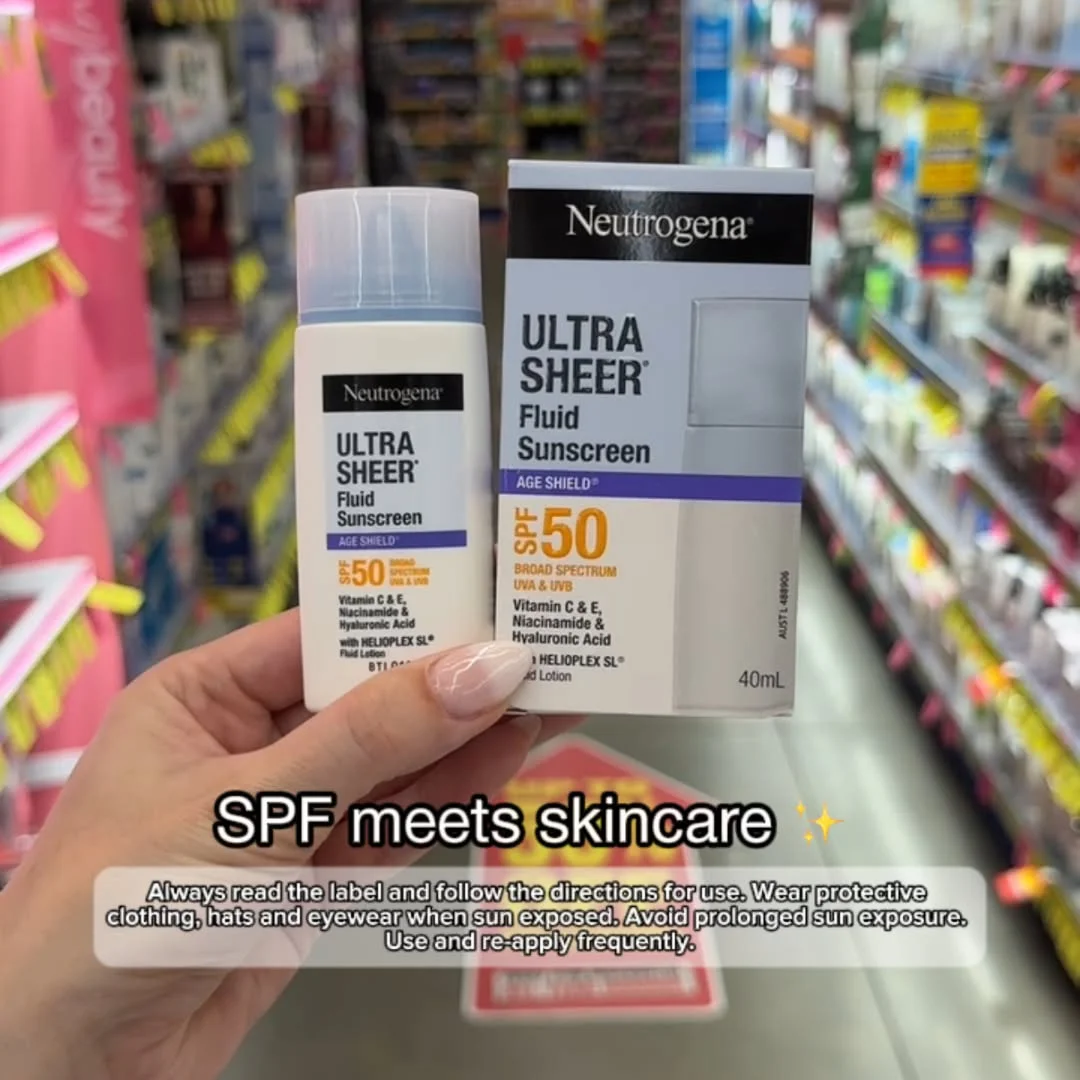
A manicured hand holds the Neutrogena Ultra Sheer Fluid Sunscreen bottle alongside its box in a pharmacy aisle — colorful shelves blurred in the background. The text overlay at the bottom reads "SPF meets skincare" with a sparkle emoji. Both the bottle and box are fully readable: SPF 50 Broad Spectrum, Age Shield technology, Vitamin C & E, Niacinamide & Hyaluronic Acid, with Helioplex SL. A small disclaimer about sun protection sits beneath the headline. Casual, vertical, shot-on-phone energy — the kind of content that blends into organic feeds.
Why it works: This ad breaks every "polished creative" rule and outperforms because of it. The handheld, in-store perspective mimics a friend texting you a product recommendation from the pharmacy aisle. The blurred retail background does two things: it signals immediate availability and it grounds the product in a real shopping environment rather than a sterile studio. Showing both the bottle and the box means the ingredient list and key claims do the marketing copy's job for free. "SPF meets skincare" is the entire value proposition in four words — and the sparkle emoji adds just enough personality to feel native on social.
Platform fit: Instagram Stories and TikTok. The vertical, phone-shot format is native to both platforms. The casual aesthetic blends into organic content feeds.
Clone this layout: One product, one clear benefit headline. The in-hand format works best when the packaging itself communicates ingredients and benefits — let the box do the selling.
21. Glow Recipe — pink gradient shelf with first-order hook
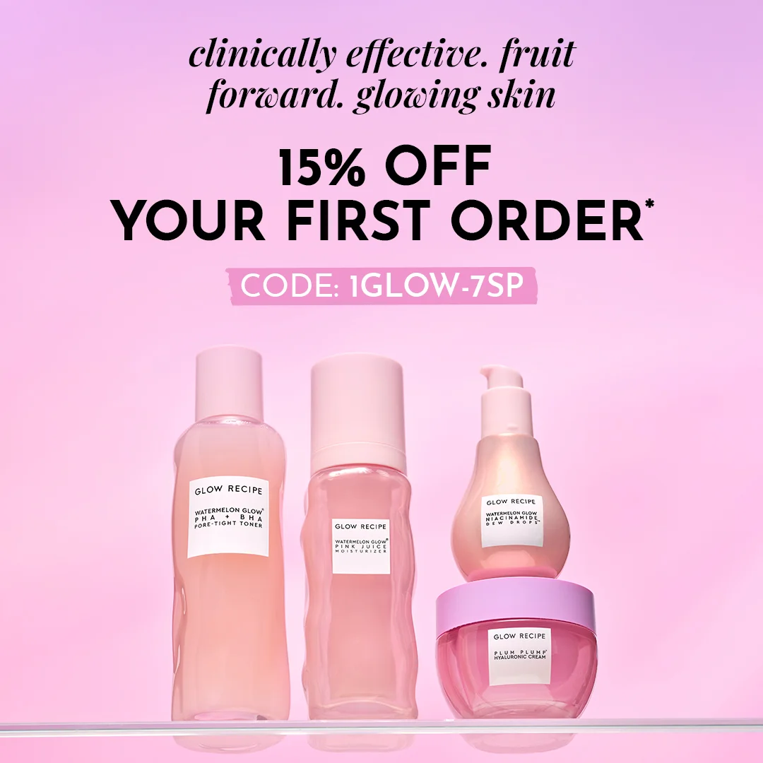
Four Glow Recipe products sit on a clear glass shelf against a pink-to-lavender gradient background. From left to right: the Watermelon Glow PHA+BHA Pore-Tight Toner, the Watermelon Glow Pink Juice Moisturizer, the Niacinamide Dew Drops in its teardrop pump bottle, and the Plum Plump Hyaluronic Cream in a round jar. All packaging is transparent pink glass with clean white labels. At the top, italic black text: "clinically effective. fruit forward. glowing skin." Below, bold: "15% OFF YOUR FIRST ORDER*" — and a pink banner with the code "1GLOW-7SP." The top half is text, the bottom half is product. No wasted space.
Why it works: Glow Recipe treats their product line as a single visual system. The transparent pink packaging creates a cohesive gradient effect when grouped — the shelf itself becomes the brand identity. The three-phrase headline ("clinically effective. fruit forward. glowing skin.") compresses the entire brand positioning into nine words: science, ingredients, and outcome. The first-order discount isn't buried — it's the second most prominent element in the frame, complete with a specific code that drives direct traffic and makes attribution easy.
Platform fit: Instagram Feed. The pink gradient and cohesive product display are built for a platform where your profile page is a visual experience.
Clone this layout: The multi-product shelf format works best when your packaging is cohesive. Use templates with consistent brand colors — maintaining a single background color across your ads builds recognition over time.
Social proof and community
Trust is the most expensive thing in skincare. These brands build it through proof, not promises.
22. Summer Fridays — the self-care flat lay
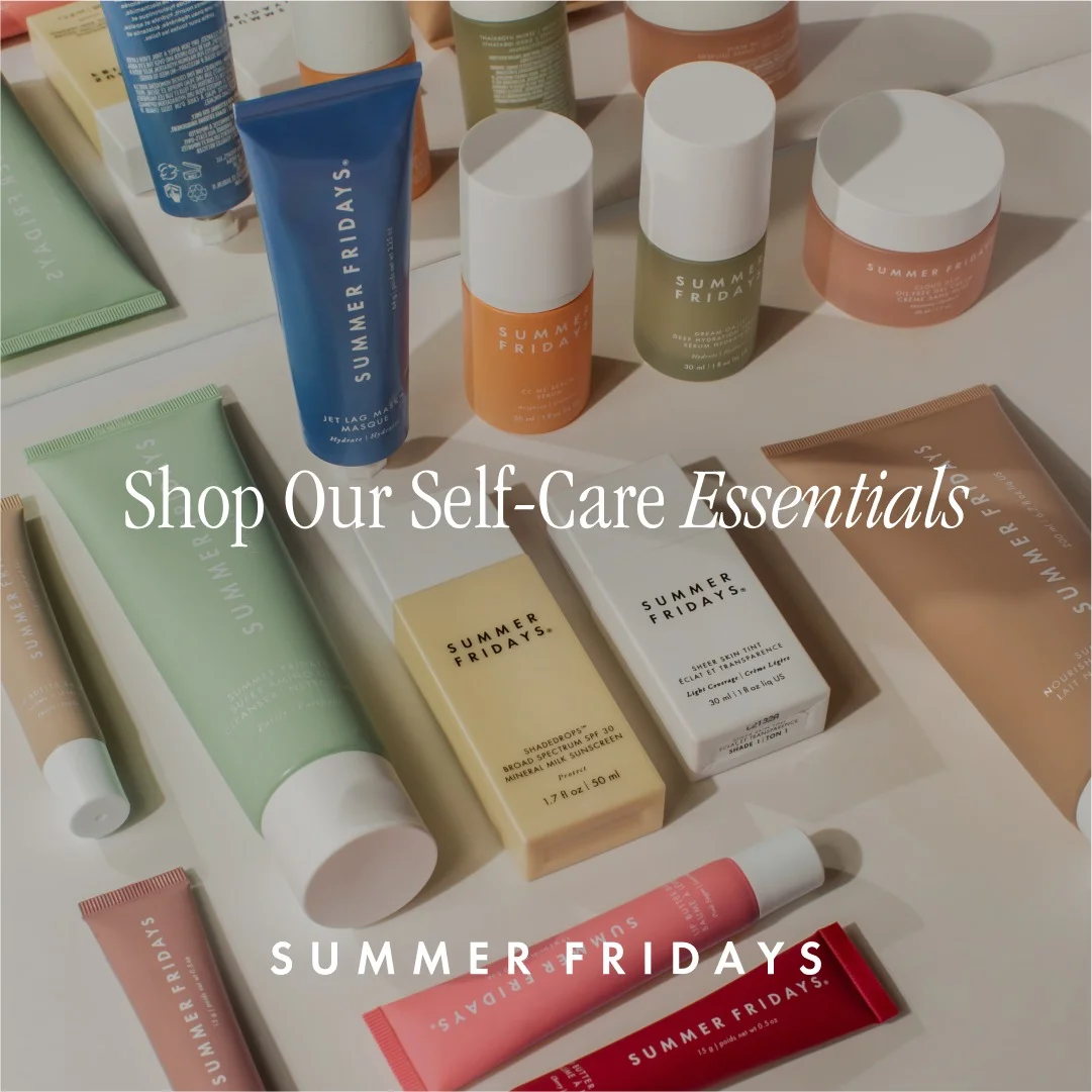
An overhead flat lay of the full Summer Fridays product range scattered across a white surface. The packaging spans a wide color palette — sage green tubes, a bold blue moisturizer, an orange box, a yellow carton, white jars, a pink tube, and a deep red squeeze tube — all arranged in an organic yet curated composition. White serif text across the center: "Shop Our Self-Care Essentials." The brand name "SUMMER FRIDAYS" anchors the bottom. No price. No urgency. No product singled out. Just a catalog moment disguised as a lifestyle image.
Why it works: Summer Fridays was founded by two influencers (Marianna Hewitt and Lauren Gores Ireland) who understood that Instagram is an aesthetic platform. The product packaging was designed for social media sharing from day one — and the range of colors is what makes the flat lay work. The green, blue, orange, pink, and red packaging creates a color story that holds the eye across the entire frame. "Shop Our Self-Care Essentials" frames moisturizer-buying as ritual-building. And because no single product is highlighted, the viewer's eye wanders across the full range — exactly the behavior you want when driving to a product page, not a checkout.
Platform fit: Instagram Feed and Pinterest. The lifestyle, aspirational format resonates on platforms where aesthetic discovery drives behavior.
Clone this layout: Show your products in a flat lay arrangement against a neutral surface. The overhead angle and organic spacing make any product line look intentional — the key is variety in color and shape so the eye has somewhere to travel.
23. First Aid Beauty — UGC that doesn't look like an ad
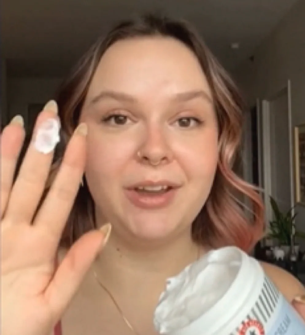
A close-up selfie of a young woman with brown hair and pink-tinted ends, holding up two fingers dabbed with white cream near her face. The First Aid Beauty Ultra Repair Cream tub — white body, red FAB cross logo — peeks into the bottom corner of the frame. She's looking directly into the camera with an open, mid-sentence expression, shot in what's clearly her apartment with natural window light. Gold necklace. No text overlay. No headline. No call to action. It looks like a screenshot from someone's Instagram Story, not a paid placement.
Why it works: This ad mimics a genuine user recommendation down to the smallest detail. The direct eye contact creates an immediate personal connection — it feels like a friend telling you about a product, not a brand selling you one. The cream visible on her fingertips is a tactile proof point: you can see the product's texture before you buy it. The home setting and natural lighting reinforce authenticity. And because there's zero text overlay, the viewer's brain categorizes this as content, not advertising — which is exactly when consideration starts. No hype means no skepticism.
Platform fit: Instagram Stories and TikTok. The vertical, phone-shot format blends naturally into user feeds, promoting consideration through genuine portrayal.
Clone this layout: Show your product being applied — not sitting on a shelf. One product, one person, one authentic moment. The less it looks like an ad, the better it performs as one.
24. Kiehl's — 72-hour hydration with alpine credibility
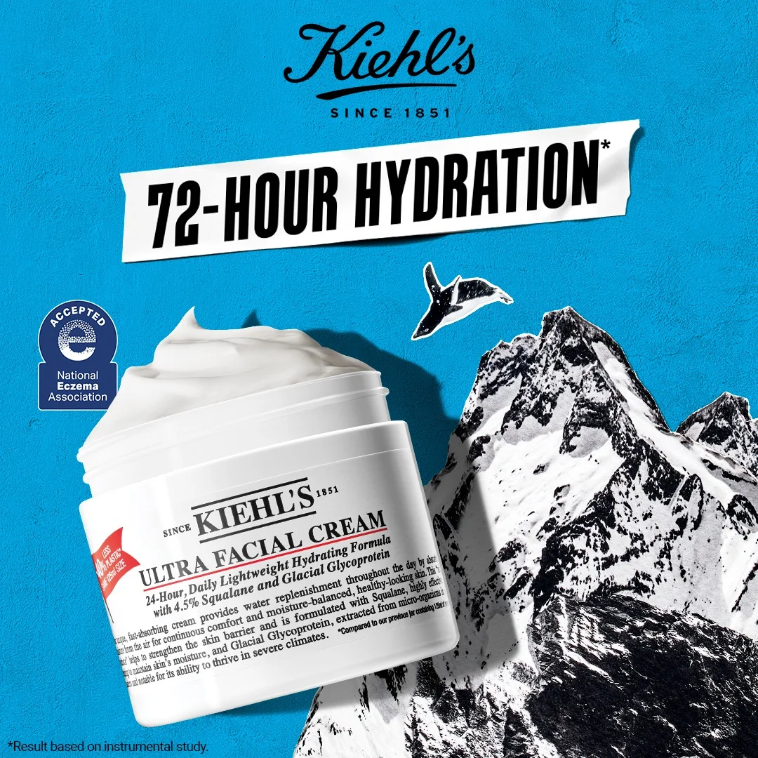
Kiehl's Ultra Facial Cream jar sits front and center against a vibrant blue background. Behind it, dramatic black-and-white mountain peak illustrations rise up, with a black bird silhouette soaring above them. The Kiehl's "Since 1851" logo sits in white cursive at the very top. "72-HOUR HYDRATION" runs across the middle in bold black text on a torn white paper banner — a design detail that breaks the clean layout just enough to grab attention. A circular "National Eczema Association Accepted" seal is positioned on the left. The jar's label calls out Squalane and Glacial Glycoprotein as the hero ingredients. Bold, dynamic, modern — not the apothecary heritage play you'd expect from a brand founded in 1851.
Why it works: Kiehl's made a smart creative decision: instead of leaning on 170 years of heritage (which risks looking dated), they built the ad around a dynamic visual system. The vibrant blue background creates high contrast against the white jar. The mountain illustrations reinforce the "Glacial Glycoprotein" ingredient story — visual proof of where the ingredient comes from. The torn-paper banner holding the "72-HOUR HYDRATION" headline adds a layer of raw energy to an otherwise clean composition. And the National Eczema Association Seal of Acceptance is the trust signal that converts hesitant buyers. Specific, measurable claims like "72-hour" outperform vague "all-day moisture" promises every time.
Platform fit: Instagram Feed and Facebook. The bold colors and seal-driven credibility work well in feed placements with enough real estate to read the details.
Clone this layout: If your product has a third-party certification or award, make it visible. Use bold background colors that contrast with your packaging. Specific duration claims ("72-hour," "14-day") outperform generic ones.
Concern-specific creative
The best skincare ads target one concern and one outcome. Not "good for your skin" — "reduces acne scars in 14 days."
25. Dermalogica — the professional's choice, split-screen authority
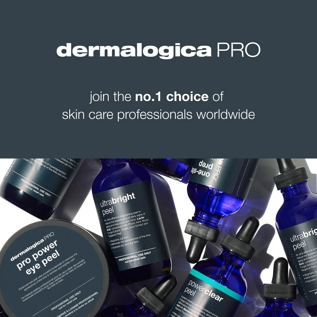
A dark charcoal background runs the full frame. At the top, the "dermalogica PRO" logo in blue and white, followed by the headline: "join the no.1 choice of skin care professionals worldwide" in clean white text. The bottom half is a dense cluster of deep blue Dermalogica PRO bottles — ultrabright peel, pro power eye peel, power clear peel — with black caps, arranged in an organic, slightly overlapping pile. The dark-on-dark palette means the products emerge from the background like tools laid out on a worktable.
Why it works: Dermalogica's origin as a brand for skincare professionals is its strongest asset, and this ad leads with it. The continuous dark charcoal background creates a moody, clinical atmosphere that immediately signals "this is not a consumer brand — this is what the pros use." You absorb the authority claim at the top before your eye drops to the product arsenal below. The "no.1 choice of professionals worldwide" is social proof at the highest possible level. And the product cluster isn't a neat line — it's an organic, overlapping arrangement that looks like a working professional's toolkit rather than a merchandising display.
Platform fit: Instagram Feed and Facebook. The professional authority positioning works with an audience aged 25+ who research skincare seriously.
Clone this layout: Text-heavy headline at top, product display below. If you have professional endorsements or certifications, lead with them. The dark background makes blue and white packaging pop without needing bright colors.
26. La Roche-Posay — clinical blue, new product launch
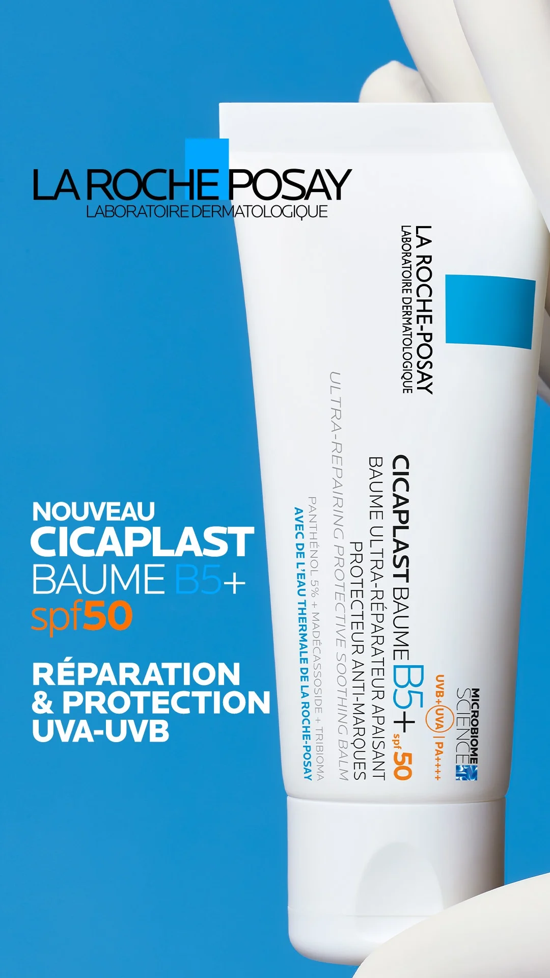
La Roche-Posay's Cicaplast Baume B5+ SPF50 tube is angled diagonally across the right side of the frame against a bold blue background with curved white framing elements at the edges. The La Roche-Posay "Laboratoire Dermatologique" logo sits at the top. On the left, French text stacks cleanly: "NOUVEAU" then "CICAPLAST BAUME B5+" in bold, with "spf50" in orange as a visual anchor. Below that: "REPARATION & PROTECTION UVA-UVB" in white. A second tube peeks in at the bottom, partially cropped. The tube's blue cap — the brand's signature color — ties the product to the background. Clinical, confident, no-nonsense.
Why it works: La Roche-Posay doesn't try to be trendy. It leans into being the brand dermatologists recommend. The bold blue background is psychologically associated with trust and professionalism — exactly the right emotional frame for a clinical skincare product. The diagonal product placement adds dynamic energy to what could be a static composition, and the curved white framing elements create depth without clutter. The orange "spf50" callout ensures the key differentiator pops against the blue. This is a new product launch ad that communicates one thing: this product protects and repairs.
Platform fit: Facebook and Instagram Feed. The clinical aesthetic works with audiences who research before purchasing.
Clone this layout: If your product has a key feature (SPF, a specific ingredient concentration), highlight it in a contrasting color. Diagonal product placement adds energy to a clinical layout — and a bold monochrome background makes white packaging impossible to miss.
27. Hero Cosmetics — your whiteheads are shaking
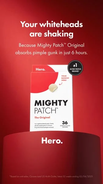
Deep red gradient background. The Mighty Patch Original box sits on a glowing pedestal, centered and lit like a trophy. The headline — "Your whiteheads are shaking" — is bold, playful, and impossible to scroll past. Below it: "Because Mighty Patch Original absorbs pimple gunk in just 6 hours." A "#1 Acne Patch Brand" badge floats beside the product. Hero branding bookends the frame top and bottom. The entire composition screams confidence.
Why it works: That red background is a weapon. In a category dominated by clinical whites and calming blues, Hero Cosmetics went full aggressive — and it pays off. The headline doesn't educate, it trash-talks your acne. "Your whiteheads are shaking" is the kind of copy Gen Z screenshots and sends to friends. The pedestal positioning lifts the product literally and figuratively, while the "#1 Acne Patch Brand" badge backs up the swagger with proof. Six hours is a specific, believable timeframe that turns curiosity into purchase intent. This ad ran for 90+ days — a solid performer that earned its media spend.
Platform fit: Instagram Stories and TikTok. The vertical format, bold color, and punchy copy are engineered for mobile-first platforms where you have one second to stop the scroll.
Clone this layout: Use a hero shot template with a bold, saturated background. Center the product. Lead with a personality-driven headline, not a feature list. If you have a "#1" claim, use it.
Product efficacy and results
When your product works, show receipts. These ads lead with proof and let the numbers close.
28. Biossance — 100% sculpted, Sephora cosigns
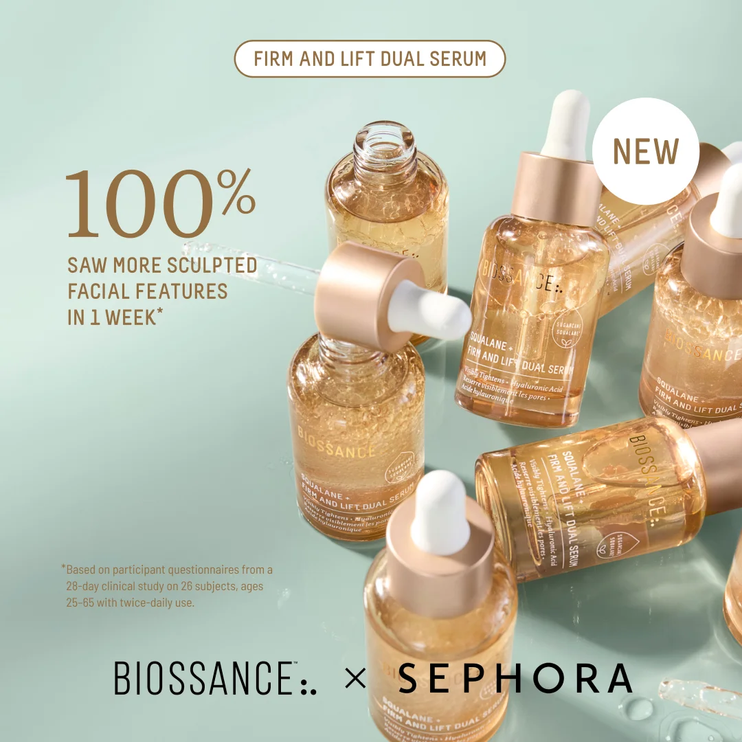
Serene mint green background. Eight Biossance Firm and Lift Dual Serum bottles scattered in a dynamic cluster — some upright, some tilted, droppers out, golden serum catching the light. The headline dominates: "100% SAW MORE SCULPTED FACIAL FEATURES IN 1 WEEK." A "NEW" badge and "FIRM AND LIFT DUAL SERUM" callout sit at the top. "BIOSSANCE x SEPHORA" anchors the bottom. The fine print cites a 28-day clinical study on 26 subjects. The abundance of bottles creates visual richness that a single product shot can't match.
Why it works: The dynamic product cluster is the layout choice that separates this from every other serum ad in your feed. Instead of one bottle on a pedestal, Biossance scattered eight of them across the frame — creating visual abundance that communicates premium quality and demand. The 100% stat is absurd in the best way: it's the strongest possible claim, backed by clinical study fine print that makes it credible instead of suspicious. The mint green background paired with warm golden serum is a deliberate color contrast — cool and warm tones that make the product glow. And the Sephora co-branding at the bottom does what Sephora always does: instant trust signal for the beauty shopper who needs one more reason to click.
Platform fit: Instagram Feed and Facebook. The square format and visual density work best in feed placements where the viewer has time to absorb the composition.
Clone this layout: Use a product-on-background template. If you have multiple units of the same product, scatter them dynamically instead of lining them up. Lead with your strongest stat — if it's 100%, don't be shy about it.
29. Krave Beauty — press reset, three products, total clarity
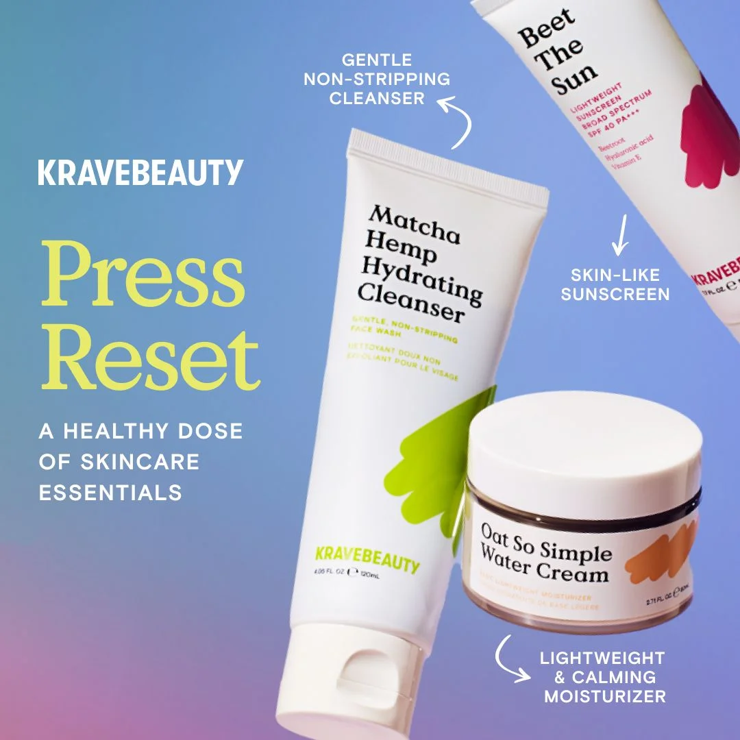
Three Krave Beauty products on a soft blue-to-pink gradient background, arranged at a diagonal from top-right to bottom-left. The Matcha Hemp Hydrating Cleanser tube sits top-center, the Beet The Sun sunscreen peeks in from the upper right, and the Oat So Simple Water Cream jar anchors the bottom. Arrows connect each product to a short benefit callout: "Gentle Non-Stripping Cleanser," "Skin-Like Sunscreen," "Lightweight & Calming Moisturizer." On the left, bold yellow text reads "Press Reset" with the subline "A Healthy Dose of Skincare Essentials." All three products share clean white packaging that pops hard against the gradient.
Why it works: Krave Beauty built its brand on the anti-maximalism position — and this ad is the visual proof. "Press Reset" isn't a product headline, it's a counter-positioning statement aimed at the 12-step routine industry. Three products. Three benefits. Three arrows. That's the entire routine. The diagonal arrangement creates natural visual flow without feeling staged, and the gradient background adds warmth and personality without stealing attention from the product info. Each arrow-to-benefit label answers "what does this do?" in four words or fewer. The white packaging against that gradient is high contrast by design — these products stop thumbs on a busy feed.
Platform fit: Instagram Feed and TikTok. The educational, visually clean format works on platforms where quick comprehension drives engagement.
Clone this layout: Use a text-focused template with bold, simple messaging. Product-to-benefit arrows are an underused format that turns product shots into educational content.
30. Peach & Lily — glass skin testimonial in coral
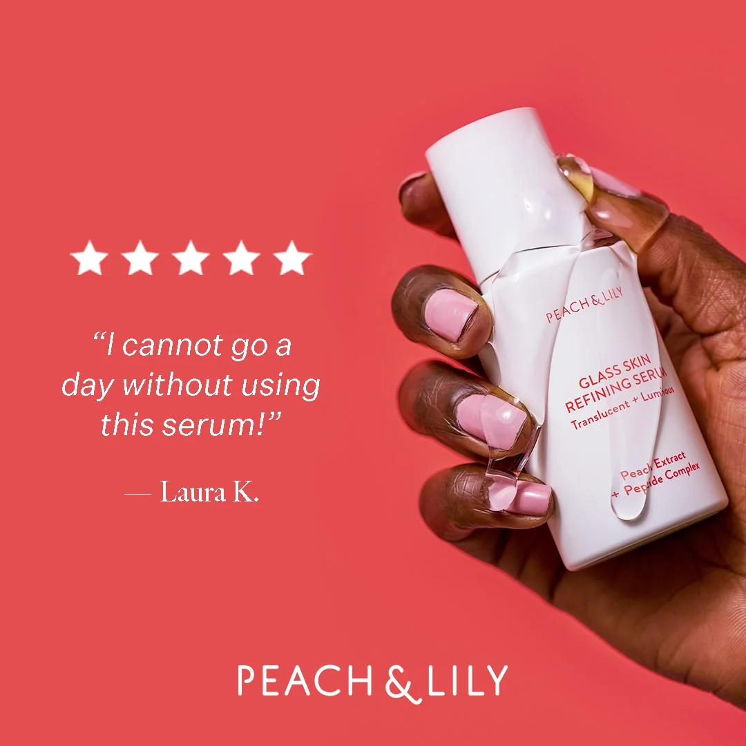
A vibrant coral background. Left side: a prominent 5-star rating and user quote: "I cannot go a day without using this serum!" — Laura K. Right side: a hand holding the Peach & Lily serum, the bottle held naturally. The brand logo sits subtly at the bottom. The split composition — testimonial and product side by side — creates a cause-and-effect narrative: this review, this product.
Why it works: The testimonial-first layout is a deliberate hierarchy choice: social proof before product. The viewer reads the 5-star review and forms a positive impression before their eye even lands on the bottle. The coral background is warm, energetic, and distinctly different from the clinical blues and soft pinks that dominate skincare advertising. The hand-held product shot adds a human element — someone is using this, not photographing it. And the high contrast between white text and coral background ensures the testimonial is readable even at small sizes.
Platform fit: Instagram Feed and Pinterest. The close-up, testimonial-driven format works well on platforms where social proof drives purchase decisions.
Clone this layout: Use a full-bleed testimonial template. Lead with the review — star rating, quote, real language — and let the product follow.
31. Clinique — 15% off your first purchase, product range as incentive
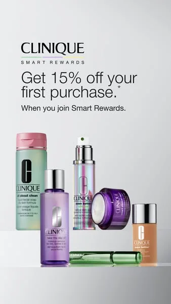
Portrait format, clean white background. "CLINIQUE SMART REWARDS" sits at the top in small caps, followed by the headline: "Get 15% off your first purchase.*" and the subline "When you join Smart Rewards." The bottom half shows five Clinique products grouped on a light grey surface — the green-and-pink All About Clean cleanser, the purple Take The Day Off makeup remover, the silver Even Better Clinical serum, a purple Smart Clinical jar, and a beige foundation bottle. Each product's signature Clinique "C" logo faces the viewer. No clutter, no lifestyle imagery, no models. Just the offer and the products.
Why it works: This ad runs a two-part play: the discount converts, and the product lineup upsells. The 15% off headline owns the top half of the frame — it's the first thing you read. The product group below answers the immediate follow-up: "15% off what, exactly?" Five products spanning cleanser, remover, serum, treatment, and foundation show enough range to hook almost any skincare buyer. The "Smart Rewards" framing turns a standard discount into membership access, which feels exclusive rather than desperate. And the clinical white background isn't just aesthetic — it's brand strategy. Clinique's entire positioning is built on dermatologist-tested credibility, and that sterile-clean look reinforces it without saying a word.
Platform fit: Facebook and Instagram Feed. The offer-driven format works well in placements where the audience is already considering a skincare purchase.
Clone this layout: Use a single-product or multi-product template with a clean background. If you're running a first-purchase offer, make it the headline. Show enough of your range to give the viewer a reason to click through.
What the best skincare ad examples have in common
After analyzing 31 ads from 30 brands, five patterns separate the ads that convert from the ones that get scrolled past.
1. One product, one promise
The best-performing skincare ads don't show the full product line. They show one product solving one problem. CeraVe doesn't run an ad about "complete skincare" — it runs an ad about ceramides restoring developing skin. Dr. Dennis Gross doesn't promote "daily skincare" — it promotes the Alpha Beta Peel's clinical claim of 92% seeing a brighter, firmer, clearer complexion in one week. Specificity drives action. Generality drives scrolling.
2. Real proof beats polished creative
In our analysis, Paula's Choice's before/after images outperform retouched versions. First Aid Beauty's UGC outperforms studio shoots. Biossance's "100% saw more sculpted facial features" stat with a dynamic product cluster outperforms a flat product image with the same stat. The pattern is consistent: authenticity wins. Industry data on UGC ad performance consistently shows brands with strong UGC pipelines tend to see lower CPMs than those relying on polished brand content.
3. Ingredient callouts pay for themselves
In our analysis, ingredient text overlays tend to lower CPA and lift ROAS. When Herbivore lists Ashwagandha and Hemp Seed Oil under their Emerald product, it answers questions the shopper would otherwise need to research. Neutrogena puts "Vitamin C & E, Niacinamide & Hyaluronic Acid" directly on visible packaging. The Inkey List and Good Molecules prove this works at every price point.
4. Color is brand equity
Glossier owns red caps on pink bottles. CeraVe owns clinical blue. Tatcha owns purple-and-gold. Drunk Elephant owns the color riot. The brands with the strongest visual identities use color as a recognition system that works at any size — thumbnail, feed, Stories, display banner. If your product photos need a logo to be identified as yours, your color system isn't working hard enough.
5. Platform-native creative outperforms repurposed ads
Neutrogena's handheld, in-store product shot feels native on Instagram Stories. Supergoop's tennis racket metaphor rewards the kind of closer inspection that Instagram Feed encourages. Bubble's four-panel grid maximizes the information density that Instagram Feed viewers expect. The lesson: build for the platform, not for the brand guidelines.
Create your own skincare ads with AdDogs
Pick any layout above. Upload your product photo. Pick your dimension — 3 on Free/Basic (square for Instagram Feed, portrait for Stories and TikTok, landscape for Facebook and Google Display), all 14 on Pro and Ultimate. AdDogs' static ad generator rebuilds the composition with your product and brand colors in seconds. One credit per ad.
Browse the skincare ad template collection — 14,000+ templates from ads that actually converted. Find a layout that matches your product, your audience, your platform. One credit per ad. $0.40 on Basic, $0.33 on Pro.
Every ad on this page is a layout you can clone. Stop designing from scratch. Start cloning what works. Then test your variations systematically to find the winner.
FAQ
What size should skincare ads be for Instagram?
Instagram Feed ads perform best at 1080x1080 (square). Stories and Reels use 1080x1920 (9:16 vertical). For a full breakdown of every platform's requirements, see our ad sizes and specs guide. AdDogs supports 14 aspect ratios — 3 on Free and Basic (square, portrait, landscape), all 14 on Pro and Ultimate. One credit generates one ad in your chosen dimension.
How much do skincare ads cost to create?
A freelance designer charges $50-150 per ad. AdCreative.ai charges $3.90 per ad ($39/mo for 10 credits). AdDogs charges $0.40 per ad on the Basic plan ($12/mo for 30 credits) — see our full comparison with AdCreative.ai. That's 30 finished ads a month for less than a single stock photo.
What makes a skincare ad high-converting?
One product, one benefit, real proof. The top performers in our analysis share three traits: specific ingredient callouts (not "powerful formula" but "10% Niacinamide"), authentic visuals (UGC or unretouched photos), and platform-native creative (built for the platform, not repurposed from a different channel). Based on industry data, ingredient callout overlays consistently outperform generic claims in paid tests.
How many skincare ad variations should I test?
Start with 5-10 variations per product. Different templates, different compositions, different color approaches. At $0.40 per ad, testing 10 variations costs $4. Testing 50 costs $20. For a deeper dive into testing strategy, read our ad creative testing guide. Volume beats perfection at the testing stage — create more, let the algorithm pick the winner.
Can I use AI to create skincare product ads?
Yes. AdDogs generates skincare ads by cloning the layout, composition, and style of proven templates. Upload your product photo, pick a template from the skincare collection, and the AI rebuilds the ad with your product and brand colors. seconds. No design skills required.
Every day you spend designing skincare ads from scratch is a day your competitor spends testing 50 variations. Pick a template. Upload your product. See what seconds feels like.