B2B SaaS ad examples: 18 real ads with receipts


B2B SaaS pours an estimated 41% of its ad budget into LinkedIn — yet the format that out-clicks the rest is the plain single image, around 0.42% CTR versus 0.24% for video (a 2026 benchmark set). The best-performing B2B SaaS ad isn't a polished video. It's one static frame doing one job well. Below are 18 B2B SaaS ad examples, grouped by the six jobs B2B creative does, each with why it works and its run-time where we can prove it.
What counts as a B2B SaaS ad example, and the six jobs they do
A B2B SaaS ad is a paid creative that sells access to business software — a project tool, a design platform, a training subscription — to the person who buys or expands the seat, not the consumer who buys a physical product. That buyer is skimming a work feed for relevance, not stories, which is why static frames carry most of the load and why only about a quarter of LinkedIn ad creatives convert at all, per Cognism's study of 761 B2B ads.
Sort the winners and the same six jobs keep showing up. Enterprise social proof borrows credibility from logos and co-brands. Stat and data cards lead with a number. Gated lead magnets trade a PDF for an email. Webinar and event ads sell a seat at a session. Demo-first ads put the product's job inside the frame. Migration and comparison ads meet the buyer inside the tool they already use. Name the job and you can clone the exact layout that does it.
Every creative shown below is a static ad pulled from Meta's Ad Library — SaaS Facebook ads and Instagram placements. LinkedIn and Google appear later as cost data, not shown ads, because their libraries don't retain the multi-year receipts Meta's does. One caveat before the badges start: run-time is a survival signal, not a click-through rate. A 400-day run doesn't publish the CTR — it shows an advertiser kept paying for the creative through a year of budget reviews, which is the strongest evidence a public ad library offers. For a broader, non-B2B view of the same swipe file, see our full SaaS ad examples library.
Enterprise social proof: logo walls and co-brands
The fastest credibility a SaaS ad can rent is someone else's logo. Four ads below borrow it — one with a wall of enterprise names, three with a named institution co-signing the offer. A note on the three Coursera entries: Coursera is prosumer edtech, not core B2B SaaS. They're here because nobody runs the co-brand pattern more consistently — clone the layout, not the audience.
ClickUp — the enterprise logo wall
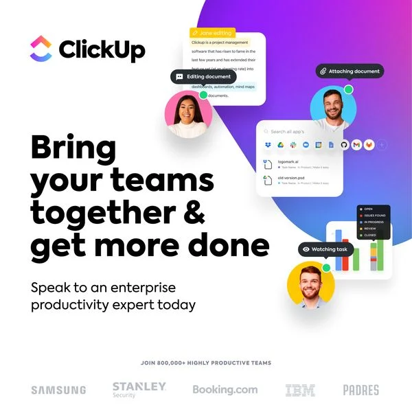
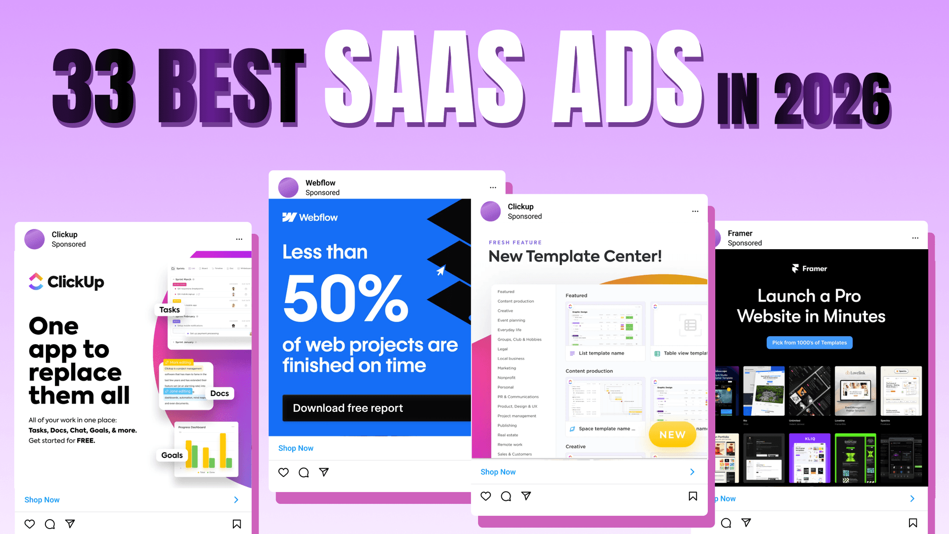
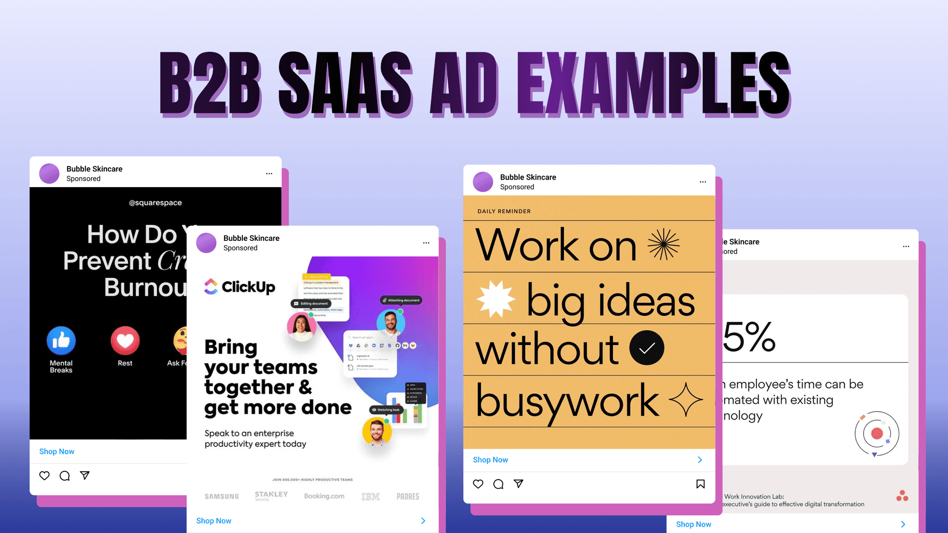
"Bring your teams together & get more done — speak to an enterprise productivity expert today" runs over a wall of recognizable logos: Samsung, Stanley Security, Booking.com, IBM, the Padres. A "join 800,000+ highly productive teams" line sits under a product-UI collage. Every element in the frame is doing one thing: transferring trust from names the buyer already knows onto a tool they don't yet. The CTA matches that motion: an enterprise buyer talks to a human, not a free-trial form. It's the most enterprise-flavored layout in the set, built for a sales-led buyer who needs to see peers before a demo.
Clone it: the ClickUp logo-wall layout is in the Software & Tools ad examples library — swap the logos for your own customers and keep the "join N teams" proof line.
Coursera — a deadline co-signed by Berkeley

"100% online Berkeley Master of Advanced Study in Engineering — apply by March 1" sits over a photo of the campus Campanile with the Berkeley logo locked in. The institution photo does the credibility work. The hard date does the urgency. It stayed live 395 days in Meta's Ad Library, a long run for a creative built around a single deadline, and it targets the upskilling buyer who trusts a named university more than a platform.
Coursera — a career outcome co-signed by Meta

"Meta iOS Developer Professional Certificate — launch a career in mobile development" pairs a smiling learner with the Coursera and Meta lockup. The co-brand is the whole pitch: the outcome (a career) is abstract, so a name the buyer already respects makes it concrete. Meta's Ad Library logs it at 195 days, and it aims at the individual learner through Meta's cheap prosumer reach.
Coursera — an institution co-brand with an apply CTA
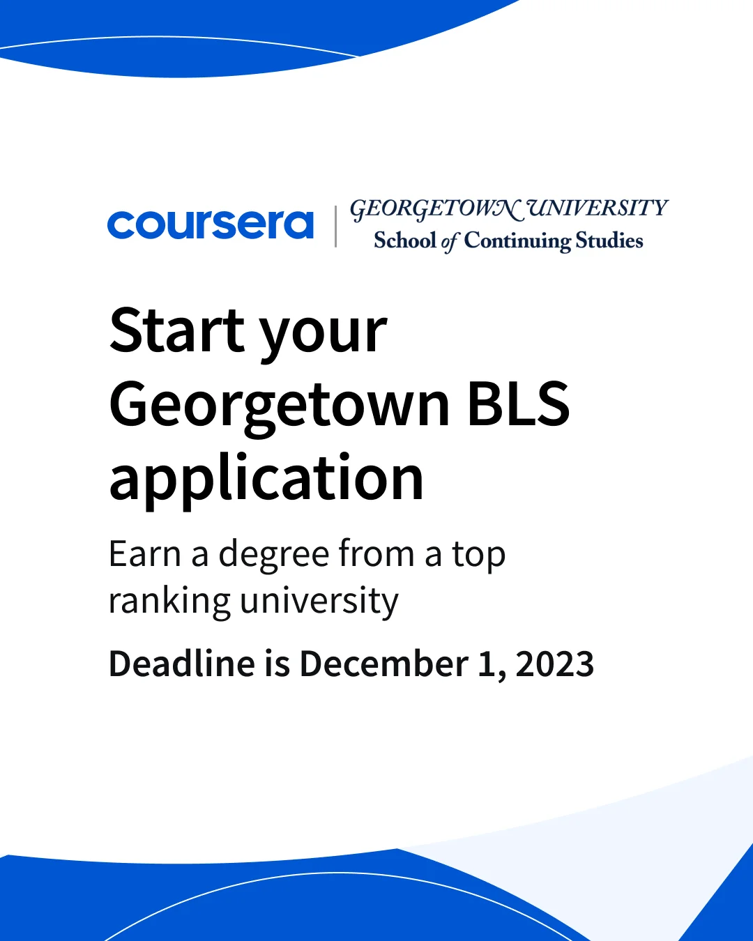
"Start your journey with Georgetown" fronts an online BA co-brand with a direct apply-now button — the Berkeley engine dialed to a higher-commitment offer. It ran 82 days in Meta's Ad Library, a shorter window that reads as a test rather than a proven workhorse. It fits a higher-education buyer weighing a full degree, not a short course.
Stat and data cards
When the value is invisible, a number makes it legible in under two seconds. Five ads below lead with data — a stat, a poll, or a concept rendered as one clean visual. Two are Squarespace, an SMB tool rather than enterprise software — included because their stat-card craft is the cleanest in the set, and the layout ports straight onto a B2B data point.
Asana — a stat card with a cited source
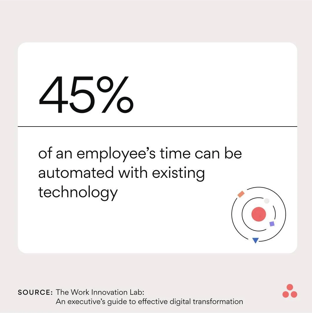
"45% of an employee's time can be automated with existing technology" fills the frame, credited to Asana's Work Innovation Lab. One number, one source line, no product screenshot. The citation is what separates it from a generic motivational card — it reads as research, which is exactly the posture a thought-leadership ad wants. It targets the operations or team lead evaluating whether a tool earns its seat cost.
Clone it: the Asana stat-card layout is in the Software & Tools ad examples library — drop in your own benchmark and clone it with your product.
Squarespace — a stat that reframes the category
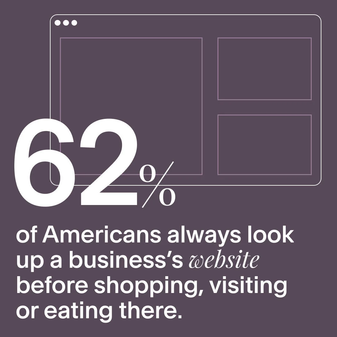
"62% of Americans always look up a business's website before shopping, visiting or eating there" runs inside a simple browser outline. The stat reframes a website from a nice-to-have into a revenue driver, which does more selling than any feature list. It aims at the small-business owner who hasn't yet decided a site is worth the money.
monday.com — a concept built from product UI
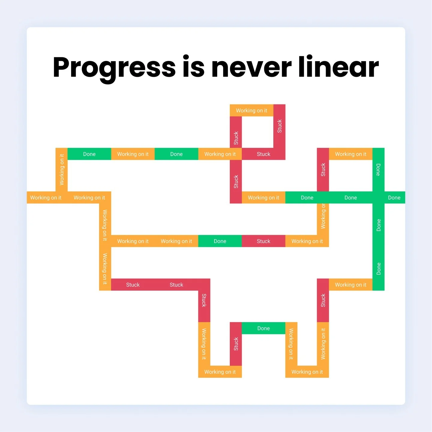
"Progress is never linear" is drawn as a maze made entirely of monday.com status pills — Done, Working on it, Stuck. The product becomes the art: the ad teaches what the tool looks like without a single dashboard screenshot, a rare awareness play that still shows the product.
Asana — a one-line typography ad
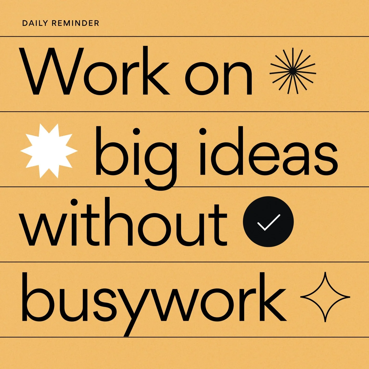
"Daily reminder — work on big ideas without busywork" is set in bold type over ruled lines and small icons, no interface anywhere. Pure typography is the cheapest ad to produce and the easiest to test in volume, and this one carries an aspirational one-liner that any knowledge worker feels. It fits a top-of-funnel Meta placement where a brand is buying recognition, not clicks.
Squarespace — an engagement poll
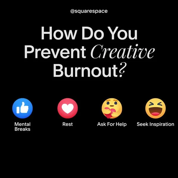
"How do you prevent creative burnout?" invites reaction emojis (mental breaks, rest, and so on), turning the ad into a community prompt rather than a pitch. The product tie is loose on purpose: the job here is engagement and reach, letting the feed's own mechanics do the distribution for a brand-awareness objective.
Gated lead magnets
A gated asset trades something useful for an email address, which is why the lead-magnet layout is one of the most durable in B2B. Both ads below have the run-time to prove it.
Webflow — the free-ebook lead magnet
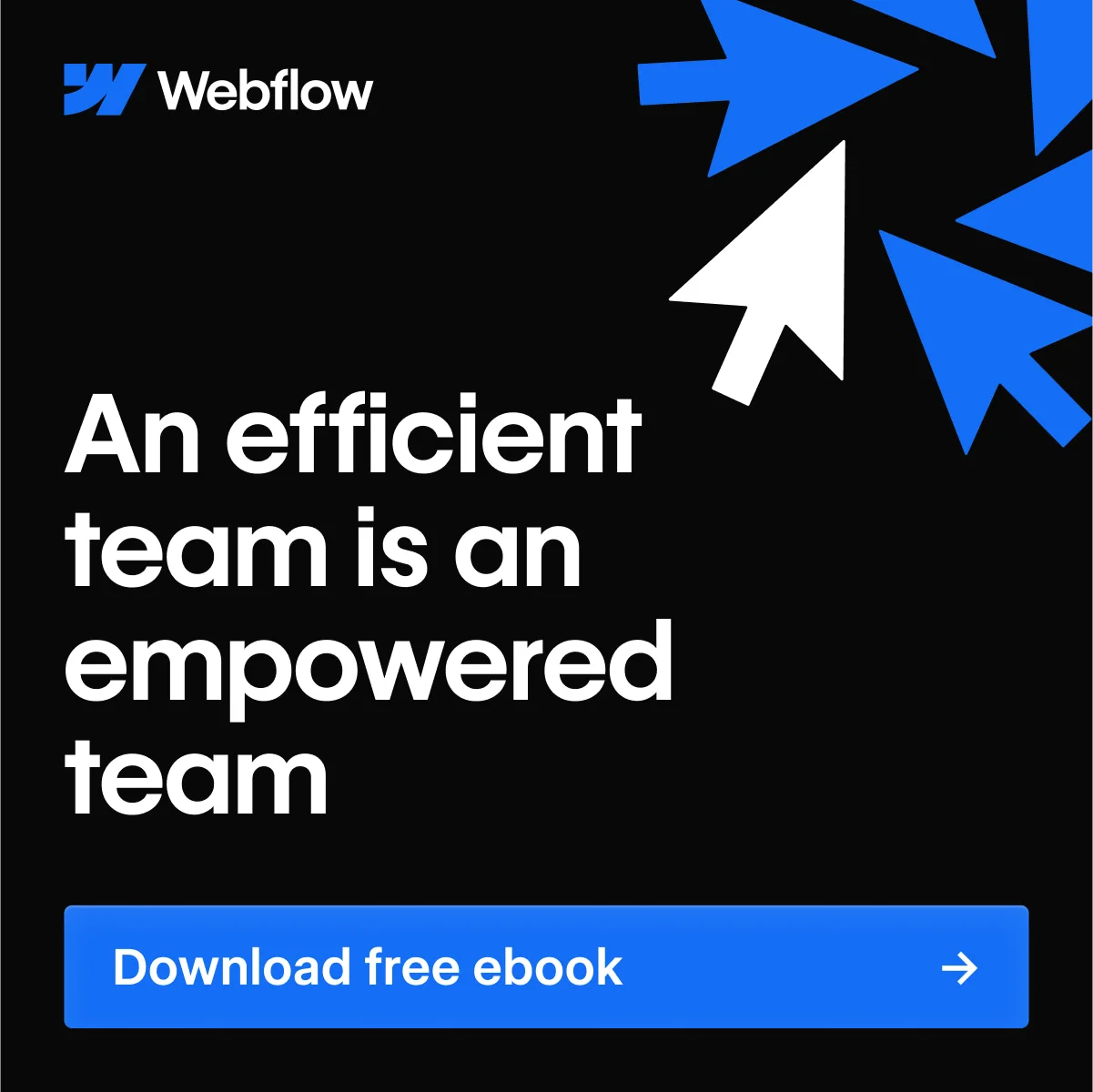
"An efficient team is an empowered team — download free ebook" sits on a black field with blue cursor arrows pointing toward the offer. No product shot, no pricing, just a promise of a document worth the trade. It held its slot for 332 days in Meta's Ad Library, part of a whole series Webflow runs on the same engine — a signal the format keeps paying its way, not a lucky one-off. The buyer is the org-level decision-maker who reads reports before they book demos, and the layout is deliberately calm so the offer, not the design, does the work.
Clone it: the Webflow lead-magnet layout is in the Software & Tools ad examples library — name your ebook, keep the cursor arrows pointing at the CTA.
Coursera — a gated skills report

A "fastest-growing skills" report with a bare download button and almost no headline copy — the report title is the hook. A 209-day run in Meta's Ad Library backs it up. Data-as-lead-magnet works because the reader wants the benchmark, not the pitch, and it targets the learning-and-development buyer who plans training around market trends.
Webinar and event ads
An event ad sells a seat, not a signup — a softer ask than a demo, which makes it a natural entry point for a higher-consideration buyer.
ClickUp — a webinar with named speakers

"Ready to take your agency's customer experience to the next level?" fronts a webinar ad with a date and two named speakers, each with a headshot, above a "register below" button. Faces make the session feel real, and naming the speakers borrows their credibility the way the logo wall borrows the enterprise names: a softer entry than a demo, aimed here at agency owners. Other SaaS brands run the same layout for priced workshops (monday.com advertises a paid five-hour Core workshop with a certification badge), so the format scales from free session to paid training with only the CTA changing.
Demo-first ads
Show software working and it sells itself. Four ads below put the product's job — the correction, the collaboration — inside the frame instead of describing it.
Grammarly — a live correction in the ad
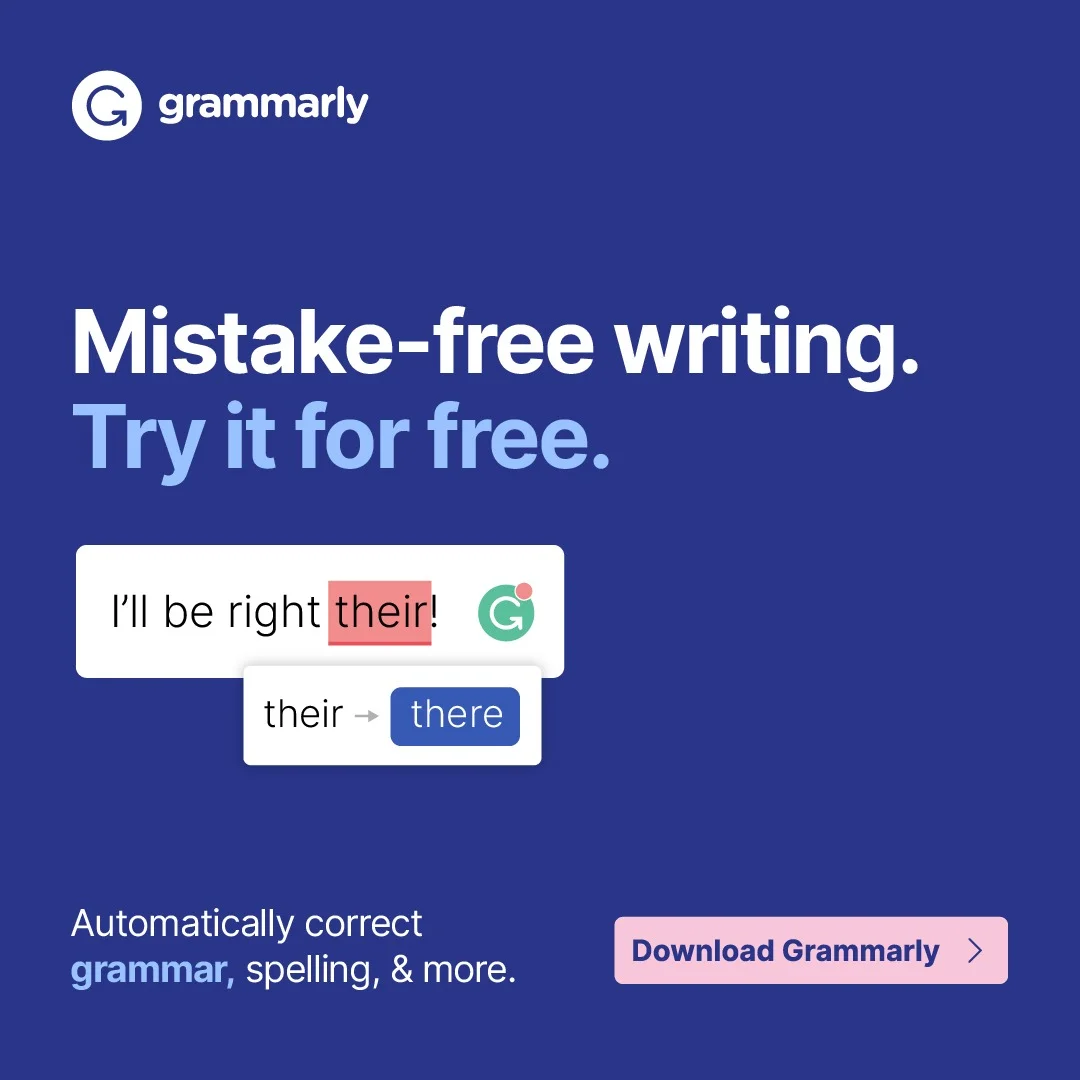
"Mistake-free writing. Try it for free." runs on a blue field with a live correction chip fixing "their" to "there" right in the frame. The ad is a demo compressed to a single interaction: the reader sees exactly what the product does before the click, which is the whole point of a demo-first creative. It's a before-and-after with no words wasted on explaining the before. The buyer is a prosumer or a team lead expanding seats, and the low-friction "try it for free" ask matches a product that proves itself in one use.
Clone it: the Grammarly correction-chip layout is in the Software & Tools ad examples library — put your product's core action in the frame and clone it with your product.
Grammarly — a visual A/B pun
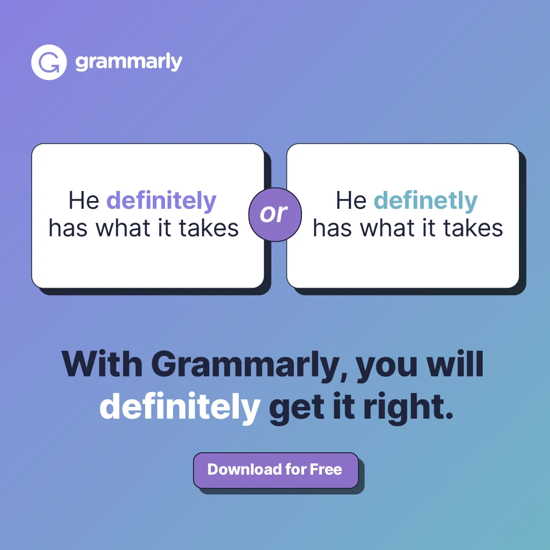
"With Grammarly, you will definitely get it right" plays out as two cards: "definitely" against the misspelled "definetly." The gag is the demo — the reader instantly gets what the tool catches, and the pun makes a spelling fix memorable. Humor is rare in B2B, and it earns a second look here without diluting the product message, in the same demo-first Meta placement as the correction-chip ad.
Grammarly — a color variant on the same demo
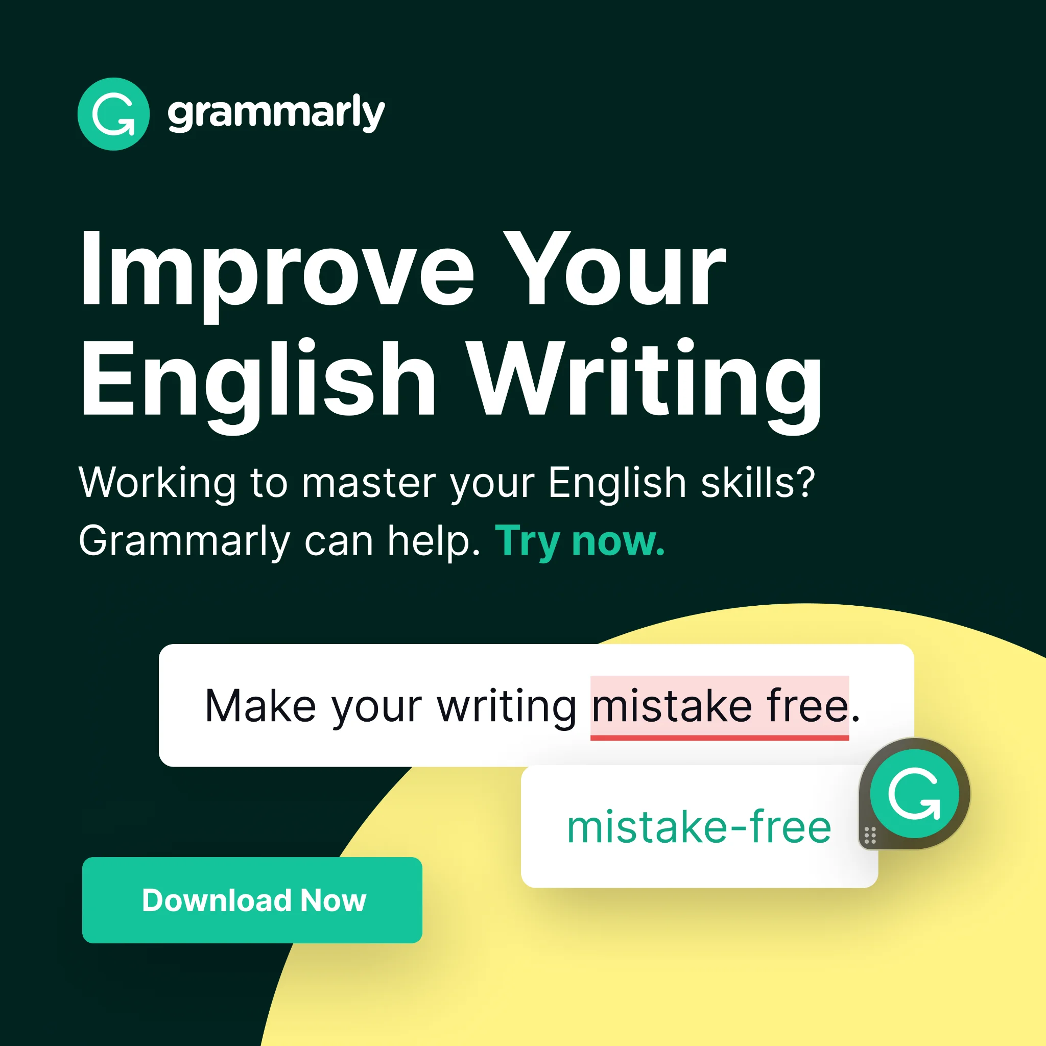
"Improve your English writing — working to master your English skills? Try now" runs the same demo-first idea on a dark green field for a different audience: English learners rather than native professionals. Running one proven layout across colors and headlines is how a brand tests audiences without rebuilding the creative — one winning format becomes a family of B2B SaaS ad examples for adjacent buyers.
Figma — collaboration shown, not told
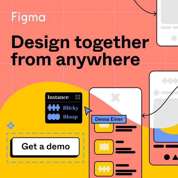
"Design together from anywhere — get a demo" shows a collaboration canvas with named cursors moving across it, so the multiplayer value is visible before the reader reads a word. The demo CTA signals a higher-consideration buyer than a free trial would — a team evaluating a shared tool. It targets the design lead choosing a platform for a whole team, which is why the ask is a demo, not a download.

Create your own facebook product ads
Create your ad
Migration and comparison ads
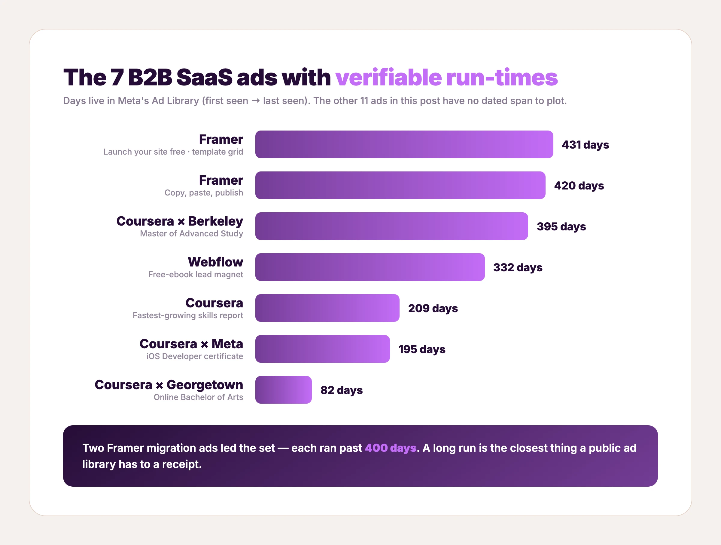
Your hardest buyer already uses something else. Migration ads meet them inside that tool and show the switch as trivial. Both Framer ads below ran over a year in Meta's Ad Library.
Framer — copy, paste, publish
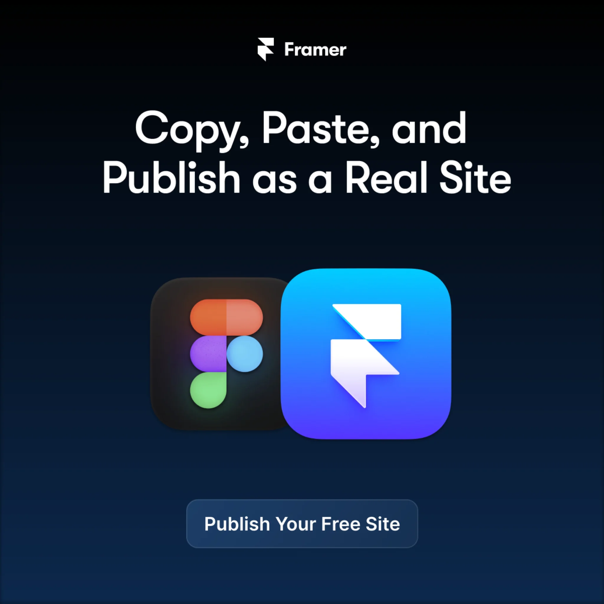
"Copy, paste, and publish as a real site" sits between the Figma and Framer app icons, with a "publish your free site" button below. The competitor isn't attacked — it's shown, side by side, as the starting point the buyer already has open. That's the move: name the incumbent visually, then make the switch look like three keystrokes. Meta's Ad Library clocked it at 420 days. The three-verb headline compresses the whole value proposition to a rhythm the reader finishes in one beat, and it targets the designer who lives in Figma and dreads the handoff to a real website.
Framer — launch it free, proof in a grid
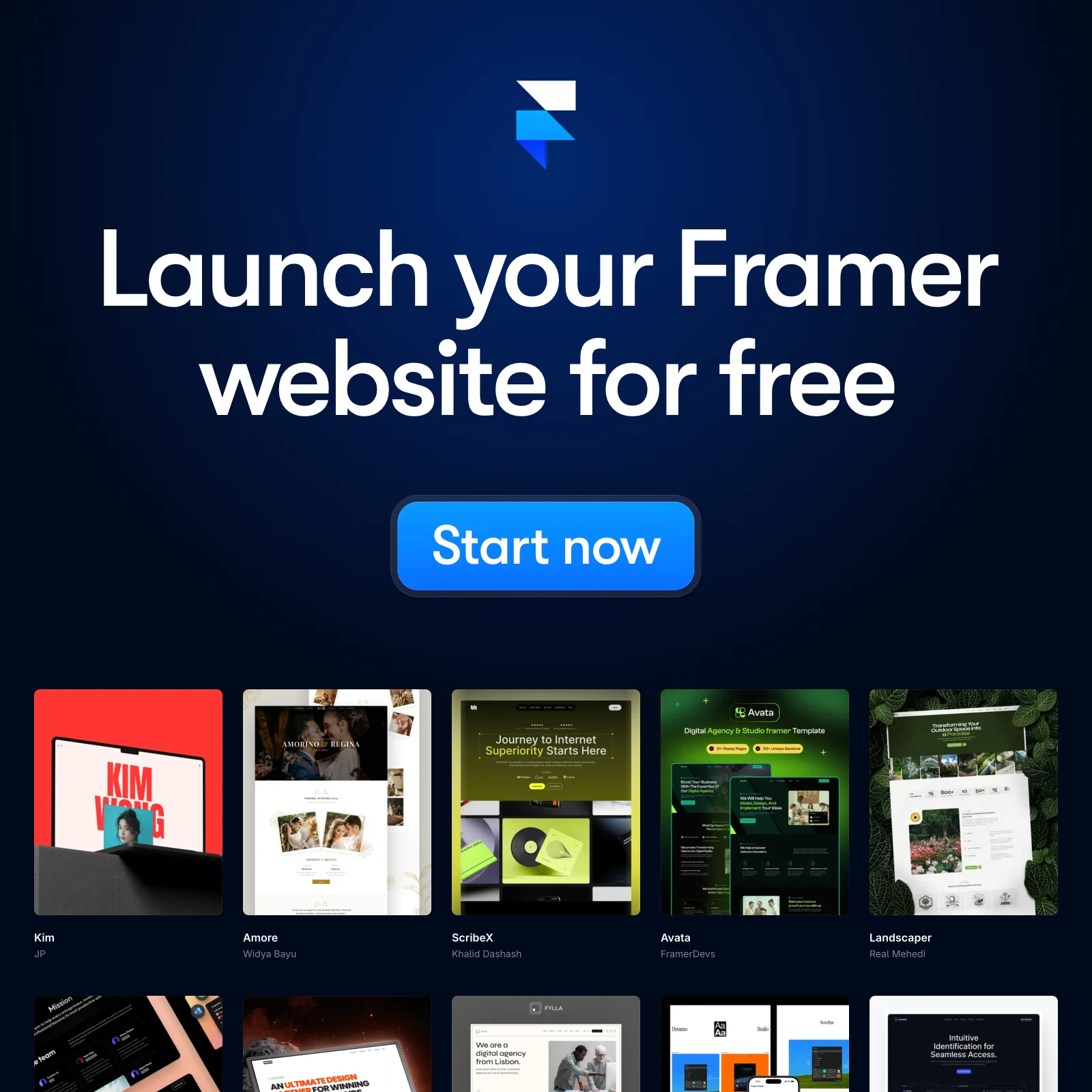
"Launch your Framer website for free" runs over a grid of real site templates — the output is the proof. Showing what the buyer will make beats claiming the tool is easy, and the free offer removes the last objection. At 431 days in Meta's Ad Library, it's the longest run in this set. It fits a broad Meta prospecting audience of builders and small teams who want a site without a developer.
Where B2B SaaS ads run: LinkedIn vs Meta vs Google
All 18 ads above are Meta creatives, and that's deliberate: Meta's Ad Library keeps multi-year run-time receipts, so it's the only place a swipe file can show proof. LinkedIn's library retains ads only about a year after their last impression, and Google's transparency center dates are captured manually — so no LinkedIn or Google creative is shown here. Those channels appear as cost data instead, which is the honest version of a multi-platform B2B post.
Budget doesn't split evenly across the three platforms — the right one depends on the funnel stage you're buying. LinkedIn ads for SaaS buy the tightest account targeting at the highest cost per lead. Google ads for SaaS capture active demand through search while display seeds it. ABM in the matrix below means account-based marketing — targeting a named list of companies rather than a broad audience.
| Platform | ABM / account targeting | Lead-gen | Demo / high-intent | Retargeting |
|---|---|---|---|---|
| Strongest — job-title and company targeting is native; SaaS clicks cost $10.48–$15.72 each (HockeyStack, 70+ companies) | Native Lead Gen Forms, but the highest cost per lead of the three | Works for booked demos when the account fit is tight enough to justify the click | Website retargeting, capped by ~1-year ad retention | |
| Meta | Weakest — no company-size or job-title targeting, so account precision is low | Cheapest lead-gen of the three and the fastest place to test creative volume | Cheap enough to test demo asks at scale, per one 2026 agency aggregate | Strongest pixel-based retargeting of the three |
| Limited to intent signals, not firmographics | Search captures active demand; display seeds it | High-intent demo requests from bottom-funnel search terms, at a directional mid-range cost per lead | Display remarketing across the network |
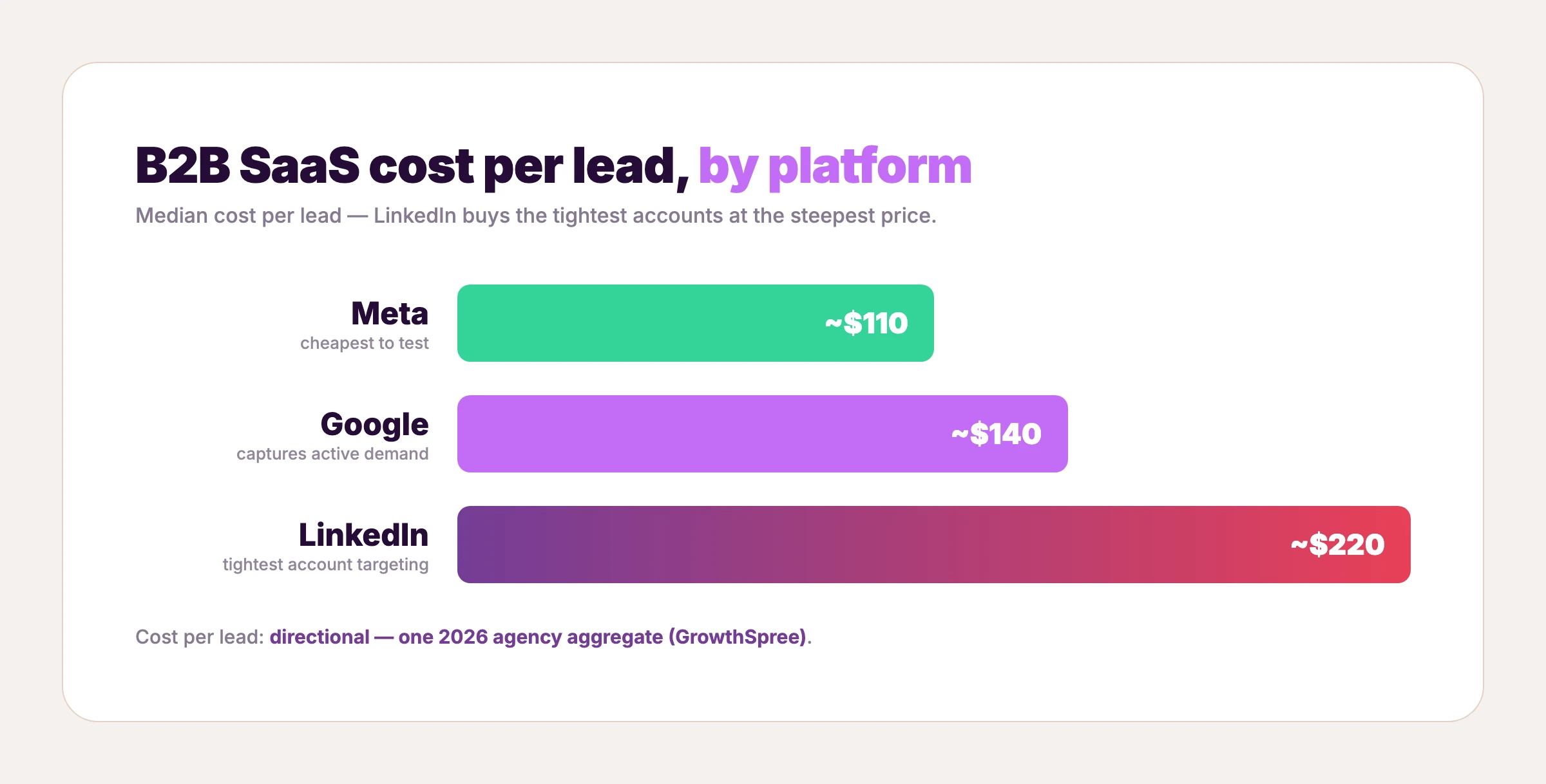
Cost per lead tracks that split. In one agency's client set, the directional medians land near $110 on Meta, $140 on Google, and $220 on LinkedIn — LinkedIn charges the most per lead but reaches the tightest accounts, so the expensive click can still buy the cheaper deal. For a wider map of where B2B buyers browse ad creative, see where to find more B2B ad examples.
Each platform also wants its own dimensions. Building one layout in the right sizes is what lets a single winning frame run everywhere.
| Platform | Primary static size | Also runs |
|---|---|---|
| Single image 1200×627 (1.91:1) | Square 1:1 | |
| Meta | Square 1:1 and portrait 4:5 | Story/Reel 9:16 |
| Google display | 300×250, 336×280 | 728×90, 160×600, 300×600 |
Those Google display sizes are the same SaaS banner ads a search campaign leans on for remarketing — the format is small, but it's where a lot of B2B display spend quietly lands.
B2B SaaS ad copy formulas you can steal
Strip these 18 B2B SaaS ad examples down to their headlines and four reusable formulas fall out. Fill in the blanks with your own product.
- The stat card: "[X]% of [audience] [do this surprising thing]." — Asana's "45% of an employee's time can be automated," Squarespace's "62% of Americans always look up a business's website."
- The demo line: "[Outcome the product delivers] — [low-friction ask]." — Grammarly's "Mistake-free writing. Try it for free," Figma's "Design together from anywhere. Get a demo."
- The borrowed-credibility line: "Join [N]+ [audience]" beside names they know. — ClickUp's "join 800,000+ highly productive teams" over the Samsung–IBM logo wall, Coursera's Berkeley and Meta co-brands.
- The lead-magnet line: "[Desirable asset] — download the free [format]." — Webflow's "download free ebook," Coursera's "fastest-growing skills" report.
Formulas are portable — the proof is yours to supply. To decide how many variants of each to run, see how many creatives to test.
How to clone these B2B SaaS ad examples with your product
Each layout above is a real ad that ran in market — and all 18 B2B SaaS ad examples are in the AdDogs library, matched by source. That turns a swipe file into a starting line. Pick the frame that fits your job — logo wall, stat card, demo, migration — and rebuild it around your product. No customer logos, proprietary stats, or webinars yet? Start with the demo-first or typography jobs — they need nothing but your product and one honest line.
Browse the 14,000+ ad examples, filter to the 1,351 Software & Tools ad examples, and pick the exact layout you want. Upload your product photo. AdDogs clones the composition — layout, hierarchy, the place where the logo wall or the correction chip sits — swaps in your product, and applies your brand colors automatically. One credit produces one finished ad in seconds, in the dimension you choose, and every plan exports at 2K resolution. Basic is $12/mo for 30 ads, Pro is $33/mo for 100, and Ultimate is $63/mo for 212 — Pro and Ultimate unlock all 14 aspect-ratio options, so the same layout can be rebuilt for LinkedIn, Meta, and Google.
Pick the ClickUp logo wall or the Framer migration layout, drop in your product, and clone it with your product. The Software & Tools ad examples collection is where the 18 above already live.
FAQ
What is a B2B SaaS ad?
A B2B SaaS ad is a paid creative that sells access to business software — a project tool, a design platform, a training subscription — to the buyer who owns or expands the seats. Most run as static single images because B2B buyers skim work feeds for relevance, and only about a quarter of LinkedIn ad creatives convert at all, so the frame has to make the value legible in under two seconds.
Which platform works best for B2B SaaS ads — LinkedIn, Meta, or Google?
It depends on the funnel stage. LinkedIn wins account-based targeting but charges the most per lead — roughly $220 in one 2026 agency set versus $110 on Meta and $140 on Google. Meta is the cheapest place to test creative volume, and Google captures active demand through search, so most B2B SaaS programs run all three and split budget by stage.
What size should B2B SaaS ads be on each platform?
LinkedIn's single-image format is 1200×627 (1.91:1). Meta runs square 1:1 and portrait 4:5, plus 9:16 for Stories and Reels. Google display leans on 300×250 and 336×280, with 728×90 and 160×600 as common banner sizes — building one layout across those dimensions lets a single winning frame run on all three.
How many B2B SaaS ad creatives should you test?
Enough to find a winner, since roughly a quarter of B2B creatives convert at all — a small set almost guarantees you test only losers. Running one proven layout across a handful of headlines and colors, the way Grammarly does, tests audiences without rebuilding the ad each time.
Can you recreate these B2B SaaS ads with your own product?
Yes — all 18 layouts above are in the AdDogs library, matched to the real ads by source. Pick a layout, upload your product photo, and one credit produces one finished ad in your chosen dimension, exported at 2K, starting at $0.40 per ad on the $12/mo Basic plan.