Outdoor Ad Examples

Browse 1,402 outdoor and adventure ad examples sourced from high-performing campaigns. Clone any design, swap in your product, and get a finished ad in seconds.

Updated October 2026

Outdoor ads only have one rule: show the gear outside. Peak Design, YETI, Patagonia, Huckberry, REI, and BOTE all run the same formula because a backpack photographed indoors sells a backpack. A backpack photographed on a ridgeline at golden hour sells adventure. Outdoor shoppers buy gear to access experiences, and the ad needs to show the experience — not the product in isolation.

Visual vocabulary is wide angles, golden-hour grading, and gear captured in use — tent staked against mountains, cooler in a pickup bed at sunset, trail shoes mid-stride on switchbacks. Palettes lean earthy and natural — forest green, rust, slate, ochre, charcoal. Copy is almost absent or lands as one line of confident voice: "Built for dirt." "Goes further." "Weekend bag, weekday backup." Meta and YouTube carry the majority of paid spend. YouTube especially strong for gear-in-use video content.

Browse outdoor ad examples pulled from real campaigns — tents, backpacks, coolers, trail shoes, camping stoves, hiking apparel. Pick a template, upload your product, and AdDogs applies your palette across three formats.
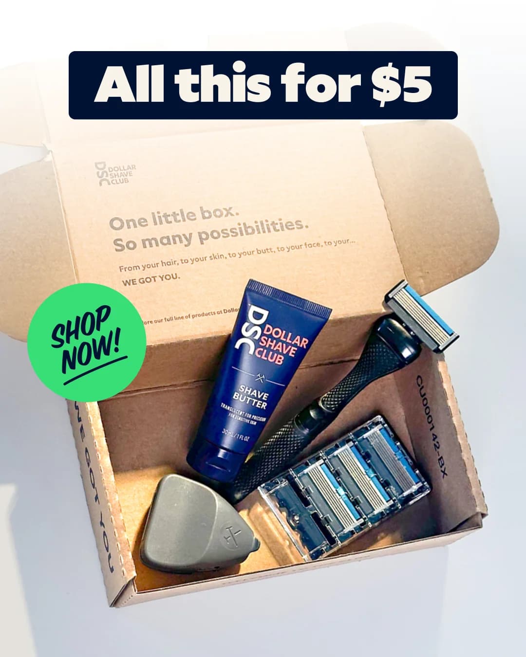

Dollar Shave Club — Value Box Flat Lay
Dollar Shave Club
HexClad Cookware — Celebrity Endorsement Hero Shot
HexClad
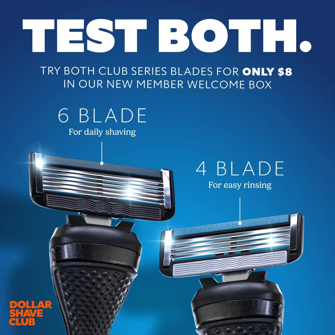
Dollar Shave Club — Dual Razor Comparison
Dollar Shave Club
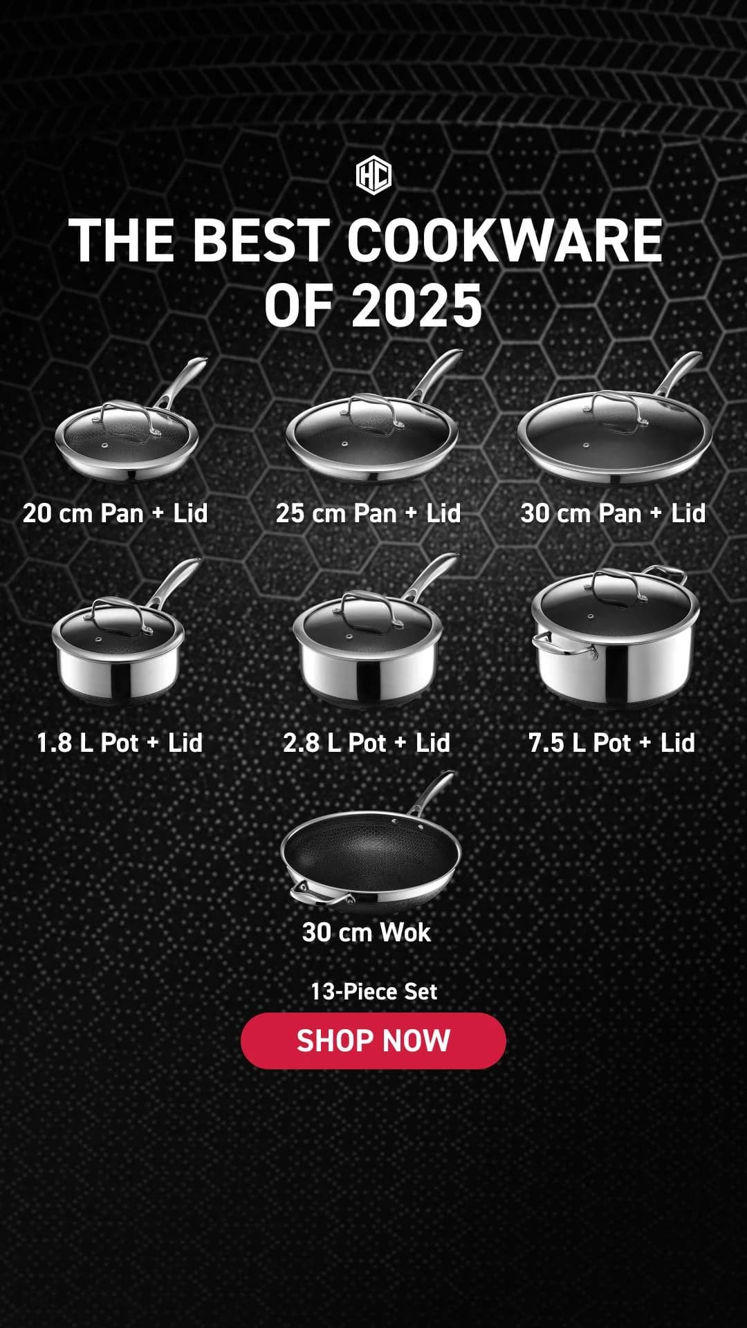
HexClad Cookware Set — Product Grid
HexClad
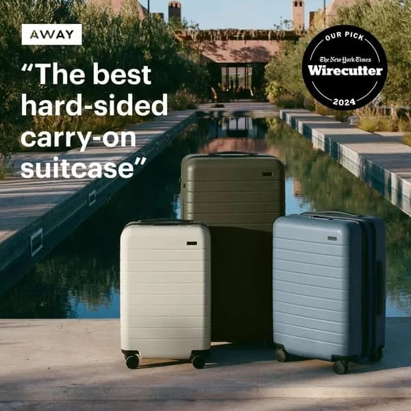
Away Luggage — Lifestyle Product Group
Away
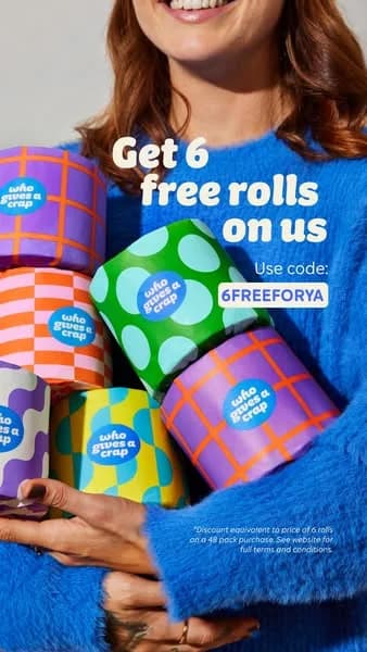
Who Gives A Crap — Playful Product Lifestyle
Who Gives A Crap
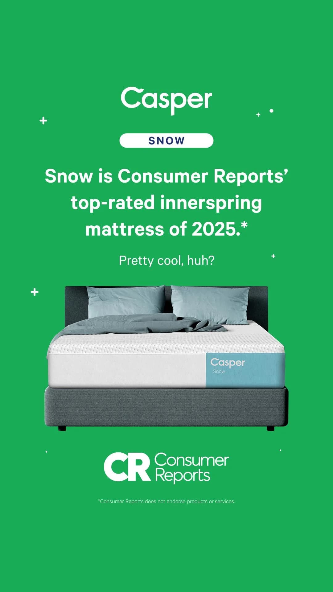
Casper Snow — Bold Mattress Hero Shot
Casper
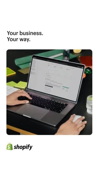
Shopify — Laptop In-Use Lifestyle Shot
Shopify
Dyson Black Friday — Dual Product Showcase. Brand: Dyson. This Dyson ad leverages a minimalist, high-contrast layout to showcase two premium products against a stark black background. The composition strategically places the Dyson fan and vacuum cleaner, allowing their sophisticated designs and metallic finishes to stand out. The dark palette evokes luxury and modernity, aligning perfectly with Dyson's brand identity. Text hierarchy is simple and effective: the Dyson logo and "BLACK FRIDAY" message are positioned top-left, immediately communicating brand and a time-sensitive sales event without cluttering the product visuals. This design is optimized for platforms like Instagram, where clean aesthetics and strong visual impact are crucial for stopping the scroll. The ample negative space ensures product focus, while the subtle red and purple accents add visual interest, drawing attention to key design elements. It effectively promotes a major sale while maintaining a premium brand image.. Headline: BLACK FRIDAY. Why this ad works: High-contrast dark mode product display — The deep black background dramatically enhances the metallic sheen and intricate details of the Dyson products. This high contrast ensures the ad immediately captures attention in a busy feed, signaling premium quality and sophisticated design, which is crucial for a luxury brand like Dyson. Strategic dual product visual hierarchy — Featuring two distinct, high-value products (fan and vacuum) simultaneously broadens appeal to a wider audience interested in Dyson's diverse offerings. The clear separation and individual lighting ensure each product receives adequate visual attention, maximizing the impact of a single ad unit for a major sales event. Clear, concise Black Friday messaging — The "BLACK FRIDAY" text is prominently placed yet unobtrusive, immediately communicating a time-sensitive sales event. This direct approach leverages urgency, prompting viewers to explore deals without needing additional descriptive text, making the ad highly effective for driving immediate consideration during a peak shopping period.. Specs: Brand: Dyson, Industry: Home & Lifestyle, Platform: Instagram, Format: Static, Audience: GeneralCaraway High-quality Minimalist Lifestyle Photograph. Brand: Caraway. A high-quality, minimalist lifestyle photograph showcasing kitchen organization. It works by blending seamlessly into a social feed as native content while clearly demonstrating the product's utility.. Specs: Brand: Caraway, Industry: Home & Lifestyle, Platform: Facebook, Format: Static, Audience: GeneralAnker Nano Charger — Dynamic Feature Highlight. Brand: Anker. This ad effectively uses a dynamic layout to highlight the Anker Nano charger's key benefit: speed. The product is centrally positioned, visually "breaking" through an icy "3X" numeral, creating a powerful metaphor for rapid charging. The cool blue gradient background reinforces the "Nano" and "FASTER" themes, evoking efficiency and modern technology. Text hierarchy is clear: the bold "FASTER" immediately grabs attention, followed by the specific benefit "FOR YOUR IPHONE" and the product name "Anker Nano." The prominent "SHOP NOW" CTA button is strategically placed for conversion. Optimized for platforms like Facebook, its strong visual impact and clear value proposition cut through feed clutter, making it highly effective for driving consideration and conversion for tech-savvy consumers seeking efficient charging solutions. The composition ensures critical elements are visible across various aspect ratios.. Headline: FASTER. Primary text: FOR YOUR IPHONE Anker Nano. Why this ad works: Visual Metaphor of "Breaking Ice" for Speed — The imagery of the charger shattering the "3X" ice block powerfully communicates rapid speed and efficiency. This visual storytelling is more engaging than plain text, instantly conveying the product's core benefit and creating a memorable impression for the viewer, enhancing recall. Clear, Benefit-Driven Headline and Numeric Claim — The bold "FASTER FOR YOUR IPHONE" headline directly addresses a common user pain point, while the "3X" numeric claim provides a quantifiable improvement. This combination of a strong benefit and a specific, impressive statistic drives immediate understanding and perceived value, boosting click-through rates. Strategic Use of Brand and Call-to-Action — The Anker logo is prominently placed, building brand recognition, while the "SHOP NOW" button is a clear, high-contrast call to action. This ensures that after understanding the product's benefit, users are immediately guided towards the next step in the purchase journey, optimizing for conversion.. Specs: Brand: Anker, Industry: Home & Lifestyle, Platform: Facebook, Format: Static, Audience: GeneralYoung Family Home Tour — Lifestyle Scene. This lifestyle image effectively leverages a bright, clean aesthetic to appeal to young families. The composition places the family and real estate agent centrally, using the home's natural light and spaciousness to create an inviting atmosphere. Warm neutral colors and natural wood elements contribute to a feeling of comfort and aspiration. The staircase acts as a subtle leading line, guiding the eye through the potential home. Optimized for platforms like Instagram or Facebook, this ad relies on visual storytelling rather than explicit text, allowing the aspirational scene to resonate emotionally. The lack of on-image text ensures a clean visual, making it highly adaptable for various ad copy overlays and platform formats. It subtly positions the service as facilitating significant life milestones.. Why this ad works: Aspirational lifestyle imagery connects with target audience — Showing a young family with a baby exploring a bright, modern home taps into universal desires for stability, growth, and a fresh start. This emotional resonance makes the ad highly relatable for potential homebuyers, positioning the service as a facilitator of significant life milestones rather than just a transaction. Natural light and clean aesthetic evoke comfort — The abundant natural light and minimalist interior design, featuring warm neutral colors and natural wood, create an inviting and spacious feel. This visual strategy suggests a desirable, comfortable living environment without needing explicit claims, appealing to the emotional desire for a peaceful and welcoming home. Subtle narrative builds emotional connection — The interaction between the attentive real estate agent and the young family, especially the baby, tells a story of a significant life event. This narrative approach humanizes the service, positioning it as supportive and understanding of family needs, fostering trust and a deeper emotional connection with the target audience.. Specs: Industry: Home & Lifestyle, Platform: Facebook, Format: Static, Audience: ParentsMKBHD dbrand Triple Black — Dynamic Product Arrangement. Brand: dbrand. This ad leverages a high-contrast, dynamic layout to showcase MKBHD's limited edition dbrand skins. The vibrant red background immediately grabs attention, creating a bold visual anchor for the multiple black tech products. Products are arranged diagonally, leading the eye across the frame and highlighting the consistent "Triple Black" design. Text hierarchy is clear: the MKBHD brand and "LIMITED EDITION SKINS" are top-left, while the large "TRIPLE BLACK" headline dominates the center, emphasizing the product's unique selling proposition. The call to action (URL) is strategically placed at the bottom-right. This composition is highly effective for platforms like Instagram or Facebook, where a strong visual impact is crucial for scroll-stopping. The minimalist yet detailed product design appeals to tech-savvy audiences. The overall aesthetic is clean, bold, and premium, reinforcing the quality of the skins. The subtle icon pattern on the skins adds an element of discovery and detail for engaged viewers.. Headline: TRIPLE BLACK. Primary text: MKBHD LIMITED EDITION SKINS. Why this ad works: High-contrast color scheme for impact — The stark red background against the matte black products creates immediate visual pop. This contrast ensures the ad stands out in a busy feed, drawing the eye directly to the product details and branding. It communicates boldness and premium quality, effectively capturing attention in a crowded digital space. Dynamic diagonal product arrangement — Products are positioned on a diagonal axis, creating a sense of movement and energy across the frame. This composition technique naturally guides the viewer's eye through the various skinned devices, showcasing the range and consistency of the "Triple Black" design across different tech items, enhancing product discovery. Influencer branding for instant credibility — Featuring "MKBHD" prominently leverages the tech reviewer's established authority and loyal following. This partnership instantly signals quality and desirability to the target audience, driving consideration and trust without extensive copy. It's a powerful endorsement that resonates with tech enthusiasts.. Specs: Brand: dbrand, Industry: Fashion & Apparel, Platform: Instagram, Format: Static, Audience: Men 18-24Woman with Phone & Mug — Lifestyle Shot. This lifestyle ad effectively captures a relatable, everyday moment, positioning the subject as engaged and comfortable. The composition places the woman slightly off-center, drawing the eye naturally to her face and the phone she's interacting with, suggesting a focus on digital connection or content. Soft, natural lighting and a clean kitchen background contribute to a warm, inviting aesthetic, aligning with a "clean" vibe. The color palette of earthy tones (her shirt, counter) against a bright, minimalist kitchen creates a harmonious and aspirational yet achievable feel. This image is optimized for platforms like Instagram, where authentic, unposed lifestyle content performs well, fostering relatability and aspirational identification without explicit product placement. The lack of overt text or branding allows the image to speak for itself, promoting a sense of discovery or organic integration.. Why this ad works: Authentic Lifestyle Scene Builds Relatability — The ad captures a common, quiet moment of daily life – checking a phone with a warm drink. This authenticity makes the image highly relatable to the target audience, fostering an immediate emotional connection and making the ad feel less intrusive and more like organic content. Soft, natural lighting creates inviting mood — The use of soft, diffused natural light illuminates the scene gently, avoiding harsh shadows and creating a warm, inviting atmosphere. This lighting technique enhances the feeling of comfort and ease, making the viewer feel welcome and positively disposed towards the implied brand message. Subtle composition guides eye to interaction — The woman is positioned slightly off-center, with her gaze directed towards her phone, which she holds prominently. This subtle compositional choice naturally guides the viewer's eye to her interaction with the device, hinting at the potential for a digital product or service without explicit branding.. Specs: Industry: Home & Lifestyle, Platform: Instagram, Format: Static, Audience: Women 25-34Inside Weather Sofa — Lifestyle Testimonial Sale. Brand: Inside Weather. This ad effectively combines social proof with a clear promotional offer, leveraging a lifestyle layout. The central focus is an inviting orange sofa, presented in a natural home setting, which helps potential customers visualize the product in their own space. Overlayed at the top, a prominent 5-star rating and a positive customer testimonial build immediate trust and credibility. The bottom banner clearly communicates a tiered "President's Day Sale," creating urgency and incentivizing purchase. The color palette is warm and inviting, with the sofa's vibrant orange contrasting subtly with the yellow walls, while the cool grey/teal banner ensures the sale details stand out. This composition is optimized for platforms like Instagram, where visual appeal and concise information drive engagement and conversion. The text hierarchy guides the eye from social proof to the product, then to the actionable discount.. Headline: "Perfect orange sofa". Primary text: president's day sale 10% off $1000 15% off $2000 20% off $3000. Why this ad works: Prominent 5-star rating builds instant trust — The large, clear 5-star rating immediately signals product quality and customer satisfaction. This visual social proof is highly effective in advertising, as consumers are more likely to trust peer recommendations than direct brand claims, significantly increasing consideration for the product. Lifestyle context aids product visualization — Presenting the sofa within a warm, lived-in room helps viewers imagine it in their own homes. This lifestyle photography is crucial for furniture, moving beyond a sterile product shot to evoke comfort and aspiration, making the product feel more tangible and desirable. Tiered discount creates purchase incentive — The "President's Day Sale" banner with tiered discounts (10% off $1000, 15% off $2000, 20% off $3000) clearly communicates value. This strategy encourages higher average order values by rewarding customers for spending more, driving conversion during a specific promotional period.. Specs: Brand: Inside Weather, Industry: Home & Lifestyle, Platform: Instagram, Format: Static, Audience: GeneralBruvi Coffee — Cost Comparison Split Screen. Brand: Bruvi. This ad effectively utilizes a split-screen comparison layout to highlight a significant cost-saving benefit. The left side visually negates expensive cafe coffee with a clear 'no' symbol, while the right showcases the Bruvi machine as the affordable, quality alternative. The dominant headline immediately grabs attention with a strong financial promise. Color psychology employs a clean, minimalist palette of white, grey, and deep blue, conveying professionalism and trust. Composition guides the eye from the problem (left) to the solution (right), reinforced by bulleted cost breakdowns. Optimized for platforms like Instagram, its clear visual narrative and direct value proposition are designed to stop the scroll and drive consideration, making it highly effective for conversion-focused campaigns.. Headline: Save $100 a month on your daily coffee.. Primary text: Cafe quality coffee $152/month Cafe quality coffee $39/month. Why this ad works: Direct cost comparison drives immediate value — The ad explicitly states a $100 monthly saving, backed by clear 'before' and 'after' price points. This direct, quantifiable financial benefit is highly persuasive, immediately demonstrating the return on investment for potential customers and addressing a common pain point for daily coffee drinkers. Visual negation clearly defines the problem — The crossed-out coffee cup on the left instantly communicates the problem: expensive cafe coffee. This visual shorthand is universally understood, quickly establishing the ad's premise and creating an emotional connection with viewers who relate to the cost of their daily coffee habit. Clean aesthetic enhances product appeal — The minimalist background and modern design of the Bruvi machine project a clean, sophisticated image. This aesthetic positions the product as a desirable, contemporary solution for home coffee, appealing to consumers who value both functionality and a sleek, uncluttered kitchen environment.. Specs: Brand: Bruvi, Industry: Food & Beverage, Platform: Instagram, Format: Static, Audience: ProfessionalsBellroy Adventure Gear — Dynamic Lifestyle Grid. Brand: Bellroy. This ad employs a dynamic nine-panel grid layout, effectively showcasing Bellroy's bags across diverse active, outdoor, and urban scenarios. Each panel contributes to a visual narrative of product utility and versatility. The earthy color palette, dominated by natural greens, browns, and grays, reinforces a rugged yet stylish aesthetic, aligning with the brand's focus on durable, functional gear. The composition lacks overt text, relying entirely on aspirational imagery to convey benefits and brand identity. This visual-first approach is highly optimized for platforms like Instagram, where authentic, lifestyle-driven content captures attention. The diverse models and activities broaden the appeal, positioning the products for adventurers, urban explorers, and everyday users who value both style and function. The implicit visual hierarchy allows each segment to tell a part of the overall brand story.. Why this ad works: Dynamic nine-panel lifestyle grid — The collage format effectively showcases product versatility across multiple scenarios—from hiking and climbing to casual urban wear. This diverse visual storytelling demonstrates the bags' adaptability and durability, appealing to a broad audience seeking multi-functional gear. It prevents visual fatigue by offering varied perspectives. Authentic, aspirational user imagery — The ad features real people engaging in active lifestyles, creating an authentic and aspirational feel. Viewers can easily envision themselves using the products in similar situations, fostering a stronger emotional connection and perceived utility. This approach builds trust and desire more effectively than studio shots. Earthy color palette reinforces brand values — The consistent use of natural greens, browns, and muted grays across the products and environments reinforces Bellroy's commitment to durable, practical, and design-conscious gear. This palette subtly communicates ruggedness and timeless style, aligning with an audience that values quality and understated aesthetics.. Specs: Brand: Bellroy, Industry: Fashion & Apparel, Platform: Instagram, Format: Carousel/Collage, Audience: Fitness EnthusiastsBellroy Wallets & Pouches — Rugged Lifestyle Grid. Brand: Bellroy. This ad employs a dynamic grid layout, showcasing Bellroy's wallets and pouches through a series of close-ups and in-use scenarios. The composition strategically highlights product durability and premium materials, featuring shots with water splashes and dirt to convey ruggedness. Earthy tones and natural textures dominate the color palette, reinforcing an organic, adventure-ready aesthetic that resonates with an active, discerning audience. The lack of overt text overlay pushes visual storytelling to the forefront, relying on strong product photography and contextual imagery to communicate value. This visual-first approach is highly optimized for platforms like Instagram, where scroll-stopping imagery and aspirational lifestyle content drive engagement. The varied shots ensure comprehensive product understanding without explicit descriptions, appealing to consideration-phase consumers.. Why this ad works: Visual demonstration of product durability — The inclusion of shots showing the products being splashed with water and placed in dirt effectively communicates their ruggedness and resilience. This visual proof builds trust and highlights a key feature without needing explicit text, making the ad highly persuasive for active users. Comprehensive product feature spotlight — The collage format allows for a multi-faceted view, from close-ups of material textures and the brand logo to in-hand shots and internal organization. This comprehensive visual exploration educates the viewer on design, quality, and functionality, fostering a deeper understanding and appreciation for the product. Authentic, aspirational lifestyle integration — By placing the products in natural, outdoor settings and showing them in use (holding cash), the ad creates an authentic lifestyle connection. This approach helps the target audience visualize themselves using the product in their daily adventures, elevating the brand beyond mere utility to an aspirational accessory.. Specs: Brand: Bellroy, Industry: Fashion & Apparel, Platform: Instagram, Format: Carousel/Collage, Audience: Men 25-34Litter-Robot 4 — Cat & Product Lifestyle Shot. Brand: Litter-Robot. This ad effectively uses a lifestyle layout, featuring the Litter-Robot 4 alongside a charismatic cat in a home environment. The composition places the product prominently on the left, balanced by the engaging cat on the right, whose direct gaze creates an immediate connection. Neutral colors—creamy white, warm browns, and natural light—evoke a clean, modern, and inviting atmosphere, suggesting seamless integration into any home. This aesthetic is optimized for platforms like Instagram, where authentic, high-quality pet content thrives and stops the scroll. The visible accessories (filters, waste bags) subtly highlight the complete solution. Without explicit text, the visual narrative focuses entirely on product utility and pet comfort, driving consideration through aspirational living rather than direct claims. The overall impression is one of effortless pet care and a harmonious home.. Why this ad works: Engaging cat model creates emotional connection — The cat's direct gaze and comfortable posture immediately draw the viewer in. Pets evoke strong emotional responses, making the ad highly relatable and memorable for pet owners. This humanizes the product, shifting focus from a mere appliance to a beloved pet's comfort and well-being, fostering a deeper connection with the brand. Product-in-use demonstrates real-world integration — Showing the Litter-Robot in a bright, natural home setting, complete with a cat interacting with its accessories, effectively communicates its purpose and ease of integration into daily life. This visual proof builds trust and helps potential buyers envision the product solving their pet care challenges in their own homes. Clean, bright aesthetic signals modern convenience — The bright, natural lighting and neutral color palette convey a sense of cleanliness, modernity, and sophistication. This aesthetic aligns perfectly with the premium nature of an automatic litter box, appealing to owners who prioritize convenience, hygiene, and aesthetically pleasing, high-tech solutions for their beloved pets.. Specs: Brand: Litter-Robot, Industry: Pets & Animals, Platform: Instagram, Format: Static, Audience: GeneralAnker SOLIX F2000 — Outdoor Lifestyle In-Use. Brand: Anker SOLIX. This ad employs a lifestyle layout, integrating the Anker SOLIX F2000 power station into an aspirational outdoor camping scene. The dark, nocturnal setting creates high contrast, making the product's illuminated display and the vibrant text pop, optimizing for visibility on busy social feeds like Instagram or Facebook. Compositionally, the product is prominently placed in the foreground, anchoring the scene, while the relaxed man and warm campfire lights evoke a sense of comfort and capability. The clear text hierarchy, with the brand logo at the top and the bold, benefit-driven headline "2400W Ultra-Powerful and Versatile" centrally positioned, immediately communicates the product's core value proposition. This design effectively sells a lifestyle enabled by the product, rather than just the product itself, appealing to adventurous consumers.. Headline: 2400W Ultra-Powerful and Versatile. Primary text: Anker SOLIX F2000. Why this ad works: Aspirational lifestyle integration — By placing the Anker SOLIX F2000 within a cozy, adventurous camping scene, the ad sells an experience, not just a product. This lifestyle integration creates an emotional connection, allowing potential customers to envision themselves enjoying the freedom and convenience the power station provides. It effectively demonstrates utility in a desirable context. High contrast for visual impact — The dark, nighttime backdrop provides a stark contrast for the product's illuminated display, the warm campfire glow, and the bright, multi-colored headline. This high visual contrast ensures the ad stands out in a crowded feed, drawing immediate attention to both the product and its key power benefit. It enhances readability and memorability. Benefit-driven headline highlights power — The prominent headline "2400W Ultra-Powerful and Versatile" immediately communicates the product's core strengths. Using a large, bold font with a distinct color for "2400W" emphasizes the key selling point. This direct, benefit-oriented messaging quickly informs the viewer of the product's high capacity and broad utility, appealing to practical needs.. Specs: Brand: Anker SOLIX, Industry: Home & Lifestyle, Platform: Instagram, Format: Static, Audience: Men 25-34Anker SOLIX Power Station — Lifestyle Hero Shot. Brand: Anker SOLIX. This ad effectively combines a product hero shot with a contextual lifestyle background, creating a compelling narrative for Anker SOLIX. The layout strategically splits the frame: the top half features a cozy, snow-covered village, hinting at power needs during winter, while the bottom half prominently displays the portable power station and solar panels against a clean white backdrop. This composition technique clearly presents the product while subtly suggesting its real-world application. The dark, robust product design with bright blue accents contrasts sharply with the warm, inviting background lights, drawing the eye to the solution. Text hierarchy places the brand logo at the top, followed by a bold, benefit-driven headline, and then detailed product information, guiding the viewer's attention. Optimized for platforms like Instagram or Facebook, its clear visual message and aspirational context resonate with users seeking reliability and preparedness.. Headline: Power Ready for Anything. Why this ad works: Contextual background builds immediate relevance — The snowy village scene in the background immediately sets a scenario where reliable power is crucial, such as an outage or off-grid living. This visual storytelling creates an emotional connection and highlights the product's utility without needing explicit text, making the ad highly relatable to potential customers concerned about preparedness. Clear product display ensures easy identification — By isolating the Anker SOLIX power station and solar panels on a clean white foreground, the ad ensures maximum visibility and clarity of the product. This hero shot approach allows viewers to easily identify the product's design and components, reducing cognitive load and making it simple to understand what is being offered. Benefit-driven headline captures attention — The headline "Power Ready for Anything" is concise, impactful, and focuses directly on the core benefit of the product – versatility and reliability. This strong value proposition immediately communicates the solution to potential pain points, encouraging further engagement by promising comprehensive power independence.. Specs: Brand: Anker SOLIX, Industry: Home & Lifestyle, Platform: Instagram, Format: Static, Audience: GeneralCASETiFY Plush Phone Cases — Playful Product Array. Brand: CASETiFY. Multiple CASETiFY phone cases are dynamically arranged on a vibrant pink background, showcasing variety and unique 3D designs. The layout strategically positions each case at an angle, creating depth and inviting visual exploration of the distinct textures and colors. The bright, playful color palette of the background and products immediately captures attention, signaling a fun and expressive brand identity. This ad is optimized for visual-first platforms like Instagram, where its aesthetic appeal and clear product focus can effectively stop the scroll. The minimal text hierarchy, featuring only the brand logo, ensures that the unique product designs are the primary communication, allowing the visual novelty to drive engagement and brand recognition. This approach leverages strong visual storytelling over explicit messaging.. Why this ad works: Dynamic product arrangement showcases variety — The angled, staggered placement of four distinct phone cases immediately communicates variety and customization options. This approach is more engaging than a flat lay, encouraging viewers to visually "pick up" each case and explore its unique design, driving curiosity and consideration. Vibrant color palette attracts attention — The bright pink background combined with the colorful cases creates a high-energy, eye-catching visual. This vibrant aesthetic is highly effective on social feeds, cutting through visual clutter and appealing to a younger demographic that values expressive and playful accessories, increasing scroll-stopping power. Focus on unique 3D textures highlights product differentiation — The close-up, elevated angle emphasizes the tactile, plush 3D elements on each case. This visual strategy effectively communicates the product's unique selling proposition – its distinctive design and texture – which is crucial for accessory brands competing on aesthetics and individuality.. Specs: Brand: CASETiFY, Industry: Fashion & Apparel, Platform: Instagram, Format: Static, Audience: Women 18-24Misfits Market Ribeye — Engaging Question Layout. Brand: Misfits Market. This ad employs a curiosity-driven layout, starting with a bold, engaging question at the top, immediately drawing the viewer's attention. A high-quality image of a raw ribeye steak is centrally placed, serving as the visual anchor and proof of product quality. The muted beige background provides a clean, natural canvas, allowing the vibrant red of the meat and the dark, readable text to stand out effectively. Below the product, a detailed, narrative-style answer explains Misfits Market's unique value proposition of rescuing premium cuts at a discount. This text-heavy composition is optimized for platforms like Facebook, where users are more receptive to educational content and storytelling. The clear text hierarchy guides the eye from the intriguing question, to the product, and then through the brand's mission, fostering consideration and trust. The overall design is clean and direct, focusing on transparency and value.. Headline: What's wrong with this ribeye?. Primary text: ANSWER: Nothing at all! After processing tomahawk steaks for a national steakhouse chain, one of our suppliers was left with too many of these USDA Prime ribeyes to sell—and that's where we come in. We rescue these rich, tender, super high-quality cuts and sell 'em to you at a discount. Stock up for steak night—and check out our other rescue buys—at misfitsmarket.com!* *AVAILABILITY MAY VARY. Why this ad works: Curiosity-driven headline hooks attention — The headline 'What's wrong with this ribeye?' acts as a powerful hook, immediately engaging the viewer's curiosity. It creates a mini-puzzle that compels users to read further for the answer. This interactive approach significantly increases dwell time and encourages deeper engagement with the ad's core message, making it stand out in a crowded feed. Visual proof reinforces product quality — A high-resolution, unedited image of a raw, marbled USDA Prime ribeye serves as undeniable visual proof of the product's quality. This authentic presentation builds immediate trust and desire, reinforcing the claim of 'super high-quality cuts.' It visually validates the brand's promise before the user even reads the detailed explanation. Storytelling copy builds brand value — The detailed body copy effectively tells the story of how Misfits Market rescues premium meat, transforming a potential waste product into a valuable discount for consumers. This narrative educates the audience about the brand's mission and unique business model, fostering a deeper connection and positioning the offering as both ethical and economical.. Specs: Brand: Misfits Market, Industry: Food & Beverage, Platform: Facebook, Format: Static, Audience: General18|8 Barbershop — Modern Men's Grooming Action Shot. Brand: 18|8. This ad effectively uses a dynamic lifestyle shot to convey a premium barbershop experience. The close-up composition places the modern man and the grooming action at the forefront, creating an aspirational yet relatable image. The dark, rich background colors enhance the subject's prominence, while the vibrant red text blocks provide high contrast, ensuring readability and immediate attention-grabbing on busy platforms. Text hierarchy is clear: the brand logo is subtly placed, allowing the bold headline to dominate the lower-left, guiding the eye. This layout is optimized for platforms like Instagram or Facebook, where visual storytelling and strong calls to action perform well. The overall design communicates sophistication and a tailored service for its target male audience, reinforcing the "reinvented" aspect of the barbershop experience.. Headline: THE BARBERSHOP REINVENTED FOR MODERN MEN. Why this ad works: Dynamic action shot creates aspirational appeal — The close-up of a well-groomed man receiving a precise trim immediately conveys quality and attention to detail. This "in-use" composition allows potential customers to visualize themselves experiencing the premium service, fostering aspiration and trust. It's highly effective for service-based businesses. High-contrast text blocks ensure readability — The bold white text set against solid, vibrant red rectangular blocks creates exceptional contrast against the darker background image. This design choice ensures the key message, "THE BARBERSHOP REINVENTED FOR MODERN MEN," is instantly legible and impactful, cutting through visual clutter on social feeds. Strong male focus targets specific demographic — The ad features a confident, modern man, directly appealing to the target male demographic seeking a refined grooming experience. This clear visual representation helps potential clients identify with the brand and its offerings, making the ad highly relevant and increasing engagement among men interested in personal care.. Specs: Brand: 18|8, Industry: Health & Wellness, Platform: Instagram, Format: Static, Audience: Men 25-34Barebones Living High-quality Lifestyle Hero Shot. Brand: Barebones Living. A high-quality lifestyle hero shot featuring outdoor cooking equipment in a scenic desert environment. It serves as a strong template for aspirational outdoor or home goods brands.. Specs: Brand: Barebones Living, Industry: Home & Lifestyle, Platform: Facebook, Format: Static, Audience: GeneralEkster Key Case & Cardholder — Product Spotlight. Brand: Ekster. This ad employs a clean, minimalist layout to showcase two Ekster products: a key case and a cardholder. The composition strategically places both items at an angle on a light grey background, creating depth while maintaining visual clarity. The monochromatic color scheme of dark grey and black against light grey conveys a sleek, modern, and professional aesthetic, appealing to a sophisticated audience. Text hierarchy is clear, with a bold headline "Good Things COME IN TWOS" drawing immediate attention, followed by detailed feature lists for each product. This structure optimizes for quick information absorption on platforms like Instagram or Facebook, where users rapidly scan content. The use of lines connecting features to specific product parts enhances understanding, making complex information digestible.. Headline: Good Things COME IN TWOS. Primary text: KEY CASE Slim Key Storage Holds 2-8 Keys Leather & Stainless Steel Prevents Scratches CARDHOLDER 12 Cards + Bills Slim & Strong 6061-T6 Aluminum Instant Card Access RFID Protection. Why this ad works: Dual Product Showcase with Clear Feature Callouts — By presenting both the key case and cardholder with distinct, bulleted feature lists, the ad efficiently communicates value. This side-by-side comparison highlights the complementary nature of the products, encouraging a bundled purchase. The visual connection lines ensure each feature is clearly attributed, enhancing comprehension and perceived utility for the discerning consumer. Minimalist Aesthetic Appeals to Modern Consumers — The ad's clean lines, monochromatic palette, and ample negative space create a sophisticated, minimalist vibe. This design choice resonates with an audience that values sleekness and functionality, positioning Ekster as a premium brand. It effectively cuts through visual clutter on social feeds, attracting users who appreciate understated elegance and practical innovation. Benefit-Driven Headline Creates Intrigue and Value — The headline "Good Things COME IN TWOS" is catchy and immediately establishes a value proposition for purchasing both items. It implies synergy and enhanced utility when the products are used together, subtly encouraging a larger purchase. This framing moves beyond mere product description to suggest a lifestyle improvement, boosting engagement.. Specs: Brand: Ekster, Industry: Fashion & Apparel, Platform: Facebook, Format: Static, Audience: Men 25-34HelloFresh — Earth-Friendly Announcement Illustration. Brand: HelloFresh. This ad employs a high-contrast, illustrative layout to announce "GREAT NEWS!" The bold, white headline against a dark green banner immediately captures attention, establishing a clear text hierarchy. Below, a vibrant lime green background with subtle speckles provides a fresh, organic feel, reinforcing HelloFresh's brand identity. The central composition features hands gently cradling a stylized Earth, symbolizing care and environmental responsibility, which aligns with potential sustainability announcements. The dominant green palette throughout leverages color psychology to evoke nature, health, and eco-consciousness. Optimized for social feeds like Facebook or Instagram, its clean, graphic style and strong visual contrast ensure scroll-stopping power, while the minimal text keeps the focus on the impactful visual message, hinting at positive brand developments.. Headline: GREAT NEWS!. Why this ad works: Bold Headline Commands Immediate Attention — The "GREAT NEWS!" headline, rendered in large, white, sans-serif font against a dark green banner, creates maximum contrast and urgency. This direct address immediately grabs the viewer's eye, signaling an important announcement. In a crowded feed, such a clear and prominent message is crucial for stopping the scroll and encouraging further engagement. Strategic Green Palette Reinforces Brand Values — The ad's dominant use of various green shades—dark, lime, and a subtle speckled background—is highly effective. Green is psychologically linked to nature, freshness, and sustainability, perfectly aligning with HelloFresh's meal kit service and potential eco-friendly initiatives. This consistent color story builds strong brand association and communicates core values visually. Central Earth Illustration Evokes Care and Impact — The simple yet powerful illustration of hands holding the Earth centrally positions the brand as a steward of the planet. This visual metaphor conveys a message of responsibility, care, and positive global impact. It creates an emotional connection with an eco-conscious audience, hinting at news that benefits the environment or community, fostering goodwill and curiosity.. Specs: Brand: HelloFresh, Industry: Food & Beverage, Platform: Facebook, Format: Static, Audience: GeneralBlissy Silk Pillowcase — Direct Comparison Chart. Brand: Blissy. This ad employs a direct comparison layout, strategically positioning Blissy's silk pillowcase against generic satin. The top-heavy text hierarchy immediately presents a bold headline, followed by a clear, concise feature-benefit comparison chart. Vibrant, saturated colors in the pillowcases at the bottom add visual appeal, contrasting with the soft pink background. The use of green checkmarks and red 'X's provides instant readability and reinforces the value proposition. This visual clarity is optimized for fast-scrolling platforms like Instagram, where quick comprehension is key. The "Award Winner" badge adds crucial social proof, enhancing credibility and driving consideration by addressing potential skepticism upfront. The composition effectively balances informative text with aspirational product imagery.. Headline: DITCH THE SATIN PILLOWCASE. Primary text: Strengthens Collagen, Prevents Hair Loss, Hypoallergenic. Satin gets too hot and is made with chemicals.. Why this ad works: Direct comparison clarifies superior benefits — The side-by-side comparison chart immediately highlights Blissy's advantages over satin. Using clear checkmarks and 'X's, it simplifies complex benefits into digestible points, allowing viewers to quickly grasp the value proposition. This direct approach is highly effective for consideration-stage audiences. Vibrant product colors attract attention — The bold, saturated colors of the Blissy pillowcases at the bottom of the ad create a strong visual anchor. This vibrant palette not only makes the product appealing but also contrasts effectively with the lighter background, drawing the eye down after the text has been processed. Award badge builds immediate trust — The "2023 NEWBEAUTY Award Winner" badge serves as powerful third-party validation. Placed prominently, it instills trust and credibility, especially important for premium products. This social proof can significantly reduce purchase friction and encourage conversion by affirming product quality.. Specs: Brand: Blissy, Industry: Home & Lifestyle, Platform: Instagram, Format: Static, Audience: Women 25-34Samsonite Proxis — Dynamic Lifestyle Shot. Brand: Samsonite. This ad employs a dynamic lifestyle composition, featuring a stylish male model confidently holding a Samsonite Proxis suitcase. The diagonal placement of the luggage and the model's pose create visual movement, drawing the eye across the frame, guiding attention from the model's face to the product. A sophisticated color palette of warm gold and tan for the product and attire contrasts sharply with the cool, metallic grey background, ensuring the premium luggage stands out prominently. Text hierarchy is clear and concise: the Samsonite brand logo anchors the top, followed by an aspirational headline, and finally the product name "PROXIS" with its innovative technology highlight at the bottom. This layout is optimized for platforms like Instagram, where high-quality, aspirational visuals resonate strongly, effectively conveying luxury, durability, and innovation. The minimal text overlay keeps the primary focus on the premium product and the aspirational travel lifestyle it represents.. Headline: TOMORROW IS HERE. Primary text: PROXIS / MADE WITH ROXKIN™ TECHNOLOGY. Why this ad works: Dynamic composition creates visual flow — The model's confident pose and the diagonal orientation of the suitcase generate a sense of movement and purpose. This dynamic arrangement guides the viewer's eye from the model's engaging gaze down to the product, making the ad feel active and less static, which helps capture attention in a busy feed environment. Strategic color contrast highlights product — The warm, rich gold of the Proxis suitcase and the model's tan suit pop against the cool, metallic grey background. This high contrast ensures the product is the undeniable focal point, immediately drawing attention to its premium finish and innovative design, reinforcing its luxury positioning. Aspirational lifestyle connects with audience — The stylish model, sophisticated attire, and sleek luggage evoke a sense of modern, professional travel. This aspirational imagery allows the target audience to envision themselves with the product, associating Samsonite with success, confidence, and cutting-edge travel experiences, driving brand desire.. Specs: Brand: Samsonite, Industry: Fashion & Apparel, Platform: Instagram, Format: Static, Audience: ProfessionalsElvie Pump — Ultra-Discreet Feature Spotlight. Brand: Elvie. This ad effectively uses a split-screen composition, pairing a lifestyle shot with detailed product feature callouts. The dark, gradient background provides high contrast for the white text and product, enhancing readability and a premium feel. The model's natural pose and focus on the product being worn subtly emphasize discretion, a key selling point. Text hierarchy is clear, with "Ultra-discreet" as the dominant headline, followed by specific "Ultra-" benefits. This vertical format is optimized for mobile feeds like Instagram Stories or Reels, where it can capture attention with its clean layout and direct communication of value. The overall design balances aspirational lifestyle with practical product information, driving consideration.. Headline: Ultra-discreet. Primary text: Ultra-easy App-connected Ultra-quiet 32dB Ultra-light 0.53 lb Ultra-slim 2.72" depth. Why this ad works: Lifestyle integration highlights key benefit — The model wearing the pump subtly demonstrates its "ultra-discreet" nature, making the primary claim immediately tangible. This visual proof point is more persuasive than text alone, building trust and desire for the product's core promise, especially for new mothers seeking convenience. Clear feature callouts drive understanding — Specific "Ultra-" benefits like "quiet 32dB" and "slim 2.72" depth" are clearly linked to the product. This direct, annotated approach educates the viewer on key differentiators, addressing potential concerns and building a strong value proposition for a high-consideration purchase. High contrast ensures readability and premium feel — The white text and product against the dark, gradient background create excellent contrast. This not only makes all information easy to read on small screens but also lends a sophisticated, modern, and premium aesthetic, aligning with the brand's innovative positioning and target audience's expectations.. Specs: Brand: Elvie, Industry: Health & Wellness, Platform: Instagram, Format: Static, Audience: Women 25-34Samsonite Underseater Backpack — Feature Spotlight. Brand: Samsonite. This ad effectively utilizes a clean, minimalist layout to highlight product features. A central hero shot of the backpack against a soft, light gradient background ensures the product is the undisputed focal point. Strategic annotations with clear lines and text labels guide the viewer's eye to specific benefits like 'Expandable' and 'Water-Resistant Coated Material,' transforming a simple product image into an informative sales tool. The neutral color palette of the backpack and background conveys professionalism and versatility, appealing to a broad audience. Optimized for platforms like Instagram or Pinterest, where visual clarity and direct information are valued. The text hierarchy prioritizes the brand, then a benefit-oriented headline, followed by detailed feature callouts, making it highly effective for driving consideration by educating the consumer.. Headline: FIND YOUR PERFECT UNDERSEATER. Why this ad works: Annotated features drive product understanding — The clear lines and concise text labels pointing to specific features like 'Expandable' and 'Ergonomic Backpack Straps' immediately inform the viewer about the product's benefits. This direct approach eliminates guesswork and helps potential customers quickly grasp the value proposition, aiding in the consideration phase of the buying journey. Clean hero shot maximizes product focus — By centering the backpack against a simple, light background, the ad ensures maximum visual attention on the product itself. This minimalist composition prevents distractions, allowing the viewer to absorb all the detailed feature information without competing visual elements, which is crucial for product-focused advertising. Benefit-oriented headline engages target audience — The headline 'FIND YOUR PERFECT UNDERSEATER' directly addresses a common need for travelers. It prompts engagement by suggesting a solution to a specific problem, immediately connecting with users actively seeking travel luggage. This approach is more effective than a generic product name for driving initial interest.. Specs: Brand: Samsonite, Industry: Fashion & Apparel, Platform: Instagram, Format: Static, Audience: ProfessionalsPeak Design GNAR Case — Feature Spotlight. Brand: Peak Design. This ad effectively uses a split-screen composition, showcasing the Peak Design GNAR Case in detail against an aspirational outdoor backdrop. The product is presented in both front and side views, allowing for comprehensive feature callouts like "Extra Rugged" and "Loves Gloves." The dark, robust product colors are contrasted by the light beige information panel and vibrant green landscape, creating visual interest. Text hierarchy is clear, with the product name prominent and feature descriptions easily digestible through bullet points and visual indicators. This layout is optimized for platforms like Instagram, where detailed product views combined with lifestyle context resonate with an active, tech-savvy audience. The ad balances technical specifications with an adventurous brand identity, driving consideration for a new product.. Headline: Peak Design GNAR Case. Primary text: NEW GNAR CASE for iPhone 16 Pro & iPhone Pro Max. Burly, Not Bulky 3.2mm thick. Extra Rugged 15ft drop protection. Loves Gloves superior grip.. Why this ad works: Dual product view for comprehensive understanding — Presenting both the front and side profiles of the GNAR Case immediately conveys its design and slimness. This dual perspective helps potential buyers visualize the product's form factor and key features like button texture and thickness, reducing purchase friction by answering common questions upfront. Clear feature callouts with visual indicators — The use of lines pointing directly from text descriptions to specific product parts (e.g., "Burly, Not Bulky" to the side texture) makes features instantly understandable. This visual linking enhances clarity and ensures that the audience quickly grasps the unique selling points without needing to search for context. Aspirational lifestyle background for context — The blurred background featuring a motorcyclist on a dirt path immediately establishes the product's intended use case and target audience. This aspirational imagery connects the rugged phone case to an adventurous lifestyle, appealing to users who prioritize durability and outdoor readiness for their tech.. Specs: Brand: Peak Design, Industry: Home & Lifestyle, Platform: Instagram, Format: Static, Audience: Men 25-34CASETiFY Vibrant Cases — Dynamic Stack. Brand: CASETiFY. This CASETiFY ad employs a dynamic, stacked product layout against a clean, gradient background, effectively showcasing multiple vibrant phone cases. The composition uses a diagonal arrangement, creating visual movement and leading the eye across the different color options. Generous negative space in the upper right quadrant allows the products to breathe and provides room for potential ad copy, though none is present here. The bold, contrasting colors (purple, pink, black) evoke a playful yet premium vibe, appealing to a younger, fashion-conscious demographic. Optimized for visual-first platforms like Instagram, the ad relies on strong product aesthetics and brand recognition (logo on case and bottom right) to capture attention. The minimal text overlay keeps the focus squarely on the product's design and color variety, making it an effective awareness piece.. Why this ad works: Dynamic Stacked Composition Highlights Variety — The diagonal stacking of three phone cases creates a sense of depth and movement, effectively showcasing multiple color options simultaneously. This dynamic arrangement is more engaging than a static grid, drawing the viewer's eye across the range and implying choice and personalization, crucial for accessory brands. (50 words) Vibrant Color Palette Drives Scroll-Stopping Appeal — The bold combination of purple, hot pink, and black cases against a neutral gradient background creates high visual contrast. These vibrant colors are inherently eye-catching, particularly on social feeds, and communicate a playful, fashion-forward brand identity, resonating strongly with younger, style-conscious consumers. (50 words) Integrated Brand Logo Reinforces Identity — The CASETiFY logo is prominently displayed on the camera ring of each phone case and again as a standalone graphic. This consistent, integrated branding ensures high recall and reinforces the product's authenticity and design-centric appeal, building brand equity with every visual impression. (50 words). Specs: Brand: CASETiFY, Industry: Fashion & Apparel, Platform: Instagram, Format: Static, Audience: Women 18-24CASETiFY Custom Phone Cases — Dynamic Array. Brand: CASETiFY. This ad employs a dynamic, multi-product composition to highlight CASETiFY's diverse range of phone case designs. The cases are arranged in an energetic, overlapping cascade against a clean, gradient background, creating a sense of movement and variety. The vibrant, contrasting colors and playful patterns immediately capture attention, appealing strongly to a younger, trend-conscious demographic. This visual strategy is highly effective for platforms like Instagram, where scroll-stopping aesthetics are paramount. The absence of heavy text places full emphasis on the product's visual appeal and customization options. The composition skillfully showcases multiple products without feeling cluttered, leveraging negative space to prevent visual overload while emphasizing the brand's extensive catalog.. Why this ad works: Dynamic product cascade highlights variety — The artful arrangement of multiple phone cases, seemingly floating and overlapping, creates a dynamic visual flow. This technique effectively showcases the breadth of CASETiFY's design options in a single glance, appealing to consumers who value personalization and choice. It communicates abundance without clutter. Vibrant color palette attracts youth audience — The use of bright pinks, purples, and contrasting patterns like cherries and clouds instantly grabs attention. This playful and energetic color scheme resonates strongly with younger demographics (18-24), aligning with their desire for expressive and trendy accessories. It makes the product feel fun and fashionable. Clean background emphasizes product designs — The subtle gradient background ensures that the colorful phone cases remain the undisputed focal point. By minimizing distractions, the ad allows viewers to fully appreciate the intricate details and diverse aesthetics of each case. This clean presentation enhances the perceived quality and design focus of the brand.. Specs: Brand: CASETiFY, Industry: Fashion & Apparel, Platform: Instagram, Format: Static, Audience: Women 18-24CASETiFY ESSENTIALS — Diverse Lifestyle Group Shot. Brand: CASETiFY. This ad employs a lifestyle group shot, featuring five diverse models showcasing CASETiFY's "Essentials" phone accessories. The layout strategically positions models in varied poses, subtly integrating phone cases and straps as fashion statements rather than mere products. A minimalist, gradient grey background ensures the focus remains on the models and their accessories, preventing visual clutter. The color palette leans into neutral, earthy tones for clothing, allowing the product's subtle hues to blend seamlessly. This composition is optimized for platforms like Instagram, where aspirational lifestyle content resonates. The prominent "ESSENTIALS BY CASETiFY" text establishes brand and collection, while the overall visual hierarchy prioritizes aesthetic appeal and brand association over explicit product features, driving awareness and consideration.. Why this ad works: Diverse casting for broad audience appeal — Featuring a diverse group of models in terms of ethnicity and style creates broad relatability. This inclusive approach helps the brand connect with a wider demographic, positioning CASETiFY as a brand for everyone, not just a niche. It enhances brand perception and potential market reach. Subtle product integration within fashion context — Instead of overt product shots, the accessories are seamlessly integrated into the models' outfits and actions. This positions CASETiFY products as essential fashion accessories rather than just protective gear. It elevates the brand's perception, aligning it with style and personal expression, which resonates strongly with target audiences. Minimalist background highlights models and products — The clean, gradient grey background eliminates distractions, ensuring that the viewer's attention is drawn directly to the models and the CASETiFY products they are showcasing. This minimalist approach enhances the premium feel of the ad, allowing the sophisticated styling and product design to speak for themselves without competition.. Specs: Brand: CASETiFY, Industry: Fashion & Apparel, Platform: Instagram, Format: Static, Audience: GeneralRimowa Luggage — Split Product & Lifestyle. Brand: Rimowa. This ad employs a unique split-screen composition, featuring an oversized, cropped hero shot of the iconic Rimowa luggage in the top half, contrasted with a full-body lifestyle shot of a person walking with a smaller version of the same luggage below. This layout effectively highlights both the product's distinctive design and its aspirational, in-use context. The minimalist color palette of silver, gray, and muted earth tones reinforces the brand's luxury and timeless appeal, avoiding visual clutter. Compositionally, the large luggage establishes brand recognition, while the smaller one demonstrates scale and practicality. Optimized for visual platforms like Instagram, its clean aesthetic and sophisticated vibe resonate with a premium audience, relying on strong imagery rather than heavy text to convey its message. The ad subtly suggests travel and adventure, positioning the product as an essential companion.. Why this ad works: Split Composition for Dual Product Focus — The ad masterfully uses a split layout, showcasing an enlarged product detail at the top and a lifestyle scene with the product in use below. This simultaneously emphasizes the iconic design features and demonstrates the luggage's practical, aspirational role in travel, engaging viewers on multiple levels. Muted Palette Conveys Luxury and Durability — The sophisticated color scheme of metallic silver, various grays, and warm beige tones projects an image of understated luxury and robust quality. This palette avoids fleeting trends, reinforcing Rimowa's reputation for timeless design and enduring craftsmanship, appealing to a discerning, premium audience. Aspirational Lifestyle Integration with Subtle Storytelling — By depicting a stylish individual confidently walking with the luggage, the ad evokes a sense of journey and sophistication. The model's natural pose and the urban backdrop subtly suggest a desirable travel lifestyle, making the product an accessory to an aspirational experience rather than just a functional item.. Specs: Brand: Rimowa, Industry: Fashion & Apparel, Platform: Instagram, Format: Static, Audience: Men 25-34Hollywood Sign — Aspirational Lifestyle Shot. This lifestyle ad leverages an iconic landmark to evoke aspiration and freedom. The composition places the subject, viewed from behind, interacting playfully with the Hollywood sign, creating a relatable and engaging scene. The natural lighting and earthy color palette of brown, green, and blue contribute to an authentic, un-staged feel, resonating well with audiences seeking genuine content. The layout utilizes the rule of thirds, balancing the human element with the vast landscape and the distant sign. This visual narrative is highly optimized for platforms like Instagram, where high-quality, aspirational imagery drives engagement and brand affinity. The lack of explicit text places the entire persuasive burden on the visual storytelling, inviting viewers to project themselves into the experience. The peace sign adds a subtle, positive emotional cue, enhancing the overall feel-good vibe.. Why this ad works: Aspirational Location Appeal — The iconic Hollywood sign instantly connects with themes of dreams, success, and travel. This powerful association taps into viewers' aspirations, making the ad memorable and emotionally resonant. It positions any associated brand or message within a desirable, larger-than-life context, fostering positive brand sentiment and broad appeal. Relatable Human Element — Featuring a person from behind creates an "everyperson" feel, allowing viewers to easily imagine themselves in the scene. The casual pose and peace sign add a touch of playful authenticity and positivity, making the image highly shareable and fostering an emotional connection that transcends a direct product pitch. Authentic, Un-Staged Aesthetic — The natural lighting, candid pose, and realistic setting contribute to an authentic, un-staged look. This approach builds trust and resonates with audiences who are increasingly wary of overly polished or artificial advertising. It feels like user-generated content, boosting engagement and perceived credibility on social feeds.. Specs: Industry: Home & Lifestyle, Platform: Instagram, Format: Static, Audience: GeneralEKSTER Wallet — Minimalist Hero Shot. Brand: Ekster. This ad features an EKSTER smart wallet in a minimalist hero shot, centered on a stark white background. The composition leverages generous negative space to draw immediate attention to the product's sleek design and metallic finish. The monochromatic palette of silver, white, and grey communicates a modern, premium, and high-tech aesthetic, aligning with the brand's innovative product. The bold, concise headline, "Make it Pop.", creates intrigue and hints at the wallet's unique card-ejection mechanism without explicitly showing it. This clean, high-contrast visual is optimized for platforms like Instagram, where it stands out in a busy feed. The simple text hierarchy, with the brand logo above the headline, ensures clarity and brand recall, making it effective for initial awareness campaigns.. Headline: Make it Pop.. Why this ad works: Ample negative space highlights product design — The product is strategically placed with significant white space surrounding it. This minimalist approach eliminates distractions, ensuring the viewer's eye is solely focused on the EKSTER wallet. It effectively highlights the product's sleek lines and sophisticated design, conveying a sense of premium quality and modern elegance that resonates with discerning consumers. Monochromatic palette conveys modern luxury — The ad's use of silver, white, and grey tones creates a cohesive and sophisticated visual identity. This monochromatic scheme not only enhances the product's metallic finish but also communicates a sense of innovation, cleanliness, and high-end technology. It positions the EKSTER wallet as a premium, cutting-edge accessory for the modern individual. Concise, bold headline creates intrigue — The headline "Make it Pop." is short, impactful, and highly effective at generating curiosity. It subtly alludes to the wallet's signature card-ejection feature, prompting viewers to wonder about the product's functionality. This intriguing copy encourages engagement and further exploration, making the ad memorable and distinctive.. Specs: Brand: Ekster, Industry: Fashion & Apparel, Platform: Instagram, Format: Static, Audience: Men 25-34dbrand Phone Case — Clicky Buttons Feature Shot. Brand: dbrand. This ad effectively utilizes a high-contrast, minimalist layout to spotlight a key product feature: "Clicky Buttons." The diagonal composition of the phone case, rendered in a textured matte black against a stark white background, creates dynamic visual interest while maintaining a clean aesthetic. This monochromatic palette ensures the product's tactile details are highly visible, optimizing for platforms like Instagram where visual clarity and detail capture attention. The text hierarchy is clear, with the bold headline "Clicky Buttons" immediately drawing the eye, followed by an intriguing sub-headline that builds desire. The generous negative space around the product ensures an uncluttered focus, allowing the viewer to appreciate the design and implied functionality without distraction. This approach leverages visual simplicity to communicate a premium, satisfying user experience.. Headline: Clicky Buttons. Primary text: Welcome to your new addiction.. Why this ad works: Tactile Focus Through Macro Photography — The extreme close-up shot emphasizes the texture and engineering of the buttons, creating a strong sense of tactility. This visual detail communicates a premium, satisfying user experience, appealing directly to consumers who value the physical interaction with their devices and appreciate superior product design. High Contrast for Feature Highlight — The stark black product against a pure white background ensures maximum contrast. This makes the "Clicky Buttons" feature pop, guaranteeing high visibility in a busy feed and drawing the eye directly to the product's unique selling proposition. This clarity aids quick comprehension and scroll-stopping power. Intriguing Copy Builds Desire — The headline "Clicky Buttons" is direct and benefit-oriented, while the sub-headline "Welcome to your new addiction." creates curiosity and implies a superior, satisfying experience. This combination effectively hooks the viewer, fosters a desire for the product, and suggests a premium, engaging interaction.. Specs: Brand: dbrand, Industry: Home & Lifestyle, Platform: Instagram, Format: Static, Audience: Generaldbrand GRIP — Dark Hero Phone Case. Brand: dbrand. This ad employs a minimalist, dark hero shot strategy, placing the dbrand GRIP phone case prominently in the lower right quadrant. The composition leverages significant negative space in the upper frame, drawing immediate attention to the bold brand typography and a compelling headline. The dark color palette with subtle texture on the case conveys a sense of premium quality and robust protection. A strategic pop of orange on "Grippiest" highlights the key product benefit, creating visual interest against the monochrome. This design is highly effective for platforms like Instagram or Facebook, where its high contrast and clear message can cut through visual clutter. The text hierarchy is clear: brand first, then unique selling proposition, ensuring quick comprehension. The close-up detail emphasizes the case's unique texture and fit, appealing to users seeking both style and function.. Headline: The World's Grippiest Phone Case.™. Why this ad works: High-contrast dark mode commands attention — The deep black background and product create a striking contrast with the white text, making the ad pop on any platform. This dark aesthetic signals premium quality and durability, immediately appealing to a tech-savvy audience looking for robust phone protection. Strategic negative space emphasizes key message — The generous empty space above the product allows the brand name and headline to breathe, preventing visual clutter. This deliberate use of negative space guides the viewer's eye directly to the unique selling proposition, enhancing message retention and brand recall. Benefit-driven headline with visual accent — The headline "The World's Grippiest Phone Case" directly addresses a common pain point for phone users. Highlighting "Grippiest" in orange provides a visual anchor, reinforcing the primary benefit and making the core message instantly digestible and memorable.. Specs: Brand: dbrand, Industry: Home & Lifestyle, Platform: Instagram, Format: Static, Audience: Men 25-34Tropical Menswear — Lifestyle Portrait. This lifestyle portrait effectively leverages natural elements to frame the subject, creating an aspirational, relaxed mood. The composition places the model slightly off-center, with palm fronds guiding the eye and reinforcing a tropical setting. A warm color palette, featuring the vibrant orange knit shirt and sunglasses, contrasts sharply with the cool blue sky and green foliage, ensuring the subject stands out. This visual dynamism captures attention on scroll-heavy platforms like Instagram. The slightly desaturated, film-like quality adds a premium, nostalgic feel. Optimized for visual storytelling, the ad relies on mood and aesthetic appeal rather than explicit text, making it ideal for brand building and engagement. The square crop fits seamlessly into Instagram feeds, maximizing native platform performance.. Why this ad works: Natural framing enhances aspirational lifestyle — The palm fronds strategically frame the subject, drawing the eye inward and reinforcing the tropical, vacation-like atmosphere. This natural composition technique adds depth and authenticity, making the aspirational lifestyle feel attainable and desirable to the target audience, boosting engagement. Warm-cool color contrast creates visual pop — The vibrant orange of the shirt and sunglasses stands out against the cooler blue sky and green palm leaves. This high contrast ensures the subject is the focal point, capturing attention quickly in a busy feed. It evokes summer and leisure, aligning with seasonal fashion trends. Authentic, relaxed pose builds relatable aspiration — The model's casual lean and direct gaze, combined with the slightly unbuttoned shirt, convey an effortless cool and authenticity. This relaxed posture makes the aspirational lifestyle feel more accessible and less staged, fostering a stronger emotional connection with viewers seeking similar experiences.. Specs: Industry: Fashion & Apparel, Platform: Instagram, Format: Static, Audience: Men 25-34Anker Solix Solar Panels — Discount Offer Layout. Brand: Anker SOLIX. This ad leverages a vibrant, clean aesthetic to promote a significant discount on Anker Solix solar products. The layout strategically places the brand at the top, followed by a prominent yellow banner acting as a call-to-action/headline. The colossal "33% DI SCONTO" dominates the mid-frame, ensuring immediate attention to the offer. Below, the solar panels and power station are clearly displayed, grounding the abstract discount in tangible products. The light blue gradient background, accented with blurred teal and blue orbs, evokes a sense of clean energy and modernity. This composition is highly optimized for social media feeds like Instagram, where bold, high-contrast numbers and clear value propositions effectively stop the scroll. The text hierarchy guides the eye from brand recognition to the compelling offer, then to the product, making the ad efficient for quick consumption.. Headline: Iscriviti per approfittare delle offerte. Primary text: FINO AL 33% DI SCONTO. Why this ad works: Dominant discount number grabs immediate attention — The "33% DI SCONTO" is the largest visual element, immediately communicating the core value proposition. This bold numerical display cuts through feed clutter, ensuring the primary message is absorbed instantly. For discount-driven campaigns, this directness significantly boosts ad recall and click-through rates by appealing to price-sensitive consumers. High-contrast yellow banner for clear action — The bright yellow banner, diagonally placed, creates a strong visual break and highlights the initial call to action: "Iscriviti per approfittare delle offerte." Its vibrant color against the blue background ensures it's highly visible, guiding the user towards the next step. This technique effectively separates the action from the offer, enhancing clarity. Clean energy color palette builds trust — The ad utilizes a soothing light blue gradient background, complemented by blurred teal and blue orbs, which visually aligns with clean energy and environmental themes. This color psychology fosters a sense of trust and innovation, subtly reinforcing the brand's association with sustainable solutions. It creates a positive, aspirational context for the product.. Specs: Brand: Anker SOLIX, Industry: Home & Lifestyle, Platform: Instagram, Format: Static, Audience: GeneralName Your Dog Calls You — Interactive Text Grid. This ad employs a text-heavy grid layout, functioning as an interactive "name generator" for dog owners. The clean blue and white color scheme provides excellent contrast, ensuring high readability and a friendly, approachable aesthetic. The composition is clearly segmented into two distinct sections, guiding the user through a simple two-step process to generate their dog's "name" for them. Text hierarchy is well-defined, with the main title being the largest, followed by prominent section headers, and then the easily scannable list items. This format is highly optimized for social sharing platforms like Facebook or Instagram, where engaging, shareable content thrives. It actively encourages user interaction and comments, significantly boosting organic reach and engagement metrics. The absence of complex visuals keeps the focus entirely on the playful game, making it universally accessible and quick to understand for a broad audience of pet enthusiasts.. Headline: NAME YOUR DOG CALLS YOU. Primary text: FIRST LETTER OF YOUR FIRST NAME + YOUR BIRTH MONTH. Why this ad works: Interactive content drives organic engagement — This ad functions as a mini-game, inviting users to participate by combining their name and birth month. This interactive element significantly boosts comments, shares, and saves, leveraging social algorithms to increase organic reach and virality, making the content highly effective for engagement-focused campaigns. Clear visual hierarchy ensures readability — The ad uses distinct font sizes and bolding for the main title, section headers, and list items. This clear hierarchy guides the eye effortlessly through the content, making it easy to understand the instructions and participate quickly. High contrast between text and background further enhances readability. Relatable topic appeals to pet owners — The theme of "what your dog calls you" taps into the emotional bond between pet owners and their dogs. This universally appealing and lighthearted topic resonates deeply with the target audience, encouraging participation and sharing among a highly engaged community of pet lovers.. Specs: Industry: Home & Lifestyle, Platform: Facebook, Format: Static, Audience: GeneralPeak Design Travel Tripod — Testimonial Lifestyle Shot. Brand: Peak Design. This ad effectively uses a lifestyle shot to convey product utility and aspirational use. The composition places the user and product within a natural, adventurous setting, appealing to the target audience's desire for outdoor photography. The muted, earthy color palette of the landscape and the man's attire creates a cohesive, organic feel, reinforcing the "travel" aspect. Text hierarchy is clear: a prominent third-party endorsement at the top establishes credibility, followed by a persuasive quote acting as the primary message. The product name is subtly integrated, pointing directly to the item. This layout is optimized for platforms like Instagram, where authentic, high-quality imagery combined with social proof drives engagement and consideration. The overall vibe is clean and organic, focusing on the product's real-world application rather than technical specifications alone.. Primary text: IF YOUR PHOTO/VIDEO ENDEAVORS INCLUDE FREQUENT TRAVEL, THIS IS THE TRIPOD YOU SHOULD INVEST IN.. Why this ad works: Third-party endorsement builds instant credibility — The "BEST OVERALL CAMERA TRIPOD" badge from "GEAR JUNKIE" acts as powerful social proof. Placing it prominently at the top immediately establishes trust and authority, reducing perceived risk for potential buyers and signaling superior quality before they even read the descriptive text. Lifestyle imagery connects with user aspirations — Featuring a photographer in a natural, outdoor setting directly appeals to the target audience's passion for adventure and travel photography. This visual storytelling helps viewers envision themselves using the product, creating an emotional connection and highlighting the tripod's practical benefits in real-world scenarios. Strategic text placement guides product focus — The quote "IF YOUR PHOTO/VIDEO ENDEAVORS..." directly addresses a key pain point for travel photographers, while the "CARBON FIBER TRAVEL TRIPOD" label, with its connecting line, clearly identifies the product. This combination of benefit-driven copy and clear product identification ensures the message is understood and linked to the visual.. Specs: Brand: Peak Design, Industry: Home & Lifestyle, Platform: Instagram, Format: Static, Audience: ProfessionalsLitter-Robot 4 — Playful Pet Lifestyle Shot. Brand: Litter-Robot. This ad leverages a charming pet-centric lifestyle shot to introduce the Litter-Robot 4. The composition places the adorable cat, with its engaging "blep" expression, front and center, immediately drawing the viewer's eye and creating an emotional connection. The product is subtly positioned in the background, allowing the viewer to discover it naturally within a clean, modern home environment. The bright, natural lighting and warm wooden floor contribute to a welcoming and aspirational aesthetic. This approach is highly optimized for platforms like Instagram, where authentic, high-quality pet content performs exceptionally well. The visual hierarchy prioritizes emotional engagement over overt product display, fostering curiosity and positive brand association. The lack of text overlay keeps the focus purely on the visual narrative, making it a scroll-stopping piece for pet owners.. Why this ad works: Engaging pet expression captures attention — The cat's direct gaze and playful tongue-out expression create an instant emotional connection. This humanizes the ad, making it highly shareable and memorable for pet owners scrolling through social feeds, significantly boosting initial engagement and recall for the brand. Product subtly integrated into lifestyle — By placing the Litter-Robot in a realistic, clean home setting alongside a pet, the ad demonstrates how the product seamlessly fits into a modern lifestyle. This subtle integration reduces sales pressure, allowing viewers to envision the product's benefits without feeling overtly marketed to. Bright, natural light creates aspirational feel — The abundant natural light illuminates the scene, highlighting the product's clean design and the overall pristine environment. This bright aesthetic signals a premium, desirable product that contributes to a clean and happy home, appealing to pet owners seeking convenience and quality.. Specs: Brand: Litter-Robot, Industry: Pets & Animals, Platform: Instagram, Format: Static, Audience: General
Why Clone Ads

What Makes Outdoor Ads Convert

Never shoot outdoor gear indoors

A tent in a studio is a still life. A tent on a ridgeline is an ad. Outdoor shoppers can spot indoor lighting in half a second, and it signals "doesn't actually go anywhere." If you have zero outdoor product shots, get one. Even a parking lot at sunset outperforms a white studio.

Golden hour does the color grading for you

Shots captured in the last hour before sunset come with built-in warm light, long shadows, and depth that no editing can fake. Outdoor brands schedule shoots around golden hour because it's the highest-converting light. If you can't control the shoot, pick a template with golden-hour grading baked in.

Gear in use beats gear on display

A backpack floating on white loses to a backpack on someone's shoulders mid-hike. Outdoor audiences want proof the gear works where it claims. Show the product doing the thing — cooler open with drinks, tent pitched with gear inside, shoes muddy from trail.

Questions

Landscape 16:9 and wide 1.91:1 work unusually well for outdoor because wide aspect ratios capture the environment better than square. Meta feed still favors 4:5 and 1:1. For YouTube pre-roll, 16:9 is required. Patagonia and YETI both run 16:9-native video assets on YouTube and crop down to 9:16 for Reels rather than the reverse.

Patagonia leads sustainable outdoor apparel with mission-driven creative. YETI runs heavy lifestyle-plus-rugged spend across coolers and drinkware. Peak Design owns travel-and-photography gear. Huckberry curates a broader outdoor-editorial aesthetic. BOTE dominates paddleboard and water lifestyle. Each brand shoots in actual environments — no studio substitutes — and it shows in their creative library.

One real outdoor shot is enough to anchor the creative — a phone photo from a weekend hike will outperform a studio shoot. The layout, brand treatment, and composition can be cloned from winning templates, but the environmental context has to be real. Outdoor audiences pick up on composited or stock-library backgrounds within two scrolls.

Meta (Instagram plus Facebook) carries the majority of paid spend. YouTube pre-roll runs well for gear-in-use video (tent pitching, cooler demos, camping setups). Reddit and niche forums drive high-intent long-tail traffic for serious gear shoppers. TikTok is less dominant in outdoor than in beauty or apparel, but thru-hiker and van-life creators are gaining traction.

Three things: gear is outside, lighting is golden-hour warm, and copy is under 10 words. Outdoor shoppers trust ads that look like their own Instagram camp photos — not brand-catalog studio shots. If your ad could pass as a climber's post or a weekend camper's story, you're on the right track. Anything that reads as commercial photography gets scrolled past.

Create Your Own
Outdoor Ad

Clone any outdoor ad example. Upload your product photo. Seconds later, you have a finished ad ready to launch.

Create your ad
AdDogs ad examples globe