33 Instagram static product ad examples worth cloning

Static product ads are the workhorse of Instagram paid media. They're cheaper to produce than video, faster to test, and trivial to iterate — you can ship ten variations in the time it takes to edit a single Reel. (We broke down the full static vs. video tradeoff separately.) The catch: a static ad has one frame to stop the scroll, so the layout has to do all the work.
Every ad below is a real campaign — a set of Instagram static product ad examples pulled straight from our library of 14,000+ ads that real DTC brands ran. Each comes with a quick breakdown of the Instagram ad design choices that make the layout work, and a link to clone that exact composition with your own product. Pick one, upload your product photo, and AdDogs rebuilds the layout with your colors and logo applied — in seconds.
These 33 are grouped by the six layouts that show up most in high-performing feeds: product-on-background heroes, flat lays, product-in-use, before/after and split screens, testimonials, and comparison/claim-led ads.
Product-on-background heroes
Simplest format, hardest to get wrong: one product, one background, one message. No clutter — just a clean shot doing the selling. These win by isolating the product and letting color and negative space carry the weight.
1. Grüns — clean product on a color wash
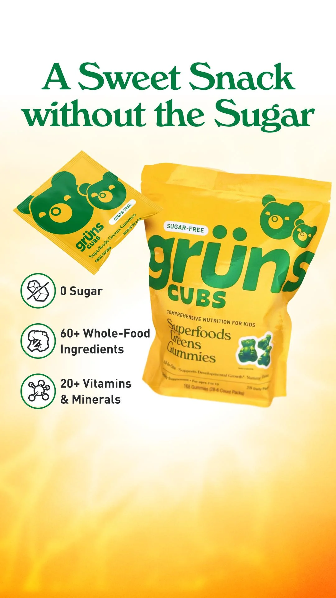
A bright yellow pouch and single-serve sachet sit on a warm yellow-to-white gradient, with green type and three icon-backed benefits ("0 Sugar," "60+ Whole-Food Ingredients," "20+ Vitamins"). The high-contrast yellow-and-green palette is built to stop a scroll, and the icons make the claims scannable in under a second. It's a textbook product-on-color ad: one SKU, one promise, zero distractions.
Clone it: browse supplement ad examples, upload your product, and let AdDogs drop it onto a brand-colored background.
2. Surreal — product on solid color with a discount banner
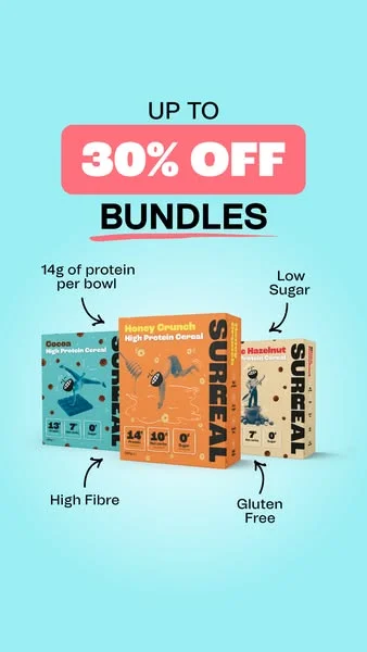
A coral "UP TO 30% OFF BUNDLES" banner pops against a playful blue background, with arrows pointing from callouts like "14g of protein" straight to the product boxes. The vibrant palette signals the brand's personality before you read a word, and the arrows guide the eye exactly where the brand wants it. A clean blueprint for promoting an offer without burying the product.
Clone it: start from a food & beverage ad example and swap in your packaging — AdDogs keeps the layout and applies your palette.
3. Herbivore — single bottle on a calm backdrop
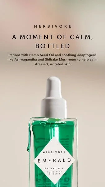
The emerald-green oil bottle sits against a soft, warm neutral with generous negative space and the line "A MOMENT OF CALM, BOTTLED." The bottle's emerald color carries the contrast; the empty space carries the premium read. Premium skincare looks premium through restraint, not noise.
Clone it: see how other brands frame a hero bottle in our skincare ad examples.
4. Jones Road Beauty — product on a muted tone with callouts
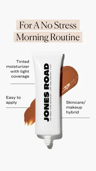
A vertical tube of tinted moisturizer flanked by short callouts ("light coverage," "easy to apply") on a stark white field, headlined "For A No Stress Morning Routine." The minimalism removes every distraction so the product is the only thing to look at, and the vertical crop is built for Stories. Clean, calm, and unmistakably the product.
Clone it: explore beauty ad examples and rebuild the callout layout around your SKU.
5. AG1 by Athletic Greens — one product, maximum negative space
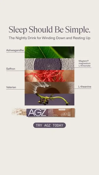
An "ingredient stack" of macro textures — saffron, ashwagandha — runs down a calm earthy palette under "Sleep Should Be Simple." Showing the raw ingredients in high definition builds trust without a paragraph of copy, and the single vertical axis pulls the eye from problem to product in one motion. Minimalism here is a credibility move, not a style choice.
Clone it: supplement ad examples has dozens of minimalist layouts ready to take your product.
6. Bearaby — single hero product
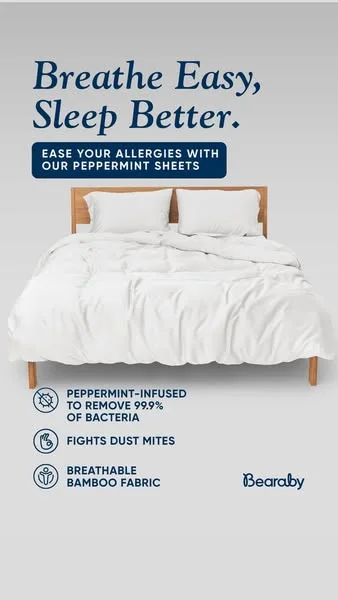
A crisp white bed isolated on muted grey, with deep-blue type reading "Breathe Easy, Sleep Better." and icon-backed benefits. Isolating the product against a neutral makes it the undisputed focal point, and the clean palette telegraphs "fresh and trustworthy" before the copy lands. Hero shots live or die on this kind of contrast.
Clone it: browse mental wellness & sleep ad examples and apply the hero treatment to your product.
7. OluKai — footwear hero shot
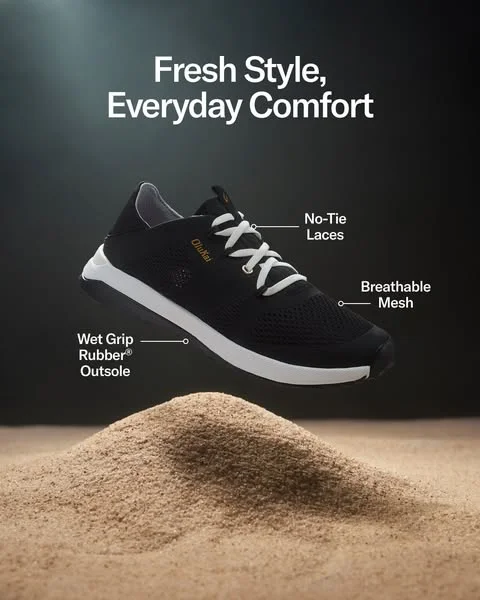
The shoe is dramatically suspended above a sand dune against a dark gradient, with labeled callouts ("No-Tie Laces," "Wet Grip Rubber Outsole"). Elevating the product creates lightness and motion, the dark background maximizes contrast, and the callouts double as quiet feature education. Proof a single-product hero doesn't have to be static-feeling.
Clone it: see more in footwear ad examples and rebuild the floating-hero look.
8. Hyperice — device hero shot on black
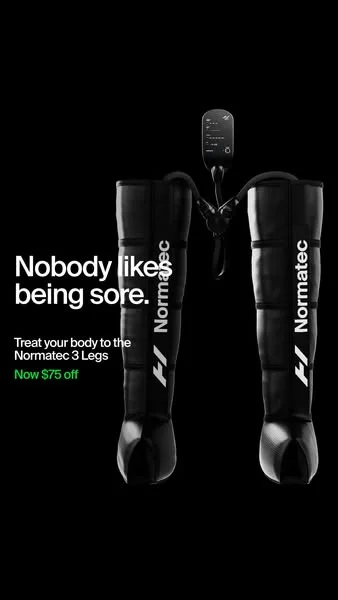
The recovery boots sit centered on pure black under "Nobody likes being sore.", with a single green "$75 off" the only break in the monochrome. The black field isolates the product for maximum drama, the problem-first headline hooks the audience instantly, and the lone green accent sends the eye straight to the offer. One color, used with intent, outperforms five.
Clone it: sports & fitness ad examples shows how recovery and gear brands frame the blackout hero.
Flat lays and arrangements
Flat lays sell a system, not a single item. Shot top-down, they show range, components, or a full routine in one frame — and reward tidy composition and a cohesive palette.
9. Bellroy — top-down flat lay
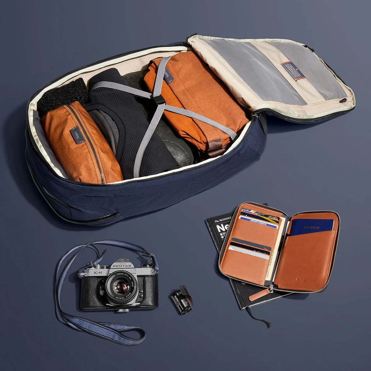
An open travel bag and its companion pieces laid out top-down on deep blue, tan leather and black hardware reading as one coordinated kit. The flat lay shows how the products work together as an ecosystem, and generous spacing keeps it premium instead of cluttered. This is the move when your value prop is "a system," not a single SKU.
Clone it: fashion & apparel ad examples has flat-lay layouts you can fill with your own lineup.
10. Little Spoon — flat lay with personality
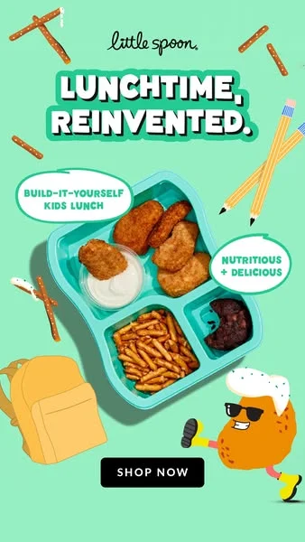
A bento box of kid-friendly food on bright mint, angled slightly with a running-potato character and text bubbles around "LUNCHTIME, REINVENTED." The bright palette and whimsical character inject movement into a flat lay, while the callouts carry the value prop. Proof that a top-down shot doesn't have to feel static.
Clone it: kids & family ad examples — drop your product into the playful flat-lay frame.
11. Starbucks — seasonal flat lay
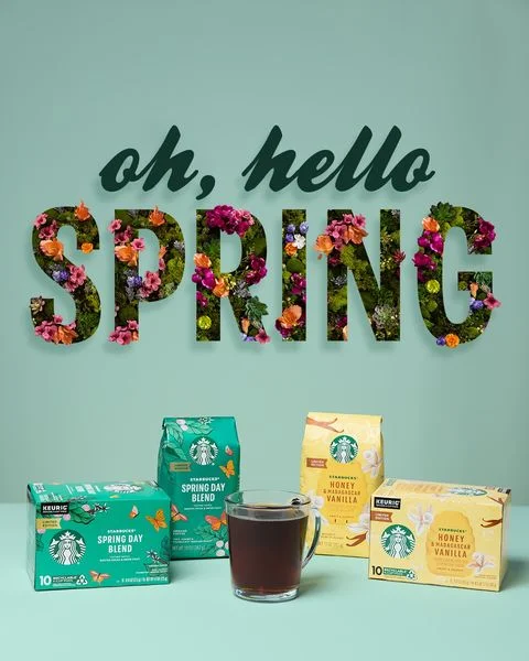
Floral "SPRING" lettering fills the top half as a visual magnet; a clean flat lay of products fills the bottom on a soft mint field. The oversized seasonal hook stops the scroll, and the organized arrangement below makes every item identifiable. A simple template for any seasonal or launch moment.
Clone it: coffee ad examples shows the seasonal flat-lay format in action.
12. SPANX — product grid
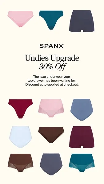
A tidy grid of underwear in a range of styles and muted colors on off-white, with "Undies Upgrade" and a centered "30% Off." The grid lets shoppers scan variety at a glance, the centered discount anchors the offer, and the sophisticated palette keeps it elevated. The right call when range itself is the selling point.
Clone it: rebuild the grid with your collection from fashion ad examples.
13. Kitsch — multi-panel grid with social proof
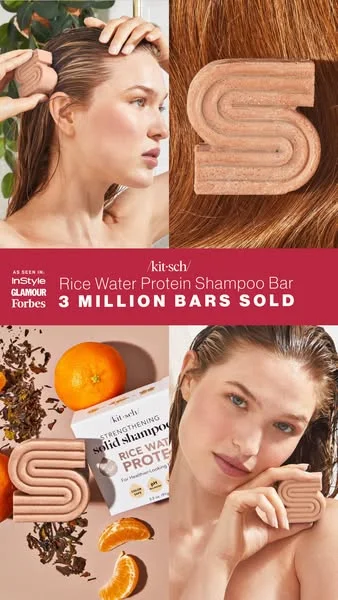
A four-panel grid mixes in-use, texture close-up, and ingredient shots, with a red center banner shouting "3 MILLION BARS SOLD" and "AS SEEN IN." The panels tell a complete story — what it is, how it feels, what's in it — while the banner stacks social proof in the middle of the frame. A lot of information, organized so none of it feels heavy.
Clone it: haircare ad examples — assemble your own multi-panel story.
Product in use
In-use shots answer the only question a hero shot can't: what does this look like in my life? Showing a hand, a body, or a screen turns a product into a behavior.
14. Curology — product in hand
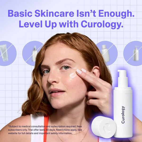
A relatable model applies the product while generic, crossed-out bottles sit alongside the headline "Basic Skincare Isn't Enough. Level Up with Curology." The in-use moment builds authenticity, and the crossed-out generics make the comparison without naming a competitor. Lifestyle and positioning in a single static frame.
Clone it: skincare ad examples — put your product in the application moment.
15. Free Fly — worn in motion
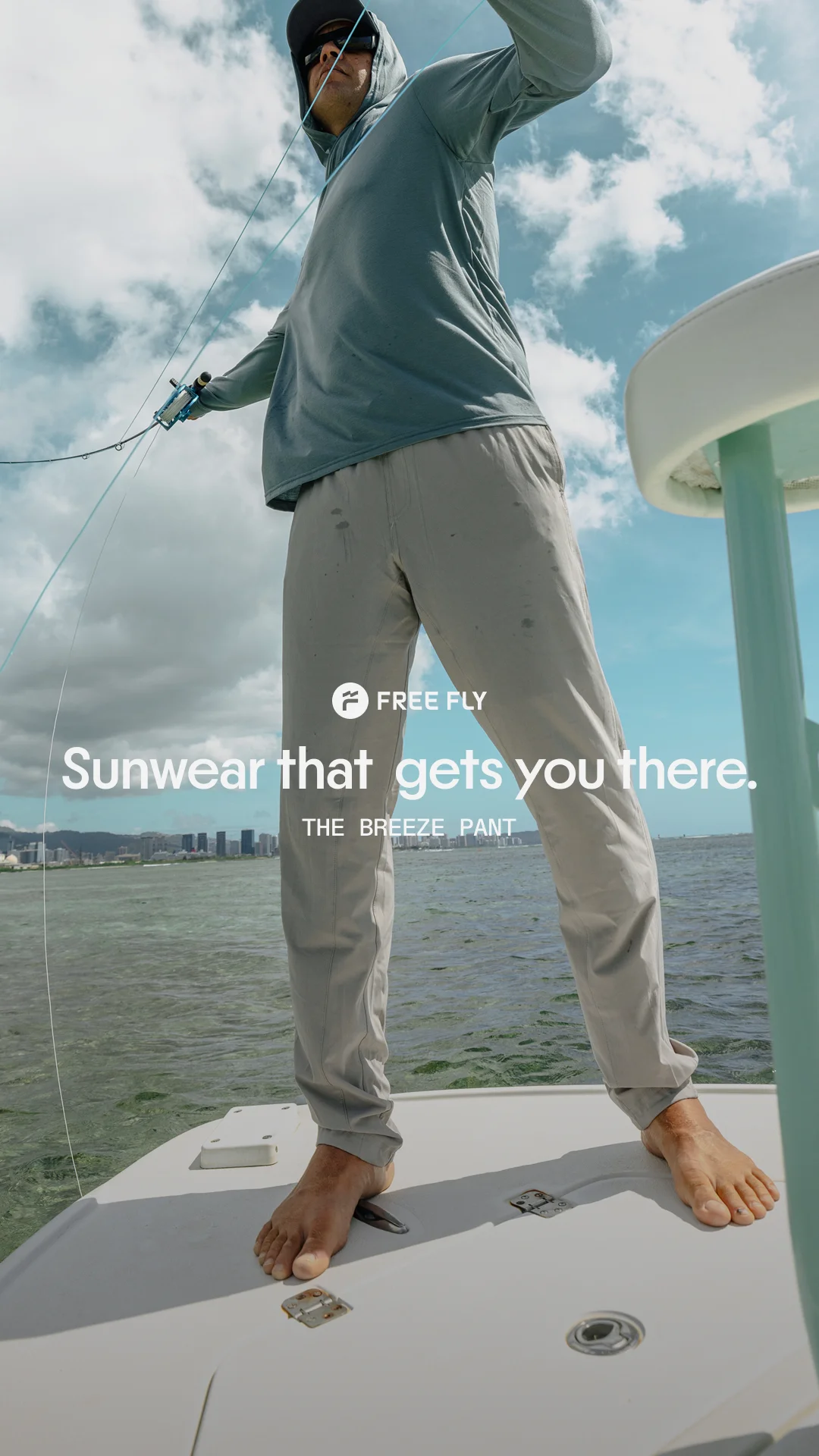
A low-angle shot looks up at an angler mid-cast under "SUNWEAR that gets you there." The perspective makes the wearer look heroic and the apparel aspirational, while a clean text hierarchy keeps the message scannable. When the product is something you do, not just hold, put it in motion.
Clone it: fashion ad examples — rebuild the lifestyle-in-motion layout for your apparel.
16. Grammarly — product on screen
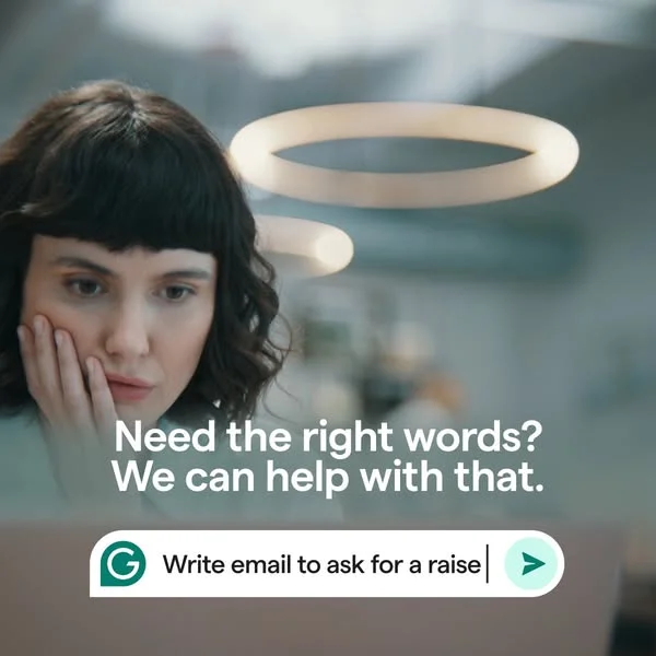
A relatable user looks pensive against a blurred background while a real UI snippet ("Write email to…") demonstrates the product in action under "Need the right words? We can help with that." The problem-solution narrative builds empathy, and showing the actual interface beats any generic "Learn More." How software sells a static feed slot — the best SaaS ads roundup breaks down 31 more like it, with run-time receipts.
Clone it: SaaS & tech ad examples — frame your interface as the proof.
17. Corkcicle — product mid-use
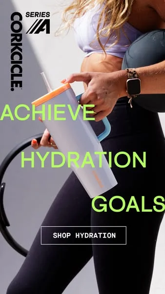
A cropped, active figure holds the tumbler mid-workout, with neon-green "ACHIEVE HYDRATION GOALS" popping against the darker scene. Tying the product to an active identity makes it aspirational, and the high-contrast text reads instantly on a small screen. The vertical crop is purpose-built for Stories and Reels.
Clone it: browse static ad examples and place your product in an in-use moment.
18. Solo Stove — product in its scene
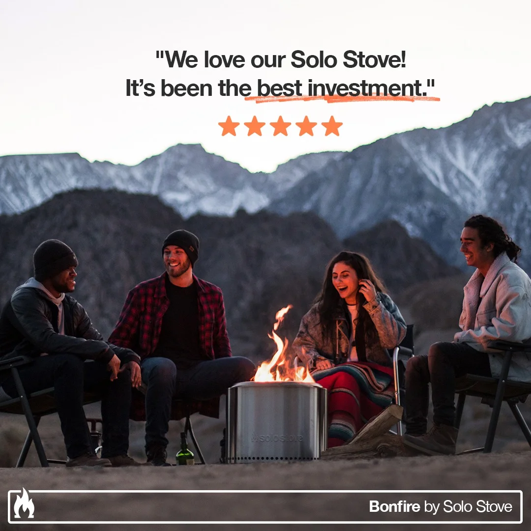
Four people gather around the lit fire pit, with a bold testimonial quote and five-star rating layered over the scene. The genuine smiles sell an experience rather than a product, the testimonial stacks social proof, and the fire's glow supplies the warmth. Lifestyle plus proof in one frame.
Clone it: static ad examples — drop your product into a real-life scene.
19. Nutrafol — routine in context
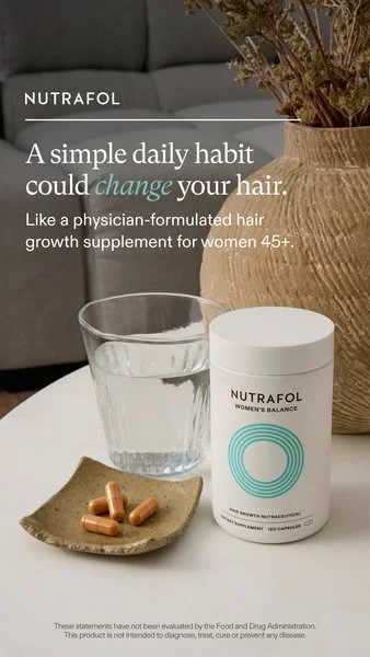
The supplement is staged with a glass of water and a few capsules in a calm home setting, headlined "A simple daily habit could change your hair." The relatable context normalizes the routine, the headline names the audience and the benefit, and the soft, natural palette reinforces the wellness positioning. Everyday staging makes a daily habit feel like part of the morning, not a chore. For more in this vertical — and the rules that keep these ads live — see our supplement and wellness ad examples.
Clone it: haircare ad examples — stage your product as part of a routine.

Create your own instagram product ads
Create your adBefore/after and split screens
Nothing proves a claim faster than two states side by side. Before/after and split-screen layouts hand the viewer the evidence and let them draw the conclusion.
20. The Ordinary — before/after split
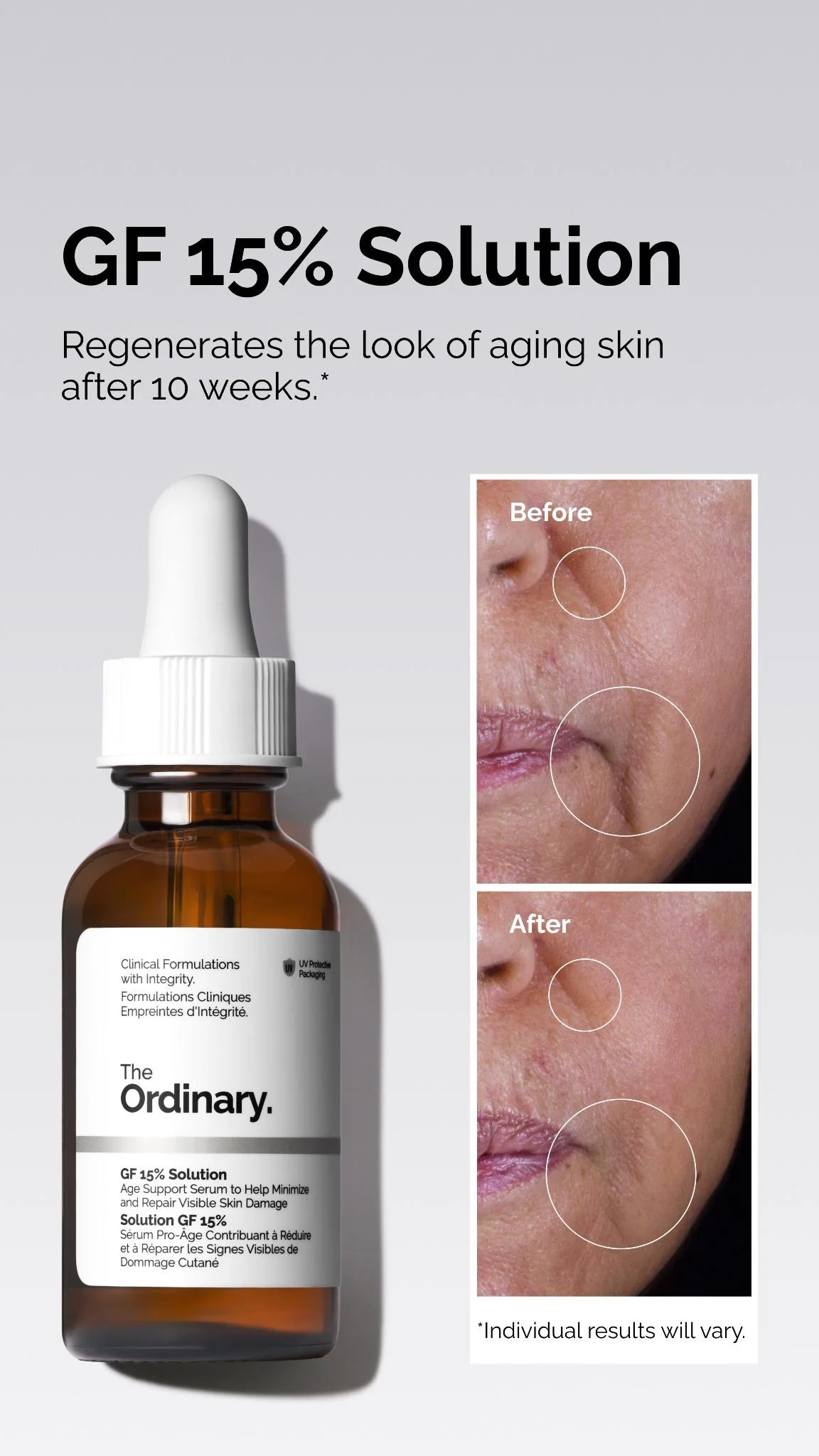
A hero shot of the GF 15% Solution pairs with circled before-and-after imagery on a clean white-and-grey field with stark black type. The side-by-side is undeniable visual proof, the minimalist styling reads as scientific credibility, and the bold headline names the product and benefit at once. On-brand restraint that still sells results.
Clone it: skincare ad examples — build the before/after split around your product.
21. PetPlate — before/after problem-solution
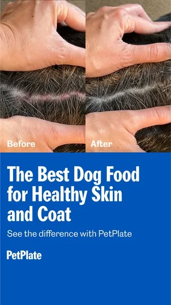
A split image shows irritated skin up top and a calmer, healthier coat below, on a vivid blue field with bold white type reading "The Best Dog Food for Healthy Skin and Coat." The before/after delivers tangible proof, the blue-on-white contrast keeps it legible, and the narrative names a real owner worry and answers it. Clean problem-to-solution storytelling.
Clone it: pets ad examples — recreate the before/after for your product.
22. Free Soul — "how it started / how it's going"
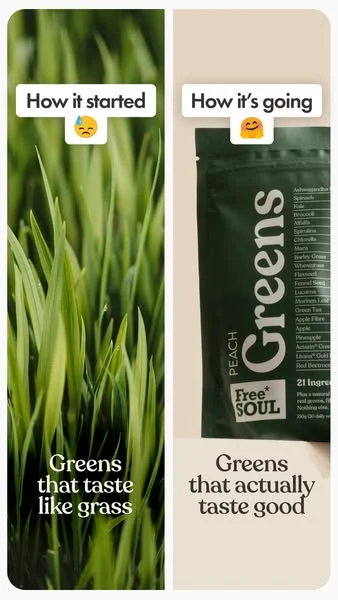
A vertical split runs "How it started" (raw grass, the bad-tasting-greens problem) against "How it's going" (sleek product). The framing instantly sets up a relatable pain point and resolves it, and the stark visual contrast between raw and refined drives the message home. A reusable template for any "we fixed the annoying part" story.
Clone it: supplement ad examples — build the started/now split for your SKU.
23. Made In Cookware — split screen with social proof
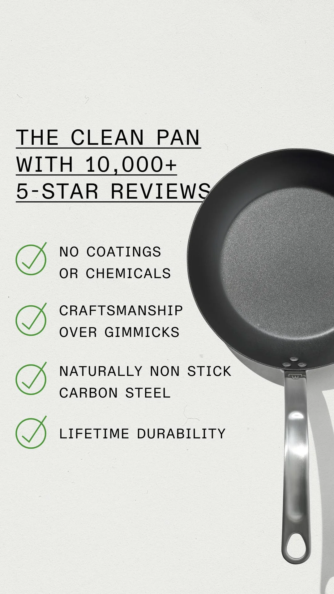
The left half carries benefit copy with green checkmarks; the right half is a hero shot of the pan on a muted off-white. The headline "THE CLEAN PAN WITH 10,000+ 5-STAR REVIEWS" front-loads social proof, the split keeps text and product from competing, and the green checks read as instant approval. Information-dense without feeling busy.
Clone it: static ad examples — split copy and product like this around your SKU.
24. Everlane — dual-angle split
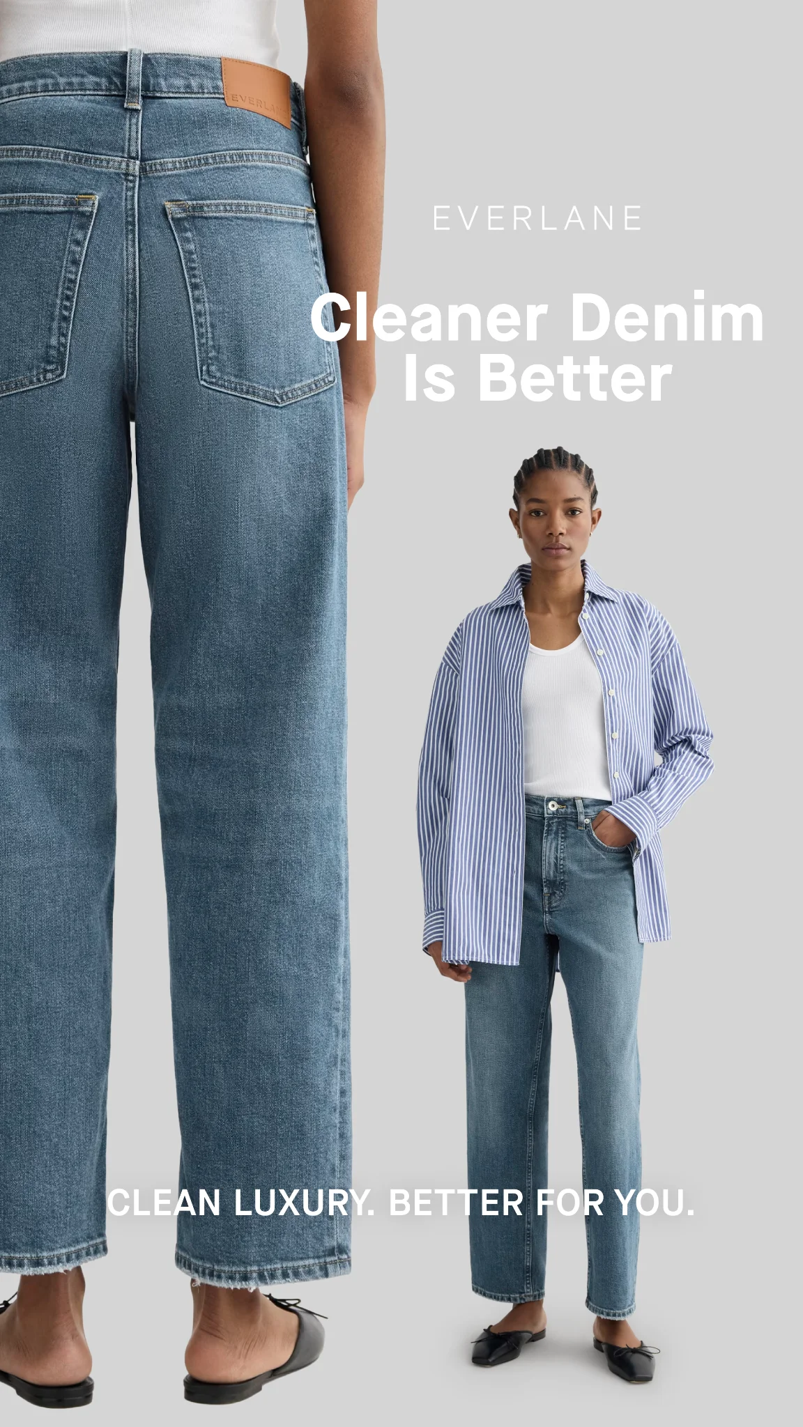
Two views of the same jeans — a back close-up and a front full-body — share one frame on light grey under "Cleaner Denim Is Better." The dual perspective gives shoppers complete product information at a glance, and the minimalist styling reinforces the brand's clean-luxury positioning. The format to reach for when one angle isn't enough.
Clone it: fashion ad examples — show two angles of your product in one frame.
25. Maui Nui Venison — lifestyle/product split
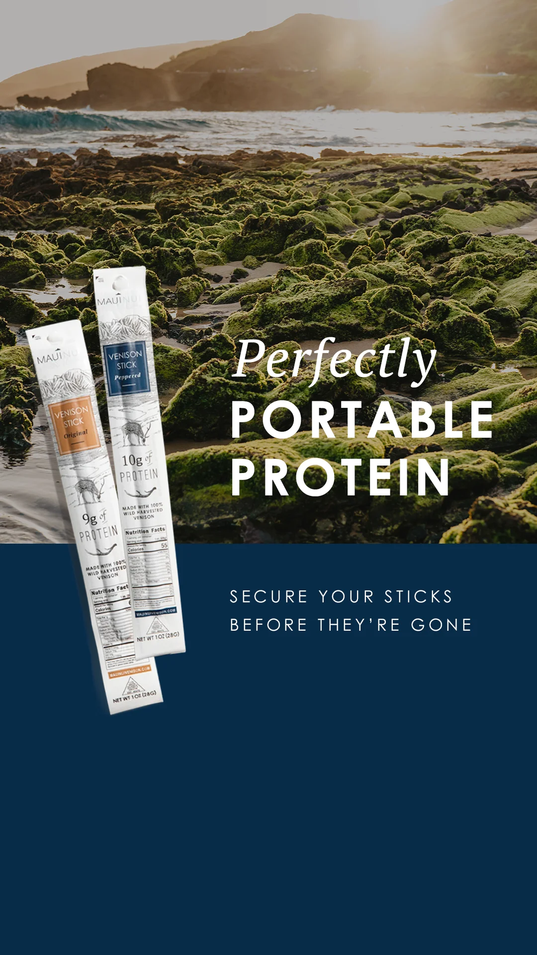
The top half is a rugged Hawaiian coastline; the bottom is a deep-blue block with the product and "Perfectly PORTABLE PROTEIN." The lifestyle image ties the snack to adventure and the outdoors, while the split keeps context and product cleanly separated. Aspiration up top, clarity down below.
Clone it: food & beverage ad examples — pair a lifestyle scene with your product.
Social proof and testimonials
A claim from the brand is marketing; the same claim from a customer is evidence. Testimonial ads put the proof in the headline.
26. True Botanicals — quote plus product
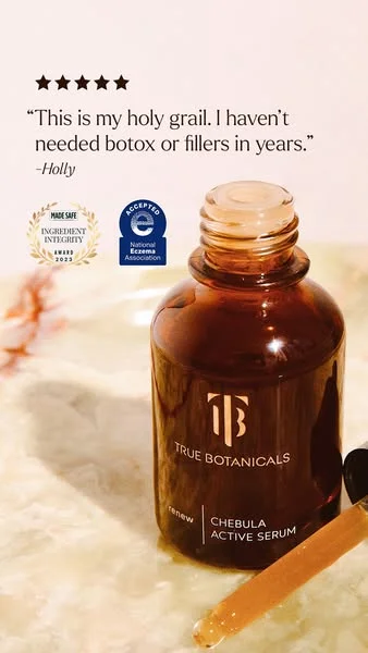
A split layout gives the left half to a bold customer quote — "This is my holy grail. I haven't needed botox or fillers in years." — and the right to an amber bottle on light marble. The testimonial hits first and builds instant credibility, trust badges layer on more proof, and the warm, natural palette signals premium efficacy. Social proof as the headline, not an afterthought.
Clone it: skincare ad examples — lead with a customer quote beside your product.
27. Satechi — review-led product shot
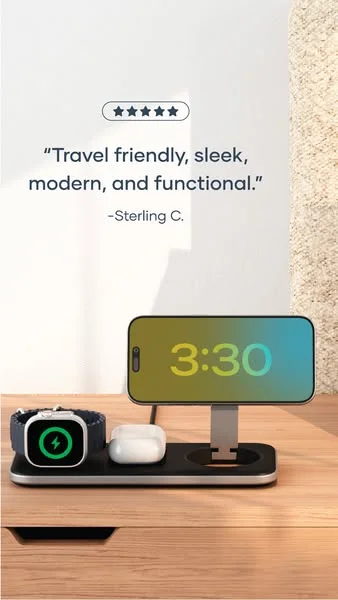
A five-star customer quote sits at the top as the headline, above the charging station shown actively powering a phone, watch, and earbuds on a warm wooden surface. The review acts as an instant trust signal, the in-use shot demonstrates the multi-device value, and the clean backdrop keeps it premium. Proof and product working in one frame.
Clone it: static ad examples — turn a real review into your headline.
28. Clevr Blends — founder testimonial
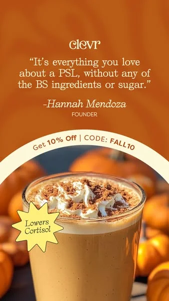
A founder quote pairs with an appetizing drink shot in a warm orange-and-cream autumnal palette, with a "Lowers Cortisol" starburst. The personal endorsement adds authenticity, the seasonal styling drives appetite appeal, and the health callout answers a specific concern. Testimonial plus craving in a single scroll-stopper.
Clone it: coffee ad examples — wrap a quote around your product shot.
29. Fulton Insoles — editorial-style testimonial
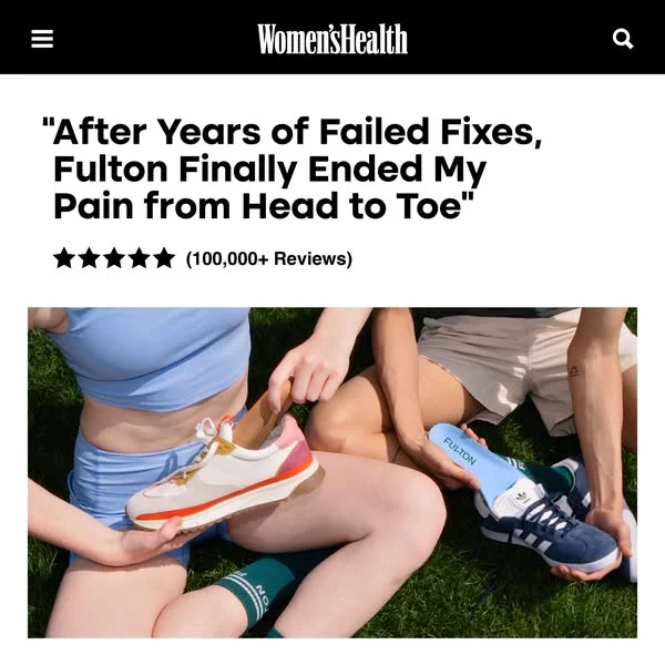
The ad mimics a "Women's Health" article, pairing a testimonial headline — "After Years of Failed Fixes, Fulton Finally Ended My Pain" — with a relatable lifestyle image of insoles going into sneakers. The editorial format borrows credibility and reads as native content, while the headline speaks straight to chronic pain. A native-feel layout that earns the click before it sells.
Clone it: footwear ad examples — build the editorial-testimonial look for your product.
Comparison and claim-led ads
When your edge is measurable — more features, better ingredients, a hard number — say it out loud. Comparison and claim-led layouts lead with the argument.
30. The Ridge — product comparison with a quote
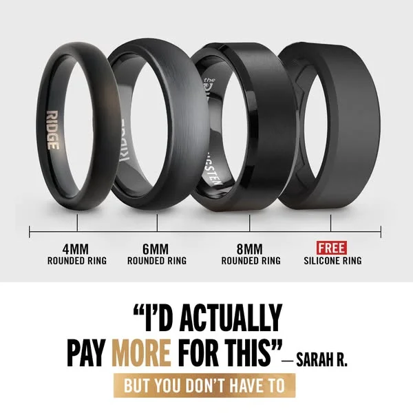
The top half lines up four rings by width and material — 4mm, 6mm, 8mm, plus a "FREE Silicone Ring" — while the bottom carries the quote "I'D ACTUALLY PAY MORE FOR THIS" from a customer, Sarah R. The lineup clarifies the options at a glance, the testimonial builds value and trust, and the high-contrast layout stays crisp on mobile. Comparison and proof in one tidy frame.
Clone it: fashion ad examples — lay out your product tiers with a customer quote.
31. G FUEL — head-to-head split
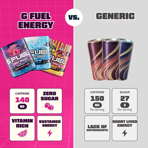
A stark "VS." split pits vibrant-pink G FUEL against a muted-grey "Generic," each side carrying a four-point feature grid. The split-screen format makes the purpose instantly clear, the energetic pink claims the favorable side through pure color psychology, and the parallel grids let shoppers scan the difference fast. The cleanest way to win a side-by-side.
Clone it: supplement ad examples — build your own versus-generic split.
32. Hers — stat-led claim
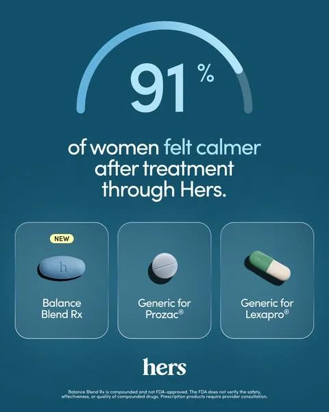
A dominant "91% of women felt calmer after treatment through Hers." statistic anchors a clean, minimalist layout in light blue on deep teal, with a framed grid of options below. The big number is the headline and the social proof at once, the high-contrast palette keeps it readable, and the product grid simplifies otherwise-complex choices. When you have the number, make it the whole ad.
Clone it: mental wellness ad examples — lead with your strongest stat.
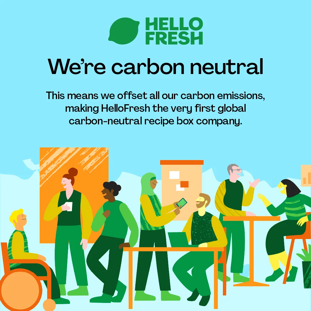
33. HelloFresh — value-led claim
A bold "We're carbon neutral" headline fills the top against bright blue; a diverse, friendly illustration fills the bottom. The directness cuts through the feed, the illustration makes a brand-values message feel approachable, and the green-and-blue palette reinforces the eco-claim. A reminder that a claim-led ad can sell values, not just features.
Clone it: food & beverage ad examples — put your brand claim front and center.
Clone any of these in seconds with AdDogs
Every ad above is a real layout that worked for a real brand — and the layout is the part you're allowed to borrow. Pick the one closest to your product, open it in AdDogs, and upload your product photo. AdDogs rebuilds the composition with your product in place, extracts your brand colors and logo, and exports it ready for the feed. One credit, one ad, in seconds — no designer, no Photoshop, no starting from a blank canvas.
Looking for Instagram ad ideas for ecommerce? Skip the blank canvas. Clone what already converts, swap in your product, and start with the Instagram ad examples library today.
FAQ
What makes a good Instagram static product ad?
A strong static product ad does one job per frame: stop the scroll, then make a single point. The best ones isolate the product with high contrast or generous negative space, keep copy short enough to read in a second or two, and use one accent color or callout to direct the eye to the offer. Across the 33 ads above, the pattern repeats — one product, one message, one clear next step.
What size should an Instagram static product ad be?
Instagram feed favors square (1:1) and vertical (4:5); Stories and Reels use full-screen vertical (9:16). The safest approach is to design once and export the ratios each placement needs. In AdDogs, Basic exports 1:1, 9:16, and 16:9, while Pro and Ultimate unlock all 14 aspect-ratio options — you pick the dimension per generation, at 1 credit per render.
Do static image ads still work on Instagram in 2026?
Yes. Static ads remain the workhorse of Instagram paid media because they're cheap to produce, fast to test, and easy to iterate — you can ship many variations for the cost of one video. They're especially effective for product hero shots, before/after proof, and claim-led offers, where a single clear frame often outperforms motion.
How do you make Instagram product ads without a designer?
Start from a layout that already works. Browse the ad examples library, pick a composition that fits your product, and upload your product photo — AdDogs recreates the layout with your product, colors, and logo applied, then exports it for the feed in seconds.
Is it legal to clone another brand's ad layout?
Layouts, compositions, and formats aren't protected the way logos, photos, and copy are — which is why "product on a color background" or "before/after split" show up across thousands of brands. What you can't do is reuse another brand's actual assets (their images, logo, or exact wording). AdDogs clones the layout and rebuilds it with your product and brand, so you borrow the structure, not the content.


