Testimonial ad examples: 17 static ads by format
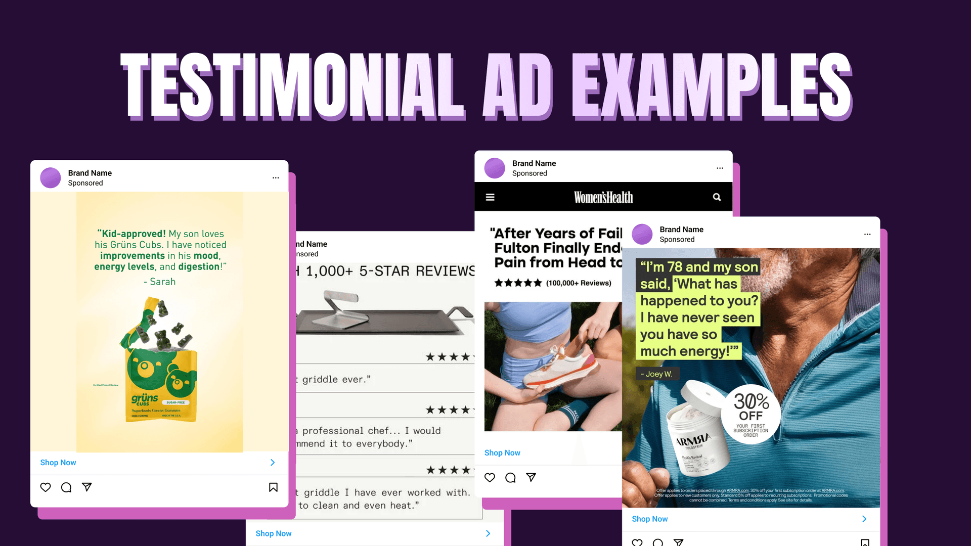


A prospect trusts another customer's five-star review more than anything a brand can say about itself — the same word-of-mouth instinct that makes 88% of people trust recommendations from people they know. That's why testimonial ads convert when a polished brand ad stalls. The catch: most testimonial ad examples you find are big-budget video spots you can't reproduce. The 17 static ones below break down to the layout, so you can rebuild the exact composition around your own product.
A testimonial ad is a paid ad built around a real customer's words: a quote, a star rating, a screenshot, a before-and-after, or a short clip, used as proof that the product delivers. Testimonial advertising works because the endorsement comes from a peer, not the seller, and the reader knows the difference.
Why testimonial ads still convert
Customers' words carry weight a brand's own copy never will. That trust is measurable: Nielsen's study of 40,000 people across 56 countries ranks a recommendation from someone you know as the most-trusted format there is, ahead of every paid channel. A testimonial ad borrows that trust and drops it into the feed.
Conversion data backs it up. Northwestern's Spiegel Research Center found a product page with five reviews converts about 270% higher than one with none, and the lift scales with price: +190% on low-cost items, +380% on expensive ones. After 42,000+ hours of usability testing, Baymard Institute found 95% of shoppers rely on reviews to evaluate a product, and the star-rating row gets used more than the review text itself.
One outcome is clean enough to measure. Job-prep site WikiJob added three lines of customer testimonials to a product page and saw purchases rise 34% in an A/B test. The winning testimonials were deliberately understated, not superlatives — understatement out-converts hype, and you'll see it in every example below. It's a product-page test rather than an ad test, but it isolates the testimonial itself as the lever.
One caveat before the roster: these brands are here for their craft, not their numbers. Per-brand testimonial-ad lift figures aren't public, so read every example as an illustration of composition. Hard proof sits in the category stats above.
The 8 testimonial ad formats
Every testimonial ad that works runs on one of eight static compositions. That last column is the part no other guide gives you: where the eye lands and where each piece sits.
| Format | Best for | Where it lives | Static-composition cue |
|---|---|---|---|
| Quote card | A customer's exact words | Meta feed, 1:1 / 4:5 | Big centered pull-quote as the hero, attribution and small headshot below, calm single-color field, logo in a top corner |
| Star-rating card | Ratings-driven categories | Meta feed, retargeting | Star row top-center as the eye-magnet, short review mid-canvas, "Verified Buyer" tag, product along the bottom |
| Review screenshot | High-skepticism buys | Meta feed, Stories 9:16 | Native review chrome so it reads like a real phone, star row brightest, product beside it, minimal branding |
| UGC still | Trust-first, younger feeds | Meta + TikTok feed | Real face as the hero (~50% weight), caption-style quote bar at the bottom, product in-hand, un-polished light |
| Before-after | Visible-result categories | Meta feed (non-weight-loss) | Split frame, before on the left / after on the right, divider dead-center, identical lighting, timeframe badge |
| Video still | Repurposing testimonial video | Meta + TikTok, 9:16 | Candid face mid-expression, subtitle-style quote strip at the bottom, product in the lower third |
| Expert / authority | Considered or technical buys | Meta feed, YouTube | Expert portrait plus name and credential as hero, one endorsement line, product beside, restrained premium palette |
| Press-quote + aggregate | Launches, category leaders | Meta feed, display | Publication name or big number as the hero line, product beside, publication logo or review count for legitimacy |
You can browse 14,000+ ad examples filtered by industry and format, then match one to the review you already have. New to this: if all you have today is written reviews and a star rating, start with a quote card or a star-rating card. Every composition here transfers to any category, beauty or not, because the layout carries the proof.
Quote-card testimonial ad examples
Formats one through three all live in the AI Overview's densest bucket, text and social proof, so they come first. A quote card, the simplest of these customer testimonial examples, sets a customer's exact words in type and lets them carry the frame.
Grüns — quote card
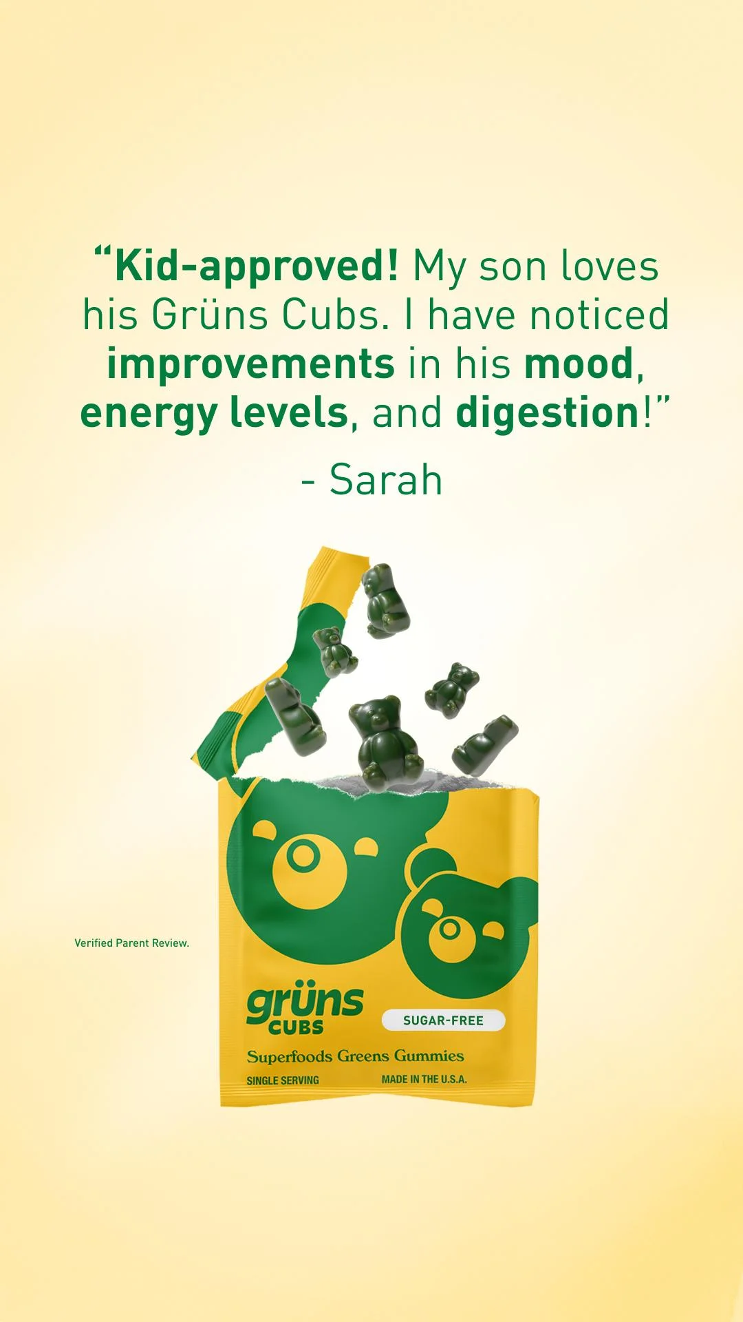
Quote card. A parent's verbatim review carries the whole frame, with the product playing a supporting role.
- The quote is the entire visual — type dominates the top half so the customer's words do the selling before the product even registers.
- Bolding the exact outcome words (mood, energy levels, digestion) turns a review into a benefit list without the brand claiming anything.
- Playful product photography, gummy bears mid-spill, keeps a supplement ad light while the "Verified Parent Review" line adds credibility.
Clone this composition: set the customer quote in large type across the top third of a vertical card on a soft single-color gradient, bold the two or three outcome words that matter, attribute it to a first name below, then drop your product mid-frame in a candid, in-use moment with a small "verified review" caption in a lower corner. Rebuild it around your product and one real review.
ARMRA — quote card
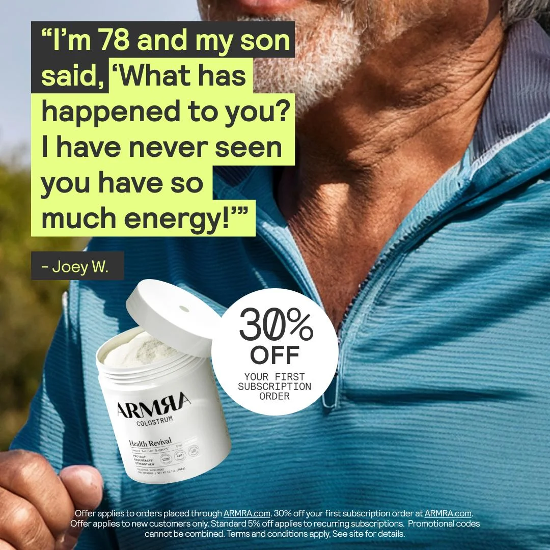
Quote card. A highlighted customer quote sits over the customer's own face, with a subscription offer stacked in the same frame.
- The highlighter-box treatment makes the quote read like a physical marked-up passage, so the eye lands on the words first, then the smiling customer behind them.
- Pairing the quote with the customer's face and age ("I'm 78") makes the energy claim feel specific and believable rather than generic.
- The 30%-off subscription badge stacks a testimonial with a direct-response offer, so social proof and the conversion ask share one frame.
Clone this composition: run a lifestyle photo of the real customer full-bleed, set their quote in bold type inside a highlighter-color box down one side, add a small attribution chip, then place the product and an offer badge in the lower third. Rebuild it around your product and a verbatim review from a named customer.
Rheal — quote card
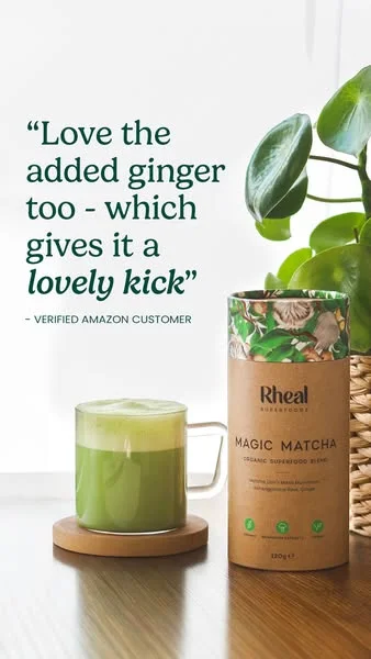
Quote card. A short, sensory one-liner anchors a cozy in-home product still.
- A short quote as the hero ("lovely kick") reads fast and feels like an overheard recommendation rather than ad copy.
- The in-home styling shows the product in the exact moment the review describes, so words and image reinforce each other.
- "Verified Amazon Customer" borrows third-party marketplace credibility without the brand making the claim itself.
Clone this composition: place a short customer quote in the upper corner as the hero, italicize the sensory phrase, attribute it to a verified-customer tag, then fill the rest of the frame with a warm lifestyle still of the product in use. Rebuild it around your product and one concise real review.
Star-rating testimonial ad examples
When the rating is the reason people buy, in beauty, supplements, or apparel, make the stars the focal point, not a footnote.
Glossier — star-rating card
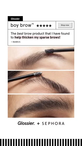
Star-rating card. A five-star review card sits above a stack of product-demo close-ups.
- The five-star row is placed inline with the product name and a "Shop now" button, so rating, product, and action read in a single glance.
- The quote does the selling in the customer's own words ("thicken my sparse brows") and bolds the exact benefit, turning a review into a headline.
- Stacked application close-ups act as visual evidence for the written claim, pairing social proof with a demo in one frame.
Clone this composition: build a bordered review card with the product name, a five-star row, and a CTA button on one line, the quote below with the benefit bolded and a first-name attribution, then stack two or three product-in-use close-ups underneath. Rebuild it around your product and a verbatim review.
Fulton Insoles — star-rating card

Star-rating card. A review is framed as an editorial page, with the rating reinforced by a review count.
- Borrowing a recognizable publication's masthead frames the testimonial as earned coverage rather than an ad.
- The five-star row is reinforced with a hard number, "100,000+ Reviews", so the rating carries volume proof, not just sentiment.
- The quote leads with the customer's failed-fixes backstory and the result, which pre-qualifies pain-point readers before they see the product.
Clone this composition: set a masthead bar at the top, run the testimonial as a large headline in quotation marks, follow it with a five-star row and your real review count in parentheses, then place a lifestyle photo of the product in use below. Only use a publication frame and review count you can actually stand behind.
Made In Cookware — star-rating card
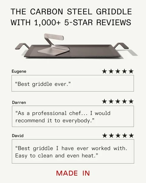
Star-rating card. Three named reviews stack under a headline that front-loads the aggregate rating.
- Stacking three named reviews, each with its own five-star row, shows a pattern of praise rather than a single cherry-picked quote.
- The headline front-loads the aggregate proof ("1,000+ 5-STAR REVIEWS") so the star theme registers before any single quote is read.
- Varied quote angles — enthusiasm, a professional-chef endorsement, and a practical "easy to clean, even heat" point — cover emotional and functional objections at once.
Clone this composition: lead with a headline naming your real aggregate review count, place the product render below it, then stack three review blocks, each with a reviewer first name, its own five-star row, and a boxed quote. Rebuild it around your product and three verbatim reviews.
A warning the data makes explicit: don't fake a perfect score. Spiegel found purchase likelihood peaks between 4.0 and 4.7 stars and declines toward 5.0. A wall of five-stars reads as manufactured, and a few critical reviews add credibility.
Review-screenshot ad examples
Nothing reads as "real" like a screenshot. Review ads built on a screenshotted review or comment keep the native chrome of the platform, so they look captured, not designed, a staple of the Facebook static ad examples that dominate Meta feeds.
IM8 Health — review screenshot
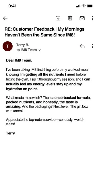
Review screenshot. The entire ad is a pixel-perfect reproduction of a forwarded customer email.
- The ad is indistinguishable from a real forwarded email — status bar, Gmail chrome, and reply thread make it read as an intercepted customer message, so the scrolling thumb pauses.
- Bolded phrases inside the body do the selling (nutrients, sustained energy, hydration, taste) while the plain-text framing keeps it feeling unpaid.
- The subject line front-loads the transformation benefit in the one line most likely to be read.
Clone this composition: reproduce a native mobile email screen, status bar and mail-app toolbar included, put the customer's benefit-led subject as the bold headline, then set the review as a plain-text email body with the two or three key phrases bolded and a first-name sign-off. Screenshot a real customer message; never mock one up.
Verb Energy — review screenshot
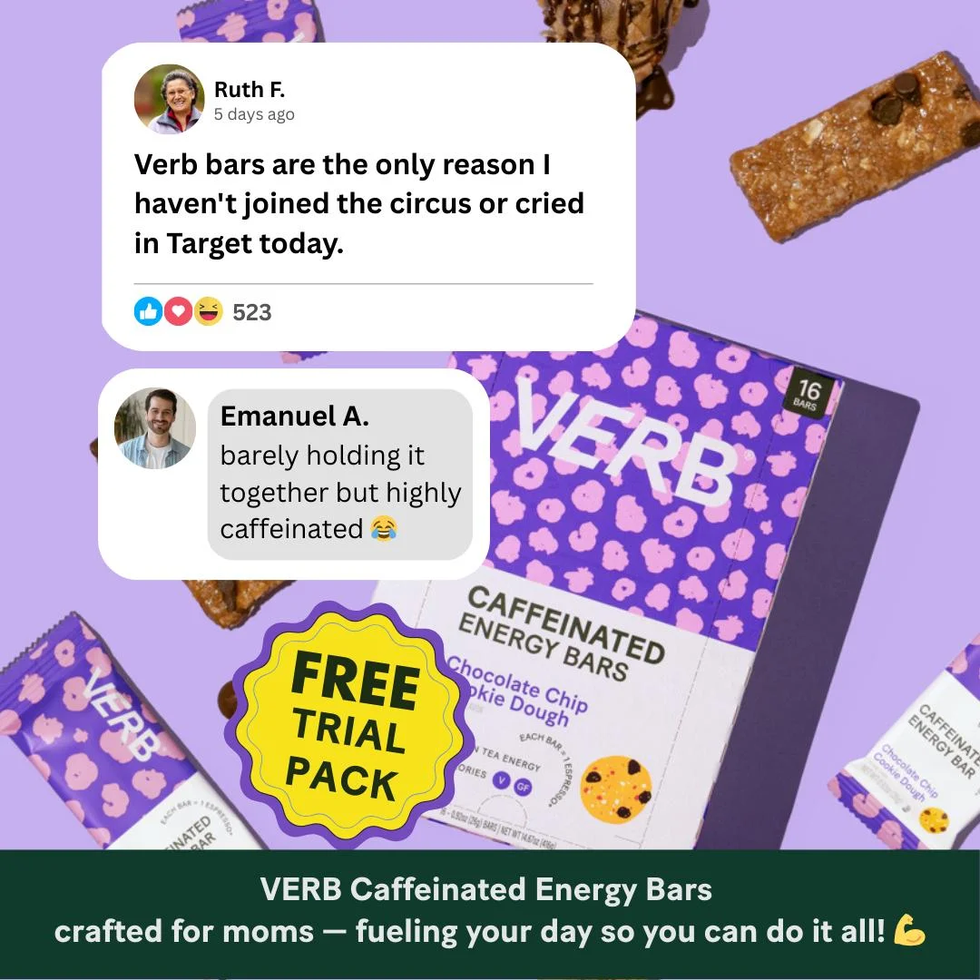
Review screenshot. Two social-comment cards float over scattered product packaging.
- Real social-comment UI — avatars, timestamps, reaction icons and a like count — makes the testimonials read as organic posts screenshotted from a feed.
- The relatable, self-deprecating humor builds instant kinship with the target buyer and earns the scroll-stop.
- Product packaging and a "FREE TRIAL PACK" sticker share the frame, so the social proof lands next to a clear offer.
Clone this composition: stack one or two social-comment cards, each with an avatar, name, timestamp, the verbatim comment, and native reaction icons, over a playful field of your product packaging with an offer sticker. Screenshot real customer comments; don't fabricate them.
UGC testimonial and social proof ad examples
Social proof ads and UGC testimonial ads trade a clean card for a real face, the format that earns trust with younger, more skeptical feeds.
Surreal — UGC still
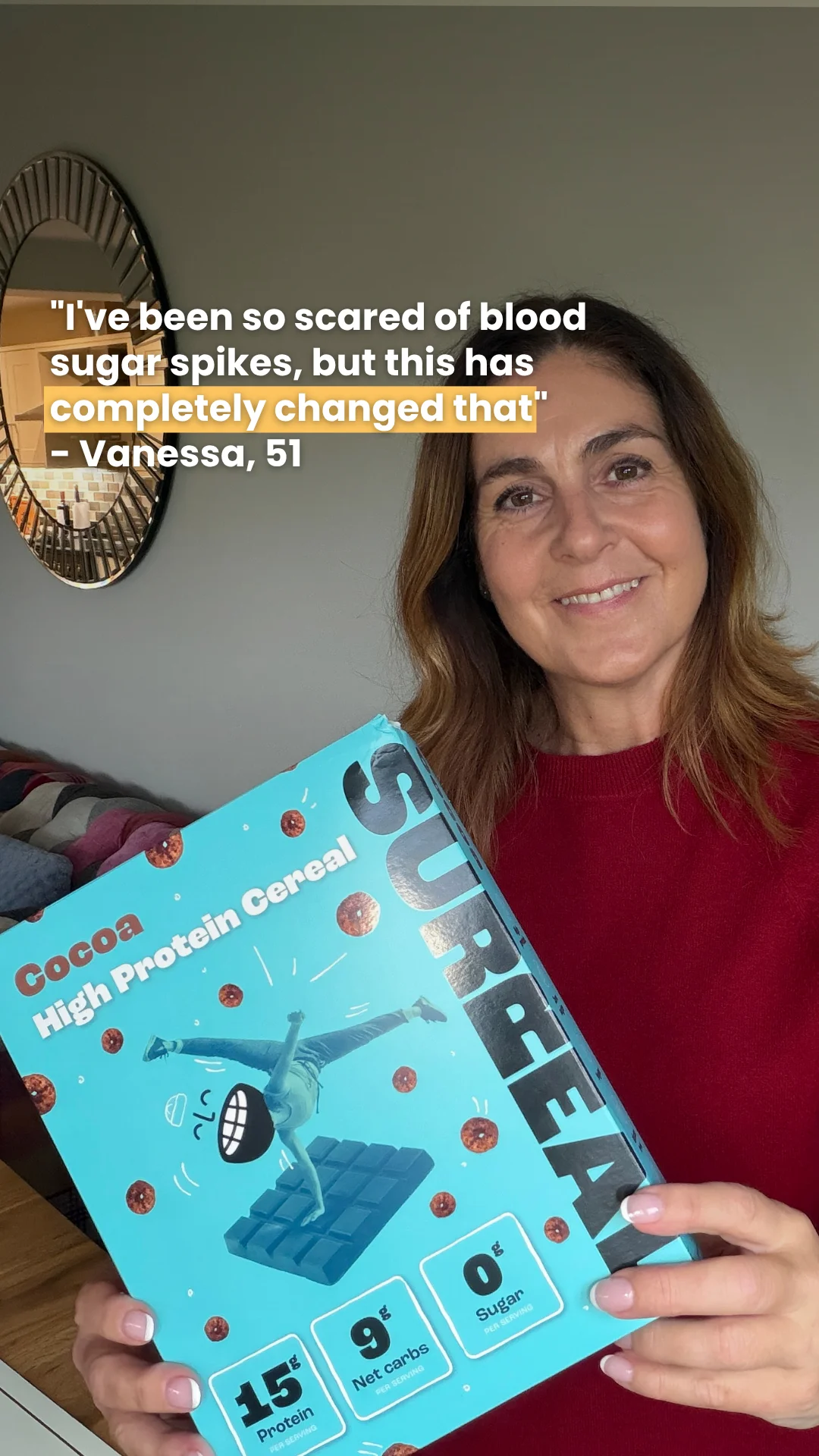
UGC still. A real-person selfie holds the product beside a caption-style quote.
- It reads as an authentic customer selfie, not a studio shoot — the ordinary home setting and handheld box make the endorsement feel real.
- The caption quote leads with a specific fear (blood sugar spikes) and a named, age-attributed reviewer, so the proof is concrete and relatable.
- The product is held so its key nutrition claims are legible right beside the testimonial, tying the promise to a reason to believe.
Clone this composition: shoot or source a real customer holding your product at home in ordinary light, overlay their verbatim quote as a caption with one phrase highlighted, and attribute it to a first name and age. Rebuild it around your product and a real customer.
Cymbiotika — social proof
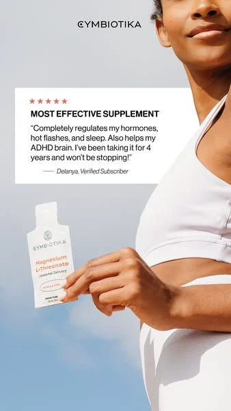
Social proof. A written review card is paired with a real person holding the exact product.
- Pairing a five-star review card with a real person physically holding the product puts claim and proof in one frame.
- "Verified Subscriber" plus a multi-year usage span signals a durable, credible customer rather than a one-time buyer.
- The bolded review headline gives a scannable takeaway while the quote supplies specific, believable benefits.
Clone this composition: split the frame — a real person holding your product on one side, a white review card with a star row, a short bold headline, the verbatim quote, and a "verified" attribution on the other. Rebuild it around your product and a real review.
ARMRA — UGC still
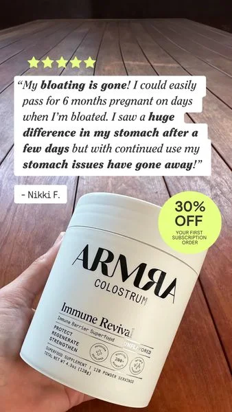
UGC still. A hand holds the product under a floating review card and an offer badge.
- The handheld tub on a real wood table gives an unpolished, user-shot feel that lends the review card credibility.
- Bolded fragments inside the quote let the benefit land in a half-second scroll.
- The 30%-off subscription badge stacks a clear offer onto the social proof.
Clone this composition: photograph a hand holding your product in a real, in-use setting, float a review card with a star row and the verbatim quote (key fragments bolded) over the top, and add an offer badge. Rebuild it around your product and a named customer's review.
Authenticity does the work here, not polish. Trust in reviews has swung hard: BrightLocal's tracking shows it peaked at 84% in 2016-17, fell to 42% in 2025, and recovered to 49% in 2026 as shoppers read more and scrutinize harder. Model-perfect faces and copywriter-smooth quotes trip the fake-detector. Real faces, phone-shot texture, specific details, and verified-buyer tags are what convert.

Create your own facebook product ads
Create your ad
Before-and-after testimonial ad examples
The transformation is the testimony. Before-and-after is the highest-converting format in visible-result categories like skincare, and the highest-risk on this page.
CALECIM Professional — before-and-after
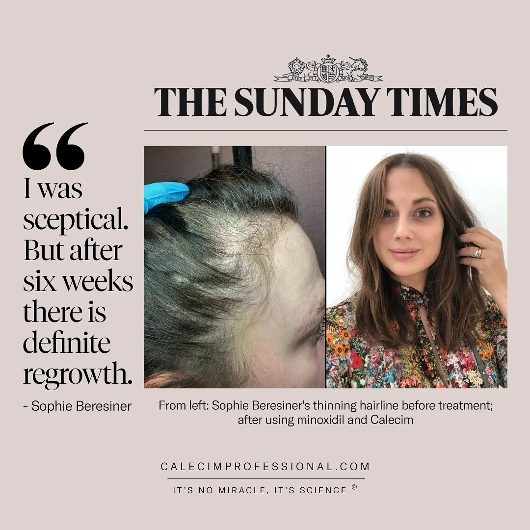
Before-and-after. Two photos of the same customer show the change, framed by a press masthead.
- The literal before/after pair does the persuading — thinning hairline on the left, restored hair on the right — so the transformation is shown, not claimed.
- The customer line opens with the skeptic's objection and closes with the result, mirroring the visual and pre-empting doubt.
- A publication masthead plus a time-bound result ("six weeks") reads as an honest, results-typical claim rather than a hyped promise.
Clone this composition: set two consistently-lit photos of the same customer side by side, before on the left and after on the right, run a vertical pull-quote down one edge with attribution, and add a caption that discloses exactly what produced the result. Only use real, unretouched photos and a specific timeframe, never a guaranteed outcome.
Unbloat — before-and-after
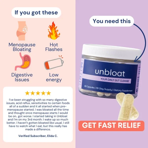
Before-and-after. A problem-vs-solution split applies the before/after structure to a symptom state.
- The "If you got these" / "You need this" split lets the reader self-identify on the left, then see the fix on the right.
- The five-star review is long, specific and hedged ("I still have to watch what I eat, but this really has made a difference"), which reads as a real subscriber rather than a scripted rave.
- Symptom icons let the reader qualify themselves in a glance, and the arrow-to-product plus button carry the eye from problem to purchase.
Clone this composition: build a left/right split — a "before" panel listing the symptom state with a verified customer's verbatim review, and an "after" panel with your product, an arrow, and a CTA button. Rebuild it around your product and a real, self-hedged review.
Before-and-after is where the rules bite hardest. The FTC's Rule on Consumer Reviews and Testimonials (16 CFR Part 465), effective October 21, 2024, bans fake and undisclosed testimonials and carries civil penalties up to $51,744 per violation. Health, finance, and body-result claims draw the most scrutiny: results have to be typical and substantiated, not cherry-picked. For regulated categories, we go deeper in the regulated-category playbook.
Video-testimonial stills (and why this post is static-first)
The talking-head frame works as a static, too. Pull one candid frame from a testimonial video and you have a scroll-stopper; more on that trade-off in static vs video ads. This post stays static-first because a static ad ships in seconds and tests for cents.
Shreddy — video still
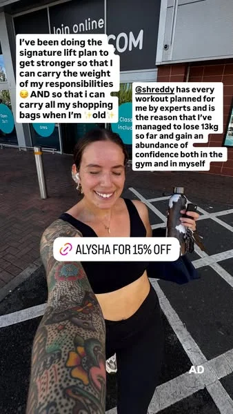
Video still. A repurposed creator story frame carries caption-sticker testimonials and a discount code.
- The Story-caption stickers plus the "AD" label make it unmistakably a repurposed creator frame, not a designed graphic.
- The testimonial sells in the creator's own unpolished voice, with a specific result, which reads as authentic peer proof rather than brand copy.
- The candid smiling face and real gym setting build trust, while the built-in discount code folds an offer straight into the still.
Clone this composition: pull a candid frame from a real customer's video or story, overlay their words as native caption stickers, add a discount-code sticker and an "AD" disclosure, and keep the setting unposed. Rebuild it around a real customer's own footage and words.
Expert and celebrity endorsement ads — and why you don't need one
Expert and celebrity endorsement ads borrow authority instead of building it. They work, and they come with the sharpest disclosure rules on this page.
Wild Nutrition — expert / authority

Expert / authority. A named, credentialed founder endorses her own product in a single editorial pull-quote.
- First-party founder authority done right: the endorsement is attributed to a real, named person with a concrete, checkable credential ("over 20 years"), which reads as expertise rather than a paid claim.
- The single editorial pull-quote and calm one-color background keep the eye on the words, so the credential and the italicized "evidence-backed" do the persuading.
- The founder's face and relaxed pose humanize a trust-driven supplement category, making the expert claim feel personal instead of clinical.
Clone this composition: run a warm single-color background with the expert or founder photographed to one side, set their endorsement as a large serif pull-quote with the credibility phrase italicized, and add a small attribution block with their name and credential. Use a real, named expert speaking to a genuine credential; if they are paid, disclose it.
Under the FTC Endorsement Guides (16 CFR Part 255), a paid expert or celebrity must disclose the material connection, and the advertiser is on the hook for whatever the endorser claims. The bigger point: you don't need a celebrity. Your customers are your celebrities, and a verified buyer costs nothing to feature.
Press-quote and aggregate social-proof ads
When you don't yet have a wall of reviews, borrow a publication's voice or lead with a number.
Made In — press-quote
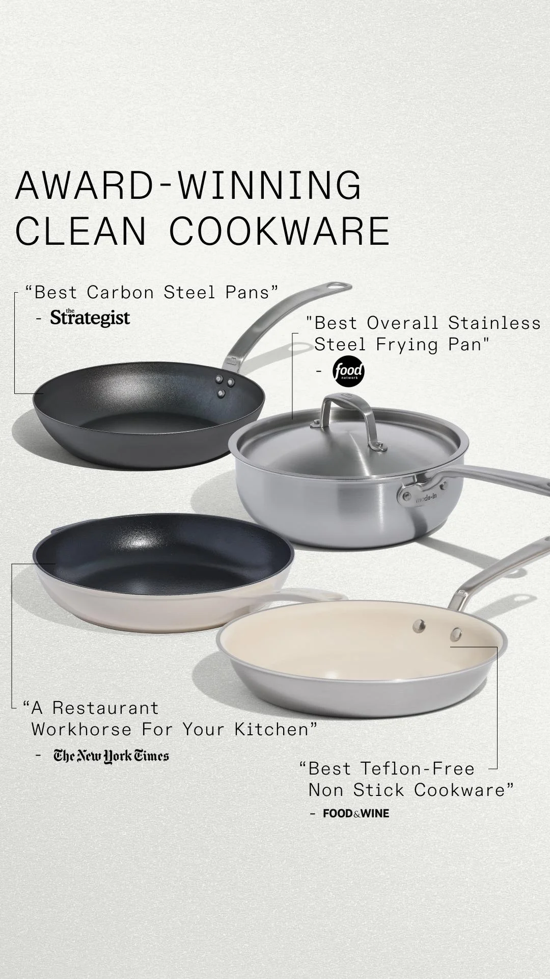
Press-quote. Four publication pull-quotes are tied by leader lines to the products they praise.
- Borrowing credibility from four recognizable publications at once compounds the proof instead of resting on a single voice.
- Each quote is tied by a leader line to the specific product it praises, making the claims feel earned and product-specific.
- A clean off-white background and black type keep the focus on the mastheads and products, so the social proof reads even at thumbnail size.
Clone this composition: arrange your products diagonally on a clean off-white field, connect each to a real press pull-quote and that publication's logo with a thin leader line, and top it with a plain awards headline. Only use quotes you actually earned, tied to the right product.
Ekster — aggregate
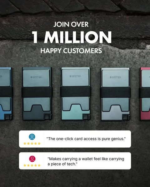
Aggregate. A big-number claim sits above two five-star review cards.
- Pairing a big-number aggregate with two concrete five-star quotes backs the scale claim with specific voices.
- The oversized number gives an instant, scannable proof point before the reader reads a word of the testimonials.
- A product line-up across the middle keeps the product present while the review cards do the persuading.
Clone this composition: set your real customer-count as an oversized hero headline, run your product line-up across the middle, then place two rounded review cards below, each with an avatar, a five-star row, and a verbatim quote. Pull the number from your own dashboard; never inflate it. If neither a press quote nor a big number is yours yet, the quote-card and star-rating formats above are where to start.
How to turn your existing reviews into testimonial ads
You already have the hard part: the reviews. What's missing is the composition. Every example above reduces to the same five-part static skeleton.
The repeatable testimonial-ad layout
Read top to bottom, the layout is always: hook line → the quote → the proof → the product → the CTA.
- Hook line: the sharpest fragment of the review, or the star row, sized as the hero.
- The quote: one or two lines in the customer's real words; specific beats smooth.
- The proof: star rating, "Verified Buyer" tag, first name, or a real photo.
- The product: the actual item, so the eye connects the praise to the thing.
- The CTA: one button, one action.
A rating goes on a star card, a phone comment goes in a screenshot, a face goes in a UGC still. The step-by-step build is in how to recreate a winning static ad, and the test-and-scale loop is clone, test, kill, scale.
Clone a proven testimonial ad in AdDogs
Start from a layout that already works instead of a blank canvas. Pick any composition above from AdDogs' 14,000+ ad examples, upload your product photo, and clone a proven testimonial ad with your product and your own real customer quote. The AI rebuilds the structure with your product swapped in and your brand colors and logo applied, finished in seconds. One credit renders one ad in the dimension you pick. Pro and Ultimate unlock all 14 aspect-ratio options, so the same testimonial can ship to Meta, Stories, and TikTok at the right size — one credit per dimension.
Plans start at 30 ads for $12/mo ($0.40/ad) on Basic, with Pro at $33 and Ultimate at $63. The one rule that never bends: clone the structure, not the words. The composition is a pattern anyone can reuse; the quote has to be your own real customer's. Borrowing someone else's testimonial, or a competitor's customer, is exactly what the FTC rule prohibits. If cloning a layout gives you pause, we cover where the legal line sits.
FAQ
What is a testimonial ad?
A testimonial ad is a paid ad built around a real customer's endorsement: a quote, a star rating, a review screenshot, a before-and-after, or a short clip, used as social proof that the product works. It converts because the endorsement comes from a peer, not the seller — the closest thing in a feed to the word-of-mouth 88% of people trust from someone they know.
What's the difference between a testimonial and an endorsement?
A testimonial is a genuine, usually unpaid statement from a real customer about their own experience. An endorsement typically involves a paid public figure or expert, like AG1's Andrew Huberman. The distinction is legal: under the FTC Endorsement Guides (16 CFR Part 255), any paid or material connection has to be disclosed, and the advertiser is liable for the claims made.
How long should a testimonial ad be?
For a static ad, keep the visible quote to one or two lines, roughly 20 words or fewer, so it's readable in a scrolling feed. Longer written testimonials on a landing page can run to about 50 words before attention drops. The rule holds across formats: cut to the most specific sentence and let the star row or photo carry the rest.
How effective are testimonial ads?
Reviews and testimonials move buyers measurably. BrightLocal's Local Consumer Review Survey 2026 reports 49% trust online reviews as much as a personal recommendation, 93% have purchased after reading reviews, and 85% are more likely to use a business after positive ones. In a controlled test, WikiJob's added testimonials lifted purchases 34%. Those figures sample local-business reviews, so read them as directional for online reviews generally, not a promised e-commerce conversion rate.
How do you turn your customer reviews into ads?
Pull your most specific review, pick the matching format (star card, screenshot, UGC still, or before-after), and drop it into the five-part layout: hook, quote, proof, product, CTA. With a clone-and-swap tool like AdDogs, that's one credit and a few seconds per ad, from $12/month for 30 ads on Basic. You supply the real quote; the tool rebuilds the proven structure around your product.