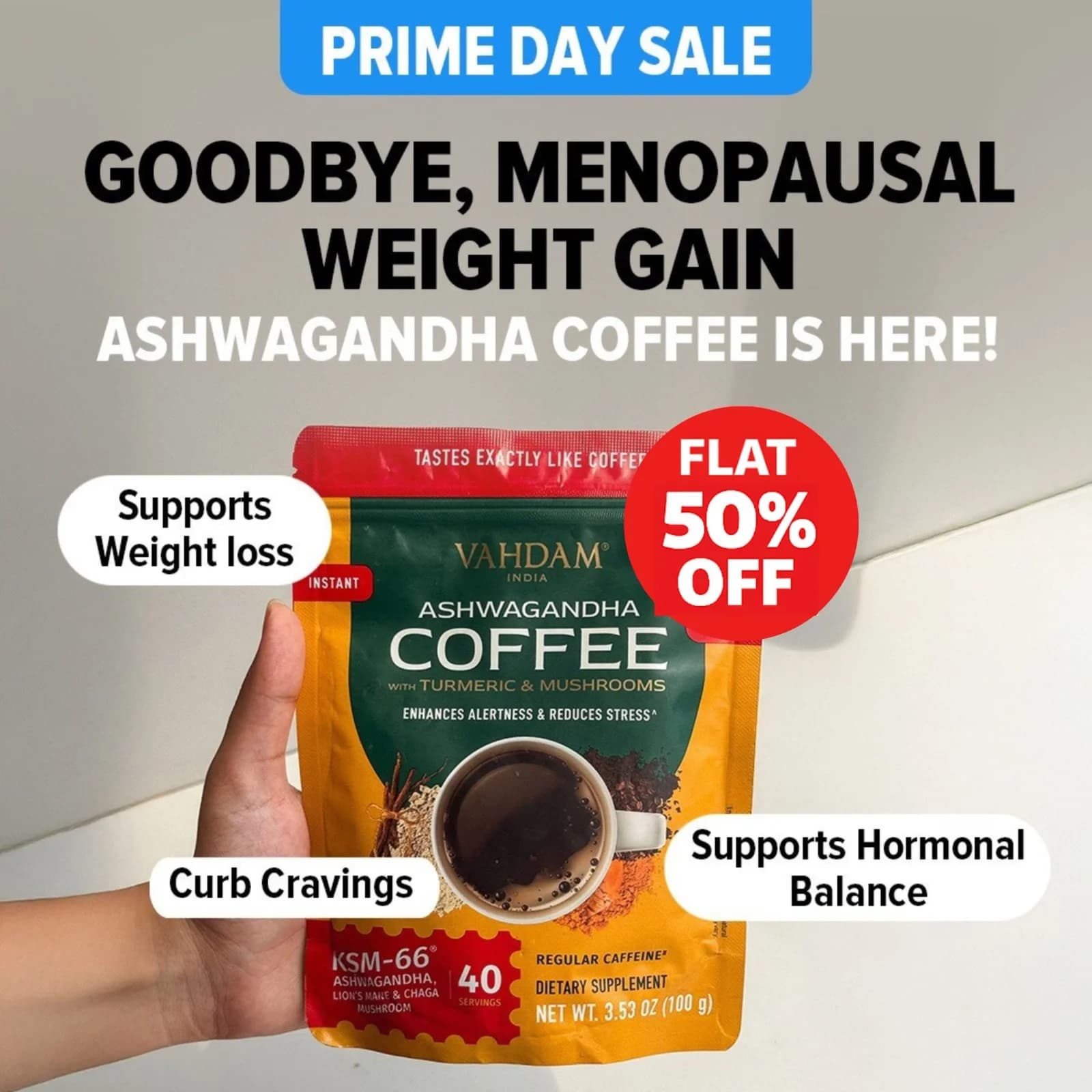
BONJOUR BONJOUR Coffee Alternative — Split Screen Comparison — Coffee Ad Example
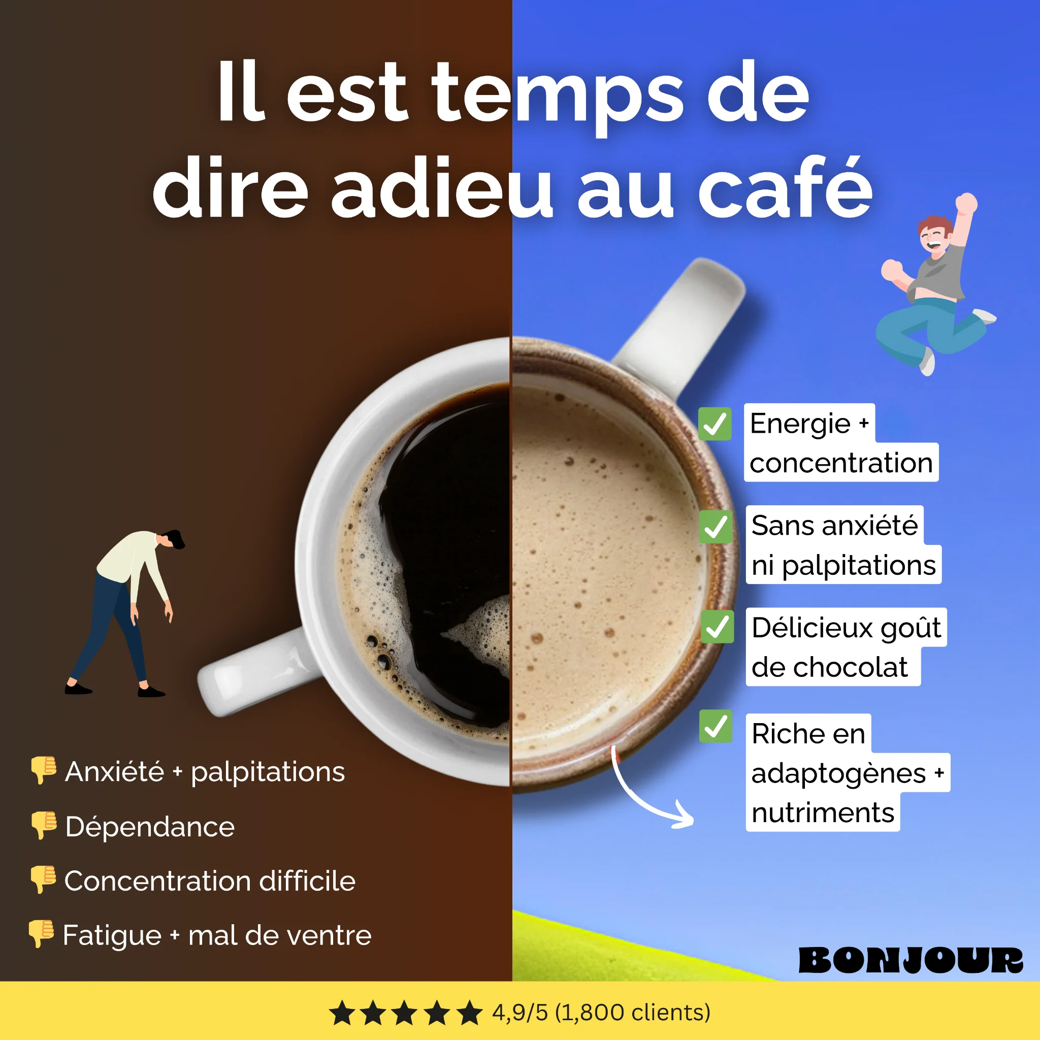
This ad effectively uses a split-screen layout to create a clear before-and-after comparison, visually contrasting the negative effects of coffee with the positive benefits of the alternative. The composition centers a coffee cup, visually dividing it to represent the two states, enhancing the comparison. Color psychology is key: the dark brown on the left evokes a sense of dullness and discomfort, while the vibrant blue and yellow on the right convey energy and positivity. Text hierarchy guides the viewer from the overarching headline to bulleted pros and cons, making information digestible. The use of simple, relatable illustrations enhances emotional connection. Optimized for platforms like Instagram, its bold colors and clear value proposition cut through feed clutter, driving consideration by directly addressing common pain points and offering a solution.
Why This Ad Works
Clear Visual Comparison Drives Understanding
The split-screen layout with a single coffee cup visually divided immediately communicates the "before and after" effect. This direct comparison simplifies a complex message, allowing viewers to quickly grasp the problem (coffee's downsides) and the solution (the alternative's benefits) without extensive reading.
Strategic Color Psychology Enhances Message
The dull, dark brown on the left side effectively represents the negative feelings associated with coffee, like fatigue and anxiety. In contrast, the bright blue and yellow on the right evoke energy, happiness, and clarity, creating a strong emotional pull towards the advertised product.
Relatable Illustrations Build Empathy
The use of simple, expressive illustrations—a tired, slumped figure versus a joyful, jumping one—creates an immediate emotional connection. Viewers can easily see themselves in these scenarios, making the ad's message more personal and the proposed solution more appealing and urgent.
Ad Specs
Color Palette
Original Ad Copy
How to Clone This Ad
From reference to ready-to-run ad
Pick a template
Click "Use This Template" at the top of this page.

Upload your product
Any angle, any background — AdDogs handles the cutout.
Brand auto-applied
Your colors and logo pulled straight from your brand.
Pick your dimension
14 aspect ratios on Pro and Ultimate, 3 on Free and Basic. One credit per generation.
What You Could Improve
Add a Clear Call-to-Action Button
While the ad effectively communicates benefits, it lacks a prominent CTA button. Adding a button like "Découvrir le produit" or "Acheter maintenant" would guide users directly to the next step, significantly improving conversion rates by reducing friction.
Integrate a Specific Product Image
The ad uses a generic coffee cup. Introducing a subtle, branded image of the actual BONJOUR product (e.g., its packaging or a prepared drink) could enhance brand recognition and product association, making the solution more tangible and desirable.
Questions
AdDogs rebuilds the ad with your product photo and extracts your brand colors automatically from your logo. Same layout and composition — your product, your brand.
Pick your dimension per generation. Free and Basic include 3 dimensions: square (1:1) for Instagram and Facebook feeds, portrait (9:16) for Stories and Reels, landscape (16:9) for Google Display and YouTube. Pro and Ultimate unlock all 14, including Pinterest (2:3), cinematic (21:9), and banners.
Built for health & wellness and food & beverage products. The Split Screen composition works best when the product photo carries the persuasion. Any background, any angle — AdDogs handles the cutout.
One credit. $0.40 on the Basic plan ($12/mo for 30 credits), $0.33 on Pro. One credit produces one finished ad in the dimension you pick. Five free credits to start, no card.
Pour shots for cold-audience discovery, origin maps and roaster credentials for consideration, free-first-bag offers for bottom-funnel. Trade, Atlas, and Driftaway all run this three-stage pattern. Subscription specifically needs the "never run out" framing for retargeting — shoppers subscribe because they're tired of running out, not because they want to discover new roasters every week.
Blue Bottle runs the most polished minimalist premium creative. Chamberlain Coffee owns Gen-Z with the Emma Chamberlain creator-brand positioning. Trade Coffee leads subscription discovery. Atlas Coffee Club runs world-tour packaging as a creative hook. Counter Culture holds the craft-roaster editorial tier. Pique dominates wellness-adjacent with matcha and tea crossover creative.
More Coffee Ad Examples
View all
By Industry
By Format
Clone Your First Ad
Pick a template. Upload your product. Seconds later, you have an ad ready to launch. No design skills. No Photoshop.
Create your ad