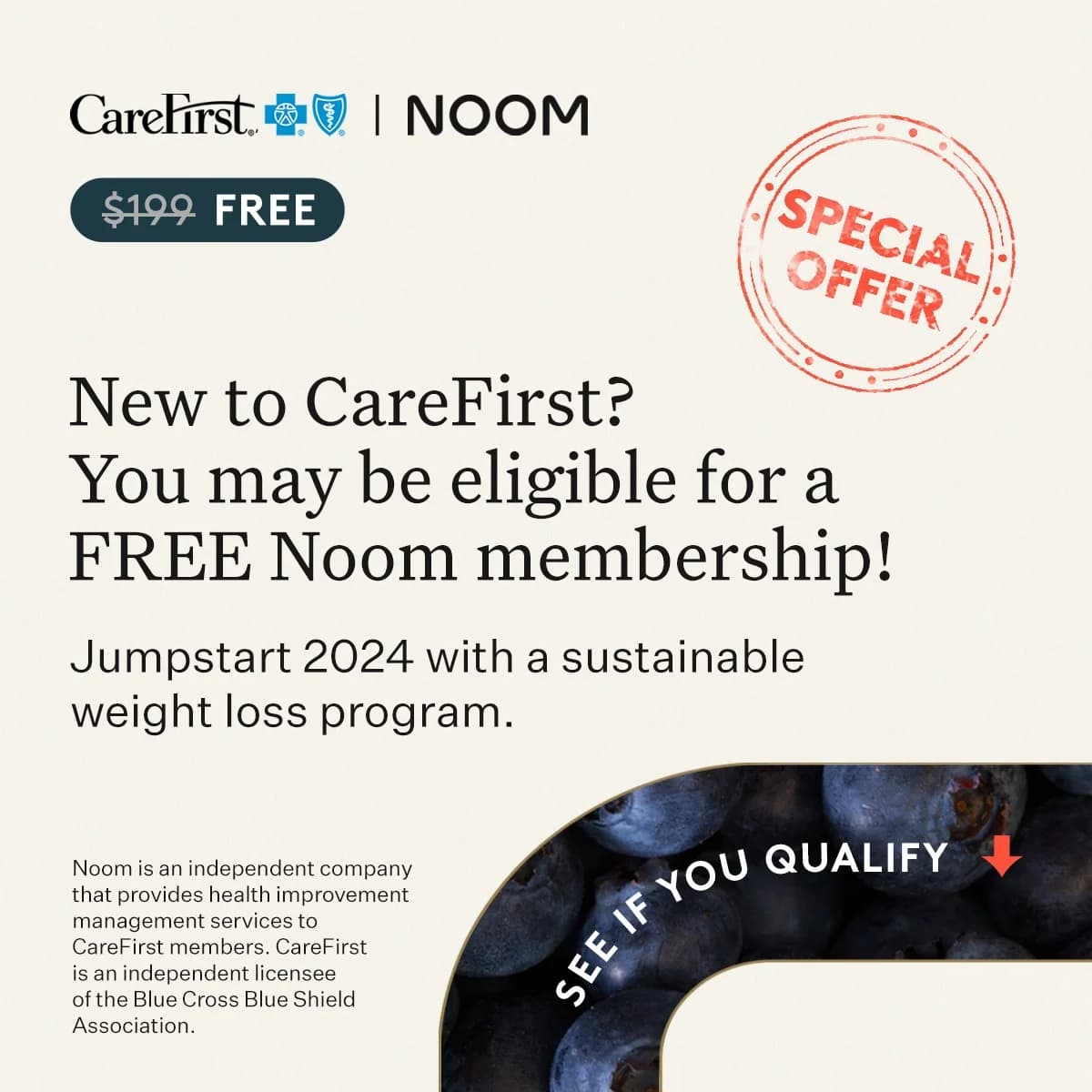
CareFirst | NOOM CareFirst Noom Partnership — Text-Heavy Offer — Finance Ad Example
This ad employs a text-heavy, informational layout designed to clearly communicate a valuable partnership offer. The dominant headline immediately presents a free Noom membership, leveraging a strong incentive. A muted, textured background ensures high contrast for the dark typography, enhancing readability. The "SPECIAL OFFER" stamp adds a sense of urgency and exclusivity, drawing the eye. Compositionally, the ad guides the viewer from the brand logos and offer tag at the top, through the main benefit, down to a visually distinct call-to-action embedded within a blueberry image at the bottom right. This strategic placement of the CTA, coupled with an arrow, directs user interaction. The overall design prioritizes clarity and directness, optimizing for platforms where users seek specific information and value, such as Facebook or Google Display. The visual hierarchy effectively funnels attention towards the eligibility check.
Why This Ad Works
Clear value proposition drives engagement
The ad prominently features "$199 FREE" and "FREE Noom membership" early in the copy. This immediate articulation of a significant financial benefit captures attention quickly, appealing directly to cost-conscious consumers. It effectively positions the offer as high-value, encouraging further reading and consideration.
“Special Offer” stamp creates urgency
The distressed red "SPECIAL OFFER" stamp acts as an eye-catching visual cue. Its placement and distinct color immediately signal importance and potential time-sensitivity, prompting viewers to engage before the opportunity passes. This psychological trigger enhances perceived value and encourages immediate action.
Visual CTA guides user interaction
The "SEE IF YOU QUALIFY" text, embedded within the blueberry image and accompanied by a downward arrow, creates a clear, actionable visual prompt. This non-traditional CTA stands out from the main text block, effectively directing the user's eye to the intended interaction point, reducing friction for the next step.
Ad Specs
Color Palette
Original Ad Copy
How to Clone This Ad
From reference to ready-to-run ad
Pick a template
Click "Use This Template" at the top of this page.

Upload your product
Any angle, any background — AdDogs handles the cutout.
Brand auto-applied
Your colors and logo pulled straight from your brand.
Pick your dimension
14 aspect ratios on Pro and Ultimate, 3 on Free and Basic. One credit per generation.
What You Could Improve
Enhance CTA prominence and clickability
While the visual CTA is present, its integration into the image makes it less immediately clickable than a standard button. Consider a more distinct button-style CTA, perhaps in a contrasting color, placed below the main text block to improve click-through rates and user experience on mobile.
Clarify eligibility criteria upfront
The ad states "New to CareFirst?" and "You may be eligible." While intriguing, adding a concise bullet point or a short phrase about *who* typically qualifies (e.g., "for new members in select plans") could pre-qualify users, reducing bounce rates from ineligible clicks.
Questions
AdDogs rebuilds the ad with your product photo and extracts your brand colors automatically from your logo. Same layout and composition — your product, your brand.
Pick your dimension per generation. Free and Basic include 3 dimensions: square (1:1) for Instagram and Facebook feeds, portrait (9:16) for Stories and Reels, landscape (16:9) for Google Display and YouTube. Pro and Ultimate unlock all 14, including Pinterest (2:3), cinematic (21:9), and banners.
Built for health & wellness and finance & insurance products. The Text-Heavy composition works best when the product photo carries the persuasion. Any background, any angle — AdDogs handles the cutout.
One credit. $0.40 on the Basic plan ($12/mo for 30 credits), $0.33 on Pro. One credit produces one finished ad in the dimension you pick. Five free credits to start, no card.
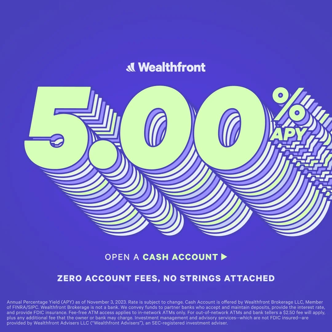
Finance is the most compliance-heavy category on paid media. Get certified as a financial-services advertiser on Meta and Google before launching. Avoid guaranteed-return language, specific income claims, and "get rich" framing. Safe copy: APY percentages with disclaimer, "no hidden fees," "FDIC-insured." Keep a legal-reviewed copy bank and plan for 30-50% initial rejection rates on new creative.
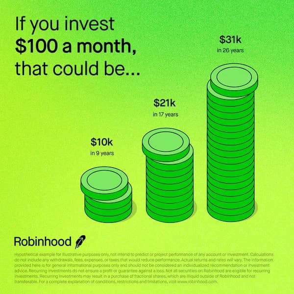
Chime runs the heaviest consumer-banking DTC paid spend with green-palette app-mockup creative. Wealthfront and Betterment lead robo-advisor paid with portfolio-return and fee-savings numbers. SoFi runs broad fintech-premium creative. Robinhood owns trading-app bold aesthetic. Public leads social-investing with pastel consumer-friendly framing. Cash App dominates Gen-Z peer-to-peer. Each brand has distinct palette discipline worth studying.
More Finance Ad Examples
View all


By Industry
By Format
Clone Your First Ad
Pick a template. Upload your product. Seconds later, you have an ad ready to launch. No design skills. No Photoshop.
Create your ad