
FACTOR_ Factor_ 2-Min Meals — Product Grid & Hero — Food & Beverage Ad Example
This ad employs a dynamic split-screen layout, combining a hero shot on the left with a product variety grid on the right. The hero image, featuring a hand holding a meal, adds a human touch and scale, while the grid showcases diverse meal options, appealing to varied tastes. Color psychology leverages natural food tones against dark containers, enhancing appetite appeal and product freshness. The composition guides the eye from the prominent "50% OFF" offer to the bold "2-MIN MEALS" headline, establishing immediate value and convenience. Optimized for visual platforms like Instagram, the clean presentation and clear benefit statement cut through feed clutter. Text hierarchy is effective, with the large headline capturing attention and the sub-headline reinforcing the core value proposition.
Why This Ad Works
Split-screen layout showcases variety and detail
The ad effectively uses a split-screen, dedicating the left to a detailed, in-hand hero shot, and the right to a grid of three distinct meals. This dual approach simultaneously provides a close-up, relatable view and demonstrates the breadth of meal options, addressing both quality and choice concerns for potential customers.
Prominent discount drives immediate conversion intent
The bright yellow "50% OFF YOUR FIRST BOX" callout is strategically placed and visually dominant. This strong incentive immediately grabs attention and communicates significant value, crucial for driving first-time subscriptions. It creates urgency and reduces perceived risk, directly targeting conversion-focused users.
Benefit-driven headline targets busy, convenience-seeking audience
The bold "2-MIN MEALS." headline directly addresses a key pain point for the target audience: lack of time. Coupled with the sub-headline "So you can heat, eat, and go.", it clearly articulates the core benefit of speed and convenience, resonating strongly with busy professionals or individuals seeking effortless meal solutions.
Ad Specs
Color Palette
Original Ad Copy
How to Clone This Ad
From reference to ready-to-run ad
Pick a template
Click "Use This Template" at the top of this page.

Upload your product
Any angle, any background — AdDogs handles the cutout.
Brand auto-applied
Your colors and logo pulled straight from your brand.
Pick your dimension
14 aspect ratios on Pro and Ultimate, 3 on Free and Basic. One credit per generation.
What You Could Improve
Add clear call-to-action button or arrow
While the offer is clear, the ad lacks an explicit CTA button or visual cue like an arrow pointing to a "Shop Now" or "Get Started" button. Adding a distinct, contrasting CTA element would significantly improve click-through rates by guiding users directly to the next step, reducing friction in the conversion funnel.
Integrate a lifestyle element into the product grid
The current product grid is purely functional. Introducing one image showing a meal being enjoyed in a relevant setting (e.g., at a desk, outdoors) could enhance relatability and emotional connection. This would help potential customers visualize how Factor_ fits into their busy lives, strengthening the lifestyle appeal.
Questions
AdDogs rebuilds the ad with your product photo and extracts your brand colors automatically from your logo. Same layout and composition — your product, your brand.
Pick your dimension per generation. Free and Basic include 3 dimensions: square (1:1) for Instagram and Facebook feeds, portrait (9:16) for Stories and Reels, landscape (16:9) for Google Display and YouTube. Pro and Ultimate unlock all 14, including Pinterest (2:3), cinematic (21:9), and banners.
Built for food & beverage and health & wellness products. The Split Screen composition works best when the product photo carries the persuasion. Any background, any angle — AdDogs handles the cutout.
One credit. $0.40 on the Basic plan ($12/mo for 30 credits), $0.33 on Pro. One credit produces one finished ad in the dimension you pick. Five free credits to start, no card.
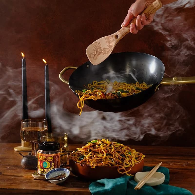
Disproportionately well for Gen-Z CPG. Liquid Death, Poppi, Graza, and Fly By Jing all scaled on TikTok with UGC-style creative and trend-matching. TikTok-native content looks less polished, more irreverent, and short (under 15 seconds). If your food brand skews under 35, a TikTok-first creative strategy likely beats Meta-first for the first $500k in paid spend.
Liquid Death runs the most culturally viral creative in beverage. Poppi and Olipop lead functional soda on Meta and TikTok. Graza owns the DTC olive oil category with bright-green squeeze-bottle aesthetics. Magic Spoon built cereal paid growth on retro-box nostalgia. Fly By Jing dominates Chinese-pantry spice. Each brand has a weekly creative rotation worth studying for hook patterns.
More Food & Beverage Ad Examples
View all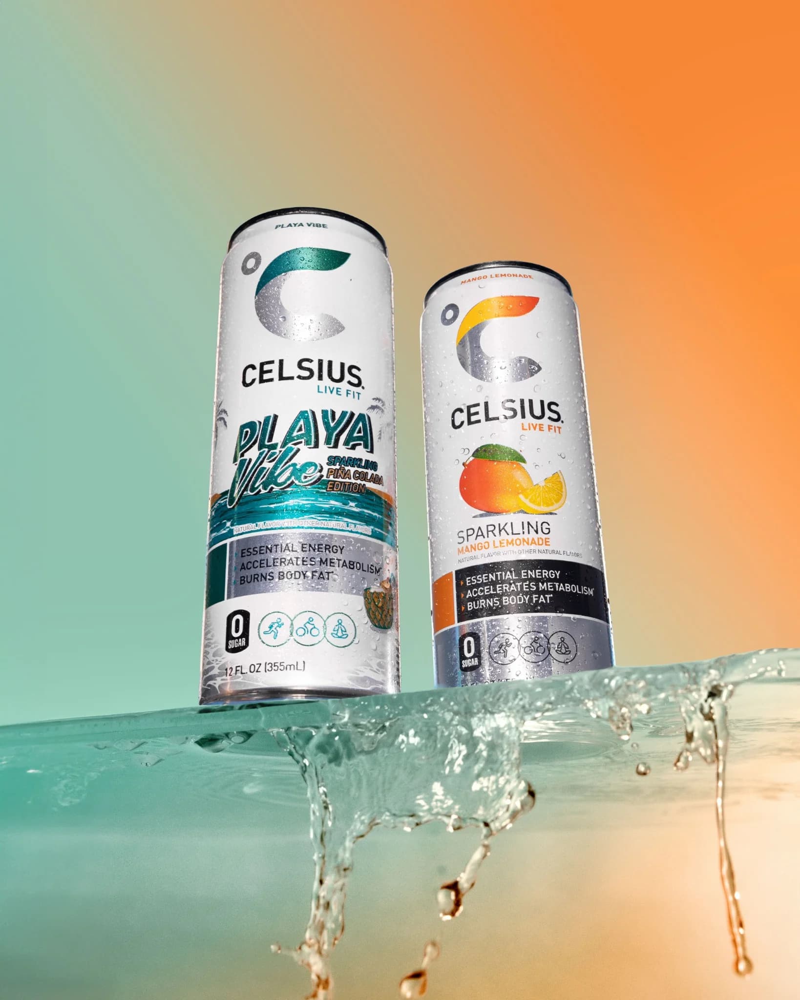
By Industry
By Format
Clone Your First Ad
Pick a template. Upload your product. Seconds later, you have an ad ready to launch. No design skills. No Photoshop.
Create your ad