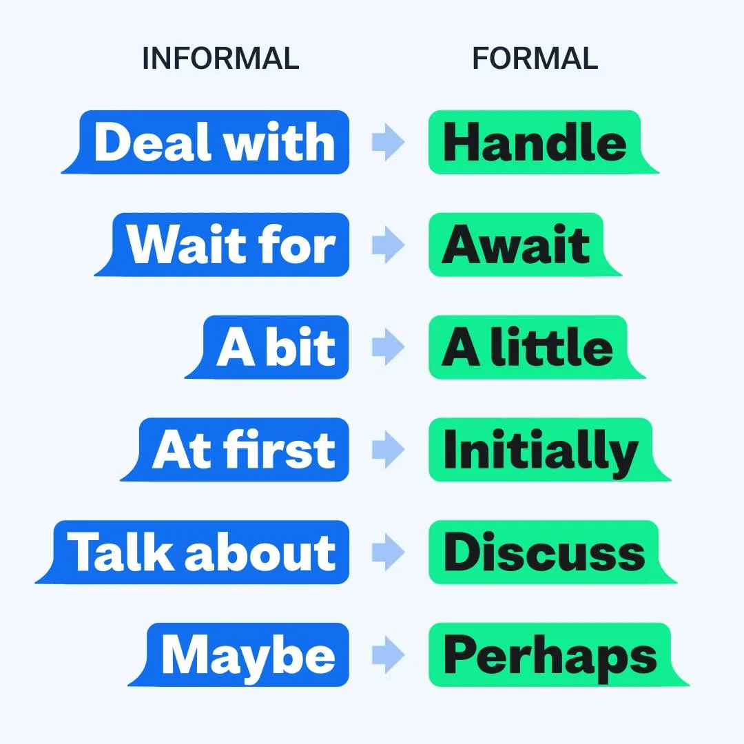
Informal vs. Formal Language — Comparison Grid — Education Ad Example
This ad employs a clear comparison layout, utilizing distinct chat bubble graphics to differentiate between informal and formal language. The composition strategically places "INFORMAL" terms on the left in vibrant blue bubbles and their "FORMAL" counterparts on the right in bright green, with arrows guiding the eye. This visual metaphor of text messages makes the educational content highly relatable and digestible, optimized for platforms like Instagram or Pinterest where quick, shareable insights thrive. The high-contrast color palette ensures excellent readability against the light background, crucial for text-heavy visuals. Text hierarchy is simple: bold headings define categories, while consistent sizing for examples maintains visual balance. This design effectively simplifies a linguistic concept, making it engaging and easy to absorb for a broad audience.
Why This Ad Works
Chat bubble design enhances relatability
The use of chat bubble graphics transforms a potentially dry linguistic lesson into an engaging, modern visual. This design choice resonates with digital natives, making the content feel current and directly applicable to everyday communication. It significantly boosts the ad's shareability and memorability on social platforms.
High contrast colors ensure readability
The vibrant blue and green text bubbles stand out sharply against the light grey background. This high contrast is critical for text-based ads, ensuring legibility across various screen sizes and lighting conditions. It minimizes eye strain and allows for rapid information processing, which is essential for scroll-stopping content.
Clear left-to-right comparison structure
The consistent layout, with "INFORMAL" on the left and "FORMAL" on the right, linked by clear arrows, creates an intuitive comparison. This structured approach guides the viewer's eye effortlessly through each example, making the educational content easy to understand at a glance and highly effective for quick learning.
How to Clone This Ad
From reference to ready-to-run ad
Pick a template
Click "Use This Template" at the top of this page.

Upload your product
Any angle, any background — AdDogs handles the cutout.
Brand auto-applied
Your colors and logo pulled straight from your brand.
Pick your dimension
14 aspect ratios on Pro and Ultimate, 3 on Free and Basic. One credit per generation.
What You Could Improve
Incorporate a brand logo for attribution
The ad lacks any branding, which means its valuable educational content could be shared widely without attributing the source. Adding a subtle logo or brand name, perhaps in a corner, would build brand recognition and ensure that the creator benefits from the content's virality and engagement.
Add a clear call to action
While informative, the ad doesn't prompt further interaction. Including a call to action like "Save this post," "Follow for more writing tips," or "Visit our site for a full guide" would convert passive viewers into active followers or potential customers, driving deeper engagement and audience growth.
Questions
AdDogs rebuilds the ad with your product photo and extracts your brand colors automatically from your logo. Same layout and composition — your product, your brand.
Pick your dimension per generation. Free and Basic include 3 dimensions: square (1:1) for Instagram and Facebook feeds, portrait (9:16) for Stories and Reels, landscape (16:9) for Google Display and YouTube. Pro and Ultimate unlock all 14, including Pinterest (2:3), cinematic (21:9), and banners.
Built for education products. The Comparison composition works best when the product photo carries the persuasion. Any background, any angle — AdDogs handles the cutout.
One credit. $0.40 on the Basic plan ($12/mo for 30 credits), $0.33 on Pro. One credit produces one finished ad in the dimension you pick. Five free credits to start, no card.
Instructor portrait plus expertise credential plus one specific outcome. MasterClass runs this pattern at massive scale. Skillshare adds project-preview visuals. For bootcamps, student testimonial plus salary outcome beats instructor-led creative because bootcamp shoppers decide on graduate results, not teacher fame. Format split by offering type.
Duolingo runs the most viral education creative on TikTok with the unhinged-owl-mascot aesthetic — a case study in meme-native brand marketing. MasterClass holds the premium-instructor paid tier. Skillshare leads project-based creative. Coursera dominates credential-plus-university-partnership creative. Brilliant owns the daily-puzzle gamified pattern. Each brand rotates creative weekly because education CPMs run high.
More Education Ad Examples
View all


Similar Style in Other Categories


By Industry
By Format
Clone Your First Ad
Pick a template. Upload your product. Seconds later, you have an ad ready to launch. No design skills. No Photoshop.
Create your ad