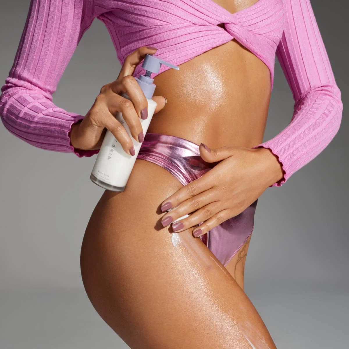
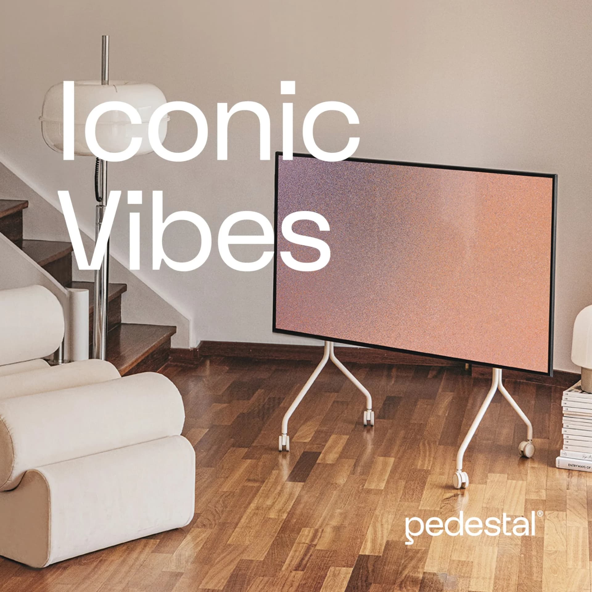
Olivetti Olivetti Digital Watch — Feature Spotlight Layout — Fashion Ad Example
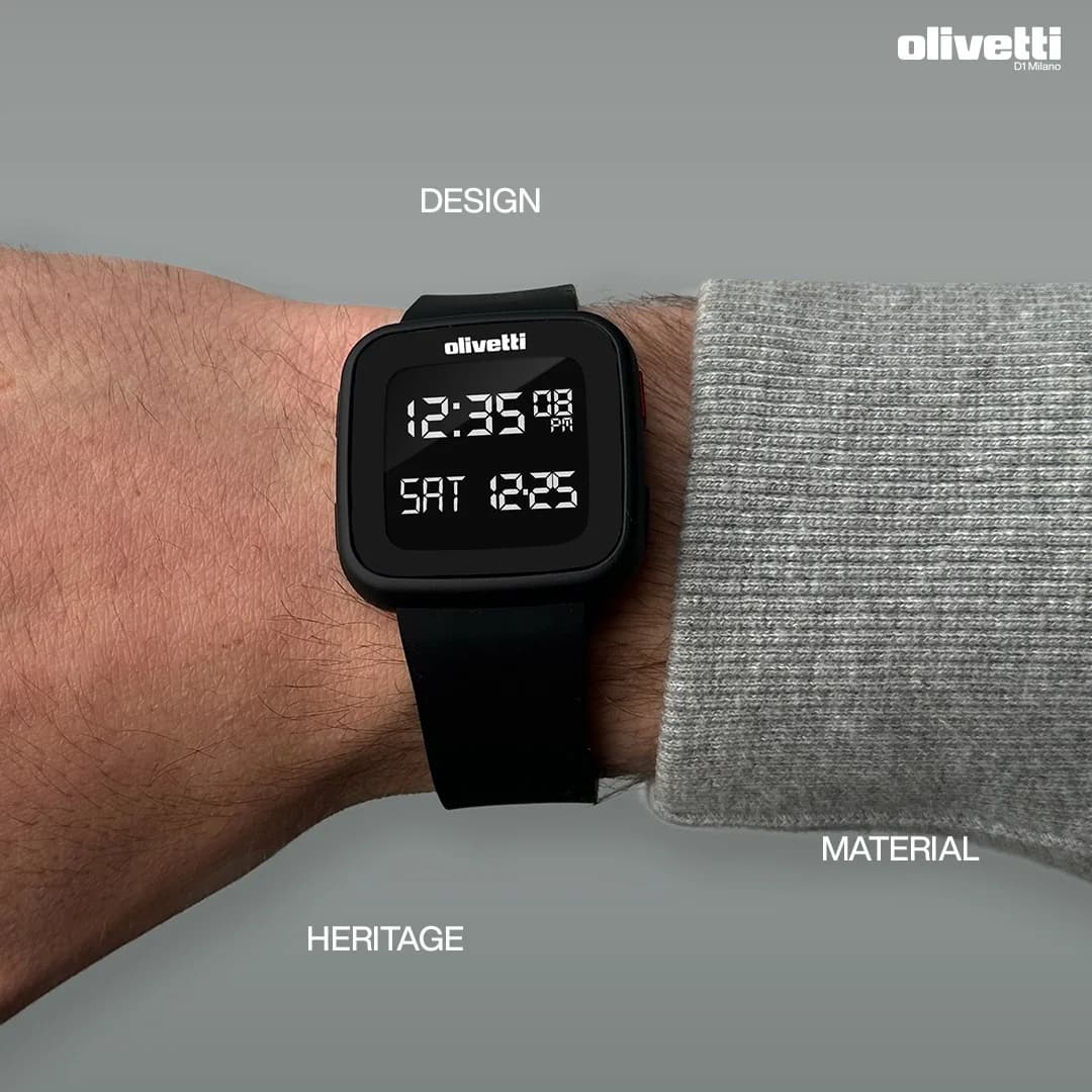
This ad employs a split composition, effectively showcasing the Olivetti digital watch on a wrist alongside a textured grey sleeve. The layout strategically uses negative space and three distinct text labels—"DESIGN," "MATERIAL," and "HERITAGE"—to guide the viewer's eye and highlight key product attributes. The monochromatic grey and black palette conveys sophistication and modernity, ensuring the watch's sleek design remains the focal point without visual distractions. This clean aesthetic is highly optimized for platforms like Instagram, where minimalist visuals and clear product presentation capture attention. The composition allows for easy adaptation across various aspect ratios, maintaining visual integrity. Text hierarchy is minimal, with the brand logo prominent and feature labels subtly integrated, allowing the product's visual appeal to drive engagement.
Why This Ad Works
Strategic text labels guide attention
The strategic placement of "DESIGN," "MATERIAL," and "HERITAGE" labels directly points to relevant visual elements. This technique creates an immediate understanding of the product's core value propositions. It helps viewers quickly grasp what makes the watch unique, enhancing message retention and driving interest in its specific attributes.
Monochromatic palette emphasizes product design
The ad's monochromatic palette, dominated by black and various shades of grey, effectively emphasizes the watch's sleek design and modern aesthetic. By removing distracting colors, the focus is entirely on the product's form, texture, and digital display. This minimalist approach communicates sophistication and timelessness, appealing to a discerning audience.
Split composition highlights product and material
The composition cleverly splits the frame between the watch on the skin and the textured sleeve. This contrast not only highlights the watch's wearability but also subtly draws attention to the quality of the material, both of the watch and the accompanying garment. It grounds the product in a real-world context, making it relatable.
Ad Specs
Color Palette
How to Clone This Ad
From reference to ready-to-run ad
Pick a template
Click "Use This Template" at the top of this page.

Upload your product
Any angle, any background — AdDogs handles the cutout.
Brand auto-applied
Your colors and logo pulled straight from your brand.
Pick your dimension
14 aspect ratios on Pro and Ultimate, 3 on Free and Basic. One credit per generation.
What You Could Improve
Add a clear call to action for conversion
Currently, the ad lacks a clear call to action, which can hinder conversion efforts. Adding a prominent CTA like "Shop Now" or "Discover More" would direct interested viewers to the next step. This is crucial for moving prospects from awareness to consideration or purchase, especially on social platforms.
Introduce a subtle pop of brand color
While the monochromatic scheme is clean, introducing a subtle pop of brand-aligned color could enhance memorability and scroll-stopping power. A small accent color, perhaps in the background or a design element, could differentiate the ad in a crowded feed without compromising its minimalist aesthetic or brand identity.
Questions
AdDogs rebuilds the ad with your product photo and extracts your brand colors automatically from your logo. Same layout and composition — your product, your brand.
Pick your dimension per generation. Free and Basic include 3 dimensions: square (1:1) for Instagram and Facebook feeds, portrait (9:16) for Stories and Reels, landscape (16:9) for Google Display and YouTube. Pro and Ultimate unlock all 14, including Pinterest (2:3), cinematic (21:9), and banners.
Built for fashion & apparel products. The In-Use/Action composition works best when the product photo carries the persuasion. Any background, any angle — AdDogs handles the cutout.
One credit. $0.40 on the Basic plan ($12/mo for 30 credits), $0.33 on Pro. One credit produces one finished ad in the dimension you pick. Five free credits to start, no card.
Fit-comparison split frames and on-model lifestyle — in that order for direct-response, reversed for brand-builders. Fit-comparison teaches shoppers why your cut is worth the price tag in under two seconds. Lifestyle builds long-term aided recall. Skip studio-on-white product shots at launch — they read as Amazon, not as brand.
True Classic, Quince, and Mack Weldon lead men's DTC. Aritzia, Vuori, and Alo Yoga lead women's premium athleisure. Everlane and Skims run the heaviest transparency-priced and shapewear spend respectively. Each brand has a weekly creative rotation worth studying — True Classic alone runs 200+ active variants at any time on Meta.
More Fashion Ad Examples
View all
Similar Style in Other Categories
By Industry
By Format
Clone Your First Ad
Pick a template. Upload your product. Seconds later, you have an ad ready to launch. No design skills. No Photoshop.
Create your ad