L'Atelier d'Amaya L'Atelier d'Amaya — Bordeaux Storefront Announcement — Jewelry Ad Example
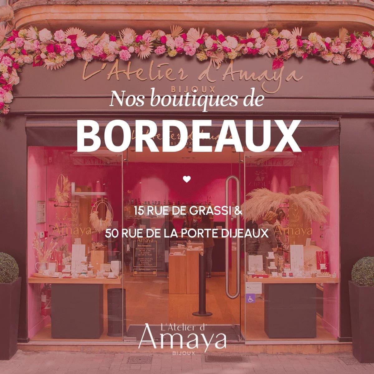
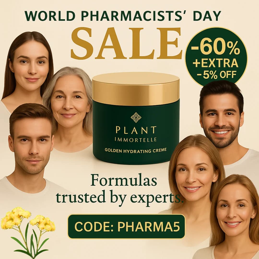
A storefront image for L'Atelier d'Amaya Bijoux, featuring a strong pink/magenta overlay that instantly communicates a feminine, luxurious, and inviting brand identity. The layout centers on the physical store, with a prominent floral garland adding a premium, festive touch. Text hierarchy guides the viewer from the general announcement ("Nos boutiques de") to the specific location ("BORDEAUX" in large, bold font) and then the precise addresses. This composition is optimized for social platforms like Instagram, where visually appealing, high-contrast imagery with clear, concise messaging can effectively stop the scroll. The color psychology leverages pink to evoke warmth and elegance, aligning perfectly with a jewelry brand targeting women. The overall design effectively blends aesthetic appeal with crucial location information, driving local awareness and potential foot traffic.
Why This Ad Works
Vibrant color overlay creates brand mood
The strong pink/magenta filter over the storefront instantly conveys a feminine, luxurious, and playful brand identity. This color choice is highly effective for a jewelry brand, attracting the target demographic and making the ad visually pop in a crowded feed, signaling premium yet approachable.
Clear geographical focus for local relevance
The prominent "BORDEAUX" immediately communicates local relevance to residents or visitors of the city. This direct approach ensures that the ad reaches the most pertinent audience, driving foot traffic to the specific store locations rather than general brand awareness, maximizing local marketing ROI.
Decorative floral garland adds premium aesthetic
The elaborate floral arrangement above the storefront elevates the ad's aesthetic, suggesting luxury and attention to detail. This visual element enhances the brand's perceived value and creates an inviting, festive atmosphere, making the physical store appear more appealing and a desirable destination for shoppers.
Ad Specs
Color Palette
Original Ad Copy
How to Clone This Ad
From reference to ready-to-run ad
Pick a template
Click "Use This Template" at the top of this page.

Upload your product
Any angle, any background — AdDogs handles the cutout.
Brand auto-applied
Your colors and logo pulled straight from your brand.
Pick your dimension
14 aspect ratios on Pro and Ultimate, 3 on Free and Basic. One credit per generation.
What You Could Improve
Add a clear call to action button
While addresses are provided, a direct CTA like "Visit Us" or "Get Directions" would significantly improve conversion. Social platforms offer native buttons that reduce friction, guiding users directly to the next step, rather than expecting them to manually search or remember the address.
Increase contrast for address readability
The addresses, though present, are somewhat lost against the busy storefront and pink overlay. Testing a variant with a subtle background box or a slightly darker text shadow for the addresses would enhance readability, ensuring critical information is easily digestible, especially on smaller mobile screens.
Questions
AdDogs rebuilds the ad with your product photo and extracts your brand colors automatically from your logo. Same layout and composition — your product, your brand.
Pick your dimension per generation. Free and Basic include 3 dimensions: square (1:1) for Instagram and Facebook feeds, portrait (9:16) for Stories and Reels, landscape (16:9) for Google Display and YouTube. Pro and Ultimate unlock all 14, including Pinterest (2:3), cinematic (21:9), and banners.
Built for fashion & apparel and home & lifestyle products. The Storefront composition works best when the product photo carries the persuasion. Any background, any angle — AdDogs handles the cutout.
One credit. $0.40 on the Basic plan ($12/mo for 30 credits), $0.33 on Pro. One credit produces one finished ad in the dimension you pick. Five free credits to start, no card.
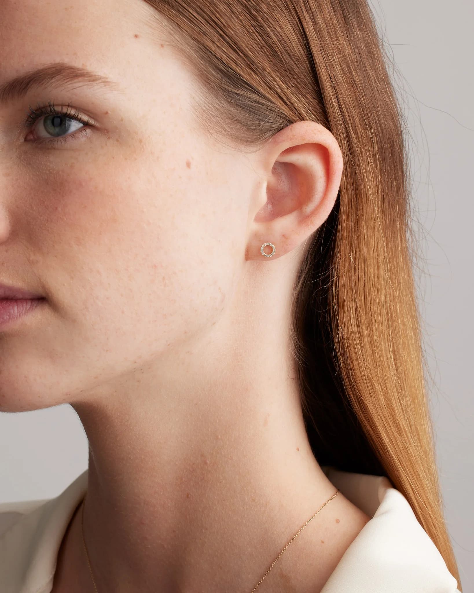
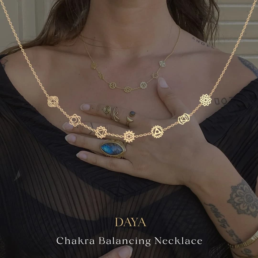
Macro product shots on dark backgrounds with visible price tags. Mejuri and Catbird both run this as their dominant direct-response format. For engagement rings, 360-degree video rotations outperform static stills because the stone's sparkle is the whole pitch. Lifestyle on-model shots work as second-variant brand support but rarely win CPA tests as primary creative.
Pinterest is the single highest-intent channel for engagement rings. Shoppers research for 3-6 months before purchase and Pinterest is where the mood-boarding happens. Brilliant Earth and Blue Nile both run heavy Pinterest spend at 2:3 vertical aspect ratio with macro stone close-ups. Pin-style creative (serif typography, editorial layout) beats Meta-style direct response on this platform.
More Jewelry Ad Examples
View all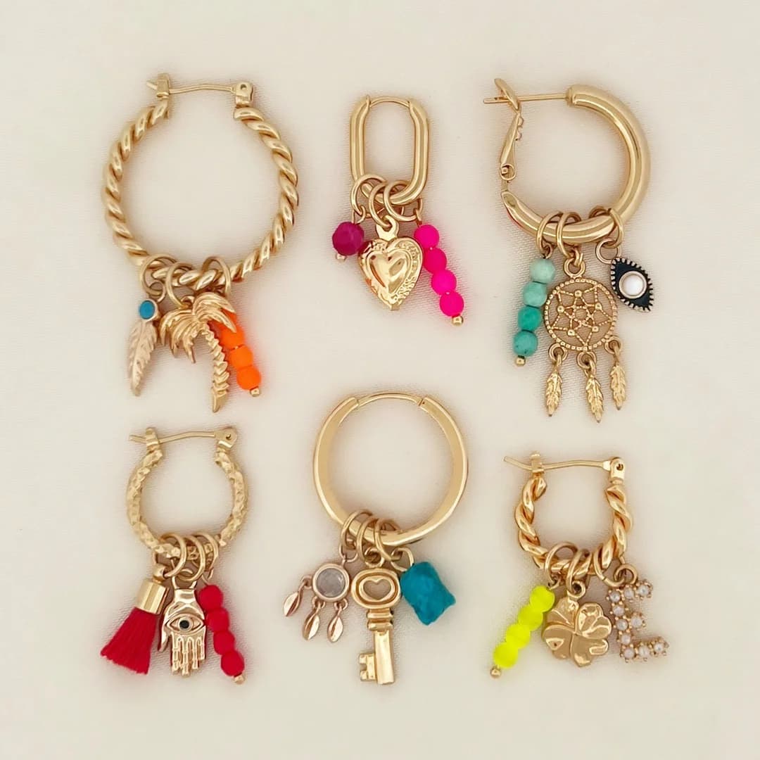
By Industry
By Format
Clone Your First Ad
Pick a template. Upload your product. Seconds later, you have an ad ready to launch. No design skills. No Photoshop.
Create your ad